BOOK FIND!
I have stumbled into an unusual object – well, a set of three, actually.
This is a set of the first edition German printing of Alexander Speltz’ Colored Ornament, printed in 1914, with text in English. It’s a three portfolio collection of full color plates, with an accompanying index/survey write-up for each portfolio. The thing is divided into Antiquities – mostly Greek and Roman, with a smattering of Pre-Columbian, plus some plates showing eastern Mediterranean art and decoration; Middle Ages – mostly Romanesque through Gothic, with some from Byzantium; and Modern – not particularly modern, it appears to cover early Renaissance up to pre-Empire.
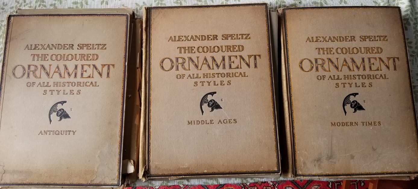
Now before you hyperventilate and begin looking the thing up on the used book market, note that it is in extremely rough shape, and plates are missing. The Antiquities and Modern folios are each missing 4 or so, and the Middle Ages folio is missing about 10. The folio covers are crumbling, and the heavy paper to which each image is affixed is well on the march to being dust. It’s clear that someone cherry-picked pages to frame separately. In fact, the person I got this from said he was doing exactly that. Still, there’s plenty of good material here, and I do have the companion about/index volumes. And it was free.
Here’s a small sample of the roughly 150 plates that remain:


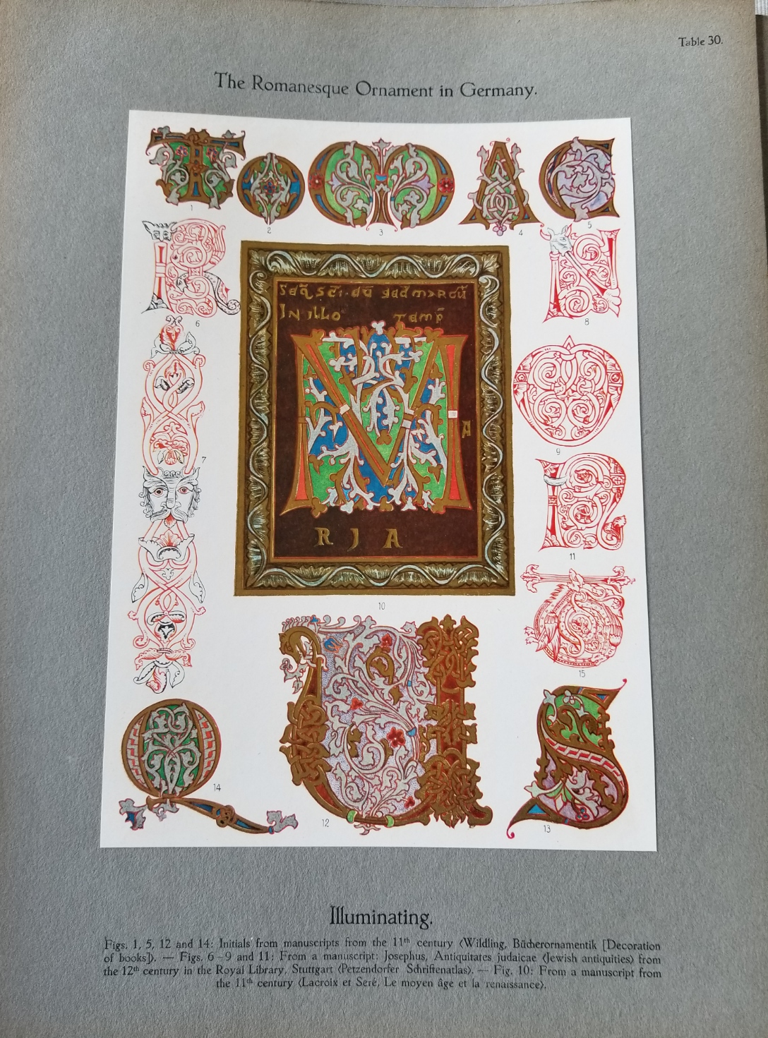
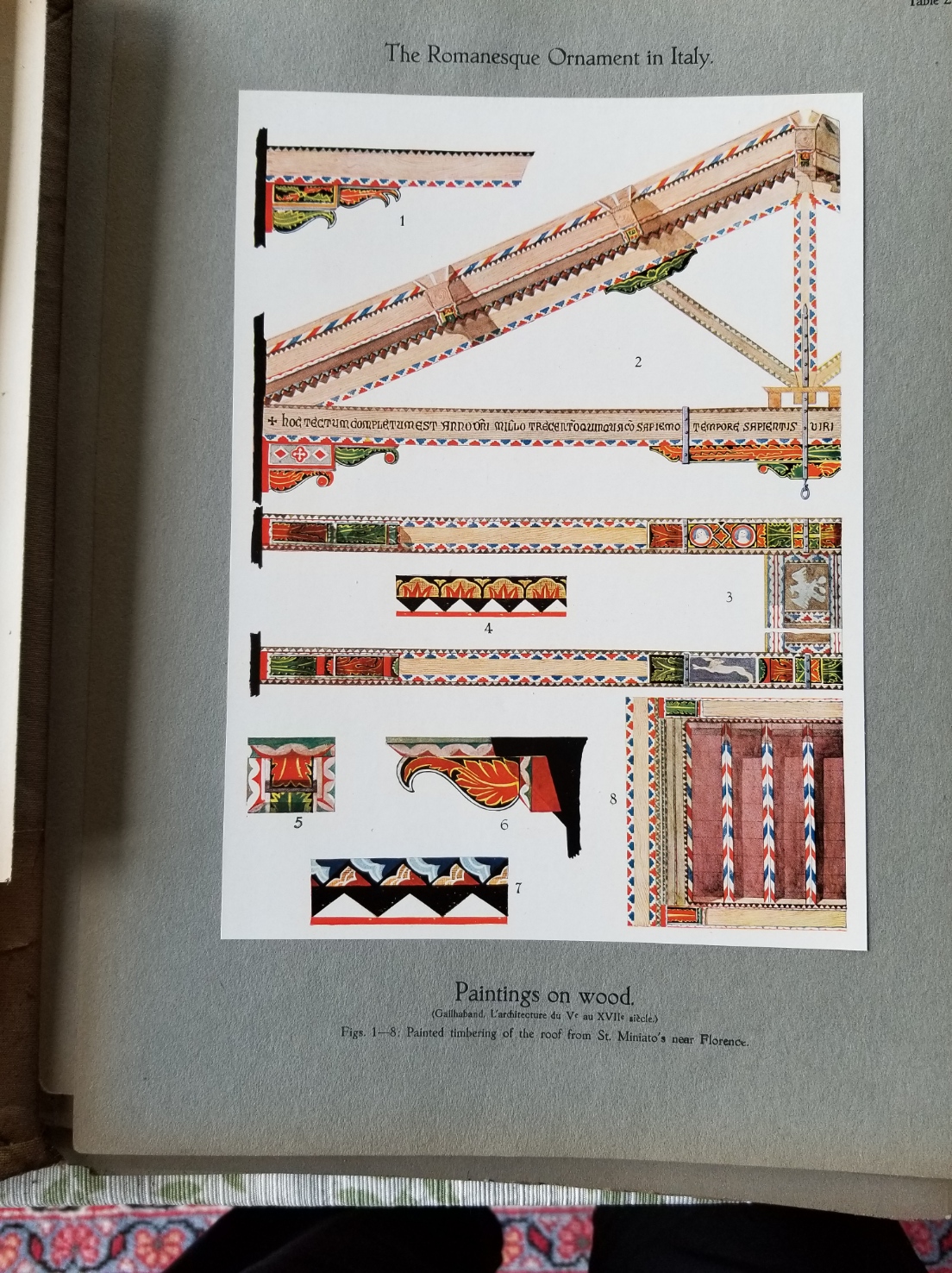

This is a very “hard artisan” focused work. There are just a couple of plates featuring textiles. Only one with embroidery. It’s mostly architectural ornament, ceramics, jewelry and other metal work, calligraphy and early printing, some furniture, glass, mosaics, and interior ornamentation. Not sculpture, not weapons, not hanging paintings. Still there’s a wealth of inspiration here.
I intend to keep these survivors together and ward them as well as I can given that I’m not an archival museum. I see folk selling individual plates from the thing, but even at the prices they are asking I’m not tempted in the least to break it up further. Local pals, if you are interested, drop me a note. A gentle viewing and photography session would not be out of question.
DIZZY GRAPES
Fueled by a week at the beach; hot, dry, and windy weather; paella, sufficient wine, and other indulgences, my grape-adorned sideboard placemat grows.
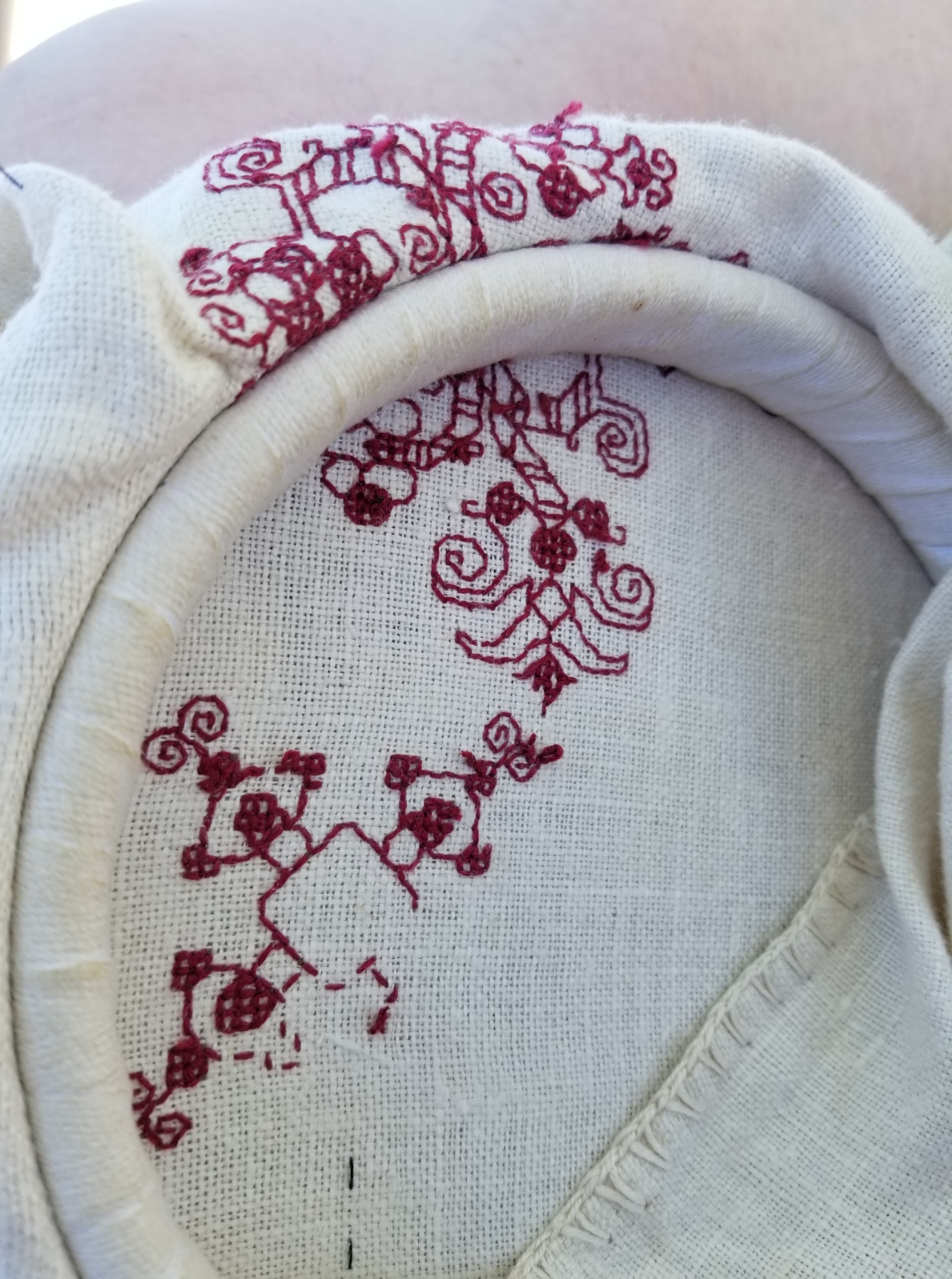
First an observation on the ground cloth itself. I had intended to preserve the simple crocheted edging that this piece of well worn linen came with. But as you can see – “loving hands at home” were at work when this remnant was rescued from a larger prior incarnation, and the edges of the cloth are far from parallel. The thin black lines are my basted guidelines, done on the weave to mark the absolute center, and also about 1.5 inches in from the edges. Obviously they are not parallel to the edges. The short sides are especially skew:

Eventually I will have to trim off the edges and hem. Then possibly finish with a bit of simple needle lace. I haven’t done that in a while, so it should be an interesting adventure. But for now, I will stick to the inside of the designated rectangle. I’m still contemplating designing a companion edge pattern to the field of the original artifact, so I won’t get too close to those basted lines, just to make sure I have ample room for both the edging and the field.
So, that being said, I started in the center. Note that I don’t stitch over my basted guidelines – I snip them out as I come close.

You can really see the even/uneven nature of the ancient linen in the shot above. Yes, I am working it in a hand-held hoop (although I’ll probably switch to my sit-upon later tonight). I’m using plain old DMC six-strand floss, color #615. This piece will become a placemat on my sideboard, where wines are generally opened. The grape motif is fitting, but there is ample chance for spills, and washability is my prime concern. The linen itself is already far from pristine, so a few more stains won’t make much difference, but I didn’t want to use silk or faux silk (rayon), to make care less complicated.
According to the updated notes on the museum photo, the stitches used are double running and an Italian double sided cross stitch. The original has a design that’s truncated around the outer edge, and might have been cut down from a larger work. I do believe that The Ancients were just as practical as we are today. If something wasn’t going to be seen flipped over, it didn’t merit the additional work of making it perfect on both front and back. A bold leap of surmise on my part, but since I have no earlier larger work to repurpose into this sideboard mat, I’m comfortable with not extending the extra effort. Plus, I am doing this entirely for me. I have no intention on documenting it and entering it in any historical needlework exhibit or arts competition.
The variant of the two-sided cross stitch I’m using produces a boxed cross stitch on the front and a square grid on the back. If you zoom in on the original the scrum of stitches does look like a cross in a box. I could have used meshy, either pulled tight or relaxed to go double-sided, or long armed cross stitch (another historically congruent approach), or even satin stitch, but I wanted to try something new. Here’s the back. You can see the little grids where on the front the presentation is solid color.
And of course, since nothing can be perfect, especially after all the wine referenced above – this particular iteration of the secondary motif was in the wrong place. I haven’t done it yet, but the whole square has to be picked out. But I made progress none the less. The offending misplaced robot-headed square is mostly unseen over my knee in the general progress shot below. The other two secondary motifs are correctly placed.
I will continue on with this cloth, filling in the additional iterations of the main and companion motifs. Still thinking of doing a companion edging, but treating it as they most often did contemporary with the design, by using butted rather than mitered corners. We’ll see what I come up with…
I’m “off paper” now, mentally rotating/flipping as needed, hence the dizzy title of this post. I like that extra challenge, too.
This design may end up being in The Third Carolingian Modelbook, a project I’ve already begun. But frankly there has been very little uptake of either of my two earlier citation rich for-sale books, and only marginally more from my free releases of mostly original material or from the free pattern broadsides or the SAL on this website. Sales and downloads, yes – but very little actual stitching from any them. It’s disappointing, and I am not sure I want to take the time if folk are just looking for shelf fodder and not actual stitching inspiration.
Have you done something from my pages? Please let me see it. If you give permission I would be happy to post your work here on String under a gallery tag, either with your name or anonymously as you prefer.
EPIC FANDOM STITCHALONG – BAND 17
JURASSIC JUMBLE
Oh, heavens. More dinosaurs. I couldn’t help it. I love dinos. This set is for the fans of the bumpy and finned back beasts. There are attempts at a pair each of a Stegosaurus and Spinosaurus variant hiding in the foliage.
Although we only see the center bit of the long repeat on the Epic sampler, if you are interested in working this design as a longer piece I do provide the entire long repeat and It’s a VERY long meandering repeat.
Time Factor 4, for needless and wanton complexity, a very long repeat that’s not easy to remember; and for having to do more dinos.

Use one color, multiple colors, or variegated threads, as you prefer. As with the rest of Epic, there are no rules or must-do approaches.
As usual this band plus working notes and hints has been appended to the bottom of the write-up on the SAL page, accessible via this link or via the tab at the top of every page here on String-or-Nothing.
If you are working our Epic Fandom SAL either as a whole or as a strip excerpt, please let me know. It gives me great joy to see how my “pattern children” fare out in the wide, wide world, especially when they meet up with creative, playful people. And if you give permission, I’d be happy to share your pix of this developing sampler, it in its finished state, or derivative projects including one or more of the Epic bands here on String, in a gallery post, with full credit to you as interpretive artist.
Band 17 debuted on he Facebook Enablers group on 5 July. Band 18 will appear there on 2 August, and will be echoed here on 16 August.
#EpicFandomSAL
END OF DON’T, BEGINNING OF THE NEXT
Just finishing up Don’t. I think the Mystery Neice will be happy with it. We worked together to pick out the colors, typefaces, and border design used, so there was ample recipient-input on this one.
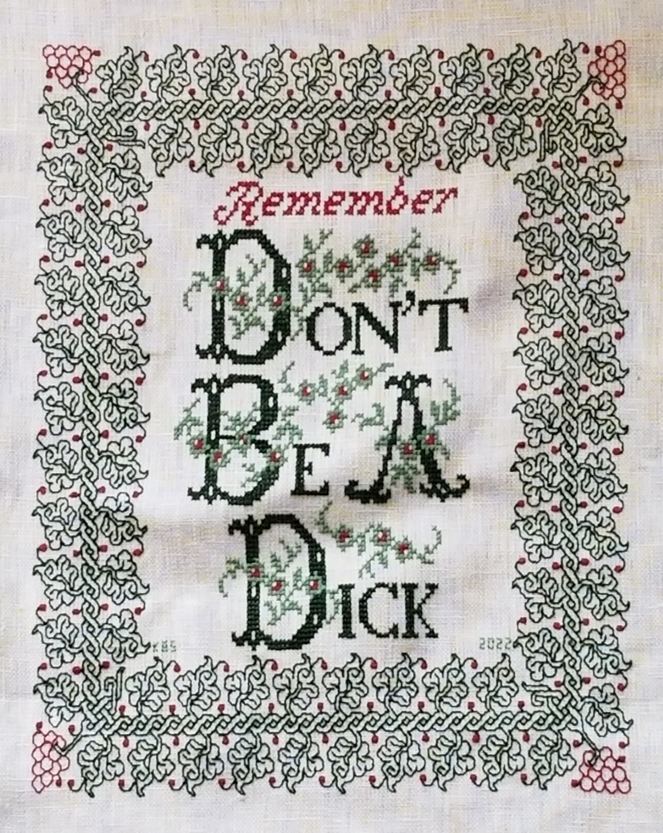
I’m happy with it, too. Although I have to confess a bit of a mistake at the outset, which has necessitated a somewhat rueful kludge.
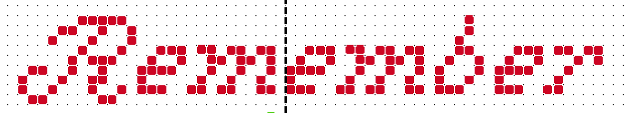
The original did not include “Remember.” Why is it there?
Because when I started stitching the border at the left center line, instead of starting it at the center of one of the sprigged spirals, I started with one of the spirals that grows a leaf. That de-centered the inscription north/south. I walked happily down the left edge, across the bottom, and up the right side. When I got to the top I noticed that (horrors!) to make my corner fit there would be larger space between it and the words than there is at the bottom. Nine units more, to be exact. So I thought about what I could put there. More flowers? Possibly. Another ornament? Again possible. But the more I thought about it, the more I wanted to NOT add mass on top which would draw attention to the lack of space at the bottom. So a word was the way to go.
I decided on adding “Remember” and went pawing through alphabet resources to find something thin, elegant, and nine units tall – something that would fill space without adding too much bulk. The initial script R is from an antique Sajou booklet at the Patternmaker Charts site. The lower case letters needed to be smaller, and I found a good candidate in Creating Historic Samplers by Grow and McGrail – the same source I used for the lower case letters in the main area. It’s not a profoundly useful book, but it does have a section of beginners’ advice, plus some sample US Colonial era motifs, alphabets, and borders. Best of all for those just starting out, it’s very inexpensive on the used market.
Now on to the next – Grape Sideboard Scarf.
For the next project I’ve decided to use a well washed linen piece I picked up at a yard sale in Silver Spring, Maryland easily 42 years ago. It’s a dresser scarf, trimmed with a hand-turned hem secured by a simple crochet, with a crochet picot edge on the short sides. Based on the materials and back story I suspect it was cut down from a larger cloth and trimmed out sometime in the late 1930s or 1940s. I got it the same time as I got the larger finished linen piece that became my Everything is Worth Doing Well sampler, although they were not cut from the same source. Yes, it’s worn and a bit discolored from storage even before I got it, but it’s sound.

The stitchable area is about 16.5 inches x 28.5 inches (about 49.9 cm x 72.4 cm), and the thread count is roughly 32 threads per inch. That’s about16 units per inch using a 2×2 thread grid, with a total design area of 264 units x 456 units. That varies a bit across the piece, so I’m averaging measurements taken at several spots (penny method for easy thread counting here).

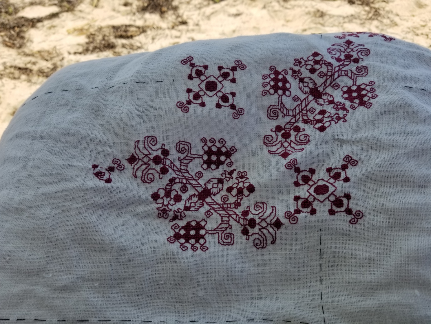
I’m going to stitch it in red, using a pattern I’ve recently redacted from a 17th century Italian cushion cover held in the Hermitage Museum (Accession T-2736 in case the link breaks). A thumbnail of the original is below. It’s about 40 x 48 cm, roughly 15.75 x 19 inches. No info on the thread count of the artifact.

Obviously I am going to maintain the dresser scarf’s edging. Also depending on the scale the design works up to I may only stitch to within 1.5 inches of the existing hems, then devise a coordinating sprouting edge to encircle the center field.
As far as the charted redaction went – this one was tricksy. There’s a major sub-sub-element that is off-grid; meaning that when I get to it (and write this here so I remember) I will have to “split the difference” on my evenweave, and shunt that bit over one thread.
Since this will be used as a protective placemat on my sideboard largely for opening the evening wine, the grape motif is appropriate. And I’ll use a DMC 6 ply floss, one of the garnets – 615 or 616, I haven’t decided yet on which one yet. I go for cotton instead of silk on this for washability because spills WILL happen.
The next step is to baste in my horizontal and vertical center lines, plus that 1.5 inch margin inside the hems. Then I begin, working center out.
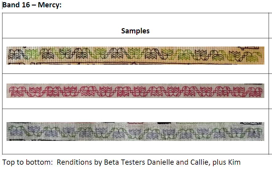
EPIC FANDOM STITCHALONG – BAND 16
MERCY
After the last band, everyone who is still sticking with this project deserves something simple. Very simple. This would also be a useful learning exercise for someone wanting to try a first strip in double running or back stitch. There are no surprises here at all.
Time Factor 1 for a nice, quiet, symmetrical repeat that returns us to alignment with the indicated project center line.
Use one color, multiple colors, or variegated threads, as you prefer. As with the rest of Epic, there are no rules or must-do approaches.
As usual this band plus working notes and hints has been appended to the bottom of the write-up on the SAL page, accessible via this link or via the tab at the top of every page here on String-or-Nothing.
If you are working our Epic Fandom SAL either as a whole or as a strip excerpt, please let me know. It gives me great joy to see how my “pattern children” fare out in the wide, wide world, especially when they meet up with creative, playful people. And if you give permission, I’d be happy to share your pix of this developing sampler, it in its finished state, or derivative projects including one or more of the Epic bands here on String, in a gallery post, with full credit to you as interpretive artist.
Band 17 debuted on he Facebook Enablers group today and will be echoed here on 19 July.
#EpicFandomSAL
