IT’S BEEN A WHILE
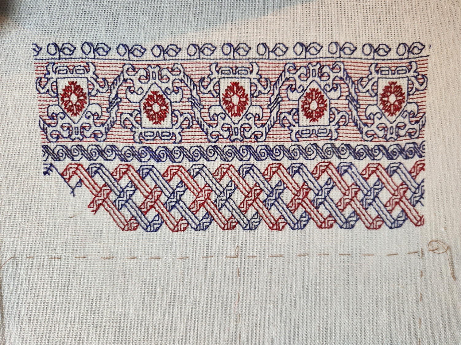
A catch-up post on what’s been stitched since I explained the Mystery Saying. Just a bit over two weeks, in fact. This is what I’ve been up to:

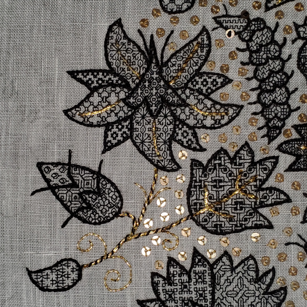
Forgive the tilt. The lacing is a bit uneven and the work appears skewed. All will be nice and parallel when it’s finally off the frame.
I was in the middle of the fish strip when I last posted. Obviously that plus three more have been completed. Plus a partial that I’m currently stitching. All of these new designs are my own. The fish, pretzel knots, crystal-like flowers, toothed border, and strange furry beast will be in Ensamplario Atlantio III when that’s finally released.
The fish, crystal flowers, and the current monster-bearing strip are all keyed on various stories in Fractured Symmetry, the Resident Male’s book that I am using as inspiration for this piece.
- The fish is well, an otherworldly fish, not much to say about them other than they are a point of minor triumph when they appear.
- The crystal flowers are an interpretation of fractalites – engineered/grown aesthetic constructs that are a special hobby of Terrendurr, the alien half of the detective duo whose adventures the book chronicles.
- And the menacing yeti/gorilla/bigfoot creature is a Yyrgamon, a forest dweller native to the planet Raylic – a bit less mythical than a yeti, rarer than gorillas, and of greater cultural significance than the bigfoot; and of highly significant appearance in one of the books’ stories.
On the sampler the Yyrgamon’s presence will bring some balance to the bottom half of the piece, and provide weight to compliment the saying block, above.
Note that basted line down below my current strip. That’s the bottom edge of the stitching area. I have room for one more band. Or possibly one with a “sprouting” narrow edging across the bottom. No clue as to what will end up there yet. I might have to draft up something new to fit.
Stay tuned!
THAT MYSTERY SAYING…
More progress on the sampler tribute to the Resident Male’s book Fractured Symmetry. I’ve teased the photo of the motto on Facebook, and promised to explain it here. I’m now further along, and can do so.

The phrase comes from a discussion describing a settlement of Raylics – furred, pack-dwelling aliens, close allies of Terrans. While their society as a whole is a technologically advanced one, space-flight capable and modern in every aspect, they retain a closer bond to their past than do many other species of similar achievement. One way this manifests is the presence of artisanal/subsistence communes, preserving the skills, values, and lifestyles of prior generations. In this discussion, the Raylic founder of such a commune refutes a scoffer, who doesn’t believe that their efforts would be viable.
“In my youth I traveled space, and on other worlds there are still those who appreciate what is built with ferthan, fuur and fustovv” – Raylic for mind, fist and blood – and we will sell to them if our own folks have so much forgot what it means to truly live.”
Fractured Symmetry, page 224 of the print edition
So in a way, not unlike Roycroft and other similar movements grouped together under the Arts and Crafts banner, this statement echoes the tenets of concentrated, dedicated, personal manufacture; of valuing traditional hand skills for the vision, effort, expression (and any possible personal sacrifice of choice) that they contain. A weighty thought, and one not too often found in gadget-oriented/low-touch science fiction in general. And quite appropriate for a hand-embroidered piece.
As far as what’s what in the stitching, some but not all of the strips have allusions to the various stories that make up the book. The latest band with its fish-like creature is one of the ones that does. All of the band patterns (but not the alphabets) are in my books. A couple are in my free download Ensamplario Atlantio Volume II. Several are from the third volume of that series, on which I am currently working. One is in my for-pay work The Second Carolingian Modelbook.
The fancy initial F is based on yet another of the listings on the Patternmaker Charts blog – adapted from a linear alphabet in Sajou number 182. Although it’s shown in two colors, I opted to do the letter in just one. It was also a bit tricky because it contains a lot of half stitches, which are not well documented in the original chart. Obviously I also modded the letter a bit, making it taller by inserting a bit of my own interlacing, eliminating the solid cross stitch (or satin stitched) units, and smoothing out some pointy ends. The rest of the letters I made up on the fly, as needed. So if you go looking for a full A-Z of them you won’t find it.
One thing I’m still thinking about is adding more to the background field surrounding the motto. A lot will depend on how dense the stitching is beneath it. I don’t intend to do full voiding, not even in a sparse pattern, but there might be some need to add a bit more around the letters. Possibly a couple more spot motifs in blue. We will see…
How far am I along? There’s a little bit of basting remaining, left of the working end of the fish strip. That marks the north/south center point. The fishies straddle it. So there’s still a lot more to go. But that’s good progress considering I only started stitching this one only 14 days ago.
TWISTING THE DAYS AWAY
More progress on the latest small band sampler. Just a little to go on the latest band.
That basted line below the ribbon strip marks the top quarter of the piece, measured from the top edge of the stitching. Next I will probably do a narrow red band, and then on to the lettering. Advance warning that it will bear another incomprehensible motto in yet another non-Terran language, in keeping with my themed tribute.
On to answering questions from my inbox.
First one up is “Why do you leave twigs as you go?” I think the person is referring to single stitches like the ones hanging down in the upper left of this snippet.
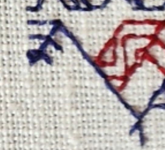
These are a temporary artifact of the way I work double running stitch. In this case I had just enough thread left to do the blue bit shown, but not enough to continue down the other two parallel lines that make up the ribbon. But I know I’ll be coming back from the other direction. So to make life a tiny bit easier, instead of coming back and then having to noodle around to hit the **exact** spot along a continuous line where the previously laid stitches pierce the ground, while I was at that spot I added just one stitch along each of those future branches. That way when I return from the other direction I have a nice, easy to see spot point to join up with instead of having to squint. It’s a tiny thing, but makes life a lot easier.
The second item was phrased as a minor accusation – “You say you almost never use stitches over 2×1, but the angles on your piece clearly show them.” To this person I can say that I haven’t violated one of my stitching conventions. My weave is skew and makes the angles that are 45° on my chart look closer to 60° or 30° when stitched. Here is how that works:
Using the penny method I counted 28 threads going east/west, and 24 threads north/south. Multiply each of those by 1.33 and you get roughly 37.25 threads per inch in the horizontal direction, and 31.9 threads per inch in the vertical (I rounded up to 32 on that one).

That means that a square stitched over 2×2 threads will appear as a rectangle – taller than it is wide, with a ratio of about 1:0.83. Here’s a rough illustration of what’s happening.
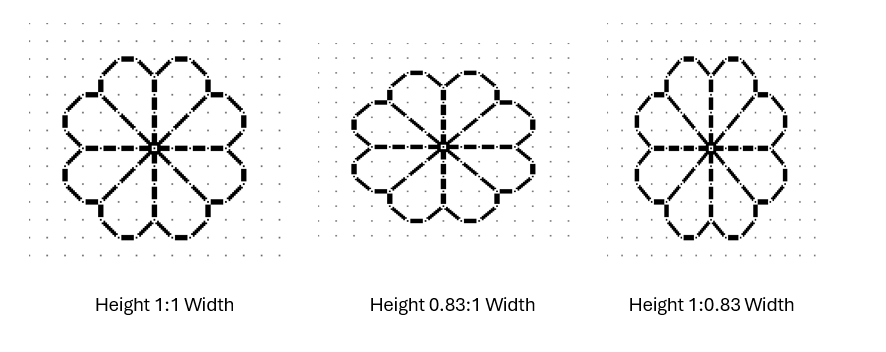
All three of the simple quaternary flowers above are exactly the same in terms of stitch count. All of them model what happens if you stitch over 1×1, 2×2, 3×3 or any exact ratio count. The one at the left is what most people expect to see when working on Aida or evenweave, and for the most part it is. But if you find a piece of woven, countable ground that isn’t exactly even – that has more threads in one direction than in the other, the stitched expression of the fully symmetrical pattern will appear a bit distorted in one direction or the other. If you have more vertical threads per inch, the design will appear squished – wider and more squat. If you have more horizontal threads, the design will appear stretched out and taller. In my case my fabric has more horizontal threads per inch than vertical ones. You can clearly see this here when you compare the length of three stitches in each direction.
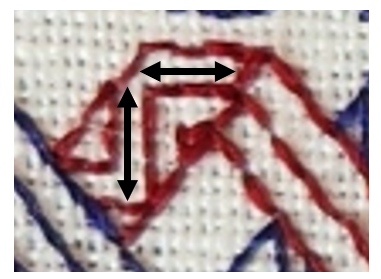
That vertical arrow bar is visibly longer than the horizontal one.
I stitch on skew count quite often, mostly because I am frugal and use countable grounds NOT specifically sold for embroidery. These include vintage linens, newly purchased finished goods (like napkins), and yardage sold of the bolt intended for regular garment or home goods sewing. But when I do use these non-standard materials I try to plan the direction of my stitching or the design of my work to either take advantage of the distortion, or avoid calling attention to it.
If the counts are close, most likely no one will notice, and if they do it will be because I’ve chosen to do a pattern that goes around a corner. Here’s an example. These are closeups of the same pattern from my first Fangirl sampler (the bony bois). The left photo is of the strip pattern running up the side of the piece, and the other from the same strip stitched along the bottom.

Side by side it’s very clear that there is distortion. But I doubt you noticed it in the last post’s photo of the entire piece.
The easiest way to avoid this challenge is NOT to work the same design both horizontally and vertically on the same piece of ground. That’s where band samplers show their strength. The bigger the percentage deviation between horizontal and vertical count, the more I lean towards doing a piece featuring strips or parallel bands.
As a closing thought on this, note that I planned the direction of the count on my Unfinished Coif rendition in response to the ever so slightly skew 72×74 thread per inch count. I had purchased the meter piece of wide linen but in spite of the cost I discarded the frugal method of cutting it to maximize the number of coif-size pieces I could get from the yardage. I was only making one coif, and saved the remnant for future work. So my ground for that project was cut on the other direction of the grain than the ones worked from the pieces supplied to the in-country stitchers. I did this so the stitched filling designs on it would be stretched and thinner rather than wider and more squat.
In the example above you can best see this in the big leaf with the fancy interlace filling. That filling when charted presents with the larger “circles” formed around the center interlace by the twists as being of equal height and width. But as stitched they look taller than they are wide. It’s a very tiny and subtle difference, but one I think added to the elegance of the overall presentation.
Oh, and as an aside…. The ONLY place aside from use as part of eyelet formation I have ever seen a 2×1 stitch unit in ANY filling or band artifact or historical work prior to 1650 was found by Toni Buckby, our fearless leader on Unstitched Coif. She redacted the “stirrup” fill I used in the paisley shape in the lower left. The 2×1 units form the elongated crosses in the center of the scattered motifs.
