Yesterday a friend and I went to the Boston Museum of Fine Arts, in specific to see the “Strong Women in Renaissance Italy” exhibit. We also took in “Fashioned by Sargent”, and wandered at will and whim through other halls, especially those in the new wing. All in all, it was a splendid day out, full of fascinating things to see and discuss, in excellent company. This post focuses on the Strong Women exhibit. I enjoyed the Sargent exhibit, too, but I took fewer photos. If my friend has more than I do, I might do a follow on about it though.
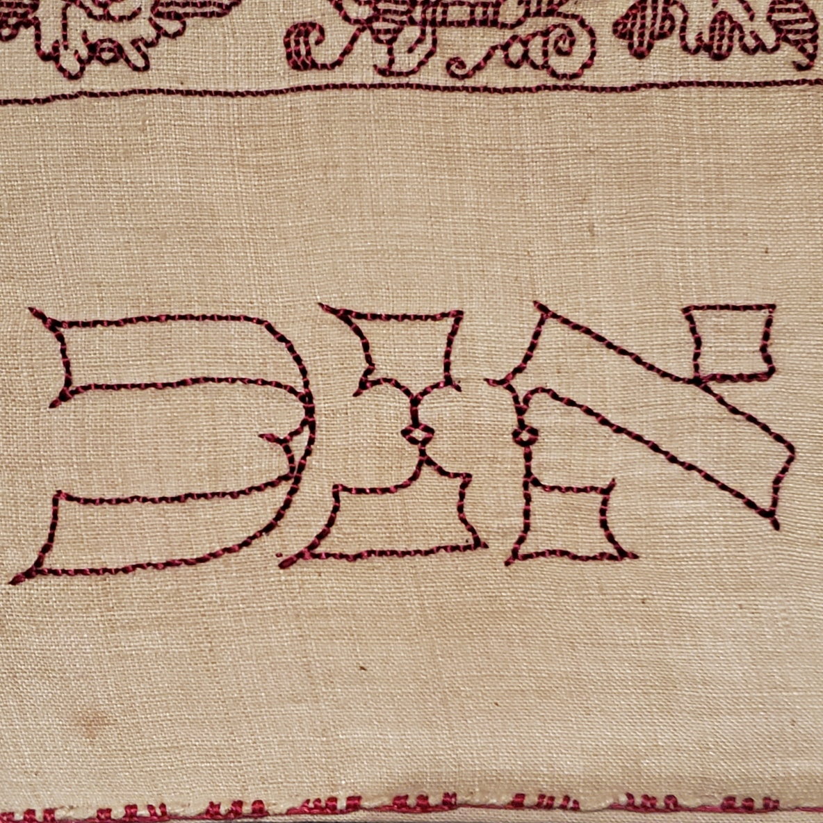
My main motivating reason to go was that the Renaissance exhibit included an artifact I’ve written about before. On loan from the Jewish Museum in New York is Honorata Foa’s red countwork Torah binder. Here is a photo I took at the MFA, of a bit that’s folded under in the official Jewish Museum photo linked above.

And an ultra-closeup. Note that the work is stitched over a grid of 3×3 threads.
Compare the original to my rendition, stitched on a big-as-logs, known thread count of 32 threads per inch, over 2×2 – 16 stitches per inch. Yes, I brought it with me, and photographed it held up to the glass display case.
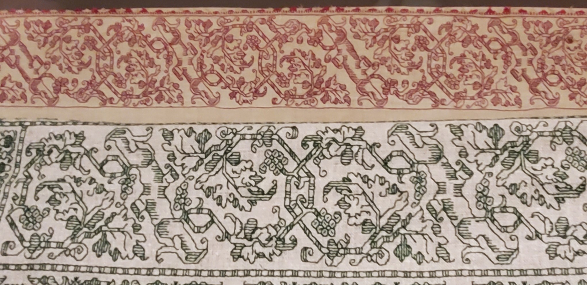
Given the difference in scale of the two, and allowing for the inch or so of distance between them, a rough eyeball estimate is that the ground for the Foa original is about the equivalent of the 72-ish count linen we all used for the Unstitched Coif project. I also think that the weave on the Foa original is ever so slightly more compressed east-west than it is north-south. making the diagonals a tiny bit more upright than they are on my version. Fascinating stuff!
Now that I see the structure, scale and alignment of the Hebrew letters, I am beginning to think that they were written out and then over stitched, conforming as much as possible to the 3 over 3 rubric, as opposed to the regular countwork of the foliate strapwork above them. For one, they don’t inhabit the same baseline. And they do seem to employ improvised angles and variant stitch lengths, although they were clearly done by someone with a skilled hand who took pains to keep stitch length as uniform as possible over those variant angles. Even so, I may be able to improvise a full alphabet of them, adapting the missing letters from the forms of those that are displayed and known. Another to-do for my ever-growing list…
The Foa Torah Binder was not the only fascinating bit of needlework or textiles on display. On the non-stitched side, there were two long lengths of sumptuous silk velvet brocade, one with a manipulated texture (possibly stamped to create highlights and shadows). What struck me the most was the scale of the patterns. The pomegranate like flower units were as big as turkey platters – far larger even than the legendary motif on the front and center of the famous Eleanor of Toledo portrait:
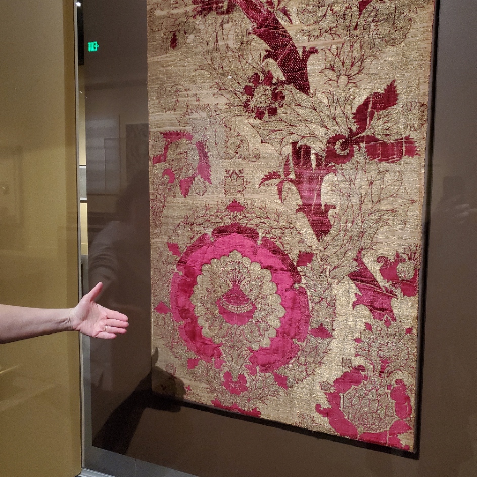

The red one on the left was credited as “Length of Velvet”, from Florence, circa 1450-1500. MFA accession 31.140. The helping hand for scale was provided by my friend. The one of the right is “Length of Velvet”, possibly from Venice, 15th century. MFA accession 58.22. The photo at the museum link is closer to the color (the gallery was dark) and shows off the highlights and shadows impressed into the velvet. Those aren’t two colors, they are the product of some sort of manipulation of the nap. It’s not shorter in the lighter sections, it looks like it’s all the same length, but some just catches the light differently, which is what made me think that it might have been heat/water manipulated with carved blocks. But that’s just the idle speculation of someone who knows nothing about fabric manipulation techniques.
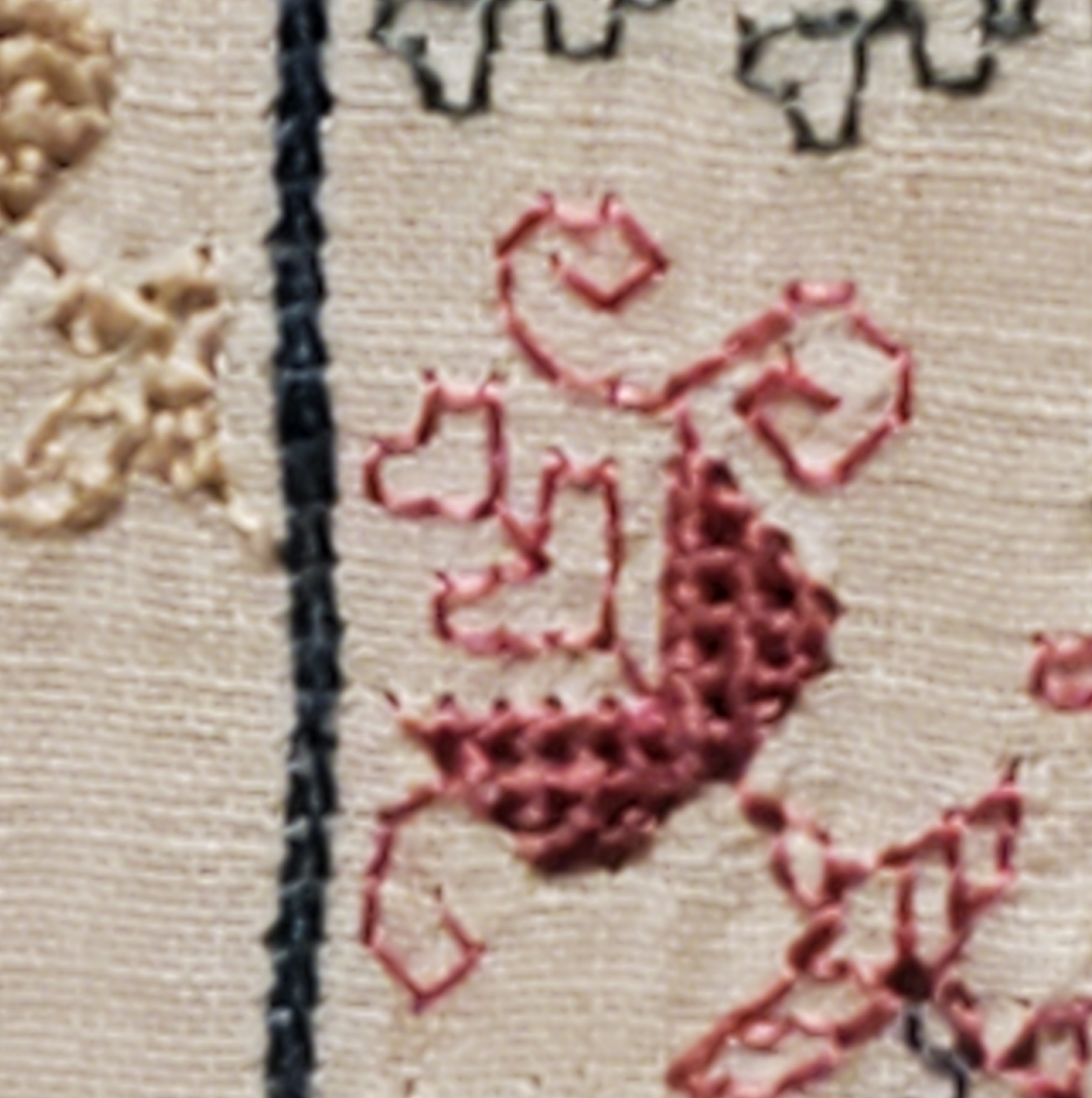
There was another counted piece. It can be difficult to judge the size of these from on line museum photo collections. Even when the dimensions are given, sometimes it just doesn’t input.

Photo above shamelessly borrowed from the museum page, where they describe it as a towel. The object’s name is a purported description of the stitches used. Punto Scritto and Punto a Spina Pesce MFA Accession 83.242, Italian, 16th century. Towel size? Nope. Tablecloth to seat 8 size. Wow.
Here are my photos.
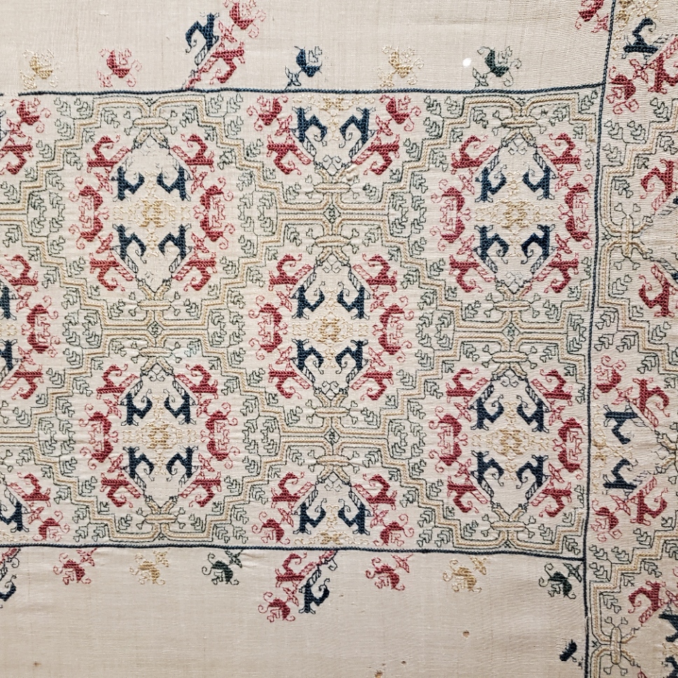

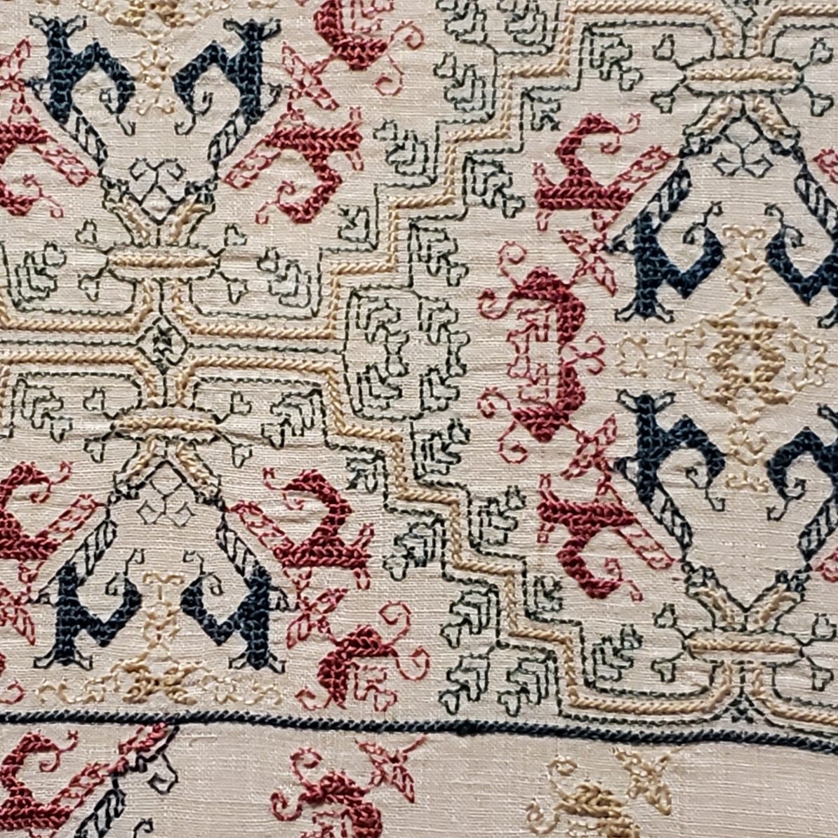


Punto Scritto is another name for double running stitch. That’s ok. Punto a Spina Pesce has been used by the museum to describe some but not all Italian works featuring a variant long armed cross stitch. I think I can see that in the solid, heavier green and yellow lines.
Without having seen the backs, which would clarify this, I suspect that Punto a Spina Pesce (fishbone stitch), is the version of long armed cross stitch that is done by taking stitches with the needle parallel to the direction of stitching as one moves down the row, rather than the one where the needle is held vertically as one works. While the front of both is almost identical, the appearance of the reverse differs, with the horizontal-needle one being formed similar to the way stitches in herringbone are worked. The horizontal method leaves long parallel traces that align with the row-like appearance of the front. If multiple rows are worked this way, there are raised welts in all but the first and last row because the thread on the back is double layered as each consecutive row is added. In the latter there are also parallel lines on the back, but they are perpendicular to the direction of the stitching and overlapping threads on the back are also vertical. As to which one is “correct” – both seem to exist in the folk tradition, so pop some popcorn and sit back to watch the proponents of each fight it out.
A third technique is used. The colored buds are filled in using what I call “Meshy” – the drawn work stitch based on double sided boxed cross stitch that totally covers the ground, and is pulled tightly enough to look like a mesh net of squares. That’s most often employed as a ground stitch in voided work, but it is not uncommon in foreground use, as well. This one is on my charting list, too.
One last thought on this piece – it reminds me a bit of a strip I charted and stitched up a while back, as part of my big blackwork sampler. The source for that one is here, Metropolitan Museum of Art, Accession 79.1.13, Strip, Italian, 16th century but the photo below is of my work.

There were more stitched pieces in the room, but the only other charted one was this adorable chubby unicorn piece in drawn thread. It’s tons of fun to stumble across things I’ve got in my research notes, but never seen in person. This one is MFA’s “Lace”, 16th century Italian, Accession 43.237. Long shot below borrowed from their site.

The museum chose to display this one scrolled, like they did the Torah Binder, so that only a portion was visible. Here are my three shots, left, right, and center.


Yes, there are many ways to achieve this look. But squinting closely one can see that no threads were picked from the work as in withdrawn thread work. There are neat little bundles of three threads where the solid areas meet the mesh ground. (Easier to see in the flesh than in my photo though).

It’s clear that this piece was cut from a larger cloth. I wouldn’t be surprised to find another fragment of it in another museum collection someday. That’s not uncommon. But for now, chubby unicorns, their big quaternary star and attendant scrawny vegetation are also on my to-chart list. But I am curious about the ornament above them.
Now there were lots of other items on display in this exhibit, most of which I’ve seen in the BMFA’s on line photo collection – other stitchery, several modelbooks (all open to needle lace pages), lots of ceramics, and many paintings. Some of which from the “back stacks” – items not on usual display. It was grand to see them out and being admired. I admit I did not download the guided tour and didn’t buy the accompanying $45 book, but while there were lots of women depicted in these massed works, there were very few historical individuals described or shown.
I was hoping to learn more about (for example) what individual female members of the Italian mercantile nobility actually did, beyond being married for political alliances. There were a few portraits, but not much of the story behind the sitters’ identities (if known at all) was presented in the in-room captions. There was a smattering of works by female artists, but the majority of pieces were by men, depicting saints, virtues, and ideals – laudable and arguably strong, but not the personal presence I had hoped for. All in all it was a lovely exhibit, with tons of pieces that were interesting in and of themselves, but as an exhibit showing the power and reach of Renaissance Italian women, it came off more as an assemblage of things from their time, rather than a documentation of their lives, ambitions, and accomplishments.

OH WOW! How wonderfully fantastic that you were able to compare your work to the original!!!
Love the lace!! It reminds me vaguely of some Amager stitching that I have seen. The “towel” (LOL) and Foa Binder are also wonderful. Thank you for sharing!
[…] I shared several photos of this at the time of our visit. And I put it on my list for redaction. Well, now is that time. I’m going to chart this one up, and then use the designs on a MUCH smaller cloth of my own. And as I look closer at this one, I think I will try to use a similar range of colors (but in cotton for washability), and the stitches I think look the closest to those of the original. At least on the front. I don’t see any photos of the back on the museum page in order to make totally accurate identifications, and am not impelled to write to request any. One thing I did note is that for the solid filled areas, the tightly pulled two-sided cross stitch variant I call Meshy was used. That isn’t credited on the museum page. […]