REVISITING THE STUPID CUPIDS
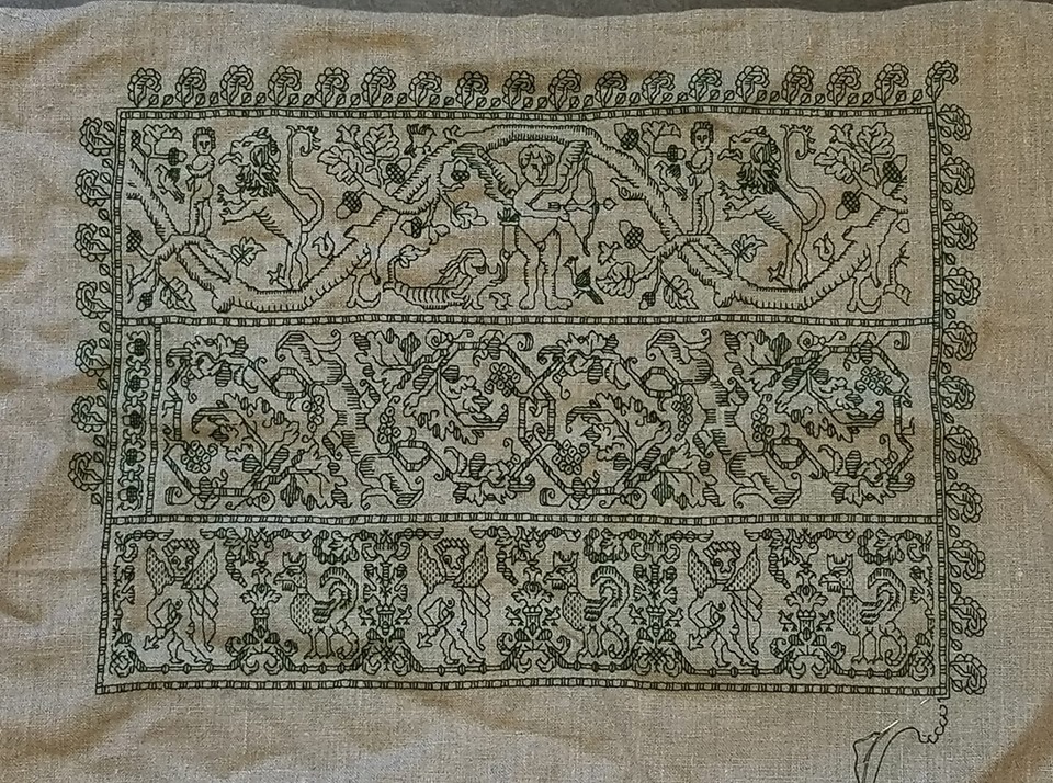
Remember this sampler I completed early last year?
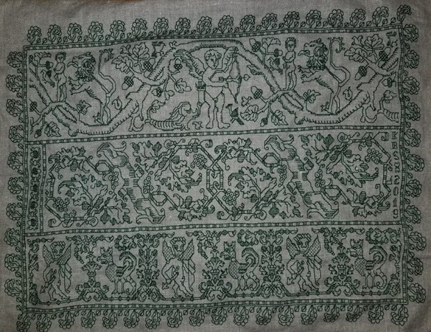
I went on at length about the rather goofy looking cupid strip at the bottom, and about the cousins of the middle strip, but I never discussed the top strip – the cupid and oak branch meander that includes the poor little guy being menaced by the lion.
I haven’t seen this cupid strip in any modelbook (yet). But I’ve found several examples of it in museum collections. My rendition is more or less a “moving average” of all of them, and will be in my ever-forthcoming T2CM.
This design is notable because of the multiple ways in which it has been rendered. Here are five. I’ve got another two someplace in my notes. When I find them I’ll update this post.

First, there’s the standard single strip with edging representation above, marked as 16th century, Italian – double running in silk, in red – one of the most common colors for this type of work. It’s in the St. Gallen Textilmuseum in Switzerland, and can be found in their on-line collection, Accession 23760 (you probably will have to search for the object by accession number because their links are dynamic and break).

This is the same pattern doubled and turned into a frame. It’s also sourced as 16th century, Italian. Note that the design is butted, not mitered, with an interesting truncated bit to fill in the left and right sides. There is no accessible link for this piece at the source I stumbled on – 1st Dibs Antiques, but that appearance was within the past year. All I have is a screen cap, and the photo is long gone from the sales site. However complications ensue. It or something practically identical was offered at Bonham’s site several years ago. Thistle Threads did an excellent write-up of the Bonham’s offering 2016. (She’s got some up close photos, too).

The blue sample above is from the Hermitage Museum, It’s dated 16th to early 17th century, Italian, double running, with the voided ground worked in squared filling. It’s accession number is T-2799. (If the link breaks, search there for “Bad Spread” (sic).) This is the piece on which my rendition is most closely based.
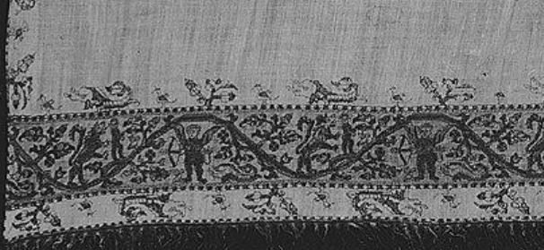
The black and white image above is hard to make out, but it’s clearly the same cupids, done in polychrome AND with a worked ground. It’s not really voided because the foreground isn’t left plain or minimally adorned. There’s not much elaboration on the Metropolitan Museum’s page, but it is attributed as Italian, of the early 17th century. It’s accession 68.145.6. I hope some day they go back and take another, better photo.
And lastly, there’s this one. The most unusual of them all. Here is our friend (blindfolded for a change), done using red silk outlines, but then infilled with couched gold metal thread.

This example is in the Cooper-Hewitt Museum. Its citation is Band, 16th century; silk, metallic yarn on linen; H x W: 110 x 90 cm (43 5/16 x 35 7/16 in.); Gift of Richard C. Greenleaf; 1954-167-2
Now. Why post all of these versions? First, because they are interesting. Second, to refute a commonly held belief that there is only ONE right way to execute these designs. Stitchers took the same base pattern and used it in many individual ways. Monochrome, polychrome. Plain ground, voided, or totally overstiched. There is no canon.
Be historically faithful and execute historical designs in any of the myriad styles contemporary with the base pattern. It would be very difficult to make the case that any one of those treatments was never used. Or take the same pattern and reinterpret it using modern styles, scale, or materials. There are no Embroidery Police who enforce historical precedent over individual expressive creativity.
Which is a long-winded way of saying that if a pattern sings to you, just go for it.
FLOCK OF STUPID CUPIDS
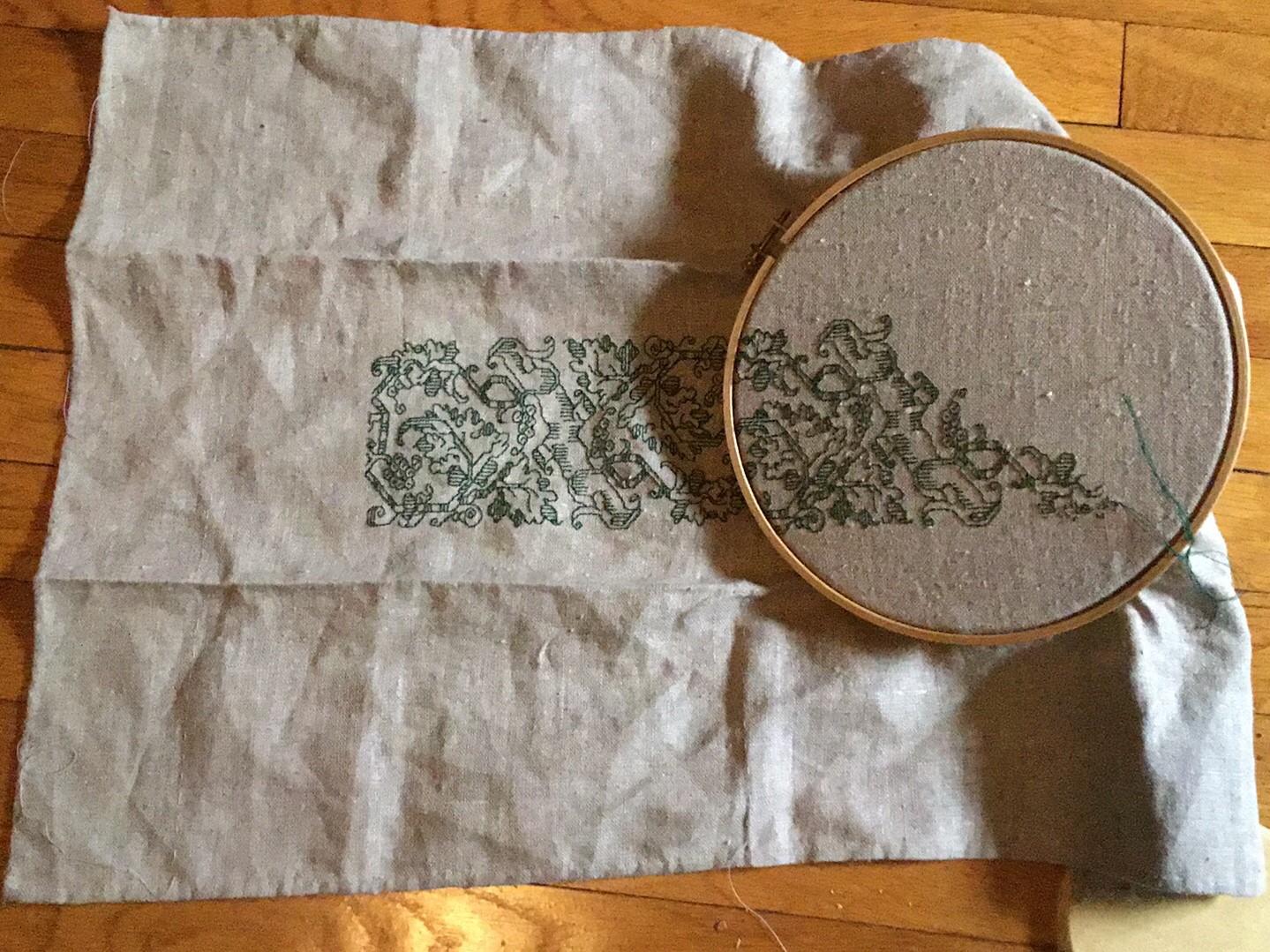
All that’s left to do is to tweak the corners. They don’t match, which is fine, but they should at least be of similar density. It’s also interesting to note that my so-called even-weave linen isn’t quite even. There’s a distinct difference in proportion between the plume flowers done horizontally and those done differently. The verticals are a bit elongated, north south. The same slight distortion also shows up in the proportions of the bottom cupid strip.

And along the way, I found yet another Separated at Birth example – possibly not siblings cut from the very same artifact strip, but close cousins at the very least.
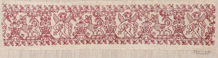
Here’s an example of the derpy cupid and cockatrice panel from the collection of the Art Institute of Chicago, Accession # 1907.665a (in case the link breaks).
And here’s the same design, in the collection of the Cooper-Hewitt, Accession # 1971-50-96. This is the one I graphed up for eventual inclusion in the forthcoming Second Carolingian Modelbook, from which I stitched my rendition. Note that although the stitch counts in the bit below and my rendition are identical, my sample is distorted by the proportions of my ground cloth’s weave compared to the original, which is distorted a bit in the other direction.

AIC dates theirs to 1601 to 1700, and it came to them as part of a Rogers Fund donation in 1907. CH’s sample came from one of my personal heroines – Madeline Hague, collector, curator and historical stitching researcher, and was donated to the museum with other items of her personal collection as a bequest. CH dates this from the 16th-17th century. Both agree on an Italian provenance.
There are some subtle differences between them that I didn’t notice until I had actually stitched up a length of the design. The birds on the narrow companion border on the top edge, although of the same design, do not face in the same direction on both strips. The bow in the AIC example is a bit more detailed, as are the sprouting separators between the cupids and cockatrices, but the CH’s sample has more detail on the cupid’s chest.
Still, the similarities do convince me that the two strips might have been worked from the same broadside sheet or modelbook illustration, or copied from a prior stitchery (or each other). They might have been worked by two people for use on the same original artifact or set of artifacts – cuffs, matching towels, bed hangings or sheets. One intriguing clue is the fact that each one sports a cut end, where the embroidered length is clearly snipped right through the stitching, and a “selvedge edge” where the embroidery deliberately stops before the cloth is cut (on the right on the CH sample, and on the left on the AIC snippet).
So. Were these used in tandem? Are they contemporary? Were they copied from the same source? Were they copied one from the other? We have no way of knowing. But as goofy as this cupid looks, he clearly has a mysterious and secret past.
UPDATE – NOVEMBER 2022
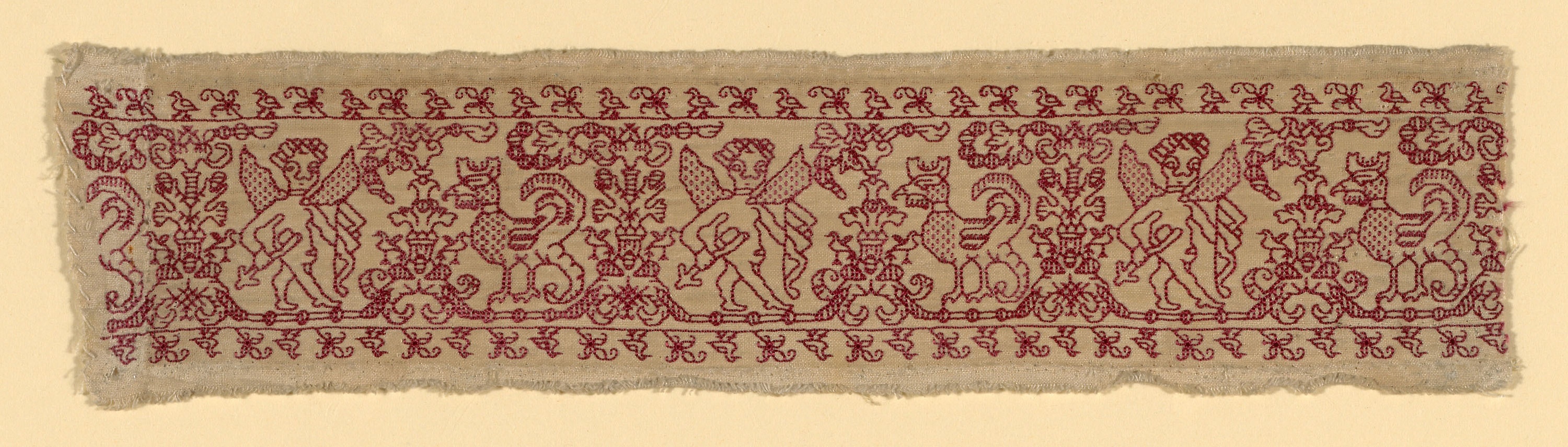
I have found another Cupids artifact, at a different museum. This one is from Boston Museum of Fine Arts, Accession 95.1125.
The museum says it is probably of Spanish or Italian origin, and does not posit a date. To confuse everyone all the more, it has the same breast/chest detail as the Cooper Hewitt sample, BUT it also has the lower bow detail of the AIC snippet. It also has the companion border of twigs and birds facing in opposite directions top and bottom, like the AIC holding. And as I examine these all more closely, I find that small details on the Cooper Hewitt sample differ among the repeats shown. For example, look at that chain of “bubble balls” that emerges from the flowered tree in between the cupids and roosters. The direction of the vertical striping on them isn’t uniform. Again the AIC and MFA samples are closer in their treatment of that bit.
PROBLEM AREAS? NOT SO MUCH.
Vacation week was quite relaxing, and I managed to get more stitching done than I thought I might. There’s something idyllic about sitting on warm sand under an umbrella, peeping over the top of the embroidery frame at the ebb and flow of the tide.

I squared off some of the missing bits along the right hand edge, and worked on the plume-flowers that march around the outside, rounding two more corners.
Now that I’m back at home and working from a graph is easier than on the windy beach, I will eke out the rightmost edge of the top cupid/lion strip. BUT the empty area to the right of the center strip is too narrow to subdivide with the established strapped frame. I’ll probably use it to sign the piece with my initials and the date. I’ll draft that space up in GIMP and if necessary, add a couple of small motifs to fill out the area.
That will leave just the corners. Once I have all four I’ll decide on how to play them. I might go back and pick out the cornermost plume-flower at the upper right, then introduce some sort of sprout-off-the-corner-point motif for all four corners, mostly similar, but with slight adaptations to local conditions.
Yes, my bungie jump style of stitching did lead to an unbalanced piece, but I like it. The cupid-cockatrice count problem described in the last post actually did me a favor by introducing a bit of movement and unconventionality into the thing.
Now to just finish my Stupid Cupid Sampler, all the while dreaming up the next piece. Planned or improvised? Your guess at this point is as good as mine. But either way, my plans are rudimentary at best, and you won’t see me drafting out the entire thing stitch-by-stitch.
CORNERED AGAIN
I’m still doodling on the Stupid Cupid sampler, having fun with some of the larger strip designs that will be in The Second Carolingian Modelbook.
As usual, I’ve leapt off into the deep end with no particular plan. I know that some people hyperventilate unless they have drafted out every stitch of a piece or are working from a fully graphed kit, but I have more fun improvising as I go. I have learned to leave myself as many options as possible as I work, so that I don’t “paint myself into a corner.” I’ll try to explain…
Ground Prep
The first thing I did was standard prep. I like to hand-hem all four sides of my ground cloth, cutting off any skew-to-weave edges before I hem. I also lay down minimal guidance lines. At the minimum I will use a light color/barely visible standard sewing thread to baste a line of demarcation across both the horizontal and vertical center lines of the piece. Sometimes I also add a perimeter line, measured from the cloth’s edge, to mark the edge of the area to be worked. I don’t count the threads I go over as a baste (the basting stitches are not uniform in length), but they do follow the weave exactly. This gives me a nice, stable piece to work on, with pre-defined center points and stitching boundaries.
Thread Selection
I pick a thread color (or colors) that work well with my ground. If multiples, I try to pick colors from stash that are in quantities that would allow me to make my selection on the fly, rather than limiting what can be done to fit what’s on hand. Depending on the size of my piece, the fragility of the threads to be used and whim, I drag out either my flat scrolling frame or my sit-upon round frame. In this case, I picked the green DMC floss (#890) I had left over from my tablecloth, to coordinate with the natural light brown of my linen.
Design Selection and Placement
Then I begin thumbing through my design notebooks and collections. Sometimes as I prep my ground, an idea of what to do is already forming. If it does, I may add some additional guidance lines to help reserve areas for words, or to further subdivide the available area – but to date I have never laid down a grid over the entire piece, nor have I ever outlined specific counted-out areas in which to place particular strips/fills/motifs. Others may wish to do those things, but I don’t find it necessary.
Once I find my first pattern, I decide where on the cloth I want it to go (top, bottom, centered, offset from the center a bit), find that design’s calculated or motif-visual center, and start. I always begin at one of my center lines and work from there.
Here’s the current piece at this stage of work.
You can barely see the pale blue threads that mark my centers and my margins. That “tail” hanging off the bottom of the piece is part of one. They don’t live long. I never stitch over them. As I encroach upon my marking lines, I pick them out and snip the about-to-be-crossed bits out.
At the point above, I hadn’t decided on what to put north and south of this bit. I hadn’t even decided up and down because this design is north/south symmetrical. And I wasn’t thinking yet of any framing mechanism. But that didn’t last long.
As you can see in the bit above, I decided on a second strip, and decided to separate them with a narrow barred border, stolen from the stems of the first pattern. I began adding the bars north and south, but not knowing what was coming next, or in fact where the roly-poly cupid/cockatrice bar would end relative to the first strip, held off adding them to the left and right.
And here I found my first problem. I had aligned the center of the vase between the first cupid and the cockatrice with the center of the symmetrical strip, above. But I didn’t notice that the areas bearing the figure and the creature were not of equal width. Because the cupid’s alcove is wider than the cockatrice’s, the left and right ends of that strip did not end neatly aligned to the area already worked.
What to do?
Ignore it and keep going.
So I did. I added the third major strip, the cupid/lion/fleeing boxer/dolphin panel. It’s a VERY wide repeat, with no exact center, but I aligned the visual center of the featured cupid with the already established center line.

Again, the design repeats, but the counts are not exact, so worked my piece left and right to a “good stopping point.” As I did so, I noted that the bottom strip would probably be the widest, so I added the bars left and right to finish out the frame around that section.

I then continued the bar north from the surround of the bottom strip. And encountered the second challenge. How to deal with the empty area to the left of the center strip?
I thought about several possibilities including finding a one-word motto to stitch vertically; continuing with the center strip design to fill out the area; or making this bug into a design feature. I chose the lattermost.
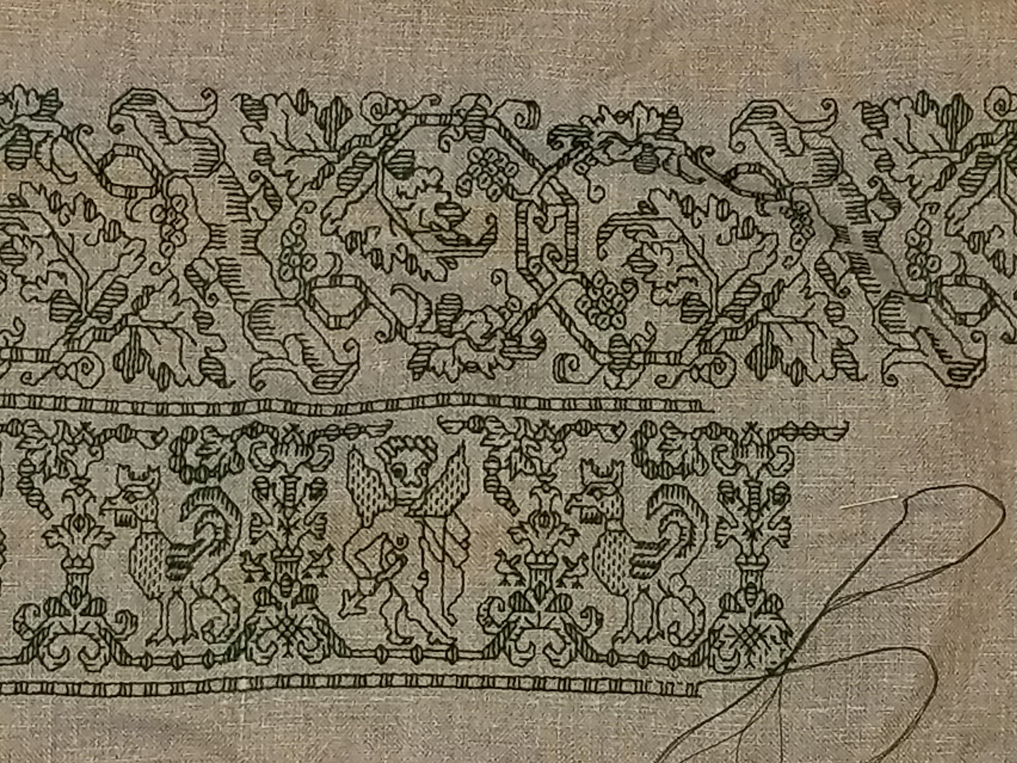
At the bottom left of the photo below you can see it. I continued my outer bar north, but added a second one, that defined a narrow strip. Then I improvised a standard acorn meander. I didn’t even bother to draw it out. I just found my center point, replicated an acorn from the top strip, and stitch-doodled up the linkage.

Then I took a stand-back look and decided that I didn’t want to add more strips to this piece. But a deeper, coordinating yet frilly outer companion border would work. So I flipped through my to-be T2CM collection and picked one out. I started in the north/south center of the left edge and stitched it until I got to the corner, then rounded the corner and continued on, spacing the edge of the first plume on the top roughly equally far away from the exact corner point as the bulk of the foliage on the left.
This time to fill in the empty space between my top stitched band and the newly established border(s), I decided to eke out the existing design. That’s what I have on-the-needle in the photo above.
Purists will note that I am using Heresy Stitch for the baseline of my frilly plumed border, rather than sticking to strict double running. I’m going back and adding a narrow border, using Heresy I can move along faster with minimal re-setting of my hoop.
Challenges yet to come….
- How will the plume border butt up against the three corners to come? Will I be able to round them as gracefully as this one?
- Will I go back and engineer some sort of corner treatment for the point of the plume border after I get all four done? Will I be able to use the same one for all four?
- The center strip is short on the right-hand edge, too – but not as short as on the left. Will I have room to add another supplemental bar and narrow border there? Will I do something else?
- Where will I sign and date this thing?
Now these burning issues may not seem like the epitome of suspense in your world. But in mine, they are fraught with danger and excitement.
FRAMED!
At long last. Framed and hung up in the bedroom.

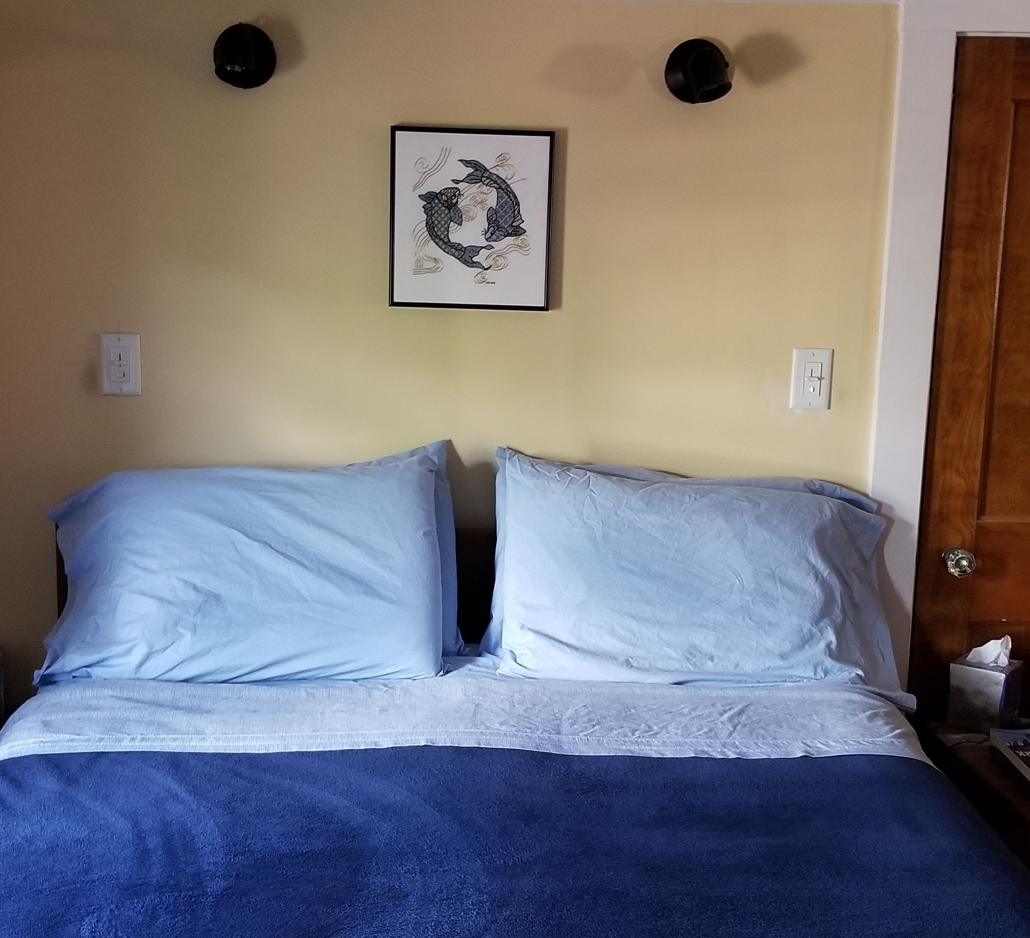
Obviously I now have to paint the bedroom walls…
I’m quite happy with the way this turned out. The frame is simple enameled steel, in deep navy. I ended up going to Walden Framer in Lexington, MA. Mr. Ed Pioli, the owner and artisan in chief, did an excellent job at a reasonable price. I will be bringing my other as-yet unframed pieces there, too.
To answer more questions on the piece’s composition, mostly from other people outside the framing shop when I was there. No, neither of us is a follower of astrology, and it’s not a panel depicting anyone’s sign. It’s just two koi, in a traditional arrangement. And no – there isn’t a boy-koi, and a girl-koi (or any other manifestation of yin/yang) intended. It’s just two koi swimming in a circle. And no, that’s not real gold thread. It’s high quality imitation gold sold for Japanese embroidery. And no, I didn’t sew it on a machine, I did it by hand. Really and truly. (People are curious about the strangest things.)
What am I working on now? Well, the Great Tablecloth/Napkins project is done, but I still itch to stitch. So I’m just doodling. Filling up a small piece of linen, waiting for the Inspiration Fairy to chuck a brick through my mental window.
I’ve written about this design before. I think this time I’ll circle the center panel with other, narrower bands. Again, no set plan, I’ll just pick them as I go along, with no composition agenda in particular in mind. Eventually I’ll figure out what to stitch next.
UPDATE
It’s taken me a week or so to get this post up and out. In the mean time my doodle has grown, but still has no plan.
The lower design is a curious one. Although it’s a clear repeat with the rather bulbous naked cherub alternating with the cockatrice, there is little symmetrical inside the repeat. Close attention has to be paid to this one because even the internal framing mechanism (the bar and beads below the feet of each) has a different counts in each of its two instances, and the usual urn or leafy unit between the creatures also exists in two incarnations. It’s a curious one, for sure, but fun, and is keeping me on my toes.
Both of these designs will be in T2CM, which is moving again towards release. No date yet, but watch this space.
