A NEW CLUSTER OF HERESIES
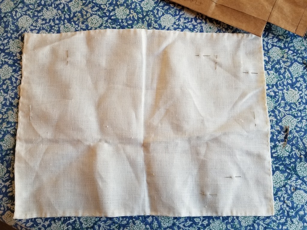
I’m working happily away on what will become my replacement cushion cover. I decided that rather than cutting shapes and then stitching them, it would be easier to stitch on a larger piece of reclaimed denim, and then cut it into haphazard shapes bearing the stitching later. The denim is particularly thick and heavy, which has posed some problems.

The traditional Japanese method of working this style of running stitch embroidery is to use a relatively long needle, stitch in hand without a frame or hoop, and pleat the fabric onto it, such that the visible stitches on the front are roughly twice as long as the gaps between them.
This type of stitching isn’t easy because the denim resists the tiny folds and scoops needed for evenly placed and correctly sized stitches. I’ve tried, and would probably “get it” on a different ground. Eventually I will do another project in this technique with proper materials, but for now this is what I am committed to, and my goal is more important than the way I get there.
So in the long tradition here at String, Here’s a run down of what I am supposed to be doing, or what would make this a truly traditionally produced piece, along with my confessed heresies.
Needles
I am not using traditional Japanese-made needles, specific to hand sewing, and especially Sashiko.
I have a long steel needle, sharp and stout enough to pierce the denim, with a small eye. I found a paper of five of them in a box of miscellaneous threads and notions I picked up at a yard sale. No name, brand or date is associated with them, and they are not quite uniform. The eyes are very smooth, but there’s a bit of variation on eye placement and point taper. It’s remotely possible they are antique and hand-made. I use another of these as my plunging needle because the small eye retains the loop of strong carpet thread I need to capture goldwork ends and pull them to the back. In any case, these needles are almost two inches long, certainly long enough and easy enough to maneuver for the technique. It’s the stiff denim that’s the problem.
Thread
I looked at various thread options. The threads marketed specific for Sashiko are imported and not exactly inexpensive. From what I gathered, they are unmercerized cotton, nicely twisted, and not as “hard finished” as commercial threads sold for crochet. So I went hunting.
I cast about and eventually ordered a big spool of weaving cotton from Webs. It’s their Valley Yarns “Valley Cotton 10/2.” It was a risky purchase because it’s a large quantity, but I happened to hit a weaving yarn sale. And if the stuff didn’t work for my cushion project, I would be happy to knit lace with it.


I’ve got roughly 4,200 yards. Plenty. On the right above is a comparison shot of some threads next to a metric ruler. Apologies for the lousy photography. From top to bottom we have
- Valley Cotton 10/2 – a two ply matte finish cottom
- Coats & Clarks Knit Cro Sheen – a four ply shiny finish yarn. Much rounder and heavier that the Valley Cotton.
- Standard DMC 6 ply cotton embroidery floss. I didn’t have white to hand, so this is yellow. Six two-ply strands. The Valley is equivalent to about four plies of the DMC.
- Long discontinued DMC 6 ply linen embroidery floss. This I did have in white. It’s a mite heavier than the cotton floss, and the Valley Cotton is equivalent to about 3 plies of this.
I’m pleased with the Valley Cotton’s usability, its proportion in relation to the stitch length I’m using, and it’s appearance against the denim. It also coordinates well with the remaining Haitian cotton upholstery fabric used on the parts of the chair I do not intend on recovering.
Pattern Sources and Preparation
I tried to use straight drafting – laying out the geometry and drawing directly on the fabric. I also tried printed paper designs, employing tracing paper and pouncing to move them from paper to the cloth. Neither was satisfactory. Then I stumbled across some commercially sold plastic templates, and decided to take the short-cut.


Stencils opened up another experimentation hole. What writing instrument to use with them. I tried all of the standard pens and pencils intended for fabric marking. Some were too crumbly to achieve the fine point needed to use the stencils. A highly regarded pen drew clear, with the ink “blooming” into visibility over a 15 minute period. That was better, but it was difficult to see when ink was poorly laid down and needed retracing, or what had and had not been marked. It was even more difficult to realign the stencil to do a repeating pattern because of the wait and imperfections due to poor ink flow. (In fact I haven’t succeeded doing that yet, but I am still trying).
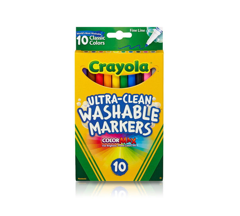
I settled on an unorthodox inking approach AND a non-traditional marking method. I am using these easily found Crayola wash-out fine point markers with the stencils.
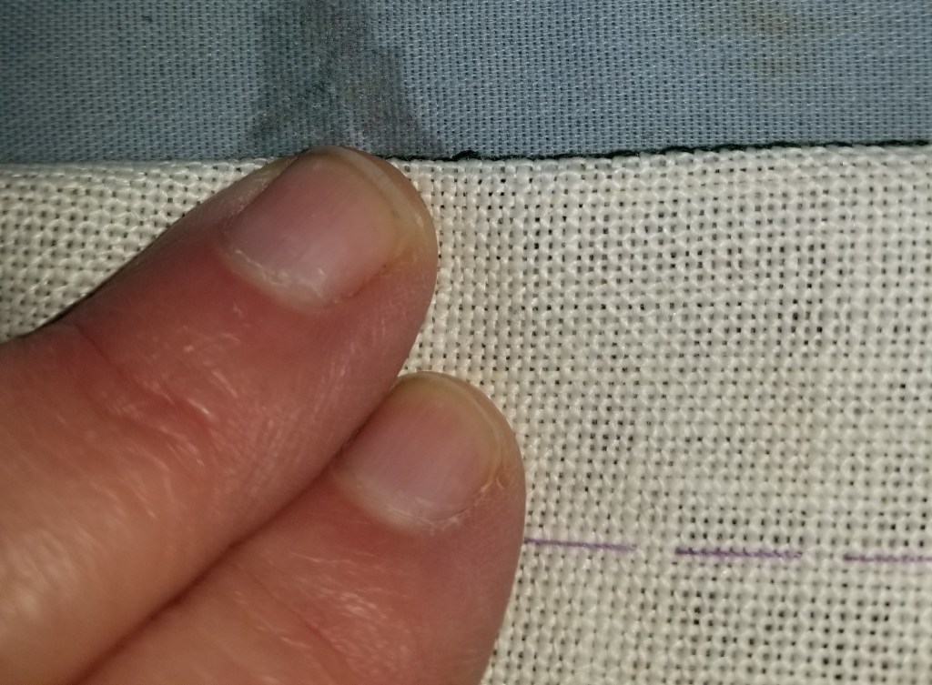
I am also marking on the back, stitching the piece from the back, with starts and terminations on that side, but taking care that the reverse when I am working (which is the public side) shows the longer stitch length as opposed to gap length. Running stitch is running stitch. If you are careful in working, either side can be manipulated to be the public display side. Even in this style where the public side is characterized by longer stitches than there are gaps between them. And that’s why the photo at the top of the page shows the public side of the denim leg I’m stitching, but you see the twill tape wrapped inside unit of my hoop.
Heresies
So to sum up – my heresies are:
- Using a hoop and not stitching in hand
- Stabbing vertically rather than pleating the fabric onto my needle
- Using weaving cotton instead of Sashiko thread
- Using some unidentified vintage needle instead of the recommended long sharps
- Using stencils instead of drafting out the designs by hand
- Stenciling on the BACK rather than the front of the piece
- Stitching from the back, with the reverse side of my work actually being the side on public display
I pause now so the traditionalists can catch their breath, take a sip of tea or coffee and revive themselves.
With luck all hyperventilation and shock have passed.
More unorthodoxy
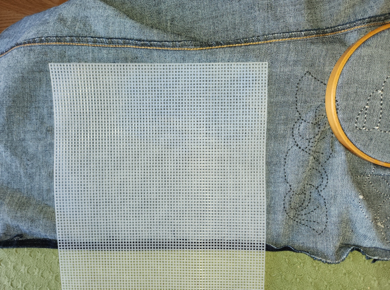
To add another dimension of complication, I am also hoping to use Western linear stitching on this piece. I plan to use standard double running stitch, and some of the fills or strapwork patterns that are oh so familiar to anyone who has followed this blog. But there is no grid on this denim, and it’s not countable.
Again I am going to cheat, and stitch on the reverse. I am going to use my markers and this piece of plastic canvas to make a dot grid, and then use that dot grid to place my stitches. Double running is the same on front and back. If I stitch with care and make no skips, there should be no telltales in front to betray my working method.
Cheaters may never prosper, but on rare occasion a shortcut or labor-saving method is warranted.
WOOLLY THOUGHTS
I’ve started on a promised project – a rendition of my Harsh Language piece, as a gift for a friend who prefers to remain anonymous. They survived Covid, and made a special request. I honor their determination. The objectionable word has been zealously cropped out of the image below to prevent irritating the easily-offended.

Although this is a small, quick-stitch, simple piece, I couldn’t resist using it for testing and learning. The Stealth Apprentice’s specialty is researching and recreating historical dye recipes – trying them out on yard goods, threads, and yarns. Of late, she’s been working on a group of dyes derived from lichens and mushrooms, with spectacular results. Sometimes when she’s working on a new recipe, she lets me beta-test her end result. I’m supposed to look for handling properties, color-fastness during stitching (crocking on fabric, or reside left on hands), and the like. And I am very happy to oblige. It’s fun to play with new materials and give useful feedback.
We chatted about this project, and Stealth Apprentice suggested a purple, dyed using “an uncertain lichen – probably a Parmotrema species”; and a mustard gold, dyed using “a dyer’s polypore mushroom”. The purple is a deep claret, and the yellow is a sunny mustard. They are equally saturated, so one doesn’t eclipse the other. I had no idea that these hues could come from lichen and inedible mushrooms, both which I will now view with greater respect. The purple is more true to the snippet above than the magenta it looks like on the winder below, but you get the general idea.
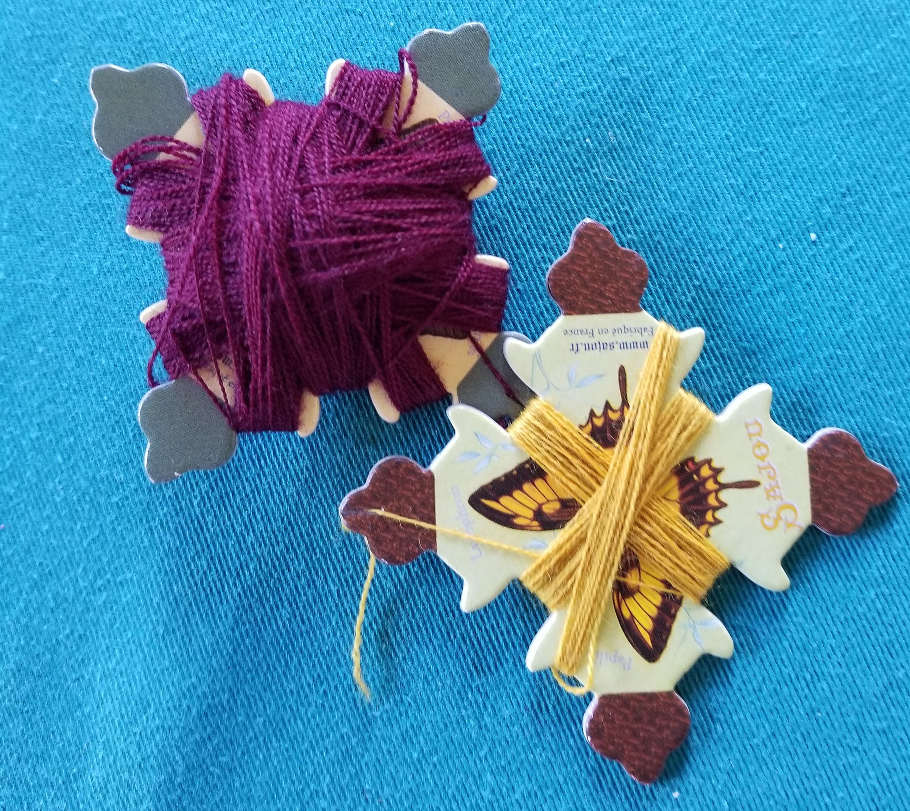
Both wools are of the same base stock prior to their color baths. They are of very soft and fine fibers, a single strand of two tightly twisted plies (which cannot be separated), about the thickness equivalent of three plies of standard cotton embroidery floss. They’re more plush and rounder, of course, with the stretch you’d expect from wool.
For this counted project due to fact that the wool thread is more robust than the cottons, silks, and faux-silk (rayons) I usually use, I’ve picked a ground cloth that’s far coarser than ones I usually use. Coarser in that it has fewer threads per inch – not that it’s harsh to the hand. This well aged bit from my stash is about 24 threads per inch, give or take; with slightly more threads per inch on the warp (parallel to the selvage) than the weft (perpendicular to the selvage). Since I’m stitching over two threads, I’m at 12 stitches per inch – big as logs to me since I’m used to working at 18 to 25 stitches per inch. But the result is spot on what’s required if one strand of this wool is used. If I were to double the strands, I’d probably be looking at working at 10 stitches per inch or fewer, probably down around 6-8 stitches per inch for better, less crowded effect.
Working with the wool and how it differs from cotton, silk, and rayon:
- Needle size: Obviously the tiny eye, round point needles I usually use are too thin for this and their eyes are way too small. Instead I’m using a tapestry needle. I think it’s a size 22, but it has been long divorced from any packaging, and has been living in sin with its mismatched fellows in one of my needle cases.
- Needle threading: Even with the larger size needle, threading is still not easy. Wool fuzzes (obviously) and waxing is right out (also obviously). My little bee needle threader is an absolute must for this project.

- Frame: I am using a hoop. The piece is small, so most of the area to be stitched fits inside it. But not for long. Eventually I will need to re-hoop over previously stitched bits. I will try to avoid doing so as much as possible, but right now I don’t have the option of moving this over to a flat frame. If I have to hoop over the letters in particular, I will be covering them with a soft fabric as padding, to prevent crushing or skewing the wool threads. I’d recommend flat frames, slate frames, or scrolling flat frames for countwork in wool, and will make sure to avoid my hoops in the future.
- Thread abrasion: This is much more pronounced in wool than cotton, rayon, or silk. Drawing the fluffy thread through the tiny holes of the ground cloth’s weave does degrade the strand over time. Spare yourself waste, agony, and an uneven appearance on the front – use shorter strands than you would with any other thread. And yes – if I were to be working on Aida or a ground cloth with larger holes, or using a larger needle this would be abated somewhat. But I much prefer the uniform look of a nice, tight even weave ground over the scattered holes presented by the purpose-woven stitching fabrics, so I am bringing this bit of extra work entirely on myself.
- Stitching technique: Even more so than with cotton (the most forgiving), silk, or rayon (the most unruly), wool needs to be worked in double running or back stitch with vertical passes of the needle through the cloth – not with a “sewing” or scooping stitch. Working with one hand in front of the work and the other behind means that care must be taken not to snag the working thread when the needle is returned by the unseen hand. It’s all too easy to pierce the working strand (it’s fuzzy and soft) and create an headache to untangle later.
- Tension: Wool is springy and stretchy. Cotton is not. Silk and rayon are even less elastic than cotton. It’s easy to stitch the less elastic threads quickly, and getting the feel for how tight to snug them up on a nice, taut, hooped ground is relatively quick. Wool by contrast stretches and then bounces back. It’s VERY easy to stitch it too tightly – stretching it as the stitches are formed, only to see it bounce back later when the ground is released from tension. Save yourself a headache and only draw the threads as tightly as it takes to make them lie flat and even, which will be significantly less tight than you are used to with other fibers.
- Ripping back after mistakes: Don’t count on it. The fuzzy nature of the thread makes it far more likely that stitches will pierce those laid down before, rather than slide alongside them. Ripping back will be painstaking, and the thread that’s recovered (if you are able to do it at all) will be seriously damaged by the removal, too much so for invisible difference re-use. Unless it’s just going back one or two stitches, treat mistakes as lost causes and sacrifice the strand. Snip on the front and withdraw the ends from the back to minimize fibers left on the front.
I’ll continue on with this, learning as I go. For all of the differences, I am enjoying working with wool and look forward to doing more of it in the future. I’ll continue to post (fig-leafed) progress on this piece. Like I said – it’s small and will be a quick finish. I’ll have to put it on hiatus for a few days at the end of next week for another obligation, but even with that should have it done and on its way to my convalescent friend well before mid-September.
BOOKMAKING 109: STITCHING FINISHED, ON TO ASSEMBLY STEP ONE
I’ve finished all of the stitching on the book cover project, now on to turning the flat piece of cloth into the finished item.
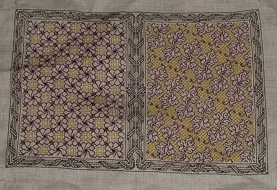
Although I am a teensy bit disappointed that my centering efforts on the leafy side did not pan out, I think you can see that my guess was correct. Given the eccentric nature of this slow-descent repeat, it’s not obvious at all.
An interesting thing happened – density of color. The yellow used on the front and the back are the same – same color number, even the same skein. But the diagonal diamond voided fill used behind the leaves is more dense than the lattice weave used with the swirly flowers. And the swirly flowers, having nice dense centers and connector leaves show the red as being more intense, too. The colors present differently depending on the stitching designs chosen. Close diagonals will appear visually more dense and darker than stitches done “with the weave” – horizontally or vertically.
While density differences do manifest in monochrome, they mostly present as grey scale from a distance, or in some blackwork substyles – something akin to the cross-hatched lines that are used to indicate depth and shadow. But in polychrome it works a bit differently. Individual colors – the same colors in fact – will pop or recede, or even intensify, depending on the closeness and orientation of the line segments on which they are used.
Making up the Book Cover
Well, for me at least the fun part is over. Now for the less interesting but no less exacting half of the project – turning this flat piece of cloth into a book jacket.

As you recall, we have the flaps all neatly defined by basted lines. These I will just turn over, not bothering to finish off the raw edges. They will be well concealed once the thing is sewn together, plus the added bulk of a turned or rolled hem would distort the lie of the stitched part of the cover.
First I flipped the thing over, with the “good side” down, so I could fold my flaps to the back. I set the creases along the stitching lines and the basted guide lines, setting them with my iron. It’s easier to do if you finger-press first to get the precise fold line, then follow the finger-pressed creases up with a warm iron. (Ignore the blue ironing board cover stained with the ghosts of projects long past).
I started by setting the folds on the top and bottom edge, and then the left and right sides.

Then I trimmed off some of the excess fabric at the top and bottom. I didn’t bother trimming the left and right because there really wasn’t much to trim.
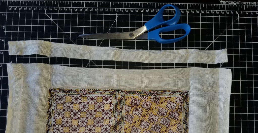
The next step was to fold everything in, and remove some of the bulk in the corners – note that I did not trim it all.

At this point with lots of nice, crisp creases in place, and no further need for the markings, I teased out all remaining bits of lavender basting thread.
On to the corners, to make them a bit sharp. There are other ways to do this, but origami-style “squash folding” to make a mitered corner is the simplest. I folded the corners in, ironed in the creases and pinned them for hand-tacking. And while I had the pin ball out (the needle-felted pin-puff is a treasured gift, made by Younger Spawn), I pinned the flaps to the body, although I will NOT be stitching them down..

And the last bit of prep was the stash-dive for a bit of red ribbon. That I will sew to the inside of the cover. It’s just long enough so it can be teased out to either the top or bottom, and will serve as an effective placemarker regardless of whether my recipient chooses the flower or the leafy side as the front cover.
Now off to do all of the tacking. The next post will cover sewing the end flaps in, to make the pockets into which the book covers will be slid. Before writing that bit up I want to experiment a bit, because I’d like those seams to be neat, and if possible – visible, and in green. We’ll see if that works out or if I punt and just stitch in the plain white sewing thread I am using for tacking and affixing the ribbon.
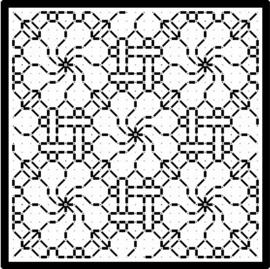
DON'T PANIC – AGAIN
A while back I stitched up this piece, both as a tribute to Hitchhiker’s Guide, and as a bit of inspiration for my office. I’m a proposal specialist – managing short deadlines and general panic are my stock in trade.
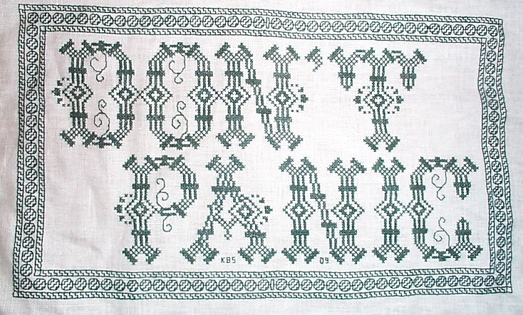
When I posted this on Facebook last Friday, I got several requests for the chart. So, tweaking memory dormant since 2009, I drafted one up.
I make this chart freely available for YOUR OWN PERSONAL, NON-COMMERCIAL USE. Consider it as “good-deed-ware.” It’s tough out there right now. Pay this gift forward by helping out someone else in need; phoning or getting in touch with a family member, friend or neighbor who could use a cheerful contact; volunteering time or effort; or if you can afford it – donating to one of the many local relief charities or food banks that are helping those displaced from work right now.
CLICK HERE TO DOWNLOAD THE DON’T PANIC CHARTS AND INSTRUCTIONS – THEN SAVE THE PDF THAT POPS UP
Eventually I will add this to the Embroidery Patterns page tabbed above. But for the time being – be safe, stay well, and care for those whom you love.

BOOKMAKING 102
This is the second piece in the series on making an embroidered book jacket, based on the general instructions I presented earlier this month. The first piece dealt with drafting up a simple pattern to construct the book cover, preparing the piece of cloth I am using, and transferring the guide lines from the pattern to the ground cloth.
In this session I discuss laying out the design for the embroidery itself. While I encourage folks to play along at home, starting their own book project and working with me, I will not be presenting a “Stitch-Along.” There will be no full project graphs presented here. Instead I encourage people to pick their own designs, and I hope that by describing my own thought processes, I will enable others to think outside the box.
Let’s start where we left off. We have our ground cloth prepared and ready to stitch:

The stitching areas – the front, the spine and the back – are all defined by basting lines at their edges. There are also basting lines marking the horizontal center (spanning all three areas), and the vertical center of the front and back. The spine is so narrow that it’s easy to count to determine its exact vertical center.
Step 5. Stitch Design Layout
I chose a medium count even weave fabric for this. It’s is about 30-32 threads per inch, which means I’ll get 15 to 16 stitches per inch. There’s no reason why Aida or other purpose-woven grounds intended for cross stitch cannot be used. However the fineness of the cloth will influence what counted patterns are used.
As a “bungee-jump” stitcher, at this point I am just starting to think about my layout. Possibilities abound, and I try not to close any out until I am absolutely sure. For example, even before I get to the choice of the fill pattern(s) these general layout options exist:
- Work a single design to cover the entire piece, ignoring the divisions between the spine, front and back covers.
- Work the front and back covers separately, each with its own design, with or without some sort of stripe or divider running up the spine.
- I could work a border around the front and back cover, either meeting along the spine, or leaving space between for yet another fill.
- I could divide the front and back into subsections, and work each of them in a different fill (again, with our without borders)
- I could draw a freehand shape or other motif on the piece, then fill it with one or more fills (a la the inhabited blackwork style).
Here are general representations of some of the possibilities above:

Decisions, decisions. Best not to back myself up a tree. Not just yet. But right now I’m leaning to the version in the lower right. Front and back covers, each a single field pattern, but different; some sort of border around the edges of the front and back cover (same border front and back to unify the design). Something on the spine, possibly a third design, Possibly words. No clue.
Step 6. Stitch Design Selection
Since I am planning for 15 or so stitches per inch, my cover is about 3.5″ wide and 5.5″ tall. If I do a single repeat on each cover I will have room for play. My total field is about 52 stitches across x 82 stitches tall. Even if I subtract some for a border, there’s room for one of the larger repeats from Ensamplario Atlantio, or Ensamplario Atlantio II.
While I’ve stitched up some of these before, I haven’t play tested them all. This is a fun opportunity to do some I haven’t worked up yet. Plus I rarely do multiple colors, so maybe I’ll think of that, too. Paging through the books I come up with a few possibilities. Number 110 from Ens Atl II hits me for one of the covers, but just about every design in both books is a good candidate:
This is an intermediate complexity 16-stitch square repeat (the count from the center of one flower to the next is 16 stitches). A simple square repeat with a half-drop, I should be able to get at least 2.5 repeats across – that would be about 40 stitches across out of my available 52. That would leave 12 stitches (6 per side) for a border. And there’s nothing to say I can’t just truncate the design anywhere I like – there’s no reason to worry about completing the edge repeats across.
Now, if I had selected a coarser ground – say 11 count Aida, my stitching field would be smaller because there are fewer stitches per inch available. In that case my field would be about 38 stitches across. Two repeats would be all I could fit. I could still use this design to good advantage, but designs with a wider repeat, like this more complex panel of pears (28 stitch square), would be harder to squeeze in Just one full repeat would fit across, with a bit extra for a partial, or for a border. (Come to think of it, pears may be in order for the other cover… Hmmm. Not decided yet, but maybe…)

Why do I say “other cover” and not front or back. Simple. Both of these designs are totally symmetrical and at this point either one could serve as front or back, depending on which way the book is held.
Now on to placement. I have a couple of options. I could deliberately center my design at the centerpoints I established by basting, or I could skew them left/right/up/down, to produce an asymmetrical composition. Both are valid, and asymmetry can be quite dramatic. But I think I’ll stick to the easiest way out here. Instead of skewing the repeat, I will place the center of one flower exactly at the center of my cover area, and I will begin stitching there.
By beginning in the center I get to establish my design. I will work out left and right, and when I get close to the edge, I’ll stop and decide whether or not I still want a border, and if I do – I’ll pick it or design it to fit the available space. My guess is that I’ll probably work to within 6 – 8 stitches of the basted edge line. We’ll see…
Step 7. Thread/Color Selection
OK. I’ve got my lattice-and-rose picked out. What threads and colors to use… Again this is just my thoughts and preferences. For your project pick whatever you enjoy using that’s suitable for your chosen ground.
First, this is a removable book cover. It will get dirty. It may end up on another book after the target one is filled up. Chances are that it will need to be washed at some point in its life. Therefore I am opting for plain old cotton thread over silk or rayon. DMC will serve quite nicely.
I do a lot of monochrome, much of it modeled on historical pieces. I don’t get to play with multiple colors very often. I’m not a big fan of variegated threads for this type of work. I think the color gradations unless very carefully handled distract from the delicate structure of the stitching, so I’ll stick to solids. And nice, deep, contrasting solids. Two, possibly three colors.
Pawing through my stash I come up with the first two. If I use a third color, I will employ it on the border – not in the field patterns. I’ve chosen two regal colors – DMC 814, a deep red, and more burgundy/less crimson than the red I usually stitch with; plus DMC 3820, a goldenrod yellow – a color I rarely use.

Step 8. Start Stitching
Now for the fun part. Finally. After all of this planning and prep, I get to start stitching. I reserve the right at any time to decide I don’t like the result and pick everything out, but off I go, none the less.

On the piece above you can see the remnants of my light blue basting threads that marked my centerpoint. The center of one of the first flower I worked is exactly where those two lines intersected. Note that I clip back the basted centering threads to keep them out of my way as I go along. I find it’s better to remove them bit by bit, rather than stitch over them and try to pull them out later.
I am using one strand of floss, doubled. I cut a length twice as long as I need, extract one strand, and fold it in half, taking care to match the cut ends. Then I wax it lightly EXCEPT FOR the last inch, leaving the loop open. I thread the now adhered-together cut ends through my needle. Without making any knots, I make my first stitch, pulling my thread up from underneath and plunging back down from the top. I take care not to pull my thread all the way through and on the plunge back down, I catch the loop at the end of the thread with my needle. Then I gently draw up tension until the loop on the back looks like a normal running stitch. In effect, I’ve started off my double running with a noose instead of a knot.
I continue along in double running, plotting out my course to keep “leapfrogging” on. A lot of people trip up by thinking they have to stitch in one direction until half of their thread is used, then turn around and retrace their steps. For something like this, it’s better to head off in one direction until your strand is used up, taking detours as they arise but always returning back to your main path (if you don’t have enough thread to complete a detour and return, end off before you start the branch).
Then you take a second strand and fill in the every-other stitch on that main path. Any thread that remains after that second pass on established stitching is complete is used to go on further in the design. It’s kind of like a game of hop-scotch, one thread advancing, the other filling in then continuing the design, and the thread after that starting at the point the first one ended, but filling in the skipped stitches left behind by the second. Black is the first thread, red is the second, and blue is the third in this example. Each dangling leaf is a detour that’s started and finished on the baseline:
On my stitching you can see around the edges of the red flowers where I have left attachment points for future journeys, and in a couple of spots, the partially worked lines of departure for those branchings. I find the path planning to avoid painting myself into a corner to be mildly challenging, and quite relaxing. And yes – sometimes I do trap myself. So it goes. Sometimes I can use unidirectional heresy stitch to get myself out of a bind, sometimes I just have to knot off and go on. (I do knot unless there is a compelling reason to work entirely double-sided, but it’s got to be a darn good reason because I hate working in the ends.)
You’ve also noticed how I’ve employed my colors. The red for the connected flowers, and the gold for the background lattice. It’s just one way of doing it. I do end off each gold lattice segment separately, opting not to leave long connector stitches on the back.
I’ll be working on this for a bit longer before I make decisions about the border. If for nothing else, just to keep everyone in suspense.
In the mean time, if I’ve been a Bad Influence and led you astray, please feel free to comment, critique, send pix of your book cover in progress, or otherwise kibbitz. All input/feedback is welcome.
BOOKMAKING 101
After I wrote the last post which gave general directions on how to make a fabric slipcover for a small notebook, I decided I could do one better, and go step by step with pointers. Eventually this will join the tutorial series posted at the tab, above. But that will take a while since I’ll be doing this in real time. Please feel free to join along and work your own book project with me.
Step 1. Making the Book Jacket Pattern
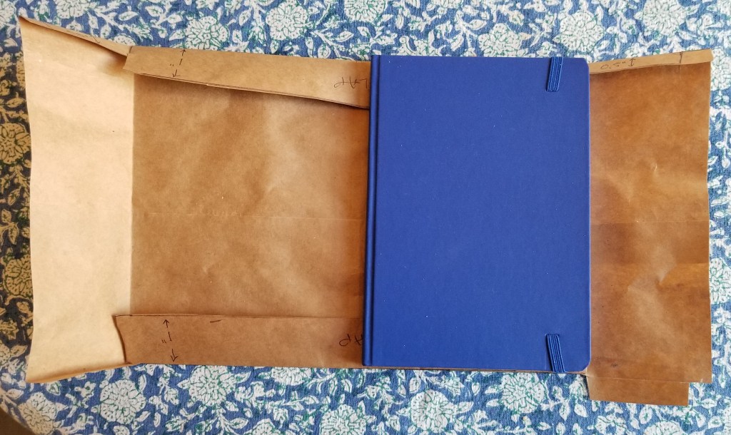
Using a piece of brown paper cut from a grocery bag, I made a pattern/mock-up of my book jacket. This is based on the protective covers we (of a certain age) made to guard school-issued textbooks.
I started by tracing the size of my cover – front, spine, and back – on the brown paper, then I added the extra bits for the fold-ins front and back, plus a small turned in edge across the top. It really doesn’t matter what your book’s dimensions are – just trace it and add the flaps as shown below.
Tracing the book
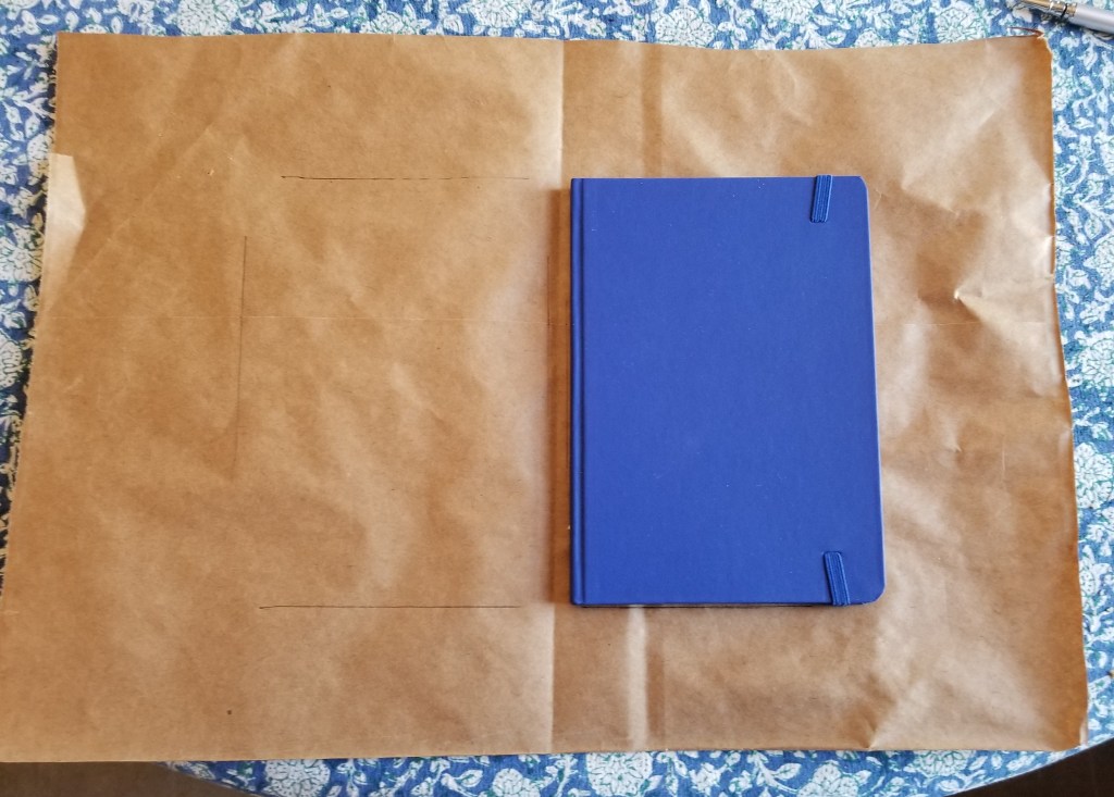
The layout
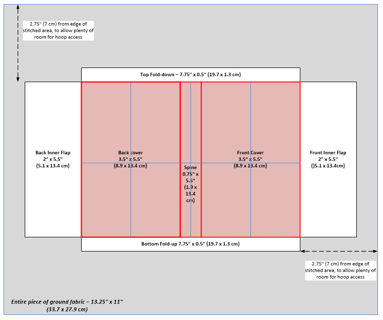
Note that I added some turn-over/hem allowances to the basic diagram above:

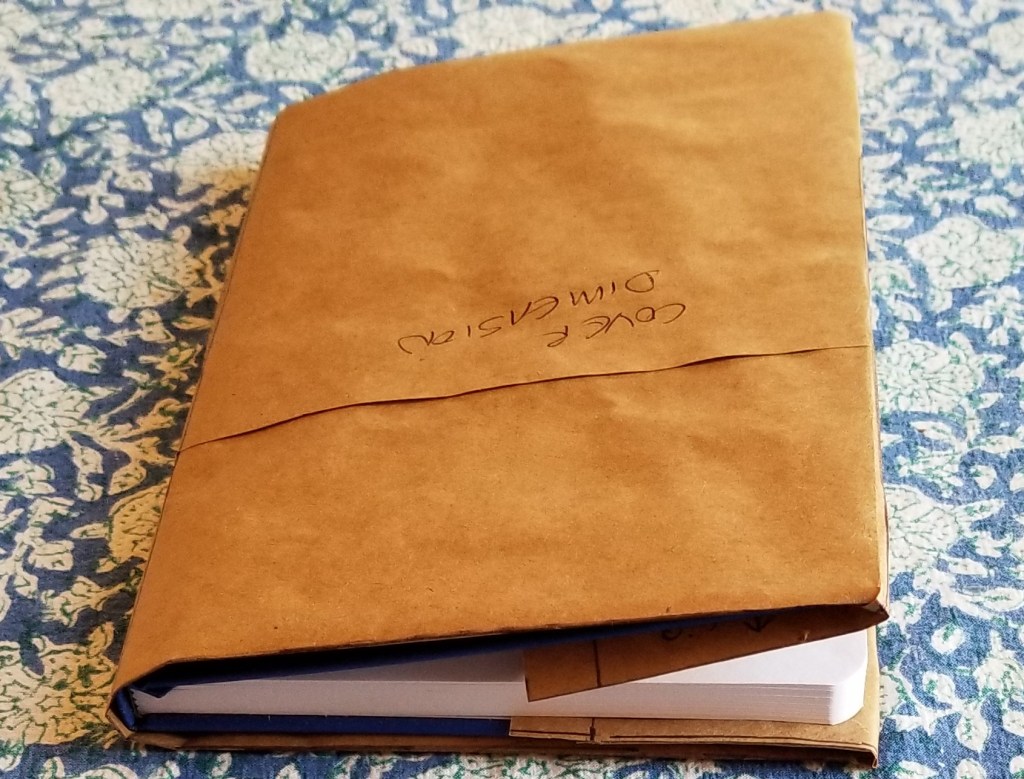
Try it on for a perfect fit
I cut my finished pattern out, folded it and fit it on my target book. Hooray! It fit and the book actually closed. The cloth version will be more stretchy and supple than brown paper, so I have no doubt that the thing will close more completely when it’s final. (HINT: If your book won’t get within inches of closing, redraft, adding a touch more width to the spine).

Step 2. Select and square the cloth.
I dug through my stash and found a piece of even weave that’s slightly larger than my brown paper mock-up/pattern. It’s about 30-32 threads per inch (estimated roughly), which would make it the equivalent of something between 14 and 16 count Aida. One drawback though, the edges do fray if left unhemmed or bound.

Whether you buy a pre-cut piece of even weave or snip your own from yard goods, chances are that the edges aren’t totally even on the grain of the weave. I like to square it off to make sure that my edges are true. I do this by pulling out the short threads that are snipped off at an angle, so that all remaining threads in both directions run the full length of my piece.

In the photo above, with the nasty bits unraveled, you can see that the piece of even weave I bought was not cut true. But now it is.
Why do this? To make sure your piece is neatly aligned on the cloth. It’s less vital on this project than on a sampler or other item you wish to frame, but it’s a good habit to get into, and will save you headaches down the road.
Step 3. Hemming
If you are using a less fray-prone ground like Aida, or just wish to skip this step, feel free. Be aware though that some loss may happen especially if you use and hoop and tug on your cloth to make it sufficiently taut for easy stitching. If you skip hemming, make sure you have an extra half-inch or so all the way around to compensate for any loss.
Were this intended to be a long term project, I’d trim off all of those little mini-fringes, and do a nice double-folded hem all the way around. But this is a quick and dirty project, and one that will finish with (gasp) cutting the ground cloth and discarding all of the existing edges. So I cheated. I just folded down the edges along the weave’s lines and pinched to set the crease and then used the threads I had pulled off the edges during Step 1 to do a plain running stitch, fixing the fold in place. And I didn’t bother trimming off the fuzzy fringes.

Step 4, Pattern Transfer
OK. I’ve got my cloth all prepped, and my pattern constructed. How to get those nice rectangular lines onto our nice, neatly aligned and properly squared/hemmed piece of ground?
I suppose I could trace them. But better than tracing is basting. If I baste using a neutral tone plain sewing thread that doesn’t shed color, I have non-smudge, non-erasable lines that are easy to remove without a trace. But where to put them?
I could take measurements of my cloth and my pattern then do math, and center the thing to within an inch of its life. Or I can cheat, and rely on the fact that I’ve squared my cloth (see!). All I need are a few pins.
I set my pattern down on my ground cloth and eyeball its placement. Then I insert pins to mark the edges of my to-be-stitched areas. In this case, although it’s optional, I also pinned out the location of the flap edges. Then I basted along the even weave grain, along the lines described by the pins. Note that I needed only ONE pin to denote each line:


And the final result:
All of my main pattern lines (sans hems) are indicated by lilac basted lines, absolutely on grain north/south/ and east/west with my ground cloth’s weave. It’s hard to see, but I’ve added three more guidelines, in pale bridesmaid’s blue. The mark the vertical centers of the front and back panels, and the horizontal center of the entire piece.
And now I’m ready to think about what stitch designs I will use, what design layout I might attempt, what colors/threads to select, and get started.
Stay tuned…
ENSAMPLARIO ATLANTIO II
While I am still struggling with the release of The Second Carolingian Modelbook at an affordable price point, other doodling has not ceased. I took a look at my notebooks and decided that enough had piled up to make a sequel to my free book of linear designs. And so I present Ensamplario Atlantio II.

This one contains over 225 designs. Most are for the filling patterns used for inhabited blackwork (the outlines plus fillings style pictured on the cover), or for all-over patterning:


Some sport small motifs that can be scattered either at the represented or wider spacing:


Others can be repeated to make strips or borders:


And some are just silly:


There are also longer repeats specifically meant to be borders


Finally, there are two yokes meant for collar openings, but if I tease everything here there will be nothing left.
Click to download –> Ensamplario-Atlantio-II <–
in PDF format (9 MB)
Although Ensamplario Atlantio II is free, I beg you to respect my author’s rights. These designs are intended for individual, non-commercial use. Please do not repost the book or its constituent pages elsewhere. If you want to use its designs in a piece or a pattern you intend to sell, please contact me for licensing. Other than that, please have fun with them.
And (hint, hint) I ALWAYS like to see the mischief the pattern children attempt out there in the wild world. Feel free to send a photo of anything you make from any of my designs. If you give permission, I’ll post it here, too.
UPDATE:
For those who want more and wonder where the first volume of this series is, no worries. Pop over here to download the constituent parts of the original Ensamplario Atlantio. Why four parts then, but one big download now? When EnsAtl first came out downloading a doc that big was more of a problem for some, so I snipped it into pieces for ease of retrieval. I don’t need to do that anymore.
PROBLEM AREAS? NOT SO MUCH.
Vacation week was quite relaxing, and I managed to get more stitching done than I thought I might. There’s something idyllic about sitting on warm sand under an umbrella, peeping over the top of the embroidery frame at the ebb and flow of the tide.

I squared off some of the missing bits along the right hand edge, and worked on the plume-flowers that march around the outside, rounding two more corners.
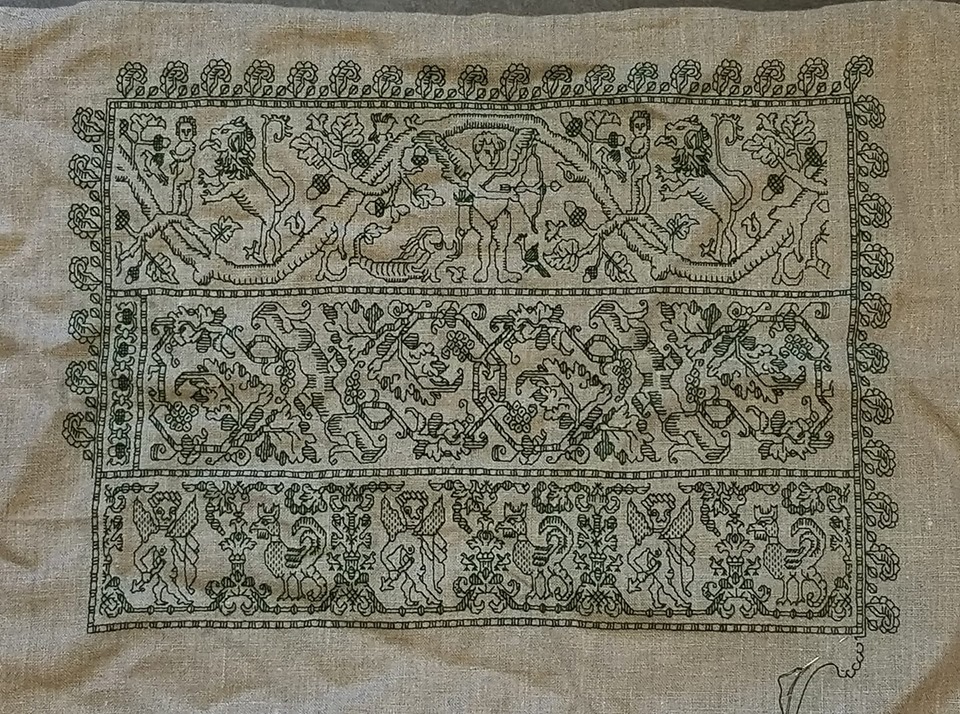
Now that I’m back at home and working from a graph is easier than on the windy beach, I will eke out the rightmost edge of the top cupid/lion strip. BUT the empty area to the right of the center strip is too narrow to subdivide with the established strapped frame. I’ll probably use it to sign the piece with my initials and the date. I’ll draft that space up in GIMP and if necessary, add a couple of small motifs to fill out the area.
That will leave just the corners. Once I have all four I’ll decide on how to play them. I might go back and pick out the cornermost plume-flower at the upper right, then introduce some sort of sprout-off-the-corner-point motif for all four corners, mostly similar, but with slight adaptations to local conditions.
Yes, my bungie jump style of stitching did lead to an unbalanced piece, but I like it. The cupid-cockatrice count problem described in the last post actually did me a favor by introducing a bit of movement and unconventionality into the thing.
Now to just finish my Stupid Cupid Sampler, all the while dreaming up the next piece. Planned or improvised? Your guess at this point is as good as mine. But either way, my plans are rudimentary at best, and you won’t see me drafting out the entire thing stitch-by-stitch.
SWISH BY SWISH
I continue to make slow progress on my Fish piece. Again, I plead the heat, the general malaise it creates, my unwillingness to sit under a hot halogen work light, and a reticence to stitch with sweaty fingers. But as you can see, I’m almost done with the center area gold water swirls. Just a few “echo lines” are left to add to the group below the head of Fish #1, then I will have to advance the scroll, to get the remaining bits at the top and bottom. (Swirly lines that currently go off the edges of my stitching area have been saved until the work area is realigned, even if they go over by just a little bit.) And of course, sign the thing with my initials and the date.
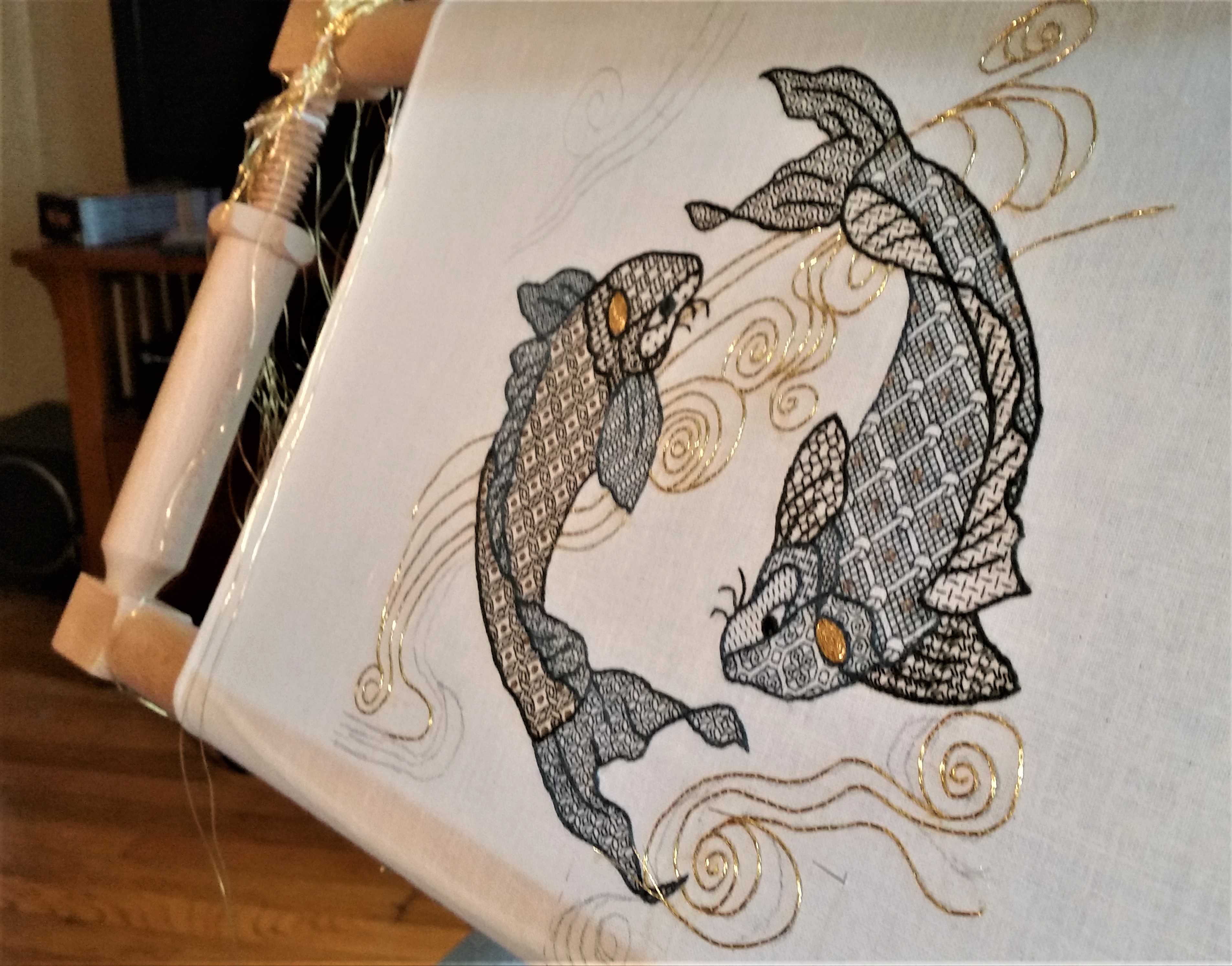
I do like the way the spirals of gold in the head spots turned out.
More answers to inbox questions:
Where did you get the gold and sequins?
The #5 imitation gold thread came from the Japanese Embroidery Center, in Atlanta Georgia. The 2mm gold tone pailettes came from General Bead, in San Francisco. Both were ordered off the ‘net sight-unseen.
How are you sewing down the gold?
Standard simple couching, of two strands held together, flat and parallel (not twisted around each other). I’m using one strand of gold-tone silk, heavily waxed, taking little stitches across the gold. The stitches get closer together as curves are formed, and further apart on the straight runs, but generally don’t exceed about 5mm (3/16ths of an inch) apart.
The no-hands frame is an absolute must for this type of work. I hold the gold and bend it into a curve to match the sketched lines with my left hand, then use the right to form the affixing stitches, taking care not to pull so tightly that I deform the line. After the length is stitched down and the end cut, leaving about 3/4 of an inch on the surface, I plunge them to the back. I do this with a heavy, antique needle threaded with a loop of strong carpet thread, and lasso the ends, pulling the loop gently around the waving ends, then quickly yank them to the back of the work. After I finish an area I bundle the plunged gold ends as neatly as I can, mostly trying to keep the resulting bits small and camouflaged as much as possible. Note that on shortest line segments care must be taken when plunging NOT to end up pulling out one or both of the stitched down gold strands. Much colorful language ensues when that happens…
How will you finish this piece off?
I really don’t know. I don’t want to do a fabric scroll or hanging style finish on this one. Although that would be congruent with the subject matter, I feel it would be too cliche, and take up too much space on the beach place wall where we intend to hang it. Instead I may opt for a spare non-matted/no glass modern frame. Possibly a near-invisible thin black one. But in any case, I suspect I’ll splurge and have this one done by pros instead of my usual dinking around above my competence.
What’s next?
Not sure. I still have a stitch-itch, although I have a couple of projects lined up to knit once fall weather kicks in. Possibly a return to my big green sampler, now that I have a reliable stand for it. Possibly a smaller something-else.
SLOW PROGRESS IS STILL PROGRESS
Inching along here on my fishies. Yes, did end up getting the Lowery stand last week:

I really like it and am glad I splurged when I did. For those looking at the photo, trying to parse it out, the stand itself is the grey metal armature – from the heavy base plate, up to the gripper jaw holding on to the wooden cross piece, to which my stitching frame is attached.
The wooden piece with its grasping flanges that engage my frame is a supplemental purchase – the “Long Frame Extension.” I strongly recommend it if you have a Millennium or other scrolling frame, especially if it’s large/heavy, or has wide bars. Because the stand clamps down on the solid wood of the extension, I do not have to worry about overtensioning the jaws and harming the delicate stretcher arm, with its reamed out internal screw threads.
Now, as to actual progress, it’s been hot, and since I sit under a halogen work lamp, and we are not air-conditioning-enabled – I admit slacking off on most hot evenings. In response to questions about my comfy chair, I post this photo, complete with orb-of-the-sun heat-source mini floor-lamp, Morris style recliner, and frame (supported by its new stand.)
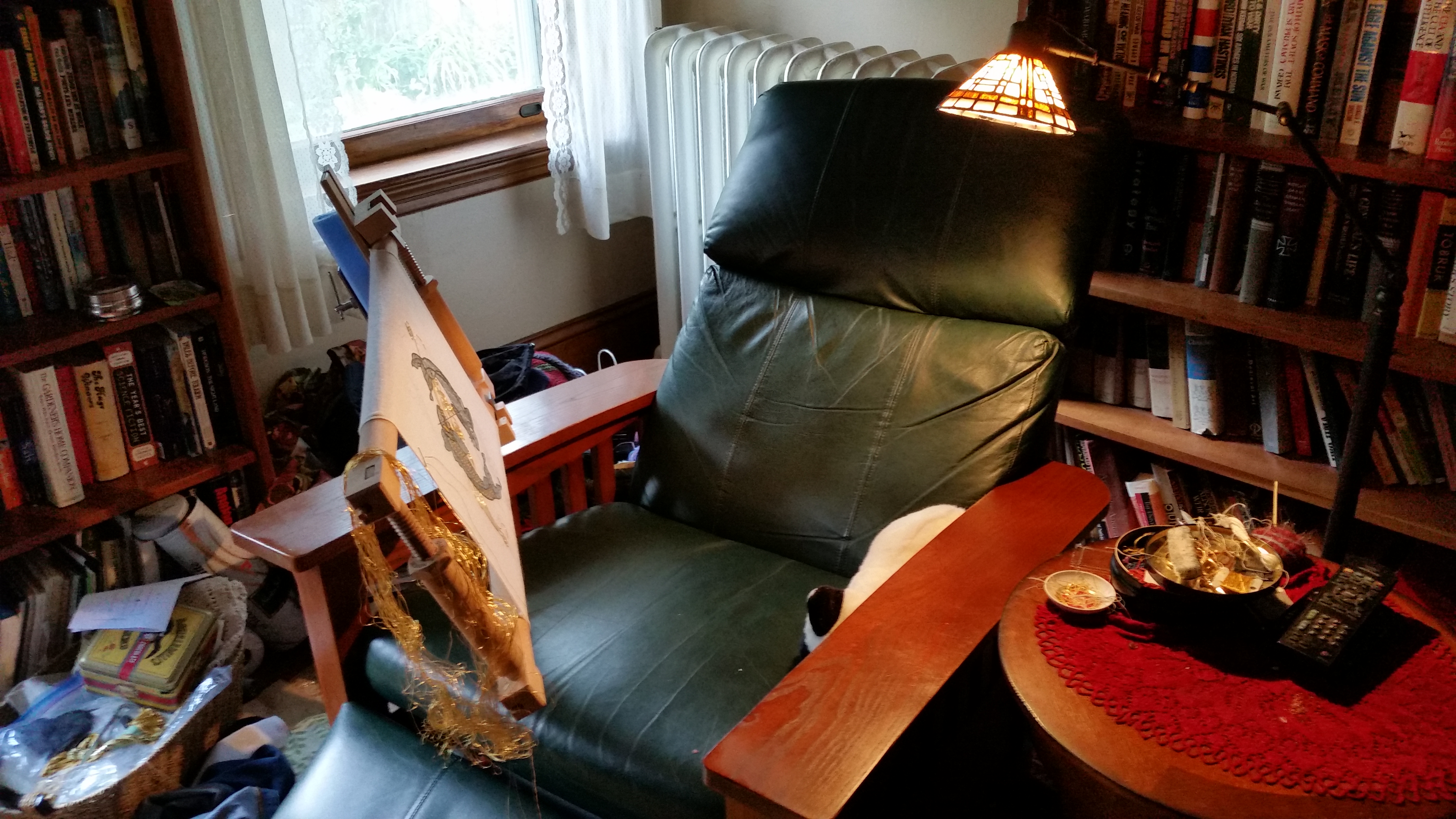
No, that’s not a real cat in the chair. It’s a conveniently sized stuffed-toy cat, liberated from the kids’ collection. It serves as a nice, soft supplemental elbow rest. You can also see the embarrassing midden of supplies and in-progress projects, heaped into baskets between the chair and the bookcase, and the ever-encroaching box of on-deck items that is slowly taking over the small table.
The floor stand’s foot is tucked underneath my chair, with a couple of bricks on it for good measure. The extra weight allows me to swing the frame out of my way like a door, so I can exit the chair without having to move the entire set-up, or shimmy under it.
Finally, here’s the paltry progress itself:
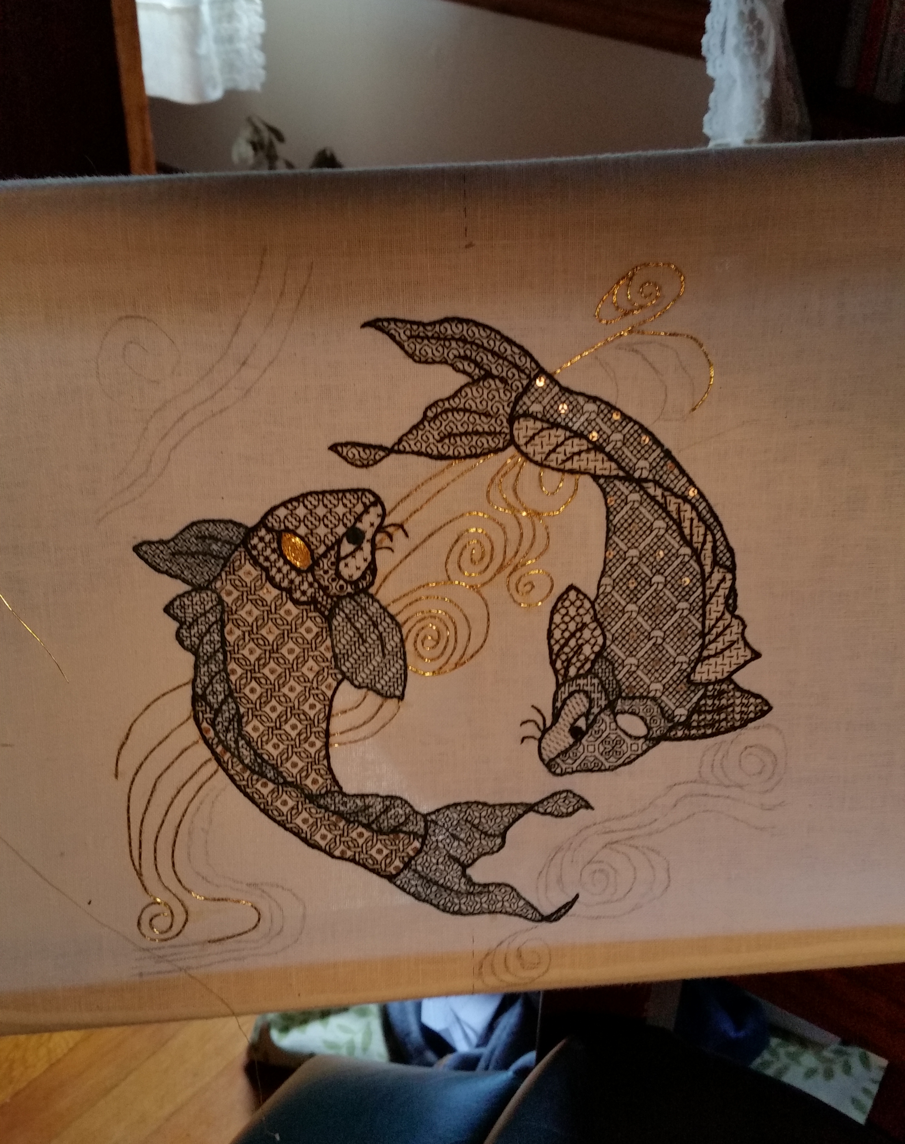
I’ve added sequins to the previously un-sequined Fish #1, who was feeling very jealous of Fish #2’s bling. The light is angled to make some of them sparkle, but there is a sequin in the center of each grid area in the body. I’ve also made progress on the gold whorls. Next are finishing the couched gold lines above Fish #1, doing the spot on his head, and starting on the whorls below him. Eventually I will have to scroll up and down a tiny bit to access the remaining swirly bits at the very top and bottom of the piece.
And then I’ll be done.
Next project? Not sure yet. I have a couple in mind. Possibly return to Big Green. Possibly another smaller sampler. Possibly a cushion to replace the stuffed cat. Maybe playing with tambour and wool… There’s no need to rush, I’ll be working finishing up my koi probably until September.
