PERSISTING THROUGH BUSY WORK
It has been a week that was. A couple of them in fact. But I’ve tried to maintain equipoise by keeping hands and mind occupied as much as possible. To that end I have several bits of progress to report.
First is the start of yet another sampler. I’m not sure if this one will be adapted as another tribute to The Resident Male’s literary output, it will remain un-themed and completed with patterns picked at random, or if it will end up bearing a motto. I didn’t even decide which direction was up or down until the latest band was begun. The yarn-crazed kittens, being directional, made that determination for me. For now, I can only present progress. Two bands finished. The kittens are the third.


Keep an eye on those cats. They will resurface by the end of this post.
I also embarked on a project to send a holiday preparation care package to Elder Offspring and Companion, who have moved cross country, and are not going to be able to make it back here to share the family celebration. To that end, I’m selecting some of the tree ornaments we have made over the years, and am augmenting that with some additional crocheted snowflakes, including the holiday stocking for Companion I knit in late summer that matches the one I did about 28 years ago for Offspring, and making a really silly scrap fabric garland.


The crochet snowflake patterns came from a variety of sources, and to be truthful, I didn’t take notes. About half came from the book below, the rest were free patterns I found via Internet search. I had aimed for 12 but there are 13 here. One of these was especially wonky, so I felt guilty and made an extra to compensate. As for the oddnesses among them (yes, there are lots of errors), I plead distraction. I did these (and the garland) entirely while team-playing Skyrim with the Resident Male. He mans the controller, we cooperatively navigate the puzzles. Occasionally I appear to have lost my place in the pattern, but kept going anyway.

The no-sew garland consisted of taking strips of scrap low-fray fabric – in this case fleece remnants left over from a charitable project at a former workplace – and knotting them onto a sturdy cotton cord. Lots of scissor work reducing the scrap squares to strips, and a bit tedious to do, but there was no waste. The fabric odds and ends I saved from the dumpster have a new and decorative life.
I’ve also re-upped to serve as a volunteer indexer for the Antique Pattern Library. No pix for that, just lots of paging through and taking notes. It’s going slowly due to too many other things in process, plus overcoming the deep ennui brought on by the current political climate. But it is moving along.
Last but not least is fulfilling a promise. Several people were interested in working up their own version of the Persist mini-sampler I did back in 2017, and that I recently salvaged for re-use as an on-line avatar image. Since I had never charted it up in the first place, it took a bit of work to retro-engineer. Here is the thing in its original form:

Those kittens? They now run across the bottom of the sampler, below the tumbling voided flower panel, inside the snail border. It seemed a fitting tribute to current events, and the piece really needed better vertical balance. There are other tweaks made to the alphabet, spacing and other bits. I consider the new version to be vastly improved over the 2017 version.
As usual, I share this for your personal use only. And I request it be Good-Deed-Ware. If you download it consider me paid back if you do something nice for someone else. A work of small kindness or empathy. Reach out to someone who needs cheering up or companionship. Volunteer to do something to aid your community. Every little bit counts, and right now counts more than ever.

In any case, click here to download a PDF containing the three-part chart above plus commentary.
I have also added this chart to the Embroidery Patterns tab elsewhere on this site.
ELIZABETH HARDWICK ON BIAS?
Once again a chance image on Facebook throws me into a frenzy of charting. The Friends of Sheffield Manor group posted this image of Elizabeth Hardwick, Countess of Shrewsberry. attributed to the school of Hans Elworth. It’s accession 1129165 of the UK’s National Trust collection.

Obviously what struck me were the sleeves. I tried and tried to chart them on the diagonal, but the geometry worked out much more cleanly if done straight. Now sewing, especially historically accurate construction is not my strength. But I ask folk more versed in it than I am, was it possible that if embroidered linen was used for those sleeves might they have been cut on the bias and not with the grain? The motifs look grain-wise at the collar, but are clearly sitting “on point” on the diagonal for the sleeves.
In any case, I’ve added the graph to the on-site free collection here. My rendition of it is approximate, but as close as I was able to achieve. I’m fuzzy on the exact shape of the free floating rondels occupying the empty areas where the chain rosettes meet. And their color is also problematic. Some are brown, some red, and some a pale indeterminant color – it might just be fading of the paint.

I lay no claim to the design itself – only my graphed rendition. Like most of the pieces offered here on String, this is available for your personal use. It’s Good Deed Ware – if you work it up please consider paying the kindness forward, assisting someone in need, calling a friend or family member who could use a bit of cheering up, or otherwise making the world a tiny bit more pleasant. And please note that my representation of this design is copyrighted. if you are interested in using it commercially or for larger distribution, either incorporating it into a pattern for sale or other dissemination, or if you want to use it on items that are made for sale or donation, please contact me.
And as always, I love to see what mischief the pattern children are up to out there in the wide-wide world. Feel free to send me a photo or a link. And if you give permission, I’ll add your work with or without your name (as you desire) to the growing Gallery page here on String.
A HOLBEIN COLLAR
Special thanks to Karen over at the Elizabethan Costume group on Facebook, who visited the current “Holbein at the Tudor Court” exhibit a the Queen’s Gallery, and came away with an assortment of extreme close-up photos of various clothing details. One of them showed an intimate view of the portrait of Thomas Howard, third Duke of Norfolk, a painting in the Royal Collection. The Duke died in 1554. and the painting was probably done in the decade before he was arrested for treason, which was about 8 years before his death.

He’s quite an imposing gentleman in his lynx fur, and his collar is hard to see in the official full-size repros of the portrait. But Karen’s extreme close-up helped. Her shot is below, shared with her permission.
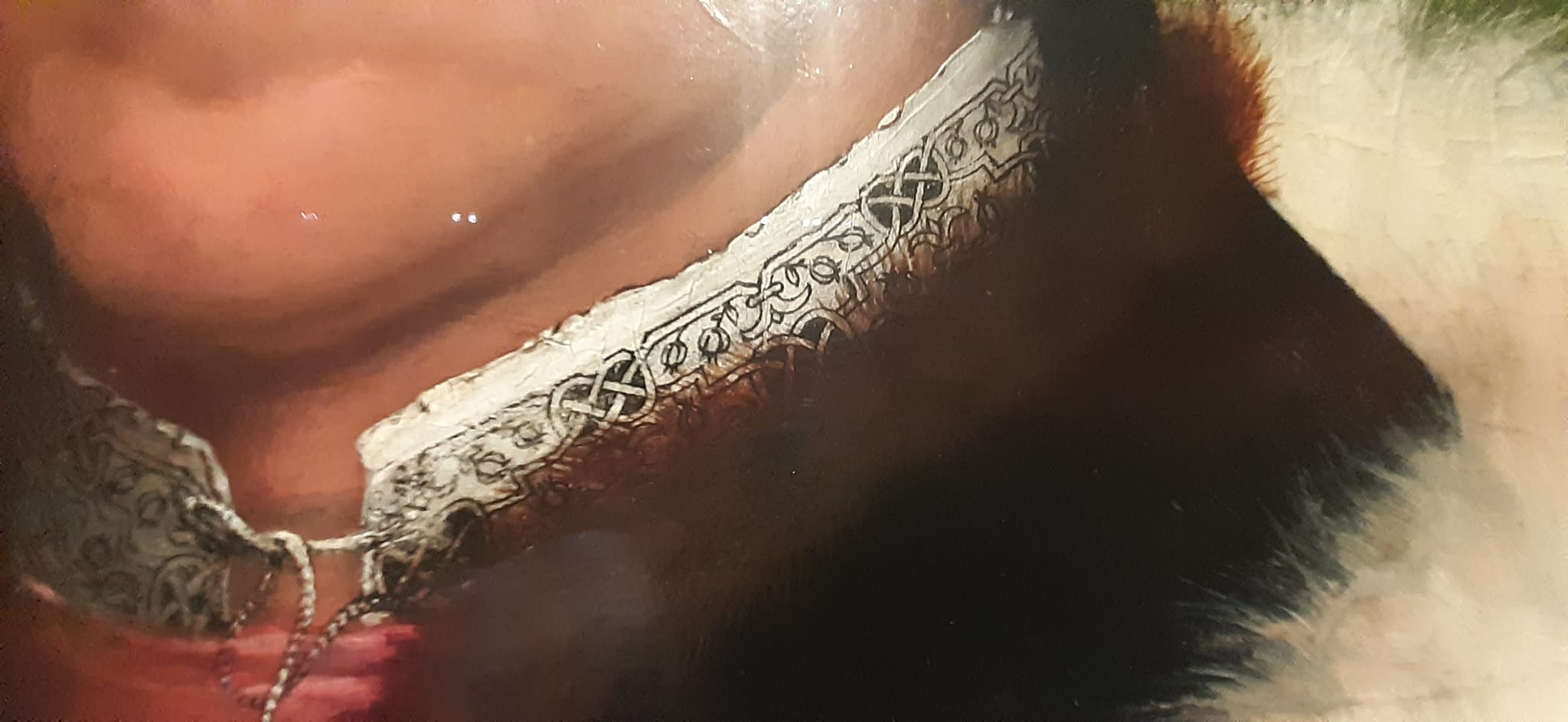
Here’s the blackwork band I transcribed from his collar, more or less.

This redaction is only posited. It’s harder to chart from a painting than it is from a stitched artifact. Luckily this was a Holbein, who understood and clearly depicted the geometry and alignments of countwork. I’ve used my standard rules on this one:
- Modern blackwork and its expanded vocabulary aside, historical examples employ only straight lines, right angles, and 45-degree angles.
- Stitch length units are regular, and are constrained to multiples of a single whole unit, either on edge or on the diagonal. Yes, there are some artifacts with instances of half-unit stitches, but for the most part they are extremely infrequent in foreground design. They do appear sometimes in voided work, to help the stitcher cozy up to the outlines of their previously laid down foreground design.
- Gaps between stitches in a continuously linked design will be the same multiple of the base unit. There are no “floating islands” in this piece. Every bit is straight-line attached to every other bit, and therefore must be on the same base grid.
- Not every iteration of the original is assumed to be spot on accurate. Especially in painted depictions, where three dimensional rendering of rumpled cloth can add imprecision, or the painter not being constrained by a drawn grid, did a “you get the idea” representation rather than a stitch-faithful one.
On this chart I have rendered the background inside the interlaces as a block of solid color, as they were in the painting. It’s not clear what stitches were used to achieve this, but long armed cross stitch, boxed (four-sided) cross stitch, and plain old cross stitch are all good candidates. Note that because these areas are bounded by diagonals there will be considerable fudging with half diagonals (aka quarter stitches in modern cross stitch) to eke out coverage. The solid fill result here is what matters most.
In any case like most of the pieces offered here on String, this is available for your personal use. It’s Good Deed Ware – if you work it up please consider paying the kindness forward, assisting someone in need, calling a friend or family member who could use a bit of cheering up, or otherwise making the world a tiny bit more pleasant. And please note that my representation of this design is copyrighted. if you are interested in using it commercially or for larger distribution, either incorporating it into a pattern for sale or other dissemination, or if you want to use it on items that are made for sale or donation, please contact me.
And as always, I love to see what mischief the pattern children are up to out there in the wide-wide world. Feel free to send me a photo or a link. And if you give permission, I’ll add your work with or without your name (as you desire) to the growing Gallery page here on String.
FILE FOLDER ARCHAEOLOGY
It happens that this week a couple of people have stumbled upon this old unfinished sampler that now hangs on my Wall of Shame.

It’s unfinished because I had started it as a wedding present for a friend. Sadly her engagement ended before the wedding. I never felt like finishing it off after that, although I still have it. It’s also the only piece I have ever done on Aida. I didn’t enjoy working that ground, which is probably another reason why it has languished since the early 1980s.
The reason these folks found it was that they were looking for a charted Hebrew alphabet. I knew I had one. Somewhere.
I had drafted one up, and it had gone through several iterations. The first was for a contemplated but never started service project for my family’s congregation – a Torah cover, to be exact. But I never had the time to follow through, so the scrap of graph paper was stowed in my doodle notebooks. About 8 or so years later I began this gift. I rescued the earlier scrap, played with the letter forms a bit based on the Macintosh pixel based Hebrew font. I added back a bit more of the pen and ink serifs, and messed with proportions a bit. After this project went into dormancy that doodle joined the earlier one. And I went looking for both this morning. Needless to say I didn’t find either. But I still have the sampler, so I re-graphed the alphabet based on how I stitched it (and tinkered a bit, again).

Click here for an easy to save PDF of the Hebrew alphabet chart above.
The first two lines at the upper right are the full alphabet. The five characters immediately below them are special. A few of the letters are written differently when they appear at the end of a word. You can’t write without them, so I offer them, too.
In addition to just a plain alphabet, I have charted up some of the most commonly stitched words.
Shalom – Peace
Mazel – Luck
Matzah (also spelled Matzoh) – The unleavened bread eaten at Passover. Some families have special linen napkins to cover the matzah for their Seder celebration.
Lechem – Bread. Like the Matzah cover for Passover, some families have a special napkin to cover the bread for holiday meals and for Shabbat.
Mizrach – East. In Europe it was the custom long ago to mark the Eastern wall of a place of worship or learning as a reminder of Jerusalem. It’s not done as often now as it used to be, but Mizrach embroideries do pop up on Judaica collections.
Now please don’t go asking me for translations or interpretations. I’m pretty much a late entrant to Hebrew School and I continued to struggle with the language in college. So much so that I ended up dropping back to French for my language credit to graduate.
The Hebrew chart will also join the others on my Embroidery Patterns tab.
Another Artifact of the Past
While I was hunting around for the alphabet doodles, I stumbled across the original of the handout I used to use when teaching basic sock knitting. It contains an abbreviated sock that we would work through together in the workshop, plus some of the other sock patterns available here on String. Also, it includes the pattern for the famous “You’re Putting Me On” Socks by express permission of Judy Gibson, that pattern’s author. Judy was major inspiration for sock knitters in the early days of the Internet, and merrily led hundreds of us astray into projects we wouldn’t have dared without her support. The 15 page booklet ends with some other useful references, including a chart of standard sock sizes and measurements, some (mostly dead) links to sock resources on the ‘net, and a visual on Kitchener grafting.

Click here for a free download of my Sock Knitting Workshop handout.
I’ll probably add it to my books page. Eventually.
CAT AND MOUSE
An odd confluence of happenstances and the resulting doodle.
Last week there was a discussion in one of the Facebook groups dedicated to 1500s costuming or blackwork that started with someone asking for a historical blackwork design that featured cats. There aren’t many examples, and the chat covered iconography, citing that cats weren’t the most auspicious of symbols at that time.
Then an unusual source came across my feed: a line-rendered group of cats, but not from the period in question. This plate flew across my Twitter feed. The source is Ernest Allen Batchelder’s Design in Theory and Practice, New York: Macmillan, 1910.

This appears on page 157. The book is a rather lively examination of design principles across history, and appears to be a transitional work, including the natural elements of the aesthetic/Art Nouveau style, but more solidly grounding the more angular principles that characterize the Art Deco/late Craftsman mood. For all I know it may be a seminal point in decorative design history, but I will leave that point to be hashed over by any readers who are schooled in design theory and lineages.
In any case, here were some linear cats just crying out to be graphed and stitched. So in response to a generalized (as opposed to Elizabethan-specific) demand for cats and to delight cat-loving friends and family, here is what the Batchelder sketch inspired:

This is rather large to be used as a fill pattern in inhabited blackwork (the subtype with outlines and fancy fills), but it is in scale for use as a large all-over design. I could see it being worked as is, in double running or back stitch, in monochrome or in multiple colors (those yarn balls cry out for variegated thread). It could be done voided, with the background filled in. The cats could be solidly stitched or left as is, or customized to match the markings of favorite pets (I provide a rudimentary tabby and tuxedo but any other markings might be fudged in). A frieze of this as the leftmost third of a placemat might be fun. I leave use up to you.
Like my other designs of late, this is “good-deed-ware.” If you like it and use it, I encourage you to look around and make a donation to a local cause that is helping people hit hard by plague-related economic challenges. “Starving artist” should be a metaphor, not a life description.
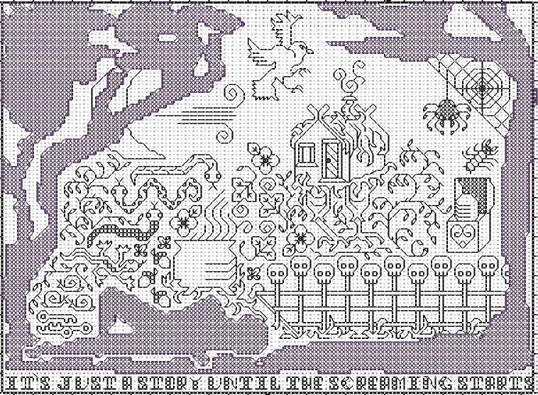
OCTOBER ISN’T ALL THAT FAR OFF
So for those of you who favor seasonal stitchery, here is a suitably spooky present:
The inspiration for Baba Yaga is courtesy of my pal and former co-worker Laura Packer. Laura is a storyteller by trade – an unusual occupation these days, but one she does splendidly. You can sign up for notification of her public tellings at the link above, or you can subscribe for all sorts of creative goodness at her Paetron link.
Laura had sent a much appreciated surprise to me, so I doodled up the main Baba Yaga chicken-leg hut motif in return. She swooned over it, and suggested further additions from the story cycle – the chest with the egg/heart; the fence of bones (I stole my bony boi’s faces for that), the moon, three keys, a cauldron, a forest of briers, wind, a raven; and keys, creepy crawlies and other things in sets of three. I put in as many as I could, adding the motto across the bottom and the dreamer frame (in silhouette, intended to be stitched very densely for added mystery).
When we were both happy, I went final with it. And gave full rights to the design in perpetuity to Laura. She returned the favor by allowing me to post it here.
Please note that this is just a chart – not a full project described in detail. I suggest work in one or two colors on even weave or one of the higher count Aida fabrics, but I do not give thread consumption estimates. Linear elements can be done in double running or back stitch. The silhouette frame can be worked in long armed cross stitch, four sided cross stitch, or plain old cross stitch – your choice. There are gaps in places between the solid dark areas of the silhouette frame and its outline. Feel free to fudge those in with partial stitches if you like. I didn’t want to add visual complication by including the partials. It’s going to be hard enough to count as it is.
I don’t even have an as-stitched example to post (yet). If you beat me to that and feel so inclined, please send a photo and I will showcase it here.
You can download Baba Yaga from my embroidery pattern page (tab above or click here). While I am not charging for the thing, I do release it as “good deed ware.” Subscribe to Laura’s channel, or make a donation/buy a thing/otherwise subsidize the creative professional of your choice.
Artists – and especially face to face performance artists, actors, and musicians – are having a very hard time of it right now. But it’s art that keeps us anchored and sane in times of stress. If you can, please be a true patron and lend a hand. After all, doing good for those touched by the the spirits of creativity can only bring good fortune in return. Often in very unexpected ways. Let me tell you a story…
DANCING AROUND THE CORNER
Having gone on and on about straight repeats as my bony bois march across the top of my piece, we have now come to the first corner.
Thankfully, my count is spot-on and everything is in place.
But why did I start with the strip of skeletons doomed to dance upside down? Because I knew that I would probably make some tiny adjustments to the design as I went along. The viewer’s eye is drawn to the closest point of the work, and the most logical part – that’s always the strip across the bottom, where the motifs are all right-side-up.
It’s unlikely that any small tweaks would be noticeable in the upside-down part at the top. So being too lazy (and waaay too short of thread I can’t replenish) I started there, knowing that I would not be ripping back vast regions to norm those tweaks.
Closer up, in a more normal orientation:
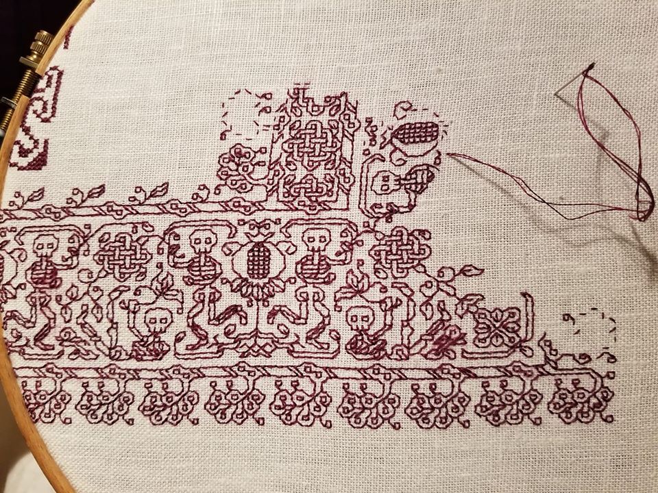
My last post discussed the non-historical use of the same framing element on either side of a mirrored repeat with horizontal directionality. Here’s another feature of this strip that’s not often seen in museum artifacts – the mitered corner.
The majority of corner treatments in surviving historical fragments have butted-up or improvised corners. Carefully plotted mirror images across a diagonal (mitering) are quite hard to find. But I decided to do one anyway. You can spot the diagonal running through the center line of the rightmost internal knot, down through some leafy bits, and into a flower-like shape. I’ve also established the beginning of the 90-degree flipped border, with the upper part of that skeleton plus the first pomegranate underway.
I’ve also rounded the outside corner. In a serendipitous happenstance (I can’t claim I planned it ahead of time), the width and height counts of my marching plumes are equal, so I was able to fudge the corner with one last plume on a long stem.
Side note: At this point I really don’t need to refer to my printed pattern any more, I am mostly working off prior stitching, with occasional glances back at my chart to make sure all is aligned and true.
But that inside edging – it’s different. I’ve introduced another element, playing with the eternity knots and tying them into the plume strip. I did this because the thread count of the warp (the threads that stretch up-down in the detail photo) is denser than the thread count of the weft (those that go across in the detail photo). The closer together the threads are, the more compressed the design will be in that direction. My skeletons marching up/down the sides of my piece will end up looking ever so slightly shorter and chunkier compared to their more lanky brothers that tumble across the top and bottom. BUT I can draw the eye away from that difference by adding the additional knotwork strip.
So it turns out that my design is all about insouciance, breaking historical composition precepts, and visual deception. Still for all of that I think that its look is more closely aligned to the aesthetic of historical blackwork rather than more modern pieces. Just my opinion, feel free to differ.
Class Handout Page
And for having the patience to read down this far, here’s another present. I was going through some older files and came across this class handout page. I’ve taught several workshops using it. The last one I came equipped to do was for a public SCA demo in Rhode Island, although the circumstances and attendees made just sitting and chatting about the stitching a better option. Still, I did update the handout, and it may as well be of use to someone.
The patterns are (more or less) ordered in level of complexity, and are intended to be a self-tutorial in double running stitch. When I teach I provide the page below, a strip of Monk’s cloth and length of standard embroidery floss and needle, plus an inexpensive hand hoop (if I have some to spare). Depending on prior experience, stitching proficiency, confidence level I encourage the participant to select one of the designs from the leftmost two columns, to try out face-to-face in the workshop. Then I encourage everyone to use the rest for self-study at home.
For self study, what I suggest is to just grab a piece of cloth and begin – no need to plan an intense, composed sampler. Pick a point anywhere on your chosen ground, then starting at the spot in the upper left column where you feel comfortable, continue down that column to the simple acorns. Then keep going. The next design in the complexity sequence is the flower spring at the top of the next column. Go down that column to the folded ribbons.
After that, I’d suggest attempting the birds at the bottom left. From there the vertical star flowers, then the knots, four-petal flower meander, and the design immediately above the title. Once you’ve done all that the remaining four intermediate patterns on the page should be well within your grasp (the heart flower all-over, fancy acorns, geometric strip, and oddly sprouting peppermint-stick squash blossoms).
Of course you can be totally random and just use these designs as you will. No need to march in lock step with the protocol, above.

Download this handout in PDF format from my Embroidery Patterns page. It’s the last one listed (click on the thumbnail there to get it, then save it locally).
As ever, if you stitch up something from any of my designs, please feel free to send pix. I always get a big smile out of seeing you having fun with the pattern children. And if you specifically say so and give permission to re-use your photo, I will be happy to post it here and index it under “Gallery”.
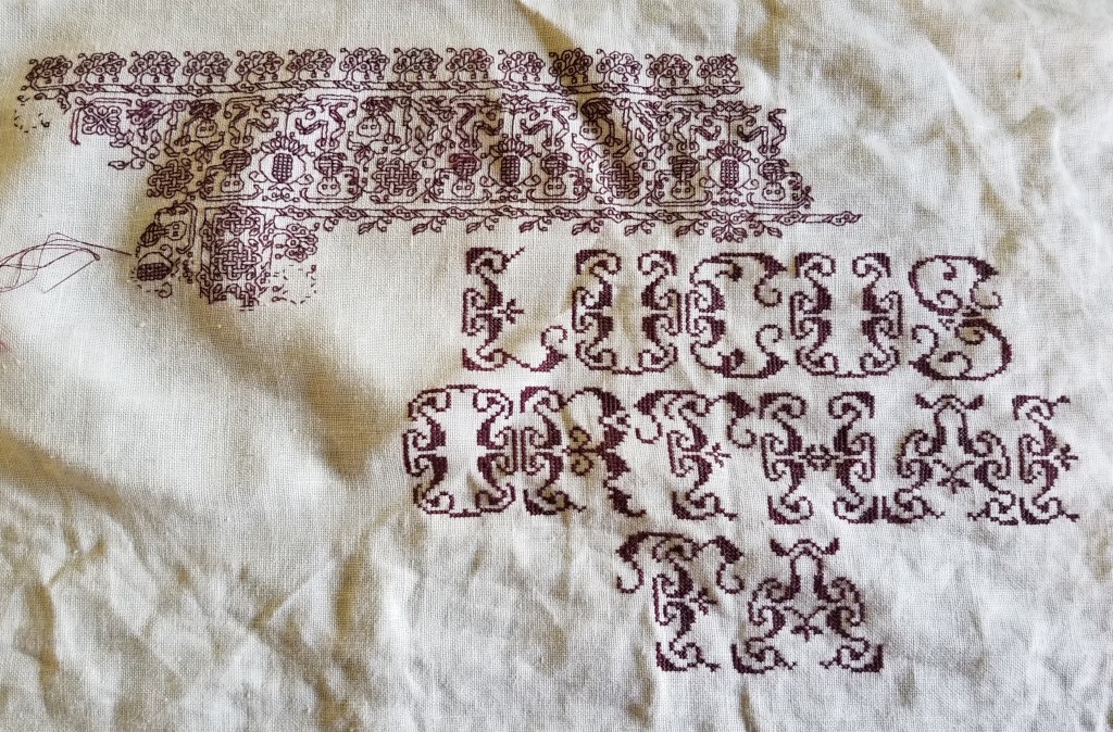
HARSH LANGUAGE FOR HARSH TIMES
UPDATE: This pattern is now available as an easy-download PDF file, via the Embroidery Patterns tab, above.
I start with a gallery of finishes. Sanity saved! Smiles spread! (Think what you must about the phrasing – I’m happy that my goal of preserving both have been achieved).
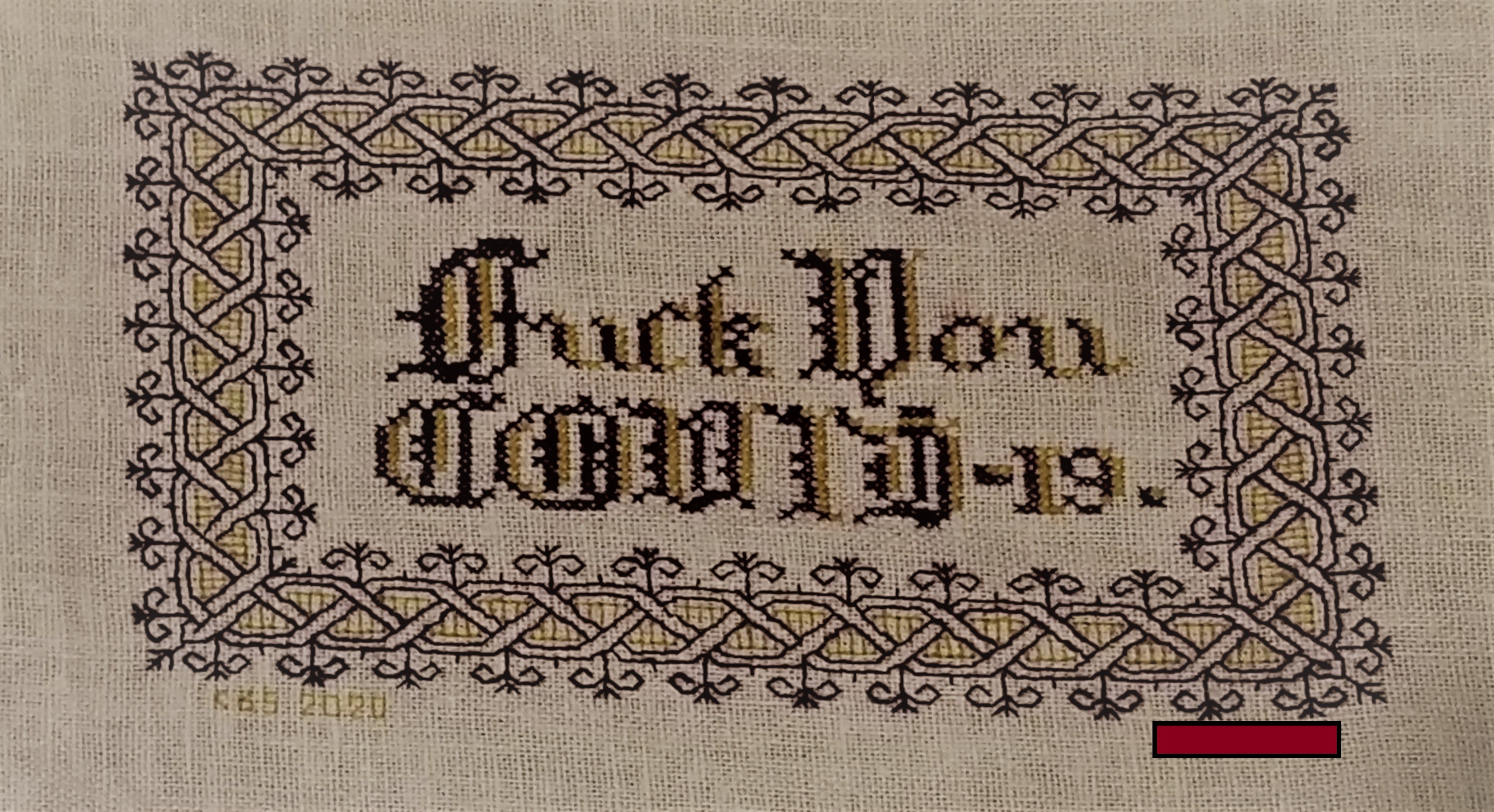
My own finish. Naturally dyed claret and mustard yellow wool on linen/cotton blend. I played with the color placement and letter forms a bit, since I can’t do anything verbatim these days.

Photo (c) 2020 by Madeline Keller-King, reproduced here by permission

Photo (c) 2020 by Breen Pat, reproduced here by permission
A couple of days ago I posted the design for my “Don’t Panic” piece, which has become shockingly relevant.
Friend Edith points out that harsh times call for harsh language, and that while some people might be soothed by a gentle statement, more strident expression suits many others.
Therefore for Friend Edith, and in the spirit of Dame Judy Dench, who is famed for stitching up provocative statements, I make this chart freely available for YOUR OWN PERSONAL, NON-COMMERCIAL USE.
Consider it as “good-deed-ware.” It’s tough out there right now. Pay this gift forward by helping out someone else in need; phoning or getting in touch with a family member, friend or neighbor who could use a cheerful contact; volunteering time or effort; or if you can afford it – donating to one of the many local relief charities or food banks that are helping those displaced from work right now.

Right-click on the image above to save it as a JPG.
This piece is intended to be done in cross stitch (the lettering), and double-running or back stitch (the frame). While it’s shown in black and red, use one color if you like, or substitute in as many other colors as you wish.
The source for the lettering is yet another of the offerings in Ramzi’s Patternmakercharts.blogspot.com collection. The border is from my recently released Ensamplario Atlantio II, a free collection of linear designs – mostly blackwork fills and borders.
Thank you Edith! Your inspiration and request will brighten the hearts of many, while rendering their walls cheekily NSFW.
(And there goes my PG blog rating, and any remaining shreds of reputation for gentility. But it’s worth it if someone smiles.)
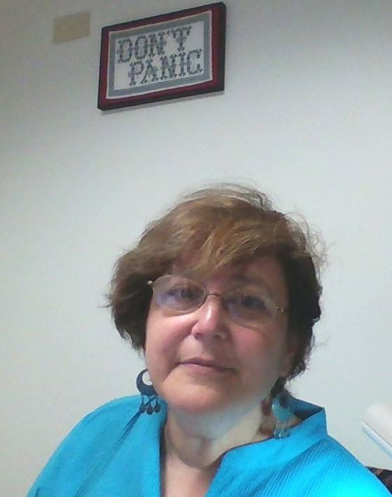
DON'T PANIC – AGAIN
A while back I stitched up this piece, both as a tribute to Hitchhiker’s Guide, and as a bit of inspiration for my office. I’m a proposal specialist – managing short deadlines and general panic are my stock in trade.
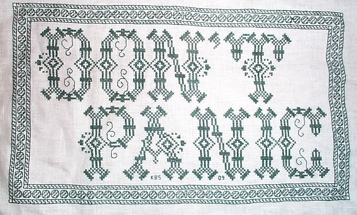
When I posted this on Facebook last Friday, I got several requests for the chart. So, tweaking memory dormant since 2009, I drafted one up.
I make this chart freely available for YOUR OWN PERSONAL, NON-COMMERCIAL USE. Consider it as “good-deed-ware.” It’s tough out there right now. Pay this gift forward by helping out someone else in need; phoning or getting in touch with a family member, friend or neighbor who could use a cheerful contact; volunteering time or effort; or if you can afford it – donating to one of the many local relief charities or food banks that are helping those displaced from work right now.
CLICK HERE TO DOWNLOAD THE DON’T PANIC CHARTS AND INSTRUCTIONS – THEN SAVE THE PDF THAT POPS UP
Eventually I will add this to the Embroidery Patterns page tabbed above. But for the time being – be safe, stay well, and care for those whom you love.
ALTERNATIVE ALPHABET RESOURCES FOR INCLUSIVE STITCHERY
Lately I’ve seen a couple of resources for embroiderers who wish to make samplers or other stitchings to honor friends or family who are differently-abled. I post them here for general reference. [NOTE – THE LINKS BELOW WERE EDITED ON 22 AUGUST 2022, AFTER I LEARNED THAT MR. TAKAHASHI’S WEBSITE IS DOWN.]
First is this alphabet from type designer Kosuke Takahashi. It takes a linear construction alphabet, and overlays Braille dots on it, to form a construction that can be read by those familiar with both type forms.

Sadly, Mr. Takahashi’s website appears to be down, but the article about his invention along with a better visual of the material above can be found here, on Colossal. The author’s old site noted that his workis free for personal use. If you want to compose an item or design for sale, you would need to contact the designer to license the font.
Second is a linear stitch interpretation of the sign language alphabet.
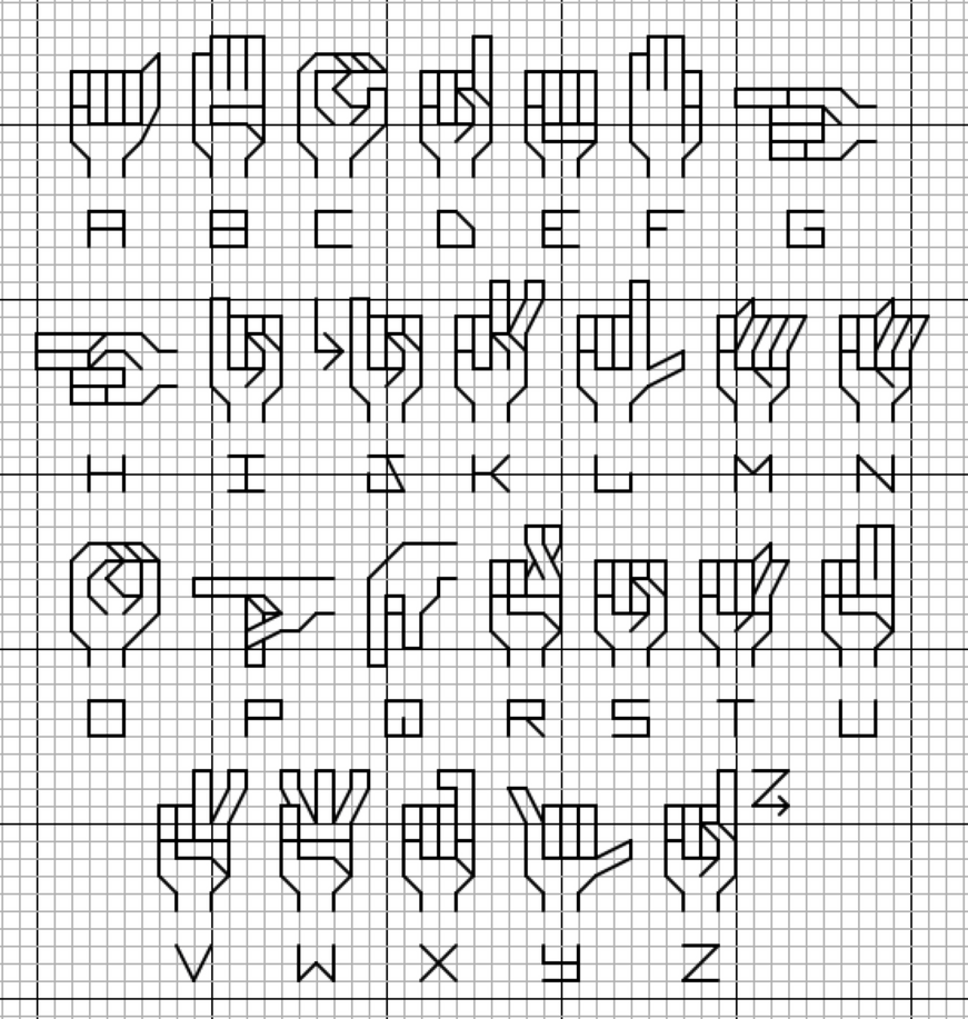
The source is Deviant Art board poster and cross stitch designer lpanne, and is under her copyright. Again, if you create anything from this for sale, please take the time to contact the artist and ask for permission.
Although this last item presents text in a non-standard way, for most of us it makes it less rather than more comprehensible. But it’s a nifty idea for the nerdy-minded among us. Artist Sam Meech knits up scarves using ASCII coding, represented by two colors (one for 1 and the other for 0). He’s able to include entire quotations and text passages in his Binary Scarves. He sells them at his site below.

(photo shamelessly lifted from Sam’s site)
You can read more about Sam’s scarves here.
If you want to create your own binary string, tons of text-encoders abound. I used this one to translate
STRING-OR-NOTHING
into
01010011 01110100 01110010 01101001 01101110 01100111 00101101 01101111 01110010 00101101 01001110 01101111 01110100 01101000 01101001 01101110 01100111 00001101 00001010
If this is new to you – each eight digit “word” is in fact a letter. “N” for example is 01101110. The binary scarves work like early paper punch tape, stacking each octet one above another. So the word “STRING” would come out like this:
01010011 = S
01110100 = T
01110010 = R
01101001 = I
01101110 = N
01100111 = G
There was a time in my distant past that I used paper tape, and could recognize and read the octet patterns by sight. But that was long ago, in a technology forgotten by time…
