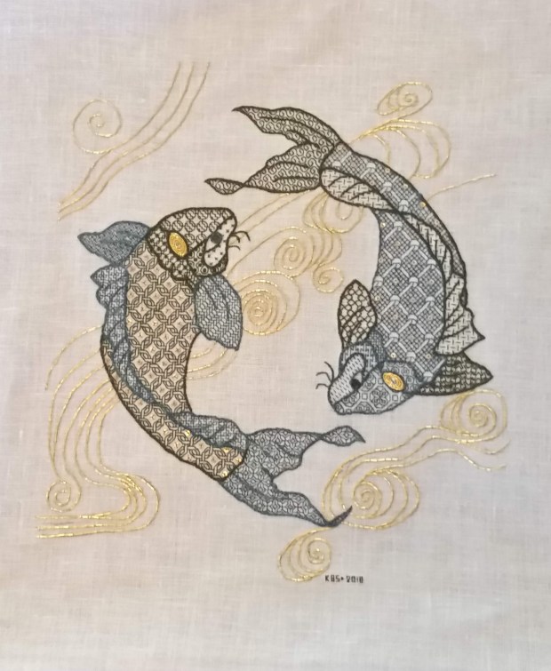
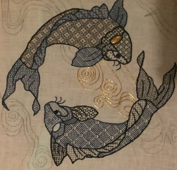
FINISHED!
The stitching on my Two Fish piece is now complete. The only things left to do are to iron out the pleats from mounting on the stretcher bars, and having it framed. 
And a close-up:
For those who wanted something to better illustrate the scale of the stitching, here’s a standard US penny on the work:

For the record, the recipient is so pleased with the thing that we’ve decided to keep it here in the house, rather than consigning it to the beach place. Eventually, after framing, it will end up in our bedroom.
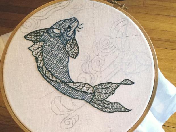
SWISH BY SWISH
I continue to make slow progress on my Fish piece. Again, I plead the heat, the general malaise it creates, my unwillingness to sit under a hot halogen work light, and a reticence to stitch with sweaty fingers. But as you can see, I’m almost done with the center area gold water swirls. Just a few “echo lines” are left to add to the group below the head of Fish #1, then I will have to advance the scroll, to get the remaining bits at the top and bottom. (Swirly lines that currently go off the edges of my stitching area have been saved until the work area is realigned, even if they go over by just a little bit.) And of course, sign the thing with my initials and the date.
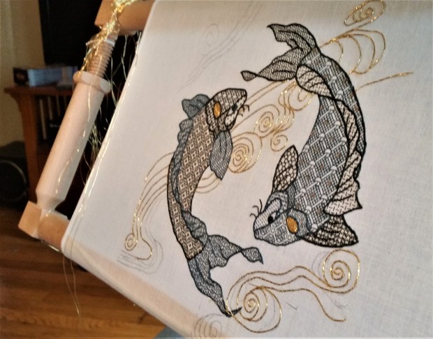
I do like the way the spirals of gold in the head spots turned out.
More answers to inbox questions:
Where did you get the gold and sequins?
The #5 imitation gold thread came from the Japanese Embroidery Center, in Atlanta Georgia. The 2mm gold tone pailettes came from General Bead, in San Francisco. Both were ordered off the ‘net sight-unseen.
How are you sewing down the gold?
Standard simple couching, of two strands held together, flat and parallel (not twisted around each other). I’m using one strand of gold-tone silk, heavily waxed, taking little stitches across the gold. The stitches get closer together as curves are formed, and further apart on the straight runs, but generally don’t exceed about 5mm (3/16ths of an inch) apart.
The no-hands frame is an absolute must for this type of work. I hold the gold and bend it into a curve to match the sketched lines with my left hand, then use the right to form the affixing stitches, taking care not to pull so tightly that I deform the line. After the length is stitched down and the end cut, leaving about 3/4 of an inch on the surface, I plunge them to the back. I do this with a heavy, antique needle threaded with a loop of strong carpet thread, and lasso the ends, pulling the loop gently around the waving ends, then quickly yank them to the back of the work. After I finish an area I bundle the plunged gold ends as neatly as I can, mostly trying to keep the resulting bits small and camouflaged as much as possible. Note that on shortest line segments care must be taken when plunging NOT to end up pulling out one or both of the stitched down gold strands. Much colorful language ensues when that happens…
How will you finish this piece off?
I really don’t know. I don’t want to do a fabric scroll or hanging style finish on this one. Although that would be congruent with the subject matter, I feel it would be too cliche, and take up too much space on the beach place wall where we intend to hang it. Instead I may opt for a spare non-matted/no glass modern frame. Possibly a near-invisible thin black one. But in any case, I suspect I’ll splurge and have this one done by pros instead of my usual dinking around above my competence.
What’s next?
Not sure. I still have a stitch-itch, although I have a couple of projects lined up to knit once fall weather kicks in. Possibly a return to my big green sampler, now that I have a reliable stand for it. Possibly a smaller something-else.
SLOW PROGRESS IS STILL PROGRESS
Inching along here on my fishies. Yes, did end up getting the Lowery stand last week:

I really like it and am glad I splurged when I did. For those looking at the photo, trying to parse it out, the stand itself is the grey metal armature – from the heavy base plate, up to the gripper jaw holding on to the wooden cross piece, to which my stitching frame is attached.
The wooden piece with its grasping flanges that engage my frame is a supplemental purchase – the “Long Frame Extension.” I strongly recommend it if you have a Millennium or other scrolling frame, especially if it’s large/heavy, or has wide bars. Because the stand clamps down on the solid wood of the extension, I do not have to worry about overtensioning the jaws and harming the delicate stretcher arm, with its reamed out internal screw threads.
Now, as to actual progress, it’s been hot, and since I sit under a halogen work lamp, and we are not air-conditioning-enabled – I admit slacking off on most hot evenings. In response to questions about my comfy chair, I post this photo, complete with orb-of-the-sun heat-source mini floor-lamp, Morris style recliner, and frame (supported by its new stand.)
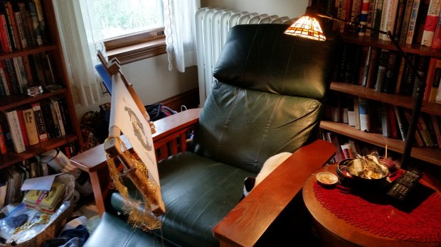
No, that’s not a real cat in the chair. It’s a conveniently sized stuffed-toy cat, liberated from the kids’ collection. It serves as a nice, soft supplemental elbow rest. You can also see the embarrassing midden of supplies and in-progress projects, heaped into baskets between the chair and the bookcase, and the ever-encroaching box of on-deck items that is slowly taking over the small table.
The floor stand’s foot is tucked underneath my chair, with a couple of bricks on it for good measure. The extra weight allows me to swing the frame out of my way like a door, so I can exit the chair without having to move the entire set-up, or shimmy under it.
Finally, here’s the paltry progress itself:

I’ve added sequins to the previously un-sequined Fish #1, who was feeling very jealous of Fish #2’s bling. The light is angled to make some of them sparkle, but there is a sequin in the center of each grid area in the body. I’ve also made progress on the gold whorls. Next are finishing the couched gold lines above Fish #1, doing the spot on his head, and starting on the whorls below him. Eventually I will have to scroll up and down a tiny bit to access the remaining swirly bits at the very top and bottom of the piece.
And then I’ll be done.
Next project? Not sure yet. I have a couple in mind. Possibly return to Big Green. Possibly another smaller sampler. Possibly a cushion to replace the stuffed cat. Maybe playing with tambour and wool… There’s no need to rush, I’ll be working finishing up my koi probably until September.
GOLD FISH!
After an annoying lapse of personal preparedness, I am now back from vacation – at home where I left my gold thread. Sadly, no fish-stitching happened during my break because I was without it.
Goldwork is temperamental, exacting, and oh so rewarding. I don’t pretend to be very good at it, especially compared to The Masters. I bumble around at best.
I did play with metal thread embroidery decades ago, when I first encounted the SCA and began looking into historical styles. I did couched work, direct embroidery with passing threads, and or nuée – a style that involves laying the gold threads across the entire width of the image-to-be, then overstitching it with colored threads to create pictures, almost in raster style, that glimmer as the gold peeks through. But I had a goal back then – to advance embroidery in that organization, and all of these styles have a high learning curve. Happily, I stumbled across blackwork – something that’s easy to learn and easy to teach. I haven’t climbed back out of that hole in the years since.
Back to the project at hand – it’s clear that hooping over gold would destroy it, so for this phase of the work I have moved Two Fish to my flat frame.
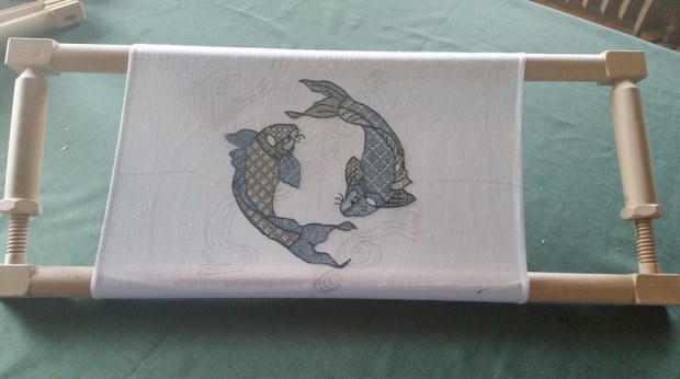
The rather unusual scrolling flat frame is a Millennium from Needle Needs in the UK. It’s a bit on the pricey side, but worth every penny. Although the design isn’t centered in this early fit, I do not think that the minor bit of scrolling I may have to do will damage the work – for example, there’s no point where I would have to lap stitched fabric entirely around the top and bottom bars.
It became evident very quickly that an extra hand would be needed to do this part of the project. Or two. So I hauled out my ancient Grip-It floor stand. I prefer a side stand rather than a trestle or tilt-top support that sits in front of the worker, and but side-supports are hard to find.
Ancient Grip-It works ok, but its main two drawbacks are that is easily overbalanced by a large frame like this, even when front mounted; and that the jaw is wimpy and doesn’t hold very well – and at the same time, I am concerned about pressure it puts on the finely turned wood sidebars of the Millennium. Here’s my sadly overmatched Grip-It in action on an earlier piece on this same frame. You can almost hear the joints squeaking as it strains to keep itself upright. To be fair, since I sit in a Morris style chair as I work, the off side of the frame does get extra support from my left side chair arm.

I’m on the hunt for a replacement floor stand, so if you have a candidate to recommend, feel free to post a comment.
As far as the stitching itself goes, I’ve begun. Even with the floor stand, I find I need additional hands.
I want hand one to manage the stitch-down thread (one strand of gold-color silk floss, well waxed) poised on top of the work; one hand to receive the stitch-down thread’s needle below the work; one hand to provide gentle tension on the gold threads to keep them flat and even as I go along; and one hand to manage a laying tool to keep the two strands being couched in flat alignment to each other, and not crossing over each other. That’s two more hands than I currently have…
I can double up the stitch-down needle hand, stabbing the thing into the work on each stitch, then re-positioning the hand above or below and drawing the thread through the ground; but I haven’t found a graceful way to tension and direct the gold yet. Since I haven’t worked this way in over 20 years, extensive re-training/re-familiarization is needed, and the going is slow but steady.
SHINY!
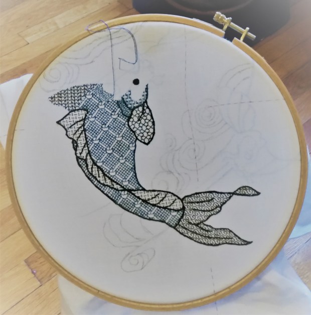
I know there are people who want updates on the Two Fish project. Here’s progress as of last night:

Just two more count-filled areas to go – the cheek between the eye and the gills, and the far fin. The cheek fill will be relatively light, and the fin, much darker than the rest of the fish, but I haven’t picked out either one yet.
Most obviously – I couldn’t wait. Since I don’t plan to relocate the hoop before I end up taking it off altogether and moving to my flat frame, I decided to add the sequins.
As per my earlier random thoughts, I sewed down one 2mm flat gold pailette in the center of each interwoven O shape in the body fill. I attached them using one strand of well-waxed gold tone silk – three stitches per pailette. I’m very happy with the look, and only lost a few that refused to cooperate, skittering away under my chair. If I were to do this again, I’d probably make a muslin cover for a squishy rectangular sponge, and scatter the sequins on it, then use my needle tip to pierce the center hole and pick up each little circle as I needed it. Putting a bunch in a dish, then trying to fish them out one by one with large, clumsy fingers was not efficient.
For reference, the extra-tiny pailettes aren’t a big-box-crafts-store item. I found them on-line, from General Bead in San Francisco. Their 2mm stock is very limited – a vintage assortment of various sizes and colors, made in the 1980s.
I’ve also gotten a start on the heavier outlines. I’ll add the overstitched details to the fins and tail after that. For a while I thought I might render those details in ecru silk, to match the ground fabric color, but I decided that it would be jarring to do that for one fish but not the other. The pailettes are enough of a differentiator between the two. I’ll use blue for those lines, to match the fin/tail color of Fish #2.
Unusual Stitching Gadget/Tool Report
The other bit to report is a rather unorthodox method of remediating crocking – the unwanted transfer of color from the thread to the ground fabric (or the stitcher’s hands).
The deep blue floss silk I am using is an experimental item, an early try at hand-dyed indigo by my Stealth Apprentice. She shared a sample from her initial trial run with me, to see how it worked, and to get feedback to improve her product. But even though we determined that she needed to improve color-set on subsequent batches (which she has done, with excellent results), I am too frugal to let anything go to waste. So I began this project with the beta-test silk.
For the most part, I don’t mind a small amount of crocking on this project. I think it adds to the watery look of the fish. But there have been a couple of mistakes and false starts on my part, where I have had to pick out stitches done in indigo. Those corrections left substantial residue on the cloth. So… How to get rid of the deep blue smudges without harming the already-stitched work? It’s obvious that water-based solutions aren’t going to help. They’ll just float more dye off the threads.
So I hit on an improvised solution.

Yes, that’s Silly Putty. Thinking back, I remember spending lots of time pressing Silly Putty onto newspaper comics pages, to lift images that could be stretched in laughable ways. If it could attract and hold ink from newsprint, might it be able to lift the surface dusting of indigo color from my ground cloth? Maybe…
Looking over the specs for chemical composition and the on-line Materials Safety Data Sheets (MSDS) for the components, it looked like the worst I’d be risking was potential deposit of oil. So I tried it on a scrap of fabric, and saw no oily residue.
I decided to go for it. Using the plastic eggshell underneath to support the fabric, I pressed the Silly Putty onto the smudged area, then quickly lifted it straight up (no scrubbing or “erasing” movements). The goal was not to let it linger on the cloth any longer than it needed to.
While this didn’t work perfectly, three or four quick blots did remove enough of the smudges to even out their tone with the rest of the surrounding area. The blotted area is the part of the back fin, the center of the back fin section closest to the tail.

Under magnification I can see no bits of Putty left in the cloth or in adjacent stitching, nor can I see any oily discoloration. Now that’s not to say that in 100 years (if this piece lasts that long) the blotted areas might not appear extra dirty or otherwise affected, but I won’t be around to do that bit of textile restoration, so for me at least, it’s a win.
Would I try the Silly Putty Solution again under similar circumstances? Probably.
Do I recommend it unconditionally? No. I caution that you carefully weigh possible risks prior to using it on a valuable piece of your own work.
ONE FISH, TWO FISH. GREEN FISH, BLUE FISH.
Some progress on Fish #2, plus some more answers to questions that arrived after the last post.

I’ve started on the main body section, using yet another fill from Ensamplario Atlantio.
How do you know where to put the patterns?
I’m not sure whether you are asking how I know which pattern to pick, or how I place them in their designated spot, so I’ll answer both.
Remember, in the last post I answered that I pick fills on the fly, and that occasionally I pick the wrong one? Here’s an example – the first design I attempted for Fish #2’s main body section, shown just before it disappeared forever:

Yes I went back and teased out this bit that I stitched on Friday night, replacing it with the intertwined Os. I originally chose the discarded fill because I wanted something light, but I didn’t like the effect of this flat lattice as the finished bit grew. It was too static, and in a large area, would have been very boring. Plus, it would be difficult to achieve the visual offset that I used on the other side of the spine in Fish #1. So I went looking for a slightly larger yet not too dense replacement.
The intertwined Os work. But as I sat stitching over the weekend, I had an idea (warning – they are usually dangerous). Those centers of the Os? Think of how nifty they’d look and how blingy Fish #2 would be if each center was spotted with one tiny little 2mm gold spangle like this:

I’ve found some, but they come in a couple of different gold tones. I am waiting for my wave lines gold thread to arrive, then I’ll try to get as close to it as I can with the spangles. I won’t be working with that thread or the spangles until all of the blue and green bits are finished and the piece is safely mounted on my larger, flat frame. And that can’t happen until after the coming weekend because I have promised to lead a beginners’ blackwork class in Rhode Island, and I want to have my Big Green Sampler on display using my big scrolling frame.
How do I decide where in the spot to place a design? It depends. Most of the time I look at my shape and find the “meatiest” part. In a square that’s easy – it’s the exact center of the shape, but for oddly contoured areas, it’s not always the geographic center. Then I look at my chosen fill and find the bit of it I want to emphasize. I center the element of the design I want to emphasize at the “meaty” point, and work from there out to the edges of my chosen shape.
Here are a few examples:


In the first red sample, I’ve more or less centered the fill in the shape, starting with the little flower in the middle In the second, I placed the first acorn I stitched so that there would be one full, uninterrupted iteration of that motif, then completed around it according to the fill’s motif spacing. In the gears, knowing I couldn’t get an entire dragon in the shape, I tried to place at least most of one in the upper left first, knowing that the eye starts looking there. As a bonus, you can see that I tried to roughly center the circles-plus-flowers motif in the maroon gear to the dragon’s right. I started that shape’s fill with the twined edges of the interlace immediately above the gear’s center hole.
How do you get such crisp lines and corners?
First, the silk I am using is longer staple and less fuzzy than cotton floss. The red samples above are DMC cotton, and you can see the halo effect around each stitch. Second, I I also wax my threads rather aggressively – even silk. This compacts them and makes them more difficult to pierce. Since each stitch is so short on 40 count linen (20 stitches = 1 inch), loss of sheen and coverage from waxing is not a problem.
I’m using double-running, with occasional short hops in “heresy stitch” to avoid getting caught in a dead-end. Once I’m done the back of this piece will not be visible, so I am not taking pains to make it totally and completely two-sided. However, I do use double running logic for the most part, for better thread economy and to avoid possible show-through that results from long hops across the back.
As I’ve described before, I use a blunt-point needle to avoid piercing the threads of my ground cloth, and never take an over-two stitch: one unit on my chart = one stitch, at all times. While others do use a sharp to pierce the stitching thread, I find that I don’t like the look produced by piercing previous stitches: it’s often bumpy. I prefer the butted-end-to-end look I achieve with a blunt.
You know this isn’t historical blackwork, right?
Yes, I know that, and I never claimed that it was.
Blackwork is a portmanteau term that covers many, many substyles of high contrast work, often but not always done in monochrome. There are counted substyles and non-counted ones. Some are single color or limited color range works done strip-style, counted or uncounted. Some use abutting areas, each clearly outlined, and filled with various stitched treatments, occasionally but not always geometric, and not always done on the count. Some use stippling as shading either inside or outside of their motifs. Some of those rely on tonal variations to give the piece a three-dimensional feeling, and some don’t. And there’s a whole school of modern blackwork that dispenses with outlines altogether, and uses the tonal density of the patterns – sometimes sticking to a limited number of base designs with modifications, and some using a wider range of fills to achieve a range from light to dark. This last group draws inspiration from engravings and lithographs to make intricately shaded and modeled images.
What Fishies shares with historical styles are the use of heavy outlines, metallic accents, and geometric, counted fills. What it doesn’t share is subject matter – this is a Japanese-inspired, quasi-traditional composition. Also, the complexity of the fills I favor is not particularly well documented. Historical inhabited blackwork tends to simpler fills than the wildly detailed ones I often use. I do note that the body fill for Fish #1 WAS adapted from a historical source – from a sleeve shown in one of the late Elizabethan era men’s portraits, that – of course – I can’t lay hands on right now.
Happily I have no pressures to abide by covenants of historical accuracy for this work. I’m having fun. End of story.
Any other questions? Feel free to post them here as comments, and I’ll try to answer.
SWIMMING ALONG
More progress has been made on my Two Fish blackwork piece.
I’ve gotten more questions about how I go about doing these. I’ll try to answer them here, rather than piecemeal by message. If you have additional questions, please feel free to post them in the comments. I’ll sweep up all that lands there, and then answer them in the next Fish post. First – today’s progress:
And the questions….
Where can I get this kit?
There is no kit, it’s an original composition of classic elements that I am designing on the fly. I won’t be publishing a chart for the final project, or releasing it as a kit.
Original? How?
The Resident Male had mentioned a two-fish embroidery a while back, so I started by looking at a few on-line images of swimming koi. Here’s a post about designing original projects drawn from various sources of inspiration.
Using the freeware GIMP graphics program, I adapted a couple, starting by tracing some, then merging them to blend parts together, simplifying details, changing proportions, increasing the spine curvature, and tweaking angles – until I had a fish I liked. Then I flip-mirrored it so that I had two fish circling each other. After that I added the “water lines” behind the pair – adapting them from the bit below (from a book of traditional Japanese wave and ripple designs – Ha Bun Shu, by Yusan Mori, circa 1919), also traced, augmented a bit and then enlarged.

Once I had the whole thing drawn out, I sized it up to be my desired dimension, using the GIMP resize feature, and printed it out on paper.
How did you prepare your cloth?
I selected a piece of 40-count linen, cut a square about 30% larger than my target design dimensions, hemmed all four edges, and basted guide lines to help me identify the center point. On this project I am picking out those guide lines as stitching encroaches on them. I’ve got no need to keep them intact because nothing depends on placement against them. For the record, I’m working my fills over 2×2 threads – 20 stitches per inch.
How did you get the drawing onto the cloth?
I used the poor-girl’s light table – a big window, and a bit of painters’ tape. I took my resized drawing and taped it to my dining room window, then centering the basted lines of my already-hemmed and center-identified fabric over the marked center of the on-paper design, I taped the ground cloth to the window on top of the paper pattern. This is the same method I used for my Ganesh project, although I had just Scotch Tape in India:

Then I traced the design onto the ground using a bunch of pencils I had to hand – some washable pencils intended for cloth marking, some not. I’ll probably regret not using Proper Pencils, but the urge to get going does not always wait until optimal supplies have been secured.
Did you graph out the whole design?
Nope. All I transferred to the cloth were the outlines. For inhabited blackwork (the substyle that uses outlines plus fills), I never graph out the whole project. Once the outlines are on the cloth, I work my fillings right into the spaces indicated, if needed, by looking at a sample of the design, either on another cloth or on paper.
At the time I did the tracing, I had absolutely no firm thoughts about colors, fill designs to use, thickness of outlines, or how to work the water lines. I knew I wanted to use a hand-dyed indigo silk, and possibly some couched metallic thread, but that was it.
Where are the fills from? How do you pick what fills to use?
In truth, I have no idea which fill I will use for any particular spot until I am ready to stitch it and make my selection. Most of the fills I’ll use on this piece are in Ensamplario Atlantio, my free eBook of blackwork geometrics, but I may draft up more or tweak existing ones as needed.
In this case I started with the largest area on the darker of the two fish. I wanted something vaguely reminiscent of scales, but with more interest. I thumbed through book and hit upon the knot design. For the other side of the fish, I used the same fill, but offset it, to imply movement (mating the design across the fin area would have made a flat, static composition). I wanted the tail to feel “swishy” so I chose a design with a prominent swirl. For the back fin, I chose one of the lightest fills, for contrast. The fin behind the fish uses a darker effect fill than the fin in front, again to add depth. And so on.
I try to scale the chosen fill to the size of the area where it will live. Big areas get the largest, most demonstrative fills. Small areas get smaller repeats. Sometimes though I’ll violate this, if a larger design has a smaller sub-element that will fit entirely in the current space – like picking one strawberry out of a larger repeat and using just that.
Do you ever pick a fill you regret later?
Sure. Sometimes a fill does not show to good advantage next to its neighbors. Then I pick it out and try again. But this doesn’t happen very often.
What about the outlines?
I almost always wait to embroider the outlines until all of the adjacent fills have been completed. This gives me a bit of time to be satisfied with the fills as worked, and lets me cover up the edges where fills meet. It’s MUCH easier to cover up than to work flush to a pre-stitched outline, especially when the fill may require a half-stitch at the edge for complete coverage.
The exception for this was my Forever Coif. Instead of drawing the design on my ground, I used cross stitch to lay down my outlines (based on a familiar design, charted in my New Carolingian Modelbook), and then in-filled the to-be-stitched areas with geometrics. Finally, I over-embroidered my cross stitch outlines to make them heavier and more prominent. The original cross stitching does not show:
On Two Fish, I am using mostly reverse chain stitch for the outlines. The thinner accent lines inside the fins and tail are split stitch. Differences in line thickness are achieved by using different numbers of floss strands.
Color? Heresy?
Why not? This is an original, modern piece, done using styles and techniques inspired by historical stitching. There are no Embroidery Police waiting to ticket me because I am using multiple colors.
I started out intending to only use the indigo – a product dyed by a friend of mine. While I love the look, I decided I wanted to play with an additional vector of contrast, so I liberated some commercial Au Ver a Soie Soie D’Alger from my big green sampler project and began experimenting. I liked the additional depth it gave. I may do the other fish as a tonal “opposite” to this one – a traditional treatment of the two-circling-koi motif. If I do, I may swap placement of the colors as well as changing up the density of the fills, so that Fish #2 may have a less dense green body, but darker blue fins and tail.
And the wavy water lines?
Right now, I am still thinking couched metallics. I haven’t decided between gold or silver, or a mix of both. I have some nice silver passing thread brought back from my Paris trip, but nothing comparable in gold, and only a limited quantity of the Sajou stuff. So I have to find the **right** thread for them. That’s going to be tough, with no local sources. I’ll have to rely on recommendations, on-line reviews, and catalog descriptions. Suggestions will be gratefully accepted!
UNHISTORICAL FISH
Just to vex my new readership, I start a totally unhistorical stitching project. Well, not to vex anyone actually. This piece was bespoken by The Resident Male a while back. I’ve thought about it for several years, and decided to finally do it. The ultimate purpose is a piece to hang on the wall of our Cape Cod place, as part of a large collage of sea life art.
The design is based on a double-koi motif, where the fish are circling each other. I began with a clip art of a single fish, and simplified it, changing proportions and angles, and removing detail that would be obscured by my chosen stitching style. Then I mirror imaged and flipped a duplicate of my first fish, placing it opposite it’s sibling, and trying to get them more or less balanced and centered as a composition.
For the last bit – the “water lines” in the background, I thank the Public Domain Review, for posting a link to a book of traditional Japanese wave and ripple designs – Ha Bun Shu, by Yusan Mori (circa 1919). My chosen ripple was taken from page 22.
So, with my inspired-by fish, and borrowed water lines (with some of my own extensions to eke out the composition’s dimensions), I end up with this – already shown window-traced onto my prepared ground:

The ground chosen is an almost-white 40 count linen, hemmed on all four sides. I’ve marked the center with basting lines of old, non-crocking plain old sewing thread. I will be picking them out as I encroach upon them because there is no central guide purpose they serve after aligning the initial tracing. I will be using silks, mostly. Originally I thought I’d be stitching only in a hand-dyed natural indigo, colored by (and occasionally available from) my Stealth Apprentice, but last night I changed gears and have added some commercial Au Ver a Soie Soie d’Alger, in a deep green.
I will be working my two fishies in a combo of styles. The fish themselves will be done in inhabited blackwork, with fills inside strong outlines. I’ll pick the fills on whim as I go along, and possibly come up with some new ones along the way. The fish will not be direct opposites of each other – the inner detail will vary, but one will definitely be lighter (using less dense fillings) than the other, and placement of the blue and green may swap.
Right now I’m toying with doing something different for the outlines, instead of my usual plain old chain stitch. Not sure yet what, but I do want to vary the width of some of them analogous to heavier brush strokes.
The water lines will probably be done in gold or silver (maybe both), possibly simple couched strands, possibly something else. I bought some heavier metallic threads at the Sajou store in Paris, and have been hoarding them for the right project. They may well come into play here.
And the first little bit – a filling from Ensamplario Atlantio, the fourth part:
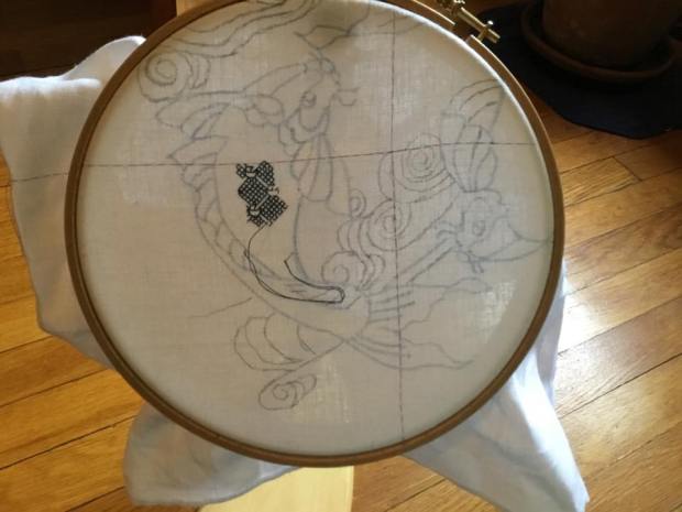
So. Do I have a plan? Kind of. But I still like the fun of designing on the fly.
