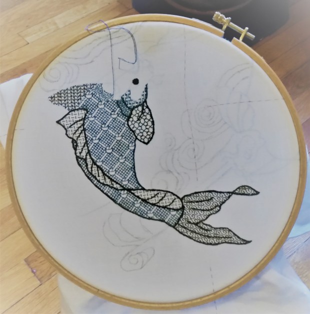
More progress has been made on my Two Fish blackwork piece.
I’ve gotten more questions about how I go about doing these. I’ll try to answer them here, rather than piecemeal by message. If you have additional questions, please feel free to post them in the comments. I’ll sweep up all that lands there, and then answer them in the next Fish post. First – today’s progress:
And the questions….
Where can I get this kit?
There is no kit, it’s an original composition of classic elements that I am designing on the fly. I won’t be publishing a chart for the final project, or releasing it as a kit.
Original? How?
The Resident Male had mentioned a two-fish embroidery a while back, so I started by looking at a few on-line images of swimming koi. Here’s a post about designing original projects drawn from various sources of inspiration.
Using the freeware GIMP graphics program, I adapted a couple, starting by tracing some, then merging them to blend parts together, simplifying details, changing proportions, increasing the spine curvature, and tweaking angles – until I had a fish I liked. Then I flip-mirrored it so that I had two fish circling each other. After that I added the “water lines” behind the pair – adapting them from the bit below (from a book of traditional Japanese wave and ripple designs – Ha Bun Shu, by Yusan Mori, circa 1919), also traced, augmented a bit and then enlarged.

Once I had the whole thing drawn out, I sized it up to be my desired dimension, using the GIMP resize feature, and printed it out on paper.
How did you prepare your cloth?
I selected a piece of 40-count linen, cut a square about 30% larger than my target design dimensions, hemmed all four edges, and basted guide lines to help me identify the center point. On this project I am picking out those guide lines as stitching encroaches on them. I’ve got no need to keep them intact because nothing depends on placement against them. For the record, I’m working my fills over 2×2 threads – 20 stitches per inch.
How did you get the drawing onto the cloth?
I used the poor-girl’s light table – a big window, and a bit of painters’ tape. I took my resized drawing and taped it to my dining room window, then centering the basted lines of my already-hemmed and center-identified fabric over the marked center of the on-paper design, I taped the ground cloth to the window on top of the paper pattern. This is the same method I used for my Ganesh project, although I had just Scotch Tape in India:

Then I traced the design onto the ground using a bunch of pencils I had to hand – some washable pencils intended for cloth marking, some not. I’ll probably regret not using Proper Pencils, but the urge to get going does not always wait until optimal supplies have been secured.
Did you graph out the whole design?
Nope. All I transferred to the cloth were the outlines. For inhabited blackwork (the substyle that uses outlines plus fills), I never graph out the whole project. Once the outlines are on the cloth, I work my fillings right into the spaces indicated, if needed, by looking at a sample of the design, either on another cloth or on paper.
At the time I did the tracing, I had absolutely no firm thoughts about colors, fill designs to use, thickness of outlines, or how to work the water lines. I knew I wanted to use a hand-dyed indigo silk, and possibly some couched metallic thread, but that was it.
Where are the fills from? How do you pick what fills to use?
In truth, I have no idea which fill I will use for any particular spot until I am ready to stitch it and make my selection. Most of the fills I’ll use on this piece are in Ensamplario Atlantio, my free eBook of blackwork geometrics, but I may draft up more or tweak existing ones as needed.
In this case I started with the largest area on the darker of the two fish. I wanted something vaguely reminiscent of scales, but with more interest. I thumbed through book and hit upon the knot design. For the other side of the fish, I used the same fill, but offset it, to imply movement (mating the design across the fin area would have made a flat, static composition). I wanted the tail to feel “swishy” so I chose a design with a prominent swirl. For the back fin, I chose one of the lightest fills, for contrast. The fin behind the fish uses a darker effect fill than the fin in front, again to add depth. And so on.
I try to scale the chosen fill to the size of the area where it will live. Big areas get the largest, most demonstrative fills. Small areas get smaller repeats. Sometimes though I’ll violate this, if a larger design has a smaller sub-element that will fit entirely in the current space – like picking one strawberry out of a larger repeat and using just that.
Do you ever pick a fill you regret later?
Sure. Sometimes a fill does not show to good advantage next to its neighbors. Then I pick it out and try again. But this doesn’t happen very often.
What about the outlines?
I almost always wait to embroider the outlines until all of the adjacent fills have been completed. This gives me a bit of time to be satisfied with the fills as worked, and lets me cover up the edges where fills meet. It’s MUCH easier to cover up than to work flush to a pre-stitched outline, especially when the fill may require a half-stitch at the edge for complete coverage.
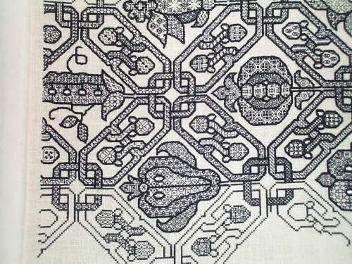
The exception for this was my Forever Coif. Instead of drawing the design on my ground, I used cross stitch to lay down my outlines (based on a familiar design, charted in my New Carolingian Modelbook), and then in-filled the to-be-stitched areas with geometrics. Finally, I over-embroidered my cross stitch outlines to make them heavier and more prominent. The original cross stitching does not show:
On Two Fish, I am using mostly reverse chain stitch for the outlines. The thinner accent lines inside the fins and tail are split stitch. Differences in line thickness are achieved by using different numbers of floss strands.
Color? Heresy?
Why not? This is an original, modern piece, done using styles and techniques inspired by historical stitching. There are no Embroidery Police waiting to ticket me because I am using multiple colors.
I started out intending to only use the indigo – a product dyed by a friend of mine. While I love the look, I decided I wanted to play with an additional vector of contrast, so I liberated some commercial Au Ver a Soie Soie D’Alger from my big green sampler project and began experimenting. I liked the additional depth it gave. I may do the other fish as a tonal “opposite” to this one – a traditional treatment of the two-circling-koi motif. If I do, I may swap placement of the colors as well as changing up the density of the fills, so that Fish #2 may have a less dense green body, but darker blue fins and tail.
And the wavy water lines?
Right now, I am still thinking couched metallics. I haven’t decided between gold or silver, or a mix of both. I have some nice silver passing thread brought back from my Paris trip, but nothing comparable in gold, and only a limited quantity of the Sajou stuff. So I have to find the **right** thread for them. That’s going to be tough, with no local sources. I’ll have to rely on recommendations, on-line reviews, and catalog descriptions. Suggestions will be gratefully accepted!

It’s coming along swimmingly. Nice touch to move the knot pattern to suggest movement. Love the indigo. I hate metallics. Not the look, using them. If I must use them, I use Madeira Heavy Metal. Since it’s made for sewing, it works very well. I use it to sew on beads. It washes well and doesn’t fray.
Thanks for the good words and for the thread recommendation. I’ll look into the Madiera. What I want to find is not something I can stitch with, but a smooth or tightly twisted/cabled passing thread roughly equal in width to six plies of floss (full strand) or even a bit heavier, that I can use for couching. And I agree – metallics are not my fave, either. 🙂
I like that it’s not all black. the colour change from balck to blue is subtle and stops it being opressive
Thanks! It doesn’t show up so well, but what looks black in this photo is actually a very deep hunter green. I tried black, but the green “pops” better.
The green shows up on my screen as greenish grey, and the colour combination works beautifully. Black would have been too stark and discordant against the blue. This really is working out very well – I love your choices for the fill patterns. Question: You are getting very good stitch definition on the 40-count. How does one strand of DMC floss compare in thickness with one of silk? Would the cotton floss give comparable results?
Thanks! The Au Ver A Soie silk floss is roughly equivalent to cotton floss, perhaps a bit lighter, but I am waxing it heavily which compacts it somewhat, and having more loft “slims down” more under waxing than does cotton floss. The small production indigo is less massy than the commercial silk. Two plies of it are equal to one of the Soie. I am waxing that, too.