STILL WORKING ON IT
Apologies that time seems to run ahead between these posts. I have only so many hours of comfortable productive sitting time each day, and I tend to spend them actually stitching, drafting/redacting new designs, and working on my books. Blogging often gets ignored.
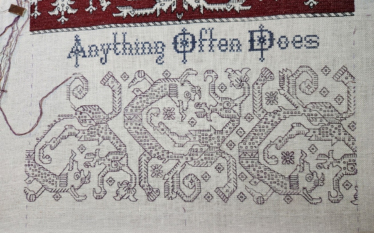
But that doesn’t mean I’ve been idle. Far from it. I finished those two strips at the bottom of the Anything Could Happen sampler (the one honoring The Hungry Judges book by my Resident Male, itself still being written, too.).
Laying the roller bars out flat in the early morning light accounts for the shadows and non-parallel edges. In any case, two things remain – two panels at the top, one of which will be a duplicate of the blue one at the very bottom; and devising the little motifs that go at either end of the motto lines. Once I’ve identified those, drawn them up, and stitched them I can work the yellow step-voiding around them. I can say that one of those spaces will hold my initials and the year of completion.
Which brings us to the top panel. What to put there?
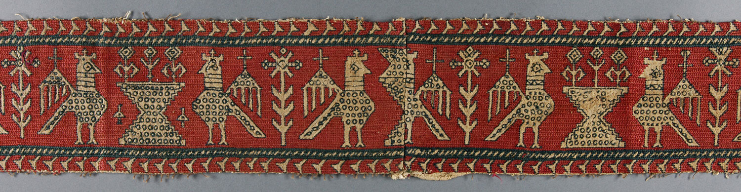
I wanted to continue with my theme of panels from the Azemmour Cluster. Paired birds are very common. I wrote about them a while back in this post. In the larger examples they usually face each other from either side of an urn that sports three plants or flowers. There’s also often a house-like structure with small resident creatures as the unit in between the pairs of birds. But those things aren’t set in stone. Sometimes trees appear, or other birds of various sizes. But one thing all of the bird panels big enough to bear it have, and that’s lots of “chaff” filling the main motifs. Smaller ones often have a token bit of filling, too, but sometimes they are just the bird outlines, with a tree or flower in between them, not quite as rounded and with fewer diagonal stitches than the paired bird panels of early modelbooks, but slightly echoic of them none the less.
Sadly they also tend to be of two sizes – either way too small north-south to fill my available space, or about a third to twice again as tall as the area I have to put them in. So since I wanted birds, I had to draft up my own.
I took inspiration from several of the bird strips in the prior post and tried to incorporate as much as I could of their iconography and general look-and-feel. So armed with my interpretation of the birds, I begin the top with that central urn. This strip will be voided in non-traditional purple to balance out the purple of the monsters strip. A departure, but true to the spirit of the design family, and (I hope) seen as a respectful tribute to the long standing tradition of Azemmour embroidery.

CATCHING UP AGAIN
It has been a while since the last post. But I keep going. After all, I have a reputation for stubborn persistence to uphold.
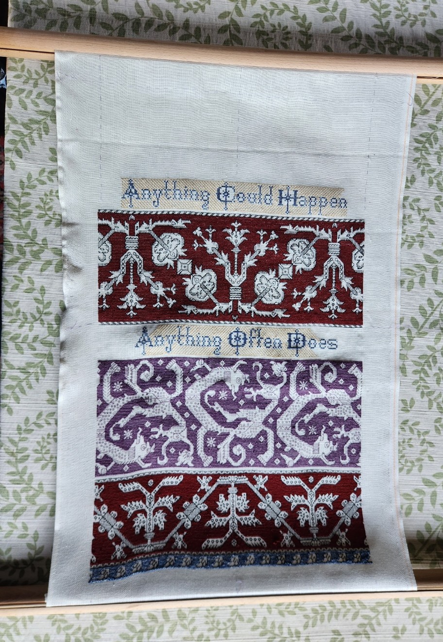
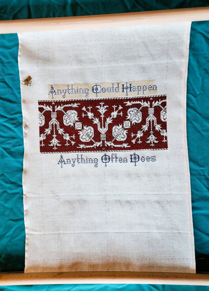
First, here’s a shot of the whole Anything Could Happen sampler, unrolled, as it was just before I began the current strip.
A few things to note. First, there is much less room remaining at top and bottom that needs to be filled. In fact, I have shorted myself. I should have chosen narrower strips than the pomegranate meander and the strange monsters band. I still intend to work a full width strip above and below what’s there, plus a narrower matching border as the final top and bottom framing mechanism – probably in blue. That means I will go over my basted edge lines. I may even have to finish with a hand hoop because I will run out of real estate for the flat frame by the time I get to those final edgings.
Second, the yellow step voiding behind the lettering still doesn’t reach all the way to the side edges. Right now that’s on purpose. The piece is a tribute to the science fiction book currently being written by my Resident Male. Those areas on either side of the motto lines are small, but they are big enough to contain a custom motif or two directly relating to book content. And I might use one or two of them as signature or date blocks. In either case, I will be drawing up new content, and won’t fill in the background yellow until the foreground material has been completed.
Third, that rippled left edge. That’s an artifact of Doing Something Wrong. I had this happen once before, but not for many years. I hand-hem my edges. Occasionally I get lazy and leave the selvedge edge unhemmed. A big mistake. That means that the left and right edges of the piece have different stretch potential (hemming limiting stretch more than the native woven bolt edge). When that happens, distortion, stretching, and fraying can occur. When I frame the piece with fabric as a hanging scroll, I will take pains to do it in a manner that covers up those flaws. Nothing else I can do about it until then.
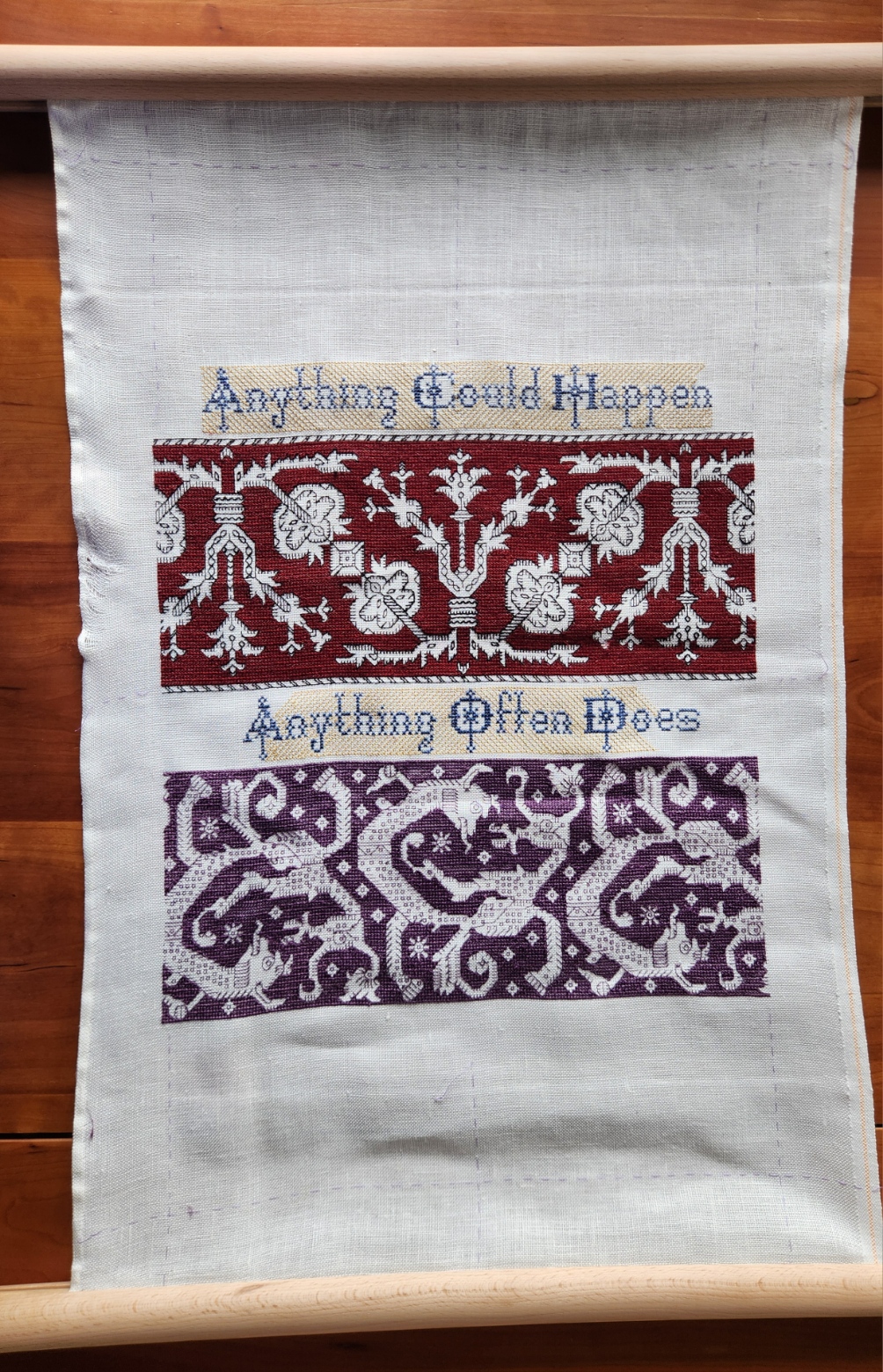
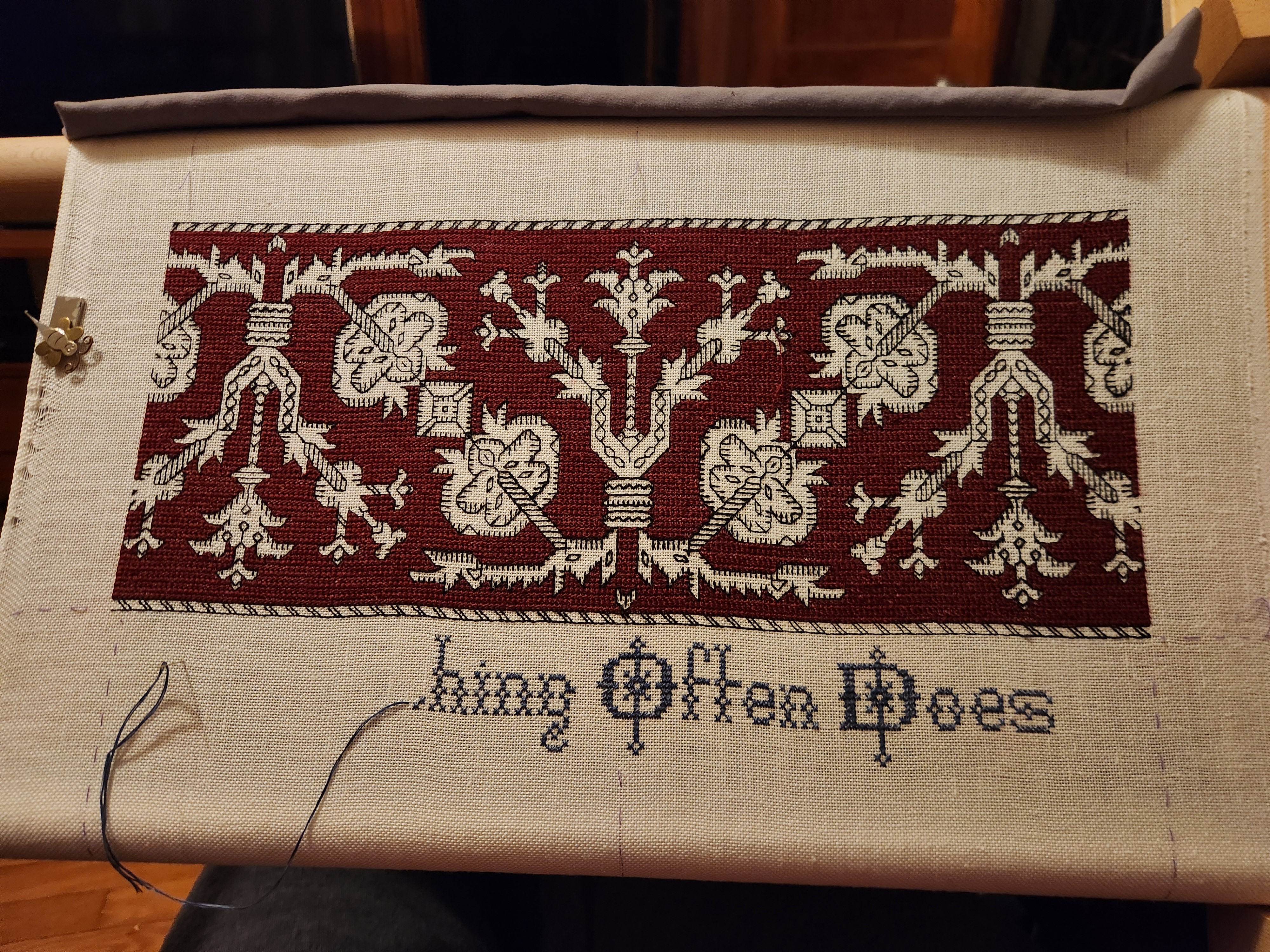
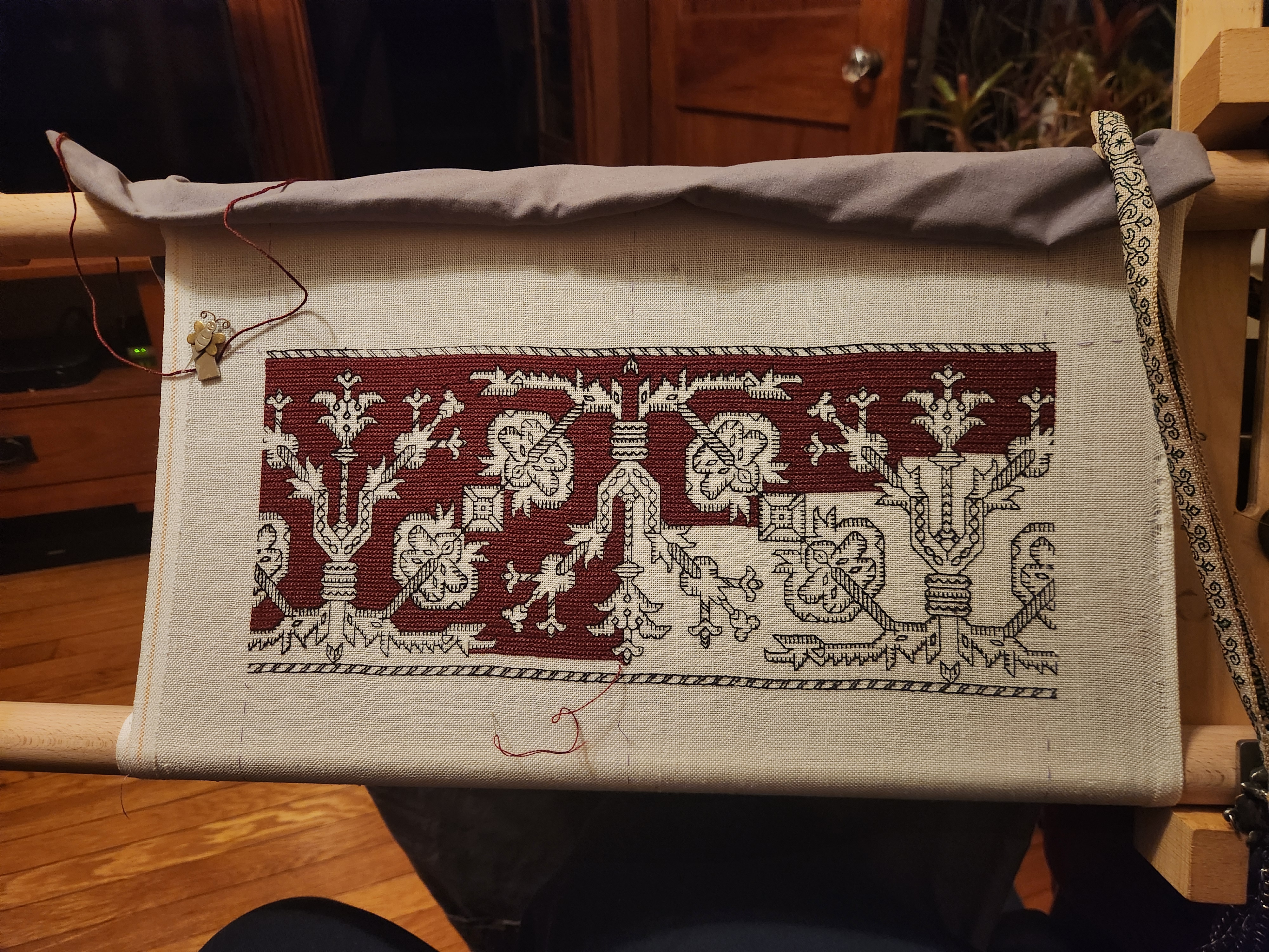
And now we get to the part that you want to see. The latest strip. This one is a play on the Spider Flower I’ve discussed here before. There are many iterations of this Azemmour Cluster design. I included a chart normed from multiple repeats of one of them in my Second Carolingian Modelbook, as Plate 33:4.
This one is being done in black and cranberry, but a bit differently from the obviously related Pomegranate Meander I used earlier (Second Carolingian Modelbook, Plate 34:1). For one, I am now sure that I will have enough thread to do a properly cushy rendition of long armed cross stitch. Using two plies of the Au Ver a Soie Soie d’Alger gives the proper well filled plaited look to the ground. I have also gotten a bit better at splitting and re-spinning the Tied to History Allori reeled silk, so the black lines are more uniform in appearance. Always fun to pick up a new skill.
These designs are both fast and slow to work up. Slower than many double running stitch strips because of all of those little disassociated filling bits that make up the decorative “chaff” inhabiting the foreground, but faster than many others due to the simple nature of the outlines themselves. I admit that chaff is a pain in the neck to do, impossible to terminate individually due to their small size and scattered placement, and annoying to path plan while minimizing skips. But again, I’m stubborn beyond words. One reason I had put off playing with this pattern family for so long was dealing with the chaff. No longer.
Health Update
Obviously I have weathered the latest round of surgery. The last procedure to shave down my cranial chordoma manifestation was quite lengthy – over 21 hours. But it was as effective as it could have been given the delicate location and nature of the beast. Getting most of it means there are leftovers that will be addressed via an aggressive program of proton and photon radiation. So next week it’s back to daily visits to rad therapy for the better part of a month and a half.
I can say that I continue to improve on a daily basis. Right after surgery I was particularly discreditable – a massive black eye that looked like a boxing souvenir, for starters. Lots of other swelling and seam-like scars just inside my hairline. Double vision at distance when I could peek at the world with two eyes; and with the swollen right side of my face, the eye being squeezed tightly I couldn’t open it, little to no useful vision on the right.
Now I look mostly normal.

Stitches are all out, the bruising and most of the swelling is gone. Zero cognitive effects, no headaches, no balance or hearing issues. I’ve kicked the double vision, and the right eye’s useful productivity has returned to my nearsighted normal. Which explains why I was able to finish the monsters and start on the new strip.
My continuing physical improvement challenge is to rebuild strength and mobility. I can get around the house but slowly, but am not quite in the shape to do all the simple chores like gardening I was able to accomplish just a month ago. Again stubbornness works in my favor. I refuse to be defined by what I can no longer do, so every day I work towards making that list just a bit shorter.
MORE PROGRESS AND MAILBOX QUESTIONS
As you can see, I am keeping busy.
I started the yellow double running step voiding behind the lower half of the motto, as promised. I will alternate between that ultra-speedy fill and the long armed cross stitch (LACS) behind my monsters, just for the variety of doing so. But the LACS is not going to be done quickly. Too many nooks and crannies. Plus the thread is less cooperative – very slubby and inconsistent in the splitting. But I will make it work.
And I am more convinced now that I will be designing some small motifs or initial/date holders to go at either end of both upper and lower motto strips, so I won’t be filling in the yellow all the way to the left and right edges until I know what I will be working around.
In related project news, I have indeed re-mounted this piece on my shorter side stretcher bars – the easier for carrying it along with me tomorrow and working on it next week. I’ve also kitted up my Pirate Lunchbox with everything needful, including unbroken skeins in the tangle of magnetic cable ties on the lid; a box for spooled/bobbined thread; a box for orts; extra wax; halfie-reading glasses to overclock my walking-around bifocals (a precaution); a needle case; extra beeswax; and (unseen) a small metal cigarette case that I use to hold cut lengths of thread so they don’t tangle until they are used. Plus my chatelaine, of course, which isn’t shown here in the box because I am wearing it.
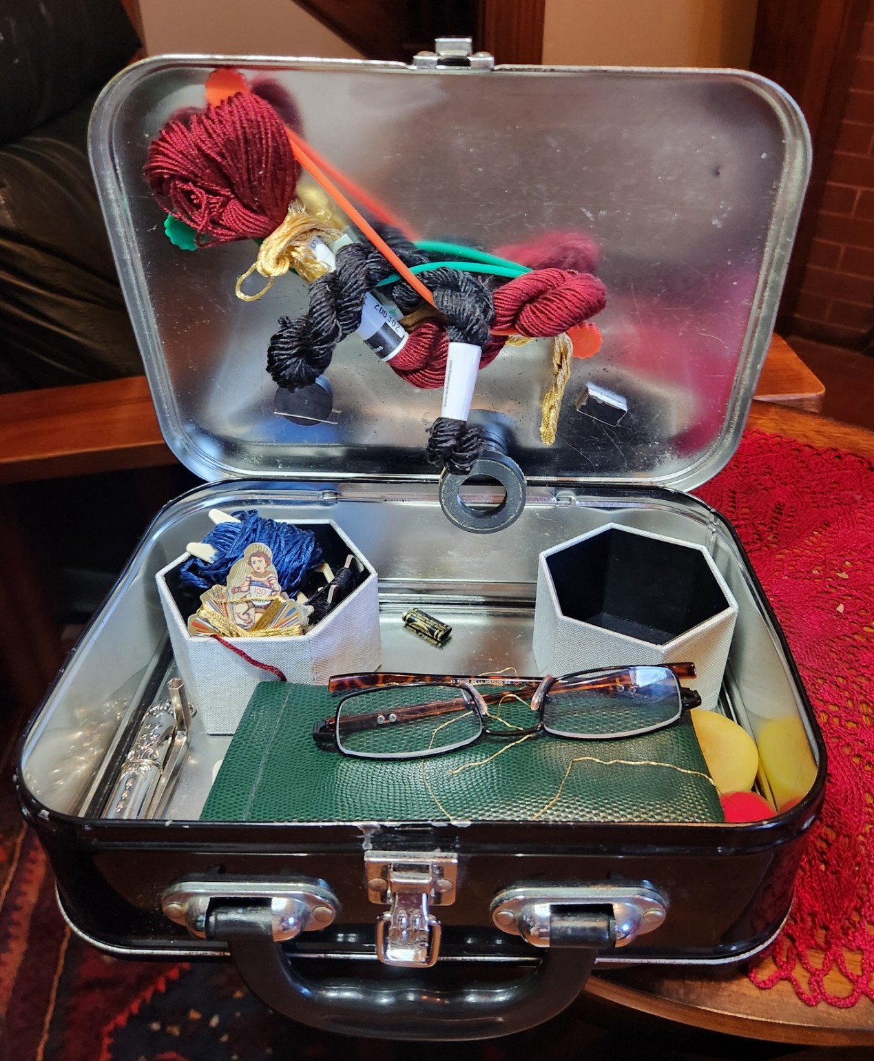
And speaking of the chatelaine, there is a modification. A while back I bought a magnetic backed micro needle threader, shaped like a bee. It wasn’t a chained accessory – just a free standing piece. In a Great Mystery it went missing about three years ago when I took my big coif project on a road trip to visit family in Buffalo. Then it mysteriously re-appeared seven months later on our back porch in Arlington, Massachusetts. I’ve used it ever since. Until Sunday, when I dropped it and heard it rattle through the springs and metal struts under my favorite reclining chair.
We searched and searched but eventually gave up, thinking it was irretrievably stuck in the guts of the chair. And having moved the heavy recliner, did an opportunity vacuum under it. The vacuum must have found it and shredded it because I found wreckage. The decorative bee part was gone, leaving only the stinger/hook. I was sad but not intending on replacement.
However, last year I had bought another threader specifically made for chatelaine use because I found chained/worn tools to be more convenient. It worked nicely for about a month, but the fancy filigree casing enclosed a very fragile wire loop style dime store threader. One really good pull and the wire loop parted with no way to replace it.
Threader hook intact but orphaned? Fancy threader top end intact but useless? A bit of careful excavation to remove the old wire end and hot glue; some gentle prying to insert the hook from the bee threader; some more glue; and we have a new, more sturdy and useful hybrid. Just in time for me to take and use tethered, with little to no chance of loss.
Questions
From my inbox or private mail.
Did you do all those little orphaned squares and bits inside the monsters in double running stitch?
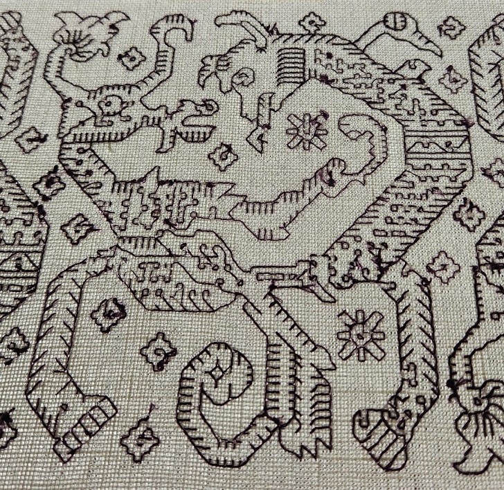
Nope. To terminate for each and every one would have been madness. Instead I tried to path-plan to avoid skips longer than one horizontal or vertical unit, wherever possible. There are a single-diagonal skips if unavoidable. To prove it, here’s a snippet of the back side.
Are you doing this totally double sided? Are you using waste knots to start?
Nope, to both. as you can also see from the photo above, I’m a heretic. I use knots, but I do not depend on the bulk of the knot to anchor the thread. If I am not doing a loop start, I pierce my thread/threads just above the knot as a faux-loop start. And I knot/anchor onto existing threads, then run down the line a bit for extra security to terminate.
Will you post a video on how you are separating and finger spinning the reeled silk?
I apologize, but I must disappoint you. I have none of the equipment, time, talent, nor extra set of hands to venture off into video land. There will be no videos from me on this or any other technique. But I can try to describe it.
My stash-aged slubby Tied to History Allori Bella silk is quite robust. I can’t blame the vendor for the surface fuzz. It might have gotten roughed up in my rather casual storage drawer rather than having emerged from manufacture that way. I will give them benefit of the doubt.
The thick single is composed of four constituent multi-ply strands, but they are often stuck together. I cut a length – usually no more than 15 or so inches (about 38 cm), and try to cleanly tease it in half into two multi-ply strand groups. To do this I employ the smooth tip of my laying tool, and not a sewing needle. Once I have the two in hand, I set one aside and work on the other.
In theory, each of these halves SHOULD be divisible again, to yield two more smaller strands, making up the four specified on the label. One would think that there would be two smaller components to make up each of those. For the entire thread thickness that would logically deliver eight strands for stitching, with each of those made up of two even skinnier reeled components.
But not. Those eight are not always uniform. Some are thicker than others. Some are composed of three, not two reeled sub-elements. And teasing them apart is particularly difficult because when they get this fine the slubs and surface lint that joins them is quite evident. Still, I try to get even thicknesses. Separating out that third sub element if present, and using it doubled if need be, or mixing and matching the others as best I can.
As far as the finger spinning, it’s just twisting it between fingertips. Sometimes under a thumb on top of some rather solid beeswax. The goal is not to coat the thread, make it feel waxy, or shed dandruff – just apply enough to make the surface fibers hold the spin and resist snagging as I stitch.
Health Update
Off to the hospital tomorrow. You may not see posts here for another week. Or you might. I can’t bring the laptop, but I will have some other tech with me. Updates are not impossible, but will be highly dependent on ambient circumstances and available energy. I do wish to thank everyone for their well wishes and support. It’s comforting to know that almost three decades of dedicated babbling on line about stitching, knitting, and other niche pursuits has turned up such a pleasant community of the co-minded.
See you all on the flip side. May your threads and yarns stay untangled, and your stitches true.
MARCHING ON IN MAY
Progress on the glide path to Friday and beyond. First, the follow up on my raised bed garden and my use of the sitting/kneeling bench.

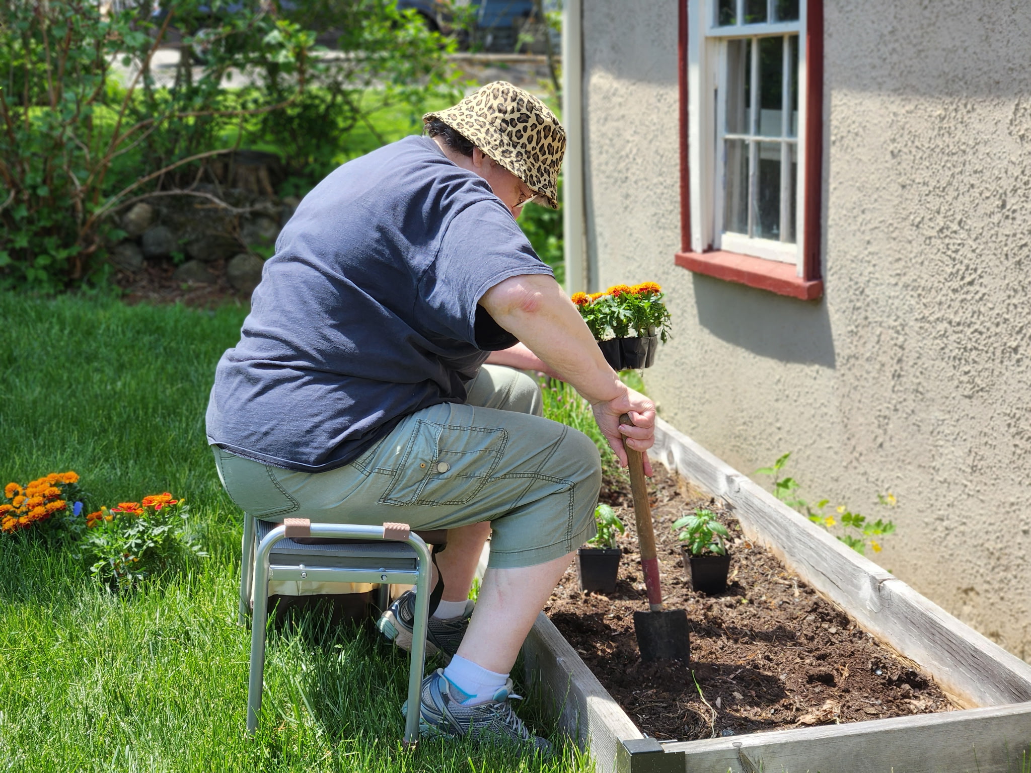
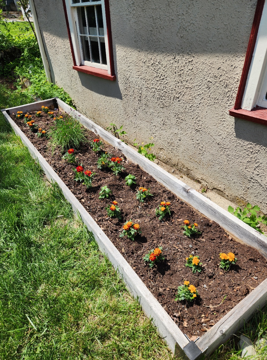
Three types of marigolds, of graduated height and color; plus the survivor chives and a couple of basil plants to balance out the green of the chives. We also added a gerbera daisy to the front yard perennial patch. While those African-origin daisy like plants can overwinter down in Maryland where I grew them before I don’t think it will make it if we have a standard January/February here in our zone. I do plan to pull it before first frost, and (with luck) set it out again next spring. No clue what color it will bloom. I like an occasional surprise.
Progress continues on the Hungry Judges sampler. I’m more than half way done with the final partial repeat of the curious monster panel. My goal is to get that all laid in over the next day or so, and then turn to the voiding behind the lower half of the motto phrase, and the solid fill behind the monsters themselves. The lettering bit will be a matched inversion of the voiding I did on the top line – stepwise yellow, radiating from the center. The monsters get long armed cross stitch in the same purple as the foreground stitching. All of that may take at least ten days of work, probably more.
I really want to work on this piece with me to the hospital. Yes, I will have knitting there. Socks stop for nothing. But I do not stay sane by socks, alone.
Obviously I would not be bringing the Lowery floor stand. Too big, too heavy with the companion bricks needed to balance out the weight of my large frame, too much in the way. To preserve no-crush/no-hooping over the silk, I do want to keep the piece on my Millennium scroller. It only fits on my widest bars, so that will be a test. I do have a shorter set of side extenders. I used them earlier when I did the pomegranate panel, but swapped them out for the longer ones to stitch the wider monster bit. Remounting with those would help somewhat by reducing height. To stitch I could lean the frame against the over-bed utility table common in patient rooms, and work either in the bed itself or in the side lounge chair (leaving the bed to sit up is wildly encouraged). Moving the frame around and protecting it to accommodate meals and other messy things though will take some more thought. Managing the threads, tools and other supplies is easy. My pirate motif metal lunchbox is perfectly able to handle what I need, and being magnetic will hold oddments and tools at the ready.
Other goings on here at String Central are pretty low key. We did have a spot of fun on Sunday. Since the next two weekends will be rather constrained by my upcoming procedure, we went out for a Dim Sum brunch to celebrate my upcoming end of May birthday. A tasty treat, for sure and one of my favorites. Now it’s just resting up, gathering strength and resolve for tumor-reduction surgery at the end of this week.
Health thoughts
And to round out the health musings – some thoughts on steroids. I’m on a relatively low dose program of them right now to combat double vision caused by pressure on a cranial nerve. Not long term damage, just a bit of squeezing that has me seeing oddly at distance. For example, driving is right out because I see a third lane where only two actually exist. So far close work hasn’t been too taxing, but I am glad that I thought ahead and am not working on 40+ count linen for this piece.
Steroids have all sorts of side effects associated with them. Everyone has heard of ‘Roid Rage, where someone (usually an overconsuming athlete) goes off the rails due to medication abuse. And there are others – reports of metallic taste or a general diminution of the ability to taste food; hand tremors; unusual emotions; and the like.
I’m not someone who has ever taken a lot of meds so when something unusual crops up I do notice. I propose a metaphor for how steroids manifest for me. And if you are a long time Star Trek fan, you’ll recognize it. Remember – this isn’t a diagnosis, it’s just a metaphor. After all, fictitious ailments are totally fictitious.
Taking low dose steroids is like having Bendii Syndrome – the made-up malady experienced by Vulcans. It was used in several Trek series as a plot device to present a weakness of that usually hyper-competent people, by limiting their ability to control their emotions and disabling their ability to reason with logic. A Vulcan without logic or emotional stability was deeply troubled, and locked into a personal and societal shame in a way not unlike patients with advanced dementia are in our real world.
Normally I’m pretty stoic. I gloss over the small stuff, the minor annoyances and botherations of daily life. Dropping the toast butter side down. Hitting the wrong key as I type. Overly loud music from a car idling in front of my house. Little things that usually mean nothing. But right now it’s like an extra 15% vexation overage is slathered on top of all such things, so that I notice more than I usually do. No hot reactions, no gusts of anger or frustration; just a rasp of unfamiliar discomfort strange enough to stab a tiny needle into my serene mindset.
I am happy that this med will not be a permanent addition. Once the nerves calm down from the various planned interventions and the double vision is gone (or as a last ditch resort has been tamed by optical compensation) I will be quit of steroids, and all will return to equipoise.
In the mean time I will admire my flowers and plan out my Emotional Support Embroidery scenario as concrete steps to remain serene.
If you can know and name a challenge, you can deflect or defeat it. And I will do so.
CONTINGENCY PLANNING IN ALL THINGS
Obviously I am still at it, working away on the current embroidery, and surfing the health issues management seas.
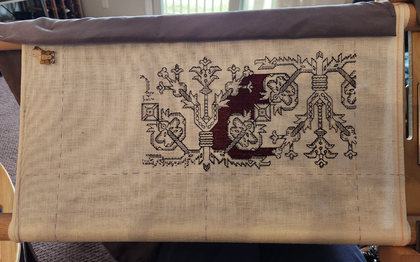
First, to present the size of the piece as a whole, here it is, fully unscrolled. No, that’s not discoloration at the bottom. Just an early morning light shadow.
At 28 threads per inch, these strips are gigantic. The actual margins of my stitched area are barely visible, marked in basting, roughly an inch inside the scroll bar mounts, so there’s not as much usable real estate here as I would normally prefer.
And note that I haven’t extended the yellow step voiding behind the top line of the motto to the margin. I may want to use those small left and right areas for a couple of supplemental motifs, or for signature blocks. I haven’t made that decision yet, so I am keeping my options open. I can always go back and extend that fill later.
But contingency planning here extends beyond the treatment of the ends of that upper text band. There is the possibility that I will face more visual challenges in the coming weeks as I get further into my treatments and as protocols change in the name of long-term efficacy. It being my nature both professionally and personally to always plan for exigencies, I have stepped up preparations to deal with such problems.
First, rather than leaping into the stepwise yellow behind the lower motto strip, I’ve put it off. It will happen, mirrored north south to the alignment of the yellow behind the upper lettering. But that’s easy to see, and super fast to stitch. I can save it for later.
Second, I still want to do some more of the Azemmour Cluster designs. I have a few already charted up in The Second Carolingian Modelbook, but with the broadening of identifications in museum collections, and greater recognition of the group as a cohesive design legacy, I thought I’d go hunting for some other examples – both of the familiar, like the pomegranate meander shown here, and with luck, possibly something new.
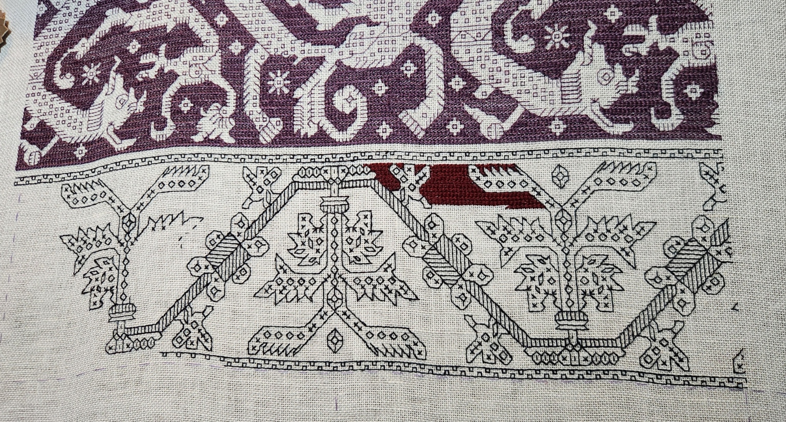
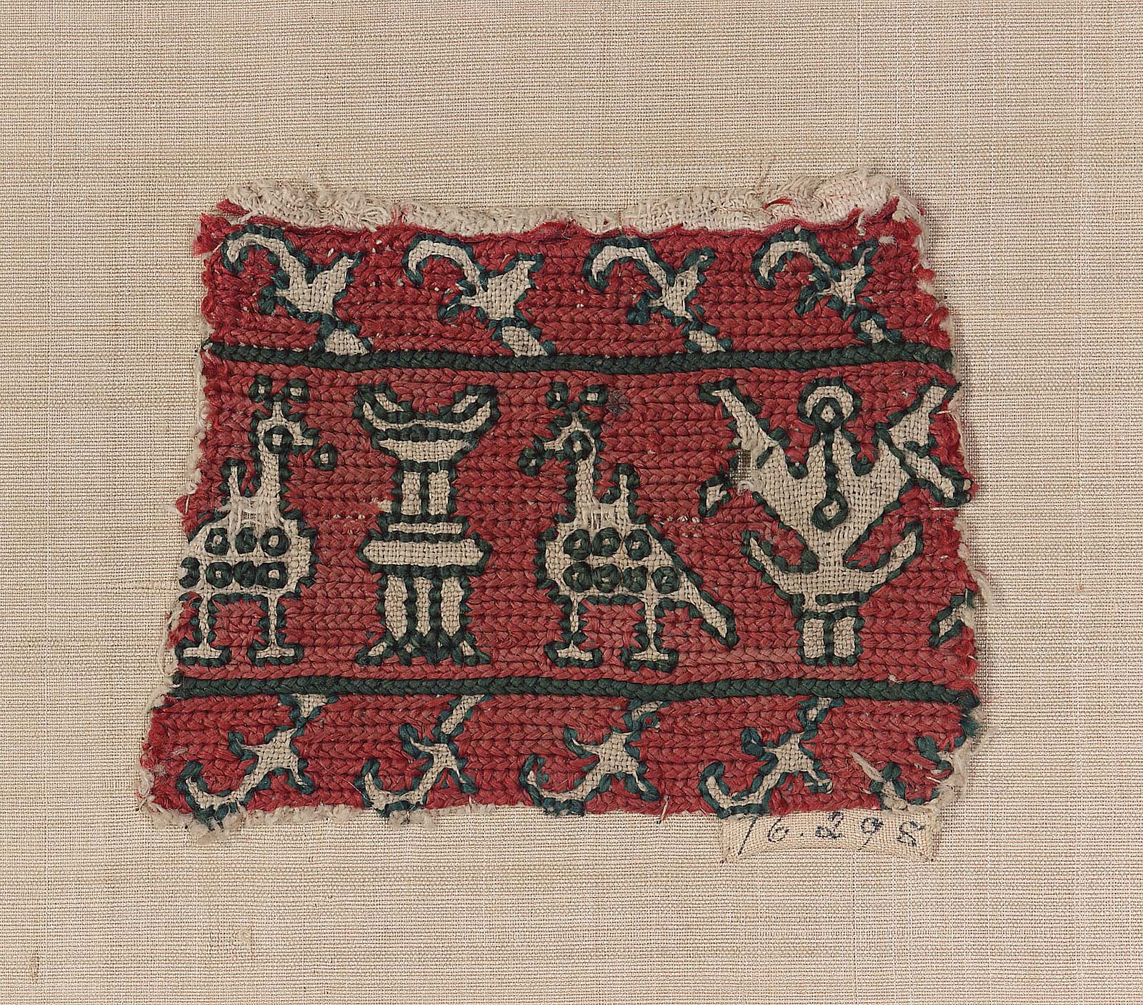
Well, I did find a few examples of things that were brand new to me, but clearly identified as belonging. First is this one – a fragment sold at a Bonham’s auction in 2023. They tag it as Azemmour, and 17th century.
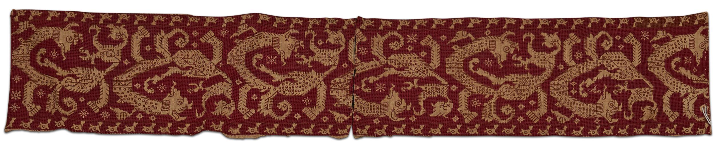
I adore this parade of monsters. For one, I have not seen its like before, yet given the style, interior ornament, and execution, it belongs in the family. Second, it’s clear from the wild divergence of the detail that absolute precision repeat-to-repeat for the person or team who stitched it was rather optional. Those squares and “edge whiskers” that make replication easier to count are far from uniformly worked. And there are also some departures in larger elements of the design as well.
I had to graph it up immediately while I could still squint to do so, norming the repeat as best as I could for my own ease of stitching, even though there will be width for only one full iteration, plus some side bits left and right.
Because of the excessive amount of “design taming” needed to norm this one I have taken more liberties with fidelity than I usually do. I squeaked out my chart and have started laying in the base design. All of the major elements and placements of the original are in my rather broadly adapted version. It will be obvious, proportional and recognizable, but there will be departures, especially in the use of the small filler motifs between the monster bodies, in the placement of the interior decorations, and in minor deviations in the shape of some of the fins and projections. So close, but not exact.
The working method for this one will be different from the claret red voided bit above, and also a departure from the original. The Bonham’s voiding was done in that heavily overstitched meshy treatment I have worked before. That would be a bit overambitious on the 28 count, so I will relax and just do more long-armed cross stitch. But I will stick to presenting the outlines, detail and voiding all in the same color as in the auction fragment. My goal is to lay down as much of the precision rendition as possible, saving the simple background stitching for later. Just in case.
Despite the morning-light color distortion, I am actually using a purple silk here. More of the legacy Tied to History Allori Bella from my stash, split down and finger spun to my desired thickness. Once the yellow goes behind the blue on “Anything Often Does,” I will enjoy having the color play between that color and the purple.
So between roughing in the monsters of certain menace (disclaimer – no actual monsters of this type in the Hungry Judges book, but on here they represent a deeply disturbing aura of major peril central to the plot); and doing the grounds behind the lower half of the motto, and behind the monsters, I feel I have at least three weeks of accomplishable stitching on my dance card, and can outlast any additional temporary visual hurdles.
What other strips am I considering for when these bits are done?
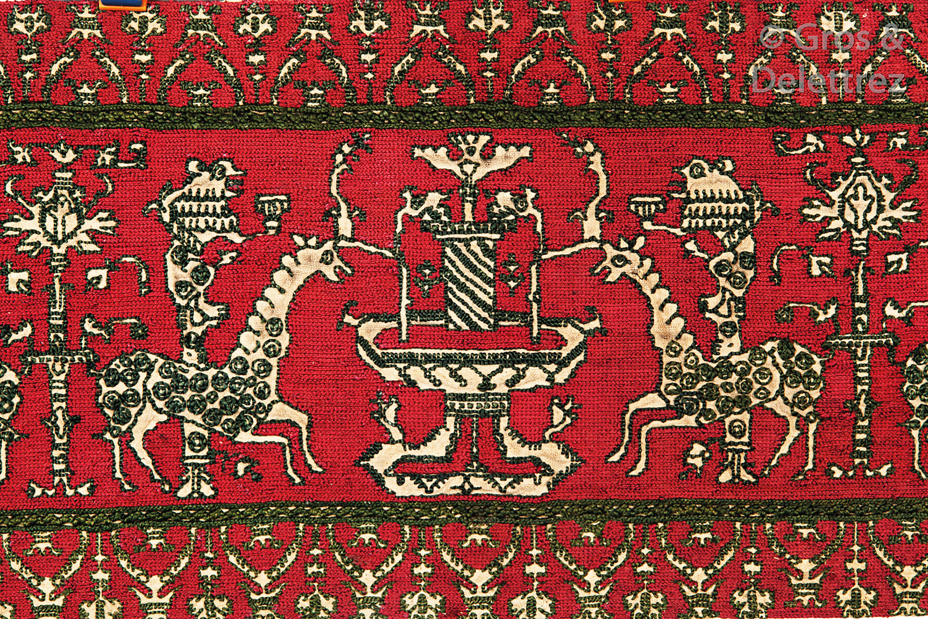
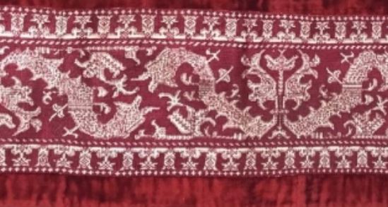
Here’s another auction find from 2019, and a unique composition that I haven’t seen before. Also claimed to be a 17th century representation of the Azemmour style. Not quite sure what is represented. Possibly camel-like unicorns at a fountain. I haven’t charted this one yet. The stitching style of the ground will make that challenging, and I may not have room for it on this piece.
Of course there are the oh-so-well-represented bird panels, the cup sipping/flute playing harpies the fountain panels, the urns, and wide meanders. And more. So much to play with for just this limited space. I suspect that one or more variants of the bird panels will appear. They are narrow and easy to shoehorn in. And I will need to leave room for at least one band of companion border, top and bottom. Identification, selection, color, and execution of course are all open to whim.


Update
After I posted the photo of the strange camel/giraffe/unicorn beasties at their fountain, Stitch Pal Melinda chimed in with photos of a similar strip held at the Los Angeles County Museum of Art (LACMA). Here is the auction strip photo again, and a photo she provided, side by side for comparison (I am hoping she doesn’t mind the side by side). Auction sample on left, Melinda’s on right.
I did go wandering through that institution’s on line photo collection but could not find a citation or page. Even Melinda notes the lack of info on the piece other than the Italy or Spain 1700s notation, which we now now to be not entirely credible.
So for fun, let’s compare. First, it’s clear that there is commonality between the two. The rondel-decorated long neck beasties. The pillars behind them, each topped with a chalice-holding monkey. The central fountains and trees at the other end of the bounce repeat between the animals’ hindquarters. The modes of internal decoration on the design elements. They all do track across.
BUT there is considerable difference in the total representations. This isn’t a case of long-lost-twins where one can say “Oh, look! Someone sold two snippets of the same work to two different customers.” Details are different, with some simplified, some omitted entirely. Spacing between design elements, the proportions and widths/heights of the elements vary between the two. And of course the companion border treatments do not track at all. Particularly curious is the change in scale for the lower companion border in the LACMA sample. That is quite odd.
Can we take any clues here whatsoever from this set of similarities and differences? Posit relationships or dates? Not within my competence. I would guess that there are other examples of this general motif out there somewhere. And that for both of these someone eyeballed copies of the base concept rather than painstakingly transcribed some graphed or stitched “official” root source material. I further suspect that if we were to see a longer sample and follow along the repeats, just like the odd monster I’m working now, we will find that the individual iterations of the design are far from uniform (I can spot some even in the small pieces seen above). And as far as dating, we can’t assume that the change in border scale indicates some sort of later/less diligent manifestation of an earlier more detailed concept. Hard, chemical forensics would be needed to provide clues on which of these two might have been done first.
If my eyesight holds out I will try to chart this. Possibly as a melded average of the two representations. But there’s more stitching to be prepped for the coming few weeks, so it won’t be happening with anything remotely resembling urgency.
And thank you Melinda! Your clever eye and visual memory has made my day. I always enjoy a tumble down a research rabbit hole. All the joy of happy productivity, to you. May your threads stay untangled, and your stitches, true.
WORDS!
Moving right along, and answering questions.
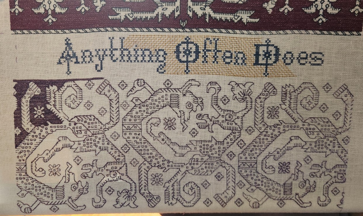
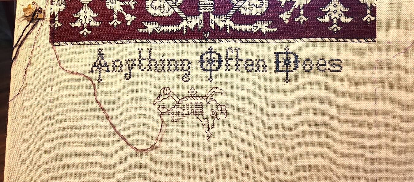
I’ve finished the first panel. I’ve drafted out the motto and it’s obviously in process, too. What you see here is just the second half of the phrase. The first half will go above the completed strip, but I have room to add this part without advancing the scroll, so I am doing it first. And here are some details which should help folk looking for more info.
I am using a combo of two alphabets available on the Patternmaker Charts blog site, established by Ramzi, and apparently now maintained by helpers as well. The bolder upper case letters are from Sajou Booklet #004, but I tweaked them slightly for greater twinkle and depth. I am after all honoring yet another science fiction book by my Resident Male is currently writing. Starlight is appropriate. The lower case alphabet does not line up exactly with the upper case one in terms of spacing and ornament, but again, it has twinkle. It’s from the same site, but appears in Sajou #007. The site has been up for a very long time, and the interface is clunky to navigate but the content is priceless. Booklets indicated by asterisks contain line drawn material. No asterisks means the content is charted.
How did I know to use these together? Guesswork, and reaching way back to being a little kid. My grandfather owned a contract print and engraving shop in the pre-photocopy era. He produced catalogs, advertising material, magazines, books, stock certificates, menus, and lots of other printed matter. While it’s obvious that I didn’t follow him into the family business, I was a curious little thing, and he was happy to show me the fun of type faces, font sizes, leading, kerning, and the way that different typesetting choices and physical presentation can change the way a message is perceived. With his paper samples and layout guides, I always had the wildest written report covers in grade school.
Maybe a little bit stuck from those chats, and from going through his printed examples because I still quest for just the right thing when I compose my motto-bearing pieces. Sometimes I hit the mark, sometimes not. But to this day I always learn from the hunt and the exercise.
What’s the next panel after the words are completed? Something totally new. I’m web-walking looking for Azammour Cluster pieces I haven’t seen before. There are more than there were just three years ago, because the fragments in museum and private hands are being re-evaluated, and the turn-of-the-1900s identifications as Renaissance era snippets sold to collector/tourists are being updated. I’ve found a couple of very interesting ones featuring motifs other than the usual meandering repeats or birds. Charting now. Slowly. Reveal when I have more to show, of course.
And what is the full text of the motto?
Anything Could Happen
Anything Often Does
This can be read in a few different ways. First and foremost is that it is a direct quotation from The Hungry Judges, the novel currently in development, and central to the plot stream.
Yet at the same time, I can see it as a summary statement of my former professional career in engineering/high-tech bids and proposals. That was an endless parade of short term crisis containment and contingency planning – managing overburdened teams striving to meet unrealistic deadlines, spiced with technical requirements that were not always feasible within performance constraints. But I never missed an on-time submission in 42 years, had an enviable win rate, and emerged without ulcers.
And lastly of course, it does echo my current medical predicament. My malady is not something pegged to known statistical associations with genetics, environmental or exposure factors, stress, or lifestyle. Chordoma is so rare that triggers are not understood, yet appears to be a totally random reactivation of the extremely small number of dormant stem cells that everyone retains along their spinal column, going back to our embryonic origins. What wakes them up is a medical mystery.
With my typical attack optimism, I am planning on outlasting this wack-a-mole recurrence, and with radiation and other modalities, continued vigilance and via several promising avenues of targeted antibody and other “lullaby” treatments, return them to secure slumber.
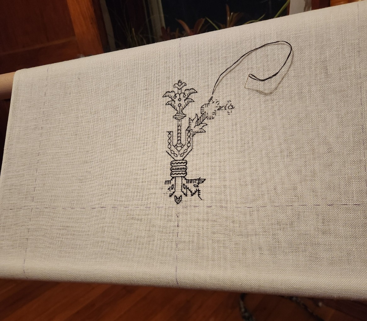
FIRST PANEL FLIP
Moving right along on my latest. I’m just past the point of flipping the frame over.
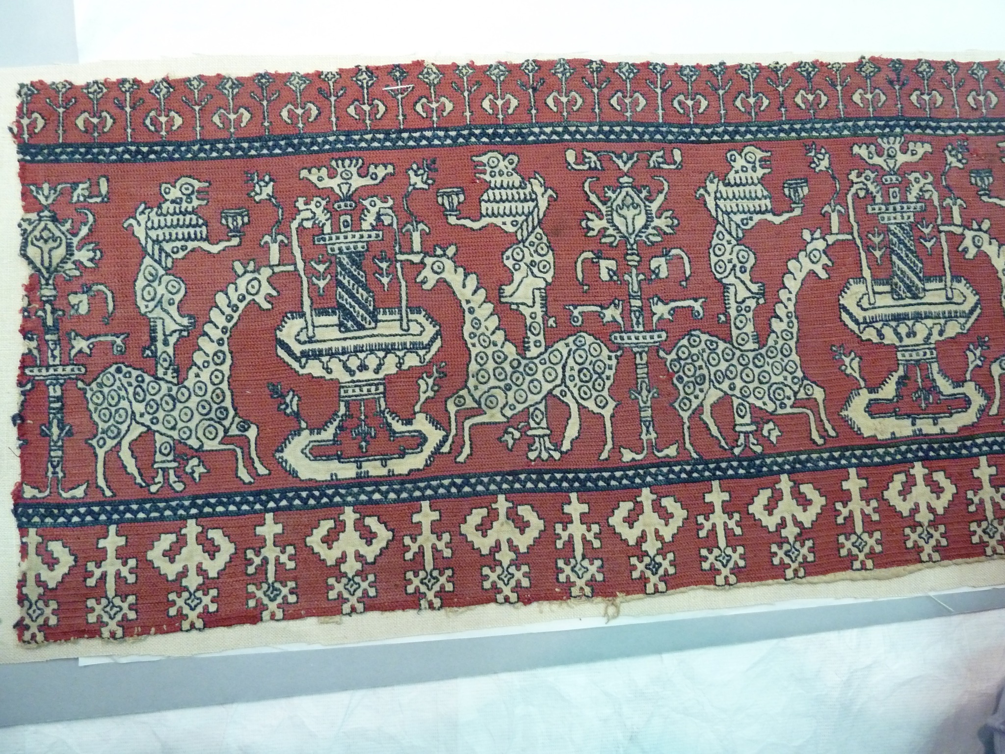
I’ve got all the black double running outlines for the main motif done. That’s not uncommon for Azemmour Cluster pieces, but is not a usual treatment for these larger ones. In the larger museum snippets they are usually outlined in the same color as the voided ground. In the later multicolor ones, anything goes. But it is more common for the smaller ones – especially the ones with birds and foliage or small urns. Since this is not intended to be a fully historically accurate piece, I feel free to take liberties. As for specific references for the pomegranate variants of the spider flower, I point you to these, both collected around the turn of the 20th century, and both formerly attributed as being Italian works of the 1600s.
Museum of Fine Arts Boston, Accession 11.2880, Newly attributed to Azemmour, 18th century.
https://collections.mfa.org/objects/68407/tent-stitch?ctx=4b923968-ddd5-426e-a76c-6afa55e9b949&idx=229
Cleveland Museum of Art, Accession 1929.843. Also newly reattributed and dated. Azemmour, 19th century
https://www.clevelandart.org/art/1929.843
A very similar motif also shows up on this late polychrome sampler.
Victoria and Albert Museum Accession T.35-1933 , Morocco, 19th century
https://collections.vam.ac.uk/item/O70740/sampler-unknown/
Flipping and Stitch Inversion
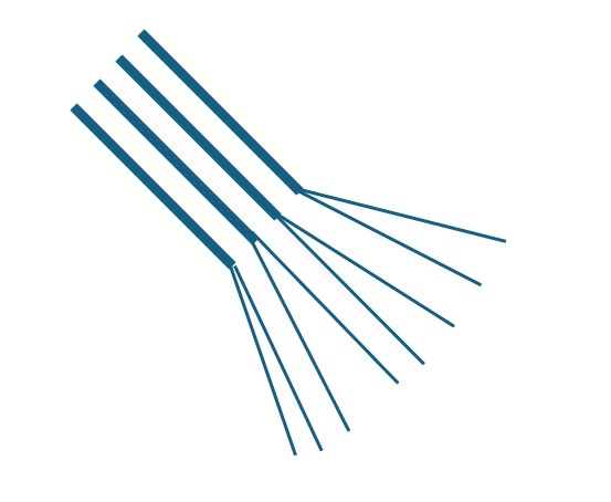
Why flip? Because I find it awkward to reach the entire area behind the frame for two-handed stitching. And the area of best access seems to be slightly different for each piece of work. But flipping long armed cross stitch (LACS) introduces a small variable that has to be dealt with. Inversion flips the direction of the interlace if the stitch is worked in the same way regardless of frame orientation. LACS is usually done in alternating rows, back and forth, to produce a plaited type appearance. While this is most evident when the thread offers better coverage than the sparse strand I am using, the effect is still there. I even take care to keep all rows across in the same left-right orientation, even if they are interrupted by a non-voided design element, so that when areas do meet up there isn’t a visible “seam” where two rows worked in the same direction abut.
Flipping however means that if I continue to work the same way, with the long arm originating along the top edge of the row and plunging back down at the bottom, slanted in the direction of travel, the spot where the voiding was laid down with the top of my stitching surface aligned at the top of my working area will be inverted compared to anything stitched after the flip. So to avoid those visible “seams” I have to mirror my stitching sequence along the vertical.
Now that I’m working with the side that was the bottom now at the top, my long arm stitches have to emerge at the bottom, proceed in the direction of travel, and re-enter the cloth at the top of my stitching line. Clear as mud? I thought so. This may help. the black arrows indicate direction of travel. And yes, the back side of this work presents mostly as vertical lines, with a bit of fudging at left and right, especially if a diagonal bit of non-voided area is encountered. And if that meet-up is not a diagonal, I do terminate my lines at each end with the equivalent of the missing plain old cross stitch leg, for a neater edge appearance.
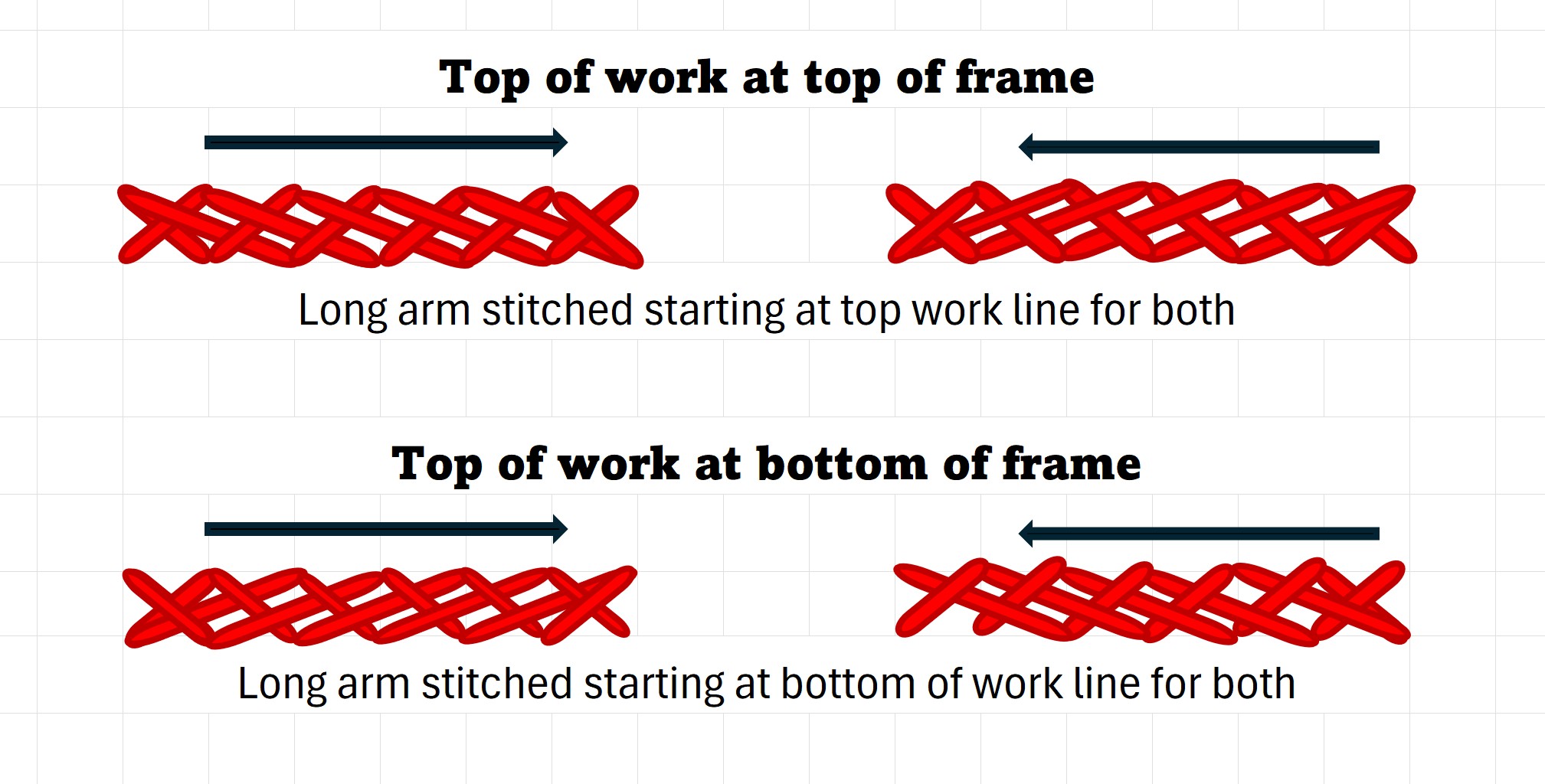
If you can visualize it while the direction of crossings look different when seen this way, once they are stitched they are identical, with no visible interruption in texture between them.
What’s Next?
It’s time to start thinking about the next strip. This one is just above the basted center line of my available ground. I am going to omit the traditional top and bottom framing motifs, often seen sprouting from or in addition to a divider like the rope edge I stitched, opting instead to just do a set top and bottom of the whole piece.
Next will probably be a narrower band, not voided. I think as a whole-piece theme, I will alternate voiding with plain double running bands. I am thinking about doing it in another color. I have some medium indigo color Alori silk, and some of the same stuff in purple. I’m considering one or both but probably not together, nor in combo with the black. Not enough contrast between them, and neither is in quantity enough for voiding. Have to ponder more on this.
And just for fun, in the photo at the top you can see the whole frame set-up. My widest Millennium, grasped on the right (just the tips of the jaws in camera range, by the Lowery Large Frame Extender. My chatelaine is draped over it, where I stow it between sessions. You can see the old pillowcase I have pinned to the back of the work. That limits light transmission through the cloth, both from the television (upper left, various vintage Star Trek series are comforting accompaniments to stitching); and the library window (upper right) during daylight hours. I have a couple of magnets stacked in the upper corner of my margin, to hold my needle threader and keep the cut length of thread I’m drawing strands from handy.
Health update
Needle threader? For work on 28 count? And 28 count at all? Yup. Although my fave is 40+, especially around 50, right now my health complications include a modicum of double vision and close detail fatigue caused by mechanical pressure on the nerve that controls the eye movements needed for binocular focus. I can see well enough to stitch, read, or knit out to about fingertip length, but much beyond that diverges – to the point where driving a car is neither feasible nor safe. But because I anticipated a visual challenge and throttled back, I still have my Emotional Support Stitching to fall back on. And it is most welcome.
And I am happy to report that proton radiation therapy begins on Monday. We attack my cranial interloper aggressively, and I am optimistic for the outcome, and enduring the upcoming 40-odd days of treatment with minimal if any side effects. I did it last year and can do it again. Of course, I have other coping mechanisms. Knitting socks in waiting rooms, for example.
WORKING IT
And the latest piece continues to grow.
At this massive gauge – 28 threads per inch compared to my normal 40+, it’s mile a minute. All in all I am pleased. While the voiding is sparse (one strand of spun Au Ver a Soie’s Soie D’Alger – a thread economy measure), it is solid enough to be effective.
Another thread economy issue is in the black. The reeled long fiber Alori silk is divisible into four strands. Each of those strands is made up of three plies, not all of uniform thickness, although the thickness of each of the four officially divisible strands is very close. I am dividing each strand into a two ply, and a one ply, using the one ply doubled. No, this is not an advisable practice, and I would not suggest anyone else pursue it. But I am working from stash and want to eke out every inch possible.
As a result of my frugality there is a noticeable variation in the density of the black double running stitch lines. Some are heavier than others. To be fair, this is actually a look pretty common among museum artifacts, but in their it case was caused by the stitcher’s having to finger-spin each length of thread used from a clout of dyed, combed but unspun silk fiber. It’s especially evident on samplers worked by newer/younger stitches, where there is a marked difference in weights and even colors, since intermediate shades were achieved by marling together their parent hues. As with everything, practice helps. Some stitchers were more uniform in their thread thickness or color blending efforts than others. So I am doing my best, trying to mate or meld areas of similar weight so thick/thin dashes don’t occur in the same line of double-running.
In the helpful hacks department, note the old grey pillowcase pinned to the top edge of the work, and hanging down in back. That’s a light shade. I find that minimizing the ambient light shining through the work from windows, low lamps, and the television eases counting. In this case the pillowcase does double duty. This piece on my longest Millennium frame bars is too wide for the travel carrying case I made for on-frame projects. I suppose I could make another, but time does not stand still. I pop this one into that king size bed pillow slip, pin the top end closed, and it’s good to go.
Go we did. I packed up my upstairs Lowery stand (I keep a hex key in my stitching box for this very purpose), disassembling the thing into a heavy canvas tote bag, and bringing the frame, large frame extender, tool chatelaine, and pirate lunchbox of threads and other support materials/tools with us out to our place on Cape Cod. A welcome respite and restorative bayside sojourn. Nothing heals better than watching the tides march in and out.
As to health issues, I have bounced back from the dual biopsies in March – stamina and strength are back to where they were back in February. Findings are not universally great but neither are they dismal. My Danger Lentil might have been any number of tumor types that are far more dire than what was revealed. I do have a secondary chordoma site, at a location not previously documented for that very rare manifestation. But chordoma doesn’t eat brain. It eats bone and connective tissue, and responds well to radiation therapy. I meet with a rad oncology team soon to plan and embark on another round of proton treatments.
In the mean time I am in good spirits, optimistic and full of fight, along with the strength and stubbornness to win. And armed as I am with this easy to see project, plus working on Ensamplario Atlantio Volume 4, and a few pairs of socks to knit – equipped with ample amusements to keep that determination in high gear.
COMFORT FOOD FOR THE FINGERS
As folk following along here know, I like to keep busy. I need the comfort of fiddle-food for my fingers. Waiting is particularly annoying without it. Just before heading off for my second diagnostic procedure, I had started an experiment in Buratto, on a chance find bit of cloth that mimics the weave of that Renaissance era open mesh ground.
I am not pleased with it. I’m using some of the leftover Ciafonda faux silk I got in India. Nice enough thread, but not lofty enough for this. Even stacked, the double running stitch fill is too sparse. I supposed I could pick it all out and begin again, but right now I don’t have the patience to do that. I’m going to set this small wash-cloth size bit aside and get back to it later.
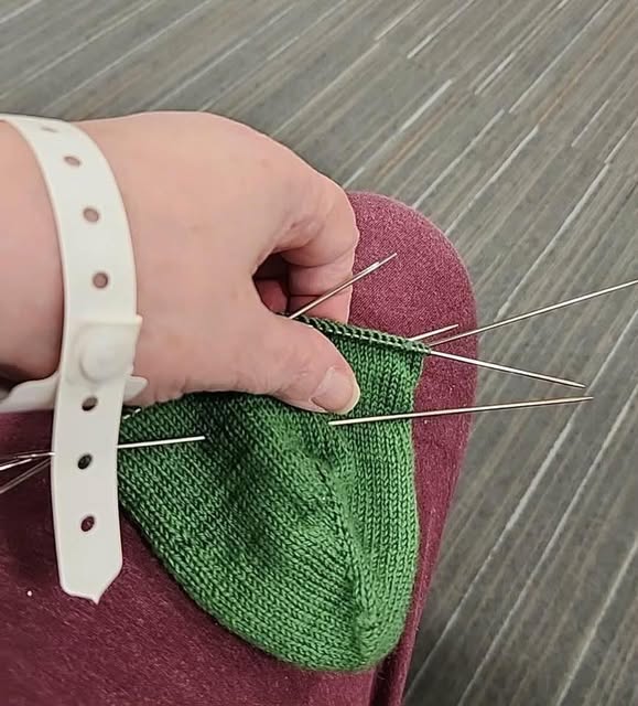
As you can tell from the bit of hospital tray shown, I had been working on this during my stay there. But I also brought knitting with me, and bargained with the various specialists installing the needed lines and monitors to leave my “bendy parts” clear, including inner elbows, wrists, backs of hands, and index finger tips. They were kind enough to work around all that. As a result, here’s last week’s finish. Yet another pair of socks cast on in pre-op, and finished during the ensuing week and a half of recuperation.
Since these are pretty much done on autopilot – toe up (Figure-8 toe), double wrap German short row heel, and something improvised on the ankle, such socks are “procrasti-knitting,” a fill-in project done while I contemplate other more involved efforts.
And I have arrived on the next one. It will eventually be fine-tuned to honor my Resident Male’s latest book-in-progress, but he’s at an early part of that journey. Themes and significant bits to be illustrated are still in the developmental phase. So I will do something of broader appeal, and add the book-specific bits as they become evident.
But what to do? And how to “future-proof” the project in case therapies affect short term acuity of vision? While such a thing is far from a probability, being a proposal manager has trained me to think in terms of identifying and managing possibilities, no matter how remote. Always.
Thank goodness for a deep stash. I vastly prefer stitching on finer count linens, and consider 40 to 70 threads per inch to be my sweet spot. But that doesn’t mean I don’t have linen of other counts squirreled away. I have unearthed a lovely piece of 28 count. Big as houses. Very easy to see. So I grabbed it, cut a healthy piece, hemmed the edges, basted my edge and center guidelines, and mounted it on my largest width Millennium scrolling frame.
And for thread – how about REAL silk? I adore the stuff. I have two large hanks of Au Ver a Soie’s Soie d’Alger in a lovely cranberry red just sitting there staring at me. And some Tied to History Alori Silk divisible in a couple of colors, also in a parking orbit. If I am going to indulge myself, why not?
The overall style of this one? I will take inspiration from the casual research I’ve done into the Azemmour Cluster. This is a well represented group of embroidered fragments that made their way into museums via wealthy donors who collected bits and bobs of what was sold to them as “Authentic Renaissance Embroidery” in the era of the European Grand Tour, roughly from the 1870s and ending around the time of Word War I. There are lots of snippets formerly labeled as being Greek, Italian, or Spanish that are now being reclassified to their true point and time of origin – Morocco in the late 1700s through 1900. I wrote about some of them in my Second Carolingian Modelbook, and in this 2018 blog post. And then I revisited the cluster in 2023, when a group of eye-popping multicolor pieces documenting concurrent usage of many of the style’s key design tropes was pointed out to me during the Zoom-based group meetings for participants in the Unstitched Coif Project. We had a lively discussion on the obvious Renaissance roots of some of those tropes, and why the museum attributions of so many of them are only now being updated.
I’ve stitched up a couple of the Azemmour group on previous pieces but I’ve never done a deep dive. Not sure which of them I will work with voided grounds, what colors or combos I will use, or what the rest of the piece will look like. But here’s the start. As I said – big as logs.
This armed against boredom and the as-yet-unknown, I march ahead.
ONE FOOT IN FRONT OF ANOTHER
Just because things are a bit in the air here at String Central right now, doesn’t mean that our dedication to Relentless Forward Progress has been put aside. There are things to do, things to make, and accomplishments waiting to be notched and acknowledged.
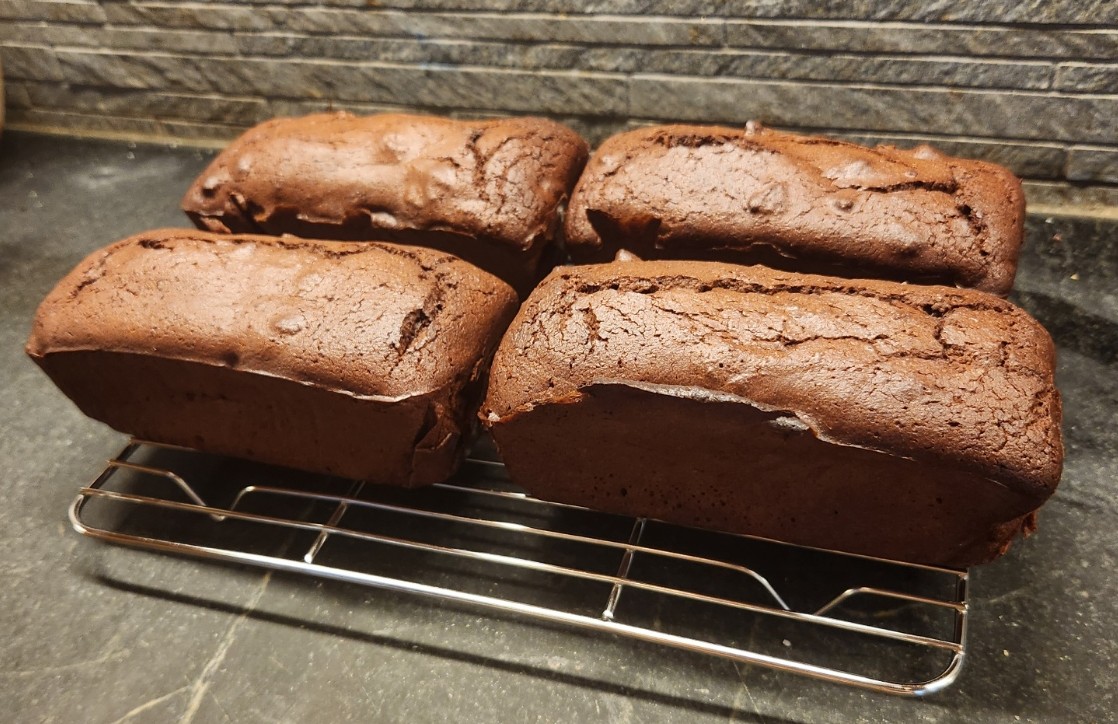
First, we did have a wonderful weekend of low key celebration here. The Resident Male (and Executive Chef) outdid himself. He did homemade gravlax (the Jacques Pepin overnight cure version); grilled boneless lamb with garlic and rosemary; and roasted cauliflower and red onions. I pulled my weight by baking four small chocolate pound cakes, one of which we split for dessert, stowing the other three in the freezer for future treats. But I have promised to detail my adventures in low carb baking, so I will elaborate here a bit.
Low Carb Chocolate Pound Cake
I started with this recipe – Keto Chocolate Pound Cake, from the All Day I Dream About Food blog site. The thing was pretty straightforward if you happen to have the ingredients in the house, which we did. Note that this recipe uses almond flour, monkfruit-based brown sugar substitute, butter, baking powder, eggs and sour cream in addition to the items mentioned below in my summary of deviations.
First change, instead of one standard size loaf pan, I used this one – a four mini-loaf thing I got years ago when I was a regular contributor to school-based fundraising bake sales. It takes a standard size loaf cake recipe and turns it into four more saleable and storage friendly smaller units.
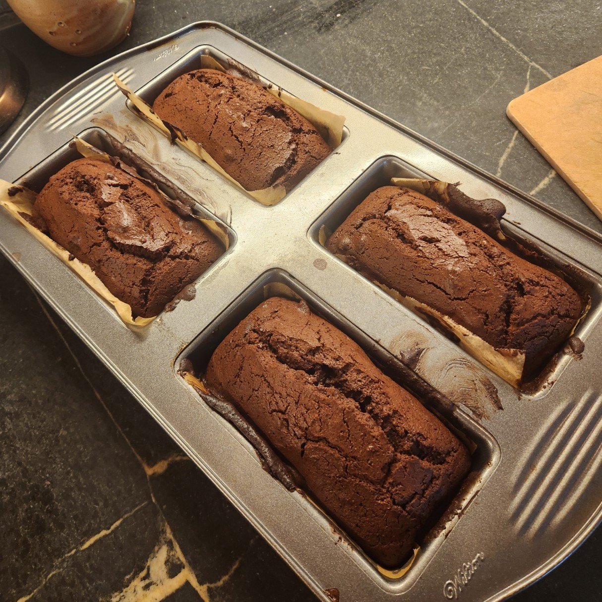
I am pretty sure I found this pan in a yard sale, but I do see them sold in cooking supply and on line sources. And yes, I buttered each little loaf hole and lined it with a piece of buttered baking parchment to make removal easier. From prior experience I know that this pan in my convection oven bakes faster than a full depth loaf pan. To compensate I did my bake at the recommended temperature, but only for 50 minutes – not the 60 to 75 cited in the recipe. I tested the cake with a skewer for doneness.
Second, and this is a personal preference – I detest coffee flavor in my chocolate. The recipe calls for two kinds of cocoa – regular and “black”, chocolate flavor whey protein powder, plus espresso powder and a quarter cup of room temperature, strong coffee. We had the whey powder on hand, no problem. I used just one kind of cocoa, combining the specified quantities for both together – a Dutch Process, known for its deeper/stronger chocolate flavor, and the only one on my pantry shelf right now. I skipped the espresso powder, and in place of the coffee (clearly needed to hydrate the rather thick batter) I used the same quantity of very strongly brewed unsweetened black Assam tea, also cooled to room temperature.
Third, I tossed two large handfuls of coarsely chopped toasted pecans into the batter before spooning it into the pan.
Fourth, I omitted the chocolate ganache glaze entirely. I knew I would be freezing the three extra cakes, and I know from experience that ganache can get chalky when that happens. Given that the four little loafs were moist and tender, and we would be eating one right away, I didn’t see the need. I can always whip up a little bit of glaze when we defrost a survivor if I think the extra moisture is needed.
Here is the end result. A definite do-again. Moist, dense without being heavy, with a deep cocoa flavor. The toasted pecan bits were a welcome addition for both flavor and texture. Each little cake makes two very generous portions. Perhaps next time I will also add a handful of zero-sugar chocolate chips. But that would be truly decadent. Based on this result as opposed to many truly dismal Keto baking experiences I have had, I may explore the site of origin to see what else is up there.
Booties
I had a special request to knit some booties for a the sister of a friend of a family member – the first of that particular friend circle to have a baby. My favorite bootie pattern is a quick knit. I can do a pair in about four hours, so why not.
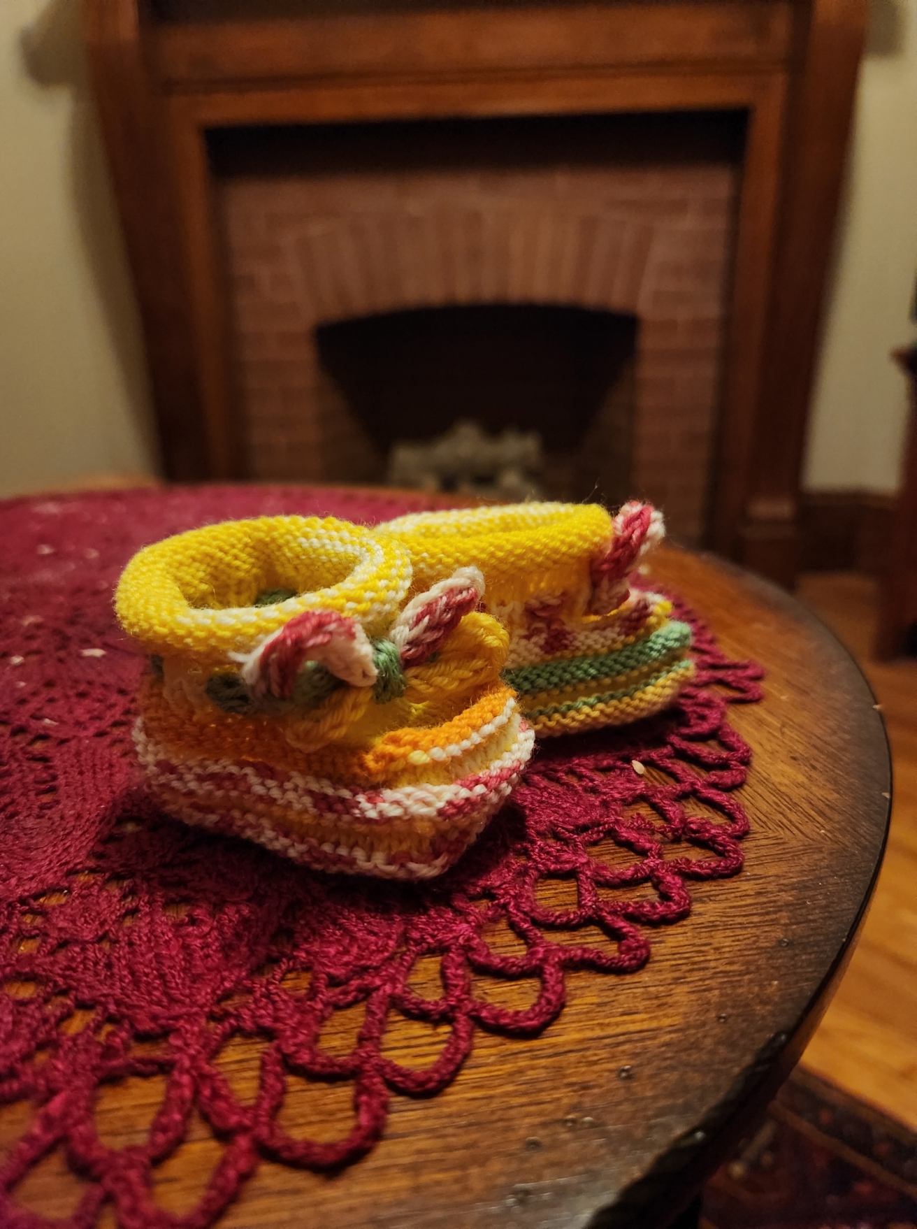
These are from the same pattern I used easily thirty times over a few decades to make items for my own spawn, plus baby gifts for friends, family, and co-workers. The original pattern was posted by Ann Kreckel in 1995, to the ancient email based KnitList mailing list back in the days when the Internet was still climbing out of primordial seas. It can still be found via the Internet Archive’s Wayback Machine utility – Click here to retrieve it.
In the past I’ve posted a mini-tutorial on making these, and invented and shared a hat to match.
Reading over the instructions it occurs to me that even with my mini-tutorial many knitters today might have a problem following the pattern as Ann originally shared it. Not that there are mistakes, but I do note that the level of comfort with written instructions in the general knitting community has declined sharply in the video era; and the terms and logic of the thing might challenge a newer knitter. I think I could make the pattern more accessible with a simple re-write and merge with my mini-tutorial. But it’s not my design, so I am not comfortable just doing so.
I have tried tracking down Ann to ask about updating and hosting her pattern as a free offering, but so far I haven’t gotten a response. If any of the old KnitList gang reads this and knows how to find her, please pass along my sincere wishes for happiness and health, and my request for pattern editing and republication permission.
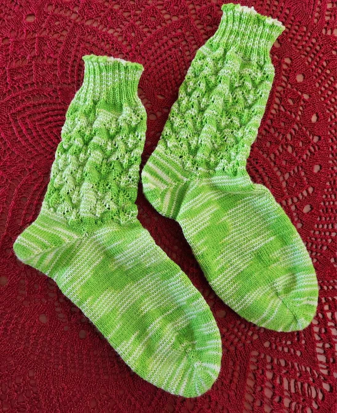
Socks
Hating to just sit there, no matter where I am, over the past two weeks at home, waiting in doctors’ offices, and after my last procedure I kept busy knitting a pair of socks. They are going to be a present for someone who went above and beyond during a regional emergency – not to aid me, but to help someone near and dear. I won’t spill the beans because there is a remote chance that they might see this post. But I did do a whole pair, start to finish, and will be casting on for another before the coming hospital sojourn. Sanity before all other things, and keeping busy keeps me sane.
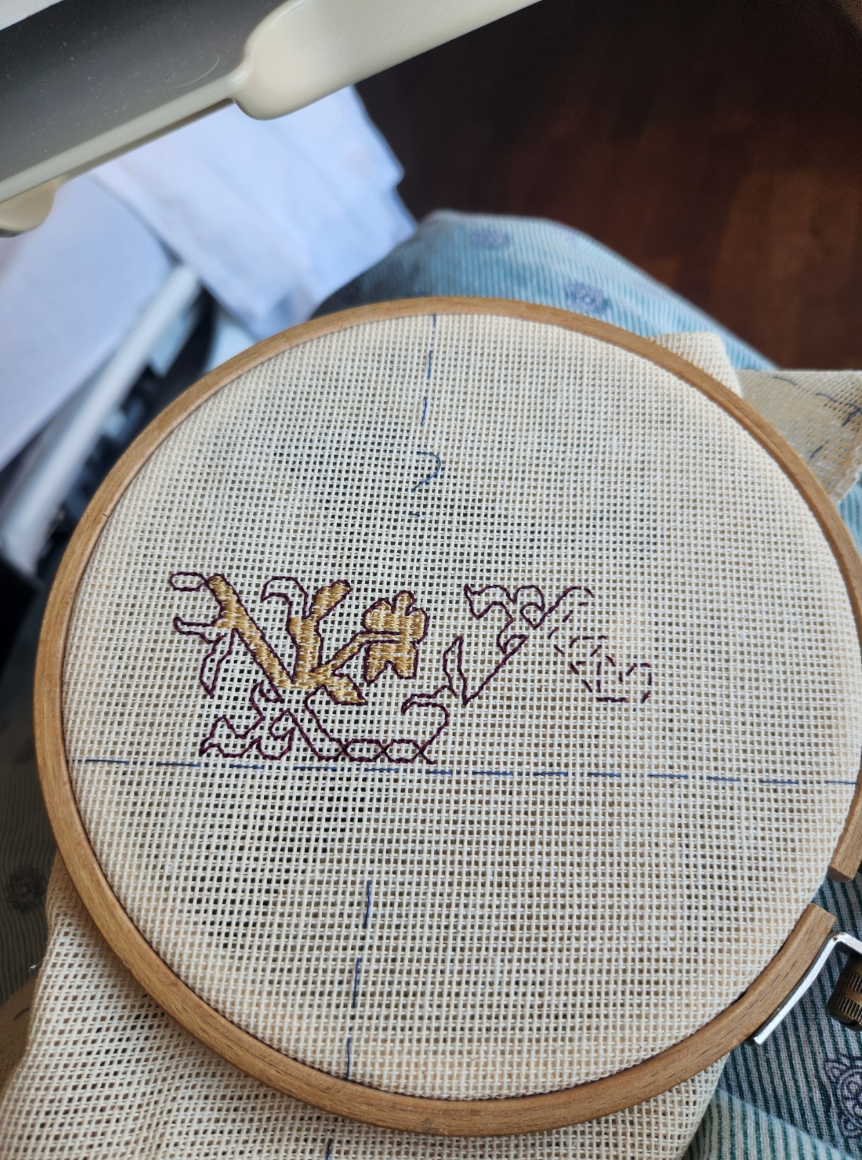
Stitching – Playing with Faux Buratto
Another bit of sanity-preservation. I wanted a stitching project to bring with me, too. Something small, easy to see, and easy both to follow and to stitch. Something I can slap in a small hoop and support with minimal kit. Yet something that holds interest, and would be enough of a challenge to tempt me to curious activity. I have teased this on Facebook, but here is the full story.
A while back I -lucked into a curious bit of textile. A sieving/bundling cloth used in traditional Korean kitchens as part of food preparation. HMart had it on a rack in the housewares section, and I noticed the weave immediately. I did a blog post on the discovery a while back,
I want to try out a few designs on this cloth. The first step of course was to establish a normed edge. Like most textiles the retail cut rarely aligns with the weave structure, so I basted the largest possible rectangle I could, and added guidelines for vertical and horizontal centers. Then I just started in on an outline. I’m keying off the use of deep red and yellow-gold in a couple of museum artifacts. I’m going to try out establishing my outline for this strip and then do one of several possible fill methods. This style is later 1500s into the 1600s. Then I will try one of the monochrome type designs. from the earlier half of the 1500s. After that probably another multicolor but using a different scale and fill style. It’s a small cloth and there isn’t room for a ton of strips on it, but I will use the available real estate to best advantage, picking on the fly as I usually do.
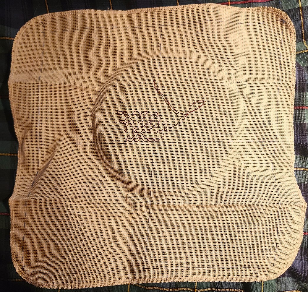
What you see here so far is simple uncounted basting in blue, marking out margins and centers. Those skew cut edges and the amount of area wasted does annoy me a bit, but this piece of cloth was never intended for the purpose to which I am putting it. Just above the center line you can see my start – double running in crimson faux silk (rayon). The design is already 100% established and from this point I can go left and right “off book” just by copying what I’ve already laid down. And I will have T2CM with me, electronically, just in case.
General Health Status Update
Yes, I know I alarmed a lot of you yesterday, for which I deeply apologize. But obfuscation has never been my strong suit. To clarify at this moment, aside from the facial numbness that triggered the hunt for the Danger Lentil, I feel pretty good. I have bounced back from the prior biopsy with no ill effects. I am back to my regular exercise routine. I am pretty much day-to-day advancing the new normal as I have been for many months now. Stamina is excellent, and I have no problems sleeping or eating. I have no headaches, nor blurred vision, auditory or balance problems. In general given my past year’s journey I am in excellent health.
I have every confidence that the team will figure out what’s going on, and that a treatment plan will be devised AND that I will weather that, too. So I do thank you for your words of support and comfort. I have both battle fury and the strength to put it to best employ. Know I keep all of you in my thoughts, and I do appreciate that you are thinking of me, too.
