Obviously I am still at it, working away on the current embroidery, and surfing the health issues management seas.
First, to present the size of the piece as a whole, here it is, fully unscrolled. No, that’s not discoloration at the bottom. Just an early morning light shadow.
At 28 threads per inch, these strips are gigantic. The actual margins of my stitched area are barely visible, marked in basting, roughly an inch inside the scroll bar mounts, so there’s not as much usable real estate here as I would normally prefer.
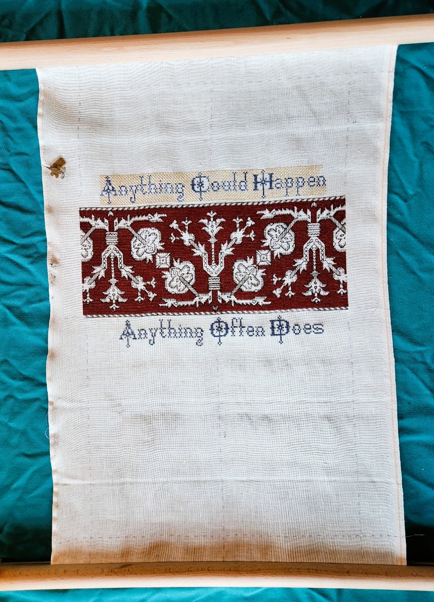
And note that I haven’t extended the yellow step voiding behind the top line of the motto to the margin. I may want to use those small left and right areas for a couple of supplemental motifs, or for signature blocks. I haven’t made that decision yet, so I am keeping my options open. I can always go back and extend that fill later.
But contingency planning here extends beyond the treatment of the ends of that upper text band. There is the possibility that I will face more visual challenges in the coming weeks as I get further into my treatments and as protocols change in the name of long-term efficacy. It being my nature both professionally and personally to always plan for exigencies, I have stepped up preparations to deal with such problems.
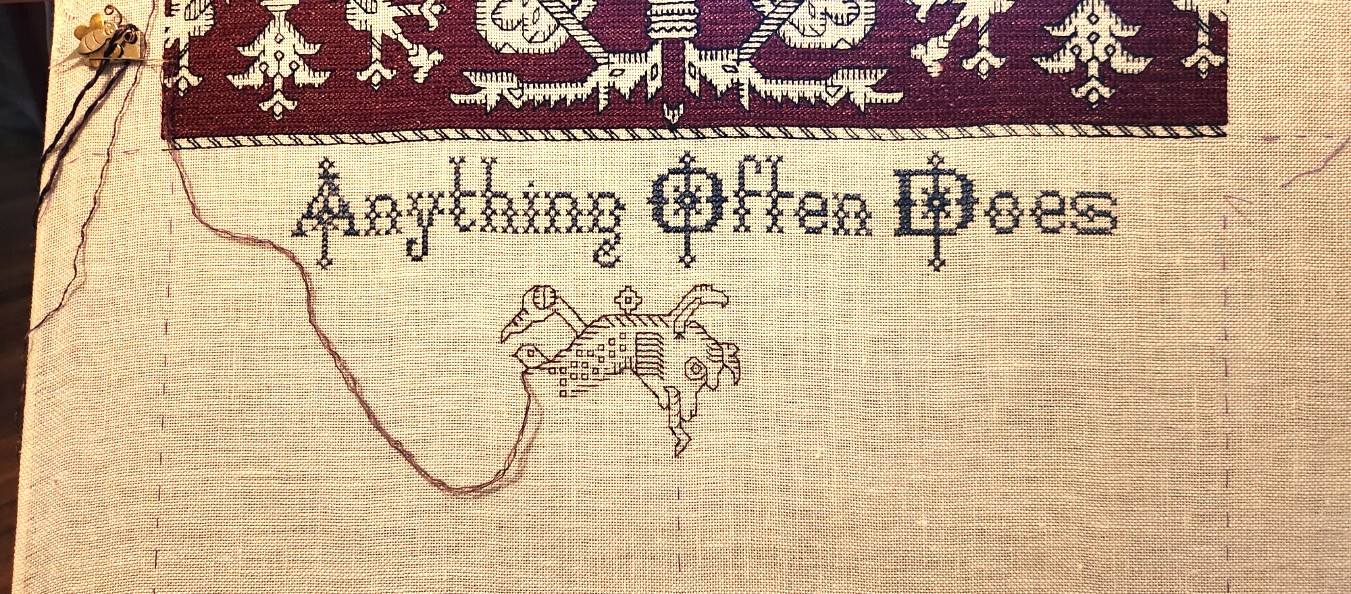
First, rather than leaping into the stepwise yellow behind the lower motto strip, I’ve put it off. It will happen, mirrored north south to the alignment of the yellow behind the upper lettering. But that’s easy to see, and super fast to stitch. I can save it for later.
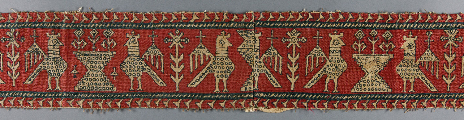
Second, I still want to do some more of the Azemmour Cluster designs. I have a few already charted up in The Second Carolingian Modelbook, but with the broadening of identifications in museum collections, and greater recognition of the group as a cohesive design legacy, I thought I’d go hunting for some other examples – both of the familiar, like the pomegranate meander shown here, and with luck, possibly something new.
Well, I did find a few examples of things that were brand new to me, but clearly identified as belonging. First is this one – a fragment sold at a Bonham’s auction in 2023. They tag it as Azemmour, and 17th century.
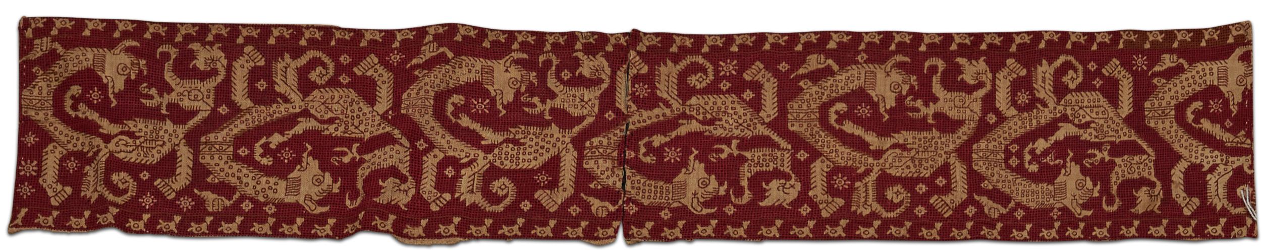
I adore this parade of monsters. For one, I have not seen its like before, yet given the style, interior ornament, and execution, it belongs in the family. Second, it’s clear from the wild divergence of the detail that absolute precision repeat-to-repeat for the person or team who stitched it was rather optional. Those squares and “edge whiskers” that make replication easier to count are far from uniformly worked. And there are also some departures in larger elements of the design as well.
I had to graph it up immediately while I could still squint to do so, norming the repeat as best as I could for my own ease of stitching, even though there will be width for only one full iteration, plus some side bits left and right.
Because of the excessive amount of “design taming” needed to norm this one I have taken more liberties with fidelity than I usually do. I squeaked out my chart and have started laying in the base design. All of the major elements and placements of the original are in my rather broadly adapted version. It will be obvious, proportional and recognizable, but there will be departures, especially in the use of the small filler motifs between the monster bodies, in the placement of the interior decorations, and in minor deviations in the shape of some of the fins and projections. So close, but not exact.
The working method for this one will be different from the claret red voided bit above, and also a departure from the original. The Bonham’s voiding was done in that heavily overstitched meshy treatment I have worked before. That would be a bit overambitious on the 28 count, so I will relax and just do more long-armed cross stitch. But I will stick to presenting the outlines, detail and voiding all in the same color as in the auction fragment. My goal is to lay down as much of the precision rendition as possible, saving the simple background stitching for later. Just in case.
Despite the morning-light color distortion, I am actually using a purple silk here. More of the legacy Tied to History Allori Bella from my stash, split down and finger spun to my desired thickness. Once the yellow goes behind the blue on “Anything Often Does,” I will enjoy having the color play between that color and the purple.
So between roughing in the monsters of certain menace (disclaimer – no actual monsters of this type in the Hungry Judges book, but on here they represent a deeply disturbing aura of major peril central to the plot); and doing the grounds behind the lower half of the motto, and behind the monsters, I feel I have at least three weeks of accomplishable stitching on my dance card, and can outlast any additional temporary visual hurdles.
What other strips am I considering for when these bits are done?
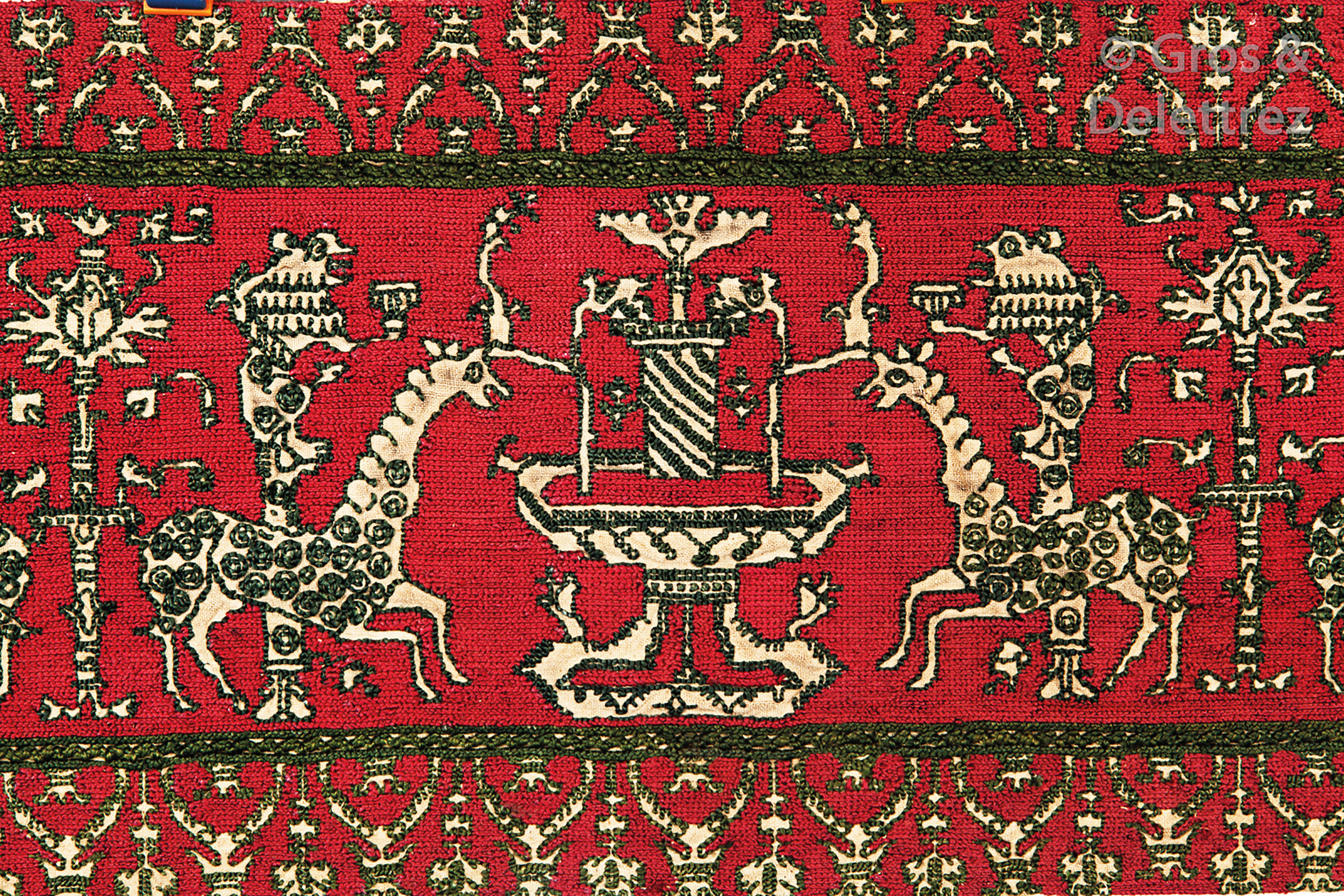
Here’s another auction find from 2019, and a unique composition that I haven’t seen before. Also claimed to be a 17th century representation of the Azemmour style. Not quite sure what is represented. Possibly camel-like unicorns at a fountain. I haven’t charted this one yet. The stitching style of the ground will make that challenging, and I may not have room for it on this piece.
Of course there are the oh-so-well-represented bird panels, the cup sipping/flute playing harpies the fountain panels, the urns, and wide meanders. And more. So much to play with for just this limited space. I suspect that one or more variants of the bird panels will appear. They are narrow and easy to shoehorn in. And I will need to leave room for at least one band of companion border, top and bottom. Identification, selection, color, and execution of course are all open to whim.


Update
After I posted the photo of the strange camel/giraffe/unicorn beasties at their fountain, Stitch Pal Melinda chimed in with photos of a similar strip held at the Los Angeles County Museum of Art (LACMA). Here is the auction strip photo again, and a photo she provided, side by side for comparison (I am hoping she doesn’t mind the side by side). Auction sample on left, Melinda’s on right.
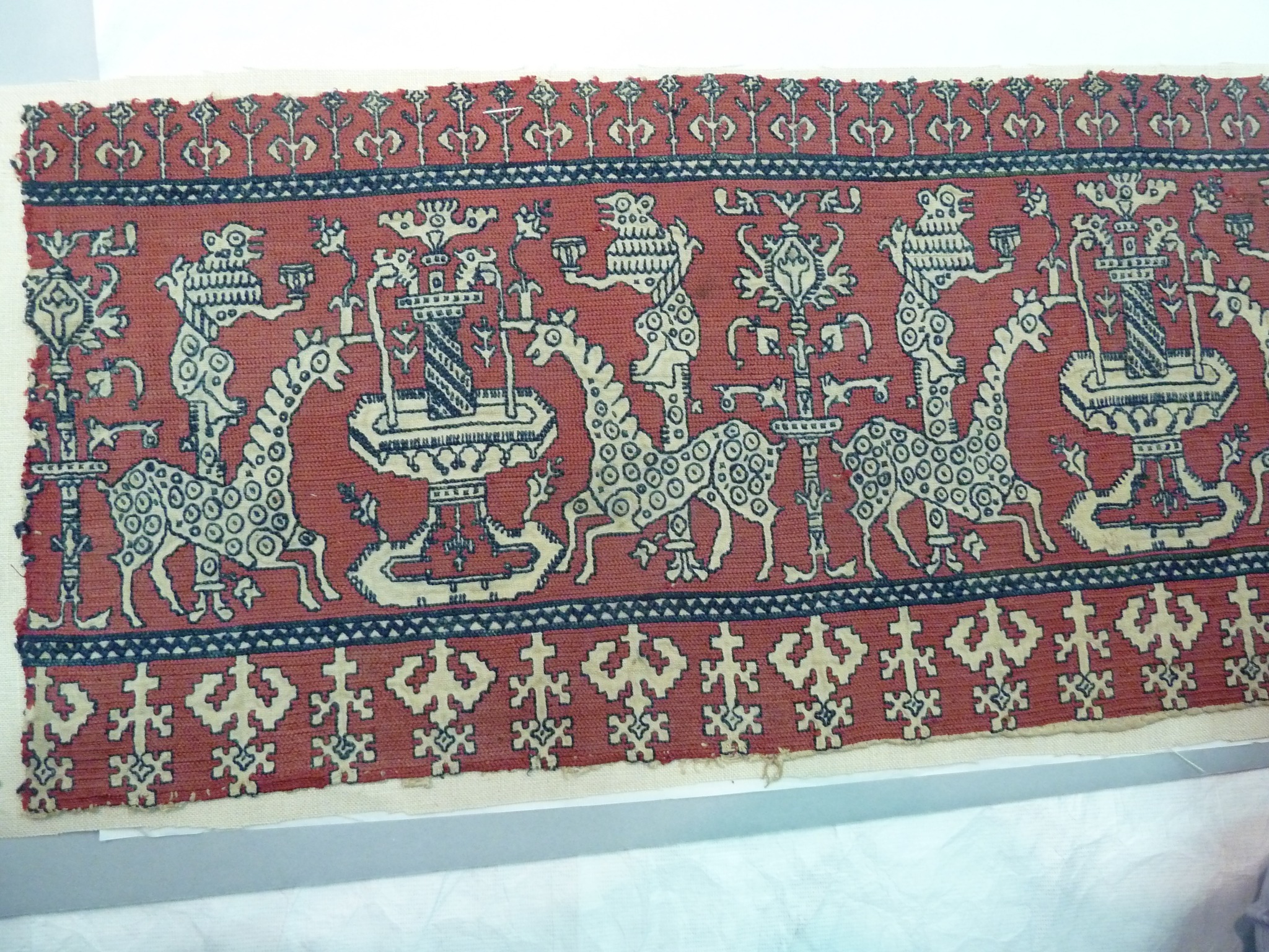
I did go wandering through that institution’s on line photo collection but could not find a citation or page. Even Melinda notes the lack of info on the piece other than the Italy or Spain 1700s notation, which we now now to be not entirely credible.
So for fun, let’s compare. First, it’s clear that there is commonality between the two. The rondel-decorated long neck beasties. The pillars behind them, each topped with a chalice-holding monkey. The central fountains and trees at the other end of the bounce repeat between the animals’ hindquarters. The modes of internal decoration on the design elements. They all do track across.
BUT there is considerable difference in the total representations. This isn’t a case of long-lost-twins where one can say “Oh, look! Someone sold two snippets of the same work to two different customers.” Details are different, with some simplified, some omitted entirely. Spacing between design elements, the proportions and widths/heights of the elements vary between the two. And of course the companion border treatments do not track at all. Particularly curious is the change in scale for the lower companion border in the LACMA sample. That is quite odd.
Can we take any clues here whatsoever from this set of similarities and differences? Posit relationships or dates? Not within my competence. I would guess that there are other examples of this general motif out there somewhere. And that for both of these someone eyeballed copies of the base concept rather than painstakingly transcribed some graphed or stitched “official” root source material. I further suspect that if we were to see a longer sample and follow along the repeats, just like the odd monster I’m working now, we will find that the individual iterations of the design are far from uniform (I can spot some even in the small pieces seen above). And as far as dating, we can’t assume that the change in border scale indicates some sort of later/less diligent manifestation of an earlier more detailed concept. Hard, chemical forensics would be needed to provide clues on which of these two might have been done first.
If my eyesight holds out I will try to chart this. Possibly as a melded average of the two representations. But there’s more stitching to be prepped for the coming few weeks, so it won’t be happening with anything remotely resembling urgency.
And thank you Melinda! Your clever eye and visual memory has made my day. I always enjoy a tumble down a research rabbit hole. All the joy of happy productivity, to you. May your threads stay untangled, and your stitches, true.

Thank you for sharing this beautiful work. I wish you easy and successful treatments ahead!
a very different piece but so filled with beauty.
Your auction find of the band of girafficorns looked familiar. Here is a similar piece from LACMA, seen in 2012. Hmm – file of photos is labeled as “nonumber” . I’ll post photos of it to my Facebook page
Such interesting designs, and I look forward to seeing what you do with them. I’m hoping the Bonham variant you are charting is one of the clearly two-headed beasties, the one at far left or the one 5 from the left. The whole piece promises to be spectacular!