TRUE CONFESSIONS
I am very glad that I didn’t focus on making this piece two-sided.
At the outset, I thought about it. Hiding the ends on both Montenegrin Stitch and Meshy (Two-Sided Italian Cross Stitch, pulled tightly) are easy. Lots of real estate overstitched in which both beginnings and endings can be camouflaged. Double running is a bit more difficult, especially when one strand is used. Yes, I know various termination methods to do so – one-strand loop start and waste knots to begin; back-trace stitching, and threading through the existing line to end – but they are annoying to do, especially on a large piece. I made a half-hearted stab at it, but abandoned double sided double running early on, But I never thought it would be the two solid techniques that would be giving me trouble.
Here’s the front:
Here’s the back:

Montenegrin is working well. There are just a couple of bald spots where I lost track, mostly in angle changes. I blame resuming the habit of watching TV while I’m stitching. Occasionally I get caught up in the action, and miss a turn. Then don’t realize it until I am long past. Had I still been reverse-side-display focused, I would have done more diligent checking, and would have ripped back and redone the less than perfect bits.
Meshy on the other hand… Ouch.
The two-sided Italian cross stitch works best over large areas, like backgrounds in voided style pieces. It isn’t as cooperative when its playgrounds are small, as they are in these flower parts. It’s like working nothing but the bits where voided stitching bumps up against a foreground line, with no respite. Working these small parts I never quite get the rhythm – it’s all compensation stitches, with very little chance to display the openwork texture. That also means that coverage on the back gets slighted as working direction changes to adapt to the shape of the field being filled. Add to that the tension limitations of the cotton floss (more fragile than silk, believe it or not), and in spite of cotton’s fluffier nature, we have lots of bald spots on the back. Far from optimal for double sided display.
Finally then there’s my own general laziness. I’ve made a couple of mistakes that I’ve had to pick out. But instead of picking out large areas, I’ve mostly opted to pick out just the “broken” bits, tying off loose ends, or fastening them with overstitching on the back. Most of the fat or knotty looking spots above are from fixing mistakes. Sometimes the errors encroached on Meshy sections, and those are notoriously difficult to frog. Sometimes I ripped out small segments and replaced them because I didn’t feel like re-creating the large, accurate sections they were in, just to get at a couple of errant stitches.
So my back is a relative shambles. I will of course continue on, focusing on the front. But especially for those of you who tell me that my pieces are inhumanly perfect, please know that you usually only see the after photo, and lots of corrections and creative editing went into making the project look like that.
DITHERING
I am still not sure what to stitch next. As part of the stash archaeology portion of the planning process, I did a quick rummage through my accumulated threads. And I’ve been collecting them since grade school.

This box holds a mix of all sorts of things. Most date back to about 1966 when I first got an allowance, but it’s mostly full and partial skeins of J&P Coats Deluxe 6-strand embroidery floss and DMC 6-strand embroidery floss. I’ve got some older bits in there, too – legacy from my grandmother Pauline’s stash.
There is also a handful of Madeira 6-strand floss mixed in. I’ve never actually bought that brand, so I suspect it was second-hand stash that was given to me, or that I found at a yard sale. An interesting detail is that Madeira is now known for specialty packaging (in addition to thread quality), but the put-up I have in this scrum is all pull skeins. I can find no information on when the company changed over to the specialty packaging, but I suspect I acquired these stray skeins no later than 1985.
Other oddments include some soutache left over from SCA dresses done in the late 1960s, plus hose spools of variegated color silk (or possibly rayon) machine embroidery thread. They are end spool spoils, discarded as being insufficient for industrial use, but salvaged by my grandmother Minnie (the union seamstress/machine operator) for personal use, before she retired in the mid 1960s.
The oldest in the collection? These.

I have about a dozen different colors of the that JP Coats Deluxe, all with the 10-cent price on the skein band itself, but this indistinct tannish grey one had the clearest label. From the price and the color (purchased to stitch a bunny on a pair of 6th grade jeans), I can say with authority that I bought it in 1968.
The purple one is Lily 6-ply cotton floss, one of the grandma-Pauline-hand-me-downs. Although embroidery floss is still marketed under that name, it hasn’t been made by Lily itself since the 1960s. From the style of the typography on the wrapper, my guess is that this was purchased in the 1950s. The blue skein is Cynthia 6-ply cotton floss. I can find nothing about that brand or the possible maker. Dating again from the typography, I’d say that one is even older than the purple skein, and is another Pauline-leftover.
But that’s not all. In the past 10 years or so I’ve been the recipient of quite a few stashes, as friends and coworkers came into crafts supply inheritances they were not interested in keeping. And I’ve pursued several free trades or secondhand purchases via the local on-line yard sale lists. For example, some of the thread below was tossed in when I bought my second Lowery floor stand.

This material is a jumble of leftovers. Some of it is wound on bobbins (not my preferred system of storage), other is still in the original form factor. Most of it is single or partial skeins. Almost all of it is standard cotton floss, mostly DMC and Anchor. A small amount sparkly fleck special effects thread is mixed in, but no true metallics. There’s also a bit of white-labeled “craft floss” – inexpensive imports sold in multicolor packs at big box crafts stores. That’s best suited for braiding friendship bracelets since it’s usually short staple, and not of proven washability. Of note is that special packaging for Madeira, right there at the center bottom. That’s quality stuff, all full packs, and probably what I would use first of all of this bounty.
Now, my two leading possibilities for ground.

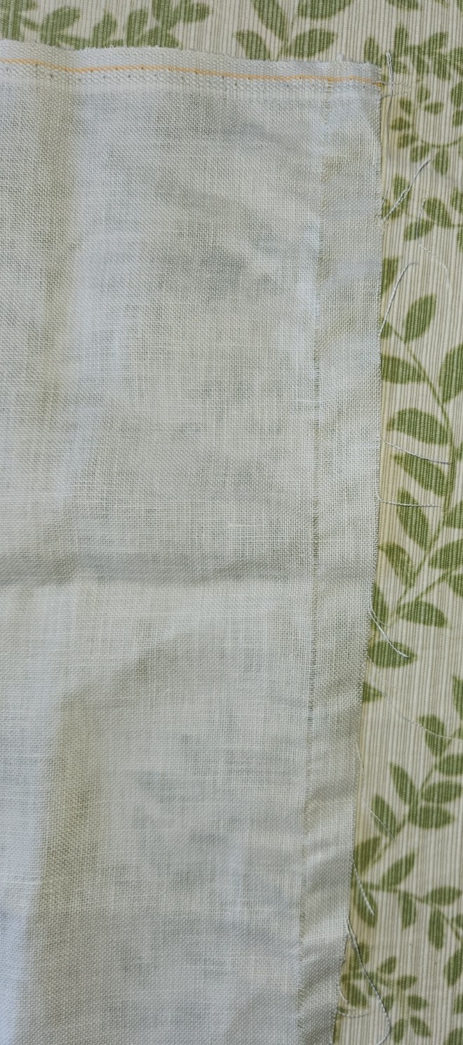
First, a lovely 19 x 27 inch (48.26 x 68.58 cm) piece of 40-count linen – a holiday present from my spawn, who enable me when they can. I’m very impressed by the vendor, whoever it was. Not only is the stuff cut exactly on true, it’s also neatly serged on three sides, with the fourth being selvedge. Usually I have to true the piece and hem myself. From the particular form of the orange stripe and line of blue stitching along the selvedge I think it might be Newcastle linen, but other firms do orange stripes, too.
The candidate on top of the linen is a yet another free trade/adoption acquisition. I have two lengths of this edged narrow weave, both about 6.25 inches x 5 yards (15.87 cm x 4.57 meters). The effective stitching area however is 4.875 inches wide (123.83 cm) due to the fancy brocaded borders.
I had been thinking of doing a squared off blouse yoke with it, but that would work better if the stuff was narrower. I’m not up for doing curtains or edging a trailing hem with this. The width is also a bit problematic for many other uses on clothing. About the only thing I can imagine is running it across the top of two wingspan wide to-the-knee lengths of linen, and fastening it at strategic points to make a peplos-like summer swing top/beach living cover-up. Hmmm… that might just work. And summer wearables should be done in washable thread, not the red silk. I don’t have enough of any one color in my ancient stash of cottons, although I’ve got plenty of black in my current on-deck stash….
So, what am I left with after this open bit of nostalgia and mental dithering?
If the peplos idea doesn’t firm up, I’ll probably prep the linen for stitching – establishing basted edges and center lines for the embroidery, but I’m not sure WHAT to stitch. Inhabited blackwork like the Unstitched Coif? Another randomly composed piece combining bands, motifs, and fills, done at whim (but with no motto)? In the Madeira colors, or in red silk?
Yet another wall hanging. A one of a kind wearable just for me. Decisions, decisions….
Input, other ideas, hoots of derision all gratefully accepted.
JOYOUS ENDING
I’ve finished the latest piece – the sampler in tribute to the Resident Male’s nascent book Forlorn Toys. He is still writing it, so I won’t give spoilers beyond what I have already cited: the motto, the very obvious panel of aforesaid toys, my attempt at spaceships, and the band with the curious feathery rabbit like creatures.

All in all, I am quite pleased with it. Joy now goes to join my Wall of Shame – the place where my completed but as yet unframed/not-ready-for-public-display pieces live side by side with my unfinished projects. As you know this one like so many others is stitched on reclaimed household linen. I did not notice a bleach-weakened bit along a patch of the edging at the lower left. When that was hooped over and tension applied, the neatly done hem stitching failed, leaving a hole. I will eventually mend that, but other priorities assert themselves.
First among those priorities is a piece I promised to the community of therapists and nurses that tended to me at Vanderbilt Rehab Center at Newport Hospital. It’s fueled by a gift of silk floss from Occupational Therapist Abbey. She admired the work I brought with me intending to stitch. She had an inherited stash of silk threads but no use for it, and asked if I would like it. Always happy to have such things, I agreed, and she sent me a wonderous assortment of Pearsall’s silk floss – long discontinued – in jewel tones.

A princely gift, indeed. And only fitting that I use it for a gift back to the caregivers who got me back on my feet and moving again.
I’ve selected a tinted linen to use as ground for this one. I am not sure who gave me this because I didn’t put a note into the package (possibly my spawn, so apologies if it was). It’s custom dyed Zwiegart 36 count linen (big as logs for me), from Hollis Hands Create – a frosty barely blue tint called Silver Moon.
The first step is to begin the design of the motto. In this case “RELENTLESS FORWARD PROGRESS,” furnished by the Vanderbilt Physical Therapy team. Done. And then to begin thinking about how the rest of the piece will be worked. Not a band sampler this time, it will be a “framed” piece, with one or more bands of design running around all four sides of the motto, complete with corners and any improvisations to make the bands’ designs work out correctly with minimal fudging. Therefore I will be doing a some on-screen work to prepare for this one. More than I would have needed had this been a simple band sampler. For example, those corners will have to be drafted out even if I chose band designs I’ve previously devised. And I will have to plan to use multiple colors effectively because while there are many hues in my bag of silks, there are no duplicates, and most of the skeins are partials. It will be fun to figure out how best to use my limited quantity treasures.
And then there’s selecting a size for the piece and preparing my ground. For that the first bit is to true the edges of the linen cut. To do that I find and pull the warp or weft thread at the narrowest point of the cut, withdrawing it entirely from narrow end across to the widest end. This gives me a clean line along which to cut, and ensures that my edges are parallel. On this piece of ground with one selvedge edge, you can see that the left and right sides perpendicular to the selvedge each are slightly skew, one by about an inch, and the other by about 3/4 of an inch.
Note that regardless of the retail source, or whether or not the edges are serged or otherwise finished, if I buy a cross bolt full width cut or a fat quarter I always inspect the edges and true them in this manner. I have yet to receive any cut that was done completely congruent with weave direction. Sometimes the deviation is minimal, and there is only an inch or so lost all the way around. Sometimes, especially with lower price precuts sold in big box crafts stores, up to four inches can be wasted all the way around
This is why if you purchase pre-cut yardage, even if you have added on extra width to allow for easy hoop use and framing, it doesn’t hurt to add an additional inch or two all the way around. You never know when you will get a cut so skew that after the cloth is trued parallel to the weave, the cloth ends up being much smaller than you thought you were buying. Charles Craft prepackaged cotton and cotton blend evenweave was notorious for skew cuts. Their products started me doing this “proofing” step, and I have not regretted it since.
I won’t be using this entire fat quarter on this project. I will measure my ground cloth piece after it’s cut and the left and right edges are hemmed. I’ll decide then on the orientation of my sampler, cut my ground accordingly (also on a pulled thread line), and hem that last edge. The remaining bit will be returned to stash. And I will get a start on selecting my framing pattern(s) and drafting up my new corners.
On the non-computer work side, while the design work is going on but after I get my piece of cloth sized and hemmed, I will baste in guidelines: centers and stitching area edges. The final count of the available stitching real estate between the area edge marks will help inform final design tweaks.
I don’t think of all this pre-work as being very complex or onerous. The physical prep is mostly mindless and gives me plenty of headspace for the rest of the planning.
Now off to select my patterns… I toyed with using icons representing progress from sitting to walking, but I decided that was too limiting. The rehab therapies offered go far beyond simple sit to stand to walk, and I wanted the piece to be as inclusive (or non-specific) as possible. And the logos for the various institutions and professional certifications involved are too fussy to be easily charted at my scale. So it’s a mix of florals, geometrics, and possibly a pet or mythical beast or two thrown in. After all, who doesn’t identify with dragons or kittens?
AND FROM THE FLIP SIDE
Here I am. A bit less than I was, in terms of body parts, weight, and height, but overall what remains is whole and mostly functional.
I am not going to go into the all the details, but I will say that I am incredibly lucky. So many things can go wrong during and after a 12-hour surgical procedure that involves many tricky bits near major nerve centers. But I am happy to say that my chordoma tumor was removed successfully, along with my coccyx and more than half of my sacrum. I will have to have a deep survey next month for surety, then be on lifelong watch to make sure it doesn’t recur, but for now at least I am cancer-free.
The surgical team was able to avoid some nerve damage, and to install a rather elaborate truss system to support my spine and hold my pelvis together. Those two things let me walk again, and even climb stairs – things I had hoped to be able to do, but realistically was accepting that I might not. I’m wobbly with a walker, and need a spotter on the stairs, but each day brings new strength as I exercise and practice. I am hoping that by the holiday season I will be off the walker and on a cane, headed to unassisted ambling.
The one area that is lagging behind is sitting. As you would expect, with that much alteration to my fundament, sitting would pose challenges. So far I am able to sit on a special cushion for about 4-5 minutes. I continue to train for improvement.
Weight is an expected loss during cancer treatment, and that did happen. But height? In my case because my lower spine was amended, a certain degree of shrinkage has occurred. I used to be 5’8″. I’m now 5’7″. So it goes.
And as you can tell by the presence of this update, I have computer access again. I’m using it as an inducement to get out of bed and stand, above and beyond the various exercise routines recommended by my physical therapist. Time however is limited. I can do a couple of short sessions a day, but no more. That means posts here will continue to be few and far between, and that no substantive work will be happening on The Third Carolingian Modelbook, or on corrections to Ensamplario Atlantio III (or for that matter EnsAtl IV).
I can however stitch again. I can do it laying in bed, sort of. Like the computer work, sessions are limited by endurance, so progress is slow. But there has been progress.

Compared to the last post, the dragon square is finished, and I’ve begun the voiding on the top strip. Nice and mindless, simple work.
So there it is. I’m still here, slowly recuperating. I do thank my spawn, siblings, mom, inlaws, and everyone else who sent encouraging notes, showed off their work from my designs, phoned, sent gifts, memes and silly bits to cheer me up, or visited. Your sharing buoyed me through a very challenging two months.
I also want to thank my surgical team, attending specialists, nursing staff, therapy staff, cleanliness/safety staff, and everyone else I interacted with at Rhode Island/Brown University Hospital, and in Newport Hospital’s Vanderbilt Rehab wing. That I write this at all is testament to the quality of their handiwork and care.
And it goes without saying that he who is precious to me – my Resident Male – deserves major thanks for his constant presence and support, gentle nursing, firm coaching, and patience. He drove hundreds of miles back and forth to Rhode Island between 17 March and 29 April, and has catered to my every petulant wish since returning home.
Stay tuned. I intend to keep these posts coming, and pivot away from tedious health updates back to the needle arts.
SEE YOU ON THE FLIP SIDE
That time has come. Tomorrow is the beginning of The Great Eviction, in which my invader and I will be separated. I am ready, packed, prepped, and armed with great ferocity and the single minded determination to overcome, outlast, and outwit my adversary and come back as unchanged as possible (except for the obligate scars, of course).
I’ve marked my level of optimism on my latest sampler. I haven’t mentioned progress in a while, but it quickly became my Emotional Support Embroidery after receiving my diagnosis last month. Not ironed, but as a WIP, it’s too early to think about doing that.

Yes, it’s still unfinished. I’ll do some more on it later today of course, but I won’t be done. That’s on purpose. I have every intention of future completion. And note the victory wreaths on the top as-yet-to-be-background-stitched strip. That strip is also deliberately placed skew to the centering of the rest of the sampler. My life has been tilted akilter, so this bit is, too.
I’d also like to everyone for the unexpected outpouring of support. I am overwhelmed by the vast number and generous sentiment of the comments here, on various social media platforms, and sent to me personally by direct message and email. I had no idea I had reached so many people around the globe. I am not a spiritual person, but I can say that if Providence can be petitioned, perhaps the wide ecumenical spread and volume of promised prayers in every major worldwide religion (and many of the less well known ones) will tilt the odds even more in my favor.
See you soon!
-Kim
MORE GOODIES FOR THE CHATELAINE
The second half of my 2025 Toy Allowance has arrived! I bought more pieces for the stitcher’s chatelaine Younger Spawn gave me for the holiday in 2023.

Here’s a roundup of all of the components.
First, rose pin and majority of chains. Not sure where the Offspring picked that up. I noted several vendors selling near identical unpopulated chatelaines last year, but this year the rose design isn’t popping up.
First on left – the laying tool. This is a standard steel laying tool, not a fancy one made for display wearing. The Resident Male gave it to me about 5 years ago, along with the super-precise sharp scissors that are also on this chain.
Next, up by the rose is a needle threader. It’s a fine wire style threader encased in fancy findings. This is a new purchase from Beaddoodads, an Etsy shop based in Australia. It’s lovely and works quite well. A much welcome addition. I have a note in to the seller to find out if the threader can be replaced when it eventually and inevitably breaks (those skinny wire ones are only good for a year or so). In the mean time I’m literally keeping it on a short leash and will look to see if there is some sort of protective sheath I can devise for the working end.
On the long dangle next to the threader is my spool cage. This is also new, and as you can see, is home-made. I twisted it from the protective cage or bail that holds champagne corks in place before the bottle is opened. I may go back and do another. This one is from our New Years Eve bottle. Our anniversary bottle was silver tone instead of brass color. It’s just big enough to hold a full spool of the Corticelli silk I’m using now, and snug enough to keep it from unsupervised unreeling.
Back up we find a needle case, also new, and also from Beaddoodads. It has three small rubber or silicon gaskets that keep the slip on top securely in place, even while hanging.
Next over the the little purse accessory that Offspring included with the original gift. I softened some beeswax generously shared with me by a hyper-local beekeeper (Hi, Kevin, who lives around the corner!), and then molded it into one side of the snap enclosure holder.
Up again towards the rose is the last of the three new bits from Beaddoodads – the bobbin reel. It’s the long pin-like object holding the bobbin of plum color thread. In theory it is long enough to hold three metal bobbins. I only had one empty one to hand. I’ll probably replace it with three inexpensive generic metal bobbins. This one is for my ancient Elna SU sewing machine. Klaatu is very finicky about bobbins, and Elna ones of the correct vintage are hard to come by. It’s also worth noting that the bobbin reel is long enough to use with one of the little wooden Corticelli spools. Once one of those is empty, I’ll probably be using it instead of metal bobbins.
And last on the right is the pair of embroidery scissors that I got from the Resident Male along with my laying tool. Notice how it is chained. If I attach the lanyard clasp to just one of the scissor’s finger holes, gravity and movement eventually open the scissors. Those blades are stabby, plus I don’t want to damage them. By threading the chain through both loops, the scissors stay closed after use. And doing so is no impediment to ease of use.
Finally we have the ribbon to which this weighty seven-armed octopus is pinned. Together with all of its parts, my chatelaine is quite heavy. The needle case is surprisingly weighty, and the little purse is no feather, either. I find pinning the thing to a waistband to be uncomfortable, and don’t want to tear holes in my tshirts, blouses, flannel workshirts or sweaters (I’m usually in one of those). So I took a length of evenweave fabric ribbon I bought at Sajou during our Paris trip, designed a custom pattern and stitched up an alternate solution.
I doubt I will add other bits. I have a very elegant silver framed mini-magnifying glass. But it’s way too good and way to fragile to add to the rest. Plus I I don’t reach for it every time I sit down to work. I’d like to add the electronics tweezers I use when picking out, but there’s no easy way to modify them with a metal chain loop or bail for hanging. And I feel that the weight of the thing as is now is pretty much maxed out.
As to the utility of this portable toolset – I really like it. No more setting bits down on the table or chair arm beside me, then sweeping it off as I get up. I will still use my pirate lunchbox to carry the larger kit (more backup needles, my lint-trapping wad of silly putty, the magnifying glass, tweezers, more thread beyond the current skein-at-use, and the like), but for wandering around the house, sitting out on the porch or on the beach at the Cape, the chatelaine is all I need.
I even used it while we attended panels and readings at the Arisia science fiction convention in Cambridge, MA last weekend. And I don’t mind jingling like a belled cat as I wander around, although at Arisia I did wear a two-pocket workshirt, and stuffed the pin and its dangles into one of the pockets when we were in motion, mostly to keep the noise down, and to prevent anything from snagging on passers-by.
THE SYMMETRIES OF LINEAR STITCHED FILLS AND STRIPS
As promised here’s a rundown on pattern repeat type, and centering fills and strips in designated spaces on your project. For one, there’s really very little need to sit down and stitch-by-stitch completely graph out the design to your final dimensions. In general knowing where the edges and centers of your space, plus the pattern repeat type is all that’s required. These hints go for both fills in regular and irregular shapes, and for strip or band type designs that march along the width of your project, or decorate the edge of a garment.
And a note on grounds, if I may. Aida, Hardanger, Anne Cloth, and Monks Cloth are types of purpose woven grounds used for modern countwork. They feature prominent holes outlining their base size units. Departing from that established grid can be very difficult and involve piercing the fabric in the solid spots between the built-in holes. Partial stitches do exist in the purpose-woven world, and are much despised by stitchers. Working multiple grids skew to each other on the same piece of purpose woven ground is almost never done. I’d say never-never, but somewhere it might exist, although I haven’t seen it nor the rants of despair from folk who have encountered it.
Evenweave (or near-evenweave) is a bit more flexible. Since the stitchers count threads on evenweave instead of hole-defined units, they can employ multiple grids on one piece. If the stitcher decides to work their unit over 2×2 threads, two adjacent spaces can use different grids, offset by one thread so long as the juncture where they meet is taken into consideration. I did this on my Two Fish piece, using the skew alignment to hint at undulating motion. Note the knot and grid filling. Not only is it stitched discontinuously across the bel, I also interrupted the grid. Both sides are worked 2×2, but NOT on the same 2×2 grid – the tail section is displaced one thread up and over.

So when you see me talking about skew grids or using partial stitches when centering various types of symmetry on a single piece, please know that the ability to do this is mainly something that can be done on evenweave. Purpose woven grounds like Aida will limit the way patterns of differing symmetries can be centered against each other. It’s just a fact of life.
Before I begin, all of the fills and bands charted on this page are available in my Ensamplario Atlantio series, my Epic Fandom Stitch Along, or previously shared here on this blog. All are available as free downloads for personal use. Links are provided.
OK. Finally getting into it. Patterns can be grouped into a few basic clusters, with some caveats.
Center Line Repeats
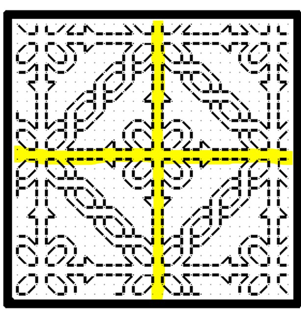
First we have simple line-center repeats. These are designs that cover even numbers of units, and mirror along a center line. The chosen pattern may be a band or strip, with one vertical line where the design mirrors to its left and right. Or it might be an all-over design or fill, with at least one vertical and one horizontal mirroring line.
This blackwork fill/all-over design has both a horizontal and a vertical center line, marked in red. The motif tiles into square blocks of 14 units. The easiest way to use it is to either count to or (if irregular) eyeball the visual center of the space to be filled, then begin stitching the design at the spot where the two center lines meet. Even if the space to be filled is NOT a multiple of 14 but is any other even number of stitches, if centered this way the design will truncate neatly around the edges, as it does in the sample from Ensamplario Atlantio Volume 1, below.
But if the space to be filled contains an odd number of stitches you will either have to displace the center lines so that there is one more unit to one side or the other, or you might have to work partial stitches all the way around the perimeter for full coverage.
Some people insist on using a single grid for ALL of the fills on an inhabited piece. That means that even if they are working over 2×2 threads on evenweave, where adapting the grid you are using to the space at hand would be quite easy, they choose not to. They end up having to either accept minor misalignments between adjacent patterns, or employing partial stitches to eke out the design. That can be avoided by NOT mixing fills or bands with this type of symmetry with some of those discussed later in this article.
Here’s the same type of symmetry expressed in a band pattern. This one is from my Epic Fandom Stitch Along. Note that in this simple meander there are two lines of symmetry (sometimes called mirror or bounce lines). The pattern replicates in mirror image on either side of them, just as it does in the all-over fill. One full repeat is 36 units, and alignment in your desired space can be focused on the center/mirror/bounce lines of either the up or down facing fronds.

Regardless of symmetry type, if you are filling an irregular spot, and you are eyeballing the center alignment point you might end up having to work half stitches around the edge of your area, again to eke out the coverage. This is one reason why some instances of inhabited blackwork (the kind with the freehand drawn outlines infilled with counted geometrics) rely on heavily stitched, thick outlines. Those “fig leaf” the offending partial stitch spots and make the work look neater.
Here’s a bit on my Unstitched Coif, where I eyeballed the alignment of the fill, worked a ton of half stitches (a challenge on 72-74 count near evenweave, stitched over squares of two threads), then went back and put in heavier outlines to hide irregularities. Zoomed waaaaay in like this you can see them around the edges. For scale, that little bud at the upper left is smaller than a US penny.

Now there are some exceptions and complications. We’ll get to those later.
Center Unit Repeats
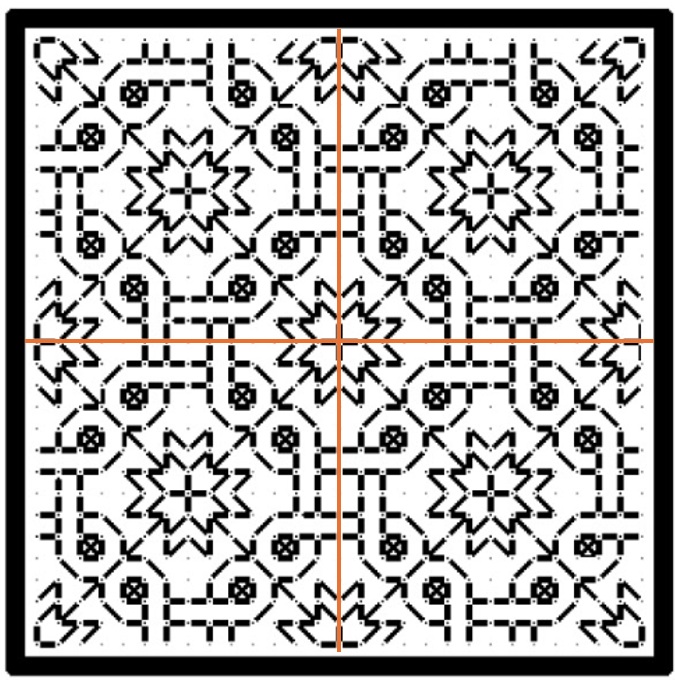
All well and good you say, but the symmetrical repeat I want to use doesn’t meet up neatly at a center line like those. In most cases your repeat has a “spine” of a single unit rather than a center line. That column or row of units is repeated only once, and is not mirrored, although the design itself does mirror left and right (or up and down) that non-repeating column or row. That means that a full repeat of the design includes two symmetrical wings, plus that pesky center unit – an odd number of units, total. Here’s a fill/all-over design that features center units. In this case one full repeat is a square of 23 units (one center unit, plus 11 more units to the left, and to the right of it).
And here’s a strip repeat, also with a simple center-unit style symmetry. Like the line unit band above, there are two possible centers. Either one can be used, although convention on band samplers is to feature two main motifs in the center of the stitched area – in this case the pair of beak to beak chickens.

The strip above is from my Workshop Handout broadside, another free download here at String you can access via this post or via the Embroidery Patterns tab at the top of every page.
Hybrid Repeats
Some designs display a delightful flexibility when it comes to centering because they incorporate BOTH a center unit and a center line bounce point/mirroring. This happens with fills/all-overs and for strip/band patterns.
Here’s a sample of a fill that includes both. I’m only marking one repeat of each type on it, otherwise the thing will end up looking like a swatch of plaid.

This design can be aligned either to the center lines (red), or center units (yellow). And here’s an example of the same type of pattern in a strip or band. The center can be the red line or one of the yellow columns.

Again, if a combo of center line and center column symmetrical strips are used on a band sampler in a mixed environment that doesn’t deviate from one universal grid note that true center alignment will not be possible. The even-number repeat centerline bands will all line up with each other. But if you insert a design with center unit/column symmetry but have to use the same “stitch holes” in Aida as the rest of your project, that center column will not line up with the true center of the rest of the piece. Which may or may not matter to you. Food for thought.
Staggered Drop Repeats
Now it gets harder to identify these. This style of repeat is common in fills/all-overs, but less common in strips/bands, but they do occasionally pop up. For the most part they employ mini-motifs, sometimes in straight-on replication, sometimes with mirroring or rotation; and use regular offsets to place them. Sometimes its a simple half-drop, sometimes it’s a larger interval or not regular when the horizontal and vertical offsets are compared. Most of the time these staggered or evenly scattered mini-motifs do resolve into very large area true repeats, with the same motif repeating in the same relative position in the field, but it’s rare to use these in areas big enough for that resolution to happen. How to center them? It’s a bit more complicated.
Here are three with different rates of periodicity (how big the sample has to be before it manifests a true, full repeat), presenting different problems. These are all from Ensamplario Atlantio Volume 1, Second Edition.

The flowers at left can be centered in a panel in one of two ways. Either using the regular center-line symmetry of the very simple little four petaled flower, or by counting to identify the centerpoint of the more complex sprigged flower. Either way will work, although I think using the smaller mini-motif would be visually more pleasing. Note that regardless of the size or count of the space you use these repeats “walk” and will always truncate around the edges.
The snail garden square at the right is a hybrid. It can be effectively centered either on the tiny squares and on the larger snail-bearing unit. Both work nicely. Which I would choose would depend on the size of the space I wanted to fill with it. If the space was large enough to accommodate four of the snail gardens without truncation, I’d probably use the tiny squares as my center alignment point. The snail gardens rotate around them, and optically form a flower-like shape when viewed from a distance. If the space was small, I’d put the garden in the middle to ensure at least one full iteration of it was represented.
The griffin/dragon beastie in the center presents a harder problem. There’s only one element here, and it has no clear center line or center column/row. Additional complications come from the rotation and offset of the beastie motifs. The easiest way to center this one is to find the center point of the beastie itself, match that to the center point of the area to be filled, and work the others around the first, completing the truncated ones as possible. In the photo below, this is what I did with the wing like bits, second from the right in the photo below, and what I SHOULD have done with the little dolphins in the box next to them, but obviously didn’t.

The myriad mistakes in my current piece are what inspired this post. In addition to the errant dolphins in the latest section, you can see that the voided bit currently underway wasn’t properly aligned. It’s a center line repeat, I have an even number of units across, but if you compare the left and right edges, you’ll see that the design is shifted two units to the right. The center of that strip does not align with the center of the set of boxes, above. The dolphin box is intentionally shorted one unit compared to the others in its row because my count across is not divisible by four (available area minus 6 units total for the gutters between the boxes). There are more similar mistakes in the previously completed part, now wound around the roller bars of my stretcher frame.
I confess to making many alignment sins on this one that together have landed me in this predicament, including initially basting the center guideline that runs the entire length of the piece offset to the right by three units; never going back and measuring, but instead working the other vertical guidelines off that one; starting the first blocks and not bothering to confirm centers or edges until it was too late to pick out and start again; fudging everything in to try to compensate for the pile of errors that was accumulating behind me; and not paying enough attention to centering the various fills in their boxes.
I will continue on to completion with this one, warts and all, but I may revisit the base concept of voided strips alternating with boxed fills in a future work.
AND NOW WE ARE FOUR
I report the finish on my RESIST sampler. Completed, signed and dated.

Don’t worry about that dot on the bottom margin – that’s just fluff I neglected to brush off prior to the photo. The message is dead serious, but there are some silly bits in it. Like the dragon heads that parade across the top. The eyes in the original are empty – no pupils. But I put some in on this strip, and got several emotions when I did. My dragon heads look angry, attentive, contemplative, attentive, and bored. And more. Just a whim.
I am also pleased with the Pegasus strip – doodled up just for this piece. It will be included in my forthcoming Ensamplario Atlantio Volume III (EnsAtl3). No timeline yet for that release. Here are the sources for all fifteen bands, top to bottom.
- Dragon head edging – The Second Carolingian Modelbook (T2CM), Plate 25:4. Redaction with impromptu manic eyeball improvisations.
- Acorn meander – T2CM, Plate 25:3. My original.
- Line interlace – T2CM, Plate 11:3. Adaptation of non-graphed modelbook design.
- Twisted meandering eels – T2CM, Plate 27:2. Redaction
- RESIST using alphabet border – Whole alphabet blocks and bits that fit around them, EnsAtl3. My original.
- Lily buds – Several versions in my various works, this one from my free class handout available on my patterns tab. Adapted redaction.
- Kittens and string – EnsAtl3. My original.
- Large floral all-over – EnsAtl3. My original.
- Doubled simple flower strip – T2CM, sample figure on building larger borders from narrow ones, on the write-up page for Plate 7. Original narrow strip, T2CM, Plate 6:3. My original.
- Cursed bunnies eating my hostas again – I had fun stabbing these guys, too, for obvious reasons. EnsAtl3. My original.
- Very large sprouting all-over. Broadside available here on String here and on my patterns tab. Redaction.
- Block edge border T2CM. Plate 23:2. My original.
- Thistles – T2CM, Plate 30:3/ Adaptation of non-graphed modelbook design.
- Pegasus strip – EnsAtl3. My original.
- Rooster edging – (Turn it upside down and you’ll see them). EnsAtl3. My original.
Now RESIST joins the three fangirl samplers I have completed, celebrating the science fiction works of my Resident Male. That’s a lot of stitching since June, shown here on my Wall of Shame, where all my finished but not yet framed works live.

What’s next? Probably another in the PERSIST-RESIST grouping. ASSIST will be longer than RESIST. Also on a high count not-so-evenweave linen remnant. As you can see, the prep step of hemming has started.

I’m torn about colors and threads. And I have to calculate the thread count of this scrap piece. I have a feeling that it’s a bit more skew than the other four, and probably a skosh coarser than RESIST. I have some silks in various colors that might work on it, doubled in happy polychromatic chaos. Or I might do it all in deep red, possibly with a spot of a shiny black for emphasis.
As to what to put on it, I’m also contemplating options. The word, for sure. Possibly some voided bits or heavy foreground long-armed cross stitch strapwork bands (I haven’t done much of that recently). Or maybe I’ll work in some tiles of fills. But not worked inside freehand drawn shapes – just in geometrics. I have LOTS of fills begging to be taken out to play, some of which I came up with on the fly for the Unstitched Coif project. Since that’s off at the V&A, it seems proper that I stitch them up on something I can look at and enjoy here at home.
Stay tuned for more stitchy mischief.
WHAT I DID SUMMER TO FALL
Starting 27 June and finishing yesterday evening, 25 October, I have cranked out three small samplers, one after another.

All three were inspired by books written by my Resident Male, although not all of the source books have been published. Here’s a better shot of the latest, fresh off the hoop. (Yes, I will eventually press and frame them all.)
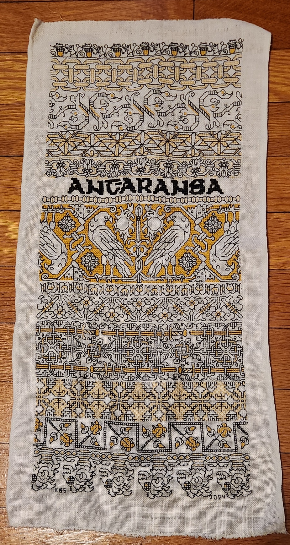
The last strip at the bottom is in the tradition of 16th and 17th century band edging patterns that often accompanied a wider main band design. While most of these narrow bands were floral, foliate or geometric, some of them featured creature heads, occasionally bird-like, lizard or dragon shaped, but all cropped and facing in the same direction. Those edgings would present with the baseline against the main design, so that ones below the main design were upside down, and dance around the corners. With those in mind, I have ended my Treyavir-inspired piece with the severed heads of lantern-eyed goblin monsters, gelnids, among the formidable foes of the novel’s hero Reignal.
To recap, I used black Sulky #30, double stranded. For the accent color I used standard DMC floss, #3820, sometimes two plies, sometimes one ply. All of the black foregrounds were done in double running stitch. Several treatments were used for the fills and accents. Here’s the list of accent treatments along with pattern sources:
- Acorns – plain old cross stitch (POCS), two plies. My own design.
- Chain – double running, two plies. My own design.
- Leafy meander – mix of double running and four sided cross stitch, two plies. My own redaction of a pattern appearing on a sampler dated 1687, accents are my own mods.
- Geometric triangles – simple boxed fill in double running, one ply. My own interpretation of an idle doodle done by J.R.R. Tolkein, more on this here.
- Flower meander – contour lines in double running, one ply. My own design.
- Motto – four sided cross stitch, two plies in the black Sulky. My own alphabet based on a mashup of several Uncial-derived pixel alphabets from the early Macintosh era.
- Narrow bead – double running and single stitches, one ply. My own design.
- Falcons – Long armed cross stitch (LACS), two plies. My own design.
- Tulip buds – double running, two plies. My own design.
- Flower and rod meander – POCS, my own design.
- Sword interlace – POCS, two plies. My own design.
- Step birds – simple diamond fill, one ply. My own redaction of a sleeve decoration on a portrait, circa 1500. It’s on the Patterns tab, here on String.
- Roses in boxes – POCS, two plies. An adaptation of a pattern appearing in my Second Carolingian Modelbook, plate 27:4 – my redaction of a border from a historical artifact.
- Monster heads – POCs, single running stitch, French knots – two plies.
Everything described as “my own design” above, will be in either my forthcoming books Ensamplario Atlantio Volume III, or The Third Carolingian Modelbook – both currently in process.
Now with this sampler done I can’t sit idle. Progress on the next might be a bit slower because I have various holiday deadline related projects to complete and ship out. And I have to decide if I am going to continue the series immediately, with the next bit of embroidery dedicated to either the Resident Male’s mixed SF/Fantasy short story collection The Temple of Beauty, or one of his other in process works; or if I’m going to go totally off script and do a piece entirely on whim.
But to be prepared, I’ve already selected a small stash remnant, hemmed it, and basted my edge and centerline guides, shown here between the completed pieces for scale:

It’s not as long as the last two, and significantly narrower than Stone by Stone. And the linen is higher count.
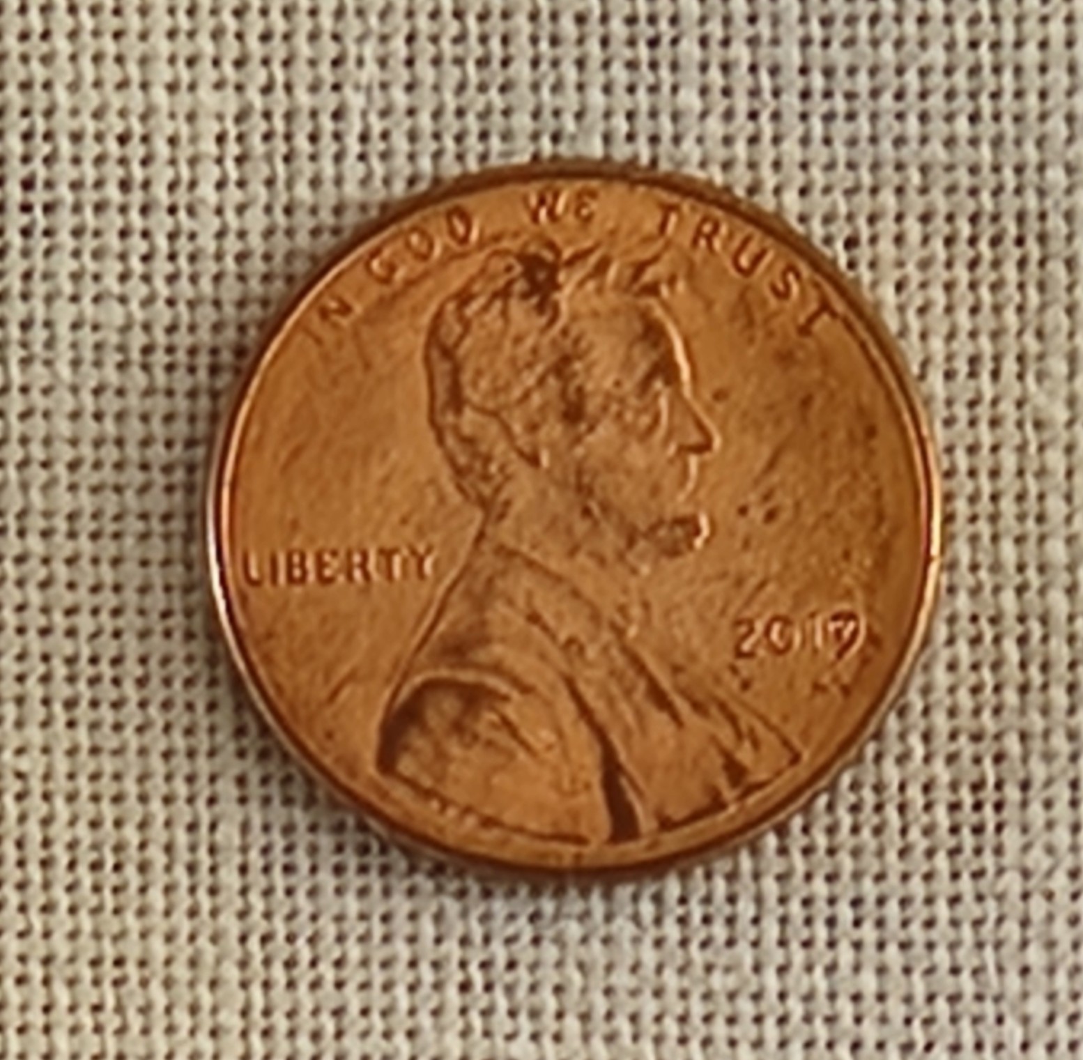
By my penny method, the coin covers 30 threads north-south, and 30 threads east-west. Multiply by 1.33 (a penny by definition is .75 inch) and we get an evenweave thread count of about 40 threads per inch. Green and black Stone by Stone was stitched on 33.25 thread per inch evenweave. The blue and red piece for Fractured Symmetry was on skew count 37.25 x 32 threads per inch linen, and the black and yellow Treyavir piece was on big-as-logs 26 threads per inch evenweave.
While this next piece will be physically smaller, the available “real estate” for pattern display will be roughly similar to the previous larger pieces that were worked on coarser grounds.
I haven’t decided on whether this one will also employ two colors. Right now I’m leaning to an all black piece, but one that uses multiple thread thicknesses. The reason is because I have come into a wealth of black threads in various weights, mostly rayon, but some cotton and silk as well.
Back in late summer when I was getting ready to go to Cape Cod for an extended stay I noted that I was rapidly eating into my spool of black Sulky #30. I was unsure if I would have enough to finish the yellow and black piece. Not having time enough for mail order, and not trusting that mail order would find me at our beach place (no street address delivery, you have to pick up mail and most UPS or Amazon sends at the post office), I went hunting in person. I started at the store where I had originally bought the Sulky, three years ago. They no longer stocked it, nor did several other local possibilities. But as I was chatting with one of the sales clerks and commiserating about mid-project disappointment, the next person in line said that she had the thread I needed in stash, and would be happy to share. We exchanged contact info, and she went home to stash-dive. I drove over to her house (just the next town over) and found a delightful bag of goodies awaiting me – several spools of black in assorted weights. I left my own thank-you present behind and scurried home with the goods. So my possibilities have multiplied. And on the finer ground, the elegantly fine faux silk rayons provided by my ever so generous benefactor will shine. (Oh, if you are reading this Kind Benefactor, ten thousand thanks again for helping me out of that jam!)
Don’t be surprised if I now segue to crocheted snowflakes, both production and blocking, or other crafts. I will be picking up this stitching either alongside those efforts, or after. But you can be sure that in terms of embroidery, I’m armed and dangerous, and I can’t be stopped.
STONE BY STONE FINISHED, ANOTHER BEGUN
The blackwork mini-sampler I did to celebrate The Resident Male’s latest work (now in Beta reading) is complete, a mere 30 days from the first stitch done on 27 June, to stitching the signature on 27 July.
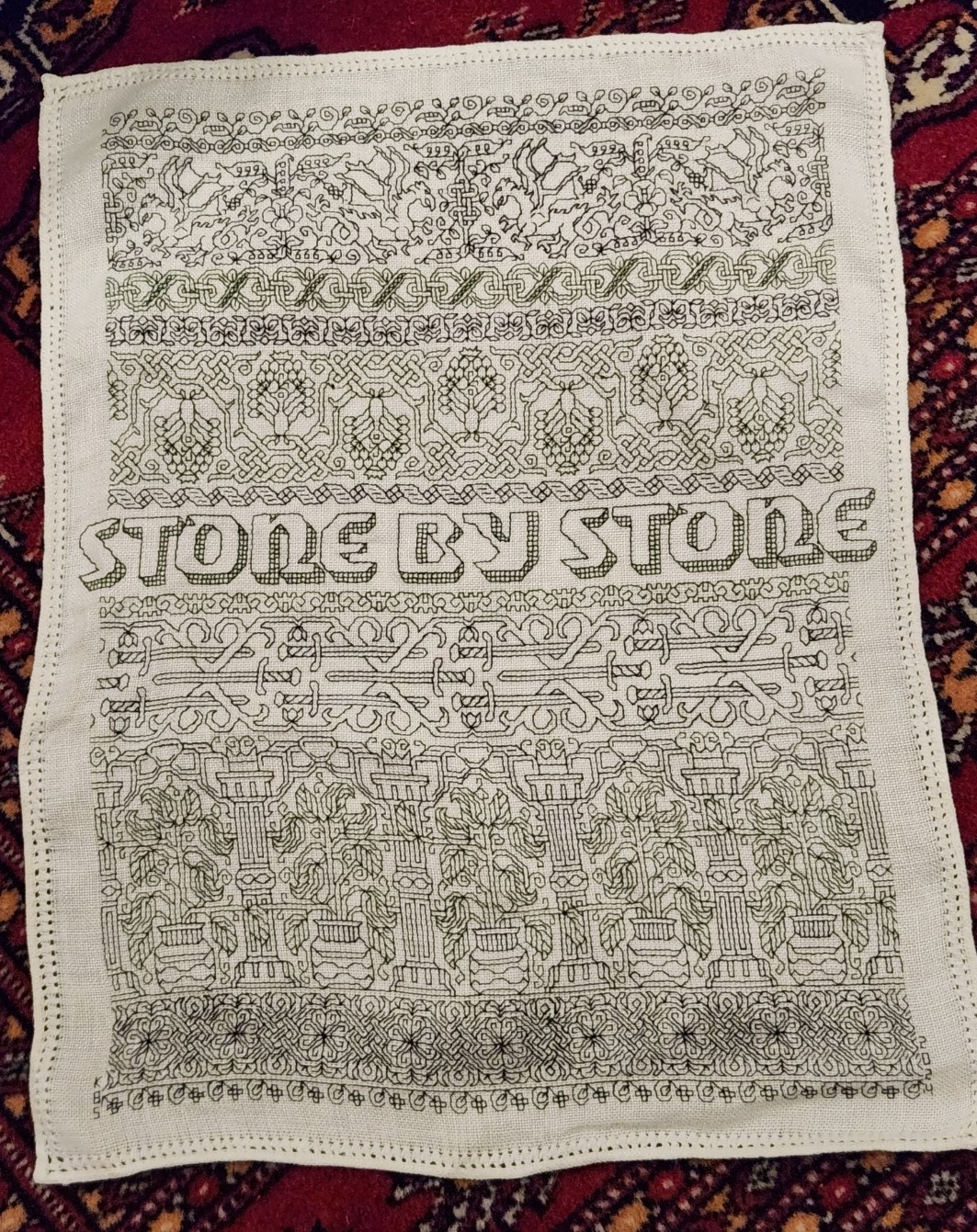
Dated and signed. If I had been thinking, I would have left spots at the left and right of that bottom flower edging for the initials and date, so they would have been in line. But not wanting to pick anything out (stitching in hand on the edge is a real pain), I went outside the lines and signed/dated the piece in the margins.
For the record, this was done in one strand of Sulky 30, a mix of black and deep green. I am not particularly fond of the Sulky look here using only one strand stitched over 2×2 ground cloth threads. It’s a hard finish thread, and was a poor choice for the rather open holes on this 33.25 threads per inch count ground. The threads rattle around in the ground cloth weaving holes, making sharp corners and straight runs rather wobbly. I probably should have used a double strand.
While I could have been happier about that stitch regularity and alignment problem, I’m not un-pleased with the end result. All of these bands will be in Ensamplario Atlantio Volume III. With the exception of the ribbon immediately above the letters, they are all of my own devising. That ribbon band is something I redacted myself from an extant artifact. No timeline yet on Ens Atl III‘s release, but I am close, with 20 pages of new fills (a few with source annotations). It will also have an as-yet undetermined number of pages with narrower bands, plus several full page plates with larger, all-over designs, wider fills, strips with mitered corners, and shirt yokes. Neatly symmetrical mitered corners on these strips are very rarely seen in period pieces – usually designs are butted up against each other, or the corners are fudged and display no planned diagonal mirroring. But modern stitchers prefer them, so I’ll furnish a few.
For now Stone by Stone has joined the other pieces on my Wall of Shame – the pin-rail display of as-yet-unframed, or unfinished stitching in my sewing room. And you can see why I called this a mini-sampler, compared to its brothers.

While I will be finishing this off as either a framed or fabric scroll piece, I’m not quite sure how to do it yet because the margins around the stitching are so small, and the antique pulled thread hem too charming to hide. I might baste it to a piece of deep green or black cloth, and either frame or scroll-finish that. But such things are to contemplate in the future.
Now on to the next piece.
Since I’ve established a pattern of these needlework tributes to The Resident Male’s writing output, I have decided to do another small piece to honor Fractured Symmetry, which so far has been unrecognized in stitchery. This time however I’m starting with a piece of cut yardage rather than a rescued vintage linen item, complete with finished edges. To that end, I need to prepare my ground cloth for stitching.
First I need to true it to weave, because the cut edges of remnants (and even purchased pieces of ground cloth) rarely follow the threads. Here you see my chosen piece of stash linen. I’ve found the first unbroken thread along each edge, and carefully pulled it out, leaving the partials above it intact. This gives me a nice, straight line along which to cut. Note that there is a bit of skew that will be snipped off before the next step:

In total, that’s about an inch (2.5 cm)of wastage north/south, and about 3/4 of an inch (2 cm) wasted east/west. But it can’t be helped. I carefully cut along the lines created by the withdrawn threads, and hand-hemmed the cloth all the way around. I know others use sergers or sewing machines to do this. It’s a pain to haul that puppy out. If Klaatu (my ancient Elna) was out and being used for something else, I probably would have done an off-the-edge zig zag or other specialty stitch using it. But I don’t begrudge the time to hem. It’s the sort of thing I can do while watching TV.
After hemming my ground works out to about 9 7/8 inches wide (25 cm) across by 18.5 inches tall (47 cm). This time I’ll leave about 1.25 inches (a little over 3 cm) of unworked margin all the way around, to avoid the stitch-in-hand challenge of Stone. That gives me a stitching area of roughly 7.5 inches x 17.3 inches (19 cm x 43 cm).
And the thread count? Easy with the penny method.

In this close zoom cell phone photo, the penny obscures 28 threads going east/west, and 24 threads north/south. Multiply each of those by 1.33 and you get roughly 37.25 threads per inch in the horizontal direction, and 31.9 threads per inch in the vertical. Obviously not evenweave, but I can work with that. It does mean that the designs as stitched will be a bit compressed in the horizontal, and a bit elongated in height. For example, squares on the count will present a bit like rectangles, but since I’m planning a simple band sampler, that will just end up being part of the piece’s overall look.
The next step is to iron the cloth to get out the storage creases (yes, I should have done that first), then baste in my guidelines to mark the vertical and horizontal centers, and to establish the top, bottom, and right hand margins. (I could do the left, too, but since I generally start in the center then finish symmetrical bands to the right first, I usually just work them to that same point in the repeat to the left.)
And while I’m doing that bit of tedium, I’ll be thinking about what strips or motifs to include on this piece. I’ve got a couple of bands I want to try out, but no full piece designed. And I also still have to find a word or short phrase to enshrine on it, so I’ll be thumbing through Fractured Symmetry to pinpoint that.
This is the fun of being a bungee-jump stitcher. You get to surprise yourself as you go along.
