MORE CATS, UNDERFOOT
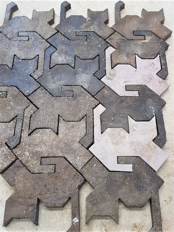
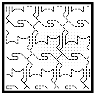
You may have seen this image floating around the ‘net today. It’s of concrete tiles, cast into tessellating cat shapes. It was easy to graph up into a blackwork fill pattern, so I did so.
Then I decided that before I could post it, I had to find the original source and give credit where credit was due.
The hunt proved a bit more difficult than I expected. The thing has been passed hand to hand since 2022, and many layers of links via Pinterest and other social media sites took a while to munch through. But I found it.
The cat tiles are a product of a Korean firm – designdb, and are part of a recycling initiative named Green Road. They are concrete, but instead of aggregate, the firm uses milled plastic waste. In the case of these tiles, the addition is made largely from the empty, discarded bags that formerly held cat food. You can find the firm’s description of the project here. Call up Google Translate to navigate the Korean. No clue if these are sold internationally, but the initiative itself is worthy of respect.
And now having given the design firm its due, I present a simple blackwork embroidery fill based on their tessellated cat design.
Enjoy!
LOOKING BACK AT AN OLD PROJECT
I’ve been tidying up my closets and drawers. I stumbled across a couple of items that I haven’t worn in a long time. Luckily they still fit well enough, so they’ve been rescued and added to the regular rotation. One was this T-shirt style pullover.

It’s one of the most intricate projects I did, mostly because I designed it myself. I did it back before Russian language sites became notorious for malware dissemination and wholesale piracy/copyright infringement. There were a few knitting sites back then that were clearly hobbyist-generated, with hand drawn charts for texture patterns. Needless to say there are many reasons why I do not recommend visiting any of them now and strongly caution against it, but I do confess that in the early days of the international Internet, I did browse worldwide.
In any case I stumbled across a hand drawn texture pattern thumbnail that led to this diagonal design. It wasn’t as tall a repeat as I present, and the drawing didn’t show a center mirroring, but both that detail and elongation were so obvious to me at the time. So to maximize the fun, I doodled up a pattern. The resulting repeat with its offset verticals was SO large that to this day it remains one of the largest knitting charts I’ve ever drafted.
The yarn I used was a bit unusual. I knit this from Silk City’s Spaghetti – a narrow cotton tape ribbon, with a native gauge that was roughly sport weight (24 stitches to 4 inches/10cm). The result was both crisp and springy, making a negative-ease garment that was quite come-hither and curve-hugging. Any hard twist sport weight cotton, linen or ramie can be used. As dense and tightly twisted as possible for maximum display of the textures.
I knit this project before I began blogging with intent – probably around 1991 or so. I shared an initial write-up in the ancient KnitList email based chat group, and eventually revised it and posted it on an earlier incarnation of String-or-Nothing in 2004. It’s been up and available ever since, but I don’t know of anyone else who has tried to knit it. The short length and close fit however seem spot on with current street fashion so I present it again. If I had a full length mirror I’d post an as-worn, but I am quite a bit older, and a bit bigger these days. The pattern is offered in just one size, and given the stretch would probably fit a US size 14-20 of ample endowment. I knit and wore it as a 16-18, and can still present it credibly if a bit brazenly as size 20. You could probably tinker it down a couple sizes using a slightly thinner yarn and smaller needles.
The name? I named it after the middle name my mom always thought was hers, until a birth certificate was obtained and she found out she’d been saddled with another. Since it was a Russian derived name and my mom has always been my knitting inspiration, it seemed fitting.
You can download the pattern for Raiisa here,
or from the sweaters section of the free Knitting Patterns Page tab available elsewhere on this blog.
FILE FOLDER ARCHAEOLOGY
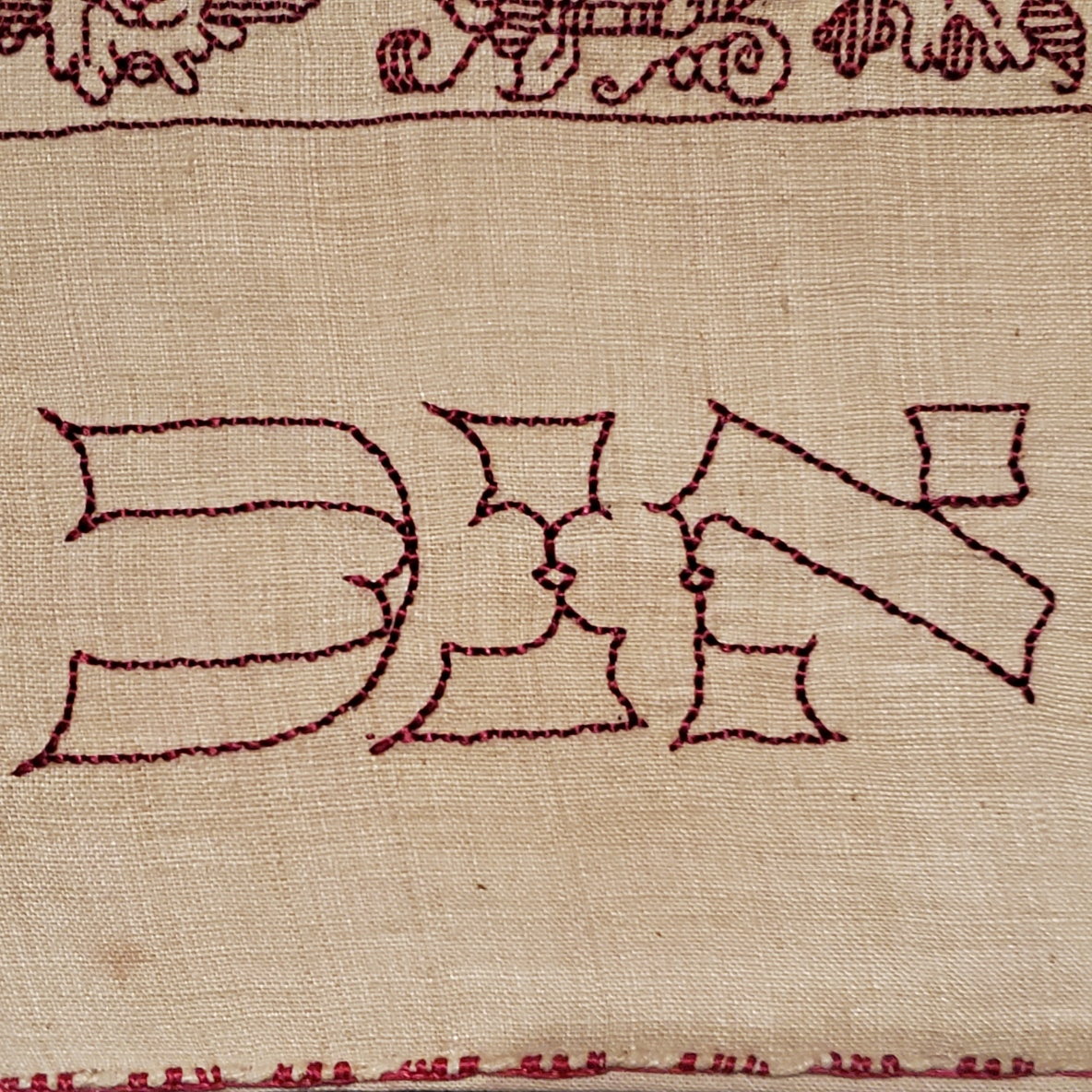
It happens that this week a couple of people have stumbled upon this old unfinished sampler that now hangs on my Wall of Shame.

It’s unfinished because I had started it as a wedding present for a friend. Sadly her engagement ended before the wedding. I never felt like finishing it off after that, although I still have it. It’s also the only piece I have ever done on Aida. I didn’t enjoy working that ground, which is probably another reason why it has languished since the early 1980s.
The reason these folks found it was that they were looking for a charted Hebrew alphabet. I knew I had one. Somewhere.
I had drafted one up, and it had gone through several iterations. The first was for a contemplated but never started service project for my family’s congregation – a Torah cover, to be exact. But I never had the time to follow through, so the scrap of graph paper was stowed in my doodle notebooks. About 8 or so years later I began this gift. I rescued the earlier scrap, played with the letter forms a bit based on the Macintosh pixel based Hebrew font. I added back a bit more of the pen and ink serifs, and messed with proportions a bit. After this project went into dormancy that doodle joined the earlier one. And I went looking for both this morning. Needless to say I didn’t find either. But I still have the sampler, so I re-graphed the alphabet based on how I stitched it (and tinkered a bit, again).

Click here for an easy to save PDF of the Hebrew alphabet chart above.
The first two lines at the upper right are the full alphabet. The five characters immediately below them are special. A few of the letters are written differently when they appear at the end of a word. You can’t write without them, so I offer them, too.
In addition to just a plain alphabet, I have charted up some of the most commonly stitched words.
Shalom – Peace
Mazel – Luck
Matzah (also spelled Matzoh) – The unleavened bread eaten at Passover. Some families have special linen napkins to cover the matzah for their Seder celebration.
Lechem – Bread. Like the Matzah cover for Passover, some families have a special napkin to cover the bread for holiday meals and for Shabbat.
Mizrach – East. In Europe it was the custom long ago to mark the Eastern wall of a place of worship or learning as a reminder of Jerusalem. It’s not done as often now as it used to be, but Mizrach embroideries do pop up on Judaica collections.
Now please don’t go asking me for translations or interpretations. I’m pretty much a late entrant to Hebrew School and I continued to struggle with the language in college. So much so that I ended up dropping back to French for my language credit to graduate.
The Hebrew chart will also join the others on my Embroidery Patterns tab.
Another Artifact of the Past
While I was hunting around for the alphabet doodles, I stumbled across the original of the handout I used to use when teaching basic sock knitting. It contains an abbreviated sock that we would work through together in the workshop, plus some of the other sock patterns available here on String. Also, it includes the pattern for the famous “You’re Putting Me On” Socks by express permission of Judy Gibson, that pattern’s author. Judy was major inspiration for sock knitters in the early days of the Internet, and merrily led hundreds of us astray into projects we wouldn’t have dared without her support. The 15 page booklet ends with some other useful references, including a chart of standard sock sizes and measurements, some (mostly dead) links to sock resources on the ‘net, and a visual on Kitchener grafting.

Click here for a free download of my Sock Knitting Workshop handout.
I’ll probably add it to my books page. Eventually.
A SPANISH GENTLEMAN AND HIS COLLAR
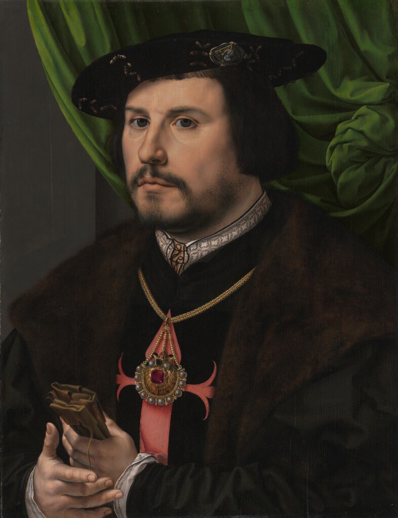
Once again discussions on Facebook have brought a portrait to my attention. Elspeth over at Elizabethan Costume has found something I’ve been seeking for a long time. An portrait of an individual with a Spanish name, with a sitter that is wearing what we would describe as blackwork.
While 19th and 20th century discussions of blackwork in the Tudor period often call it Spanish Blackwork, and offer “Spanish Stitch” as another name for double running. But there are very few portraits of Iberian individuals wearing it, as one might think there would be if the folk attribution of Catherine of Aragon’s introduction of a style already popular in her homeland was to be corroborated. This portrait, dated 1530-1532 is by Jan Gossaert, and is part of the J. Paul Getty Museum’s collection, accession 88.PB.43. It depicts Francisco de los Cobos y Molina, who served in Charles V’s Holy Roman Empire court as a trusted secretary and advisor. The Morgan Library and Museum notes the absolute identification of the sitter. Note that shortly after this was painted, Catherine far away in her English court was only a year away from Henry’s declaration that their marriage was invalid (1533) and her subsequent sequestration.
There are higher resolution pictures at the museum link, above.
To say thank you to Elspeth and to spread my joy in finding a heretofore unknown bit of delight, I share a graph for that collar.
Click here for a full size downloadable PDF of the pattern below.

Now. How “authentic” is my representation?
I’d say it’s no more than an honest representation. Remember that the original I am working from is a painting. The painter did his best to capture the alignment of the verticals with the horizontal interfaces, but he fudged almost all of them. What I’ve done is to show the design elements in as close to the original proportions as I could manage, with the correct number of “pips” inside the boxes formed by the repeat, and represent as well as I could the marching row of them more or less evenly spaced across the top edge of the collar band. Like the painter, I have fudged the geometry of the thing to make it fit. And of course the nature of those pips is open to interpretation. Little hoof-like triangles? A three pronged fork, bent to one side? Should the ones in the square be closer to each other than I show? Should the middle one of each box side be taller? All of these would be as valid as what I show. After all, a tiny blob of paint can be seen in many ways.
I will be adding this pattern to the Embroidery Patterns page here at String, so it can be easily found in the future. If you choose to try out this design, please feel free to share a photo. I do so enjoy seeing what mischief these doodles attempt out there in the wide, wide world.
UP CLOSE AND PERSONAL!
Yesterday a friend and I went to the Boston Museum of Fine Arts, in specific to see the “Strong Women in Renaissance Italy” exhibit. We also took in “Fashioned by Sargent”, and wandered at will and whim through other halls, especially those in the new wing. All in all, it was a splendid day out, full of fascinating things to see and discuss, in excellent company. This post focuses on the Strong Women exhibit. I enjoyed the Sargent exhibit, too, but I took fewer photos. If my friend has more than I do, I might do a follow on about it though.
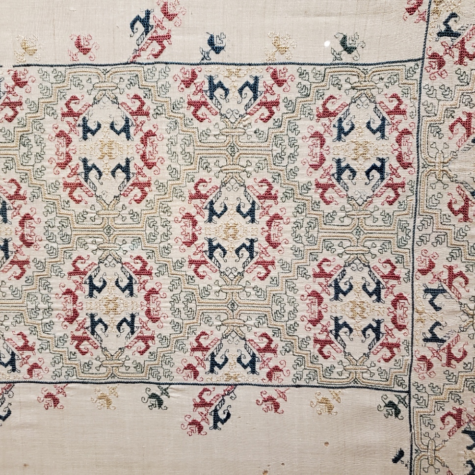
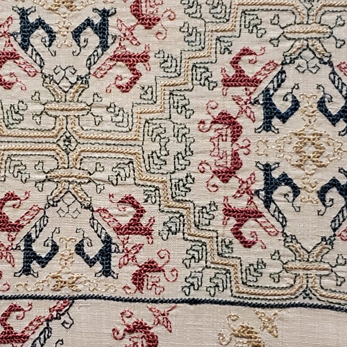
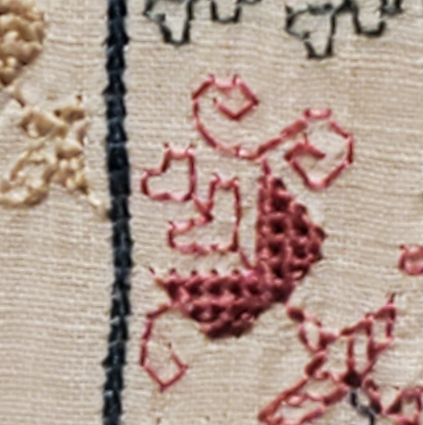
My main motivating reason to go was that the Renaissance exhibit included an artifact I’ve written about before. On loan from the Jewish Museum in New York is Honorata Foa’s red countwork Torah binder. Here is a photo I took at the MFA, of a bit that’s folded under in the official Jewish Museum photo linked above.

And an ultra-closeup. Note that the work is stitched over a grid of 3×3 threads.
Compare the original to my rendition, stitched on a big-as-logs, known thread count of 32 threads per inch, over 2×2 – 16 stitches per inch. Yes, I brought it with me, and photographed it held up to the glass display case.
Given the difference in scale of the two, and allowing for the inch or so of distance between them, a rough eyeball estimate is that the ground for the Foa original is about the equivalent of the 72-ish count linen we all used for the Unstitched Coif project. I also think that the weave on the Foa original is ever so slightly more compressed east-west than it is north-south. making the diagonals a tiny bit more upright than they are on my version. Fascinating stuff!
Now that I see the structure, scale and alignment of the Hebrew letters, I am beginning to think that they were written out and then over stitched, conforming as much as possible to the 3 over 3 rubric, as opposed to the regular countwork of the foliate strapwork above them. For one, they don’t inhabit the same baseline. And they do seem to employ improvised angles and variant stitch lengths, although they were clearly done by someone with a skilled hand who took pains to keep stitch length as uniform as possible over those variant angles. Even so, I may be able to improvise a full alphabet of them, adapting the missing letters from the forms of those that are displayed and known. Another to-do for my ever-growing list…
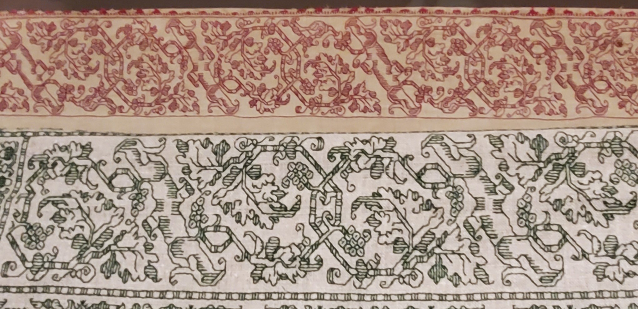
The Foa Torah Binder was not the only fascinating bit of needlework or textiles on display. On the non-stitched side, there were two long lengths of sumptuous silk velvet brocade, one with a manipulated texture (possibly stamped to create highlights and shadows). What struck me the most was the scale of the patterns. The pomegranate like flower units were as big as turkey platters – far larger even than the legendary motif on the front and center of the famous Eleanor of Toledo portrait:
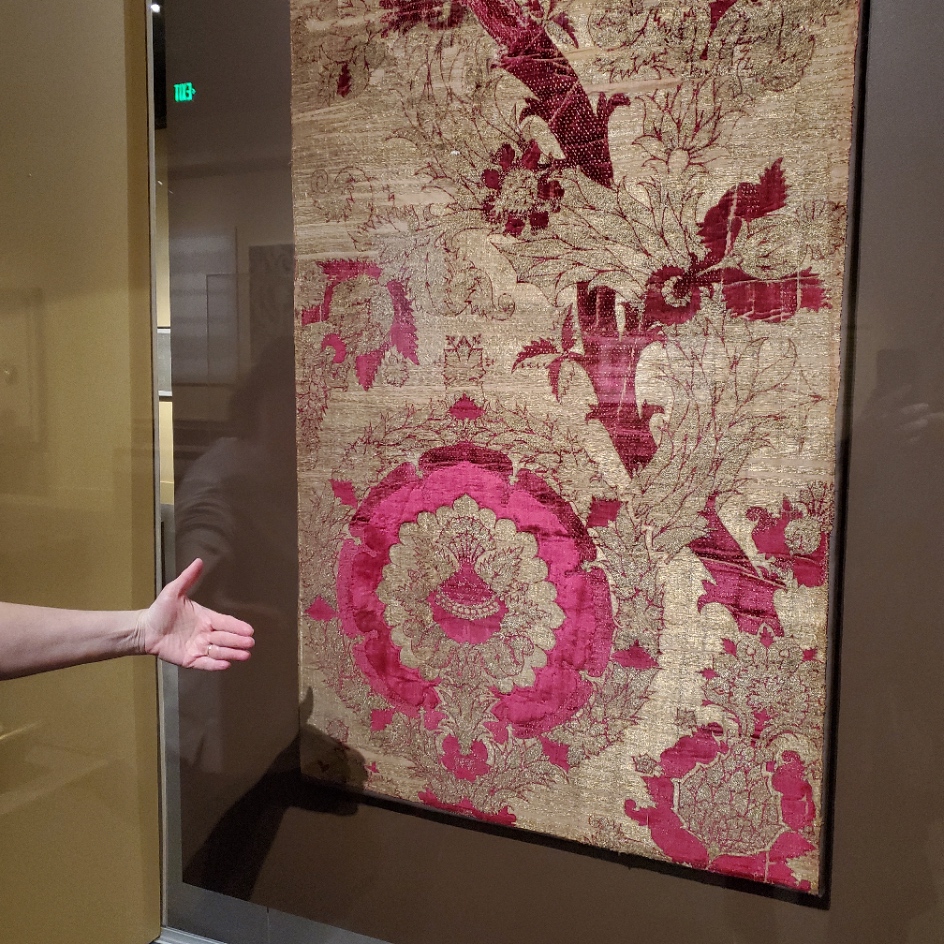

The red one on the left was credited as “Length of Velvet”, from Florence, circa 1450-1500. MFA accession 31.140. The helping hand for scale was provided by my friend. The one of the right is “Length of Velvet”, possibly from Venice, 15th century. MFA accession 58.22. The photo at the museum link is closer to the color (the gallery was dark) and shows off the highlights and shadows impressed into the velvet. Those aren’t two colors, they are the product of some sort of manipulation of the nap. It’s not shorter in the lighter sections, it looks like it’s all the same length, but some just catches the light differently, which is what made me think that it might have been heat/water manipulated with carved blocks. But that’s just the idle speculation of someone who knows nothing about fabric manipulation techniques.
There was another counted piece. It can be difficult to judge the size of these from on line museum photo collections. Even when the dimensions are given, sometimes it just doesn’t input.

Photo above shamelessly borrowed from the museum page, where they describe it as a towel. The object’s name is a purported description of the stitches used. Punto Scritto and Punto a Spina Pesce MFA Accession 83.242, Italian, 16th century. Towel size? Nope. Tablecloth to seat 8 size. Wow.
Here are my photos.


Punto Scritto is another name for double running stitch. That’s ok. Punto a Spina Pesce has been used by the museum to describe some but not all Italian works featuring a variant long armed cross stitch. I think I can see that in the solid, heavier green and yellow lines.
Without having seen the backs, which would clarify this, I suspect that Punto a Spina Pesce (fishbone stitch), is the version of long armed cross stitch that is done by taking stitches with the needle parallel to the direction of stitching as one moves down the row, rather than the one where the needle is held vertically as one works. While the front of both is almost identical, the appearance of the reverse differs, with the horizontal-needle one being formed similar to the way stitches in herringbone are worked. The horizontal method leaves long parallel traces that align with the row-like appearance of the front. If multiple rows are worked this way, there are raised welts in all but the first and last row because the thread on the back is double layered as each consecutive row is added. In the latter there are also parallel lines on the back, but they are perpendicular to the direction of the stitching and overlapping threads on the back are also vertical. As to which one is “correct” – both seem to exist in the folk tradition, so pop some popcorn and sit back to watch the proponents of each fight it out.
A third technique is used. The colored buds are filled in using what I call “Meshy” – the drawn work stitch based on double sided boxed cross stitch that totally covers the ground, and is pulled tightly enough to look like a mesh net of squares. That’s most often employed as a ground stitch in voided work, but it is not uncommon in foreground use, as well. This one is on my charting list, too.
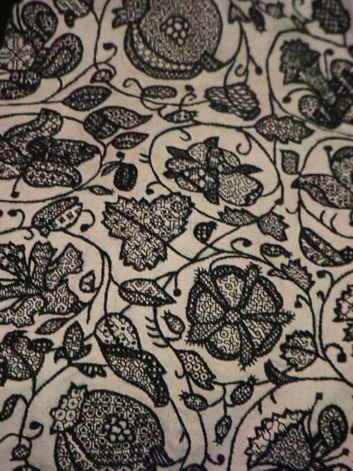
One last thought on this piece – it reminds me a bit of a strip I charted and stitched up a while back, as part of my big blackwork sampler. The source for that one is here, Metropolitan Museum of Art, Accession 79.1.13, Strip, Italian, 16th century but the photo below is of my work.

There were more stitched pieces in the room, but the only other charted one was this adorable chubby unicorn piece in drawn thread. It’s tons of fun to stumble across things I’ve got in my research notes, but never seen in person. This one is MFA’s “Lace”, 16th century Italian, Accession 43.237. Long shot below borrowed from their site.

The museum chose to display this one scrolled, like they did the Torah Binder, so that only a portion was visible. Here are my three shots, left, right, and center.


Yes, there are many ways to achieve this look. But squinting closely one can see that no threads were picked from the work as in withdrawn thread work. There are neat little bundles of three threads where the solid areas meet the mesh ground. (Easier to see in the flesh than in my photo though).

It’s clear that this piece was cut from a larger cloth. I wouldn’t be surprised to find another fragment of it in another museum collection someday. That’s not uncommon. But for now, chubby unicorns, their big quaternary star and attendant scrawny vegetation are also on my to-chart list. But I am curious about the ornament above them.
Now there were lots of other items on display in this exhibit, most of which I’ve seen in the BMFA’s on line photo collection – other stitchery, several modelbooks (all open to needle lace pages), lots of ceramics, and many paintings. Some of which from the “back stacks” – items not on usual display. It was grand to see them out and being admired. I admit I did not download the guided tour and didn’t buy the accompanying $45 book, but while there were lots of women depicted in these massed works, there were very few historical individuals described or shown.
I was hoping to learn more about (for example) what individual female members of the Italian mercantile nobility actually did, beyond being married for political alliances. There were a few portraits, but not much of the story behind the sitters’ identities (if known at all) was presented in the in-room captions. There was a smattering of works by female artists, but the majority of pieces were by men, depicting saints, virtues, and ideals – laudable and arguably strong, but not the personal presence I had hoped for. All in all it was a lovely exhibit, with tons of pieces that were interesting in and of themselves, but as an exhibit showing the power and reach of Renaissance Italian women, it came off more as an assemblage of things from their time, rather than a documentation of their lives, ambitions, and accomplishments.
BUZZ ON BEESWAX
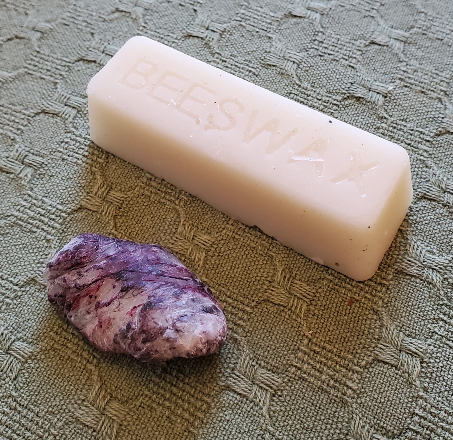
I keep seeing questions about waxing threads on various social media needlework discussion groups. I usually end up retyping this. So to make reference easier while offering up this Helpful Hint, I take the time to write it out in long form.
I use beeswax on my threads for blackwork and cross stitch. I only use 100% beeswax, not candles or other beeswax products that often contain fragrances, colors, or agents to soften (or harden) the wax. Whenever possible I buy it direct from beekeepers, at farmers’ markets or county agricultural fairs, avoiding the overpriced boxed or containerized offerings at big box craft and sewing stores. I’ve also bought it via Etsy and Amazon, but am leery of super-low priced imports that might contain adulterations. I look for domestic producers with a range of local bee-related products instead, especially those who guarantee the purity of their product. Even then it’s not a very expensive purchase. A one-ounce mini log is currently running between $1.50 to $2.00, and will last for years and years. By contrast those Dritz plastic containers of wax with no ingredient labeling are about $5.00 for an unweighed bit I estimate to be less than 25% of the mass of the one-ounce mini logs.
What does beeswax do for me?
- It tames surface fuzz on my threads, making them sleeker and smoother.
- It aids in needle threading, making that much easier and quicker.
- It cuts down on differential feed when using two plies of thread together. That means that both plies are used at the same rate, and I am less likely to end up with one extremely shorter than the other after a length of stitching.
- It eases thread passage through the fabric and “encourages” threads to lie next to each other in mutual holes rather than earlier threads being pierced by successor stitches. I find this leads to neater junctions in double running stitch and neater stitch differentiation in cross stitch.
- Since I stitch with one hand above and one hand below, occasionally the working thread is “nipped” as it is passed back from the unseen back to the front. A problem that leads to work-stopping knots and snarls that have to be teased out. Waxing cuts way down on this because the thread fibers are kept closer and are more difficult to snag.
- Less drag from less fuzz and eased passage through the work allows me to use a longer length of thread than I can get away with without waxing. Even a little bit of extra length before the thread degrades enough to make the work messy makes it easier to achieve a uniform appearance when working the second pass of double running, or doing the “return leg” of a line of cross stitches.
I wax my threads for blackwork and cross stitch: cotton, silk, faux art silk (aka rayon), linen – everything except wool. Note that I tend to work on higher count grounds rarely venturing below ground thread counts of 32 per inch (16 stitches per inch when done over 2×2 threads), and usually in the 38-46 range, sometimes up to 72 threads per inch (18 to 23, and up to 36 stitches per inch respectively). My blackwork and cross stitches are relatively short, so thread sheen is not a factor. If I am working satin stitch, or a longer linear stitch that takes advantage of thread directionality and sheen, like satin stitch, I skip the wax.
I usually keep two of those single-ounce logs going – one for dark colors, the other for light because even the best threads will crock dye and leave traces of lint in the wax as I use it. Since I do a lot of blackwork with strong colors, I don’t want to run a white, yellow or other delicately tinted thread through the accumulated color left behind by the darker ones. Below is a one-ounce mini log, untouched; and the remains of an identical log after about seven years of very heavy, daily use. The frugal will note that there’s more than enough in one mini log to break it in half, and use one piece for dark colors and the other for light, but that’s not what I did here. That grungy little stub used to look exactly like its brother. It’s so filthy now I may break down and melt the stub, skim off the lint and recast it in a silicon baking mold.
Applying wax to working threads is quite simple. I hold the bar in my hand, with the thread to be waxed between my thumb and the bar, under gentle pressure. Then I use the other hand to pull the thread across the surface of the wax once or twice. I don’t want to wax heavily – there should NOT be flecks of wax on the thread, and it should not feel stiff as a wick. In fact, after I thread my needle I usually run it once or twice through a scrap of waste cloth before use to remove any that might be there, before using the lightly waxed thread on my project at hand.
Back to when to use and when not to use beeswax. Here are a couple of examples. First, my project-in-waiting – the Italian green leafy piece. Lots of satin stitch. The dark green outlines are two plies of Au ver a Soie’s Soie D’Alger multistrand silk floss on 40 count linen (over 2×2 threads). Wax on all the outlines, even though they are silk. That infilled satin stitch worked after the outlines are laid out? More of the incredibly inexpensive Cifonda “Art Silk” rayon I found in India. No wax on the satin stitch. That lives or dies by thread sheen and directionality. While the stuff is very unruly and I do wax it when I have used it for double running or to couch down gold and spangles on my recent coif project, here doing so would not give me this smooth and shiny result.
And an example from the coif mentioned above. It’s on a considerably finer ground – 72×74 tpi. All of the fills are done in one strand of Au Ver a Soie’s Soie Surfine in double running. All waxed. The black outlines on the flowers and leaves are two plies of the latest batch of four-ply hand-dyed black silk from Golden Schelle, done in reverse chain stitch. Also waxed. The yellow thread affixing the sequins and used to couch the gold, the same Cifonda rayon “silk” used in the leafy piece, waxed, too. The black threads whipping the couched gold are two plies of Soie Surfine, waxed. But the heavy reeled silk thread ysed for the outline is Tied to History’s Allori Bella Silk. It’s divisible, and I probably didn’t do it as the maker intended, but that’s two two-ply strands, plus a single ply teased from a two-ply strand – 3 in all – worked in heavy reverse chain. That’s a longer stitch, thicker than even the black flower outlines, and because the stitch was long and I wanted to make it stand out from the other black bits, shine was part of what I needed. NOT waxed.

Many people have asked me if waxing makes the piece collect dust faster, leads to color migration, or makes the stitching feel heavy and well…. waxy, or if it stains the cloth when the piece is ironed. My answer is that I find no difference in dust accumulation on my finished pieces on display. And I see no color change, either. Beeswax has been used for stitching for hundreds of years with no ill effect that I have seen reported. Modern substitute thread conditioning products of unknown composition have not undergone that test of time.
As for a heavy, waxy feel – again, no. Not if you apply it lightly. I do cover my stitching with a piece of protective muslin when I iron it, and never iron pieces on which I’ve used the Art Silk anyway. I have never noticed waxy lines of residue on my ironing cloth when I have ironed my cotton, linen, or silk pieces.
So there it is. Waxing, why and how I do it. Your mileage may vary, of course.
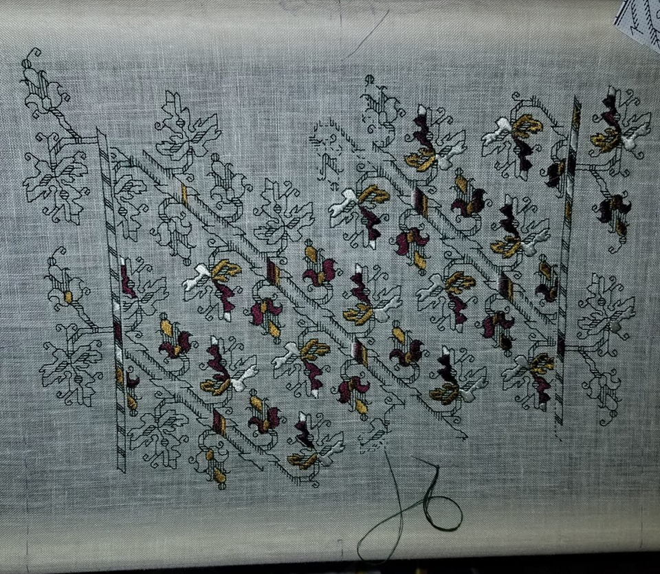
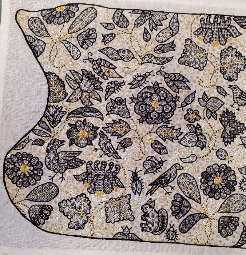
UNSTITCHED COIF – FINISH. THE FILLS
As promised here’s the breakdown of the design, motif by motif – a guided tour of what I was thinking or not thinking about. This is turning out to be way longer than I expected. Feel free to scroll down to the eye candy and ignore the prose.
First, on the general aesthetics, I already confessed yesterday that this piece is a departure from the strictly historical, using stitches, materials, and fills that have no specific point source in a particular artifact contemporary (or near contemporary) with the original Victoria and Albert Museum piece of ink-drawn linen. But in spite of that I’ve tried to stick to general aesthetic. It was a time of “more is more.” Pieces like this coif were status items that proclaimed the wearer’s wealth. I heard Thistle Thread’s Tricia Wilson Nguyen lecture at Winterthur about how copious precious metal spangles, threads, and even lace served as walking bank accounts, shouting prosperity but still being available as liquid capital to an owner whose fortunes dipped so low that reaching for a scissors to snip off a bit for ready cash was a welcome option. To that end, I’ve doubled down on the gold accents. But not being as flush as landed gentry from the late 1500s, I’ve used imitation gold thread and gold tone mylar rounds.
I’ve also tried to emulate the more lush aspects of some historical blackwork pieces, that created depth and shaded nuance by using fills of different visual density, augmenting the effect with raised outlines. I would have liked to use a plaited stitch for the stems, but it’s clear that the original artisan didn’t leave room for them, so I settled on outlines that were markedly heavier than the fills, topped off by a whole-piece outline that was even thicker and more dimensional.
I also like the difference in blacks used. The fills in the thin modern-dyed spun silk single strand are dark enough to look lacy and contrast well with the ground. The outlines, done in the boutique, small batch historically dyed double strand (also spun) are a much softer black. In some places the black takes on a reddish or brownish tinge, or moderates to an even less dense charcoal. If they were as deeply toned as the fills I think that each leaf, petal, or wing would present more as a grey-scale visual mass rather than letting the fills speak louder than the outlines. Finally the deeply black modern dyed but glossier reeled filament silk used in the perimeter then echoes the black of the fills, and makes a world of difference to the piece, pulling it all together. All black, all different, and all contrasting with each other.
On planning and fill selection, I winged it. I didn’t sit down and plan anything. I picked fills on the fly, with only a vague idea of where I would put dense, sparse, and intermediate fills as I began each sprig or group. Some succeeded quite nicely, others I would re-do differently had I the chance. Would I ever sit down and plan an entire project’s density/darkness/shading map ahead of time to avoid this? Probably not. It’s more fun to bungee-jump stitch.
On to the piece. First a quick recap of the whole item:

On this whole coif shot I can see three center circles of motion in the design, one surrounding each rose, and one surrounding the two centermost unique motifs – the borage flower/strawberry pair. The rest of the flowers are surrounding those elements. Maybe I see them because I’ve been staring at the thing for so long, or maybe my admittedly ornate but heavily outlined rendition with the gold whipped stems sinking into the background pulls those surrounds forward. When the exhibit comes around and I can see all the other pieces it will be interesting to see what other symmetries they accentuate.
We’ll start at the upper left. Although I began at the lower right, it’s easier to walk across starting at this point. I give fill counts and cite the number of fills I used from the project’s official website. Now some of the ones in my doodle notebooks duplicate or near duplicate those (we were after all mining very similar sources), so I apologize if any double-listed ones ended up in the wrong pile.
The first motif in the upper left I have been told is a marigold, one of six on the piece. It’s truncated at the edge by the indent. The marigolds were especially hard to work because those little jelly bean spaces of their petals were so tiny that most of the fills I had included repeats too large to be useful for them. I tended to use four repeats in the outer petal ring, repeating the sequence four times. The inner ring used different fills, usually two. Fourteen fills in this motif, twelve are mine, including the bunny rabbits. The other two are from the collections redacted by Toni Buckby, our Fearless Leader, and are available at the Unstitched Coif project website.
Immediately to right of the partial marigold in the corner is a truncated carnation or gillyflower (hard to tell them apart). Three of these are here, but only one isn’t cut by the perimeter. At this point, relatively late in my stitching I went out on the hunt for additional fills, and redacted a couple of pages of them for the upcoming third Ensamplario Atlantio volume. One of particular note is the leaf at the lower right, with that flying chevron shape, one of several I drafted up from a photo of a blackwork sampler, “Detached Geometric Patterns and Italianate Border Designs with Alphabet” 1697. National Trust Collections, Montacute House, Somerset, NT 597706. The twist and box of the sepal is from the same source. Yes, I know they are later than the coif’s original. Since by definition anything I doodle is even later still, I didn’t see the harm it using them. 18 fills total in this sprig, six from Toni’s redactions, two from mine, and ten of my own doodles.
Next to the right on this photo cut is a columbine. It’s barely snipped, and one of three on the piece. The large leaves made good showcases for some of the bigger repeats, even with the gold overstitching. As a result on this sprig we’ve got only five fills, two of which are from Toni’s pages. On this motif as on all of them, I tried to use fills of contrasting effect. Here in the flower we have the very strong linear grid of the main pattern, paired with the angular acorn spot motif. This flower is also an example of introducing movement or syncopation by NOT using the same grid for adjacent motifs.
Back to the left edge now. This sprig includes a narcissus or daffodil, plus a viola and something indeterminant, possibly a blossoming narcissus, all on one stem. Leaves are also of multiple forms. There are only two of this hybrid sprig on the piece, both nipped by their respective edges. All those little areas add up to 19 fills on this one. I’m particularly happy with the density effects I got on this one, with the narcissus throat, the leaf curl, and the viola sepals bringing darker depth. I did try to find two patterns of similar density for the lower petals on the narcissus, too. I have to look closely to remind myself that they are two petals of one design and three of another.
Next over is the rose. I’ll come back to the bugs that surround it. There are two roses on the coif, and two tiny partial bits on the lower edge. In truth, I’m not enthused about the way the big flower turned out. I like the sepals and the outer ring of petals (three fills, all of the same tone), but the inner rings aren’t well differentiated – although I used one fill for all five of the middle ring and that isn’t bad, that inner ring with its three fills is rather boring. Were I to do it over again I’d make some different choices here. I used sixteen fills in all for this sprig, including two of Toni’s set.
The creatures dancing “ring around the rosie” includes seven bugs and two birds. Visually they do make a circle around the rose, with one larger bug flying off above the narcissus. Here I spy a mistake, and the thing being in transit right now, it’s too late to fix. I meant to go back and add little gold stripes to the body of the bug to the upper right of the rose. Those tiny bits of couching were the ones I liked least to do. So it goes.
Like the marigold petals, the body parts of all the coif’s bugs were a challenge. Some are so tiny that it’s hard to squeeze anything resembling a pattern into them. I doodled on those, but I tried hard to make the doodles unique. In a couple of cases I found I had made a duplicate of a pattern stitched before, and went back to make modifications to one of the inadvertent pair. All of the large bugs with sequin eyes have a feature in common. Although it’s hard to see because of the stripes, I used the same pattern for both of their wings, but rotated it 90-degrees to give them extra movement. I have found no historical precedent for using directional fillings this way. Taken as a group, there are 27 fills among all of these bugs and birds, four of which are from Toni’s pages.
Reading across, the strawberries are next. (I’ll cover the bird to its right in the next post). There is only one strawberry sprig on the project, and it’s another challenge because of the small petal and sepal spaces. This is another motif I count as only a partial success. I like the top strawberry, flower, and leaf, but I think I should have chosen differently for the lower strawberry. Possibly working the sepals for the second one and that leafy whatever that terminates the sprig both darker. That would have made the lighter fill in the bottom bud a bit more congruent. Thirteen fills in all, four of them from Toni.
Back to the left hand edge of the photo, below the narcissus/viola stem are the large bird, and the second marigold (cut off at the edge). There’s also a tiny bug above the marigold in which I worked “KBS 2023” as my signature. This flower was my finishing point – the last one stitched. Most of the fills in the petals were improvised on the spot. The bird carries an interlace and star I remember doing on my first large piece of blackwork, an underskirt forepart, back in 1976. That piece however was worked on a ground that was about 28 count (14 stitches per inch), not 72 count (36 stitches per inch). You may even recognize some of the other fills I reused on the coif in the snippet below. Vital stats on Marigold #2 – 12 fills for the whole sprig including the large bird, one of which is Toni’s.
The second columbine, to the right of the bird, grows from the bottom edge of the coif. I wonder how many people will look closely enough at the leaf on the left to realize that it’s bugs. I was thinking bees, but I’ve been told they read more like flies, and “ick.” There are four fills in this sprig, one of which is Toni’s.
Adjacent to the right we find Needles the Squirrel, his friend the round bug, and one of those rose snippets. I group them together for convenience. Needles’ pine spray fill is mine, and came about during discussions on line and in the Unstitched Coif group’s Zoom meet-ups. Someone mentioned using an acorn fill for their squirrel, but UK folk were quick to point out that the indigenous Red Squirrel, who preferentially dines on pine nuts, was deeply endangered by the invasive Grey Squirrel, who prefers acorns. So I doodled up the spray, shared it with the group, and used it on mine, bestowing the appropriate name. I’ll find out in December if anyone else used this fill. I also did the directional shift in Needles’ ears. There are only six fills in this group.
Marigold #3 is in the right corner of this photo. He’s also rather a mess. I should have picked two dark and two light fills for the outer ring of petals, instead of one dark one and three intermediates. I did rotate the direction of the fills around the circumference. Oh, the snails? A variant of those snails with their wrong-way curled shell is on the majority of my blackwork pieces. Not quite a signature, but not far from one, either. There are 17 fills in this sprig, one from Toni.
On to the center of the piece.

Back up to the top of the center strip. Here we have the sadly bisected bird, with the fourth marigold to its right. Although the petals are a bit uneven, I did try something specific with this one, using two fills in of similar density in the center ring, and four also similarly sparse fills in the outer ring. I count this one as a success. Together these two motifs contain 13 fills, two of which come from Toni’s pages.
Below the marigold is the singular borage flower. There’s only the one, and he’s at the center of it all. I will cover the caterpillar later. He’s one of my favorites in the piece. I especially want to call out the tiny paisley at the bottom of the stem. The fill there is one that Toni redacted from a coif, V&A Accession T. 12.1948. It is very unusual fill, with the exception of a few that use a circle of stitches radiating from a center hole sunburst style, it is the ONLY historical fill I have seen that uses the “knight’s move” stitch – two units by one unit, to produce a 30-degree angle. Knight’s move stitches are very common in modern blackwork, but exceedingly rare in historical pieces. Knowing this I’ve drafted up hundreds of fills and in keeping with this paucity, have only included them on three or four of the most egregiously modern. The little stirrups in that paisley open up a whole new world of possibilities. Borage contains 11 fills. Five of them including the stirrups are Toni’s.
At the bottom below the borage is Carnation #2, attended by four insects. I am also fond of this one, especially the long skinny bud on the lower left. That striped lozenge filling is one of Toni’s and I adore it. With all the folded leaves there was ample space to play with density, and it was fun to pick these fills on the fly. All the more so because the combos worked. The insects, from lower left, a caterpillar or worm, an amply legged spider, a moth, and a beetle, are a playful way of rounding out the space between the center and the side areas, the latter being (mostly) mirrored near-repeats. This group holds a whopping 23 fills, nine of them from Toni’s redaction page.

And back up to the top we go. Carnation #3, another truncated motif. Like the last carnation this one had a lot of play for contrast. It was actually among the earlier sprigs I stitched because I began upside down in what is now the upper right hand corner. This is the motif on which I began to get a better feel for the size of the repeats in the fills and how that size related to the dimensions of the shape to be filled. There are 19 fills in this one, including two of Toni’s.
Below this last carnation is Rose #2 and its bug and bird armada. Don’t worry, I am not double counting the moth I included with Carnation #2. I like this rose slightly better than the other one, but don’t count either one as a stunning success. I may excerpt the rose and try again. In any case you can see that I’ve hit full stride here in using fills of various repeat sizes.
For the most part I stitch fills then go back and outline them when the motif is complete. I have always found that to be a forgiving way of working that allows fig-leafing of the fills’ often all to ragged edges. But on the caterpillar (my favorite insect on the coif) I started at the head, stitched its fill, and then outlined it. I continued in this manner segment by segment. I did this because I knew if I waited until the end, my divisions between the body segments would get muddy. I wanted to make sure that the little center divots that ran down his back were seen. I probably wouldn’t have attempted this if I hadn’t seen others in the Unstitched Coif group Zoom meetings working up all of their outlines, then going back and adding fills.
Rose #2 and accompanying critters used 31 fills, including six from Toni’s pages.
Below and a bit to the right of the rose is Columbine #3, and a partial rose. There’s also a lump from which the columbine sprouts, but that may be a mistaken interpretation on my part. Perhaps that was supposed to be an arched stem. Maybe yes, and maybe no. I spent a lot of time dithering about how to handle the columbines. Those curly narrow top protrusions in particular limited the size of the repeats that could fill them effectively, especially if I wanted to play up the contrast between the gold topped and plain petals. The circle fill (one of Toni’s) worked nicely and set the tone for my later choices. In this grouping there are nine fills, including Toni’s circles.
Back up to the top for Marigold #5, which happens to be the first bit I stitched. The leaf with the larger butterflies was the first fill I did. When I started I thought that stitching over 2×2 threads might be problematic, so I worked this one over 3×3. However my eye and hand are SO attuned to 2×2 that it was clear that the new count would drive me to distraction, so I quickly switched to my standard. But I didn’t pick out the errant leaf. I doubt if I hadn’t mentioned it you would have noticed. In any case you can see that I was very tentative on fill repeat size on this first flower. For example, I could have used much larger repeats in the leaves. Still this was the try-out. I beta tested using fills aligned in radial directions, the gold center coil (here only a half), veining and stems in couched gold double strand, and curls in couched single strand. And adding spangles. Once they were in I noted how the stems disappeared, so I went back and whipped them with black to make them stand out a bit from the background. This sprig uses 15 fills.
Below the marigold is the second Daffodil/Narcissus and Viola sprig. I’m generally pleased with it, although I wish I had saved the feather fill for one of the birds. You will note that I take no special care in always whipping the stems in the same direction. I did them in the most convenient/least awkward direction because needle manipulation to avoid catching previously laid down work was very important. As I went on I destroyed most of the sequin/French knot eyes and some of the smaller couched gold bits by snagging them with my needle tip or smashing them with ham-handed stitching. I ended the project by replacing all of the eyes. There are 19 fills in this motif, two of which are from Toni’s pages.
Last but not least we have yet another marigold, Marigold #6 with bird, bug, and bits. I confess that the marigold was my least favorite to work, even by the time I did this one – only the second one I stitched. That little intrusion below the bud may also be a vagrant bit of curl or stem, but I filled it in anyway. This bird has the first sequin/french knot eye I did. I also experimented with three sizes of little seed beads, but decided that they were too dimensional and/or just too big for this use (the paillettes I used are only 2mm across). Our final motif has 19 fills, including one from Toni’s page.
That ends the guided tour. The total count of unique fills on this piece is 274. 51 of them are from the pages of fills redacted by our Fearless Leader, Toni, and posted on the project’s home website. The remaining 223 are mine, mostly taken from my Ensamplario Atlantio series.
Would I ever attempt something like this again? In a heartbeat. BUT I will never do another piece of this size and stitch count to deadline. While it was intensely fun every minute of the roughly 900 hours I was stitching, I prefer to stretch those hours out over a longer time period. Intense thanks to Toni and my fellow Unstitched Coif participants, for the opportunity, the learning experience, the encouragement, and the camaraderie. I am looking forward to the December exhibit, and to meeting as many of you as possible, in person.
When the flyer for the exhibit is released I will post it here on String, on Facebook, Instagram, and Linked In. In the mean time, reserve the date – it will be on December 18 through the 24th, at the Bloc Gallery, Sheffield Museums, Sheffield, UK.
YET ANOTHER BLACKWORK PATTERN INTERPRETATION
A big thank you to the Facebook/Blogspot guru who posts at Attire’s Mind. Today he posted a painting from the collection of the National Gallery of Art, (Accession 1931.1.114 in case the links break). It’s a devotional image by Giovanni Battista Morini, and is entitled “A Gentleman in Adoration before the Madonna.” It’s dated to 1560.

The Attire’s Mind post called out the blackwork on cuffs and collar.
Of course I was smitten with the pattern and had to graph as close an approximation of it as I could. It’s got a bit of interpretation, but given that the original I am working from is paint and not countable linen, I think that relying on best-effort/logical construction that achieves the motifs using the least real estate is good enough.
This one is especially interesting because it looks like the artist went out of his way to depict two line thicknesses. These could have been achieved by using different stitches, or by varying thread thickness. I’ve tried to convey that look by using two line thicknesses in my chart. Experimentation with how to render this in real stitching would be lots of fun.
Now, I could save this along for eventual publication in The THIRD Carolingian Modelbook, which I’ve already begun compiling, but given my dismal track record of decade-plus production for each of that series’ two prior volumes, why wait?

You can click here to download this as an easy single page PDF file
It’s also available on my Embroidery Patterns page. Enjoy!
INITIAL EXPERIMENTS
I’ve started in trying out various approaches and threads for the Unstitched Coif project. Here’s last night’s progress on my sidecar companion piece. It’s the same ground and threads I will use on the main project, but done to keep mistakes off “center stage.”
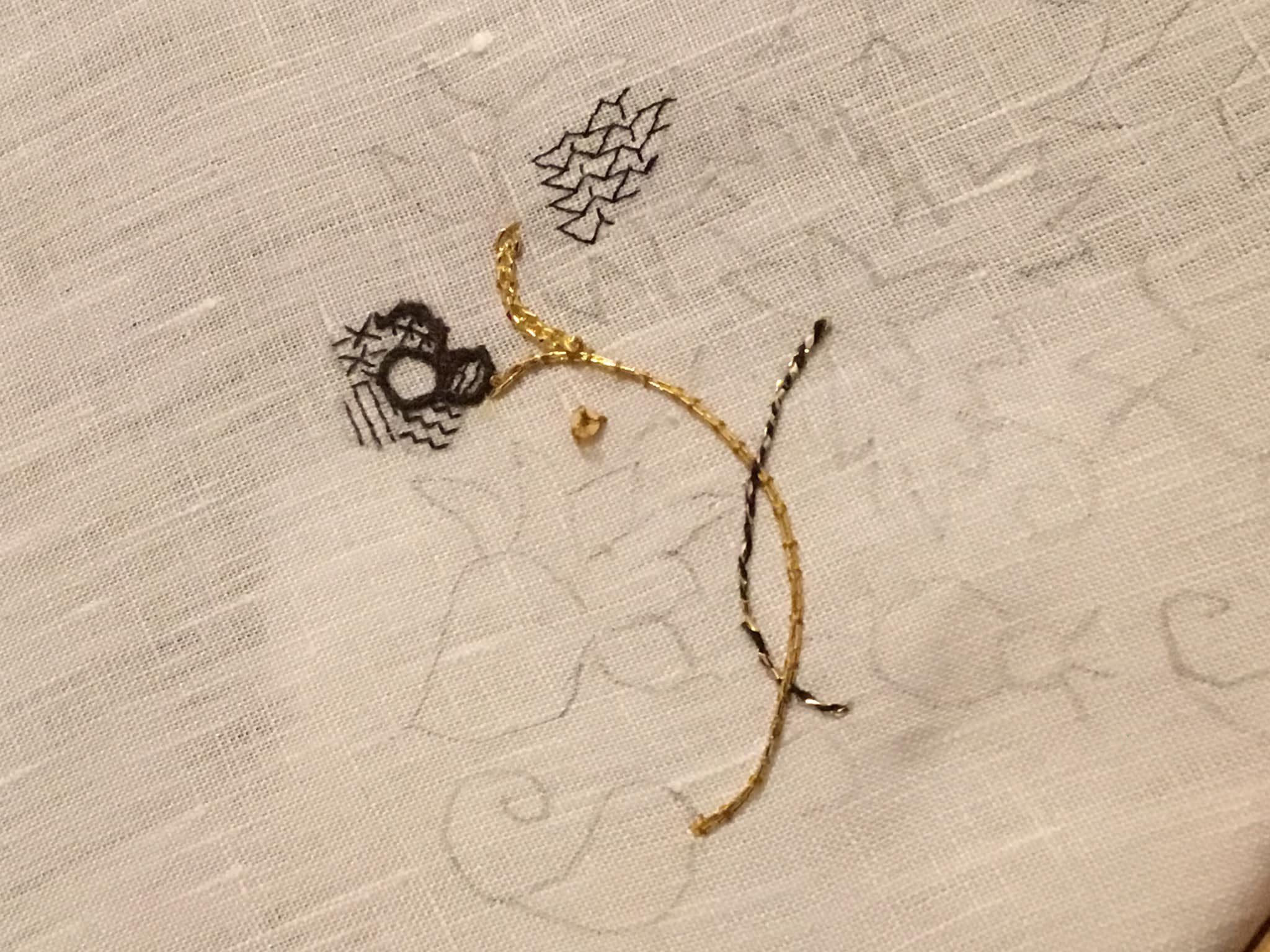
This isn’t final work, just doodles. I am not proud of it, there are lots of things that are sub-optimal. Let’s go through the bits.
First, the couched double strand of Japanese Gold #5. Still getting my mojo back with metal thread couching, I did cross my strands at the beginning of the bit up near the sad little flower, but by and large it worked. And it’s much easier on the flat frame where I can use two hands to stitch, rather than on this little round, where one hand is used to hold the frame itself. If the other hand manipulates the couching thread, I still need a third to tension and bend the metal thread around curves. Sadly, I am only equipped with two hands.
I used a gold color “art silk” for the couching threads, and was able to plunge the ends neatly using a loop of polyester sewing thread to capture them. That thread does not remain in the project. I thread a folded strand into a needle that’s slightly larger than what I would use to stitch, and with the loop trailing, pass it from top to bottom through my ground, then use that loop to nab the metal threads’ ends and pull them through to the reverse.
As far as appearance, not bad. I’ve managed tight curves using this stuff before, and I am confident that I could do it again. But the contrast between the blackwork and the many gold stems might be too great. We will see….
The 2mm paillette sewn just south of the gold stem. It works. It’s the right size for the uninhabited spaces between motifs. I will probably use them to spangle the piece once the majority of the stitching is done. And yes, I used the same faux gold tone silk to affix it, with three stitches.
The thicker gold sprig at the top. Again, that’s the Japanese Gold #5, but used as a passing thread. Only partial success with this bit. I used a reverse chain stitch, and passed the chain loop underneath the legs of the previous stitch, but did not pierce the fabric. While I like the sparkle it adds, it was not easy to do. The wrapped thread denatures, and the #28 needle was impossible to thread. I most definitely need a different needle if I want to use this stuff as a passing thread. Still even though it’s not a heavy plaited stitch and may not be exactly documented as a specific stitch used on historical coifs, the texture sings to me, as an echo of Elizabethan/Stuart era aesthetic. If I can figure out a better needle size, I may use it for some of the logically thicker stem sections. But like the plain couched bit, I am afraid of overwhelming the blackwork. Even more so with with sparkle.
The black and gold stem. Two strands of one of my thicker, stash-aged filament silks. Very fuzzy and prone to catching. I tried out both regular chain stitch and reverse chain (top and bottom of the stem respectively), then I whipped the entire stem with a single strand of the Japanese Gold. Again I had problems with the gold thread unraveling, even though the only place I pierced the ground was at the beginning and end of the stem. Different needle, for sure. And possibly doing it in the other spiral direction. Perhaps I was unknowingly adding to the metal thread’s twist by working in the established direction. But if I can make it work, I do like the look. Perhaps as shown here, I could vary stem treatments, twining full gold with black/gold. Or I could try out a line of double running, back or outline stitch done off count, and whip that, or work another threaded-behind surface treatment with the gold. More thought (and a better needle) is required.
The sad little flower. Been over this one before. My initial stab at counting on this ground. Working over 3×3 threads with one strand of Golden Schelle thread. Not pleased. Nothing wrong with the thread but it but a touch too heavy for the effect I want. That plus my own eyes, the needle size and unfamiliarity with working so fine a count make this bit suboptimal. I also tried using two strands of my slightly thicker stash silk for the outlines, in reverse chain. Too thick. Good for stems at that thickness. Have to experiment with using only one. Or perhaps using two of the Schelle strands for the outlines. More work is needed before I settle on “just right.”
The bit of fill at the very top. This is the debut try-out of one of the finer, newly purchased threads. This one is the one I got off Amazon – YLI 100 weight silk. The tiny spool holds 200 meters.

It has a very smooth finish compared to the others I have, and is quite ethereal. I waxed it with beeswax (as I do all of my threads used for countwork), and that helped give it more body. It was difficult to keep my needle threaded though, because being that fine it could have held a state banquet for fifty more threads of its diameter in the ample eye space of my #28 tapestry needle.
On the effect achieved – yes, I made a mistake in the fill design I was playing with (Ensamplario Atlantio II, #29). I chose that one because it would magnify differences in warp and weft stitch length, both straight and on the diagonal. I am getting more used to working with the magnifier three inches from my nose, and although I have some stitches wrong, they are all in the right spots. The effect though is rather leggy and spider like. This thread may be too tightly spun and smooth for best effect. I will try it out with a double strand next.
So there is my first round-up of experiments. Nothing done yet on the main project. Some food for thought. Some nope. And I am on tenterhooks waiting for the other two threads and the finer needles. But until they arrive, back to the lab for more bench tests!
INCHING TOWARD THE GATE
I amass materials for the Unstitched Coif project.
First, the recommended linen has arrived. It’s very densely woven, and fabulously fine. So fine in fact that my thinnest silk is way too heavy to work the fills. It’s even fine enough to make counting the threads with my Penny Method difficult.


Squinting as hard as I can, at max magnification, I really can’t parse out the count from my photos. I need a better photo set-up, but I can say that it’s significantly finer than 40 count (above).

What thread to use? I went back and asked Ms. Buckby, the project leader what was recommended for fills. She said that on her own piece she was using a a strand of 6 thread (120 denier) silk. So I went hunting for it here in the US, to save the overseas shipping cost.
No retailer of fine embroidery supplies I was familiar with listed denier on their catalogs, so I asked the wise folk at Needle in a Haystack if they had any recommendations. They did, and I ordered two possible candidates plus some wicked tiny #10 and #12 beading blunts to manage them. More on these threads when they arrive and I can beta test them. I will probably still use the silk I have for the more prominent outlines. Thankfully there’s plenty of linen, so I will probably mount a “sidecar” for experimentation, before making major commitments on my main piece.
I also ordered more of the 2mm paillettes I used on Two Fish. That’s only on 40 count, the leftover of which is what’s shown above, and you can see that they are just a smidge larger than the 2×2 thread cross stitches in the fish’s cheek. I am not sure that I will use them, but if I do, these tiny guys are about all that will fit in the “white space” of this intricate coif design.

I also ordered and received an adjustable head-mounted magnifier, much better suited to use with bifocals than the one I had. Thanks for the lead, Callie! I would not attempt countwork on this one with un-augmented vision.

Now while I wait for the threads, the next step is prepping the linen and transferring the cartoon’s outlines onto the fabric.
I did not wash this fabric prior to stitching on it. The weave is already so tight that stitching will be a challenge. Washing tightens linen. It may be a major faux pas, but I don’t want to take that risk.
I thought about using prick and pounce (stabbing tiny holes in the paper, affixing it securely above the fabric and sifting dark powder – usually crushed artist’s charcoal through the holes, then connecting the dots with drawing or painting), but in truth I have had a dismal track record with that method. Instead I am tracing, using glass and a strong light source. I usually do this by taping the design to my big dining room window, then taping the linen on top, but this time I am afraid that the piece is so large that even if I tape it, the weight plus the pressure of tracing will stretch the cloth.
Instead I have improvised a light table, using an old storm window, a utility light, some package padding I saved for no special reason, and some fabric scraps to keep the linen clean in case some basement filth remained on the window and sawhorses after I de-spidered and washed them down.

It worked well enough, although I kept knocking into those splayed sawhorse legs.
Next up was to align the grain of the fabric with the cartoon. Since it seems to be a bit more dense in the weft than the warp, I chose to align the design perpendicular to the selvedges. I’ll have to do some cutting and hemming, but we’ll get to that another day. And once the fabric was aligned, I had to decide on my framing method. I have two Millennium scroll bar sets. I could run them along the short edges of the design or the long edges:
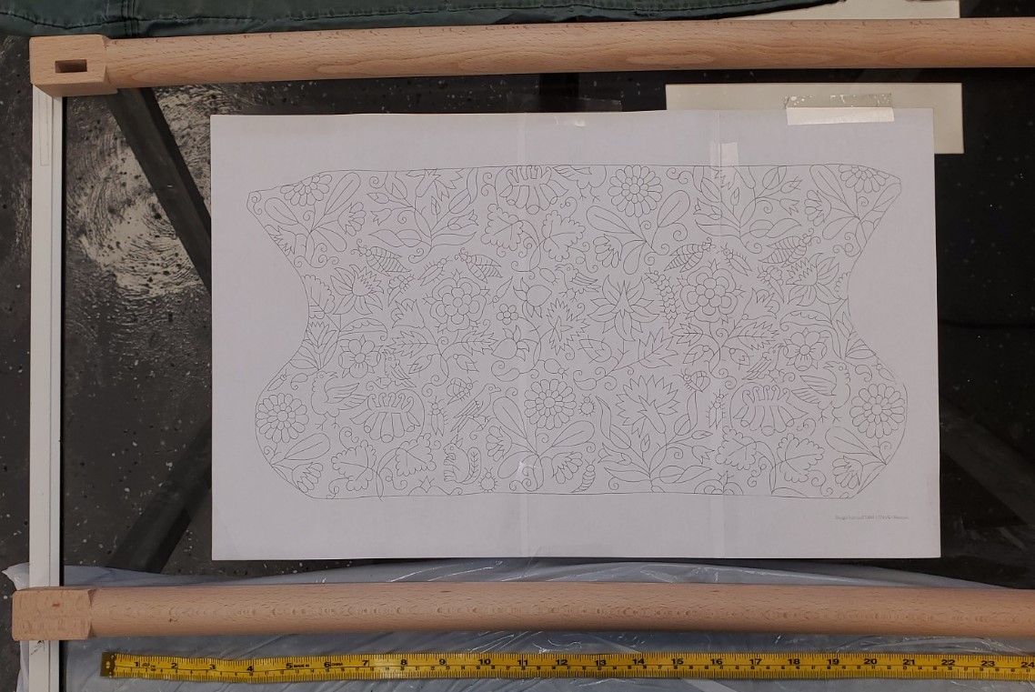

Obviously if I did them the short way there would be lots of stitched fabric being rolled and stressed as I worked. Not optimal. Especially not so if I go through with my impulse to incorporate metal threads and paillettes. So long way it is with the design fully splayed out using my largest set-up.
Starting in the middle, I traced out the design using a plain old mechanical pencil with a thin lead. It’s not perfect. I did my best to secure the fabric, and it sagged/stretched far less than it would have had I taped it to a window, but I admit some of my lines are a tiny bit off. And then there’s that unfortunate bit I tried to erase. I’ll attempt to spot clean or camouflage that later. But the design is now on the cloth.


Tomorrow I cut my piece, and hem, with an eye to mounting on my frame. Since the entire thing will be laid out without being eaten on the scroll, I may even try edging with twill tape and lacing the sides for additional tension. Provided I can find the twill tape.
Stay tuned!
