CATCHING UP AGAIN
It has been a while since the last post. But I keep going. After all, I have a reputation for stubborn persistence to uphold.
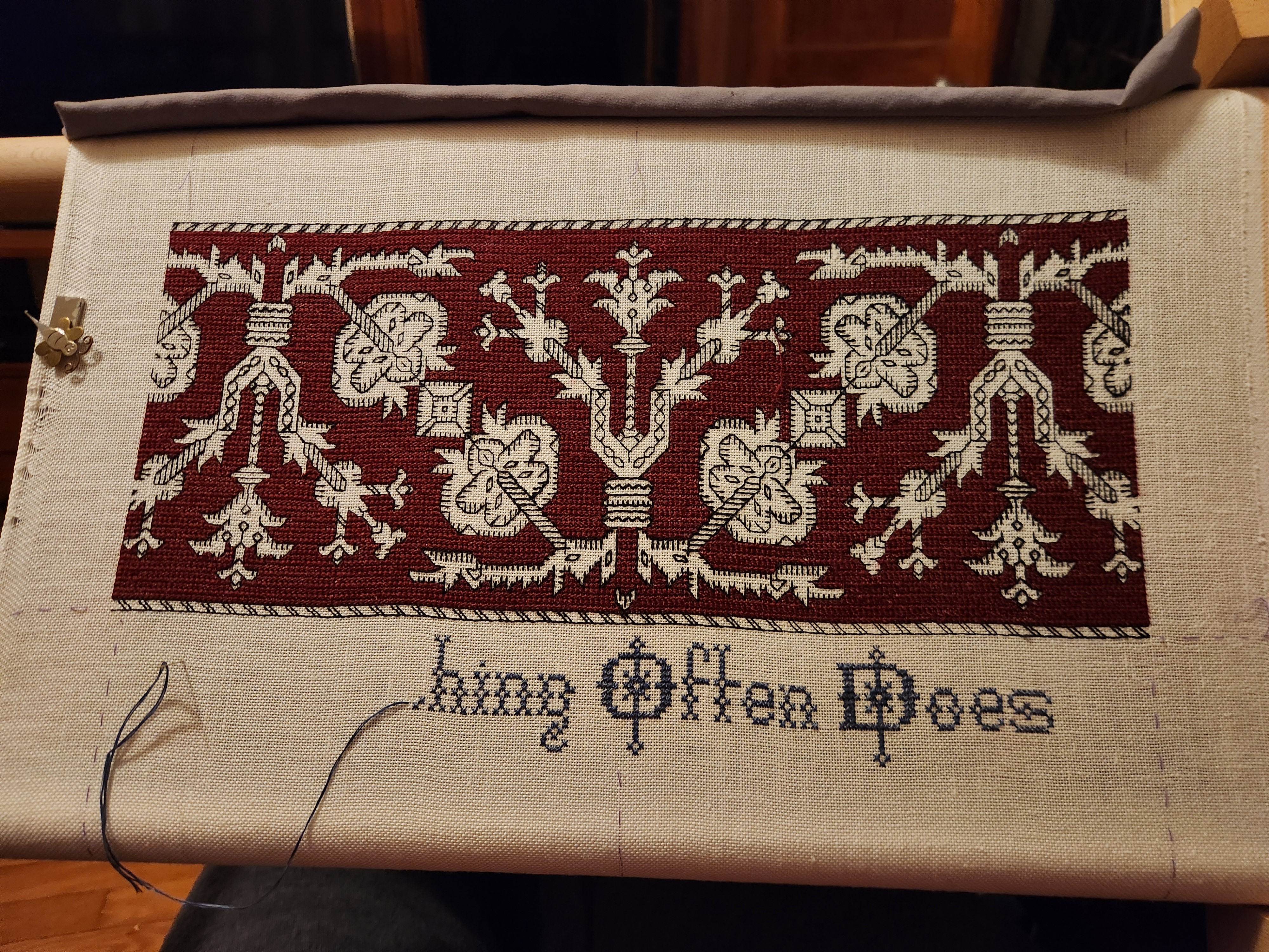
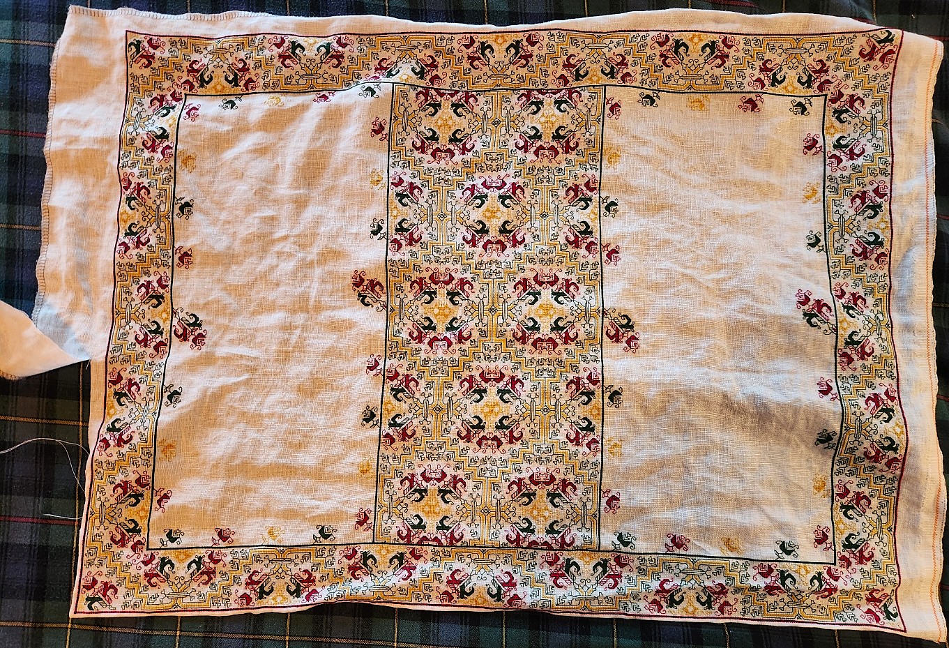
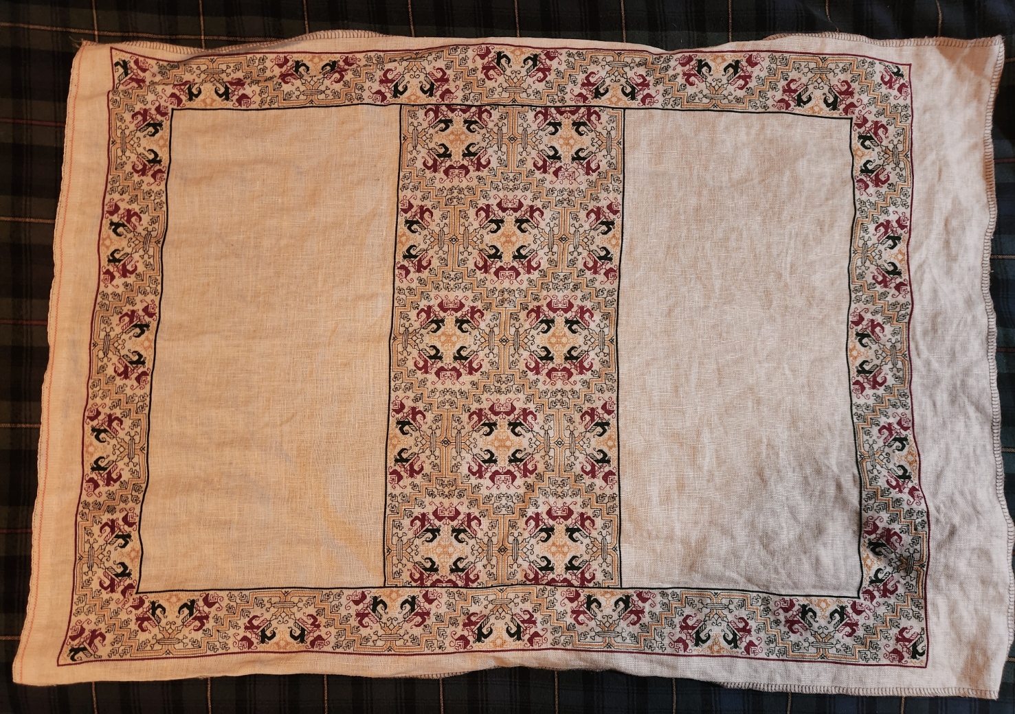
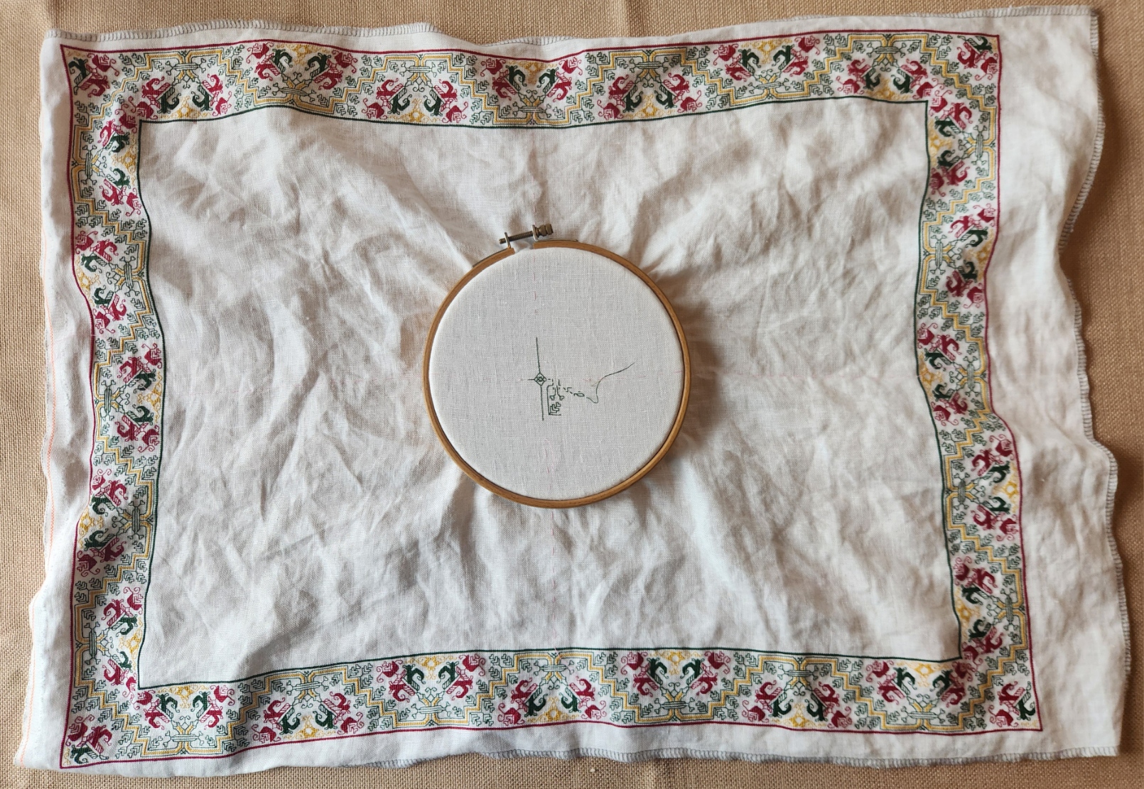
First, here’s a shot of the whole Anything Could Happen sampler, unrolled, as it was just before I began the current strip.
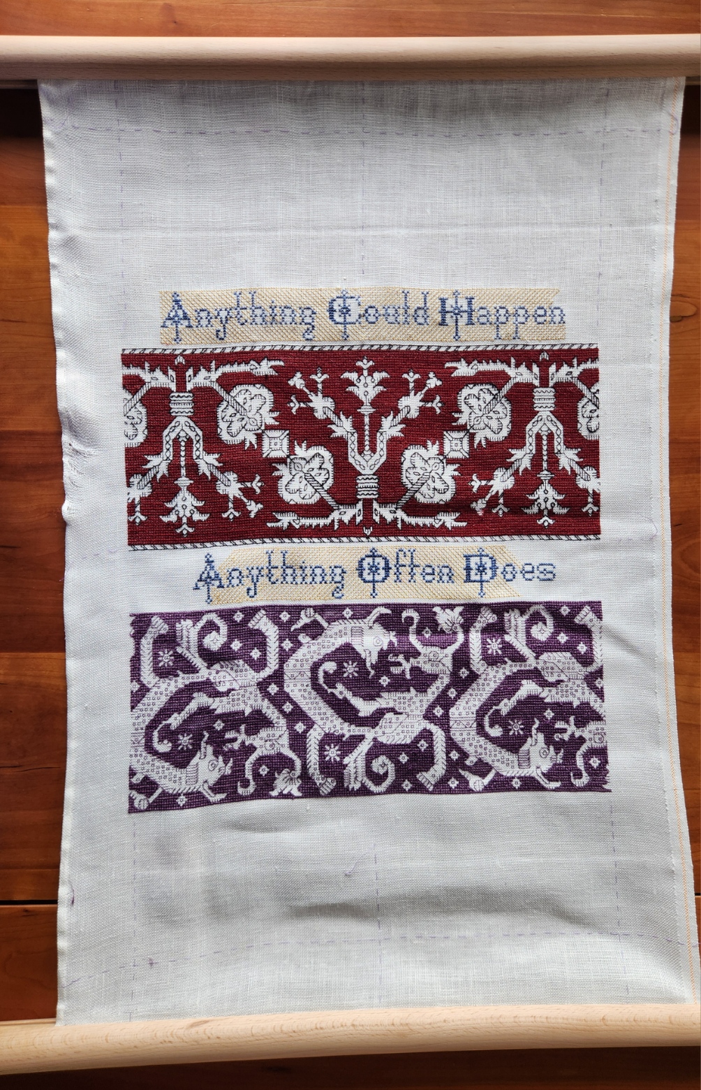
A few things to note. First, there is much less room remaining at top and bottom that needs to be filled. In fact, I have shorted myself. I should have chosen narrower strips than the pomegranate meander and the strange monsters band. I still intend to work a full width strip above and below what’s there, plus a narrower matching border as the final top and bottom framing mechanism – probably in blue. That means I will go over my basted edge lines. I may even have to finish with a hand hoop because I will run out of real estate for the flat frame by the time I get to those final edgings.
Second, the yellow step voiding behind the lettering still doesn’t reach all the way to the side edges. Right now that’s on purpose. The piece is a tribute to the science fiction book currently being written by my Resident Male. Those areas on either side of the motto lines are small, but they are big enough to contain a custom motif or two directly relating to book content. And I might use one or two of them as signature or date blocks. In either case, I will be drawing up new content, and won’t fill in the background yellow until the foreground material has been completed.
Third, that rippled left edge. That’s an artifact of Doing Something Wrong. I had this happen once before, but not for many years. I hand-hem my edges. Occasionally I get lazy and leave the selvedge edge unhemmed. A big mistake. That means that the left and right edges of the piece have different stretch potential (hemming limiting stretch more than the native woven bolt edge). When that happens, distortion, stretching, and fraying can occur. When I frame the piece with fabric as a hanging scroll, I will take pains to do it in a manner that covers up those flaws. Nothing else I can do about it until then.
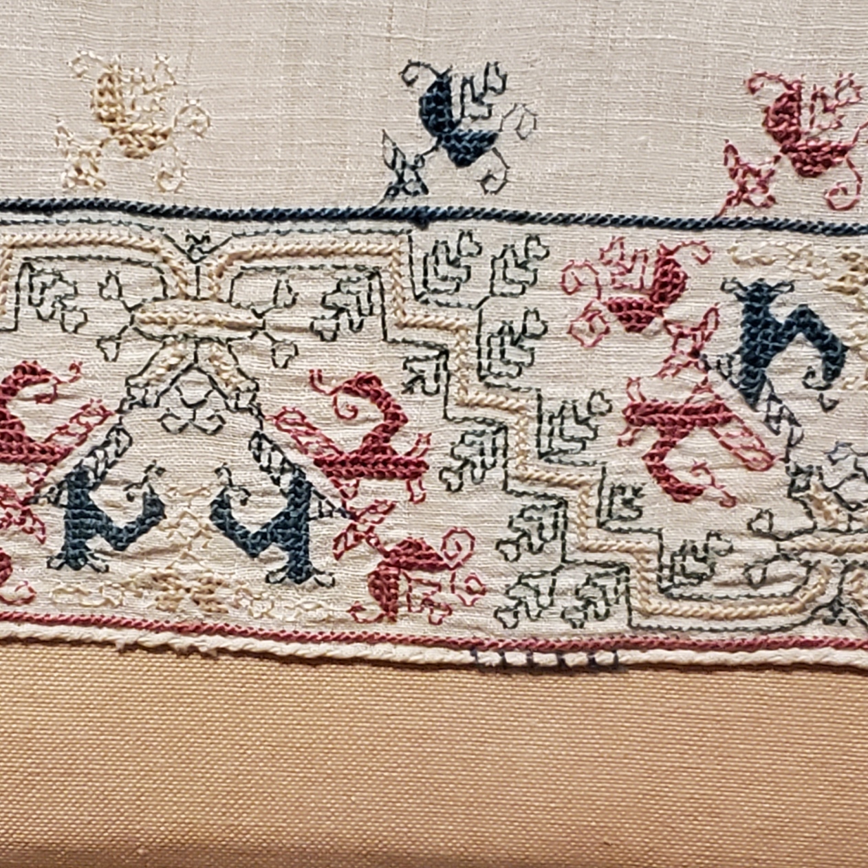
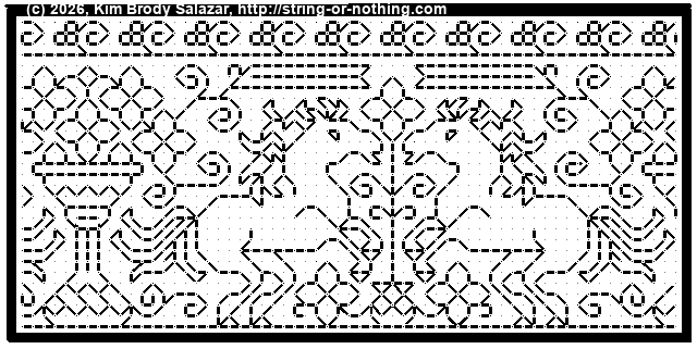
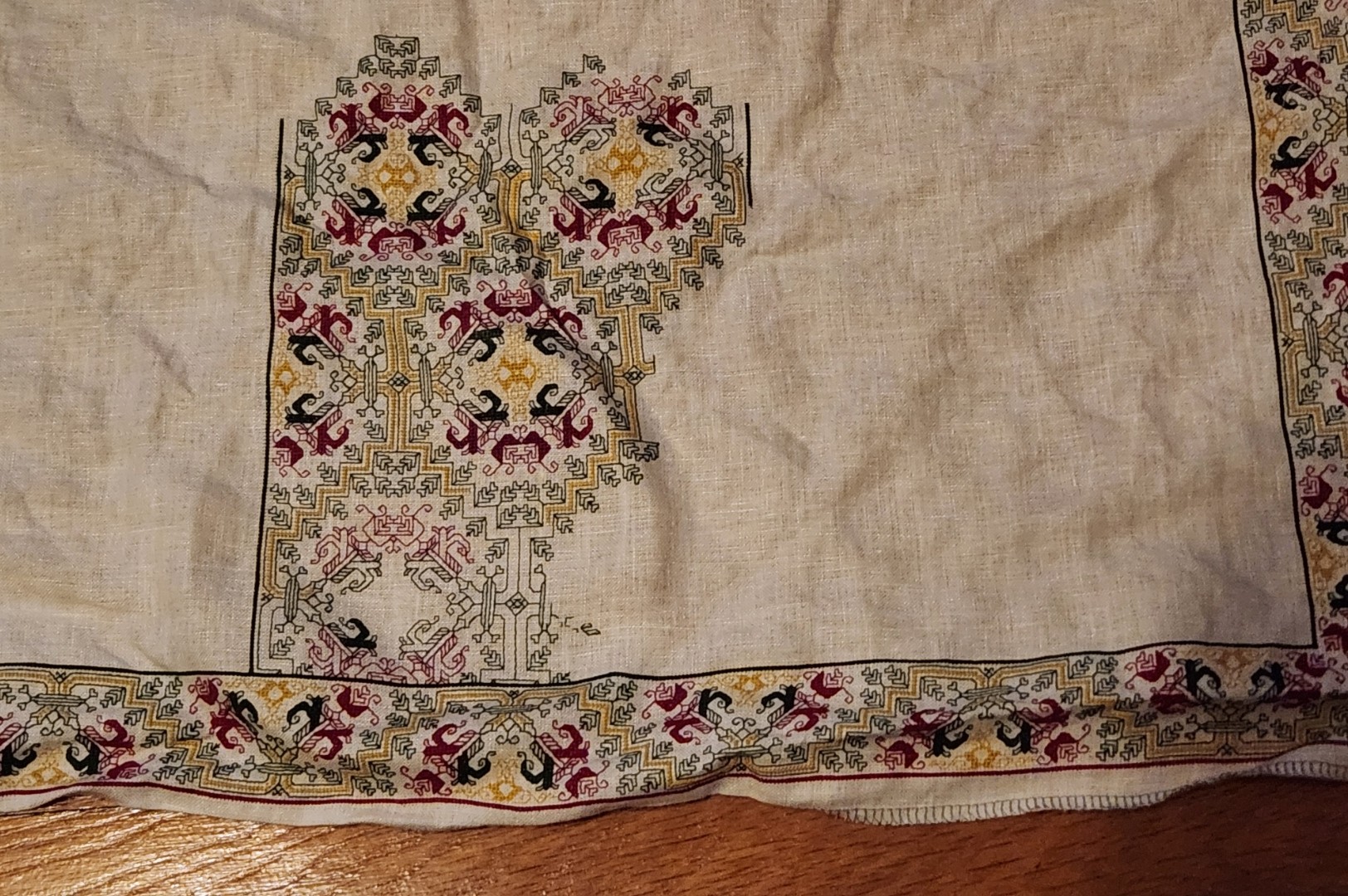
And now we get to the part that you want to see. The latest strip. This one is a play on the Spider Flower I’ve discussed here before. There are many iterations of this Azemmour Cluster design. I included a chart normed from multiple repeats of one of them in my Second Carolingian Modelbook, as Plate 33:4.
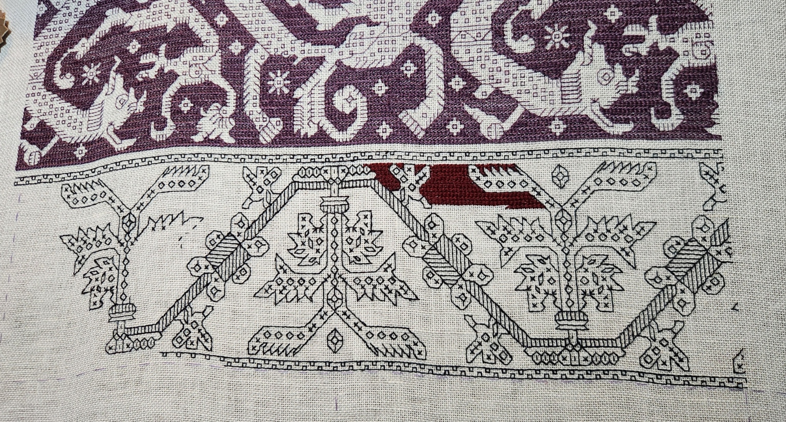
This one is being done in black and cranberry, but a bit differently from the obviously related Pomegranate Meander I used earlier (Second Carolingian Modelbook, Plate 34:1). For one, I am now sure that I will have enough thread to do a properly cushy rendition of long armed cross stitch. Using two plies of the Au Ver a Soie Soie d’Alger gives the proper well filled plaited look to the ground. I have also gotten a bit better at splitting and re-spinning the Tied to History Allori reeled silk, so the black lines are more uniform in appearance. Always fun to pick up a new skill.
These designs are both fast and slow to work up. Slower than many double running stitch strips because of all of those little disassociated filling bits that make up the decorative “chaff” inhabiting the foreground, but faster than many others due to the simple nature of the outlines themselves. I admit that chaff is a pain in the neck to do, impossible to terminate individually due to their small size and scattered placement, and annoying to path plan while minimizing skips. But again, I’m stubborn beyond words. One reason I had put off playing with this pattern family for so long was dealing with the chaff. No longer.
Health Update
Obviously I have weathered the latest round of surgery. The last procedure to shave down my cranial chordoma manifestation was quite lengthy – over 21 hours. But it was as effective as it could have been given the delicate location and nature of the beast. Getting most of it means there are leftovers that will be addressed via an aggressive program of proton and photon radiation. So next week it’s back to daily visits to rad therapy for the better part of a month and a half.
I can say that I continue to improve on a daily basis. Right after surgery I was particularly discreditable – a massive black eye that looked like a boxing souvenir, for starters. Lots of other swelling and seam-like scars just inside my hairline. Double vision at distance when I could peek at the world with two eyes; and with the swollen right side of my face, the eye being squeezed tightly I couldn’t open it, little to no useful vision on the right.
Now I look mostly normal.

Stitches are all out, the bruising and most of the swelling is gone. Zero cognitive effects, no headaches, no balance or hearing issues. I’ve kicked the double vision, and the right eye’s useful productivity has returned to my nearsighted normal. Which explains why I was able to finish the monsters and start on the new strip.
My continuing physical improvement challenge is to rebuild strength and mobility. I can get around the house but slowly, but am not quite in the shape to do all the simple chores like gardening I was able to accomplish just a month ago. Again stubbornness works in my favor. I refuse to be defined by what I can no longer do, so every day I work towards making that list just a bit shorter.
MARCHING ON IN MAY
Progress on the glide path to Friday and beyond. First, the follow up on my raised bed garden and my use of the sitting/kneeling bench.

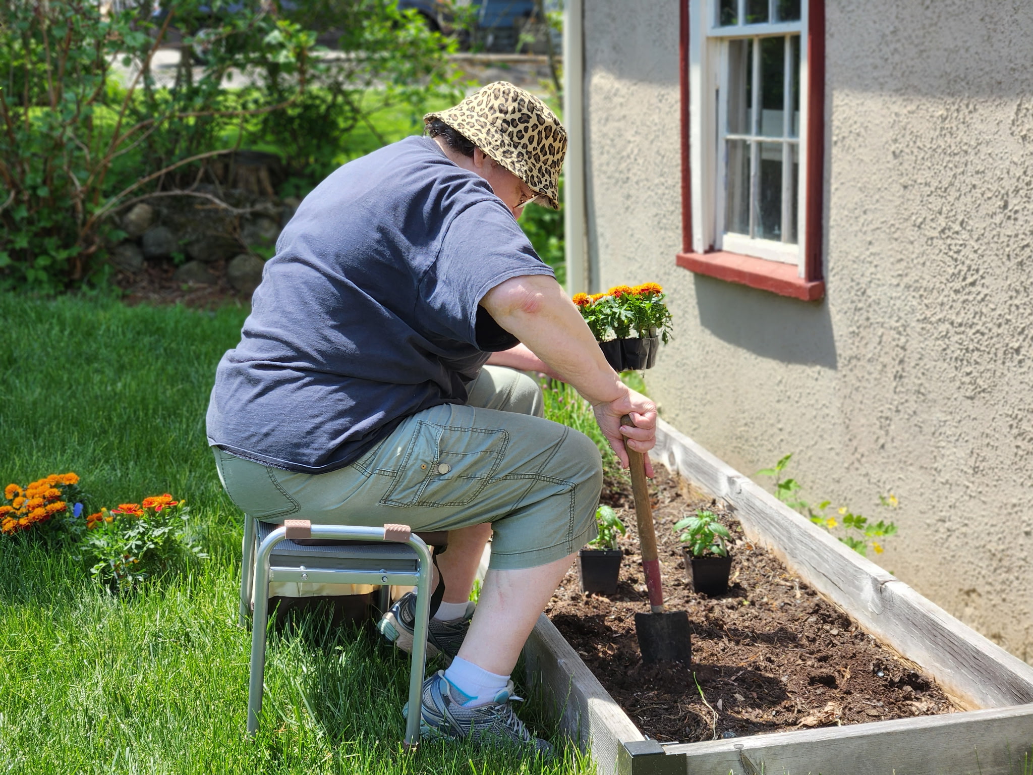
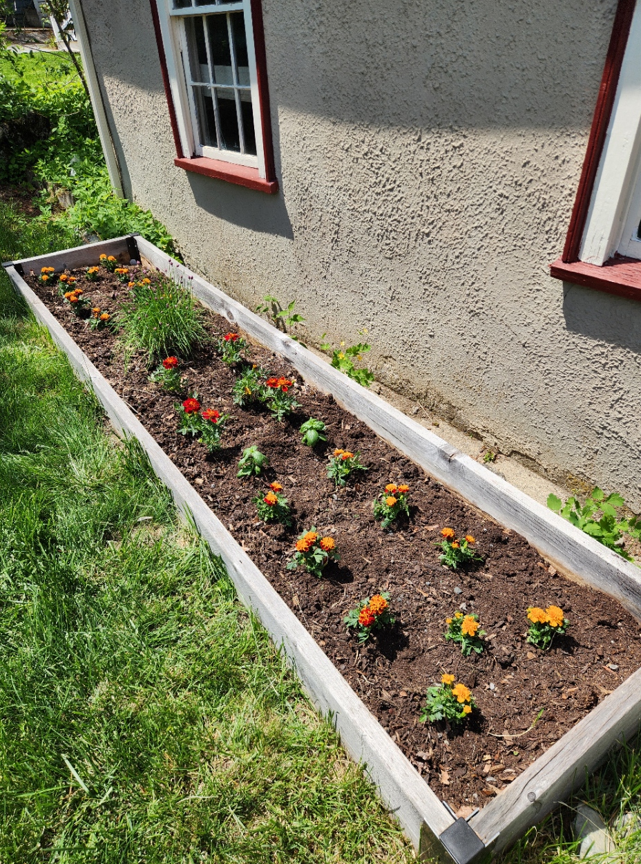
Three types of marigolds, of graduated height and color; plus the survivor chives and a couple of basil plants to balance out the green of the chives. We also added a gerbera daisy to the front yard perennial patch. While those African-origin daisy like plants can overwinter down in Maryland where I grew them before I don’t think it will make it if we have a standard January/February here in our zone. I do plan to pull it before first frost, and (with luck) set it out again next spring. No clue what color it will bloom. I like an occasional surprise.
Progress continues on the Hungry Judges sampler. I’m more than half way done with the final partial repeat of the curious monster panel. My goal is to get that all laid in over the next day or so, and then turn to the voiding behind the lower half of the motto phrase, and the solid fill behind the monsters themselves. The lettering bit will be a matched inversion of the voiding I did on the top line – stepwise yellow, radiating from the center. The monsters get long armed cross stitch in the same purple as the foreground stitching. All of that may take at least ten days of work, probably more.
I really want to work on this piece with me to the hospital. Yes, I will have knitting there. Socks stop for nothing. But I do not stay sane by socks, alone.
Obviously I would not be bringing the Lowery floor stand. Too big, too heavy with the companion bricks needed to balance out the weight of my large frame, too much in the way. To preserve no-crush/no-hooping over the silk, I do want to keep the piece on my Millennium scroller. It only fits on my widest bars, so that will be a test. I do have a shorter set of side extenders. I used them earlier when I did the pomegranate panel, but swapped them out for the longer ones to stitch the wider monster bit. Remounting with those would help somewhat by reducing height. To stitch I could lean the frame against the over-bed utility table common in patient rooms, and work either in the bed itself or in the side lounge chair (leaving the bed to sit up is wildly encouraged). Moving the frame around and protecting it to accommodate meals and other messy things though will take some more thought. Managing the threads, tools and other supplies is easy. My pirate motif metal lunchbox is perfectly able to handle what I need, and being magnetic will hold oddments and tools at the ready.
Other goings on here at String Central are pretty low key. We did have a spot of fun on Sunday. Since the next two weekends will be rather constrained by my upcoming procedure, we went out for a Dim Sum brunch to celebrate my upcoming end of May birthday. A tasty treat, for sure and one of my favorites. Now it’s just resting up, gathering strength and resolve for tumor-reduction surgery at the end of this week.
Health thoughts
And to round out the health musings – some thoughts on steroids. I’m on a relatively low dose program of them right now to combat double vision caused by pressure on a cranial nerve. Not long term damage, just a bit of squeezing that has me seeing oddly at distance. For example, driving is right out because I see a third lane where only two actually exist. So far close work hasn’t been too taxing, but I am glad that I thought ahead and am not working on 40+ count linen for this piece.
Steroids have all sorts of side effects associated with them. Everyone has heard of ‘Roid Rage, where someone (usually an overconsuming athlete) goes off the rails due to medication abuse. And there are others – reports of metallic taste or a general diminution of the ability to taste food; hand tremors; unusual emotions; and the like.
I’m not someone who has ever taken a lot of meds so when something unusual crops up I do notice. I propose a metaphor for how steroids manifest for me. And if you are a long time Star Trek fan, you’ll recognize it. Remember – this isn’t a diagnosis, it’s just a metaphor. After all, fictitious ailments are totally fictitious.
Taking low dose steroids is like having Bendii Syndrome – the made-up malady experienced by Vulcans. It was used in several Trek series as a plot device to present a weakness of that usually hyper-competent people, by limiting their ability to control their emotions and disabling their ability to reason with logic. A Vulcan without logic or emotional stability was deeply troubled, and locked into a personal and societal shame in a way not unlike patients with advanced dementia are in our real world.
Normally I’m pretty stoic. I gloss over the small stuff, the minor annoyances and botherations of daily life. Dropping the toast butter side down. Hitting the wrong key as I type. Overly loud music from a car idling in front of my house. Little things that usually mean nothing. But right now it’s like an extra 15% vexation overage is slathered on top of all such things, so that I notice more than I usually do. No hot reactions, no gusts of anger or frustration; just a rasp of unfamiliar discomfort strange enough to stab a tiny needle into my serene mindset.
I am happy that this med will not be a permanent addition. Once the nerves calm down from the various planned interventions and the double vision is gone (or as a last ditch resort has been tamed by optical compensation) I will be quit of steroids, and all will return to equipoise.
In the mean time I will admire my flowers and plan out my Emotional Support Embroidery scenario as concrete steps to remain serene.
If you can know and name a challenge, you can deflect or defeat it. And I will do so.
WORDS!
Moving right along, and answering questions.
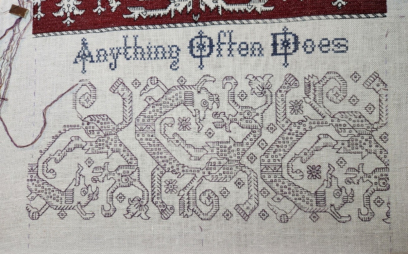
I’ve finished the first panel. I’ve drafted out the motto and it’s obviously in process, too. What you see here is just the second half of the phrase. The first half will go above the completed strip, but I have room to add this part without advancing the scroll, so I am doing it first. And here are some details which should help folk looking for more info.
I am using a combo of two alphabets available on the Patternmaker Charts blog site, established by Ramzi, and apparently now maintained by helpers as well. The bolder upper case letters are from Sajou Booklet #004, but I tweaked them slightly for greater twinkle and depth. I am after all honoring yet another science fiction book by my Resident Male is currently writing. Starlight is appropriate. The lower case alphabet does not line up exactly with the upper case one in terms of spacing and ornament, but again, it has twinkle. It’s from the same site, but appears in Sajou #007. The site has been up for a very long time, and the interface is clunky to navigate but the content is priceless. Booklets indicated by asterisks contain line drawn material. No asterisks means the content is charted.
How did I know to use these together? Guesswork, and reaching way back to being a little kid. My grandfather owned a contract print and engraving shop in the pre-photocopy era. He produced catalogs, advertising material, magazines, books, stock certificates, menus, and lots of other printed matter. While it’s obvious that I didn’t follow him into the family business, I was a curious little thing, and he was happy to show me the fun of type faces, font sizes, leading, kerning, and the way that different typesetting choices and physical presentation can change the way a message is perceived. With his paper samples and layout guides, I always had the wildest written report covers in grade school.
Maybe a little bit stuck from those chats, and from going through his printed examples because I still quest for just the right thing when I compose my motto-bearing pieces. Sometimes I hit the mark, sometimes not. But to this day I always learn from the hunt and the exercise.
What’s the next panel after the words are completed? Something totally new. I’m web-walking looking for Azammour Cluster pieces I haven’t seen before. There are more than there were just three years ago, because the fragments in museum and private hands are being re-evaluated, and the turn-of-the-1900s identifications as Renaissance era snippets sold to collector/tourists are being updated. I’ve found a couple of very interesting ones featuring motifs other than the usual meandering repeats or birds. Charting now. Slowly. Reveal when I have more to show, of course.
And what is the full text of the motto?
Anything Could Happen
Anything Often Does
This can be read in a few different ways. First and foremost is that it is a direct quotation from The Hungry Judges, the novel currently in development, and central to the plot stream.
Yet at the same time, I can see it as a summary statement of my former professional career in engineering/high-tech bids and proposals. That was an endless parade of short term crisis containment and contingency planning – managing overburdened teams striving to meet unrealistic deadlines, spiced with technical requirements that were not always feasible within performance constraints. But I never missed an on-time submission in 42 years, had an enviable win rate, and emerged without ulcers.
And lastly of course, it does echo my current medical predicament. My malady is not something pegged to known statistical associations with genetics, environmental or exposure factors, stress, or lifestyle. Chordoma is so rare that triggers are not understood, yet appears to be a totally random reactivation of the extremely small number of dormant stem cells that everyone retains along their spinal column, going back to our embryonic origins. What wakes them up is a medical mystery.
With my typical attack optimism, I am planning on outlasting this wack-a-mole recurrence, and with radiation and other modalities, continued vigilance and via several promising avenues of targeted antibody and other “lullaby” treatments, return them to secure slumber.
ANOTHER FINISH! THE MULTICOLOR ITALIAN WHATEVER-IT-IS, IS DONE.
Yup! It’s done.
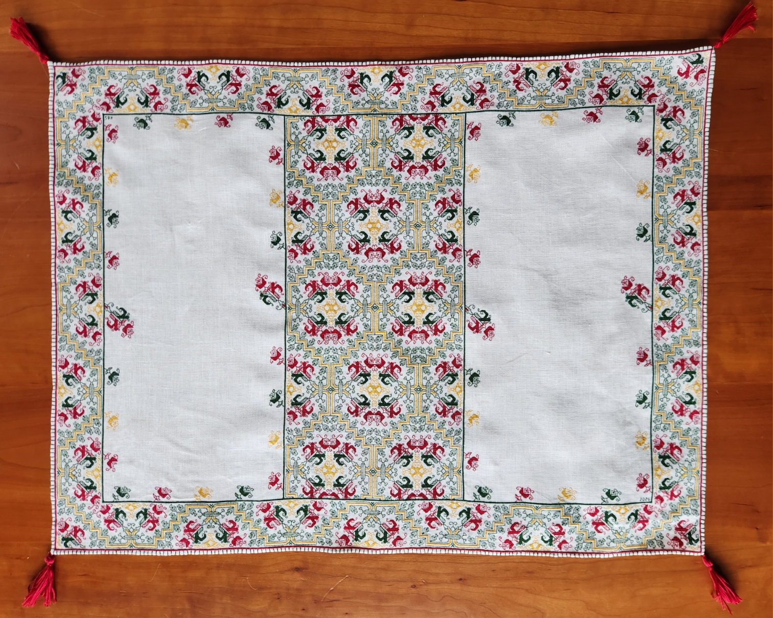
Final finished dimensions (not counting the tassels), are 60 cm wide x 45 cm tall (about 23.6 inches wide by 17.7 inches tall). It’s stitched using one thread of standard DMC cotton floss on 40 count linen. The stitches used are double running, Montenegrin, and two-sided Italian cross stitch. Although the thing is mostly double-sided, I did not take any special measures to hide ends.
I started on or about 13 September 2025, drafting out the design from photos taken at a 2023 Boston of Museum of Fine Arts visit, and from the museum’s own photo of the inspiring original. Prepping the ground – determining and basting centerlines and edge guides happened immediately after.
Actual stitching commenced on 19 September. At that point I had the edging drafted, but not the corner joins. I began at the bottom center and worked around the perimeter, and worked the corner out on the fly. (It doesn’t match any of the corners of the original.) Then I continued around, replicating that corner three more times. After I finished the frame, I did the wide center stripe, formed by doubling the framing meander, with a couple of small adaptations as in the original. Then I added the sprigs that circle the unembellished panels, left and right – more quotations from the main meander motif, with small adaptations congruent with the original.
The final step was a narrow rolled hem, ornamented with a rather odd buttonhole stitch variant. Instead of working it with the joining horizontal bar along the edge of the piece, I did it – backward – piercing the ground from the front, and catching the loop at the base of the stitch in the back. That made a single vertical loop around the rolled hem, with no whip-stitch style slant, and with the bar connecting the buttonhole stitches riding unseen across the back, tucked into the edge of the rolled hem itself. I have no historical source for this, just trial and error, trying to replicate the visual remains of the bar-ornamented hem of the original. And I did feel compelled to make the little red tassels in homage to the ones on the original.
It’s hard to estimate total hours for this. I tend to work 2-3 hours per evening, with an additional 3 hours in the afternoon on Saturday and Sunday. That adds up to about 23.5 hours per week, and 25 weeks from start to finish. Rounding down for holidays or travel days when nothing got done, I would estimate this piece took about 575 hours total. I’d call it moderate – far less intense and shorter than many I have completed. But a time commitment, none the less.
Now let’s compare mine to the 16th century original (Boston Museum of Fine Arts accession 83.242).

The Boston Museum of Fine Arts caption has been revised over the years. It now reads “Line stitch and tent stitch or long-legged cross stitch. A towel.” It is noted that the ground is linen, but the thread is not described (I assume it’s silk).
There is a bizarre discrepancy in the size listing. The description reads “970 x 1480 cm (381 7/8 x 582 11/16 in.); Legacy dimension: Height: x width: 58 5/16 x 38 3/16 in.” 582 inches wide would be 16 yards wide. When we saw it displayed in the MFA’s 2023 exhibit, it was certainly large, like a tablecloth for 6 to 8, but certainly not 16 yards long. Therefore I am going with the “legacy dimension” of 58 5/16 x 38 3/16 inches or 148.1 cm wide by 97 cm.
That means that the 148.1 cm x 97 cm original is about 2.5 times wider and 2.1 times taller than my 60 cm x 45 cm rendition. This to me makes sense when you look at the repeats. I posit that my work stitching 2×2 on my 40 count ground is not far from the gauge at which the original was worked, although it might have been done on finer linen over 3×3 threads. My photos and the museum photos are not sharp enough to make that determination. As to the stitches used, I do think I hit the nail on the head, although using cotton instead of silk restricted the amount of tension I was able to get on the meshy two-sided Italian cross stitch bits. I would have preferred that they be more open, but the cotton wasn’t up to the savage yanking needed to get that look. Still, you can see the meshy effect on mine.
I can also say that at more than four times larger than my piece, along with variances in execution of the design on each of the four sides, plus irregularities in the corners, that I believe the original was executed by a group, perhaps in a workshop or other communal working situation, with one or more individuals working on each side, simultaneously. Those original corners look like kludge mash-ups where folk resolved alignment problems on the fly. Tiny differences in execution seem to cluster on sides, and don’t appear randomly scattered about. That would argue for several people working at the same time, copying from a common source, but replicating their own individual “mistakes” within arms reach.
All in all I am quite pleased with my rendition. I have absolutely no idea what we will do with it, or on what surface we will display it, but I am pleased none the less.
Moral of the story – the Ancients did wonderful work. But they were not superhuman, and didn’t demand the icy perfection and merciless symmetry that Victorian and later stitchers have striven to achieve. Approaching the level of virtuosity seen in historical pieces is NOT outside of the realm of modern possibility. All it takes is time, practice, and attention to detail.
STITCHING FINISH, BUT NOT FINISHED-FINISHED
And so the stitching on the Italian multicolor piece is complete!
The sprigs are done. I will do a final patrol over the thing to see if I might have forgotten to fill a spot, or left out a curlicue, but unless something surfaces, there is no more double running, Montenegrin, or two-sided Italian cross stitch to work.
What I am up to now is the narrow rolled hem. I want to thank long-distance friend Rhaeya for posting a how-to photo of her method of hand-working a narrow rolled hem on linen. It’s far more efficient and easier than the method I learned from my Grandmother. Granted – the family method was predicated for use on chiffon and it came in handy for a wedding I attended decades ago, which required a bridesmaid’s dress with ruffled tiers of that stuff in light blue. But it didn’t work quite as elegantly as Rhaeya’s does for this heavier linen.
You can see I’ve done the bottom edge, and have begun the side on the left. The remaining hem will probably take another two or three days to do with absolute precision. After that comes a layer of decorative stitching around the edge. The inspiration for that is this photo of the museum original:
See the green verticals? After staring at the thing and doing lots of thought experiments, I have decided to not work them as simple blanket stitch or buttonhole stitch. There’s no real evidence for the “spine” of color those stitches would create along the edge. Nor are these stitches whipped at at angle. A bit of experimentation might be in order, but I do think that some sort of open chain stitch or looping/knotting logic was used here, one that left verticals on both sides, but with a line of horizontals on only the reverse, linking the verticals at the base adjacent to the red border.
I have no pix of the back of the work to confirm my guess, but I do think that it is logical. The only other option would be to take invisible stitches between each rising green line through the body of the hem, with no horizontal stitches seen on the surface front or back. A possibility, but too fussy. The more I look at this, the more I consider the labor that went into my small quotation of the whole, and the more I think on how the larger piece might have been made, the more I believe it was a workshop product. Done as quickly as possible, by a team of stitchers. Discontinuities in corners, very slight differences in the design as stitched on the different sides, and the size of the piece are the main drivers of my thoughts.
So the simpler I can do it, the better. Done as quickly and efficiently as I can, in the spirit of my posited long-ago workshop. And when that stage is done – probably another four to six days, I will cap it all off with my initials and date hidden someplace in the piece, plus little red tassels on each corner, again in homage to the original, as seen below.
UPDATE:
Folk have asked me for more details on the rolled hem methods I mentioned. I have gone back to my friend and received permission to publish the info and photo below.
First is my Grandmother’s method. She showed it to me way back when I was a kid, no older than about 12. She was mending the frilly collar of my Great Aunt’s best blouse, which had snagged on something. The collar was a froth of chiffon ruffles. To fix the bit of blown-out rolled hem, she teased out a bit of the hem on either side of the snag, then took a toothpick or darning needle and rolled the exposed material tightly around the end of it, making sure that the raw edge was inside the roll. Then she took a very fine needle and sewing silk (not fat cotton thread she used for machine sewing), and with tiny stitches, stitched from the edge of the roll catching just a tiny nip of the fabric – fixing the rolled hem in place. She did a few stitches, then advanced the toothpick or darning needle, rerolled as needed, and continued on. The result was nearly invisible. Hard to tell that where the snag had been. The hem “dipped in” just a bit; but the mended bit was uniform with the diameter of the rolled hem north and south of the former damage.
But rolling that way around a core isn’t practical for the 40 count linen I’m using. Too bulky. So I was dreading having to finish. Then my friend, professionally known as Rhaeya Mars, Costume Designer M.F.A, posted this photo of a work in progress in her Facebook feed:
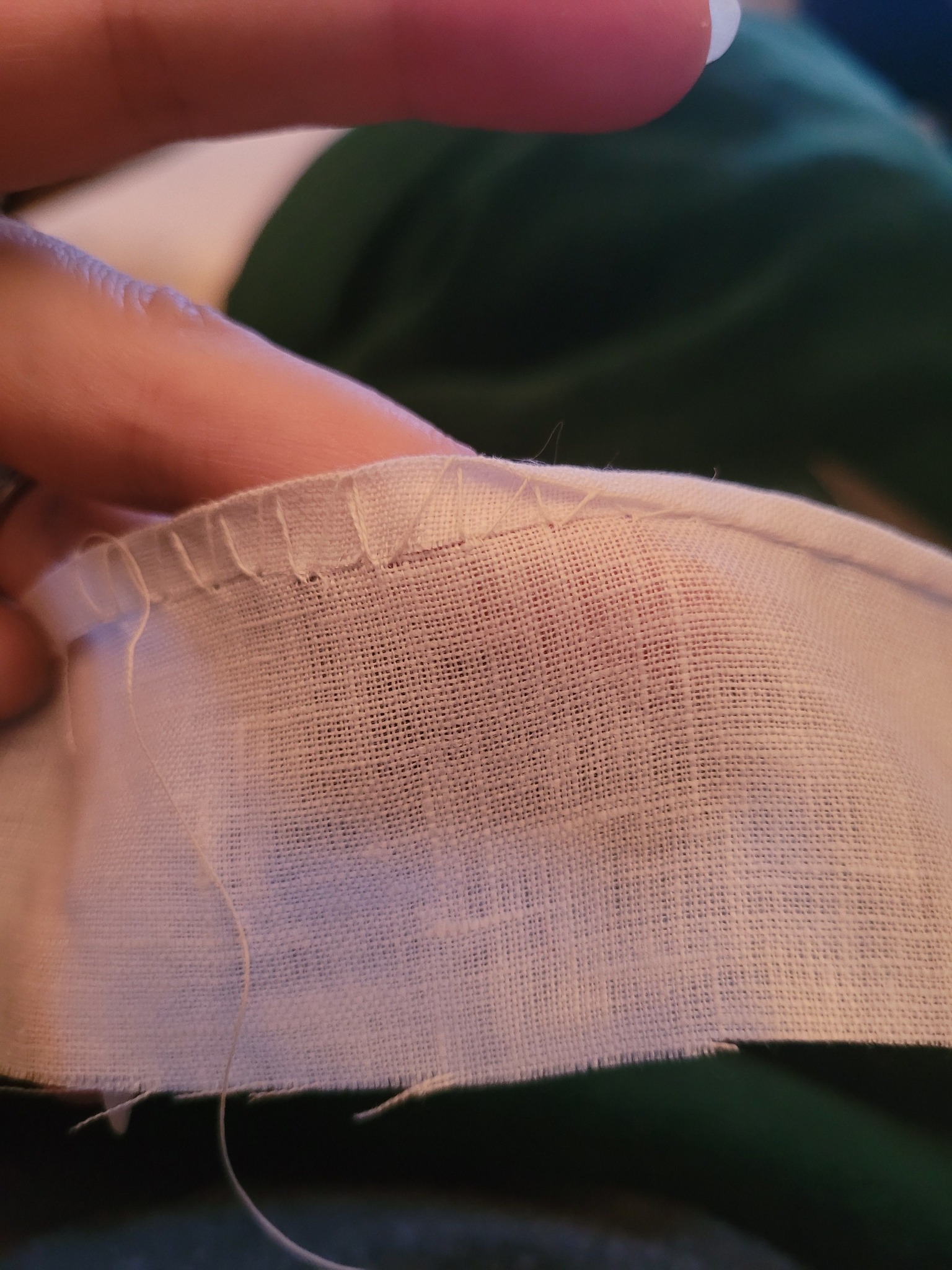
Now this method of folding, nip-stitching, and drawing up to encase the edge may be old hat to many of you, but to me it was Dawn Over Marblehead. I could do that! I could do it on the count to ensure an even width! I could hide the nips along the edge of my established border row of red Montenegrin stitch.
And so I am.
Thank you again Rhaeya! You saved me from endless fumbling, and ensured a clean finish for my project. Oh, and for the record she is the same talent who SINGLEHANDEDLY made her own Elizabethan embroidered jacket – the whole thing, from drafting and testing the garment pattern, to drawing the stitching design, working it in historically accurate methods and materials, and then assembling, trimming out and wearing the thing, to spectacular effect. Just to dazzle you, here is a display of it in modern context (minus the rest of the complimenting outfit).
LET THE SPRIGGING COMMENCE! (AND A PRESENT)
First, let’s get the present out of the way, since that’s what most of you are here to see. In honor of the Year of the Horse, here is a linear strip, for your personal/non-commercial use.
Now on to the blather.
I have finished the outer frame and wide inner band on my Italian multicolor piece.
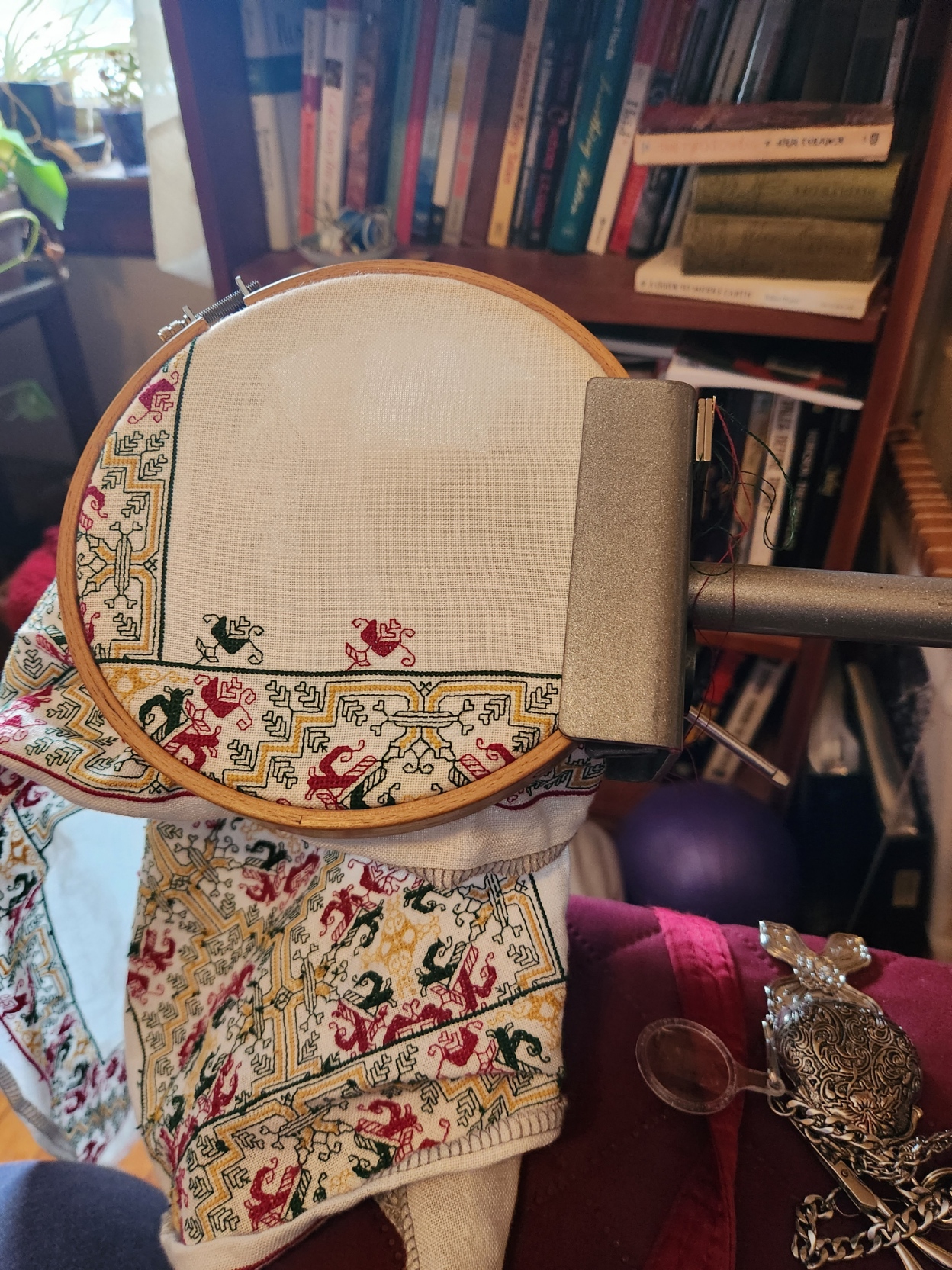
The next step is the interior edging of sprigs that circle the two empty panels, left and right. (Also proof that I do use my Lowery stand with hoops as well as large, heavy frames.
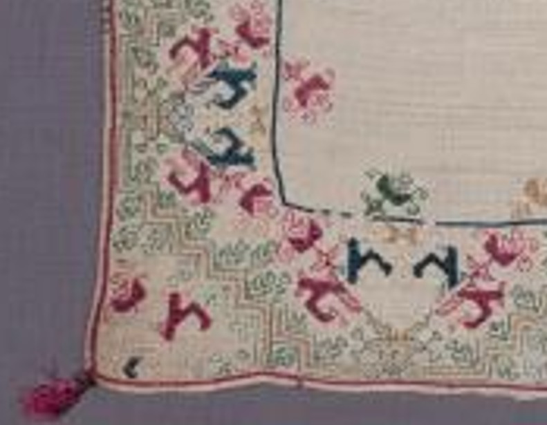
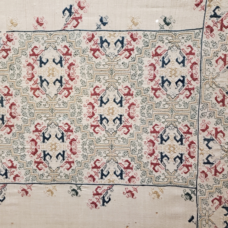
I am basing the use of these sprigs on the original artifact. The original however was significantly bigger than mine. It features both large and smaller sprigs, all quotes from the border and band design. But because my piece is smaller, I think that alternating big ones and little ones will make it a bit crowded, so I will be using only the smaller sprigs. This next photo is of the original – MFA Accession 83.242, Italian, 16th century.
All in all I’m pretty pleased with my fidelity to the original. There are some deviations, but not many. Note that edge bit where the wide center strip joins the frame. My rendition hits in exactly the same spot of the repeat. Which surprises me since no corner of the original was identical to mine (a deviation for sure), and no two corners of the original were identical.
Hmm… Looking at this a bit more closely…
I may rip my first two sprigs back and fix the length of the lower curl, then re-plot the spacing accordingly.
POST HOLIDAY CATCH-UP
Greetings to all on the flip side of 2025. The year had its ups and downs, but ended with a sweet rush of family and friends, both visits and visiting. Thus fortified, I head forward into 2026.
First a couple of housekeeping details related to my books, broadsides, and posts.
- To the person who wrote to my address saying that they heard I was deathly ill, and asking if I had passed, so that my copyrights would all now be gone, I offer disappointment. I am now an official Cancer Survivor. Very much alive. And even if the worst had happened, copyrights do not expire with the author – they are assets transferred to the author’s estate, and remain valid for the full span of 95 years after publication.
- To the person or persons who without my permission, uploaded my free books to SCRIBD and other on-line download repositories. I have had them all taken down. Your accounts are now flagged by those entities, and I am sure your other activity on those sites will be scrutinized. The ONLY place I have given permission to repost any of my work is the Antique Pattern Library – and even at that site, only one of my works. I ask that if you see any of my pieces reposted anywhere else, in part or in their entirety, you please notify me. I share generously, but I do not condone theft – even of freely shared material.
- And or those who have made the accusation that I am paid to use certain products, I may be a bad influence, but I am not an “Influencer.” I wrote about the murky world of Buzz Marketing back in 2006, and I know of least one instructor who from site traffic appears to assign that piece as class reading every spring semester. Every product I mention I have bought at retail; been given as a gift by a family member or friend unaffiliated with the maker, distributor, or retailer; or found in a thrift store. I accept no freebies. All opinions I express on String-or-Nothing are genuine and entirely my own – unprompted.
Apologies for the harsh words, but the world is an increasingly harsh place, and I am losing patience with incivility.
Now for the fun stuff.
A special welcome to those new to this long-running blog. Not quite sure why, but traffic has been up quite a bit since late November. And not just folk hitting the latest entry. I’ve seen upticks in people searching for past knitting and stitching articles. You are most welcome! There’s over 26 years of spottily indexed material here to explore. Feel free to post questions. If I can I will point to relevant prior posts or try to answer new questions, if not, I will confess my limitations.
On the current embroidery project I have completed the frame around the outside edge, and have moved on to the wide stripe of patterning that flows across the center. As in the museum original, the wide stripe involved adapting the border strip for use as an all-over. I’ve done (more or less) the same fudges in the wide strip as appear on the Museum of Fine Arts original (MFA Accession 83.242), and am pleased with the results. Although the deep yellow lacy motif along the edge of the design when doubled in the all-over as the center of what emerges as round motifs, looks disturbingly like a B-movie robot.
If you squint very hard you can just make out the pink basted centerline guides at the top of the photo, and at the right of the completed bit. That’s the only alignment help I needed. I am 100% sure that when I get to the other side of the span the truncation of the all-over will be happen exactly at the same spot in the cycle’s repeat.
After this wide bit I come to a decision point. Do I do two narrow bands parallel to it, evenly spaced between the center stripe and the edge? The original used multiple bands, but it was more than four times the size of mine. And I still want to add the edge sprigs around the inside borders that occur on the original. I did not do them at the time I did the border because I wanted them to be carefully spaced, and was too lazy to do the math needed prior to working the center stripe. Here’s a snippet of the original showing those single-color sprigs. Easy replication of the end element from the main flower.
Comparing the museum photo to mine and noting some small differences in the curls that come off the ends of the red terminal flower buds? Yup. In this photo they are done differently than in mine. I charted the design from just one of the sides of the original, and stuck to it throughout.
I believe the museum piece was stitched by more than one person, which would make sense because of its size and the amount of labor involved. The variation in those curls from edge to edge along with the very chaotic treatment at the corners where the edges meet might be additional evidence for my multiple-stitcher proposition. In any case, being just one person and doing only a smaller quotation from the original, I have normed all four corners logical to the repeat and congruent to each other (a vanishingly rare treatment in a period textile), and used the same basic chart throughout rather than replicating all of the “committee-generated deviations and compromises.”
And after all this stitching is complete I will do a close-rolled hem, like the original. Possibly with the vertical ornamental elements in green also shown in the photo above. I haven’t decided on whether those are plain vertical stitches, buttonhole, or blanket stitches – the fragments are few and difficult to interpret from the museum photos and the ones I took at the 2023 MFA exhibit. In any case they are clearly decorative and not structural because there are very few hits of them scattered around the edges, and the hem is sewn and intact even where they are absent. The last step will be cheeky little red tassels on the corners.
AND PROGRESS ON OTHER FRONTS
The holidays being party over, our latke party, Christmas Eve feast, present exchanges being done, the luxury of time is creeping back into our daily routine. So I can post about my other two big end of year projects.
First is my Italian-inspired cloth. Still not sure what I will do with it, although it’s looking likely that it will end up as a piece of honor on a credenza here in the house. I have finished the outer frame. I started this one on 19 September, at the center of the left hand edge, as seen in the photo below. I marched around the perimeter, opting to go a bit shy on the right hand side to preserve use of the “perfect” corner I charted out. I joined up with the starting spot last week via an extended tendril just to confirm the count and that no fudging would be needed. Spot on, no alignment problems at all. I finished out the join and all of the panel detail last night.
And surprise! I’m not done!
I am working a doubled variant of the edge pattern across the center. Possibly flanked by two single panels. I haven’t decided on those yet. I want to capture the spirit of the original, a towel done in Punto Scritto and Punto a Spina Pesce MFA Accession 83.242, Italian, 16th century, silks on linen. The original is quite large, more than four times the size of my rendition.
More on the developing center panel as it grows, of course.
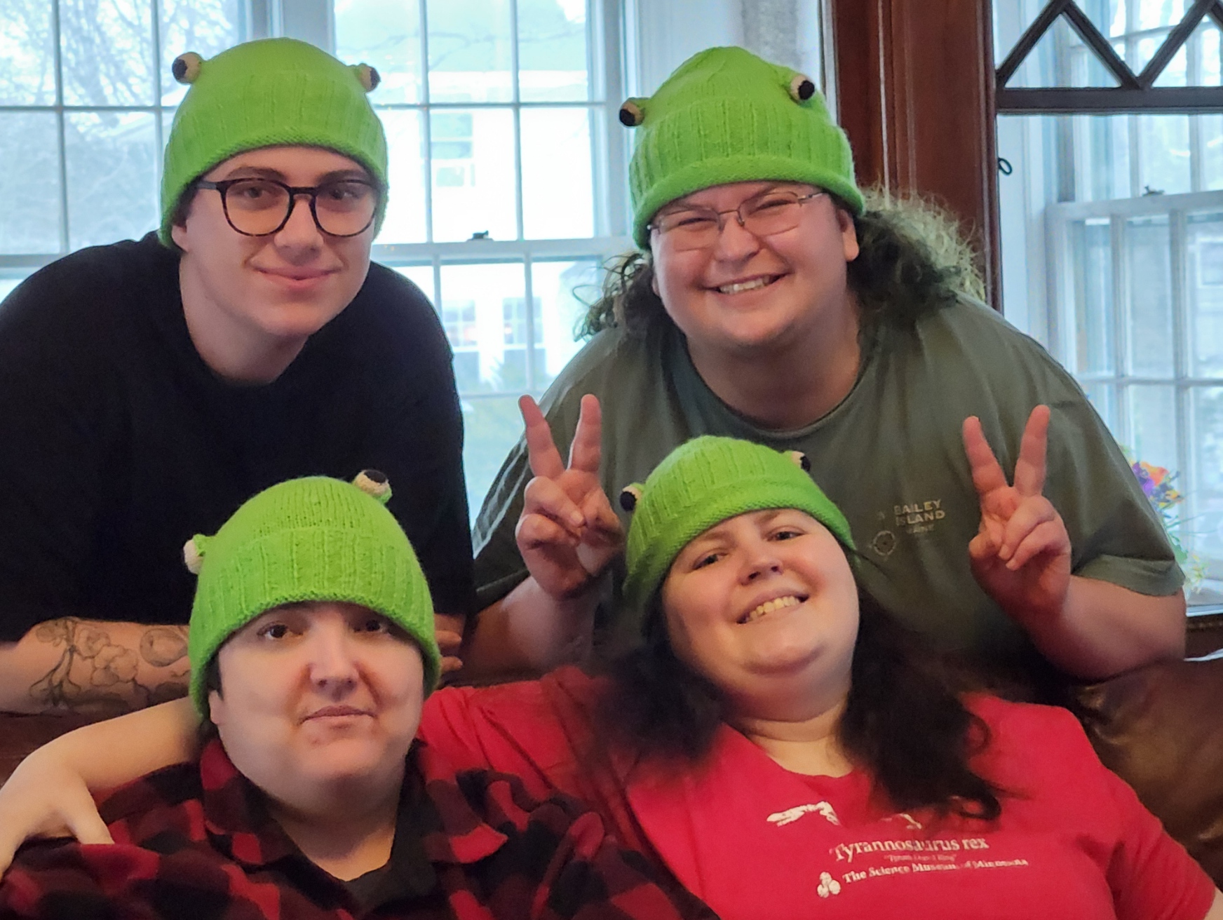
The other big project was my set of frog hats. Five of them have been given to the recipients, all received with delight and enthusiasm. Four shown below, on consenting adults.
I’ll be finishing up the eyes on the last two this week. I am not sure if I can put out a full method description because it’s a bit complex to explain exactly what I did. But here goes…
First, I knit up seven hats, working in the round on two circular needles, roughly following the general pattern I am using as my source. I’ve used a different cast-on, swapped in K2P2 ribbing for the original K1P1, and arranged the thing so that when the brim is folded, the more attractive side of my cast-on is on the outside of the hat.
Then I took inspiration from a free published pattern for eyeballs, changing the color progression slightly. I used much smaller DPNs for the eyeballs than I used for the hat body, largely to contain the stuffing. Seven hats meant 14 eyes. In retrospect I think I should have made them bigger, but the hat is still true to the concept.
Once the little eyeball spheres were knit, stuffed, and ended off, I had to add eyelids. To do that I used a threaded needle and embroidered backstitch. I looped my backstitches over my DPNs to set up the foundation for a row of knit-on I-Cord. Three needles’ worth, five stitches each. I did this via sewing because picking up stitches across the surface of the eyeball was difficult to do without disturbing the stuffing.
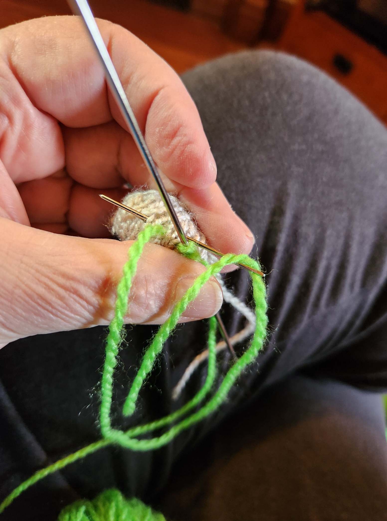
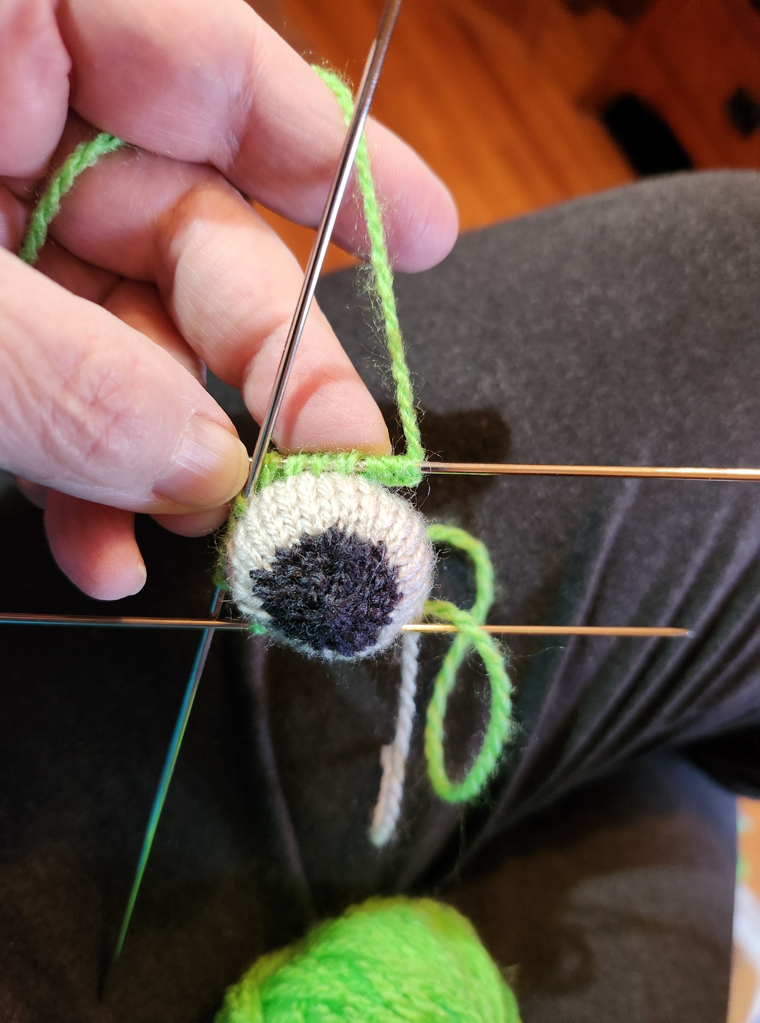
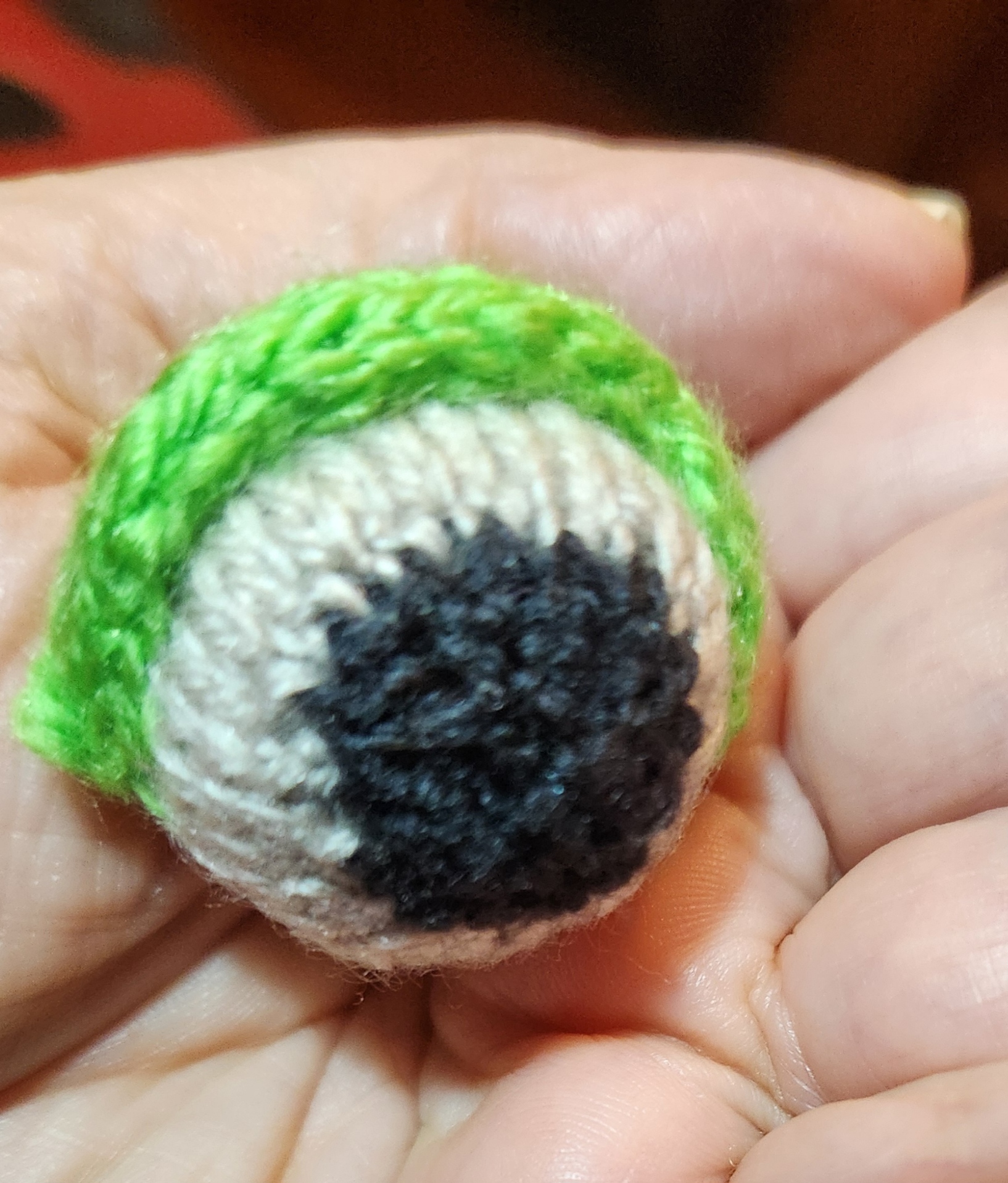
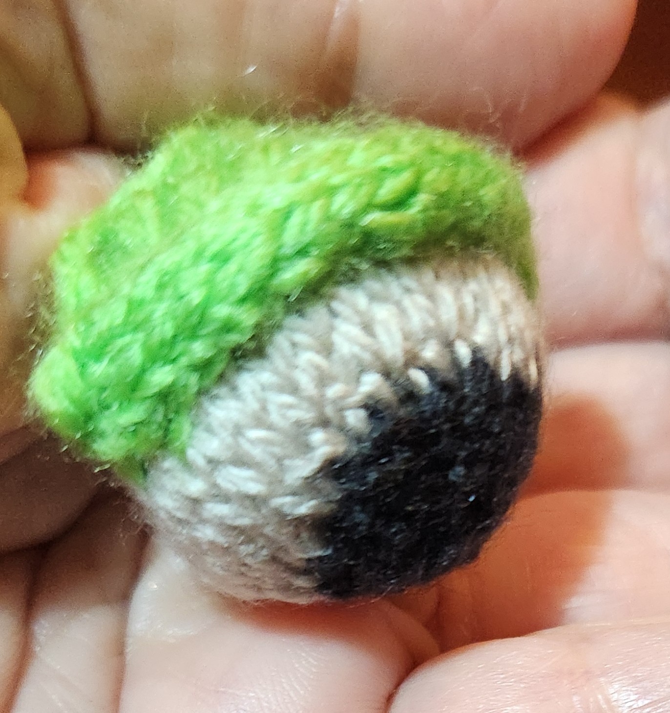
Once the eyelid was done, I went back and using a small crochet hook, picked up a line of knit stitches across the base of the I-Cord on the back, where it joined the eyeball. Those I knit into a triangle to make a dormer-window style cowling. I have to admit that I don’t think I did any two of them exactly the same way, because no two of the eyeballs themselves were exactly alike. That alone would make any specific write-up extremely difficult.
After the eyeball/eyelid, connectors were completed I sewed those units onto the hats, using mattress stitch.
I still have to finish the eyelids and final assembly on two more hats by the end of this week. I’ll stroll towards that completion. No hurry.
TEN DAYS OF PROGRESS – KNIT METHOD COMPARISON
Coming to the end of our recuperative sojourn out in North Truro. I had hoped to post pix of the aurora from here, but sadly last night was heavily clouded, and windy. So I maintain my record of weather-related disappointment in relation to notable sky events.
But that doesn’t mean that nothing has been accomplished in the past week and a half. I’ve been knitting, stitching, and working on various book-related projects.

That’s four of the hat bodies for the frog hats done, with another about 40% done. That leaves only a couple more to go, then I will begin the army of eyeballs for them all.
One large skein of THE Herschnerr’s afghan yarn makes about four hats. I am not any more pleased with it for knitting than I was with it for crocheting (it’s leftover from the Eyeball Bolster). It squeaks and splits. And being mid-range acrylic, is not “heirloom quality.” But for a topical hat whose topicality won’t last long, and being on hand rather than a new purchase, it is good enough.
One thing I’ve done is to check my speed and uniformity across a range of knit-in-the-round methods. Counting from the upper right, Hat #1 was done using the Magic Loop method. That employs one overly long circular needle. The excess cable length is drawn out into a loop between two stitches roughly on the opposite side of the piece from the point where one is knitting. One works to that loop, then pulls the excess out to make a new loop 180-degrees from the loop that has just been encountered. For the record, I find it quite awkward, an annoying break in the rhythm of production, and prone to distending stitches.
Hat #2 was done using just one circular needle of as close a size to the circumference of the hat as I had in my collection. Round and round, yanking the stitches across the joins as I went. I didn’t enjoy this one either. I find that circs of that small size have needle parts that are not long enough for my overly large paws. My fingers might not be pianist long, but my hands are quite wide. I wear men’s size golf gloves because women’s gloves are too narrow. Hand size plus the way I hold my needles for Continental style work means that my ring and pinky fingers support the weight of the needles and the piece. Using a circular this short makes me grasp cable, not the sturdy needle parts. Harder to hold, harder to maintain unform stitches, and harder to form them at speed.
Hat #3 was worked entirely on DPNs. Now I’m more in my comfort zone. But being out here on the Cape I only brought my set of mismatched but brightly colored Boye aluminum DPNs. They are seven inches long (about 17.78cm). I much prefer my vintage European DPNs from Inox, which were 8 inches long (20cm). I should have grabbed them, but didn’t. The short Boyes worked well enough for the K2P2 ribbing, and I flew through that section, but when I changed to stockinette, the extra width of the knit fabric without the draw-in of the ribbing made keeping all the stitches on the needles a bit difficult. I had to stop to retrieve dropped stitches more often than I anticipated. That slowed me down and affected uniformity of stitches, even though I’m a proven DPN warrior.
Hat #4 was worked with two circulars. This is a hybrid method. Each circular holds half of the stitches. Using both ends of the first needle, you work the stitches across the front of the piece, then you switch to the other circular, and use both ends of it to work the stitches of the back. Unlike with DPNs where the needles travel around the work, with each DPN advancing to the next position as it is freed then employed for the next segment, the two circulars in this method NEVER change places. Yes, there is a bit of awkwardness as one fishes for the correct end to use and then moves stitches up into working position, but it is not as fiddly as Magic Loop. And unlike Magic Loop, there is no distortion between stitches because there is no spot where the cable loop has to be drawn out. I also found that the in between needle bits did not ladder, but that may be because as an experienced DPN jockey, I tensioned across the gap in the same way that I do where two DPNs meet. All in all this worked quite nicely, especially for the stockinette part.
Hat #5 (in process) will be the “best of both worlds” piece. I started it on DPNs for the ribbing – proven faster for me than the other methods, and moved to two circulars for the stockinette tube section – the best for maintaining sanity and uniformity given the needle assortment I have with me here on the road. I will probably continue on two circs for a while and then when it’s convenient, switch back to the DPNs for at least half of the crown. That will minimize the needle ends flailing around part when the decreases begin to make a major dent in total stitch count. In all probability I’ll keep working this mixed method way for the remaining few hats.
For the record, the eyeballs will all be done on DPNs in a smaller size than the hat bodies. I want them to be nice, tight spheres, suitable for stuffing. So instead of these 3.5mm needles I’ll be moving down to 2mms, or possibly even smaller. Much experimentation is anticipated.
Also in the photo is the latest progress on my Italian multicolor stitched piece. I’m well into the third corner, having done the math correctly (thank goodness). No need to improvise a new corner. I know the museum original had four different corners, but in this case I’m glad to have to do only one.
The long stretch across is next. I have confidence that I am not off in count, so everything should align when I get to corner #4 and the the shorter march to rejoin my point of origin, but in case it doesn’t that last corner is where any fudging will occur. In the mean time I will work with my usual mix of confidence and suspenseful apprehension, plotting out just-in-case strategies so I have them if needed.
And they say that needlework as a hobby has no drama… If only folk knew.
CHARGING AHEAD ON MULTIPLE FRONTS
We are making headway here!
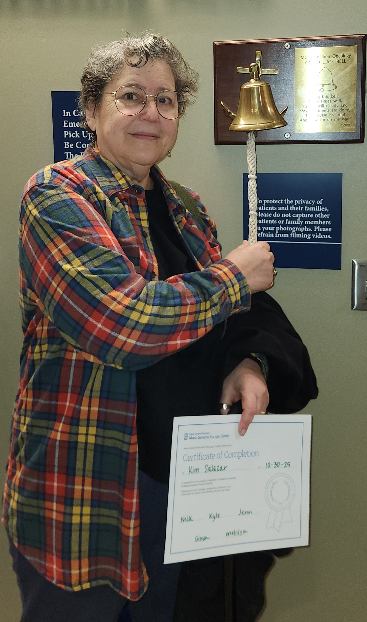
First, as I announced on FaceBook, I have completed radiation therapy. Minimal side effects to report even at conclusion of the course. We are now taking a bit of ease to recuperate both from the therapy itself, and having to drive out in the pre-dawn hours for 6:45 am appointments. 40 days of that doesn’t sound too bad when compared to the decades over which we left early as commuters, but once you are no longer used to being part of the Dawn Patrol, it becomes a lot harder.
Special thanks to the radiation crew Mass General Hospital, who greeted me every morning with good humor, efficiency, and a steady tolerance for my unorthodox music requests. I suspect that at least one of them has signed on to read here at String because of a mutual interest in knitting. If so, please pass the word back to the whole gang.
Second, my Italian multicolor piece is zipping along. I’m almost at the halfway point for the outer rim.

I’m 99% sure I will meet my horizontal centerline spot on in terms of thread count. I adjusted the total width to ensure that my corners are identical. There is one tiny mistake I need to go back and fix, but it is not something that has an effect on band width or repeat cycle. I could leave it, but I won’t.
And as you can see I am also making rapid progress on the frog hats – my third front of advance. Frog Hat #1 is now well underway. I admit that aside from the initial cast-on number I have not paid much attention to the general pattern I am using as my source. I’ve used a different cast-on, swapped in K2P2 ribbing for the original K1P1, and arranged the thing so that when the brim is folded, the more attractive side of my cast-on is on the outside of the hat. And yes, I’m working in the round on two circular needles.
Next comes hat depth and the decreases. I want the hat to fit rather sleekly rather than being full and floppy, so I will probably go short on the total depth compared to the written instructions. We’ll see if I follow the pattern’s decrease or if I end up opting for something more rounded.
My goal is to work the boring hat portion of at least four of the batch of hats I intend to make. Once those are complete I will make the eyeballs and eyelids, then finish off by sewing the eye units onto the hat bodies. Given quick progress on first hat (and that done while I still carved out time to embroider), I do hope to complete the minimum of the hard-promised four by the new year. The others are optional and will depend on available yarn, time, and my own rather spotty attention span.
I leave you with a repeat of the somewhat disheveled, early morning bell-ringing photo I posted on FB to celebrate my liberation from therapy. And yes – my last day’s music request was the 1812 Overture. You can’t celebrate an Independence Day in Boston without it. Especially because the MGH hospital complex is close by the river, and on upper floors commands a lovely view of the Esplanade where the annual 4 July celebration takes place.