I’ve finished all of the stitching on the book cover project, now on to turning the flat piece of cloth into the finished item.
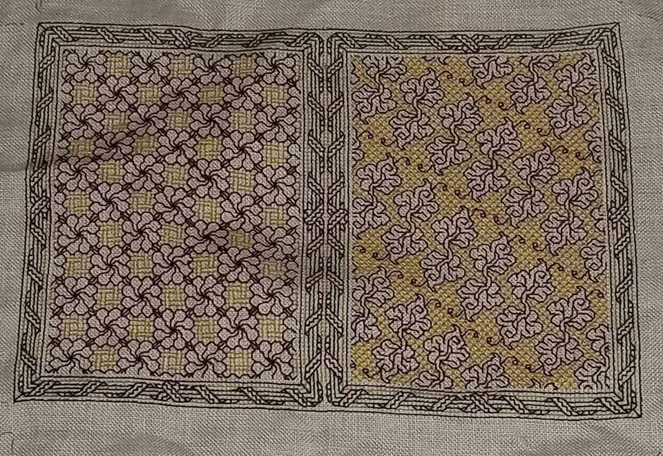
Although I am a teensy bit disappointed that my centering efforts on the leafy side did not pan out, I think you can see that my guess was correct. Given the eccentric nature of this slow-descent repeat, it’s not obvious at all.
An interesting thing happened – density of color. The yellow used on the front and the back are the same – same color number, even the same skein. But the diagonal diamond voided fill used behind the leaves is more dense than the lattice weave used with the swirly flowers. And the swirly flowers, having nice dense centers and connector leaves show the red as being more intense, too. The colors present differently depending on the stitching designs chosen. Close diagonals will appear visually more dense and darker than stitches done “with the weave” – horizontally or vertically.
While density differences do manifest in monochrome, they mostly present as grey scale from a distance, or in some blackwork substyles – something akin to the cross-hatched lines that are used to indicate depth and shadow. But in polychrome it works a bit differently. Individual colors – the same colors in fact – will pop or recede, or even intensify, depending on the closeness and orientation of the line segments on which they are used.
Making up the Book Cover
Well, for me at least the fun part is over. Now for the less interesting but no less exacting half of the project – turning this flat piece of cloth into a book jacket.

As you recall, we have the flaps all neatly defined by basted lines. These I will just turn over, not bothering to finish off the raw edges. They will be well concealed once the thing is sewn together, plus the added bulk of a turned or rolled hem would distort the lie of the stitched part of the cover.
First I flipped the thing over, with the “good side” down, so I could fold my flaps to the back. I set the creases along the stitching lines and the basted guide lines, setting them with my iron. It’s easier to do if you finger-press first to get the precise fold line, then follow the finger-pressed creases up with a warm iron. (Ignore the blue ironing board cover stained with the ghosts of projects long past).
I started by setting the folds on the top and bottom edge, and then the left and right sides.

Then I trimmed off some of the excess fabric at the top and bottom. I didn’t bother trimming the left and right because there really wasn’t much to trim.
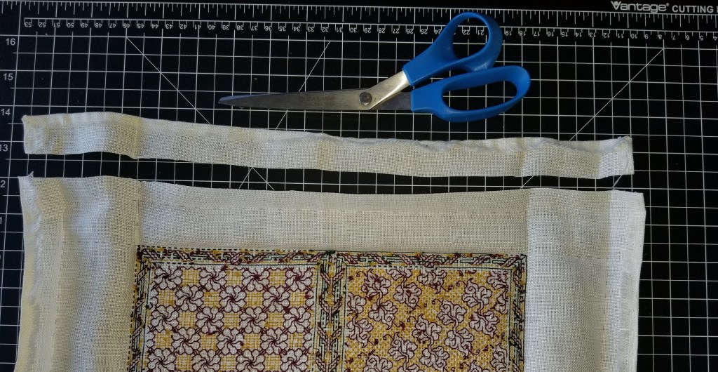
The next step was to fold everything in, and remove some of the bulk in the corners – note that I did not trim it all.

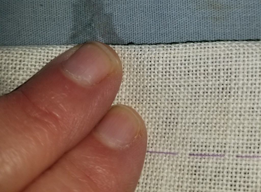
At this point with lots of nice, crisp creases in place, and no further need for the markings, I teased out all remaining bits of lavender basting thread.
On to the corners, to make them a bit sharp. There are other ways to do this, but origami-style “squash folding” to make a mitered corner is the simplest. I folded the corners in, ironed in the creases and pinned them for hand-tacking. And while I had the pin ball out (the needle-felted pin-puff is a treasured gift, made by Younger Spawn), I pinned the flaps to the body, although I will NOT be stitching them down..

And the last bit of prep was the stash-dive for a bit of red ribbon. That I will sew to the inside of the cover. It’s just long enough so it can be teased out to either the top or bottom, and will serve as an effective placemarker regardless of whether my recipient chooses the flower or the leafy side as the front cover.
Now off to do all of the tacking. The next post will cover sewing the end flaps in, to make the pockets into which the book covers will be slid. Before writing that bit up I want to experiment a bit, because I’d like those seams to be neat, and if possible – visible, and in green. We’ll see if that works out or if I punt and just stitch in the plain white sewing thread I am using for tacking and affixing the ribbon.

I’ve loved watching your project unfold, and it encouraged me to have patience to take out some stitches that I’m not satisfied with on a current project, and to start anew. I too have the same skein/different density problem on a project! It’s reassuring to know I’m not crazy thinking “whoa — weren’t these the same yellow?!” – but can say to you that the difference in the color effect barely registers with me when I look at your piece. I suspect that the color differential is greatly exaggerated in our minds when we’re immersed in our own stitching, but doesn’t present nearly as severely as we imagine. Thanks so much for sharing this project with us.
You are so inspirational. I just love using your blackwork fillers on my projects.
Thanks! I love seeing what mischief the pattern children attempt when playing with others. Please feel free to post/send photos. I will repost here (with your permission, of course).