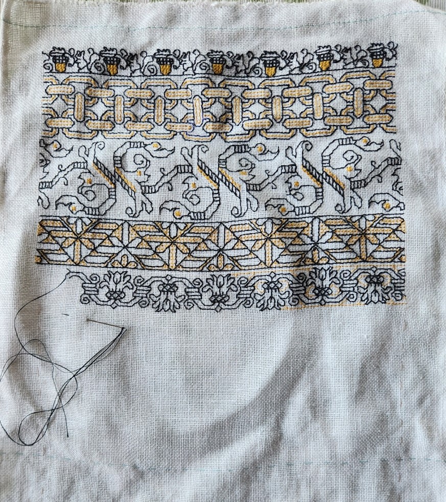
Although I’ve been lax about blogging, I have made progress on the Treyavir sampler.

Although it looks like I used several yellows for the accents to the plain black stitching, they are all the same color. What makes them look differently are the numbers of plies, the stitch used, and the stitch density. The yellow in the acorns is done in two plies of DMC #3820 in plain old cross stitch. The interlink accents are two strands of DMC in double running, as are the yellow bits in the odd foliate S-repeat below the chain. The triangular counterchange design uses a single strand of the DMC in double running, worked in a simple box fill. And the flower meander currently being stitched uses that same single strand of DMC yellow and double running, but in a very open and sparse manner.
Catching up since the last post, Strip #3, the vaguely leafy S-repeat, is not my own original. I redacted it from sampler dated 1697 (a bit later than my usual sources). It’s from Detached Geometric Patterns and Italianate Border Designs with Alphabet” 1697. National Trust Collections, Montacute House, Somerset, NT 597706. It’s the black one in the second row, upper right. Obviously the yellow is my add, specific to this piece. I’ve puzzled out several other designs from this sampler, and may include them in the next Ensamplario volume, since being post 1610, they are out of the timeline spread I try to stick to for my Carolingian Modelbook series. But in one place or another they will eventually escape from my desktop.
Skipping ahead to Strip #5, this simple meander is another of my own doodles, and will also be in EnsAtl III, but with a departure from that to-be-published version. Like all of the other placements of yellow in this, the background play was improvised on the spot just for this piece.
The one above the in-process stitching deserves a longer explanation. Strip #4 is something a bit far afield. I can’t call it my own. I would say it’s “After J.R.R. Tolkein.” That’s right. I used an on-newspaper doodle done by The Professor himself as my leaping off point. The heavily embellished newsprint page from August 1960 was displayed in the “Tolkein: Maker of Middle Earth” exhibit. The photo of it was captured by a fellow follower of the Prancing Pony Podcast: Tolkien & Middle Earth discussion group on Facebook, and shared in that group on 9 August 2024. I played with it and produced my version within hours of that post. Here is the inspiring image:

I was moved by the three-color bit at the upper left. Redacting it to be compliant with my blackwork standards was a bit problematic. For one, I stick to a single unit, 90°-45°-180° angle schema. I avoid half stitches and stitches taken over 2×1 units or other multiples. Curved lines are also a challenge. But for all of that, plus trying to keep the thing in as small a footprint as possible, I do think the lineage of my rather art-deco looking version can be perceived.
I also note that the visual designers working on the aesthetic for Gondor in the movie versions of Lord of the Rings might have been likewise inspired by these doodles. Evidence:

Now, what’s this design doing on a piece dedicated to the work of my own Resident Male? I looked at the strips already laid down and then went nosing around in my doodle pages for something that would contrast well with them. Preferably of medium width and a geometric, with potential to be worked up as a relatively solid band rather than a meander or baseline-sprouted design. I wanted something to balance the chain links above it and provide counterbalance to the extra wide designs I’m considering for use in the lower half of the piece. This one was just too juicy to pass over. And flowing from arguably the greatest wellspring of fantasy literature, from which every epic in that genre since has contained at least a drop of legacy, the filtered scion of my interpretation seemed appropriate.
Next up, another Mystery Inscription from Treyavir. Possibly a narrow defining band to frame it, then on to some really complex custom strips that echo bits from that book.
my mother often used to sketch drafts on newspaper. i=It was something about the effect of the newsprint as a background that made an inneffective design look bad and a good one noticable
I like the yellow, and the color difference due to different techniques used…fascinating. So far the acorn band is my favourite, but I love oak trees so that’s not a surprise. The triangle design toward the bottom makes me think “palm trees”.
@ louisebee – I thought it was all about there were horizontal and vertical guidelines, sort of a replacement for graph paper. The news print showing through does add something to the designs in the photo above that a plain white paper would not. Maybe mimicking the texture a linen would have?
I reread the Hobbit this past weekend, and realised where the name of you blog had come from. “What does it have in its pockets, precious?”
Yup. Blogging under this address/name since around 1996 (earliest entries lost in one of my many provider migrations). And I almost always have a project of some sort with me, so it’s also very true. 🙂
I have also been charting from that sampler, for my intermediate blackwork course at the Embroiderer’s Guild of Victoria. I saw it in person at Montacute House last year, and took lots of photos then.
I have stitched that border, although without colour. It’s a fun stitch for working out the pattern. I’ve done a few of the others as well.
I only use Excel for charting though.