LONG LOST TWINS, PART VI
In Part III of this series I mentioned two pieces now held in two different museums that I suspect were cut from the same original artifact. That would make them bona fide twins, separated at birth. I don’t believe that was an unusual happenstance. Here is another example of a pair of items, now separated in two different collections, that I believe to have a common origin:
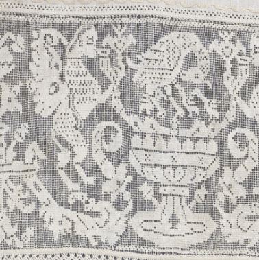
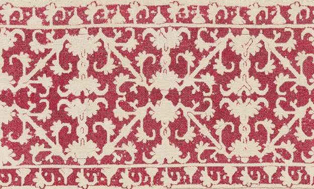
“Border,” Art Institute of Chicago. Accession 1907.664. 17th century, Italy. 8.5 x 31.4cm (3 3/8 x 12 3/8 inches).

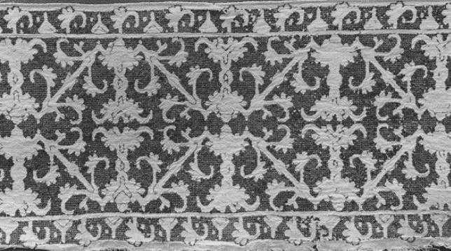
“Embroidery,” Museum of Fine Arts, Boston. Accession 95.1126. Undated. Italy. 17 x 78 cm (6 11/16 x 30 11/16 inches). Dimensions include several repeats and a considerable chunk of unworked linen.

The Art Institute’s photo is sharper, but these are spot-on identical in pattern count and execution, color placement, stitch and edging detail. The Chicago write-up details the stitches used as being “back, hem, satin, and split stitches; edged with silk floss in buttonhole and detached buttonhole stitches.” The MFA says “worked with line stitch, chain stitch, and laid work, and with red and yellow silk… The linen is joined by fagoting, and is edged with buttonhole stitch and loops and knots.”
I am not daunted by the discrepancy. This is pretty typical. Terminology for stitching techniques and stitches isn’t universal over time or place. One expert’s “line stitch” may well be another expert’s “back stitch.” And neither one may be back stitch as we know it today. Sometimes that term is used for double running, even though the two stitches are produced differently and can be distinguished from each other by looking at the work’s reverse. It’s almost impossible to know from the descriptions posted on line when they were written or by whom. In fact, descriptions within a single museum’s collection may not be consistent – having been written by different curators of varying degrees of familiarity with the type of work, decades apart. I would trust Santina M. Levey’s descriptions the V&A in totality. But I’m not so sure I’d trust an unattributed blurb in another museum that may or may not have accompanied the piece when it was originally donated in 1909, and may not have been revisited since.
I’ve worked in a museum and I know that the archivists and curators, no matter how educated and experienced, do not know everything about every artifact; and not every artifact in the collection has been studied and corroborated by experts in that specific area of endeavor. Lots of times an artifact languishes for decades in a storage case with the tag that was on it when it was donated. It would not be unusual for something acquired before 1925 to have a “best guess” attribution that’s never been re-evaluated. Documentation standards have risen over the years, but these older acquisitions are not upgraded and retagged unless they have a bearing on a specific line of (funded) inquiry. So artifacts just sit there with speculative provenances and dates. One of the problems dilettantes like me face is that having no academic yardstick, we accept all published or museum attributions at face value. Or we reject them, or cherry pick the ones that fit our pet theories. (I’m no different in this. My pet theory du jour is that these are from the same original.) My point is that without validated and serious study, even the grandest and most augustly respectable museum’s taggings can be incomplete or open to question.
I’d love to see these two items in person, and I’d love to see their reverse sides. Just looking at them I know I could re-create them using several techniques, depending on whether or not the originals were one or two sided. Double running stitch for the red and yellow linear elements, and carefully laid satin stitch on the count for the yellow diamonds? Sure! Providing ends were carefully managed, that would be the same on the front and back. Back stitch and pattern darning? Also would work on the front, although that would result in a one-sided finished product.
So until I have the entree to actually peruse these in person, I’ll just contemplate the photos. I don’t know if these two museums know of the commonality of their holdings. But I do posit with some amusement that somewhere back around the turn of the last century, a dealer in Europe made a killing, snipping an original (possibly already damaged), and selling the fragments to two wandering American collectors; who in all probability each went home each thinking he or she had snatched up the only remains of this masterwork.
LONG LOST TWINS, PART V
More duplicates!
First off, I’ve found two more examples of the spinx, urn, and pelican pattern I showed in the first note of this series. Both of the new examples are in the Cooper Hewitt. Here are just the center urn sections from both. Please visit the links to view the entire works:
Border, Smithsonian Cooper Hewitt, Accession 1931-66-144. 17th Century, North Africa


For comparison, here are the urn/bird sections of the three I’ve previously posted:
Valence Embroidered with a Grotesque Motif, Hermitage Museum, 16th century, Italy

Border, Metropolitan Museum of Art, Accession 14.134.16a, 17th century, Italy.

Valence Embroidered with a Grotesque Motif. Hermitage Museum, 16th century, Italy.
Of the red mesh background examples, two retain their companion edgings, but they are different and unrelated to each other and to the main pattern panel. No two are alike, neither in the main motif or the companion edgings, although all of the main motifs are clearly descended from a common source.
As to North Africa vs. Italy as the source of the Cooper Hewitt pieces, Iv’e noted that some panels cited by Freida Lipperheide as being Moroccan in origin are now attributed by other museums as being Italian. The style of stitching apparently was called “Moorish,” or “Moresque” at one time, and that label may have influenced the early attributions. Again, without academic and detailed materials analyses we’re at the mercy of the occasionally musty museum attributions.
It’s interesting to note that the most detailed piece is the 17th century Cooper Hewit holding; and that iteratino is most like the 16th century darned net sample (two baby birds; pomegranates growing from the urn base; other similarities)/ The other pieces are closer to each other (one baby bird, downward growning side urn decorations, etc.). I note that the tendency fo these patterns is to lose rather than gain detail over time. But in the absence of any scholarly examination of these pieces, I can’t challenge the museum dates. But I can safely say that considerable leeway exists in pattern interpretation.
On to a new example. This one is an even better example of pattern conservatism over time. Centuries, in fact.
Band. Metropolitan Museum of Art. Accession 09.50.1363, 16th to 17th century, Italy.


Band. Metropolitan Museum of Art. Accession 09.50.61. 1th Century, Greek Islands
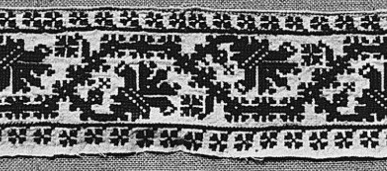
As you can see, I’ve found at least three examples of this one, spanning a possible 200-year range, done in different styles. The top one appears to have been worked in Italian two-sided cross stitch, but not pulled tightlly. Some of its side sprigs are in plain old cross stitch. The middle example features a pulled background mesh stitch – possibly the same Italian two-sided cross stitch, but tightly drawn. Jury is still out on this one, but up-close viewing reveals bundling rather than withdrawn or missing threads). The bottom example is worked in plain old cross stitch, with evidence of having been stitched in two colors (the vertical element in the fragmentary corner appears to have been done in a second color).
Now, not every pattern maintains recognizability and integrity over 200 years. But some clearly do, in spite of minor variations in detail (the side sprig flowers), and in stitch choice. Of course it’s also possible that the original collectors bought items wihtout clear documentation of provenance or origin time; and that some of the examples we think of as being earlier, are in fact of later manufacture. Again we need serious inquiry on this, armed with all of the dating techniques at modern disposal. So I ask as a self-taught dilettante – Is anyone out there looking for a really meaty doctoral thesis topic in textile history?
I’ve got more of these multiples to show. Stay tuned!
LONG LOST TWINS, PART IV
I’m happy that folk are enjoying this series. These sets are some of the material I presented at my Hrim Schola talk. I did have a bit too much material to cover there (I should have requested a two-hour timeslot), so this series is filling in some of the detail I glossed over in my class.
Today’s family branches out into two colors.
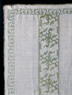
The first two are both from the Museum of Fine Arts, Boston:

#2 Punto di Milano, MFA Accession 92.42, 4 1/8 x 20 7/8 inches (10.5 x 53cm)
They were both part of the Denman Waldo Ross collection and the museum acknowledges the resemblance in their on line listing, but does not provide any other context for the two items, or opine as to why they might be so similar. And they are similar – not identical. Both are stitched in that pulled thread mesh-producing technique we’ve seen before, and both are green. Differences between colors on the two photos are more likely relics of the photo process or of differential fading, and do not necessarily indicate that the two started out either the same or different colors. We’d need to see the backs of the two side by side to get a better feel for original color.
Some differences are quite obvious. #1 is a single width strip, and #2 is double wide, mirrored like the strips in Friday’s post. But there are other differences. I’ve graphed out both of these for TNCM2, and they’re not spot on. The wings on the center motif in the double wide are significantly longer than the narrower version, and those little triangles at the reflection points vary oddly in treatment, being somewhat similar piece to piece to piece, but having a fair amount of variation, even within the same piece. The presence or absence of the triangles in #2 may have more to do with some very evident mistakes made by the stitcher – look how the center line meanders across the piece.
We can’t draw any conclusions based on the other obvious difference – the absence of edge patterns on the double wide strip because the museum sample was closely trimmed. It may have had companion edgings at one point, now lost to time and someone’s aggressive scissors. Note that size of the artifact is given edge to edge of the snippet, and in this case does not represent a measurement across the stitched area alone. It’s close on #2, there’s not much unstitched area left on that sample, but there’s a tiny bit more left on the single wide.
The edgings on #1 are of separate interest. It’s unusual (but not unknown) to see a piece with two different edgings, rather than the same one appearing top and bottom. I also am amused by these edging. The stitcher chose to ignore all of the difficult bits where the mesh fits in and around the leaves of the companion motifs. He or she just left those bits bare, but did so consistently across the piece so we know it wasn’t a mistake. (There is a mistake on top border of the single-wide – the first frond on the right is too short).
Were these part of the same original artifact? Perhaps a bedspread or towel, with narrow banding up the sides and a wider strip elsewhere, similar in design use proportion to this one?
It’s tempting to say so, but we can’t be certain.
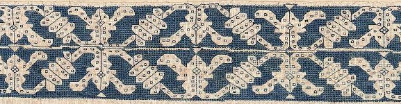
Finally I’ve stumbled across another iteration of this pattern:
Frontal (detail) Victoria & Albert Museum Accession 747-1892. 17th century (made), no provenance.

This one is even more problematic. Here is the whole artifact. It’s an altar frontal, composed from pieces of older works. The V&A’s date 17th century (made) acknowledges the fact that the item is composed of earlier bits:

But you can see that the borders at the left and right of this piece are clearly our friend, the Wandering Y pattern, presented with yet another companion border, complete with occasional and illogical presence of that little triangle center hat.
What can we learn from this grouping? Again we’ve got items identified by century, which is rather wide dating window. Might the red strips in the composed altar frontal be older than that artifact’s dating, and in fact be contemporary with the green pieces? Perhaps. One rarely cuts up brand new work to reassemble into a recycled piece, and this piece is clearly pieced together in a rather eke it out and make do manner. Was the frontal assembled in Italy from Italian lacis and edging scraps, or was it made up elsewhere? Unknown. There are other examples of assembled altar pieces of this type, so they were not uncommon.
I would like to speculate that given the mistakes on the two blue-green pieces, that we have evidence here of a pattern copied by “loving hands at home.” Were they from the same source artifact? We can’t say. That conjecture is possible, and stylistically congruent with other pieces of the time, but there is no hard proof in the on-line descriptions.
Maybe there’s more detail about these works in the museum archives, or in the archives of the the D. Waldo Ross collection. Wherever those are papers are today. But again we have a grouping that spans up to 200 years, sporting a recognizable core pattern, in multiple and varying expressions.
LONG LOST TWINS, PART III
To start off, a quick revisit of Part I of this series. I’ve found another example of the same sphinx and pelican with urn design (I knew I had seen one more, I just had to remember where.) This one is also part of the Hermitage collection, a piece of lacis (darned net). Note that due to problems with my blogging engine, only the museum citation will work as a link to the artifact page.
Valence Embroidered with a Grotesque Motif. Hermitage Museum. 16th century, Italy.

So now we have a second 16th century example of this design, and proof that these patterns were used to execute multiple needlework styles. There are some differences between the details of the lacis and the voided embroidery examples I posted earlier this week. The lacis work is closer to the other Hermitage piece – the simpler of the two – but that could be because lacis does not lend itself to the fine detail that can be worked in double running.
Now on to today’s multiple. This is a fun one.
First, here’s our basic design worked as a single width strip.

And here is the same design but done up as a double width strip:

There are some minor differences in treatment between them. I can’t tell what stitch is used for the voided background of the second, but whatever it is, it is not the pulled thread mesh of the first example. And some of the interior elements of the design – the Y an O centers at the reflection lines – are filled in in the second sample, while they’re left unworked in the single width band. It may also be possible that the outline on the second sample was worked in a contrasting color silk because it appears to be darker and more crisp than the outline in the narrower example. And of course, the companion edging treatments are totally different.
But that’s not all. Here are two more examples of the same pattern, also with their Y and O centers left unworked:
Now these two are EXTREMELY close in width, proportions, background treatment, count of the main design, and of the border. Even the placement of the little dots in the border element are identical. Both were collected between 1900 and 1920, the MFA’s by D. Waldo Ross (active around that time); and the MMoA’s originating from F Fischbach in Wiesbaden, Germany in 1909.
I believe that these two are actually and truly long-lost twins. It would not be impossible for these two pieces to have been cut from the same original artifact, or from a closely matched set of originals (like two of a set of multiple matching coverpanes – sort of like oversized napkin/towels). The two snippets were thens old to two different well-heeled collectors.
As to style, unlike the second item above, the outlines of our two twins are clearly not worked in a contrasting color. This piece also has a rather nifty and individualized border, created specifically to match the center strip. Sprigs of the main design’s foliage and center element are echoed in the companion edging.
Note that in NONE of these samples does the count of the companion narrow edging have anything to do with the count of the main panel repeat. This is pretty much universal. Modern attempts to align the repeats of edging and main strip are over-fastidious efforts, a practice not seen in historical samples. To my eye aligning border and main strip removes a bit of visual spontaneity, making the whole into a more static entity. But that’s my just own aesthetic opinion. Your mileage may vary, and your own tolerance for visual disorder might be lower than mine. All is good.
What conclusions can we draw from this set? Again, minor variations in working method were totally at at the discretion of the stitcher. There were then like there are now, no embroidery police. Narrow borders were also chosen independent of the main design, and might or might not match the style or design elements of the center strip. And finally – mirroring strips to make wider bands is a totally historically legitimate method of working a deeper strip.
On dating and provenance, again these designs were very conservative, varying little over time. We’ve got another 100 years or so to play with if we go by the museum dates. Plus this won’t be the last time we’ll see pieces attributed variously as being of Italian or Greek origin. There was a very lively trade in the region, and these pieces are very hard to pin down to just one place. Plus Greek Island embroideries retained many of these patterns in active vocabulary long after similar designs had passed out of high style in Italy. Not all traditional Greek stitchery patterns are of 16th-17th century origin of course, but some do share a common lineage with Italian works of the same time.
For the record, this pattern (in single width) is among those I’m hoping to present in TNCM2.
MORE INSPIRATION FROM HISTORICAL SOURCES
Once more I go web-wandering, looking for counted thread inspiration from around 1500 through 1620 or so. This time I present some lesser known examples of counted stitching.
What I really wanted to find were examples of household linens – towels, sheets, pillows or other bedding, cushions, tablecloths, and the like. You’d think with all those innumerable domestic scenes so common in iconography there’d be some. So I looked for Annunciations, domestic scenes of the infant or young Jesus, plus other Bible and Saint’s lives scenes or parables; and tableaus from mythology. Anything that might show a made-up bed, a dining table, someone drying off, or someone getting dressed.
Given the popularity of counted edging patterns and huge number of household linen artifacts in museum collections, one would think these items would be common in paintings and prints. But they’re not. Perhaps the detail of these patterns was too tedious for most artists to attempt to reproduce. And it’s possible that for some of the religious art, the absence of decorated linen is of meaning. Lives of humility might not be graced by otherwise ubiquitous domestic embroidery, and it’s possible that the audience for these paintings noticed the omission. But I leave such interpretations to art historians. (I’m sure there’s more than one dissertation out there on household contents shown in classic religious art scenes.) Here is what I found in my troll of the Web Gallery of Art.
Domestic linen:
Here’s a nifty Bathsheba, she’s bathing, unaware of the peeping King David. She’s wrapped in either sheets or towels – some of which have elaborate embroidered red trim, with just enough detail to make out that the designs are regular enough to be counted. Although this work is undated in the collection, Jan Masseys other paintings are dated from 1550s and 1560s:
http://www.wga.hu/art/m/massys/jan/bathsheb.jpg
Masseys had a thing for David with Bathseba in disarray. Here’s another with towels or linens, although the detail is a bit more ambiguous that the last. This one is from 1562:
http://www.wga.hu/art/m/massys/jan/david_ba.jpg
And the barest hint of a bit of blackwork on a napkin from a Last Supper painted by Jacopo Bassano in 1546:
http://www.wga.hu/html/b/bassano/jacopo/1/08lastsx.html
A painting by Carvaggio – Supper at Emmaus, 1601. This one looks like it may be a table carpet, upon which a plain white cloth is spread. Even so, the pattern on the carpet is interesting:
http://www.wga.hu/html/c/caravagg/06/35emmau.html
This is by the same artist and same subject the one above, but is a later work (1606). The table cover under the white cloth looks a lot more like a voided pattern stitched on linen:
http://www.wga.hu/html/c/caravagg/08/47emmau.html
Bath linen(?) in lower right corner, edged with geometric. Master of the Fountainebleau School, Diana at the Bath, around 1590:
http://www.wga.hu/html/m/master/fontaine/diana.html
An embroidered pillow with a dainty counted edging along the seams, in Ambrogio Bergognone’s Madonna del Velo, from the 1500s:
http://www.wga.hu/html/b/bergogno/virgin_v.html
Personal linen:
Lots more of these in portraits, although not every painter took the time to do more than indicate the presence of intricate patterns. Certainly not with the graph-able precision of the famous Holbein Anna Meyer portrait on his Darmstadt Madonna panel. Still, detail on scale, placement, and colors can be harvested from these pix. Also I do note that while outer garment styles change and vary from region to region, and placement of the embroidery varies from piece to piece, the styles of the borders patterns and edgings used on chemises and shirts remains surprisingly stable across time and geography.
Black wide geometric stitching on chemise’s high collar neck band. Also edging embroidered on cloth worn as a turban style hat. Carvaggio, The Fortune Teller (detail) 1596-1597
http://www.wga.hu/html/c/caravagg/02/11fortu2.html
Geometrics on man’s wing-style collar. Portrait of Henri II, 1547:
http://www.wga.hu/html/c/clouet/francois/henri2.html
Chemise heavily embroidered in black, but probably not counted. Hans Eworth, Portrait of Lady Dacre, 1540
http://www.wga.hu/html/e/eworth/l_dacre.html
Geometric stitching in red on narrow high collar. Catarina va Hemessen, Self Portrait, 1548:
http://www.wga.hu/html/h/hemessen/caterina/selfport.html
Wide man’s collar and cuffs, in geometric patterns with center panel and complimenting narrow edging bands, worked in red on white linen. Giovanni Battista Moroni, Portrait of Don Gabriel de la Cueva, later Duke of Albuquerque, 1560:
http://www.wga.hu/html/m/moroni/portduke.html
Woman’s chemise with broad center panel and collar band, in black on white linen. Peter Bourbus, Portrait of Jacquemyne Buuck, 1551:
http://www.wga.hu/html/p/pourbus/pieter/portrai2.html
Narrow geometric band at top edge of woman’s low chemise (also may be detail in red on hat). Vittore Carpaccio, Portrait of Young Woman (artist dates are 1472-1526)
http://www.wga.hu/html/c/carpacci/5/021woman.html
Boy’s shirt – narrow collar band, voided in black on white. Jean Clouet, Dauphin Francois. (Artist dates are 1485-1541)
http://www.wga.hu/html/c/clouet/jean/dauphin.html
Man’s shirt – narrow panels with black on white geometric stitching, divided by heavier narrow strips of gold or yellow silk embroidery. Lucas (the Elder) Cranach, Portrait Diptych(detail). 1509:
http://www.wga.hu/html/c/cranach/lucas_e/11/05dipty2.html
Man’s shirt- narrow panels parallel to center front slit. geometric black on white. Lucas (the Elder) Cranach, Portrait of a Clean-Shaven Young Man, 1522
http://www.wga.hu/html/c/cranach/lucas_e/12/03young1.html
Man’s shirt – horizonal panel of either two color stitchery, or one color on brown, appliqued over narrow cartridge pleats to keep them in place. Albrecht Durer, Self Portrait at 26, 1498:
http://www.wga.hu/html/d/durer/1/02/05self26.html
Woman’s chemise, with small black edging allt he way around. Martha and Mary Magdalene, 1596 by Carvaggio:
http://www.wga.hu/html/c/caravagg/02/16martha.html
Another scoop neck chemise in the same style of the one above. St. Catherine of Alexandria, 1598 also by Carvaggio:
http://www.wga.hu/html/c/caravagg/02/15cather.html
A different style of higher neck chemise, this one decorated by wide double bands down the center, plus a band around the neck, and narrow strips of stitching, possibly
on seams. From Portrait of the Artist’s Sisters Playing Chess, by Sofonisba Anguissola, 1555:
http://www.wga.hu/html/a/anguisso/sofonisb/chess.html
A man’s high-neck shirt this time, with a wide band of black geometrics on white. Portrait of a Man, dated 1520-25 by Girolamo Romanino:
http://www.wga.hu/html/r/romanino/manportr.html
Edging on a veil, black on very fine, almost transparent linen. Not too many paintings that show stitched veils! Portrait of Martha Thannstetter (nee Werusin), dated 1515 by Bernhard Strigel
http://www.wga.hu/html/s/strigel/bernhard/portrai2.html
Another stitched veil – this one in multicolors, and possibly dual sided work. Andrea Previtali’s Madonna Baglioni, 1515-1520:
http://www.wga.hu/html/p/prevital/baglioni.html
Multicolor bands on boy’s shirts, done in a style that looks counted to me. Bernhard Strigel’s Portrait of the Cuspinian Family, 1520:
http://www.wga.hu/html/s/strigel/bernhard/cuspinia.html
Voided work edging around a neckline, in black. (Reminds me of the bit at the far right of my current piece). Sanzio Raffaello’s angel – a fragment of the Baronici Altarpiece, from 1500-01:
http://www.wga.hu/html/r/raphael/1early/02baron2.html
Two different narrow edging patterns, both in black, both very simple and easy to duplicate right from the portrait. Sanzio Raffaelo’s Portrait of a Woman (La Muta) from 1507:
http://www.wga.hu/html/r/raphael/2firenze/2/36lamuta.html
Raffaello was very good at clearly depicting intricate stitching. I really like this St. Sebastian (1501-1502) – the tshirt elaborately embroidered in yellow (gold?) with little black cross stitches is clear enough to chart:
http://www.wga.hu/frames-e.html?/html/r/raphael/1early/01sebast.html
Very clearly counted work – a man’s shirt with a wide, heavy two-tone neckband. It looks applied to the shirting underneath to me. Hans Maler’s Portrait of Moritz Welzer von Eberstein, from 1524:
http://www.wga.hu/html/m/maler/welzer1.html
And a lady with a high multicolor stitched collar. This looks like highly embossed stitching to me, not jewelry. And regular enough to make me think that the underlying cartoon was worked on the count, with the embossed stitching done over the cartoon. I have no basis for this opinion other than observation, so feel free to disagree. Willem Key’s Portrait of a Lady, undated, but the artist lived from 1515 to 1568:
http://www.wga.hu/html/k/key/willem/portlady.html
A particularly good view of upper body construction of a woman’s chemise, embroidery framing center slit, following around the collar and radiating out from it. In this case, with one single pattern maintained uniformly throughout. Black on white. Bernardino Luini’s Salome from 1527-1531:
http://www.wga.hu/html/l/luini/father/2/salome1.html
Another killer high neckband on a man’s shirt. Again multicolor with red and yellow (gold?), worked on the count. Jan Gossaert’s A Noble Man dated 1525-1528:
http://www.wga.hu/html/g/gossaert/2/baudouin.html
and finally
Ambrogio de Predis’ Portrait of a Man, from 1500. The pattern on his sleeves is in the forthcoming collection of blackwork filling patterns:
http://www.wga.hu/html/p/predis/portra_m.html
I have references to at least as many again pix as are presented above. Let me know if you’d like me to share them too.
LIFE KNITTING AND BOOTIES
Google Images now contains Life Magazine’s vast photo archive. If you’re old enough to remember the heyday of home delivered magazines, you will most certainly remember that glossy, oversized, highly visual catalog of each week’s events. It was spectacular.
Buried in that archive are a nice set of knitting-related images, mostly from the 1930s and 1940s. Most of them are from three issues, a 1939 one on knitting for the British army, a 1941 how-to-knit issue, and a 1952 home/baby knitting article. The accompanying articles aren’t in this archive, but the how-to and finished object pictures that formed the core are. There is also a smattering of celebrities at rest/with family pictures, some travelogue/news shots of women knitting abroad, and a couple of college girls knitting from the late ’40s/ early ’50s – the last time there was an on-campus knitting fad.
The 1941 how-to series pix are interesting because they show the pencil grip throwing style (even though some of the series pix are missing_. There are also at least one 1952 vintage how-to, showing Continental method:
- Long tail cast on
- K2tog decrease
- Binding off technique #1
- Binding off technique #2
- Binding off technique #3
- Purling #1
- Purling #4
- K2,P2 Ribbing
- Picking up along an edge #1
- Picking up along an edge #2
- Knit stitch (Continental , from 1952 article)
And some finished objects
- Knitted faceless Balaclava or hood
- Hat/scarf combo (open end of tube scarf forms hat)
- Another shot of the hat/scarf
- Soaker
Here are some of the other shots:
- Celebrity knitter Eleanor Roosevelt knitting on a plane? train?, 1937
- British showgirls knitting, 1937
- Cover picture from the 1941 how to knit issue
- British store clerk knitting (1939)
- Celebrity knitter Prisca Bunau-Varilla (French Ambassador’s daughter) 1960
- Cute woman gas station attendant knitting
- British waiter doing troop knitting (note method of holding yarn)
- Celebrity knitter Eve Arden, 1959
- Hotel page boys knitting, 1939
- Height of the campus argyle knitting craze, 1948
- Wounded Finnish soldier and nurse knitting, (note that he’s using Continental method, she’s throwing. I bet he learned as a kid at home.) 1940
- Lose weight while knitting? 1940
- Celebrity knitter Jane Froman, 1936
- Chinese girls knitting on long bamboo(?) DPNs, 1946
- Gangsters’ wives knit, too. 1949
- Celebrity knitter JoAnne Woodward. Perhaps Paul is getting socks, 1958
- British toddler playing with knitting 1939
- Celebrity knitter Barbara Bel Geddes 1959
- Striking women auto workers knitting (France), 1937
- British ambulance driver knitting, 1937
- Knitting in public, 1944
- Troop knitting 1939
- Celebrity knitting Byron Nelson and wife (wife knitting), 1945
But to me, the most interesting picture is that of this little bootie, from 1952. Although I prefer not to repost the pix of others, I think fair use here applies so you can see these side by side:


The “Janes Booties” (at right) I often knit are one of those much loved, scribbled-on-an-envelope patterns passed hand to hand. The version I use was posted to the KnitList by Ann Kreckel in 1995. I did a step by step how-to for Ann’s pattern in 2005. Extremely similar patterns have appeared in a letter to Threads Magazine, and in the 1999 Knitters Socks Socks Socks competition book. The Threads letter was printed in the 1991s, and was penned by an elderly lady who said she’d been knitting them since her girlhood. My guess is that the ur-source for this pattern might have been a magazine article or leaflet appearing sometime between 1900 and 1920.
I’m always on the lookout for earlier manifestations of Janes Booties so this shot grabbed my attention. The Life magazine bootie looks a bit squashed and shallow compared to my green bootie, but I can see that it shares basic construction with the pattern I use. First, the bottom looks to be a rectangle of garter stitch. The sides of the bootie look like more garter stitch picked up around the edge of the sole plate strip, then knit in the round. The top of the toe looks like it was worked flat, back and forth, culminating with the tube-knit ankle part, worked in the round on the ankle stitches plus those from the top of the foot. Eyelets form the holes for the tie string.
While the Life bootie is much less plump, with a shallow toe area and overall less boxy appearance (no garter stitch welts to form the sides), and ended off in a plain garter anklet rather than a rolled stockinette top, it was made the same way. I’d consider it a first cousin to Ann Kreckel’s pattern. If anyone spots earlier incarnations of similarly constructed booties in historical sources, please let me know!
AMAZING ON-LINE REFERENCE LIBRARY
Out web-walking again, I’ve stumbled across a treasure trove of books on spinning, weaving, and other textile arts. It includes historical and recent works on lacemaking, embroidery, tatting, knitting, crochet and some other less practiced crafts, as well as ethnographic material, periodicals, and academic papers. I’m sure I’m the last to find out about it, but I share the reference all the same.
This textile-related archive is maintained by the University of Arizona. Its collections are available on-line, with the individual works so distributed either aged out of copyright, or presented with the authors’ permission. There are thousands of items – mostly geared to industry and manufacture, but with a healthy smattering of works detailing hand production. Scans are available as PDFs, with the larger books broken out into smaller segments of under 15MB. Not all are in English.
Among the works I found that are of greatest interest to me in specific are:
Whiting, Olive. Khaki Knitting Book, Allies Special Aid, 1917, 58 pages. PDF
This compendium of knitting patterns presents sweaters, wristlets, socks, scarves, mittens, hats, caps, and baby clothes intended in part for troops overseas during WWI, and for the comfort of refugee families displaced by the war. Patterns for knitting and crochet are both included. The socks shown mostly knit top-down, some have a gradually decreased instead of grafted toe. Some of the socks are worked on two needles and seamed. One pair in particular (marked as a pattern from the American Red Cross, p. 13) seems to include a written description of a grafted toe, but it does not name the technique. Directions are a bit more detailed than is usual for pre 1940 knitting booklets. Fewer than a quarter of the patterns are illustrated with finished item photos. Aside from a list of abbreviations in the front, there are no how-to or technique illustrations.
Nicoll, Maud Churchill. Knitting and Sewing. How to Make Seventy Useful Articles for Men in the Army and Navy, George H. Doran Company, New York, 1918, 209 pages. PDF
This book is a bit more detailed than the previous one. It also contains a rundown of standard troop knitting patterns – hats, mufflers, balaclavas (called helmets), mittens, socks and the like. Every project is illustrated either with a photo or a line drawing of the finished product. Instructions are written out in a fuller format than in the Khaki Knitting Book. It also has some valuable bits of instruction including a list of yarn substitutions, plus two full size color plates showing the wools used, identified by name; a small stitch dictionary section,
Of special note are some unusual mittens (including a mitten with truncated thumbs and index fingers – p.68), half-mittens – p. 77, “doddies” or mittens with an open thumb, p. 80, and double heavy mittens intended for seamen or mine sweepers hauling cables – p. 94). The grafting method of closing up sock toes is clearly described AND illustrated, but it is called “Swiss darning” (p.131). I’ve heard that term used for duplicate stitch embroidery on knitting, especially when the decorative stitches are sewn in rows mimicking actual knitting, rather than being stitched vertically, but I have never before seen it applied to actual grafting. The entire section on socks and stockings is particularly clear and useful. There are even a couple of crocheted and knit mens’ ties in the sewing section.
Finally, the sewing section (about a quarter of the book) might be useful to people doing historical costuming or regimental re-creators who are looking to augment their kit. The one drawback is that most of the sewing patterns are predicated on Butterick printed patterns, and the schematics are not provided in the book. Among the offerings are money belts, a chamois leather body protector and waistcoat, various types of shirts and undergarments, pajamas made from heavy blanket fabric, and a book bag (like a messenger’s bag).
Egenolf, Christian. Modelbuch aller art Nehewercks un Strickens, George Gilbers, 1880, 75 pages. Note: Reprint of 1527 book. PDF
Ostaus, Giovanni. La Vera Perfezione del Disegno [True Perfection in Design], 1561, 92 pages. Note: 1909 facsimile. PDF
These are two modelbooks of the 1500s. There are several others in the collection, but they are mostly books of needle lace designs. Ostaus also offers up mostly patterns for the various forms of needle lace, plus some patterns that can be adapted to free-hand (as opposed to counted) embroidery, plus a large section of allegorical plates to inspire stitched medallions, slips, and cabinets. One thing I’ve always liked are some of his negative/positive patterns. These are designs that if laid out on a strip of thin leather or paper and cut can be separated longitudinally into two identical pieces. There are several of these scattered around the middle of the book.
Starting around page 73 or so there is a section of graphed patterns, a number of which landed in my New Carolingian Modelbook collection.
The Egenolf book also is mostly line drawing suitable for freehand embroidery. Some are pretty cluttered, but some are very graceful. The oak border on p. 32 has always been one of my favorites. There’s one plate with a counted pattern, on p. 72.

—. Priscilla Cotton Knitting Book, Priscilla Publishing Co., 51 pages. PDF1, PDF2, PDF3, PDF4, PDF5, PDF6.
This books is obviously a seminal source behind many of today’s reference books on knitting technique and patterns. Notation is sparse and “antique” with n (narrow) being used for k2tog, and o for yarn over, and other oddities. There’s a fair bit of circular doily knitting, but it is of the knit radially and seamed variety seen also in Abbey’s Knitting Lace. In fact many of the doilies appearing in Abbey appear to have been adapted directly from this work. You’ll also recognize many Walker treasury edging patterns in these pages.
In addition to the stitch texture and lacy knitting sections, there’s a bit on “cameo knitting” which appears to be another name for stranding (in PDF2). The section on filet knitting (in PDF3) is relatively extensive, and clearly shows both the strengths and weaknesses of this rarely described style.
—. Priscilla Irish Crochet Book No. 2, Priscilla Publishing Co., 52 pages. PDF1, PDF2, PDF3, PDF4, PDF5, PDF6, PDF7, PDF8.
This has got to be the single most complete and eye-popping source I’ve ever seen on Irish crochet. Not only does this contain an amazing amount of eye candy, it also gives directions on how to create it, offering up pattern descriptions for the individual motifs, the joining brides and grounds, and the working method of fastening the motifs to a temporary backing while the grounds are being worked.
—. Egyptisch Vlechtwerk [Sprang], Holkema & Warendorf, 36 pages.PDF1, PDF2
As an example of the depth of the collection, here’s a work on Sprang, one of the lesser known fiber manipulation crafts sometimes mistaken for early knitting. It is in Dutch and appears to be from before WWI, but it is illustrated with photos of finished pieces and works in progress.
These are just a small sample of the hundreds of works available at the University’s website. Again, most are on the industrial aspects of the textile arts, from fiber acquisition (including sericulture and sheep raising) through spinning, and weaving, but a goodly number are of direct interest to hand-crafters. Topic lists exist for knitting, crochet, embroidery, cross stitch, lace, tatting, and a multitude of other subjects. Support this valuable resource by visiting and using it. I know I’ll be combing through here for years…
MORE MITTEN INSPIRATION THAN I BELIEVED POSSIBLE ON ONE SITE
Rebecca over at Pocahontas County Fare points to a fabulous link – a project to outfit all participants at the NATO summit held in Riga with traditional Latvian hand-knit mittens. The conference took place back in November. Rachel details how to download and view the entire collection. I just provide boring links to some of my favorites appearing in the web-accessible galleries of regional styles.
What’s best about the galleries of the mittens at the Riga conference site is that each and every one of the over 5,000 pairs is photographed in detail at high resolution. High enough in fact to mine them for their colorwork patterning. Also high enough to spot some continuities of design.
Some of the mittens shown sport patterns that are extremely similar to those appearing in embroidery modelbooks from the 1500s and early 1600s:
http://www.rigasummit.lv/en/id/galleryin/nid/119/gid/3518/
http://www.rigasummit.lv/en/id/galleryin/nid/119/gid/3507/
http://www.rigasummit.lv/en/id/galleryin/nid/117/gid/3230/
http://www.rigasummit.lv/en/id/galleryin/nid/117/gid/3240/
http://www.rigasummit.lv/en/id/galleryin/nid/117/gid/3092/
http://www.rigasummit.lv/en/id/galleryin/nid/115/gid/2954/
http://www.rigasummit.lv/en/id/galleryin/nid/115/gid/2944/
http://www.rigasummit.lv/en/id/galleryin/nid/115/gid/2933/
http://www.rigasummit.lv/en/id/galleryin/nid/115/gid/2904/
http://www.rigasummit.lv/en/id/galleryin/nid/115/gid/2883/
http://www.rigasummit.lv/en/id/galleryin/nid/115/gid/2869/
http://www.rigasummit.lv/en/id/galleryin/nid/115/gid/2872/
http://www.rigasummit.lv/en/id/galleryin/nid/115/gid/2811/
http://www.rigasummit.lv/en/id/galleryin/nid/115/gid/2801/
http://www.rigasummit.lv/en/id/galleryin/nid/115/gid/2793/
http://www.rigasummit.lv/en/id/galleryin/nid/118/gid/3470/
http://www.rigasummit.lv/en/id/galleryin/nid/118/gid/3458/
http://www.rigasummit.lv/en/id/galleryin/nid/118/gid/3411/
http://www.rigasummit.lv/en/id/galleryin/nid/118/gid/3382/
Others evoke later eras.
http://www.rigasummit.lv/en/id/galleryin/nid/115/gid/2833/
http://www.rigasummit.lv/en/id/galleryin/nid/115/gid/2804/
http://www.rigasummit.lv/en/id/galleryin/nid/115/gid/2812/
http://www.rigasummit.lv/en/id/galleryin/nid/115/gid/2814/
http://www.rigasummit.lv/en/id/galleryin/nid/118/gid/3326/
And some are timeless – with patterns that evoke mosaics or other forms appearing in every era since people first figured out that regular geometrics were pleasing to look at:
http://www.rigasummit.lv/en/id/galleryin/nid/115/gid/2810/
http://www.rigasummit.lv/en/id/galleryin/nid/115/gid/2799/
http://www.rigasummit.lv/en/id/galleryin/nid/115/gid/2790/
http://www.rigasummit.lv/en/id/galleryin/nid/118/gid/3476/
http://www.rigasummit.lv/en/id/galleryin/nid/118/gid/3427/
http://www.rigasummit.lv/en/id/galleryin/nid/118/gid/3433/
http://www.rigasummit.lv/en/id/galleryin/nid/114/gid/2745/
I’m dazzled. I could look at these for hours (and I already have). Special thanks to Rebecca for posting the link, and to the unknown person who wandered over here from there, leaving the ant-trail I followed back to her site out of curiosity.
WRAPPED SPANISH HAT – EXPERIMENT 1
As promised, here is my experimental foray at the wrapping technique used on the 18th Century Spanish hat from the V&A’s photo collection.

I tried out three different methods of making the floats. First, this is the second swatch. My initial attempt was working this in the flat. It was a mess. So I switched to working in the round, on the principle that the inspiring hat was probably knit in the round.
The largest section on the bottom (green arrow in the photo) was done using Tamar’s suggested method – bringing the yarn to the front of the work, slipping the stitches to be wrapped purlwise, moving the yarn to the back of the work, returning the slipped stitches to the left hand needle and then knitting them off. You can see that it works nicely, but has a tendency to distort the stitch immediately preceding the wrapped segment. This is most evident in the columns of wraps, in which the same stitches are wrapped on several succeeding rows to produce a vertical column. It’s still there on the area where I shifted the wraps to produce a diagonal, but it is less evident.
The second section (red arrow) was done using the method I first posited – moving the yarn to the back of the work, slipping the stitches purlwise, bringing the yarn to the front of the work, returning the slipped stitches to the left hand needle, tucking the working yarn behind again, and then knitting off the formerly slipped stitches. It has slightly different weaknesses than Tamar’s method. In this case, I seem to be more prone to drawing the loop too tightly, and there is also a slight distortion of the stitch immediately preceding the wrapped section. It does however look just a little bit neater to me.
The third method (blue arrow) was one that came to me while I was fiddling with the other two. I worked those final two rows of wraps not as wraps, but in two passes. On the first pass I brought the yarn to the front, slipped the stitches that I wanted to “wrap”, returned the yarn to the back, slipped the plain stitches after them, brought the yarn to the front, slipped the “wrap” stitches, returned the yarn to the back, and slipped the plain all the way around. This laid one continuous thread in a single loop around my work. Then I knitted off the entire row. You can see I had time to do this twice. This does make a neater line than the wrapped methods, but has other drawbacks. First and foremost – it’s hard to keep an even tension on the continuous loop as it’s carried around the entire piece. Second, having a single continuous loop limits knitting’s natural elasticity. While this might be a useful technique to help maintain tightness in areas you don’t want to stretch out (like on the cuffs of an all-cotton sweater), I don’t think it is optimal for a hat.
Now going back and looking at the V&A picture again, it does look like there’s slight distortion of the stitches immediately before the wraps, and the wraps do look more like the slightly bowed ones produced by both Tamar’s and my posited methods. Without seeing the artifact itself, it’s hard to say which of the two was used. I lean to mine, just because I can control the distortion a little bit better with it than with hers, but both are functionally equivalent, and I’d say both are possible use case candidates that can’t be entirely ruled out without actually seeing the artifact’s front and back, both close-up.
MORE MUSINGS ON THAT SPANISH HAT
Back to that red Spanish hat. Several people wrote in with comments that deserve further testing.
First, Nancy and Jean suggested that it might have been done with two-end knitting or Tvndsstickning (also called Twined Knitting). I haven’t played with this technique yet, but from the appearance of the side sporting the standings in this Knitty article, I have my doubts on its application for this purpose. It looks like each individual stitch in this technique bears a wrap. The Spanish Hat clearly shows longer floats that wrap several stitches together. The twined/two-end knitting technique does look very interesting, and could clearly be used not only to make the double thick fabric for which it is justly famed, but might also have additional decorative implications if the twisting was shunted from back to front and vice versa, following a simple geometric pattern. But I don’t think it was employed on this hat.
Tamar (of the infinite needlework library) also wrote with another simpler suggestion. She was able to get a closer look at the bottom edge of the hat in the V&A’s picture. She says:
Especially at the bottom of the picture on the V&A site,
you can see the wrap yarn coming directly from the bottom
of the knit stitch to the right. So the wrap goes
immediately in front of a group of stitches.I haven’t tested it, but perhaps the wrap is done first
around the previous row’s stitches, and then they are
knitted.
This makes sense, and would probably be a bit less fiddly than knitting and then the wrapping in the same row method I posited on Friday. I’ll test out both wrapping methods, possibly tonight, to see. If all goes well, I’ll put down my lace shawl and do up a quick hat pattern using my findings. It would be highly cool to reverse engineer a knitting technique of the 1700s, and rescue it from historical obscurity!
