I’m happy that folk are enjoying this series. These sets are some of the material I presented at my Hrim Schola talk. I did have a bit too much material to cover there (I should have requested a two-hour timeslot), so this series is filling in some of the detail I glossed over in my class.
Today’s family branches out into two colors.
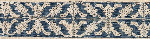
The first two are both from the Museum of Fine Arts, Boston:

#2 Punto di Milano, MFA Accession 92.42, 4 1/8 x 20 7/8 inches (10.5 x 53cm)
They were both part of the Denman Waldo Ross collection and the museum acknowledges the resemblance in their on line listing, but does not provide any other context for the two items, or opine as to why they might be so similar. And they are similar – not identical. Both are stitched in that pulled thread mesh-producing technique we’ve seen before, and both are green. Differences between colors on the two photos are more likely relics of the photo process or of differential fading, and do not necessarily indicate that the two started out either the same or different colors. We’d need to see the backs of the two side by side to get a better feel for original color.
Some differences are quite obvious. #1 is a single width strip, and #2 is double wide, mirrored like the strips in Friday’s post. But there are other differences. I’ve graphed out both of these for TNCM2, and they’re not spot on. The wings on the center motif in the double wide are significantly longer than the narrower version, and those little triangles at the reflection points vary oddly in treatment, being somewhat similar piece to piece to piece, but having a fair amount of variation, even within the same piece. The presence or absence of the triangles in #2 may have more to do with some very evident mistakes made by the stitcher – look how the center line meanders across the piece.
We can’t draw any conclusions based on the other obvious difference – the absence of edge patterns on the double wide strip because the museum sample was closely trimmed. It may have had companion edgings at one point, now lost to time and someone’s aggressive scissors. Note that size of the artifact is given edge to edge of the snippet, and in this case does not represent a measurement across the stitched area alone. It’s close on #2, there’s not much unstitched area left on that sample, but there’s a tiny bit more left on the single wide.
The edgings on #1 are of separate interest. It’s unusual (but not unknown) to see a piece with two different edgings, rather than the same one appearing top and bottom. I also am amused by these edging. The stitcher chose to ignore all of the difficult bits where the mesh fits in and around the leaves of the companion motifs. He or she just left those bits bare, but did so consistently across the piece so we know it wasn’t a mistake. (There is a mistake on top border of the single-wide – the first frond on the right is too short).
Were these part of the same original artifact? Perhaps a bedspread or towel, with narrow banding up the sides and a wider strip elsewhere, similar in design use proportion to this one?

It’s tempting to say so, but we can’t be certain.
Finally I’ve stumbled across another iteration of this pattern:
Frontal (detail) Victoria & Albert Museum Accession 747-1892. 17th century (made), no provenance.

This one is even more problematic. Here is the whole artifact. It’s an altar frontal, composed from pieces of older works. The V&A’s date 17th century (made) acknowledges the fact that the item is composed of earlier bits:

But you can see that the borders at the left and right of this piece are clearly our friend, the Wandering Y pattern, presented with yet another companion border, complete with occasional and illogical presence of that little triangle center hat.
What can we learn from this grouping? Again we’ve got items identified by century, which is rather wide dating window. Might the red strips in the composed altar frontal be older than that artifact’s dating, and in fact be contemporary with the green pieces? Perhaps. One rarely cuts up brand new work to reassemble into a recycled piece, and this piece is clearly pieced together in a rather eke it out and make do manner. Was the frontal assembled in Italy from Italian lacis and edging scraps, or was it made up elsewhere? Unknown. There are other examples of assembled altar pieces of this type, so they were not uncommon.
I would like to speculate that given the mistakes on the two blue-green pieces, that we have evidence here of a pattern copied by “loving hands at home.” Were they from the same source artifact? We can’t say. That conjecture is possible, and stylistically congruent with other pieces of the time, but there is no hard proof in the on-line descriptions.
Maybe there’s more detail about these works in the museum archives, or in the archives of the the D. Waldo Ross collection. Wherever those are papers are today. But again we have a grouping that spans up to 200 years, sporting a recognizable core pattern, in multiple and varying expressions.

[…] Long Lost Twins, Part IV. Multiple instances of a simple Y and wrap meander. […]