WHEN IS MORE OF THE SAME NOT MORE OF THE SAME?
Another post that only a stitching history nerd will love.
The last post explored some differences between modelbooks that looked like they featured the same patterns, but in fact were not printed from the same plate. This one looks at one of the most widely reprinted and well known modelbook authors – Johann Siebmacher, and three of his works, all available in on-line editions. All of the excerpts below are from these three sources:
- Schön Neues Modelbuch von allerley lustigen Mödeln naczunehen, zuwürcken unn zusticken, gemacht im Jar Ch. 1597, Nurmberg, 1597, – the source work for Mistress Kathryn Goodwyn’s Needlework Patterns from Renaissance Germany
- One reprinted in 1886 as Kreuzstich- Muster: 36 Tafeln des Ausgabe, 1604, that calls out Siebmacher as its author.
- One indexed simply as Newes Modelbuch with him as author, possibly 1611, but unclear from the source
Many of the designs in these books seem to repeat edition to edition. Some are unique to only one. Before we begin, it’s worth remembering that these books are survivals. Long use and reuse over decades have resulted in page loss. None of the editions are complete, as in “all intact in one original binding,” and some may have been re-composed at a later date from other partial works. But we do what we can with what we have, and Siebmacher’s editions have title pages in them, and distinctive numbering and framing conventions that can lead to a reasonable conclusion that they were from the same printing workshop.
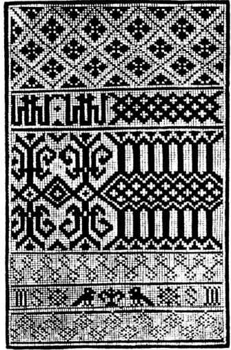
All of the books show graphed designs suited for reproduction using several techniques, including various styles of voided work on the count, lacis (darned knotted net), and buratto (darned woven mesh). Twp of them also include patterns that would be suitable for other forms of lace. Over time these patterns went on to be executed in weaving, cross stitch, filet crochet, and knitting, too. The descendants of these designs ended up in multiple folk traditions and samplers on both sides of the Atlantic.
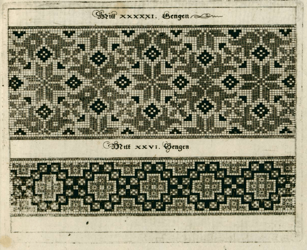
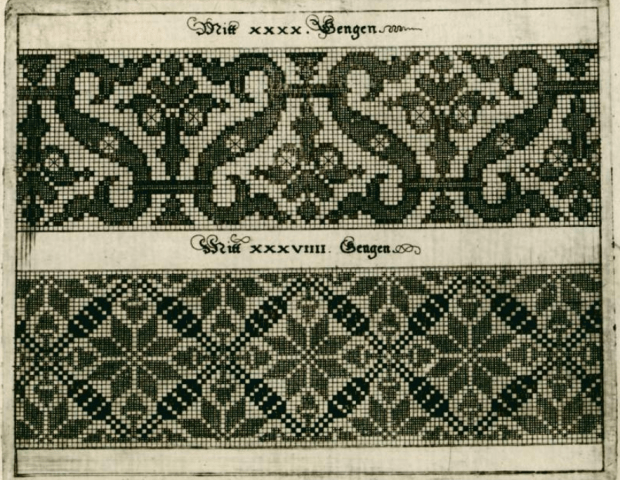
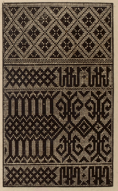
In addition to the longevity of their contents, Sibmachers books are among the earliest that seem to indicate execution of the design using more than one color or texture, a feature not common in the black-and-white printed early modelbooks. Here are examples the first two books. But I don’t think that these pages were originally printed two-tone. I think they were hand-colored to add the darker squares, either at the time of manufacture or later.
| 1597 | The possibly 1611 edition |
 |
 |
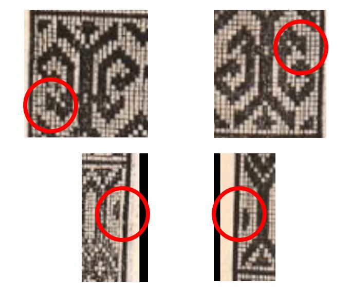
Obviously, the two samples above were printed from the same block. But the pattern of the darker squares is different, and if you look closely, the some of the solid squares looked colored in, as opposed to having been originally printed that way. I can say the retoucher who did the 1597 was a bit neater. I don’t think these were colored by the book buyer, because every single edition of Siebmacher’s works that I’ve seen have included multi-tone pages like this.
Here are other single- and multi-tone blocks that repeat between these two editions:
| 1597 | The possibly 1611 edition |
 |
 |
 |
 |
 |
|
 The brown ink on the G near the talon matches the color of the hand-drawn designs at the back of the book – post-publication additions.
The 1604 edition has similar pages that sport two-tone presentation:

But these books are not the same.
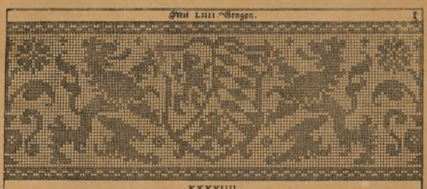
That 1604 edition… It’s curious that there are no blocks that are in the other two Siebmacher works that are also in the 1604 edition, yet all three books are clearly signed by him. And the majority of the block labels that show stitch counts for the repeat, or pattern height in units – they are curiously different between the 1604 and the others, too. But still, there evidence of style affinity across the works. Zeroing in on some specific pattern features:
A very familiar stag, that shows up on some of the earliest samplers, with descendants on American Colonial samplers, all the way up to pieces done in the 1800s.
| 1604 | 1597 |
 |
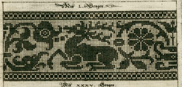 |
Similar, yet not the same.
Here is a set that’s confounding. First the hippogriff and undine from 1604:

Compare the item above to these two designs – a winged triton and an undine, each from the 1597 work:
 |
 |
Lions rampant?
| 1604 | 1597 |
 |
 |
Even the geometrics are close but not duplicates
| 1604 | 1597 |
 |
 |
All this aside, even the seemingly close 1597 and possibly-1611 versions have significant differences between them, although they do have exact page duplicates between them. Not so with 1604 – it’s unique when closely compared to the other two, even though all three have the same author attribution, and very similar styles. This is VERY odd considering the vast amount of physical labor that had to go into producing these blocks.
So. What’s going on with the 1604 edition? Why is it so different from the other two? Has anyone read an academic work that examines this issue in more detail, or corroborates these findings with other editions that are not published on line?
So many patterns, so many questions, so little time to do in depth research.
ONE DESIGN’S MIGRATION
Early stitching modelbooks. They so often look the same, page after page. Where did I see that design before? Why is it oh, so familiar?
And so we launch again into a post that only a stitching geek would love.
Early European modelbooks produced by sixteenth century printers in Italy, Germany and France often include similar patterns. Often the same patterns. Sometimes patterns SO much alike that one would think they were printed from the same blocks. In some cases, especially if one printer did successive editions of work, that’s entirely likely. In other cases, where the same block appears in works from different shops – that’s not entirely clear. Especially if the workshops of the various printers were separated by geography and/or time. However it happened – trade in blocks, plagiarism from printed copy, whatever – it is clear that considerable cross-pollination did occur.
Here is just one example.
This is from Niccolo d’Aristotile’s (called Zoppino) Venice-published Ensamplairo di Lavoiri, 1530/1531, as redacted as Volume I of Kathryn Goodwyn’s Flowers of the Needle collection (left). At right I show the same page from an original (unredacted) copy of the same book in the Gallica BNF20 collection, to remove doubt about any assertions I made below being artifacts of cleaning up for reprint. Watch those two center designs:

1530/31, Italy is pretty early, right?
Well, there’s this. Johann Schonsperger the Younger, from 1529, published in Augsberg, Germany This is from Ein new getruckt model Buchli auf außnehen, vnnd bortten wircken..., in the collection of the Staatliche Museen zu Berlin, #0S-1473-kl, as presented via Bildindex.

Not surprisingly, Johann Schonsperger’s earlier work, Ein new Modelbuch auff auaußnehen vnd bortern wircken.. from 1526 (also from Augsberg) has the exact same page. Also from Staatliche Museen zu Berlin, #0S-1472, as presented via Bildindex.

So we’ve traced this panel back to a 1526 edition, published in Germany. But were all of these printed from the same blocks?
I’d say that the two Schonsperger pages were certainly produced from the same blocks. They have the same curious features and mistakes.
By contrast, here are the same sections from the Zoppino work, with the same areas highlighted:

Yup. The little crescent is missing, and the lower arm of the fleur-de-lis type detail with the clumsy header is gone entirely – the design is truncated, leaving it on the cutting room floor. There are other differences – mistakes made in one version of the design but not in the other, that you would only notice if you were trying to redraft or stitch from each pattern.
So in this one case, I’d posit that a copy of a printed page from Schonsperger in Augsberg – either as part of a book, or as a broadside – made its way to Venice, where it was seized upon and re-rendered for inclusion in Zoppino’s collections. Which is pretty much counter to the intuitive argument that I’ve seen many make – that these counted patterns all originated in Italy and then spread north. Of course there may be another printed copy even earlier than Schonsperger…
Oh, and this design in particular? I’ve always been fascinated by the narrow border with its strong directionality. I posited in The New Carolingian Modelbook, that based on similarities to examples of Tiraz band calligraphy done on the count, as appearing in Richard Rutt’s book A History of Hand Knitting, 1989, that this motif may have been copied (possibly without knowing what it represented) from an extant piece of stitching, rug, or other textile from an Islamic workshop. If that’s true, it would make the design’s peregrinations even more impressive. Somewhere in the Islamic world, to Germany, then to Italy. And on from there…
UPDATE
And the Schonsperger plate makes another appearance! This time in Anton Woensam’s Ein new kunstlich Modelbůch, published in 1536, in Köln.

UPDATE UPDATE
You guessed it! Another appearance of our block friend – this one in Peter Quentell’s 1541 Ein New kuntslich Modelbook, published in Cologne. It also has the same idiosyncrasies as the Schonsperger, above.
UPDATE UPDATE UPDATE
Yet another representation has crossed my notice. And it’s a particularly curious one. This is from Schon neues Modelbuch, printed in Frankfurt in 1608, from the shop of Mayn Durch Sigismundum Latomum (Latomus).

Although it mostly aligns with the Schonsperger-Woensam 1536/Quentell 1541 version, it’s lacking a couple of very minor copyist errors, although it faithfully duplicates other peculiarities of that printing. Also it extends further to the left – instead of seven column/diamond repeats in the geometric on the left hand side, there’s a mirror point/bounce repeat. BUT at the center of that repeat there’s an artifact – the “elbow” of the curlicue pattern on the right. In other blocks it may serve to cue the stitcher that the geometric and the curlicue can be alternated, but here it’s encapsulated inside a rather clumsy centering, with a badly botched top and bottom border, plus on the same bounce line, another improvised mirrored center (with an extra wide column of boxes) in the simple separate border beneath. Almost like someone wanted to take an older block and eke out the page, so a new bit was carved to match. Hmmm…..
UPDATE x 4
I thought I had stopped finding more of these today, but apparently not. I’m including this because it fills in more of the early representation/movement of this design.
From Livre nouveau et subtil touchant l’art et science tant de brouderie fronssures tapisseries comme aultres mestiers qu’on fait à l’esguille soit au petit mestier aulte lisse sur toile clere tres utile et necessaire a toutes gens usant des metiers et arts dessinés ou semblables, published in 1527 by Pierre Quinty, probably in Cologne. It appears to be the Schonsperger plate, verbatim. Complete with odd little carving errors.

Our timeline now looks like this:
- 1526 – Augsberg (Schonsperger block)
- 1527 – Cologne (Schonsperger block)
- 1529 – Augsberg (Schonsperger block)
- 1531 – Venice (Zoppino block)
- 1536 – Köln (Schonsperger block)
- 1541 – Cologne (Schonsperger block)
- 1608 – Frankfurt (Schonsperger block, partial – augmented with additional carving)
BUSY BUSY BUSY
I wish I weren’t but it’s been so, and for a while.
Sadly this means that not much substantive is getting done on any of my main projects. I feel quite badly about this because I promised a pair of Octopodes Mittens to a niece. Thanks to the ungentle hands of the Philistines at TSA, during my trip to Florida, my on-the-needles project was unceremoniously dumped out into my checked baggage, the needles were pulled out of the work (and one was lost); the magnet board I was using was bent, the magnetic strip that marked my place is missing, and they broke the yarn to remove and lose the Strickfingerhut knitting thimble thingy I use to make stranding easier. So progress has been stalled while I replace the needles, Strickfingerhut, and magnet board.
Here is the barely-begun first mitten prior to TSA’s pillaging:

Back to Square One on that project.
In the mean time, my mindless “briefcase project” socks march on. These require little to no thought, and are done in stolen hours while waiting on line at the post office, in large group meetings at work, and the like. The ankle patterns are improvised on the fly. Since January, I’ve done 3.75 pairs – all toe-up, quick knits on 76 stitches around, (US #00s – big as logs…)
Starting with the blue pair with red accents, yarns used were blue striped Cascade Heritage 150 Prints, with Kroy Sock toes/heels/ribbing; orange Cascade Heritage 150; Plymouth Neon Now (it really does glow under UV light); and Berroco Comfort sock, in pastels – which is an acrylic/nylon blend with no wool in it at all. The last one is an experiment, we’ll see how it feels to wear, and how well it holds up in regular sock rotation.

Now that I have the requisite replacement materials, it’s back to the Octopodes Mittens. Winter 2018 may be almost over, but I have a feeling the niece will appreciate them in 2019.
ALTERNATIVE ALPHABET RESOURCES FOR INCLUSIVE STITCHERY
Lately I’ve seen a couple of resources for embroiderers who wish to make samplers or other stitchings to honor friends or family who are differently-abled. I post them here for general reference. [NOTE – THE LINKS BELOW WERE EDITED ON 22 AUGUST 2022, AFTER I LEARNED THAT MR. TAKAHASHI’S WEBSITE IS DOWN.]
First is this alphabet from type designer Kosuke Takahashi. It takes a linear construction alphabet, and overlays Braille dots on it, to form a construction that can be read by those familiar with both type forms.

Sadly, Mr. Takahashi’s website appears to be down, but the article about his invention along with a better visual of the material above can be found here, on Colossal. The author’s old site noted that his workis free for personal use. If you want to compose an item or design for sale, you would need to contact the designer to license the font.
Second is a linear stitch interpretation of the sign language alphabet.
The source is Deviant Art board poster and cross stitch designer lpanne, and is under her copyright. Again, if you create anything from this for sale, please take the time to contact the artist and ask for permission.
Although this last item presents text in a non-standard way, for most of us it makes it less rather than more comprehensible. But it’s a nifty idea for the nerdy-minded among us. Artist Sam Meech knits up scarves using ASCII coding, represented by two colors (one for 1 and the other for 0). He’s able to include entire quotations and text passages in his Binary Scarves. He sells them at his site below.

(photo shamelessly lifted from Sam’s site)
You can read more about Sam’s scarves here.
If you want to create your own binary string, tons of text-encoders abound. I used this one to translate
STRING-OR-NOTHING
into
01010011 01110100 01110010 01101001 01101110 01100111 00101101 01101111 01110010 00101101 01001110 01101111 01110100 01101000 01101001 01101110 01100111 00001101 00001010
If this is new to you – each eight digit “word” is in fact a letter. “N” for example is 01101110. The binary scarves work like early paper punch tape, stacking each octet one above another. So the word “STRING” would come out like this:
01010011 = S
01110100 = T
01110010 = R
01101001 = I
01101110 = N
01100111 = G
There was a time in my distant past that I used paper tape, and could recognize and read the octet patterns by sight. But that was long ago, in a technology forgotten by time…
