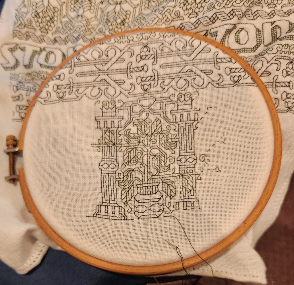
On the final stretch of the Stone by Stone mini sampler. I decided a while back that I wanted to include something with columns in the piece. I had a chart picked out – something I had redacted a while back, destined for T3CM, but was saving for book publication rather than sharing here. But I miscalculated, and the remaining space after the sword panel wasn’t tall enough, so I had to quickly doodle up a solution. It’s not entirely successful. And I’ll detail why after the photo.

First the departures. When I doodle, I stick (mostly) to a list of guidelines I’ve deduced from decades of redacting historical designs. These include sticking to 45/90/180 degree angles – the simple angles formed by the sides and corner to corner diagonals that can be achieved in one square unit. No “knights move,” 2×1 or other multiple unit spanning stitches, and (if at all avoidable) no half stitches. I also try to comply with specific ways that repeats and meanders are formed.
The peacock panel has a small sin – the center point of the peacock’s crown is formed by two half-diagonal stitches. In cross stitch they’d be termed “quarter stitches.” The current columns and potted plants panel doesn’t use any partial stitches, but the urn/plant components aren’t obviously symmetrical to the center line determined by the arch. However you are seeing only one half of the full repeat here. The thing is mirrored as what I described as a type 2 repeat in my earlier post, linked above:

It’s also further complicated by the overlap of the leaf bearing tendril alternating right and left. You’ll see that in better detail as I get further along. This gives it a rather complicated and unexpected adherence to type 2. I’m hoping it will make more visual sense as I go along.
Aside from the issue of the overly complex symmetry the arrangement of the leaves, while formalized is far more naturalistic than historical pieces in general. So is the veining in the leaves. Again a departure from the standard aesthetic.
I’m also not pleased by the minimization of the arch compared to the columns and plant pot. That difference in size and weight does have historical precedent, but it doesn’t complement the overall design as well as I hoped.
And the last bit that didn’t work as well as I hoped is the use of the two colors in this strip. Stone by Stone is stitched in black and green. A very deep green. It alternates by strip except for the motto, in which the foreground of the letters is worked in black, while the shadowing is done in green. The vegetable bits and tendrils of this band are all in green. The columns, arches, and urns are in black. I’m hoping that the green leaves in front of the black columns won’t be so confusing looking when more of them have been completed.
Still, for all of these criticisms, I am not totally displeased. This strip stays. I am not sure what will be the final band below, but whatever it is, it will be densely stitched and black. Thumbing through my notes now looking for just the right thing…
Oh, these two strips – the sword interlace and this historical/modern inspiration mash-up, will be in Ensamplario Atlantio volume III. I’m anticipating that the quick-to-stitch sword one in particular will be popular shirt trim among the SCA’s sword-wielding community. I’m planning on drafting up a matching yoke for it, too.