LETTERS FROM THE PAST
Antipodean social media pen pal and long time needlework/knitting co-conspirator Sarah Bradberry recently posted about a thrift store find – a 1971 vintage book entitled Lettering for Embroidery. It’s available for borrowing at the Internet Archive (free account sign-in is required). It’s an interesting read, although its overall aesthetic now looks 60s-retro rather than cutting edge fresh. Which is to say that it’s back in style.
Her post made me think about some of the unconventional alphabets I’ve drawn upon for my various non-traditional samplers, why I picked them, and how I used them.
To begin, I like letter forms – perhaps an inheritance from my grandfather Mack who owned a printing company. He would point out the often tiny differences among various typefaces and font sizes in printers’ samples, advertising materials, newspapers, and in books, and how those differences contributed to the overall message of the printed piece. While I obviously didn’t follow him into the family business, some of what he showed me must have stuck.
Let’s start with one of the more outrageous. It’s a phrase in an non-Terran language, picked up from my one of my Resident Male’s writing ventures. The book itself isn’t out yet, but I can say that in the text, it is translated as “Life’ll kill you.”
Ringed with my dancing skeletons, and bedizened with sword bearing interlaces to echo the stated meaning, I wanted to use an almost unreadable other-worldly set of letter forms; shapes that themselves danced. I went to my go-to spot for graphed alphabets – the free Patternmaker Charts collection of antique Sajou, Alexandre, and other leaflets. This one is from the Rouyer #248 booklet. I kerned and leaded the rather large letters tightly, to accentuate the flow of the curls across the words. (Kerning is the space between letters, leading is the space between lines of type). In terms of composition, the three words are centered, with no regard for how the letters stack vertically. These letters are also proportionally spaced because they vary so much in width, and cannot be easily worked monospaced (the way an old fashioned fixed-width Courier typewriter prints.)
Here’s another where I tried to fit form to the statement. The full chart for Don’t Panic is free here on String.
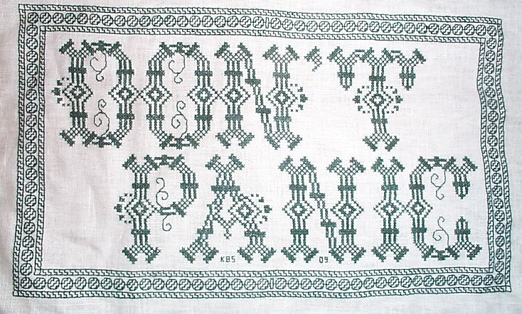

Yes, I know in the Hitchhikers’ Guide books the phrase is described as being “in large, friendly letters,” but this was going into my office where I managed frantic people wrestling deadlines under extreme pressure. I thought a jittery sign would be funnier. My favorite source to the rescue, this alphabet is from Sajou #325. It drips nervousness, even though the firm serifs imply regular stability.
Note that as with many of these vintage alphabets, the letters I and W are omitted, in keeping with the paradigm of classical calligraphy. I extrapolated the I, and doodled a matching apostrophe. Again, I kerned tightly, although I’m not fond of the space between the A and the N. I should have tucked them closer together, as I did between the P and the A. But As are problematic. I also chose not to center these words one on top of the other. The offset adds to the perceived unease.
Here are two more (slideshow presentation to save space, click on arrows beside the photo to advance). In these I chose to use the words as horizontal bands of ornament, flush left and breaking words when I ran out of space. I went back and eked out the bands to come up to the right margins. Mostly I did this because I was impatient. I didn’t want to take the time to do a full arrangement of the motto as it would appear before working the rest of the piece. I knew I’d have space to work the full quotation, but just stitched them letter by letter, with no advance planning. Since I had seen historical samplers that did just that, I felt confident beginning flush left and cutting words in the middle as space dictated.

I am not sure where I got the alphabet for the “Do not meddle in the affairs of wizards” piece. I stitched it circa 1994/1995, just before I began keeping a blog. Obviously the source followed the additional classical convention of presenting just a V shape to cover both that letter and U. I’m also pretty sure I extrapolated the I. In any case, the thread count on this one is no where near as fine as on the others above. There was less room for larger lettering, and I had to find something small enough to fit (most of) the words in, with minimal truncation.
The Arthur C. Clark quotation uses another alphabet from the Patternmaker collection, this time from Sajou #55. It may even be the project on which I stumbled across that source. Being a two-color piece, I wanted something that combined both, and that had an old-fashioned, formal look without being very stuffy. The red swirls suggested a bit of obfuscation and incantation as they tendril around the more solid letter forms. Again I extrapolated the I (thankfully there are no Ws in the phrase). This alphabet with the exception of the I has a very blocky, chunky and solid appearance in spite of the red whisps. There was no need to play with kerning, and spacing between words was easy and regular. The general look of boxy solidity underscores the sentiment expressed. For the A.C. Clarke attribution, I was lucky to find a tall and narrow alphabet in Sajou #172 to fit remaining space on the final lettering line. I will say that after this piece I lost my appetite for broken words.
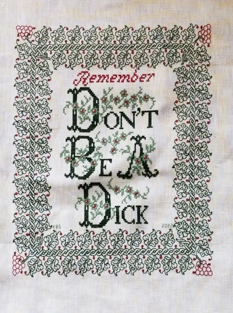
At the risk of alienating all, my two coarse language pieces (behind the eyeball fig leaf image, also in slide show) use formal typefaces to express very informal and direct sentiments. If you are easily offended by rude words, skip ahead.
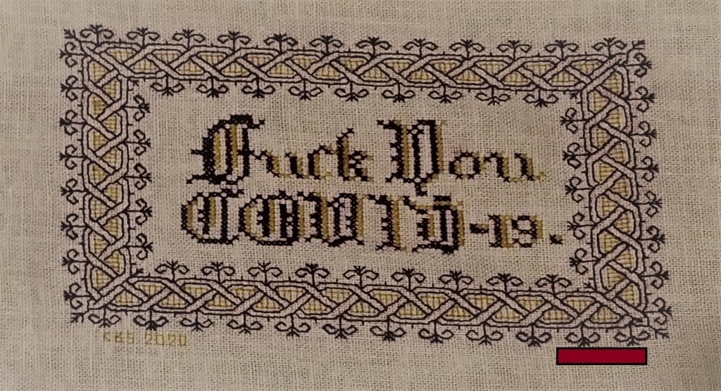
The Covid sentiment, done in a blackletter typeface, uses two alphabets from a German book, available on Patternmaker Charts. One is uppercase, the other lower. The lower case alphabet also supplied the numbers. Again I had to invent a matching letter I. Blackletter family typefaces are reserved for formal documents like diplomas, and newspaper mastheads here in the US. I wanted to play on that gravitas.
Similarly, for the admonition done in green, I wanted to evoke the greeting card world of hearts and gentle sentiment, to contrast the general scolding represented with sweetness and light. I picked one of the flowery alphabets from Patternmaker Chart’s Sajou #160 but leavened it with a smaller yet still uppercase typeface for the rest of the lettering. That classic form serif alphabet is from Grow and McGrail’s Creating Historic Samplers. The R of Remember is from Sajou #1 also on Patternmaker Charts, and the lower case lettering for the rest of that word can also be found in the Grow and McGrail book. I also adapted the floral ornaments from the initial letters for use as fill to surround the lower case one.
Pay Attention to Trifles has the most typefaces I’ve ever used on a single piece. I wanted the word Attention to leap out, Trifles to be the most ornate, and the message to be decoded only on a second glance. And I wanted a vaguely carnival type over the top mix of styles to complement the extremely busy design that is stuffed full of buried “Easter Eggs” as requested by the recipient.

All of these are from the Patternmaker Charts website.
- Pay – Sajou #652
- Attention – Sajou #654
- Even to – Alexandre #143
- Trifles – Sajou # 53 and 203
The dual tone coloration on these was not always noted in the original. Some I tarted up myself. I kerned each line separately, trying to best suit the alphabets being used, squishing ATTENTION a bit made it shout louder. Letting the other lines straggle a bit more made them a bit more lyrical.
While busy, the mad assortment is just over the top enough to gentle the nagging advice of the motto. If I had done the entire thing in the same face as Attention, the statement would have been way to strident. Throw in a bit of whimsey and it becomes an in-joke between the donor and the recipient. The centered text with the balanced motifs left and right is in contrast to the rather chaotic jumble of gears done in inhabited blackwork. There is repeating arrangement of the gears (more or less), but not the strict centering of the lettering. I think that adds to the haphazard playfulness of this piece.
I have done lots of other pieces with mottoes or words on them, but they don’t really showcase different approaches. The last one I’ll cite here is the piece on which I’m currently working. I’m almost done with the penultimate band, and have designed another custom-fit to go below it and end off the work as a whole.
I can’t say for sure where I found the alphabet I modified for use on this one. I found the image in my notes folder, with no attribution other than mid-March 2020 save date. I ended up upscaling from the typeface as charted by using a block of four units for every single unit in the original, and smoothing angles accordingly. Using the squared fill for the shadowing was intended to make the text reminiscent of a brick wall. That the span of the words is larger than the rest of the piece and contributes to that effect is serendipity, not planning. My count was off, and (thankfully) having started in the center, at least the motto protrudes mostly evenly left and right, looking even more monumental than I had planned.

I did kern aggressively to make the motto fit the space, but I should have lost one more unit between the B and Y of by. Still, I think it works. It’s blocky, yet because the letters are represented by outline and shadow, it contrasts nicely with the rest of the piece, overrun as it is with very busy fills.
OK. A conclusion now. Sort of.
If you are designing your own motto bearing piece, there are lots of choices out there that can make a real impact on the design, above and beyond the decorative elements that surround it. If you are unburdened by time/place restrictions (you are not designing a piece in the style of a specific location, school, style, or era), you are free to play. Think of the lettering as another element you can manipulate to underscore the message of your motto, or to convey a mood in which you would like it to be received.
Want to be playfully threatening, like an admonition to keep the kitchen or bathroom clean? How about using a different typeface and font size for each letter, to make it look like a ransom note. Want to convey warm wishes and affection to your extremely sweet and caring (but possibly somewhat humorless) family member? How about one of the ornate flower-bedecked alphabets from around 1900? Have a Goth leaning pal whose heart beats for irony and sarcasm? Use that same flower font in funereal black and purple to express an over the top sentiment.
You can speak words with typeface choice, font size, color, and spacing beyond the actual ones you stitch.
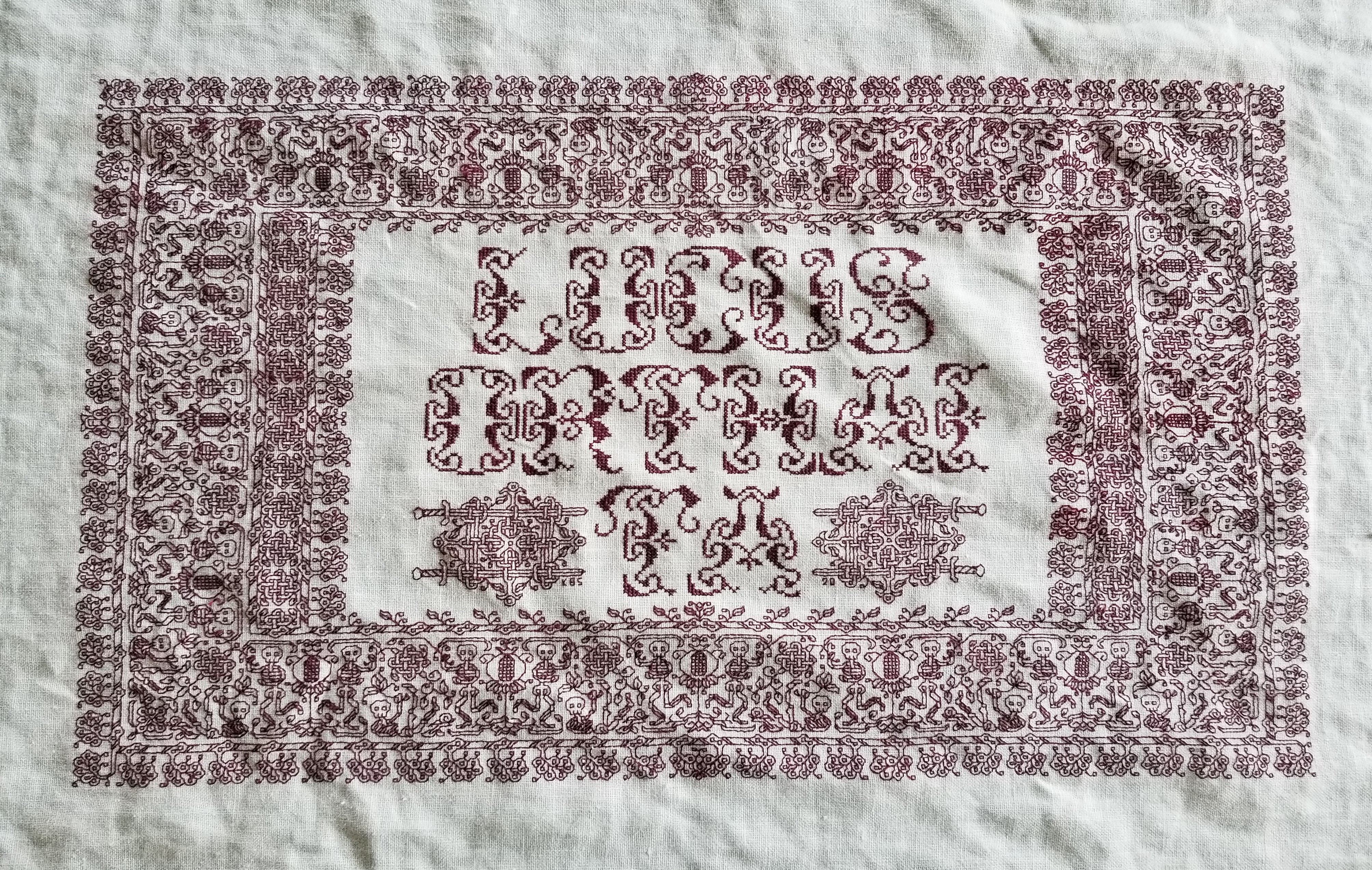
CLARKE’S LAW SAMPLER – FINAL SOURCES ROUND-UP (LONG)
UPDATE ON 24 APRIL 2022 – For some unknown reason, the majority of this page disappeared. I’ve gone back to find and restore the missing info. Apologies if the links are still broken. This is a work in progress.
———–ORIGINAL POST – RESTORED MATERIAL FIRST PUBLISHED ON 24 OCTOBER 2010 ———–
I seem to have picked up some new readers here this week. I answer questions and comments from Kabira, Annanna, H. from Japan, and others. Recognizing that upon completion this heads to my pile of “finish me for display”, is unlikely to emerge before the holidays are over (and may not be seen again before spring) I post my wrap-up now on the almost-completed piece. Apologies for the length of this post.
First, thanks for your kind words. I’ve had a lot of fun stitching this piece. My sampler is more of an exercise in perseverance than anything else. The wide pattern strips, though complex, are not appreciably more difficult to stitch than are the narrow ones. All follow the same basic logic, and once a stitcher is used to following that logic the only thing that can go wrong is miscounting threads. (Bright, indirect light helps with that).
My sampler is worked on 36 count even weave linen, using one or two strands of standard DMC embroidery floss, colors #310 (black) and #498 (deep crimson). Worked over 2×2 threads, it’s done at 18 stitches per inch (about 7 per cm). The entire embroidered area measures out to roughly 16 x 32 inches (40.6 x 81.3 cm). I did not work it double sided, but the double sided logic does prevail.
The Clarke’s Law sampler, like all embroideries on this site, is an original composition. However the individual strips are adapted from or inspired by historical sources. I comb period modelbooks (mostly pattern books printed before 1650) and photos of museum artifacts, looking for goodies. Then I graph them out and stitch them up. I’ve been playing with patterns this way since the early 1970s, and over the years I’ve amassed a collection of designs. I put out a couple of leaflets within the Society for Creative Anachronism, the first one being issued in 1977/1978, and reprinted a couple of times thereafter. I released a second, better documented leaflet in 1983.
Then in in the ’90s some friends convinced me that others would find my notebooks useful (the leaflets containing only a small bit of what I’d been collecting) and introduced me to a publisher. The result was The New Carolingian Modelbook: Counted Embroidery Patterns from Before 1600 (TNCM). Sadly, the publisher turned out to be either exploitative or incompetent, or both, and to this day I’ve seen almost no return for the effort. But the book is out there, and continues to sell on the used book market for absurd prices. New copies continue to trickle in via eBay and a used book seller in New Mexico, so somewhere out there beyond my reach, there is still a source.
Be that as it may, I continue to collect and “play test” patterns on samplers like this one. Here’s an index to the sources for the 22 patterns used on the Clarke’s Law sampler:

1. TNCM Plate 32:1 “Twined Blossom and Interlace Meandering Repeat”. Known affectionately as “The Brooklyn Pattern.” Ultimate source – Domenico daSera. Opera Noua composta per Domenico da Sera detto il Francoisino. Venice, 1546 – one of my all time favorite modelbooks.
2. The alphabet for the main quote is from Sajou #55, posted by pattern archivist Ramzi at his Free Easy Cross, Pattern Maker, PC Stitch Charts and Free Historic Old Pattern Books blog site. Thanks, Ramzi! I played with it a bit, working the curlicues in red and weaving them over/under the letter forms.
3. TNCM Plate 69:1 “Grape Motif or Border Repeat”. I graphed it up originally from a photo in Drysdale’s Art of Blackwork Embroidery that showed the Victoria & Albert Museum’s artifact T.14-1931. The picture available on line is MUCH better than Drysdale’s black and white photo. Many of the other patterns on this piece come from this same source. Drysdale cites it as being Spanish, from the late 16th/early 17th Century. The V&A’s attribution is Italian, 16th Century. I’d go with the museum’s judgment on this one, and if given the chance to republish, would amend TNCM’s listing accordingly.
4. Plume Flowers. Victoria & Albert Museum’s artifact T.14-1931. I’ve charted this out on paper but other than stitching it here, I haven’t published it yet.
5. Hops. Victoria & Albert Museum’s artifact T.14-1931. I’ve charted this out on paper but other than stitching it here, I haven’t published it yet.
6. Column and Wreathe Repeat. Victoria & Albert Museum’s artifact T.14-1931. I’ve charted this out on paper but other than stitching it here, I haven’t published it yet.
7. TNCM 68:2 “Seam Decoration or Border Repeat”. Graphed from photo in Pascoe’s Blackwork Embroidery: Design and Technique. Pascoe cites this as being from 1545. The original was worked along the shoulder seam join line of a butted sleeve man’s shirt, stitched in all black.
8. Another alphabet from Ramzi’s Sajou collection. This one is from #172. It’s interesting to note that several of the late 1800s/early 1900s booklets he’s got quote some early modelbook patterns closely enough to recognize the direct line of heritage.
9. Meander Repeat. Victoria & Albert Museum’s artifact T.14-1931, BUT this one appears on at least one other source, also on display at the V&A. The keeper of the www.drakt.org website shows a display case with what’s clearly a close kin to the T.14-1931 pattern, but worked voided style. [2022 Edit note – I have since tracked down the particular strip that was included in the massed display artifact shown on the defunct drakt.org website – it’s Victoria & Albert Museum’s Border, dated 1600s, accession 503-1877. The massed display in which it is mounted is also pictured on the V&A’s page.]
10. Yet Another Meander Repeat (I’m running out of descriptive names). This one is also from Victoria & Albert Museum’s artifact T.14-1931. I’ve charted this out on paper but other than stitching it here, I haven’t published it yet. I worked it voided, although the original is in double running only.
11 a-d (top to bottom)
a. TNCM 55:1. “Snail Border Repeat”. My original, inspired by period designs.
b. TNCM 51:1 “Brier Rose Twining Border Repeat” My original, inspired by period sources. Also in my second booklet, Counted Thread Patterns from Before 1600, published informally in the SCA circa 1983.
c. My first booket, Blackwork published in 1978. Pattern #j, which I cited as being Italian counted thread work from the 1500s. No citation though, which is why it didn’t make the cut for later booklets.
d. TNCM 52:2. “Flower and Bud Meandering Border Repeat”. My original, inspired by period designs.
12 a-d (top to bottom)
a. My first booket, Blackwork published in 1978. Pattern #gg, which I cited as being English, very early 1500s. No exact source though, and I didn’t include it in TNCM for that reason.
b. TNCM 54:3 “Pomegranate Meandering Repeat” and #53 Counted Thread Patterns from Before 1600. Another one of my own, inspired by period sources.
c. TNCM 49:2 “Acorn Meandering Border Repeat” One of the early set I graphed from the photo in Drysdale’s Art of Blackwork Embroidery that showed the Victoria & Albert Museum’s artifact T.14-1931.
d. TNCM 44:2 “Acanthus Meandering Border Repeat” also #55 from Counted Thread Patterns from Before 1600. Yet another from the Drysdale photo of Victoria & Albert Museum’s artifact T.14-1931. (I do adore that source!)
13. Wreath and Columns Repeat. Victoria & Albert Museum’s artifact T.14-1931. I’ve charted this out by hand but other than stitching it here, I haven’t published it yet.
14. Columbines(?) and Twists Voided Repeat. This one also appears on the same Drakt website photo taken at the V&A as one of the sources for #9, above. I can’t make out the artifact’s accession number though. And yes – I graphed it direct from the on line photo, as seen on the screen.
15. TNCM 58:1 “Strawberries and Violets Meandering Border Repeat.” Also #61 in Counted Thread Patterns from Before 1600. This is the pattern adapted from the very famous Jane Bostocke sampler, also resident in the V&A. But my source materials were photos in Gostelow’s International Book of Embroidery and King and Levy’s The Victoria and Albert Museum’s Textile Collection: Embroidery in Britain from 1200 to 1750. If you’re familiar with those sources you’ll understand why my squinting at them came up with the odd raspberries in between the flowers, instead of what can now be plainly seen as simple twists on the V&A’s own photo page. I’d amend the description to “After Bostocke..” were I to republish TNCM now.
16. Black strip pattern. From page 57 of Louisa Pesel’s Historical Designs for Embroidery, but I worked it outlined and voided instead of foreground stitched.
The patterns I tested on this piece will probably make their way into a sequel to TNCM – once I find a graphing program capable of handling double running stitch with ease, and that can chart out giant repeats at a small, but useful gauge. I want to be able to present largest of these patterns on a single page, and to do it using a background dots and voided line style of presentation which I came up with for use in TNCM, and which I find much easier to follow than regular dark line on background graph paper charts:
 (Snippet of Jesters pattern, TNCM 69:2)
What’s next? I’m not sure. I’m certainly not stitched out. I’d like to do another big sampler to try out more patterns, but I haven’t decided on its size or form yet. There’s also the possibility of a set of matched but not matched napkins – six all using the same colors, but all different. There’s also a pile of holiday knitting to achieve between now and the end of the year. Rest assured – I won’t be idle.
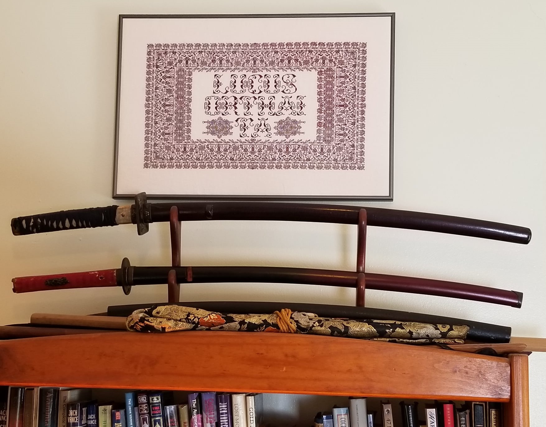
WHOLE DARNED THING (STITCHED, ACTUALLY)
It’s been a while since I posted a whole-sampler shot of my Clarke’s Law piece:

As you can see, I’m on the last little bit of the final strip at the very bottom. I like this one (but I like all of them). I think it would be exquisite as a narrow edging band around cuffs and collar of a Renaissance era woman’s shift or man’s shirt, like those on these Veneto paintings circa 1502-1531.
Even with my anticipated workload this week I should be able to knock out that teensy bit by Thursday, latest. All that’s left after that is to fill in some of the shorter line ends with a bit of blackwork fillings; to sign the thing somewhere; and to finish it off with a black fabric mitered edge. Jury is still out on whether I’ll frame or scroll mount the thing for final display, but once it’s up my wall will be home to one of the universe’s ten most nerdy samplers.
ON THE LAST STRIP
If you follow here you know I do try to keep personal bits out of this blog, but my absence over the past two weeks was due to a family funeral. My mother’s husband passed away. He was an upright guy, an affectionate and attentive companion, an avid reader, splendid raconteur, bon vivant, and just fun to be around. He made her very happy for all too short a time, and will be sorely missed by our family and his.
In spite of being away, work has been progressing (ever so slowly) on my Clarke’s Law sampler. I finished the strawberry band, and started in on the narrow strip at the very bottom:


Apologies for the dark photos. It’s a dark morning. Click on either one for a more legible enlargement.
The design of the narrow black strip is based on a pattern published in Louisa Pesel’s Historical Designs for Embroidery, but I worked it outlined and voided instead of foreground stitched.
Knitters, be enheartened. I also started a pair of socks on the plane. I’m about half way through sock one, working Knitty’s Outside In by Janice Kang in a screaming russet – the orange favored by Elder Daughter. Who will be thrilled to read this post.
PENULTIMATE BAND – ALMOST HALFWAY DONE
A look at how far I’ve gotten on this last strip, sans frame:

I still think a narrow dark black strip is needed below this panel to establish a visual border along the bottom edge. After that the only stitching left is to fill in some small doodles at the motto’s line ends where my text didn’t span horizon to horizon. And to finish off the thing I need to edge out the piece with mitered fabric strips (sort of a self-matting made from cloth), and figure out whether to frame or rod-suspend the final piece. I’ve been working on this now since the first week of December, averaging between 30 and 45 minutes per day. Not particularly fast, but about what I thought it would take when I embarked on my project.
To answer my far-flung offspring – What’s next? Not sure. I owe a ton of holiday socks, so I may take a knitting interlude. But I haven’t broken the stitch itch yet, and will probably start another randomly executed band sampler, although I haven’t decided it it should include a saying, some alphabets, or be just another collection of patterns I’m auditioning for future publication.
Another possibility is the immense dragon from my favorite source (seen at the left of center in the photo). I’ve already begun charting it up. It’s gigantic. Just the little pepper shaped blossom object at the lower right spans more than 40 stitches. Given that few people appear to be interested in this stitching style at the level of complexity that fascinates me, I’m not sure if a multi-page dragon graph would be of use to anyone else. Still, I might do it just for the fun of just doing it. We’ll see.
BACK TO THE STRAWBERRIES
Evidence of progress on my penultimate (possibly ultimate) strawberry panel, way down at the bottom of my Clarke’s Law sampler:

A strip this wide with a voided filling does take a bit of time to complete. Still, I’m chugging along, about a quarter of the way through, perhaps a bit more. And I’m thinking on what to do next. I do owe a ton of holiday socks that need to be knit between now and the end of the year. But I’m just not engaged to produce socks right now. What I want to do is to keep stitching. It’s always a bittersweet moment when a project is within sight of the end. There’s impatience to be done with it and be on to the next. There’s indecision about the direction of the next work. And there’s dissatisfaction with and pride in the current piece mixed 50/50. I can see what I’d have done differently on this one, and I can also point to bits that turned out even better than I expected.
In the mean time, I hope someone got use out of the three part tutorial on stitching logic. Here are recap direct links to all of the posts:
Double Running Stitch Logic 101 – Two Sided Work and Baseline Identification
Double Running Stitch Logic 102 – Working from the Baseline
Double Running Stitch Logic 103 – Accreted and Hybrid Approaches
I also took an earlier and less organized stab at the subject here:
ANSWERING MY OWN QUESTIONS
I’m still working on the accreted section post, but I’ll hop in to answer my own questions from my last note.
First, here’s progress to date on the current strip.

The baseline anomaly in this one may be easier to spot now. If you click on the image above and look closely you’ll see that the pattern is composed of two identical sections that never meet. There’s a void that runs through the entire longitudinal stem. Therefore since the upper and lower sections are totally separate, there are TWO baselines in this one, an upper and a lower one. Here’s a suggested baseline for the upper section:

And the baseline for the lower section:

Sneaky to be sure. But the sneakiness is my fault based on a misinterpretation of the sources I had available.
This pattern is graphed out in TNCM as my (early) interpretation of the center-most design in the lower section of the ultra famous Jane Bostocke sampler in the V&A. At the time I did this I was working from a tiny 2″ square photo in a book, and did not have the luxury of the magnificent photos now available on line. I did the best I could under the circumstances, fudging the little violets in the center somewhat, missing the ornament running down the center of the main vine (which may or may not connect the top and bottom halves of the pattern) and missing the true nature of what looks to be mulberries between the strawberries in my piece. In the original they’re more like little spiral tendrils. I’ve also missed a couple of other fruits/leaves branching from the main line. If I were to re-issue this design now I’d play up “inspired by” in my description. Still even with my clumsy amendations, the pattern is recognizable as a scion of the Bostocke design. Or perhaps not since no one identified it over the past week.
THE PROMISED STRAWBERRIES
Another quickie. First apologies to the mathematicians and topologists among us. I should have more correctly stated “any continuous wall maze can be solved by following a right hand (or left hand) wall.” Discontinuous mazes are like double running stitch patterns with breaks in them. They can’t be stitched (traversed) 100% double sided.
I’ve made some progress since the last picture which was taken this Friday past. I’ve selected the penultimate strip for my piece. This one is wide, and I’m working it two-tone.

You get extra points if you can spot (from this partial repeat) something about its baseline. Hint: It’s not that the strawberry pips and texture on the pansy type flower keep this from being a candidate for 100% identical double sided work. With a little bit of cleverness, the two sides could be made to read mostly similar, although the pips and textures would by necessity not be identically placed.
Double points if you can identify the source I used as point of departure. TNCM owners, ssshhhh!
In other news, I’m still working on a follow-up post with more info on baselines, and on the accreted section stitching method.
BALANCE IN ALL THINGS
While writing and graphing the last post took up the better part of a week’s discretionary time, I did make progress on my Clarke’s Law sampler. Here’s the area to the left of the center motif – the area that balances a similar section to the right. You’ll note that the pattern I used for the tutorial is the lower of the two narrow red double running stitch bands.

Lovely photo courtesy of Younger Daughter, who is much better with a camera than I am.
This week’s follow on post covering the accreted section double running stitch tutorial will be late. I’ve begun it, but some obligations this week will make it hard for me to finish it by Friday.
Apologies!
YOU GUESSED IT, MORE SLOW PROGRESS
Well, my day job continues to eat my life, leaving precious little time left over to do much else. I do keep plugging away on the Clarke’s Law sampler. I finished out the small panel of narrow bands on the right, and am working on the border defining the bottom edge of the similar space on the left. I have to admit that I’m very bored with this narrow strip. It’s LOTS of repetitions of the SAME unit, with LOTS of long armed cross stitch background to fill in. I am sincerely looking forward to when this band is over and done with, so I can move on to the next bit of fun.

For Eleanor, who wanted to see the source material for the current band, it’s here. Fourth strip up from the bottom. I wish I could read the V&A accession number on the label in the photo.
The set of narrow bands in the blank space immediately above the bit I’m working now will be different from the ones on the right of the center motif. There will be four and they’ll alternate between black and red, but they will be of different widths than their counterparts, with the narrowest on the bottom rather than on the top.
Apologies to the few remaining readers here. This project has bored everyone but me to tears. Thank you for putting up with it.
