OCULAR PROOF?
The latest strip. Unusual because of the columns:
Angelique asks when this type of needlework was popular. I respond that double running stitch came into vogue in the early 1500s, and continued to be worn for the next 130 years or so, although the actual designs worked in the stitch changed over that period. The strips I’m doing now are late, mostly adapted from a photo of a sampler, and that sampler is dated to the late 1500s, early 1600s. Which would put it at Shakespeare’s time and just after.
So. Does my favorite style of needlework appear in Shakespeare? Possibly. People have looked to his texts and found all manner of things that might or might not be there, but I have a feeling that double-sided counted work of this type did make an important cameo.
My case? Othello.
As those of you who know the play remember, Othello is swayed to believe in his wife’s supposed infidelity by scheming Iago, who points to a particular handkerchief as proof. Othello had given the piece to Desdemona. It was filched by her lady in waiting (Iago’s wife) and planted as manufactured evidence that Desdemona was having an affair with Cassio, Othello’s trusted favorite whom Iago envies and despises. The play’s central tragedy results.
The handkerchief is mentioned in a couple of places. It’s in Act 3, Scene 3:
IAGO
Nay, but be wise: yet we see nothing done;
She may be honest yet. Tell me but this,
Have you not sometimes seen a handkerchief
Spotted with strawberries in your wife’s hand?
OTHELLO
I gave her such a one; ’twas my first gift.
IAGO
I know not that; but such a handkerchief –
I am sure it was your wife’s–did I to-day
See Cassio wipe his beard with.
And is described further in Act 3, Scene 4:
OTHELLO
That is a fault.
That handkerchief
Did an Egyptian to my mother give;
She was a charmer, and could almost read
The thoughts of people: she told her, while
she kept it,
‘Twould make her amiable and subdue my father
Entirely to her love, but if she lost it
Or made gift of it, my father’s eye
Should hold her loathed and his spirits should hunt
After new fancies: she, dying, gave it me;
And bid me, when my fate would have me wive,
To give it her. I did so: and take heed on’t;
Make it a darling like your precious eye;
To lose’t or give’t away were such perdition
As nothing else could match.
DESDEMONA
Is’t possible?
OTHELLO
‘Tis true: there’s magic in the web of it:
A sibyl, that had number’d in the world
The sun to course two hundred compasses,
In her prophetic fury sew’d the work;
The worms were hallow’d that did breed the silk;
And it was dyed in mummy which the skilful
Conserved of maidens’ hearts.
Later in the same Act: Cassio comes upon the handkerchief and gives it to his doxy Bianca:
CASSIO
Pardon me, Bianca:
I have this while with leaden thoughts been press’d:
But I shall, in a more continuate time,
Strike off this score of absence. Sweet Bianca,
Giving her DESDEMONA’s handkerchief
Take me this work out.
BIANCA
O Cassio, whence came this?
This is some token from a newer friend:
To the felt absence now I feel a cause:
Is’t come to this? Well, well.
CASSIO
Go to, woman!
Throw your vile guesses in the devil’s teeth,
From whence you have them. You are jealous now
That this is from some mistress, some remembrance:
No, in good troth, Bianca.
BIANCA
Why, whose is it?
CASSIO
I know not, sweet: I found it in my chamber.
I like the work well: ere it be demanded–
As like enough it will–I’d have it copied:
Take it, and do’t; and leave me for this time.
So allowing me the license used by many Shakespeare pretenders, what we’ve got here is a handkerchief – essentially a two-sided piece work, embroidered with strawberries. There’s an allusion to the embroidery being a deep crimson silk (“the dyed with mummyconserved of maidens’ hearts”), although Lord alone knows whether or not mummy was actually used as a dyestuff, and if it was, what color it might have produced or abetted. We’ve got a link between the work and a mysterious Egyptian/Moorish origin. It’s worth noting that the name for double running stitch at the time of the plays debut was “Spanish Stitch,” and it was wildly fashionable and popular. Plus it’s clear that whatever type of embroidery it was, it was easily copied.
Taken together – reversible, red (along with black, one of the most fashionable colors for Spanish Stitch), stitched in silk, easily copied, link with Moorish origins – that’s my style!
If the local amateur troop ever decides to stage Othello, I think I’ll volunteer to stitch the handkerchief. And I plan on doing a strawberry panel on the current sampler, for good measure.
FROM THE BACK
Suzie asks to see the back of my Clarke’s Law sampler. Here it is in the dawn light:

I’ve not been very assiduous about making it 100% two sided, but double running stitch does lend itself to highest efficiency if one follows that logic. I’m also using knots, for which I am wildly unapologetic. Also, I’m not one of the back-is-perfection nazis. Neat, yes. Long jumps and stringy bits can be shadow-visible from the front of the work. Plus work should have a logical progression that uses thread efficiently. Rabid about it though – no. Historical works weren’t perfect.
If you notice, both the plume and hops flower patterns contain elements that cannot be worked 100% double sided – isolated lines or units not attached to the main work area. For example, in the hops flowers those are the little detached diamonds that inhabit the central motif. If I were to work this pattern double sided I’d modify it slightly, adding a vertical connecting each of those diamonds to the lozenge that surrounds it. That way front and back could be completely alike. But since the back on this won’t be visible once it’s mounted, I’m not making an extreme effort. Still, you can see that with the exception of the voided backgrounds, I’m pretty close:

Plus as you can see from the back of the piece at the top, I’m on the letters that follow the hops band. What to do next? I haven’t decided yet.
STITCH BY STITCH
Hobbled as I am by lack of time (work has invaded every corner of my life), I haven’t had much time to do much stitching. Ten days since the last progress point and I’ve only managed to finish out a postage stamp sized area on the last strip and to begin the next row of letters:

For WindyRidge who asked for a close-up, here’s the hops flower panel:

After a couple of cursory searches for these embroidery styles on line, I’m beginning to get the feeling that not too many ‘net-enabled stitchers are playing with them. There are folks doing double running stitch and voided embroidery to be sure, but not from patterns of this complexity or vintage. If there are any of you out there I’d love to hear from you; especially if you’re composing new works incorporating patterns from historical sources, as opposed to working up samplers designed by others. While working up pre-designed samplers is a pursuit of high order, it doesn’t face the same sort of problems as original collation/composition. Those are the problems I’m most interested in right now.
HOPPING ALONG
Through it all progress is being made. I do try to grab 10 minutes at lunch and another half hour in the evenings to decompress. Plus two weekends ago I had an actual half-day off on Saturday. My most recent strip is growing. I’ve got one more hops flower to go on the right hand edge, then it’s back to more lettering:

This is a strange strip to be sure. You can see the similarity between this and the plume flowers strip:

Both feature the same type of up/down symmetry, with a center vaguely vegetal motif separated by mirrored stem-like surrounds. Both use small parallel stitches on the inside edges of the motif as shading. Both combine flat decoration (the sprig at the center of this strip’s flower’s base, and a similar sprig in the same spot on the plumes), with more rounded, natural forms. And both sport a sort of baroque exuberance and total unconcern with true plant shapes. Not unsurprising since both of these were cribbed from the same source sampler.
It is interesting though to see how variants in working method change the look. The plumes were done in one strand of floss, the hops flowers outlines in two, with the background of the latter in one strand. Although detail in the two strips is roughly comparable, and if anything the plumes have MORE detail than the current strip, the plumes are lighter and airier. The current strip is by contrast, meaty looking. Those ocarina like turnip things on the stem divides are particularly fleshy, in a somewhat unsettling way.
I’m not sure what the strip after the next bit of lettering will be. I am considering a bastard mutation of two blackwork styles – perhaps working an outline for a very open and unadorned long repeat strip similar to this one:

But instead of working the background, working the foreground as if it were one of the freehand inhabited blackwork styles, similar to this:

Not sure yet, but with no historical accuracy constraints on this piece, why not?
STRIP BY STRIP
Poking my head up from yet another marathon sprint at work here. With promise of another one hard on the heels of the last, I’m probably surfacing just long enough to note limited progress on my sampler and report other news.
First the progress:


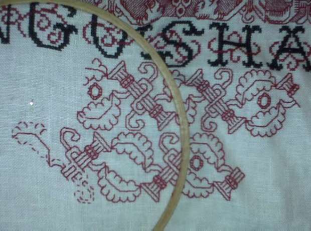
You can see that I’ve completed another row of text, and I’m on to another double running stitch panel. I’m working this one voided too. It’s a mishmash, with the bulk of the elements taken verbatim from the sampler that provided the previous strip. The hops flower(?) and the strange ocarina-like turnip things on the side are direct quotes. The finials on either side of the hops flower were very difficult to copy though, so I took the liberty of substituting bird heads for them. Lots of patterns of this style/era include animals, humans or birds (all or in part) sprouting from vegetation. My treatment of the voided area is however a total flight of fancy. I chose to use half-cross stitch, massed into a field of diagonal lines. I used a diagonal fill on the Do-Right sampler, too:
Unlike the graph paper like squared fill I on the grapes strip, I haven’t seen historical precedent for the diagonal line treatment. But it’s not totally illogical. If you’ve seen an artifact worked this way, please let me know. Other unusual treatments of the voiding include working the background narrower than the foreground and the direction of my diagonals. I’ve only seen one historical piece worked this way – a late 16th early 17th century panel photographed in Cavallo’s Needlework. I graphed that one out, it’s in TNCM on Plate 74:1 – I worked a bit of it a while back, and am considering doing it again on this piece:

Mirroring the diagonals on either side of the central motif is new. I haven’t done this before, and I’ve never seen it done on any other piece. Again – I can’t claim originality, there’s only so many ways to do things in needlework, and it’s a sure bet that the most obvious have been tried before. One last thing I’m planning on doing is NOT filling in the voiding in the background behind the little triangular areas above and below the strange, mutant turnip things. That will make the central hops flower motifs on their lozenges of darker background look a bit like a series of very large beads.
Given my impossible work schedule, the stitching density of both the foreground motif (again worked with two threads of my DMC floss), and the background (worked with one thread), this panel should take me quite a while. After this one comes the rest of my quote. So far I’ve stitched “Any sufficiently advanced technology is indi-” Next comes “-stinguishable from magic. In all probability, the “magic” won’t fit on the next line of text. I’ll deal with that problem when I get there.
Next post – snails in the Antipodes! My dream casket! (Not the kind you’re thinking of…) Stay tuned.
PLUME FLOWERS FINISHED
Work has a nasty way of eliminating any discretionary time whatsoever, but five minutes here and 20 minutes there, I have finally managed to finish the plume flower double running strip:

On to the next band of lettering, and on to thinking about what to do after that one is done. The current rate of production coupled with a workload that promises to double again in the coming month will give me ample time for that bit of consideration.
I hope to resume my explorations into charting software possibilities. I’ve got an itch to publish more patterns (including the just-completed strip), but without tools and time it’s just not happening.
STITCHING AND VISUAL DENSITY
Charlotte asks about the colors of the bands on the Clarke’s Law sampler. She says that each successive band looks lighter than the one before. I answer:
So far I’ve used only two colors of embroidery floss – DMC Red #498 and DMC Black #310. The top band was done in long-armed cross stitch, using two strands of red. Long armed cross stitch produces a particularly dense and raised texture.

Outlines on the grapes band were worked in double running stitch using two strands of the red, but the background grid filling was done in one strand – also in double running.

The current plume flower band is worked in double running using just one strand.

Between the relative densities of the various source patterns and the density of the working methods I’ve ended up with the progressively lighter look for each band even though all are worked using the same thread.
My plan for the rest of the bands is to do more of the double running work, choosing bands of different visual densities and working some but not all of them voided (with a background fill, but not necessarily solid). The next one will probably be somewhat closer in look to the grapes panel, but in between that and the current band in darkness. I will alternate bands of various densities with the black lettering. I’ve used plain old cross stitch for both the letters and the red embellishing squiggles that loop around the letters. If you compare it to the long armed cross stitch snippet above you can see the difference in coverage between the two.

When all of the lettering is done I’ll consider working more long armed cross stitch. Depending on how much room is left on the cloth, I might just go for broke with one massively large pattern, working it voided, so that the piece has a nice dense anchoring segment at the bottom. Or there might be a couple of bands of progressively darker stitching leading up to it. I haven’t chosen the patterns yet and I’m not sure exactly how much room I’ve got, so you’ll have to stay tuned to see how it all works out.
To answer Ellis – the reason you can’t see any lines drawn on on the linen for stitching over is because there aren’t any. This piece is done on the count. I’m using the weave of the linen as my guide, copying patterns drawn out on graph paper, with each grid of the graph paper corresponding to square of 2×2 threads.
To answer Marya – if my pattern contains a straight line that spans two or more graph units I do not make one big stitch over all of them. I make an individual stitch for each grid unit, even if they are all in one straight line. This keeps the work neater and more true to the graphed original. Long stitches are also more likely to catch on things.
To answer [anonymous] who noted that all of these patterns seem to rely on just 90 and 45 degree angles – yes, you’re right. I can’t rule out totally that diagonals over a 1×2 grid unit weren’t used (30/60 degrees), but so far I haven’t found a historical piece that used them in this type of pattern. It’s possible that some in-filled blackwork diaper patterns (the dark outline, different geometric filling variant seen below) used stitches at those angles, but I haven’t had the luxury of examining enough historical works close-up to make that determination. Lots of modern blackwork does use those angles. But for me, I’ll stick to the orthodox and limit my design to 45s and 90s.

BAND THREE ALMOST DONE
Apologies to the person out there anxiously awaiting the rest of my charting review series. I’ve had a serious attack of work obligations that has eaten into all time not spent sleeping. Even family maintenance has been scaled back. Blogging and research for blogging is right out. But for all of that, I do reserve to myself a half hour in the evenings for de-stressing. So I do have some progress to show on my Clarke’s Law sampler:

When this band of plume flowers and branches is done I do the next line of text. At the current rate of life-obfuscation, I won’t have to worry about picking the next band pattern for weeks yet to come.
Sigh.
STILL STITCHING
I’m still working on my round-up of charting software reviews. I’ve got three or so more dedicated programs to try, and then I’ll attempt to bend standard graphics programs to my use. In the mean time, work eats at my life. I did get a little bit of time to stitch while we were watching the Olympics yesterday. Here’s the result of that hour plus the prior week’s worth of dinking around on my Clarke’s Law sampler:

Complex, but in a blocky, heavy-torso, post Renaissance way, kind of delicate. It makes the grape border above the line of text seem meaty by comparison. This strip is mostly reversible. Some small bits like the diamond in the center of the plume/flower’s base and the bark texture lines are discontinuous, and I didn’t bother to either start or finish off my threads invisibly. But with a bit of tinkering to norm the non-attached bits of detail, there’s no reason why this pattern couldn’t be worked totally two-sided.
For those of you who are thumbing through TNCM looking for this one, it’s not in there. It’s part of the set I’m grooming for the next book. If the investigations into a feasible charting method ever pay off…
PROGRESS AND USING STITCHING CHART PROGRAMS FOR GRAPHING KNITTING
In the middle of this charting program exploration I have had time to do a bit on my Clarke’s Law sampler. But first to answer a question. Aileen read my last couple of posts and wondered what I would consider a complex double running stitch pattern. I answer with pix of my current piece, plus a snippet of this pattern done up using Pattern Maker Pro, from yesterday’s review.


The nickel shows scale (click for better size shots of each). This strip is stitched using one strand of DMC floss, color #498 on 32 count linen (16 spi). Not particularly fine, but fine enough to show the patterns. The entire stitched area is about 15.75 inches across. From the top of the dark red twining strip to the bottom of the the D of ADVANCED is about 8.6 inches.

The top strip and the cross stitch words were all done using two floss strands. The outlining of the motif in the wide grape strip was done using two strands, and the squared background was done using one. (I’ve since found historical precedent for the squared background treatment).
All of the strips between the words will be relatively light in value, done in some combo of plain or voided double running stitch, but they won’t be as wide as the grapes (well, maybe the last one will be just to balance). I won’t do another dark band in long armed cross stitch (either foreground or voided) until after the entire quotation is done. I think it will take another three bands of text before the whole quotation is complete. Then I’ll fill out the cloth with a mix of styles, perhaps doing some in two-tone. It’s all fly by night here. I’ll also figure out something to eke out the line ends where the lettering comes up short. I think that NOT centering each line of text works better for my purposes, especially because I’m breaking text between lines in an unorthodox manner.
Now back to writing up the results of my stitch charting program explorations. Which for my knitting and crocheting readers, will have value. Either of the programs I described yesterday can be used to graph out colorwork repeats, or linear crochet (filet and tapestry styles). Pattern Maker Professional also allows you to assign a True Type knitting font (like the one from Aire River) to the symbol palette, and then using the program in symbols-on-graph mode, to compose knitting charts. Here’s a sample from PM showing a simple double 1×1 twist cable:

Where this falls apart though for knitting is if you try to display both colors and textures at the same time. The purl symbol will always be associated with one chosen color, the knit symbol with another. Although you can override the program and display more than one symbol per color, this program links symbol and color in a way that you can’t have multiple colors per symbol. Numbering rows is also problematic.
As I write up the rest of the sampled programs I’ll include their potential for use by knitters.
