WHAT I DID SUMMER TO FALL
Starting 27 June and finishing yesterday evening, 25 October, I have cranked out three small samplers, one after another.

All three were inspired by books written by my Resident Male, although not all of the source books have been published. Here’s a better shot of the latest, fresh off the hoop. (Yes, I will eventually press and frame them all.)
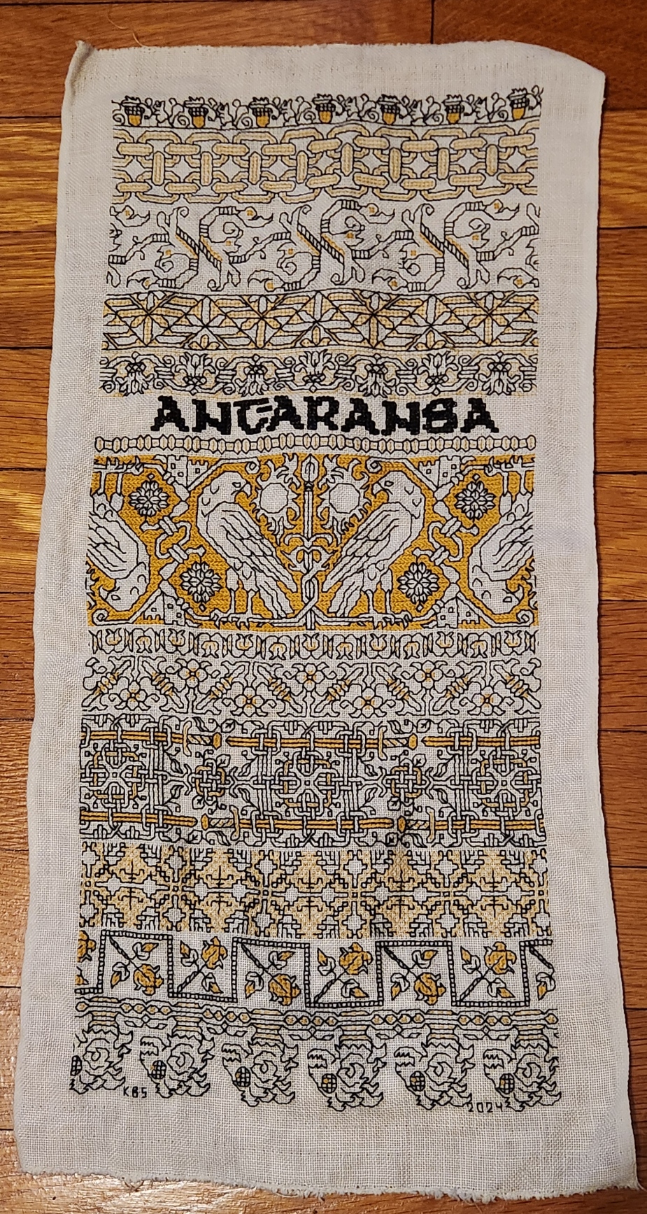
The last strip at the bottom is in the tradition of 16th and 17th century band edging patterns that often accompanied a wider main band design. While most of these narrow bands were floral, foliate or geometric, some of them featured creature heads, occasionally bird-like, lizard or dragon shaped, but all cropped and facing in the same direction. Those edgings would present with the baseline against the main design, so that ones below the main design were upside down, and dance around the corners. With those in mind, I have ended my Treyavir-inspired piece with the severed heads of lantern-eyed goblin monsters, gelnids, among the formidable foes of the novel’s hero Reignal.
To recap, I used black Sulky #30, double stranded. For the accent color I used standard DMC floss, #3820, sometimes two plies, sometimes one ply. All of the black foregrounds were done in double running stitch. Several treatments were used for the fills and accents. Here’s the list of accent treatments along with pattern sources:
- Acorns – plain old cross stitch (POCS), two plies. My own design.
- Chain – double running, two plies. My own design.
- Leafy meander – mix of double running and four sided cross stitch, two plies. My own redaction of a pattern appearing on a sampler dated 1687, accents are my own mods.
- Geometric triangles – simple boxed fill in double running, one ply. My own interpretation of an idle doodle done by J.R.R. Tolkein, more on this here.
- Flower meander – contour lines in double running, one ply. My own design.
- Motto – four sided cross stitch, two plies in the black Sulky. My own alphabet based on a mashup of several Uncial-derived pixel alphabets from the early Macintosh era.
- Narrow bead – double running and single stitches, one ply. My own design.
- Falcons – Long armed cross stitch (LACS), two plies. My own design.
- Tulip buds – double running, two plies. My own design.
- Flower and rod meander – POCS, my own design.
- Sword interlace – POCS, two plies. My own design.
- Step birds – simple diamond fill, one ply. My own redaction of a sleeve decoration on a portrait, circa 1500. It’s on the Patterns tab, here on String.
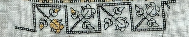
- Roses in boxes – POCS, two plies. An adaptation of a pattern appearing in my Second Carolingian Modelbook, plate 27:4 – my redaction of a border from a historical artifact.
- Monster heads – POCs, single running stitch, French knots – two plies.
Everything described as “my own design” above, will be in either my forthcoming books Ensamplario Atlantio Volume III, or The Third Carolingian Modelbook – both currently in process.
Now with this sampler done I can’t sit idle. Progress on the next might be a bit slower because I have various holiday deadline related projects to complete and ship out. And I have to decide if I am going to continue the series immediately, with the next bit of embroidery dedicated to either the Resident Male’s mixed SF/Fantasy short story collection The Temple of Beauty, or one of his other in process works; or if I’m going to go totally off script and do a piece entirely on whim.
But to be prepared, I’ve already selected a small stash remnant, hemmed it, and basted my edge and centerline guides, shown here between the completed pieces for scale:

It’s not as long as the last two, and significantly narrower than Stone by Stone. And the linen is higher count.
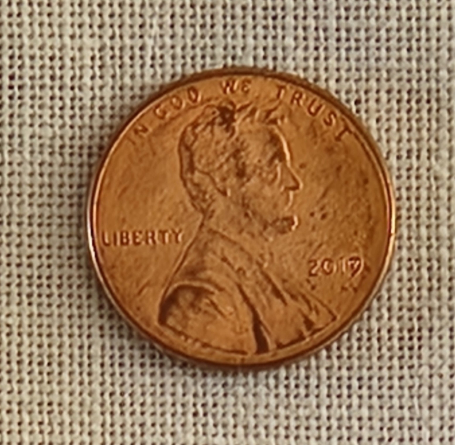
By my penny method, the coin covers 30 threads north-south, and 30 threads east-west. Multiply by 1.33 (a penny by definition is .75 inch) and we get an evenweave thread count of about 40 threads per inch. Green and black Stone by Stone was stitched on 33.25 thread per inch evenweave. The blue and red piece for Fractured Symmetry was on skew count 37.25 x 32 threads per inch linen, and the black and yellow Treyavir piece was on big-as-logs 26 threads per inch evenweave.
While this next piece will be physically smaller, the available “real estate” for pattern display will be roughly similar to the previous larger pieces that were worked on coarser grounds.
I haven’t decided on whether this one will also employ two colors. Right now I’m leaning to an all black piece, but one that uses multiple thread thicknesses. The reason is because I have come into a wealth of black threads in various weights, mostly rayon, but some cotton and silk as well.
Back in late summer when I was getting ready to go to Cape Cod for an extended stay I noted that I was rapidly eating into my spool of black Sulky #30. I was unsure if I would have enough to finish the yellow and black piece. Not having time enough for mail order, and not trusting that mail order would find me at our beach place (no street address delivery, you have to pick up mail and most UPS or Amazon sends at the post office), I went hunting in person. I started at the store where I had originally bought the Sulky, three years ago. They no longer stocked it, nor did several other local possibilities. But as I was chatting with one of the sales clerks and commiserating about mid-project disappointment, the next person in line said that she had the thread I needed in stash, and would be happy to share. We exchanged contact info, and she went home to stash-dive. I drove over to her house (just the next town over) and found a delightful bag of goodies awaiting me – several spools of black in assorted weights. I left my own thank-you present behind and scurried home with the goods. So my possibilities have multiplied. And on the finer ground, the elegantly fine faux silk rayons provided by my ever so generous benefactor will shine. (Oh, if you are reading this Kind Benefactor, ten thousand thanks again for helping me out of that jam!)
Don’t be surprised if I now segue to crocheted snowflakes, both production and blocking, or other crafts. I will be picking up this stitching either alongside those efforts, or after. But you can be sure that in terms of embroidery, I’m armed and dangerous, and I can’t be stopped.
PENULTIMATE, BUT ROSY
Having fallen a bit behind in timely progress posting, I present current status covering three strips.
First, here is the sword interlace – my own design with no direct historical precedent. Here it’s finished and the color accents have been applied. Since I wrote about it in my last post there’s not much to add other than I am pleased with the way it turned out. The yellow bits are worked in two strands, using plain old cross stitch for the blades and pommel, and two strands in double running (on skew count) for the interlace embellishments and sword hilts.
This pattern in its original slightly taller and more graceful form it will appear in Ensamplario Atlantio Volume III. I think this would make killer trim on the shirt of someone who might favor martial motifs rather than floral or plain geometrics.

The next strip down has debuted here on String, about a year ago. It’s available at my original post, and in the embroidery tab page on this site, where it’s listed as “Sleeve Band, 1500.” I may put it into The Third Carolingian Modelbook, as well. (Yes, I’m working on that one, too). The short story is that I redacted it from a portrait in the collection of the Bristol Museum and Art Gallery, Accession K1651; Italian, circa 1500. Here is its page in Art UK.
Although the majority of the design is as close as I could get to the sleeve decoration in the portrait, for this decidedly non-historical piece I took two liberties. Obviously the first is my use of the second color – in the case done in single strand, simple diamond mesh to contrast with the strongly horizontal/vertical foreground in black. The other departure is the small black square I added at the centerpoint defined by where the birds’ tails meet. That detail isn’t on the original and isn’t on my chart of it. I added that because I work in double running, and it served as a very convenient bridge point that helped me navigate jumps between the non-contiguous motifs.
The only connection I can see between this motif as a tribute to the Treyavir source material is that this style of pattern persisted for a very long time, working its way from haute adornment for noblewomen during the Renaissance to becoming part of a peasant folk tradition that could have been stitched anywhere from the Baltic to the Aegean at any point in time over the past 300 years. And there is a very brave peasant woman in the Resident Male’s novel.

The third band is something that started out with historical underpinnings but took a whole bunch of left hand turns along the way.
If you have a copy of my Second Carolingian Modelbook to hand you will find the original on Plate 27:4. The accompanying blurb cites it as being redacted from an embroidery at Belton House, Lincolnshire, UK, registered with the National Trust as Inventory Number 436944. But in the original the roses were a supporting secondary border, all sprouting from a single straight baseline in the same direction.
I started working the first one that way, then decided to go feral, and do them more closely spaced together, and in the zig-zag manner below. I also added the second color accent I didn’t bother regraphing the design, I just did the mental rotation and kept going. If you like it this way, you can find the book and do the flip yourself, too.
As for why I did it, this is a themed piece after all. Treyavir features an estate that’s a safe haven for women who are economic refugees or endangered survivors of a feudal, patriarchal society. So I’ve taken that and put my roses each in their own secure room, open to come or go as they please, yet protected from life’s more brutal realities. Non standard presentation, but I think it’s an improvement on the rather humdrum original.
Finally, here is the whole thing to date so you can see the balance of density, accent color, and movement. I have room below the roses for one more strip. And I’ve drafted up something special to put there.

FALCONS AND SWORDS
Of course we’ve got them. This is of course an homage to an epic fantasy adventure.

A finish on the voided falcon panel. Foreground first in double running stitch, using black thread. Background then worked in the same accent yellow I’ve been using, in long armed cross stitch (LACS). The telltale plaited look of LACS done in rows that alternate direction is clear:

Working the voiding after the outlines can be tricky. First, on a design this dense, there are lots of angles and small spaces that need to be accommodated. Those starts and stops are a headache for sure, and make the texture a bit murky in that last stitch where the fill abuts an outline. And then there’s the care taken to not snag or penetrate the outline stitching itself, so that it isn’t covered by the voiding. You can see a couple little spots on this were I wasn’t totally successful, and a black outline has been eclipsed by the later work in yellow. I did my best, but no one is perfect.
On to the subsequent three strips. First two fillers – a simple bud meander to balance the narrow border just above the falcons. My own invention, and destined for Ensamplario Atlantio volume III (EnsAtl3). Just a touch of yellow in the tulip like flower, and a stitch in the long leaves to bring the color into this band.
The one below with small quad flowers and slanting rods with fleur-de-lys terminals is also my own, and will be in EnsAtl3. I was thinking the rods or staves of office held by seneschals and stewards. A design element congruent with such folk in Treyavir. Again, just a touch of accent yellow to keep it in play.
The current panel is a bit of a departure. I did a spot motif of similar style on my big dancing skeleton Fangirl Sampler, based on an entirely different as yet unpublished book by my Resident Male.

I have since done some modifications, morphing that spot motif into a repeating border. I really like it – lacy and complex. That border will also be in EnsAtl3. But the design didn’t quite fit here. There was too much empty space, and that was distracting. So I picked out the small bit that I had started, and redid my concept specifically for this sampler. The main elements of the design are still there, but they are denser. I think that it will balance out the lighter, more airy two strips just above it. I’m not sure how to deploy the yellow. Possibly filling in the sword blades and embellishing other elements of the interlace. We will see where fancy takes me as I continue with this strip. This variant will NOT be in EnsAtl3.
After this comes one or two more bands, tops. No clue as to what they will be yet. Existing pieces? Prior art reworked? Something entirely new, doodled up to fit? Keep watching these skies and you’ll find out.
DO WHAT’S RIGHT
And we have more progress to report on the latest sampler strip in my series of stitched pieces commemorating the literary output of my Resident Male.
First we start with the now expected Mysterious Saying. In this case, “Ant-Aransa,” a quotation from the inspiring work – Treyavir. It translates roughly to “Do what’s right.” An admonishment that should be heeded more often for us all.

The lettering is not from my usual source for typefaces. I started by looking up pixel based fonts, many from the early days of screen display, and mashed up several Uncial like adaptations to chart out the letters I used. There is no one clean source, but the closest would be Scriptorium. I probably should have allotted more space for the hyphen, but so it goes. The lettering is worked in four sided cross stitch (each cross stitch outlined by a straight stitch on all four sides. I did that to make the saying pop, and to have optimal coverage.
Below Ant-Aransa is a very narrow ancillary border from the upcoming Ensamplario Atlantio III. I believe I show it there in combo with other design elements, and without the second color accents.
Moving on, I designed the strip in progress specifically for this sampler, with specific points of reference to the source inspiration. Treyavir is a work of fantasy with science fiction elements. It tells the story of Reignal Maigntar, Falcon Knight, so of course there have to be prominently featured falcons. Other story elements here include the waning sun, his spear, Grey Hallet (his castle/manor house), and curious crystalline magic gems. All present and accounted for.
As usual the foreground black stitching is worked in double running, but I’ve chosen to do the yellow voiding in long armed cross stitch. This choice was probably not optimal, due to the headache of squeezing that stitch into a few of the very narrow spaces between the foreground motifs. But again, there it is. I might include the falcon strip in Ens Atl III. That decision is still pending. As is revisiting the center of the suns to add some interior decoration. I will wait to see the whole strip completed, including voiding before I make that choice.
What’s left? As you can see below I’m only at the halfway point and there is still plenty of real estate to cover. Probably more swords or other weaponry. In a knightly story there is always room for armaments. Other than that, I haven’t a clue. As usual I’ll figure that out when I get there.

POST REBOOT PROGRESS
Although I’ve been lax about blogging, I have made progress on the Treyavir sampler.

Although it looks like I used several yellows for the accents to the plain black stitching, they are all the same color. What makes them look differently are the numbers of plies, the stitch used, and the stitch density. The yellow in the acorns is done in two plies of DMC #3820 in plain old cross stitch. The interlink accents are two strands of DMC in double running, as are the yellow bits in the odd foliate S-repeat below the chain. The triangular counterchange design uses a single strand of the DMC in double running, worked in a simple box fill. And the flower meander currently being stitched uses that same single strand of DMC yellow and double running, but in a very open and sparse manner.
Catching up since the last post, Strip #3, the vaguely leafy S-repeat, is not my own original. I redacted it from sampler dated 1697 (a bit later than my usual sources). It’s from Detached Geometric Patterns and Italianate Border Designs with Alphabet” 1697. National Trust Collections, Montacute House, Somerset, NT 597706. It’s the black one in the second row, upper right. Obviously the yellow is my add, specific to this piece. I’ve puzzled out several other designs from this sampler, and may include them in the next Ensamplario volume, since being post 1610, they are out of the timeline spread I try to stick to for my Carolingian Modelbook series. But in one place or another they will eventually escape from my desktop.
Skipping ahead to Strip #5, this simple meander is another of my own doodles, and will also be in EnsAtl III, but with a departure from that to-be-published version. Like all of the other placements of yellow in this, the background play was improvised on the spot just for this piece.
The one above the in-process stitching deserves a longer explanation. Strip #4 is something a bit far afield. I can’t call it my own. I would say it’s “After J.R.R. Tolkein.” That’s right. I used an on-newspaper doodle done by The Professor himself as my leaping off point. The heavily embellished newsprint page from August 1960 was displayed in the “Tolkein: Maker of Middle Earth” exhibit. The photo of it was captured by a fellow follower of the Prancing Pony Podcast: Tolkien & Middle Earth discussion group on Facebook, and shared in that group on 9 August 2024. I played with it and produced my version within hours of that post. Here is the inspiring image:

I was moved by the three-color bit at the upper left. Redacting it to be compliant with my blackwork standards was a bit problematic. For one, I stick to a single unit, 90°-45°-180° angle schema. I avoid half stitches and stitches taken over 2×1 units or other multiples. Curved lines are also a challenge. But for all of that, plus trying to keep the thing in as small a footprint as possible, I do think the lineage of my rather art-deco looking version can be perceived.
I also note that the visual designers working on the aesthetic for Gondor in the movie versions of Lord of the Rings might have been likewise inspired by these doodles. Evidence:

Now, what’s this design doing on a piece dedicated to the work of my own Resident Male? I looked at the strips already laid down and then went nosing around in my doodle pages for something that would contrast well with them. Preferably of medium width and a geometric, with potential to be worked up as a relatively solid band rather than a meander or baseline-sprouted design. I wanted something to balance the chain links above it and provide counterbalance to the extra wide designs I’m considering for use in the lower half of the piece. This one was just too juicy to pass over. And flowing from arguably the greatest wellspring of fantasy literature, from which every epic in that genre since has contained at least a drop of legacy, the filtered scion of my interpretation seemed appropriate.
Next up, another Mystery Inscription from Treyavir. Possibly a narrow defining band to frame it, then on to some really complex custom strips that echo bits from that book.
REBOOT
Yes, I did go back and tease out ALL of the stitching seen in my last post. I was not happy with the discontinued DMC linen I was using. Single strand it was (mostly) too thin for this 26.6 tpi linen ground. Doubled, the slubby nature of the thread – especially where two thick sections ended up side by side – made what should be smooth lines very haphazard in appearance.
Not being near home base with my stash to hand, nor near any useful retail outfits or access to reliable one-day delivery where I am, I had to rely on what was already in my stitching box. Back to the black Sulky 30. In this case, on the very coarse ground, two strands work nicely. I teamed the black up with a strong golden yellow (DMC 3820), also worked as two strands.

The yellow is not dark enough to be distinctive on its own for the linear elements, but as fill and voiding, it is effective. So I’m playing with it as accent rather than as a full-fledged “partner color” as done with the two colors on Stone by Stone and Ferthan, Fuur, Fustovv.
The sharp eyed will note a major error on my part, that I will go back and fix the hard way. Look at the right side of the piece. The chain elements end there two units further along in the repeat than they do along the left edge of the stitching. Because the squirrels are not a symmetrical repeat, I did not notice that my centerline was off until I did the second strip. I will go back later and fudge those two left side units in the shorted strips so that everything is nice and even.
And if I hadn’t confessed this sin here, I bet you would never have noticed.
The squirrels and the double chain are both slated for inclusion in Ensamplario Atlantio Volume III. Both are my own designs. The chain will include variants like corners, a centered yoke treatment, so that it can be easily stitched up as embellishment on cuffs and collars for shirts and chemises.
I haven’t decided yet to include the current strip in EnsAtl III, or to hold it in reserve for The Third Carolingian Modelbook (also in production, but not as far along). The reason is that it is a redaction rather than an original. I have a clean point source for it, although it’s late (1697). More on the design as the stitching develops and I figure out how to bling it up with yellow accents.
As to the size of this piece, it’s narrow, but long. You can see how much real estate I have to cover:

I do have a few very tall strips to include on this one. And another Enigmatic Saying in an Unearthly Language. Stay tuned!
A START, A FINISH, AND POSSIBLE DESTRUCTION
And of course we are off and running on another small sampler honoring another of The Resident Male’s fiction books. The Fangirl Army of One is on a roll here. At this point I have only a few more to do before my production catches up to his.
This sampler celebrates Treyavir, a fantasy novel, relating the adventures of Reignal Maigntar, Falcon Knight. It’s a shorter read than most of his others, but no less engaging. There are mysteries, monsters, magic, epic truths and deceptions, love and loss, all presented in a tone echoic of Jack Vance’s Dying Earth fantasies, as a tribute to their blend of light banter, irony, and deeper issues. But on to the stitching…
First, the ground. I rarely work on grounds with counts below 36 threads per inch, but this well aged stash piece is roughly 26 or 27 threads per inch, and is a true evenweave, 100% linen. Penny method count, below – the penny obscures about 20 threads both north/south and east west (or close enough due to thick/thin threads not to matter). A US penny by definition is 3/4 of an inch in diameter. 20 x 1.33 = 26.6 threads per inch.

I think it may have come to me in a bag of remnants provided by Long Term Needlework Pal Kathryn Goodwyn, but I’m not sure. It’s evident that whomever had it before began a project using it, marking centers and edges in blue thread, but ended up cutting this narrow piece off from the larger whole after those bastings were complete. My remnant is about 10 x 20 inches (25.4 x 50.8 cm). It will be a long and skinny band sampler, and look all the more so due to the scale of the bands when stitched on this coarser weave.
I’ve started work on it but I am not entirely pleased with the linen thread I picked out and packed. It’s a long discontinued DMC product – one that was only briefly available in the US circa 2017, and is now gone. I bought a handful each of black and white from my local independent craft shop, pretty much all they had.
Here are the first couple of bands.

The thread has too much thick/thin texture and is too “hard” for optimal display in double running on this ground. One strand looks skimpy, and it doesn’t do corners well. I previously tried out two strands with the squirrel band, but found that since the thread ranges from slubby to skinny the appearance was very haphazard, with some bits being too dense to see the design, and others very thin by comparison. It was especially jarring in double running, where one pass might be a run of very thick stitches, but the second pass that completes the line might interpose skinny ones between them.
For the Destruction part – I am thinking about ripping back the 1.25 bands you see here and beginning the piece again from scratch. But I am away from stash and alternate thread options are severely limited. My immediate option is the black Sulky I used on Stone by Stone. That’s still in my traveling stitching box. Two strands of that would probably work better than two strands of this stuff. I am not near a retail source for old reliable DMC 310 cotton, and mail order doesn’t work well where I am right now.
Even if I rip back, I will redo the squirrels as is. They will be in Ensamplario Atlantio III. I’m not sure I particularly like the geometric band below it. It’s from The Second Carolingian Modelbook, but I think given chance of a total re-do I will work something else in its place, and save this one for another piece.
The linen DMC thread I will save for something else. Perhaps pattern darning, surface embroidery, or a delicate needle lace edging. I might use the white stuff for cutwork or pulled work, But neither will be deployed for double running again.
And of course just NOT having this project to work on until better options present is an unacceptable course of action. If you are like me you would understand. So instead of actually ripping back, I just whine about it here.
And more happily, I do have a finish. The holiday stocking I previewed in my last post is complete. A quick finish, too. Only four days from cast on to darning in the ends.
The stocking on the left in the photo is the new one. It’s a copy of one I’ve done twice before. The first one (photo, right) was a stocking kit purchased at now long gone yarn shop, Wild & Woolly, in Lexington, MA, circa 1996. In a minor miracle, I was able to find my copy.
The pattern was part of a kit was put out by SM Designs of York Maine. It contained worsted weight (5 stitches per inch) rustic Maine style spun wool in three colors. The kit came in several flavors, including one with Xmas trees. I bought the last one in stock. It had a simple graph of little paper dolls holding hands, in silhouette around the cuff. I did up the kit for the Alex stocking below, but being unable to do anything verbatim, I added in the panel at the top to duplicate stitch the name, subbed in my own holly berry leaf design for the paper dolls, did French knots in embroidery for the berries, and whipped the purl welt “folding line” row with leftover red and green yarn.

Eventually I knit up a second sock for sibling Morgan. I used the same pattern, but couldn’t find a true worsted weight rustic Maine style yarn for it. I adapted the design for a slightly heavier weight yarn of similar texture, but used the same holly leaf pattern, in with a different green and red. Also bearing a top strip for a name. To save packing space, I didn’t bring it with me, so it’s not in this shot.
Elder Spawn Alex and partner just moved out of state, and return to the home nest for the holidays is unlikely. So to make the first holiday off and away a bit more home-like, I volunteered to knit up a matching stocking for Spawn Partner. They requested a wolf instead of the holly leaves. I doodled one up in the same scale as the original graphed bit. He got a bit elongated in the knitting (knit stitches are not 1:1 height to width like cross stitches), but I think he’s vaguely recognizable as not being a horse or reindeer.

Comparing the three stockings, the types of rustic Maine style minimally processed 100% two-strand wool are harder to come by, and what is out there continues to get heavier and thicker. The best match I could achieve was even thicker than what I used for Stocking #2. If that one was worked from yarn knitting to 4.5 spi, this stocking was done from yarn with a native gauge of 4 spi. Since I wanted all three to be the same size, I had to play with the pattern a bit (again) and experiment with needle sizes until I achieved the original gauge. More or less. Side by side though I think I did well enough.
Now I bounce back from the world of knitting, and return to embroidery. I am off to contemplate my (stitching) life choices. At least I have my Silly Putty with me. This linen thread crocks and sheds fibers onto the ground, too. If only there was a retail source for DMC thread nearby… Sigh.
