STILL WORKING ON IT
Apologies that time seems to run ahead between these posts. I have only so many hours of comfortable productive sitting time each day, and I tend to spend them actually stitching, drafting/redacting new designs, and working on my books. Blogging often gets ignored.
But that doesn’t mean I’ve been idle. Far from it. I finished those two strips at the bottom of the Anything Could Happen sampler (the one honoring The Hungry Judges book by my Resident Male, itself still being written, too.).
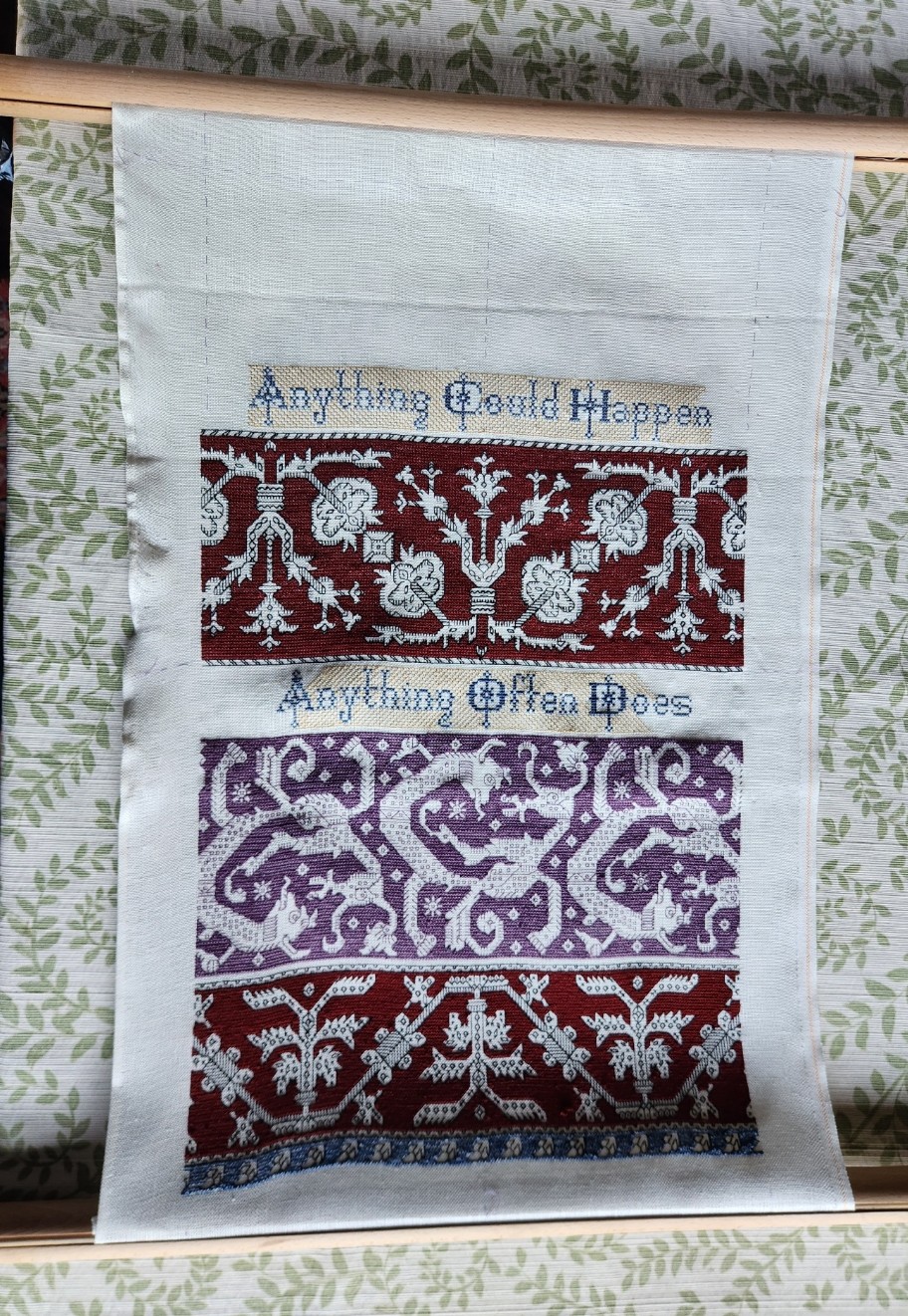
Laying the roller bars out flat in the early morning light accounts for the shadows and non-parallel edges. In any case, two things remain – two panels at the top, one of which will be a duplicate of the blue one at the very bottom; and devising the little motifs that go at either end of the motto lines. Once I’ve identified those, drawn them up, and stitched them I can work the yellow step-voiding around them. I can say that one of those spaces will hold my initials and the year of completion.
Which brings us to the top panel. What to put there?
I wanted to continue with my theme of panels from the Azemmour Cluster. Paired birds are very common. I wrote about them a while back in this post. In the larger examples they usually face each other from either side of an urn that sports three plants or flowers. There’s also often a house-like structure with small resident creatures as the unit in between the pairs of birds. But those things aren’t set in stone. Sometimes trees appear, or other birds of various sizes. But one thing all of the bird panels big enough to bear it have, and that’s lots of “chaff” filling the main motifs. Smaller ones often have a token bit of filling, too, but sometimes they are just the bird outlines, with a tree or flower in between them, not quite as rounded and with fewer diagonal stitches than the paired bird panels of early modelbooks, but slightly echoic of them none the less.
Sadly they also tend to be of two sizes – either way too small north-south to fill my available space, or about a third to twice again as tall as the area I have to put them in. So since I wanted birds, I had to draft up my own.
I took inspiration from several of the bird strips in the prior post and tried to incorporate as much as I could of their iconography and general look-and-feel. So armed with my interpretation of the birds, I begin the top with that central urn. This strip will be voided in non-traditional purple to balance out the purple of the monsters strip. A departure, but true to the spirit of the design family, and (I hope) seen as a respectful tribute to the long standing tradition of Azemmour embroidery.

FALCONS AND SWORDS
Of course we’ve got them. This is of course an homage to an epic fantasy adventure.

A finish on the voided falcon panel. Foreground first in double running stitch, using black thread. Background then worked in the same accent yellow I’ve been using, in long armed cross stitch (LACS). The telltale plaited look of LACS done in rows that alternate direction is clear:

Working the voiding after the outlines can be tricky. First, on a design this dense, there are lots of angles and small spaces that need to be accommodated. Those starts and stops are a headache for sure, and make the texture a bit murky in that last stitch where the fill abuts an outline. And then there’s the care taken to not snag or penetrate the outline stitching itself, so that it isn’t covered by the voiding. You can see a couple little spots on this were I wasn’t totally successful, and a black outline has been eclipsed by the later work in yellow. I did my best, but no one is perfect.
On to the subsequent three strips. First two fillers – a simple bud meander to balance the narrow border just above the falcons. My own invention, and destined for Ensamplario Atlantio volume III (EnsAtl3). Just a touch of yellow in the tulip like flower, and a stitch in the long leaves to bring the color into this band.
The one below with small quad flowers and slanting rods with fleur-de-lys terminals is also my own, and will be in EnsAtl3. I was thinking the rods or staves of office held by seneschals and stewards. A design element congruent with such folk in Treyavir. Again, just a touch of accent yellow to keep it in play.
The current panel is a bit of a departure. I did a spot motif of similar style on my big dancing skeleton Fangirl Sampler, based on an entirely different as yet unpublished book by my Resident Male.

I have since done some modifications, morphing that spot motif into a repeating border. I really like it – lacy and complex. That border will also be in EnsAtl3. But the design didn’t quite fit here. There was too much empty space, and that was distracting. So I picked out the small bit that I had started, and redid my concept specifically for this sampler. The main elements of the design are still there, but they are denser. I think that it will balance out the lighter, more airy two strips just above it. I’m not sure how to deploy the yellow. Possibly filling in the sword blades and embellishing other elements of the interlace. We will see where fancy takes me as I continue with this strip. This variant will NOT be in EnsAtl3.
After this comes one or two more bands, tops. No clue as to what they will be yet. Existing pieces? Prior art reworked? Something entirely new, doodled up to fit? Keep watching these skies and you’ll find out.

