LETTERS FROM THE PAST
Antipodean social media pen pal and long time needlework/knitting co-conspirator Sarah Bradberry recently posted about a thrift store find – a 1971 vintage book entitled Lettering for Embroidery. It’s available for borrowing at the Internet Archive (free account sign-in is required). It’s an interesting read, although its overall aesthetic now looks 60s-retro rather than cutting edge fresh. Which is to say that it’s back in style.
Her post made me think about some of the unconventional alphabets I’ve drawn upon for my various non-traditional samplers, why I picked them, and how I used them.
To begin, I like letter forms – perhaps an inheritance from my grandfather Mack who owned a printing company. He would point out the often tiny differences among various typefaces and font sizes in printers’ samples, advertising materials, newspapers, and in books, and how those differences contributed to the overall message of the printed piece. While I obviously didn’t follow him into the family business, some of what he showed me must have stuck.
Let’s start with one of the more outrageous. It’s a phrase in an non-Terran language, picked up from my one of my Resident Male’s writing ventures. The book itself isn’t out yet, but I can say that in the text, it is translated as “Life’ll kill you.”
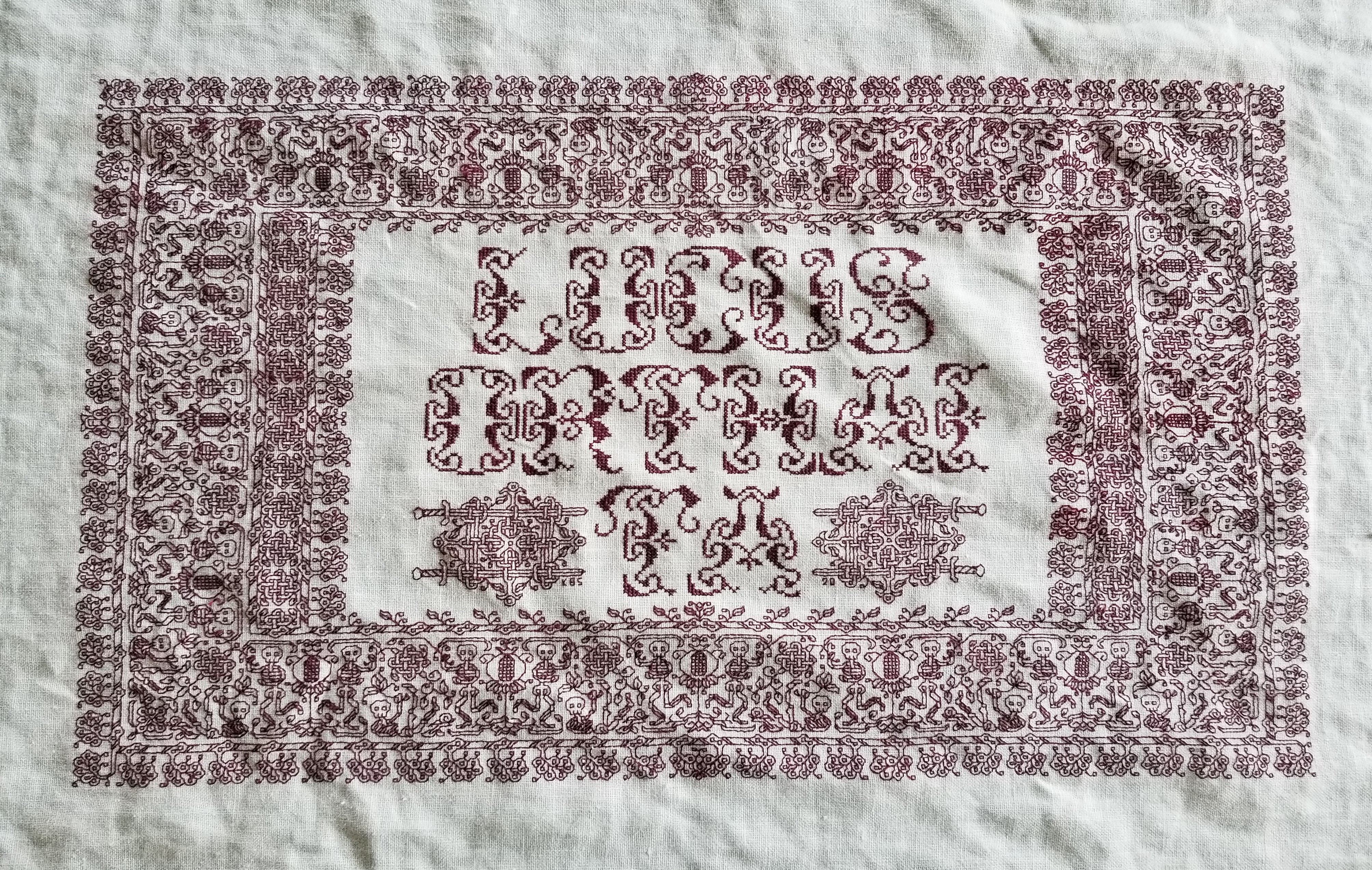
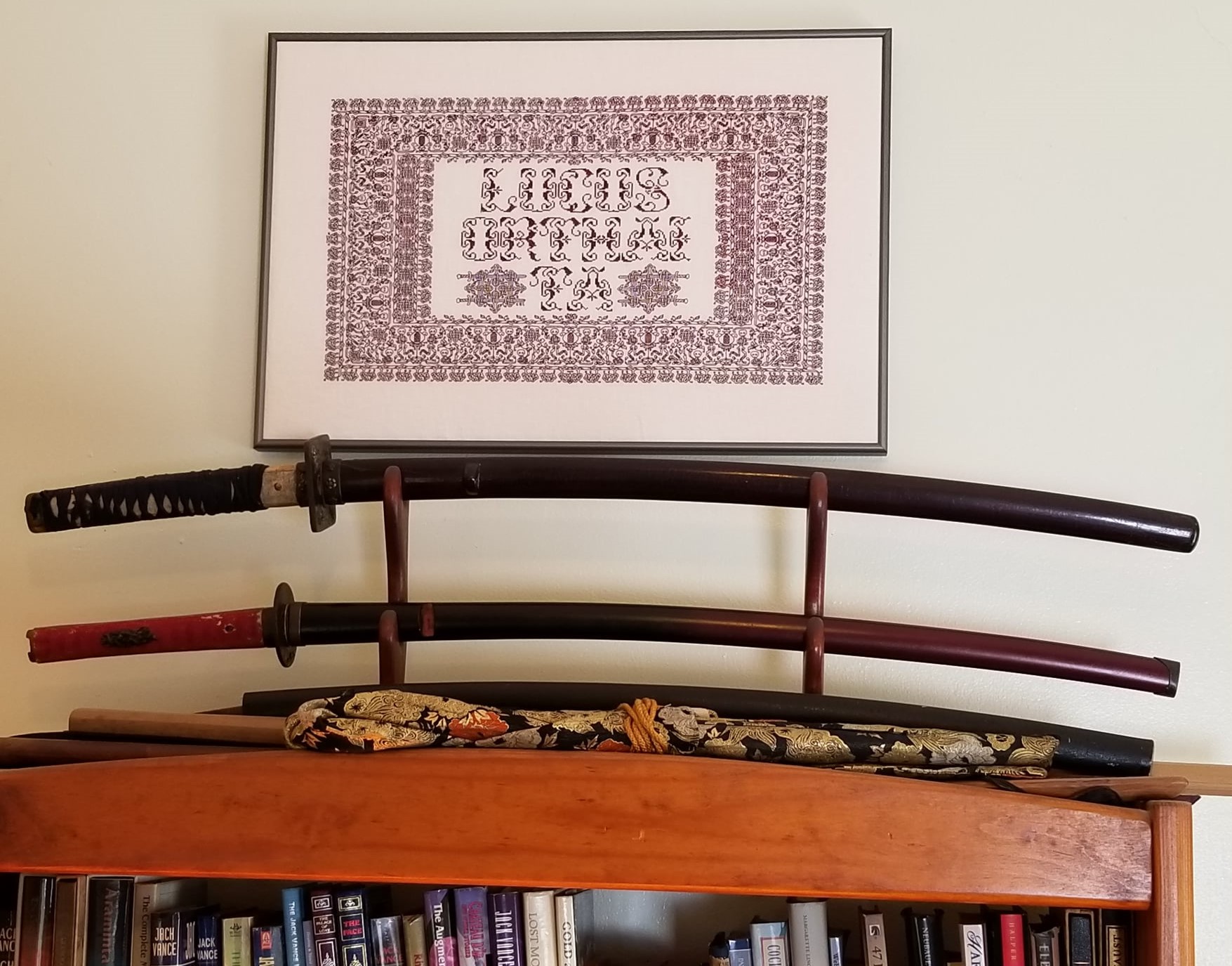
Ringed with my dancing skeletons, and bedizened with sword bearing interlaces to echo the stated meaning, I wanted to use an almost unreadable other-worldly set of letter forms; shapes that themselves danced. I went to my go-to spot for graphed alphabets – the free Patternmaker Charts collection of antique Sajou, Alexandre, and other leaflets. This one is from the Rouyer #248 booklet. I kerned and leaded the rather large letters tightly, to accentuate the flow of the curls across the words. (Kerning is the space between letters, leading is the space between lines of type). In terms of composition, the three words are centered, with no regard for how the letters stack vertically. These letters are also proportionally spaced because they vary so much in width, and cannot be easily worked monospaced (the way an old fashioned fixed-width Courier typewriter prints.)
Here’s another where I tried to fit form to the statement. The full chart for Don’t Panic is free here on String.
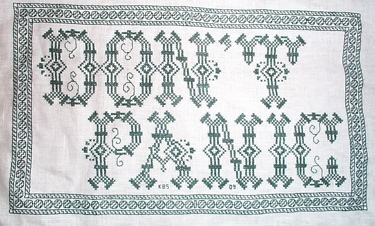

Yes, I know in the Hitchhikers’ Guide books the phrase is described as being “in large, friendly letters,” but this was going into my office where I managed frantic people wrestling deadlines under extreme pressure. I thought a jittery sign would be funnier. My favorite source to the rescue, this alphabet is from Sajou #325. It drips nervousness, even though the firm serifs imply regular stability.
Note that as with many of these vintage alphabets, the letters I and W are omitted, in keeping with the paradigm of classical calligraphy. I extrapolated the I, and doodled a matching apostrophe. Again, I kerned tightly, although I’m not fond of the space between the A and the N. I should have tucked them closer together, as I did between the P and the A. But As are problematic. I also chose not to center these words one on top of the other. The offset adds to the perceived unease.
Here are two more (slideshow presentation to save space, click on arrows beside the photo to advance). In these I chose to use the words as horizontal bands of ornament, flush left and breaking words when I ran out of space. I went back and eked out the bands to come up to the right margins. Mostly I did this because I was impatient. I didn’t want to take the time to do a full arrangement of the motto as it would appear before working the rest of the piece. I knew I’d have space to work the full quotation, but just stitched them letter by letter, with no advance planning. Since I had seen historical samplers that did just that, I felt confident beginning flush left and cutting words in the middle as space dictated.


I am not sure where I got the alphabet for the “Do not meddle in the affairs of wizards” piece. I stitched it circa 1994/1995, just before I began keeping a blog. Obviously the source followed the additional classical convention of presenting just a V shape to cover both that letter and U. I’m also pretty sure I extrapolated the I. In any case, the thread count on this one is no where near as fine as on the others above. There was less room for larger lettering, and I had to find something small enough to fit (most of) the words in, with minimal truncation.
The Arthur C. Clark quotation uses another alphabet from the Patternmaker collection, this time from Sajou #55. It may even be the project on which I stumbled across that source. Being a two-color piece, I wanted something that combined both, and that had an old-fashioned, formal look without being very stuffy. The red swirls suggested a bit of obfuscation and incantation as they tendril around the more solid letter forms. Again I extrapolated the I (thankfully there are no Ws in the phrase). This alphabet with the exception of the I has a very blocky, chunky and solid appearance in spite of the red whisps. There was no need to play with kerning, and spacing between words was easy and regular. The general look of boxy solidity underscores the sentiment expressed. For the A.C. Clarke attribution, I was lucky to find a tall and narrow alphabet in Sajou #172 to fit remaining space on the final lettering line. I will say that after this piece I lost my appetite for broken words.
At the risk of alienating all, my two coarse language pieces (behind the eyeball fig leaf image, also in slide show) use formal typefaces to express very informal and direct sentiments. If you are easily offended by rude words, skip ahead.
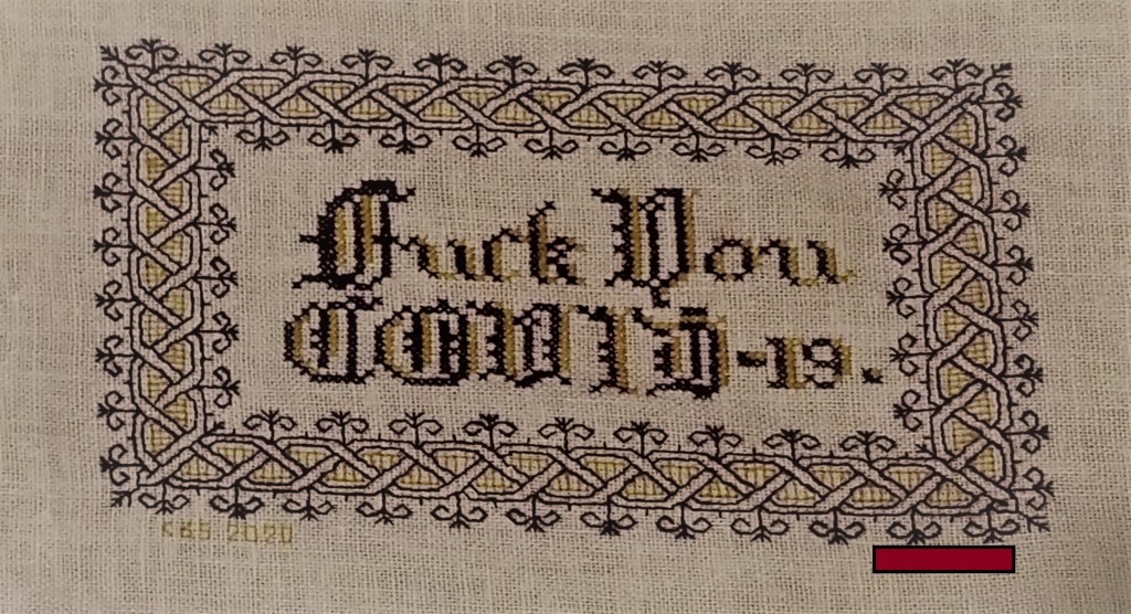
The Covid sentiment, done in a blackletter typeface, uses two alphabets from a German book, available on Patternmaker Charts. One is uppercase, the other lower. The lower case alphabet also supplied the numbers. Again I had to invent a matching letter I. Blackletter family typefaces are reserved for formal documents like diplomas, and newspaper mastheads here in the US. I wanted to play on that gravitas.
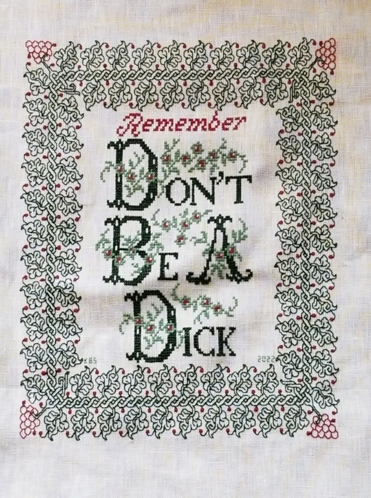
Similarly, for the admonition done in green, I wanted to evoke the greeting card world of hearts and gentle sentiment, to contrast the general scolding represented with sweetness and light. I picked one of the flowery alphabets from Patternmaker Chart’s Sajou #160 but leavened it with a smaller yet still uppercase typeface for the rest of the lettering. That classic form serif alphabet is from Grow and McGrail’s Creating Historic Samplers. The R of Remember is from Sajou #1 also on Patternmaker Charts, and the lower case lettering for the rest of that word can also be found in the Grow and McGrail book. I also adapted the floral ornaments from the initial letters for use as fill to surround the lower case one.
Pay Attention to Trifles has the most typefaces I’ve ever used on a single piece. I wanted the word Attention to leap out, Trifles to be the most ornate, and the message to be decoded only on a second glance. And I wanted a vaguely carnival type over the top mix of styles to complement the extremely busy design that is stuffed full of buried “Easter Eggs” as requested by the recipient.

All of these are from the Patternmaker Charts website.
- Pay – Sajou #652
- Attention – Sajou #654
- Even to – Alexandre #143
- Trifles – Sajou # 53 and 203
The dual tone coloration on these was not always noted in the original. Some I tarted up myself. I kerned each line separately, trying to best suit the alphabets being used, squishing ATTENTION a bit made it shout louder. Letting the other lines straggle a bit more made them a bit more lyrical.
While busy, the mad assortment is just over the top enough to gentle the nagging advice of the motto. If I had done the entire thing in the same face as Attention, the statement would have been way to strident. Throw in a bit of whimsey and it becomes an in-joke between the donor and the recipient. The centered text with the balanced motifs left and right is in contrast to the rather chaotic jumble of gears done in inhabited blackwork. There is repeating arrangement of the gears (more or less), but not the strict centering of the lettering. I think that adds to the haphazard playfulness of this piece.
I have done lots of other pieces with mottoes or words on them, but they don’t really showcase different approaches. The last one I’ll cite here is the piece on which I’m currently working. I’m almost done with the penultimate band, and have designed another custom-fit to go below it and end off the work as a whole.
I can’t say for sure where I found the alphabet I modified for use on this one. I found the image in my notes folder, with no attribution other than mid-March 2020 save date. I ended up upscaling from the typeface as charted by using a block of four units for every single unit in the original, and smoothing angles accordingly. Using the squared fill for the shadowing was intended to make the text reminiscent of a brick wall. That the span of the words is larger than the rest of the piece and contributes to that effect is serendipity, not planning. My count was off, and (thankfully) having started in the center, at least the motto protrudes mostly evenly left and right, looking even more monumental than I had planned.

I did kern aggressively to make the motto fit the space, but I should have lost one more unit between the B and Y of by. Still, I think it works. It’s blocky, yet because the letters are represented by outline and shadow, it contrasts nicely with the rest of the piece, overrun as it is with very busy fills.
OK. A conclusion now. Sort of.
If you are designing your own motto bearing piece, there are lots of choices out there that can make a real impact on the design, above and beyond the decorative elements that surround it. If you are unburdened by time/place restrictions (you are not designing a piece in the style of a specific location, school, style, or era), you are free to play. Think of the lettering as another element you can manipulate to underscore the message of your motto, or to convey a mood in which you would like it to be received.
Want to be playfully threatening, like an admonition to keep the kitchen or bathroom clean? How about using a different typeface and font size for each letter, to make it look like a ransom note. Want to convey warm wishes and affection to your extremely sweet and caring (but possibly somewhat humorless) family member? How about one of the ornate flower-bedecked alphabets from around 1900? Have a Goth leaning pal whose heart beats for irony and sarcasm? Use that same flower font in funereal black and purple to express an over the top sentiment.
You can speak words with typeface choice, font size, color, and spacing beyond the actual ones you stitch.
HARSH FINISH, SOFT BEGINNING
Setting a new overland speed record for completion, I offer my Harsh Language piece. I began it on 22 August, and finished on 30 August. Eight days. Lightning fast, especially considering that I only stitch for an average of an hour and a half per day (more on weekend days, less midweek). Here it is in all its glory. I’ve redacted not the offending verb but the dedication, because as I’ve said before, the recipient wishes to remain anonymous.

I did have fun playing with the wool. It was much thinner and more tightly spun and cleanly finished (read non-fuzzy) than tapestry/needlepoint wools, and a joy to use.
In addition to the hints I offered up before, I would add that even with the shorter length, care must be taken to let the needle and strand spin freely, in order to counteract the twist imposed during the stitching process. That twist can loosen the spin of the wool strand enough to denature it to the point of shredding. You can see a couple of heavy stitches in the piece, where I was nearing the end of the strand, and the thread had “bloomed” but I kept going.
And yes, the weave of the ground wasn’t quite proportionally even. I don’t remember where this stuff came from – purchased retail, found at a yard sale, acquired as a gift – but it’s been in my stash easily since 1996, and has a yellowed selvage edge to prove it. But aside from that flappy edge (no where near this stitching), it was sound. It’s probably a cotton/linen blend. You can see the skewing in this detail. Horizontal stitches are just a tad wider than verticals, and diagonals are not 45-degrees.

What’s next?
Well I pulled out this remnant, and used about a third of it on this little piece. The remainder will go to become decorative outer layers for some masks. This open weave fabric is pretty useless as any sort of barrier, so I will line the masks with two or more layers of nice, tight 100% cotton 300-count pillowcases (retired from their prior duty). They are navy blue.
I will be using more thread provided by Stealth Apprentice for beta-testing. It’s luscious silk, dyed in one of her early indigo vat experiments. The color of the thread ranges from a nice deep denim down to Wedgewood, and was the child of serendipity, not a planned effort to produce a variegated.
I admit I put this hank off because it posed some minor problems. It’s a multi-strand floss, but during color processing it became rather matted and tangled (it was before she learned better methods to secure the hanks during dyeing), and the indigo itself does crock quite a bit, leaving blue fingers and traces on the ground as it is stitched. However this blue was an very early experiment long before she went retail with her products, so all is forgiven.
To deal with the matting I’m using the full strand and not trying to separate the plies. To tame the tangle, instead of trying to wind it I cut the skein in one place, and looped it over a stick. I’m teasing out strands one by one at the loop, and using them in full “cut length.”
There can be no mistakes with this stuff – it does leave very evident marks if picked out. And I fully expect the color to migrate onto the backing during washing. But that’s o.k., too. I think the look will be quite interesting after haloing. The navy inner layers may peek through the somewhat loose weave and camouflage some of that halo.
Challenges considered, I am very glad I saved this thread until just the right project appeared. This piece will certainly change over time as it is subjected to my ungentle care. Masks after all need vigorous cleaning. The blue may bloom onto the ground cloth. Such leeched color may dissipate over subsequent washes, or the threads themselves might do a old-jeans fade. All are anticipated and none are unwelcome. So while the thread might not have been optimal for some other more formal projects, it’s spot on perfect for this one.
I’ve got enough fabric for at least four masks. Possibly five. I’m not sure if I will do them all in this blue, or I’ll play with other threads – either monochrome or in a wild mix (I think there’s only enough blue for two, anyway). I don’t know if I’ll stick to all-over designs. I might for example doodle up one in an inhabited blackwork design – the scrolling flowers with heavy outlines, with patterned or speckled fillings. I’ll probably skip metal threads and spangles though, due to the laundering requirement. Or I may do one with scattered, themed spot motifs – insects, for example. Or I may do several “zones” and use different fillings in each. Or I’ll work band designs on the diagonal. The possibilities are endless, and (sadly) I don’t see the need for masks going away any time soon.
Will I make all four? How will they play out? Will something else catch my easily distractable eye, and I’ll do that instead? Will I keep these or give them away? Stay tuned. (And they say needlework has no excitement, mystery, or suspense.)
Oh. And there is no “bad” thread. There’s a perfect project for just about anything that can be used. I love this blue silk and I will enjoy stitching with every inch.
WOOLLY THOUGHTS
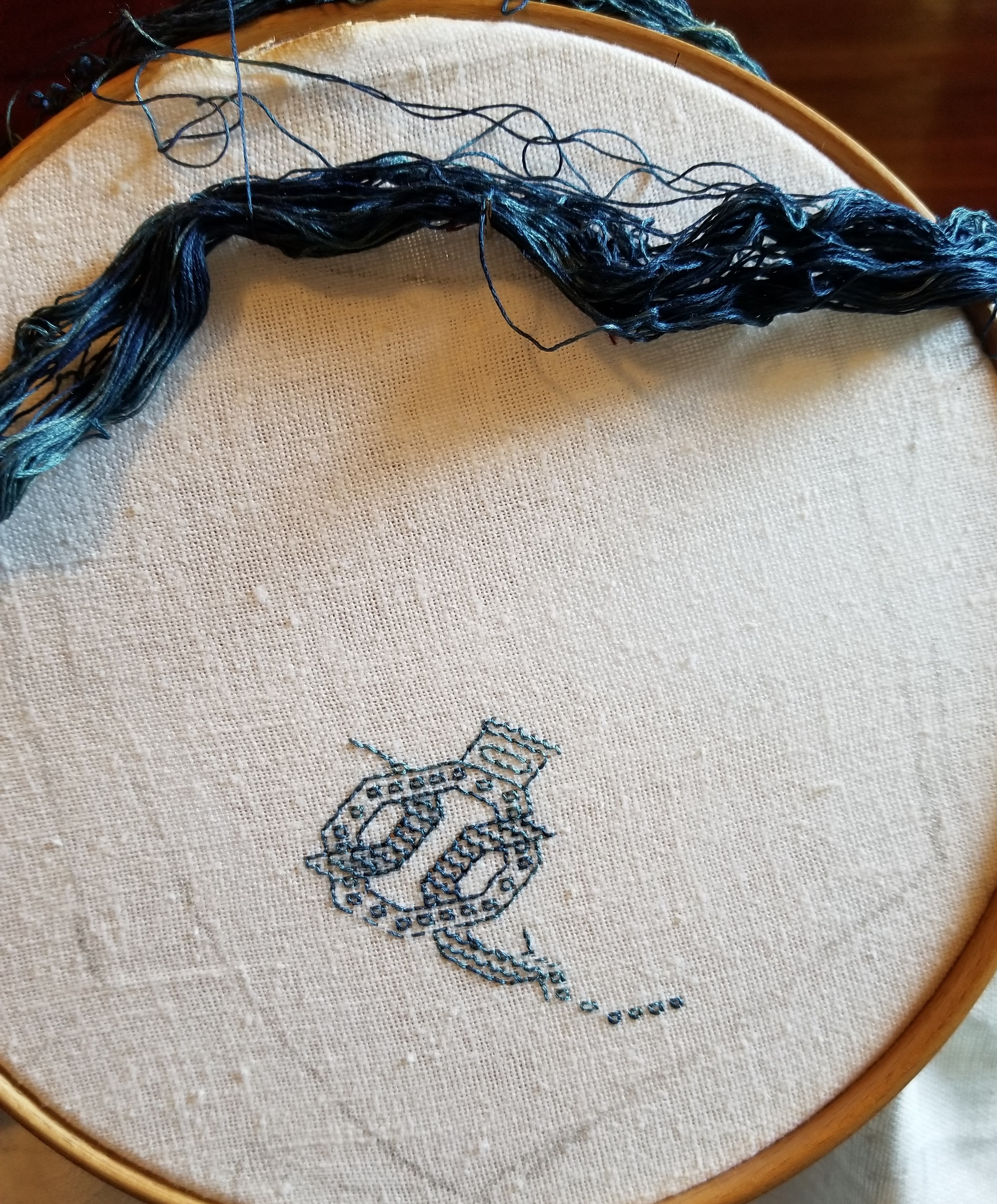
I’ve started on a promised project – a rendition of my Harsh Language piece, as a gift for a friend who prefers to remain anonymous. They survived Covid, and made a special request. I honor their determination. The objectionable word has been zealously cropped out of the image below to prevent irritating the easily-offended.

Although this is a small, quick-stitch, simple piece, I couldn’t resist using it for testing and learning. The Stealth Apprentice’s specialty is researching and recreating historical dye recipes – trying them out on yard goods, threads, and yarns. Of late, she’s been working on a group of dyes derived from lichens and mushrooms, with spectacular results. Sometimes when she’s working on a new recipe, she lets me beta-test her end result. I’m supposed to look for handling properties, color-fastness during stitching (crocking on fabric, or reside left on hands), and the like. And I am very happy to oblige. It’s fun to play with new materials and give useful feedback.
We chatted about this project, and Stealth Apprentice suggested a purple, dyed using “an uncertain lichen – probably a Parmotrema species”; and a mustard gold, dyed using “a dyer’s polypore mushroom”. The purple is a deep claret, and the yellow is a sunny mustard. They are equally saturated, so one doesn’t eclipse the other. I had no idea that these hues could come from lichen and inedible mushrooms, both which I will now view with greater respect. The purple is more true to the snippet above than the magenta it looks like on the winder below, but you get the general idea.
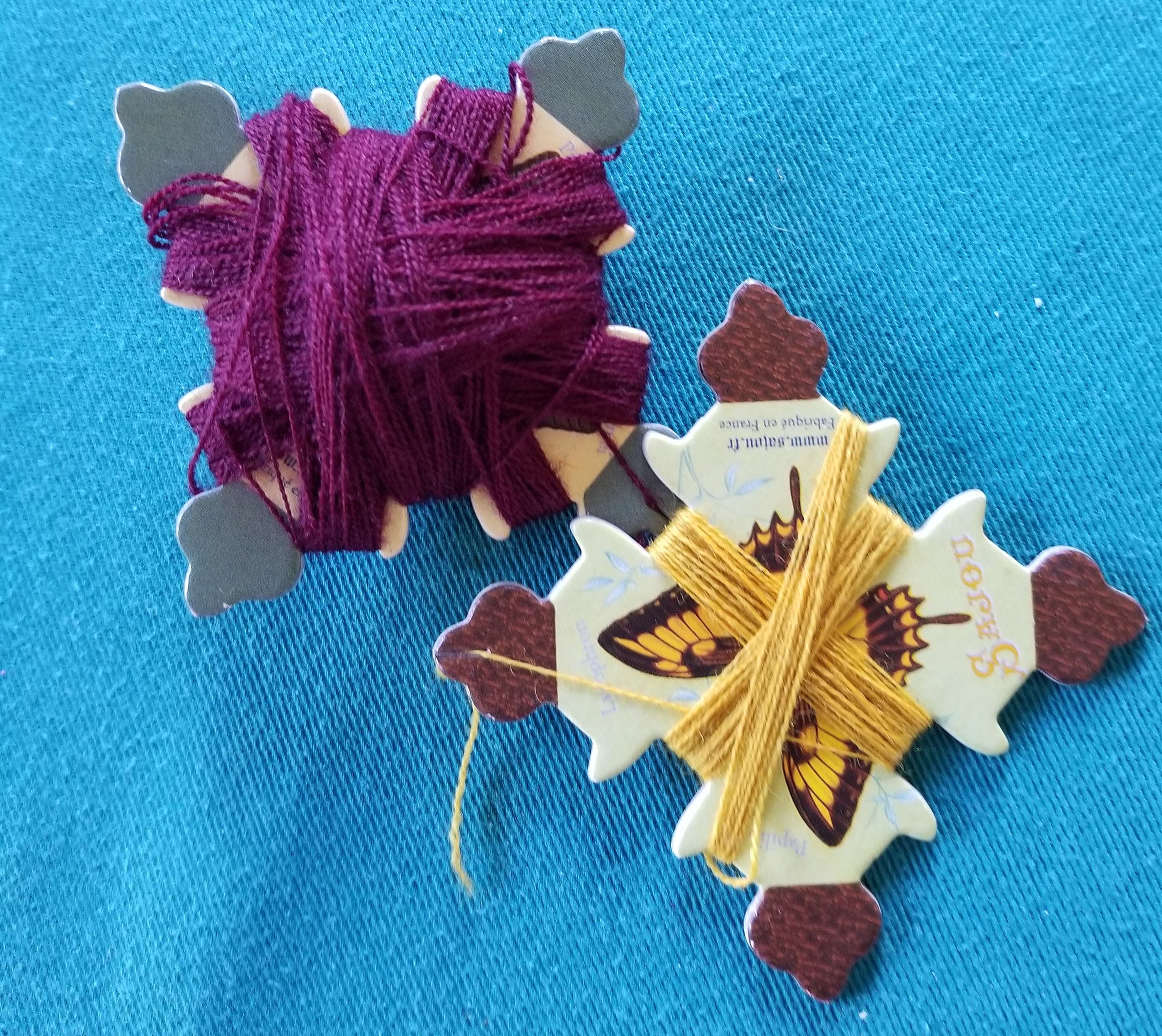
Both wools are of the same base stock prior to their color baths. They are of very soft and fine fibers, a single strand of two tightly twisted plies (which cannot be separated), about the thickness equivalent of three plies of standard cotton embroidery floss. They’re more plush and rounder, of course, with the stretch you’d expect from wool.
For this counted project due to fact that the wool thread is more robust than the cottons, silks, and faux-silk (rayons) I usually use, I’ve picked a ground cloth that’s far coarser than ones I usually use. Coarser in that it has fewer threads per inch – not that it’s harsh to the hand. This well aged bit from my stash is about 24 threads per inch, give or take; with slightly more threads per inch on the warp (parallel to the selvage) than the weft (perpendicular to the selvage). Since I’m stitching over two threads, I’m at 12 stitches per inch – big as logs to me since I’m used to working at 18 to 25 stitches per inch. But the result is spot on what’s required if one strand of this wool is used. If I were to double the strands, I’d probably be looking at working at 10 stitches per inch or fewer, probably down around 6-8 stitches per inch for better, less crowded effect.
Working with the wool and how it differs from cotton, silk, and rayon:
- Needle size: Obviously the tiny eye, round point needles I usually use are too thin for this and their eyes are way too small. Instead I’m using a tapestry needle. I think it’s a size 22, but it has been long divorced from any packaging, and has been living in sin with its mismatched fellows in one of my needle cases.
- Needle threading: Even with the larger size needle, threading is still not easy. Wool fuzzes (obviously) and waxing is right out (also obviously). My little bee needle threader is an absolute must for this project.

- Frame: I am using a hoop. The piece is small, so most of the area to be stitched fits inside it. But not for long. Eventually I will need to re-hoop over previously stitched bits. I will try to avoid doing so as much as possible, but right now I don’t have the option of moving this over to a flat frame. If I have to hoop over the letters in particular, I will be covering them with a soft fabric as padding, to prevent crushing or skewing the wool threads. I’d recommend flat frames, slate frames, or scrolling flat frames for countwork in wool, and will make sure to avoid my hoops in the future.
- Thread abrasion: This is much more pronounced in wool than cotton, rayon, or silk. Drawing the fluffy thread through the tiny holes of the ground cloth’s weave does degrade the strand over time. Spare yourself waste, agony, and an uneven appearance on the front – use shorter strands than you would with any other thread. And yes – if I were to be working on Aida or a ground cloth with larger holes, or using a larger needle this would be abated somewhat. But I much prefer the uniform look of a nice, tight even weave ground over the scattered holes presented by the purpose-woven stitching fabrics, so I am bringing this bit of extra work entirely on myself.
- Stitching technique: Even more so than with cotton (the most forgiving), silk, or rayon (the most unruly), wool needs to be worked in double running or back stitch with vertical passes of the needle through the cloth – not with a “sewing” or scooping stitch. Working with one hand in front of the work and the other behind means that care must be taken not to snag the working thread when the needle is returned by the unseen hand. It’s all too easy to pierce the working strand (it’s fuzzy and soft) and create an headache to untangle later.
- Tension: Wool is springy and stretchy. Cotton is not. Silk and rayon are even less elastic than cotton. It’s easy to stitch the less elastic threads quickly, and getting the feel for how tight to snug them up on a nice, taut, hooped ground is relatively quick. Wool by contrast stretches and then bounces back. It’s VERY easy to stitch it too tightly – stretching it as the stitches are formed, only to see it bounce back later when the ground is released from tension. Save yourself a headache and only draw the threads as tightly as it takes to make them lie flat and even, which will be significantly less tight than you are used to with other fibers.
- Ripping back after mistakes: Don’t count on it. The fuzzy nature of the thread makes it far more likely that stitches will pierce those laid down before, rather than slide alongside them. Ripping back will be painstaking, and the thread that’s recovered (if you are able to do it at all) will be seriously damaged by the removal, too much so for invisible difference re-use. Unless it’s just going back one or two stitches, treat mistakes as lost causes and sacrifice the strand. Snip on the front and withdraw the ends from the back to minimize fibers left on the front.
I’ll continue on with this, learning as I go. For all of the differences, I am enjoying working with wool and look forward to doing more of it in the future. I’ll continue to post (fig-leafed) progress on this piece. Like I said – it’s small and will be a quick finish. I’ll have to put it on hiatus for a few days at the end of next week for another obligation, but even with that should have it done and on its way to my convalescent friend well before mid-September.
