TWO COLOR DOUBLE RUNNING STITCH – TWICE THE FUN
As promised, here is a round-up of what I’ve been looking into on double running stitch, done in two alternating colors. First, heartfelt thanks to Melinda Sherbring and the gang over at the Facebook group Historic Hand Embroidery.
I knew I had seen examples of this type of work on samplers, but my own research notes are particularly poor in samplers. I tend to focus on the small fragments of household and body linen that lie quietly and largely unnoticed in museum research collections. Samplers receive far more attention, are often under licensing restrictions or have been fully charted by reproduction houses. So in a fit of laziness (it being vacation) I put out a call to the group and asked for assistance. Many people responded, Melinda especially so, furnishing 85% of the material I will cite below. So copious thanks, Melinda! I bow to your greater expertise on these, and will accept any/all corrections.
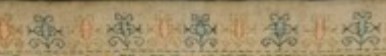
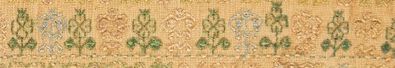
First, here’s what I am talking about. Here is a simple graph of a sprig pattern, worked in double running of a single baseline.

Note the alternating color stitches in the baseline. If I were to stitch this, I’d start with black, take that first stitch at the baseline’s left edge, then in double running work the rest of the first flower in black as a detour from my baseline. When I returned to the baseline, I’d continue on to the next black stitch, then I could continue working the whole thread of black until I ran out, carefully counting the units between black flowers. After that I’d start again from the left, filling in the missing green stitch, and taking detours to work the green flowers. Or I could do it the easier way – parking my black threaded needle, taking up a green one, and working green stitches until I got to the first green flower, working that as a detour in the standard manner, and marching on for a few stitches after, then catching up and leapfrogging ahead with the black. Note that using two colors means one will always be traveling along the baseline in the same direction. There is no doubling back to fill in second pass double-running stitches as one can if a single color is used.
After some experimentation, I found the “leapfrog” method far easier, in spite of having to be careful not to snag the parked thread. Less long distance counting means fewer errors for me. I suspect that close examination of encroachment on these historical pieces will turn up that leapfrogging was the way they did it, too. It’s just so intuitive and so much simpler.
One more observation – an alternating baseline is a giveaway that the band was done in double running. It would be quite awkward and wasteful of thread to achieve this effect in back stitch. And using back stitch to do the branching detour sprigs would mean having to terminate the thread on each one, or stranding over to return to the baseline. Again, something wasteful to be avoided.
Examples
Melinda provided far more than these photos, but I am cherry picking the ones with details that display the best. Click on the sampler institution/accession/date link to see the full pieces. A couple more of Melinda’s citations are at the end of this post, for those who want to do their own deep dive.
Ashmolean WA2014.71.3 (1631-1700) The boxers/urns panel has a companion border at the bottom with alternating pink/blue sprigs and a clear two-tone baseline. There’s also another pair of companion borders at the bottom that uses a band of green stitching with the alternating color sprigs and two-tone baseline immediately along its edge:
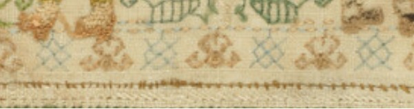
Ashmolean WA2014.71.27 (mid 1600s) has the alternating color sprigs on a two-color baseline on the topmost motif. This is the one I dimly remembered from tiny illustrations in a sampler book. Note that additional satin stitching was done in the centers of the motifs to bring extra dimensionality and color, but the double running outlines are still there.
Burrell 31.7 (1640-1670) Sadly, no high resolution image. But on the bottom-most strip – its framing border, top and bottom strongly looks like two-tone sprigs, and probably has an alternating baseline but it’s hard to make out the detail on the baseline. More investigation on my part needed. As an aside, it’s nice that the Burrell gives thread counts for the linen ground – 28 warp x 25 weft per cm, or 71.12 x 63.5 threads per inch. I’ve included the main strip because it or a close sibling pops up in connection with alternate two-tone borders in other works.
Burrell 31.9 (1640-1670) Third strip from the bottom. Again, certain ID limited by photo quality, but it does look like that much wider strip was done with a two-tone WIDER baseline (same spirit as mine, but a different pattern), with alternating color detours. Shares a lot of the aesthetic and some bands with Burrell 31.7 – interesting!
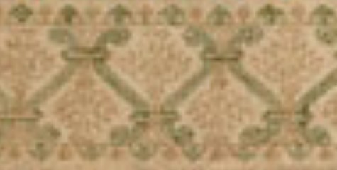
Cooper Hewitt 1981-28-70 (1600s) Love their high resolution photos. Another clear hit. The companion border around the bottommost wide strip, for sure – done in at least THREE colors (wow!) with a multicolor baseline and single color sprigs. A green, a blue, and possibly a red and a pink, the red and pink are very much faded. Or it might just be green, blue, and pink. It’s very hard to parse but it does look like the baseline was done in pink-green-red-blue-pink-green-red-blue, which would leave very long skips, overlapping on the reverse. I’d love to see the back to confirm that, and to confirm the number of colors.
There are more possibilities on this same piece, but for the most part they are heavily overstitched in satin stitch or (possibly) hollie point or another detached looping/weaving stitch, worked on the outline and for the most part obscuring it. It also looks like the second color was not necessarily used on the double running stitch outline for the sprigs, but was employed in the fill treatment Here’s one with an alternating baseline of blue and pink(?). The pink looks like it was used to outline the acorn and leaf shapes with double running. Pink and green were used for the detatched stitch fills for the acorn and leaf, but the blue of the baseline seems to have ben employed to fill the twigs between the acorns and leaves.

Fitzwilliam T.59-1928 (circa 1680) I stumbled across this one looking for the other items Melinda cited. I saw tiny black and white photo of this in one of the first embroidery history books I borrowed from the library – a book published before 1965 or so. I charted some of the strips from it with a magnifying glass, and used them on a piece I did in high school, long before I found the SCA. I haven’t seen this piece since. (People looking to chart now have no idea how much easier it is today with on line access to zillions of primary sources and high resolution photos, all of which can be enlarged right on the screen. A far cry from being smuggled into university libraries to stare at fuzzy microfiche images, or taking magnifying glasses to low quality black and white photos in books.) There is clearly a two-tone companion border with an alternating color baseline accompanying the prominent rose band:
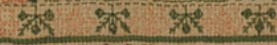
By way of contrast, this bit from the same sampler was NOT done with a two-tone baseline. Even if there are pink straight stitches between the green diamonds and other motifs in the uniting center band, those sprouting leaves in pink are independent from the true baseline, which is solid, unbroken green.

Fitzwilliam T.61-1928 (1677) Also stumbled upon, and sadly a bit blurry. Two possibilities in the photo below – and the lower wide border to which one of the candidates is the companion one looks to a design that’s a cousin to the one from the Burrell sampler above. The two-tone companion is clearly not the same design, even though it’s difficult to see.

More citations:
Ashmolean WA2014.71.44 (1633) Not a sharp photo, but the red/green framing bands on the boxers strip does look like it is probably done in the dual tone baseline, alternating color detour method.
Fitzwilliam T.82-1928 (1691). Looks like there could be a couple of candidate bands, especially in the framing borders around larger strips, but the photo resolution isn’t quite there, and I can’t be sure that the colors are united by a two-tone baseline. I need to do more investigation.
Conclusions:
I have not seen this treatment in portraits, or in fragments of household linen – only on band samplers. I will keep looking, but I think Melinda’s generosity makes it clear that double running done in two colors, with a two-tone baseline and sprigs alternating between those colors was a 17th century innovation, popular in England of that era. She has given us lovely data points from 1629 to the 1690s. Given the paucity of extant samplers before 1600, that is to be expected. Thanks again Melinda!
But I never say never. All I can say is “I haven’t seen it yet.” And who knows, maybe someone out there HAS a citation for use of this technique before 1625, a sighting in works from other times/locations; or evidence on a textile fragment or portrait that it was used on clothing or household linen. If so, please add a comment with that reference here, and I’ll be happy to do a follow-up post.
And my own progress?
I’m up to the outer framing border. I just realized that I forgot to plot the way the wreath-springs work in the corners, so I will do that later or tomorrow, and concentrate on finishing out the upper edge tonight.
Yes, the colors are a bit disjointed, and I’m not entirely pleased with how prominent the diagonals turned out. But I am working under severe materials quantity constraints. Most of the colors were too light to show well in this style of work, and those that are are in single 8 yard six-strand skeins, most of which were already nibbled by the original owner for her prior projects. I am still splitting each strand of the six, to double the yardage, but it’s going to be tight.
CONTINUING EXPERIMENTS
The Grand Experiment of splitting the individual plies of my vintage six-ply Pearsall’s silk floss into component strands continues. So far it has worked out. I’ve only lost one of the separated strands, and that was to it catching on something after I had unwound it, but before I restored some twist by finger spinning, and a very light application of beeswax to set the new spin.
I’m liking the look of the separated strands. Very much a historical look, with the long staple fibers being shown to advantage, and the occasional thick-thin variance of the finger-spun strands. Note that in the photo below in the salmon thread you can see the kink set by the original spinning, but that the kinky texture is not evident at all in the stitched diamond filling. A win.
Too bad the Pearsall’s is such a discontinued unicorn. I don’t think I could do this with Au Ver a Soie’s Soie D’Alger. The staple isn’t as long, and the twist is both different and tighter.
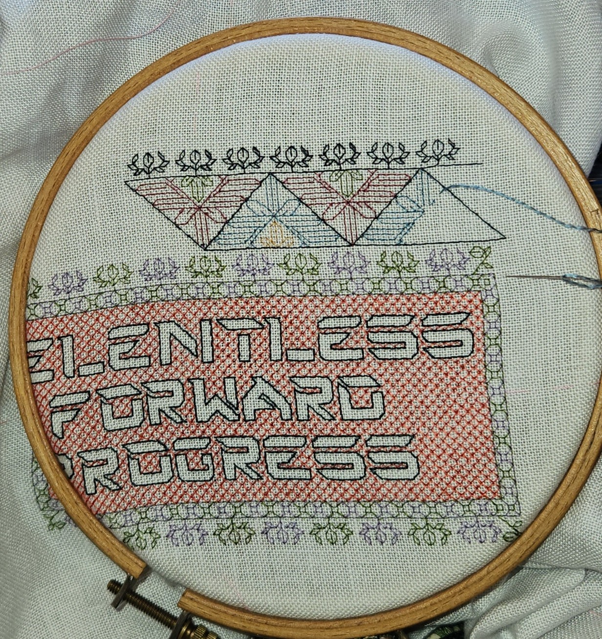
One thing I did to eke out my colors was to work with two at the same time, alternating color stitches on the baselines, and working sprigs and inner ornaments in one color or the other. I hadn’t tried this parlor trick before.

You can see at the bottom of the motto rectangle that I hop-scotched the two colors – working one a bit along, then filling in the other. There are also TWO baselines in this strip due to the use of two colors. One handles the edge along the diamond infilling, plus the alternating squares-and-diagonals inside the border strip, and the other handles the top line and alternating sprigs. That’s because logic prevents doing the top and bottom edge PLUS the sprigs in two colors off of one baseline. In alternating colors you have to keep going forward along a line unless you want it to be solidly one color or the other. I could do the single color wreath sprigs easily, but those three stitches between them (or between the bottom legs of the squared diagonal boxes) would also have to be a single color because they would require doubling back to fill. Therefore, two baselines. Not a problem, and pretty easy to parse for quick stitching, once I realized the problem and stopped stitching myself into cul de sacs.
Except for the dark outlines of the letters, all of the stitching so far has been done with the split strand Pearsall’s. And I intend to continue working that way for the rest of the project, because of the look, my need to stretch my very limited quantities, and the challenge of doing something new and unexpected.
The next design will be one I’ve done quite recently, but worked up a bit differently. I did this Tolkein-sketch-inspired strip on the sampler I did in tribute to the Resident Male’s novel Treyavir. I worked the outlines in navy blue, and then went back and filled in selected areas of the design with squared filling, in a deep gold-tone yellow.

This time I’ve added a corner (very easy to do because of the clear diagonal elements). I’m plotting out a way to do it in multicolor because I don’t really have enough of any one (or two) colors to ensure that I can stitch the entire thing all the way around as a full frame. And I certainly don’t have enough of any one color to do a fill treatment as I did before. Doing multicolor will be problematic because of the design itself, too. The long diagonals “cap” the petal like elements. Possibilities include:
- Skipping over the end cap petal stitches and using a separate color for the top and bottom lines, and to work any stitches between petal caps on the diagonal. All petal elements will be entire, with no truncated end caps.
- Dividing my colors into two groups – possibly cool (blues, greens, purples) and warms (oranges, salmons, tan – no true reds in the pile to speak of). Working triangles in one direction in cools, in succession, alternating with warms, BUT letting the cool color triangle edges dominate, letting the warmer colors recede.
- Working the top and bottom baselines and hard diagonals in the same color throughout (possibly two very close shades of the same color, alternating stitches), then filling in the rest of the triangle patterning in alternating warm and cool colors. All cap stitches will be done in the outline colors.
- Some variant of 1, 2 or 3, with the smaller center triangles being worked in a different tone or possibly even the opposite color group from the larger, outer triangles.
Now to finish off the salmon diamond fill behind the letters, plus the remaining bits of the wreath sprig two-tone edging on that box. Then on to the outer frame.
Also, I will write more on two-tone double running history in the next post (with special acknowledgement to the ever generous Melinda Sherbring who shared copious notes and examples with me) – but I can only sit for so long at a time, and that’s an entire saga all on its own.
AND SO WE BEGIN AGAIN…
Never will I be someone who has a long hiatus between projects. Aside from the fact that I always have several concurrent ones, the final phases of any project are usually fueled by advance planning for the next one.
As I mentioned in the last post, I was prepping the ground for RELENTLESS FORWARD PROGRESS, the piece I am doing as a thank-you for the therapy and nursing staff at Vanderbilt Rehab/Newport Hospital. I’ve finished the truing, decided on a size, hemmed all the way around, and basted my centers and edge borders. I also completed the atypical (for me) task of plotting out 90% of the chart for the entire piece, and started in on the stitching:

I did the extreme layout because I wanted to center the motto properly, inside a surround that used as little fudging as possible. This meant working up corners, and making sure the repeat count was congruent with my usage, and with the available space. Oh, and the lettering. I didn’t find a vintage alphabet with the right flavor, so I decided to make the piece rather abstract, with a quasi-futuristic typeface, instead. I went looking for Just The Right Thing, and didn’t find it among charted alphabets, either. So I drafted up my own. Taking four or five different vaguely science-fiction-movie style typefaces, I rammed them together and drew up my own outline-only interpretation. Before you ask, I don’t have the whole alphabet – only the letters I needed for the motto. But except for an H and I, I have all of the top ten letters from the frequency table, and those two are easy extrapolations.
As the photo above shows, I’ve matched up the center of my chart with the center of my cloth, and started in on the stitching. If you look reaaalllly closely you will see the pink basting threads marking my center lines. And even just starting out I am loving the Pearsall’s. Smooth, sleek, easy to stitch – a dream to work with.
My intent is to do a narrow inner frame around the lettering. Inside that frame I will do very open voiding, possibly just diamonds in a complementary but lighter color. I might experiment with the Pearsall’s 6 ply floss. Each of the separable standard plies is clearly made up of two constituent strands. The silk itself is quite long staple and very strong. I may try to separate a standard ply and work those background diamonds with just one of those strands – what is in effect a half-ply of silk. That would stretch my limited supply, and keep the lettering in front as prominent as possible. Stay tuned for that experiment. I’m not there yet, and have to finish the motto first.
As for my continuing rehab from surgery – I am still improving. Every day a bit stronger and more capable. I can walk further, sit longer, and do far more things on my own than I could in May when I came home. At the end of this month I will start a program of Proton Beam Radiation aimed at eliminating any last possible but otherwise undetectable cancer precursor cells; to knock the chance of recolonization way down. It will run through October and be a daily appointment, Monday through Friday. An inconvenience for sure, but anything that tips the odds even more in my favor is most welcome. In the mean time, my job is to get as strong and as fit as possible prior to radiation commencement. I am taking that job VERY seriously.
JOYOUS ENDING
I’ve finished the latest piece – the sampler in tribute to the Resident Male’s nascent book Forlorn Toys. He is still writing it, so I won’t give spoilers beyond what I have already cited: the motto, the very obvious panel of aforesaid toys, my attempt at spaceships, and the band with the curious feathery rabbit like creatures.

All in all, I am quite pleased with it. Joy now goes to join my Wall of Shame – the place where my completed but as yet unframed/not-ready-for-public-display pieces live side by side with my unfinished projects. As you know this one like so many others is stitched on reclaimed household linen. I did not notice a bleach-weakened bit along a patch of the edging at the lower left. When that was hooped over and tension applied, the neatly done hem stitching failed, leaving a hole. I will eventually mend that, but other priorities assert themselves.
First among those priorities is a piece I promised to the community of therapists and nurses that tended to me at Vanderbilt Rehab Center at Newport Hospital. It’s fueled by a gift of silk floss from Occupational Therapist Abbey. She admired the work I brought with me intending to stitch. She had an inherited stash of silk threads but no use for it, and asked if I would like it. Always happy to have such things, I agreed, and she sent me a wonderous assortment of Pearsall’s silk floss – long discontinued – in jewel tones.

A princely gift, indeed. And only fitting that I use it for a gift back to the caregivers who got me back on my feet and moving again.
I’ve selected a tinted linen to use as ground for this one. I am not sure who gave me this because I didn’t put a note into the package (possibly my spawn, so apologies if it was). It’s custom dyed Zwiegart 36 count linen (big as logs for me), from Hollis Hands Create – a frosty barely blue tint called Silver Moon.
The first step is to begin the design of the motto. In this case “RELENTLESS FORWARD PROGRESS,” furnished by the Vanderbilt Physical Therapy team. Done. And then to begin thinking about how the rest of the piece will be worked. Not a band sampler this time, it will be a “framed” piece, with one or more bands of design running around all four sides of the motto, complete with corners and any improvisations to make the bands’ designs work out correctly with minimal fudging. Therefore I will be doing a some on-screen work to prepare for this one. More than I would have needed had this been a simple band sampler. For example, those corners will have to be drafted out even if I chose band designs I’ve previously devised. And I will have to plan to use multiple colors effectively because while there are many hues in my bag of silks, there are no duplicates, and most of the skeins are partials. It will be fun to figure out how best to use my limited quantity treasures.
And then there’s selecting a size for the piece and preparing my ground. For that the first bit is to true the edges of the linen cut. To do that I find and pull the warp or weft thread at the narrowest point of the cut, withdrawing it entirely from narrow end across to the widest end. This gives me a clean line along which to cut, and ensures that my edges are parallel. On this piece of ground with one selvedge edge, you can see that the left and right sides perpendicular to the selvedge each are slightly skew, one by about an inch, and the other by about 3/4 of an inch.
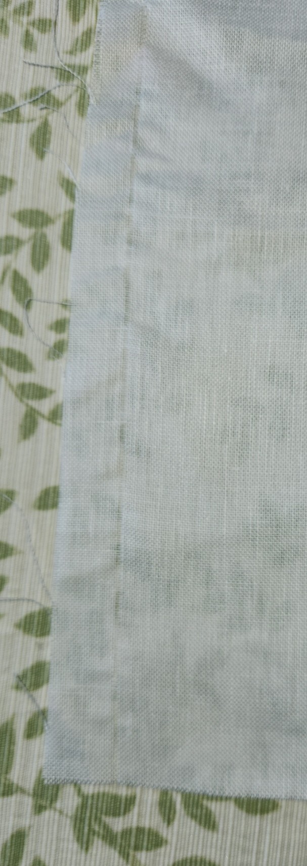
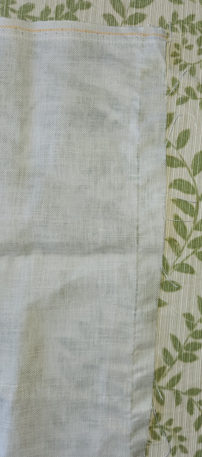
Note that regardless of the retail source, or whether or not the edges are serged or otherwise finished, if I buy a cross bolt full width cut or a fat quarter I always inspect the edges and true them in this manner. I have yet to receive any cut that was done completely congruent with weave direction. Sometimes the deviation is minimal, and there is only an inch or so lost all the way around. Sometimes, especially with lower price precuts sold in big box crafts stores, up to four inches can be wasted all the way around
This is why if you purchase pre-cut yardage, even if you have added on extra width to allow for easy hoop use and framing, it doesn’t hurt to add an additional inch or two all the way around. You never know when you will get a cut so skew that after the cloth is trued parallel to the weave, the cloth ends up being much smaller than you thought you were buying. Charles Craft prepackaged cotton and cotton blend evenweave was notorious for skew cuts. Their products started me doing this “proofing” step, and I have not regretted it since.
I won’t be using this entire fat quarter on this project. I will measure my ground cloth piece after it’s cut and the left and right edges are hemmed. I’ll decide then on the orientation of my sampler, cut my ground accordingly (also on a pulled thread line), and hem that last edge. The remaining bit will be returned to stash. And I will get a start on selecting my framing pattern(s) and drafting up my new corners.
On the non-computer work side, while the design work is going on but after I get my piece of cloth sized and hemmed, I will baste in guidelines: centers and stitching area edges. The final count of the available stitching real estate between the area edge marks will help inform final design tweaks.
I don’t think of all this pre-work as being very complex or onerous. The physical prep is mostly mindless and gives me plenty of headspace for the rest of the planning.
Now off to select my patterns… I toyed with using icons representing progress from sitting to walking, but I decided that was too limiting. The rehab therapies offered go far beyond simple sit to stand to walk, and I wanted the piece to be as inclusive (or non-specific) as possible. And the logos for the various institutions and professional certifications involved are too fussy to be easily charted at my scale. So it’s a mix of florals, geometrics, and possibly a pet or mythical beast or two thrown in. After all, who doesn’t identify with dragons or kittens?
