PROGRESS
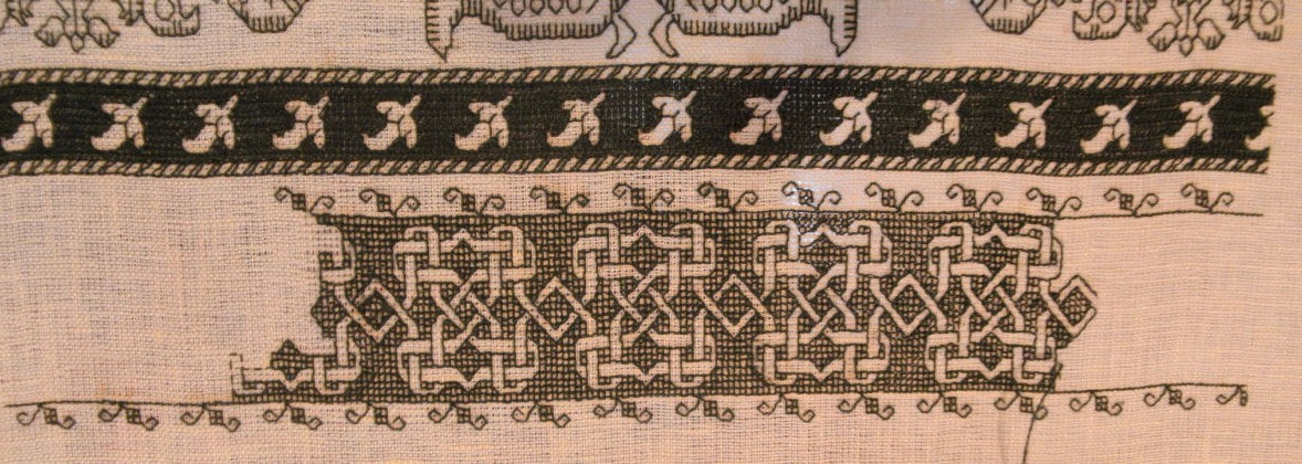
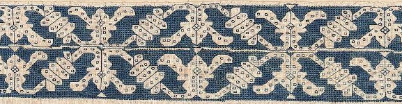
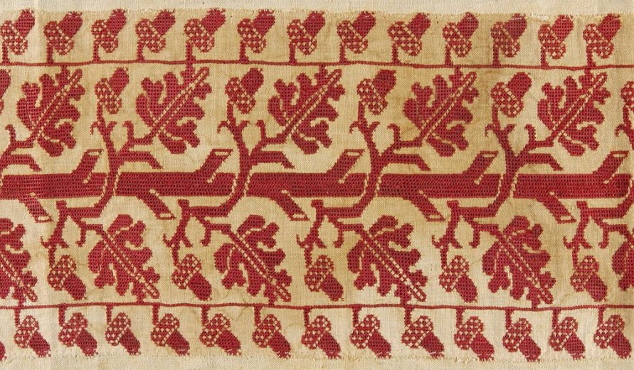
We’re quite busy these days at String Central. I continue to work on the long green sampler. Here’s the latest strip, photographed in early dawn light. This pattern is also in TNCM2, albeit without the gridded voiding. The little complementing border was stolen from a different TNCM2 pair.
TNCM2 as a whole also progresses. And to top it off, Younger Daughter and I are hard at work on an outfit for her to wear to the Waltham Watch City Festival steampunk gala.
Long time readers here may remember that last year at this time, Younger Daughter spent quite a bit of April and May in Children’s Hospital, in the throes of an argument with her burst appendix. She had wanted to attend the festival last year, and was very disappointed to have missed it. As a distraction, we planned out the outfit she would have liked to have worn. Being on the young side, what we designed for her was more steampunk than steamy-punk (no exterior corsets, hip high hemlines, or fishnet stockings). As incentive for cooperation with often uncomfortable hospital requests, I promised to make said outfit.
Now a year later, she’s totally better and my promise has been called in. We’re about halfway through the venture. A blouse/waist has been obtained (an antique barn bargain retread). We’re just finishing up a camel wool walking skirt, and will be trimming it next week with black and brown point folded ribbon. She’ll be decorating a brown suede bolero with copious brass buttons, plus a watch, a compass and a magnifying glass. The bolero and buttons were also flea market finds. Pix of all of these as they near completion. But I can present her hat:
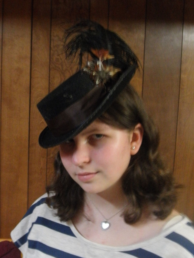
She started with an costume top hat, and excised about 2 inches of height. She covered the surgical scar with a brown ribbon, complete with a bow and streamers in the back; then added feathers and gears.
Cute, no?
URNS DONE
Done with this strip, on to the next!
I spent some time noodling out what the next one will be. I tried out some complex Punto Spina Pesce patterns – the ones that use either Montenegrin or a Montenegrin-like long armed cross stitch variant to trace interlaces and intersecting lines, to make a linear design that’s fairly heavy. Unfortunately more experimentation is warranted. I’ve got a basic understanding of these stitches and how they merge horizontal, vertical and diagonal elements, but the designs I’m looking at make those changes very quickly, sometimes after a run of only one graph unit. The methods I’ve learned from the Autopsy of the Montenegrin Stitch Exhumed book take two or three units to complete directional transitions. I’ll have to play with these more off line to figure out “speed changes” and triple line conjunctions.
What am I working as the next strip instead? Stay tuned!
LONG LOST TWINS, PART VI
In Part III of this series I mentioned two pieces now held in two different museums that I suspect were cut from the same original artifact. That would make them bona fide twins, separated at birth. I don’t believe that was an unusual happenstance. Here is another example of a pair of items, now separated in two different collections, that I believe to have a common origin:
“Border,” Art Institute of Chicago. Accession 1907.664. 17th century, Italy. 8.5 x 31.4cm (3 3/8 x 12 3/8 inches).

“Embroidery,” Museum of Fine Arts, Boston. Accession 95.1126. Undated. Italy. 17 x 78 cm (6 11/16 x 30 11/16 inches). Dimensions include several repeats and a considerable chunk of unworked linen.

The Art Institute’s photo is sharper, but these are spot-on identical in pattern count and execution, color placement, stitch and edging detail. The Chicago write-up details the stitches used as being “back, hem, satin, and split stitches; edged with silk floss in buttonhole and detached buttonhole stitches.” The MFA says “worked with line stitch, chain stitch, and laid work, and with red and yellow silk… The linen is joined by fagoting, and is edged with buttonhole stitch and loops and knots.”
I am not daunted by the discrepancy. This is pretty typical. Terminology for stitching techniques and stitches isn’t universal over time or place. One expert’s “line stitch” may well be another expert’s “back stitch.” And neither one may be back stitch as we know it today. Sometimes that term is used for double running, even though the two stitches are produced differently and can be distinguished from each other by looking at the work’s reverse. It’s almost impossible to know from the descriptions posted on line when they were written or by whom. In fact, descriptions within a single museum’s collection may not be consistent – having been written by different curators of varying degrees of familiarity with the type of work, decades apart. I would trust Santina M. Levey’s descriptions the V&A in totality. But I’m not so sure I’d trust an unattributed blurb in another museum that may or may not have accompanied the piece when it was originally donated in 1909, and may not have been revisited since.
I’ve worked in a museum and I know that the archivists and curators, no matter how educated and experienced, do not know everything about every artifact; and not every artifact in the collection has been studied and corroborated by experts in that specific area of endeavor. Lots of times an artifact languishes for decades in a storage case with the tag that was on it when it was donated. It would not be unusual for something acquired before 1925 to have a “best guess” attribution that’s never been re-evaluated. Documentation standards have risen over the years, but these older acquisitions are not upgraded and retagged unless they have a bearing on a specific line of (funded) inquiry. So artifacts just sit there with speculative provenances and dates. One of the problems dilettantes like me face is that having no academic yardstick, we accept all published or museum attributions at face value. Or we reject them, or cherry pick the ones that fit our pet theories. (I’m no different in this. My pet theory du jour is that these are from the same original.) My point is that without validated and serious study, even the grandest and most augustly respectable museum’s taggings can be incomplete or open to question.
I’d love to see these two items in person, and I’d love to see their reverse sides. Just looking at them I know I could re-create them using several techniques, depending on whether or not the originals were one or two sided. Double running stitch for the red and yellow linear elements, and carefully laid satin stitch on the count for the yellow diamonds? Sure! Providing ends were carefully managed, that would be the same on the front and back. Back stitch and pattern darning? Also would work on the front, although that would result in a one-sided finished product.
So until I have the entree to actually peruse these in person, I’ll just contemplate the photos. I don’t know if these two museums know of the commonality of their holdings. But I do posit with some amusement that somewhere back around the turn of the last century, a dealer in Europe made a killing, snipping an original (possibly already damaged), and selling the fragments to two wandering American collectors; who in all probability each went home each thinking he or she had snatched up the only remains of this masterwork.
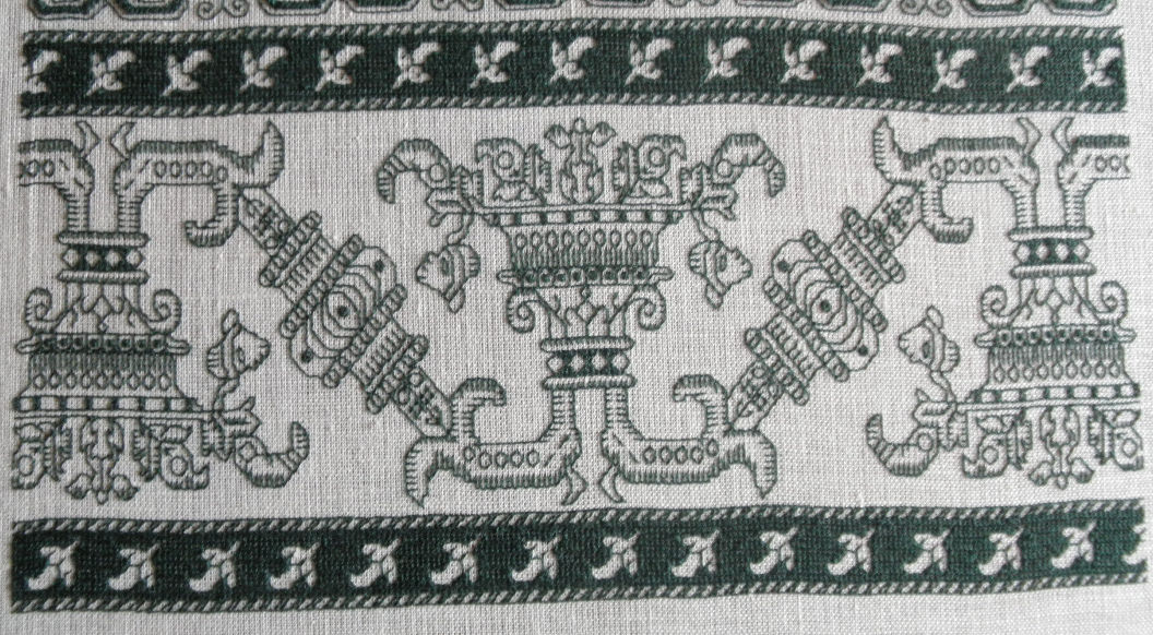
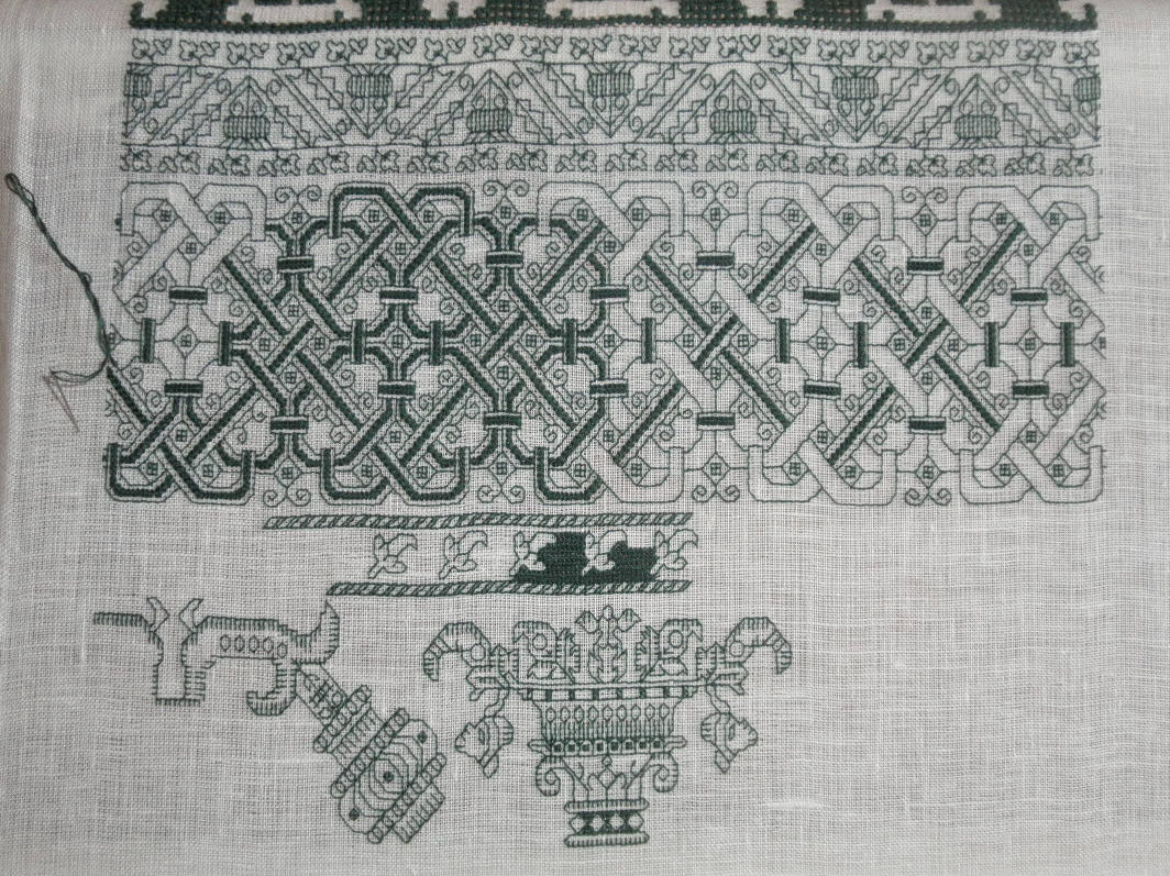
URNS AND PEPPERS
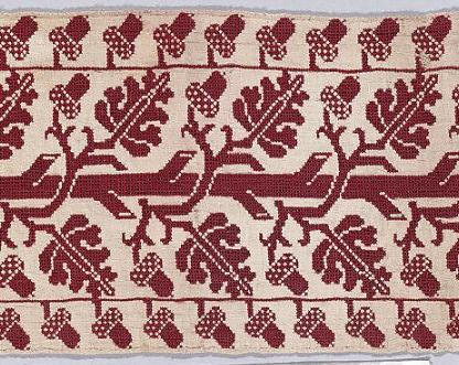
Yes, I’m still chugging along on the long green sampler. Here’s the progress on the latest strip, and an “on the edge” view of the last one, so you can see the dimensionality of the Montenegrin stitch accents in the last one:
I was originally going to work the entire background of the center urn motif voided in long-armed cross stitch, just like the pepper-sporting companion edge strips. I’m still thinking on that one. That much green might overwhelm the piece. It’s hard to judge visual balance when the previously completed parts are rolled on the scroll bar, but here are all the strips to date, in order (apologies for varying lighting, angles, etc. – a photographer, I’m not).


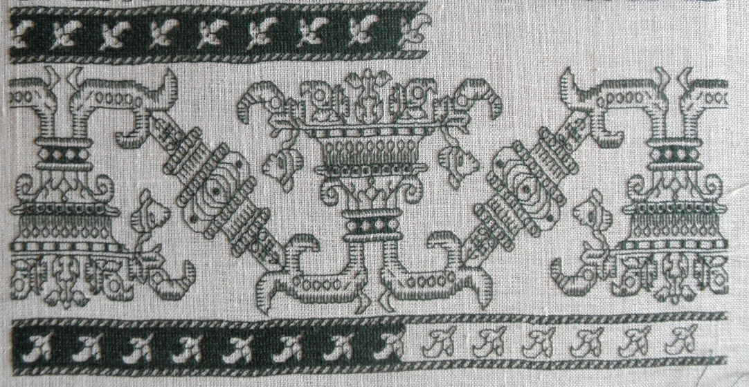
Opinions on working the urn section voided would be gratefully accepted.
Finally – are these odd bud shapes really peppers? I haven’t a clue. New World peppers would have been a recent introduction when this design was new. They might be, or they might be some other vegetation as yet unknown to me.
LONG LOST TWINS, PART V
More duplicates!
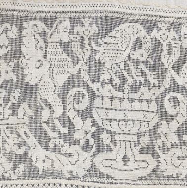
First off, I’ve found two more examples of the spinx, urn, and pelican pattern I showed in the first note of this series. Both of the new examples are in the Cooper Hewitt. Here are just the center urn sections from both. Please visit the links to view the entire works:
Border, Smithsonian Cooper Hewitt, Accession 1931-66-144. 17th Century, North Africa


For comparison, here are the urn/bird sections of the three I’ve previously posted:
Valence Embroidered with a Grotesque Motif, Hermitage Museum, 16th century, Italy

Border, Metropolitan Museum of Art, Accession 14.134.16a, 17th century, Italy.

Valence Embroidered with a Grotesque Motif. Hermitage Museum, 16th century, Italy.
Of the red mesh background examples, two retain their companion edgings, but they are different and unrelated to each other and to the main pattern panel. No two are alike, neither in the main motif or the companion edgings, although all of the main motifs are clearly descended from a common source.
As to North Africa vs. Italy as the source of the Cooper Hewitt pieces, Iv’e noted that some panels cited by Freida Lipperheide as being Moroccan in origin are now attributed by other museums as being Italian. The style of stitching apparently was called “Moorish,” or “Moresque” at one time, and that label may have influenced the early attributions. Again, without academic and detailed materials analyses we’re at the mercy of the occasionally musty museum attributions.
It’s interesting to note that the most detailed piece is the 17th century Cooper Hewit holding; and that iteratino is most like the 16th century darned net sample (two baby birds; pomegranates growing from the urn base; other similarities)/ The other pieces are closer to each other (one baby bird, downward growning side urn decorations, etc.). I note that the tendency fo these patterns is to lose rather than gain detail over time. But in the absence of any scholarly examination of these pieces, I can’t challenge the museum dates. But I can safely say that considerable leeway exists in pattern interpretation.
On to a new example. This one is an even better example of pattern conservatism over time. Centuries, in fact.
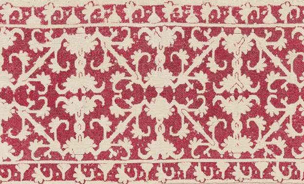
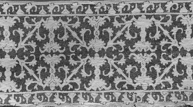
Band. Metropolitan Museum of Art. Accession 09.50.1363, 16th to 17th century, Italy.


Band. Metropolitan Museum of Art. Accession 09.50.61. 1th Century, Greek Islands
As you can see, I’ve found at least three examples of this one, spanning a possible 200-year range, done in different styles. The top one appears to have been worked in Italian two-sided cross stitch, but not pulled tightlly. Some of its side sprigs are in plain old cross stitch. The middle example features a pulled background mesh stitch – possibly the same Italian two-sided cross stitch, but tightly drawn. Jury is still out on this one, but up-close viewing reveals bundling rather than withdrawn or missing threads). The bottom example is worked in plain old cross stitch, with evidence of having been stitched in two colors (the vertical element in the fragmentary corner appears to have been done in a second color).
Now, not every pattern maintains recognizability and integrity over 200 years. But some clearly do, in spite of minor variations in detail (the side sprig flowers), and in stitch choice. Of course it’s also possible that the original collectors bought items wihtout clear documentation of provenance or origin time; and that some of the examples we think of as being earlier, are in fact of later manufacture. Again we need serious inquiry on this, armed with all of the dating techniques at modern disposal. So I ask as a self-taught dilettante – Is anyone out there looking for a really meaty doctoral thesis topic in textile history?
I’ve got more of these multiples to show. Stay tuned!
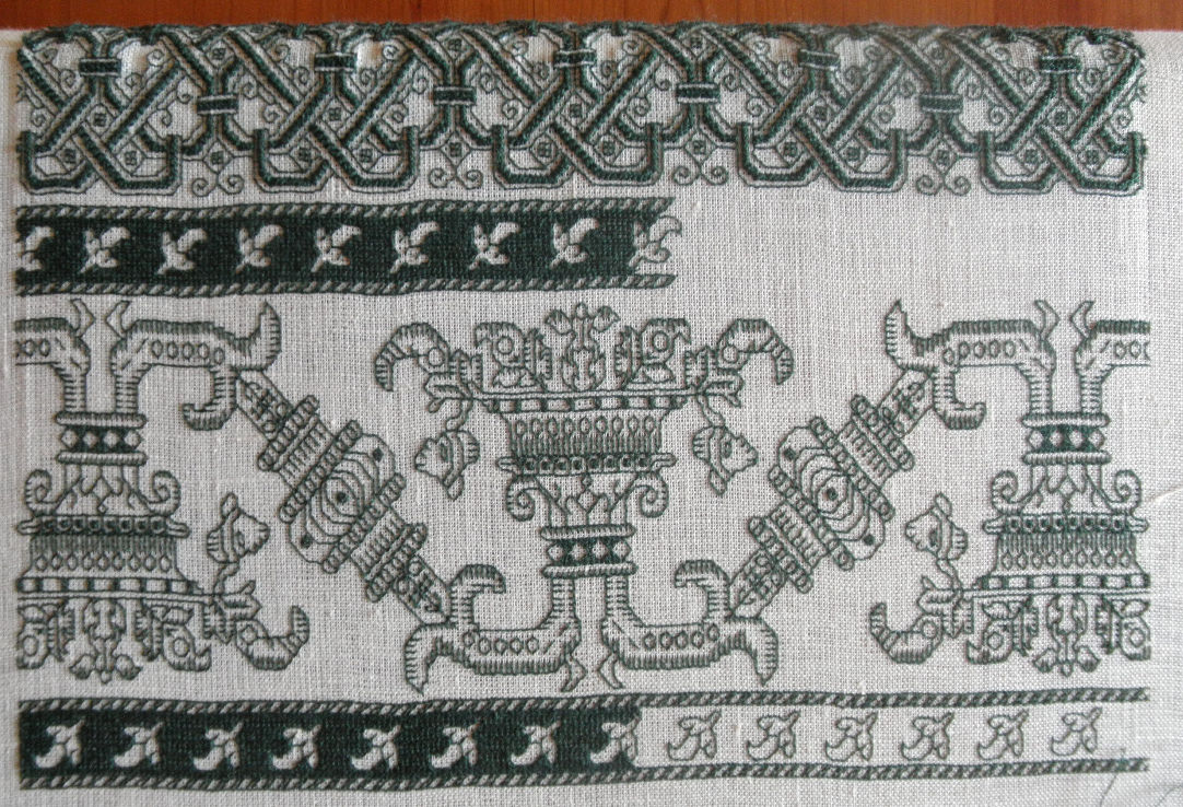
INTERLACED!
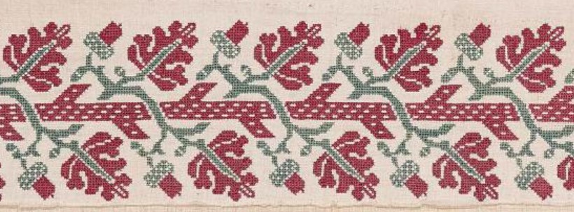
Yes, I’m still working on my long green sampler. Both of the patterns below will be in TNCM2:

Thanks to the Montenegrin book I’ve been able to do all those twisty, bendy parts where diagonals meet horizontals or verticals. It was a lifesaver! I really like this interlace. You’ll note by comparing my piece with the original below that my ground cloth is off square – not quite even weave. So it goes. I’m working that distortion into my pattern selection and placement.
“Strip,” Metropolitan Museum of Art, Accession 79.1.13. 17th century, Italy, possibly Sicily
It’s very hard to see, but it looks like there might have been spangles in the empty spaces between the internal curlicues. There may be a spangle in the upper left (better seen at the full photo at the link), where the work is the least damaged, plus some evidence of now empty holding stitches, and some corrosion aligning with where the spangles would have been. This pattern would make a killer coif or all-over sleeve panel with spangles there, and maybe a few more replacing the little four box free floating squares. I’m thinking of working it in black and gold with spangles for a modern envelope clutch style evening bag.
In any case, that strip is now done and I’m on to the next – a rather complex urn and branch with a very dark and solid background. It’s going to take a lot of stitching to cover all that real estate in long armed cross stitch, so progress on the piece, once the double running foreground is all laid in will be very dull to watch for a while. Good thing I have other content lined up.
I am however less than pleased with the Zoundry Raven blogging composition software I’ve been using. The last few posts have killed it. I can get them composed and loaded if I do all the work in one session, but I can’t call up a previously started piece for additional work – not even to copy out text and recompose in a new post. That means that I’ll have to re-draft the next several Long Lost Twins pieces. Stay tuned!
LONG LOST TWINS, PART IV
I’m happy that folk are enjoying this series. These sets are some of the material I presented at my Hrim Schola talk. I did have a bit too much material to cover there (I should have requested a two-hour timeslot), so this series is filling in some of the detail I glossed over in my class.
Today’s family branches out into two colors.
The first two are both from the Museum of Fine Arts, Boston:

#2 Punto di Milano, MFA Accession 92.42, 4 1/8 x 20 7/8 inches (10.5 x 53cm)
They were both part of the Denman Waldo Ross collection and the museum acknowledges the resemblance in their on line listing, but does not provide any other context for the two items, or opine as to why they might be so similar. And they are similar – not identical. Both are stitched in that pulled thread mesh-producing technique we’ve seen before, and both are green. Differences between colors on the two photos are more likely relics of the photo process or of differential fading, and do not necessarily indicate that the two started out either the same or different colors. We’d need to see the backs of the two side by side to get a better feel for original color.
Some differences are quite obvious. #1 is a single width strip, and #2 is double wide, mirrored like the strips in Friday’s post. But there are other differences. I’ve graphed out both of these for TNCM2, and they’re not spot on. The wings on the center motif in the double wide are significantly longer than the narrower version, and those little triangles at the reflection points vary oddly in treatment, being somewhat similar piece to piece to piece, but having a fair amount of variation, even within the same piece. The presence or absence of the triangles in #2 may have more to do with some very evident mistakes made by the stitcher – look how the center line meanders across the piece.
We can’t draw any conclusions based on the other obvious difference – the absence of edge patterns on the double wide strip because the museum sample was closely trimmed. It may have had companion edgings at one point, now lost to time and someone’s aggressive scissors. Note that size of the artifact is given edge to edge of the snippet, and in this case does not represent a measurement across the stitched area alone. It’s close on #2, there’s not much unstitched area left on that sample, but there’s a tiny bit more left on the single wide.
The edgings on #1 are of separate interest. It’s unusual (but not unknown) to see a piece with two different edgings, rather than the same one appearing top and bottom. I also am amused by these edging. The stitcher chose to ignore all of the difficult bits where the mesh fits in and around the leaves of the companion motifs. He or she just left those bits bare, but did so consistently across the piece so we know it wasn’t a mistake. (There is a mistake on top border of the single-wide – the first frond on the right is too short).
Were these part of the same original artifact? Perhaps a bedspread or towel, with narrow banding up the sides and a wider strip elsewhere, similar in design use proportion to this one?
It’s tempting to say so, but we can’t be certain.
Finally I’ve stumbled across another iteration of this pattern:
Frontal (detail) Victoria & Albert Museum Accession 747-1892. 17th century (made), no provenance.

This one is even more problematic. Here is the whole artifact. It’s an altar frontal, composed from pieces of older works. The V&A’s date 17th century (made) acknowledges the fact that the item is composed of earlier bits:

But you can see that the borders at the left and right of this piece are clearly our friend, the Wandering Y pattern, presented with yet another companion border, complete with occasional and illogical presence of that little triangle center hat.
What can we learn from this grouping? Again we’ve got items identified by century, which is rather wide dating window. Might the red strips in the composed altar frontal be older than that artifact’s dating, and in fact be contemporary with the green pieces? Perhaps. One rarely cuts up brand new work to reassemble into a recycled piece, and this piece is clearly pieced together in a rather eke it out and make do manner. Was the frontal assembled in Italy from Italian lacis and edging scraps, or was it made up elsewhere? Unknown. There are other examples of assembled altar pieces of this type, so they were not uncommon.
I would like to speculate that given the mistakes on the two blue-green pieces, that we have evidence here of a pattern copied by “loving hands at home.” Were they from the same source artifact? We can’t say. That conjecture is possible, and stylistically congruent with other pieces of the time, but there is no hard proof in the on-line descriptions.
Maybe there’s more detail about these works in the museum archives, or in the archives of the the D. Waldo Ross collection. Wherever those are papers are today. But again we have a grouping that spans up to 200 years, sporting a recognizable core pattern, in multiple and varying expressions.
LONG LOST TWINS, PART III
To start off, a quick revisit of Part I of this series. I’ve found another example of the same sphinx and pelican with urn design (I knew I had seen one more, I just had to remember where.) This one is also part of the Hermitage collection, a piece of lacis (darned net). Note that due to problems with my blogging engine, only the museum citation will work as a link to the artifact page.
Valence Embroidered with a Grotesque Motif. Hermitage Museum. 16th century, Italy.

So now we have a second 16th century example of this design, and proof that these patterns were used to execute multiple needlework styles. There are some differences between the details of the lacis and the voided embroidery examples I posted earlier this week. The lacis work is closer to the other Hermitage piece – the simpler of the two – but that could be because lacis does not lend itself to the fine detail that can be worked in double running.
Now on to today’s multiple. This is a fun one.
First, here’s our basic design worked as a single width strip.

And here is the same design but done up as a double width strip:

There are some minor differences in treatment between them. I can’t tell what stitch is used for the voided background of the second, but whatever it is, it is not the pulled thread mesh of the first example. And some of the interior elements of the design – the Y an O centers at the reflection lines – are filled in in the second sample, while they’re left unworked in the single width band. It may also be possible that the outline on the second sample was worked in a contrasting color silk because it appears to be darker and more crisp than the outline in the narrower example. And of course, the companion edging treatments are totally different.
But that’s not all. Here are two more examples of the same pattern, also with their Y and O centers left unworked:
Now these two are EXTREMELY close in width, proportions, background treatment, count of the main design, and of the border. Even the placement of the little dots in the border element are identical. Both were collected between 1900 and 1920, the MFA’s by D. Waldo Ross (active around that time); and the MMoA’s originating from F Fischbach in Wiesbaden, Germany in 1909.
I believe that these two are actually and truly long-lost twins. It would not be impossible for these two pieces to have been cut from the same original artifact, or from a closely matched set of originals (like two of a set of multiple matching coverpanes – sort of like oversized napkin/towels). The two snippets were thens old to two different well-heeled collectors.
As to style, unlike the second item above, the outlines of our two twins are clearly not worked in a contrasting color. This piece also has a rather nifty and individualized border, created specifically to match the center strip. Sprigs of the main design’s foliage and center element are echoed in the companion edging.
Note that in NONE of these samples does the count of the companion narrow edging have anything to do with the count of the main panel repeat. This is pretty much universal. Modern attempts to align the repeats of edging and main strip are over-fastidious efforts, a practice not seen in historical samples. To my eye aligning border and main strip removes a bit of visual spontaneity, making the whole into a more static entity. But that’s my just own aesthetic opinion. Your mileage may vary, and your own tolerance for visual disorder might be lower than mine. All is good.
What conclusions can we draw from this set? Again, minor variations in working method were totally at at the discretion of the stitcher. There were then like there are now, no embroidery police. Narrow borders were also chosen independent of the main design, and might or might not match the style or design elements of the center strip. And finally – mirroring strips to make wider bands is a totally historically legitimate method of working a deeper strip.
On dating and provenance, again these designs were very conservative, varying little over time. We’ve got another 100 years or so to play with if we go by the museum dates. Plus this won’t be the last time we’ll see pieces attributed variously as being of Italian or Greek origin. There was a very lively trade in the region, and these pieces are very hard to pin down to just one place. Plus Greek Island embroideries retained many of these patterns in active vocabulary long after similar designs had passed out of high style in Italy. Not all traditional Greek stitchery patterns are of 16th-17th century origin of course, but some do share a common lineage with Italian works of the same time.
For the record, this pattern (in single width) is among those I’m hoping to present in TNCM2.
LONG LOST TWINS, PART II
To continue our museum hopping trip viewing similar patterns, here’s another cluster Again, this is a group that to my limited knowledge is NOT based upon a graph appearing in an extant 15th ro 16th century modelbook (but I haven’t seen them all).
I’ve graphed the MMA and MFA examples (#2 and #3) for inclusion in TNCM2. I also stitched #2 in long armed cross stitch, on my big blackwork sampler: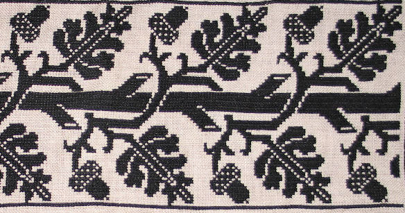
Compare my proportions to the museum examples to see the minor distortion caused by the not-quite-even weave grounds of the historical examples, especially #1.
#1 from the PMA is cited as being worked in silk using cross and eyelet stitches (trapunto). The MFA cites #2 as being stitched in “Punto di Milano,” which is a term they use for a family of pulled thread techniques that produces a mesh-like appearance, often by use of two-sided Italian cross stitch, pulled very tightly. It’s more commonly found as a background in voided work, but pops up for foreground elements and accents, too. There is no consensus among museums on what this technique should be called. To complicate matters, there are several ways of producing the overstitched mesh background look, both single and double sided. Still the execution of these are very close, and both look to have been done using pulled thread technique rather than a withdrawn thread method.
But #1 and #2 are not pieces of the same artifact. I’ve confirmed counts between them. There are enough small differences in strip width, ground cloth thread count proportions, stitching and minor pattern details to conclude that #1 and #2 are not twins separated after birth. But they are so close that I’d opine that they were probably stitched from the same source – pattern collection sampler, printed broadside, hand-drawn pattern, or source artifact. There’s even a remote possibility that one of these is the paradigm for the other. We can’t say for sure, all we can do is note that they’re children of the same family.
Now #3 and #4 might be more closely related. The width measurement, count, proportions, form and color placement on them are extremely close. Even those nasty little skips that give the tree branch bark its texture are spot on exact in placement between the two pieces. But I can’t say for certain that they are either pieces of the same original, or photos of the same artifact. Pieces have moved between museums before, and even the most scholarly author can make a mistake in attribution. The problem is the accompanying descriptions. #3 is in Punto di Milano. But the Kendrick-Holme book specifies that #4 is “embroidered with red and green floss silks in satin and double running stitches.” Again, attributions might not be correct. I wish I could find out if #4 is still in the V&A, and get a closer look at it.
So to sum up, again we’ve got a recognizable and stable pattern, possibly spanning centuries of active use. I think the attribution on #1 is a bit early, but I have no proof. We’ve also got two and possibly three different methods of execution, and evidence that variants of the same pattern were worked in both monochrome and multiple colors. We can posit that multicolor variants came later, but we cannot flatly conclude that monochrome came first, due to the broad and overlapping range of dates given for these pieces (with the 15th century date discounted as a possibly questionable outlier).
There are lots more of these in my notebooks. I find this fascinating, but I realize that not everyone is an uber-stitch-geek like me. Please let me know if you’re bored to tears, or if you’d like to see more examples of patterns over time.
YAAY FOR MONTENEGRIN; LONG LOST TWINS PART I
Work continues on my long green sampler. I was a bit of a stall last week, but with the help of the excellent Autopsy of the Montenegrin Stitch, Exhumed by Amy Mitten, I’ve forged on ahead. The Montenegrin is what I’m using for the dark accent stripes in the interlace:
Autopsy is a small flip book that contains nothing but diagrams for two Montenegrin stitch forms, showing the order and logic of the individual stitches. How tough can that be? Plenty tough. What the book lays out is the stitch sequence for EVERY junction where horizontal, vertical and diagonals meet. As you can see from my piece, there are lots of junctions possible! This is a boutique item to be sure – not everyone leaps in and rolls around in this particular stitch style, but if you are planning a project using it, the book is well worth its its price.
It’s no secret that I’m nearing completion of my own book. I’ve got about 60 plates of patterns done. 58 of them are complete. I may or may not expand that to 62 for publication. I have to make some decisions on some out-takes and patterns that span multiple pages. I have the companion “about” pages written. I’ve got the bibliography done. I’m working on the introduction now. And as I do so, I’ll be posting related bits to String. I can’t include museum photos in the book without licensing them. But I can use links to those photos here. Much of this material is stuff I covered in my Schola lecture. But instead of running through the travelogue of styles and techniques, I want to start with the fun part. The “Long Lost Twins” examples.
Long Lost Twins Part I
The counted thread styles I’ve been working for the past three years are quite well represented in museums worldwide, largely thanks to those interested in historical embroidery between 1870 and World War II. This is the era that included both Freida Lipperheide whose pattern collection documented specific artifacts (published in 1880s), Louisa Pesel (a leading needlework researcher most active from around 1900 until her death in 1947), and Arthur Lotz who cataloged all extant modelbooks (published in 1933). There were countless other books on old lace and needlework, and collectors ranged all over Europe harvesting examples. Many of these collectors amassed impressive assemblages of artifacts, and their collections form the backbone of what’s available for view at the Metropolitan Museum of Art in New York, the Boston Museum of Fine Arts, the Hermitage in St. Petersberg, the Philadelphia Museum of Art and others. We owe a lot to their diligence and enthusiasm.
However the collectors were rather more of the Indiana Jones school than we as modern stitching devotees would like. The pieces are not clearly associated with provenance or date. Often they are small snippets disassociated from the original integral artifact, so the exact nature of the item they adorned is open to discussion, and center strips that might have been used in combo with additional narrow edgings have been cut and removed from context. Styles and patterns were also relatively conservative, appearing over long spans of time. Unlike samplers which have an increasingly wide body of academic research documenting them, these (mostly) domestic embroideries have drawn lesser attention, probably because they are anonymous and problematic to date. I don’t claim to be an academic. I’m just a dilettante. But I can observe. And this series contains some of my observations.
But enough dry disclaimer. Here’s our first example of fun.
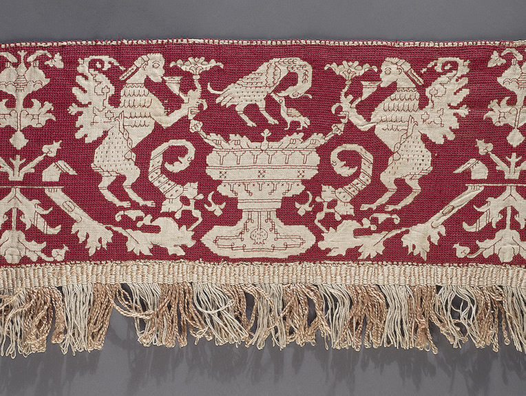
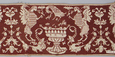
The image on the left is Valence Embroidered with a Grotesque Motif, now in the Hermitage Museum. They date it as 16th century, from Italy. It’s stitched in red silk on linen, with a pulled thread background to achieve a mesh like effect and double running stitch for the outlines and details. The whole piece is about 5×29 inches or 13x75cm, unclear if that’s with our without the fringe, or whether the photo shows the entire artifact. The Hermitage obtained this piece in 1923. The item on the right is Border, Accession 14.134.16a in the Metropolitan Museum of Art. They date it as a 17th century Italian work. I’ve only shown one repeat, but the whole two+ repeat artifact is shown on the museum photo. It’s 6.14 x 24.5 inches or 15.9 x 62.2 cm. It was acquired in 1914.
You have to admit, they’re pretty darned close. If anything the later work has a bit more detail than the earlier one (although the earlier piece shows more diligence in filling in the more difficult tiny background bits inside small diameter swirls. This usually not the way the generation to generation transcription of patterns works. Detail is usually lost, with chubby Renaissance cherubs devolving into the minimalist “boxers” on 17th century samplers. To date I have not seen this pattern in a period pattern book.
As to the iconography, the pelican vulning itself (pricking its breast to produce blood to feed its young) is a standard image of the time. The obvious allegory is self-sacrifice. The other two winged creatures are rather sphinx like to me – wings and feathers, heads of women, lion bodies. They appear to be either blowing pan-pipes or sipping on flowers, depending on which piece you are looking at. The well or giant urn and vegetative components are very standard. Large urns flanked by facing beasts or mythical figures are very common in weaving and other decorative arts of the 1500s and 1600s. So what I end up with is a piece extolling virtues of self-sacrifice and wisdom, with a vaguely feminine cast.
Now, why are these so close? I haven’t a clue. I do not know if work of this type was done at home by talented amateurs, or in workshops. The skill level to create these is relatively high by modern cross-stitch kit standards, but in truth it’s not all that difficult, and the majority of today’s dedicated counted thread stitchers would have minimal trouble achieving it. I have no doubt at all that non-professionals in the 1500s could have churned out this work in quantities sufficient to edge bed hangings, sheets, curtains, towels, or pillows. About all I can say is that they are not from the same original. There are enough minute differences between them both in pattern details and the way they were stitched to preclude them being from a matching set.
I also have no choice other than to rely on the museum’s dates. And so we see the weaknesses of the attributions inherited by the museums from the original collectors. Are they in fact close in date with one being rather late 1500s and the other being rather early 1600s? Are they contemporary, from one century or the other? No way for me to tell.
What were they originally used for? Again, these pieces are out of context. We don’t know. The Hermitage pegs theirs as being part of a valence, probably based on the presence of the fringe along the lower edge. Was this part of a bed suite? A good guess, but without pieces or fragments of the rest of the suite, there’s no way to tell. The Met’s sample is even harder to place for use. It’s been totally removed from its origins. If it had accompanying top and bottom borders (very common), or a fringe like the Hermitage piece, they’re long gone.
So what we have are two pieces officially dated up to 100 years apart, recognizably highly similar in design, worked in very similar materials and techniques, from the same general geographic area. The later one displays slightly more detail than the earlier example. We’ve got no unifying source of pattern that link them. My only conclusions are that these prove that patterns were re-used; that they were relatively conservative over time AS IF the workers were stitching from common source material either printed or stitched. I’d also say that small variations work to work validate similarly small deviations performed by modern stitchers wishing to replicate the style and design, but that’s just my own personal opinion.
I have lots more of these. Stay tuned!
