THE UNSTITCHED COIF EXHIBIT
As promised, here’s a recap of the exhibit. It was an immersive whirlwind of talent, exuberance, and fun. I am very happy we were able to go. I just wish we had longer to chat with all the delightful, creative folk in attendance. But first, here’s a run-down of the displays. Note that while the Unstitched Coif was well represented, it isn’t the only project Toni Buckby is doing. More on those other efforts after the coifs…
The Unstitched Coif
I tried to take photos that showed the individual displayed pieces in situ, among their neighbors. The official website http://blackworkembroidery.org is hosting stitcher-provided blurbs and supplemental photos – the same info that is in the official exhibit book. This linked page indexes all of the stitchers alphabetically by first name. I provide the names of the stitchers for each photo below to save squinting. Pop over to that official site page for high-res closeups of any coifs that catch your eye.
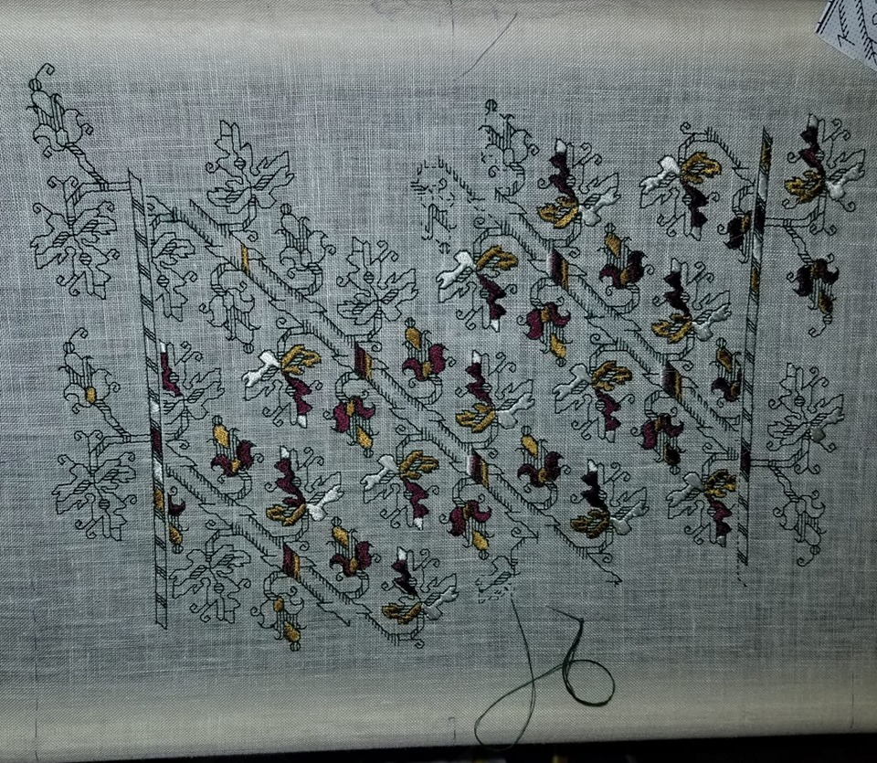
First, the introductory material – a brief on the project, plus a sample of the pattern transcribed onto cloth (but not stitched) and made up into wearable configuration. If you open the poster photo in another window you may be able to zoom in enough to read the text.


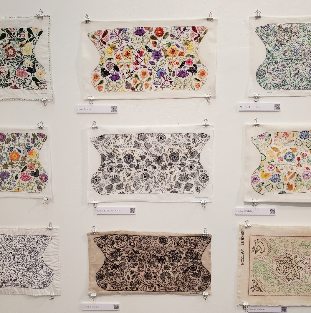
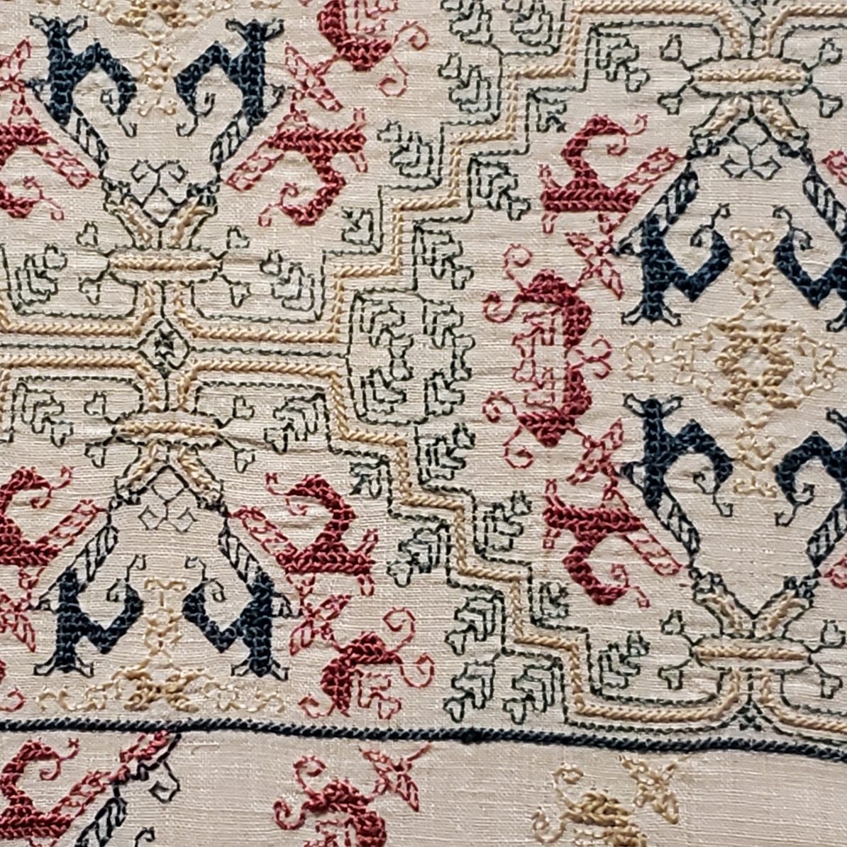
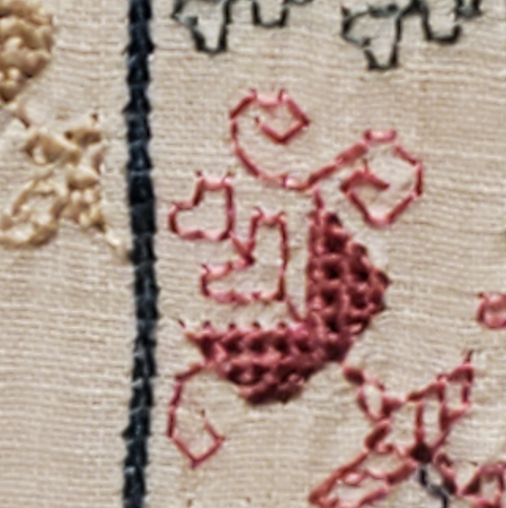
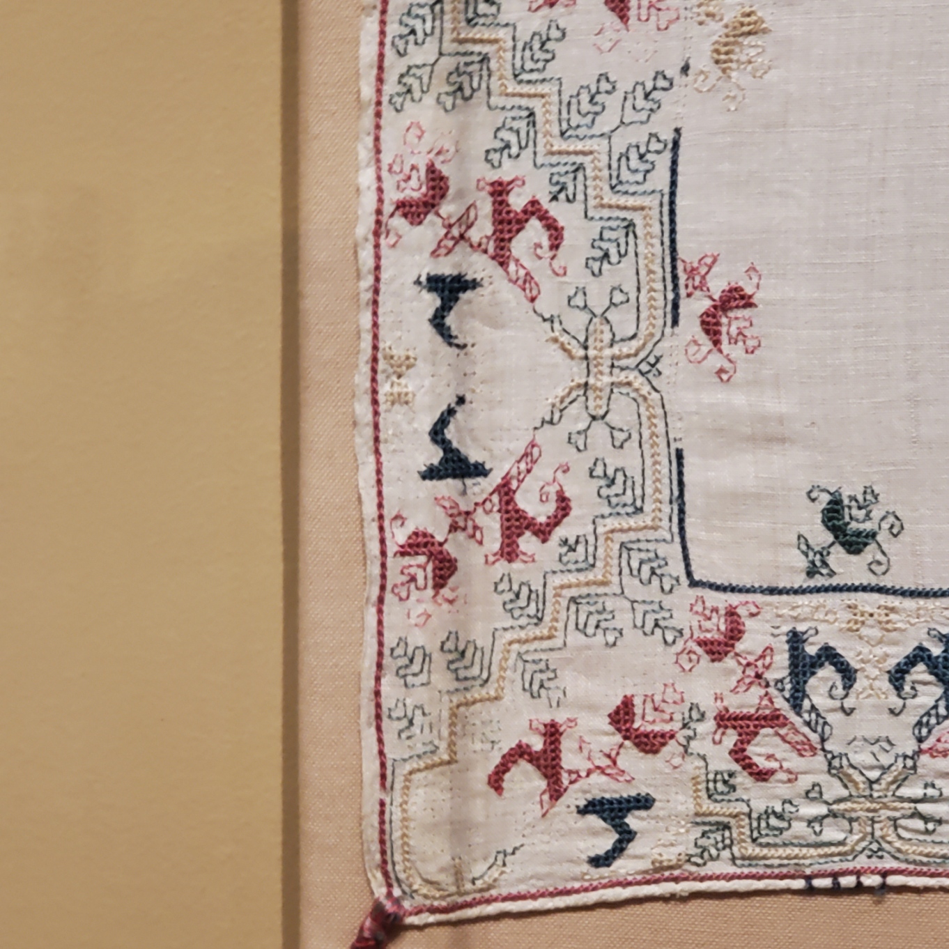
And on to the coifs, in groups of three as displayed. There is an amazing variety of techniques, approaches, color interpretations, embellishments, and general artistic vision. The little QR codes on the name tags led to the stitcher’s personal submissions referenced above. Again, if you see something that you want to examine in lovely detail, go to this page and click on the stitcher’s name to read that material.
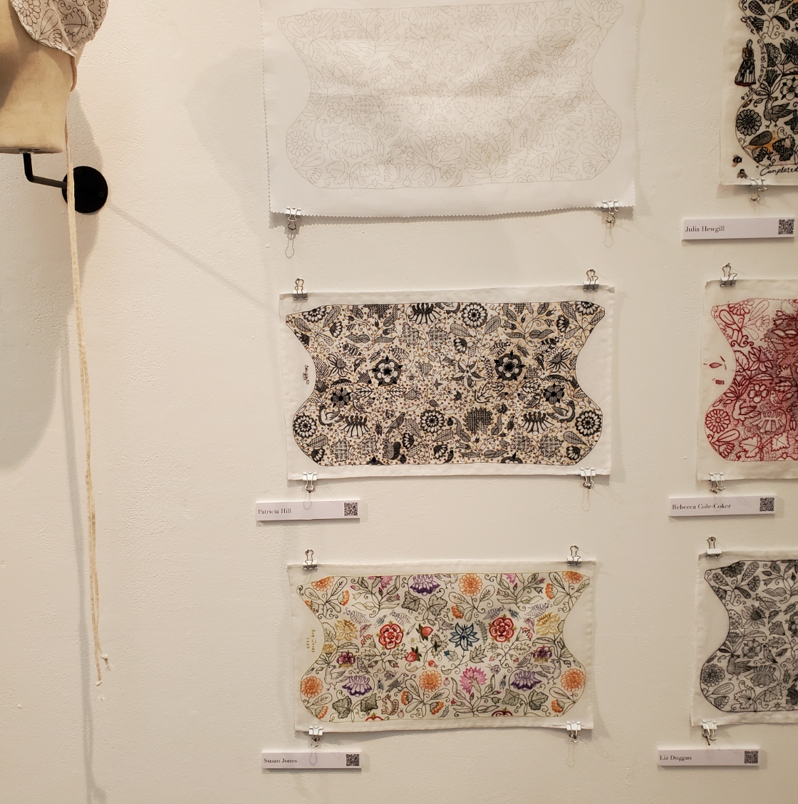
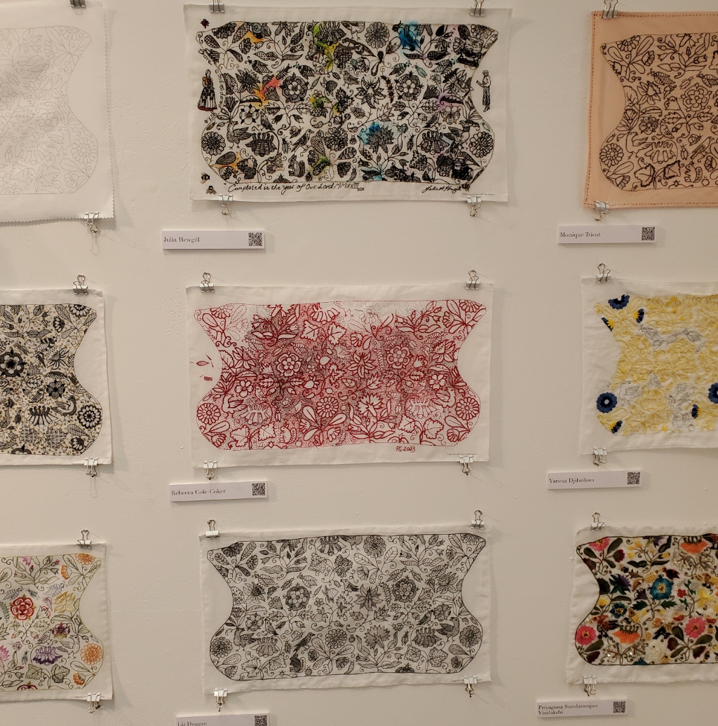

| Unstitched cloth Patricia Hill Susan Jones | Julia Hewgill Rebecca Cole-Coker Liz Duggan | Monique Tricot Vanesa Djibrilova Priyaguna Sundararajan Visalakshi |
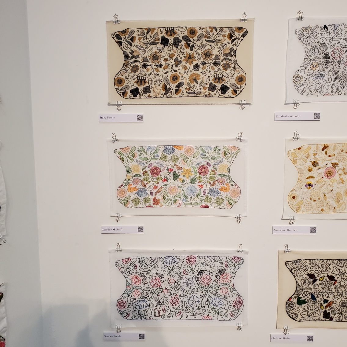

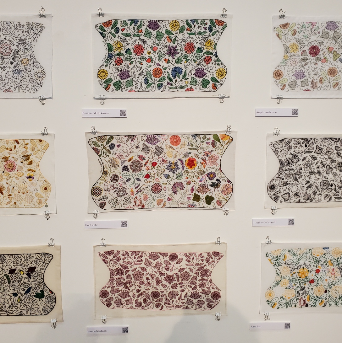
| Tracy Fernie Caroline M. Swift Simone Smith | Elizabeth Connolly Ann Marie Howden Christine Harley | Rosamund Dickinson Eva Cantin Joanna Stachura |
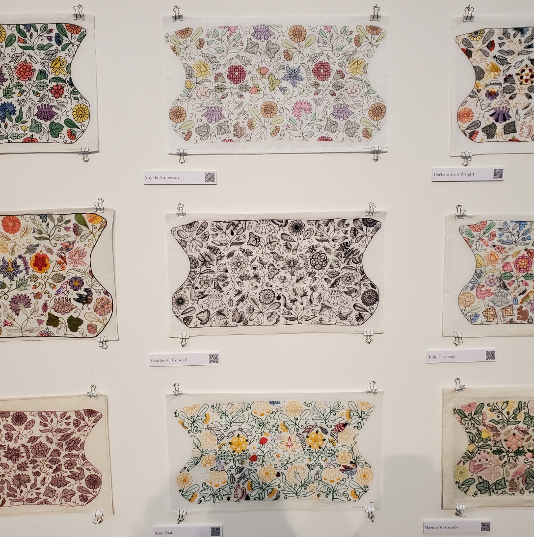


| Angela Anderson Heather O’Connell Aine East | Barbara Jean Wright Julie Cavanagh Marion McCrindle | Elizabeth Dymond Holly Searle Margery Dickson |


| Jane Burnham Vicki Parsons Jen Cable | Anna Tagg Sue Critchley Becky Stewart | Louise Goult Jill Kipnis Sarah Capel |


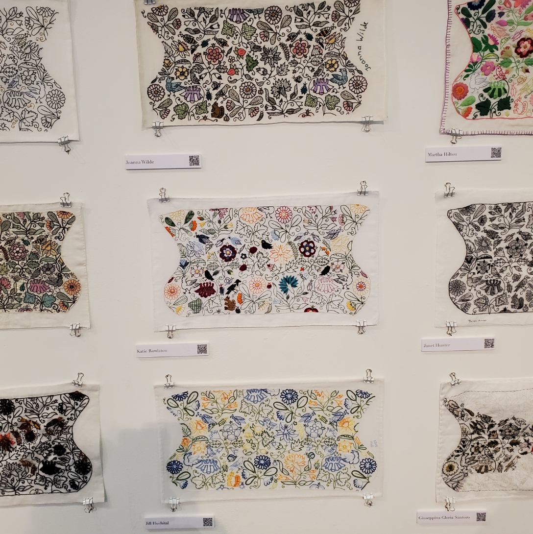
| Catherine Hill Kim Brody Salazar Jen Best | Christine Hillman Jo Tyrrell Victoria Keech | Joanna Wilde Katie Rowlston Jill Huchital |
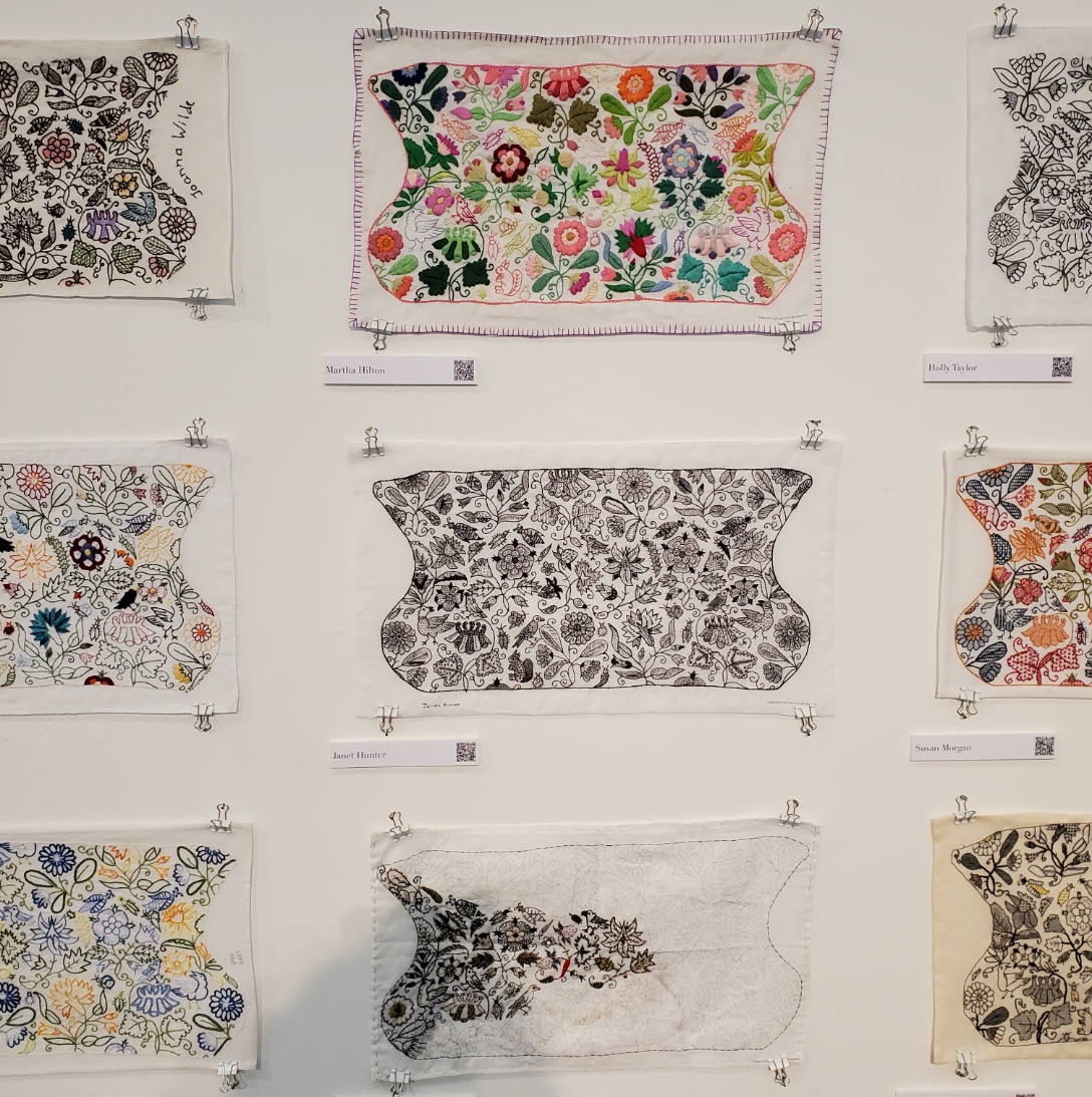

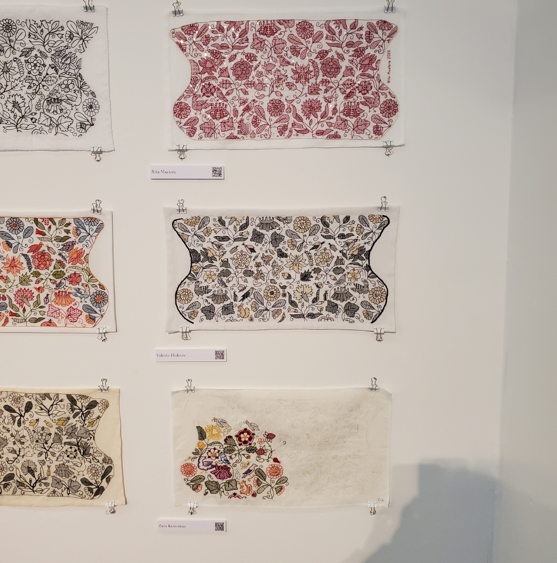
| Martha Hilton Janet Hunter Giuseppina Gloria Santoro | Holly Taylor Susan Morgan Leila Scott | Rita Masters Valerie Holmes Zara Kesterton |
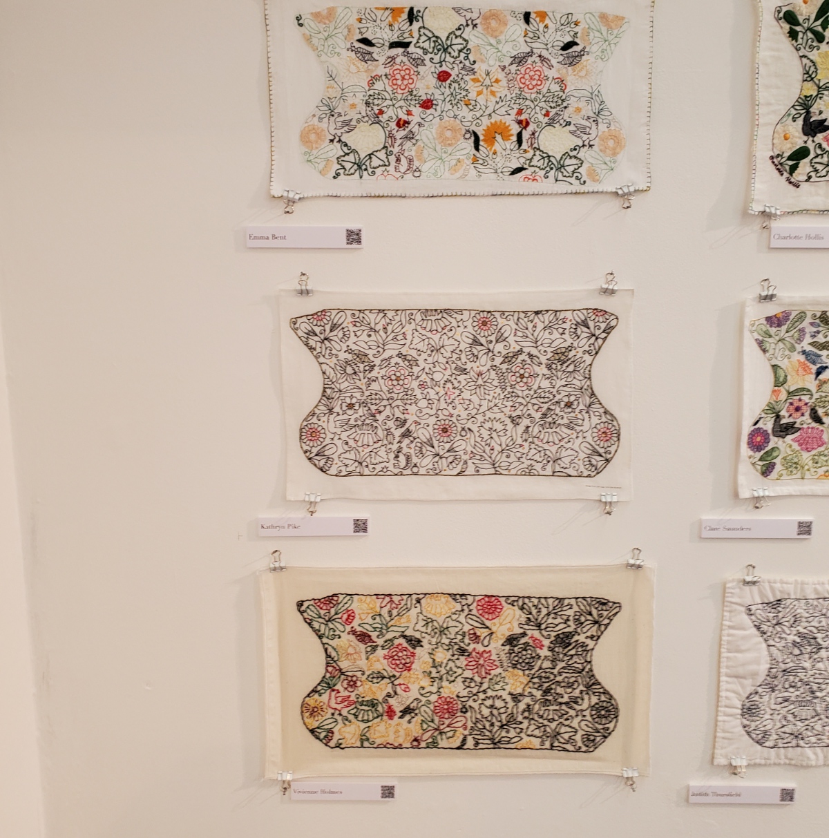
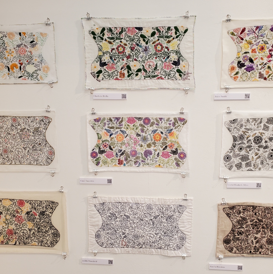
| Emma Bent Kathryn Pike Vivienne Holmes | Charlotte Hollis Clare Saunders Judith Thursfield | Joyce Smith Linda Elizabeth Albin Amelia Brookins |


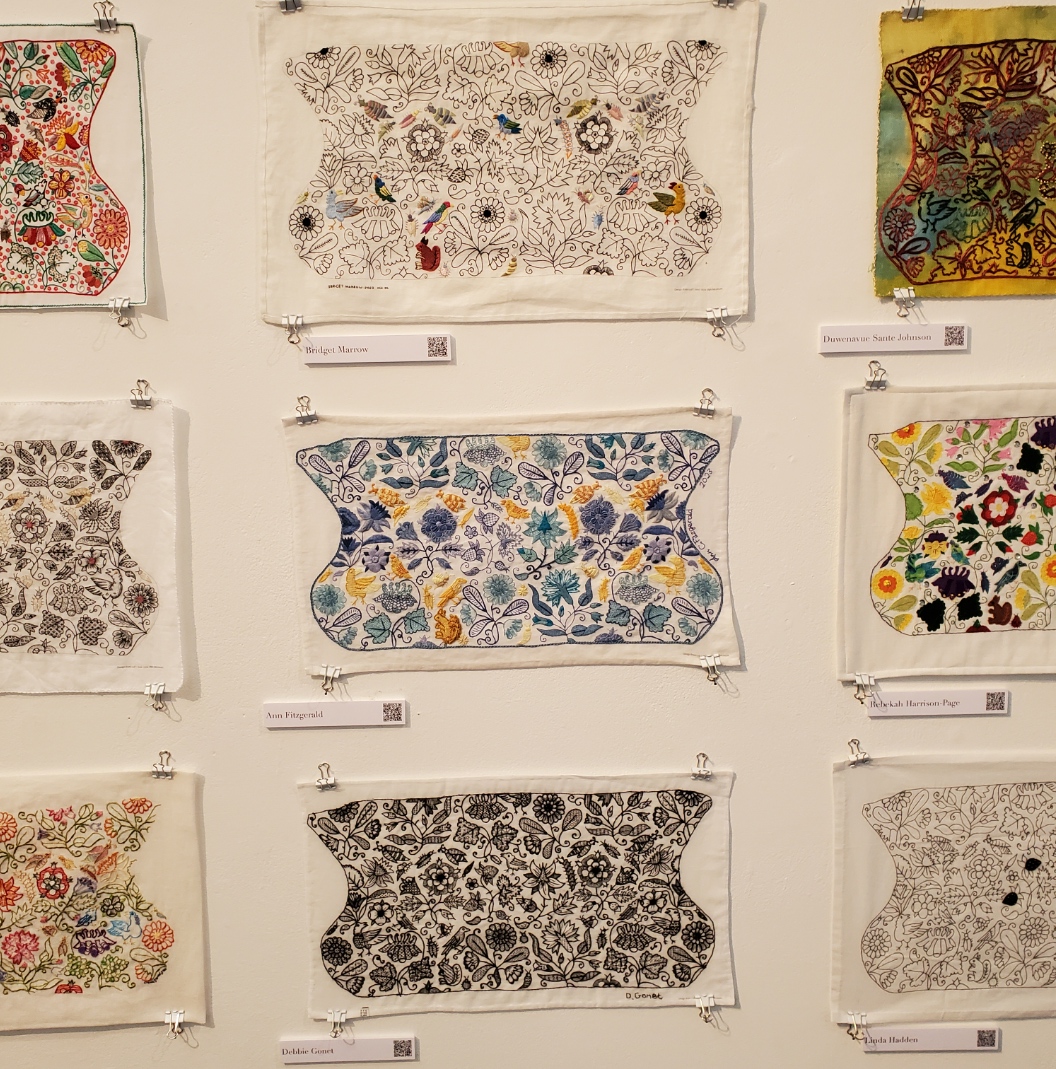
| M. Faye (Fred) Prior Lesley O’Malley Serena Watson | Isabelle Verny Mathieu Anna Vereker Fiona Johnston | Bridget Marrow Ann Fitzgerald Debbie Gonet |
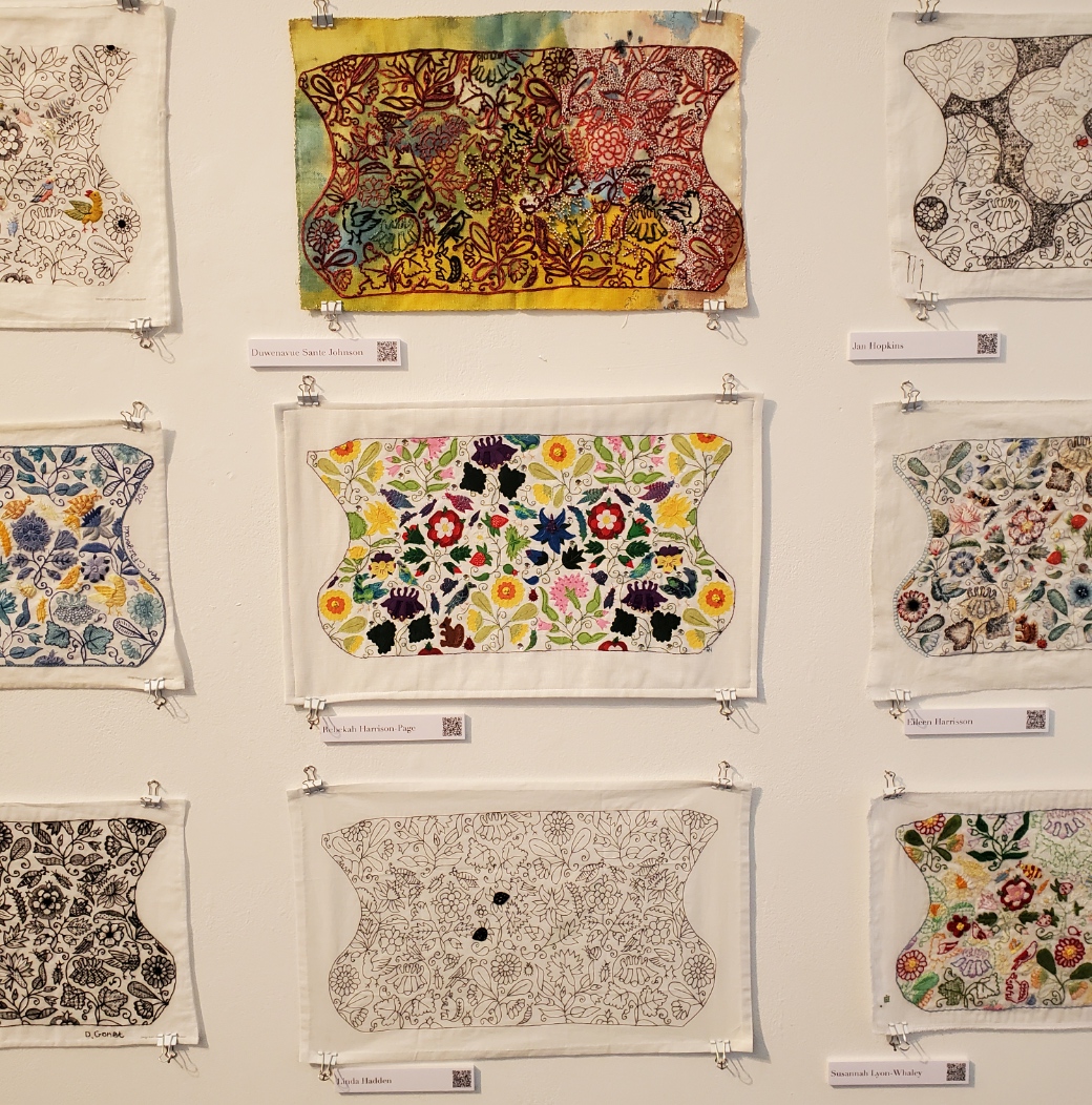
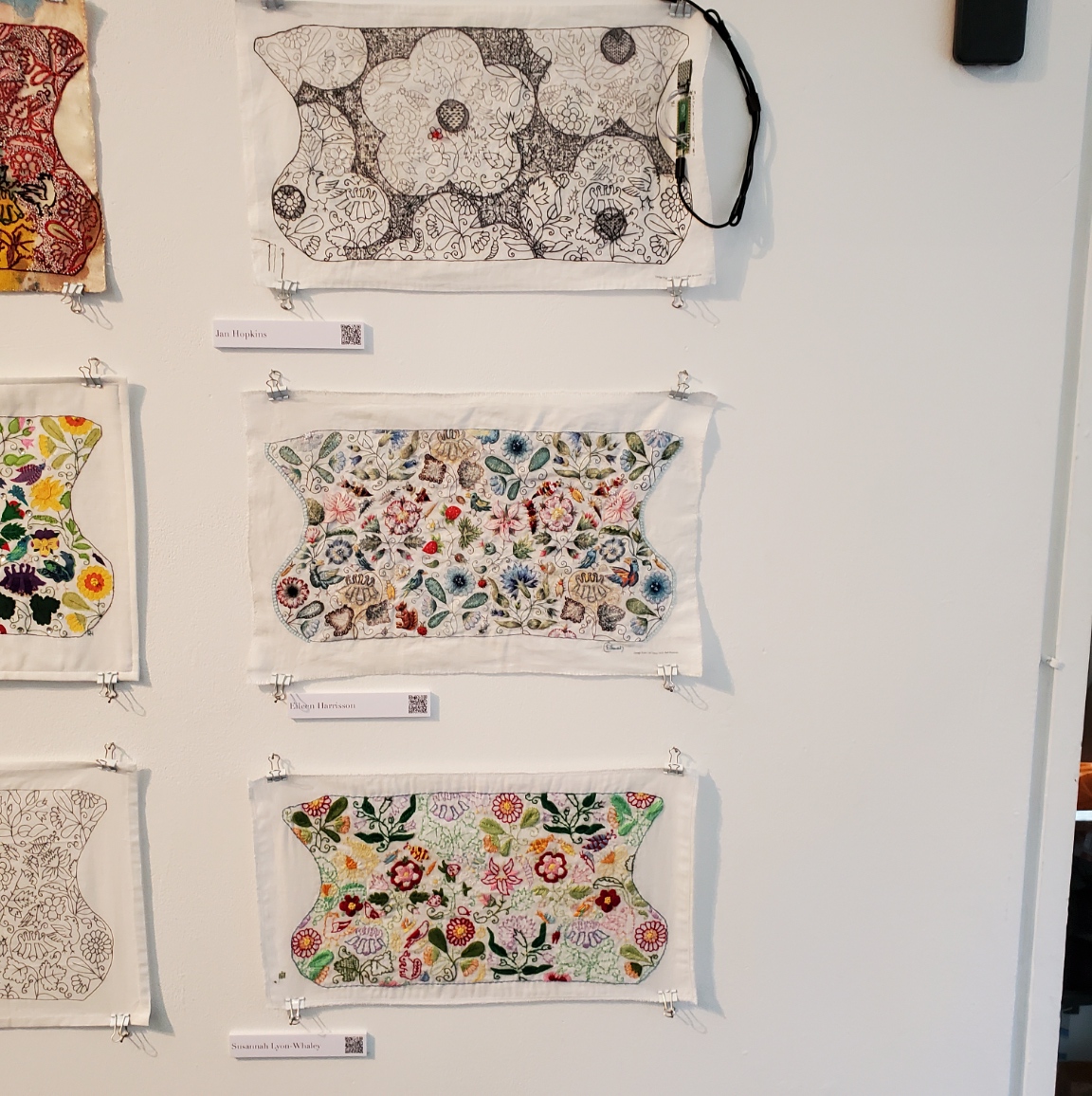

| Duwenavue Sante Johnson Rebecca Harrison-Page Linda Hadden | Jan Hopkins Eileen Harrisson Susannah Lyon-Whaley | Long wall photo to round out the set. |
Coif Replication
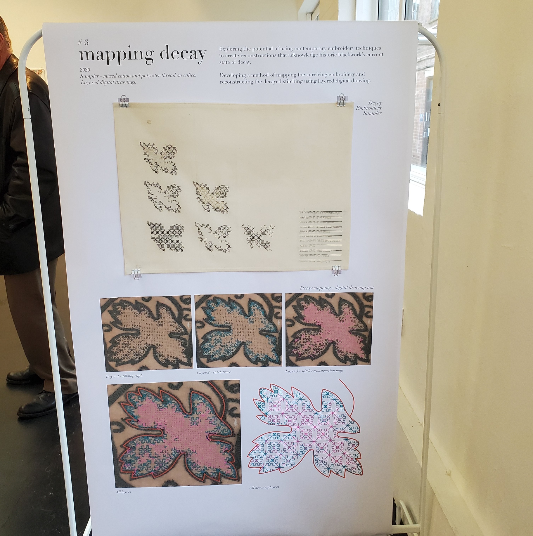
As she describes it, Toni Buckby hit upon the idea for the Unstitched Coif project while working on a replication assignment for the Victoria and Albert Museum. They have many pieces of blackwork that are literally eating themselves to death – the tannic black dye used on the silk threads turns them brittle over time. Now, some 400-500 years after they were stitched they are crumbling, leaving only the holes in the ground behind. But these pieces are still sought after for research by visiting enthusiasts/scholars. Toni was commissioned to do a full stitch by stitch reproduction of V&A accession T.12-1948, a well known and popular (although rapidly disintegrating) piece. Her reconstruction is intended for use in educational and outreach efforts because the original is now to fragile to be handled for view.
Toni sourced modern materials as close as possible to those of the original (the 72/74 threads per inch ground is the same one recommended for use on the Unstitched Coif project). She used forensic investigation of the “fossil” piercings and older photos to work out the now crumbled fills and outlines that can no longer be seen on the artifact itself. Her repro is at right.


Other Forensic Analyses and Reproductions
Toni is mapping out another very famous bit of blackwork in the V&A’s collection – the Falkland Pillow Cover, Accession T.81.1924. (In coincidence, this is the piece whose tiny thumbnail photo in Mary Thomas’ Embroidery Book set me off on my own blackwork journey back in the early ’70s). She is using layered drafting methodology to posit the placement and patterning of sections that have now largely disappeared.

Toni is also in mid-project of an ambitious effort to map the patterns on the three dimensional Falkland Waistcoat , V&A Accession T.80-1924, also a victim of thread degradation, plus other distortions and alterations. The goal of this effort is to chart the 3D design and translate it into flat patterning on garment sections that can be replicated and reassembled into a full reproduction. As you can see, exploring the garment shape by modeling is already underway. (Again, click on the photos to open in a new window, so you can enlarge them to read the text).


There was much more to the exhibit – a series of photos and explanations on materials suitability and choice methodology, and samples of the stitches used. But I’ve gone on long enough.
Suffice it to say that it was total immersion in the subject matter that sings to me, surrounded by people who understand and appreciate the artistry, time, and technique it requires. I met so many people, so talented and so gracious, who took time to chat with me, share their insights, and to mutually giggle in joy of finding others of the like mind. I’ve learned a lot from this project both in my own stitching, and from each and every version displayed here. I am deeply indebted to Toni for pulling the community together, orchestrating the effort, inspiring us along the way, and pointing the way forward, beyond. I do hope that this stitched together fellowship persists, and joins forces on future efforts. I know my needle is sharp and ever ready.
REVISITING THE OYSTERS
This being cookie season it’s no wonder that this post is also about a family favorite, repeated year upon year since 2006 or so. This time, I attempted a slimmer version of our Oysters. That’s a hazelnut spritz sandwich cookie with a chocolate ganache filling – another sort-of invention of mine. The odd name came about the first year I did them. I didn’t grind the toasted hazelnuts fine enough, and bits of nut stuck in the dies of the cookie press. Lots of blobby, odd shapes resulted. We mated them as best we could. But the shapes and top/bottom format made the kids think of the shellfish, so the name stuck.
My original Oysters recipe is here.
Now there’s not much to be done to slim down the ganache – that’s just a strong bittersweet chocolate and cream, no sugar. Yes it has carbs, but a zero carb cookie is an asymptotic goal at best. Like the other cookies this week I subbed in the King Arthur Keto Wheat Flour for standard all purpose, and Swerve granulated (and powdered) sugar substitute for the white sugar. I generally use a bit less of the sugar sub than was called for in the unmodified recipe because I find the stuff to be sweeter than regular sugar. In addition, I ran out of granulated Swerve, and used a third of a cup of their confectioners’ substitute in place of that last half-cup of granulated.
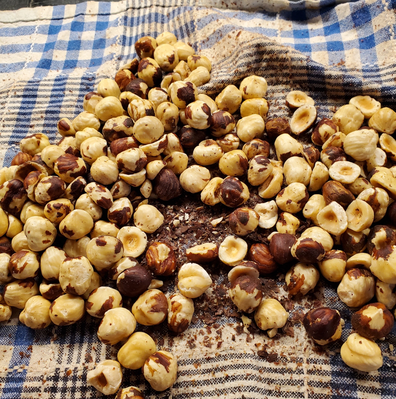
And there was a small complication with the hazelnuts. They were locally unobtainable here this year, although had I known at the time I would have ordered on line from a specialty nut dealer. But fortuitously I did have enough leftover from last year and stowed in the freezer to do the recipe. I’ve used leftover nuts before and have not noticed any degradation in taste or performance, provided they are brought back to room temperature before toasting, chopping or otherwise using in the recipe being prepared.
Here are the hazelnuts after being rolled around and rubbed in a clean linen dishcloth. That flakes off lots of the brown inner membrane. While in an ideal world it would be totally removed, this amount is enough to avoid too many little brown flecks in the finished cookies, and to reduce the bitterness those membranes bring.
OK. So I made the batter. To get the right consistency I needed to add lots more cream than originally specified to achieve the peanut butter-like consistency. The dough needs to be just firm enough to pick up and pat into a log to insert into the cookie press, but still quite soft. Some years even with the “full octane” version I’ve had to add more than the recipe’s 6 tablespoons of milk or cream to get there. Perhaps the flour those years was drier than usual In any case, King Arthur does warn that recipes may require additional liquid to work properly with their Keto flour. I ended up using about 9.
I was very encouraged by the swift and easy cookie press action. One two-stop squeeze for each cookie, forming them fairly flew. Here they are unbaked.

Obviously I use one of the larger hole dies for the cookie press to avoid a repeat of “the oyster problem.”
On to actual baking. That’s where things began to be noticeably deviant from standard. Like the peanut butter cookies for this year and the two prior, these cookies sweated a lot of oil. I might have been able to reduce the shortening in them, but once a batter is mixed you can’t get it out again. They floated around on the surface of the silicon baking mat, in effect frying in that oil.
Here’s the last sheet with the stragglers. Admittedly I let that sheet go a minute or two longer than I should have – the cookies shouldn’t be that brown around the edges. And that odd man out is the last cookie – the traditional cook’s share – fashioned from the remaining bit in the cookie press that can’t make it through to true cookie form.
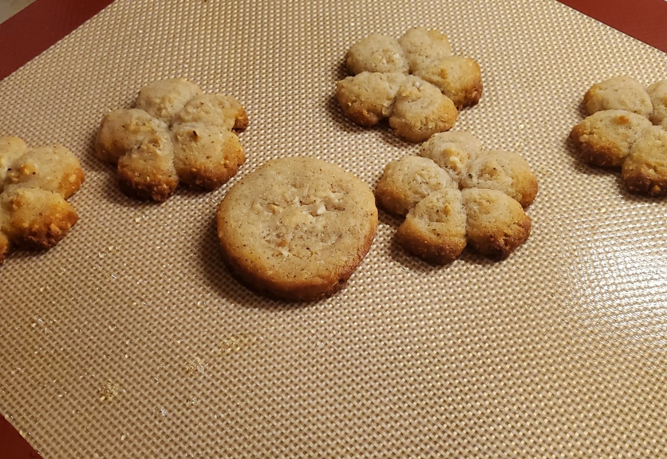
See those droplets on the mat? That’s fat exudate from the cookies. It’s hard to see but there’s a lake of it on the mat.
Still the cookies were cohesive and semi-attractive. Now, how did they taste?
Sadly, like the gingers, peanut butters, and chocolate chips, only a glimmer of their true selves. That ubiquitous cardboard-rye taste of the Keto flour overwhelmed the hazelnut flavor. They look ok, but to me at least they are yet another disappointment. Obviously the chocolate ganache will punch them up a bit, but that won’t happen until next week. I am delegating filling these to Younger Spawn, whose baking expertise is far in advance of mine. It’s best not to fill these too early because they do change texture as moisture from the ganache seeps into the spritz cookie.
I’m done with the slimmed portion of the cookie parade. That’s three years in a row I’ve attempted to make a less sinful cookie, and three years I’ve not been satisfied. I am afraid the answer may be not trying to re-engineer the cookie. It may be just to not make them anymore. This may well be the last year for ten types of cookies. Especially considering that the Keto flour and sugar substitute are four times as expensive as regular ingredients. Perhaps next year I will go full octane, making the originals but only as half- or quarter-batches of five types, and no longer share the largesse.
A SLIMMED DOWN GINGER
No, I’m not going to write about a red-haired friend embarking on a diet and exercise program. This is one of the holiday baking posts that intrudes on the otherwise fiber-filled menu here at String each December.
Back in 2018 I mashed together several thoughts and came up with another more or less original cookie – the Triple Ginger White Chocolate Chip. I posted the recipe for it in 2019 after two full and successful holiday cookie test runs.
The dough for it is of the same basic type as a chocolate chip cookie, perhaps a bit lighter on the brown sugar, with added cream for more richness, and three types of ginger – dry ground ginger, minced candied ginger, and ginger juice – to give it kick. As I had done them before they were delightfully sharp and gingery, lighter than gingerbread, with the white “chocolate” morsels acting sort of like internal frosting, bringing little bursts of sweetness. They quickly became a family favorite, and I’ve done them every year since.
This year, the third year I’ve been attempting to bake at least some of the cookies in lower-carb incarnations of their former selves, I tried to reduce the caloric load of this cookie. I had dismal results in previous years using various mixes of almond and coconut flour for other cookies. A few were absolute failures, but I was encouraged this year by the introduction of King Arthur Keto Flour. I haven’t used it for bread, roti, or tortillas yet, but that may eventually happen. I have tried the recipes they posted for it on their website, for pie crust and chocolate chip cookies. Neither was good enough to post links for them. I also used various Swerve brand monkfruit based non-sugar sweeteners.
The Keto flour and the Swerve granulated, brown and confectioners sugars all claim to be near analogs in baking – in theory they can be subbed one-to-one for conventional products. In practical use, not really. More like “kinda” and “maybe.” To start with I find the Swerve products are sweeter than regular sugars. And the King Arthur Keto flour isn’t as hydrophilic as normal wheat flour (it doesn’t suck up as much moisture or fat). It also browns faster, but doesn’t leap from raw to burnt the way almond and coconut flours do. In fact, it does ok for dusting and pan frying – something the other flours totally fail.
As a result I tend to tinker with conventional recipes when subbing in these products. I will scant the quantities of the fake sugars by a tablespoon or two, and tinker with the liquid and fat levels when I use the fake flour to avoid a sticky, greasy dough.
Here is the cookie dough for the Triple Gingers this year, with amendments. I used my original but I left out a tablespoon of brown fake sugar and two of the white fake sugar, and added an extra tablespoon of cream:

It looks pretty normal, although the dough isn’t “sticking” to the chips like it usually does. But I continued on. I always fridge this type of dough overnight before portioning it out and baking it.
I did the usual – scooping using my 2.5 TBS dough scoop (like a little ice-cream scoop), then dividing the lump in half and rolling it into two balls. We like small cookies at holiday time because there are 10 types on the plate. Little cookies let folks sample without being overwhelmed.
Usually what happens with these drop cookie doughs is that if I make a generally round-ish ball, it melts during baking to yield a flatter nicely circular cookie. Here’s a picture of the Triple Gingers from a previous year to illustrate:

And here are this year’s. But not even the first most lumpy batch. That set went into the oven and then emerged in exactly the same shape – misshapen balls. No melting, no spreading. So when I made the second batch I flattened them with the heel of my hand. Again, no melting, no spreading. They may be blobs, but at least they are somewhat cookie shaped. Second and third batches seen before (left) and after baking (right):
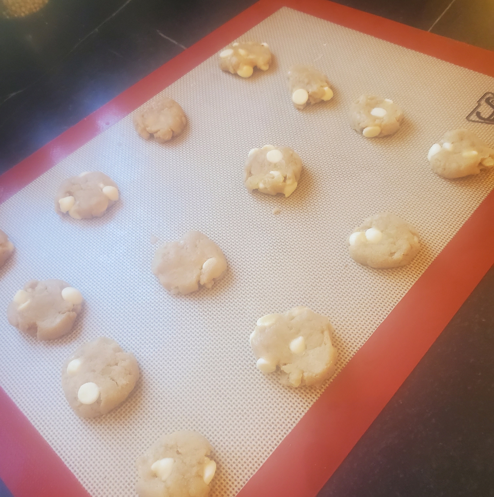

Not my most attractive product, for sure. To be fair, I did notice that the King Arthur Keto chocolate chip recipe didn’t make spreading cookies either, but I thought that was because I did something wrong. Those also just didn’t taste right. Kind of like I had used rye flour and cardboard by mistake, and with the texture of a store-bought packaged cookie, and not a comforting home-made one.
Back to the Gingers… How did they taste? I sampled (of course). While they are ok, they are not as they should be. They don’t have the cardboard/rye flavor I didn’t like in the chocolate chip cookies, which is good. But they don’t have the ginger punch of my original recipe, and I suspect they will get hard quickly. They are sweet, with a pleasant caramel note, but that note reduces the ginger to an afterthought. Ugly and disappointing as they are, they are still serve-able, and will take their place in this year’s cookie line up. But obviously more tinkering is warranted. Between the differential take-up of the butter by the flour, and the performance of the fake sugar, successful adaptation will take a lot more than just dumping more ginger into this recipe.
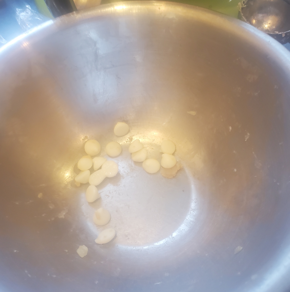
And as a last note – remember I said that the dough didn’t hold onto the chips? I had to jam them in, which is why so many are on the surface. When I was done forming the cookies I had a puddle of extras left behind. I’ve never seen that happen before with any type of morsel-bearing cookie.
And I think I should get a medal for not snacking on them as I finished the bake.
A SPANISH GENTLEMAN AND HIS COLLAR
Once again discussions on Facebook have brought a portrait to my attention. Elspeth over at Elizabethan Costume has found something I’ve been seeking for a long time. An portrait of an individual with a Spanish name, with a sitter that is wearing what we would describe as blackwork.
While 19th and 20th century discussions of blackwork in the Tudor period often call it Spanish Blackwork, and offer “Spanish Stitch” as another name for double running. But there are very few portraits of Iberian individuals wearing it, as one might think there would be if the folk attribution of Catherine of Aragon’s introduction of a style already popular in her homeland was to be corroborated. This portrait, dated 1530-1532 is by Jan Gossaert, and is part of the J. Paul Getty Museum’s collection, accession 88.PB.43. It depicts Francisco de los Cobos y Molina, who served in Charles V’s Holy Roman Empire court as a trusted secretary and advisor. The Morgan Library and Museum notes the absolute identification of the sitter. Note that shortly after this was painted, Catherine far away in her English court was only a year away from Henry’s declaration that their marriage was invalid (1533) and her subsequent sequestration.
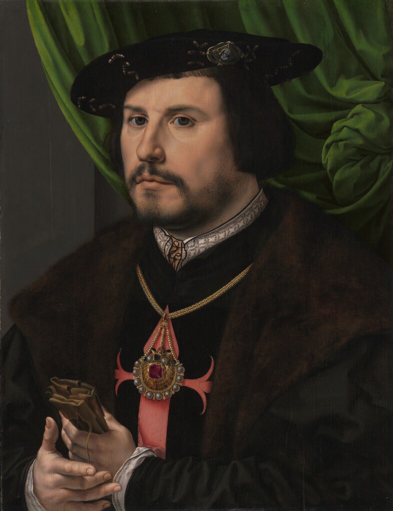
There are higher resolution pictures at the museum link, above.
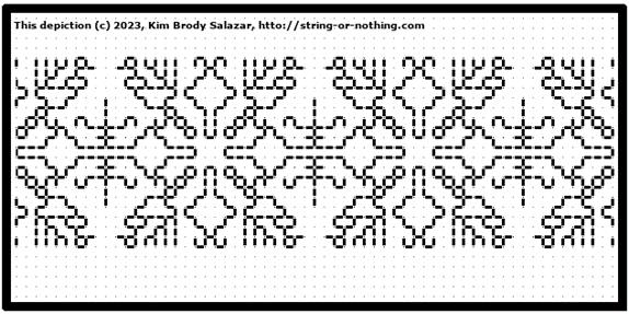
To say thank you to Elspeth and to spread my joy in finding a heretofore unknown bit of delight, I share a graph for that collar.
Click here for a full size downloadable PDF of the pattern below.

Now. How “authentic” is my representation?
I’d say it’s no more than an honest representation. Remember that the original I am working from is a painting. The painter did his best to capture the alignment of the verticals with the horizontal interfaces, but he fudged almost all of them. What I’ve done is to show the design elements in as close to the original proportions as I could manage, with the correct number of “pips” inside the boxes formed by the repeat, and represent as well as I could the marching row of them more or less evenly spaced across the top edge of the collar band. Like the painter, I have fudged the geometry of the thing to make it fit. And of course the nature of those pips is open to interpretation. Little hoof-like triangles? A three pronged fork, bent to one side? Should the ones in the square be closer to each other than I show? Should the middle one of each box side be taller? All of these would be as valid as what I show. After all, a tiny blob of paint can be seen in many ways.
I will be adding this pattern to the Embroidery Patterns page here at String, so it can be easily found in the future. If you choose to try out this design, please feel free to share a photo. I do so enjoy seeing what mischief these doodles attempt out there in the wide, wide world.
MORE ON THE UNSTITCHED COIF EXHIBIT
It’s coming! Here is the official flyer.

The stitching on the flyer is by Toni Buckby, the Unstitched Coif Project’s Fearless Leader. The original she reproduced under the auspices of the V&A is in their collection, It’s rather well known, made between 1570 and 1599 (Accession T.12-1948), but is rapidly deteriorating because the dye used on the black silk continues to eat away at the fiber. The thing is extremely fragile these days, with the stitching crumbling, leaving only needle holes behind. As a result, the museum commissioned a stitch-perfect duplicate for educational outreach, to limit handling of the now endangered original artifact. Toni undertook this assignment, performing forensic analysis of the damaged bits, and examining old photos to puzzle out missing patterns, then sourcing materials and employing methods as close as possible to those used in the 1500s. Toni says that the reproduction informed the Unstitched Coif project concept and planning. The linen sourced for that is the same 72×74 count recommended for Coif participants.
In addition to the gallery exhibit Toni plans to update the Coif project’s official website with photos of all 130 submitted pieces. Each one is a different interpretation of the same drawn outline. Some are monochrome, some are multicolor; some include counted fillings, others use freehand fillings; some are surface embroidery of other styles; a few sport beads, paint, or other inclusions. The website has already been updated with a suite of downloads of the drawn outlines, prepared for several paper sizes. Toni is also exploring the possibility of a printed book, with photos and accompanying blurbs for each coif, as supplied by its stitcher. I do not know if the book will be a limited circulation run or if additional copies will be available for non-participants to buy.
I am looking forward to seeing the exhibit in person. I will be flying to the UK from Boston, to be at the opening event and at a private reception for participants later in the week. I will be taking a lot of photos of the coifs plus other exhibits in situ. If you are among the overseas participants who won’t be able to attend, and you want to see how your piece is displayed, please message me. If I know what to look for (a photo would help), I will try to find your coif and take a picture of it as it hangs in context with its neighbors.
UP CLOSE AND PERSONAL!
Yesterday a friend and I went to the Boston Museum of Fine Arts, in specific to see the “Strong Women in Renaissance Italy” exhibit. We also took in “Fashioned by Sargent”, and wandered at will and whim through other halls, especially those in the new wing. All in all, it was a splendid day out, full of fascinating things to see and discuss, in excellent company. This post focuses on the Strong Women exhibit. I enjoyed the Sargent exhibit, too, but I took fewer photos. If my friend has more than I do, I might do a follow on about it though.
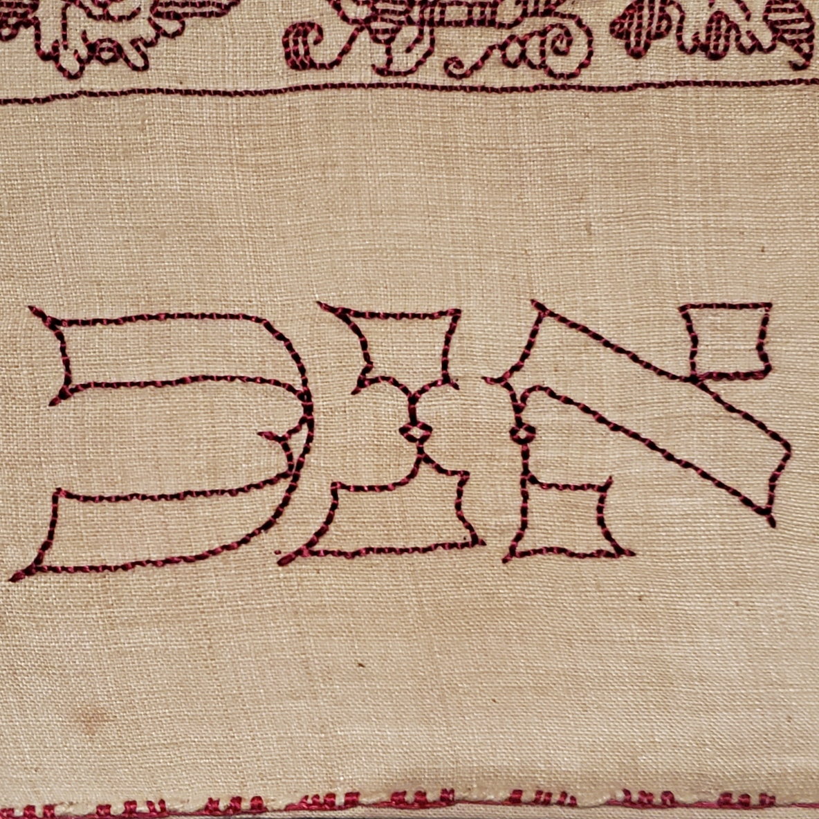
My main motivating reason to go was that the Renaissance exhibit included an artifact I’ve written about before. On loan from the Jewish Museum in New York is Honorata Foa’s red countwork Torah binder. Here is a photo I took at the MFA, of a bit that’s folded under in the official Jewish Museum photo linked above.

And an ultra-closeup. Note that the work is stitched over a grid of 3×3 threads.
Compare the original to my rendition, stitched on a big-as-logs, known thread count of 32 threads per inch, over 2×2 – 16 stitches per inch. Yes, I brought it with me, and photographed it held up to the glass display case.
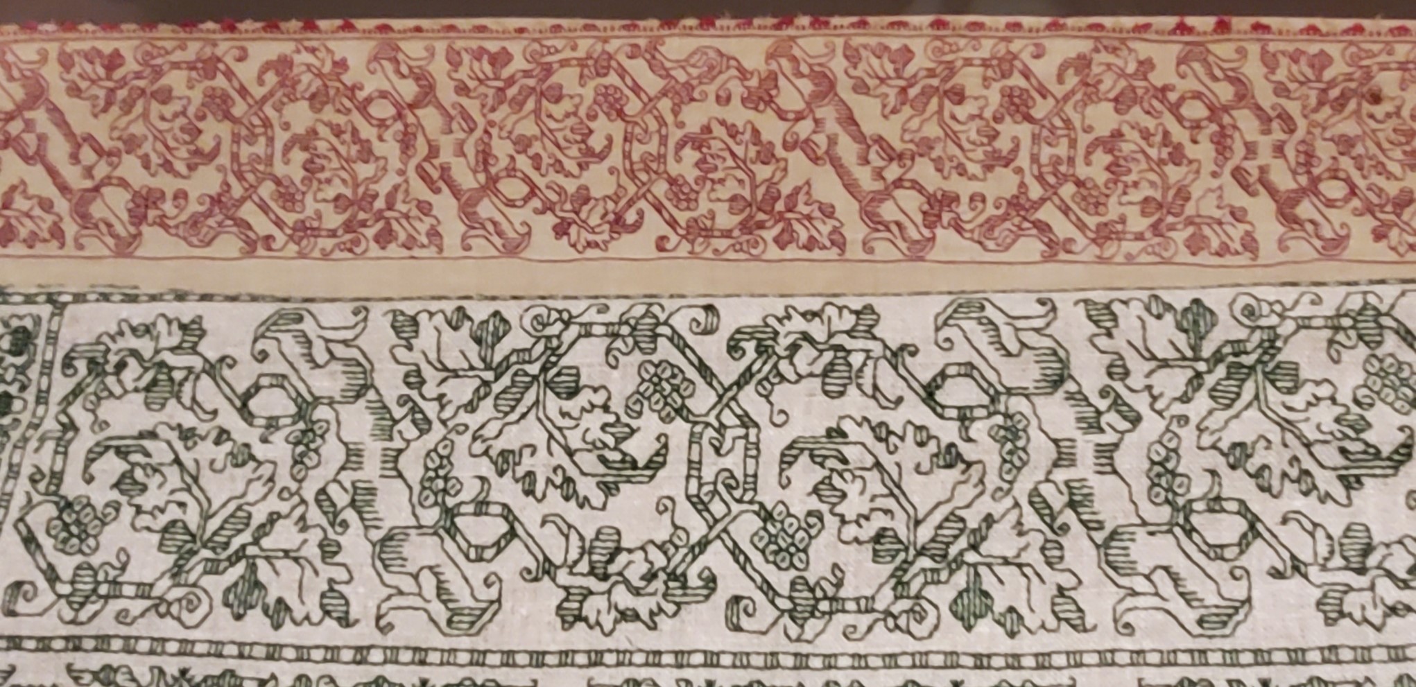
Given the difference in scale of the two, and allowing for the inch or so of distance between them, a rough eyeball estimate is that the ground for the Foa original is about the equivalent of the 72-ish count linen we all used for the Unstitched Coif project. I also think that the weave on the Foa original is ever so slightly more compressed east-west than it is north-south. making the diagonals a tiny bit more upright than they are on my version. Fascinating stuff!
Now that I see the structure, scale and alignment of the Hebrew letters, I am beginning to think that they were written out and then over stitched, conforming as much as possible to the 3 over 3 rubric, as opposed to the regular countwork of the foliate strapwork above them. For one, they don’t inhabit the same baseline. And they do seem to employ improvised angles and variant stitch lengths, although they were clearly done by someone with a skilled hand who took pains to keep stitch length as uniform as possible over those variant angles. Even so, I may be able to improvise a full alphabet of them, adapting the missing letters from the forms of those that are displayed and known. Another to-do for my ever-growing list…
The Foa Torah Binder was not the only fascinating bit of needlework or textiles on display. On the non-stitched side, there were two long lengths of sumptuous silk velvet brocade, one with a manipulated texture (possibly stamped to create highlights and shadows). What struck me the most was the scale of the patterns. The pomegranate like flower units were as big as turkey platters – far larger even than the legendary motif on the front and center of the famous Eleanor of Toledo portrait:
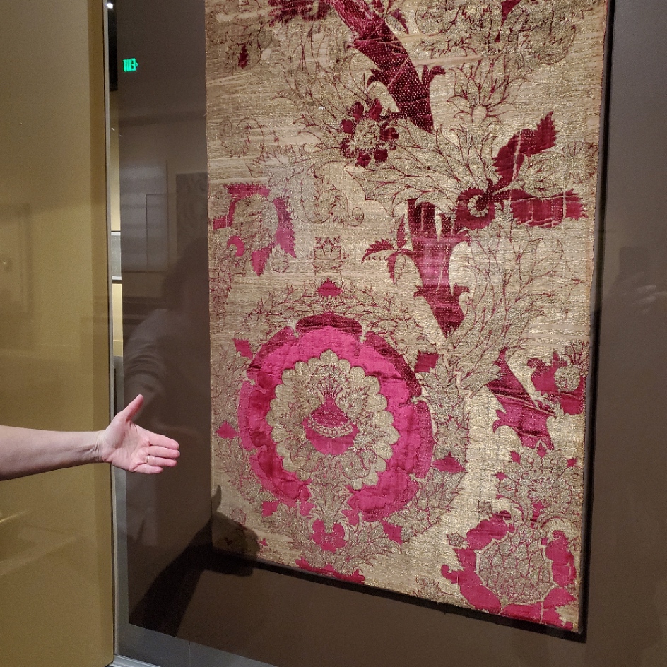

The red one on the left was credited as “Length of Velvet”, from Florence, circa 1450-1500. MFA accession 31.140. The helping hand for scale was provided by my friend. The one of the right is “Length of Velvet”, possibly from Venice, 15th century. MFA accession 58.22. The photo at the museum link is closer to the color (the gallery was dark) and shows off the highlights and shadows impressed into the velvet. Those aren’t two colors, they are the product of some sort of manipulation of the nap. It’s not shorter in the lighter sections, it looks like it’s all the same length, but some just catches the light differently, which is what made me think that it might have been heat/water manipulated with carved blocks. But that’s just the idle speculation of someone who knows nothing about fabric manipulation techniques.
There was another counted piece. It can be difficult to judge the size of these from on line museum photo collections. Even when the dimensions are given, sometimes it just doesn’t input.

Photo above shamelessly borrowed from the museum page, where they describe it as a towel. The object’s name is a purported description of the stitches used. Punto Scritto and Punto a Spina Pesce MFA Accession 83.242, Italian, 16th century. Towel size? Nope. Tablecloth to seat 8 size. Wow.
Here are my photos.
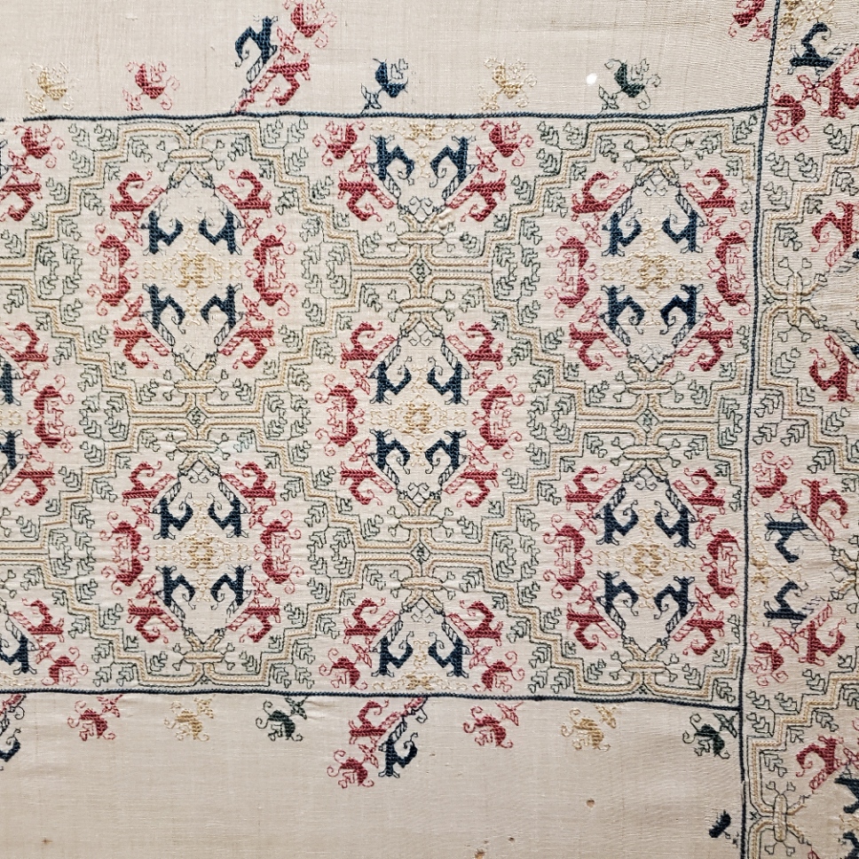


Punto Scritto is another name for double running stitch. That’s ok. Punto a Spina Pesce has been used by the museum to describe some but not all Italian works featuring a variant long armed cross stitch. I think I can see that in the solid, heavier green and yellow lines.
Without having seen the backs, which would clarify this, I suspect that Punto a Spina Pesce (fishbone stitch), is the version of long armed cross stitch that is done by taking stitches with the needle parallel to the direction of stitching as one moves down the row, rather than the one where the needle is held vertically as one works. While the front of both is almost identical, the appearance of the reverse differs, with the horizontal-needle one being formed similar to the way stitches in herringbone are worked. The horizontal method leaves long parallel traces that align with the row-like appearance of the front. If multiple rows are worked this way, there are raised welts in all but the first and last row because the thread on the back is double layered as each consecutive row is added. In the latter there are also parallel lines on the back, but they are perpendicular to the direction of the stitching and overlapping threads on the back are also vertical. As to which one is “correct” – both seem to exist in the folk tradition, so pop some popcorn and sit back to watch the proponents of each fight it out.
A third technique is used. The colored buds are filled in using what I call “Meshy” – the drawn work stitch based on double sided boxed cross stitch that totally covers the ground, and is pulled tightly enough to look like a mesh net of squares. That’s most often employed as a ground stitch in voided work, but it is not uncommon in foreground use, as well. This one is on my charting list, too.
One last thought on this piece – it reminds me a bit of a strip I charted and stitched up a while back, as part of my big blackwork sampler. The source for that one is here, Metropolitan Museum of Art, Accession 79.1.13, Strip, Italian, 16th century but the photo below is of my work.

There were more stitched pieces in the room, but the only other charted one was this adorable chubby unicorn piece in drawn thread. It’s tons of fun to stumble across things I’ve got in my research notes, but never seen in person. This one is MFA’s “Lace”, 16th century Italian, Accession 43.237. Long shot below borrowed from their site.

The museum chose to display this one scrolled, like they did the Torah Binder, so that only a portion was visible. Here are my three shots, left, right, and center.


Yes, there are many ways to achieve this look. But squinting closely one can see that no threads were picked from the work as in withdrawn thread work. There are neat little bundles of three threads where the solid areas meet the mesh ground. (Easier to see in the flesh than in my photo though).

It’s clear that this piece was cut from a larger cloth. I wouldn’t be surprised to find another fragment of it in another museum collection someday. That’s not uncommon. But for now, chubby unicorns, their big quaternary star and attendant scrawny vegetation are also on my to-chart list. But I am curious about the ornament above them.
Now there were lots of other items on display in this exhibit, most of which I’ve seen in the BMFA’s on line photo collection – other stitchery, several modelbooks (all open to needle lace pages), lots of ceramics, and many paintings. Some of which from the “back stacks” – items not on usual display. It was grand to see them out and being admired. I admit I did not download the guided tour and didn’t buy the accompanying $45 book, but while there were lots of women depicted in these massed works, there were very few historical individuals described or shown.
I was hoping to learn more about (for example) what individual female members of the Italian mercantile nobility actually did, beyond being married for political alliances. There were a few portraits, but not much of the story behind the sitters’ identities (if known at all) was presented in the in-room captions. There was a smattering of works by female artists, but the majority of pieces were by men, depicting saints, virtues, and ideals – laudable and arguably strong, but not the personal presence I had hoped for. All in all it was a lovely exhibit, with tons of pieces that were interesting in and of themselves, but as an exhibit showing the power and reach of Renaissance Italian women, it came off more as an assemblage of things from their time, rather than a documentation of their lives, ambitions, and accomplishments.
BUZZ ON BEESWAX
I keep seeing questions about waxing threads on various social media needlework discussion groups. I usually end up retyping this. So to make reference easier while offering up this Helpful Hint, I take the time to write it out in long form.
I use beeswax on my threads for blackwork and cross stitch. I only use 100% beeswax, not candles or other beeswax products that often contain fragrances, colors, or agents to soften (or harden) the wax. Whenever possible I buy it direct from beekeepers, at farmers’ markets or county agricultural fairs, avoiding the overpriced boxed or containerized offerings at big box craft and sewing stores. I’ve also bought it via Etsy and Amazon, but am leery of super-low priced imports that might contain adulterations. I look for domestic producers with a range of local bee-related products instead, especially those who guarantee the purity of their product. Even then it’s not a very expensive purchase. A one-ounce mini log is currently running between $1.50 to $2.00, and will last for years and years. By contrast those Dritz plastic containers of wax with no ingredient labeling are about $5.00 for an unweighed bit I estimate to be less than 25% of the mass of the one-ounce mini logs.
What does beeswax do for me?
- It tames surface fuzz on my threads, making them sleeker and smoother.
- It aids in needle threading, making that much easier and quicker.
- It cuts down on differential feed when using two plies of thread together. That means that both plies are used at the same rate, and I am less likely to end up with one extremely shorter than the other after a length of stitching.
- It eases thread passage through the fabric and “encourages” threads to lie next to each other in mutual holes rather than earlier threads being pierced by successor stitches. I find this leads to neater junctions in double running stitch and neater stitch differentiation in cross stitch.
- Since I stitch with one hand above and one hand below, occasionally the working thread is “nipped” as it is passed back from the unseen back to the front. A problem that leads to work-stopping knots and snarls that have to be teased out. Waxing cuts way down on this because the thread fibers are kept closer and are more difficult to snag.
- Less drag from less fuzz and eased passage through the work allows me to use a longer length of thread than I can get away with without waxing. Even a little bit of extra length before the thread degrades enough to make the work messy makes it easier to achieve a uniform appearance when working the second pass of double running, or doing the “return leg” of a line of cross stitches.
I wax my threads for blackwork and cross stitch: cotton, silk, faux art silk (aka rayon), linen – everything except wool. Note that I tend to work on higher count grounds rarely venturing below ground thread counts of 32 per inch (16 stitches per inch when done over 2×2 threads), and usually in the 38-46 range, sometimes up to 72 threads per inch (18 to 23, and up to 36 stitches per inch respectively). My blackwork and cross stitches are relatively short, so thread sheen is not a factor. If I am working satin stitch, or a longer linear stitch that takes advantage of thread directionality and sheen, like satin stitch, I skip the wax.
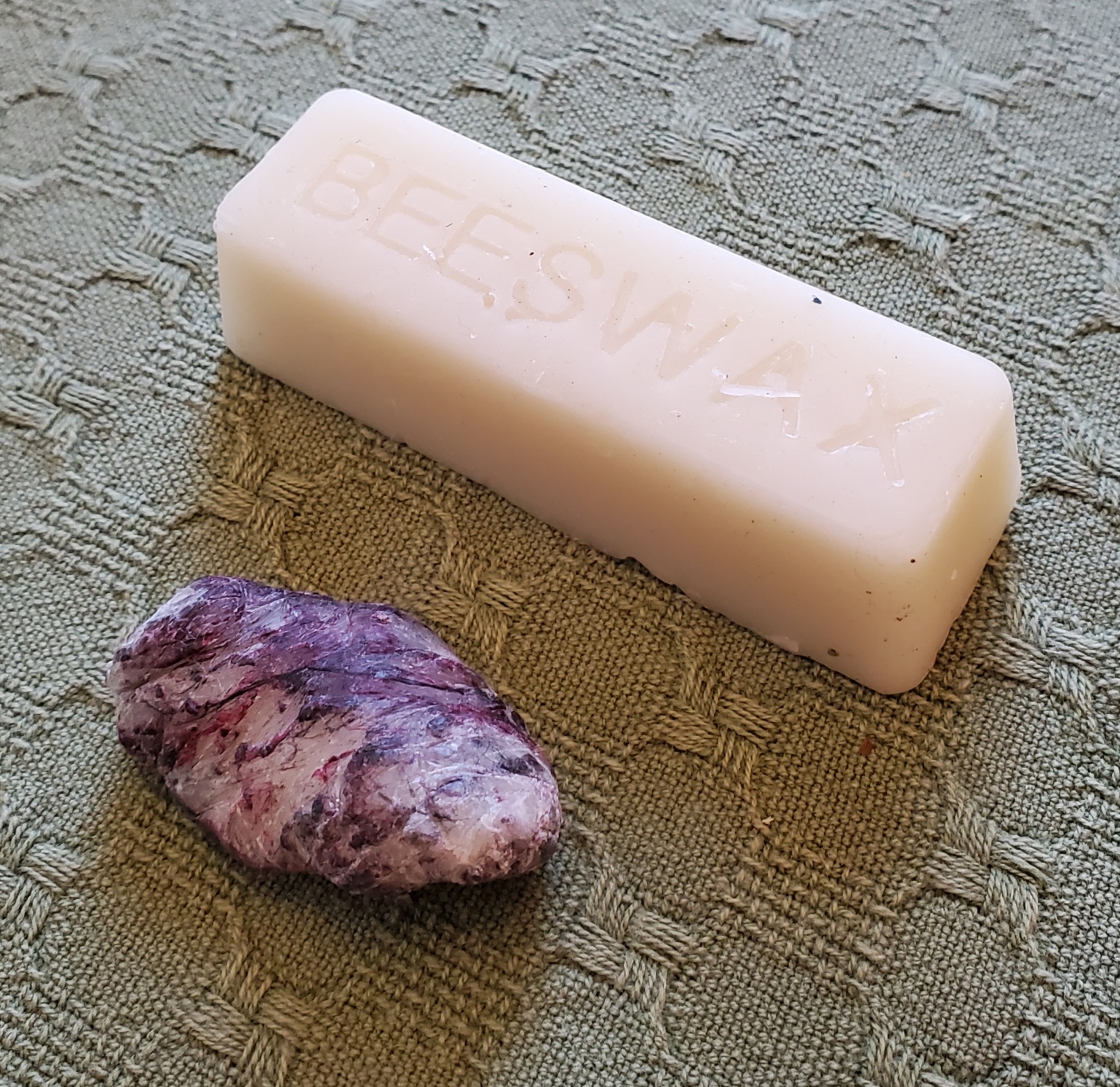
I usually keep two of those single-ounce logs going – one for dark colors, the other for light because even the best threads will crock dye and leave traces of lint in the wax as I use it. Since I do a lot of blackwork with strong colors, I don’t want to run a white, yellow or other delicately tinted thread through the accumulated color left behind by the darker ones. Below is a one-ounce mini log, untouched; and the remains of an identical log after about seven years of very heavy, daily use. The frugal will note that there’s more than enough in one mini log to break it in half, and use one piece for dark colors and the other for light, but that’s not what I did here. That grungy little stub used to look exactly like its brother. It’s so filthy now I may break down and melt the stub, skim off the lint and recast it in a silicon baking mold.
Applying wax to working threads is quite simple. I hold the bar in my hand, with the thread to be waxed between my thumb and the bar, under gentle pressure. Then I use the other hand to pull the thread across the surface of the wax once or twice. I don’t want to wax heavily – there should NOT be flecks of wax on the thread, and it should not feel stiff as a wick. In fact, after I thread my needle I usually run it once or twice through a scrap of waste cloth before use to remove any that might be there, before using the lightly waxed thread on my project at hand.
Back to when to use and when not to use beeswax. Here are a couple of examples. First, my project-in-waiting – the Italian green leafy piece. Lots of satin stitch. The dark green outlines are two plies of Au ver a Soie’s Soie D’Alger multistrand silk floss on 40 count linen (over 2×2 threads). Wax on all the outlines, even though they are silk. That infilled satin stitch worked after the outlines are laid out? More of the incredibly inexpensive Cifonda “Art Silk” rayon I found in India. No wax on the satin stitch. That lives or dies by thread sheen and directionality. While the stuff is very unruly and I do wax it when I have used it for double running or to couch down gold and spangles on my recent coif project, here doing so would not give me this smooth and shiny result.
And an example from the coif mentioned above. It’s on a considerably finer ground – 72×74 tpi. All of the fills are done in one strand of Au Ver a Soie’s Soie Surfine in double running. All waxed. The black outlines on the flowers and leaves are two plies of the latest batch of four-ply hand-dyed black silk from Golden Schelle, done in reverse chain stitch. Also waxed. The yellow thread affixing the sequins and used to couch the gold, the same Cifonda rayon “silk” used in the leafy piece, waxed, too. The black threads whipping the couched gold are two plies of Soie Surfine, waxed. But the heavy reeled silk thread ysed for the outline is Tied to History’s Allori Bella Silk. It’s divisible, and I probably didn’t do it as the maker intended, but that’s two two-ply strands, plus a single ply teased from a two-ply strand – 3 in all – worked in heavy reverse chain. That’s a longer stitch, thicker than even the black flower outlines, and because the stitch was long and I wanted to make it stand out from the other black bits, shine was part of what I needed. NOT waxed.

Many people have asked me if waxing makes the piece collect dust faster, leads to color migration, or makes the stitching feel heavy and well…. waxy, or if it stains the cloth when the piece is ironed. My answer is that I find no difference in dust accumulation on my finished pieces on display. And I see no color change, either. Beeswax has been used for stitching for hundreds of years with no ill effect that I have seen reported. Modern substitute thread conditioning products of unknown composition have not undergone that test of time.
As for a heavy, waxy feel – again, no. Not if you apply it lightly. I do cover my stitching with a piece of protective muslin when I iron it, and never iron pieces on which I’ve used the Art Silk anyway. I have never noticed waxy lines of residue on my ironing cloth when I have ironed my cotton, linen, or silk pieces.
So there it is. Waxing, why and how I do it. Your mileage may vary, of course.
THINKING, BUT KEEPING BUSY
A couple of people have asked if I’m taking a break from needlework in the aftermath of the great coif project.
Nope. To be truthful, I am filling my time with far less challenging pieces while I contemplate the next big project.
First, I’ve returned to the third forehead cloth. I’ve done two before and love wearing them instead of bandannas to contain my hair on windy days. I do a little bit on them in the afternoons, and in the evening catch up on my sock knitting.

The socks are my standard issue toe-ups on anything from 76 to 88 stitches around, depending on needle size; figure-8 toe (an technique unjustly despised by many), plain stockinette foot, German short row heel, then something interesting for the ankle. Mostly improvised. The only hard part is remembering what I did on that ankle so I can repeat it on the second sock.
The forehead cloth is fairly flying. It’s all one pattern, on cotton/linen yard goods that works out to about 32 threads per inch. That’s as big as logs compared to the coif’s linen. I’m trying out Sulky 30 thread (two strands). It’s ok, but I am not so fond of it I’d throw over softer, more fluid flosses. I am betting though that it will stand up to hard laundering better than standard cotton floss. The stitching on my other two forehead cloths, done in silk, has survived quite nicely. Unfortunately the ties – folded strips of the same ground – have totally shredded and been replaced twice on each. I may move to narrow store-bought twill tape for the ties, instead. Jury on that is still out. Oh, and yes, there are mistakes on this. Some I’ll fix, and some I won’t. Have fun hunting for them. 🙂
While I’m here, I’ll share a tiny blackwork hint.

I’m doing double running but this will be relevant to those who favor back stitch, too. See those “legs” sticking out in the photo above? As I passed those junction points I knew I would be coming back again, from a different direction. It is far more difficult to hit the exact right spot when joining a new stitch to an existing stitched line (both perpendicular as here, and diagonally) than it is to mate up to a stitch end. Those legs are there so when I come by again I have a clear and simple target for the point of attachment. This saves a lot of time, minimizes my errors and helps keep my junctions as neat as possible. Try it, I think you’ll find the trick useful.
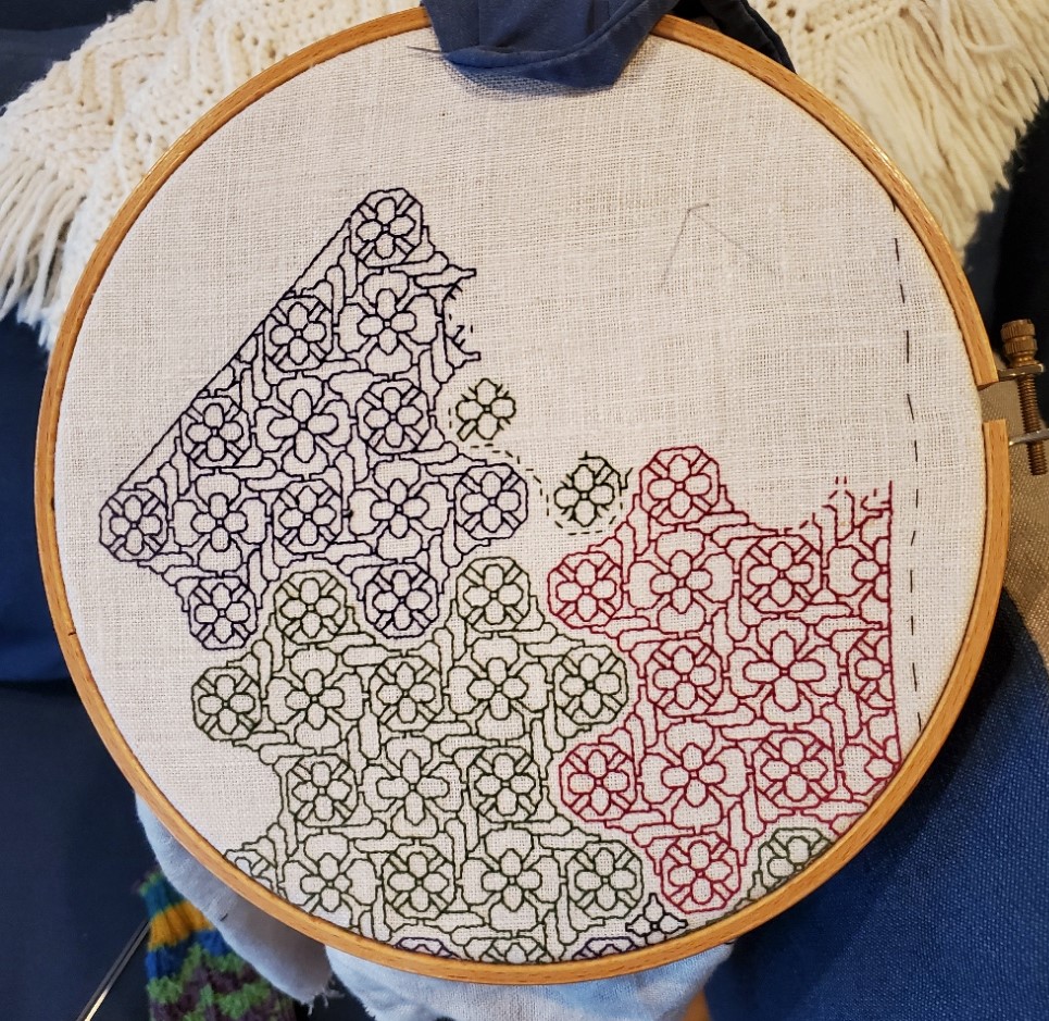
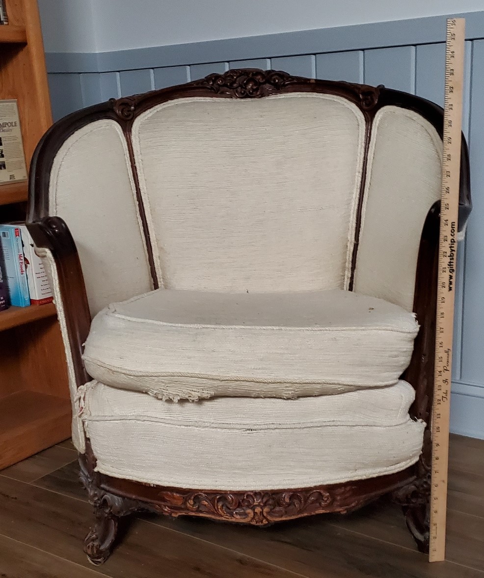
What am I contemplating for my next project? Possibly a blackwork/sashiko hybrid. I have a barrel chair, a wreck salvaged from the trash, that I had recovered in Haitian Cotton back in the early 1980s. It has survived four house moves and two children, but although the back and sides are in good shape, the seat cover and the area just under the seat are both shot. I still adore the thing even though it doesn’t really fit in with the rest of the house’s style. So it’s going up into my office. I plan on recovering the shredded areas with patchwork denim overworked in white running stitch. The denim will be reclaimed from various outgrown and destroyed garments I’ve held onto against just such a future need. Since I do not plan on replacing the rest of the upholstery, I’m counting on those flashes of white to bring the seat and the rest of the piece together.
ANOTHER PORTRAIT, ANOTHER REDACTION
About a year ago a member of the Italian Renaissance era fashion discussion group, Loggia Veccio on Facebook asked for help decoding the blackwork on the sleeves of this portrait. I volunteered, but heard nothing back. Today she came forward again to repeat her request. So I oblige.
The first thing I did was try to find the full attribution for the portrait, plus a better, higher resolution image than this repasted one.
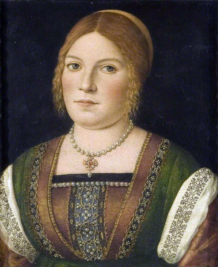
The original is held by the Bristol Museum and Art Gallery, Accession K1651. While it’s not available on the museum’s own website, it does have a page in the Art UK on line collection. The accompanying information cites its date as circa 1500, and the working title as “Portrait of an Unknown Young Woman.” The blurb goes on to say that it has some congruence with works produced by Carpaccio, but stops short of definitively identifying the painting as his.
On to that sleeve. It’s a relatively simple pattern, but redacting from paintings is never as easy as doing so from an actual textile. In this case while the design looks quite regular at gazing distance, up close examination shows that multiple interpretations of the repeat are represented. I’ve attempted to reduce those to a most probable approximation, but it is just an approximation.
As usual, my assumptions were square units, all of the same size, mirrored both horizontally and vertically. I further assumed no diagonals based on the stepwise total appearance. And while I first thought this might have been done in one continuous line, examination of multiple repeats showed that it was most probably done as lozenges rather than a united whole, with small “islands” filling in between the main bird-bearing motif. Here is my best guess.
As usual, a printable page with the pattern and accompanying text is available by clicking here, or popping over to my Embroidery Patterns tab.
ANOTHER FOA FAMILY ARTIFACT
A while back I did a long post on a design cluster that appears in Italian work of the 1500s to 1600s. It’s characterized by thin stems, grape leaves, striated flowers, curls, and occasionally, infilling in multiple colors. Here are some examples of the style family, and how they have fared in my hands.
Philadelphia Museum of Art, Accession 1894-30-114.
The museum dates this (a bit improbably) as being 14th century, Italian. I would bet that attribution hasn’t been revisited since acquisition in 1894. Here’s my in-process rendition of it (my own redaction).
There’s also this piece in the collection of the Metropolitan Museum of Art, Accession 51449.71.1.4. The Embroiderer’s Guild has another piece of what may be the same original in their archives. The MET dates this as 16th century, Italian. The photo below is my rendition of this work – my own redaction, in T2CM – the original photo is not as clear.
Finally we have this one. It’s in the Jewish Museum in New York, Accession F-4927. The original bears an embroidered date in the Jewish calendar, so there’s no quibbling with the point of temporal origin. It’s labeled Italy, 1582/83. Again, here’s my workup of my own redaction.

This last piece is a Torah binder, a decorative strap to hold the scroll together in between uses. The bundled scroll and its rollers would have been further protected by a richly embroidered covering, and if the congregation could afford it, adorned with a silver front plate, crown, and reading pointer. Making and/or commissioning such things was both a great good deed and a point of family prestige. In addition to the date, the binder bears the dedication” In honor of the pure Torah, my hand raised an offering, Honorata… wife of… Samuel Foa, it is such a little one.” The museum’s blurb notes that Italian Jewish women often were donors of important textiles and other objects, doing so to commemorate family births or marriages.
When I first wrote about these objects I noted that Honorata Foa might have commissioned the work, or might have done it herself. With so little data available, it would be difficult to make that determination.
Now however, I’ve stumbled across another stitched item credited to a Foa family matriarch. This one is later. Although it is still a foliate meander, is clearly of a later style, surface embroidery, and not counted. It’s in the MET’s collection, accession 2013.1143. Excerpt of the museum’s photo below.

It too bears an inscription and specific date. The museum blurb translates it as “Miriam, of the House of Foa, took an offering from that which came into her hands; and she gave it to her husband, Avram. The year of peace (5376) to the lover of Torah.” The date equates to 1615/16 on the common calendar. The museum entertains the thought that Miriam might have been the embroiderer, herself.
I was amazed to find two pieces donated by the same family, 33 years apart, showing so strongly the major stylistic shift in stitching that was taking place over that time. I also feel a bit more confident about attributing the earlier piece to Honorata’s hand.
I‘ve found some other material about a Foa family that flourished in Sabbioneta, Italy in the mid to late 1500s, with an extensive business in printing bibles and prayer books. But the only textile work the publisher’s blurb mentions (but doesn’t show) is a tapestry covered bible. I may have to get the book it cites, a family chronicle written by Eleanor Foa, a modern day descendent. I’ve also found a reference to Eugenie Foa, a fiction writer of the 1800s, who wrote about French Jewish life, setting Esther, one of her characters, in an embroidery workshop. But the full text is behind permissions I don’t have (the Google link to the full text mentions Esther in Foa’s work, but the linked blurb does not). Other works that mention the modern Foa family and its scions trace origins back to the publishers of Sabbioneta, but do not mention any link to handwork.
There’s clearly a slew of thesis topics here for someone who wants to take it up: the Foa family and its involvement in the hand embroidery industry of the time. Was the prominent printing family also involved in embroidery, or was it another similarly named/possibly related branch? Was the leafy grape design cluster something from their (posited) workshop? Are there other extant products from or writings by family members? (I’d fair faint away if there was a modelbook of embroidery designs among their archives). Did the family persist in its embroidery vocation over time? If so, how did their products evolve?
As ever research rarely answers more questions than it evokes.
UPDATE: Honorata Foa’s Torah binder will be on display at the Boston Museum of Fine Arts, as part of their Strong Women in Renaissance Italy exhibit, 9 October 2023, through 7 January 2024. Although the museum’s page doesn’t show it, an article in the New York Times offered an in-gallery photo of the piece. Amazing, since I had no idea that this was happening until after I posted this blog entry.
