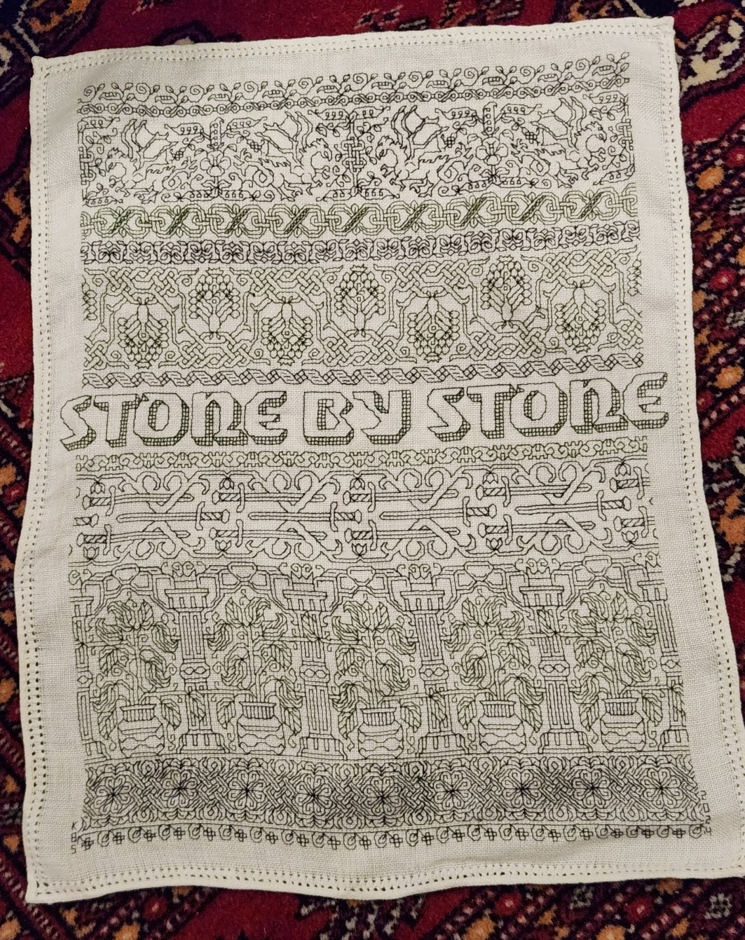
STONE BY STONE FINISHED, ANOTHER BEGUN
The blackwork mini-sampler I did to celebrate The Resident Male’s latest work (now in Beta reading) is complete, a mere 30 days from the first stitch done on 27 June, to stitching the signature on 27 July.
Dated and signed. If I had been thinking, I would have left spots at the left and right of that bottom flower edging for the initials and date, so they would have been in line. But not wanting to pick anything out (stitching in hand on the edge is a real pain), I went outside the lines and signed/dated the piece in the margins.
For the record, this was done in one strand of Sulky 30, a mix of black and deep green. I am not particularly fond of the Sulky look here using only one strand stitched over 2×2 ground cloth threads. It’s a hard finish thread, and was a poor choice for the rather open holes on this 33.25 threads per inch count ground. The threads rattle around in the ground cloth weaving holes, making sharp corners and straight runs rather wobbly. I probably should have used a double strand.
While I could have been happier about that stitch regularity and alignment problem, I’m not un-pleased with the end result. All of these bands will be in Ensamplario Atlantio Volume III. With the exception of the ribbon immediately above the letters, they are all of my own devising. That ribbon band is something I redacted myself from an extant artifact. No timeline yet on Ens Atl III‘s release, but I am close, with 20 pages of new fills (a few with source annotations). It will also have an as-yet undetermined number of pages with narrower bands, plus several full page plates with larger, all-over designs, wider fills, strips with mitered corners, and shirt yokes. Neatly symmetrical mitered corners on these strips are very rarely seen in period pieces – usually designs are butted up against each other, or the corners are fudged and display no planned diagonal mirroring. But modern stitchers prefer them, so I’ll furnish a few.
For now Stone by Stone has joined the other pieces on my Wall of Shame – the pin-rail display of as-yet-unframed, or unfinished stitching in my sewing room. And you can see why I called this a mini-sampler, compared to its brothers.

While I will be finishing this off as either a framed or fabric scroll piece, I’m not quite sure how to do it yet because the margins around the stitching are so small, and the antique pulled thread hem too charming to hide. I might baste it to a piece of deep green or black cloth, and either frame or scroll-finish that. But such things are to contemplate in the future.
Now on to the next piece.
Since I’ve established a pattern of these needlework tributes to The Resident Male’s writing output, I have decided to do another small piece to honor Fractured Symmetry, which so far has been unrecognized in stitchery. This time however I’m starting with a piece of cut yardage rather than a rescued vintage linen item, complete with finished edges. To that end, I need to prepare my ground cloth for stitching.
First I need to true it to weave, because the cut edges of remnants (and even purchased pieces of ground cloth) rarely follow the threads. Here you see my chosen piece of stash linen. I’ve found the first unbroken thread along each edge, and carefully pulled it out, leaving the partials above it intact. This gives me a nice, straight line along which to cut. Note that there is a bit of skew that will be snipped off before the next step:

In total, that’s about an inch (2.5 cm)of wastage north/south, and about 3/4 of an inch (2 cm) wasted east/west. But it can’t be helped. I carefully cut along the lines created by the withdrawn threads, and hand-hemmed the cloth all the way around. I know others use sergers or sewing machines to do this. It’s a pain to haul that puppy out. If Klaatu (my ancient Elna) was out and being used for something else, I probably would have done an off-the-edge zig zag or other specialty stitch using it. But I don’t begrudge the time to hem. It’s the sort of thing I can do while watching TV.
After hemming my ground works out to about 9 7/8 inches wide (25 cm) across by 18.5 inches tall (47 cm). This time I’ll leave about 1.25 inches (a little over 3 cm) of unworked margin all the way around, to avoid the stitch-in-hand challenge of Stone. That gives me a stitching area of roughly 7.5 inches x 17.3 inches (19 cm x 43 cm).
And the thread count? Easy with the penny method.

In this close zoom cell phone photo, the penny obscures 28 threads going east/west, and 24 threads north/south. Multiply each of those by 1.33 and you get roughly 37.25 threads per inch in the horizontal direction, and 31.9 threads per inch in the vertical. Obviously not evenweave, but I can work with that. It does mean that the designs as stitched will be a bit compressed in the horizontal, and a bit elongated in height. For example, squares on the count will present a bit like rectangles, but since I’m planning a simple band sampler, that will just end up being part of the piece’s overall look.
The next step is to iron the cloth to get out the storage creases (yes, I should have done that first), then baste in my guidelines to mark the vertical and horizontal centers, and to establish the top, bottom, and right hand margins. (I could do the left, too, but since I generally start in the center then finish symmetrical bands to the right first, I usually just work them to that same point in the repeat to the left.)
And while I’m doing that bit of tedium, I’ll be thinking about what strips or motifs to include on this piece. I’ve got a couple of bands I want to try out, but no full piece designed. And I also still have to find a word or short phrase to enshrine on it, so I’ll be thumbing through Fractured Symmetry to pinpoint that.
This is the fun of being a bungee-jump stitcher. You get to surprise yourself as you go along.
LETTERS FROM THE PAST
Antipodean social media pen pal and long time needlework/knitting co-conspirator Sarah Bradberry recently posted about a thrift store find – a 1971 vintage book entitled Lettering for Embroidery. It’s available for borrowing at the Internet Archive (free account sign-in is required). It’s an interesting read, although its overall aesthetic now looks 60s-retro rather than cutting edge fresh. Which is to say that it’s back in style.
Her post made me think about some of the unconventional alphabets I’ve drawn upon for my various non-traditional samplers, why I picked them, and how I used them.
To begin, I like letter forms – perhaps an inheritance from my grandfather Mack who owned a printing company. He would point out the often tiny differences among various typefaces and font sizes in printers’ samples, advertising materials, newspapers, and in books, and how those differences contributed to the overall message of the printed piece. While I obviously didn’t follow him into the family business, some of what he showed me must have stuck.
Let’s start with one of the more outrageous. It’s a phrase in an non-Terran language, picked up from my one of my Resident Male’s writing ventures. The book itself isn’t out yet, but I can say that in the text, it is translated as “Life’ll kill you.”
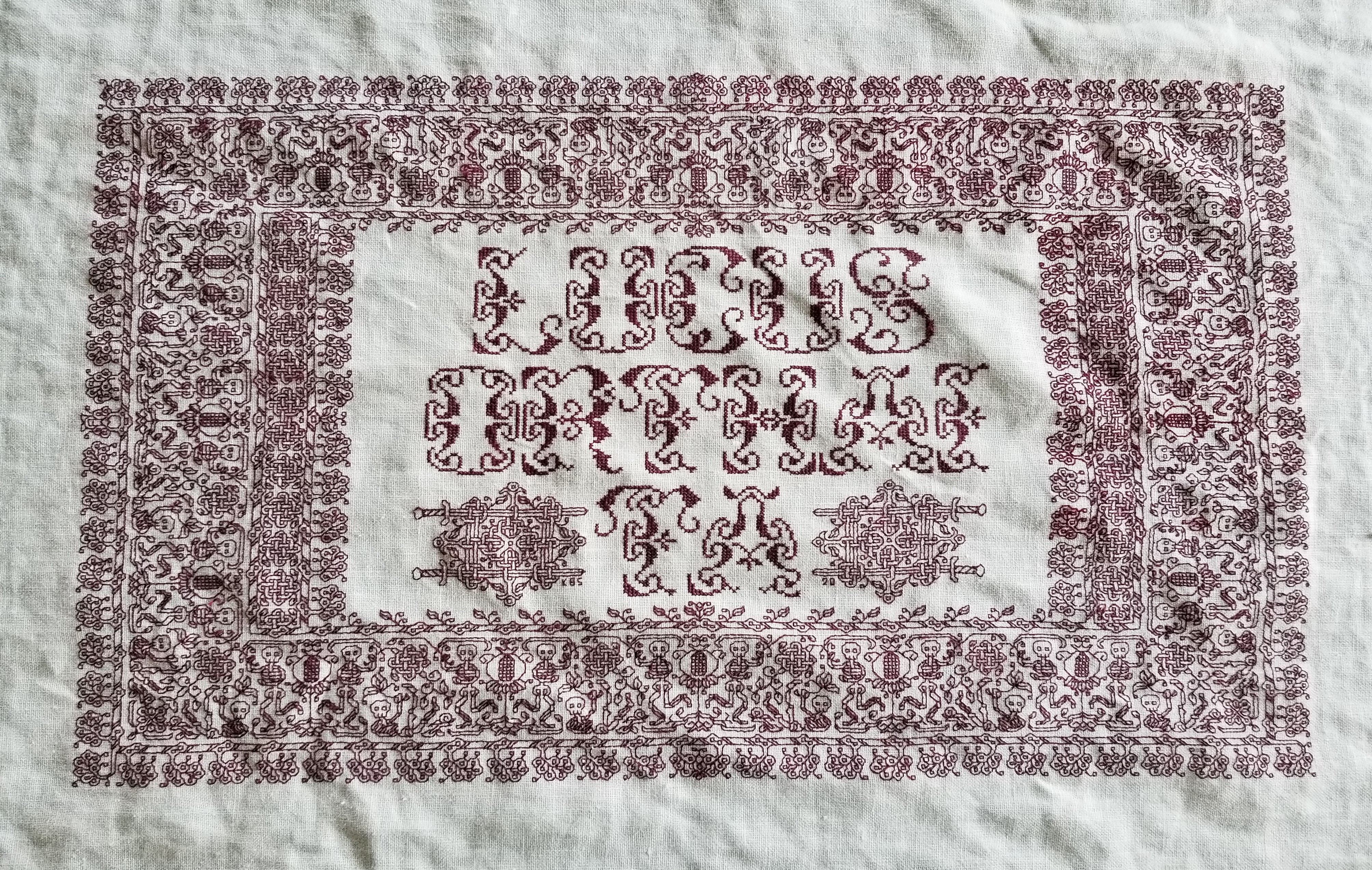
Ringed with my dancing skeletons, and bedizened with sword bearing interlaces to echo the stated meaning, I wanted to use an almost unreadable other-worldly set of letter forms; shapes that themselves danced. I went to my go-to spot for graphed alphabets – the free Patternmaker Charts collection of antique Sajou, Alexandre, and other leaflets. This one is from the Rouyer #248 booklet. I kerned and leaded the rather large letters tightly, to accentuate the flow of the curls across the words. (Kerning is the space between letters, leading is the space between lines of type). In terms of composition, the three words are centered, with no regard for how the letters stack vertically. These letters are also proportionally spaced because they vary so much in width, and cannot be easily worked monospaced (the way an old fashioned fixed-width Courier typewriter prints.)
Here’s another where I tried to fit form to the statement. The full chart for Don’t Panic is free here on String.
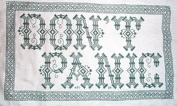

Yes, I know in the Hitchhikers’ Guide books the phrase is described as being “in large, friendly letters,” but this was going into my office where I managed frantic people wrestling deadlines under extreme pressure. I thought a jittery sign would be funnier. My favorite source to the rescue, this alphabet is from Sajou #325. It drips nervousness, even though the firm serifs imply regular stability.
Note that as with many of these vintage alphabets, the letters I and W are omitted, in keeping with the paradigm of classical calligraphy. I extrapolated the I, and doodled a matching apostrophe. Again, I kerned tightly, although I’m not fond of the space between the A and the N. I should have tucked them closer together, as I did between the P and the A. But As are problematic. I also chose not to center these words one on top of the other. The offset adds to the perceived unease.
Here are two more (slideshow presentation to save space, click on arrows beside the photo to advance). In these I chose to use the words as horizontal bands of ornament, flush left and breaking words when I ran out of space. I went back and eked out the bands to come up to the right margins. Mostly I did this because I was impatient. I didn’t want to take the time to do a full arrangement of the motto as it would appear before working the rest of the piece. I knew I’d have space to work the full quotation, but just stitched them letter by letter, with no advance planning. Since I had seen historical samplers that did just that, I felt confident beginning flush left and cutting words in the middle as space dictated.


I am not sure where I got the alphabet for the “Do not meddle in the affairs of wizards” piece. I stitched it circa 1994/1995, just before I began keeping a blog. Obviously the source followed the additional classical convention of presenting just a V shape to cover both that letter and U. I’m also pretty sure I extrapolated the I. In any case, the thread count on this one is no where near as fine as on the others above. There was less room for larger lettering, and I had to find something small enough to fit (most of) the words in, with minimal truncation.
The Arthur C. Clark quotation uses another alphabet from the Patternmaker collection, this time from Sajou #55. It may even be the project on which I stumbled across that source. Being a two-color piece, I wanted something that combined both, and that had an old-fashioned, formal look without being very stuffy. The red swirls suggested a bit of obfuscation and incantation as they tendril around the more solid letter forms. Again I extrapolated the I (thankfully there are no Ws in the phrase). This alphabet with the exception of the I has a very blocky, chunky and solid appearance in spite of the red whisps. There was no need to play with kerning, and spacing between words was easy and regular. The general look of boxy solidity underscores the sentiment expressed. For the A.C. Clarke attribution, I was lucky to find a tall and narrow alphabet in Sajou #172 to fit remaining space on the final lettering line. I will say that after this piece I lost my appetite for broken words.
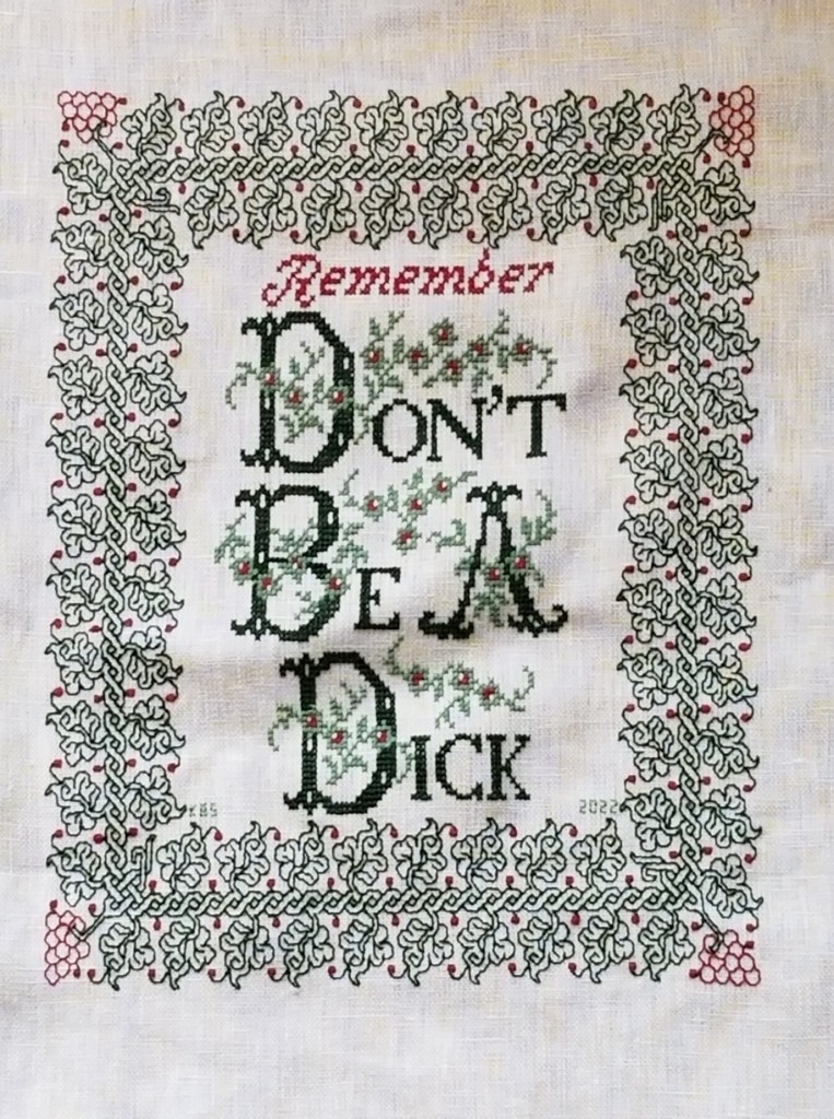
At the risk of alienating all, my two coarse language pieces (behind the eyeball fig leaf image, also in slide show) use formal typefaces to express very informal and direct sentiments. If you are easily offended by rude words, skip ahead.
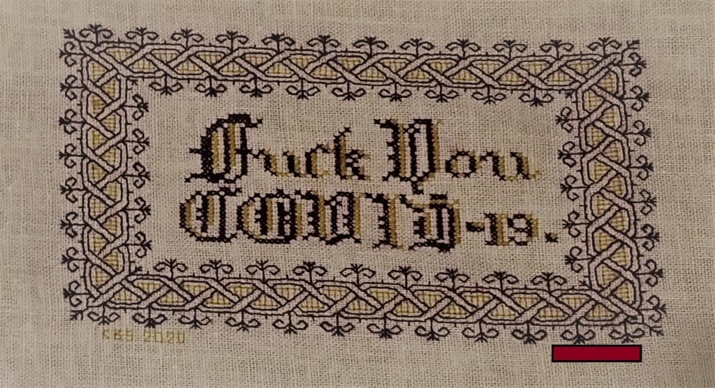
The Covid sentiment, done in a blackletter typeface, uses two alphabets from a German book, available on Patternmaker Charts. One is uppercase, the other lower. The lower case alphabet also supplied the numbers. Again I had to invent a matching letter I. Blackletter family typefaces are reserved for formal documents like diplomas, and newspaper mastheads here in the US. I wanted to play on that gravitas.
Similarly, for the admonition done in green, I wanted to evoke the greeting card world of hearts and gentle sentiment, to contrast the general scolding represented with sweetness and light. I picked one of the flowery alphabets from Patternmaker Chart’s Sajou #160 but leavened it with a smaller yet still uppercase typeface for the rest of the lettering. That classic form serif alphabet is from Grow and McGrail’s Creating Historic Samplers. The R of Remember is from Sajou #1 also on Patternmaker Charts, and the lower case lettering for the rest of that word can also be found in the Grow and McGrail book. I also adapted the floral ornaments from the initial letters for use as fill to surround the lower case one.
Pay Attention to Trifles has the most typefaces I’ve ever used on a single piece. I wanted the word Attention to leap out, Trifles to be the most ornate, and the message to be decoded only on a second glance. And I wanted a vaguely carnival type over the top mix of styles to complement the extremely busy design that is stuffed full of buried “Easter Eggs” as requested by the recipient.

All of these are from the Patternmaker Charts website.
- Pay – Sajou #652
- Attention – Sajou #654
- Even to – Alexandre #143
- Trifles – Sajou # 53 and 203
The dual tone coloration on these was not always noted in the original. Some I tarted up myself. I kerned each line separately, trying to best suit the alphabets being used, squishing ATTENTION a bit made it shout louder. Letting the other lines straggle a bit more made them a bit more lyrical.
While busy, the mad assortment is just over the top enough to gentle the nagging advice of the motto. If I had done the entire thing in the same face as Attention, the statement would have been way to strident. Throw in a bit of whimsey and it becomes an in-joke between the donor and the recipient. The centered text with the balanced motifs left and right is in contrast to the rather chaotic jumble of gears done in inhabited blackwork. There is repeating arrangement of the gears (more or less), but not the strict centering of the lettering. I think that adds to the haphazard playfulness of this piece.
I have done lots of other pieces with mottoes or words on them, but they don’t really showcase different approaches. The last one I’ll cite here is the piece on which I’m currently working. I’m almost done with the penultimate band, and have designed another custom-fit to go below it and end off the work as a whole.
I can’t say for sure where I found the alphabet I modified for use on this one. I found the image in my notes folder, with no attribution other than mid-March 2020 save date. I ended up upscaling from the typeface as charted by using a block of four units for every single unit in the original, and smoothing angles accordingly. Using the squared fill for the shadowing was intended to make the text reminiscent of a brick wall. That the span of the words is larger than the rest of the piece and contributes to that effect is serendipity, not planning. My count was off, and (thankfully) having started in the center, at least the motto protrudes mostly evenly left and right, looking even more monumental than I had planned.

I did kern aggressively to make the motto fit the space, but I should have lost one more unit between the B and Y of by. Still, I think it works. It’s blocky, yet because the letters are represented by outline and shadow, it contrasts nicely with the rest of the piece, overrun as it is with very busy fills.
OK. A conclusion now. Sort of.
If you are designing your own motto bearing piece, there are lots of choices out there that can make a real impact on the design, above and beyond the decorative elements that surround it. If you are unburdened by time/place restrictions (you are not designing a piece in the style of a specific location, school, style, or era), you are free to play. Think of the lettering as another element you can manipulate to underscore the message of your motto, or to convey a mood in which you would like it to be received.
Want to be playfully threatening, like an admonition to keep the kitchen or bathroom clean? How about using a different typeface and font size for each letter, to make it look like a ransom note. Want to convey warm wishes and affection to your extremely sweet and caring (but possibly somewhat humorless) family member? How about one of the ornate flower-bedecked alphabets from around 1900? Have a Goth leaning pal whose heart beats for irony and sarcasm? Use that same flower font in funereal black and purple to express an over the top sentiment.
You can speak words with typeface choice, font size, color, and spacing beyond the actual ones you stitch.
SOME DEPARTURES
On the final stretch of the Stone by Stone mini sampler. I decided a while back that I wanted to include something with columns in the piece. I had a chart picked out – something I had redacted a while back, destined for T3CM, but was saving for book publication rather than sharing here. But I miscalculated, and the remaining space after the sword panel wasn’t tall enough, so I had to quickly doodle up a solution. It’s not entirely successful. And I’ll detail why after the photo.

First the departures. When I doodle, I stick (mostly) to a list of guidelines I’ve deduced from decades of redacting historical designs. These include sticking to 45/90/180 degree angles – the simple angles formed by the sides and corner to corner diagonals that can be achieved in one square unit. No “knights move,” 2×1 or other multiple unit spanning stitches, and (if at all avoidable) no half stitches. I also try to comply with specific ways that repeats and meanders are formed.
The peacock panel has a small sin – the center point of the peacock’s crown is formed by two half-diagonal stitches. In cross stitch they’d be termed “quarter stitches.” The current columns and potted plants panel doesn’t use any partial stitches, but the urn/plant components aren’t obviously symmetrical to the center line determined by the arch. However you are seeing only one half of the full repeat here. The thing is mirrored as what I described as a type 2 repeat in my earlier post, linked above:

It’s also further complicated by the overlap of the leaf bearing tendril alternating right and left. You’ll see that in better detail as I get further along. This gives it a rather complicated and unexpected adherence to type 2. I’m hoping it will make more visual sense as I go along.
Aside from the issue of the overly complex symmetry the arrangement of the leaves, while formalized is far more naturalistic than historical pieces in general. So is the veining in the leaves. Again a departure from the standard aesthetic.
I’m also not pleased by the minimization of the arch compared to the columns and plant pot. That difference in size and weight does have historical precedent, but it doesn’t complement the overall design as well as I hoped.
And the last bit that didn’t work as well as I hoped is the use of the two colors in this strip. Stone by Stone is stitched in black and green. A very deep green. It alternates by strip except for the motto, in which the foreground of the letters is worked in black, while the shadowing is done in green. The vegetable bits and tendrils of this band are all in green. The columns, arches, and urns are in black. I’m hoping that the green leaves in front of the black columns won’t be so confusing looking when more of them have been completed.
Still, for all of these criticisms, I am not totally displeased. This strip stays. I am not sure what will be the final band below, but whatever it is, it will be densely stitched and black. Thumbing through my notes now looking for just the right thing…
Oh, these two strips – the sword interlace and this historical/modern inspiration mash-up, will be in Ensamplario Atlantio volume III. I’m anticipating that the quick-to-stitch sword one in particular will be popular shirt trim among the SCA’s sword-wielding community. I’m planning on drafting up a matching yoke for it, too.
STONE BY STONE
And just like that my mini-sampler is past the half-way mark.

The stitched area is about 9.25″ wide, except for the motto that clocks in at 10.25″ (about 23.5 and 26 cm, respectively). I originally planned the motto at half the current scale, but after working just one letter, saw that it was overwhelmed by the rest of the stitching. So I doubled the scale – each block unit in my drafting became a box of 2×2 units. And I changed the treatment of the shadowed areas, converting them to box fill in green against the black of the main letter outline. To me that squared fill in this application hints at cobblestones. When I doubled the scale I knew that I’d blow past my originally laid out left and right borders, but that I’d be close. I may devise a narrow border strip to surround the rest of the piece and eke out the previously stitched area to align with the new width. It will be tricky though. I would probably have to work unsupported in hand rather than on a frame or hoop. I don’t like doing that.
Because I know folks will ask, I’m afraid I can’t point to the specific typeface source I used for the original expression of the phrase (before I scaled up and altered it). I found a screen capture of that alphabet with no attribution in my folder of miscellaneous things. But I’ll keep hunting to find it because sources should be acknowledged.
As for the rest of the patterns on the piece, with one exception they are all of my own devising. The only one that isn’t my own is a redaction I did of a band appearing on this sampler, dated 1674 in the collection of the National Trust, at Montacute House, Somerset, UK, Accession NT597706. That band is the narrow ribbon scroll appearing just above the motto. I may do more from that particular sampler on this piece. Its patterns were a challenge to chart because the stitcher recorded only the absolute minimum needed to parse the repeat and spacing. I often rely on multiples to reconcile problems in motif and spacing, but without them there’s a lot of guesswork in working out the fills and repeats.
For the rest – as you know I pick on the fly, and while I know what the next design will be (another of my own), I haven’t begun thinking of what happens after that.
Now about that odd motto. It’s no secret that my Resident Male is well embarked on a career as a writer of science fiction and fantasy. He’s got several self-published novels, and is now tirelessly seeking an agent with the goal of full professional publication. To that end, he has written several more books above and beyond those available on Amazon. A few times now, something he has penned or described has resonated with me, and that required expression in needlework. As his Fangirl Army of One, I am delighted to have answered that call.

Stone by Stone is a phrase integral to his latest work, just as “Lucus Orthai Ta” is central to another of his yet-to-be-released novels. And long ago he described a cloth stitched with circling koi in one of his very early stories, a pivotal scene that led to my creating the Two Fish piece.
If you go far back enough to when we just met, although I had dabbled in counted thread work based on early sampler strips before we met, my initial headfirst plunge into blackwork was done for him as well. This piece is dated AS IX (1974/1975). It guess it has been a symbiotic relationship of pen, sword, and needle ever since.
LONGEVITY UNDER HARD WEAR, AND MOVING FORWARD
Some of the long-time readers here may remember the forehead cloths I stitched back in the Pre-Plague Era. I used some linen that was approximately 32 count (a remnant of off the bolt, not a purpose-woven needlework ground), plus some stranded silk custom dyed by my Stealth Apprentice. The black used was a historically researched tannin/iron recipe, and the thread was a prototype of the threads that Stealth Apprentice sold through Golden Schelle. The Schelle retail effort is currently in hiatus, but I do hope it will restart in the future. In any case I now report on wear and tear.
As you can see, now about seven years later and after heavy wear and washing, the forehead cloths and their embroidery have both held up well. I didn’t do much special to launder them. I threw them in my regular cold water/cold rinse wash, but hung them on a rack to dry. I’m particularly impressed by the performance of the dyed silk. It’s as dark today as it was when I first stitched it. Now I understand why black silk was so ubiquitous on body linen. It survives frequent wear and harsh laundering unscathed.
What did suffer were the ties. I used the same ground cloth to make them, cutting strips, folding them in half the long way, then tucking both raw edges inside, seaming, and turning the tubes inside out – pretty much the standard way ties are made, although I had to do mine on grain and not on the bias because I had so little fabric available.

Three of the four have disintegrated. To to little more than fuzzy strands. You can see one of the less frayed tie cut from the cloth on the bottom near the spool of twill tape in the photo above.
I am in the process of replacing all of the ties with twill tape. The finished redo of the first is at the bottom of the photo above. I hand-stitched the edge of the tape to the edge of the cloth, then folded it over and hand-hemmed the other side down to the back. When I got to the ends of the triangle, I continued on with the folded twill, whipping the edge as I went. Next comes the darker, larger cloth at the left side of the photo. Then comes the cloth I just finished embroidering. I won’t bother with the fabric ties on that one, I’ll leap direct to the twill ties.
As for the current mini-sampler stitching project, I’m rolling along with that, too.

Since my last post about it I’ve completed the green twisted link strip, and the delicate black flower strip below it. Now I’m up to another band in green. Peacocks, or if you prefer, bling chickens – my rendition lacking much of the grace and nobility of the actual birds. Note that I am not using the silk for this one. I’m still experimenting with the Sulky threads. (Partial verdict – I MUCH prefer the silk.)
The peacock strip, like the others in this piece are of my own devising, and will be in Ensamplario Atlantio Volume III. Please don’t ask me when it will be released. It’s still in process. I’ve got about twenty pages of brand new fills, plus about eight pages of larger borders and all-over designs. I am toying with the idea of including the Epic Fandom strips in this one, too, just so that they are in one easy to thumb through collection. Opinions on that are solicited.
MINI-SAMPLER PROGRESS
Munching along on my portable summer project, sized and scoped for on-the-go production. I’ve completed the first band and have started on the second.

Both of these original designs will be in Ensamplario Atlantio Volume III. As will (in all probability) the others I use on this thing.
Yes, I’ve chosen a second color – this piece will be in black and deep green. There’s a reason for that which I will reveal in the fullness of time. I’ve also chosen a motto for it – again for a specific reason that I will describe when appropriate.
I had begun this in part as a test of the single ply of Sulky 30 on this ground. While the thread is performing well in terms of ease of stitching, I’m not entirely happy with it. It’s too thin and weedy for best presentation, and two plies would have been overly massive. Here’s a discussion of thread thickness and grounds that will help you understand why I am less than pleased.
How big will this entire piece be? It’s a second-hand store piece of hand-hemstitched linen, a bit more rectangular than but about the same size as a dinner napkin.

You can see here how I tease out my guidelines as I progress, so that I never stitch over them. I know people who do full coverage cross stitch sometimes don’t bother to remove them, but since my style includes so much “white space” I find it better to never encroach on the lines. That makes picking out easier. For the record, I baste with some ancient 100% cotton machine sewing thread from my grandmother’s stash. It’s too fragile to use for structural sewing, but being non-crocking and very smooth, is extremely easy to pull out cleanly.
You can also see that I start in the middle. I worked the dragon strip right, to the guideline at the right edge. Then I filled in the top companion border to end to mate up with the line established by the dragon strip. After that I did dragon to the left, finishing up at the same point already established at the right edge. Since the strip is symmetrical, it terminates at the same distance from the hem on both sides of the work. Again the companion (non-symmetrical) narrow edging at the top was worked to the same point. Now that I have my edges established, I will work all subsequent rows aligned to the first one, using my basted center line for guidance, and finish them left and right in line with the previous work. Really and truly, this is MUCH easier to do than some folks think. Plus working this way does NOT require drafting up the entire strip to fit the available area. The only thing I WILL be drafting out custom will be the motto, so that I can determine its center. Since it will be narrower than the stitching area, I may go back to the doodle board and figure out what I can use to eke out that row left and right. Or maybe not. Another narrow strip after this one, and then we’ll find out…
LOWERY STAND HACK
In one of those “this never happens” moments, I ran across a Lowery stand being offered on my local freecycle exchange. Of course I leapt on the opportunity. Although I have one I now have a second to use in another room, or to leave at our Cape hideaway, so I have less to schlep when we visit.
This one is a bit older than the one I bought several years ago. It came with two attachments – a plastic tray in daisy form meant to hold stitchers’ oddments, and a bar with a pincushion, plus a crosspiece of unknown purpose. I took off the tray because it was very awkward and space-inefficient.
Some digging led me to the answer for the crosspiece bar – originally it held a plastic comb-like attachment, over which waiting threads were to be draped. But this re-homed stand has seen some hard use, and the plastic comb insert was long gone. And for me – not missed. I generally do monochrome or limited color set pieces, and have no need for an extra set of fingers to hold my rainbow of threads.

But the crossbar did suggest something to me. I have always wanted to display a design page alongside my work. Using my big scrolling frame mounted on the Lowery large frame extension, this wasn’t a problem. I could easily affix a page to my working surface or to a little magnet mounted on the end of the frame’s stretcher bars, using a magnetic needle minder. But if I plan on employing the Lowery to hold a smaller hoop, there isn’t enough real estate for that.
I have a flat metal magnet board of the type commonly sold for stitching. But the angle and aperture of the crossbar’s slit were wrong. The board didn’t sit well, nor was it at a useful angle. And it wobbled in the stand. So I went looking for something that might help.
More serendipity. This is the plastic “zipper style” cutting slider strip that comes with large boxes of Stretch-Tite brand plastic wrap. I find them pretty useless for their intended function, but being a packrat, I tend to keep the slider bar in the drawer with the box of wrap until the wrap is used up and the box is consigned to recycling. Here you see it clipped onto the leading edge of the crossbar. I haven’t pushed it all the way on so you can see how they engage.

Obviously I will eventually cut the plastic to length and discard the blue thumb slider. But here is the magnet bar, mounted behind the now-thicker/plastic covered front edge of the crossbar, wedged between it and the crossbar’s back. Nice and secure. At a useful angle, and ready for pattern page deployment.

Oh. That thing I’m stitching? A very small piece of linen I rescued from yet another estate sale. It came neatly hand-hemmed. It’s too small even for my hoop-on-a-stick sit-upon, so I had to pull out my hand-hoop for it. It’s exceptionally nice fabric, with evenly spaced, easy to count warp and weft. There’s a couple of minor stains on it, but once it’s stitched they won’t be noticeable. I’m looking forward to working a hoop on my hand-me-down Lowery. It will be a first, since I usually only pull it out for larger pieces.


The count on this is roughly 33.25 threads per inch in each direction (penny count method – 25 threads covered x 1.33). I’m using this doodle piece to test if I like using Sulky 30 as a single, and to beta some of the designs that will be in Ensamplario Atlantio Volume III, which I’m composing right now.
You can see my basted guidelines marking the center, and on two sides, marking about a half-inch in from the edges. That’s all I need. Gridding for this isn’t necessary. I will stitch out from the center to the right edge, and note where in the pattern I am when I reach my edge-mark guideline. Then I’ll go back and stitch to the same point at the right. For the strips symmetrical to a center line that will be the same point left and right. For strips that are centered on a box unit instead of a line, that will be within one box unit further than the iteration on the right (assuming I center the left edge of the central box on my based centerline). And for non-symmetrical or unidirectional borders like the one I’ve established on top, I’ll just work in the general direction left/right but wait until I’ve established an edge with the symmetrical strips, then I’ll “catch up” to them and make the edges even.
Do I have any idea what strips I will be using? What the overall design will be? What motto or word (if any) this will bear? To what use I will put so fully an embroidered small cloth?
Nope.
No clue as to any of those things. But that hasn’t stopped me before. Like I said – this is an experimental doodle, a portable bit of amusement to eke out the summer’s migrations. Not a deathless Project For The Ages, or an incipient family heirloom. Stay tuned to see how this one evolves. If nothing else, it will be a bit of bungee-jump stitching fun.
