LETTERS FROM THE PAST
Antipodean social media pen pal and long time needlework/knitting co-conspirator Sarah Bradberry recently posted about a thrift store find – a 1971 vintage book entitled Lettering for Embroidery. It’s available for borrowing at the Internet Archive (free account sign-in is required). It’s an interesting read, although its overall aesthetic now looks 60s-retro rather than cutting edge fresh. Which is to say that it’s back in style.
Her post made me think about some of the unconventional alphabets I’ve drawn upon for my various non-traditional samplers, why I picked them, and how I used them.
To begin, I like letter forms – perhaps an inheritance from my grandfather Mack who owned a printing company. He would point out the often tiny differences among various typefaces and font sizes in printers’ samples, advertising materials, newspapers, and in books, and how those differences contributed to the overall message of the printed piece. While I obviously didn’t follow him into the family business, some of what he showed me must have stuck.
Let’s start with one of the more outrageous. It’s a phrase in an non-Terran language, picked up from my one of my Resident Male’s writing ventures. The book itself isn’t out yet, but I can say that in the text, it is translated as “Life’ll kill you.”
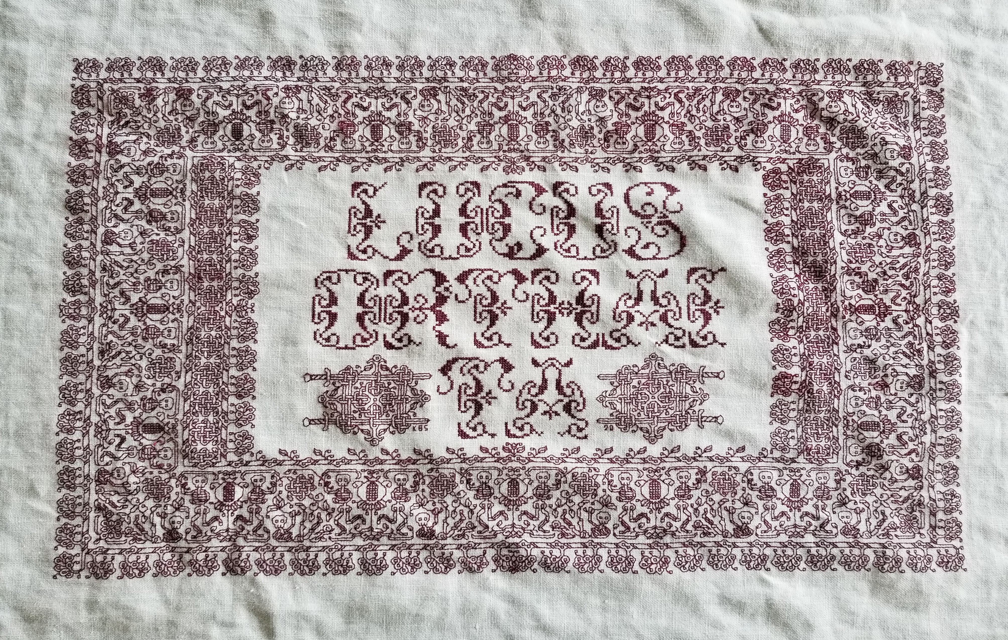
Ringed with my dancing skeletons, and bedizened with sword bearing interlaces to echo the stated meaning, I wanted to use an almost unreadable other-worldly set of letter forms; shapes that themselves danced. I went to my go-to spot for graphed alphabets – the free Patternmaker Charts collection of antique Sajou, Alexandre, and other leaflets. This one is from the Rouyer #248 booklet. I kerned and leaded the rather large letters tightly, to accentuate the flow of the curls across the words. (Kerning is the space between letters, leading is the space between lines of type). In terms of composition, the three words are centered, with no regard for how the letters stack vertically. These letters are also proportionally spaced because they vary so much in width, and cannot be easily worked monospaced (the way an old fashioned fixed-width Courier typewriter prints.)
Here’s another where I tried to fit form to the statement. The full chart for Don’t Panic is free here on String.
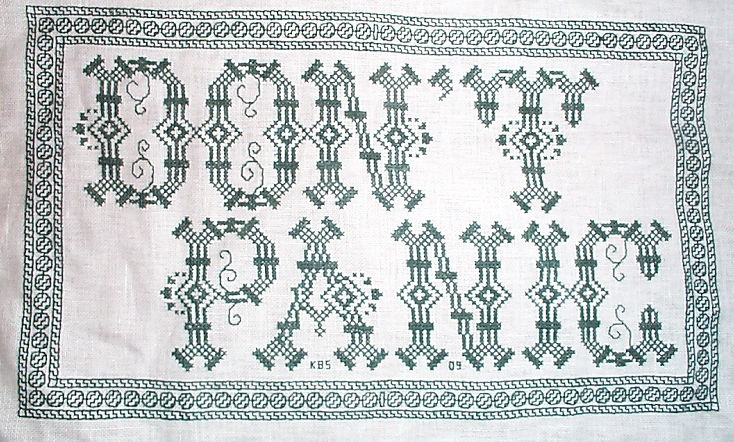

Yes, I know in the Hitchhikers’ Guide books the phrase is described as being “in large, friendly letters,” but this was going into my office where I managed frantic people wrestling deadlines under extreme pressure. I thought a jittery sign would be funnier. My favorite source to the rescue, this alphabet is from Sajou #325. It drips nervousness, even though the firm serifs imply regular stability.
Note that as with many of these vintage alphabets, the letters I and W are omitted, in keeping with the paradigm of classical calligraphy. I extrapolated the I, and doodled a matching apostrophe. Again, I kerned tightly, although I’m not fond of the space between the A and the N. I should have tucked them closer together, as I did between the P and the A. But As are problematic. I also chose not to center these words one on top of the other. The offset adds to the perceived unease.
Here are two more (slideshow presentation to save space, click on arrows beside the photo to advance). In these I chose to use the words as horizontal bands of ornament, flush left and breaking words when I ran out of space. I went back and eked out the bands to come up to the right margins. Mostly I did this because I was impatient. I didn’t want to take the time to do a full arrangement of the motto as it would appear before working the rest of the piece. I knew I’d have space to work the full quotation, but just stitched them letter by letter, with no advance planning. Since I had seen historical samplers that did just that, I felt confident beginning flush left and cutting words in the middle as space dictated.


I am not sure where I got the alphabet for the “Do not meddle in the affairs of wizards” piece. I stitched it circa 1994/1995, just before I began keeping a blog. Obviously the source followed the additional classical convention of presenting just a V shape to cover both that letter and U. I’m also pretty sure I extrapolated the I. In any case, the thread count on this one is no where near as fine as on the others above. There was less room for larger lettering, and I had to find something small enough to fit (most of) the words in, with minimal truncation.
The Arthur C. Clark quotation uses another alphabet from the Patternmaker collection, this time from Sajou #55. It may even be the project on which I stumbled across that source. Being a two-color piece, I wanted something that combined both, and that had an old-fashioned, formal look without being very stuffy. The red swirls suggested a bit of obfuscation and incantation as they tendril around the more solid letter forms. Again I extrapolated the I (thankfully there are no Ws in the phrase). This alphabet with the exception of the I has a very blocky, chunky and solid appearance in spite of the red whisps. There was no need to play with kerning, and spacing between words was easy and regular. The general look of boxy solidity underscores the sentiment expressed. For the A.C. Clarke attribution, I was lucky to find a tall and narrow alphabet in Sajou #172 to fit remaining space on the final lettering line. I will say that after this piece I lost my appetite for broken words.
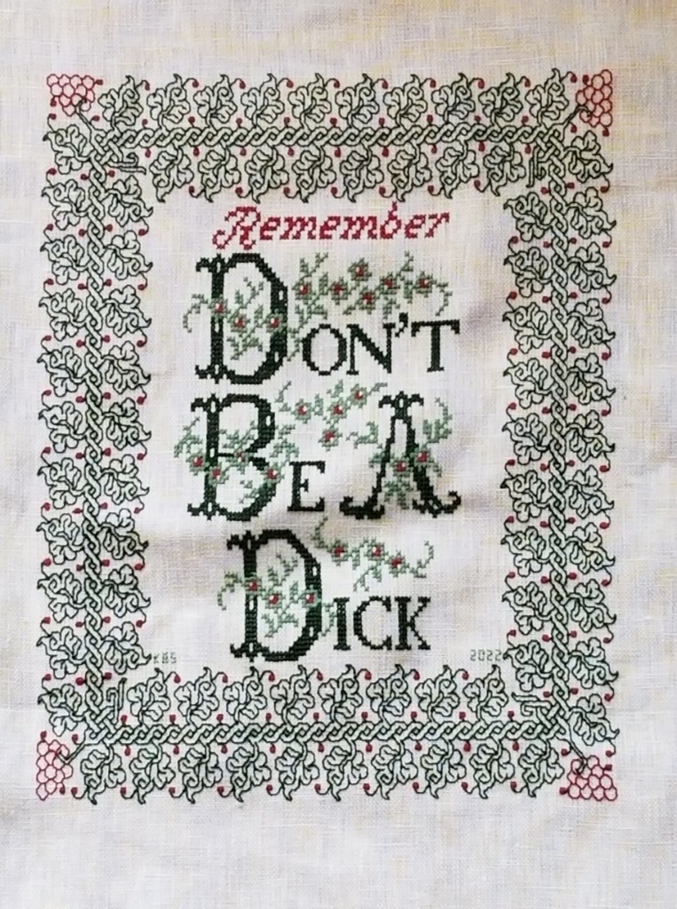
At the risk of alienating all, my two coarse language pieces (behind the eyeball fig leaf image, also in slide show) use formal typefaces to express very informal and direct sentiments. If you are easily offended by rude words, skip ahead.
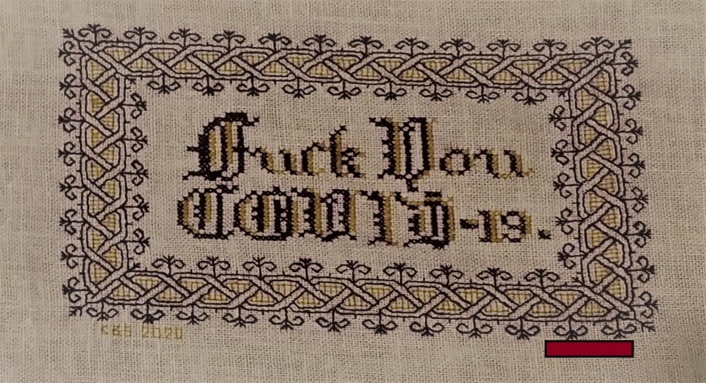
The Covid sentiment, done in a blackletter typeface, uses two alphabets from a German book, available on Patternmaker Charts. One is uppercase, the other lower. The lower case alphabet also supplied the numbers. Again I had to invent a matching letter I. Blackletter family typefaces are reserved for formal documents like diplomas, and newspaper mastheads here in the US. I wanted to play on that gravitas.
Similarly, for the admonition done in green, I wanted to evoke the greeting card world of hearts and gentle sentiment, to contrast the general scolding represented with sweetness and light. I picked one of the flowery alphabets from Patternmaker Chart’s Sajou #160 but leavened it with a smaller yet still uppercase typeface for the rest of the lettering. That classic form serif alphabet is from Grow and McGrail’s Creating Historic Samplers. The R of Remember is from Sajou #1 also on Patternmaker Charts, and the lower case lettering for the rest of that word can also be found in the Grow and McGrail book. I also adapted the floral ornaments from the initial letters for use as fill to surround the lower case one.
Pay Attention to Trifles has the most typefaces I’ve ever used on a single piece. I wanted the word Attention to leap out, Trifles to be the most ornate, and the message to be decoded only on a second glance. And I wanted a vaguely carnival type over the top mix of styles to complement the extremely busy design that is stuffed full of buried “Easter Eggs” as requested by the recipient.

All of these are from the Patternmaker Charts website.
- Pay – Sajou #652
- Attention – Sajou #654
- Even to – Alexandre #143
- Trifles – Sajou # 53 and 203
The dual tone coloration on these was not always noted in the original. Some I tarted up myself. I kerned each line separately, trying to best suit the alphabets being used, squishing ATTENTION a bit made it shout louder. Letting the other lines straggle a bit more made them a bit more lyrical.
While busy, the mad assortment is just over the top enough to gentle the nagging advice of the motto. If I had done the entire thing in the same face as Attention, the statement would have been way to strident. Throw in a bit of whimsey and it becomes an in-joke between the donor and the recipient. The centered text with the balanced motifs left and right is in contrast to the rather chaotic jumble of gears done in inhabited blackwork. There is repeating arrangement of the gears (more or less), but not the strict centering of the lettering. I think that adds to the haphazard playfulness of this piece.
I have done lots of other pieces with mottoes or words on them, but they don’t really showcase different approaches. The last one I’ll cite here is the piece on which I’m currently working. I’m almost done with the penultimate band, and have designed another custom-fit to go below it and end off the work as a whole.
I can’t say for sure where I found the alphabet I modified for use on this one. I found the image in my notes folder, with no attribution other than mid-March 2020 save date. I ended up upscaling from the typeface as charted by using a block of four units for every single unit in the original, and smoothing angles accordingly. Using the squared fill for the shadowing was intended to make the text reminiscent of a brick wall. That the span of the words is larger than the rest of the piece and contributes to that effect is serendipity, not planning. My count was off, and (thankfully) having started in the center, at least the motto protrudes mostly evenly left and right, looking even more monumental than I had planned.

I did kern aggressively to make the motto fit the space, but I should have lost one more unit between the B and Y of by. Still, I think it works. It’s blocky, yet because the letters are represented by outline and shadow, it contrasts nicely with the rest of the piece, overrun as it is with very busy fills.
OK. A conclusion now. Sort of.
If you are designing your own motto bearing piece, there are lots of choices out there that can make a real impact on the design, above and beyond the decorative elements that surround it. If you are unburdened by time/place restrictions (you are not designing a piece in the style of a specific location, school, style, or era), you are free to play. Think of the lettering as another element you can manipulate to underscore the message of your motto, or to convey a mood in which you would like it to be received.
Want to be playfully threatening, like an admonition to keep the kitchen or bathroom clean? How about using a different typeface and font size for each letter, to make it look like a ransom note. Want to convey warm wishes and affection to your extremely sweet and caring (but possibly somewhat humorless) family member? How about one of the ornate flower-bedecked alphabets from around 1900? Have a Goth leaning pal whose heart beats for irony and sarcasm? Use that same flower font in funereal black and purple to express an over the top sentiment.
You can speak words with typeface choice, font size, color, and spacing beyond the actual ones you stitch.
CATCHING UP
It’s been a while since I posted last. Hectic doesn’t begin to describe it. Kitchen finish, work-related deadlines, college graduations, and last – a blissful vacation week on Cape Cod in our new beachside condo, full of kayaking, golf, good food, and the active pursuit of doing absolutely nothing. All in all too many things to accomplish, with too little time to document any of it.
But through it all, a modicum of sanity-preserving handwork has happened: three pairs of hand-knit socks (my default no-thinking project of choice); plus some others.
First, thanks to the generosity of Certain Enablers who shall remain unnamed – a vintage shrug. I began working on this just before the vacation break. On US #9 (5.5mm) needles, this one was a quick knit. At left is the photo from the pattern. At right is my piece.


Those projections on the side are the sleeves. Obviously, I haven’t seamed the thing up yet. A bit of pretzel-type manipulation is slated to happen that will result in a T-shaped seam in the back, and the graceful drape of the simple drop-stitch rib pattern curving in the front. Or so we hope. I have the piece left on the needle because I haven’t decided yet on whether or not I will be doing some sort of live-stitch seam. It’s hot and sticky right now – too hot to sit with this tub of alpaca boucle on my lap. I’ll go back and finish this piece off when it cools off a bit. I’ll have to rush though, so Target Recipient can take the completed garment off to university with her next month.
Second is also a time-linked project. The first of two, in fact. I am edging off the two inspirational samplers I did for the girls, backing them and readying them for simple rod type hanging. Here’s the first. I’m hand’ hemming the backing/edging cloth to the stitching ground. The backing cloth is in one piece, strategically folded to be a self frame. I’ll baste a length of chain threaded on some thin woven tape in the bottom fold to provide weight, and leave small gaps in the two top corners for insertion of the hanging rod:

The second one will be close behind – the other sampler I did this fall/winter past. Also finished out for hanging from a rod. More on that after I’ve laid it out. In fact, if folk are interested, I’ll use the second one to illustrate the folding and stitching logic required to do this.
And finally, just for fun with no deadline attached (so you know what I’ll be working on tomorrow evening), an Autumn Lace shawl out of some unknown Noro fingering weight yarn, augmented by some Noro Taiyo Sock. The unknown Noro was also from the same Enabling Anonymous Donor, and was perfect for a project I’d been planning on working up for a long time:

Here you see the first course of leaves (worked bottom half, then top half). This is not a particularly difficult pattern, but it is an exacting one, with a pattern that has to be closely followed, and that is not within my capability to memorize. More on this one as it develops.
THREAD THREAD
Based on questions from Elaine and others, here’s a bit more on the thread I’ve been using on both the Permissions and Trifles samplers.
As I’ve said before, my stash came from a small needlework/beading supply shop in Pune, India. It wasn’t current stock. The head clerk sent a boy scampering up into the storage attic for a VERY dusty box of odds and ends. I picked out the best colors left, avoiding pastels, and looking for what high impact/high contrast hues that still remained in quantities of 10+ skeins. I bought them all. They were very inexpensive – just a few rupees per skein. At the then-current exchange rate of 60 rupees per dollar, I think I spent less than $20.00 translated, and came away with a huge bag full, well over 200 skeins divided up among about 15 colors. Here’s just a sample:


The name brand is Cifonda Art Silk. It’s not a spooled rayon intended for machine embroidery. As you can see, the put-up is more like cotton embroidery floss. And it turns out that the stuff is still being made, and is available in Australia, and even in the US – although mostly by special order.
The websites that offer this thread vary a bit in description. Some say it is a 35% silk/65% rayon blend. Others say it is all rayon. Contemporary put-ups specify 8 meter skeins. My vintage stash skeins are a bit longer, possibly 10 meters (I’ll measure tonight). The large bundles above are actually “super-packages” of ten individual skeins. You can see the bright red one at the left is broken open, with the single skein labels showing. On mine, color numbers are written on each skein by hand, not printed. There can be hue variances between the super-packages of the same color number, so I suspect that special care should be taken to buy all that’s needed at once, so that all is from the same dye lot.
Cifonda’s structure is that of standard floss – six strands of two-ply relatively loose twist. The individual strands are quite fine, two of them are roughly the equivalent of one ply of standard DMC cotton embroidery floss. The colors – especially deeper ones like red and indigo – do run when wet, although they do not crock (shed color on hands, ground cloth, or wax when stitching dry). I would not advise using this thread on clothing, table linen or other things likely to need laundering. It may be possible to set the colors before stitching using a mordant bath or long water soak, but I don’t have the experience, time, or materials quantity for experimentation.
I am pleased with the way the Cifonda looks in my work. It’s a bit shinier and finer textured than cotton floss, although it does not have the coverage of the true silk floss I’ve used (Soie d’Alger). My Cifonda is quite slippery. Two or more plies held together tend to disassociate and slide past each other for differential consumption, even when using short lengths in a small-hole needle. I tamed this by aggressive waxing – running the entire length of my threads over a block of beeswax before use. Since I’m doing linear counted work, any change in color or texture is not noticeable. Someone using this for satin stitch, long-and-short, or other surface stitches that maximize thread sheen would probably want to wax only the inch or so that threads through the needle.
Like all lightly twisted rayons, this thread does catch and shred a bit on rough skin. Care must be taken to use needles with very smooth eyes, and to hold the unworked length out of the way when taking stitches, because the stuff snags extremely easily. My own stash, well aged as it is, contains some colors that are a bit brittle. The bright yellow I’m using now, and the silver-grey I used on the last sampler are both prone to breaking under stress, and must be used in shorter lengths than the other colors.
I will continue to use up my India-souvenir thread stash, working smaller and smaller projects until it is gone. But in all probability, I will not seek out the Cifonda to replace that inventory as it is consumed.
Anyone else have experience or hints on using this rather unruly stuff?
FINISHED!
It’s done. All 80+ gears, each with a different filling pattern, worked with well-aged “Art Silk” (probably rayon) purchased for a single rupee per skein in India, on 30-count linen. The soot sprites (little black fuzzy creatures) playing the part of “Trifles” are in discontinued DMC linen floss, so that they contrast shaggy and matte against the brighter, smoother silky stuff. I’ve also attached some real, brass gears as embellishments, to add extra Steampunk flavor.

Here’s a close-up of the sprites in process, adapted from the little soot creatures in the movie Spirited Away.

To stitch them I worked totally off count. (Yes, I can do that, too). I outlined the eyes in split stitch using one strand of floss, and placed the eyes’ pupils, using French knots. Then I worked long and short stitch, encroaching on the split stitch eye frames, to get that spiky, unkempt, hairy texture. The arms and legs are close-worked chain with two strands, with the little toes and fingers (what of them there are) also in split stitch, but with two strands. The gears are filled in using (mostly) double running, with some departures into “wandering running” using two strands of the very fine art silk floss; and outlined in chain stitch using three strands of the stuff. All threads used were waxed using real beeswax, for manageability.
I am happy to say I’ve hit all of the specific design requests. And there were many:
- A good motto
- Steampunk (the gear theme)
- Something Whovian (the Daleks)
- Octopodes (dancing in one of the fills)
- Snails (ditto)
- Unicorns and/or dragons (ditto, and the winged, serpent tailed, beaky thing is good enough)
- Anime (the soot sprites)
- Interlaces (also inhabiting the gears)
- Autumn colors (brown, gold, russet, silver)
- Something from India (the thread itself)
The saying itself is particularly suitable for the target Daughter. It’s one of Mushashi’s Nine Precepts. The Daleks are from a graph by Amy Schilling, intended for knitting. The narrow border is in my forthcoming book, The Second Carolingian Modelbook. I found all of the alphabets used (there are four) in Ramzi’s Sajou collection. The gear shapes are adapted from a freehand tracing of a commercial airbrush stencil by Artool. Most of the gear fills can be found in Ensamplario Atlantio. The few that aren’t from that source are recent doodles, and will be made available in time, either as a fifth segment of that work, or perhaps as their own stand-alone sequel. Ensamplario Secundo, anyone?
Now Younger Daughter doesn’t head off to school until next fall, so I have about a year to add hanging tabs, or back the piece with contrasting fabric to make a scroll-like presentation. So while the stitching is complete, this piece may revisit String when I decide what the display treatment will be.
On to the next. I’ve got two more original stitched pieces in queue, with only a general idea of what each one will be, and what styles/designs/colors I’ll use. Free-fall stitching! Gotta love the adventure!
THAT SAD POINT AS A PROJECT WINDS DOWN
After lots of happy chugging along, as you can see Trifles is nearing completion.

I’ve got only eight more gears to finish up, including the two in process now. Then come a couple of “Trifles,” modeled on the little soot demons from Spirited Away, another special request from the target recipient. The hapless little things will be prisoners in the mechanism.

Finally, if there’s room and it looks good, I plan to add some brass watch gears for extra Steampunk flavor.
To answer questions, no – I am not planning this in advance. I choose the fill and color as each new gear presents itself. I chose to use four colors as a nod to the (rarely used) four color theorem, which states that any contiguous plane map can be colored in using only four colors, and have no two regions of the same color touching each other. In my case as a non-mathematician, this was done on a lark, and adds geeky joy.
I do admit that a little logical thinking has been used to select the optimal color for each gear, in a “If I make this one brown, then this one will have to be gold, and that one must be maroon,” sort of way. But again I haven’t sat down and plotted my plan of attack, other than to make the juncture point where I finish adding gears around the motto be the narrowest point of the sampler, to simplify any color meet-up issues.
On fills, I’ve tried to mix up densities and shapes, to achieve as much contrast as possible. So fills based on interlaces abut fills with isolated spot motifs, which bump up against all-over small geometrics, which in turn are next to line-based fills with few or no closed shapes. I’ve had a lot of fun paging through Ensamplario Atlantio looking for the best choice for each gear. And I’ve ended up doodling a few more, just for fun. Here are a couple:


The rather annoyed unicorn is an adaptation of a motif from the open source pattern group exercise I hosted here back in 2010/2011. I have to say that doodling these is addictive. Just playing around, I’ve put together twenty more design squares, including those I collected from the Victoria and Albert Museum smock, item T.113-188-1997. I could easily do dozens more. Now comes a question, with T2CM now finished and awaiting only resolution of logistical and publication issues prior to general availability, do I release the new group as a fifth section of Ensamplario Atlantio, or do I go on and start on Ensamplario Secundo?
NEW TOYS!
I just got back from a quick business trip. Sadly, I came back with a hitchhiker – a bad cold. But to cheer me up upon arrival was my package from Hedgehog Handworks, with my new Hardwicke Manor sitting hoop frame:


As you can see, I was so excited, I had to try it out right away, even before wrapping the inner hoop in twill tape. I’ll do that this weekend.
First the specs of my long-coveted indulgence. There are two joints providing freedom of movement. Looking at the back of the thing, the first is a slider that regulates height. The turned barrel at the base of the main vertical has a wooden screw tightener, allowing the vertical arm to be raised and lowered. Minimum height (pushed all the way in, with the frame positioned parallel to the ground) is 13.5 inches measured from table top to BOTTOM edge of the frame. Max height on which the tightening screw can be brought to bear is about 18.5 inches. The vertical stick also allows the frame to be rotated left and right, provided the wood screw is loosened to avoid damage.
The second degree of freedom is the y-shaped joint at the top of the vertical stem. The fixed attachment piece from the round frame fits into the slit of the y-shape, and is tightened by a bolt with a metal wing nut. (I will probably replace the wing nut with something a bit more finger-friendly in the future). This allows the frame head to swivel up and down, allowing access to the reverse of the work.
“Orthodox” use position and all of the pix I can find on line show the large paddle piece at the bottom being slid under the left hip, so that both legs sit upon it, and the frame is presented across the user’s lap. Users are also shown sitting bolt-upright on a chair or a sofa.
I’m a bit more relaxed. My favorite stitching chair is a Morris chair, with wide wooden arms, like mini-shelves left and right. It reclines. Instead of sitting upright, I tend to stitch in the reclined position. I also don’t want to bark the chair’s woodwork with the frame, so instead I straddle the base, with the paddle-bottom underneath my right thigh. I can adjust the position of the hoop so that it’s perfectly comfortable and accessible in that position.
All in all, I am VERY pleased, although I may need to stitch myself a small bolster on which to rest my left elbow when working with that hand beneath the frame. The chair arms are too high for comfort, and some support would be useful for extended sessions. Oh heavens. A quick project to make something useful that I can cover with MORE stitching. However will I cope? 🙂
In the same order, I also received some tambour embroidery hooks. I won’t show them here, but will save them for a future piece. Hmm…. that elbow cushion… What do you think?
And finally as a cheer-me-up, Younger Daughter, Needle Felting Maven and all around good kid, saw that I was in need of a small, weighted pin cushion that was presentable to leave here in the library next to my chair. Although she usually does far more intricate shapes (dragons, tigers, airplanes), she made me a little sea-urchin, weighted in the bottom center with a couple of big rupee coins, for extra sentimental value. It’s adorable, simple, in colors that match the rug in the library, and at about 1.5 inches across, with the coins giving it a low center of gravity, so it doesn’t go skittering off – the perfect size and weight.

Finally, I have been making progress on Trifles. As you can see, I’ve got less than a quarter of the surround left to go. And every single gear uses a different filling.

PROGRESS CAN BE VERY BORING
You know you’ve hit full stride in a project when you think of what to write in a progress post, but have no new challenges, discoveries, tricks, or lessons-learned to report. All I can do today is show off more gears and cams, with more fillings:


I’m continuing up the left side of the motto, then I’ll do the right side, and finish with the top. I’m having tons of fun selecting fill patterns from Ensamplario Atlantio.
I had hoped that when I released the thing I’d see more things on line that use its designs, but searching does turn up a few projects:
- Ben from Tiny Dream Stitchery is doing a sweet sampler, I really like the layout he’s using. It’s reminiscent of a formal Renaissance garden plan.
- Whispered Stitch is making adorable little needlebooks using motifs from the patterns, and offers a tutorial on their construction.
- And Stitches used the patterns in her rendition of a large group stitch-along project.
- Rebecca of Hugs are Fun did a name sampler, a striking and innovative idea for using the fills.
- Kathy at Unbroken Thread stitched up a spectacular piece, incorporating gold, paillettes, purl, and beads.
- Miriam did a bunch of nifty key fobs, using EnsAtl patterns along with ones from other sources.
- Colorize also has a sampler. She’s picked some of the more complex designs, brave soul!
- Susan at Tuesday Stitchers used a design in a large departure from the usual, as an embellishment stitch done on gingham in a crazy quilt. Very cool!
If you know of any others, please post them in the comments. It gives me immense joy to see the mischief that these designs get up to out there in the wide, wide world.
Sadly, I’ve also found a ton of pirate sites on line, mostly in Russia, who felt it necessary to steal the book and repost it in its entirety. I can’t do anything about them besides despise the lack of integrity and gutter slime ethics that such theft represents.
The ONLY authorized source for the book is right here on this site. It’s free. Link above, and under the Books tab on every page of String. If you have downloaded my book anywhere else, you have found a stolen copy.
GEARING UP
As you can see, Trifles is coming along. I’ve just about finished the first set of gears:


The next bit to do will be the two sides, proceeding left and right of the established bit, growing up to frame the motto. I’ll use the same stencil for my basic layout, rotating and flipping it to make the repetition less evident.
A couple of you have written to me to say that you find the gears rather disappointing – that they are not sharp and mechanical enough. In fact, the edges of some of them are more gentle, cam shaped rather than toothed, and the teeth do not mesh exactly.
Frankly, I don’t find this a problem, and I don’t care. The thing will be more representational than mechanistic. I’m going for the idea of gears here, not a CADD drawing.
I am having fun flipping through Ensamplario Atlantio looking for which fill to do next. Everything you see here has been done ad-hoc, one gear at a time, with no pre-planning on what design/color to use next. I’ve used four-color placement principles to avoid having two gears of the same color right next to each other. I’ve also tried to achieve a nice mix of densities and shapes, with contrast between horizontal/vertical and diagonal elements, all-overs/spaced spot motifs, and between straight lines/curvy patterns. On the whole I’m pleased. I’ll add more dark and density to the lower left, next. Also more gold there in that corner.
Stay tuned for further developments!
GEAR-HEADED
Trifles is moving right along. Waxing the thread has greatly speeded up production. You can see my working method: filling first, then outline to cover up any edge fill irregularities.
Here’s the gear set now:


I’m having fun picking out the fillings on the fly, trying to vary density, color, and form, so that abutters contrast nicely. For those who have asked – yes, every filling used so far appears in Ensamplario Atlantio. I have it downloaded to my iPad. My favorite sewing/knitting chair is a Mission-style recliner with very wide, flat wooden arms. I am able to stand the iPad up on one and zoom in on the chosen designs as needed. Very convenient.
Progress will get a bit less exciting from here on in. I plan to totally fill the ground around the motto with gears, each worked in a different filling design. No other colors will be used. I’m sticking to the deep russet red, chocolate, gold, and silver. I may or may not add some real brass gears as embellishment. I may add some small large-eyed tiny critters stuck in the gearwork, sort of like the soot sprites from the movie, Spirted Away. That’s another of the target recipient’s favorite fandoms.

TRIFIAL PURSUIT
Back from our annual escape to North Truro, and reporting progress on the recently dormant Trifles sampler, being stitched for Younger Daughter to take with her off to college next fall. I decided that for my no-longer-little Steampunk (and Dr. Who) fan, instead of working lots of bands, the design for this one would feature gears. But I had a lot of problems hand-drafting up a nice set of them. It took a while, but eventually I hit on the idea of using a commercial stencil intended for airbrush work, then filling in the traced gear shapes with blackwork counted fills.
Here’s where I am now:

I’ve finished the main motto and the frame around the to-be-worked area. Minor brag: Note that having marched all the way around the piece without drafting first and using only counts of the border repeat to stay on target, I ended up even, perfectly aligned.
All of the fillings I will use on this will be from my free eBook, Ensamplario Atlantio. The ground patterns are stitched using two plies, mostly in double running, with lots of departures to accommodate the non-continuous nature of many of the fills. The outlines are plain old chain stitch, done in three plies of the same color as the gear filling. I am not taking any special pains to make the cam teeth totally square, or to make them mesh. I am liking the rounding and imprecision. Right now I’m thinking of covering the entire piece with gears in burgundy, brown, gold, and silver, relying on classic Four Color Theory to avoid making any two contiguous gears the same hue. Choosing fills for color in addition to density and form is adding a new dimension to this decidedly un-traditional yet somewhat traditional blackwork piece. And I may insert a surprise Trifle or two, just to emphasize the point.
On execution, I can report that I’ve managed to tame the extremely unruly Indian “silk” (in reality, man-made rayon) thread.
Beeswax.
I occasionally wax the last inch or so of my silk threads to make threading easier and to help ward off “ply creep” – when one ply of a multi-ply threading is consumed faster than the others. But I usually don’t wax the entire length unless I’m working with linen thread. However this stuff is hellaciously difficult, shredding and sliding, breaking and fraying, and catching. Using shorter lengths wasn’t the answer – no usable length was short enough to use comfortably. So I moved up to waxing the entire strand, and when I did so, most of my problems disappeared.
I am very pleased with the results using the fully waxed threads. They don’t break. They don’t escape from the needle’s eye. They don’t shred. Both plies are consumed at the same rate. Double running is nice and crisp. A major improvement that’s increased the enjoyment factor of a project that might have been truly tedious.

And I’ve wanted an excuse to stitch up those griffon-drakes since I drafted them up for the book.
