NEARING SECOND!
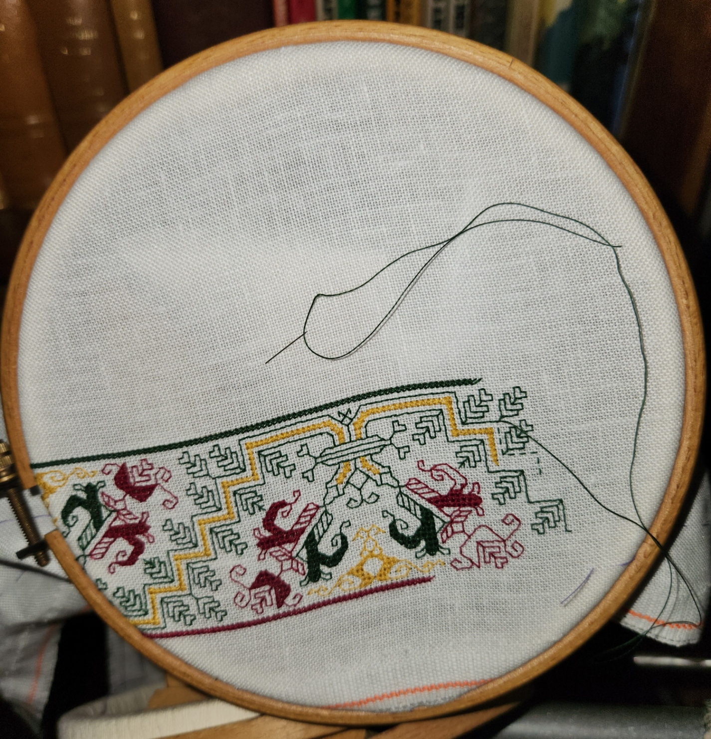
Sorry for not posting many interim images this week past. The repeat has been established. Memorized, even. So progress is pretty much more-of-the-same. Not particularly visually interesting, just being repeat after repeat. But I’m now on the run up to the second corner.

That diagonal just beginning to appear in the right side of the hoop will be the one that spans the corner, just like the one in the first corner.
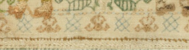
Because I was very conservative in picking my starting point on the left hand edge, centering my beginning to the center line of the narrow end, but not having a drafted corner, just winging it – my right hand edge will be a bit further from the fabric edge than that on the left. No worries. I’ll end up trimming off about an extra inch of fabric when I do the final hemming. That’s not enough to be worth improvising a new, partial corner. I prefer to replicate the one I’ve already done, since that one worked out so well. Here’s a closer photo of the bit currently in the hoop.

You can see the bottom of the stitching is so close to bottom of the fabric that getting a nice, firm hold and an efficient span is difficult. I still may mount this on a scroller once I get up to working the spans across the middle, but for now, since I’m sticking with the small hoop for portability and the ability to get as close to the hemmed edges as possible.
In terms of thread consumption, even though (in theory) the stitching on this is based on two-sided principles, the work itself is quite economical. I am using DMC standard floss, single stranded, and I’m still on the first skein of all three colors. I figure that to do the whole rim around I am looking at two skeins of each. Since I’m not quite sure how densely I’ll be working the center I might be looking at as many as four more of each, but probably closer to another two. And I have them all in stash. No worries.
I do admit that going on and on in the same repeat is a bit of a challenge in perseverance and diligence. One reason I do so many narrow band samplers is that I get to go on to the next Interesting Thing before I run out of patience with the current strip. Still, this is a good study in applied discipline over time. A skill I have always had in short supply. It’s training. Yup. Training. 🙂
As far as my other exercises in discipline, I have been Very Good about my physical therapy homework, walking, and other activities to increase strength and endurance. It’s slow going (not unlike the current stitching), but I am seeing results week on week. Horseback riding and quick step galliards may be in my past, but there are lots of other things I hope to resume over time if I keep at it.
QUARTER FOR YOUR THOUGHTS
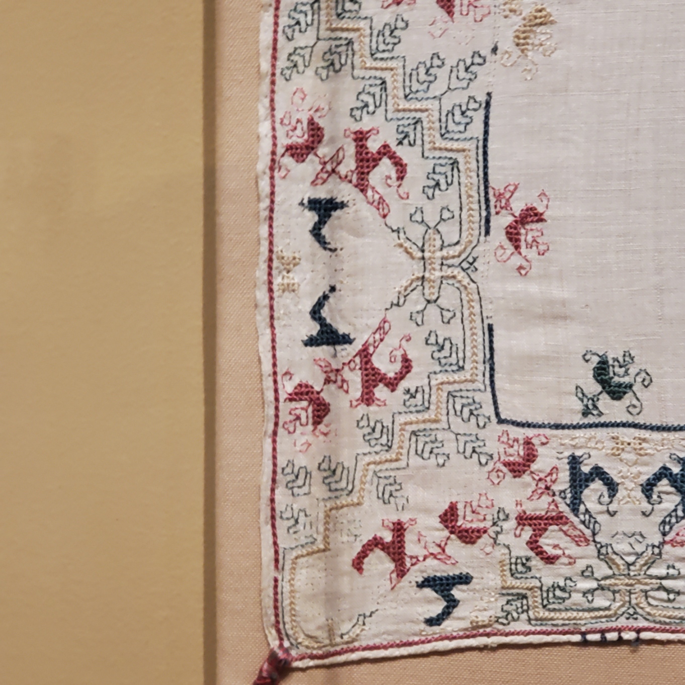
No, not inflation – at least not overtly. I’m just about 25% done with the frame around the outer edge of my Italian multicolor piece. Closeup posts of the bit currently under the needle are going to be repetitive from here on in, so I present the full canvas of this “painting.”

If it looks to you like I’ve sped up production – I have. I had wanted to mount this piece on my big Millennium frame, but I had no extra wide twill tape on hand. In person shopping being a bit unwieldy right now and not wanting to rely on goods sight-unseen I’ve stuck with the hand hoop, the sit-upon hoop being an inch wider across and even less suited to close-edge work than this smaller one. But I decided to stick the little hoop into my Lowery floor stand. That lets me work two-handed, one above and one below. And working that way for me is about half again as speedy as holding the hoop in one hand and stitching with the other. So one “up” repeat including initial outlines, meshy fills, and Montenegrin lines took about an evening and a half to stitch using the floor stand, but took three+ evenings with the hoop in hand.
The sharp-eyed will note that the center of the repeat currently in the frame does NOT align with my basted line that marks the center of the cloth as a whole, while the center of the repeat along the short edge, where I began does line up with the horizontal center line.
This was on purpose.
I took pains to do the math for the short edge, hoping to get close enough to the final diagonal needed to make a graceful improvisation for the corner. At that time I hadn’t realized that the original stitcher fudged the corner that most resembles what I wanted to do. I made it without that fudging, but at the expense of stitching further towards the serged edge of the cloth than I would otherwise prefer. You can see how low in my hoop my stitching is – a very inefficient and precarious placement that barely grasps the lower end of the fabric as I try to achieve and maintain optimal tension.
Since I hadn’t graphed out the corner and had only a rough estimate of depth, and knowing that my plans for a neat turn might not fit, instead of beginning the piece along my original posited outer edge (the basted line at left), I skimped on the edge area there, too. Not quite as much as along the second edge, but enough to make a difference. My logic was that when I continue around, if I need extra width or some odd bit of kludging to get to a neat corner on the second turn, I’d have more options. And if I didn’t, I wouldn’t be inconvenienced by the extra unworked cloth, and could cut it off in my finish.
Having narrow margins around the stitching (however inconvenient) and removing any excess play into my plans. My intention to finish this piece is to imitate the original, with “poetic interpretation” of what little remains of that treatment – a narrow turned hem, with neatly spaced blanket or buttonhole stitch and corner tassels. The hem-covering stitch of the original is probably plain old blanket stitch due to the way it has deteriorated. I would think that the edge reinforcement of tightly twisted knot like bits along the free edge in buttonhole stitch would have been preserved better, resisting large runs if snagged. But little remains. It’s very hard to see in the photos I took and the museum’s own shots, but there might even be a very narrow, barely there strip of needle lace along the edges – not wild stuff with dags and picots – just a simple solid band. I’ll be squinting at the photos to see if I can learn more. I’ve done that type of edging before, on The Resident Male’s SCA fighting shirt, in black, long ages ago, so it would not be a stretch to do it again. In any case, plain stitched hem or fancified hem, there will be little reveal of plain cloth between it and the established stitching. There will be plenty of linen left for the hem, regardless of how wide or narrow the stitched part ends up being.
Now where the true vertical center point of the piece as a whole is will matter when I get to the wide bar I am planning to add. That will span the middle, across the short dimension. It may be aligned with the center of the pattern iteration I’m currently stitching. That’s about an inch left of the basted line. BUT if I get near the other end of this side and I decide to devise ANOTHER corner treatment, and that treatment needs additional width, it might move either closer to the cloth’s original centerline, or to another point in that general direction. No clue right now what I will be doing, so stay tuned!
….Isn’t the suspense of Bungee Jump Stitching furiously exciting?
NOT QUITE EXACT, BUT GOOD ANYWAY
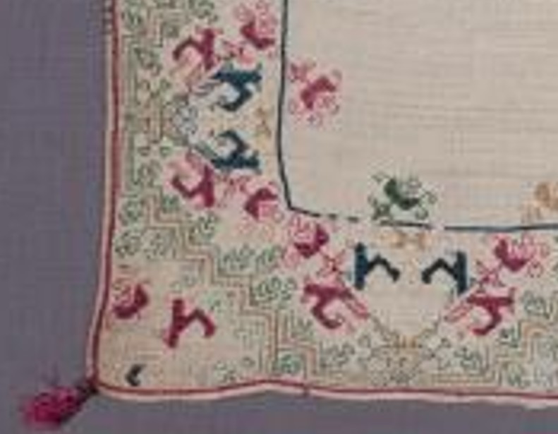
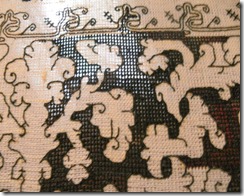
So. More examinations of the corners of the big towel from the MFA, and my first corner. Here are the four corners of the original
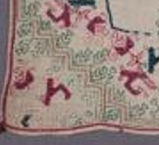

Not quite aligned but all there. Now my stitched corner as of this morning:

It’s closest to the one on the lower left, above. But not exactly. Look at this bit.
That’s a clear kludge. Not to brag, but my join is cleaner than this. I can’t deduce where the stitcher (or stitching team) began, but it’s clear that either the vertical bit on the left side of the photo, or the horizontal bit on the right was already laid down when that corner was rounded. The stitcher did their best, but the pattern doesn’t line up. For that matter, no two of the original corners ARE the same. But I bet you didn’t notice when you looked at the thing as a whole.
I will continue around on my mini-version. I haven’t decided yet if I will limit the width to multiples of the whole design, so I can replicate my corner exactly for the remaining three. Or if I will just make do, in a celebration of the heedless joy of the original.
And how far do I have to go to get to the next corner? Here’s my full cloth, so you can see the proportion of as-yet-not-done to the bit completed:
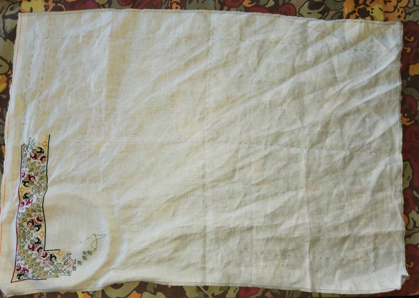
Quite a ways.
Aside from the corner challenge, upcoming decisions include a supplemental treatment spanning the center. Here’s the original again with two double width strips and two narrow single width ones across the center.

Examining those bars, I can conclude that they were done after the framing, and were aligned with the cloth’s horizontal centerpoint, because the band design is truncated (more or less) at the same point where it meets up with the frame, both north and south. But note that the centers of repeat along the long sides of the frame itself do NOT align with those bars, nor do they align with the measured center of the cloth. Again I bet you didn’t notice.
My smaller cloth may have enough room for one wide center bar; two narrow center bars; or one wide bar flanked with two narrow ones. Lots to think on there, but I won’t get to that part until after the frame around the edge is complete. And then there’s their alignment to consider. (I’m leaning towards filing them under Chaotic Neutral for the time being.)
On the healing front, I’ve completed Day 23 of radiation therapy. 17 more to go. No major perturbations, just the slog of rising before dawn to drive downtown and back before major traffic. Not that I’m counting or anything…
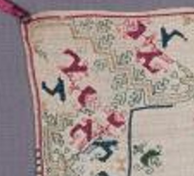
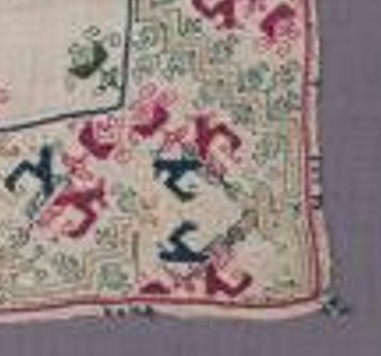
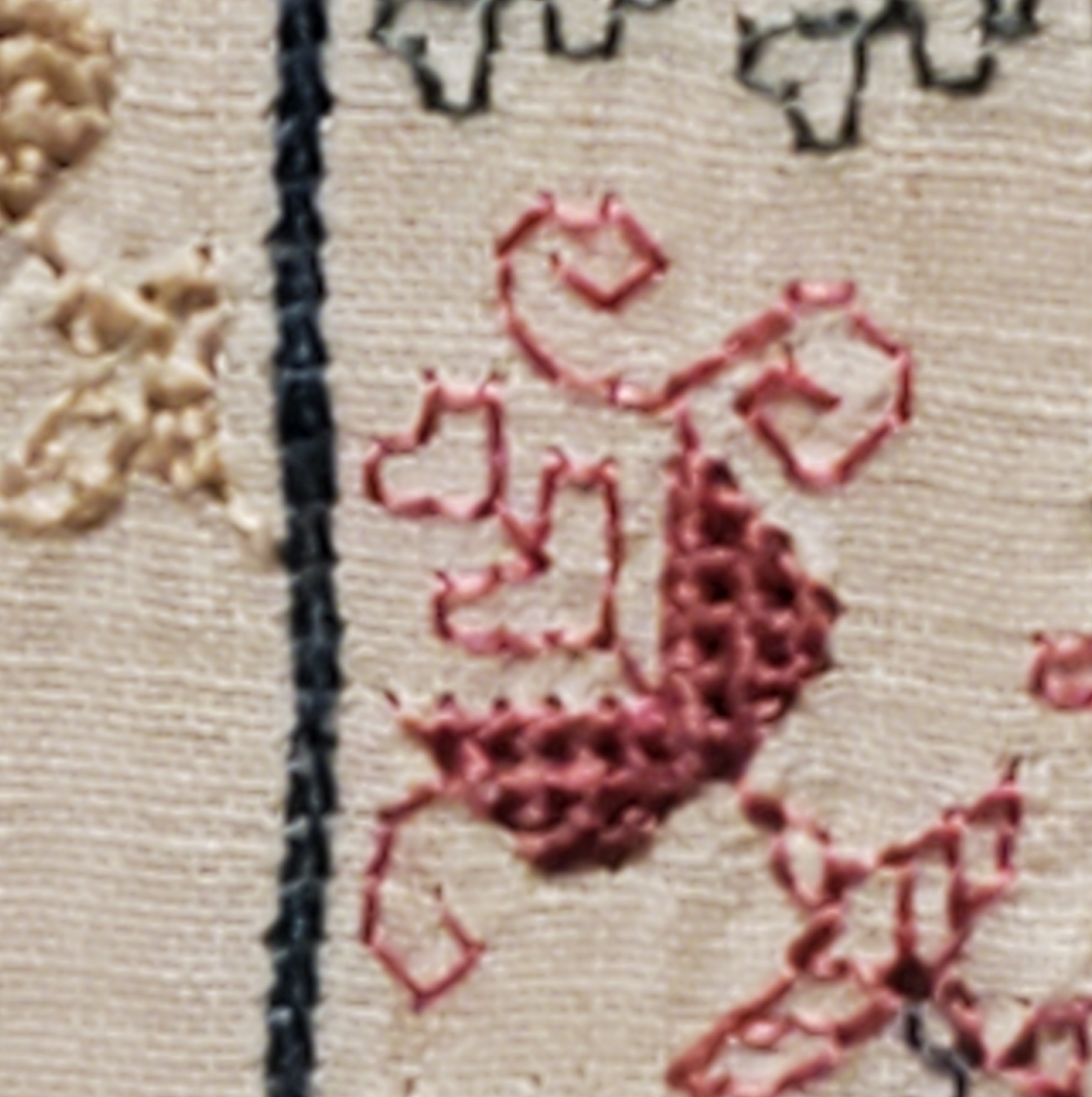
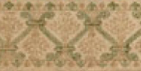
CORNER AND TASTY MILESTONE
My improvised corner on the current piece appears to be working out. And it looks like the original stitcher(s) hit upon the same notion, and did something very similar. Here’s what I have:

Note the extension of the zig-zag frame to a full iteration of the pattern, but one headed off on a right angle to the initial bit. And the beginnings of another red flower section in the triangle made by the border. Looking back at the original, although all four of its corners are treated differently (and a couple of them quite awkwardly), one does appear to take a similar approach:
We will see if this gets me into any unforseen trouble, because looking at the original, I do see some kludges that address the variance in placement between that truncated corner flower and the framing zig-zag. Fingers crossed. Still it’s fun to see that I seem to be sharing the thought process of someone else, from way back then in time.
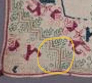
As to Meshy in cotton – I’m getting better at it as I learn more about the thread’s breaking point, and how much the ground cloth weave can be compacted by tight stitching.

The openwork texture doesn’t show well in such narrow spaces. It’s also hard to see in person without backlighting and practically putting one’s nose against the work, but the open mesh effect is there. I’m increasingly pleased with this, but I still don’t know to what purpose I will put the finished cloth.
Milestones
It’s no secret that since The Great Excavation and subsequent rehab/recovery, I’ve been living entirely on the labors of my Resident Male. While he has always handled the bulk of the cooking, I did contribute every now and again, with daily cleanup, baking special treats (especially during the holidays), and doing the occasional leftover reheat/repurposing, mid-week. But I have been a true freeloader since mid-March, and have only recently resumed unloading the dishwasher and doing other minor household tasks.
But yesterday and today I baked!
We are having some friends over tonight for dinner. I decided it was time to step up, and volunteered to make small ramekin chocolate cheesecakes
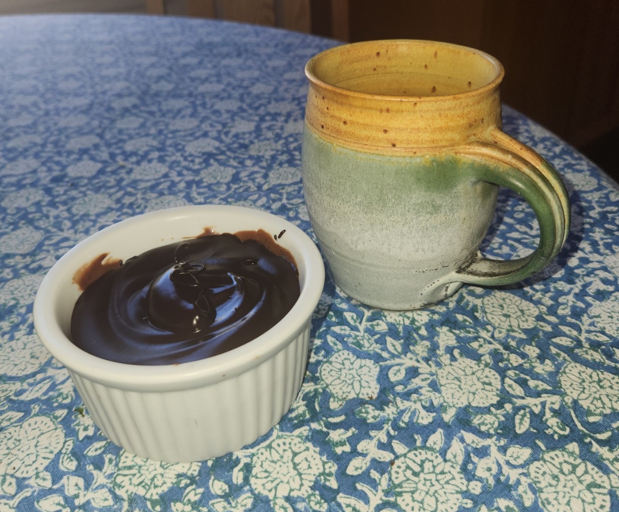
I made six of these little guys. They have three layers, and are a mash-up of several recipes. I used keto ingredients so they are low-carb, low-sugar, but not low-fat. And yes, I will clean up the edges a bit for presentation.
The bottom layer is a cocoa shortbread, made from King Arthur Keto wheat flour (no exotic nut flours, our guests are allergic), butter, cocoa, and faux sugar (Swerve brand, confectioners style). Next is the cheesecake part – standard full fat cream cheese (the bagel’s best friend), no-sugar dark chocolate baking chips (Choc Zero brand), heavy cream, eggs, vanilla, and a touch of salt. On top is a standard proportion ganache made from the same baking chips and heavy cream.
I did them in three stages with a small rest between the base and shortbread, then finished them with the ganache this morning. I was mildly tired after being on my feet so long yesterday, but not truly fatigued. While the shortbread and ganache I winged on my own, the cheesecake part is a combo of several keto cheesecake/chocolate cheesecake recipes.
I’m pretty confident that these will be acceptably tasty, with a dense but not rock solid texture. If not, I’ll report back, tweak my notes and in the future try again. Still, I’m proud of my dessert and happy to have cleared another recovery hurdle.
TRUE CONFESSIONS
I am very glad that I didn’t focus on making this piece two-sided.
At the outset, I thought about it. Hiding the ends on both Montenegrin Stitch and Meshy (Two-Sided Italian Cross Stitch, pulled tightly) are easy. Lots of real estate overstitched in which both beginnings and endings can be camouflaged. Double running is a bit more difficult, especially when one strand is used. Yes, I know various termination methods to do so – one-strand loop start and waste knots to begin; back-trace stitching, and threading through the existing line to end – but they are annoying to do, especially on a large piece. I made a half-hearted stab at it, but abandoned double sided double running early on, But I never thought it would be the two solid techniques that would be giving me trouble.
Here’s the front:
Here’s the back:

Montenegrin is working well. There are just a couple of bald spots where I lost track, mostly in angle changes. I blame resuming the habit of watching TV while I’m stitching. Occasionally I get caught up in the action, and miss a turn. Then don’t realize it until I am long past. Had I still been reverse-side-display focused, I would have done more diligent checking, and would have ripped back and redone the less than perfect bits.
Meshy on the other hand… Ouch.
The two-sided Italian cross stitch works best over large areas, like backgrounds in voided style pieces. It isn’t as cooperative when its playgrounds are small, as they are in these flower parts. It’s like working nothing but the bits where voided stitching bumps up against a foreground line, with no respite. Working these small parts I never quite get the rhythm – it’s all compensation stitches, with very little chance to display the openwork texture. That also means that coverage on the back gets slighted as working direction changes to adapt to the shape of the field being filled. Add to that the tension limitations of the cotton floss (more fragile than silk, believe it or not), and in spite of cotton’s fluffier nature, we have lots of bald spots on the back. Far from optimal for double sided display.
Finally then there’s my own general laziness. I’ve made a couple of mistakes that I’ve had to pick out. But instead of picking out large areas, I’ve mostly opted to pick out just the “broken” bits, tying off loose ends, or fastening them with overstitching on the back. Most of the fat or knotty looking spots above are from fixing mistakes. Sometimes the errors encroached on Meshy sections, and those are notoriously difficult to frog. Sometimes I ripped out small segments and replaced them because I didn’t feel like re-creating the large, accurate sections they were in, just to get at a couple of errant stitches.
So my back is a relative shambles. I will of course continue on, focusing on the front. But especially for those of you who tell me that my pieces are inhumanly perfect, please know that you usually only see the after photo, and lots of corrections and creative editing went into making the project look like that.
My Italian Fall
No international or domestic tumbles involved. Only, just like that, my fall project begins.
Yes, I am sticking with a project inspired by the big Italian towel/cover in my last post. I’m working it on a much smaller piece – a quotation rather than a full reproduction. I’m using the 19 x 27 inch (48.26 x 68.58 cm) piece of 40-count linen I mentioned earlier. That’s obviously less than the 381.89 x 582.68 inches (970 x 1480 cm) of the original. It’s very hard to make out the stitch or thread count of the original, but it does look like (most of the time) stitches happen over 4 threads. I couldn’t get close enough to get a dimensioned or scale-related photo of a strip, but I can say that I am working over 2×2 threads, and my individual motifs are smaller than on the original.

Although the size makes it a hint at the original, the design snippet I use will be a “larger” representation of the whole than it would have been if I had hit the stitch size of the original. More stitches per inch may make my pattern rendition smaller north/south and east/west, and will allow me to fit more repeats on my smaller cloth. Still nowhere near the repeat scale of the museum piece, though.
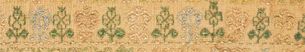
Now on to the stitches. I am using Montenegrin for the solid lines of green, red, and yellow. The Amy Mitten booklet Autopsy of the Montenegrin Stitch, Exhumed is invaluable for guidance on the various directional angles and corners needed. I used it before while stitching my long green sampler. It was what got me through the maze of this design:

I chose the squared back version of Montenegrin for the band above, but Mitten presents two versions, and I am using the other with a solid strip back for this one. Mostly for variety, and to see how the two compare.
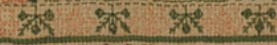
Another stitch I used on Long Green is also present on this one. I call it “Meshy” but it’s official name is two-sided Italian cross stitch. I am using it for the solid infilling on the flower-like parts. Although it’s not called out in the MFA description, the closeup photos I took clearly show the mesh structure of the stitch, when it is pulled extremely tightly. Because of silk’s tensile strength, it works especially well for this stitch. You can see that mesh at large scale, with all ground threads bundled (none cut), completely covered by the silk in the Meshy part of my long, green sampler:
However, for this piece I’ve chosen DMC cotton floss – one strand. I wanted to work from stash, and to guarantee washability. In retrospect silk might have been a much better choice, allowing greater delicacy over all and a better defined mesh; but it’s pricey, and would be a new purchase. I’m putting off buying imports until a sane US international trade policy manifests.
Cotton doesn’t have the oomph of silk. Yanking on it to maximize the mesh effect can lead to breakage, and its bulk makes the filling more bead-like than lacy, especially in the narrow spaces of this design. Still, it’s not that far from the original, and if I’m careful I can teeter on the edge of destruction without actually shredding the thread. And working the narrow petal shapes in this stitch is proving out to be its own challenge. It shows and works much better in larger, open spaces.
I had toyed with making this truly two-sided. Meshy is two-sided, and the Montinegrin variant I picked has a not-exactly-the-same but close-enough reverse. And double running can be two sided. But I’ve already made enough mistakes and corrected them without pulling everything out (very hard to do with Meshy) that the back is compromised. I will settle for MOSTLY double-sided on this one.
Obviously there’s a ton more to do on this cloth.

I may move it to my largest Millennium scrolling frame. It’s just a hair too wide in its short side dimension (bottom in the photo) to fit on my next-to-largest one. But to do that since I have measured and placed my beginning to maximize the stitched field, I will need to add waste cloth or wide twill tape around the top and bottom. I need to add “real estate” for the scrolling rods to bite. And depending on how much tension I can achieve in the east west direction using my shortest set of extenders, I may want to add some twill to the long edges to accommodate lacing, too. But for now I’ll continue with the hoop. Working with it is much slower, but it is more portable, and I wander around the house quite a bit now as I stitch, to take advantage of changes in sitting venue.
Stay tuned, there will be LOTS more progress reports on this one. I hope they won’t be too boring. The pattern will remain mostly the same throughout the piece, but I do have several challenges coming up. For example, how to handle corners, and how to divide the framed plain linen center using double or single widths of the design. And if I do so, graphing out the supplemental edging sprigs, and how to place and space them.
On the health front, all continues well. Preventive radiation continues. No side effects ill or beneficial so far, although the superpower of magnified vision would come in handy. Mobility, sitting stamina, and general energy levels are increasing. I can make it around the house without a cane now, and only use it for going outside, or up and down the stairs. I’m a lot slower than I used to be, but even slowly, I can now get there. All is good.
AHA!
I’ve finally figured out what to stitch!
Two years ago Friend Merlyn and I went to the Boston Museum of Fine Arts, and saw an exhibit that featured (among other things) this Italian masterwork.
It’s described as a towel done in Punto Scritto and Punto a Spina Pesce MFA Accession 83.242, Italian, 16th century, silks on linen. In terms of size, this piece is big enough to be a table spread to seat eight, much bigger than anything I’d think of as a bath towel.
These stitch terms are used in MFA descriptions, but not many other places, and probably haven’t been updated since the initial acquisition and accession in 1883. Punto Scritto is clearly double running stitch. Punto a Spina Pesce (as far as I can figure) appears to be what we would call a form of long armed cross stitch (LACS) because the stitches that form each adjacent unit employ the same insertion/emergence spots, although modern stitches using that Italian name appear to spread the entry/exit points out, like herringbone stitch. I also note that the directionality of the individual stitch units as it rounds corners makes me think that execution was most like the Montenegrin stitch variant of LACS (more on this below).
I shared several photos of this at the time of our visit. And I put it on my list for redaction. Well, now is that time. I’m going to chart this one up, and then use the designs on a MUCH smaller cloth of my own. And as I look closer at this one, I think I will try to use a similar range of colors (but in cotton for washability), and the stitches I think look the closest to those of the original. At least on the front. I don’t see any photos of the back on the museum page in order to make totally accurate identifications, and am not impelled to write to request any. One thing I did note is that for the solid filled areas, the tightly pulled two-sided cross stitch variant I call Meshy was used. That isn’t credited on the museum page.

Another thing my close-ups show is that the piece was stitched over squares of four by four threads. There appear to be quite a few mis-hits and subsequent corrections where four by three or three by three threads were covered. This seems to pop up mostly in the curly bits that spring off the lily like flowers. I don’t know the actual count of the ground, and obviously couldn’t get up close enough to take a dimensioned photo, but I think that 2×2 on my 40 count linen will look close to the scale of the original.
Given that the Meshy and double running stitch bits can be done truly double sided, I have to think further on the use of something in the LACS family that is presentable on both sides. I’ll probably settle on Montenegrin. Both front and back of that are presentable, although the front does feature an additional vertical bar. It’s hard to make out on the photos, but some of the solid lines, especially the dark green ones that run the length and width of the piece do seem to sport a bar in places. But the deep yellow bits that run inside the motifs, don’t. Maybe the stitcher, noting the difference between the appearance of the two sides of the stitch chose to use the more open “reverse” on the front for the yellow bits, and what we consider the front of the stitch’s more solid effect for the framing lines. Fortunately, I have both practice with the stitch plus Amy Mitten’s excellent flip book on executing Montenegrin, covering all possible directional angles, so the transitions in this design will be easy, even upside down.
Now off to chart, and once the main motifs are captured, figure out how to compose them into a viable “small snapshot” piece on my 19 x 27 inch (48.26 x 68.58 cm) cut of linen.
DITHERING
I am still not sure what to stitch next. As part of the stash archaeology portion of the planning process, I did a quick rummage through my accumulated threads. And I’ve been collecting them since grade school.

This box holds a mix of all sorts of things. Most date back to about 1966 when I first got an allowance, but it’s mostly full and partial skeins of J&P Coats Deluxe 6-strand embroidery floss and DMC 6-strand embroidery floss. I’ve got some older bits in there, too – legacy from my grandmother Pauline’s stash.
There is also a handful of Madeira 6-strand floss mixed in. I’ve never actually bought that brand, so I suspect it was second-hand stash that was given to me, or that I found at a yard sale. An interesting detail is that Madeira is now known for specialty packaging (in addition to thread quality), but the put-up I have in this scrum is all pull skeins. I can find no information on when the company changed over to the specialty packaging, but I suspect I acquired these stray skeins no later than 1985.
Other oddments include some soutache left over from SCA dresses done in the late 1960s, plus hose spools of variegated color silk (or possibly rayon) machine embroidery thread. They are end spool spoils, discarded as being insufficient for industrial use, but salvaged by my grandmother Minnie (the union seamstress/machine operator) for personal use, before she retired in the mid 1960s.
The oldest in the collection? These.

I have about a dozen different colors of the that JP Coats Deluxe, all with the 10-cent price on the skein band itself, but this indistinct tannish grey one had the clearest label. From the price and the color (purchased to stitch a bunny on a pair of 6th grade jeans), I can say with authority that I bought it in 1968.
The purple one is Lily 6-ply cotton floss, one of the grandma-Pauline-hand-me-downs. Although embroidery floss is still marketed under that name, it hasn’t been made by Lily itself since the 1960s. From the style of the typography on the wrapper, my guess is that this was purchased in the 1950s. The blue skein is Cynthia 6-ply cotton floss. I can find nothing about that brand or the possible maker. Dating again from the typography, I’d say that one is even older than the purple skein, and is another Pauline-leftover.
But that’s not all. In the past 10 years or so I’ve been the recipient of quite a few stashes, as friends and coworkers came into crafts supply inheritances they were not interested in keeping. And I’ve pursued several free trades or secondhand purchases via the local on-line yard sale lists. For example, some of the thread below was tossed in when I bought my second Lowery floor stand.

This material is a jumble of leftovers. Some of it is wound on bobbins (not my preferred system of storage), other is still in the original form factor. Most of it is single or partial skeins. Almost all of it is standard cotton floss, mostly DMC and Anchor. A small amount sparkly fleck special effects thread is mixed in, but no true metallics. There’s also a bit of white-labeled “craft floss” – inexpensive imports sold in multicolor packs at big box crafts stores. That’s best suited for braiding friendship bracelets since it’s usually short staple, and not of proven washability. Of note is that special packaging for Madeira, right there at the center bottom. That’s quality stuff, all full packs, and probably what I would use first of all of this bounty.
Now, my two leading possibilities for ground.

First, a lovely 19 x 27 inch (48.26 x 68.58 cm) piece of 40-count linen – a holiday present from my spawn, who enable me when they can. I’m very impressed by the vendor, whoever it was. Not only is the stuff cut exactly on true, it’s also neatly serged on three sides, with the fourth being selvedge. Usually I have to true the piece and hem myself. From the particular form of the orange stripe and line of blue stitching along the selvedge I think it might be Newcastle linen, but other firms do orange stripes, too.
The candidate on top of the linen is a yet another free trade/adoption acquisition. I have two lengths of this edged narrow weave, both about 6.25 inches x 5 yards (15.87 cm x 4.57 meters). The effective stitching area however is 4.875 inches wide (123.83 cm) due to the fancy brocaded borders.
I had been thinking of doing a squared off blouse yoke with it, but that would work better if the stuff was narrower. I’m not up for doing curtains or edging a trailing hem with this. The width is also a bit problematic for many other uses on clothing. About the only thing I can imagine is running it across the top of two wingspan wide to-the-knee lengths of linen, and fastening it at strategic points to make a peplos-like summer swing top/beach living cover-up. Hmmm… that might just work. And summer wearables should be done in washable thread, not the red silk. I don’t have enough of any one color in my ancient stash of cottons, although I’ve got plenty of black in my current on-deck stash….
So, what am I left with after this open bit of nostalgia and mental dithering?
If the peplos idea doesn’t firm up, I’ll probably prep the linen for stitching – establishing basted edges and center lines for the embroidery, but I’m not sure WHAT to stitch. Inhabited blackwork like the Unstitched Coif? Another randomly composed piece combining bands, motifs, and fills, done at whim (but with no motto)? In the Madeira colors, or in red silk?
Yet another wall hanging. A one of a kind wearable just for me. Decisions, decisions….
Input, other ideas, hoots of derision all gratefully accepted.
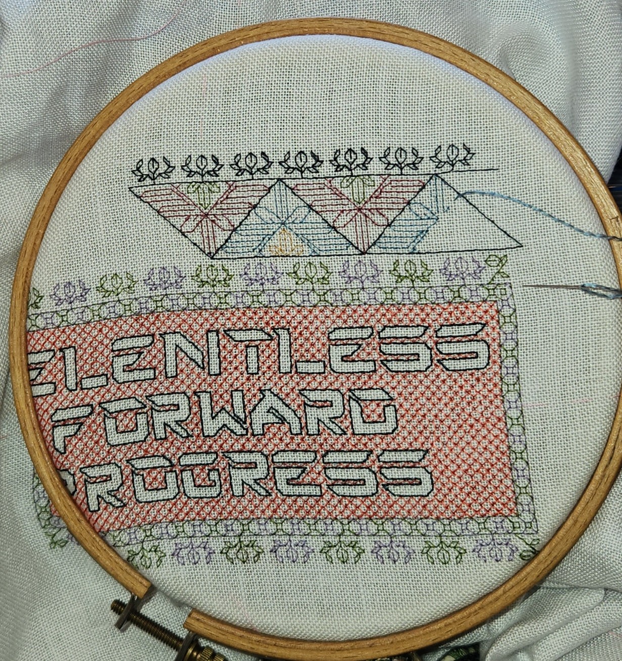
PROGRESS CONQUERED!
Finished. All that remains is to add my initials and date in the lower corner(s), frame it, and mail it to the recipients at Vanderbilt Rehab. I will be framing it myself.

I’ll figure out a stock size, get an acid free backing board, maybe a piece of black fabric to put behind the linen to camouflage any stray threads on the back, some short pins, possibly some carpet thread to keep the back neatly laced and tidy, and a simple metal frame. No glass, no mat. But this of course requires a trip to a crafts store like Michaels’, or ordering sight-unseen online. I prefer to select these materials in person. I haven’t tried driving yet, but I can now sit and my right foot is as spry as it ever was. This may be the impetus for the Next Great Step of Independence. Or the Resident Male may deign to give me a lift. We will see…
Lessons learned from this piece (so far) have largely been in silk fiber management. I’ve written before about stretching the vintage Pearsall’s silk by splitting its six from-the-maker plies in half. It worked, although handling the stuff was a challenge.
I had not finger-spun flying filaments before. When the two strands that made up the commercial ply were separated and gently stroked to release the commercial spin, so that they unkinked and straightened out, they were certainly long staple, with the silk fibers running the entire length of the strand and without short fiber fuzz, but they were disassociated into a slightly shredded longitudinal mass. I rotated the new, narrowed strand between thumb and forefinger gently, while holding the other end, to impart new twist. Not enough to make the thing kink up again and knot, but just enough to get it to resemble a single thread. Then I waxed lightly, very lightly, to help set the spin. I didn’t want to compromise the silk’s sheen, and it was too easy to shred the new thread if I held it tightly against the wax with my thumb as I drew it across.
In the photo below the red thread at the bottom is a single “native” ply of my Pearsall’s six ply embroidery floss. Note that it’s structure is two-fold. This one strand is made of two plies of silk spun independently and twisted together. The green thread in the middle is what happened when I “unspun” those two plies. You can see the long staple filament fuzz that resulted. And the blue thread on top is what happens after I finger spun and lightly waxed the fluff. It’s a bit loftier than the original thread, but clearly half as bulky.
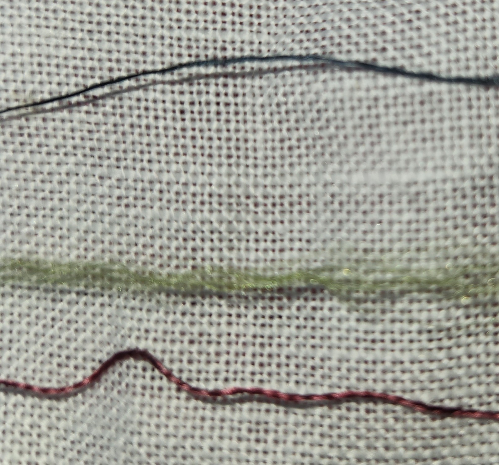
The re-spun thread was cohesive, and it handled well enough. It still needed attention and an additional spin or two as I stitched, to keep it as uniform as possible as I worked. Still, you can see spots, especially in the deep indigo that frames the outer border, where I was not entirely successful in maintaining thread spin/loft, and lines look a bit dashed, as thicker journeys completed previous lines laid down with a thinner, more tightly spun thread. But historical samplers have this look, too. Those stitchers, vastly younger than me, were learning to prepare their threads from reeled silk fibers and uniformity was a new skill to learn, and something that was a challenge even for them.
Picking out when I made the inevitable mistake was also a problem. It was too easy to latch onto only part of a strand, and shred the thread when a stitch needed to be removed. So I tried VERY hard not to make any mistakes. I was not always successful, and some waste did occur.
I still have the remainder of these colors, and more. I am not sure when I will get to use the rest of my vintage silk, but it will probably be on smaller, less densely stitched items; and again stretched to make use of every priceless inch.
Now. What’s up next?
I’m not sure. I will investigate my stash tomorrow. I just splurged on a pre-tariff large hank of antique red Au Ver a Soie silk. I want to do something with it. Possibly on leftover fabric from the coif, possibly on something less visually challenging. Maybe inhabited blackwork. Maybe strapwork. But no motto this time. Just a riot of pattern, with no lettering to center.
Or maybe I’ll finally do a faux Mexican style blouse in cottons. I have some well aged four inch wide finished edge cotton evenweave, sort of like the stuff sold for bookmarks but on steroids. It was last sold in the mid-1970s, and I got it in a stash trade a few years back. It would make a nifty base for a heavily stitched square shaped yoke, with a lighter cotton (perhaps muslin) full gathered blouse body below, and small cap sleeves. I might even have enough of the wide evenweave ribbon to edge the body hem, or to do a second blouse if the first one works out well. But instead of using traditional patterns, I might do something unexpected. Possibly one of my dinosaur strips, or the Pegasus strip – maybe even voided. Or something as-yet unseen. Suggestions welcome.
So many possibilities…
TWO COLOR DOUBLE RUNNING STITCH – TWICE THE FUN
As promised, here is a round-up of what I’ve been looking into on double running stitch, done in two alternating colors. First, heartfelt thanks to Melinda Sherbring and the gang over at the Facebook group Historic Hand Embroidery.
I knew I had seen examples of this type of work on samplers, but my own research notes are particularly poor in samplers. I tend to focus on the small fragments of household and body linen that lie quietly and largely unnoticed in museum research collections. Samplers receive far more attention, are often under licensing restrictions or have been fully charted by reproduction houses. So in a fit of laziness (it being vacation) I put out a call to the group and asked for assistance. Many people responded, Melinda especially so, furnishing 85% of the material I will cite below. So copious thanks, Melinda! I bow to your greater expertise on these, and will accept any/all corrections.
First, here’s what I am talking about. Here is a simple graph of a sprig pattern, worked in double running of a single baseline.

Note the alternating color stitches in the baseline. If I were to stitch this, I’d start with black, take that first stitch at the baseline’s left edge, then in double running work the rest of the first flower in black as a detour from my baseline. When I returned to the baseline, I’d continue on to the next black stitch, then I could continue working the whole thread of black until I ran out, carefully counting the units between black flowers. After that I’d start again from the left, filling in the missing green stitch, and taking detours to work the green flowers. Or I could do it the easier way – parking my black threaded needle, taking up a green one, and working green stitches until I got to the first green flower, working that as a detour in the standard manner, and marching on for a few stitches after, then catching up and leapfrogging ahead with the black. Note that using two colors means one will always be traveling along the baseline in the same direction. There is no doubling back to fill in second pass double-running stitches as one can if a single color is used.
After some experimentation, I found the “leapfrog” method far easier, in spite of having to be careful not to snag the parked thread. Less long distance counting means fewer errors for me. I suspect that close examination of encroachment on these historical pieces will turn up that leapfrogging was the way they did it, too. It’s just so intuitive and so much simpler.
One more observation – an alternating baseline is a giveaway that the band was done in double running. It would be quite awkward and wasteful of thread to achieve this effect in back stitch. And using back stitch to do the branching detour sprigs would mean having to terminate the thread on each one, or stranding over to return to the baseline. Again, something wasteful to be avoided.
Examples
Melinda provided far more than these photos, but I am cherry picking the ones with details that display the best. Click on the sampler institution/accession/date link to see the full pieces. A couple more of Melinda’s citations are at the end of this post, for those who want to do their own deep dive.
Ashmolean WA2014.71.3 (1631-1700) The boxers/urns panel has a companion border at the bottom with alternating pink/blue sprigs and a clear two-tone baseline. There’s also another pair of companion borders at the bottom that uses a band of green stitching with the alternating color sprigs and two-tone baseline immediately along its edge:
Ashmolean WA2014.71.27 (mid 1600s) has the alternating color sprigs on a two-color baseline on the topmost motif. This is the one I dimly remembered from tiny illustrations in a sampler book. Note that additional satin stitching was done in the centers of the motifs to bring extra dimensionality and color, but the double running outlines are still there.

Burrell 31.7 (1640-1670) Sadly, no high resolution image. But on the bottom-most strip – its framing border, top and bottom strongly looks like two-tone sprigs, and probably has an alternating baseline but it’s hard to make out the detail on the baseline. More investigation on my part needed. As an aside, it’s nice that the Burrell gives thread counts for the linen ground – 28 warp x 25 weft per cm, or 71.12 x 63.5 threads per inch. I’ve included the main strip because it or a close sibling pops up in connection with alternate two-tone borders in other works.
Burrell 31.9 (1640-1670) Third strip from the bottom. Again, certain ID limited by photo quality, but it does look like that much wider strip was done with a two-tone WIDER baseline (same spirit as mine, but a different pattern), with alternating color detours. Shares a lot of the aesthetic and some bands with Burrell 31.7 – interesting!

Cooper Hewitt 1981-28-70 (1600s) Love their high resolution photos. Another clear hit. The companion border around the bottommost wide strip, for sure – done in at least THREE colors (wow!) with a multicolor baseline and single color sprigs. A green, a blue, and possibly a red and a pink, the red and pink are very much faded. Or it might just be green, blue, and pink. It’s very hard to parse but it does look like the baseline was done in pink-green-red-blue-pink-green-red-blue, which would leave very long skips, overlapping on the reverse. I’d love to see the back to confirm that, and to confirm the number of colors.
There are more possibilities on this same piece, but for the most part they are heavily overstitched in satin stitch or (possibly) hollie point or another detached looping/weaving stitch, worked on the outline and for the most part obscuring it. It also looks like the second color was not necessarily used on the double running stitch outline for the sprigs, but was employed in the fill treatment Here’s one with an alternating baseline of blue and pink(?). The pink looks like it was used to outline the acorn and leaf shapes with double running. Pink and green were used for the detatched stitch fills for the acorn and leaf, but the blue of the baseline seems to have ben employed to fill the twigs between the acorns and leaves.

Fitzwilliam T.59-1928 (circa 1680) I stumbled across this one looking for the other items Melinda cited. I saw tiny black and white photo of this in one of the first embroidery history books I borrowed from the library – a book published before 1965 or so. I charted some of the strips from it with a magnifying glass, and used them on a piece I did in high school, long before I found the SCA. I haven’t seen this piece since. (People looking to chart now have no idea how much easier it is today with on line access to zillions of primary sources and high resolution photos, all of which can be enlarged right on the screen. A far cry from being smuggled into university libraries to stare at fuzzy microfiche images, or taking magnifying glasses to low quality black and white photos in books.) There is clearly a two-tone companion border with an alternating color baseline accompanying the prominent rose band:
By way of contrast, this bit from the same sampler was NOT done with a two-tone baseline. Even if there are pink straight stitches between the green diamonds and other motifs in the uniting center band, those sprouting leaves in pink are independent from the true baseline, which is solid, unbroken green.

Fitzwilliam T.61-1928 (1677) Also stumbled upon, and sadly a bit blurry. Two possibilities in the photo below – and the lower wide border to which one of the candidates is the companion one looks to a design that’s a cousin to the one from the Burrell sampler above. The two-tone companion is clearly not the same design, even though it’s difficult to see.

More citations:
Ashmolean WA2014.71.44 (1633) Not a sharp photo, but the red/green framing bands on the boxers strip does look like it is probably done in the dual tone baseline, alternating color detour method.
Fitzwilliam T.82-1928 (1691). Looks like there could be a couple of candidate bands, especially in the framing borders around larger strips, but the photo resolution isn’t quite there, and I can’t be sure that the colors are united by a two-tone baseline. I need to do more investigation.
Conclusions:
I have not seen this treatment in portraits, or in fragments of household linen – only on band samplers. I will keep looking, but I think Melinda’s generosity makes it clear that double running done in two colors, with a two-tone baseline and sprigs alternating between those colors was a 17th century innovation, popular in England of that era. She has given us lovely data points from 1629 to the 1690s. Given the paucity of extant samplers before 1600, that is to be expected. Thanks again Melinda!
But I never say never. All I can say is “I haven’t seen it yet.” And who knows, maybe someone out there HAS a citation for use of this technique before 1625, a sighting in works from other times/locations; or evidence on a textile fragment or portrait that it was used on clothing or household linen. If so, please add a comment with that reference here, and I’ll be happy to do a follow-up post.
And my own progress?
I’m up to the outer framing border. I just realized that I forgot to plot the way the wreath-springs work in the corners, so I will do that later or tomorrow, and concentrate on finishing out the upper edge tonight.
Yes, the colors are a bit disjointed, and I’m not entirely pleased with how prominent the diagonals turned out. But I am working under severe materials quantity constraints. Most of the colors were too light to show well in this style of work, and those that are are in single 8 yard six-strand skeins, most of which were already nibbled by the original owner for her prior projects. I am still splitting each strand of the six, to double the yardage, but it’s going to be tight.
