STONE BY STONE
And just like that my mini-sampler is past the half-way mark.

The stitched area is about 9.25″ wide, except for the motto that clocks in at 10.25″ (about 23.5 and 26 cm, respectively). I originally planned the motto at half the current scale, but after working just one letter, saw that it was overwhelmed by the rest of the stitching. So I doubled the scale – each block unit in my drafting became a box of 2×2 units. And I changed the treatment of the shadowed areas, converting them to box fill in green against the black of the main letter outline. To me that squared fill in this application hints at cobblestones. When I doubled the scale I knew that I’d blow past my originally laid out left and right borders, but that I’d be close. I may devise a narrow border strip to surround the rest of the piece and eke out the previously stitched area to align with the new width. It will be tricky though. I would probably have to work unsupported in hand rather than on a frame or hoop. I don’t like doing that.
Because I know folks will ask, I’m afraid I can’t point to the specific typeface source I used for the original expression of the phrase (before I scaled up and altered it). I found a screen capture of that alphabet with no attribution in my folder of miscellaneous things. But I’ll keep hunting to find it because sources should be acknowledged.
As for the rest of the patterns on the piece, with one exception they are all of my own devising. The only one that isn’t my own is a redaction I did of a band appearing on this sampler, dated 1674 in the collection of the National Trust, at Montacute House, Somerset, UK, Accession NT597706. That band is the narrow ribbon scroll appearing just above the motto. I may do more from that particular sampler on this piece. Its patterns were a challenge to chart because the stitcher recorded only the absolute minimum needed to parse the repeat and spacing. I often rely on multiples to reconcile problems in motif and spacing, but without them there’s a lot of guesswork in working out the fills and repeats.
For the rest – as you know I pick on the fly, and while I know what the next design will be (another of my own), I haven’t begun thinking of what happens after that.
Now about that odd motto. It’s no secret that my Resident Male is well embarked on a career as a writer of science fiction and fantasy. He’s got several self-published novels, and is now tirelessly seeking an agent with the goal of full professional publication. To that end, he has written several more books above and beyond those available on Amazon. A few times now, something he has penned or described has resonated with me, and that required expression in needlework. As his Fangirl Army of One, I am delighted to have answered that call.
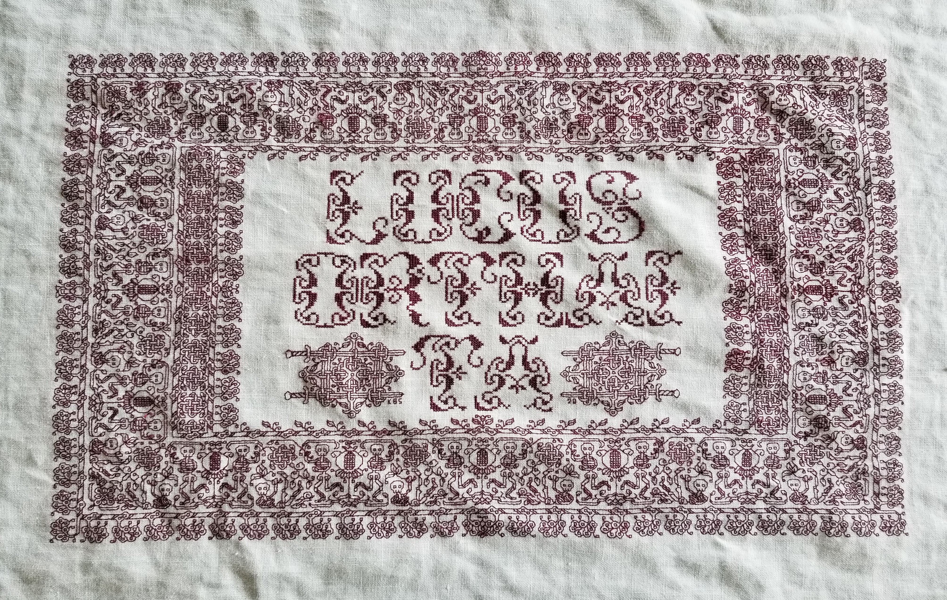

Stone by Stone is a phrase integral to his latest work, just as “Lucus Orthai Ta” is central to another of his yet-to-be-released novels. And long ago he described a cloth stitched with circling koi in one of his very early stories, a pivotal scene that led to my creating the Two Fish piece.
If you go far back enough to when we just met, although I had dabbled in counted thread work based on early sampler strips before we met, my initial headfirst plunge into blackwork was done for him as well. This piece is dated AS IX (1974/1975). It guess it has been a symbiotic relationship of pen, sword, and needle ever since.
LONGEVITY UNDER HARD WEAR, AND MOVING FORWARD
Some of the long-time readers here may remember the forehead cloths I stitched back in the Pre-Plague Era. I used some linen that was approximately 32 count (a remnant of off the bolt, not a purpose-woven needlework ground), plus some stranded silk custom dyed by my Stealth Apprentice. The black used was a historically researched tannin/iron recipe, and the thread was a prototype of the threads that Stealth Apprentice sold through Golden Schelle. The Schelle retail effort is currently in hiatus, but I do hope it will restart in the future. In any case I now report on wear and tear.
As you can see, now about seven years later and after heavy wear and washing, the forehead cloths and their embroidery have both held up well. I didn’t do much special to launder them. I threw them in my regular cold water/cold rinse wash, but hung them on a rack to dry. I’m particularly impressed by the performance of the dyed silk. It’s as dark today as it was when I first stitched it. Now I understand why black silk was so ubiquitous on body linen. It survives frequent wear and harsh laundering unscathed.
What did suffer were the ties. I used the same ground cloth to make them, cutting strips, folding them in half the long way, then tucking both raw edges inside, seaming, and turning the tubes inside out – pretty much the standard way ties are made, although I had to do mine on grain and not on the bias because I had so little fabric available.

Three of the four have disintegrated. To to little more than fuzzy strands. You can see one of the less frayed tie cut from the cloth on the bottom near the spool of twill tape in the photo above.
I am in the process of replacing all of the ties with twill tape. The finished redo of the first is at the bottom of the photo above. I hand-stitched the edge of the tape to the edge of the cloth, then folded it over and hand-hemmed the other side down to the back. When I got to the ends of the triangle, I continued on with the folded twill, whipping the edge as I went. Next comes the darker, larger cloth at the left side of the photo. Then comes the cloth I just finished embroidering. I won’t bother with the fabric ties on that one, I’ll leap direct to the twill ties.
As for the current mini-sampler stitching project, I’m rolling along with that, too.

Since my last post about it I’ve completed the green twisted link strip, and the delicate black flower strip below it. Now I’m up to another band in green. Peacocks, or if you prefer, bling chickens – my rendition lacking much of the grace and nobility of the actual birds. Note that I am not using the silk for this one. I’m still experimenting with the Sulky threads. (Partial verdict – I MUCH prefer the silk.)
The peacock strip, like the others in this piece are of my own devising, and will be in Ensamplario Atlantio Volume III. Please don’t ask me when it will be released. It’s still in process. I’ve got about twenty pages of brand new fills, plus about eight pages of larger borders and all-over designs. I am toying with the idea of including the Epic Fandom strips in this one, too, just so that they are in one easy to thumb through collection. Opinions on that are solicited.
MUSEUM DISPLAY OF CROSS STITCH WITH ART
This week past we were in the Buffalo, New York area, visiting family and friends. We had a splendid time, and one of the things we did was pop over to the newly expanded and refurbished Albright Knox Gallery of Art, in the Delaware Park section of Buffalo. The museum itself is a little jewel box of contemporary art, with a surprisingly comprehensive sampling of works by most of the 20th century’s biggest names. Now it has the room to better display its collection, and additional space to stage specialty exhibits.
Right now they are offering After the Sun – Forecasts from the North – a collection of works by contemporary artists from the greater Scandinavian/Nordic/Icelandic sphere, as they contemplate the effects of climate change on the northern/Polar bordering landscapes and society. The works were done in many media, everything from traditional oil paint on canvas and carved wood/stone or cast sculpture, to stretched scraped membranes, and even a presentation of scented oil. And to my surprise it included a suite of cross stitched pieces. While it’s not uncommon for embroidery to be displayed in a museum, it is more usual for it to be seen by itself, and not as common for it to be displayed alongside other pieces outside of a historical context (like a “life in the 1500s” type exhibit). This was a general arts collection, with the stitched pieces being given the same respect of place as those done in more represented media.
The items below were composed and stitched by artist Vidha Saumya, a resident of Helsinki, with roots in India. Her exhibit’s blurb is below. I wasn’t able to get detailed shots of all of the pieces, but they are shown after the blurb.

Pieces 1-4

A close-up of #4 – Still the Day May Live. I apologize for the skewed perspective. These were hung both above and below eye level, making it difficult to grab a photo.

Pieces 5-7

And Pieces 8-11

Again I apologize for the poor photos.
I don’t pretend to be an art critic (especially not of non-representational art) but I was moved by these. They seemed both immediate and unspecific in time – like dream images barely remembered upon waking, inhabited by an overlay of dread and nostalgia, with flecks of wishful joy.
I want to express appreciation for the curators of this collection, and I wish Ms. Saumya every success. I was very happy to see the medium both given respect, and being used to such good effect.
MINI-SAMPLER PROGRESS
Munching along on my portable summer project, sized and scoped for on-the-go production. I’ve completed the first band and have started on the second.

Both of these original designs will be in Ensamplario Atlantio Volume III. As will (in all probability) the others I use on this thing.
Yes, I’ve chosen a second color – this piece will be in black and deep green. There’s a reason for that which I will reveal in the fullness of time. I’ve also chosen a motto for it – again for a specific reason that I will describe when appropriate.
I had begun this in part as a test of the single ply of Sulky 30 on this ground. While the thread is performing well in terms of ease of stitching, I’m not entirely happy with it. It’s too thin and weedy for best presentation, and two plies would have been overly massive. Here’s a discussion of thread thickness and grounds that will help you understand why I am less than pleased.
How big will this entire piece be? It’s a second-hand store piece of hand-hemstitched linen, a bit more rectangular than but about the same size as a dinner napkin.

You can see here how I tease out my guidelines as I progress, so that I never stitch over them. I know people who do full coverage cross stitch sometimes don’t bother to remove them, but since my style includes so much “white space” I find it better to never encroach on the lines. That makes picking out easier. For the record, I baste with some ancient 100% cotton machine sewing thread from my grandmother’s stash. It’s too fragile to use for structural sewing, but being non-crocking and very smooth, is extremely easy to pull out cleanly.
You can also see that I start in the middle. I worked the dragon strip right, to the guideline at the right edge. Then I filled in the top companion border to end to mate up with the line established by the dragon strip. After that I did dragon to the left, finishing up at the same point already established at the right edge. Since the strip is symmetrical, it terminates at the same distance from the hem on both sides of the work. Again the companion (non-symmetrical) narrow edging at the top was worked to the same point. Now that I have my edges established, I will work all subsequent rows aligned to the first one, using my basted center line for guidance, and finish them left and right in line with the previous work. Really and truly, this is MUCH easier to do than some folks think. Plus working this way does NOT require drafting up the entire strip to fit the available area. The only thing I WILL be drafting out custom will be the motto, so that I can determine its center. Since it will be narrower than the stitching area, I may go back to the doodle board and figure out what I can use to eke out that row left and right. Or maybe not. Another narrow strip after this one, and then we’ll find out…
LOWERY STAND HACK
In one of those “this never happens” moments, I ran across a Lowery stand being offered on my local freecycle exchange. Of course I leapt on the opportunity. Although I have one I now have a second to use in another room, or to leave at our Cape hideaway, so I have less to schlep when we visit.
This one is a bit older than the one I bought several years ago. It came with two attachments – a plastic tray in daisy form meant to hold stitchers’ oddments, and a bar with a pincushion, plus a crosspiece of unknown purpose. I took off the tray because it was very awkward and space-inefficient.
Some digging led me to the answer for the crosspiece bar – originally it held a plastic comb-like attachment, over which waiting threads were to be draped. But this re-homed stand has seen some hard use, and the plastic comb insert was long gone. And for me – not missed. I generally do monochrome or limited color set pieces, and have no need for an extra set of fingers to hold my rainbow of threads.

But the crossbar did suggest something to me. I have always wanted to display a design page alongside my work. Using my big scrolling frame mounted on the Lowery large frame extension, this wasn’t a problem. I could easily affix a page to my working surface or to a little magnet mounted on the end of the frame’s stretcher bars, using a magnetic needle minder. But if I plan on employing the Lowery to hold a smaller hoop, there isn’t enough real estate for that.
I have a flat metal magnet board of the type commonly sold for stitching. But the angle and aperture of the crossbar’s slit were wrong. The board didn’t sit well, nor was it at a useful angle. And it wobbled in the stand. So I went looking for something that might help.
More serendipity. This is the plastic “zipper style” cutting slider strip that comes with large boxes of Stretch-Tite brand plastic wrap. I find them pretty useless for their intended function, but being a packrat, I tend to keep the slider bar in the drawer with the box of wrap until the wrap is used up and the box is consigned to recycling. Here you see it clipped onto the leading edge of the crossbar. I haven’t pushed it all the way on so you can see how they engage.

Obviously I will eventually cut the plastic to length and discard the blue thumb slider. But here is the magnet bar, mounted behind the now-thicker/plastic covered front edge of the crossbar, wedged between it and the crossbar’s back. Nice and secure. At a useful angle, and ready for pattern page deployment.

Oh. That thing I’m stitching? A very small piece of linen I rescued from yet another estate sale. It came neatly hand-hemmed. It’s too small even for my hoop-on-a-stick sit-upon, so I had to pull out my hand-hoop for it. It’s exceptionally nice fabric, with evenly spaced, easy to count warp and weft. There’s a couple of minor stains on it, but once it’s stitched they won’t be noticeable. I’m looking forward to working a hoop on my hand-me-down Lowery. It will be a first, since I usually only pull it out for larger pieces.


The count on this is roughly 33.25 threads per inch in each direction (penny count method – 25 threads covered x 1.33). I’m using this doodle piece to test if I like using Sulky 30 as a single, and to beta some of the designs that will be in Ensamplario Atlantio Volume III, which I’m composing right now.
You can see my basted guidelines marking the center, and on two sides, marking about a half-inch in from the edges. That’s all I need. Gridding for this isn’t necessary. I will stitch out from the center to the right edge, and note where in the pattern I am when I reach my edge-mark guideline. Then I’ll go back and stitch to the same point at the right. For the strips symmetrical to a center line that will be the same point left and right. For strips that are centered on a box unit instead of a line, that will be within one box unit further than the iteration on the right (assuming I center the left edge of the central box on my based centerline). And for non-symmetrical or unidirectional borders like the one I’ve established on top, I’ll just work in the general direction left/right but wait until I’ve established an edge with the symmetrical strips, then I’ll “catch up” to them and make the edges even.
Do I have any idea what strips I will be using? What the overall design will be? What motto or word (if any) this will bear? To what use I will put so fully an embroidered small cloth?
Nope.
No clue as to any of those things. But that hasn’t stopped me before. Like I said – this is an experimental doodle, a portable bit of amusement to eke out the summer’s migrations. Not a deathless Project For The Ages, or an incipient family heirloom. Stay tuned to see how this one evolves. If nothing else, it will be a bit of bungee-jump stitching fun.
A BUSY JUNE SO FAR
Who said that retirement would be boring? Wrong, wrong, wrong.
We’ve spent the last month quite busy, buzzing back and forth to the Cape to escape the heat and enjoy the late pre-season quiet of the beach. We’ve kept at the garden I detailed in the last post. So far everything is surviving. Bushes and flowers bloomed and my tiny raised bed garden is beginning to offer up a small, but appreciated harvest of peppers and herbs. The eggplant will catch up eventually. And of course I’ve been doing needlework projects. The chair recover is in hiatus until the fall – too much infrastructure to schlep around, but smaller, portable projects have been thriving.
First up, a stitching finish on a WIP that’s been bopping around since before the Unstitched Coif. This is a forehead cloth, in more modern terms – a kerchief. I had made two some years back, and have loved them to pieces. The stitched body of each is still in perfect shape, but the ties on them have died. Here is the new one, not yet assembled into final, wearable form.
This is a doodle of a pattern that will be in Ensamplario Atlantio Volume III. I’ve been working on that, too and have about 20 plates of new fills. I’m planning on including several pages of larger patterns, strips, and even yokes, too. I am still dithering about including the free patterns that make up my Epic Fandom Stitch Along in it, too. It’s already a wildly anachronistic work, and it might be handy to have all that content in one place. In any case, EnsAtl III is very much a work in progress, and will be out as soon as I can manage it.
Back to this piece. It’s an experiment. I wanted to try out Sulky 30, a spooled thread sold for hand and machine embroidery. I’m working on 32 count linen, and two strands of the Sulky work nicely in terms of coverage and line depth. There are four colors here – an almost-cranberry red, a forest green, a navy blue, and (hard to see) small motifs filling problem spaces, worked in black. There are LOTS of mistakes in this. Places I missed a stitch, or substituted the wrong twist or size center flower, but since this is a quick stitch, meant to be worn to death and not a future heirloom of my house, I didn’t bother to go back and pick them out. I did fix mistakes that would have thrown off the design as a whole, though.
My thoughts on the Sulky? Not my favorite. It’s very hard twist and dense. While that makes a nice, clean line, it does make intersections a bit more difficult to keep even. Plus when picked out, both the blue and the green crock a bit – leaving color residue on the cloth independent of fiber crumbs. I’ll probably use up what I have on things I intend to wash savagely, but I won’t be buying more. The Unstitched Coif project spoiled me. Silk over cotton, any day.
I can’t report on the origin of the ground. It’s a scrap left over from something else. A garment has been cut from it. I did get a pile of linen scraps from someone here in town, via one of the local waste-nothing exchange groups. I’m pretty sure this was one of the pieces. So my guess is that it was yard goods, not custom-sold for needlework. Even so, the count is remarkably even. There’s some slubbing but not overly much, and the thread count is something like 32×33 threads. No selvedge left so I can’t guess about warp vs weft counts.
I am going to investigate narrow twill tape for the ties this time – both for this forehead cloth and to replace the now frayed and ruined ties of the older two. I had used the ground itself, double folded and seamed for the ties on the old one. Better I should use something more densely woven and robust, and that can be easily replaced.
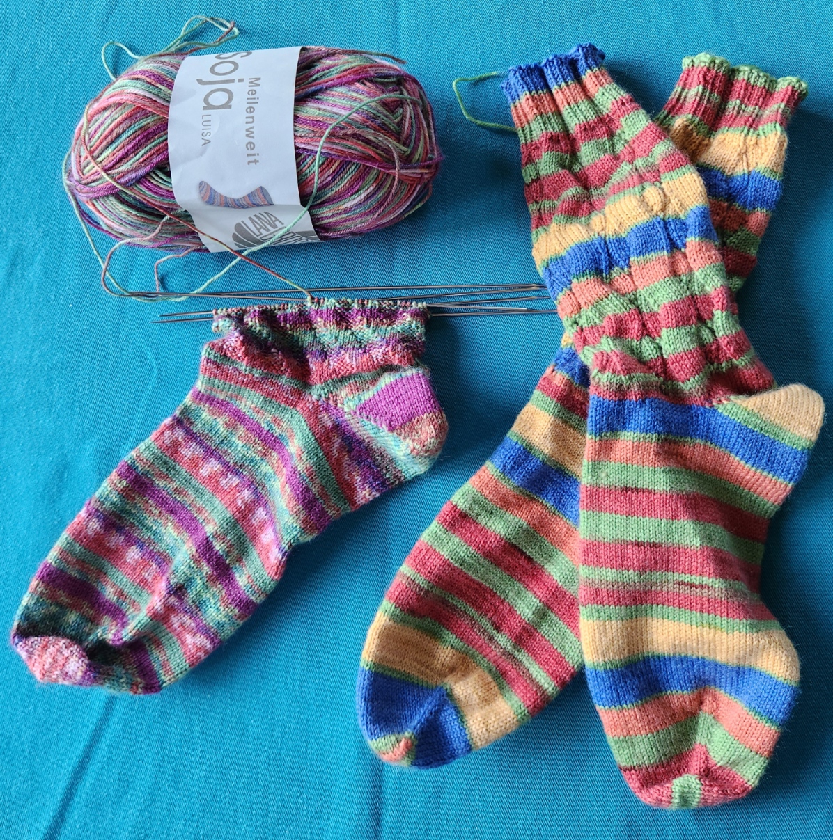
I’ve also been knitting and crocheting. Here are July’s socks. Not sure what made me knit the wide-stripe pair so tightly, but I did. They are the same stitch count around as the other pair, but are significantly narrower. I can wear them (just), but not all of my target audience can. So they will either stay home with me or find a narrow footed new friend with whom to play.
And I’ve been crocheting snowflakes. Not to keep cool but as a probably-the-case present for Elder Spawn, who has moved cross-country. It’s unlikely that we will be able to enjoy the family tree together this year come holiday time. A first for Casa Magnifica. So I have promised to make new snowflakes for what is now Casa Magnifica del Oeste, and ship them plus some of the family ornament stash, to furnish the new tree. I’ve got a half dozen complete. Six more to go, plus pin blocking and stiffening them for best display. Here are the first three, still looking sad and crumpled, right off the hook.
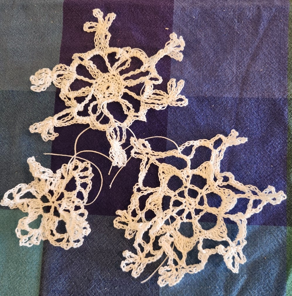
All of these are from this book. I have another one with better patterns. Someplace…

What’s next? Another stitched doodle on a thrifted linen rectangle, possibly to use up some of that black Sulky on a higher count ground. But more on that later this week.
ANNUAL SPRING SACRIFICE
My annual digression into gardening. Apologies if you came looking for needlework content. I must document my annual Rite of Spring, otherwise I’ll never remember what went in where. Please bear with me.
Spring finally arrived here in the Boston, Massachusetts metro area. It snuck in two weeks ago after an extended bout of “Are we Spring yet?” weather. And we have now performed our annual rite of sacrifice, cleaning up our planting beds, destroying invasive weeds, dividing and moving the overgrown, spreading 6 cubic yards of mulch, and otherwise adding to the plant population and general ambience.
First the front view:

The mountain laurel in back of the mulched perennial garden is on its last legs. I will do everything possible to keep it going because it’s my favorite, but it’s no where near as impressive as it was eight years ago. I added to the perennial collection, a Trollius Europaeus – a compact yellow flower variety, dead center, next to the tall peonies. The other plantings from last year did appear to survive. On the far side of the steps from right to left are Spike, our rugosa rose, and two blueberry bushes. We hack Spike back every other year to keep him contained, otherwise he’d devolve into a tangle of lethally thorned and whippy stems. He doesn’t seem to mind.
Those who have visited us may note that the giant grass that usually sat behind the blueberries is gone. It got too unruly, and given its fairy-ring growth pattern, was more an empty hole with scions invading the rest of the bed than the rustling clump it had been. There was really no way to take it back and rejuvenate the bed, so we excavated and removed it. Next year we will put something else there. Perhaps a dwarf tree or tall shrub, preferably flowering, and a bit out of the ordinary. No rhodies, arbor vitae, azaleas, or cherries. It’s fun to branch out (pun intended).
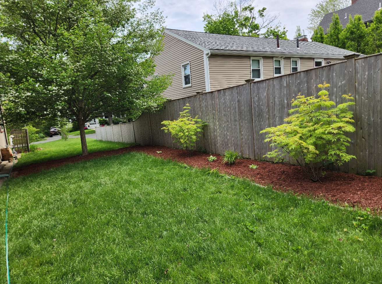
The side bed. Always a problem. It had been totally overrun by goutweed. All the plantings in there were shot through with the stuff, with no way to pull it without massive collateral damage. So I finally conceded defeat and yanked everything. Then I sorted through, carefully detangling white-stripe hostas, fern clumps, and daffodils from the carnage. I split up the hostas and put them all around the property. With one exception every white stripe you see in these pix is a transplant from the tree bed. The ferns I put under the mountain laurel. The daffodils (if they survive being moved at the wrong time of the year) will re-emerge in front of the blueberry bushes. Here you see the side bed, reduced to JUST the Hawthorne tree, now in early flowering, surrounded by stones unearthed from the bed, and mulch around that.
Continuing up and around the southern side of the lot, more goutweed was cleared. The elderberries we put in two years ago continue to thrive in spite of the shade. We gave them friends, adding low growing Japanese clumping grass and some of the transplanted hostas in between.
Now for the corner. Last fall the mighty maple that defined the corner of our lot had to come down. Here he is on his last day, in early October 2023.

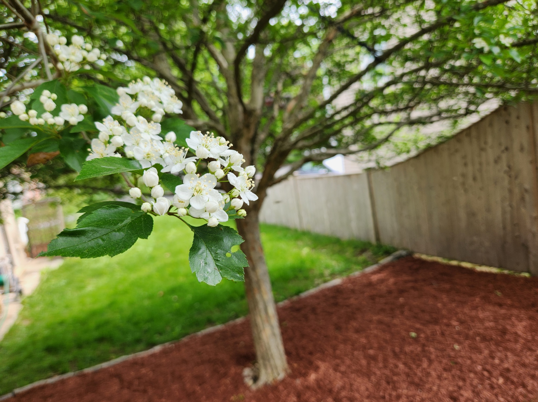
I was heartbroken but knew it was for the better. He never recovered from the abuse suffered when our side neighbor took out the in-ground pool in her yard. With half his root system compromised, he lost a major side trunk, and became severely rot-damaged on the side away from the camera. He was a looming threat our backyard neighbor’s house. Luckily we were able to get him tended to before last winter’s major storms. So there was a big empty spot that needed to be filled. We opted to put a witch hazel there. Eventually it will be 12-15 feet tall. And of course, more hostas. I am looking forward to seeing the blooms of the witch hazel come October. It will be the only late blooming thing on the property.

Oh. The witch hazel’s name? June of course. After June Foray, the brilliant voice actor who provided so much to animation during my kid cartoon years. Including this character – Witch Hazel, an occasional nemesis of Bugs Bunny.

Continuing to the next major improvement, we come up to the space where I used to plant our scarlet runner beans, climbing up an improvised trellis made from giant grass canes and cable ties. Now that there is more sun and less volunteer labor here, we decided to make life easier. Fernando built me a raised bed. I’ve populated it. Rosemary in back, with parsley, some marigolds, then a big space, and in the front, three varieties of mild and medium hot peppers, plus Japanese eggplant. Since the photo was taken I’ve added established clumps of chives and oregano to that barren spot, overflow gifts from Neighbor Kevin’s prolific garden.

Obviously there is still some work to be done. Weeds sprout in the narrow path between the lawn and the garage. And there’s that one last bastion of goutweed, lurking at far left. I will savage that sometime this week.
So there is the summary of what we have been up to the past three weeks. With luck everything will survive my ungentle hand.
MORE CATS, UNDERFOOT
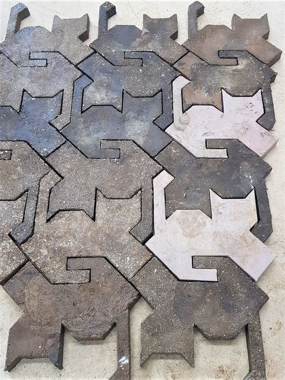
You may have seen this image floating around the ‘net today. It’s of concrete tiles, cast into tessellating cat shapes. It was easy to graph up into a blackwork fill pattern, so I did so.
Then I decided that before I could post it, I had to find the original source and give credit where credit was due.
The hunt proved a bit more difficult than I expected. The thing has been passed hand to hand since 2022, and many layers of links via Pinterest and other social media sites took a while to munch through. But I found it.
The cat tiles are a product of a Korean firm – designdb, and are part of a recycling initiative named Green Road. They are concrete, but instead of aggregate, the firm uses milled plastic waste. In the case of these tiles, the addition is made largely from the empty, discarded bags that formerly held cat food. You can find the firm’s description of the project here. Call up Google Translate to navigate the Korean. No clue if these are sold internationally, but the initiative itself is worthy of respect.
And now having given the design firm its due, I present a simple blackwork embroidery fill based on their tessellated cat design.
Enjoy!
SAVAGE BLOCKING
The merino/possum wool shoulder shawl turned out to be one of the quickest completing projects I’ve done in a while. It took only four evenings to knit.
For the record again, I used a wonderful luxury yarn – a gift from a pal. It’s Happy-Go-Knitty’s Ahuru 8, labeled as DK, but I like it as a worsted weight. It’s airier and less compressed at a stockinette gauge of 20 stitches for 4 inches/10 cm than at the DK gauge of 22. I started with a Knitty pattern from almost 10 years ago – Wavedeck, by Kate Atherley.
I made a couple of minor departures from Kate’s original. In the feather detail motif that constitutes the bottom round of the design, I worked the feathering for 15 odd number rows, not 12. Being a bit taller I thought a bit of extra length would be nice. I might have done at least three more because I had enough yarn to do so, but I was worried that blocking might not work out if I added too much depth.
Also, on the final round of bind-off, at each natural point formed by the feather border, I added a small cast-on/cast-off picot, both to accentuate those points, and to make a nice, sturdy spot for extra tugging during blocking. (To do this as I bound off according to directions, when I got to the centermost stich of each feather’s middle rib I cast on three extra stitches using the cable cast on, then immediately cast them off as per the method specified in the pattern. This made a little triangular nub at the base of each feather.
All in all, I used 1.75 skeins worth of yarn (estimate). I think I have enough left over for a pair of small wristlets, which will be a nice, comfy use for this super soft and super warm yarn.
Now for the blocking, savage or otherwise – you be the judge.
First we start with the completed, unstretched knit. Measuring with more precision but without stretch, it’s about 23 inches deep from center neck to center bottom, and about 46 inches across the wingspan (58.42cm x 116.84cm). You can see the little nubbins I added to each feather spine.

The first step is to get it nice and wet. I didn’t bother washing it with Eucalan or Kookaburra. It wasn’t dragged around enough in four days to get it grimy. Wetting was enough. Once wet, I gently squeezed out some of the water weight (no wringing, or rubbing, just a couple of compressions. Then I laid the piece folded in half on a bath towel, and rolled it up into a big jellyroll.

I leaned on the jellyroll to squeeze water into the towel, rotating it several times to get as much out as I could, but without subjecting the shawl to any undue stress.
Then I prepared my blocking area. First I laid out my usual blocking sheet – a rally checked flat twin sheet I found years ago at a yard sale, spread over a sturdy braided wool throw rug. Then I assembled my other blocking tools – blocking wires (some hand-me-downs from long time stitching and knitting pal Kathryn), and my long pins.
I began on the long side, threading every garter stitch edge bump along the straight edge onto blocking wires. Note that I used three of them. I deliberately left about a third of each wire bare, doubling up for about six stitches when I changed from one wire to the next. The reason I did this to leave room for stretching during blocking. If I filled up each wire completely, then stretched the thing during pin-out, stitches would fall of the end of the wires. Better to have lots of extra room and overlap. Bump threading below.

After wires were placed along the straight edge, I pinned them out following one of the horizontals of my checked sheet. I started at the center and tried to place pins and stretch evenly both to the left and right. The blocks of the sheet’s print helped me keep that stretch even.
Once the straight edge was laid out, again starting in the center I began pulling the points. There is no feather point at the center of this piece, so using the two points to the left and right of the center line, I used the sheet’s checks to make sure that the visual center line of the piece was perpendicular to the straight edge, and began pinning the points out from there. Now I’m not the best blocker. Were I so I would have calculated the angular difference at my chosen circumference, and marked it, pinning each to the exact spot on the indicated, scribed half circle. But that’s not me. I just winged it by eyeball. Good enough for home consumption.

Pinned out like this it’s about 30 inches deep, and 60 inches across (76.2cm x 152.4cm) roughly a gain of 7.6% in the stretching. It will probably relax a little bit once it’s released from savagery.
The next steps include letting it dry completely, unpinning and unthreading it from the blocking wires, and darning in a few ends. But at this point, it’s done. Four days of knitting, and 45 minutes of blocking, and fewer individual stitches than a single sock at my usual gauge. And one super cozy shoulder shawl, soft as whispers, to wear come autumn.
PLAYING (WITH) POSSUM
Fueled by Friend Kim who surprised me with a yarn gift, I dawdle a bit more in the Land of Knitting. I’ve done a ton of socks since finishing my Unstitched Coif submission – 14 pairs to be precise. But charmed by this super soft yarn I decided to do up a larger project – a shawl.
First the yarn. It’s an exotic fiber – a blend of possum and merino – the yarn on the right in the photo below. It’s Happy-Go-Knitty’s Ahuru 8, labeled as DK, but knitting up more like a true worsted. It’s soft as butter; very warm; extremely light, airy and compressible; and adaptable to being knit down possibly as far as sport (24 stitches for 10 cm/4 inches) and up to worsted (20 stitches for 10cm/4 inches). The color name of my skeins is Caramel, possibly the undyed color of the possums themselves. The mixed color sock weight (red supplement with a brown to ecru main skein) from Prosper Yarns will decide what it wants to be later. That one is a luscious merino/nylon blend. I think the red accent skein is intended for toes and heels.
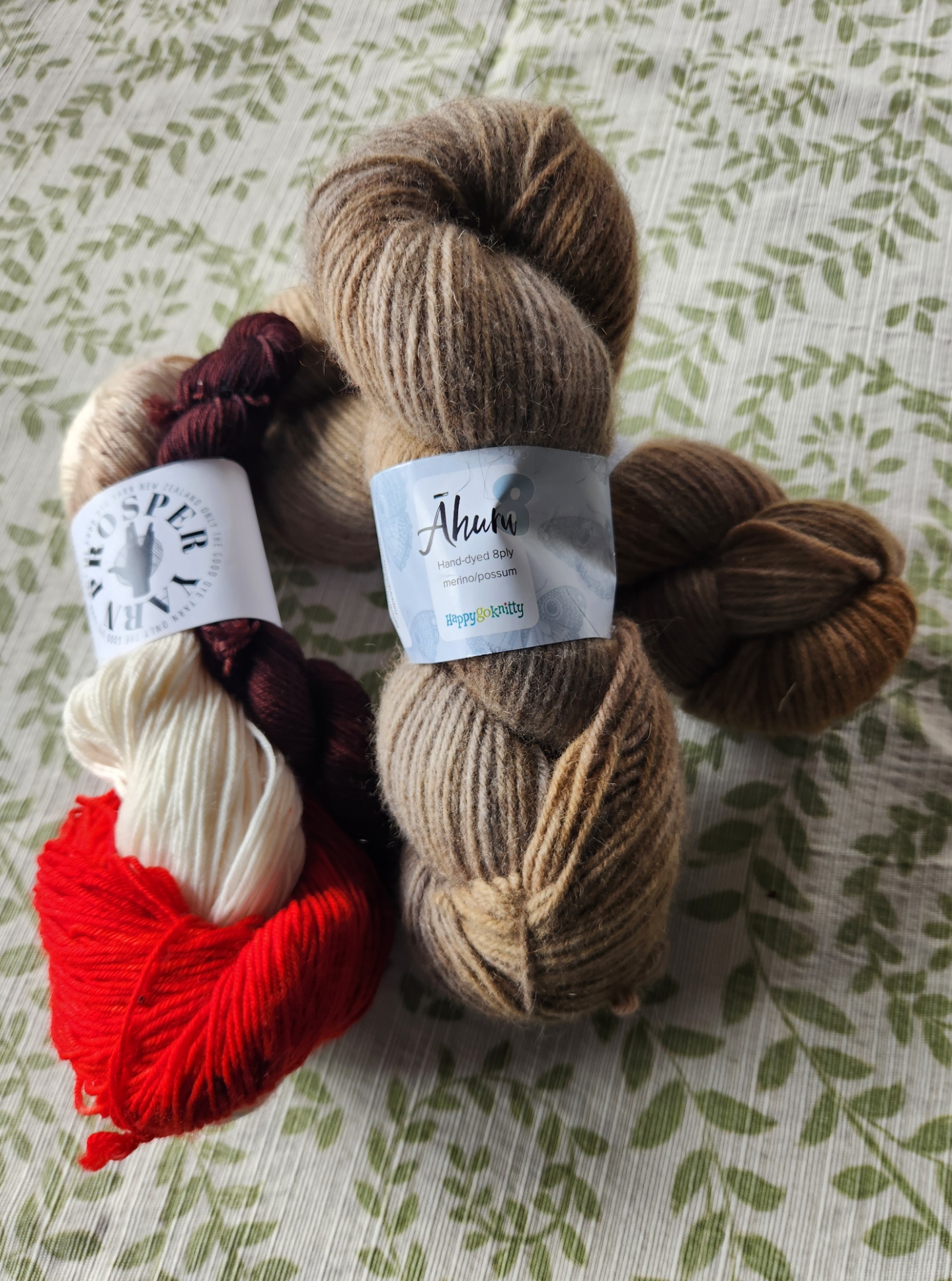
Back to the Ahuru. Now possum isn’t North American Opossum, it’s a New Zealand beast. It was introduced there from Australia and became an uncontrolled and invasive nuisance. But folk in New Zealand appear to be quite practical – there is now an entire yarn industry based on the controlled harvest of these creatures, limiting the ecological disruption they cause and furnishing some lovely fiber and (so I’ve heard) pet food.
Now the project. I have about 476 meters, roughly 520 yards. I initially thought of using it in combo with another yarn to make a yoke style pullover, but I decided that this stuff needed to shine on its own merits. So I went looking for something else. I hit upon Wavedeck, a Knitty project from 2014. It’s a half circle shawl based on the Pi Shawl principle, heavily textured with YO/decrease pairs, directionally arranged to create flower petals, with feather edging that can keep going until the yarn runs out. If it ends up a few rounds longer or shorter than the official count, it won’t matter.
Although this one looks complicated, with massive charts, it’s nowhere near as difficult as first glance would make out. The patterns are extremely logical, requiring mostly that one keep track of the current row number (odd rows only – all the even rows are the same). My only deviation so far is to use a US size 8 needle (5mm) instead of the pattern’s recommended size 7 (4.5mm). I liked the slightly looser drape of the produced fabric better with the larger size.
Here’s two evenings’ progress. I had forgotten how quickly knitting at this gauge goes. I’m up to Row 25 of the largest chart, and halfway through it.
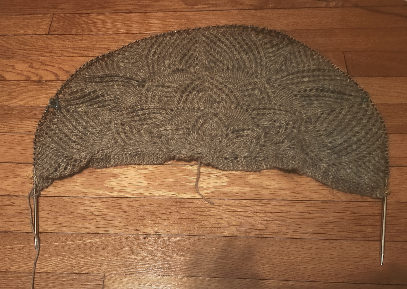
I really like the stitch definition I am getting with the Ahuru. The mottled colors come across a bit more orange than they are in the late night indoor illumination, but in person the color spread is grey to a tannish smoke brown, with spots of ecru and occasional bits of a darker chocolate, all with a tiny hint of mustard. Sounds like a mishmash, but in person it looks very Vintage Camouflage.
Knitty tags this one as “tangy” – their euphemism for “slightly challenging.” It’s one step up their four-step scale from beginner to complex. So far I’ve found it very easy to follow. If you are comfortable with yarn overs, left and right leaning decreases (K2tog and SSK), and can manage a center double decrease (three stitches merged into one, with the centermost presenting on top), and can pick up along an edge, you can do this one. Use sticky notes or a magnet board to focus on the current row, and go for it.
I’ll post back when I’ve run out of yarn and declare the project complete. After this, I’m not sure what will be next. Always a pair of socks as a guard against waiting room boredom. But I itch to stitch. Something…
