BUZZ ON BEESWAX
I keep seeing questions about waxing threads on various social media needlework discussion groups. I usually end up retyping this. So to make reference easier while offering up this Helpful Hint, I take the time to write it out in long form.
I use beeswax on my threads for blackwork and cross stitch. I only use 100% beeswax, not candles or other beeswax products that often contain fragrances, colors, or agents to soften (or harden) the wax. Whenever possible I buy it direct from beekeepers, at farmers’ markets or county agricultural fairs, avoiding the overpriced boxed or containerized offerings at big box craft and sewing stores. I’ve also bought it via Etsy and Amazon, but am leery of super-low priced imports that might contain adulterations. I look for domestic producers with a range of local bee-related products instead, especially those who guarantee the purity of their product. Even then it’s not a very expensive purchase. A one-ounce mini log is currently running between $1.50 to $2.00, and will last for years and years. By contrast those Dritz plastic containers of wax with no ingredient labeling are about $5.00 for an unweighed bit I estimate to be less than 25% of the mass of the one-ounce mini logs.
What does beeswax do for me?
- It tames surface fuzz on my threads, making them sleeker and smoother.
- It aids in needle threading, making that much easier and quicker.
- It cuts down on differential feed when using two plies of thread together. That means that both plies are used at the same rate, and I am less likely to end up with one extremely shorter than the other after a length of stitching.
- It eases thread passage through the fabric and “encourages” threads to lie next to each other in mutual holes rather than earlier threads being pierced by successor stitches. I find this leads to neater junctions in double running stitch and neater stitch differentiation in cross stitch.
- Since I stitch with one hand above and one hand below, occasionally the working thread is “nipped” as it is passed back from the unseen back to the front. A problem that leads to work-stopping knots and snarls that have to be teased out. Waxing cuts way down on this because the thread fibers are kept closer and are more difficult to snag.
- Less drag from less fuzz and eased passage through the work allows me to use a longer length of thread than I can get away with without waxing. Even a little bit of extra length before the thread degrades enough to make the work messy makes it easier to achieve a uniform appearance when working the second pass of double running, or doing the “return leg” of a line of cross stitches.
I wax my threads for blackwork and cross stitch: cotton, silk, faux art silk (aka rayon), linen – everything except wool. Note that I tend to work on higher count grounds rarely venturing below ground thread counts of 32 per inch (16 stitches per inch when done over 2×2 threads), and usually in the 38-46 range, sometimes up to 72 threads per inch (18 to 23, and up to 36 stitches per inch respectively). My blackwork and cross stitches are relatively short, so thread sheen is not a factor. If I am working satin stitch, or a longer linear stitch that takes advantage of thread directionality and sheen, like satin stitch, I skip the wax.
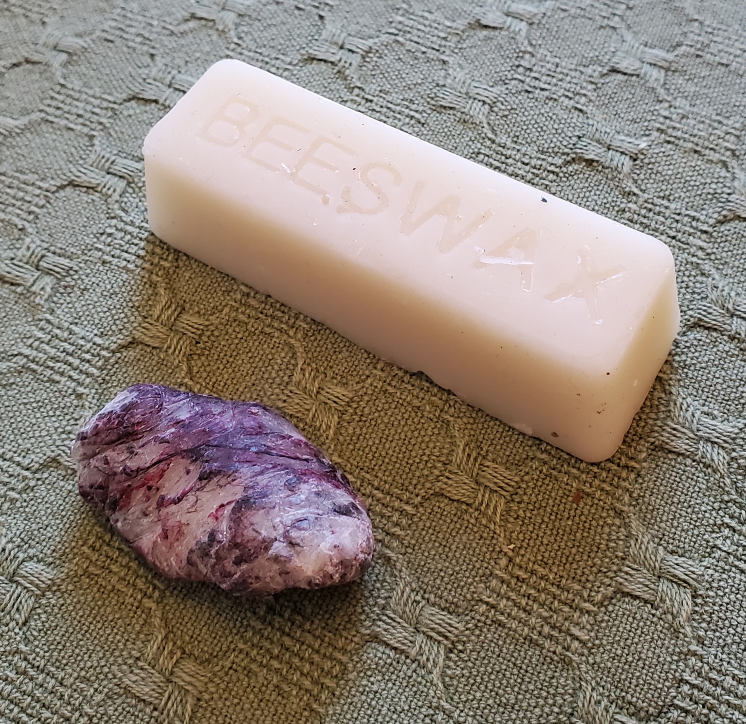
I usually keep two of those single-ounce logs going – one for dark colors, the other for light because even the best threads will crock dye and leave traces of lint in the wax as I use it. Since I do a lot of blackwork with strong colors, I don’t want to run a white, yellow or other delicately tinted thread through the accumulated color left behind by the darker ones. Below is a one-ounce mini log, untouched; and the remains of an identical log after about seven years of very heavy, daily use. The frugal will note that there’s more than enough in one mini log to break it in half, and use one piece for dark colors and the other for light, but that’s not what I did here. That grungy little stub used to look exactly like its brother. It’s so filthy now I may break down and melt the stub, skim off the lint and recast it in a silicon baking mold.
Applying wax to working threads is quite simple. I hold the bar in my hand, with the thread to be waxed between my thumb and the bar, under gentle pressure. Then I use the other hand to pull the thread across the surface of the wax once or twice. I don’t want to wax heavily – there should NOT be flecks of wax on the thread, and it should not feel stiff as a wick. In fact, after I thread my needle I usually run it once or twice through a scrap of waste cloth before use to remove any that might be there, before using the lightly waxed thread on my project at hand.
Back to when to use and when not to use beeswax. Here are a couple of examples. First, my project-in-waiting – the Italian green leafy piece. Lots of satin stitch. The dark green outlines are two plies of Au ver a Soie’s Soie D’Alger multistrand silk floss on 40 count linen (over 2×2 threads). Wax on all the outlines, even though they are silk. That infilled satin stitch worked after the outlines are laid out? More of the incredibly inexpensive Cifonda “Art Silk” rayon I found in India. No wax on the satin stitch. That lives or dies by thread sheen and directionality. While the stuff is very unruly and I do wax it when I have used it for double running or to couch down gold and spangles on my recent coif project, here doing so would not give me this smooth and shiny result.
And an example from the coif mentioned above. It’s on a considerably finer ground – 72×74 tpi. All of the fills are done in one strand of Au Ver a Soie’s Soie Surfine in double running. All waxed. The black outlines on the flowers and leaves are two plies of the latest batch of four-ply hand-dyed black silk from Golden Schelle, done in reverse chain stitch. Also waxed. The yellow thread affixing the sequins and used to couch the gold, the same Cifonda rayon “silk” used in the leafy piece, waxed, too. The black threads whipping the couched gold are two plies of Soie Surfine, waxed. But the heavy reeled silk thread ysed for the outline is Tied to History’s Allori Bella Silk. It’s divisible, and I probably didn’t do it as the maker intended, but that’s two two-ply strands, plus a single ply teased from a two-ply strand – 3 in all – worked in heavy reverse chain. That’s a longer stitch, thicker than even the black flower outlines, and because the stitch was long and I wanted to make it stand out from the other black bits, shine was part of what I needed. NOT waxed.

Many people have asked me if waxing makes the piece collect dust faster, leads to color migration, or makes the stitching feel heavy and well…. waxy, or if it stains the cloth when the piece is ironed. My answer is that I find no difference in dust accumulation on my finished pieces on display. And I see no color change, either. Beeswax has been used for stitching for hundreds of years with no ill effect that I have seen reported. Modern substitute thread conditioning products of unknown composition have not undergone that test of time.
As for a heavy, waxy feel – again, no. Not if you apply it lightly. I do cover my stitching with a piece of protective muslin when I iron it, and never iron pieces on which I’ve used the Art Silk anyway. I have never noticed waxy lines of residue on my ironing cloth when I have ironed my cotton, linen, or silk pieces.
So there it is. Waxing, why and how I do it. Your mileage may vary, of course.
THINKING, BUT KEEPING BUSY
A couple of people have asked if I’m taking a break from needlework in the aftermath of the great coif project.
Nope. To be truthful, I am filling my time with far less challenging pieces while I contemplate the next big project.
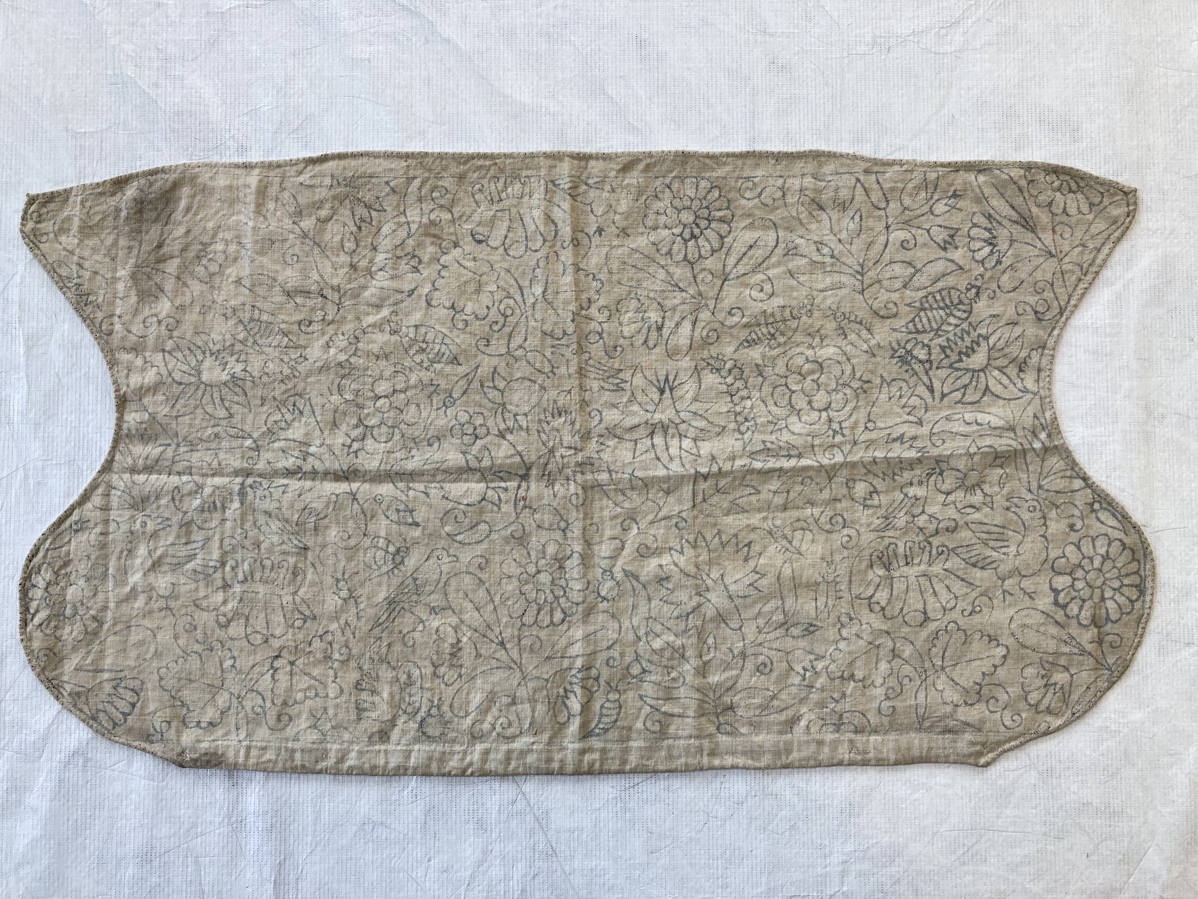
First, I’ve returned to the third forehead cloth. I’ve done two before and love wearing them instead of bandannas to contain my hair on windy days. I do a little bit on them in the afternoons, and in the evening catch up on my sock knitting.

The socks are my standard issue toe-ups on anything from 76 to 88 stitches around, depending on needle size; figure-8 toe (an technique unjustly despised by many), plain stockinette foot, German short row heel, then something interesting for the ankle. Mostly improvised. The only hard part is remembering what I did on that ankle so I can repeat it on the second sock.
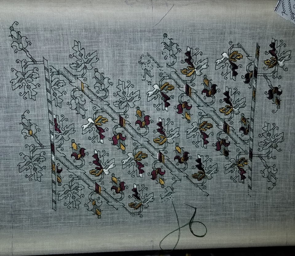
The forehead cloth is fairly flying. It’s all one pattern, on cotton/linen yard goods that works out to about 32 threads per inch. That’s as big as logs compared to the coif’s linen. I’m trying out Sulky 30 thread (two strands). It’s ok, but I am not so fond of it I’d throw over softer, more fluid flosses. I am betting though that it will stand up to hard laundering better than standard cotton floss. The stitching on my other two forehead cloths, done in silk, has survived quite nicely. Unfortunately the ties – folded strips of the same ground – have totally shredded and been replaced twice on each. I may move to narrow store-bought twill tape for the ties, instead. Jury on that is still out. Oh, and yes, there are mistakes on this. Some I’ll fix, and some I won’t. Have fun hunting for them. 🙂
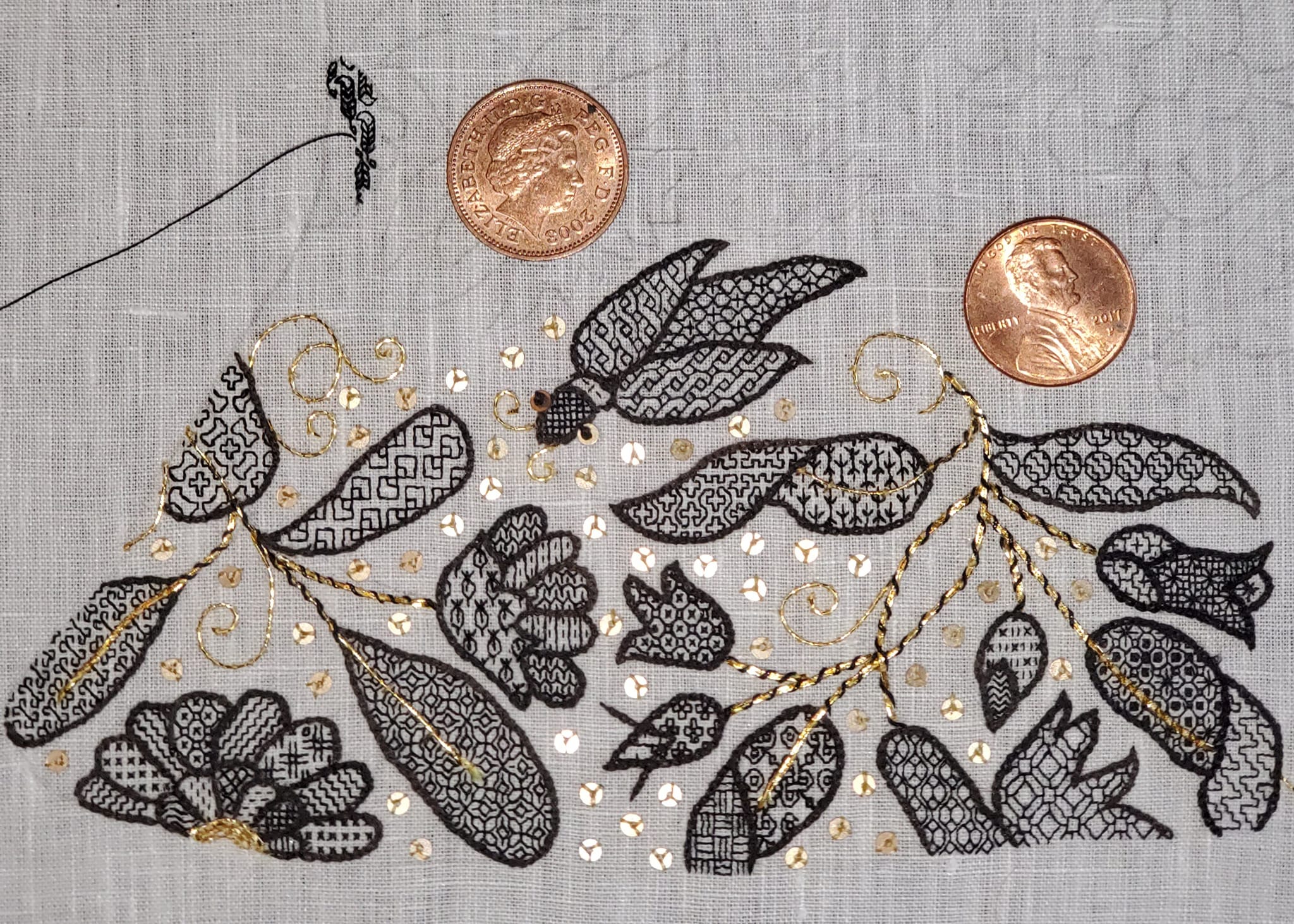
While I’m here, I’ll share a tiny blackwork hint.

I’m doing double running but this will be relevant to those who favor back stitch, too. See those “legs” sticking out in the photo above? As I passed those junction points I knew I would be coming back again, from a different direction. It is far more difficult to hit the exact right spot when joining a new stitch to an existing stitched line (both perpendicular as here, and diagonally) than it is to mate up to a stitch end. Those legs are there so when I come by again I have a clear and simple target for the point of attachment. This saves a lot of time, minimizes my errors and helps keep my junctions as neat as possible. Try it, I think you’ll find the trick useful.
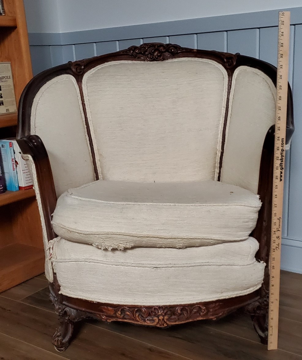
What am I contemplating for my next project? Possibly a blackwork/sashiko hybrid. I have a barrel chair, a wreck salvaged from the trash, that I had recovered in Haitian Cotton back in the early 1980s. It has survived four house moves and two children, but although the back and sides are in good shape, the seat cover and the area just under the seat are both shot. I still adore the thing even though it doesn’t really fit in with the rest of the house’s style. So it’s going up into my office. I plan on recovering the shredded areas with patchwork denim overworked in white running stitch. The denim will be reclaimed from various outgrown and destroyed garments I’ve held onto against just such a future need. Since I do not plan on replacing the rest of the upholstery, I’m counting on those flashes of white to bring the seat and the rest of the piece together.
ANOTHER PORTRAIT, ANOTHER REDACTION
About a year ago a member of the Italian Renaissance era fashion discussion group, Loggia Veccio on Facebook asked for help decoding the blackwork on the sleeves of this portrait. I volunteered, but heard nothing back. Today she came forward again to repeat her request. So I oblige.
The first thing I did was try to find the full attribution for the portrait, plus a better, higher resolution image than this repasted one.
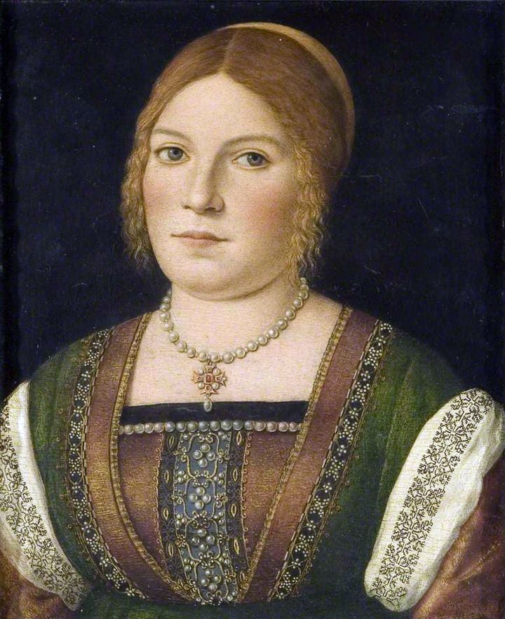
The original is held by the Bristol Museum and Art Gallery, Accession K1651. While it’s not available on the museum’s own website, it does have a page in the Art UK on line collection. The accompanying information cites its date as circa 1500, and the working title as “Portrait of an Unknown Young Woman.” The blurb goes on to say that it has some congruence with works produced by Carpaccio, but stops short of definitively identifying the painting as his.
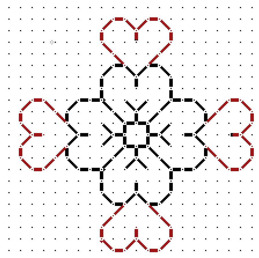
On to that sleeve. It’s a relatively simple pattern, but redacting from paintings is never as easy as doing so from an actual textile. In this case while the design looks quite regular at gazing distance, up close examination shows that multiple interpretations of the repeat are represented. I’ve attempted to reduce those to a most probable approximation, but it is just an approximation.
As usual, my assumptions were square units, all of the same size, mirrored both horizontally and vertically. I further assumed no diagonals based on the stepwise total appearance. And while I first thought this might have been done in one continuous line, examination of multiple repeats showed that it was most probably done as lozenges rather than a united whole, with small “islands” filling in between the main bird-bearing motif. Here is my best guess.
As usual, a printable page with the pattern and accompanying text is available by clicking here, or popping over to my Embroidery Patterns tab.
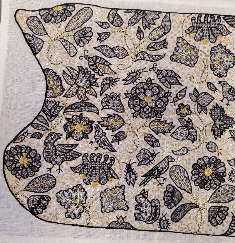
UNSTITCHED COIF – FINISH. THE FILLS
As promised here’s the breakdown of the design, motif by motif – a guided tour of what I was thinking or not thinking about. This is turning out to be way longer than I expected. Feel free to scroll down to the eye candy and ignore the prose.
First, on the general aesthetics, I already confessed yesterday that this piece is a departure from the strictly historical, using stitches, materials, and fills that have no specific point source in a particular artifact contemporary (or near contemporary) with the original Victoria and Albert Museum piece of ink-drawn linen. But in spite of that I’ve tried to stick to general aesthetic. It was a time of “more is more.” Pieces like this coif were status items that proclaimed the wearer’s wealth. I heard Thistle Thread’s Tricia Wilson Nguyen lecture at Winterthur about how copious precious metal spangles, threads, and even lace served as walking bank accounts, shouting prosperity but still being available as liquid capital to an owner whose fortunes dipped so low that reaching for a scissors to snip off a bit for ready cash was a welcome option. To that end, I’ve doubled down on the gold accents. But not being as flush as landed gentry from the late 1500s, I’ve used imitation gold thread and gold tone mylar rounds.
I’ve also tried to emulate the more lush aspects of some historical blackwork pieces, that created depth and shaded nuance by using fills of different visual density, augmenting the effect with raised outlines. I would have liked to use a plaited stitch for the stems, but it’s clear that the original artisan didn’t leave room for them, so I settled on outlines that were markedly heavier than the fills, topped off by a whole-piece outline that was even thicker and more dimensional.
I also like the difference in blacks used. The fills in the thin modern-dyed spun silk single strand are dark enough to look lacy and contrast well with the ground. The outlines, done in the boutique, small batch historically dyed double strand (also spun) are a much softer black. In some places the black takes on a reddish or brownish tinge, or moderates to an even less dense charcoal. If they were as deeply toned as the fills I think that each leaf, petal, or wing would present more as a grey-scale visual mass rather than letting the fills speak louder than the outlines. Finally the deeply black modern dyed but glossier reeled filament silk used in the perimeter then echoes the black of the fills, and makes a world of difference to the piece, pulling it all together. All black, all different, and all contrasting with each other.
On planning and fill selection, I winged it. I didn’t sit down and plan anything. I picked fills on the fly, with only a vague idea of where I would put dense, sparse, and intermediate fills as I began each sprig or group. Some succeeded quite nicely, others I would re-do differently had I the chance. Would I ever sit down and plan an entire project’s density/darkness/shading map ahead of time to avoid this? Probably not. It’s more fun to bungee-jump stitch.
On to the piece. First a quick recap of the whole item:

On this whole coif shot I can see three center circles of motion in the design, one surrounding each rose, and one surrounding the two centermost unique motifs – the borage flower/strawberry pair. The rest of the flowers are surrounding those elements. Maybe I see them because I’ve been staring at the thing for so long, or maybe my admittedly ornate but heavily outlined rendition with the gold whipped stems sinking into the background pulls those surrounds forward. When the exhibit comes around and I can see all the other pieces it will be interesting to see what other symmetries they accentuate.
We’ll start at the upper left. Although I began at the lower right, it’s easier to walk across starting at this point. I give fill counts and cite the number of fills I used from the project’s official website. Now some of the ones in my doodle notebooks duplicate or near duplicate those (we were after all mining very similar sources), so I apologize if any double-listed ones ended up in the wrong pile.
The first motif in the upper left I have been told is a marigold, one of six on the piece. It’s truncated at the edge by the indent. The marigolds were especially hard to work because those little jelly bean spaces of their petals were so tiny that most of the fills I had included repeats too large to be useful for them. I tended to use four repeats in the outer petal ring, repeating the sequence four times. The inner ring used different fills, usually two. Fourteen fills in this motif, twelve are mine, including the bunny rabbits. The other two are from the collections redacted by Toni Buckby, our Fearless Leader, and are available at the Unstitched Coif project website.
Immediately to right of the partial marigold in the corner is a truncated carnation or gillyflower (hard to tell them apart). Three of these are here, but only one isn’t cut by the perimeter. At this point, relatively late in my stitching I went out on the hunt for additional fills, and redacted a couple of pages of them for the upcoming third Ensamplario Atlantio volume. One of particular note is the leaf at the lower right, with that flying chevron shape, one of several I drafted up from a photo of a blackwork sampler, “Detached Geometric Patterns and Italianate Border Designs with Alphabet” 1697. National Trust Collections, Montacute House, Somerset, NT 597706. The twist and box of the sepal is from the same source. Yes, I know they are later than the coif’s original. Since by definition anything I doodle is even later still, I didn’t see the harm it using them. 18 fills total in this sprig, six from Toni’s redactions, two from mine, and ten of my own doodles.
Next to the right on this photo cut is a columbine. It’s barely snipped, and one of three on the piece. The large leaves made good showcases for some of the bigger repeats, even with the gold overstitching. As a result on this sprig we’ve got only five fills, two of which are from Toni’s pages. On this motif as on all of them, I tried to use fills of contrasting effect. Here in the flower we have the very strong linear grid of the main pattern, paired with the angular acorn spot motif. This flower is also an example of introducing movement or syncopation by NOT using the same grid for adjacent motifs.
Back to the left edge now. This sprig includes a narcissus or daffodil, plus a viola and something indeterminant, possibly a blossoming narcissus, all on one stem. Leaves are also of multiple forms. There are only two of this hybrid sprig on the piece, both nipped by their respective edges. All those little areas add up to 19 fills on this one. I’m particularly happy with the density effects I got on this one, with the narcissus throat, the leaf curl, and the viola sepals bringing darker depth. I did try to find two patterns of similar density for the lower petals on the narcissus, too. I have to look closely to remind myself that they are two petals of one design and three of another.
Next over is the rose. I’ll come back to the bugs that surround it. There are two roses on the coif, and two tiny partial bits on the lower edge. In truth, I’m not enthused about the way the big flower turned out. I like the sepals and the outer ring of petals (three fills, all of the same tone), but the inner rings aren’t well differentiated – although I used one fill for all five of the middle ring and that isn’t bad, that inner ring with its three fills is rather boring. Were I to do it over again I’d make some different choices here. I used sixteen fills in all for this sprig, including two of Toni’s set.
The creatures dancing “ring around the rosie” includes seven bugs and two birds. Visually they do make a circle around the rose, with one larger bug flying off above the narcissus. Here I spy a mistake, and the thing being in transit right now, it’s too late to fix. I meant to go back and add little gold stripes to the body of the bug to the upper right of the rose. Those tiny bits of couching were the ones I liked least to do. So it goes.
Like the marigold petals, the body parts of all the coif’s bugs were a challenge. Some are so tiny that it’s hard to squeeze anything resembling a pattern into them. I doodled on those, but I tried hard to make the doodles unique. In a couple of cases I found I had made a duplicate of a pattern stitched before, and went back to make modifications to one of the inadvertent pair. All of the large bugs with sequin eyes have a feature in common. Although it’s hard to see because of the stripes, I used the same pattern for both of their wings, but rotated it 90-degrees to give them extra movement. I have found no historical precedent for using directional fillings this way. Taken as a group, there are 27 fills among all of these bugs and birds, four of which are from Toni’s pages.
Reading across, the strawberries are next. (I’ll cover the bird to its right in the next post). There is only one strawberry sprig on the project, and it’s another challenge because of the small petal and sepal spaces. This is another motif I count as only a partial success. I like the top strawberry, flower, and leaf, but I think I should have chosen differently for the lower strawberry. Possibly working the sepals for the second one and that leafy whatever that terminates the sprig both darker. That would have made the lighter fill in the bottom bud a bit more congruent. Thirteen fills in all, four of them from Toni.
Back to the left hand edge of the photo, below the narcissus/viola stem are the large bird, and the second marigold (cut off at the edge). There’s also a tiny bug above the marigold in which I worked “KBS 2023” as my signature. This flower was my finishing point – the last one stitched. Most of the fills in the petals were improvised on the spot. The bird carries an interlace and star I remember doing on my first large piece of blackwork, an underskirt forepart, back in 1976. That piece however was worked on a ground that was about 28 count (14 stitches per inch), not 72 count (36 stitches per inch). You may even recognize some of the other fills I reused on the coif in the snippet below. Vital stats on Marigold #2 – 12 fills for the whole sprig including the large bird, one of which is Toni’s.
The second columbine, to the right of the bird, grows from the bottom edge of the coif. I wonder how many people will look closely enough at the leaf on the left to realize that it’s bugs. I was thinking bees, but I’ve been told they read more like flies, and “ick.” There are four fills in this sprig, one of which is Toni’s.
Adjacent to the right we find Needles the Squirrel, his friend the round bug, and one of those rose snippets. I group them together for convenience. Needles’ pine spray fill is mine, and came about during discussions on line and in the Unstitched Coif group’s Zoom meet-ups. Someone mentioned using an acorn fill for their squirrel, but UK folk were quick to point out that the indigenous Red Squirrel, who preferentially dines on pine nuts, was deeply endangered by the invasive Grey Squirrel, who prefers acorns. So I doodled up the spray, shared it with the group, and used it on mine, bestowing the appropriate name. I’ll find out in December if anyone else used this fill. I also did the directional shift in Needles’ ears. There are only six fills in this group.
Marigold #3 is in the right corner of this photo. He’s also rather a mess. I should have picked two dark and two light fills for the outer ring of petals, instead of one dark one and three intermediates. I did rotate the direction of the fills around the circumference. Oh, the snails? A variant of those snails with their wrong-way curled shell is on the majority of my blackwork pieces. Not quite a signature, but not far from one, either. There are 17 fills in this sprig, one from Toni.
On to the center of the piece.

Back up to the top of the center strip. Here we have the sadly bisected bird, with the fourth marigold to its right. Although the petals are a bit uneven, I did try something specific with this one, using two fills in of similar density in the center ring, and four also similarly sparse fills in the outer ring. I count this one as a success. Together these two motifs contain 13 fills, two of which come from Toni’s pages.
Below the marigold is the singular borage flower. There’s only the one, and he’s at the center of it all. I will cover the caterpillar later. He’s one of my favorites in the piece. I especially want to call out the tiny paisley at the bottom of the stem. The fill there is one that Toni redacted from a coif, V&A Accession T. 12.1948. It is very unusual fill, with the exception of a few that use a circle of stitches radiating from a center hole sunburst style, it is the ONLY historical fill I have seen that uses the “knight’s move” stitch – two units by one unit, to produce a 30-degree angle. Knight’s move stitches are very common in modern blackwork, but exceedingly rare in historical pieces. Knowing this I’ve drafted up hundreds of fills and in keeping with this paucity, have only included them on three or four of the most egregiously modern. The little stirrups in that paisley open up a whole new world of possibilities. Borage contains 11 fills. Five of them including the stirrups are Toni’s.
At the bottom below the borage is Carnation #2, attended by four insects. I am also fond of this one, especially the long skinny bud on the lower left. That striped lozenge filling is one of Toni’s and I adore it. With all the folded leaves there was ample space to play with density, and it was fun to pick these fills on the fly. All the more so because the combos worked. The insects, from lower left, a caterpillar or worm, an amply legged spider, a moth, and a beetle, are a playful way of rounding out the space between the center and the side areas, the latter being (mostly) mirrored near-repeats. This group holds a whopping 23 fills, nine of them from Toni’s redaction page.

And back up to the top we go. Carnation #3, another truncated motif. Like the last carnation this one had a lot of play for contrast. It was actually among the earlier sprigs I stitched because I began upside down in what is now the upper right hand corner. This is the motif on which I began to get a better feel for the size of the repeats in the fills and how that size related to the dimensions of the shape to be filled. There are 19 fills in this one, including two of Toni’s.
Below this last carnation is Rose #2 and its bug and bird armada. Don’t worry, I am not double counting the moth I included with Carnation #2. I like this rose slightly better than the other one, but don’t count either one as a stunning success. I may excerpt the rose and try again. In any case you can see that I’ve hit full stride here in using fills of various repeat sizes.
For the most part I stitch fills then go back and outline them when the motif is complete. I have always found that to be a forgiving way of working that allows fig-leafing of the fills’ often all to ragged edges. But on the caterpillar (my favorite insect on the coif) I started at the head, stitched its fill, and then outlined it. I continued in this manner segment by segment. I did this because I knew if I waited until the end, my divisions between the body segments would get muddy. I wanted to make sure that the little center divots that ran down his back were seen. I probably wouldn’t have attempted this if I hadn’t seen others in the Unstitched Coif group Zoom meetings working up all of their outlines, then going back and adding fills.
Rose #2 and accompanying critters used 31 fills, including six from Toni’s pages.
Below and a bit to the right of the rose is Columbine #3, and a partial rose. There’s also a lump from which the columbine sprouts, but that may be a mistaken interpretation on my part. Perhaps that was supposed to be an arched stem. Maybe yes, and maybe no. I spent a lot of time dithering about how to handle the columbines. Those curly narrow top protrusions in particular limited the size of the repeats that could fill them effectively, especially if I wanted to play up the contrast between the gold topped and plain petals. The circle fill (one of Toni’s) worked nicely and set the tone for my later choices. In this grouping there are nine fills, including Toni’s circles.
Back up to the top for Marigold #5, which happens to be the first bit I stitched. The leaf with the larger butterflies was the first fill I did. When I started I thought that stitching over 2×2 threads might be problematic, so I worked this one over 3×3. However my eye and hand are SO attuned to 2×2 that it was clear that the new count would drive me to distraction, so I quickly switched to my standard. But I didn’t pick out the errant leaf. I doubt if I hadn’t mentioned it you would have noticed. In any case you can see that I was very tentative on fill repeat size on this first flower. For example, I could have used much larger repeats in the leaves. Still this was the try-out. I beta tested using fills aligned in radial directions, the gold center coil (here only a half), veining and stems in couched gold double strand, and curls in couched single strand. And adding spangles. Once they were in I noted how the stems disappeared, so I went back and whipped them with black to make them stand out a bit from the background. This sprig uses 15 fills.
Below the marigold is the second Daffodil/Narcissus and Viola sprig. I’m generally pleased with it, although I wish I had saved the feather fill for one of the birds. You will note that I take no special care in always whipping the stems in the same direction. I did them in the most convenient/least awkward direction because needle manipulation to avoid catching previously laid down work was very important. As I went on I destroyed most of the sequin/French knot eyes and some of the smaller couched gold bits by snagging them with my needle tip or smashing them with ham-handed stitching. I ended the project by replacing all of the eyes. There are 19 fills in this motif, two of which are from Toni’s pages.
Last but not least we have yet another marigold, Marigold #6 with bird, bug, and bits. I confess that the marigold was my least favorite to work, even by the time I did this one – only the second one I stitched. That little intrusion below the bud may also be a vagrant bit of curl or stem, but I filled it in anyway. This bird has the first sequin/french knot eye I did. I also experimented with three sizes of little seed beads, but decided that they were too dimensional and/or just too big for this use (the paillettes I used are only 2mm across). Our final motif has 19 fills, including one from Toni’s page.
That ends the guided tour. The total count of unique fills on this piece is 274. 51 of them are from the pages of fills redacted by our Fearless Leader, Toni, and posted on the project’s home website. The remaining 223 are mine, mostly taken from my Ensamplario Atlantio series.
Would I ever attempt something like this again? In a heartbeat. BUT I will never do another piece of this size and stitch count to deadline. While it was intensely fun every minute of the roughly 900 hours I was stitching, I prefer to stretch those hours out over a longer time period. Intense thanks to Toni and my fellow Unstitched Coif participants, for the opportunity, the learning experience, the encouragement, and the camaraderie. I am looking forward to the December exhibit, and to meeting as many of you as possible, in person.
When the flyer for the exhibit is released I will post it here on String, on Facebook, Instagram, and Linked In. In the mean time, reserve the date – it will be on December 18 through the 24th, at the Bloc Gallery, Sheffield Museums, Sheffield, UK.
YET ANOTHER BLACKWORK PATTERN INTERPRETATION
A big thank you to the Facebook/Blogspot guru who posts at Attire’s Mind. Today he posted a painting from the collection of the National Gallery of Art, (Accession 1931.1.114 in case the links break). It’s a devotional image by Giovanni Battista Morini, and is entitled “A Gentleman in Adoration before the Madonna.” It’s dated to 1560.

The Attire’s Mind post called out the blackwork on cuffs and collar.
Of course I was smitten with the pattern and had to graph as close an approximation of it as I could. It’s got a bit of interpretation, but given that the original I am working from is paint and not countable linen, I think that relying on best-effort/logical construction that achieves the motifs using the least real estate is good enough.
This one is especially interesting because it looks like the artist went out of his way to depict two line thicknesses. These could have been achieved by using different stitches, or by varying thread thickness. I’ve tried to convey that look by using two line thicknesses in my chart. Experimentation with how to render this in real stitching would be lots of fun.
Now, I could save this along for eventual publication in The THIRD Carolingian Modelbook, which I’ve already begun compiling, but given my dismal track record of decade-plus production for each of that series’ two prior volumes, why wait?

You can click here to download this as an easy single page PDF file
It’s also available on my Embroidery Patterns page. Enjoy!
THE UNSTITCHED COIF TAKES A ROAD TRIP
Obviously I am still working on the Unstitched Coif project, and have a bit of progress over the past week or so. I might have had more, but we went to visit family in Buffalo, New York (about a 7.5 hour drive from Boston if you make no stops), and were too busy over the five days for me to steal more than an hour or two to stitch. We did have a great time, and got lots done – just not stitchy stuff.
I will report though that working outside in bright sunlight, even when sitting in the shade is the best illumination I’ve found. For those who look at fine stitching and wonder how folk in the pre-indoor lighting eras did it by firelight, candlelight, or tucked up next to a window, I would suggest that relying on natural sunshine is not a handicap at all, although it is time-limited by its very nature.

Yes, I am sitting in my mother-in-law’s garden, working the design upside-down. It’s upside-down for no other reason than when I first put my frame in the stand it happened to be in that orientation. I’ve just continued on that way. When work on the next vertical swath I may flip it over, but for now I’m just marching to the edge, which is now only a few design elements away.
Here are two clear progress shots, first showing the whole area I’ve done (about half of the first pattern sheet as displayed magnet-tacked to my work, above). Plus a detail shot of the latest bits.


A second, larger bird has joined the first, along with the multi-petal flower with its leaf, the rather odd looking columbine (the bit with the three gold petal ends) and some of the foliage, curls, and spangles that surround them. I’m now working on the first of two large grape leaves below the columbine. This area features some larger shapes to fill and I am having lots of fun with them by using some larger, more complex fills. The interlace currently being worked in the grape leaf looks complicated, but once the rhythm of the thing is started, it’s really quite logical.
And I am still on target for not repeating a fill between units. With one tiny exception, while the same fill design may appear more than once in a pattern element like a flower or a bug where a design may inhabit more than one petal or body segment, once that element is done I consider that fill to be “burned” and have not repeated it again. I suspect this will be more of a challenge as I move along, especially in the smallest spaces where there is little play for the more complex repeats.
In any case, I wish I were further along, but I’m also pleased with the progress to date. Gotta stitch faster, I guess…
UNSTITCHED COIF PROJECT – THE DESIGN
Our Fearless Leader, Toni Buckby, has given permission for participants to share the original image and the design from it she has derived and provided for the Unstitched Coif project. I am doing this as an echo for convenience of the project itself, since the we have been requested NOT to share links to the in-group project repository. Since this design is not my own and is totally subject to project rules, I will remove this post when and if requested.
First – the project’s photo of V&A accession number T.844-1974, Click here or on the image below.
Now the print-me files that make up Ms. Buckby’s rendition of the coif’s pattern. Click on the links below to open these PDF files, then save them locally. Note that they are formatted for A4 size paper. That’s a bit longer than standard US letter size. For best results, print on A4 at the presented size (don’t shrink in the print process), then tile the pieces together. There’s enough overlap to make this quite easy.
The official project website is here.
As for my own progress, there’s a tiny bit since the last post. But what’s always striking to me is how the designs bloom once the outlines are added. Compare!


Yes, I am working the design upside down right now. That little bug on the right is not supposed to be seen doing handstands.
MARCHING ORDER
I apologize for frequent posts on the Unstitched Coif, but if there’s something to say it’s usually very hard to keep me from saying it.
I want to thank everyone on the outpouring of support and appreciation, hints, and suggestions. I’m delighted that you are enjoying these notes, and that magnifies my own enjoyment of the process. Many of your recommendations and hints have been quite valuable. I have gotten some suggestions though pointing out that in the writers’ opinions, I am going about this all wrong. My sequence of attack on the piece – the order and manner in which I am working the components doesn’t synch with those folks’ opinions.
I attempt to explain myself.
First, I am a self-taught stitcher. I’ve never taken a class or workshop in this or any embroidery style. I fumble along aided by books and personal observation of artifact photos (and actual artifacts on rare occasion when I’ve been lucky enough to see them). It’s very possible I’ve missed lots of clues on working methods. I don’t claim how I go about my stitching is the one canonical and correct way to do it, it’s just the way that works best for me.
On lack of advance planning and charting – In general on an inhabited blackwork project (the type with outlined shapes and fills), I do very little planning ahead. Each flower or other motif is considered when I get to it, I pause, look at the new bit, decide if I want a dense/dark fill or something lighter; consider contrasts for any sub-components; and try to balance the types of fills used. Do I want the turned underside of a leaf to contrast with the rest of it? Should I put two fills that are angular and spiky next to each other, or should I try to maximize texture contrast in addition to density? Is the current space big enough to give play to one of the larger, more complex fills, or is it so small that a simple one would work better there; or should I abstract the “main motif” of a more complex fill to complete that space? Is a particular fill so stand-out that it will influence the choice of those around it? On that last one, the bead-like fill in the leaf just under the US penny is so striking that I would not want to use another rondel-based design nearby.
As you can see I’m still recalibrating for the tiny gauge. I have underestimated the display potential of these small spaces, and with judicious choice can begin using the larger, more dramatic fills both from my collection and from the ones provided by Ms. Buckby on the official project website.
Then there’s working order. One person who wrote a private note to me swears that the only way to work this type of piece is to complete all of the outlines first, then fill them in. Someone else says that I should be doing all of the fills for the entire piece first, and adding the outlines only after they are finished. Another person writes that I am a know-nothing for working the gold couching (and even worse the spangles) before finishing all of the black silk bits. And someone else chastises me for starting in a corner rather than the center of the work.
I reply that there are no Embroidery Police. I do what I do because it works for me, and because I have reasons for it – both as production procedure and as a bow to my personal temperament.
Here are yesterday’s additions – the finish of the little ruffled flower on the coif border, plus most but not all of the blackworked bits for the daffodil/narcissus like flower immediately to its right. I’ve used some medium-size fills from my notebooks for these bits, plus one of the fills cited on the website.
In general, I like to do the fills first, then go back and add the outlines. Note that along the edges of the fill areas there are half-stitches, eking the fill out up to the projected placement point of those outlines. Although they are a pain to do, they help avoid small gaps, and are much easier to stitch if you aren’t trying to bump up against heavier stitching. And when the outline stitching is finally done it neatly camouflages the ragged edges of the filled areas. Those little halfies barely peek out but do add to design completion (as seen in the “bone and cross” leaf in the lower left of the photo).
BUT there is a caveat. My traced pencil lines, especially in this area, are quite light and hard to see. I do my best to follow them, aided by an ever-present printout of the design for ready reference. I want to do the frill that marks the interior of the flower’s trumpet in a darker, denser stitch, but the edge of the frill separating the interior and the exterior of the trumpet is very hard to see. So before it was lost, I chose to do just that bit of outline, while I could still see it. I’ll go back and complete the rest of the outline on the flower as a whole once the interior dark part is worked.
Once the black silk is all laid down not only for this flower but for any other components touching its stems and sprigs, I will add the double line of gold couching for all of the leaf veins and stems in the group, and whip just the stem parts with black silk. Then I will work the single line couched gold curls, tendrils, and antennae (if any). And when most of the work surrounding a bit of “white space” is complete, I will add the spangles. Mr. Big Bug is missing the gold stripe embellishments on his body. I am still deciding on whether to do them in double or single thickness gold. Double stands out better, but there are so many that done heavily they might take over his look. I’ll get there, but not yet.
I am working each section to completion rather than doing all of the black silk work for the entire piece first, then adding the gold and adornments (or for that matter, working all of the fills or outlines first, then completing) because I need the variety to keep fresh. Each different component requires a different type of concentration and moves at a different pace. Mixing them up both gives me a better guide for the look I am trying to achieve, and keeps me mentally nimble as I go. This project would be stultifying for me if I were to break it down by type of stitching and work them singly to completion in sequence.
There are downsides to my mix-it-up approach. Those spangles and bits of bling catch threads, and can be abraded or otherwise damaged by clumsy fingers or needle tips as I go along. I will probably deploy pieces of well washed muslin or old, freshly washed handkerchiefs to cover previously stitched areas as the piece grows, taking them off only for progress photos.
And as for why I started in a corner – I point to visual focus and prominence. The center of a piece is the most scrutinized. By easing into the thing at one of the corners I commit my experiments in scale, pattern complexity, and density to the less ogled outer edge. Ripping out bits I don’t find totally successful is not an option at this gauge. Once I commit, that’s it. By the time I get to the center I should be better in command of the fill vocabulary on 70+ count, and the best of my work should mate up with the eventual viewers’ most exacting gaze. Note that if I had been stitching this coif with an eye to making it up into a hat and wearing it, I would have started at the center bit at the nape of the neck where the cap would have tucked under the wearer’s bun-bundled hair, that being the least viewed part.
The one thing I haven’t been doing reliably though is whipping down all of those plunged ends of the gold thread on the reverse, which already looks like a nightmare. I detest doing that and should be, but haven’t. For this sin I will go sit in a corner and contemplate my life choices, preferably while tending to those little monsters…
So that’s my working cadence, and my reasons for it. Should yours differ, that’s fine. What works best in the long run is what works best for each of us as individuals who understand the strengths and weaknesses of our materials and our own proclivities, instead of dogmatic compliance to an arbitrary set of rules.
ON CHARTING
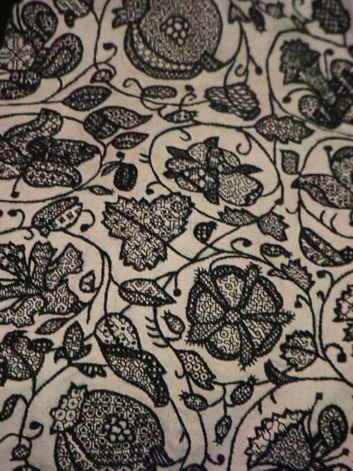
Folk have asked me how I can redact designs from photos. I try to reply, with specific examples from a new-to-me design I just charted up this morning.
First credit where credit is due. This artifact is a work bag in the collection of the Boston Museum of Fine arts, accession number 12.52. Below is their photo of the thing from the page linked in the last sentence.

The museum’s attribution is Italian or English, from around 1600. It’s part of the Denman Waldo Ross Collection, which means it was probably collected before 1900. The description further says it’s done in red silk on white plain weave linen, but does not say if it was done in double running or back stitch. No photos of the stitching’s reverse are shown, although there is a note that implies that when the piece was made up into a bag, a coarser grade of linen was used for the presumably unstitched back side.
The regularity and angles immediately signal to me that is was done on the count. Also that the ground cloth’s weave is not quite even, with a few more threads in the horizontal-appearing direction, than in the vertical. I can tell that from the large center flowers, which although they are quadrilaterally symmetrical, appear to be a bit squished side to side.
First, some base assumptions.
- Modern blackwork and its expanded vocabulary aside, historical examples employ only straight lines, right angles, and 45-degree angles.
- Stitch length units are regular, and are constrained to multiples of a single whole unit, either on edge or on the diagonal. Yes, there are some artifacts with instances of half-unit stitches, but for the most part they are extremely infrequent in foreground design. They do appear sometimes in voided work, to help the stitcher cozy up to the outlines of their previously laid down foreground design.
- Gaps between stitches in a continuously linked design will be the same multiple of the base unit. There are no “floating islands” in this piece. Every bit is straight-line attached to every other bit, and therefore must be on the same base grid.
- Not every iteration of the original is assumed to be spot on accurate. Imperfections in cloth, and stitchers who let mistakes remain or improvise their way out of a mistake can make the creation of a final normed chart a matter of adjudicated compromise, comparing as many of the iterations of the pattern as appear on the piece and deducing the most likely original pattern drafter’s intent.
It’s pretty clear that this photo, while quite good, isn’t the best. Individual stitches blur together. Angles are not always crisp, and the threads have aged over the centuries. Still the base logic and standard shapes that can be formed using the assumptions above remain. I’ve charted hundreds of these, and have a pretty good grasp of what can be done with those shapes, but even if you have fresh eyes and haven’t done this before it’s not impossible. Think Logic.
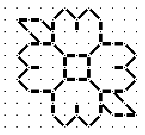
So. Where to start? That’s easy. At the center.
That big rosette must start at the center with a square of four units. We know that from the little Y units that grow out of it. Heart shape units are pretty common in this work, and it’s also easy to deduce that these must be an extra unit tall so that the center vertical of each ends up one unit above those same Ys. That makes the diagonals linking the center square to the edges of the centermost heart flower two units long.


(An aside: the distortion produced by the less than even ground is evident when you compare the original and my true-square chart.)
The next thing I added was the simple hearts that grow out of the four cardinal directions. That establishes the height and width of that motif. I decided these hearts had flat rather than pointed top corners after looking at several spots on the original, and seeing that to achieve the height as seen, pointy corners would have been too tall – the divot at the center of the heart would not be in proper proportion otherwise. After that I played with the surrounding petal shapes, noting which straight lines were preserved, and noting the parallel size of the right angle juncture where the center heart petals meet with the size of the elongated diamonds that link the center rosette to the smaller flowers. Those have to be two units at each end. And so I filled in the rest of the rosette and those connecting links.

The only thing remaining to create the flower framing motif was to graph out the little blossom. Comparing the corners of those petals it was pretty clear that they WOULD have to be pointy to make the motif congruent with its own center square, which is clearly the same size as the larger rosette. Easy. So is chaining two together to make the inter-rosette connections. The only thing I had to watch for was the direction of those little leaves sprouting on the side. Those had to mirror around the center. A simple matter of copying and pasting, with flips as needed.

The chart at right is pretty much the entire logical repeat for the floral frame (click on it if it truncates on your device). Now for the harder part. The stemmed sprig of hops? grapes? whatever? is NOT symmetrical at the bottom. For that we have to rely on alignment with the wonderfully and conveniently regular floral frame.
Yes, this part is harder, and sometimes takes quite a few trial-and-error iterations before I hit on the logic of the original. In this case it wasn’t that difficult. Although it’s not possible to count stitches in the photo, our base assumptions and our clearly defined frame made it rather easy. I look for alignments and spacing when compared with the frame. For example, if you compare the red alignment lines on the photo of the original to my chart, you see I hit all the bases. There are lots more points of alignment and extrapolation than just my few red marks. And yes, long familiarity with the shapes and curves possible does make it a bit easier.


You can also see in the original that the curlicues do not always “lay flat.” Some have fallen victim to age and loose stitching. In most cases I had to sift through multiple instances of the repeat and come up with a best guess. And in this photo is one thing I often add – a deliberate interpretation that’s a tell-tale, so that I can spot unauthorized reproductions of my charting, even when others claim to have charted the same original on their own. (Don’t laugh, this does happen. Mapmakers still do this to spot knockoffs, too.)
Thankfully the upper part of the sprig is symmetrical. I use the same alignment and spacing methods to fill in the tightly packed flower/fruit shape and the lily-like finial on the top. The best part of that is once I’ve got a good stab at half, I can cut and paste with mirroring, rather than doodling in every line segment.

And the whole thing together – click here for an easy to download, save and print PDF. Note that a full size page version of this design is also available in the permanent free embroidery patterns collection tab, scroll down to the linear patterns section.

As with all my charts, I copyright my own graphed interpretation, with no claim on the parent object that inspired it. I make this chart freely available for your own personal use. If you intend to incorporate my charting into your own design, and especially if you intend to sell that design OR if you wish to use this to produce items for sale or fundraising purposes – you are requested to contact me before doing so.
FIELD OF FLOWERS FOREHEAD CLOTH
My quick project gets off to a flying start. I’m about 20% done already. I started out with my hand-held 6 inch hoop to get close to the irregular corner of my linen scrap, but now have moved back to the larger 8 inch sit-upon.

The pattern itself is an original doodle destined for the next volume of Ensamplario Atlantio (as usual, no ETA on its release yet, but I’ve got the first 8 pages done). It requires a bit of attention, the diagonal columns connecting the saltire flowers carry twists in various directions, depending on where in the design they are, but overall the pattern itself is more repetitive than difficult. So to up the interest factor, I’ve transformed my original strip/border/edging layout into large, interlocking hashmark-shaped motifs, and am working each one in a different color. The final will have a patchwork meets jigsaw puzzle effect, kind of like a kid’s puzzle mat.
The other item of interest in this one is the thread. After reading about how others were using Sulky, a single ply hard twist thread intended for both hand and machine embroidery, I decided to give it a try. The ground is roughly 32 threads per inch linen, give or take. I am using a double strand of Sulky 30 weight.

First impressions are quite good. The 500 yard spool put-up is very convenient, as is not having to separate plies as with floss. It works up very quickly in linear stitching – the hard twist, firm nature of the thread eliminating the occasional snags and catches that can slow down softer, more friable floss and silk, when stitching with one hand above and one below. It also is amenable to being used in much longer lengths than regular embroidery floss. Longer thread length means fewer stops to end and begin new threads, so that speeds up stitching a bit. And it makes very crisp lines and corners. The hard twist paired with a blunt point needle makes the junctions where stitches cohabit easier to keep clean. There’s far less chance of a split stitch when stitching back up or down through a hole that is already used by a previous stitch, even when using (near) evenweave linen. I also like the way the dense, round thread keeps its “height,” with the stitches standing proud of the surface, rather than splaying out like floss strands do. Of course that means that floss strands provide better coverage for other types of stitches, but for linear work, clean lines and sharp corners take precedence. I try to capture the “depth” of the stitches below.

On the down side, I do note that colors do crock a bit onto the ground cloth even though the thread is not fuzzy. This is mostly evident when mistakes are picked out. Hints of the previously stitched color remain. To be fair, floss does this too, with the added annoyance of more stray fibers. My Silly Putty kludge works well enough on the color halo left when picking out Sulky, though.
So in my opinion Sulky 30 (double stranded) on 32 count linen is a good pairing. I will continue to explore its use, and report back on wash properties and durability. I would even go so far as to recommend it for folk who are interested in trying double running stitch on medium to high count evenweave. I think the properties outlined above would make it easier for those just starting out on their own blackwork journeys to achieve superior results.
Please note that I pay full retail for the materials I use. I do not accept freebies in exchange for reviews, nor does String participate in product placement schemes. Opinions here are entirely my own.
