ON CHARTING
Folk have asked me how I can redact designs from photos. I try to reply, with specific examples from a new-to-me design I just charted up this morning.
First credit where credit is due. This artifact is a work bag in the collection of the Boston Museum of Fine arts, accession number 12.52. Below is their photo of the thing from the page linked in the last sentence.

The museum’s attribution is Italian or English, from around 1600. It’s part of the Denman Waldo Ross Collection, which means it was probably collected before 1900. The description further says it’s done in red silk on white plain weave linen, but does not say if it was done in double running or back stitch. No photos of the stitching’s reverse are shown, although there is a note that implies that when the piece was made up into a bag, a coarser grade of linen was used for the presumably unstitched back side.
The regularity and angles immediately signal to me that is was done on the count. Also that the ground cloth’s weave is not quite even, with a few more threads in the horizontal-appearing direction, than in the vertical. I can tell that from the large center flowers, which although they are quadrilaterally symmetrical, appear to be a bit squished side to side.
First, some base assumptions.
- Modern blackwork and its expanded vocabulary aside, historical examples employ only straight lines, right angles, and 45-degree angles.
- Stitch length units are regular, and are constrained to multiples of a single whole unit, either on edge or on the diagonal. Yes, there are some artifacts with instances of half-unit stitches, but for the most part they are extremely infrequent in foreground design. They do appear sometimes in voided work, to help the stitcher cozy up to the outlines of their previously laid down foreground design.
- Gaps between stitches in a continuously linked design will be the same multiple of the base unit. There are no “floating islands” in this piece. Every bit is straight-line attached to every other bit, and therefore must be on the same base grid.
- Not every iteration of the original is assumed to be spot on accurate. Imperfections in cloth, and stitchers who let mistakes remain or improvise their way out of a mistake can make the creation of a final normed chart a matter of adjudicated compromise, comparing as many of the iterations of the pattern as appear on the piece and deducing the most likely original pattern drafter’s intent.
It’s pretty clear that this photo, while quite good, isn’t the best. Individual stitches blur together. Angles are not always crisp, and the threads have aged over the centuries. Still the base logic and standard shapes that can be formed using the assumptions above remain. I’ve charted hundreds of these, and have a pretty good grasp of what can be done with those shapes, but even if you have fresh eyes and haven’t done this before it’s not impossible. Think Logic.
So. Where to start? That’s easy. At the center.
That big rosette must start at the center with a square of four units. We know that from the little Y units that grow out of it. Heart shape units are pretty common in this work, and it’s also easy to deduce that these must be an extra unit tall so that the center vertical of each ends up one unit above those same Ys. That makes the diagonals linking the center square to the edges of the centermost heart flower two units long.


(An aside: the distortion produced by the less than even ground is evident when you compare the original and my true-square chart.)
The next thing I added was the simple hearts that grow out of the four cardinal directions. That establishes the height and width of that motif. I decided these hearts had flat rather than pointed top corners after looking at several spots on the original, and seeing that to achieve the height as seen, pointy corners would have been too tall – the divot at the center of the heart would not be in proper proportion otherwise. After that I played with the surrounding petal shapes, noting which straight lines were preserved, and noting the parallel size of the right angle juncture where the center heart petals meet with the size of the elongated diamonds that link the center rosette to the smaller flowers. Those have to be two units at each end. And so I filled in the rest of the rosette and those connecting links.
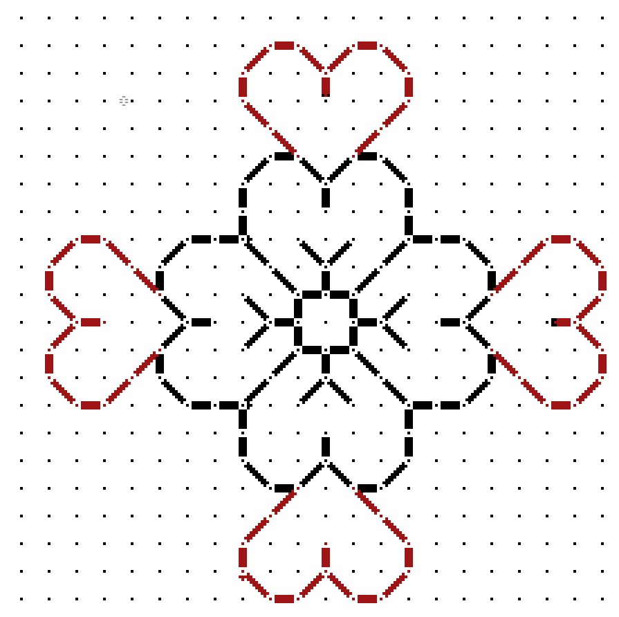

The only thing remaining to create the flower framing motif was to graph out the little blossom. Comparing the corners of those petals it was pretty clear that they WOULD have to be pointy to make the motif congruent with its own center square, which is clearly the same size as the larger rosette. Easy. So is chaining two together to make the inter-rosette connections. The only thing I had to watch for was the direction of those little leaves sprouting on the side. Those had to mirror around the center. A simple matter of copying and pasting, with flips as needed.
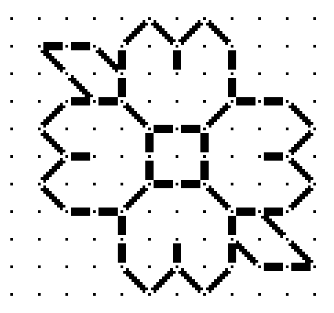

The chart at right is pretty much the entire logical repeat for the floral frame (click on it if it truncates on your device). Now for the harder part. The stemmed sprig of hops? grapes? whatever? is NOT symmetrical at the bottom. For that we have to rely on alignment with the wonderfully and conveniently regular floral frame.
Yes, this part is harder, and sometimes takes quite a few trial-and-error iterations before I hit on the logic of the original. In this case it wasn’t that difficult. Although it’s not possible to count stitches in the photo, our base assumptions and our clearly defined frame made it rather easy. I look for alignments and spacing when compared with the frame. For example, if you compare the red alignment lines on the photo of the original to my chart, you see I hit all the bases. There are lots more points of alignment and extrapolation than just my few red marks. And yes, long familiarity with the shapes and curves possible does make it a bit easier.


You can also see in the original that the curlicues do not always “lay flat.” Some have fallen victim to age and loose stitching. In most cases I had to sift through multiple instances of the repeat and come up with a best guess. And in this photo is one thing I often add – a deliberate interpretation that’s a tell-tale, so that I can spot unauthorized reproductions of my charting, even when others claim to have charted the same original on their own. (Don’t laugh, this does happen. Mapmakers still do this to spot knockoffs, too.)
Thankfully the upper part of the sprig is symmetrical. I use the same alignment and spacing methods to fill in the tightly packed flower/fruit shape and the lily-like finial on the top. The best part of that is once I’ve got a good stab at half, I can cut and paste with mirroring, rather than doodling in every line segment.

And the whole thing together – click here for an easy to download, save and print PDF. Note that a full size page version of this design is also available in the permanent free embroidery patterns collection tab, scroll down to the linear patterns section.

As with all my charts, I copyright my own graphed interpretation, with no claim on the parent object that inspired it. I make this chart freely available for your own personal use. If you intend to incorporate my charting into your own design, and especially if you intend to sell that design OR if you wish to use this to produce items for sale or fundraising purposes – you are requested to contact me before doing so.
