TWO COLOR DOUBLE RUNNING STITCH – TWICE THE FUN
As promised, here is a round-up of what I’ve been looking into on double running stitch, done in two alternating colors. First, heartfelt thanks to Melinda Sherbring and the gang over at the Facebook group Historic Hand Embroidery.
I knew I had seen examples of this type of work on samplers, but my own research notes are particularly poor in samplers. I tend to focus on the small fragments of household and body linen that lie quietly and largely unnoticed in museum research collections. Samplers receive far more attention, are often under licensing restrictions or have been fully charted by reproduction houses. So in a fit of laziness (it being vacation) I put out a call to the group and asked for assistance. Many people responded, Melinda especially so, furnishing 85% of the material I will cite below. So copious thanks, Melinda! I bow to your greater expertise on these, and will accept any/all corrections.
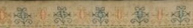
First, here’s what I am talking about. Here is a simple graph of a sprig pattern, worked in double running of a single baseline.

Note the alternating color stitches in the baseline. If I were to stitch this, I’d start with black, take that first stitch at the baseline’s left edge, then in double running work the rest of the first flower in black as a detour from my baseline. When I returned to the baseline, I’d continue on to the next black stitch, then I could continue working the whole thread of black until I ran out, carefully counting the units between black flowers. After that I’d start again from the left, filling in the missing green stitch, and taking detours to work the green flowers. Or I could do it the easier way – parking my black threaded needle, taking up a green one, and working green stitches until I got to the first green flower, working that as a detour in the standard manner, and marching on for a few stitches after, then catching up and leapfrogging ahead with the black. Note that using two colors means one will always be traveling along the baseline in the same direction. There is no doubling back to fill in second pass double-running stitches as one can if a single color is used.
After some experimentation, I found the “leapfrog” method far easier, in spite of having to be careful not to snag the parked thread. Less long distance counting means fewer errors for me. I suspect that close examination of encroachment on these historical pieces will turn up that leapfrogging was the way they did it, too. It’s just so intuitive and so much simpler.
One more observation – an alternating baseline is a giveaway that the band was done in double running. It would be quite awkward and wasteful of thread to achieve this effect in back stitch. And using back stitch to do the branching detour sprigs would mean having to terminate the thread on each one, or stranding over to return to the baseline. Again, something wasteful to be avoided.
Examples
Melinda provided far more than these photos, but I am cherry picking the ones with details that display the best. Click on the sampler institution/accession/date link to see the full pieces. A couple more of Melinda’s citations are at the end of this post, for those who want to do their own deep dive.
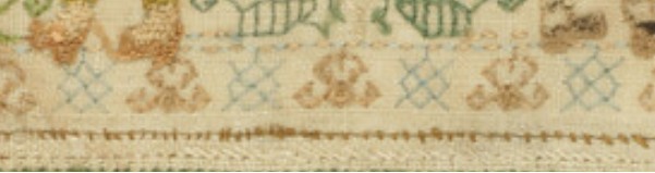
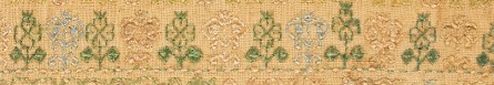
Ashmolean WA2014.71.3 (1631-1700) The boxers/urns panel has a companion border at the bottom with alternating pink/blue sprigs and a clear two-tone baseline. There’s also another pair of companion borders at the bottom that uses a band of green stitching with the alternating color sprigs and two-tone baseline immediately along its edge:
Ashmolean WA2014.71.27 (mid 1600s) has the alternating color sprigs on a two-color baseline on the topmost motif. This is the one I dimly remembered from tiny illustrations in a sampler book. Note that additional satin stitching was done in the centers of the motifs to bring extra dimensionality and color, but the double running outlines are still there.
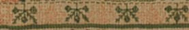
Burrell 31.7 (1640-1670) Sadly, no high resolution image. But on the bottom-most strip – its framing border, top and bottom strongly looks like two-tone sprigs, and probably has an alternating baseline but it’s hard to make out the detail on the baseline. More investigation on my part needed. As an aside, it’s nice that the Burrell gives thread counts for the linen ground – 28 warp x 25 weft per cm, or 71.12 x 63.5 threads per inch. I’ve included the main strip because it or a close sibling pops up in connection with alternate two-tone borders in other works.
Burrell 31.9 (1640-1670) Third strip from the bottom. Again, certain ID limited by photo quality, but it does look like that much wider strip was done with a two-tone WIDER baseline (same spirit as mine, but a different pattern), with alternating color detours. Shares a lot of the aesthetic and some bands with Burrell 31.7 – interesting!
Cooper Hewitt 1981-28-70 (1600s) Love their high resolution photos. Another clear hit. The companion border around the bottommost wide strip, for sure – done in at least THREE colors (wow!) with a multicolor baseline and single color sprigs. A green, a blue, and possibly a red and a pink, the red and pink are very much faded. Or it might just be green, blue, and pink. It’s very hard to parse but it does look like the baseline was done in pink-green-red-blue-pink-green-red-blue, which would leave very long skips, overlapping on the reverse. I’d love to see the back to confirm that, and to confirm the number of colors.
There are more possibilities on this same piece, but for the most part they are heavily overstitched in satin stitch or (possibly) hollie point or another detached looping/weaving stitch, worked on the outline and for the most part obscuring it. It also looks like the second color was not necessarily used on the double running stitch outline for the sprigs, but was employed in the fill treatment Here’s one with an alternating baseline of blue and pink(?). The pink looks like it was used to outline the acorn and leaf shapes with double running. Pink and green were used for the detatched stitch fills for the acorn and leaf, but the blue of the baseline seems to have ben employed to fill the twigs between the acorns and leaves.

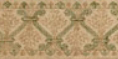
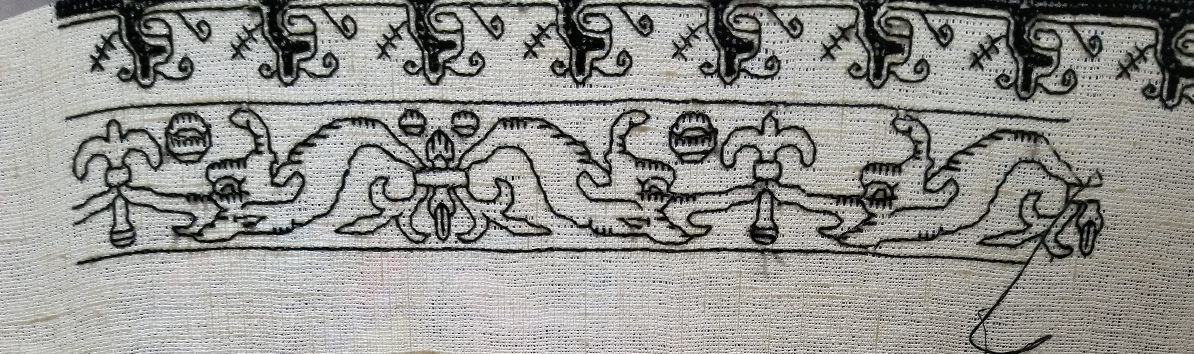
Fitzwilliam T.59-1928 (circa 1680) I stumbled across this one looking for the other items Melinda cited. I saw tiny black and white photo of this in one of the first embroidery history books I borrowed from the library – a book published before 1965 or so. I charted some of the strips from it with a magnifying glass, and used them on a piece I did in high school, long before I found the SCA. I haven’t seen this piece since. (People looking to chart now have no idea how much easier it is today with on line access to zillions of primary sources and high resolution photos, all of which can be enlarged right on the screen. A far cry from being smuggled into university libraries to stare at fuzzy microfiche images, or taking magnifying glasses to low quality black and white photos in books.) There is clearly a two-tone companion border with an alternating color baseline accompanying the prominent rose band:
By way of contrast, this bit from the same sampler was NOT done with a two-tone baseline. Even if there are pink straight stitches between the green diamonds and other motifs in the uniting center band, those sprouting leaves in pink are independent from the true baseline, which is solid, unbroken green.

Fitzwilliam T.61-1928 (1677) Also stumbled upon, and sadly a bit blurry. Two possibilities in the photo below – and the lower wide border to which one of the candidates is the companion one looks to a design that’s a cousin to the one from the Burrell sampler above. The two-tone companion is clearly not the same design, even though it’s difficult to see.

More citations:
Ashmolean WA2014.71.44 (1633) Not a sharp photo, but the red/green framing bands on the boxers strip does look like it is probably done in the dual tone baseline, alternating color detour method.
Fitzwilliam T.82-1928 (1691). Looks like there could be a couple of candidate bands, especially in the framing borders around larger strips, but the photo resolution isn’t quite there, and I can’t be sure that the colors are united by a two-tone baseline. I need to do more investigation.
Conclusions:
I have not seen this treatment in portraits, or in fragments of household linen – only on band samplers. I will keep looking, but I think Melinda’s generosity makes it clear that double running done in two colors, with a two-tone baseline and sprigs alternating between those colors was a 17th century innovation, popular in England of that era. She has given us lovely data points from 1629 to the 1690s. Given the paucity of extant samplers before 1600, that is to be expected. Thanks again Melinda!
But I never say never. All I can say is “I haven’t seen it yet.” And who knows, maybe someone out there HAS a citation for use of this technique before 1625, a sighting in works from other times/locations; or evidence on a textile fragment or portrait that it was used on clothing or household linen. If so, please add a comment with that reference here, and I’ll be happy to do a follow-up post.
And my own progress?
I’m up to the outer framing border. I just realized that I forgot to plot the way the wreath-springs work in the corners, so I will do that later or tomorrow, and concentrate on finishing out the upper edge tonight.
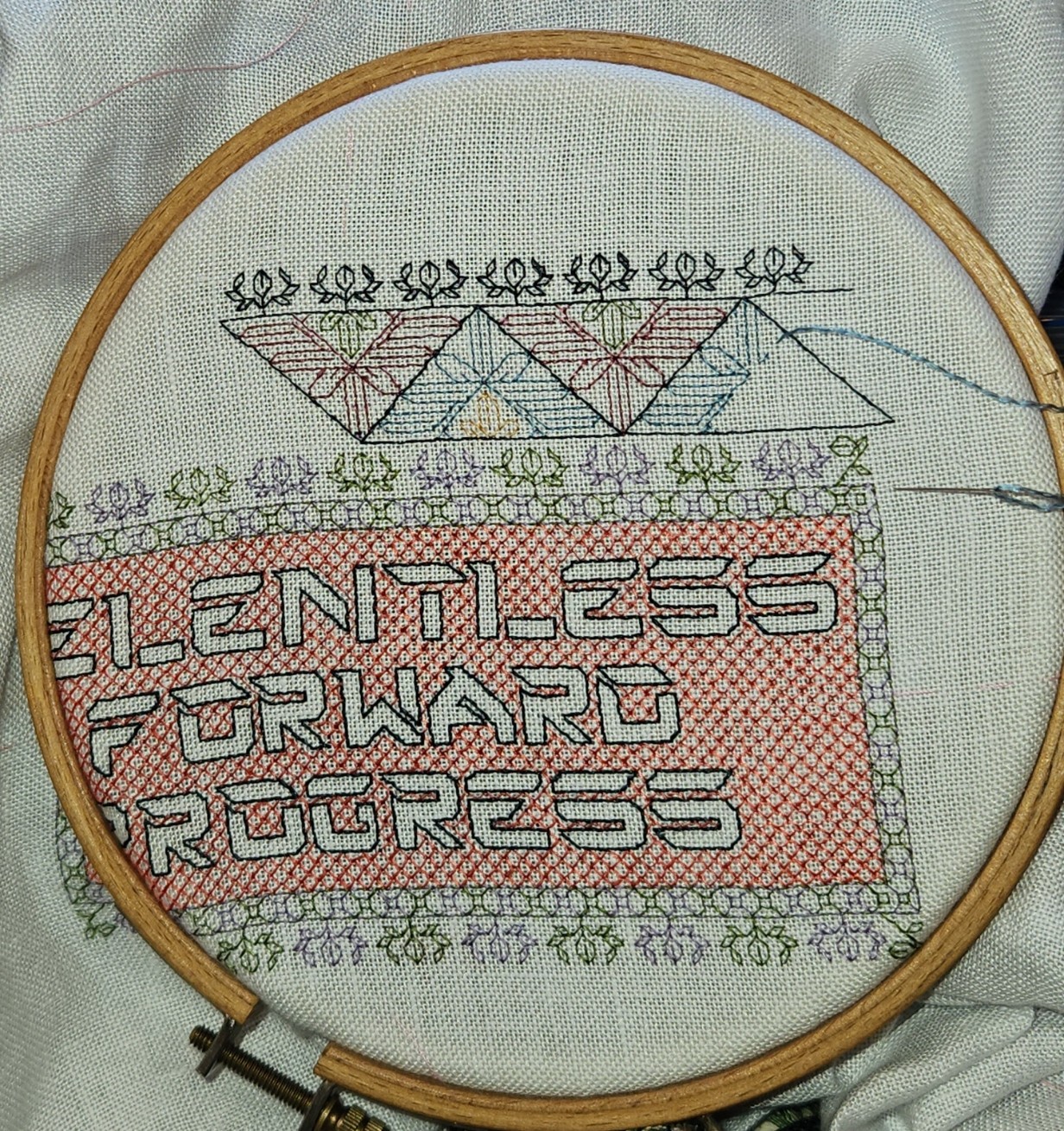
Yes, the colors are a bit disjointed, and I’m not entirely pleased with how prominent the diagonals turned out. But I am working under severe materials quantity constraints. Most of the colors were too light to show well in this style of work, and those that are are in single 8 yard six-strand skeins, most of which were already nibbled by the original owner for her prior projects. I am still splitting each strand of the six, to double the yardage, but it’s going to be tight.
MESHY DONE, PLUS KITTING OUT THE FRAME
Yaay! A bit of self discipline imposed, and the forever voiding on the meshy lettuce pattern panel is complete. I have to admit that while I adore the look, I am not wildly fond of the hard-pulling needed to achieve it. I might try it again if I ever find a linen that’s the right combo of threads-per-inch plus nice soft and lofty constituent threads, instead of skinny hard-spun ones.

How does this strip fit into the growing project? After all – it has been about 8 years since we’ve seen the whole thing laid out. For the record, I’ve filled about 45% of the available real estate – there’s a lot more to go.

Now for the next. I don’t think I’ve play-tested these dolphins before (another design in the ever-forthcoming T2CM). The original showed them with a squared fill background in voided style, but I wanted something lighter to follow the dark band I just finished. I left off the voiding, but then decided that the bit looked rather spare. My dolphins needed something to play with, so I added the round elements, and am now pleased. A quickie, this bit took just Saturday and Sunday evenings:
I will add the roundels to the dolphin at right of center, but I left it off so you can see the rather unfinished look it had without something there.
After this one? Probably another narrow strip, possibly a bit wider than this one, and possibly darker for contrast. Then after that I have a double running stunner queued, but it’s rather wide and needs a bit more spacer ground between it and the giant meshy lettuce panel.
In the mean time, as I get up close and personal with the frame I am making little improvements to my set-up. For example, the jaw of the Lowery is steel, and well loved by magnets. But it’s not exactly accessible with the large frame extender unit. BUT when I flip the thing over to terminate a thread, it is. Add a strong classic U-shaped magnet, and I’ve got a handy place to park my snips (the red magnet is just behind the red snipper).

My needle minder works quite well, and sometimes I use it to park my threader. It often does double-duty as a holder for my pattern page. But that can get in the way of the stitching area. So I glued a magnet to the flat side of one of my Millennium frame scroll bars – on the flat side (yes, I tested it to make sure the correct side was up – that’s the one that attracts rather than repels the other magnetic goodies I wanted to use):

I can use this as a rather plain needle minder all by itself, or I can park my fancy one there instead of in the hidden spot where you see it now. Or I can use another magnet with it to hold my pattern page. But best of all, I can use it in conjunction with this page holder I picked up years ago (it used to stick on my fridge door, to hold tickets, recipes, coupons, or whatever).

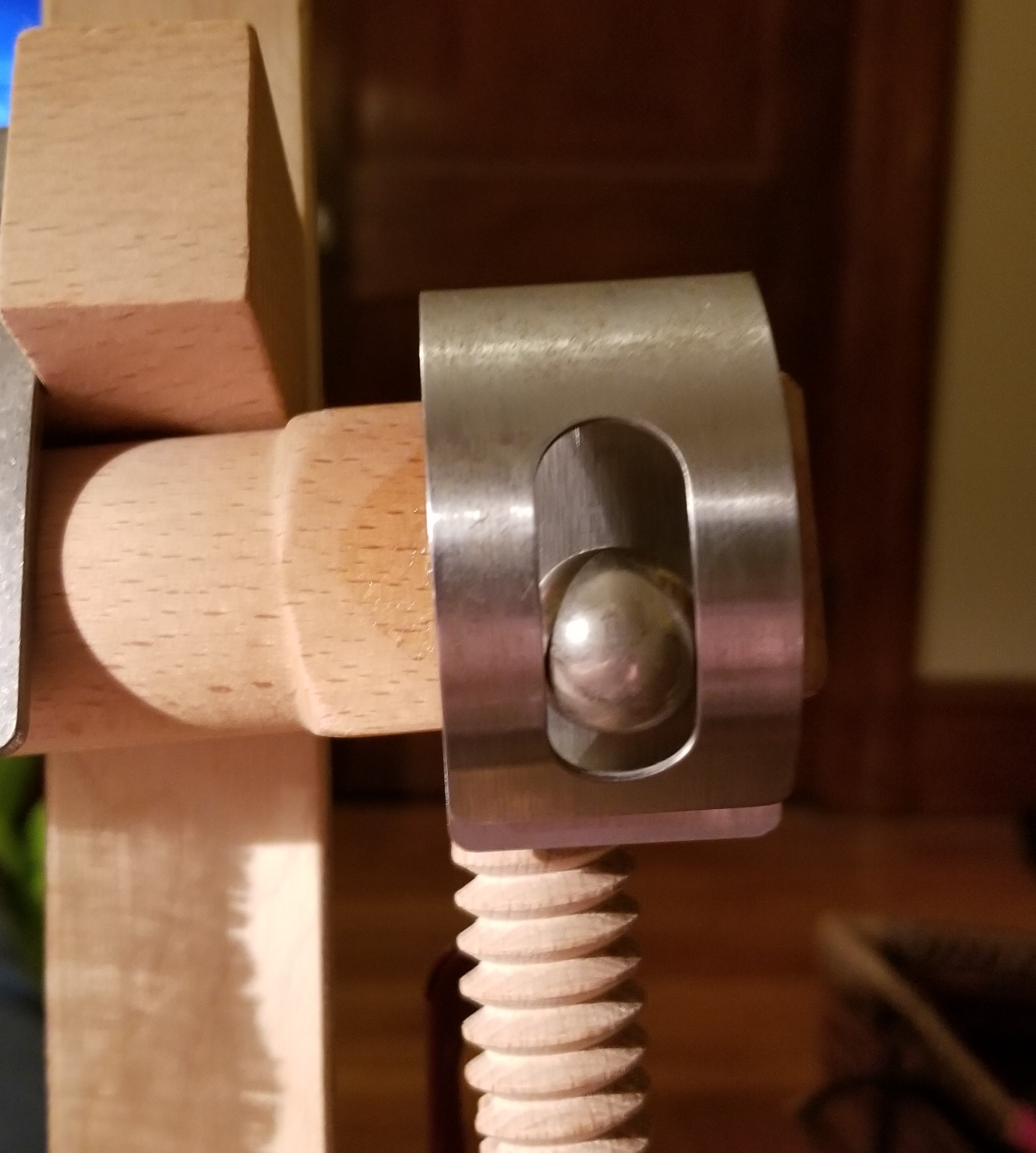
By just gluing on a magnet, I’ve left the door open for all sorts of other magnet-enabled organizers. There are other styles of clips. Hooks and loops with magnetic bases could accommodate scissors, for example. Finally, I’m still looking for it to test out, but because the rare-earth magnet I used is so strong, I’m betting it can hold my smaller flat metal magnet board. That would allow me to use placeholder magnets on my pattern page while the page is displayed right on my work area.
And where to find inexpensive strong-hold magnets? I recommend the geeky source, American Science & Surplus. They are a clearing house for engineering tidbits, science gear, weird surplus items, kids’ educational toys, and other miscellanea. They are especially good for containers, magnifiers, bags, precision scales and measurers, cutting implements, office supplies, and magnets. Like any surplus store, their inventory turns over quickly, so if you don’t see what you want there today, visit again next week.
FRAMED!
At long last. Framed and hung up in the bedroom.

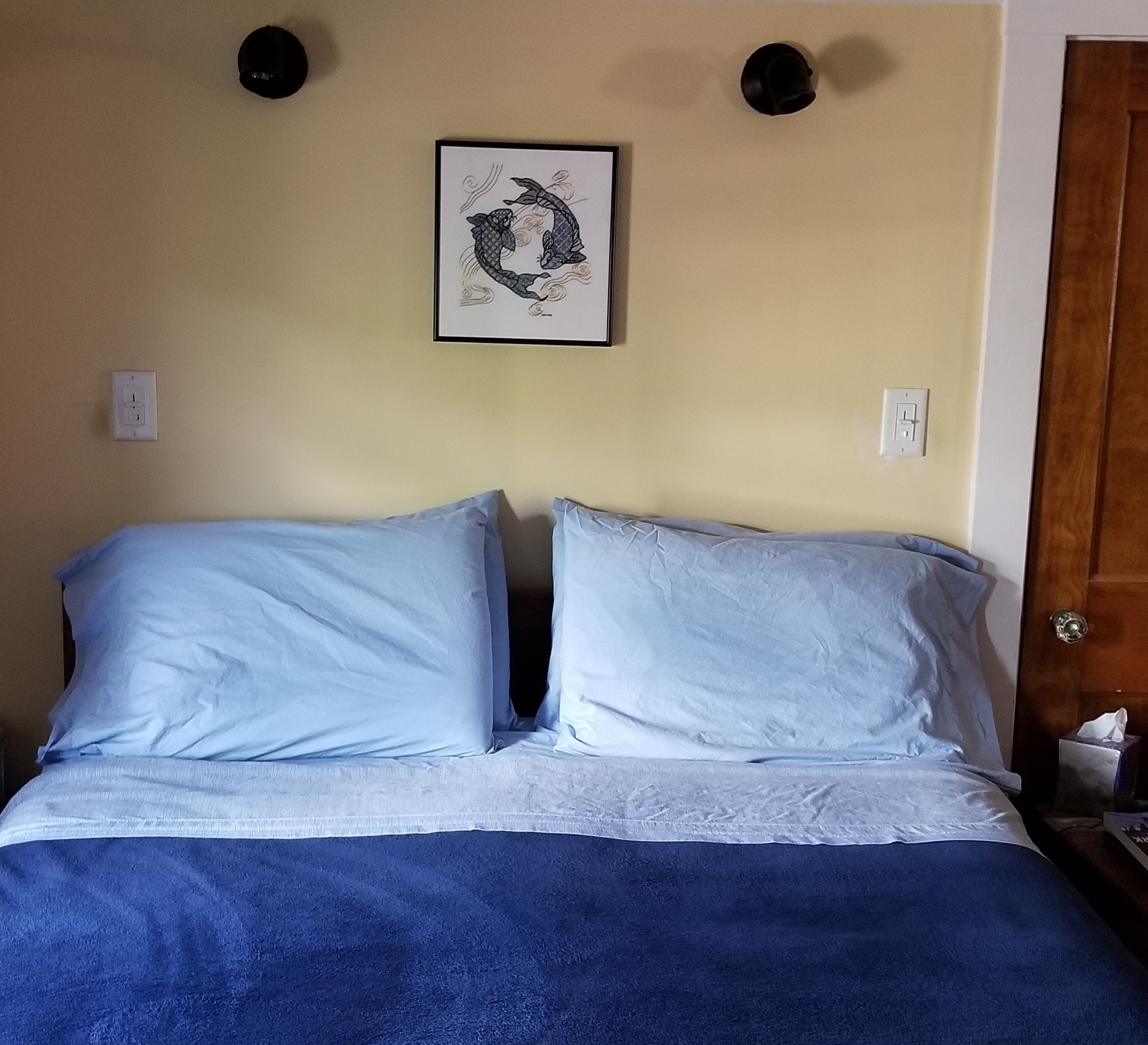
Obviously I now have to paint the bedroom walls…
I’m quite happy with the way this turned out. The frame is simple enameled steel, in deep navy. I ended up going to Walden Framer in Lexington, MA. Mr. Ed Pioli, the owner and artisan in chief, did an excellent job at a reasonable price. I will be bringing my other as-yet unframed pieces there, too.
To answer more questions on the piece’s composition, mostly from other people outside the framing shop when I was there. No, neither of us is a follower of astrology, and it’s not a panel depicting anyone’s sign. It’s just two koi, in a traditional arrangement. And no – there isn’t a boy-koi, and a girl-koi (or any other manifestation of yin/yang) intended. It’s just two koi swimming in a circle. And no, that’s not real gold thread. It’s high quality imitation gold sold for Japanese embroidery. And no, I didn’t sew it on a machine, I did it by hand. Really and truly. (People are curious about the strangest things.)
What am I working on now? Well, the Great Tablecloth/Napkins project is done, but I still itch to stitch. So I’m just doodling. Filling up a small piece of linen, waiting for the Inspiration Fairy to chuck a brick through my mental window.
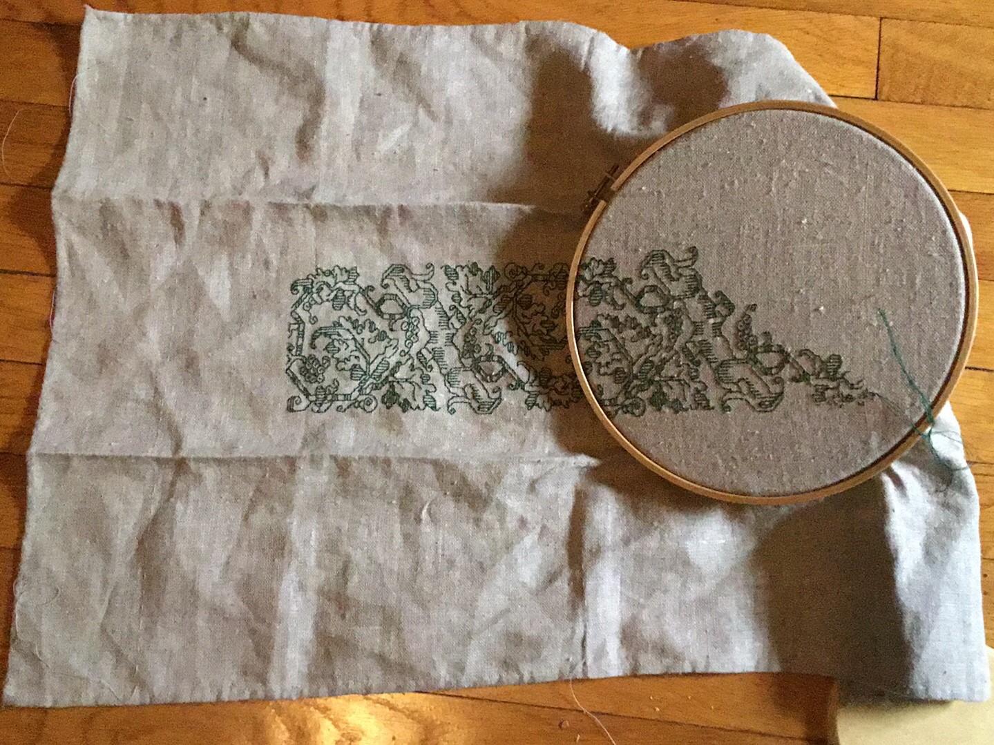
I’ve written about this design before. I think this time I’ll circle the center panel with other, narrower bands. Again, no set plan, I’ll just pick them as I go along, with no composition agenda in particular in mind. Eventually I’ll figure out what to stitch next.
UPDATE
It’s taken me a week or so to get this post up and out. In the mean time my doodle has grown, but still has no plan.
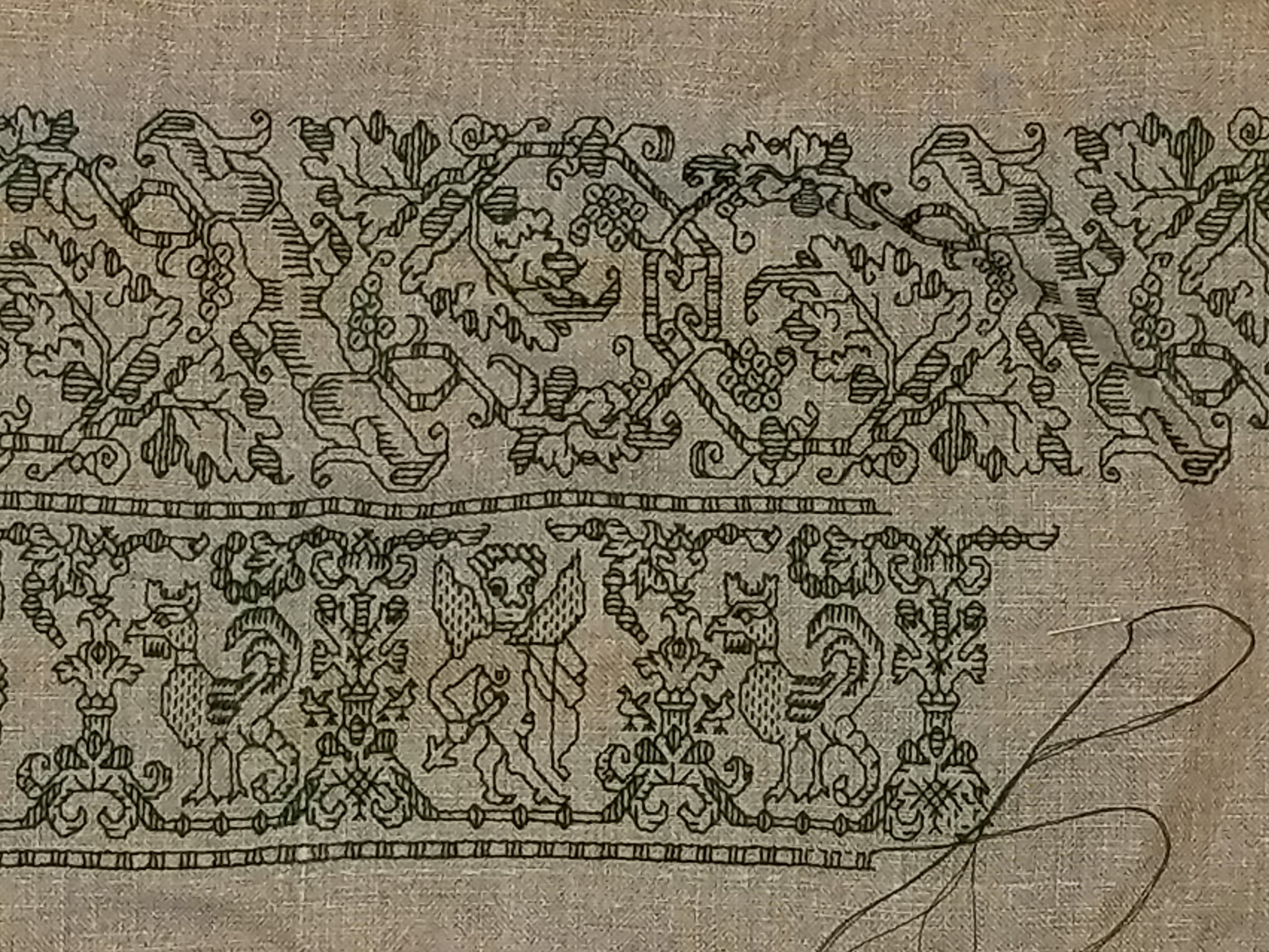
The lower design is a curious one. Although it’s a clear repeat with the rather bulbous naked cherub alternating with the cockatrice, there is little symmetrical inside the repeat. Close attention has to be paid to this one because even the internal framing mechanism (the bar and beads below the feet of each) has a different counts in each of its two instances, and the usual urn or leafy unit between the creatures also exists in two incarnations. It’s a curious one, for sure, but fun, and is keeping me on my toes.
Both of these designs will be in T2CM, which is moving again towards release. No date yet, but watch this space.
ANOTHER SAMPLER
This one’s a quickie – a present for Denizen (one of Younger Daughter’s pals, currently staying with us). She’s also headed off to university next year, and deserves her own bit of stitched wall art with a favorite saying.
Denizen has requested the immortal words of Admiral Grace Murray Hopper, “It is often easier to ask for forgiveness than it is to ask for permission.”

As you can see, I’ve already laid in the saying itself, using yet another of the alphabets from Ramzi’s Patternmakercharts.blogspot.com website. In this case, I’ve chosen a very simple all lower case set from Sajou #104. A fancy font would be too bombastic for this sentiment. I used plain old cross stitch (POCS) for the letters.
Ground this time is a large-as-logs 30 count even-weave linen remnant from my stash, long since disassociated from any label, vintage, or maker identification. The floss is more of my India-purchased faux silk – deep crimson, bright green, strident blue, and daffodil yellow. Patterns (so far) are all from The Second Carolingian Modelbook. Being unbound by any historical or usage constraints on this one, I’m happily playing with colors, limited only by the availability of my remaining threads. I’d like to use far more red to anchor the piece, but it’s the color of which I have the least, so I have to work it in more sparingly.
I’m also changing up the orientation and proportions of this one. Instead of long and thin like historical samplers, or portrait orientation like a standard reading page pieces I’ve stitched lately, I’m doing this one landscape – with the longer dimension east-to-west rather than north-to-south. I’ll probably run a more solid border the full width top and bottom, either POCS or long-armed cross stitch. There will be two banks of geometric bands, left and right both above and below the centered saying. Although I might mix that up with a collection of spot motifs above the saying. I haven’t decided yet.
One failure of note though. I wanted to do some Swedish Weaving stitch on this one, as a nod to the Denizen’s heritage. While that style is usually done on huck towling, it can also be done on plain tabby weave fabrics. Unfortunately, this particular ground cloth and my ultra-fine floss are a bad combo for the technique. I didn’t like the look so I picked it out and went with what I have. I’ll do a Swedish Weave project another time.
The motto took just one weekend, and at red bit is only one night’s stitching – about 2 hours worth, so I forecast that I’ll rip through this project in no time.
