I’m working along happily on my grapes wine-opening placemat, using the motif I redacted from the 17th century Hermitage artifact.
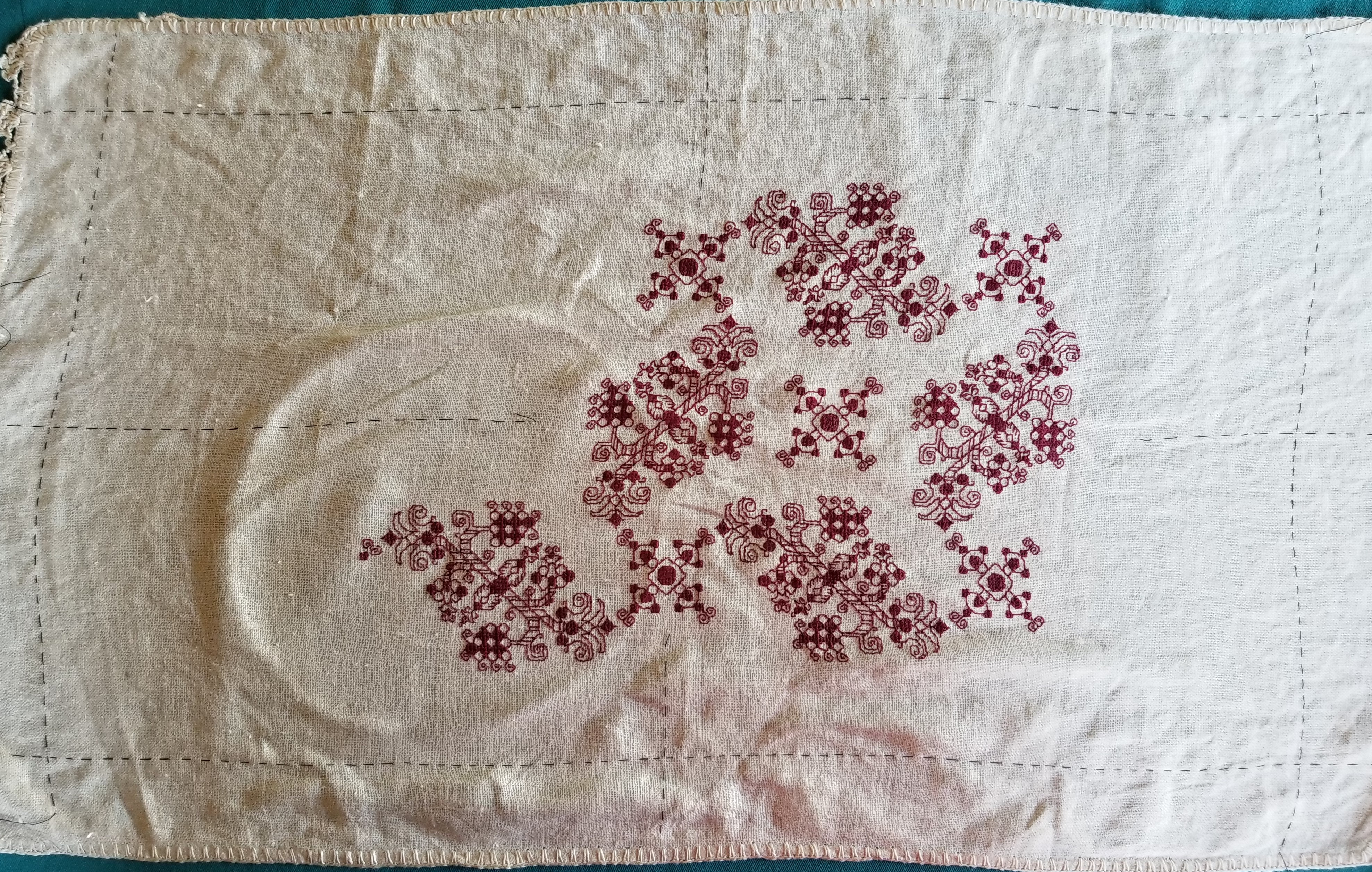
One big problem with my graphing of the design is that the original doesn’t stick to count on the placement of the individual large and small motifs. While each motif is worked true to count, their scattering across the piece is a series of eyeballed guesses, with no two offset by the same spacing. Here are a couple of enlarged snippets from the museum original that showcase the variance:
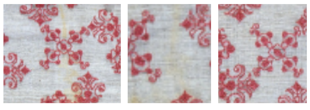
However, when I graph up a design I try to “regularize” it – often averaging the deviations among many repeats to create an easy to replicate canonical version of the design. In T2CM I note the degree to which I normed the repeat in each redacted design, so those who are interested in total veracity know that I’ve done a bit of tinkering, and can refer back to the original and determine if that level of deviation complies with their intent.
I played with the two main elements of this all-over repeat until I hit upon something that was regular and that accommodated the use of the smaller motif both as the “pinwheel” spinning off the larger grape/floral motif, and to occupy the center of the circle formed by the grape/florals. And I began stitching.
Now the placement I ended up using does have a flaw. The march of the grape/florals is offset one unit each iteration by the pinwheeling. That means that in the sample above, the right-most grape/floral presents one unit ABOVE the line established by the one immediately to its left. This is the problem that the original stitcher tried (with limited success) to combat by eyeballing placement rather than sticking to the count. Even with their best effort, the original artifact’s overall design does migrate a bit in the same way, like a time lapse photo of a rising sun, each pattern repeat appears ever so slightly above the one to its left.
This isn’t much of a problem for a large field design with no edges that matter, but for a smaller work the migration does become evident. Especially if an edging or hard border is used.
And I want to use a hard border. I’ve designed a companion border for this field, to be worked in the same color as the rest of the piece. Or I should say I’m still in the process of designing one because I haven’t settled on exactly the **right thing** yet. But this is getting close. I’m using the cinched rope visual trope contemporary with the field design, and incorporating elements of the grape/floral with it.

Yes, it’s blurry. It’s not ready for prime time yet, but you can squint and make out the basics – the rope, the pendant flowers borrowed from the field, and the line above running parallel to the rope. That line will save me, and whatever variant of this edging I end up using will include it. I will work the edging in strips, butting the corners instead of mitering them (a very historically accurate way of dealing with pesky corners), doing it in the neighborhood of the basted black guideline threads. Then I will work the field pattern up to and touching the edge line.
The rising sun anomaly will still be there, but the piece as a whole should be both bound and defined by the border. Or so I hope. Stay tuned! It’s going to be a while before I get to actually stitching that part. All the more time to refine my edging graph. 🙂

Dizzy Grapes is looking beautiful. I do like that border and hope you will post many progress pics.