THINKING, BUT KEEPING BUSY
A couple of people have asked if I’m taking a break from needlework in the aftermath of the great coif project.
Nope. To be truthful, I am filling my time with far less challenging pieces while I contemplate the next big project.
First, I’ve returned to the third forehead cloth. I’ve done two before and love wearing them instead of bandannas to contain my hair on windy days. I do a little bit on them in the afternoons, and in the evening catch up on my sock knitting.

The socks are my standard issue toe-ups on anything from 76 to 88 stitches around, depending on needle size; figure-8 toe (an technique unjustly despised by many), plain stockinette foot, German short row heel, then something interesting for the ankle. Mostly improvised. The only hard part is remembering what I did on that ankle so I can repeat it on the second sock.
The forehead cloth is fairly flying. It’s all one pattern, on cotton/linen yard goods that works out to about 32 threads per inch. That’s as big as logs compared to the coif’s linen. I’m trying out Sulky 30 thread (two strands). It’s ok, but I am not so fond of it I’d throw over softer, more fluid flosses. I am betting though that it will stand up to hard laundering better than standard cotton floss. The stitching on my other two forehead cloths, done in silk, has survived quite nicely. Unfortunately the ties – folded strips of the same ground – have totally shredded and been replaced twice on each. I may move to narrow store-bought twill tape for the ties, instead. Jury on that is still out. Oh, and yes, there are mistakes on this. Some I’ll fix, and some I won’t. Have fun hunting for them. 🙂
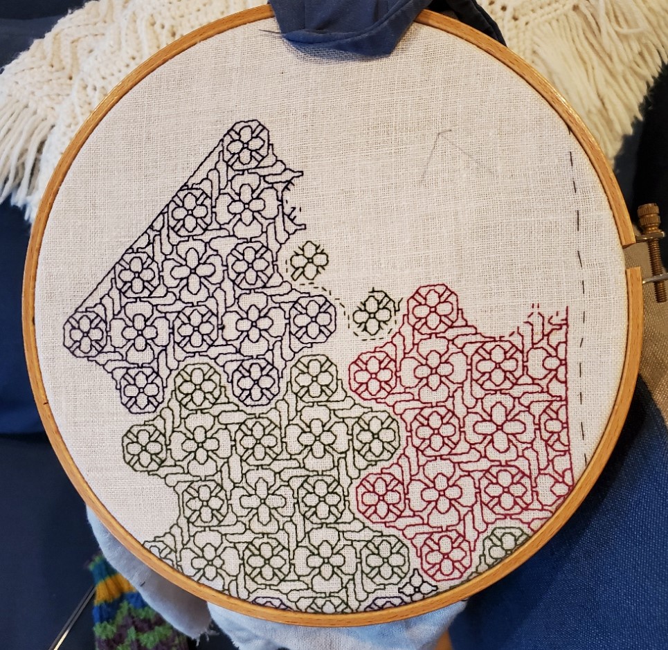
While I’m here, I’ll share a tiny blackwork hint.

I’m doing double running but this will be relevant to those who favor back stitch, too. See those “legs” sticking out in the photo above? As I passed those junction points I knew I would be coming back again, from a different direction. It is far more difficult to hit the exact right spot when joining a new stitch to an existing stitched line (both perpendicular as here, and diagonally) than it is to mate up to a stitch end. Those legs are there so when I come by again I have a clear and simple target for the point of attachment. This saves a lot of time, minimizes my errors and helps keep my junctions as neat as possible. Try it, I think you’ll find the trick useful.
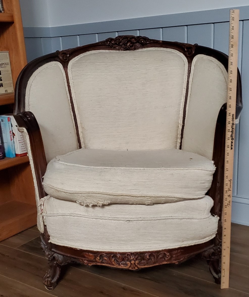
What am I contemplating for my next project? Possibly a blackwork/sashiko hybrid. I have a barrel chair, a wreck salvaged from the trash, that I had recovered in Haitian Cotton back in the early 1980s. It has survived four house moves and two children, but although the back and sides are in good shape, the seat cover and the area just under the seat are both shot. I still adore the thing even though it doesn’t really fit in with the rest of the house’s style. So it’s going up into my office. I plan on recovering the shredded areas with patchwork denim overworked in white running stitch. The denim will be reclaimed from various outgrown and destroyed garments I’ve held onto against just such a future need. Since I do not plan on replacing the rest of the upholstery, I’m counting on those flashes of white to bring the seat and the rest of the piece together.
ANOTHER PORTRAIT, ANOTHER REDACTION
About a year ago a member of the Italian Renaissance era fashion discussion group, Loggia Veccio on Facebook asked for help decoding the blackwork on the sleeves of this portrait. I volunteered, but heard nothing back. Today she came forward again to repeat her request. So I oblige.
The first thing I did was try to find the full attribution for the portrait, plus a better, higher resolution image than this repasted one.
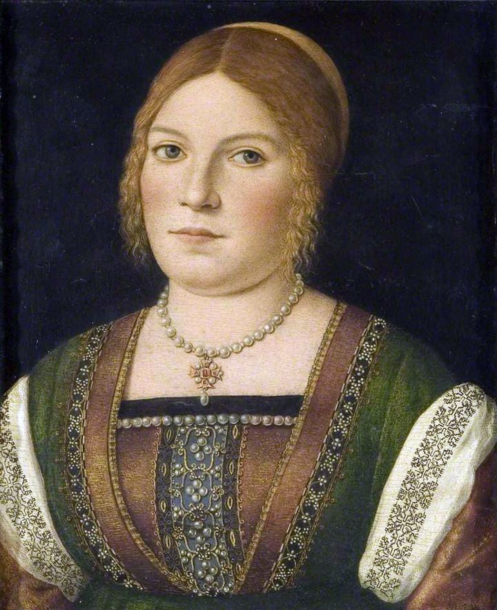
The original is held by the Bristol Museum and Art Gallery, Accession K1651. While it’s not available on the museum’s own website, it does have a page in the Art UK on line collection. The accompanying information cites its date as circa 1500, and the working title as “Portrait of an Unknown Young Woman.” The blurb goes on to say that it has some congruence with works produced by Carpaccio, but stops short of definitively identifying the painting as his.
On to that sleeve. It’s a relatively simple pattern, but redacting from paintings is never as easy as doing so from an actual textile. In this case while the design looks quite regular at gazing distance, up close examination shows that multiple interpretations of the repeat are represented. I’ve attempted to reduce those to a most probable approximation, but it is just an approximation.
As usual, my assumptions were square units, all of the same size, mirrored both horizontally and vertically. I further assumed no diagonals based on the stepwise total appearance. And while I first thought this might have been done in one continuous line, examination of multiple repeats showed that it was most probably done as lozenges rather than a united whole, with small “islands” filling in between the main bird-bearing motif. Here is my best guess.
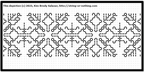
As usual, a printable page with the pattern and accompanying text is available by clicking here, or popping over to my Embroidery Patterns tab.
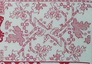
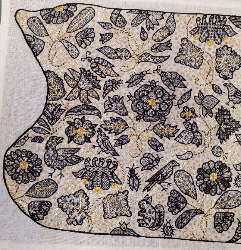
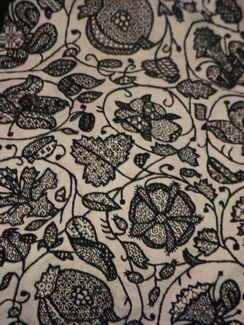
ANOTHER FOA FAMILY ARTIFACT
A while back I did a long post on a design cluster that appears in Italian work of the 1500s to 1600s. It’s characterized by thin stems, grape leaves, striated flowers, curls, and occasionally, infilling in multiple colors. Here are some examples of the style family, and how they have fared in my hands.
Philadelphia Museum of Art, Accession 1894-30-114.
The museum dates this (a bit improbably) as being 14th century, Italian. I would bet that attribution hasn’t been revisited since acquisition in 1894. Here’s my in-process rendition of it (my own redaction).
There’s also this piece in the collection of the Metropolitan Museum of Art, Accession 51449.71.1.4. The Embroiderer’s Guild has another piece of what may be the same original in their archives. The MET dates this as 16th century, Italian. The photo below is my rendition of this work – my own redaction, in T2CM – the original photo is not as clear.
Finally we have this one. It’s in the Jewish Museum in New York, Accession F-4927. The original bears an embroidered date in the Jewish calendar, so there’s no quibbling with the point of temporal origin. It’s labeled Italy, 1582/83. Again, here’s my workup of my own redaction.

This last piece is a Torah binder, a decorative strap to hold the scroll together in between uses. The bundled scroll and its rollers would have been further protected by a richly embroidered covering, and if the congregation could afford it, adorned with a silver front plate, crown, and reading pointer. Making and/or commissioning such things was both a great good deed and a point of family prestige. In addition to the date, the binder bears the dedication” In honor of the pure Torah, my hand raised an offering, Honorata… wife of… Samuel Foa, it is such a little one.” The museum’s blurb notes that Italian Jewish women often were donors of important textiles and other objects, doing so to commemorate family births or marriages.
When I first wrote about these objects I noted that Honorata Foa might have commissioned the work, or might have done it herself. With so little data available, it would be difficult to make that determination.
Now however, I’ve stumbled across another stitched item credited to a Foa family matriarch. This one is later. Although it is still a foliate meander, is clearly of a later style, surface embroidery, and not counted. It’s in the MET’s collection, accession 2013.1143. Excerpt of the museum’s photo below.

It too bears an inscription and specific date. The museum blurb translates it as “Miriam, of the House of Foa, took an offering from that which came into her hands; and she gave it to her husband, Avram. The year of peace (5376) to the lover of Torah.” The date equates to 1615/16 on the common calendar. The museum entertains the thought that Miriam might have been the embroiderer, herself.
I was amazed to find two pieces donated by the same family, 33 years apart, showing so strongly the major stylistic shift in stitching that was taking place over that time. I also feel a bit more confident about attributing the earlier piece to Honorata’s hand.
I‘ve found some other material about a Foa family that flourished in Sabbioneta, Italy in the mid to late 1500s, with an extensive business in printing bibles and prayer books. But the only textile work the publisher’s blurb mentions (but doesn’t show) is a tapestry covered bible. I may have to get the book it cites, a family chronicle written by Eleanor Foa, a modern day descendent. I’ve also found a reference to Eugenie Foa, a fiction writer of the 1800s, who wrote about French Jewish life, setting Esther, one of her characters, in an embroidery workshop. But the full text is behind permissions I don’t have (the Google link to the full text mentions Esther in Foa’s work, but the linked blurb does not). Other works that mention the modern Foa family and its scions trace origins back to the publishers of Sabbioneta, but do not mention any link to handwork.
There’s clearly a slew of thesis topics here for someone who wants to take it up: the Foa family and its involvement in the hand embroidery industry of the time. Was the prominent printing family also involved in embroidery, or was it another similarly named/possibly related branch? Was the leafy grape design cluster something from their (posited) workshop? Are there other extant products from or writings by family members? (I’d fair faint away if there was a modelbook of embroidery designs among their archives). Did the family persist in its embroidery vocation over time? If so, how did their products evolve?
As ever research rarely answers more questions than it evokes.
UPDATE: Honorata Foa’s Torah binder will be on display at the Boston Museum of Fine Arts, as part of their Strong Women in Renaissance Italy exhibit, 9 October 2023, through 7 January 2024. Although the museum’s page doesn’t show it, an article in the New York Times offered an in-gallery photo of the piece. Amazing, since I had no idea that this was happening until after I posted this blog entry.
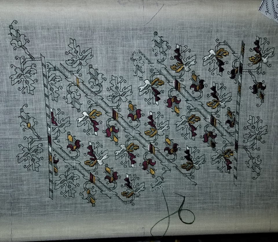
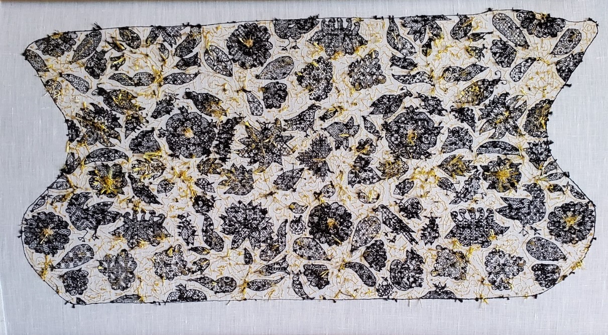
UNSTITCHED COIF – FINISH. THE FILLS
As promised here’s the breakdown of the design, motif by motif – a guided tour of what I was thinking or not thinking about. This is turning out to be way longer than I expected. Feel free to scroll down to the eye candy and ignore the prose.
First, on the general aesthetics, I already confessed yesterday that this piece is a departure from the strictly historical, using stitches, materials, and fills that have no specific point source in a particular artifact contemporary (or near contemporary) with the original Victoria and Albert Museum piece of ink-drawn linen. But in spite of that I’ve tried to stick to general aesthetic. It was a time of “more is more.” Pieces like this coif were status items that proclaimed the wearer’s wealth. I heard Thistle Thread’s Tricia Wilson Nguyen lecture at Winterthur about how copious precious metal spangles, threads, and even lace served as walking bank accounts, shouting prosperity but still being available as liquid capital to an owner whose fortunes dipped so low that reaching for a scissors to snip off a bit for ready cash was a welcome option. To that end, I’ve doubled down on the gold accents. But not being as flush as landed gentry from the late 1500s, I’ve used imitation gold thread and gold tone mylar rounds.
I’ve also tried to emulate the more lush aspects of some historical blackwork pieces, that created depth and shaded nuance by using fills of different visual density, augmenting the effect with raised outlines. I would have liked to use a plaited stitch for the stems, but it’s clear that the original artisan didn’t leave room for them, so I settled on outlines that were markedly heavier than the fills, topped off by a whole-piece outline that was even thicker and more dimensional.
I also like the difference in blacks used. The fills in the thin modern-dyed spun silk single strand are dark enough to look lacy and contrast well with the ground. The outlines, done in the boutique, small batch historically dyed double strand (also spun) are a much softer black. In some places the black takes on a reddish or brownish tinge, or moderates to an even less dense charcoal. If they were as deeply toned as the fills I think that each leaf, petal, or wing would present more as a grey-scale visual mass rather than letting the fills speak louder than the outlines. Finally the deeply black modern dyed but glossier reeled filament silk used in the perimeter then echoes the black of the fills, and makes a world of difference to the piece, pulling it all together. All black, all different, and all contrasting with each other.
On planning and fill selection, I winged it. I didn’t sit down and plan anything. I picked fills on the fly, with only a vague idea of where I would put dense, sparse, and intermediate fills as I began each sprig or group. Some succeeded quite nicely, others I would re-do differently had I the chance. Would I ever sit down and plan an entire project’s density/darkness/shading map ahead of time to avoid this? Probably not. It’s more fun to bungee-jump stitch.
On to the piece. First a quick recap of the whole item:

On this whole coif shot I can see three center circles of motion in the design, one surrounding each rose, and one surrounding the two centermost unique motifs – the borage flower/strawberry pair. The rest of the flowers are surrounding those elements. Maybe I see them because I’ve been staring at the thing for so long, or maybe my admittedly ornate but heavily outlined rendition with the gold whipped stems sinking into the background pulls those surrounds forward. When the exhibit comes around and I can see all the other pieces it will be interesting to see what other symmetries they accentuate.
We’ll start at the upper left. Although I began at the lower right, it’s easier to walk across starting at this point. I give fill counts and cite the number of fills I used from the project’s official website. Now some of the ones in my doodle notebooks duplicate or near duplicate those (we were after all mining very similar sources), so I apologize if any double-listed ones ended up in the wrong pile.
The first motif in the upper left I have been told is a marigold, one of six on the piece. It’s truncated at the edge by the indent. The marigolds were especially hard to work because those little jelly bean spaces of their petals were so tiny that most of the fills I had included repeats too large to be useful for them. I tended to use four repeats in the outer petal ring, repeating the sequence four times. The inner ring used different fills, usually two. Fourteen fills in this motif, twelve are mine, including the bunny rabbits. The other two are from the collections redacted by Toni Buckby, our Fearless Leader, and are available at the Unstitched Coif project website.
Immediately to right of the partial marigold in the corner is a truncated carnation or gillyflower (hard to tell them apart). Three of these are here, but only one isn’t cut by the perimeter. At this point, relatively late in my stitching I went out on the hunt for additional fills, and redacted a couple of pages of them for the upcoming third Ensamplario Atlantio volume. One of particular note is the leaf at the lower right, with that flying chevron shape, one of several I drafted up from a photo of a blackwork sampler, “Detached Geometric Patterns and Italianate Border Designs with Alphabet” 1697. National Trust Collections, Montacute House, Somerset, NT 597706. The twist and box of the sepal is from the same source. Yes, I know they are later than the coif’s original. Since by definition anything I doodle is even later still, I didn’t see the harm it using them. 18 fills total in this sprig, six from Toni’s redactions, two from mine, and ten of my own doodles.
Next to the right on this photo cut is a columbine. It’s barely snipped, and one of three on the piece. The large leaves made good showcases for some of the bigger repeats, even with the gold overstitching. As a result on this sprig we’ve got only five fills, two of which are from Toni’s pages. On this motif as on all of them, I tried to use fills of contrasting effect. Here in the flower we have the very strong linear grid of the main pattern, paired with the angular acorn spot motif. This flower is also an example of introducing movement or syncopation by NOT using the same grid for adjacent motifs.
Back to the left edge now. This sprig includes a narcissus or daffodil, plus a viola and something indeterminant, possibly a blossoming narcissus, all on one stem. Leaves are also of multiple forms. There are only two of this hybrid sprig on the piece, both nipped by their respective edges. All those little areas add up to 19 fills on this one. I’m particularly happy with the density effects I got on this one, with the narcissus throat, the leaf curl, and the viola sepals bringing darker depth. I did try to find two patterns of similar density for the lower petals on the narcissus, too. I have to look closely to remind myself that they are two petals of one design and three of another.
Next over is the rose. I’ll come back to the bugs that surround it. There are two roses on the coif, and two tiny partial bits on the lower edge. In truth, I’m not enthused about the way the big flower turned out. I like the sepals and the outer ring of petals (three fills, all of the same tone), but the inner rings aren’t well differentiated – although I used one fill for all five of the middle ring and that isn’t bad, that inner ring with its three fills is rather boring. Were I to do it over again I’d make some different choices here. I used sixteen fills in all for this sprig, including two of Toni’s set.
The creatures dancing “ring around the rosie” includes seven bugs and two birds. Visually they do make a circle around the rose, with one larger bug flying off above the narcissus. Here I spy a mistake, and the thing being in transit right now, it’s too late to fix. I meant to go back and add little gold stripes to the body of the bug to the upper right of the rose. Those tiny bits of couching were the ones I liked least to do. So it goes.
Like the marigold petals, the body parts of all the coif’s bugs were a challenge. Some are so tiny that it’s hard to squeeze anything resembling a pattern into them. I doodled on those, but I tried hard to make the doodles unique. In a couple of cases I found I had made a duplicate of a pattern stitched before, and went back to make modifications to one of the inadvertent pair. All of the large bugs with sequin eyes have a feature in common. Although it’s hard to see because of the stripes, I used the same pattern for both of their wings, but rotated it 90-degrees to give them extra movement. I have found no historical precedent for using directional fillings this way. Taken as a group, there are 27 fills among all of these bugs and birds, four of which are from Toni’s pages.
Reading across, the strawberries are next. (I’ll cover the bird to its right in the next post). There is only one strawberry sprig on the project, and it’s another challenge because of the small petal and sepal spaces. This is another motif I count as only a partial success. I like the top strawberry, flower, and leaf, but I think I should have chosen differently for the lower strawberry. Possibly working the sepals for the second one and that leafy whatever that terminates the sprig both darker. That would have made the lighter fill in the bottom bud a bit more congruent. Thirteen fills in all, four of them from Toni.
Back to the left hand edge of the photo, below the narcissus/viola stem are the large bird, and the second marigold (cut off at the edge). There’s also a tiny bug above the marigold in which I worked “KBS 2023” as my signature. This flower was my finishing point – the last one stitched. Most of the fills in the petals were improvised on the spot. The bird carries an interlace and star I remember doing on my first large piece of blackwork, an underskirt forepart, back in 1976. That piece however was worked on a ground that was about 28 count (14 stitches per inch), not 72 count (36 stitches per inch). You may even recognize some of the other fills I reused on the coif in the snippet below. Vital stats on Marigold #2 – 12 fills for the whole sprig including the large bird, one of which is Toni’s.
The second columbine, to the right of the bird, grows from the bottom edge of the coif. I wonder how many people will look closely enough at the leaf on the left to realize that it’s bugs. I was thinking bees, but I’ve been told they read more like flies, and “ick.” There are four fills in this sprig, one of which is Toni’s.
Adjacent to the right we find Needles the Squirrel, his friend the round bug, and one of those rose snippets. I group them together for convenience. Needles’ pine spray fill is mine, and came about during discussions on line and in the Unstitched Coif group’s Zoom meet-ups. Someone mentioned using an acorn fill for their squirrel, but UK folk were quick to point out that the indigenous Red Squirrel, who preferentially dines on pine nuts, was deeply endangered by the invasive Grey Squirrel, who prefers acorns. So I doodled up the spray, shared it with the group, and used it on mine, bestowing the appropriate name. I’ll find out in December if anyone else used this fill. I also did the directional shift in Needles’ ears. There are only six fills in this group.
Marigold #3 is in the right corner of this photo. He’s also rather a mess. I should have picked two dark and two light fills for the outer ring of petals, instead of one dark one and three intermediates. I did rotate the direction of the fills around the circumference. Oh, the snails? A variant of those snails with their wrong-way curled shell is on the majority of my blackwork pieces. Not quite a signature, but not far from one, either. There are 17 fills in this sprig, one from Toni.
On to the center of the piece.

Back up to the top of the center strip. Here we have the sadly bisected bird, with the fourth marigold to its right. Although the petals are a bit uneven, I did try something specific with this one, using two fills in of similar density in the center ring, and four also similarly sparse fills in the outer ring. I count this one as a success. Together these two motifs contain 13 fills, two of which come from Toni’s pages.
Below the marigold is the singular borage flower. There’s only the one, and he’s at the center of it all. I will cover the caterpillar later. He’s one of my favorites in the piece. I especially want to call out the tiny paisley at the bottom of the stem. The fill there is one that Toni redacted from a coif, V&A Accession T. 12.1948. It is very unusual fill, with the exception of a few that use a circle of stitches radiating from a center hole sunburst style, it is the ONLY historical fill I have seen that uses the “knight’s move” stitch – two units by one unit, to produce a 30-degree angle. Knight’s move stitches are very common in modern blackwork, but exceedingly rare in historical pieces. Knowing this I’ve drafted up hundreds of fills and in keeping with this paucity, have only included them on three or four of the most egregiously modern. The little stirrups in that paisley open up a whole new world of possibilities. Borage contains 11 fills. Five of them including the stirrups are Toni’s.
At the bottom below the borage is Carnation #2, attended by four insects. I am also fond of this one, especially the long skinny bud on the lower left. That striped lozenge filling is one of Toni’s and I adore it. With all the folded leaves there was ample space to play with density, and it was fun to pick these fills on the fly. All the more so because the combos worked. The insects, from lower left, a caterpillar or worm, an amply legged spider, a moth, and a beetle, are a playful way of rounding out the space between the center and the side areas, the latter being (mostly) mirrored near-repeats. This group holds a whopping 23 fills, nine of them from Toni’s redaction page.

And back up to the top we go. Carnation #3, another truncated motif. Like the last carnation this one had a lot of play for contrast. It was actually among the earlier sprigs I stitched because I began upside down in what is now the upper right hand corner. This is the motif on which I began to get a better feel for the size of the repeats in the fills and how that size related to the dimensions of the shape to be filled. There are 19 fills in this one, including two of Toni’s.
Below this last carnation is Rose #2 and its bug and bird armada. Don’t worry, I am not double counting the moth I included with Carnation #2. I like this rose slightly better than the other one, but don’t count either one as a stunning success. I may excerpt the rose and try again. In any case you can see that I’ve hit full stride here in using fills of various repeat sizes.
For the most part I stitch fills then go back and outline them when the motif is complete. I have always found that to be a forgiving way of working that allows fig-leafing of the fills’ often all to ragged edges. But on the caterpillar (my favorite insect on the coif) I started at the head, stitched its fill, and then outlined it. I continued in this manner segment by segment. I did this because I knew if I waited until the end, my divisions between the body segments would get muddy. I wanted to make sure that the little center divots that ran down his back were seen. I probably wouldn’t have attempted this if I hadn’t seen others in the Unstitched Coif group Zoom meetings working up all of their outlines, then going back and adding fills.
Rose #2 and accompanying critters used 31 fills, including six from Toni’s pages.
Below and a bit to the right of the rose is Columbine #3, and a partial rose. There’s also a lump from which the columbine sprouts, but that may be a mistaken interpretation on my part. Perhaps that was supposed to be an arched stem. Maybe yes, and maybe no. I spent a lot of time dithering about how to handle the columbines. Those curly narrow top protrusions in particular limited the size of the repeats that could fill them effectively, especially if I wanted to play up the contrast between the gold topped and plain petals. The circle fill (one of Toni’s) worked nicely and set the tone for my later choices. In this grouping there are nine fills, including Toni’s circles.
Back up to the top for Marigold #5, which happens to be the first bit I stitched. The leaf with the larger butterflies was the first fill I did. When I started I thought that stitching over 2×2 threads might be problematic, so I worked this one over 3×3. However my eye and hand are SO attuned to 2×2 that it was clear that the new count would drive me to distraction, so I quickly switched to my standard. But I didn’t pick out the errant leaf. I doubt if I hadn’t mentioned it you would have noticed. In any case you can see that I was very tentative on fill repeat size on this first flower. For example, I could have used much larger repeats in the leaves. Still this was the try-out. I beta tested using fills aligned in radial directions, the gold center coil (here only a half), veining and stems in couched gold double strand, and curls in couched single strand. And adding spangles. Once they were in I noted how the stems disappeared, so I went back and whipped them with black to make them stand out a bit from the background. This sprig uses 15 fills.
Below the marigold is the second Daffodil/Narcissus and Viola sprig. I’m generally pleased with it, although I wish I had saved the feather fill for one of the birds. You will note that I take no special care in always whipping the stems in the same direction. I did them in the most convenient/least awkward direction because needle manipulation to avoid catching previously laid down work was very important. As I went on I destroyed most of the sequin/French knot eyes and some of the smaller couched gold bits by snagging them with my needle tip or smashing them with ham-handed stitching. I ended the project by replacing all of the eyes. There are 19 fills in this motif, two of which are from Toni’s pages.
Last but not least we have yet another marigold, Marigold #6 with bird, bug, and bits. I confess that the marigold was my least favorite to work, even by the time I did this one – only the second one I stitched. That little intrusion below the bud may also be a vagrant bit of curl or stem, but I filled it in anyway. This bird has the first sequin/french knot eye I did. I also experimented with three sizes of little seed beads, but decided that they were too dimensional and/or just too big for this use (the paillettes I used are only 2mm across). Our final motif has 19 fills, including one from Toni’s page.
That ends the guided tour. The total count of unique fills on this piece is 274. 51 of them are from the pages of fills redacted by our Fearless Leader, Toni, and posted on the project’s home website. The remaining 223 are mine, mostly taken from my Ensamplario Atlantio series.
Would I ever attempt something like this again? In a heartbeat. BUT I will never do another piece of this size and stitch count to deadline. While it was intensely fun every minute of the roughly 900 hours I was stitching, I prefer to stretch those hours out over a longer time period. Intense thanks to Toni and my fellow Unstitched Coif participants, for the opportunity, the learning experience, the encouragement, and the camaraderie. I am looking forward to the December exhibit, and to meeting as many of you as possible, in person.
When the flyer for the exhibit is released I will post it here on String, on Facebook, Instagram, and Linked In. In the mean time, reserve the date – it will be on December 18 through the 24th, at the Bloc Gallery, Sheffield Museums, Sheffield, UK.
UNSTITCHED COIF – FINISH! MATERIALS AND TECHNIQUES
here have I been these past weeks? Stitching away in a sweatshop of my own making. That may sound tedious, but it was actually tons of fun. I had to drone away with intent to meet the completion deadline for the Unstitched Coif project. I’ve completed the embroidery, including some small repairs. All that’s left is neatening up the back a bit, hemming to final size, and shipping.
This is the first of two posts on finish. The next one will present details and commentary, motif by motif. But I still have work to do before mailing, so that will have to wait for another morning.

Yes, that little dip in the upper left is in the original, too. And yes, it does bother me, but (near) verbatim is near verbatim, so I kept it instead of extrapolating what should have been there.
Materials:
- 2.25 spools of Au Ver a Soie’s Soie Surfine spun silk for the fillings, purchased from Needle in a Haystack.
- 1.3 hanks of Golden Schelle’s black four-ply spun silk embroidery floss for the motif outlines. It’s worth noting that this is a hand-dyed product, prepared from a historically documented iron/tannin recipe, and in 500 years will probably have eaten itself to death, exactly as black threads in museum artifacts from the 1500s have deteriorated over time. I love the minor color variation and soft black produced by their small-batch method.
- About 0.25 hank of Tied to History’s Allori Bella silk in black – a reeled filament silk for the heavy perimeter outline. This one claims to be four-ply but is hard to separate. Each ply appeared to be made of three strands. I ended up using two of these constituent strands at a time, which means I got six working threads out of a length of the four-ply.
- About 0.25 of a hank of Japanese Gold #5, from the Japanese Embroidery Center in Atlanta, Georgia.
- One skein of six-strand Cifonda Art Silk (probably rayon) in a light gold color. I bought this in India, as part of a large lot for short money.
- 1.9 strings of 2mm gold tone paillettes, from General Bead. The description says there are 1000 spangles per string. I doubt that. Probably more like 500. Still, that’s a lot of spangles.
- John James needles – #12 beading needles (outlines, spangles, couching), and #10 blunt point beading needles (fills, whipping). The #12s were labeled as being blunt points, too, but they wre far sharper than the #10s. Many of the #10s, because I kept bending them as I worked, and a bent needle is harder to aim accurately.
- Mani di Fati’s 72×74 count linen – as recommended by our Fearless Leader, Toni Buckby.
- Toni’s elegant rendition of the Victoria and Albert Museum’s “Unstitched Coif”, Accession T.844-1974, shared at this link by her special permission.
Stitches Used:
- Fills – mostly double running stitch, with occasional digressions into “Heresy Stitch” (aka half back stitch), back stitch, and wild improvisation when lack of real estate and undulating edges required shoehorning motifs into tiny spaces. With one exception they are all done over 2×2 threads. When I started I thought that over 3×3 might be better, but my brain and hands are so trained to work 2×2 that it drove me nuts, so I reverted to the smaller size. But I didn’t bother ripping out the completed bit. Have fun hunting for it.
- Motif outlines – Reverse chain. A probable departure from historical usage. Carey, in her excellent book Elizabethan Stitches calls out twisted reverse chain as having documented use in 16th century historical artifacts, but mentions plain old reverse chain as having no provenance in that time. Which does seem very odd to me.
- Leaf veins and other gold details overlaid on top of black stitching – Simple couching over a double strand of the gold. Ends plunged. Plunging is another deviation from the historical. I have been schooled now by several people that is a practice common to the mid 1800s, and not before. In the 1580s gold ends were neatly tucked under. Look at all the gold I used, and especially at the short lengths. I voted to save my sanity.
- Stems – Also simple couching, but whipped with two strands of the black Soie Surfine. Where the stem extends a leaf vein, a single line of couching was laid down, but only the stem part was whipped. I began doing this after I finished the first flower, complete with background spangles, and the stems disappeared in the riot of gold.
- Spangles – I affixed my paillettes with three straight stitches each, hopping all over like a water drop on a griddle. Since I almost never strand over this was painful to do, but the ground’s dense weave and light color of the Art Silk convinced me that unless the piece was backlit, it would not be seen. Again, a sanity move.
- Perimeter outline – Yet another historical departure. I originally wanted to do this in Ladder Stitch, but the Allori silk isn’t robust enough to display stitch detail, and the modern severe blackest-black color makes such attempts moot. So I went for double reverse chain, also called Heavy Chain in the RSN’s on line stitch reference, worked as close and small as I could to make a fluid, heavily raised dense line.
Fill Sources:
I used two sources. One is the set of sourced historical redactions Toni provided on the group’s official website. They represent about 18% of the designs I used.
But now is true confessions time, and certainly not a surprise to those who know me, although I’ve avoided mentioning this in our group’s Zoom meetings. About 82% are from my own free books – Ensamplario Atlantio, Volumes I and II, along with the not-yet released Volume III that I am working on right now. (I was circumspect because this project is Toni’s. I’m just one of the foot soldiers. The glory and renown belong to the general.) My 82% includes an estimated 2% on-the spot improvs I came up with to get out of a jam.
Why a jam? Because early on in this project I declared that I would not be repeating fills between motifs. A flower could have multiple petals in the same pattern, or a bug might have matching wings in a single pattern, but once that pattern hit the cloth and the motif was completed, it was “burned” and not used again on the rest of the piece. That made some anxious moments because there are A LOT of shapes to fill, especially small jelly bean sized ones. More than once I made an inadvertent duplication and rather than ripping out the work, had to mod the second showing so it would be distinct. Or I had to fill a particularly challenging tiny spot, and just winged it because nothing I had would show well there.
What’s Left to Do:
Taming this shameful back. Mostly tacking down those annoyingly fraying gold ends, to the best of my ability. Then hemming to the final dimensions required for display. Nothing fancy, no drawn work hems or anything like that.
And of course the second post in this series. But for now, off to lion tame my dandelion mat of frizzy gold ends.
