LET THE SPRIGGING COMMENCE! (AND A PRESENT)
First, let’s get the present out of the way, since that’s what most of you are here to see. In honor of the Year of the Horse, here is a linear strip, for your personal/non-commercial use.
Now on to the blather.
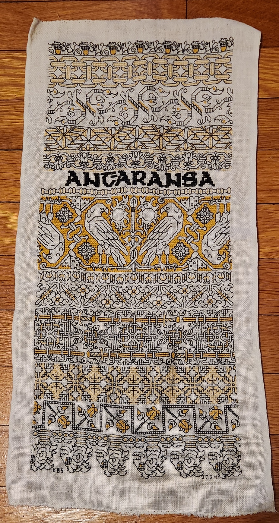
I have finished the outer frame and wide inner band on my Italian multicolor piece.
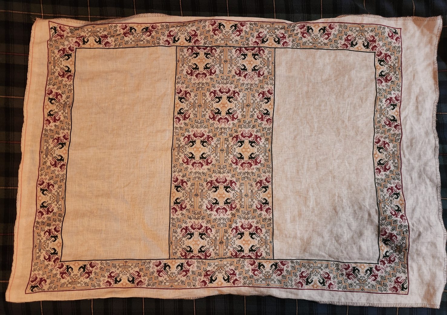
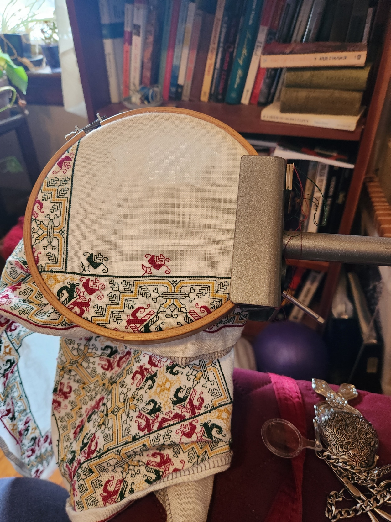
The next step is the interior edging of sprigs that circle the two empty panels, left and right. (Also proof that I do use my Lowery stand with hoops as well as large, heavy frames.
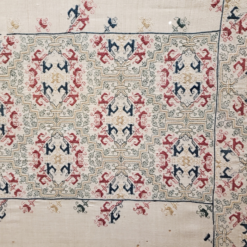
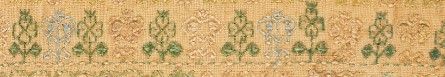
I am basing the use of these sprigs on the original artifact. The original however was significantly bigger than mine. It features both large and smaller sprigs, all quotes from the border and band design. But because my piece is smaller, I think that alternating big ones and little ones will make it a bit crowded, so I will be using only the smaller sprigs. This next photo is of the original – MFA Accession 83.242, Italian, 16th century.
All in all I’m pretty pleased with my fidelity to the original. There are some deviations, but not many. Note that edge bit where the wide center strip joins the frame. My rendition hits in exactly the same spot of the repeat. Which surprises me since no corner of the original was identical to mine (a deviation for sure), and no two corners of the original were identical.
Hmm… Looking at this a bit more closely…
I may rip my first two sprigs back and fix the length of the lower curl, then re-plot the spacing accordingly.
TWO COLOR DOUBLE RUNNING STITCH – TWICE THE FUN
As promised, here is a round-up of what I’ve been looking into on double running stitch, done in two alternating colors. First, heartfelt thanks to Melinda Sherbring and the gang over at the Facebook group Historic Hand Embroidery.
I knew I had seen examples of this type of work on samplers, but my own research notes are particularly poor in samplers. I tend to focus on the small fragments of household and body linen that lie quietly and largely unnoticed in museum research collections. Samplers receive far more attention, are often under licensing restrictions or have been fully charted by reproduction houses. So in a fit of laziness (it being vacation) I put out a call to the group and asked for assistance. Many people responded, Melinda especially so, furnishing 85% of the material I will cite below. So copious thanks, Melinda! I bow to your greater expertise on these, and will accept any/all corrections.
First, here’s what I am talking about. Here is a simple graph of a sprig pattern, worked in double running of a single baseline.

Note the alternating color stitches in the baseline. If I were to stitch this, I’d start with black, take that first stitch at the baseline’s left edge, then in double running work the rest of the first flower in black as a detour from my baseline. When I returned to the baseline, I’d continue on to the next black stitch, then I could continue working the whole thread of black until I ran out, carefully counting the units between black flowers. After that I’d start again from the left, filling in the missing green stitch, and taking detours to work the green flowers. Or I could do it the easier way – parking my black threaded needle, taking up a green one, and working green stitches until I got to the first green flower, working that as a detour in the standard manner, and marching on for a few stitches after, then catching up and leapfrogging ahead with the black. Note that using two colors means one will always be traveling along the baseline in the same direction. There is no doubling back to fill in second pass double-running stitches as one can if a single color is used.
After some experimentation, I found the “leapfrog” method far easier, in spite of having to be careful not to snag the parked thread. Less long distance counting means fewer errors for me. I suspect that close examination of encroachment on these historical pieces will turn up that leapfrogging was the way they did it, too. It’s just so intuitive and so much simpler.
One more observation – an alternating baseline is a giveaway that the band was done in double running. It would be quite awkward and wasteful of thread to achieve this effect in back stitch. And using back stitch to do the branching detour sprigs would mean having to terminate the thread on each one, or stranding over to return to the baseline. Again, something wasteful to be avoided.
Examples
Melinda provided far more than these photos, but I am cherry picking the ones with details that display the best. Click on the sampler institution/accession/date link to see the full pieces. A couple more of Melinda’s citations are at the end of this post, for those who want to do their own deep dive.
Ashmolean WA2014.71.3 (1631-1700) The boxers/urns panel has a companion border at the bottom with alternating pink/blue sprigs and a clear two-tone baseline. There’s also another pair of companion borders at the bottom that uses a band of green stitching with the alternating color sprigs and two-tone baseline immediately along its edge:
Ashmolean WA2014.71.27 (mid 1600s) has the alternating color sprigs on a two-color baseline on the topmost motif. This is the one I dimly remembered from tiny illustrations in a sampler book. Note that additional satin stitching was done in the centers of the motifs to bring extra dimensionality and color, but the double running outlines are still there.
Burrell 31.7 (1640-1670) Sadly, no high resolution image. But on the bottom-most strip – its framing border, top and bottom strongly looks like two-tone sprigs, and probably has an alternating baseline but it’s hard to make out the detail on the baseline. More investigation on my part needed. As an aside, it’s nice that the Burrell gives thread counts for the linen ground – 28 warp x 25 weft per cm, or 71.12 x 63.5 threads per inch. I’ve included the main strip because it or a close sibling pops up in connection with alternate two-tone borders in other works.
Burrell 31.9 (1640-1670) Third strip from the bottom. Again, certain ID limited by photo quality, but it does look like that much wider strip was done with a two-tone WIDER baseline (same spirit as mine, but a different pattern), with alternating color detours. Shares a lot of the aesthetic and some bands with Burrell 31.7 – interesting!
Cooper Hewitt 1981-28-70 (1600s) Love their high resolution photos. Another clear hit. The companion border around the bottommost wide strip, for sure – done in at least THREE colors (wow!) with a multicolor baseline and single color sprigs. A green, a blue, and possibly a red and a pink, the red and pink are very much faded. Or it might just be green, blue, and pink. It’s very hard to parse but it does look like the baseline was done in pink-green-red-blue-pink-green-red-blue, which would leave very long skips, overlapping on the reverse. I’d love to see the back to confirm that, and to confirm the number of colors.
There are more possibilities on this same piece, but for the most part they are heavily overstitched in satin stitch or (possibly) hollie point or another detached looping/weaving stitch, worked on the outline and for the most part obscuring it. It also looks like the second color was not necessarily used on the double running stitch outline for the sprigs, but was employed in the fill treatment Here’s one with an alternating baseline of blue and pink(?). The pink looks like it was used to outline the acorn and leaf shapes with double running. Pink and green were used for the detatched stitch fills for the acorn and leaf, but the blue of the baseline seems to have ben employed to fill the twigs between the acorns and leaves.

Fitzwilliam T.59-1928 (circa 1680) I stumbled across this one looking for the other items Melinda cited. I saw tiny black and white photo of this in one of the first embroidery history books I borrowed from the library – a book published before 1965 or so. I charted some of the strips from it with a magnifying glass, and used them on a piece I did in high school, long before I found the SCA. I haven’t seen this piece since. (People looking to chart now have no idea how much easier it is today with on line access to zillions of primary sources and high resolution photos, all of which can be enlarged right on the screen. A far cry from being smuggled into university libraries to stare at fuzzy microfiche images, or taking magnifying glasses to low quality black and white photos in books.) There is clearly a two-tone companion border with an alternating color baseline accompanying the prominent rose band:
By way of contrast, this bit from the same sampler was NOT done with a two-tone baseline. Even if there are pink straight stitches between the green diamonds and other motifs in the uniting center band, those sprouting leaves in pink are independent from the true baseline, which is solid, unbroken green.

Fitzwilliam T.61-1928 (1677) Also stumbled upon, and sadly a bit blurry. Two possibilities in the photo below – and the lower wide border to which one of the candidates is the companion one looks to a design that’s a cousin to the one from the Burrell sampler above. The two-tone companion is clearly not the same design, even though it’s difficult to see.

More citations:
Ashmolean WA2014.71.44 (1633) Not a sharp photo, but the red/green framing bands on the boxers strip does look like it is probably done in the dual tone baseline, alternating color detour method.
Fitzwilliam T.82-1928 (1691). Looks like there could be a couple of candidate bands, especially in the framing borders around larger strips, but the photo resolution isn’t quite there, and I can’t be sure that the colors are united by a two-tone baseline. I need to do more investigation.
Conclusions:
I have not seen this treatment in portraits, or in fragments of household linen – only on band samplers. I will keep looking, but I think Melinda’s generosity makes it clear that double running done in two colors, with a two-tone baseline and sprigs alternating between those colors was a 17th century innovation, popular in England of that era. She has given us lovely data points from 1629 to the 1690s. Given the paucity of extant samplers before 1600, that is to be expected. Thanks again Melinda!
But I never say never. All I can say is “I haven’t seen it yet.” And who knows, maybe someone out there HAS a citation for use of this technique before 1625, a sighting in works from other times/locations; or evidence on a textile fragment or portrait that it was used on clothing or household linen. If so, please add a comment with that reference here, and I’ll be happy to do a follow-up post.
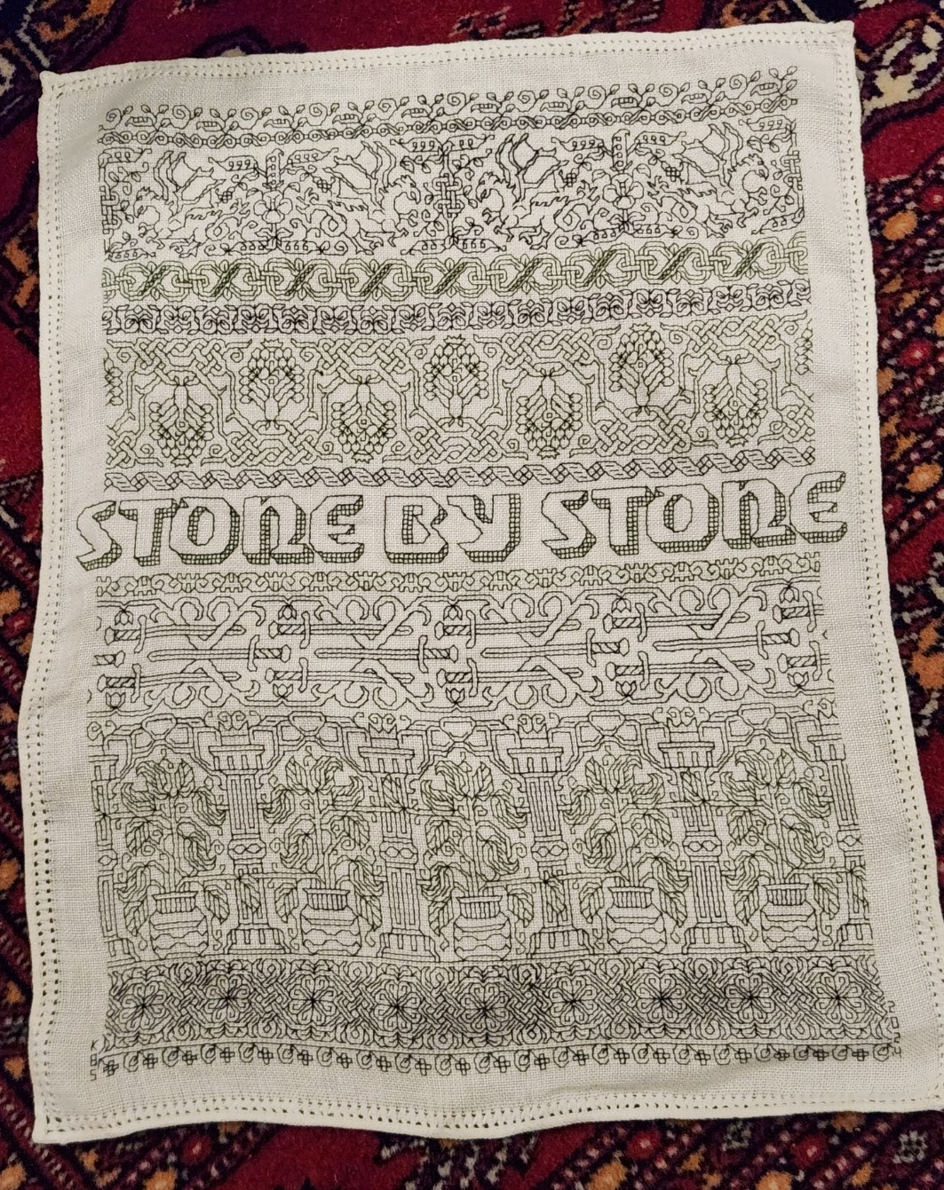
And my own progress?
I’m up to the outer framing border. I just realized that I forgot to plot the way the wreath-springs work in the corners, so I will do that later or tomorrow, and concentrate on finishing out the upper edge tonight.
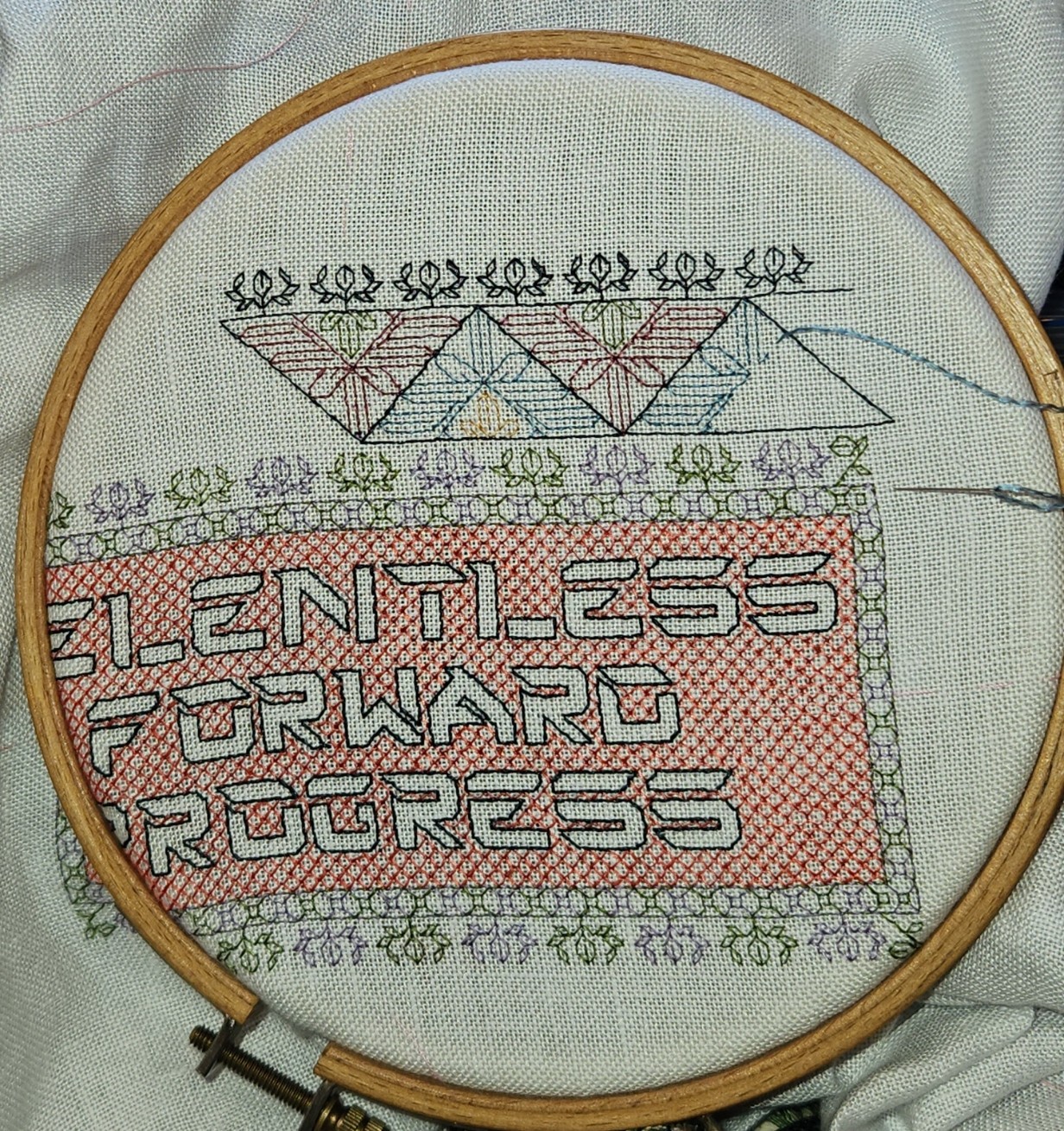
Yes, the colors are a bit disjointed, and I’m not entirely pleased with how prominent the diagonals turned out. But I am working under severe materials quantity constraints. Most of the colors were too light to show well in this style of work, and those that are are in single 8 yard six-strand skeins, most of which were already nibbled by the original owner for her prior projects. I am still splitting each strand of the six, to double the yardage, but it’s going to be tight.
ENSAMPLARIO ATLANTIO VOLUME III!
I am delighted to announce that the third volume in my free-to-download series of blackwork pattern booklets is now up and available here on String-or-Nothing.

Like the previous two volumes, Ensamplario Atlantio Volume III contains original (and a very few redacted) filling designs of the type used in inhabited blackwork. That’s the style that fills outlined shapes with fields of diapered fillings, as seen in my Unstitched Coif project submission, and in my current sampler. The new fills I created or redacted for the Coif are all in here (I had to do more – I actually ran out of suitable ones!)

It also contains most of the strips found on the several tribute and protest samplers I’ve done over the past several months – the various mythical beasts, interlaces, swords, and other fantasies in thread. (The ones not found in here are from Ensamplario Atlantio II, The New Carolingian Modelbook, or The Second Carolingian Modelbook.)


And to top that off, there are lots more designs in there I haven’t stitched yet, including tunic yokes and pieces with corners that could be used for framing necklines, or table linen. For SCA folk there are a few items of special interest – the populace badges of the East and Atlantia, and a belt motif that can be infilled with the colors that signify patronage relationships (squires, protegees, apprentices).
In truth, I’ve rushed this one to release. I apologize if there are errors or inconsistencies. I plead time pressure. If major errors turn up and I get a chance, I’ll go back and fix them. However, the very few source attributions in it have been thoroughly confirmed and are genuine. Except for those redactions, all of the other material in there is my original output.
Why free? Why not? My goal is to promulgate the spread of stitching, and to make it easy to do so. Yes, I could have bundled these books up and sold them on Amazon, like the Carolingian Modelbook series. But in truth, the yield is a pittance because I am under pressure to price the books low enough to discourage massive piracy. Higher pricing restricts access and defeats my goal of spreading the joy.
For the record, The Carolingian Modelbooks are the product of a lot of research, exacting redaction, writing, and indexing. The Ensamplario series is a lark. Largely just my doodle notebooks, produced with minimal effort. I felt justified in asking for recompense for them on the basis of labor alone. But EnsAtl books are candy to be shared just for the fun of it. You can pay me back by sharing photos of works you’ve done using these designs, teaching someone else to stitch, flaunting blackwork-embroidered garments or accessories in public to increase appreciation and awareness, or just by doing a good deed for someone in need (I release my pattern broadsides as Good Deed Ware, too.)
HOWEVER I retain copyright of my drawings, and release these designs for PERSONAL USE ONLY. For any other uses including including duplication, inclusion of the patterns on patterns or finished items for sale or charitable distribution, I request you contact me privately. I’m not an ogre, but neither do I want to see my goodwill answered with appropriation. My terms (if any) will be mild, and reasonable. Oh, and feeding them into AI for training is total anathema, and is expressly forbidden.
You can download Ensamplario Atlantio Volume III by clicking the link below, or by hopping to the MY BOOKS tab at the top of every page here on String. The earlier EnsAtl volumes are on MY BOOKS, too.
>>> CLICK TO DOWNLOAD THE PDF FILE OF ENSAMPLARIO ATLANTIO III <<<
Comments? Questions? Random remarks? Go right ahead.
A SUPPORTING CAST OF GRIFFINS
Friend Craig posted a memory last week, and re-shared a chart he adapted from one of the Siebmacher modelbooks – from the 1611 edition.

It got me to thinking. Those heraldic style charted bands appear over many years, and in several iterations. It might be fun to see how they assorted over time. So I went hunting. I combed through my notes, the Internet Archive’s collection of modelbook images, and several other sources.
This isn’t an exhaustive analysis, but it covers most of the easily accessible editions of the chart. And the large number unearthed really underscores the differences in that accessibility from the time I started poking into these early publications (circa 1974) to today. Back then there might be a couple of modelbooks as part of a microfiched set of early publications on file at one’s university. There were several sets of these ‘fiches scattered across the country, so the set that was local to me at Brandeis wasn’t necessarily the same as the set someone else might have at the University of Pennsylvania. A happy trade of blurry low quality photocopies ensued among us needlework dilettantes, and in some cases precision in attribution wasn’t as clear as it could have been. As a result, when I get around to reissuing The New Carolingian Modelbook, my first book of researched patterns, there will be corrections. Especially among the Siebmacher attributions, because somewhere along the way prints from several editions became confused, leading to a couple of the designs marked as being from the 1597 edition, actually being from a later printing.
And Siebmacher or Sibmacher – both actually. I haven’t a clue as to which spelling is the correct one, because both are used. IE is represented more often than just I, so I go with that.
So here we go. It’s another overly long post only a needlework nerd will love.
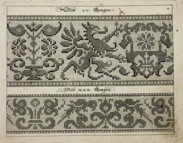
1597
Johann Siebmacher’s Schon Neues Modelbuch von allerley lustigen Modeln naczunehen, zuwürcken unn zusticken, gemacht im Jar Ch. 1597. Printed in Nurmburg.
This edition is held by the Metropolitan Museum of Art, Accession 20.16 and can be accessed here. Notes accompanying this edition cite that the modelbook historian Arthur Lotz cataloged two editions were printed in 1597, and this is from the later of the two. (I will try to fill in the Lotz numbers for these as I mention them. I have that book, but I don’t read German so please forgive my tentative attributions.) My guess is that this one is from Lotz 32b.
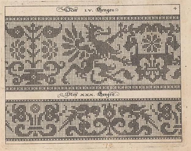
Note that it presented on the same page as the parrot strip. The numeral LV (55) at the top refers to the number of units tall the strip is. Note that all filled blocks are depicted in the same way – as being inhabited by little + symbols. There is also a companion border that shows a combo of filled boxes and straight stitches. Also note that the two “reflection points of the repeat are both shown, along with enough of the repeat reversed to indicate that the design should be worked mirrored. Craig got this spot on when he drafted the design for himself. I’m used to working straight from the historical charts but most folk find the mental flip a bit arduous. He wisely spared himself the conceptual gymnastics.
Johann Siebmacher’s Schon Neues Modelbuch von allerley lustigen Modeln naczunehen, zuwürcken unn zusticken, gemacht im Jar Ch. 1597. Printed in Nurmberg.
Here is the same page from the other edition of 1597. Very possibly Lotz 32a. It’s held by the Bayerische Stasts Bibliothek, and is shared on line here.
It’s very clear that these are both impressions from the same block. The inking is a bit heavier on this one than the other, but the design is the same. Note though that the little “4” in the upper right corner isn’t shown on this one.
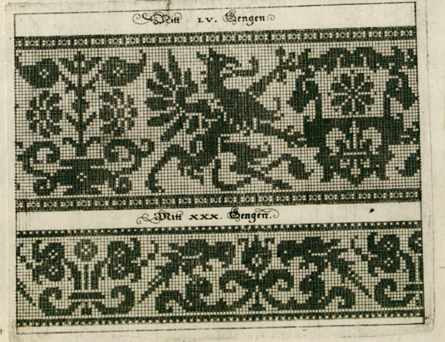
The Bibliotheque nationale de France’s copy of Johann Siebmacher’s Schön Neues Modelbuch von allerley lustigen Mödeln naczunehen, zuwürcken unn zusticken : gemacht im Jar Ch. 1597 looks like it might be the same printing as the Lotz 32b version above. It has the same “4” in the corner. BUT throughout the book it appears that someone has added shadings and color variation indicators by hand – over-inking or penciling in selected areas of many of the patterns. I don’t know if this was done by an owner, or was sold this way. I suspect the former. The darker boxes are clearly produced by careful inking, not printing. In other pages of this edition, you can see differences in how thick the ink was laid on, following pen or brush stroke lines, and not imprinted.

I don’t see a date associated with this other annotated edition, listed only as Johann Siebmacher, Newes Modelbuch, but I suspect it’s the 1597 one based on plate similarities. It’s another book in the Clark Art Institute library. Again someone took the liberty of hand-inking some of the pattern pages to add additional shading or interest. You can view it here. Given the placement of the shading, it might be the source for the version Carl used when he drew up his own graph.
Additional reprintings.
I’ll spare you more echoes of exactly the same page, but here are other representations of these 1597 editions.
There was a reproduction made in 1877, called Hans Sibmacher’s Stick- und spitzen-musterbuch: Mit einem vorworte, titelblatt und 35 musterblattern. The editor was Gerold Wien, and it was put out by the Museum fur Kunst und Industrie. The plate is a duplicate of the Lotz 32b one, complete with the 4 in the upper corner. The date of the original is cited in the repro. You can see it here. A second copy of the 1877 facsimile edition is held by the Bayerische Staatsbibliothek and can be found here.
There is an additional reproduction of this book in the collection of the Cleveland Museum of Art, as issued in Berlin in 1885. The image quality is excellent, you can find it here.
1599
Martin Jost. Schön Neues Modelbuch von allerley lustigen Mödeln naazunehen Zuwürken vn[d] Zusticke[n]: gemacht im Jar Ch: 1599. Printed in Basel.
Yes, a different name is on this book. Lotz 34 refers to it by the name of the publisher – Ludwig Konig in Basel. The on line listing also mentions Jost. It is very closely related to the works above with lots of designs in common. But not entirely the same. The on line copy is here.

That’s our friend the griffin, the same motifs on the shield being supported, and the same flower pot behind – all absolutely stitch for stitch true to the earlier version. But the repeat is truncated along the left edge. The left side of the flowerpot is gone. However the upper and lower companion border with its straight stitching is the same, and is aligned the same way with the main motif. Obviously the parrots are gone, replaced with a panel representative of cutwork. The words above the design are the same font size and typeface, but are now centered between the new borders. The letters have the same proportional size to the design’s block units, but the block units are now rendered as solid – not boxed crosses. These books are said to be among the first created using copperplate – not carved wood. I am not familiar with the process of creating those, but it does look like a print of the original might have been used to create this smaller version. Licensed reproduction, cooperative venture, or unauthorized knock-off? I am sure there are academics who have explored this, so I won’t let my speculation run wild.
Additional appearances.
There is another copy of this same griffin imprint in a book cited as Ludwig Kunigs Fewrnew Modelbuch, von allerhandt künstlicher Arbeidt: namlich gestrickt, aussgezogen, aussgeschhnitten, gewiefflet, gestickt, gewirckt, und geneyt : von Wollen, Garn, Faden, oder Seyden : auff der Laden, und sonderlich auff der Ramen : Jetzt erstmals in Teutschlandt an Tag gebracht, zu Ehren und Glücklicher Zeitvertreibung allen dugendsamer Frawen, und Jungfrawen, Nächerinen, auch allen andern, so lust zu solcher künstlicher Arbeit haben, sehr dienstlich. Printed in Basel, 1599. You can find it here.
The Lotz number for this one is 35. It’s a problematic work because it looks like at some point a bunch of pages from several different pattern books were bound together into a “Franken-edition” incorporating some of Pagano, Vincoiolo, and Vecellio in addition to the Siebmacher-derived pages. But the solid blocks griffin with the cut off flower vase, plus the cutwork panel below is identical to the other 1599 imprint.
Jost might have been a bit peripatetic. There is an identical impression of this version in another Jost Martin printing, Schön neues Modelbuch von allerley lustigen Mödeln nachzunehen, zuwürcken un[n] zusticke[n], gemacht im Jar Chr: 1599, printed in Strassburg. No differences from the one above, so I won’t repeat. Possibly the same Lotz number, too. But you can visit it if you like.
1601
Georg Beatus, Schon neues Modelbuch, printed in Frankfurt, 1601.
Yup. Another publisher. This copy is Lotz #40, and is held in the Clark Art Institute Library. You can see it here.

This print looks a lot like the Jost/Konig one, but not exactly so. First, you can dismiss those little white dots. Those are pinpricks, added by someone who ticked off the solid units as they counted. I deduce that because they are also present in many of the empty boxes. But you will notice some oddities. First, the design is further truncated at the right. We’ve lost the complete shield shape bearing the quaternary flower. And the column at the far left has been duplicated. There is also an imprecision on column and row width in this representation, absent on the others. Finally, it’s been formatted for a single print, with no supplemental design below. I’m guessing another plate.
1604
Johann Siebmacher. Newes Modelbuch in Kupffer gemacht, darinen aller hand Arth newer Model von dun, mittel vnd dick aussgeschneidener Arbeit auch andern kunstlichen Neh werck zu gebrauchen. Printed in Nurmberg, in 1604, in the shop of Balthasar Caimox. It’s in the collection of the Metropolitan Museum of Art, accession 29.59.3, and can be seen here. I don’t see this one listed in Lotz under 1604, but the Met’s listing says that it’s likely a re-issue of the 1602 edition which would make it one of the ones Lotz labels as 38a through 38e. What’s notable about this particular copy is that while many of the other fabulous animal/mythical creature strips that accompany the griffins page in the other works, the griffin page itself is missing. It wasn’t in this edition, or the page that bore it has been lost to time. I’ve included this citation here for the sake of completeness.
Note also that this 1604 edition is the one upon which the modern Dover reprint is based. Dover reissued Ernst Wasmuth’s 1880 publication, which he entitled Kreuzstich-Muster 36 Tafeln der Ausgabe v. 1604. That was based on 36 plates from this 1604 printing.
1607
Sigmund Latomus, Schön newes Modelbuch, Von hundert vnd achtzig schönen kunstreichen vnd gerechten Modeln, Teutsche vnd Welsche, welche auff mancherley Art konnen geneet werden, als mit Zopffnath, Creutz vnnd Judenstich, auch auff Laden zu wircken : Dessgleichen von ausserlesenen Zinnigen oder Spitzen. Allen Seydenstickern, Modelwirckerin, Naderin, vnd solcher Arbeitgefiissenen Weibsbildern sehr dienstlich, vnd zu andern Mustern anleytlich vnd verstendig. Printed in Frankfurt, 1607.
Yes, another name on the spine, and printed in another city. The copy from the National Library of Sweden is visible here. It’s cited as being Lotz 43b.

At first glance this looks like another imprint of the same Siebmacher griffins and parrots page from 1597, but look closer. This design adds a blank column of squares to the right edge, replacing the design elements that were there on the earlier block. This is especially evident in the parrot strip, which has lost its center reflection point along the right edge. Also the blocks are filled in, again not the boxed crosses of the earlier work. And the fills look printed, not applied (more on this later). Yet another plate? Not impossible.
1622
Sigismund Latomus was still active in 1622, issuing a modelbook, entitled Schön newes Modelbuch, von 540. schönen auszerwehlten Künstlichen, so wol Italiänischen, Französischen, Ni-derländischen, Engelländischen, als Teutschen Mödeln, in Frankfurt. As one would expect from the lengthy name, he swept up a number of pattern images, issuing them in one big bundle. Of course we can’t rule out that what we see isn’t the original document as published. It’s not at all uncommon for later owners to bind works together (binding was expensive, and separate from publishing).
Our griffins are in this collection, TWICE. One version is another imprint the same rather squished version we saw issued by Beatus in 1601, the other is one we haven’t seen before. It’s roughly similar to the one above it, but there are some very subtle differences in detail, especially along the left and right edge. And of course, it’s paired with yet another secondary border. Original inclusion, or the result of later co-binding? Your guess is as good as mine. The book is here, it’s in the Clark Art Institute Library’s collection.


1660
Skip forward even further, now 63 years since the griffins appeared. Rosina Helena Furst/Paul Furst’s Model Buch Teil.1-2 printed in Nurnberg in 1660 offered a collection of older designs in addition to new ones. There were four in his series. This particular binding combines books 1 and 2. Lotz cites volumes one and 2 as 59 and 60, each with multiple surviving copies. For what it’s worth the Furst books are the first one that mention knitting as a possible mode of use for graphed patterns, and very possibly the first that is credited either in whole or in part to a female author. Some sources credit Paul Furst as the publisher and Rosina Helena Furst as the author, others attribute the entire work to Paul, or imply that Rosina Helena took over the family business after Paul’s death. In any case, they were prolific publishers, and continued to revise, and re-release modelbooks for at least a good 20 years. They did recast the legacy images to meet changing tastes, but it’s clear that our griffin has deeply informed this later, slightly more graceful beast. Note that his pattern height number is different from the earlier ones because his spacing and borders are a different size. You can see this copy here.

1666
We continue on with the Furst Das Neue Modelbuch editions. This one is also from Nurnberg, and is a multi-volume set in the care of the Clark Art Institute Library. The parts are listed as Lotz 59b, 60a, 61b, and 62a. Again someone has inked in bits to indicate shading. But it’s clearly the same plate as the 1660 printing.

1728
This is about as late as I research. Here we are 131 years after first publication, and there is still interest in the griffins. At least in the Furst interpretation of them. This is from the workshop of J.C. Seigels Wittib, in Nurnberg, and is a reissue of the Fursts’ Model Buch Teil 1-2. Again from the Clark Art Institute Library. It also looks to have been hand-inked on top of the same plate print. But if one looks very closely, there are small mistakes in ink application with very slight differences between the two. Including a forgotten square that shows the + behind the ink in one and not the other. A clear indication that the solid black areas were additions, and not done during the print process. It also makes me think that the 1728 inker had a copy of the 1666 book and copied the annotations to the best of their ability. Does that mean that some books were sold pre-inked? Not impossible. You can make your own judgement here.

Stitched representations
I am still looking for these. Representations of other Siebmacher designs exist in monochrome and polychrome counted stitching, as well as in white openwork. His reclining stag is the most often seen through time, but his unicorns, peacocks, eagles, religious symbols, long neck swans, flower pots, and rampant lions grace some spot samplers of the 1600s and into the early 1700s – mostly but not exclusively German or Dutch in origin. I’ve seen the parrots, undines, and mermen in white darned pieces (lacis in addition to withdrawn thread darned work). And that reclining stag crossed the ocean to appear on some early American samplers as well. But I haven’t seen a stitched version of these griffins. Yet.
Of course I haven’t seen everything, and back room pieces are being digitized every day. If you’ve spotted the griffins in the wild, please let me know.
Conclusions
This really is more of an observational survey than an academic hypothesis based essay.
Originally, seeing this (and other Siebmacher designs) repeat across multiple modelbooks, I assumed that they all were produced from the same plate. But on closer examination we see that probably isn’t true.
It is safe to say that there is a strong continuity of design here. And an interesting cross pollination among publishers. Was it tribute, licensing, sharing, or a bit of light plagiarism? We cannot tell from just examining the printings. But we can say that over the course of 131 years there were at least four and possibly five plates made based on the original griffin design, yet all are immediately identifiable as springing from the same source. I’m sure there are scholars who have delved into the interrelationships in the early printing industry, and have described other migrations of text or illustration among printing houses. Perhaps this look at a single pattern book plate will help inform their future musings.
We can also say that these design plates were used by a variety of prolific printers in Germany in response to what must have been continuing demand for pattern books. I say that because they were obviously selling well enough to warrant production over a long span of time, in spite of their largely offering up the same content over and over with only minor supplements. Also, in spite of the sometimes destructive nature of pattern replication at the time these early pattern books survived largely (but not totally) intact. For something so esoteric, with little literary value, they were seen as interesting and useful enough to retain in many libraries – to the delight of those who have rediscovered them again and again across centuries.
I just might have to stitch up these griffins, and in doing so know I’m helping to keep them alive.
A HOLBEIN COLLAR
Special thanks to Karen over at the Elizabethan Costume group on Facebook, who visited the current “Holbein at the Tudor Court” exhibit a the Queen’s Gallery, and came away with an assortment of extreme close-up photos of various clothing details. One of them showed an intimate view of the portrait of Thomas Howard, third Duke of Norfolk, a painting in the Royal Collection. The Duke died in 1554. and the painting was probably done in the decade before he was arrested for treason, which was about 8 years before his death.

He’s quite an imposing gentleman in his lynx fur, and his collar is hard to see in the official full-size repros of the portrait. But Karen’s extreme close-up helped. Her shot is below, shared with her permission.
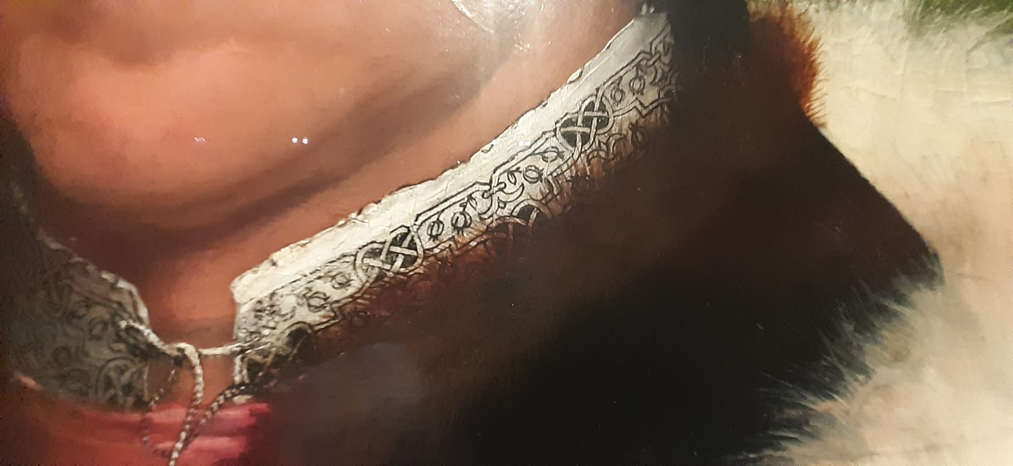
Here’s the blackwork band I transcribed from his collar, more or less.

This redaction is only posited. It’s harder to chart from a painting than it is from a stitched artifact. Luckily this was a Holbein, who understood and clearly depicted the geometry and alignments of countwork. I’ve used my standard rules on this one:
- Modern blackwork and its expanded vocabulary aside, historical examples employ only straight lines, right angles, and 45-degree angles.
- Stitch length units are regular, and are constrained to multiples of a single whole unit, either on edge or on the diagonal. Yes, there are some artifacts with instances of half-unit stitches, but for the most part they are extremely infrequent in foreground design. They do appear sometimes in voided work, to help the stitcher cozy up to the outlines of their previously laid down foreground design.
- Gaps between stitches in a continuously linked design will be the same multiple of the base unit. There are no “floating islands” in this piece. Every bit is straight-line attached to every other bit, and therefore must be on the same base grid.
- Not every iteration of the original is assumed to be spot on accurate. Especially in painted depictions, where three dimensional rendering of rumpled cloth can add imprecision, or the painter not being constrained by a drawn grid, did a “you get the idea” representation rather than a stitch-faithful one.
On this chart I have rendered the background inside the interlaces as a block of solid color, as they were in the painting. It’s not clear what stitches were used to achieve this, but long armed cross stitch, boxed (four-sided) cross stitch, and plain old cross stitch are all good candidates. Note that because these areas are bounded by diagonals there will be considerable fudging with half diagonals (aka quarter stitches in modern cross stitch) to eke out coverage. The solid fill result here is what matters most.
In any case like most of the pieces offered here on String, this is available for your personal use. It’s Good Deed Ware – if you work it up please consider paying the kindness forward, assisting someone in need, calling a friend or family member who could use a bit of cheering up, or otherwise making the world a tiny bit more pleasant. And please note that my representation of this design is copyrighted. if you are interested in using it commercially or for larger distribution, either incorporating it into a pattern for sale or other dissemination, or if you want to use it on items that are made for sale or donation, please contact me.
And as always, I love to see what mischief the pattern children are up to out there in the wide-wide world. Feel free to send me a photo or a link. And if you give permission, I’ll add your work with or without your name (as you desire) to the growing Gallery page here on String.
VALENTINE’S DAY 2024
Among my other projects, I’m working away on sequels to my two book series. Those who know me know better than to ask when they will be released, but progress is being steadily made on The Third Carolingian Modelbook, and on Ensamplario Atlantio Volume III.
EnsAtl3 is moving along faster, in part because it’s largely my own doodles with no time spent researching, documenting, writing prose descriptions with counts, or creating indices. As I was playing in it today I felt a jolt of magnanimity, and in light of the season, I decided to share a small preview. As ever, an easy print/easy read PDF can be downloaded from the link below, or from my Embroidery Patterns page.

This is my own original design. I haven’t stitched it yet. When I do I will come back and add a photo. The band repeat is 47 units tall, and 18 units wide. Two cautions:
- In an uncharacteristic move for me, the points of the arrows are formed by two half-stitches. I try to avoid these, but to get a sharp arrow, they were essential.
- The arrows themselves are NOT aligned on the center line of the hearts. Were I to do so, there would be a lot more half stitches. Be aware of this and don’t be alarmed when the shaft is one unit to the right of the heart centers. I did this uniformly throughout the design – every arrow regardless of up/down orientation is shifted to the right of the heart centerlines.
I can see this stitched for love onto the collar and cuffs of a paramour’s shirt or chemise, or adorning the linen of a beloved offspring. Archers especially might be charmed by it. Of course it can also be used on a band sampler – especially one celebrating a wedding.
To download the Hearts and Arrows Border in PDF format, click here.
Like all the other downloadables on String-or-Nothing, I offer this as good-deed-ware. If you use this, please pay it forward by assisting someone else, or making the day a bit brighter for a friend, family member, acquaintance, or stranger. And also as usual, if you want to use any of these patterns for commercial purposes, either for combination into a new published design work, or to produce for sale or donation (especially in quantity) please contact me before doing so. But please feel free to use it as you wish for your own private enjoyment. And if you want to share a photo of your piece back to me, either for inclusion in the Gallery, or just for me to see – such things always make me smile.
A SPANISH GENTLEMAN AND HIS COLLAR
Once again discussions on Facebook have brought a portrait to my attention. Elspeth over at Elizabethan Costume has found something I’ve been seeking for a long time. An portrait of an individual with a Spanish name, with a sitter that is wearing what we would describe as blackwork.
While 19th and 20th century discussions of blackwork in the Tudor period often call it Spanish Blackwork, and offer “Spanish Stitch” as another name for double running. But there are very few portraits of Iberian individuals wearing it, as one might think there would be if the folk attribution of Catherine of Aragon’s introduction of a style already popular in her homeland was to be corroborated. This portrait, dated 1530-1532 is by Jan Gossaert, and is part of the J. Paul Getty Museum’s collection, accession 88.PB.43. It depicts Francisco de los Cobos y Molina, who served in Charles V’s Holy Roman Empire court as a trusted secretary and advisor. The Morgan Library and Museum notes the absolute identification of the sitter. Note that shortly after this was painted, Catherine far away in her English court was only a year away from Henry’s declaration that their marriage was invalid (1533) and her subsequent sequestration.
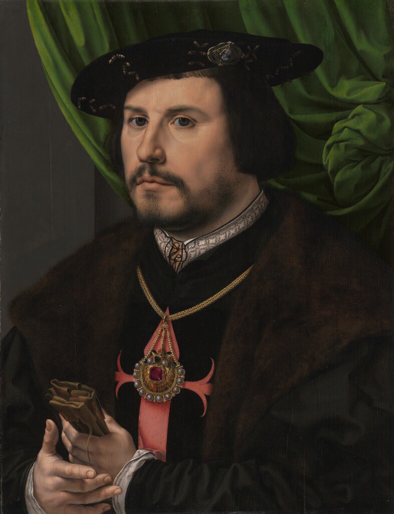
There are higher resolution pictures at the museum link, above.
To say thank you to Elspeth and to spread my joy in finding a heretofore unknown bit of delight, I share a graph for that collar.
Click here for a full size downloadable PDF of the pattern below.

Now. How “authentic” is my representation?
I’d say it’s no more than an honest representation. Remember that the original I am working from is a painting. The painter did his best to capture the alignment of the verticals with the horizontal interfaces, but he fudged almost all of them. What I’ve done is to show the design elements in as close to the original proportions as I could manage, with the correct number of “pips” inside the boxes formed by the repeat, and represent as well as I could the marching row of them more or less evenly spaced across the top edge of the collar band. Like the painter, I have fudged the geometry of the thing to make it fit. And of course the nature of those pips is open to interpretation. Little hoof-like triangles? A three pronged fork, bent to one side? Should the ones in the square be closer to each other than I show? Should the middle one of each box side be taller? All of these would be as valid as what I show. After all, a tiny blob of paint can be seen in many ways.
I will be adding this pattern to the Embroidery Patterns page here at String, so it can be easily found in the future. If you choose to try out this design, please feel free to share a photo. I do so enjoy seeing what mischief these doodles attempt out there in the wide, wide world.
ANOTHER PORTRAIT, ANOTHER REDACTION
About a year ago a member of the Italian Renaissance era fashion discussion group, Loggia Veccio on Facebook asked for help decoding the blackwork on the sleeves of this portrait. I volunteered, but heard nothing back. Today she came forward again to repeat her request. So I oblige.
The first thing I did was try to find the full attribution for the portrait, plus a better, higher resolution image than this repasted one.
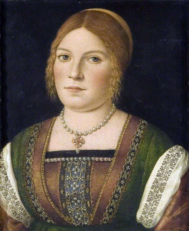
The original is held by the Bristol Museum and Art Gallery, Accession K1651. While it’s not available on the museum’s own website, it does have a page in the Art UK on line collection. The accompanying information cites its date as circa 1500, and the working title as “Portrait of an Unknown Young Woman.” The blurb goes on to say that it has some congruence with works produced by Carpaccio, but stops short of definitively identifying the painting as his.
On to that sleeve. It’s a relatively simple pattern, but redacting from paintings is never as easy as doing so from an actual textile. In this case while the design looks quite regular at gazing distance, up close examination shows that multiple interpretations of the repeat are represented. I’ve attempted to reduce those to a most probable approximation, but it is just an approximation.
As usual, my assumptions were square units, all of the same size, mirrored both horizontally and vertically. I further assumed no diagonals based on the stepwise total appearance. And while I first thought this might have been done in one continuous line, examination of multiple repeats showed that it was most probably done as lozenges rather than a united whole, with small “islands” filling in between the main bird-bearing motif. Here is my best guess.
As usual, a printable page with the pattern and accompanying text is available by clicking here, or popping over to my Embroidery Patterns tab.
YET ANOTHER BLACKWORK PATTERN INTERPRETATION
A big thank you to the Facebook/Blogspot guru who posts at Attire’s Mind. Today he posted a painting from the collection of the National Gallery of Art, (Accession 1931.1.114 in case the links break). It’s a devotional image by Giovanni Battista Morini, and is entitled “A Gentleman in Adoration before the Madonna.” It’s dated to 1560.

The Attire’s Mind post called out the blackwork on cuffs and collar.
Of course I was smitten with the pattern and had to graph as close an approximation of it as I could. It’s got a bit of interpretation, but given that the original I am working from is paint and not countable linen, I think that relying on best-effort/logical construction that achieves the motifs using the least real estate is good enough.
This one is especially interesting because it looks like the artist went out of his way to depict two line thicknesses. These could have been achieved by using different stitches, or by varying thread thickness. I’ve tried to convey that look by using two line thicknesses in my chart. Experimentation with how to render this in real stitching would be lots of fun.
Now, I could save this along for eventual publication in The THIRD Carolingian Modelbook, which I’ve already begun compiling, but given my dismal track record of decade-plus production for each of that series’ two prior volumes, why wait?

You can click here to download this as an easy single page PDF file
It’s also available on my Embroidery Patterns page. Enjoy!
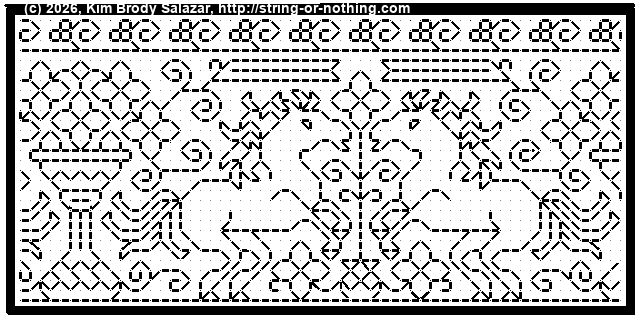
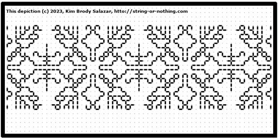
STITCHING ON THE MUSEO DEL TESSUTO’S 16TH CENTURY CAMICA
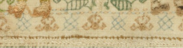
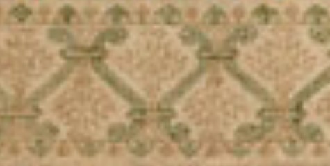
Of late there’s been considerable chatter in historical clothing and embroidery circles about the late 16th century Italian camica (underdress/smock) displayed by the Museo del Tessuto as part of their current exhibit on the life and times of Eleanor of Toledo. The piece is magnificently stitched and in extraordinarily good condition.
The piece’s citation (autotranslated) is listed on their Facebook feed page as Women’s Shirt, Italy, Sec. XVI second half, Prato, Textile Museum, inv. n. 76.01.15.
There has been extensive discussion of how it was made, with Dani Zembi of The Vorpal Rabbit blog contributing an insightful deep dive into construction, and others elaborating on her observations. Seeing so much enthusiasm for this artifact, I decided to contribute to the store of general knowledge as best I could. So I redacted the stitched patterns for the main yoke motif and the seam/hem bands.
CLICK HERE OR ON THE IMAGE BELOW TO TO DOWNLOAD A LEGIBLE PDF

The thing is also available via the Embroidery Patterns tab at the top of every page here on String.
Notes on the redaction:
- There were lots of variations in the pattern repeats on the artifact. I’ve normed my version by relying on the most represented version of each of the motifs. So this is an ideal rather than an as-stitched, include-every-original-mistake replication.
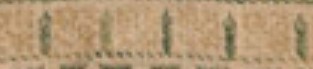
- I have tried to show use of long armed cross stitch on this piece. I do not know what variant of LACS is employed, but I have used solid blocks to show its presence. As anyone who has worked that stitch family knows, working it over only one unit is problematic. The historical stitcher solved this by using plain old cross stitches for one-unit blocks. My chart shows those, and along with the solid areas gives a good indication of the directionality of the LACS variant where it was employed.
- I did not include the pendant tab center of the yoke. That’s a two-repeat crib of the main motif, with fudged ends. Since folk using this design will do so at different ground cloth thread counts, they will have to do something similar themselves, centering a slab of the main design on their yoke and improvising the join. After all, there’s historical precedent.
- I only charted one corner because the photos I was working from didn’t show the others well enough for charting, although they may in fact be more or less symmetrical. And that corner is best guess – especially for the curlicues, which were difficult to parse due to encroachment and possibly some small damages.
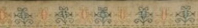
- Note the difference in the companion border above and below the yoke motif.
- The spacing of the seam ornament varies a bit in use on the sleeves, gores, and hem. Again I’ve normed it, and although in the original it does NOT align with its “beaded” spine, I’ve done so here to make it easier to stitch.
- From examination of the angled parts (sleeve and gore edges) where the seam treatment was not worked along a straight grain edge, it looks like the sprigs were spaced by eye, and stitched first, normal to the weave’s direction. Then the spine was stitched freehand in close approximation of the size of how it looks when worked on grain.
As to materials, there’s a healthy discussion about the museum’s description. The ground is linen, but some translations claim the stitching is cotton. That’s not impossible. Although a rare luxury material cotton was used and was sumptuary law legal in Italy at that time, but I’d say that claim is met with skepticism by many in the historical stitching community. In any case, even if it were, it’s not the smooth, shiny, hard mercerized and gassed cotton we find in today’s off the shelf embroidery threads. It’s something softer and less tightly twisted. Possibly finger spun (although I’m no fiber expert). I’d love to see it zoom magnified so we could learn about twist and ply.
