DO WHAT’S RIGHT
And we have more progress to report on the latest sampler strip in my series of stitched pieces commemorating the literary output of my Resident Male.
First we start with the now expected Mysterious Saying. In this case, “Ant-Aransa,” a quotation from the inspiring work – Treyavir. It translates roughly to “Do what’s right.” An admonishment that should be heeded more often for us all.

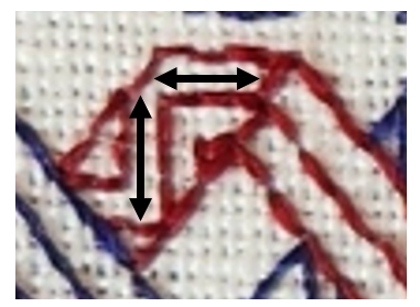
The lettering is not from my usual source for typefaces. I started by looking up pixel based fonts, many from the early days of screen display, and mashed up several Uncial like adaptations to chart out the letters I used. There is no one clean source, but the closest would be Scriptorium. I probably should have allotted more space for the hyphen, but so it goes. The lettering is worked in four sided cross stitch (each cross stitch outlined by a straight stitch on all four sides. I did that to make the saying pop, and to have optimal coverage.
Below Ant-Aransa is a very narrow ancillary border from the upcoming Ensamplario Atlantio III. I believe I show it there in combo with other design elements, and without the second color accents.
Moving on, I designed the strip in progress specifically for this sampler, with specific points of reference to the source inspiration. Treyavir is a work of fantasy with science fiction elements. It tells the story of Reignal Maigntar, Falcon Knight, so of course there have to be prominently featured falcons. Other story elements here include the waning sun, his spear, Grey Hallet (his castle/manor house), and curious crystalline magic gems. All present and accounted for.
As usual the foreground black stitching is worked in double running, but I’ve chosen to do the yellow voiding in long armed cross stitch. This choice was probably not optimal, due to the headache of squeezing that stitch into a few of the very narrow spaces between the foreground motifs. But again, there it is. I might include the falcon strip in Ens Atl III. That decision is still pending. As is revisiting the center of the suns to add some interior decoration. I will wait to see the whole strip completed, including voiding before I make that choice.
What’s left? As you can see below I’m only at the halfway point and there is still plenty of real estate to cover. Probably more swords or other weaponry. In a knightly story there is always room for armaments. Other than that, I haven’t a clue. As usual I’ll figure that out when I get there.

POST REBOOT PROGRESS
Although I’ve been lax about blogging, I have made progress on the Treyavir sampler.

Although it looks like I used several yellows for the accents to the plain black stitching, they are all the same color. What makes them look differently are the numbers of plies, the stitch used, and the stitch density. The yellow in the acorns is done in two plies of DMC #3820 in plain old cross stitch. The interlink accents are two strands of DMC in double running, as are the yellow bits in the odd foliate S-repeat below the chain. The triangular counterchange design uses a single strand of the DMC in double running, worked in a simple box fill. And the flower meander currently being stitched uses that same single strand of DMC yellow and double running, but in a very open and sparse manner.
Catching up since the last post, Strip #3, the vaguely leafy S-repeat, is not my own original. I redacted it from sampler dated 1697 (a bit later than my usual sources). It’s from Detached Geometric Patterns and Italianate Border Designs with Alphabet” 1697. National Trust Collections, Montacute House, Somerset, NT 597706. It’s the black one in the second row, upper right. Obviously the yellow is my add, specific to this piece. I’ve puzzled out several other designs from this sampler, and may include them in the next Ensamplario volume, since being post 1610, they are out of the timeline spread I try to stick to for my Carolingian Modelbook series. But in one place or another they will eventually escape from my desktop.
Skipping ahead to Strip #5, this simple meander is another of my own doodles, and will also be in EnsAtl III, but with a departure from that to-be-published version. Like all of the other placements of yellow in this, the background play was improvised on the spot just for this piece.
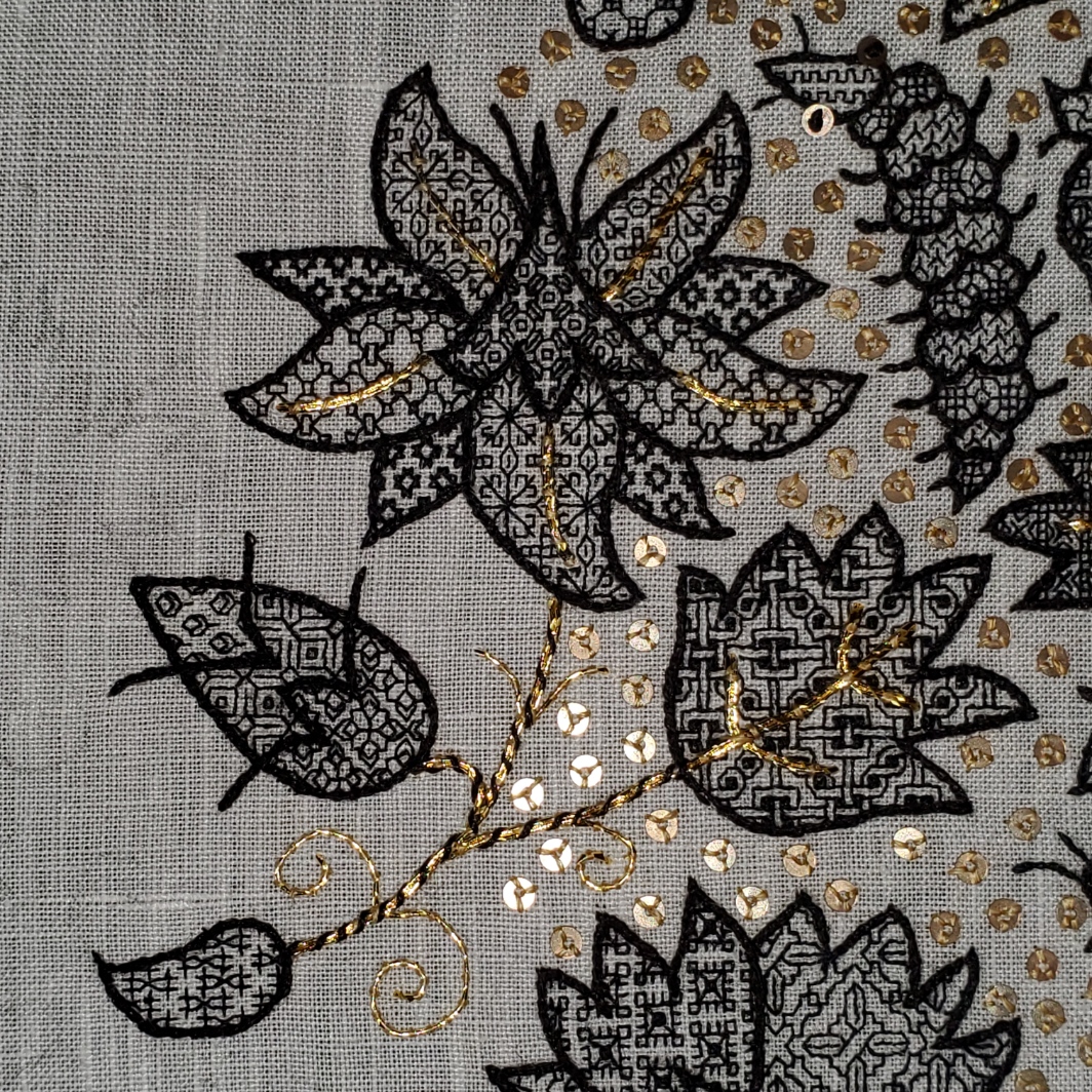
The one above the in-process stitching deserves a longer explanation. Strip #4 is something a bit far afield. I can’t call it my own. I would say it’s “After J.R.R. Tolkein.” That’s right. I used an on-newspaper doodle done by The Professor himself as my leaping off point. The heavily embellished newsprint page from August 1960 was displayed in the “Tolkein: Maker of Middle Earth” exhibit. The photo of it was captured by a fellow follower of the Prancing Pony Podcast: Tolkien & Middle Earth discussion group on Facebook, and shared in that group on 9 August 2024. I played with it and produced my version within hours of that post. Here is the inspiring image:

I was moved by the three-color bit at the upper left. Redacting it to be compliant with my blackwork standards was a bit problematic. For one, I stick to a single unit, 90°-45°-180° angle schema. I avoid half stitches and stitches taken over 2×1 units or other multiples. Curved lines are also a challenge. But for all of that, plus trying to keep the thing in as small a footprint as possible, I do think the lineage of my rather art-deco looking version can be perceived.
I also note that the visual designers working on the aesthetic for Gondor in the movie versions of Lord of the Rings might have been likewise inspired by these doodles. Evidence:

Now, what’s this design doing on a piece dedicated to the work of my own Resident Male? I looked at the strips already laid down and then went nosing around in my doodle pages for something that would contrast well with them. Preferably of medium width and a geometric, with potential to be worked up as a relatively solid band rather than a meander or baseline-sprouted design. I wanted something to balance the chain links above it and provide counterbalance to the extra wide designs I’m considering for use in the lower half of the piece. This one was just too juicy to pass over. And flowing from arguably the greatest wellspring of fantasy literature, from which every epic in that genre since has contained at least a drop of legacy, the filtered scion of my interpretation seemed appropriate.
Next up, another Mystery Inscription from Treyavir. Possibly a narrow defining band to frame it, then on to some really complex custom strips that echo bits from that book.
REBOOT
Yes, I did go back and tease out ALL of the stitching seen in my last post. I was not happy with the discontinued DMC linen I was using. Single strand it was (mostly) too thin for this 26.6 tpi linen ground. Doubled, the slubby nature of the thread – especially where two thick sections ended up side by side – made what should be smooth lines very haphazard in appearance.
Not being near home base with my stash to hand, nor near any useful retail outfits or access to reliable one-day delivery where I am, I had to rely on what was already in my stitching box. Back to the black Sulky 30. In this case, on the very coarse ground, two strands work nicely. I teamed the black up with a strong golden yellow (DMC 3820), also worked as two strands.

The yellow is not dark enough to be distinctive on its own for the linear elements, but as fill and voiding, it is effective. So I’m playing with it as accent rather than as a full-fledged “partner color” as done with the two colors on Stone by Stone and Ferthan, Fuur, Fustovv.
The sharp eyed will note a major error on my part, that I will go back and fix the hard way. Look at the right side of the piece. The chain elements end there two units further along in the repeat than they do along the left edge of the stitching. Because the squirrels are not a symmetrical repeat, I did not notice that my centerline was off until I did the second strip. I will go back later and fudge those two left side units in the shorted strips so that everything is nice and even.
And if I hadn’t confessed this sin here, I bet you would never have noticed.
The squirrels and the double chain are both slated for inclusion in Ensamplario Atlantio Volume III. Both are my own designs. The chain will include variants like corners, a centered yoke treatment, so that it can be easily stitched up as embellishment on cuffs and collars for shirts and chemises.
I haven’t decided yet to include the current strip in EnsAtl III, or to hold it in reserve for The Third Carolingian Modelbook (also in production, but not as far along). The reason is that it is a redaction rather than an original. I have a clean point source for it, although it’s late (1697). More on the design as the stitching develops and I figure out how to bling it up with yellow accents.
As to the size of this piece, it’s narrow, but long. You can see how much real estate I have to cover:

I do have a few very tall strips to include on this one. And another Enigmatic Saying in an Unearthly Language. Stay tuned!
A START, A FINISH, AND POSSIBLE DESTRUCTION
And of course we are off and running on another small sampler honoring another of The Resident Male’s fiction books. The Fangirl Army of One is on a roll here. At this point I have only a few more to do before my production catches up to his.
This sampler celebrates Treyavir, a fantasy novel, relating the adventures of Reignal Maigntar, Falcon Knight. It’s a shorter read than most of his others, but no less engaging. There are mysteries, monsters, magic, epic truths and deceptions, love and loss, all presented in a tone echoic of Jack Vance’s Dying Earth fantasies, as a tribute to their blend of light banter, irony, and deeper issues. But on to the stitching…
First, the ground. I rarely work on grounds with counts below 36 threads per inch, but this well aged stash piece is roughly 26 or 27 threads per inch, and is a true evenweave, 100% linen. Penny method count, below – the penny obscures about 20 threads both north/south and east west (or close enough due to thick/thin threads not to matter). A US penny by definition is 3/4 of an inch in diameter. 20 x 1.33 = 26.6 threads per inch.

I think it may have come to me in a bag of remnants provided by Long Term Needlework Pal Kathryn Goodwyn, but I’m not sure. It’s evident that whomever had it before began a project using it, marking centers and edges in blue thread, but ended up cutting this narrow piece off from the larger whole after those bastings were complete. My remnant is about 10 x 20 inches (25.4 x 50.8 cm). It will be a long and skinny band sampler, and look all the more so due to the scale of the bands when stitched on this coarser weave.
I’ve started work on it but I am not entirely pleased with the linen thread I picked out and packed. It’s a long discontinued DMC product – one that was only briefly available in the US circa 2017, and is now gone. I bought a handful each of black and white from my local independent craft shop, pretty much all they had.
Here are the first couple of bands.

The thread has too much thick/thin texture and is too “hard” for optimal display in double running on this ground. One strand looks skimpy, and it doesn’t do corners well. I previously tried out two strands with the squirrel band, but found that since the thread ranges from slubby to skinny the appearance was very haphazard, with some bits being too dense to see the design, and others very thin by comparison. It was especially jarring in double running, where one pass might be a run of very thick stitches, but the second pass that completes the line might interpose skinny ones between them.
For the Destruction part – I am thinking about ripping back the 1.25 bands you see here and beginning the piece again from scratch. But I am away from stash and alternate thread options are severely limited. My immediate option is the black Sulky I used on Stone by Stone. That’s still in my traveling stitching box. Two strands of that would probably work better than two strands of this stuff. I am not near a retail source for old reliable DMC 310 cotton, and mail order doesn’t work well where I am right now.
Even if I rip back, I will redo the squirrels as is. They will be in Ensamplario Atlantio III. I’m not sure I particularly like the geometric band below it. It’s from The Second Carolingian Modelbook, but I think given chance of a total re-do I will work something else in its place, and save this one for another piece.
The linen DMC thread I will save for something else. Perhaps pattern darning, surface embroidery, or a delicate needle lace edging. I might use the white stuff for cutwork or pulled work, But neither will be deployed for double running again.
And of course just NOT having this project to work on until better options present is an unacceptable course of action. If you are like me you would understand. So instead of actually ripping back, I just whine about it here.
And more happily, I do have a finish. The holiday stocking I previewed in my last post is complete. A quick finish, too. Only four days from cast on to darning in the ends.
The stocking on the left in the photo is the new one. It’s a copy of one I’ve done twice before. The first one (photo, right) was a stocking kit purchased at now long gone yarn shop, Wild & Woolly, in Lexington, MA, circa 1996. In a minor miracle, I was able to find my copy.
The pattern was part of a kit was put out by SM Designs of York Maine. It contained worsted weight (5 stitches per inch) rustic Maine style spun wool in three colors. The kit came in several flavors, including one with Xmas trees. I bought the last one in stock. It had a simple graph of little paper dolls holding hands, in silhouette around the cuff. I did up the kit for the Alex stocking below, but being unable to do anything verbatim, I added in the panel at the top to duplicate stitch the name, subbed in my own holly berry leaf design for the paper dolls, did French knots in embroidery for the berries, and whipped the purl welt “folding line” row with leftover red and green yarn.

Eventually I knit up a second sock for sibling Morgan. I used the same pattern, but couldn’t find a true worsted weight rustic Maine style yarn for it. I adapted the design for a slightly heavier weight yarn of similar texture, but used the same holly leaf pattern, in with a different green and red. Also bearing a top strip for a name. To save packing space, I didn’t bring it with me, so it’s not in this shot.
Elder Spawn Alex and partner just moved out of state, and return to the home nest for the holidays is unlikely. So to make the first holiday off and away a bit more home-like, I volunteered to knit up a matching stocking for Spawn Partner. They requested a wolf instead of the holly leaves. I doodled one up in the same scale as the original graphed bit. He got a bit elongated in the knitting (knit stitches are not 1:1 height to width like cross stitches), but I think he’s vaguely recognizable as not being a horse or reindeer.

Comparing the three stockings, the types of rustic Maine style minimally processed 100% two-strand wool are harder to come by, and what is out there continues to get heavier and thicker. The best match I could achieve was even thicker than what I used for Stocking #2. If that one was worked from yarn knitting to 4.5 spi, this stocking was done from yarn with a native gauge of 4 spi. Since I wanted all three to be the same size, I had to play with the pattern a bit (again) and experiment with needle sizes until I achieved the original gauge. More or less. Side by side though I think I did well enough.
Now I bounce back from the world of knitting, and return to embroidery. I am off to contemplate my (stitching) life choices. At least I have my Silly Putty with me. This linen thread crocks and sheds fibers onto the ground, too. If only there was a retail source for DMC thread nearby… Sigh.
FERTHAN, FURR, AND FUSTOV

Mind, fist, and blood (concentrated, dedicated, personal creativity; traditional hand skills; and the effort of expression).
It’s done. My tribute to my Resident Male‘s book, Fractured Symmetry.
The supplemental lacing I had to do for the lower third has stretched the linen a bit. It needs to relax. I will probably mist it and hover-steam it to help. Actual ironing of course is right out because of the rayon faux silk I used for the stitching. But that plus a bit of “gravity therapy” on my wall of unfinished projects will square it out again for eventual framing.
All in all, I’m pleased. I considered going back and adding more background mini-motifs to the motto section, but decided against it. Having the words float in empty space draws more attention to them, and the larger but less dense treatment of the Yyrgamon strip (the yeti-like creature) balances that empty space well enough.
From initial kickoff of hemming the linen and basting the margin and center lines, to the last stitch of the camouflaged signature initials and date took 42 days, just under two weeks longer than Stone by Stone. Although this piece is a bit narrower, it’s much longer with more strips, and the thread count was a bit finer. This one is about 9 7/8 inches wide by 18.5 inches long ( 25 x 47 cm). Stone by Stone was 9.25 inches wide by 10.25 inches long (23.5 x 26 cm). More stitches per inch = more time.
To answer some inbox questions:
- Did you graph out the whole project? No. I have drafted out the strips individually, most in advance of this project as part of my eventually to be released Ensamplario Atlantio Volume III collection. Several I drew up specific to this project as I was working on the piece, but I didn’t choose the strips ahead of time or draft up a full project plan. I did have to draft out the saying as a single unit (without the framing strips left and right) because the upper case letter was heavily modified from my inspiring source, and I invented the other letters just for this piece to accompany it.
- Can I get this chart? No. But eventually you will be able to download EnsAtl III and have these bands as individual building blocks.
- How do you do your graphing? I use a home-grown system based on the free drafting program GIMP – the same one I use for all of my books and broadsides. No commercial embroidery design program handles linear stitches as effectively and at the scale I need. And as far as I know, only my own system produces the dot-and-bar style charts I (and others) find especially easy to work from. I have a free tutorial plus free templates for my system elsewhere on this blog site (read up from the bottom because blogging software presents the retrieved posts in reverse order.)
- Why do the patterns look tall and squished? I’m not working on purpose woven evenweave linen sold specifically for embroidery. I am not sure where this well aged yardage from my stash came from, but it was “fabric store” linen sold off the bolt for home sewing. The count is about 37.25 threads per inch in the east-west direction, and about 31.9 threads per inch north-south. There’s a more complete explanation of what that does to a charted design in this linked post.
- How are you going to frame or finish it? In truth, I haven’t a clue. Yet. For the moment to relax and chill while I noodle on that problem it’s going to join Stone by Stone on my basement workroom’s Wall of Shame, with the rest of my completed but unfinished projects and perpetual WIPs.
- Why would you spend so much effort for a book? Because it’s a good book, and I believe in the author and the quality of his work. I am his Fangirl Army of One, and my most effective weapon is my needle.
Have other questions? Feel free to post them in comments, and I’ll try to answer. In the mean time it’s off to other projects. I’ve not exhausted my itch-to-stitch, but I have a couple of knitting and crochet projects in queue, plus holiday deadlines to meet, so I’ll working on them in the coming weeks.
IT’S BEEN A WHILE
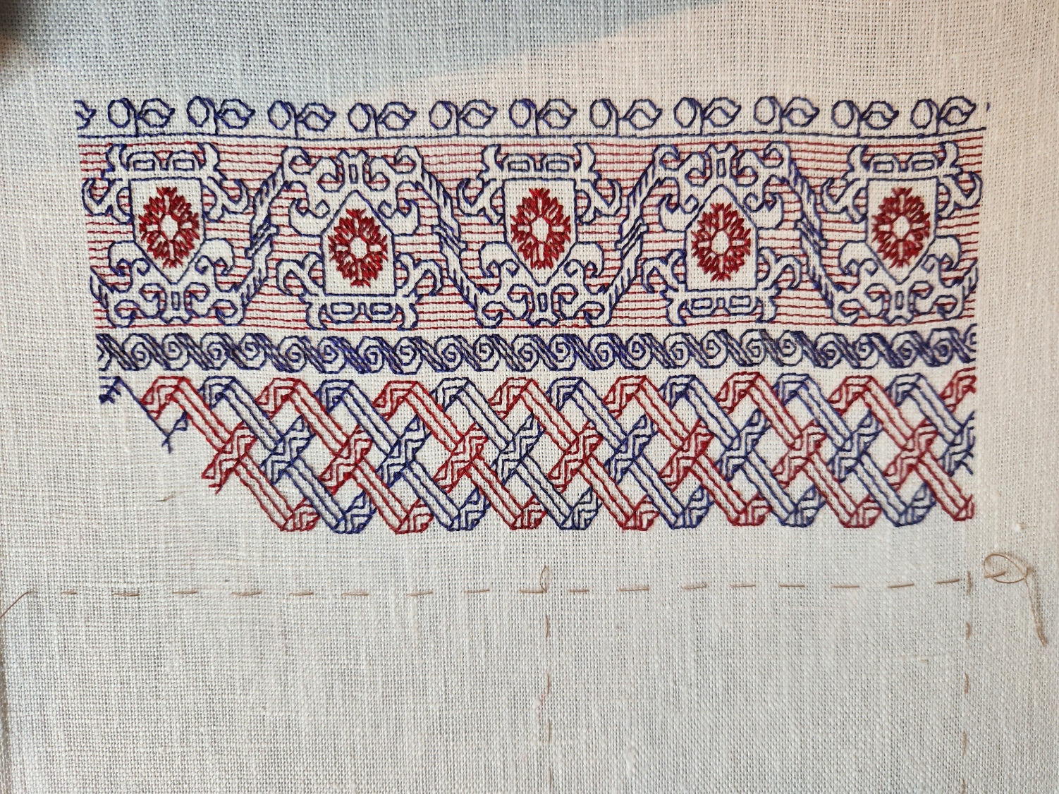
A catch-up post on what’s been stitched since I explained the Mystery Saying. Just a bit over two weeks, in fact. This is what I’ve been up to:

Forgive the tilt. The lacing is a bit uneven and the work appears skewed. All will be nice and parallel when it’s finally off the frame.
I was in the middle of the fish strip when I last posted. Obviously that plus three more have been completed. Plus a partial that I’m currently stitching. All of these new designs are my own. The fish, pretzel knots, crystal-like flowers, toothed border, and strange furry beast will be in Ensamplario Atlantio III when that’s finally released.
The fish, crystal flowers, and the current monster-bearing strip are all keyed on various stories in Fractured Symmetry, the Resident Male’s book that I am using as inspiration for this piece.
- The fish is well, an otherworldly fish, not much to say about them other than they are a point of minor triumph when they appear.
- The crystal flowers are an interpretation of fractalites – engineered/grown aesthetic constructs that are a special hobby of Terrendurr, the alien half of the detective duo whose adventures the book chronicles.
- And the menacing yeti/gorilla/bigfoot creature is a Yyrgamon, a forest dweller native to the planet Raylic – a bit less mythical than a yeti, rarer than gorillas, and of greater cultural significance than the bigfoot; and of highly significant appearance in one of the books’ stories.
On the sampler the Yyrgamon’s presence will bring some balance to the bottom half of the piece, and provide weight to compliment the saying block, above.
Note that basted line down below my current strip. That’s the bottom edge of the stitching area. I have room for one more band. Or possibly one with a “sprouting” narrow edging across the bottom. No clue as to what will end up there yet. I might have to draft up something new to fit.
Stay tuned!
THAT MYSTERY SAYING…
More progress on the sampler tribute to the Resident Male’s book Fractured Symmetry. I’ve teased the photo of the motto on Facebook, and promised to explain it here. I’m now further along, and can do so.

The phrase comes from a discussion describing a settlement of Raylics – furred, pack-dwelling aliens, close allies of Terrans. While their society as a whole is a technologically advanced one, space-flight capable and modern in every aspect, they retain a closer bond to their past than do many other species of similar achievement. One way this manifests is the presence of artisanal/subsistence communes, preserving the skills, values, and lifestyles of prior generations. In this discussion, the Raylic founder of such a commune refutes a scoffer, who doesn’t believe that their efforts would be viable.
“In my youth I traveled space, and on other worlds there are still those who appreciate what is built with ferthan, fuur and fustovv” – Raylic for mind, fist and blood – and we will sell to them if our own folks have so much forgot what it means to truly live.”
Fractured Symmetry, page 224 of the print edition
So in a way, not unlike Roycroft and other similar movements grouped together under the Arts and Crafts banner, this statement echoes the tenets of concentrated, dedicated, personal manufacture; of valuing traditional hand skills for the vision, effort, expression (and any possible personal sacrifice of choice) that they contain. A weighty thought, and one not too often found in gadget-oriented/low-touch science fiction in general. And quite appropriate for a hand-embroidered piece.
As far as what’s what in the stitching, some but not all of the strips have allusions to the various stories that make up the book. The latest band with its fish-like creature is one of the ones that does. All of the band patterns (but not the alphabets) are in my books. A couple are in my free download Ensamplario Atlantio Volume II. Several are from the third volume of that series, on which I am currently working. One is in my for-pay work The Second Carolingian Modelbook.
The fancy initial F is based on yet another of the listings on the Patternmaker Charts blog – adapted from a linear alphabet in Sajou number 182. Although it’s shown in two colors, I opted to do the letter in just one. It was also a bit tricky because it contains a lot of half stitches, which are not well documented in the original chart. Obviously I also modded the letter a bit, making it taller by inserting a bit of my own interlacing, eliminating the solid cross stitch (or satin stitched) units, and smoothing out some pointy ends. The rest of the letters I made up on the fly, as needed. So if you go looking for a full A-Z of them you won’t find it.
One thing I’m still thinking about is adding more to the background field surrounding the motto. A lot will depend on how dense the stitching is beneath it. I don’t intend to do full voiding, not even in a sparse pattern, but there might be some need to add a bit more around the letters. Possibly a couple more spot motifs in blue. We will see…
How far am I along? There’s a little bit of basting remaining, left of the working end of the fish strip. That marks the north/south center point. The fishies straddle it. So there’s still a lot more to go. But that’s good progress considering I only started stitching this one only 14 days ago.
TWISTING THE DAYS AWAY
More progress on the latest small band sampler. Just a little to go on the latest band.
That basted line below the ribbon strip marks the top quarter of the piece, measured from the top edge of the stitching. Next I will probably do a narrow red band, and then on to the lettering. Advance warning that it will bear another incomprehensible motto in yet another non-Terran language, in keeping with my themed tribute.
On to answering questions from my inbox.
First one up is “Why do you leave twigs as you go?” I think the person is referring to single stitches like the ones hanging down in the upper left of this snippet.
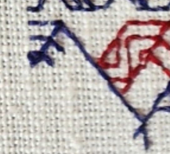
These are a temporary artifact of the way I work double running stitch. In this case I had just enough thread left to do the blue bit shown, but not enough to continue down the other two parallel lines that make up the ribbon. But I know I’ll be coming back from the other direction. So to make life a tiny bit easier, instead of coming back and then having to noodle around to hit the **exact** spot along a continuous line where the previously laid stitches pierce the ground, while I was at that spot I added just one stitch along each of those future branches. That way when I return from the other direction I have a nice, easy to see spot point to join up with instead of having to squint. It’s a tiny thing, but makes life a lot easier.
The second item was phrased as a minor accusation – “You say you almost never use stitches over 2×1, but the angles on your piece clearly show them.” To this person I can say that I haven’t violated one of my stitching conventions. My weave is skew and makes the angles that are 45° on my chart look closer to 60° or 30° when stitched. Here is how that works:
Using the penny method I counted 28 threads going east/west, and 24 threads north/south. Multiply each of those by 1.33 and you get roughly 37.25 threads per inch in the horizontal direction, and 31.9 threads per inch in the vertical (I rounded up to 32 on that one).

That means that a square stitched over 2×2 threads will appear as a rectangle – taller than it is wide, with a ratio of about 1:0.83. Here’s a rough illustration of what’s happening.
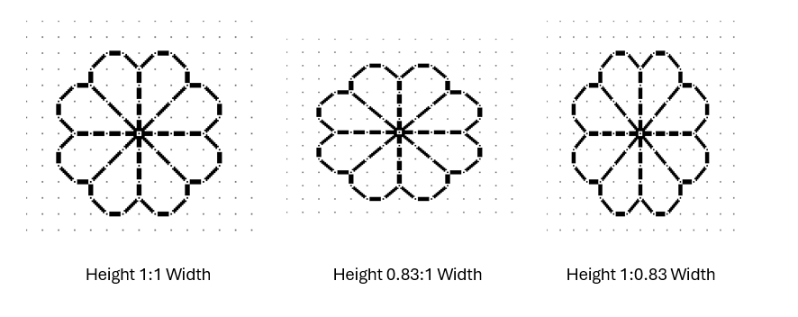
All three of the simple quaternary flowers above are exactly the same in terms of stitch count. All of them model what happens if you stitch over 1×1, 2×2, 3×3 or any exact ratio count. The one at the left is what most people expect to see when working on Aida or evenweave, and for the most part it is. But if you find a piece of woven, countable ground that isn’t exactly even – that has more threads in one direction than in the other, the stitched expression of the fully symmetrical pattern will appear a bit distorted in one direction or the other. If you have more vertical threads per inch, the design will appear squished – wider and more squat. If you have more horizontal threads, the design will appear stretched out and taller. In my case my fabric has more horizontal threads per inch than vertical ones. You can clearly see this here when you compare the length of three stitches in each direction.
That vertical arrow bar is visibly longer than the horizontal one.
I stitch on skew count quite often, mostly because I am frugal and use countable grounds NOT specifically sold for embroidery. These include vintage linens, newly purchased finished goods (like napkins), and yardage sold of the bolt intended for regular garment or home goods sewing. But when I do use these non-standard materials I try to plan the direction of my stitching or the design of my work to either take advantage of the distortion, or avoid calling attention to it.
If the counts are close, most likely no one will notice, and if they do it will be because I’ve chosen to do a pattern that goes around a corner. Here’s an example. These are closeups of the same pattern from my first Fangirl sampler (the bony bois). The left photo is of the strip pattern running up the side of the piece, and the other from the same strip stitched along the bottom.

Side by side it’s very clear that there is distortion. But I doubt you noticed it in the last post’s photo of the entire piece.
The easiest way to avoid this challenge is NOT to work the same design both horizontally and vertically on the same piece of ground. That’s where band samplers show their strength. The bigger the percentage deviation between horizontal and vertical count, the more I lean towards doing a piece featuring strips or parallel bands.
As a closing thought on this, note that I planned the direction of the count on my Unfinished Coif rendition in response to the ever so slightly skew 72×74 thread per inch count. I had purchased the meter piece of wide linen but in spite of the cost I discarded the frugal method of cutting it to maximize the number of coif-size pieces I could get from the yardage. I was only making one coif, and saved the remnant for future work. So my ground for that project was cut on the other direction of the grain than the ones worked from the pieces supplied to the in-country stitchers. I did this so the stitched filling designs on it would be stretched and thinner rather than wider and more squat.
In the example above you can best see this in the big leaf with the fancy interlace filling. That filling when charted presents with the larger “circles” formed around the center interlace by the twists as being of equal height and width. But as stitched they look taller than they are wide. It’s a very tiny and subtle difference, but one I think added to the elegance of the overall presentation.
Oh, and as an aside…. The ONLY place aside from use as part of eyelet formation I have ever seen a 2×1 stitch unit in ANY filling or band artifact or historical work prior to 1650 was found by Toni Buckby, our fearless leader on Unstitched Coif. She redacted the “stirrup” fill I used in the paisley shape in the lower left. The 2×1 units form the elongated crosses in the center of the scattered motifs.
SOME DEPARTURES
On the final stretch of the Stone by Stone mini sampler. I decided a while back that I wanted to include something with columns in the piece. I had a chart picked out – something I had redacted a while back, destined for T3CM, but was saving for book publication rather than sharing here. But I miscalculated, and the remaining space after the sword panel wasn’t tall enough, so I had to quickly doodle up a solution. It’s not entirely successful. And I’ll detail why after the photo.

First the departures. When I doodle, I stick (mostly) to a list of guidelines I’ve deduced from decades of redacting historical designs. These include sticking to 45/90/180 degree angles – the simple angles formed by the sides and corner to corner diagonals that can be achieved in one square unit. No “knights move,” 2×1 or other multiple unit spanning stitches, and (if at all avoidable) no half stitches. I also try to comply with specific ways that repeats and meanders are formed.
The peacock panel has a small sin – the center point of the peacock’s crown is formed by two half-diagonal stitches. In cross stitch they’d be termed “quarter stitches.” The current columns and potted plants panel doesn’t use any partial stitches, but the urn/plant components aren’t obviously symmetrical to the center line determined by the arch. However you are seeing only one half of the full repeat here. The thing is mirrored as what I described as a type 2 repeat in my earlier post, linked above:

It’s also further complicated by the overlap of the leaf bearing tendril alternating right and left. You’ll see that in better detail as I get further along. This gives it a rather complicated and unexpected adherence to type 2. I’m hoping it will make more visual sense as I go along.
Aside from the issue of the overly complex symmetry the arrangement of the leaves, while formalized is far more naturalistic than historical pieces in general. So is the veining in the leaves. Again a departure from the standard aesthetic.
I’m also not pleased by the minimization of the arch compared to the columns and plant pot. That difference in size and weight does have historical precedent, but it doesn’t complement the overall design as well as I hoped.
And the last bit that didn’t work as well as I hoped is the use of the two colors in this strip. Stone by Stone is stitched in black and green. A very deep green. It alternates by strip except for the motto, in which the foreground of the letters is worked in black, while the shadowing is done in green. The vegetable bits and tendrils of this band are all in green. The columns, arches, and urns are in black. I’m hoping that the green leaves in front of the black columns won’t be so confusing looking when more of them have been completed.
Still, for all of these criticisms, I am not totally displeased. This strip stays. I am not sure what will be the final band below, but whatever it is, it will be densely stitched and black. Thumbing through my notes now looking for just the right thing…
Oh, these two strips – the sword interlace and this historical/modern inspiration mash-up, will be in Ensamplario Atlantio volume III. I’m anticipating that the quick-to-stitch sword one in particular will be popular shirt trim among the SCA’s sword-wielding community. I’m planning on drafting up a matching yoke for it, too.
STONE BY STONE
And just like that my mini-sampler is past the half-way mark.

The stitched area is about 9.25″ wide, except for the motto that clocks in at 10.25″ (about 23.5 and 26 cm, respectively). I originally planned the motto at half the current scale, but after working just one letter, saw that it was overwhelmed by the rest of the stitching. So I doubled the scale – each block unit in my drafting became a box of 2×2 units. And I changed the treatment of the shadowed areas, converting them to box fill in green against the black of the main letter outline. To me that squared fill in this application hints at cobblestones. When I doubled the scale I knew that I’d blow past my originally laid out left and right borders, but that I’d be close. I may devise a narrow border strip to surround the rest of the piece and eke out the previously stitched area to align with the new width. It will be tricky though. I would probably have to work unsupported in hand rather than on a frame or hoop. I don’t like doing that.
Because I know folks will ask, I’m afraid I can’t point to the specific typeface source I used for the original expression of the phrase (before I scaled up and altered it). I found a screen capture of that alphabet with no attribution in my folder of miscellaneous things. But I’ll keep hunting to find it because sources should be acknowledged.
As for the rest of the patterns on the piece, with one exception they are all of my own devising. The only one that isn’t my own is a redaction I did of a band appearing on this sampler, dated 1674 in the collection of the National Trust, at Montacute House, Somerset, UK, Accession NT597706. That band is the narrow ribbon scroll appearing just above the motto. I may do more from that particular sampler on this piece. Its patterns were a challenge to chart because the stitcher recorded only the absolute minimum needed to parse the repeat and spacing. I often rely on multiples to reconcile problems in motif and spacing, but without them there’s a lot of guesswork in working out the fills and repeats.
For the rest – as you know I pick on the fly, and while I know what the next design will be (another of my own), I haven’t begun thinking of what happens after that.
Now about that odd motto. It’s no secret that my Resident Male is well embarked on a career as a writer of science fiction and fantasy. He’s got several self-published novels, and is now tirelessly seeking an agent with the goal of full professional publication. To that end, he has written several more books above and beyond those available on Amazon. A few times now, something he has penned or described has resonated with me, and that required expression in needlework. As his Fangirl Army of One, I am delighted to have answered that call.
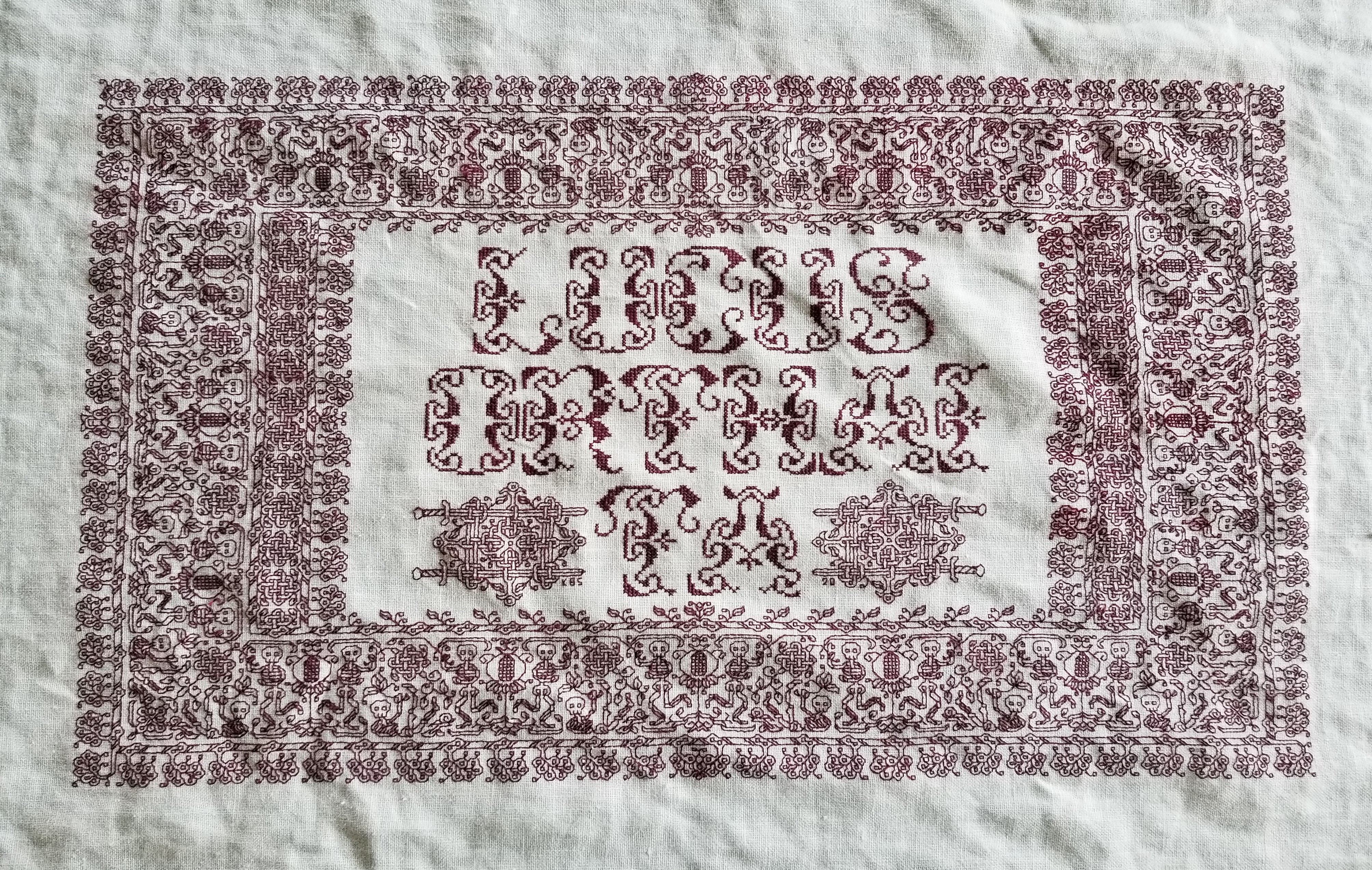

Stone by Stone is a phrase integral to his latest work, just as “Lucus Orthai Ta” is central to another of his yet-to-be-released novels. And long ago he described a cloth stitched with circling koi in one of his very early stories, a pivotal scene that led to my creating the Two Fish piece.
If you go far back enough to when we just met, although I had dabbled in counted thread work based on early sampler strips before we met, my initial headfirst plunge into blackwork was done for him as well. This piece is dated AS IX (1974/1975). It guess it has been a symbiotic relationship of pen, sword, and needle ever since.