THAT MYSTERY SAYING…
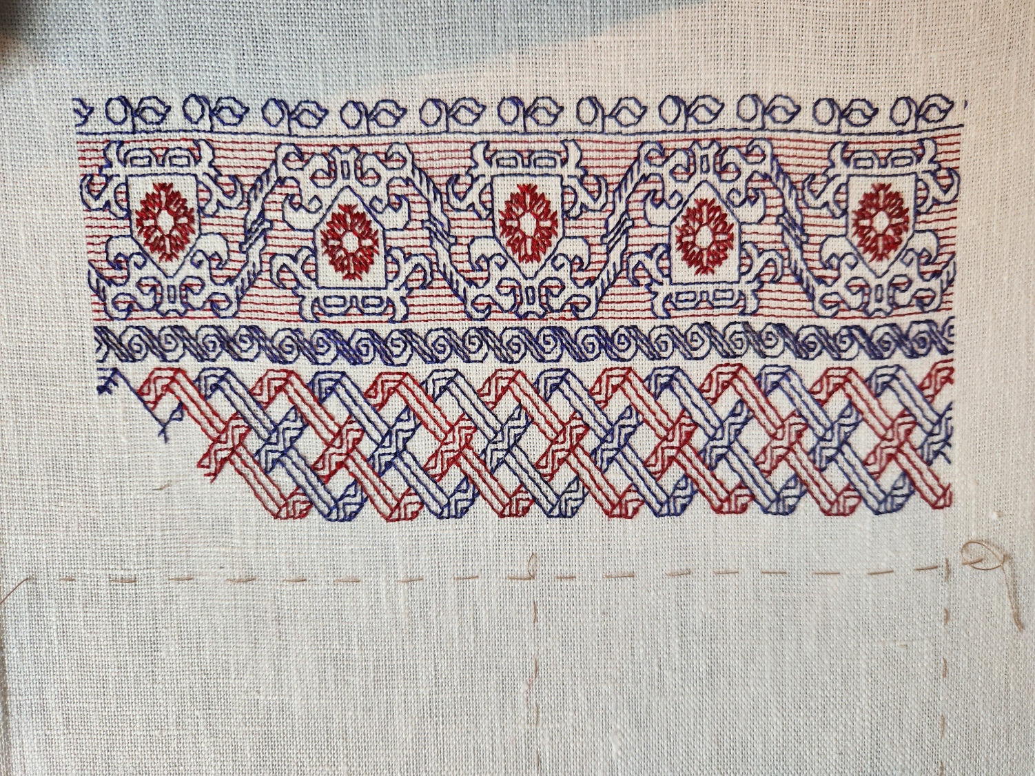
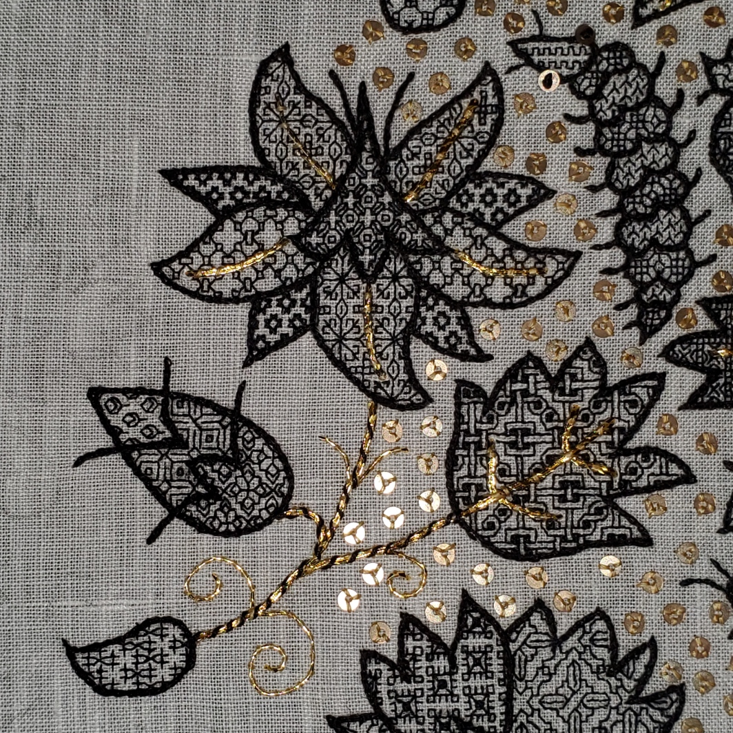
More progress on the sampler tribute to the Resident Male’s book Fractured Symmetry. I’ve teased the photo of the motto on Facebook, and promised to explain it here. I’m now further along, and can do so.

The phrase comes from a discussion describing a settlement of Raylics – furred, pack-dwelling aliens, close allies of Terrans. While their society as a whole is a technologically advanced one, space-flight capable and modern in every aspect, they retain a closer bond to their past than do many other species of similar achievement. One way this manifests is the presence of artisanal/subsistence communes, preserving the skills, values, and lifestyles of prior generations. In this discussion, the Raylic founder of such a commune refutes a scoffer, who doesn’t believe that their efforts would be viable.
“In my youth I traveled space, and on other worlds there are still those who appreciate what is built with ferthan, fuur and fustovv” – Raylic for mind, fist and blood – and we will sell to them if our own folks have so much forgot what it means to truly live.”
Fractured Symmetry, page 224 of the print edition
So in a way, not unlike Roycroft and other similar movements grouped together under the Arts and Crafts banner, this statement echoes the tenets of concentrated, dedicated, personal manufacture; of valuing traditional hand skills for the vision, effort, expression (and any possible personal sacrifice of choice) that they contain. A weighty thought, and one not too often found in gadget-oriented/low-touch science fiction in general. And quite appropriate for a hand-embroidered piece.
As far as what’s what in the stitching, some but not all of the strips have allusions to the various stories that make up the book. The latest band with its fish-like creature is one of the ones that does. All of the band patterns (but not the alphabets) are in my books. A couple are in my free download Ensamplario Atlantio Volume II. Several are from the third volume of that series, on which I am currently working. One is in my for-pay work The Second Carolingian Modelbook.
The fancy initial F is based on yet another of the listings on the Patternmaker Charts blog – adapted from a linear alphabet in Sajou number 182. Although it’s shown in two colors, I opted to do the letter in just one. It was also a bit tricky because it contains a lot of half stitches, which are not well documented in the original chart. Obviously I also modded the letter a bit, making it taller by inserting a bit of my own interlacing, eliminating the solid cross stitch (or satin stitched) units, and smoothing out some pointy ends. The rest of the letters I made up on the fly, as needed. So if you go looking for a full A-Z of them you won’t find it.
One thing I’m still thinking about is adding more to the background field surrounding the motto. A lot will depend on how dense the stitching is beneath it. I don’t intend to do full voiding, not even in a sparse pattern, but there might be some need to add a bit more around the letters. Possibly a couple more spot motifs in blue. We will see…
How far am I along? There’s a little bit of basting remaining, left of the working end of the fish strip. That marks the north/south center point. The fishies straddle it. So there’s still a lot more to go. But that’s good progress considering I only started stitching this one only 14 days ago.
TWISTING THE DAYS AWAY
More progress on the latest small band sampler. Just a little to go on the latest band.
That basted line below the ribbon strip marks the top quarter of the piece, measured from the top edge of the stitching. Next I will probably do a narrow red band, and then on to the lettering. Advance warning that it will bear another incomprehensible motto in yet another non-Terran language, in keeping with my themed tribute.
On to answering questions from my inbox.
First one up is “Why do you leave twigs as you go?” I think the person is referring to single stitches like the ones hanging down in the upper left of this snippet.
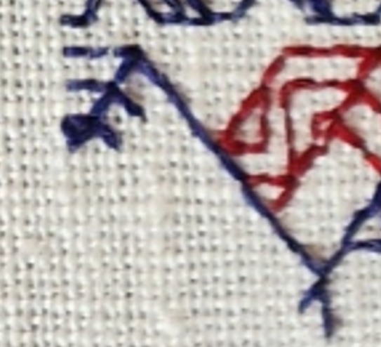
These are a temporary artifact of the way I work double running stitch. In this case I had just enough thread left to do the blue bit shown, but not enough to continue down the other two parallel lines that make up the ribbon. But I know I’ll be coming back from the other direction. So to make life a tiny bit easier, instead of coming back and then having to noodle around to hit the **exact** spot along a continuous line where the previously laid stitches pierce the ground, while I was at that spot I added just one stitch along each of those future branches. That way when I return from the other direction I have a nice, easy to see spot point to join up with instead of having to squint. It’s a tiny thing, but makes life a lot easier.
The second item was phrased as a minor accusation – “You say you almost never use stitches over 2×1, but the angles on your piece clearly show them.” To this person I can say that I haven’t violated one of my stitching conventions. My weave is skew and makes the angles that are 45° on my chart look closer to 60° or 30° when stitched. Here is how that works:
Using the penny method I counted 28 threads going east/west, and 24 threads north/south. Multiply each of those by 1.33 and you get roughly 37.25 threads per inch in the horizontal direction, and 31.9 threads per inch in the vertical (I rounded up to 32 on that one).

That means that a square stitched over 2×2 threads will appear as a rectangle – taller than it is wide, with a ratio of about 1:0.83. Here’s a rough illustration of what’s happening.
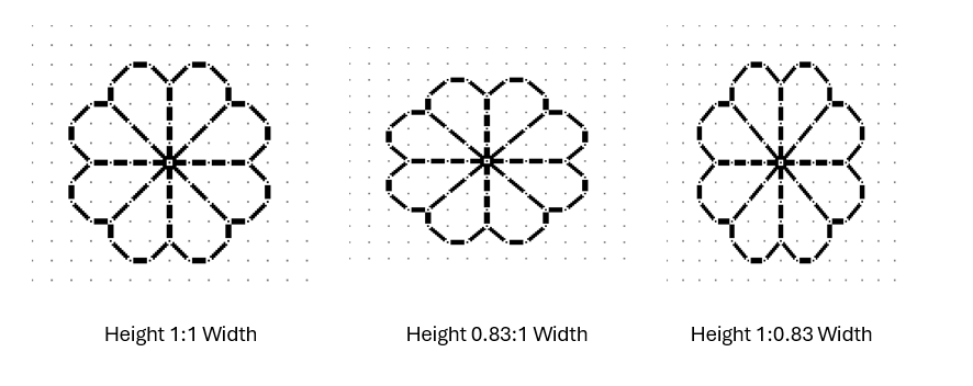
All three of the simple quaternary flowers above are exactly the same in terms of stitch count. All of them model what happens if you stitch over 1×1, 2×2, 3×3 or any exact ratio count. The one at the left is what most people expect to see when working on Aida or evenweave, and for the most part it is. But if you find a piece of woven, countable ground that isn’t exactly even – that has more threads in one direction than in the other, the stitched expression of the fully symmetrical pattern will appear a bit distorted in one direction or the other. If you have more vertical threads per inch, the design will appear squished – wider and more squat. If you have more horizontal threads, the design will appear stretched out and taller. In my case my fabric has more horizontal threads per inch than vertical ones. You can clearly see this here when you compare the length of three stitches in each direction.
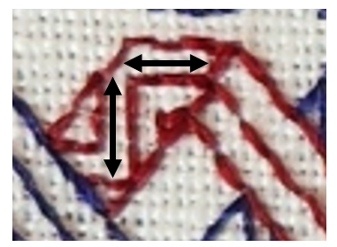
That vertical arrow bar is visibly longer than the horizontal one.
I stitch on skew count quite often, mostly because I am frugal and use countable grounds NOT specifically sold for embroidery. These include vintage linens, newly purchased finished goods (like napkins), and yardage sold of the bolt intended for regular garment or home goods sewing. But when I do use these non-standard materials I try to plan the direction of my stitching or the design of my work to either take advantage of the distortion, or avoid calling attention to it.
If the counts are close, most likely no one will notice, and if they do it will be because I’ve chosen to do a pattern that goes around a corner. Here’s an example. These are closeups of the same pattern from my first Fangirl sampler (the bony bois). The left photo is of the strip pattern running up the side of the piece, and the other from the same strip stitched along the bottom.

Side by side it’s very clear that there is distortion. But I doubt you noticed it in the last post’s photo of the entire piece.
The easiest way to avoid this challenge is NOT to work the same design both horizontally and vertically on the same piece of ground. That’s where band samplers show their strength. The bigger the percentage deviation between horizontal and vertical count, the more I lean towards doing a piece featuring strips or parallel bands.
As a closing thought on this, note that I planned the direction of the count on my Unfinished Coif rendition in response to the ever so slightly skew 72×74 thread per inch count. I had purchased the meter piece of wide linen but in spite of the cost I discarded the frugal method of cutting it to maximize the number of coif-size pieces I could get from the yardage. I was only making one coif, and saved the remnant for future work. So my ground for that project was cut on the other direction of the grain than the ones worked from the pieces supplied to the in-country stitchers. I did this so the stitched filling designs on it would be stretched and thinner rather than wider and more squat.
In the example above you can best see this in the big leaf with the fancy interlace filling. That filling when charted presents with the larger “circles” formed around the center interlace by the twists as being of equal height and width. But as stitched they look taller than they are wide. It’s a very tiny and subtle difference, but one I think added to the elegance of the overall presentation.
Oh, and as an aside…. The ONLY place aside from use as part of eyelet formation I have ever seen a 2×1 stitch unit in ANY filling or band artifact or historical work prior to 1650 was found by Toni Buckby, our fearless leader on Unstitched Coif. She redacted the “stirrup” fill I used in the paisley shape in the lower left. The 2×1 units form the elongated crosses in the center of the scattered motifs.
SOME DEPARTURES
On the final stretch of the Stone by Stone mini sampler. I decided a while back that I wanted to include something with columns in the piece. I had a chart picked out – something I had redacted a while back, destined for T3CM, but was saving for book publication rather than sharing here. But I miscalculated, and the remaining space after the sword panel wasn’t tall enough, so I had to quickly doodle up a solution. It’s not entirely successful. And I’ll detail why after the photo.

First the departures. When I doodle, I stick (mostly) to a list of guidelines I’ve deduced from decades of redacting historical designs. These include sticking to 45/90/180 degree angles – the simple angles formed by the sides and corner to corner diagonals that can be achieved in one square unit. No “knights move,” 2×1 or other multiple unit spanning stitches, and (if at all avoidable) no half stitches. I also try to comply with specific ways that repeats and meanders are formed.
The peacock panel has a small sin – the center point of the peacock’s crown is formed by two half-diagonal stitches. In cross stitch they’d be termed “quarter stitches.” The current columns and potted plants panel doesn’t use any partial stitches, but the urn/plant components aren’t obviously symmetrical to the center line determined by the arch. However you are seeing only one half of the full repeat here. The thing is mirrored as what I described as a type 2 repeat in my earlier post, linked above:

It’s also further complicated by the overlap of the leaf bearing tendril alternating right and left. You’ll see that in better detail as I get further along. This gives it a rather complicated and unexpected adherence to type 2. I’m hoping it will make more visual sense as I go along.
Aside from the issue of the overly complex symmetry the arrangement of the leaves, while formalized is far more naturalistic than historical pieces in general. So is the veining in the leaves. Again a departure from the standard aesthetic.
I’m also not pleased by the minimization of the arch compared to the columns and plant pot. That difference in size and weight does have historical precedent, but it doesn’t complement the overall design as well as I hoped.
And the last bit that didn’t work as well as I hoped is the use of the two colors in this strip. Stone by Stone is stitched in black and green. A very deep green. It alternates by strip except for the motto, in which the foreground of the letters is worked in black, while the shadowing is done in green. The vegetable bits and tendrils of this band are all in green. The columns, arches, and urns are in black. I’m hoping that the green leaves in front of the black columns won’t be so confusing looking when more of them have been completed.
Still, for all of these criticisms, I am not totally displeased. This strip stays. I am not sure what will be the final band below, but whatever it is, it will be densely stitched and black. Thumbing through my notes now looking for just the right thing…
Oh, these two strips – the sword interlace and this historical/modern inspiration mash-up, will be in Ensamplario Atlantio volume III. I’m anticipating that the quick-to-stitch sword one in particular will be popular shirt trim among the SCA’s sword-wielding community. I’m planning on drafting up a matching yoke for it, too.
STONE BY STONE
And just like that my mini-sampler is past the half-way mark.

The stitched area is about 9.25″ wide, except for the motto that clocks in at 10.25″ (about 23.5 and 26 cm, respectively). I originally planned the motto at half the current scale, but after working just one letter, saw that it was overwhelmed by the rest of the stitching. So I doubled the scale – each block unit in my drafting became a box of 2×2 units. And I changed the treatment of the shadowed areas, converting them to box fill in green against the black of the main letter outline. To me that squared fill in this application hints at cobblestones. When I doubled the scale I knew that I’d blow past my originally laid out left and right borders, but that I’d be close. I may devise a narrow border strip to surround the rest of the piece and eke out the previously stitched area to align with the new width. It will be tricky though. I would probably have to work unsupported in hand rather than on a frame or hoop. I don’t like doing that.
Because I know folks will ask, I’m afraid I can’t point to the specific typeface source I used for the original expression of the phrase (before I scaled up and altered it). I found a screen capture of that alphabet with no attribution in my folder of miscellaneous things. But I’ll keep hunting to find it because sources should be acknowledged.
As for the rest of the patterns on the piece, with one exception they are all of my own devising. The only one that isn’t my own is a redaction I did of a band appearing on this sampler, dated 1674 in the collection of the National Trust, at Montacute House, Somerset, UK, Accession NT597706. That band is the narrow ribbon scroll appearing just above the motto. I may do more from that particular sampler on this piece. Its patterns were a challenge to chart because the stitcher recorded only the absolute minimum needed to parse the repeat and spacing. I often rely on multiples to reconcile problems in motif and spacing, but without them there’s a lot of guesswork in working out the fills and repeats.
For the rest – as you know I pick on the fly, and while I know what the next design will be (another of my own), I haven’t begun thinking of what happens after that.
Now about that odd motto. It’s no secret that my Resident Male is well embarked on a career as a writer of science fiction and fantasy. He’s got several self-published novels, and is now tirelessly seeking an agent with the goal of full professional publication. To that end, he has written several more books above and beyond those available on Amazon. A few times now, something he has penned or described has resonated with me, and that required expression in needlework. As his Fangirl Army of One, I am delighted to have answered that call.
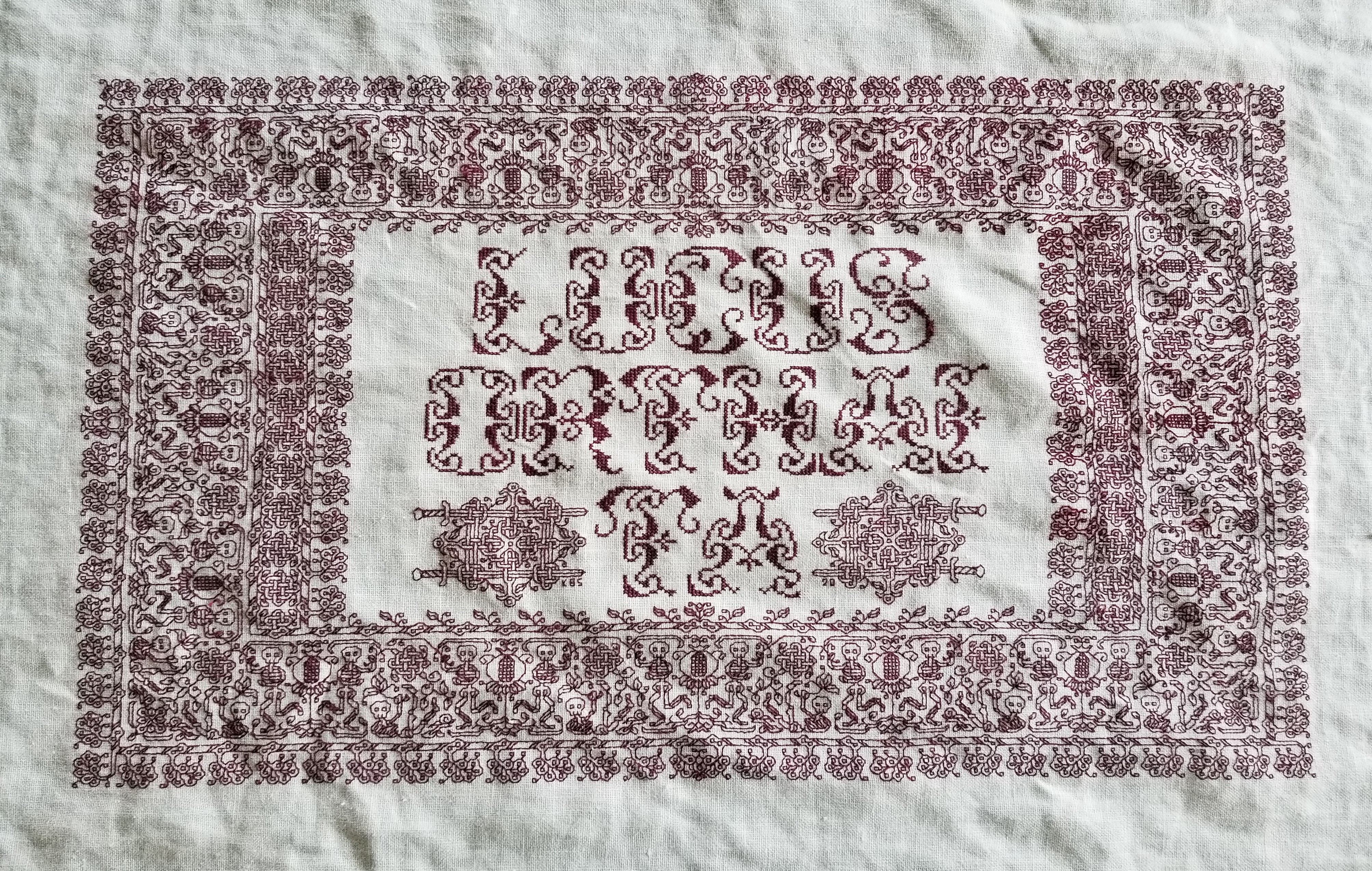

Stone by Stone is a phrase integral to his latest work, just as “Lucus Orthai Ta” is central to another of his yet-to-be-released novels. And long ago he described a cloth stitched with circling koi in one of his very early stories, a pivotal scene that led to my creating the Two Fish piece.
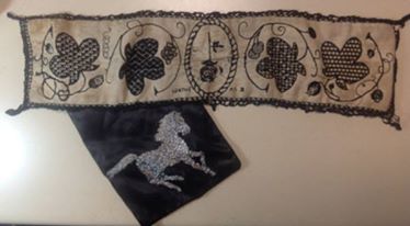
If you go far back enough to when we just met, although I had dabbled in counted thread work based on early sampler strips before we met, my initial headfirst plunge into blackwork was done for him as well. This piece is dated AS IX (1974/1975). It guess it has been a symbiotic relationship of pen, sword, and needle ever since.
LONGEVITY UNDER HARD WEAR, AND MOVING FORWARD
Some of the long-time readers here may remember the forehead cloths I stitched back in the Pre-Plague Era. I used some linen that was approximately 32 count (a remnant of off the bolt, not a purpose-woven needlework ground), plus some stranded silk custom dyed by my Stealth Apprentice. The black used was a historically researched tannin/iron recipe, and the thread was a prototype of the threads that Stealth Apprentice sold through Golden Schelle. The Schelle retail effort is currently in hiatus, but I do hope it will restart in the future. In any case I now report on wear and tear.
As you can see, now about seven years later and after heavy wear and washing, the forehead cloths and their embroidery have both held up well. I didn’t do much special to launder them. I threw them in my regular cold water/cold rinse wash, but hung them on a rack to dry. I’m particularly impressed by the performance of the dyed silk. It’s as dark today as it was when I first stitched it. Now I understand why black silk was so ubiquitous on body linen. It survives frequent wear and harsh laundering unscathed.
What did suffer were the ties. I used the same ground cloth to make them, cutting strips, folding them in half the long way, then tucking both raw edges inside, seaming, and turning the tubes inside out – pretty much the standard way ties are made, although I had to do mine on grain and not on the bias because I had so little fabric available.

Three of the four have disintegrated. To to little more than fuzzy strands. You can see one of the less frayed tie cut from the cloth on the bottom near the spool of twill tape in the photo above.
I am in the process of replacing all of the ties with twill tape. The finished redo of the first is at the bottom of the photo above. I hand-stitched the edge of the tape to the edge of the cloth, then folded it over and hand-hemmed the other side down to the back. When I got to the ends of the triangle, I continued on with the folded twill, whipping the edge as I went. Next comes the darker, larger cloth at the left side of the photo. Then comes the cloth I just finished embroidering. I won’t bother with the fabric ties on that one, I’ll leap direct to the twill ties.
As for the current mini-sampler stitching project, I’m rolling along with that, too.

Since my last post about it I’ve completed the green twisted link strip, and the delicate black flower strip below it. Now I’m up to another band in green. Peacocks, or if you prefer, bling chickens – my rendition lacking much of the grace and nobility of the actual birds. Note that I am not using the silk for this one. I’m still experimenting with the Sulky threads. (Partial verdict – I MUCH prefer the silk.)
The peacock strip, like the others in this piece are of my own devising, and will be in Ensamplario Atlantio Volume III. Please don’t ask me when it will be released. It’s still in process. I’ve got about twenty pages of brand new fills, plus about eight pages of larger borders and all-over designs. I am toying with the idea of including the Epic Fandom strips in this one, too, just so that they are in one easy to thumb through collection. Opinions on that are solicited.
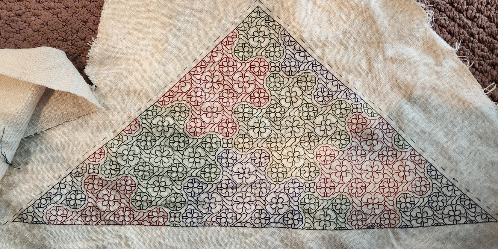
MINI-SAMPLER PROGRESS
Munching along on my portable summer project, sized and scoped for on-the-go production. I’ve completed the first band and have started on the second.

Both of these original designs will be in Ensamplario Atlantio Volume III. As will (in all probability) the others I use on this thing.
Yes, I’ve chosen a second color – this piece will be in black and deep green. There’s a reason for that which I will reveal in the fullness of time. I’ve also chosen a motto for it – again for a specific reason that I will describe when appropriate.
I had begun this in part as a test of the single ply of Sulky 30 on this ground. While the thread is performing well in terms of ease of stitching, I’m not entirely happy with it. It’s too thin and weedy for best presentation, and two plies would have been overly massive. Here’s a discussion of thread thickness and grounds that will help you understand why I am less than pleased.
How big will this entire piece be? It’s a second-hand store piece of hand-hemstitched linen, a bit more rectangular than but about the same size as a dinner napkin.

You can see here how I tease out my guidelines as I progress, so that I never stitch over them. I know people who do full coverage cross stitch sometimes don’t bother to remove them, but since my style includes so much “white space” I find it better to never encroach on the lines. That makes picking out easier. For the record, I baste with some ancient 100% cotton machine sewing thread from my grandmother’s stash. It’s too fragile to use for structural sewing, but being non-crocking and very smooth, is extremely easy to pull out cleanly.
You can also see that I start in the middle. I worked the dragon strip right, to the guideline at the right edge. Then I filled in the top companion border to end to mate up with the line established by the dragon strip. After that I did dragon to the left, finishing up at the same point already established at the right edge. Since the strip is symmetrical, it terminates at the same distance from the hem on both sides of the work. Again the companion (non-symmetrical) narrow edging at the top was worked to the same point. Now that I have my edges established, I will work all subsequent rows aligned to the first one, using my basted center line for guidance, and finish them left and right in line with the previous work. Really and truly, this is MUCH easier to do than some folks think. Plus working this way does NOT require drafting up the entire strip to fit the available area. The only thing I WILL be drafting out custom will be the motto, so that I can determine its center. Since it will be narrower than the stitching area, I may go back to the doodle board and figure out what I can use to eke out that row left and right. Or maybe not. Another narrow strip after this one, and then we’ll find out…
A BUSY JUNE SO FAR
Who said that retirement would be boring? Wrong, wrong, wrong.
We’ve spent the last month quite busy, buzzing back and forth to the Cape to escape the heat and enjoy the late pre-season quiet of the beach. We’ve kept at the garden I detailed in the last post. So far everything is surviving. Bushes and flowers bloomed and my tiny raised bed garden is beginning to offer up a small, but appreciated harvest of peppers and herbs. The eggplant will catch up eventually. And of course I’ve been doing needlework projects. The chair recover is in hiatus until the fall – too much infrastructure to schlep around, but smaller, portable projects have been thriving.
First up, a stitching finish on a WIP that’s been bopping around since before the Unstitched Coif. This is a forehead cloth, in more modern terms – a kerchief. I had made two some years back, and have loved them to pieces. The stitched body of each is still in perfect shape, but the ties on them have died. Here is the new one, not yet assembled into final, wearable form.
This is a doodle of a pattern that will be in Ensamplario Atlantio Volume III. I’ve been working on that, too and have about 20 plates of new fills. I’m planning on including several pages of larger patterns, strips, and even yokes, too. I am still dithering about including the free patterns that make up my Epic Fandom Stitch Along in it, too. It’s already a wildly anachronistic work, and it might be handy to have all that content in one place. In any case, EnsAtl III is very much a work in progress, and will be out as soon as I can manage it.
Back to this piece. It’s an experiment. I wanted to try out Sulky 30, a spooled thread sold for hand and machine embroidery. I’m working on 32 count linen, and two strands of the Sulky work nicely in terms of coverage and line depth. There are four colors here – an almost-cranberry red, a forest green, a navy blue, and (hard to see) small motifs filling problem spaces, worked in black. There are LOTS of mistakes in this. Places I missed a stitch, or substituted the wrong twist or size center flower, but since this is a quick stitch, meant to be worn to death and not a future heirloom of my house, I didn’t bother to go back and pick them out. I did fix mistakes that would have thrown off the design as a whole, though.
My thoughts on the Sulky? Not my favorite. It’s very hard twist and dense. While that makes a nice, clean line, it does make intersections a bit more difficult to keep even. Plus when picked out, both the blue and the green crock a bit – leaving color residue on the cloth independent of fiber crumbs. I’ll probably use up what I have on things I intend to wash savagely, but I won’t be buying more. The Unstitched Coif project spoiled me. Silk over cotton, any day.
I can’t report on the origin of the ground. It’s a scrap left over from something else. A garment has been cut from it. I did get a pile of linen scraps from someone here in town, via one of the local waste-nothing exchange groups. I’m pretty sure this was one of the pieces. So my guess is that it was yard goods, not custom-sold for needlework. Even so, the count is remarkably even. There’s some slubbing but not overly much, and the thread count is something like 32×33 threads. No selvedge left so I can’t guess about warp vs weft counts.
I am going to investigate narrow twill tape for the ties this time – both for this forehead cloth and to replace the now frayed and ruined ties of the older two. I had used the ground itself, double folded and seamed for the ties on the old one. Better I should use something more densely woven and robust, and that can be easily replaced.
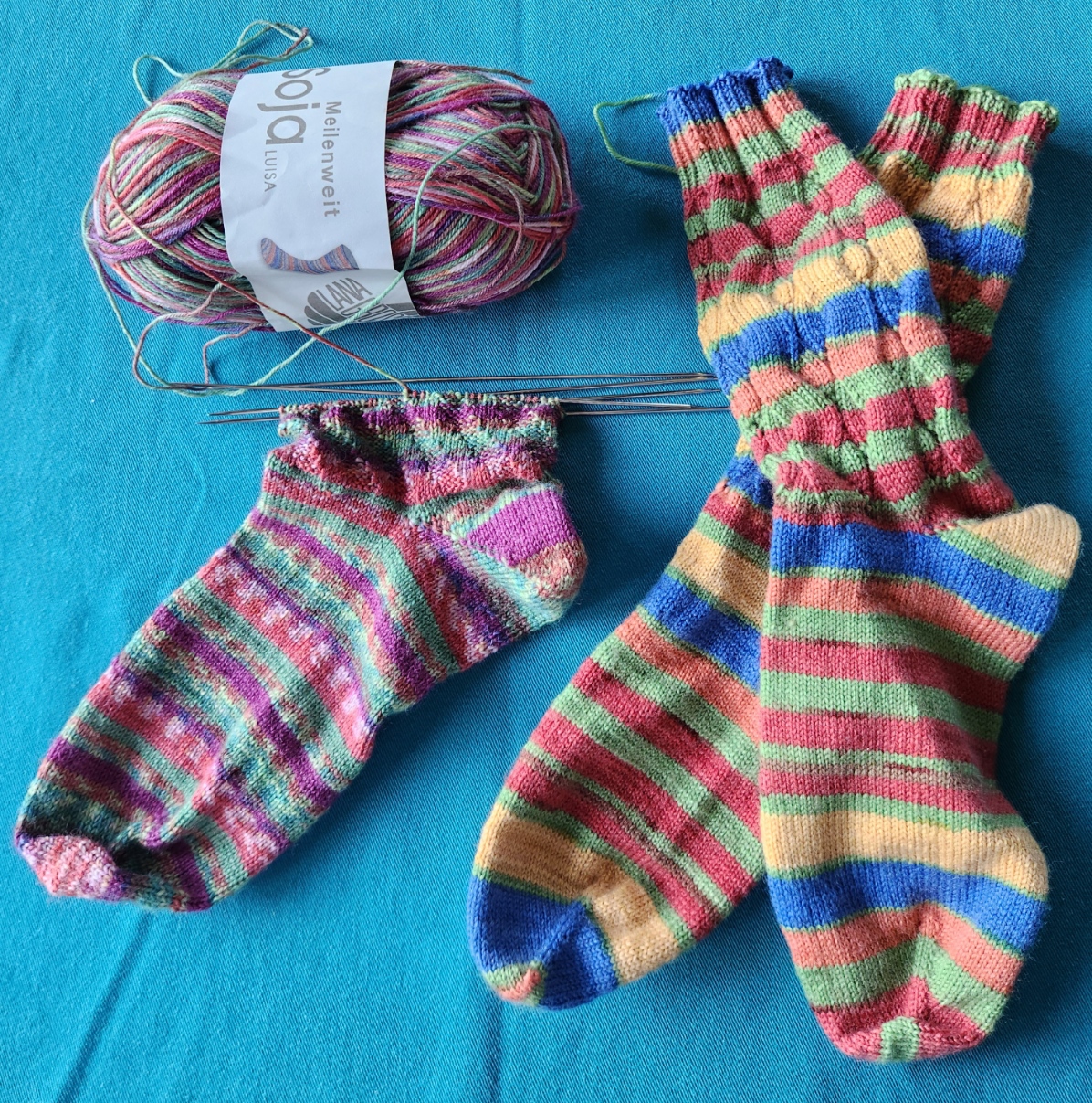
I’ve also been knitting and crocheting. Here are July’s socks. Not sure what made me knit the wide-stripe pair so tightly, but I did. They are the same stitch count around as the other pair, but are significantly narrower. I can wear them (just), but not all of my target audience can. So they will either stay home with me or find a narrow footed new friend with whom to play.
And I’ve been crocheting snowflakes. Not to keep cool but as a probably-the-case present for Elder Spawn, who has moved cross-country. It’s unlikely that we will be able to enjoy the family tree together this year come holiday time. A first for Casa Magnifica. So I have promised to make new snowflakes for what is now Casa Magnifica del Oeste, and ship them plus some of the family ornament stash, to furnish the new tree. I’ve got a half dozen complete. Six more to go, plus pin blocking and stiffening them for best display. Here are the first three, still looking sad and crumpled, right off the hook.
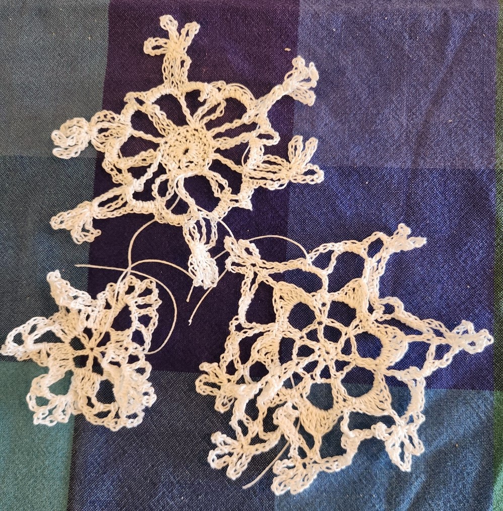
All of these are from this book. I have another one with better patterns. Someplace…

What’s next? Another stitched doodle on a thrifted linen rectangle, possibly to use up some of that black Sulky on a higher count ground. But more on that later this week.
ELIZABETH HARDWICK ON BIAS?
Once again a chance image on Facebook throws me into a frenzy of charting. The Friends of Sheffield Manor group posted this image of Elizabeth Hardwick, Countess of Shrewsberry. attributed to the school of Hans Elworth. It’s accession 1129165 of the UK’s National Trust collection.

Obviously what struck me were the sleeves. I tried and tried to chart them on the diagonal, but the geometry worked out much more cleanly if done straight. Now sewing, especially historically accurate construction is not my strength. But I ask folk more versed in it than I am, was it possible that if embroidered linen was used for those sleeves might they have been cut on the bias and not with the grain? The motifs look grain-wise at the collar, but are clearly sitting “on point” on the diagonal for the sleeves.
In any case, I’ve added the graph to the on-site free collection here. My rendition of it is approximate, but as close as I was able to achieve. I’m fuzzy on the exact shape of the free floating rondels occupying the empty areas where the chain rosettes meet. And their color is also problematic. Some are brown, some red, and some a pale indeterminant color – it might just be fading of the paint.

I lay no claim to the design itself – only my graphed rendition. Like most of the pieces offered here on String, this is available for your personal use. It’s Good Deed Ware – if you work it up please consider paying the kindness forward, assisting someone in need, calling a friend or family member who could use a bit of cheering up, or otherwise making the world a tiny bit more pleasant. And please note that my representation of this design is copyrighted. if you are interested in using it commercially or for larger distribution, either incorporating it into a pattern for sale or other dissemination, or if you want to use it on items that are made for sale or donation, please contact me.
And as always, I love to see what mischief the pattern children are up to out there in the wide-wide world. Feel free to send me a photo or a link. And if you give permission, I’ll add your work with or without your name (as you desire) to the growing Gallery page here on String.
A SUPPORTING CAST OF GRIFFINS
Friend Craig posted a memory last week, and re-shared a chart he adapted from one of the Siebmacher modelbooks – from the 1611 edition.

It got me to thinking. Those heraldic style charted bands appear over many years, and in several iterations. It might be fun to see how they assorted over time. So I went hunting. I combed through my notes, the Internet Archive’s collection of modelbook images, and several other sources.
This isn’t an exhaustive analysis, but it covers most of the easily accessible editions of the chart. And the large number unearthed really underscores the differences in that accessibility from the time I started poking into these early publications (circa 1974) to today. Back then there might be a couple of modelbooks as part of a microfiched set of early publications on file at one’s university. There were several sets of these ‘fiches scattered across the country, so the set that was local to me at Brandeis wasn’t necessarily the same as the set someone else might have at the University of Pennsylvania. A happy trade of blurry low quality photocopies ensued among us needlework dilettantes, and in some cases precision in attribution wasn’t as clear as it could have been. As a result, when I get around to reissuing The New Carolingian Modelbook, my first book of researched patterns, there will be corrections. Especially among the Siebmacher attributions, because somewhere along the way prints from several editions became confused, leading to a couple of the designs marked as being from the 1597 edition, actually being from a later printing.
And Siebmacher or Sibmacher – both actually. I haven’t a clue as to which spelling is the correct one, because both are used. IE is represented more often than just I, so I go with that.
So here we go. It’s another overly long post only a needlework nerd will love.
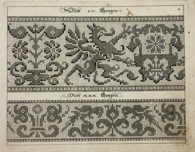
1597
Johann Siebmacher’s Schon Neues Modelbuch von allerley lustigen Modeln naczunehen, zuwürcken unn zusticken, gemacht im Jar Ch. 1597. Printed in Nurmburg.
This edition is held by the Metropolitan Museum of Art, Accession 20.16 and can be accessed here. Notes accompanying this edition cite that the modelbook historian Arthur Lotz cataloged two editions were printed in 1597, and this is from the later of the two. (I will try to fill in the Lotz numbers for these as I mention them. I have that book, but I don’t read German so please forgive my tentative attributions.) My guess is that this one is from Lotz 32b.
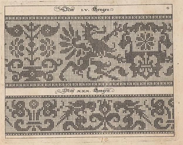
Note that it presented on the same page as the parrot strip. The numeral LV (55) at the top refers to the number of units tall the strip is. Note that all filled blocks are depicted in the same way – as being inhabited by little + symbols. There is also a companion border that shows a combo of filled boxes and straight stitches. Also note that the two “reflection points of the repeat are both shown, along with enough of the repeat reversed to indicate that the design should be worked mirrored. Craig got this spot on when he drafted the design for himself. I’m used to working straight from the historical charts but most folk find the mental flip a bit arduous. He wisely spared himself the conceptual gymnastics.
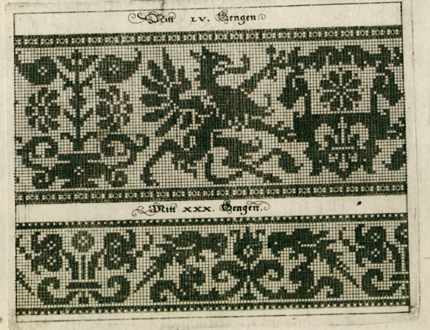
Johann Siebmacher’s Schon Neues Modelbuch von allerley lustigen Modeln naczunehen, zuwürcken unn zusticken, gemacht im Jar Ch. 1597. Printed in Nurmberg.
Here is the same page from the other edition of 1597. Very possibly Lotz 32a. It’s held by the Bayerische Stasts Bibliothek, and is shared on line here.
It’s very clear that these are both impressions from the same block. The inking is a bit heavier on this one than the other, but the design is the same. Note though that the little “4” in the upper right corner isn’t shown on this one.
The Bibliotheque nationale de France’s copy of Johann Siebmacher’s Schön Neues Modelbuch von allerley lustigen Mödeln naczunehen, zuwürcken unn zusticken : gemacht im Jar Ch. 1597 looks like it might be the same printing as the Lotz 32b version above. It has the same “4” in the corner. BUT throughout the book it appears that someone has added shadings and color variation indicators by hand – over-inking or penciling in selected areas of many of the patterns. I don’t know if this was done by an owner, or was sold this way. I suspect the former. The darker boxes are clearly produced by careful inking, not printing. In other pages of this edition, you can see differences in how thick the ink was laid on, following pen or brush stroke lines, and not imprinted.

I don’t see a date associated with this other annotated edition, listed only as Johann Siebmacher, Newes Modelbuch, but I suspect it’s the 1597 one based on plate similarities. It’s another book in the Clark Art Institute library. Again someone took the liberty of hand-inking some of the pattern pages to add additional shading or interest. You can view it here. Given the placement of the shading, it might be the source for the version Carl used when he drew up his own graph.
Additional reprintings.
I’ll spare you more echoes of exactly the same page, but here are other representations of these 1597 editions.
There was a reproduction made in 1877, called Hans Sibmacher’s Stick- und spitzen-musterbuch: Mit einem vorworte, titelblatt und 35 musterblattern. The editor was Gerold Wien, and it was put out by the Museum fur Kunst und Industrie. The plate is a duplicate of the Lotz 32b one, complete with the 4 in the upper corner. The date of the original is cited in the repro. You can see it here. A second copy of the 1877 facsimile edition is held by the Bayerische Staatsbibliothek and can be found here.
There is an additional reproduction of this book in the collection of the Cleveland Museum of Art, as issued in Berlin in 1885. The image quality is excellent, you can find it here.
1599
Martin Jost. Schön Neues Modelbuch von allerley lustigen Mödeln naazunehen Zuwürken vn[d] Zusticke[n]: gemacht im Jar Ch: 1599. Printed in Basel.
Yes, a different name is on this book. Lotz 34 refers to it by the name of the publisher – Ludwig Konig in Basel. The on line listing also mentions Jost. It is very closely related to the works above with lots of designs in common. But not entirely the same. The on line copy is here.

That’s our friend the griffin, the same motifs on the shield being supported, and the same flower pot behind – all absolutely stitch for stitch true to the earlier version. But the repeat is truncated along the left edge. The left side of the flowerpot is gone. However the upper and lower companion border with its straight stitching is the same, and is aligned the same way with the main motif. Obviously the parrots are gone, replaced with a panel representative of cutwork. The words above the design are the same font size and typeface, but are now centered between the new borders. The letters have the same proportional size to the design’s block units, but the block units are now rendered as solid – not boxed crosses. These books are said to be among the first created using copperplate – not carved wood. I am not familiar with the process of creating those, but it does look like a print of the original might have been used to create this smaller version. Licensed reproduction, cooperative venture, or unauthorized knock-off? I am sure there are academics who have explored this, so I won’t let my speculation run wild.
Additional appearances.
There is another copy of this same griffin imprint in a book cited as Ludwig Kunigs Fewrnew Modelbuch, von allerhandt künstlicher Arbeidt: namlich gestrickt, aussgezogen, aussgeschhnitten, gewiefflet, gestickt, gewirckt, und geneyt : von Wollen, Garn, Faden, oder Seyden : auff der Laden, und sonderlich auff der Ramen : Jetzt erstmals in Teutschlandt an Tag gebracht, zu Ehren und Glücklicher Zeitvertreibung allen dugendsamer Frawen, und Jungfrawen, Nächerinen, auch allen andern, so lust zu solcher künstlicher Arbeit haben, sehr dienstlich. Printed in Basel, 1599. You can find it here.
The Lotz number for this one is 35. It’s a problematic work because it looks like at some point a bunch of pages from several different pattern books were bound together into a “Franken-edition” incorporating some of Pagano, Vincoiolo, and Vecellio in addition to the Siebmacher-derived pages. But the solid blocks griffin with the cut off flower vase, plus the cutwork panel below is identical to the other 1599 imprint.
Jost might have been a bit peripatetic. There is an identical impression of this version in another Jost Martin printing, Schön neues Modelbuch von allerley lustigen Mödeln nachzunehen, zuwürcken un[n] zusticke[n], gemacht im Jar Chr: 1599, printed in Strassburg. No differences from the one above, so I won’t repeat. Possibly the same Lotz number, too. But you can visit it if you like.
1601
Georg Beatus, Schon neues Modelbuch, printed in Frankfurt, 1601.
Yup. Another publisher. This copy is Lotz #40, and is held in the Clark Art Institute Library. You can see it here.

This print looks a lot like the Jost/Konig one, but not exactly so. First, you can dismiss those little white dots. Those are pinpricks, added by someone who ticked off the solid units as they counted. I deduce that because they are also present in many of the empty boxes. But you will notice some oddities. First, the design is further truncated at the right. We’ve lost the complete shield shape bearing the quaternary flower. And the column at the far left has been duplicated. There is also an imprecision on column and row width in this representation, absent on the others. Finally, it’s been formatted for a single print, with no supplemental design below. I’m guessing another plate.
1604
Johann Siebmacher. Newes Modelbuch in Kupffer gemacht, darinen aller hand Arth newer Model von dun, mittel vnd dick aussgeschneidener Arbeit auch andern kunstlichen Neh werck zu gebrauchen. Printed in Nurmberg, in 1604, in the shop of Balthasar Caimox. It’s in the collection of the Metropolitan Museum of Art, accession 29.59.3, and can be seen here. I don’t see this one listed in Lotz under 1604, but the Met’s listing says that it’s likely a re-issue of the 1602 edition which would make it one of the ones Lotz labels as 38a through 38e. What’s notable about this particular copy is that while many of the other fabulous animal/mythical creature strips that accompany the griffins page in the other works, the griffin page itself is missing. It wasn’t in this edition, or the page that bore it has been lost to time. I’ve included this citation here for the sake of completeness.
Note also that this 1604 edition is the one upon which the modern Dover reprint is based. Dover reissued Ernst Wasmuth’s 1880 publication, which he entitled Kreuzstich-Muster 36 Tafeln der Ausgabe v. 1604. That was based on 36 plates from this 1604 printing.
1607
Sigmund Latomus, Schön newes Modelbuch, Von hundert vnd achtzig schönen kunstreichen vnd gerechten Modeln, Teutsche vnd Welsche, welche auff mancherley Art konnen geneet werden, als mit Zopffnath, Creutz vnnd Judenstich, auch auff Laden zu wircken : Dessgleichen von ausserlesenen Zinnigen oder Spitzen. Allen Seydenstickern, Modelwirckerin, Naderin, vnd solcher Arbeitgefiissenen Weibsbildern sehr dienstlich, vnd zu andern Mustern anleytlich vnd verstendig. Printed in Frankfurt, 1607.
Yes, another name on the spine, and printed in another city. The copy from the National Library of Sweden is visible here. It’s cited as being Lotz 43b.

At first glance this looks like another imprint of the same Siebmacher griffins and parrots page from 1597, but look closer. This design adds a blank column of squares to the right edge, replacing the design elements that were there on the earlier block. This is especially evident in the parrot strip, which has lost its center reflection point along the right edge. Also the blocks are filled in, again not the boxed crosses of the earlier work. And the fills look printed, not applied (more on this later). Yet another plate? Not impossible.
1622
Sigismund Latomus was still active in 1622, issuing a modelbook, entitled Schön newes Modelbuch, von 540. schönen auszerwehlten Künstlichen, so wol Italiänischen, Französischen, Ni-derländischen, Engelländischen, als Teutschen Mödeln, in Frankfurt. As one would expect from the lengthy name, he swept up a number of pattern images, issuing them in one big bundle. Of course we can’t rule out that what we see isn’t the original document as published. It’s not at all uncommon for later owners to bind works together (binding was expensive, and separate from publishing).
Our griffins are in this collection, TWICE. One version is another imprint the same rather squished version we saw issued by Beatus in 1601, the other is one we haven’t seen before. It’s roughly similar to the one above it, but there are some very subtle differences in detail, especially along the left and right edge. And of course, it’s paired with yet another secondary border. Original inclusion, or the result of later co-binding? Your guess is as good as mine. The book is here, it’s in the Clark Art Institute Library’s collection.


1660
Skip forward even further, now 63 years since the griffins appeared. Rosina Helena Furst/Paul Furst’s Model Buch Teil.1-2 printed in Nurnberg in 1660 offered a collection of older designs in addition to new ones. There were four in his series. This particular binding combines books 1 and 2. Lotz cites volumes one and 2 as 59 and 60, each with multiple surviving copies. For what it’s worth the Furst books are the first one that mention knitting as a possible mode of use for graphed patterns, and very possibly the first that is credited either in whole or in part to a female author. Some sources credit Paul Furst as the publisher and Rosina Helena Furst as the author, others attribute the entire work to Paul, or imply that Rosina Helena took over the family business after Paul’s death. In any case, they were prolific publishers, and continued to revise, and re-release modelbooks for at least a good 20 years. They did recast the legacy images to meet changing tastes, but it’s clear that our griffin has deeply informed this later, slightly more graceful beast. Note that his pattern height number is different from the earlier ones because his spacing and borders are a different size. You can see this copy here.

1666
We continue on with the Furst Das Neue Modelbuch editions. This one is also from Nurnberg, and is a multi-volume set in the care of the Clark Art Institute Library. The parts are listed as Lotz 59b, 60a, 61b, and 62a. Again someone has inked in bits to indicate shading. But it’s clearly the same plate as the 1660 printing.

1728
This is about as late as I research. Here we are 131 years after first publication, and there is still interest in the griffins. At least in the Furst interpretation of them. This is from the workshop of J.C. Seigels Wittib, in Nurnberg, and is a reissue of the Fursts’ Model Buch Teil 1-2. Again from the Clark Art Institute Library. It also looks to have been hand-inked on top of the same plate print. But if one looks very closely, there are small mistakes in ink application with very slight differences between the two. Including a forgotten square that shows the + behind the ink in one and not the other. A clear indication that the solid black areas were additions, and not done during the print process. It also makes me think that the 1728 inker had a copy of the 1666 book and copied the annotations to the best of their ability. Does that mean that some books were sold pre-inked? Not impossible. You can make your own judgement here.

Stitched representations
I am still looking for these. Representations of other Siebmacher designs exist in monochrome and polychrome counted stitching, as well as in white openwork. His reclining stag is the most often seen through time, but his unicorns, peacocks, eagles, religious symbols, long neck swans, flower pots, and rampant lions grace some spot samplers of the 1600s and into the early 1700s – mostly but not exclusively German or Dutch in origin. I’ve seen the parrots, undines, and mermen in white darned pieces (lacis in addition to withdrawn thread darned work). And that reclining stag crossed the ocean to appear on some early American samplers as well. But I haven’t seen a stitched version of these griffins. Yet.
Of course I haven’t seen everything, and back room pieces are being digitized every day. If you’ve spotted the griffins in the wild, please let me know.
Conclusions
This really is more of an observational survey than an academic hypothesis based essay.
Originally, seeing this (and other Siebmacher designs) repeat across multiple modelbooks, I assumed that they all were produced from the same plate. But on closer examination we see that probably isn’t true.
It is safe to say that there is a strong continuity of design here. And an interesting cross pollination among publishers. Was it tribute, licensing, sharing, or a bit of light plagiarism? We cannot tell from just examining the printings. But we can say that over the course of 131 years there were at least four and possibly five plates made based on the original griffin design, yet all are immediately identifiable as springing from the same source. I’m sure there are scholars who have delved into the interrelationships in the early printing industry, and have described other migrations of text or illustration among printing houses. Perhaps this look at a single pattern book plate will help inform their future musings.
We can also say that these design plates were used by a variety of prolific printers in Germany in response to what must have been continuing demand for pattern books. I say that because they were obviously selling well enough to warrant production over a long span of time, in spite of their largely offering up the same content over and over with only minor supplements. Also, in spite of the sometimes destructive nature of pattern replication at the time these early pattern books survived largely (but not totally) intact. For something so esoteric, with little literary value, they were seen as interesting and useful enough to retain in many libraries – to the delight of those who have rediscovered them again and again across centuries.
I just might have to stitch up these griffins, and in doing so know I’m helping to keep them alive.
A SPANISH GENTLEMAN AND HIS COLLAR
Once again discussions on Facebook have brought a portrait to my attention. Elspeth over at Elizabethan Costume has found something I’ve been seeking for a long time. An portrait of an individual with a Spanish name, with a sitter that is wearing what we would describe as blackwork.
While 19th and 20th century discussions of blackwork in the Tudor period often call it Spanish Blackwork, and offer “Spanish Stitch” as another name for double running. But there are very few portraits of Iberian individuals wearing it, as one might think there would be if the folk attribution of Catherine of Aragon’s introduction of a style already popular in her homeland was to be corroborated. This portrait, dated 1530-1532 is by Jan Gossaert, and is part of the J. Paul Getty Museum’s collection, accession 88.PB.43. It depicts Francisco de los Cobos y Molina, who served in Charles V’s Holy Roman Empire court as a trusted secretary and advisor. The Morgan Library and Museum notes the absolute identification of the sitter. Note that shortly after this was painted, Catherine far away in her English court was only a year away from Henry’s declaration that their marriage was invalid (1533) and her subsequent sequestration.
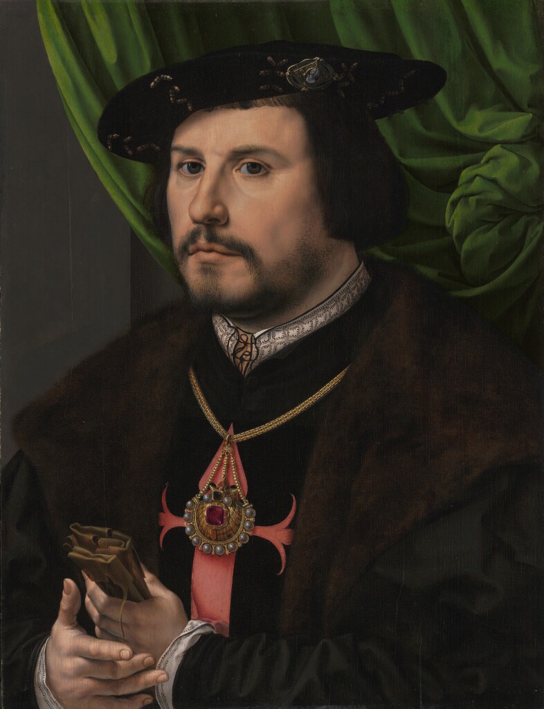
There are higher resolution pictures at the museum link, above.
To say thank you to Elspeth and to spread my joy in finding a heretofore unknown bit of delight, I share a graph for that collar.
Click here for a full size downloadable PDF of the pattern below.

Now. How “authentic” is my representation?
I’d say it’s no more than an honest representation. Remember that the original I am working from is a painting. The painter did his best to capture the alignment of the verticals with the horizontal interfaces, but he fudged almost all of them. What I’ve done is to show the design elements in as close to the original proportions as I could manage, with the correct number of “pips” inside the boxes formed by the repeat, and represent as well as I could the marching row of them more or less evenly spaced across the top edge of the collar band. Like the painter, I have fudged the geometry of the thing to make it fit. And of course the nature of those pips is open to interpretation. Little hoof-like triangles? A three pronged fork, bent to one side? Should the ones in the square be closer to each other than I show? Should the middle one of each box side be taller? All of these would be as valid as what I show. After all, a tiny blob of paint can be seen in many ways.
I will be adding this pattern to the Embroidery Patterns page here at String, so it can be easily found in the future. If you choose to try out this design, please feel free to share a photo. I do so enjoy seeing what mischief these doodles attempt out there in the wide, wide world.
