A SUPPORTING CAST OF GRIFFINS
Friend Craig posted a memory last week, and re-shared a chart he adapted from one of the Siebmacher modelbooks – from the 1611 edition.

It got me to thinking. Those heraldic style charted bands appear over many years, and in several iterations. It might be fun to see how they assorted over time. So I went hunting. I combed through my notes, the Internet Archive’s collection of modelbook images, and several other sources.
This isn’t an exhaustive analysis, but it covers most of the easily accessible editions of the chart. And the large number unearthed really underscores the differences in that accessibility from the time I started poking into these early publications (circa 1974) to today. Back then there might be a couple of modelbooks as part of a microfiched set of early publications on file at one’s university. There were several sets of these ‘fiches scattered across the country, so the set that was local to me at Brandeis wasn’t necessarily the same as the set someone else might have at the University of Pennsylvania. A happy trade of blurry low quality photocopies ensued among us needlework dilettantes, and in some cases precision in attribution wasn’t as clear as it could have been. As a result, when I get around to reissuing The New Carolingian Modelbook, my first book of researched patterns, there will be corrections. Especially among the Siebmacher attributions, because somewhere along the way prints from several editions became confused, leading to a couple of the designs marked as being from the 1597 edition, actually being from a later printing.
And Siebmacher or Sibmacher – both actually. I haven’t a clue as to which spelling is the correct one, because both are used. IE is represented more often than just I, so I go with that.
So here we go. It’s another overly long post only a needlework nerd will love.
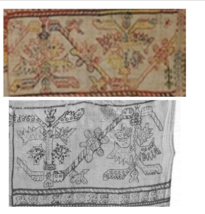
1597
Johann Siebmacher’s Schon Neues Modelbuch von allerley lustigen Modeln naczunehen, zuwürcken unn zusticken, gemacht im Jar Ch. 1597. Printed in Nurmburg.
This edition is held by the Metropolitan Museum of Art, Accession 20.16 and can be accessed here. Notes accompanying this edition cite that the modelbook historian Arthur Lotz cataloged two editions were printed in 1597, and this is from the later of the two. (I will try to fill in the Lotz numbers for these as I mention them. I have that book, but I don’t read German so please forgive my tentative attributions.) My guess is that this one is from Lotz 32b.
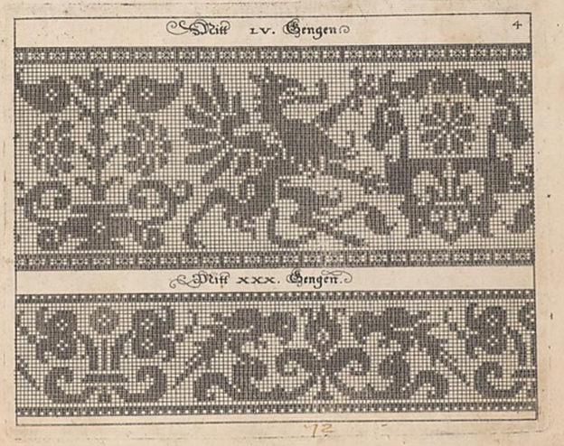
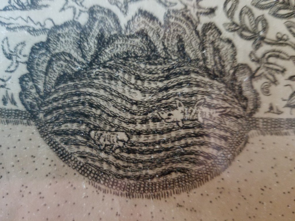
Note that it presented on the same page as the parrot strip. The numeral LV (55) at the top refers to the number of units tall the strip is. Note that all filled blocks are depicted in the same way – as being inhabited by little + symbols. There is also a companion border that shows a combo of filled boxes and straight stitches. Also note that the two “reflection points of the repeat are both shown, along with enough of the repeat reversed to indicate that the design should be worked mirrored. Craig got this spot on when he drafted the design for himself. I’m used to working straight from the historical charts but most folk find the mental flip a bit arduous. He wisely spared himself the conceptual gymnastics.
Johann Siebmacher’s Schon Neues Modelbuch von allerley lustigen Modeln naczunehen, zuwürcken unn zusticken, gemacht im Jar Ch. 1597. Printed in Nurmberg.
Here is the same page from the other edition of 1597. Very possibly Lotz 32a. It’s held by the Bayerische Stasts Bibliothek, and is shared on line here.
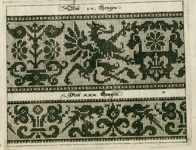
It’s very clear that these are both impressions from the same block. The inking is a bit heavier on this one than the other, but the design is the same. Note though that the little “4” in the upper right corner isn’t shown on this one.
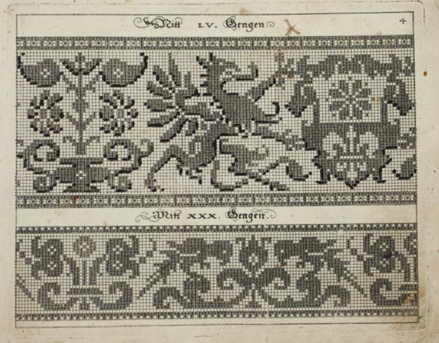
The Bibliotheque nationale de France’s copy of Johann Siebmacher’s Schön Neues Modelbuch von allerley lustigen Mödeln naczunehen, zuwürcken unn zusticken : gemacht im Jar Ch. 1597 looks like it might be the same printing as the Lotz 32b version above. It has the same “4” in the corner. BUT throughout the book it appears that someone has added shadings and color variation indicators by hand – over-inking or penciling in selected areas of many of the patterns. I don’t know if this was done by an owner, or was sold this way. I suspect the former. The darker boxes are clearly produced by careful inking, not printing. In other pages of this edition, you can see differences in how thick the ink was laid on, following pen or brush stroke lines, and not imprinted.

I don’t see a date associated with this other annotated edition, listed only as Johann Siebmacher, Newes Modelbuch, but I suspect it’s the 1597 one based on plate similarities. It’s another book in the Clark Art Institute library. Again someone took the liberty of hand-inking some of the pattern pages to add additional shading or interest. You can view it here. Given the placement of the shading, it might be the source for the version Carl used when he drew up his own graph.
Additional reprintings.
I’ll spare you more echoes of exactly the same page, but here are other representations of these 1597 editions.
There was a reproduction made in 1877, called Hans Sibmacher’s Stick- und spitzen-musterbuch: Mit einem vorworte, titelblatt und 35 musterblattern. The editor was Gerold Wien, and it was put out by the Museum fur Kunst und Industrie. The plate is a duplicate of the Lotz 32b one, complete with the 4 in the upper corner. The date of the original is cited in the repro. You can see it here. A second copy of the 1877 facsimile edition is held by the Bayerische Staatsbibliothek and can be found here.
There is an additional reproduction of this book in the collection of the Cleveland Museum of Art, as issued in Berlin in 1885. The image quality is excellent, you can find it here.
1599
Martin Jost. Schön Neues Modelbuch von allerley lustigen Mödeln naazunehen Zuwürken vn[d] Zusticke[n]: gemacht im Jar Ch: 1599. Printed in Basel.
Yes, a different name is on this book. Lotz 34 refers to it by the name of the publisher – Ludwig Konig in Basel. The on line listing also mentions Jost. It is very closely related to the works above with lots of designs in common. But not entirely the same. The on line copy is here.

That’s our friend the griffin, the same motifs on the shield being supported, and the same flower pot behind – all absolutely stitch for stitch true to the earlier version. But the repeat is truncated along the left edge. The left side of the flowerpot is gone. However the upper and lower companion border with its straight stitching is the same, and is aligned the same way with the main motif. Obviously the parrots are gone, replaced with a panel representative of cutwork. The words above the design are the same font size and typeface, but are now centered between the new borders. The letters have the same proportional size to the design’s block units, but the block units are now rendered as solid – not boxed crosses. These books are said to be among the first created using copperplate – not carved wood. I am not familiar with the process of creating those, but it does look like a print of the original might have been used to create this smaller version. Licensed reproduction, cooperative venture, or unauthorized knock-off? I am sure there are academics who have explored this, so I won’t let my speculation run wild.
Additional appearances.
There is another copy of this same griffin imprint in a book cited as Ludwig Kunigs Fewrnew Modelbuch, von allerhandt künstlicher Arbeidt: namlich gestrickt, aussgezogen, aussgeschhnitten, gewiefflet, gestickt, gewirckt, und geneyt : von Wollen, Garn, Faden, oder Seyden : auff der Laden, und sonderlich auff der Ramen : Jetzt erstmals in Teutschlandt an Tag gebracht, zu Ehren und Glücklicher Zeitvertreibung allen dugendsamer Frawen, und Jungfrawen, Nächerinen, auch allen andern, so lust zu solcher künstlicher Arbeit haben, sehr dienstlich. Printed in Basel, 1599. You can find it here.
The Lotz number for this one is 35. It’s a problematic work because it looks like at some point a bunch of pages from several different pattern books were bound together into a “Franken-edition” incorporating some of Pagano, Vincoiolo, and Vecellio in addition to the Siebmacher-derived pages. But the solid blocks griffin with the cut off flower vase, plus the cutwork panel below is identical to the other 1599 imprint.
Jost might have been a bit peripatetic. There is an identical impression of this version in another Jost Martin printing, Schön neues Modelbuch von allerley lustigen Mödeln nachzunehen, zuwürcken un[n] zusticke[n], gemacht im Jar Chr: 1599, printed in Strassburg. No differences from the one above, so I won’t repeat. Possibly the same Lotz number, too. But you can visit it if you like.
1601
Georg Beatus, Schon neues Modelbuch, printed in Frankfurt, 1601.
Yup. Another publisher. This copy is Lotz #40, and is held in the Clark Art Institute Library. You can see it here.

This print looks a lot like the Jost/Konig one, but not exactly so. First, you can dismiss those little white dots. Those are pinpricks, added by someone who ticked off the solid units as they counted. I deduce that because they are also present in many of the empty boxes. But you will notice some oddities. First, the design is further truncated at the right. We’ve lost the complete shield shape bearing the quaternary flower. And the column at the far left has been duplicated. There is also an imprecision on column and row width in this representation, absent on the others. Finally, it’s been formatted for a single print, with no supplemental design below. I’m guessing another plate.
1604
Johann Siebmacher. Newes Modelbuch in Kupffer gemacht, darinen aller hand Arth newer Model von dun, mittel vnd dick aussgeschneidener Arbeit auch andern kunstlichen Neh werck zu gebrauchen. Printed in Nurmberg, in 1604, in the shop of Balthasar Caimox. It’s in the collection of the Metropolitan Museum of Art, accession 29.59.3, and can be seen here. I don’t see this one listed in Lotz under 1604, but the Met’s listing says that it’s likely a re-issue of the 1602 edition which would make it one of the ones Lotz labels as 38a through 38e. What’s notable about this particular copy is that while many of the other fabulous animal/mythical creature strips that accompany the griffins page in the other works, the griffin page itself is missing. It wasn’t in this edition, or the page that bore it has been lost to time. I’ve included this citation here for the sake of completeness.
Note also that this 1604 edition is the one upon which the modern Dover reprint is based. Dover reissued Ernst Wasmuth’s 1880 publication, which he entitled Kreuzstich-Muster 36 Tafeln der Ausgabe v. 1604. That was based on 36 plates from this 1604 printing.
1607
Sigmund Latomus, Schön newes Modelbuch, Von hundert vnd achtzig schönen kunstreichen vnd gerechten Modeln, Teutsche vnd Welsche, welche auff mancherley Art konnen geneet werden, als mit Zopffnath, Creutz vnnd Judenstich, auch auff Laden zu wircken : Dessgleichen von ausserlesenen Zinnigen oder Spitzen. Allen Seydenstickern, Modelwirckerin, Naderin, vnd solcher Arbeitgefiissenen Weibsbildern sehr dienstlich, vnd zu andern Mustern anleytlich vnd verstendig. Printed in Frankfurt, 1607.
Yes, another name on the spine, and printed in another city. The copy from the National Library of Sweden is visible here. It’s cited as being Lotz 43b.

At first glance this looks like another imprint of the same Siebmacher griffins and parrots page from 1597, but look closer. This design adds a blank column of squares to the right edge, replacing the design elements that were there on the earlier block. This is especially evident in the parrot strip, which has lost its center reflection point along the right edge. Also the blocks are filled in, again not the boxed crosses of the earlier work. And the fills look printed, not applied (more on this later). Yet another plate? Not impossible.
1622
Sigismund Latomus was still active in 1622, issuing a modelbook, entitled Schön newes Modelbuch, von 540. schönen auszerwehlten Künstlichen, so wol Italiänischen, Französischen, Ni-derländischen, Engelländischen, als Teutschen Mödeln, in Frankfurt. As one would expect from the lengthy name, he swept up a number of pattern images, issuing them in one big bundle. Of course we can’t rule out that what we see isn’t the original document as published. It’s not at all uncommon for later owners to bind works together (binding was expensive, and separate from publishing).
Our griffins are in this collection, TWICE. One version is another imprint the same rather squished version we saw issued by Beatus in 1601, the other is one we haven’t seen before. It’s roughly similar to the one above it, but there are some very subtle differences in detail, especially along the left and right edge. And of course, it’s paired with yet another secondary border. Original inclusion, or the result of later co-binding? Your guess is as good as mine. The book is here, it’s in the Clark Art Institute Library’s collection.


1660
Skip forward even further, now 63 years since the griffins appeared. Rosina Helena Furst/Paul Furst’s Model Buch Teil.1-2 printed in Nurnberg in 1660 offered a collection of older designs in addition to new ones. There were four in his series. This particular binding combines books 1 and 2. Lotz cites volumes one and 2 as 59 and 60, each with multiple surviving copies. For what it’s worth the Furst books are the first one that mention knitting as a possible mode of use for graphed patterns, and very possibly the first that is credited either in whole or in part to a female author. Some sources credit Paul Furst as the publisher and Rosina Helena Furst as the author, others attribute the entire work to Paul, or imply that Rosina Helena took over the family business after Paul’s death. In any case, they were prolific publishers, and continued to revise, and re-release modelbooks for at least a good 20 years. They did recast the legacy images to meet changing tastes, but it’s clear that our griffin has deeply informed this later, slightly more graceful beast. Note that his pattern height number is different from the earlier ones because his spacing and borders are a different size. You can see this copy here.

1666
We continue on with the Furst Das Neue Modelbuch editions. This one is also from Nurnberg, and is a multi-volume set in the care of the Clark Art Institute Library. The parts are listed as Lotz 59b, 60a, 61b, and 62a. Again someone has inked in bits to indicate shading. But it’s clearly the same plate as the 1660 printing.

1728
This is about as late as I research. Here we are 131 years after first publication, and there is still interest in the griffins. At least in the Furst interpretation of them. This is from the workshop of J.C. Seigels Wittib, in Nurnberg, and is a reissue of the Fursts’ Model Buch Teil 1-2. Again from the Clark Art Institute Library. It also looks to have been hand-inked on top of the same plate print. But if one looks very closely, there are small mistakes in ink application with very slight differences between the two. Including a forgotten square that shows the + behind the ink in one and not the other. A clear indication that the solid black areas were additions, and not done during the print process. It also makes me think that the 1728 inker had a copy of the 1666 book and copied the annotations to the best of their ability. Does that mean that some books were sold pre-inked? Not impossible. You can make your own judgement here.

Stitched representations
I am still looking for these. Representations of other Siebmacher designs exist in monochrome and polychrome counted stitching, as well as in white openwork. His reclining stag is the most often seen through time, but his unicorns, peacocks, eagles, religious symbols, long neck swans, flower pots, and rampant lions grace some spot samplers of the 1600s and into the early 1700s – mostly but not exclusively German or Dutch in origin. I’ve seen the parrots, undines, and mermen in white darned pieces (lacis in addition to withdrawn thread darned work). And that reclining stag crossed the ocean to appear on some early American samplers as well. But I haven’t seen a stitched version of these griffins. Yet.
Of course I haven’t seen everything, and back room pieces are being digitized every day. If you’ve spotted the griffins in the wild, please let me know.
Conclusions
This really is more of an observational survey than an academic hypothesis based essay.
Originally, seeing this (and other Siebmacher designs) repeat across multiple modelbooks, I assumed that they all were produced from the same plate. But on closer examination we see that probably isn’t true.
It is safe to say that there is a strong continuity of design here. And an interesting cross pollination among publishers. Was it tribute, licensing, sharing, or a bit of light plagiarism? We cannot tell from just examining the printings. But we can say that over the course of 131 years there were at least four and possibly five plates made based on the original griffin design, yet all are immediately identifiable as springing from the same source. I’m sure there are scholars who have delved into the interrelationships in the early printing industry, and have described other migrations of text or illustration among printing houses. Perhaps this look at a single pattern book plate will help inform their future musings.
We can also say that these design plates were used by a variety of prolific printers in Germany in response to what must have been continuing demand for pattern books. I say that because they were obviously selling well enough to warrant production over a long span of time, in spite of their largely offering up the same content over and over with only minor supplements. Also, in spite of the sometimes destructive nature of pattern replication at the time these early pattern books survived largely (but not totally) intact. For something so esoteric, with little literary value, they were seen as interesting and useful enough to retain in many libraries – to the delight of those who have rediscovered them again and again across centuries.
I just might have to stitch up these griffins, and in doing so know I’m helping to keep them alive.
THE UNSTITCHED COIF EXHIBIT
As promised, here’s a recap of the exhibit. It was an immersive whirlwind of talent, exuberance, and fun. I am very happy we were able to go. I just wish we had longer to chat with all the delightful, creative folk in attendance. But first, here’s a run-down of the displays. Note that while the Unstitched Coif was well represented, it isn’t the only project Toni Buckby is doing. More on those other efforts after the coifs…
The Unstitched Coif
I tried to take photos that showed the individual displayed pieces in situ, among their neighbors. The official website http://blackworkembroidery.org is hosting stitcher-provided blurbs and supplemental photos – the same info that is in the official exhibit book. This linked page indexes all of the stitchers alphabetically by first name. I provide the names of the stitchers for each photo below to save squinting. Pop over to that official site page for high-res closeups of any coifs that catch your eye.
First, the introductory material – a brief on the project, plus a sample of the pattern transcribed onto cloth (but not stitched) and made up into wearable configuration. If you open the poster photo in another window you may be able to zoom in enough to read the text.


And on to the coifs, in groups of three as displayed. There is an amazing variety of techniques, approaches, color interpretations, embellishments, and general artistic vision. The little QR codes on the name tags led to the stitcher’s personal submissions referenced above. Again, if you see something that you want to examine in lovely detail, go to this page and click on the stitcher’s name to read that material.
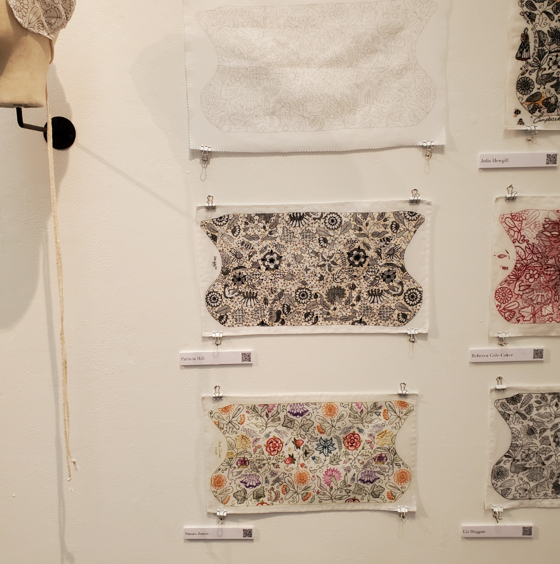
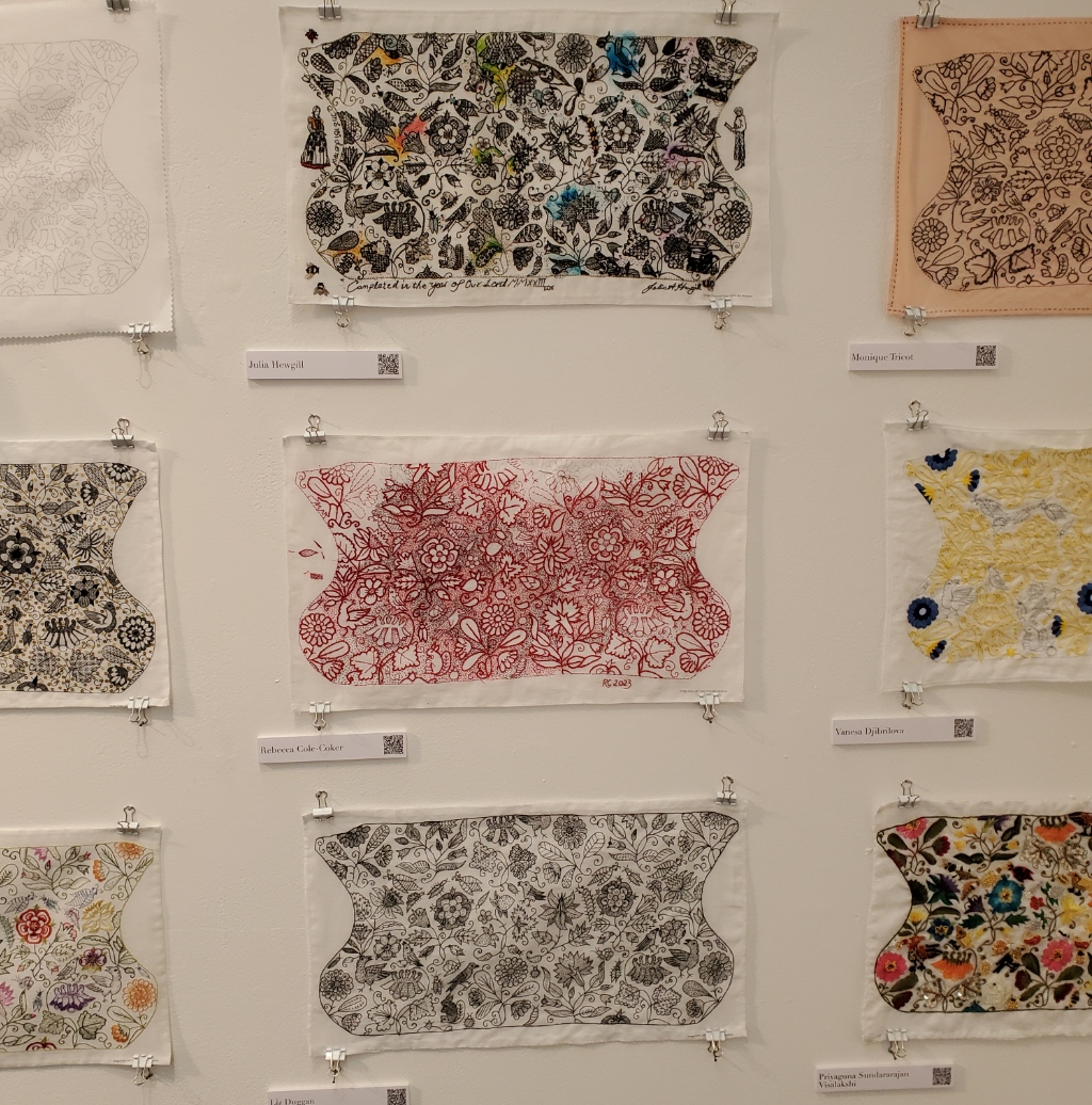

| Unstitched cloth Patricia Hill Susan Jones | Julia Hewgill Rebecca Cole-Coker Liz Duggan | Monique Tricot Vanesa Djibrilova Priyaguna Sundararajan Visalakshi |
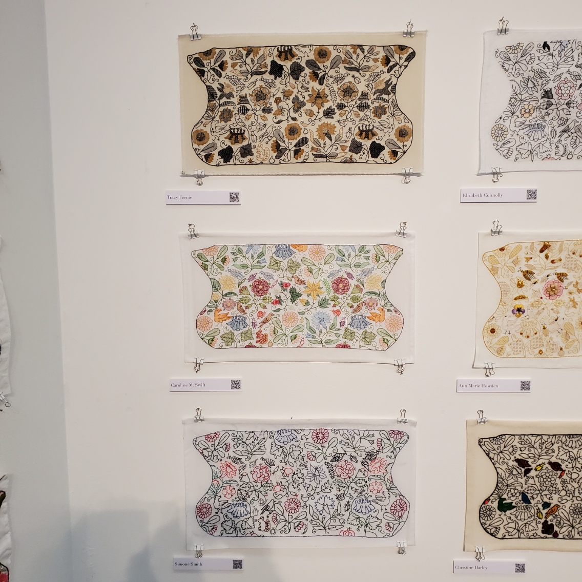

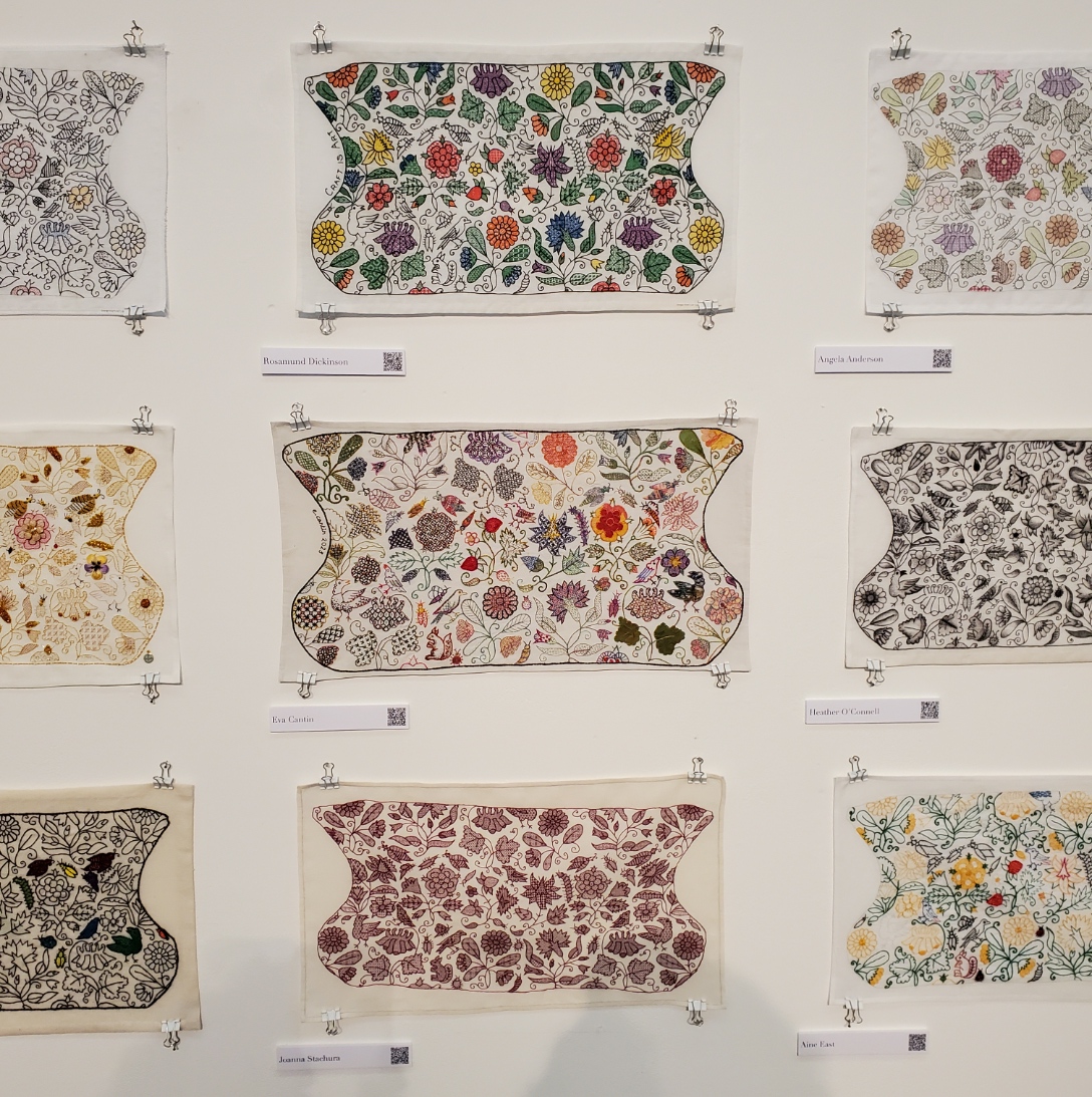
| Tracy Fernie Caroline M. Swift Simone Smith | Elizabeth Connolly Ann Marie Howden Christine Harley | Rosamund Dickinson Eva Cantin Joanna Stachura |
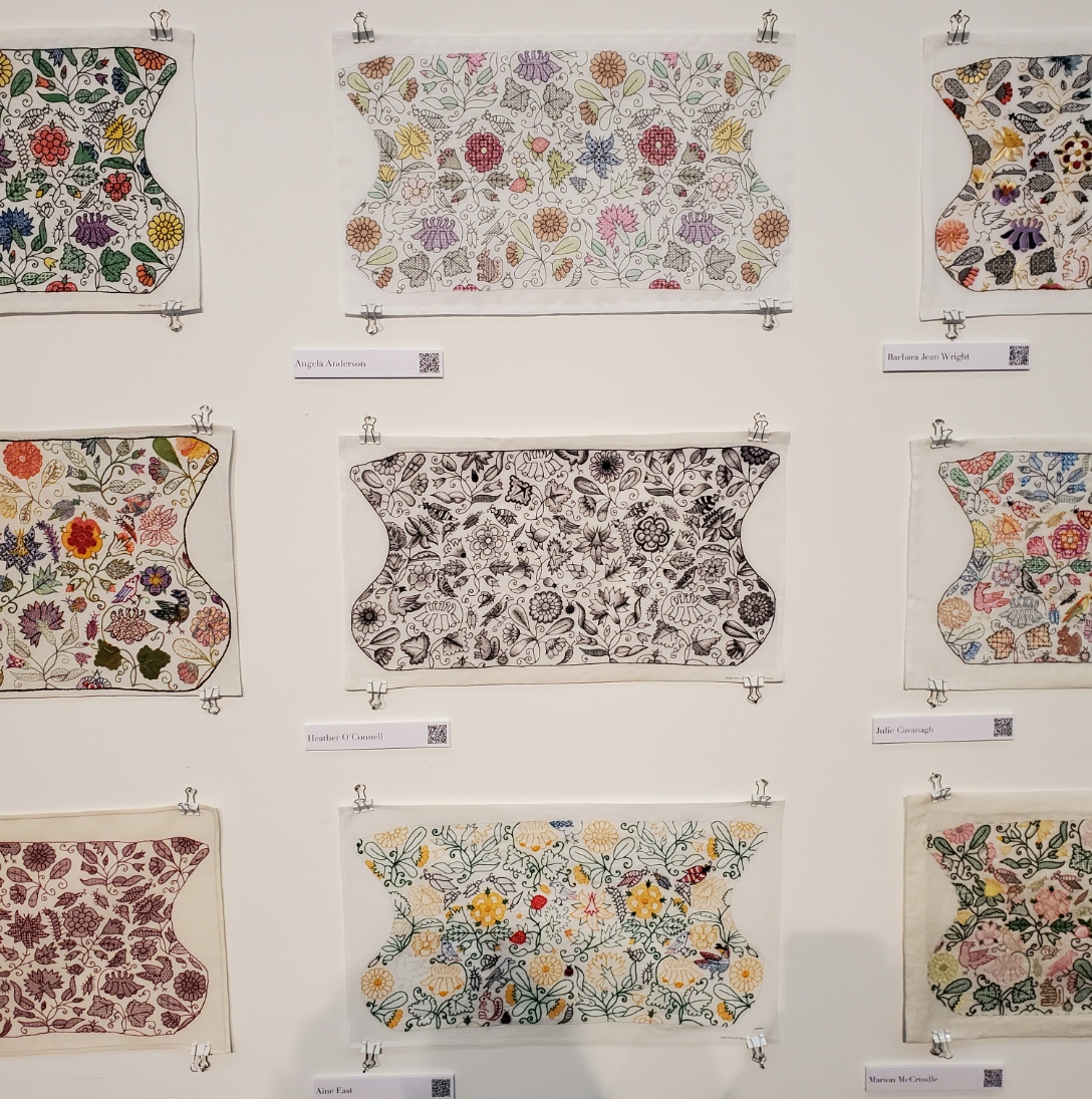


| Angela Anderson Heather O’Connell Aine East | Barbara Jean Wright Julie Cavanagh Marion McCrindle | Elizabeth Dymond Holly Searle Margery Dickson |


| Jane Burnham Vicki Parsons Jen Cable | Anna Tagg Sue Critchley Becky Stewart | Louise Goult Jill Kipnis Sarah Capel |


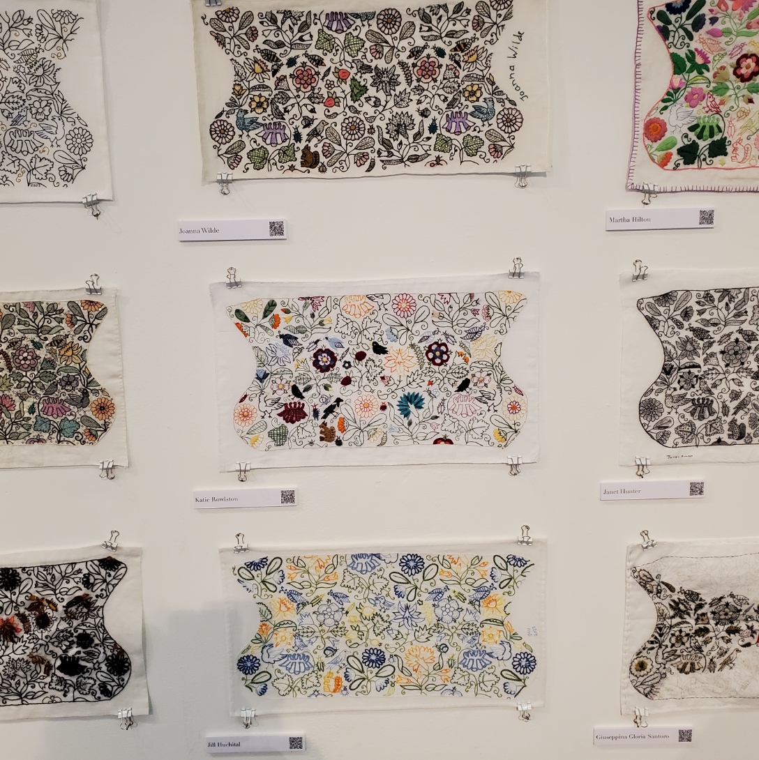
| Catherine Hill Kim Brody Salazar Jen Best | Christine Hillman Jo Tyrrell Victoria Keech | Joanna Wilde Katie Rowlston Jill Huchital |
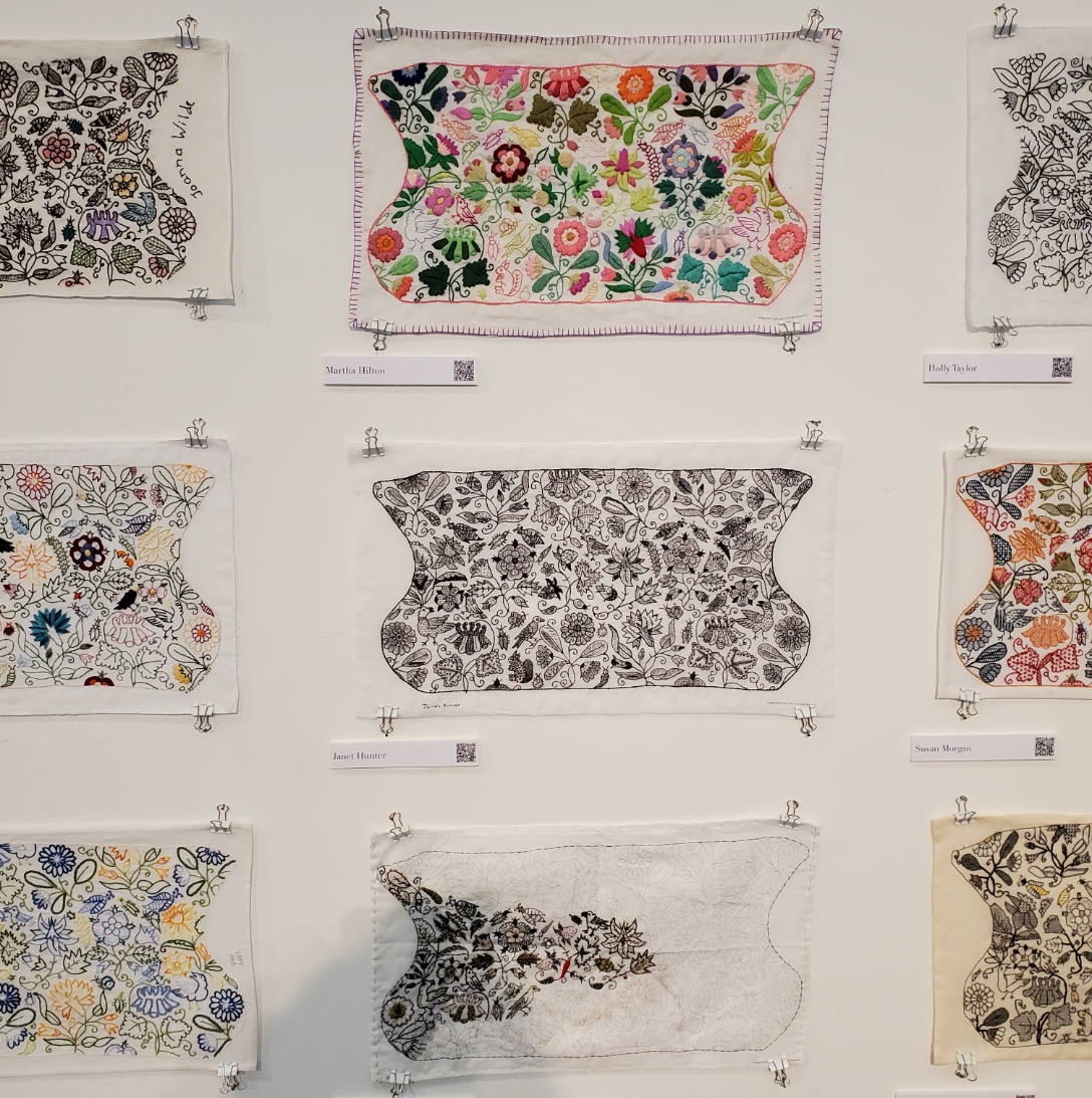

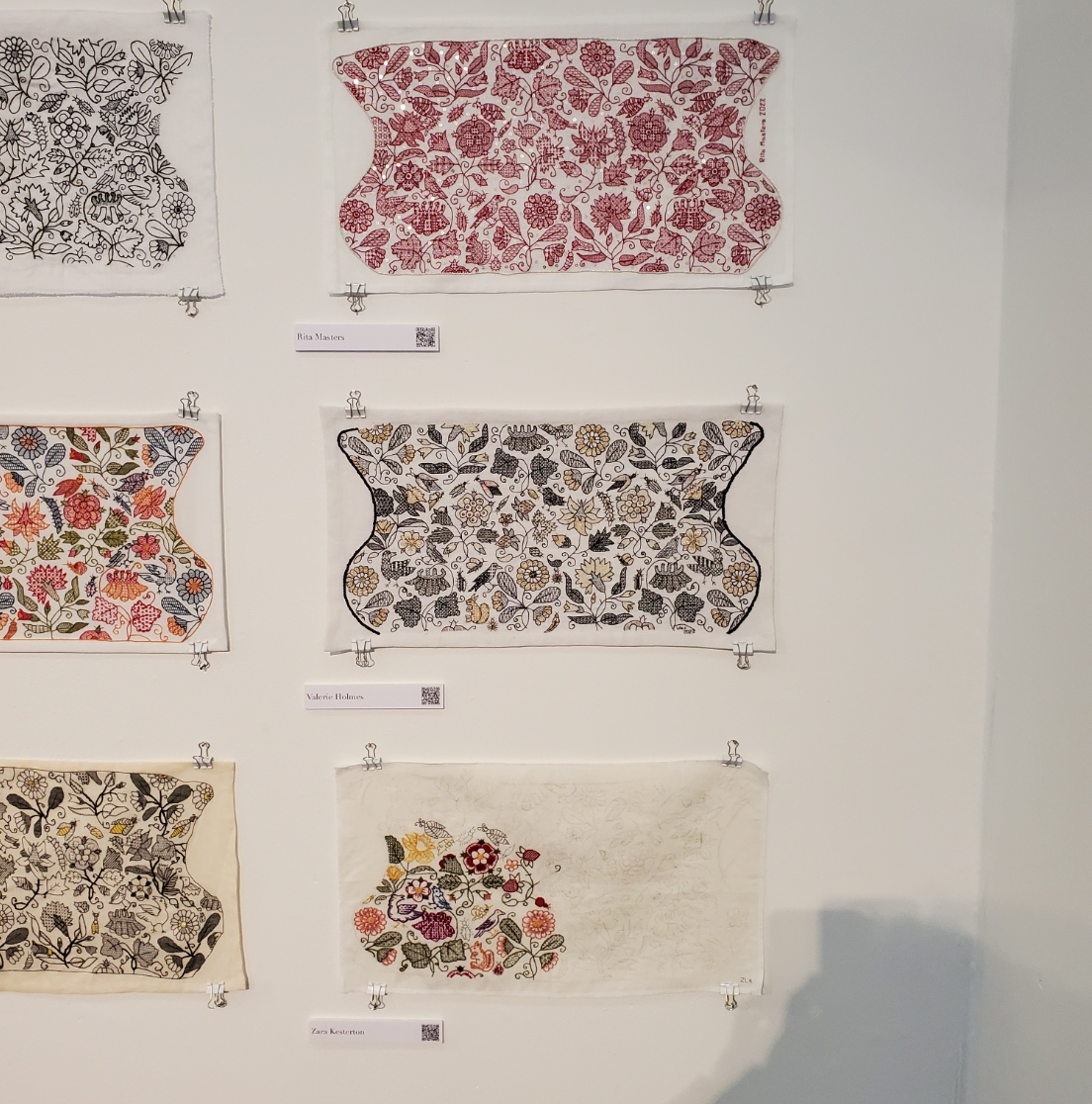
| Martha Hilton Janet Hunter Giuseppina Gloria Santoro | Holly Taylor Susan Morgan Leila Scott | Rita Masters Valerie Holmes Zara Kesterton |
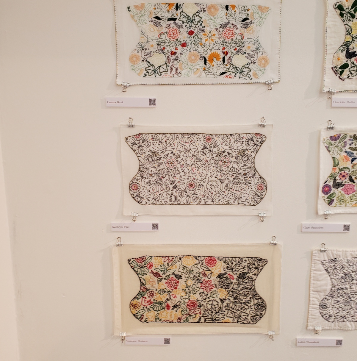
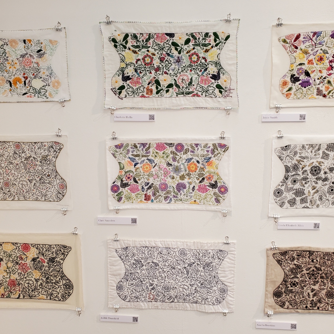
| Emma Bent Kathryn Pike Vivienne Holmes | Charlotte Hollis Clare Saunders Judith Thursfield | Joyce Smith Linda Elizabeth Albin Amelia Brookins |


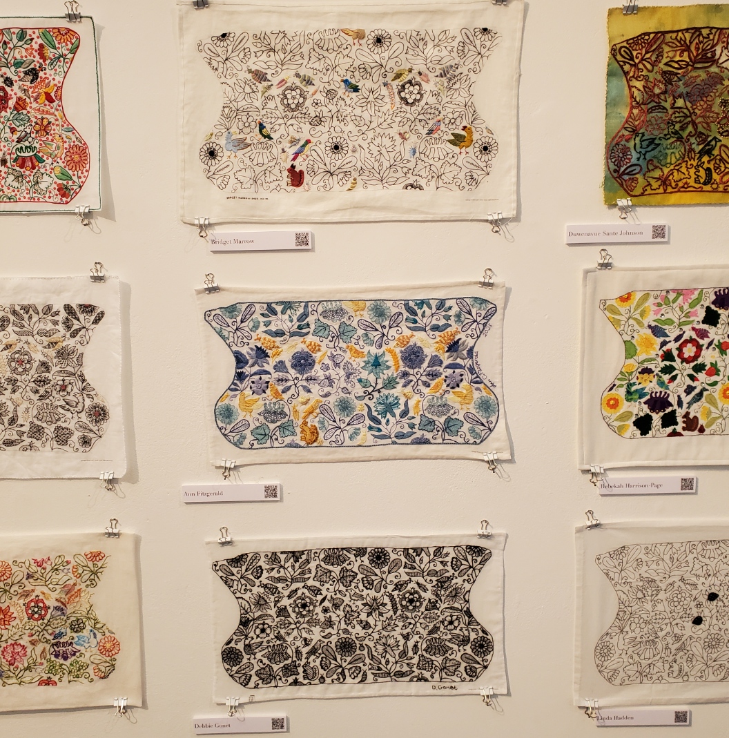
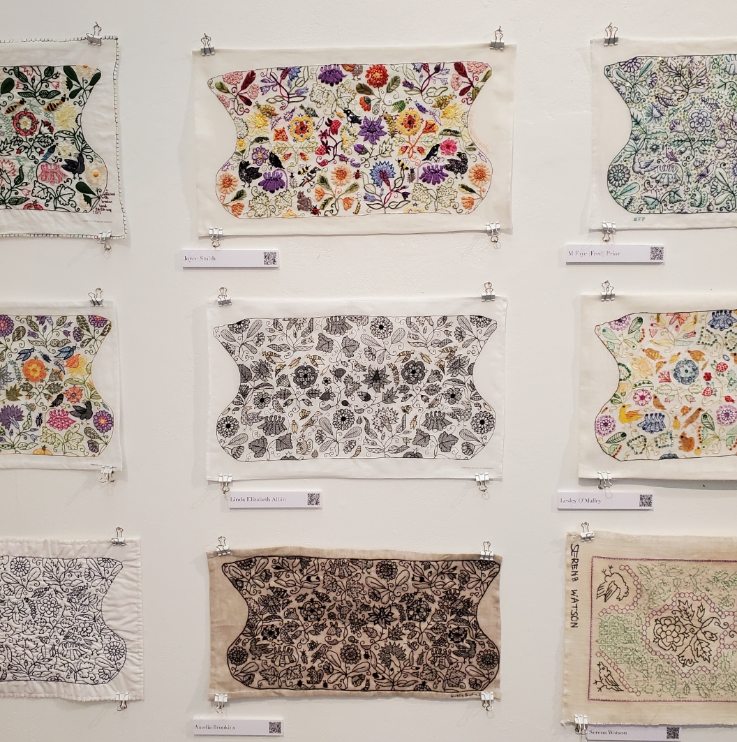
| M. Faye (Fred) Prior Lesley O’Malley Serena Watson | Isabelle Verny Mathieu Anna Vereker Fiona Johnston | Bridget Marrow Ann Fitzgerald Debbie Gonet |
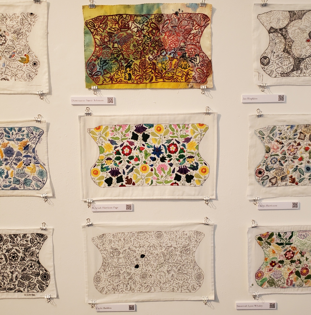
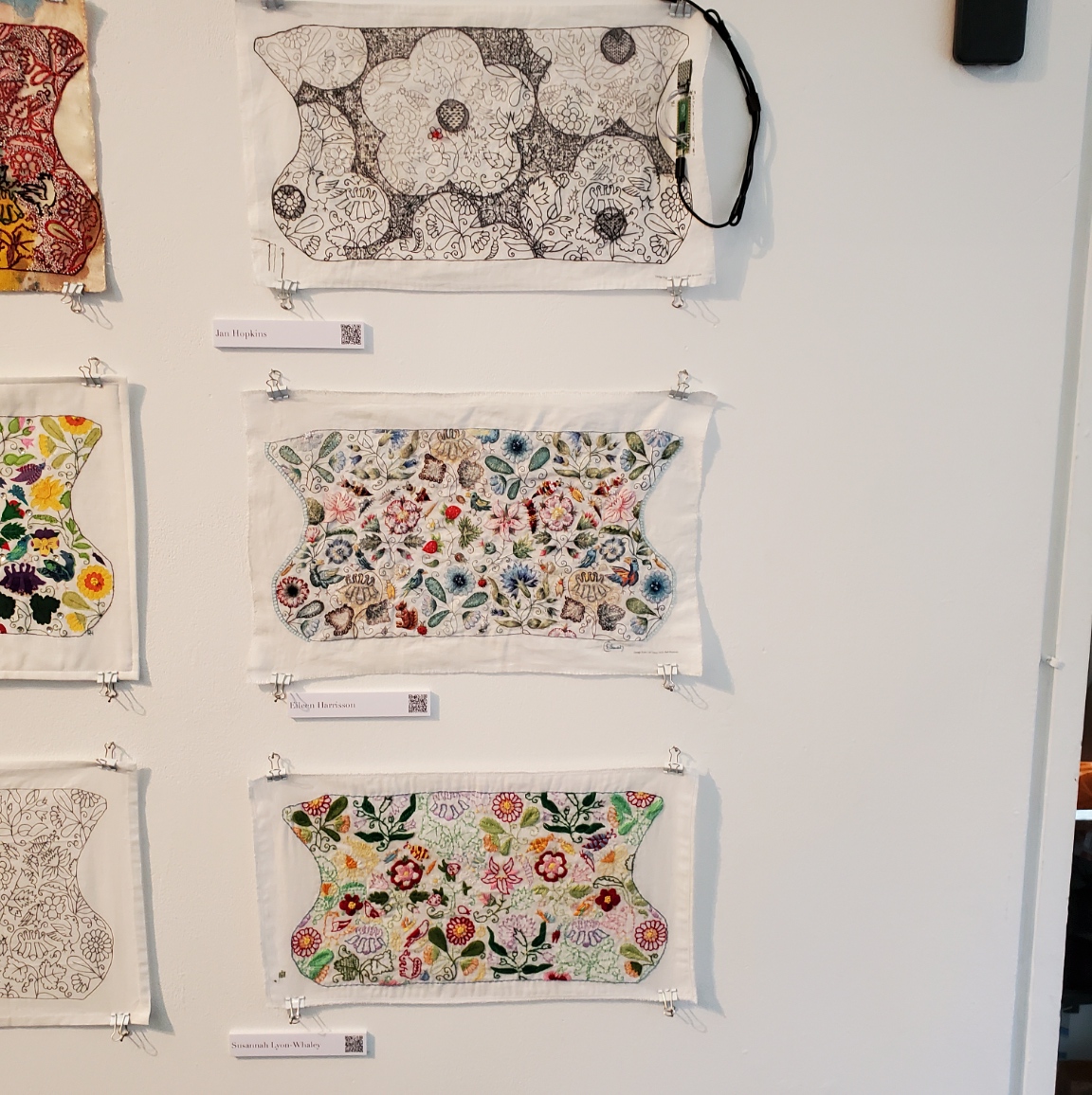

| Duwenavue Sante Johnson Rebecca Harrison-Page Linda Hadden | Jan Hopkins Eileen Harrisson Susannah Lyon-Whaley | Long wall photo to round out the set. |
Coif Replication
As she describes it, Toni Buckby hit upon the idea for the Unstitched Coif project while working on a replication assignment for the Victoria and Albert Museum. They have many pieces of blackwork that are literally eating themselves to death – the tannic black dye used on the silk threads turns them brittle over time. Now, some 400-500 years after they were stitched they are crumbling, leaving only the holes in the ground behind. But these pieces are still sought after for research by visiting enthusiasts/scholars. Toni was commissioned to do a full stitch by stitch reproduction of V&A accession T.12-1948, a well known and popular (although rapidly disintegrating) piece. Her reconstruction is intended for use in educational and outreach efforts because the original is now to fragile to be handled for view.
Toni sourced modern materials as close as possible to those of the original (the 72/74 threads per inch ground is the same one recommended for use on the Unstitched Coif project). She used forensic investigation of the “fossil” piercings and older photos to work out the now crumbled fills and outlines that can no longer be seen on the artifact itself. Her repro is at right.


Other Forensic Analyses and Reproductions
Toni is mapping out another very famous bit of blackwork in the V&A’s collection – the Falkland Pillow Cover, Accession T.81.1924. (In coincidence, this is the piece whose tiny thumbnail photo in Mary Thomas’ Embroidery Book set me off on my own blackwork journey back in the early ’70s). She is using layered drafting methodology to posit the placement and patterning of sections that have now largely disappeared.
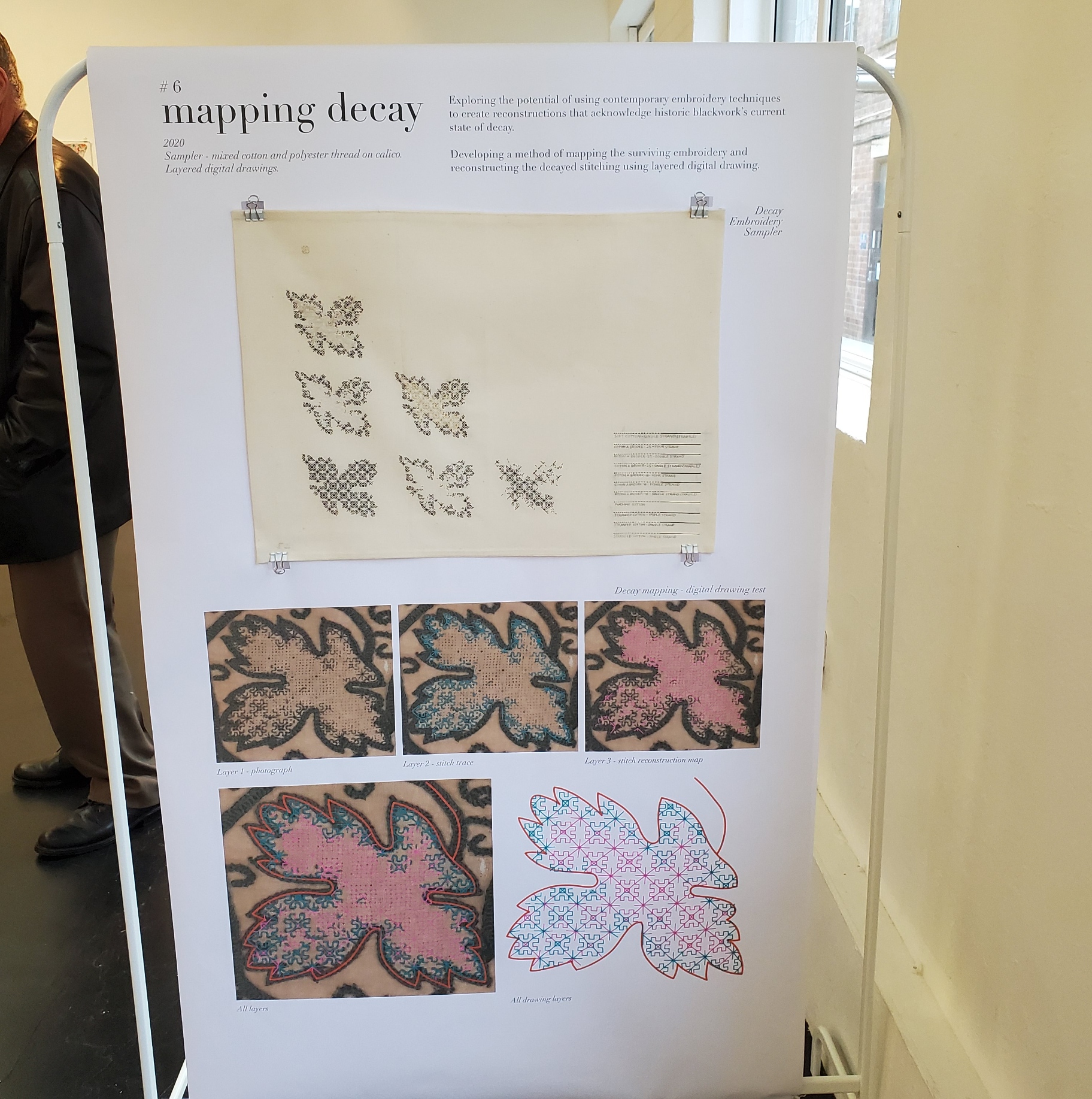

Toni is also in mid-project of an ambitious effort to map the patterns on the three dimensional Falkland Waistcoat , V&A Accession T.80-1924, also a victim of thread degradation, plus other distortions and alterations. The goal of this effort is to chart the 3D design and translate it into flat patterning on garment sections that can be replicated and reassembled into a full reproduction. As you can see, exploring the garment shape by modeling is already underway. (Again, click on the photos to open in a new window, so you can enlarge them to read the text).


There was much more to the exhibit – a series of photos and explanations on materials suitability and choice methodology, and samples of the stitches used. But I’ve gone on long enough.
Suffice it to say that it was total immersion in the subject matter that sings to me, surrounded by people who understand and appreciate the artistry, time, and technique it requires. I met so many people, so talented and so gracious, who took time to chat with me, share their insights, and to mutually giggle in joy of finding others of the like mind. I’ve learned a lot from this project both in my own stitching, and from each and every version displayed here. I am deeply indebted to Toni for pulling the community together, orchestrating the effort, inspiring us along the way, and pointing the way forward, beyond. I do hope that this stitched together fellowship persists, and joins forces on future efforts. I know my needle is sharp and ever ready.
UP CLOSE AND PERSONAL!
Yesterday a friend and I went to the Boston Museum of Fine Arts, in specific to see the “Strong Women in Renaissance Italy” exhibit. We also took in “Fashioned by Sargent”, and wandered at will and whim through other halls, especially those in the new wing. All in all, it was a splendid day out, full of fascinating things to see and discuss, in excellent company. This post focuses on the Strong Women exhibit. I enjoyed the Sargent exhibit, too, but I took fewer photos. If my friend has more than I do, I might do a follow on about it though.
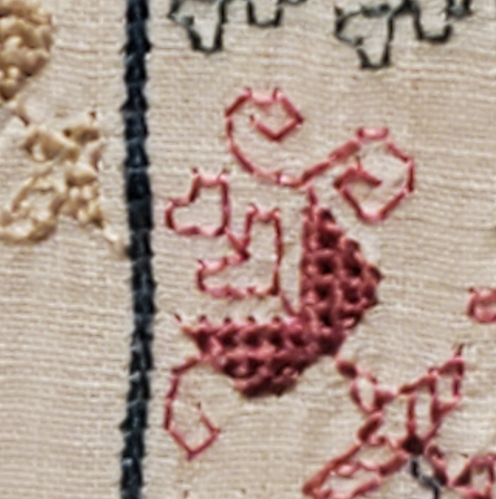
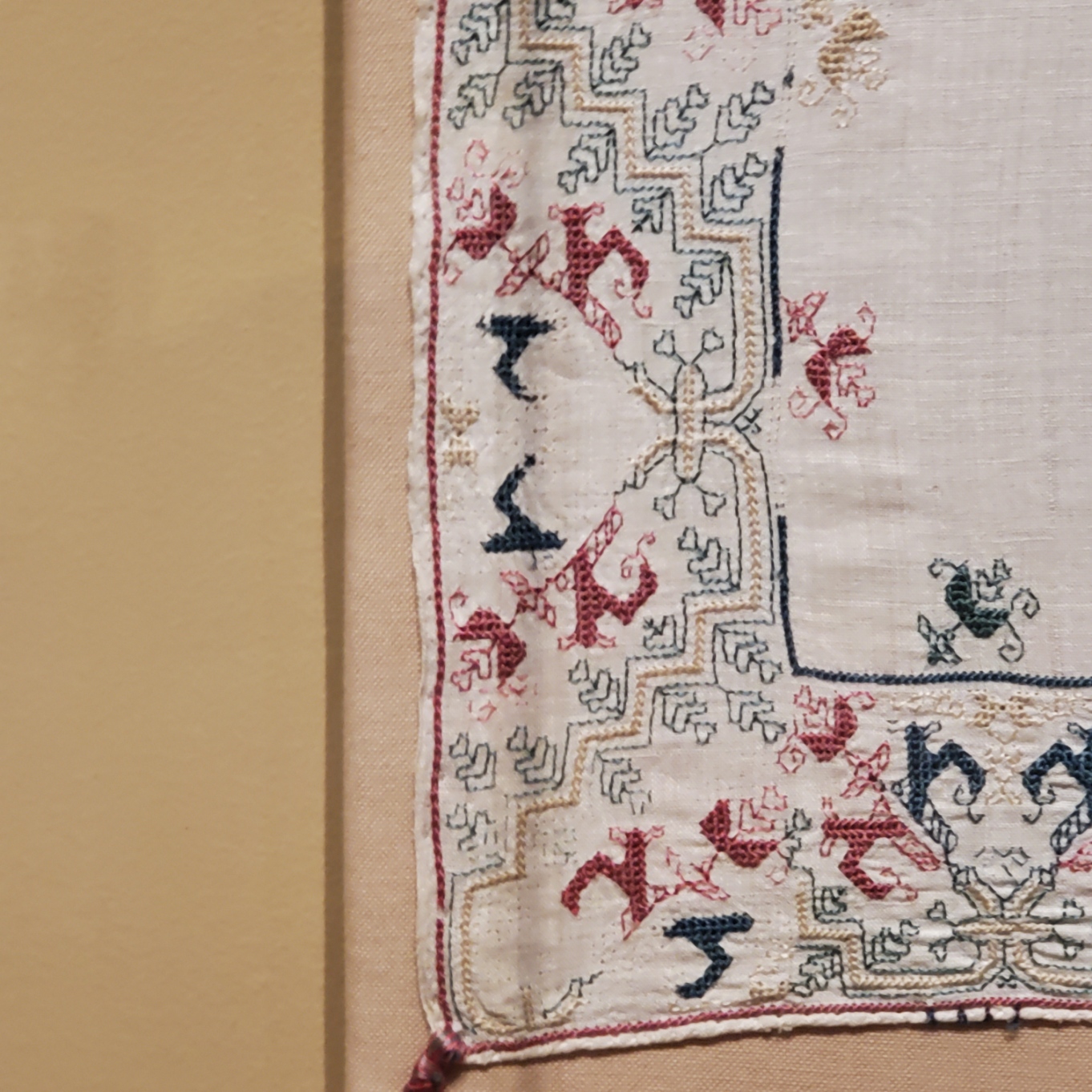
My main motivating reason to go was that the Renaissance exhibit included an artifact I’ve written about before. On loan from the Jewish Museum in New York is Honorata Foa’s red countwork Torah binder. Here is a photo I took at the MFA, of a bit that’s folded under in the official Jewish Museum photo linked above.

And an ultra-closeup. Note that the work is stitched over a grid of 3×3 threads.
Compare the original to my rendition, stitched on a big-as-logs, known thread count of 32 threads per inch, over 2×2 – 16 stitches per inch. Yes, I brought it with me, and photographed it held up to the glass display case.
Given the difference in scale of the two, and allowing for the inch or so of distance between them, a rough eyeball estimate is that the ground for the Foa original is about the equivalent of the 72-ish count linen we all used for the Unstitched Coif project. I also think that the weave on the Foa original is ever so slightly more compressed east-west than it is north-south. making the diagonals a tiny bit more upright than they are on my version. Fascinating stuff!
Now that I see the structure, scale and alignment of the Hebrew letters, I am beginning to think that they were written out and then over stitched, conforming as much as possible to the 3 over 3 rubric, as opposed to the regular countwork of the foliate strapwork above them. For one, they don’t inhabit the same baseline. And they do seem to employ improvised angles and variant stitch lengths, although they were clearly done by someone with a skilled hand who took pains to keep stitch length as uniform as possible over those variant angles. Even so, I may be able to improvise a full alphabet of them, adapting the missing letters from the forms of those that are displayed and known. Another to-do for my ever-growing list…
The Foa Torah Binder was not the only fascinating bit of needlework or textiles on display. On the non-stitched side, there were two long lengths of sumptuous silk velvet brocade, one with a manipulated texture (possibly stamped to create highlights and shadows). What struck me the most was the scale of the patterns. The pomegranate like flower units were as big as turkey platters – far larger even than the legendary motif on the front and center of the famous Eleanor of Toledo portrait:
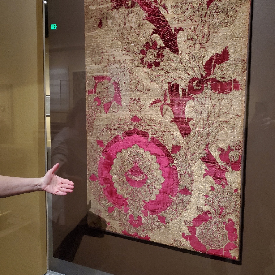

The red one on the left was credited as “Length of Velvet”, from Florence, circa 1450-1500. MFA accession 31.140. The helping hand for scale was provided by my friend. The one of the right is “Length of Velvet”, possibly from Venice, 15th century. MFA accession 58.22. The photo at the museum link is closer to the color (the gallery was dark) and shows off the highlights and shadows impressed into the velvet. Those aren’t two colors, they are the product of some sort of manipulation of the nap. It’s not shorter in the lighter sections, it looks like it’s all the same length, but some just catches the light differently, which is what made me think that it might have been heat/water manipulated with carved blocks. But that’s just the idle speculation of someone who knows nothing about fabric manipulation techniques.
There was another counted piece. It can be difficult to judge the size of these from on line museum photo collections. Even when the dimensions are given, sometimes it just doesn’t input.

Photo above shamelessly borrowed from the museum page, where they describe it as a towel. The object’s name is a purported description of the stitches used. Punto Scritto and Punto a Spina Pesce MFA Accession 83.242, Italian, 16th century. Towel size? Nope. Tablecloth to seat 8 size. Wow.
Here are my photos.
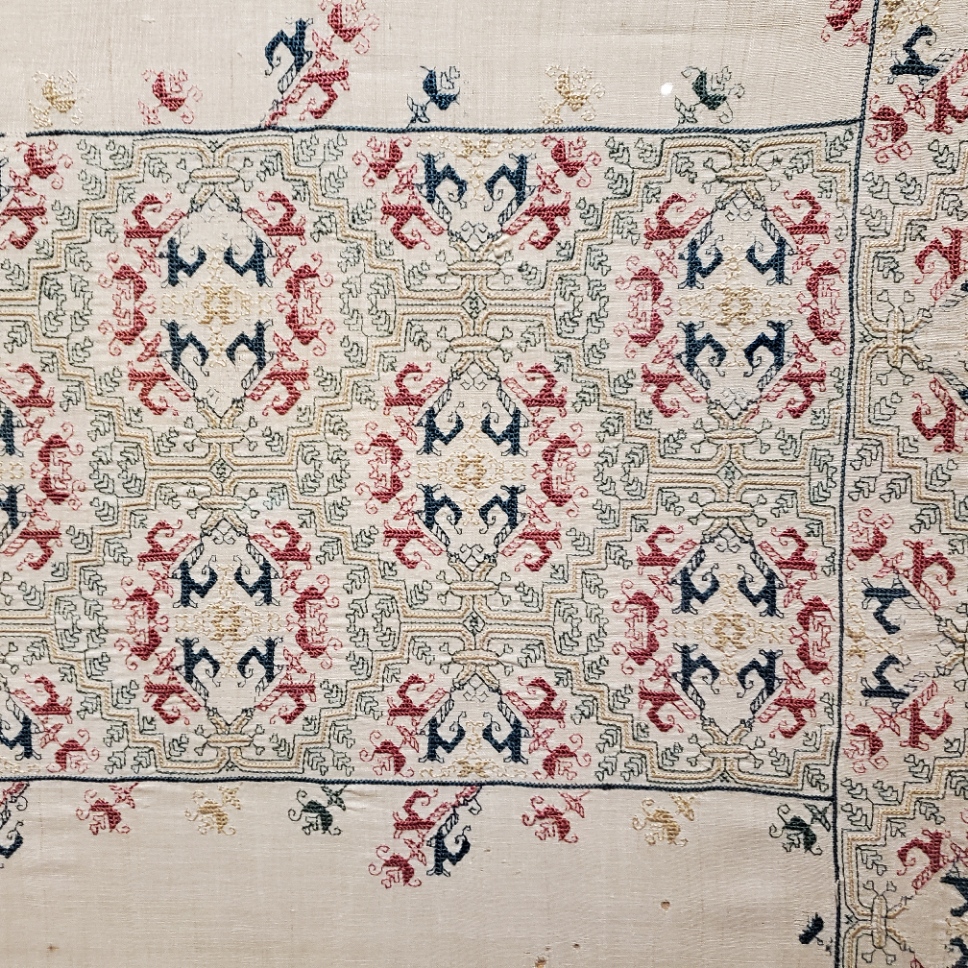

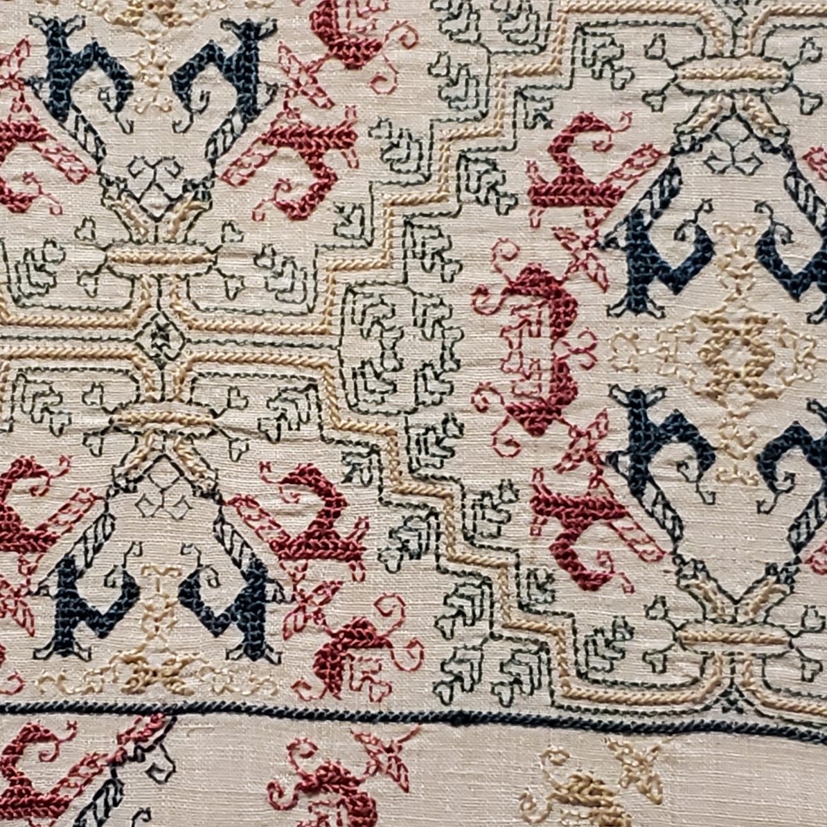


Punto Scritto is another name for double running stitch. That’s ok. Punto a Spina Pesce has been used by the museum to describe some but not all Italian works featuring a variant long armed cross stitch. I think I can see that in the solid, heavier green and yellow lines.
Without having seen the backs, which would clarify this, I suspect that Punto a Spina Pesce (fishbone stitch), is the version of long armed cross stitch that is done by taking stitches with the needle parallel to the direction of stitching as one moves down the row, rather than the one where the needle is held vertically as one works. While the front of both is almost identical, the appearance of the reverse differs, with the horizontal-needle one being formed similar to the way stitches in herringbone are worked. The horizontal method leaves long parallel traces that align with the row-like appearance of the front. If multiple rows are worked this way, there are raised welts in all but the first and last row because the thread on the back is double layered as each consecutive row is added. In the latter there are also parallel lines on the back, but they are perpendicular to the direction of the stitching and overlapping threads on the back are also vertical. As to which one is “correct” – both seem to exist in the folk tradition, so pop some popcorn and sit back to watch the proponents of each fight it out.
A third technique is used. The colored buds are filled in using what I call “Meshy” – the drawn work stitch based on double sided boxed cross stitch that totally covers the ground, and is pulled tightly enough to look like a mesh net of squares. That’s most often employed as a ground stitch in voided work, but it is not uncommon in foreground use, as well. This one is on my charting list, too.
One last thought on this piece – it reminds me a bit of a strip I charted and stitched up a while back, as part of my big blackwork sampler. The source for that one is here, Metropolitan Museum of Art, Accession 79.1.13, Strip, Italian, 16th century but the photo below is of my work.

There were more stitched pieces in the room, but the only other charted one was this adorable chubby unicorn piece in drawn thread. It’s tons of fun to stumble across things I’ve got in my research notes, but never seen in person. This one is MFA’s “Lace”, 16th century Italian, Accession 43.237. Long shot below borrowed from their site.

The museum chose to display this one scrolled, like they did the Torah Binder, so that only a portion was visible. Here are my three shots, left, right, and center.


Yes, there are many ways to achieve this look. But squinting closely one can see that no threads were picked from the work as in withdrawn thread work. There are neat little bundles of three threads where the solid areas meet the mesh ground. (Easier to see in the flesh than in my photo though).

It’s clear that this piece was cut from a larger cloth. I wouldn’t be surprised to find another fragment of it in another museum collection someday. That’s not uncommon. But for now, chubby unicorns, their big quaternary star and attendant scrawny vegetation are also on my to-chart list. But I am curious about the ornament above them.
Now there were lots of other items on display in this exhibit, most of which I’ve seen in the BMFA’s on line photo collection – other stitchery, several modelbooks (all open to needle lace pages), lots of ceramics, and many paintings. Some of which from the “back stacks” – items not on usual display. It was grand to see them out and being admired. I admit I did not download the guided tour and didn’t buy the accompanying $45 book, but while there were lots of women depicted in these massed works, there were very few historical individuals described or shown.
I was hoping to learn more about (for example) what individual female members of the Italian mercantile nobility actually did, beyond being married for political alliances. There were a few portraits, but not much of the story behind the sitters’ identities (if known at all) was presented in the in-room captions. There was a smattering of works by female artists, but the majority of pieces were by men, depicting saints, virtues, and ideals – laudable and arguably strong, but not the personal presence I had hoped for. All in all it was a lovely exhibit, with tons of pieces that were interesting in and of themselves, but as an exhibit showing the power and reach of Renaissance Italian women, it came off more as an assemblage of things from their time, rather than a documentation of their lives, ambitions, and accomplishments.
ANOTHER FOA FAMILY ARTIFACT
A while back I did a long post on a design cluster that appears in Italian work of the 1500s to 1600s. It’s characterized by thin stems, grape leaves, striated flowers, curls, and occasionally, infilling in multiple colors. Here are some examples of the style family, and how they have fared in my hands.
Philadelphia Museum of Art, Accession 1894-30-114.
The museum dates this (a bit improbably) as being 14th century, Italian. I would bet that attribution hasn’t been revisited since acquisition in 1894. Here’s my in-process rendition of it (my own redaction).
There’s also this piece in the collection of the Metropolitan Museum of Art, Accession 51449.71.1.4. The Embroiderer’s Guild has another piece of what may be the same original in their archives. The MET dates this as 16th century, Italian. The photo below is my rendition of this work – my own redaction, in T2CM – the original photo is not as clear.
Finally we have this one. It’s in the Jewish Museum in New York, Accession F-4927. The original bears an embroidered date in the Jewish calendar, so there’s no quibbling with the point of temporal origin. It’s labeled Italy, 1582/83. Again, here’s my workup of my own redaction.

This last piece is a Torah binder, a decorative strap to hold the scroll together in between uses. The bundled scroll and its rollers would have been further protected by a richly embroidered covering, and if the congregation could afford it, adorned with a silver front plate, crown, and reading pointer. Making and/or commissioning such things was both a great good deed and a point of family prestige. In addition to the date, the binder bears the dedication” In honor of the pure Torah, my hand raised an offering, Honorata… wife of… Samuel Foa, it is such a little one.” The museum’s blurb notes that Italian Jewish women often were donors of important textiles and other objects, doing so to commemorate family births or marriages.
When I first wrote about these objects I noted that Honorata Foa might have commissioned the work, or might have done it herself. With so little data available, it would be difficult to make that determination.
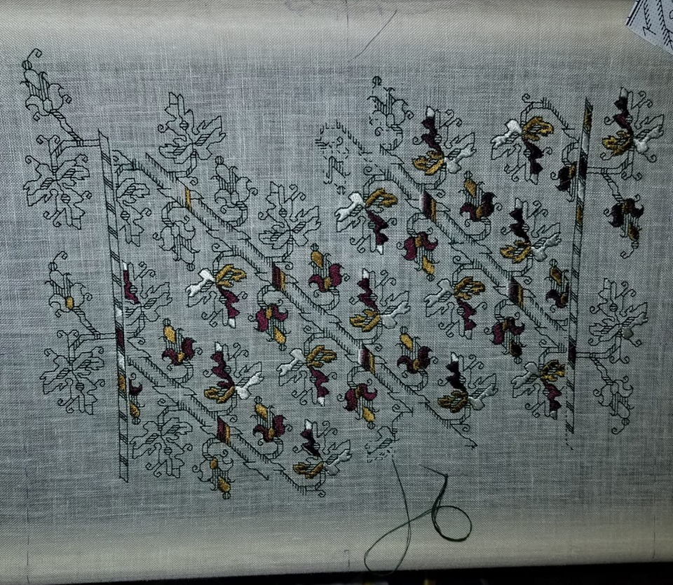
Now however, I’ve stumbled across another stitched item credited to a Foa family matriarch. This one is later. Although it is still a foliate meander, is clearly of a later style, surface embroidery, and not counted. It’s in the MET’s collection, accession 2013.1143. Excerpt of the museum’s photo below.

It too bears an inscription and specific date. The museum blurb translates it as “Miriam, of the House of Foa, took an offering from that which came into her hands; and she gave it to her husband, Avram. The year of peace (5376) to the lover of Torah.” The date equates to 1615/16 on the common calendar. The museum entertains the thought that Miriam might have been the embroiderer, herself.
I was amazed to find two pieces donated by the same family, 33 years apart, showing so strongly the major stylistic shift in stitching that was taking place over that time. I also feel a bit more confident about attributing the earlier piece to Honorata’s hand.
I‘ve found some other material about a Foa family that flourished in Sabbioneta, Italy in the mid to late 1500s, with an extensive business in printing bibles and prayer books. But the only textile work the publisher’s blurb mentions (but doesn’t show) is a tapestry covered bible. I may have to get the book it cites, a family chronicle written by Eleanor Foa, a modern day descendent. I’ve also found a reference to Eugenie Foa, a fiction writer of the 1800s, who wrote about French Jewish life, setting Esther, one of her characters, in an embroidery workshop. But the full text is behind permissions I don’t have (the Google link to the full text mentions Esther in Foa’s work, but the linked blurb does not). Other works that mention the modern Foa family and its scions trace origins back to the publishers of Sabbioneta, but do not mention any link to handwork.
There’s clearly a slew of thesis topics here for someone who wants to take it up: the Foa family and its involvement in the hand embroidery industry of the time. Was the prominent printing family also involved in embroidery, or was it another similarly named/possibly related branch? Was the leafy grape design cluster something from their (posited) workshop? Are there other extant products from or writings by family members? (I’d fair faint away if there was a modelbook of embroidery designs among their archives). Did the family persist in its embroidery vocation over time? If so, how did their products evolve?
As ever research rarely answers more questions than it evokes.
UPDATE: Honorata Foa’s Torah binder will be on display at the Boston Museum of Fine Arts, as part of their Strong Women in Renaissance Italy exhibit, 9 October 2023, through 7 January 2024. Although the museum’s page doesn’t show it, an article in the New York Times offered an in-gallery photo of the piece. Amazing, since I had no idea that this was happening until after I posted this blog entry.
EVEN MORE ON AZEMMOUR
Yet another post only a stitching nerd will love.
Remember a while back, I pulled together some observations on the Azemmour Cluster? That’s a group of embroideries, usually known as fragments rather than whole cushions or other items. Those fragments were among the bits largely collected during the era of the Grand Tour (roughly 1870s up through World War I and on to the 1920s) when monied folk would do a season in Europe, collecting artworks and other items of interest. Needlework and lace collection were among those passions, along with other more traditional forms of art. Those gleaningss eventually landed in museums.
Since needlework fragments are not among the items most highly prized in museum collections, many remained in storage cabinets, with the donor’s provenance notes unchallenged. Or they did until museums began photographing these holdings both for their own use, and to post on line. At that time many of the attributions came under scrutiny, and did not hold up. In the past thirty-plus years I’ve been nosing these up, comparing them and making notes I’ve seen dozens of museum tags specifying stitches, dates, and places of origin change.
Among these collected and sometimes reclassified pieces were items in what some call the Azemmour Cluster. They were scraps sold to unwitting tourist-collectors as genuine late Medieval through Renaissance artifacts. But in actuality it does look like a lot of them, and a lot of the most represented designs in those museum back room cabinets, were produced in Morocco, with many dating to the late 1700s at the earliest, but most were likely made in the 1800s.
To be fair, the designs DO look like they express Renaissance roots. In the post above I even point out a piece that looks like it may be a predecessor. The Moroccan connection was known for some of these. Frieda Lipperheide in Old Italian Patterns for Linen Embroidery does point out that origin for some strips, noting their similarity to Italian designs.
Well, thanks to discussions in the Zoom meetings that are part of the Unstitched Coif project, a significant arguments strengthening the joint Moroccan sojurn of these designs has come to my attention.
Here are two samplers from the Victoria and Albert Museum’s collection. The images are theirs used here under fair use/academic auspices. The multicolor one is Accession T.35-1933, a 19th century piece from Morocco, stitched in silk on linen. Yes, most of the individual fragments of these designs are in monotone, usually red, but occasionally deep indigo, these two samplers with their collections of many designs are happy riots of color.
This black and white photo is also of a multicolor piece (Accession 372-1905), dated from the 1800s, and is also listed as of Moroccan origin.
Both of these pieces contain two of the most common motifs in the cluster. This one is what I call the Spider Flower, for its spindly center blossom.
Here’s the second. I call it Wide Meander. This is found both with the wide strip looking rather sea-monster like with a gaping mouth, and in a tamer form, where the monsters have fused to become a super-wide belt like meander join. Discussions of both Wide Meander and Spider Flower are in my previous Azemmour post. Earlier musings on the Spider flower are here.

But these are not the only ones. The multicolor photo also has these two designs on it that I’ve discussed before.

The one on top is a variant of a pattern that is of Italian provenance. I mention it in this piece, and again in my discussion of voided grounds (under the boxed fill).
The one underneath I call the Pomegranate Meander. It’s clearly related to the Spider Flower, although in this case the ornaments on the joining diagonals are emphasized, rather than the center flower shape. It’s also mentioned in the Azemmour discussion cited earlier.
Plus it’s also worth noting that both of these V&A samplers show lots of variants of the customary accompanying borders so often seen with these main strip designs.
But for me the eye opener was the addition of another design to the group. Both samplers show the wide urn design.

This one I should have tweaked to based on the style of detail in the foreground. But I did graph it up for The Second Carolingian Modelbook based on this example from the Hermitage Museum, and accepted their identification as Italian, 16th to 17th century. Accession T-2714, entitled “Border Embroidered with Bowl and Stylized Plant Motifs” if the link breaks).

Here is my own rendition of this design, as I stitched it on my long green sampler.

Now we have a conundrum. We have many items whose dates and places have been corrected in museum collections. We have a continuing tradition of design replication and pattern re-use in a specific place. We have some predecessor designs and traditions that might have fed the Moroccan styles. And we even have some evidence of the post-Inquisition diaspora spreading these stitching styles TO settlements in Morocco. The Jewish link is cited by The Textile Museum of Canada. The Jewish Virtual Library notes the migration and community. The Jewish link is also mentioned here. The Textile Research Centre writes that production of Azemmour pieces died out in the mid 1900s, although recent revivals have been undertaken.
So where do we draw the line? Are these related items ALL to be reassigned to the Azemmour Cluster, with production dates in the 1700s through 1800s, sold to the unsuspecting as older artifacts? Are some possibly earlier, transitional pieces? Can we rely on just the wealth of ornament in the foreground of these strips to differentiate them from earlier forbearer pieces? Without detailed textile forensics, we may never know. But wherever and whenever their points of origin, it’s nice to see the family reunited again.
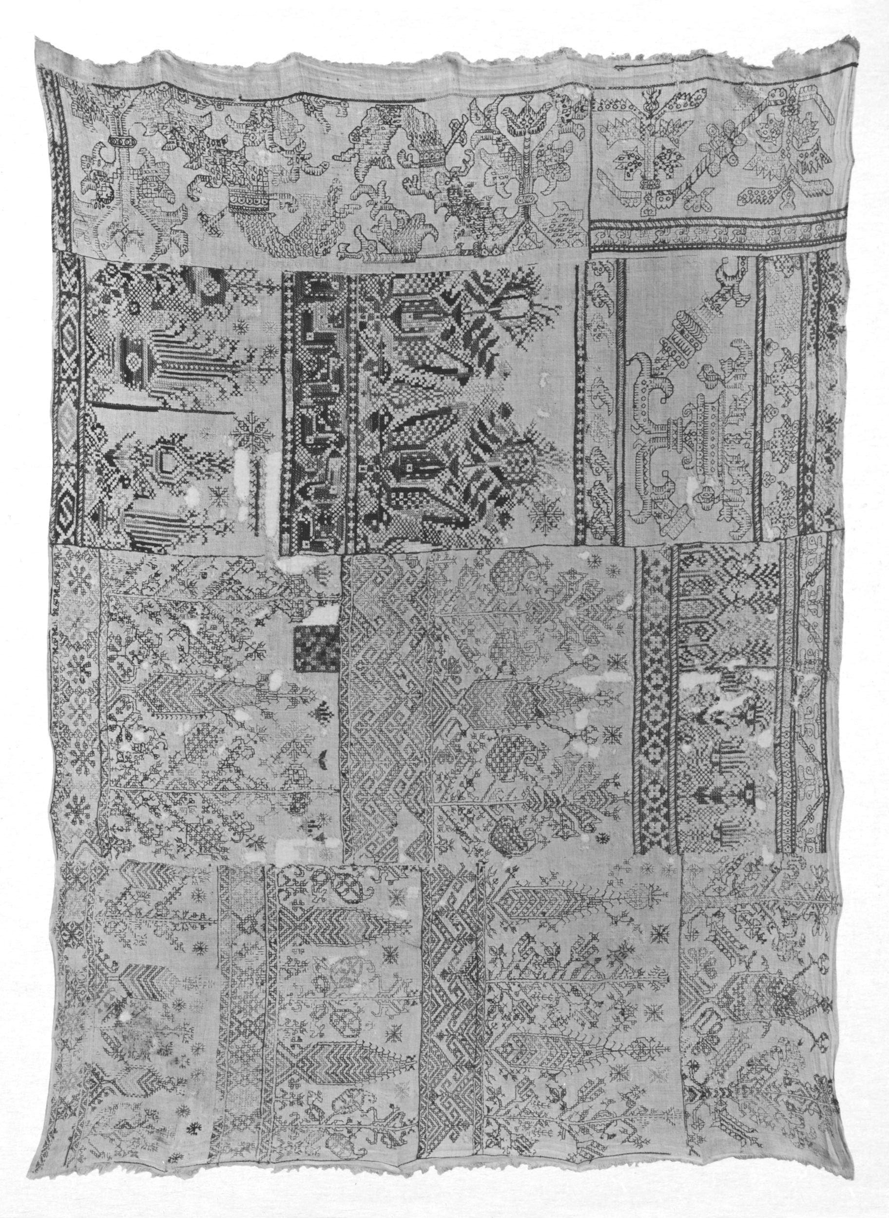
LONG-LOST TWINS, PART VII
Today’s my birthday, and needlework friend Barbara posted a snippet to my Facebook feed of a voided panel showing couples dancing. That bit of fun led to more digging on my part. I knew of similar panels in a couple of places, so I decided to do another of these posts that only a needlework geek could love.
First, here’s the one that was most prominent in my notes. It’s in the collection of the Rhode Island School of Design (RISD), accession 47.199. They attribute it as Italian, circa 1600, and cite both the ground and the stitching as being cotton. I have some doubts about the materials citation, but I’m not an expert and haven’t seen the piece up close and personal. I do note however that it would be one of the two easiest examples of this family to chart.

It’s hard to see, but the ground appears to be in that tightly pulled Meshy stitch I’ve written about before. I do not know if the foreground and outlines are done in double running or back stitch. There’s no other info on working method or object purpose. But I sort of suspect that this might have been part of household decor – possibly a bed valence or decorative cover sheet, remotely possible – a tablecloth, but for that I would expect to see a butted corner, and not the arbitrary unworked bit at the extreme right of the stitching. It is interesting to see the tease that confirms my working method – there’s a tiny bit of the foliage on the “room divider” at the right edge that was outlined, but the voiding wasn’t worked up and around that little bit of outline, leaving it orphaned and alone. More argument for this having been displayed with that selvedge bit tucked away and unseen, as I would expect for the upper hanging around a bed.
In any case, here are some relatives. First a piece from the Boston Museum of Fine Arts, accession 38.1104. They cite it as 16th century, and Italian, worked in red silk on linen. Looks like the Meshy background to me.

You can see that the design is very close, but isn’t spot on exact. There is a different treatment of detail in both the foliage divider and the castle tower divider. The border (if there was one) is also gone, but we can’t judge that in absentia. There are also lots more small bits and bobs surrounding the dancers and the little guy in the RISD sample. The male figure has traded his crowned turban-line hat for a lush head of hair. And the little guy looks to be better dressed. I’d be tempted to call him a page in this version and possibly a cupid or eros figure in the RISD piece, due to the bit of arrow fletching? sticking up over his shoulder. And although I haven’t counted the units, or investigated closely enough to see if the thread count of the two grounds are even, the MFA’s snippet does seem to be a bit compressed north-south, compared to the RISD one. But not uniformly so. The upper bodies appear to be less squished than their lower halves.
And the third – this one from the Cleveland Museum of Art, Accession 1929.840. They note their piece as being done in silk on linen. It’s pretty clear that this one is in Meshy, too.

Based on very strong similarity between this piece and the MFA holding, I suspect these might have been true siblings, pieces from the same original, cut apart and sold to two separate collectors, which then ended up in two different museum collections. In fact if you compare the right edge of the MFA piece, and the left edge of this one we can see a bifurcated page boy – it is pretty likely that we are looking at the exact snip line where they were separated. As an aside, I like the little unfinished bit underneath the lower left leaf of the foliage divider, at the left edge of the piece. Again, confirmation that outlines were laid down first, then the background was worked.
This one is in the Metropolitan Museum of Art in New York City, accession 47.40. They call it “Border” and cite it as being Italian, and 17th century, worked in silk on linen.

Their original photo is a bit fuzzy, but it’s pretty clear that this piece is possibly another section of the same original that furnished the RISD snippet. Not only are the borders and proportions intact, but the small details of crown/hat, arrow, interior detail on the dividing motifs, and even the dress border of the woman dancer is identical.
And to wrap up, I have one more snippet in my notes. This is also from the MET collection, accession 07.62.58. They cite it as Italian or Greek, 17th century, and note that it’s silk on linen. They rightly describe the meshy ground as drawnwork.

By now you should be familiar with the details of this design. Yes – it looks closer to the CMA and MFA snippets than it does to the RISD and the other MET holding. But there are some subtle differences. The ground line is most obvious. In the other two non-bordered bits of this variant, the stitchers have taken more pains to keep a stable bottom edge of the stitching. That’s not to say there aren’t deviations from that on both pieces, but on this one is is far more evident. There are also some other minor differences in detail on the dividers and on the dancers’ outfits. Now I suspect that it was not uncommon for a very large project like a set of bed hangings to be worked by multiple stitchers. Even if a master laid down the outlines and had a crew working “clean-up” behind, filling in background and detail, a large team working quickly might make these minor copyist errors. I don’t think that there is enough difference here to clearly claim that this has no chance of being a piece of the same original as the CMA and MFA fragments.
So to sum up, I do think that two original artifacts furnished all of these bits. And I would go further to posit that the unbordered one might have even been unfinished prior to its dismemberment. I thank the collectors of the “Indiana Jones” era for heading off on their Grand Tours, and bringing back these pieces. I thank the museums for hanging onto these rarely studied snippets, and for posting photos of them on line, so we can speculate about their origin. And I thank Barbara for flagging the dancers for my birthday.
I return you now to regularly scheduled, non-boring Internet content. 🙂
UNUSUAL FIND AND POSSIBLE USE
Sometimes it feels like everything I see is fraught with stitching purpose.
Yesterday Younger Spawn and I went to the local Burlington, MA H-Mart, for a general restock of kimchi, various sauces, and condiments since the options in Troy, NY for such things are less abundant and can pose a logistic challenge in an area with so little public transportation.
While we were shopping we wandered the housewares aisle. I’ve found all sorts of useful stuff in there, including the hand sickle we use to keep our giant grass in check. This time was no different.
I stumbled across a display of small mesh cloths of various sizes. If it is to be believed, Google Translate tells me this stuff is called Isambe Bozagi or Bojagi (various transliteration/translation platforms render it differently), and then translate it variously to hemp cloth (middle), and burlap (Chinese). But it’s clearly marked as cotton, and of domestic Korean manufacture.


Product information says that it’s about 33 x 34 cm and hemmed. That it’s food-safe, essential for steaming (especially dumplings, and sweet potatoes), can be used to cover food in the summer, and is used to strain soy products (possibly making tofu), and soups. It also says to wash separately and dry thoroughly before use.
All well and good. I do steam things on occasion and it might come in handy. But what caught my eye was the weave. I think it’s sideways in my penny photo, but note the doubled thread in one direction (probably the weft). That’s not unlike the woven ground used for Buratto embroidery – a stitched and darned form popular in the 16th and 17th centuries, stretching on to the 18th century. It’s a cousin to other better known darned mesh works done on knotted netting grounds or on withdrawn thread scaffoldings, but in Buratto’s case the ground was purpose woven as a mesh.
Here’s a bit in the Metropolitan Museum’s collection (Accession 076261 in case the link breaks) – 16th century, Italian. The ground is linen, not cotton, and the stitching is silk. The piece is about 13×4 inches (33×10 cm).

My Korean kitchen cloth’s mesh count is roughly 16.5 x 15 meshes per inch. Just a little bit finer than this, which is about 14 meshes per inch (counting height of the snippet and dividing by 4). And although it’s hard to make out, the structure can be seen in this ultra close-up.

There are places you can find buratto style grounds to stitch. Those resources are usually quite a bit more expensive. If you happen to have an H-Mart in your area (and they are a national chain here in the US, with more popping up every year), you may be able to luck into this wildly inexpensive cloth. It’s not perfect, but at the price it’s a wonderful tool for experimentation. I’m penciling playing with this stuff into my dance card, probably for some time next year, and may go back and get more.
Bonus Eye Candy and Background
Just for fun, here are some more examples so you can see the breadth of expression of this stitching family. There is a lot of variety in works done on buratto. Monochrome was common. Polychrome was common. Dyed grounds were common. Geometrics and florals were both common. Also the style went through several revivals, and was particularly prized during the “Indiana Jones” era of textile collecting. Many museums collections are based around those gleanings, and haven’t been revisited since their donation before WWI. As a result, many attributions are a bit “mushy” – there are certainly revival pieces marked as pre-1700s originals, and even the real experts (of which I am not one) have problems determining age without extensive forensic testing.

The one above is also Italian, 16th-17th century, and is in the collection of the Cooper-Hewitt Museum, accession 1971-50.198. No information on the museum’s page though as to size or scale.

The one above looks to have an indigo-dyed ground, stitched in white. Italian, 16th century, from the Met’s collection, accession 08.180.448. This one is about 3.75 inches tall, which makes its scale very close to the 14 meshes per inch of the Korean steaming cloth.

And a wild multicolor one 17th century Italian, also from the Met, accession 12.9.3. Many of these pieces just said “embroidered on net” or were lumped in with lacis, but lately there has been a move to divide those done on true knotted net (lacis) from those done on woven buratto fabric. The on-line descriptions are slowly being updated accordingly.
Although I can’t declare for certain, looking at the dates of the more elaborate, especially the ones with patterned infills, the style appears to have evolved in that direction over time. Here is a piece typical of that group. This 18th century piece is another gem of the Met, accession 12.8.3 in case the link breaks. But do note that multicolor is documented back to the 1500s.

And here are some links on the history of the style; some discussing its link to early modelbooks. Buratto was one of the stitching styles specifically named in modelbook prefaces as a suitable art for the designs they presented.
So there we are. A chance encounter in the housewares aisle turned into a rabbit hole of exploding possibilities. Good thing I’m retired. I might actually find the time to dance with all of these charming partners lined up on my card. 🙂
MORE COUSINS
Just because I’ve taken a departure from classic stitching and am issuing heretical blackwork patterns for spaceships, robots, and dinosaurs doesn’t mean I haven’t abandoned research. I am also inching The Second Carolingian Modelbook (T2CM) closer to the goal posts.
I continue to find multiple instances of design duplicates scattered across various museums. Here’s a trio. Clearly stitched from the same inspiring pattern. Whether it’s from an as yet unidentified modelbook or broadside sheet, an atelier’s cloth reference sample, or just copied among stitchers hand to hand is impossible to determine. However, this design will be included in T2CM so stitchers of the future can keep this historical “chain letter” going..
First, my own stab at the thing, as worked on my big blackwork sampler. I call it “Leafy-Bricks” for obvious reasons.

The first instance of Leafy-Bricks I stumbled across is in the Boston Museum of Fine Arts, Accession #07.816. It’s a small fragment, but it’s the one on which I based my redaction. They tentatively identify it as likely to be Italian, but do not date it. This snippet was collected in the very late 1800s/first decade of the 1900s during the “Indiana Jones” era of embroidery and lace sample acquisition – the time in which monied families took a season touring Europe, vying with each other to bring back the most exquisite samples of whatever struck their fancy. These collections were eventually donated to major museums to form the backbone of their historical embroidery holdings. The time/place provenances furnished by dealers or middlemen and conveyed with these pieces upon donation are not necessarily to be trusted. Many museums are now revisiting these pieces to correct annotations that haven’t changed in 75+ years.
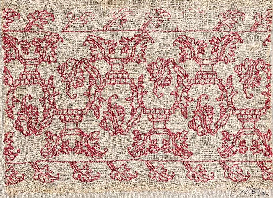
One interesting thing to note is that the count of the historical ground above is not as square as the count of my modern linen. The design is somewhat squashed left to right and elongated north-south compared to mine, although the unit counts are the same.
The second one is in the collection of the Metropolitan Museum of Art, Accession 09.50.55. Unlike many duplications among museums it’s not an instance of one original artifact having been cut apart for sale to multiple buyers. Not only is the center panel duplicated here, there are also subtle differences in the design, especially in the border. The Met only shows this in black and white and does not provide information on the color used. They date it to the 1600s, and attribute it to Italy.
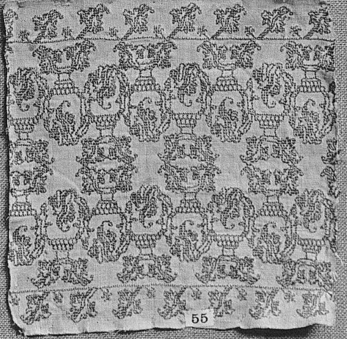
And third, which I only stumbled upon today. This one appears to be a photo only recently released by the Victoria and Albert Museum, Accession 645-1896. Be still my heart, it shows the design on fragments that were pieced into a wearable apron, providing a use case beyond what can be known from a simple fragment. The V&A also notes that the apron was composed from previously stitched fragments. They label the assembled wearable as 1630-1660, Italian, but it’s unknown what life the embroidered strips had before that usage. Best of all, among their images is one that shows the back. Yup. Double running stitch. And yes, I know they see vases in the composition, but my mind is stuck on describing the center bits as bricks.

Note the stretch across the bottom, seamed together from two distinct fragments. And the butted corner formed by a third, although butted corner treatments are more commonly represented in survivals than are pieces with carefully planned mitered or otherwise customized corners. As far as the design’s manifestation on the apron, it’s very, very close to that on the MFA’s fragment. But it’s not identical. There are small differences in the veining pattern of the main repeat’s leaves which lead me to believe it’s a fragment of another original, and not a leftover from whatever item was repurposed into the apron.
If you’ve spotted other instances of Leafy-Bricks out in the wild or have seen it in a modelbook of the 1500s to 1600s, please let me know.
Oh. And if you are interested in obtaining a copy of The New Carolingian Modelbook (my first and now out of print book), I know it’s hard to find. I don’t have any to sell myself, but on rare occasion someone finds a copy and sends it to me. Just such a copy recently came into my hands. I have sent it on to a charitable auction to benefit the SCA Barony Concordia of the Snows, which recently lost all of its communally held equipment in a devastating fire. That auction will be held on 28 August at East Kingdom Coronation. I do not know if the auction will be web-accessible. If I find out I will update this post accordingly.
STUMPWORK PEN DRAWING
A while back I posted about a drawing that came to me from my grandparents. It hung in their dining room/library. As a kid I adored it and since it was hanging so far up on the wall, was especially delighted after I finally got glasses, and discovered all the details – the flowers, bugs, and little goodies hidden in the piece.
I am convinced that my drawing is a rendering of an actual artifact. The sketch probably dates to the 1920s or 1930s at the latest. The artifact itself is clearly a stumpwork piece of some type – a style dating to the 17th century. Possibly a mirror, possibly a bookbinding. Possibly a combo of motifs from more than one piece. But I don’t think it was just dreamed up by the artist.
I’ve gone looking for the thing several times. I’ve hunted in on-line photo collections and books cataloging famous embroidery collections. I’ve paid special attention to items in New York City area museums because I have a hunch that “art student selling on the street” was more in my Brooklyn dwelling grandparents’ budget than was purchasing from a gallery. And an art student might well have sketched something seen on display in a local museum.
I even read about a collection of stumpwork pieces being acquired by the Brooklyn Museum in the 1920s, so I wrote to the curators and asked if it was still in accession, and if anyone dealing with it might recognize my piece. Sadly, not. But they were very gracious and wished me luck in my hunt.
Recently I was part of an on-line discussion among historical needlework enthusiasts, and posted my (not very good) photo. Several folks there requested higher resolution pix. So in the hope that I can enlist others in my hunt, or provide inspiration to someone wanting to stitch their own stumpwork frame, I post some here.

Bottom center – note the shark-like fish, and detail that looks very much like the artist was trying to depict actual stitching. Hills with an ocean or lake in front are very common center bottom treatments on mirror frames.
Lower left corner – the pony, plus a dove(?), a snake, and a centipede. And flowers. There are always flowers.
Lower right corner – the camel, and a beetle. That hump looks like turkey work to me. Also what might be a partial signature at the left of this detail shot – a little roundel that might be CCS or HS, or HCS.
Upper left corner – the leopard, with a caterpillar a bird, and a worm. Leopards (and lions) are common corner residents.

Upper right corner – the moose-nosed stag, with the worm and a two small snails. (Hmm… Maybe this is why I often include snails in my own work.) Stags show up often on similar pieces, too.

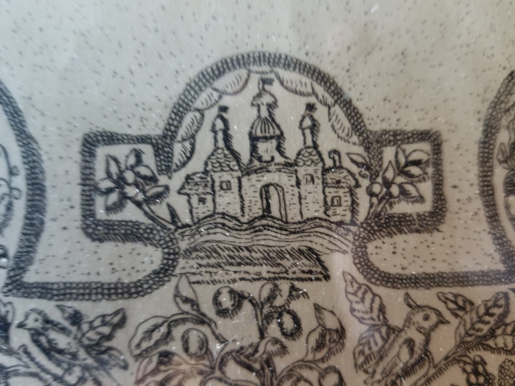
Center top – buildings, plus fruits and birds, below. Buildings, perhaps visions of Jerusalem or the city of heaven are also a standard feature of stumpwork mirror frames.
Left edge – Now this is where it gets complicated. On mirror frames there is often a couple – a king on one side and a queen on the other. Family folklore (with or without any reason) claims that in this drawing the center figure, a queen, is in fact Queen Esther, and this guy on the edge with the wide collar is King Ahasuerus. Whoever he is, he has bugs, a bird and a bunny to keep him company.
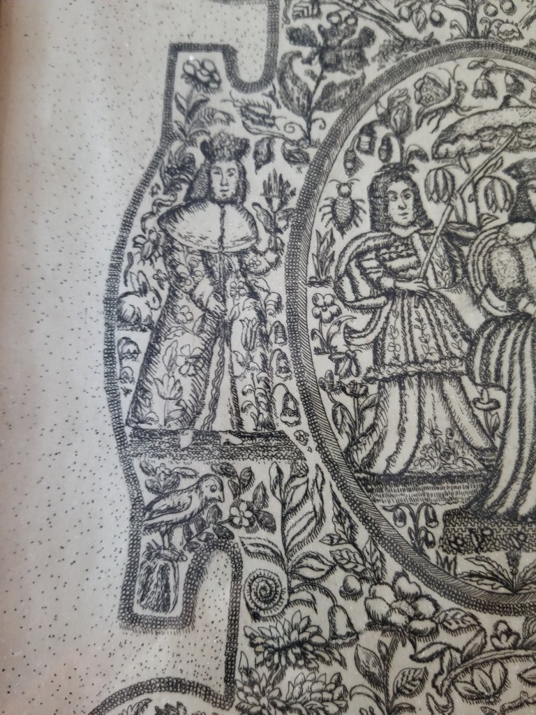
Right edge – If the Esther interpretation is correct, this would have to be Mordecai. Not quite as sumptuously robed as the King, but escorted by a bird, grapes, and another caterpillar. (Haman, being the bad guy gets no depiction.)

Center – Finally we get to Queen Esther and her attendant. And her own bunny, worm, and bugs, plus even more lovely flowers. From what I’ve seen it’s unusual for just a queen to be shown alone in these English stumpwork pieces – more often a couple was shown, usually in homage to the sitting monarchs.
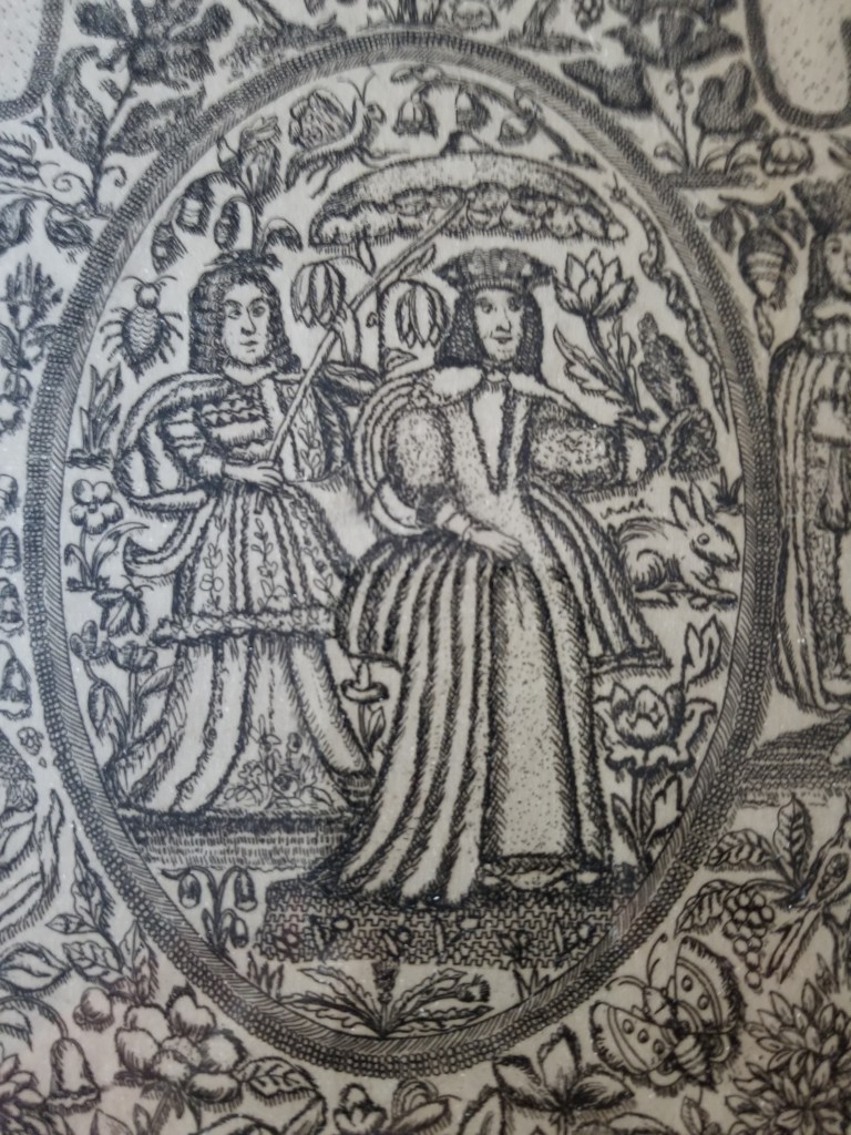
So there we have it. If you look closely at these pix you can begin to see stitch detail – a raised braided stitch of some type as the heavy outline, the mentioned turkey work on the hump of the camel, a three-D thrust on the parasol, satin stitch and shading on some of the flowers and fruits (either to indicate depth or stitches – I can’t tell).
So now the APB is truly issued. Seen these characters, or pieces like this one? Let me know. If the link is accessible, I’ll post it here.
Adapting one of these pix for your own raised work piece? Let me know! I’d be happy to post that, too. (I think the corner animals in particular would make lovely tops for small, round boxes).
Museum Examples
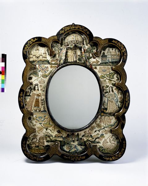
Metropolitan Museum, Mirror Frame, Third quarter 17th century, British. Accession 64.101.1332: Leopard at lower right, pond or sea with fish at bottom, couple left and right.
Victoria & Albert Museum, Mirror Frame, 1660-1680, British. Accession 351-1866. Lion and unicorn in lower corners, couple at left and right, pond with mountains and fish at bottom.
Drawing presented on Lizapalooza/Elizabethancostume.net’s blog (photo borrowed from that site, I hope they forgive me).

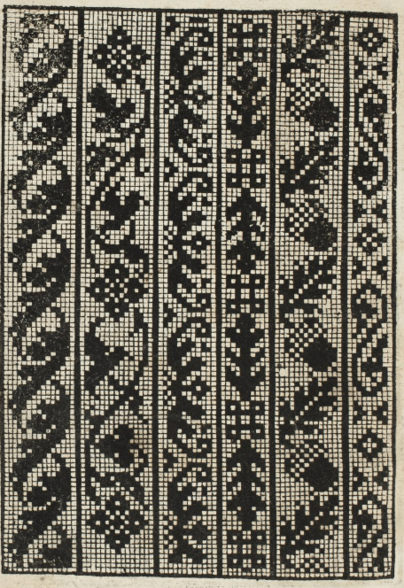
MODELBOOK BLOCKS: ACORNS AND CHICKENS
Long time SCA friend/needlework penpal and costuming/stitch research role model Kathryn Goodwyn recently began posting her transcriptions of charted modelbook pages she’s collected over the years. She’s in the middle of a series from Matteo Pagan’s L’Honesto Essampio del Uertuoso Desiderio che hano le done di nobil ingegno, circa lo imparare i punti tagliati a fogliami, published in 1550, in Venice.
This is her chart of one of the pages, presented here with her express permission:
In her post to the Historic Hand Embroidery group on Facebook, Kathryn noted that in the original, there was something odd with the acorn panel – that the count inside the frame didn’t match that of the other strips that accompanied it. Lively discussion ensued. Some people opined that the strips were all cut on individual blocks, assembled into a page at the time of printing, and pointed to the large number of designs that appear in multiple books over time, put out by different publishers.
I agree that there was lively trade and outright reproduction (authorized or not) in early pattern books. There are many instances of designs appearing either verbatim (probably printed from the same blocks), and being re-carved with introduced errors and minute differences. And it makes perfect sense that in the high precision work of block production, carving separate strips would be more forgiving of errors. If a chisel slips, only one design would be spoiled – not the entire page.
However in this particular instance, I think that this piece was carved as a single, integral block. And the skew count for Acorns was a kludge, done when the carver realized that the design would merge into the border of the block and took pains to nibble one last partial-width narrow blank row from the wide border, to separate the leaf from it.
I have found two (possibly three) renditions of this page, all from various extant Pagano volumes.
From the L’Honesto volume (1550) held by the Sterling and France Clark Art Institute Library, available on Archive.Org:
Sadly the edition of L’Honesto in the Gallica collection in France (dated 1553) does not contain this page, but modelbooks were probably issued as folios rather than bound volumes (buyers later paid to have them bound, and decades could have elapsed before that happened), experienced hard wear, and it’s not unlikely that this one is only partial.
The plate however shows up again in a composed edition of Pagano’s later work, La Gloria et L’Honore di Point Tagliati, E Ponti In Aere (1556) now in the collection of the Metropolitan Museum in New York (Accession 21.59.1). There is some confusion in the museum’s presentation – it’s not clear if this page is included once or twice. There are two images of it each tagged with a different page number, plus one image with no page number tag. On all three the facing pages are identical, as are tiny print imperfections on the pictured plate; which leads me to suspect that (gasp) there is a mistake somewhere in the museum’s on-line listings:
- The link for the first image below.
- Link for the second image below.
- Link for the third image below.


I have found this plate and its constituent strips ONLY in these images. I have not found the plate as a whole in another work, nor have I found these exact strips (identifying mistakes and all) replicated in combo with other strips in other Pagano works, or in issues by Vavassore (a close associate).
However other designs do appear to wander. Or do they…..
I’ve noted a couple of these before – but those tended to be full page designs. How about clear instances where a page of designs was created from constituent individual blocks, and those specific blocks can be spotted in different compositions/pages?
It’s surprisingly difficult to find evidence of independent re-use of identifiable single-strip or single motif blocks. Even for a very recognizable and common design that at first glance looks like a single block that wandered among several pages.
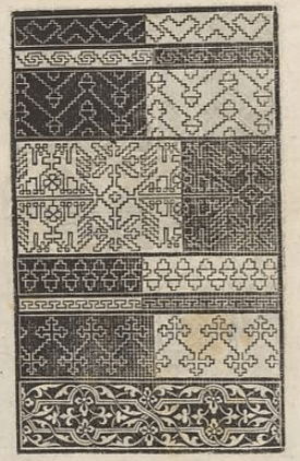
Here’s a well represented one. The Chicken Page. (My own shorthand name for it, nothing actually official.) This design shows up again and again, and persists over the ages in folk embroidery styles of Sicily, the Greek Islands, and up through Eastern Europe and into Russia. It’s meant to be rendered in double running (or back stitch) and in modelbooks often appears with other designs of similar technique on the same page. For a very long time I thought there was only one chicken. But not so.
The copy on the left below is the chicken page from Quentell’s Ein New kunstlich Modelbuch, Cologne, 1541. (I normed these pages to the same orientation for easier comparison.) The middle copy is from Ein new kunslich Modelbuch dair yn meir dan Sechunderet figurenn monster… published in 1536 in Koln, by Anton Woensam. It’s also in Ein new kuntslich Modelbuoch…,attributed to Hermann Guifferich, with a hard date of 1545 (the same page is also in his Modelbuch new aller art nehens und stickens, from 1553). On the right is an example from the composed volume La fleur des patrons de lingerie – an omnibus volume that contains four different modelbook editions bound together. While the archive lists 1515 as the publication for La fleur, that’s not correct.


Some more. At left is the Chicken Page from Zoppino’s Ensamplario di Lavori of 1530, in the version cleaned up and presented as Volume I of Kathryn’s Flowers of the the Needle collection. On the right is another imprint of the same exact block or set of blocks, from Pagano’s Trionfo di Virtu, of 1563.

Obviously the second set of chicken images was printed from exactly the same full page block, in spite of being both the earliest and the latest example in our total set. There are no deviations, and all copyist’s errors are the same, left and right for every strip. However they are also clearly not printed from the same blocks others. Most obviously, the chicken repeat in the set of two doesn’t begin or end at the same point as it does in the first set of three.
But I don’t think all three chicken panels in the first set came from the same nest either. There are too many differences between the first shown panel and the other two next to it. Not just partial lines where ink may not have reached during the print, but actual deviations in the carving:
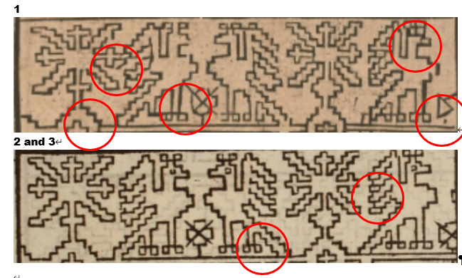
The other strips on the leftmost example of the three also deviate from the other two examples in its set, elongated stitches represented, different numbers of counts in comparable stepwise sections and the like.
My conclusion from this flock of chickens is our bird motif was carved three times. One imprint appears in Quentell [Chix1]. A second is in Woensam/Guifferich/[La fleur] [Chix2]. And a third appears in Zoppino/Pagano [Chix3].
Our timeline is now something like:
- 1530 – Zoppino – Chix3
- 1536 – Woensam – Chix2
- 1541 – Quentel – Chix1
- 1545 – Guifferich – Chix2
- 1553 – Guifferich – Chix2
- 1567 – Pagano – Chix3
What we are NOT seeing in this ONE particular case is that the chicken motif although quite prevalent and highly mobile was NOT being re-used as a single block, in combination with assorted blocks to make unique pages. Instead it appears with its established companion set – verbatim. And in the instances where it looks like it might be nesting with new friends, it is in fact an entirely different carving – a totally different chicken.
Finally, I am not sure why the positive/negative presentation is so prevalent for this particular style of block. My guess is because the dark lines/light ground carving was fragile and more time-consuming to produce than the dark ground white lines areas. Perhaps the dark areas were an economy measure, or their presence strengthened the block as a whole so that it lasted longer or warped less (dark/light areas on these blocks tend to alternate left/right).
Apologies for the length of this post. If folk remain interested I’ll look at the peregrinations of other specific designs.
