I’ve gotten some recent feedback about the way I chart my designs – both positive and negative. However, the oddest feedback was from a couple of people who couldn’t put their finger on what I was doing different, or why. I attempt to explain
First off, I thank long-time Needlework Pal Kathryn for letting me use a snippet of her recently released redaction of a Lipperheide design. Because this design is so difficult to work out, I am using her stellar rendition as a “poster child” for a complex design drafted out using standard tools. Kathryn uses Pattern Maker by Hobbyware to chart. It produces a standard grid, and is largely intended for cross stitch. But with a a bit of work its outlining feature can be used to depict linear stitching (back stitch or double running). With even more tweaking those outlines can be made thicker so they read better against the background grid. Here’s a snippet from a chart she recently released.

In the chart above, each little gridded square represents one “unit” for the stitcher. That unit is most properly worked as a single stitch, and depending on the chosen ground cloth can cover one prominent square of Aida or Monk’s cloth, or a count of anywhere from one to four threads of an evenweave (or near evenweave) simple tabby ground. Work over 2×2 threads of evenweave is the most common.
By contrast, here’s the same snippet, more or less, in my own drafting method:

In my method, instead of showing the background grid, I show dots – the “holes” of the ground cloth. If one is working with Aida or Monks Cloth, each hole corresponds to a hole on the fabric. If working with evenweave, the dots represent the spots where a needle would plunge (every 2×2 threads, 3×3 threads, whatever the stitcher chooses to work). I eliminate the grid entirely. The lines that make up the pattern are broken into direct representations of the individual stitches to be taken. I also have the option of flood-filling the background to indicate an area to be overstitched if a voided effect is desired, without obscuring the “counting dots” of the ground (the grey area on the left).
Quick aside: Here are the three types of grounds, but the samples are not to scale since Monks Cloth usually has fewer stitches per inch or cm than does Aida. Note though that both purpose-woven grounds have very prominent holes, and on each stitches are generally worked over 1×1 unit. Evenweave by contrast is undifferentiated, and stitches can be taken over any number of threads.
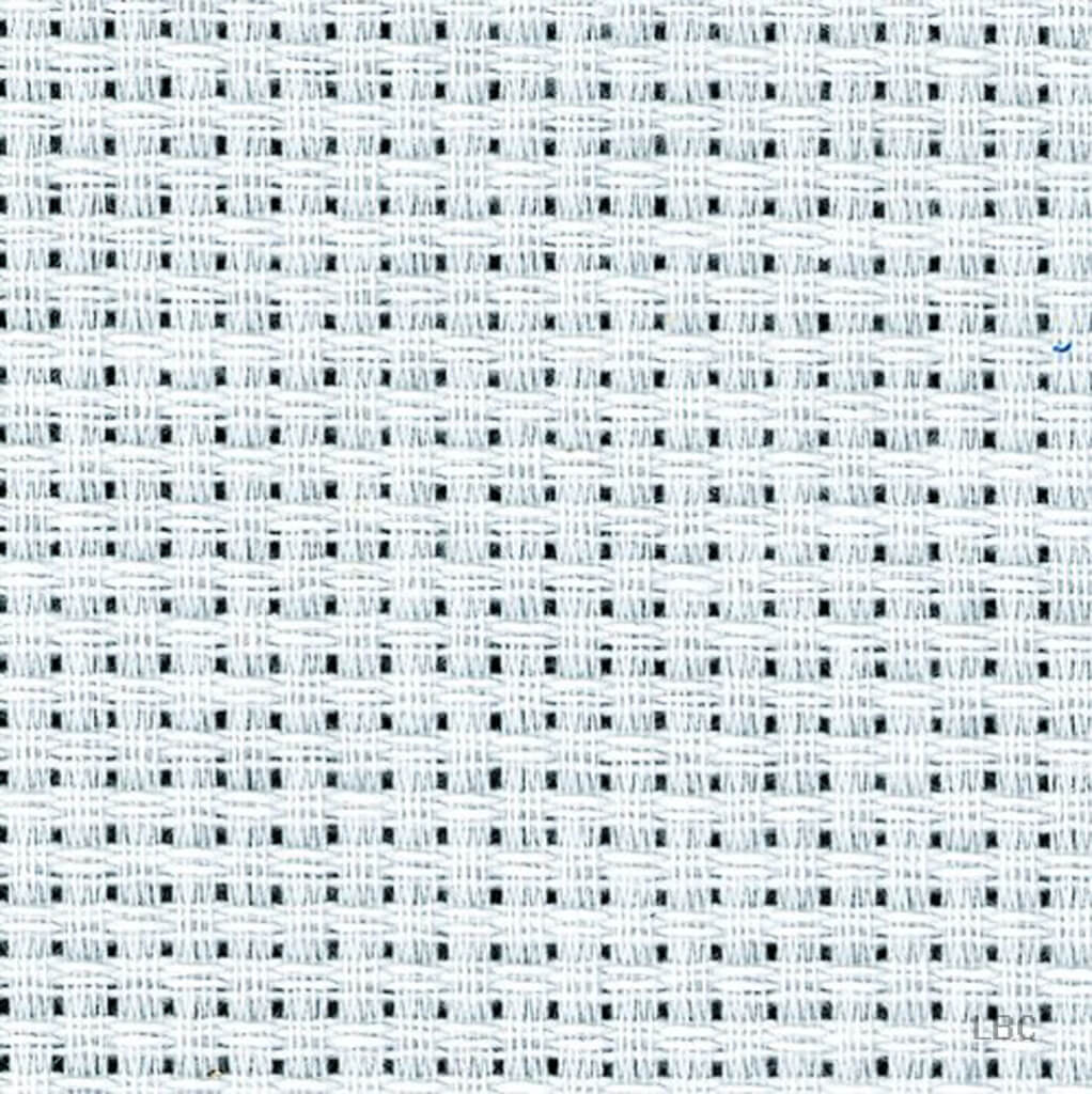 Aida |
 Monks Cloth |
 Evenweave |
As far as I know, I’m the only one who uses the dot/line method of charting. I devised it initially in 1990 for The New Carolingian Modelbook, (released in ’95) and I’ve stuck to it ever since. Yes, it’s different. And for people who are VERY used to the standard grid – my method may be difficult to get used to. But I do think it is an improvement on legibility and a reduction in visual clutter.
One thing I’ve toyed with is instead of using shading to indicate areas to be covered in voiding, using it instead with a color to emphasize the count, for the folks who like to baste guide lines onto their ground, to assist in keeping their place. That would look something like this:
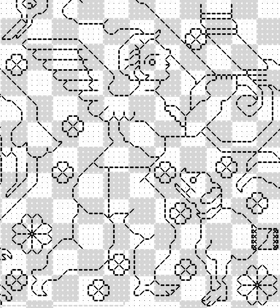
I don’t particularly care for the checkerboard look though – I find it busy and distracting. I think that if anyone is tied to guidelines they are probably better served by printing out the pattern and taking a highlight marker to it, rather than my trying to add that info for everyone.
On my full page graphs, I do indicate the centermost point, and provide margin hashmarks, major ones every 10 units, with minor ones between on the 5s. 5 10 15 20 25 and so on, with the longer major ones on the bold numbers, and the minor smaller ones on the ones in between. But I do not provide the numerals themselves.
How do I go about using my aberrant method? Sadly, it’s not supported by any commercial needlework charting program at either the consumer or professional level. Instead I use a standard open source drafting program – GIMP, and a system of templates and predetermined settings to match those templates. I offer those templates here free on String, along with a detailed tutorial on setting up GIMP and using them (read up from the bottom – the blogging software arranges my lessons in reverse chronological order). One warning – GIMP works on the same layering principle as other advanced drafting programs, assembling finished images from a stack of transparent or semitransparent layers, much the way that cartoon animators build up their on-screen images from stacks of cels. If you’ve used Adobe Illustrator or PhotoShop you will be familiar with that paradigm. If you’ve only used standard needlework charting software you may need to take some time to get used to the concept. But it’s worth it. I may not be able to estimate total thread consumption by color used from my charts (a handy feature of needlework-specific programs), but I have far greater legibility, and no limit to page size or chart scale.
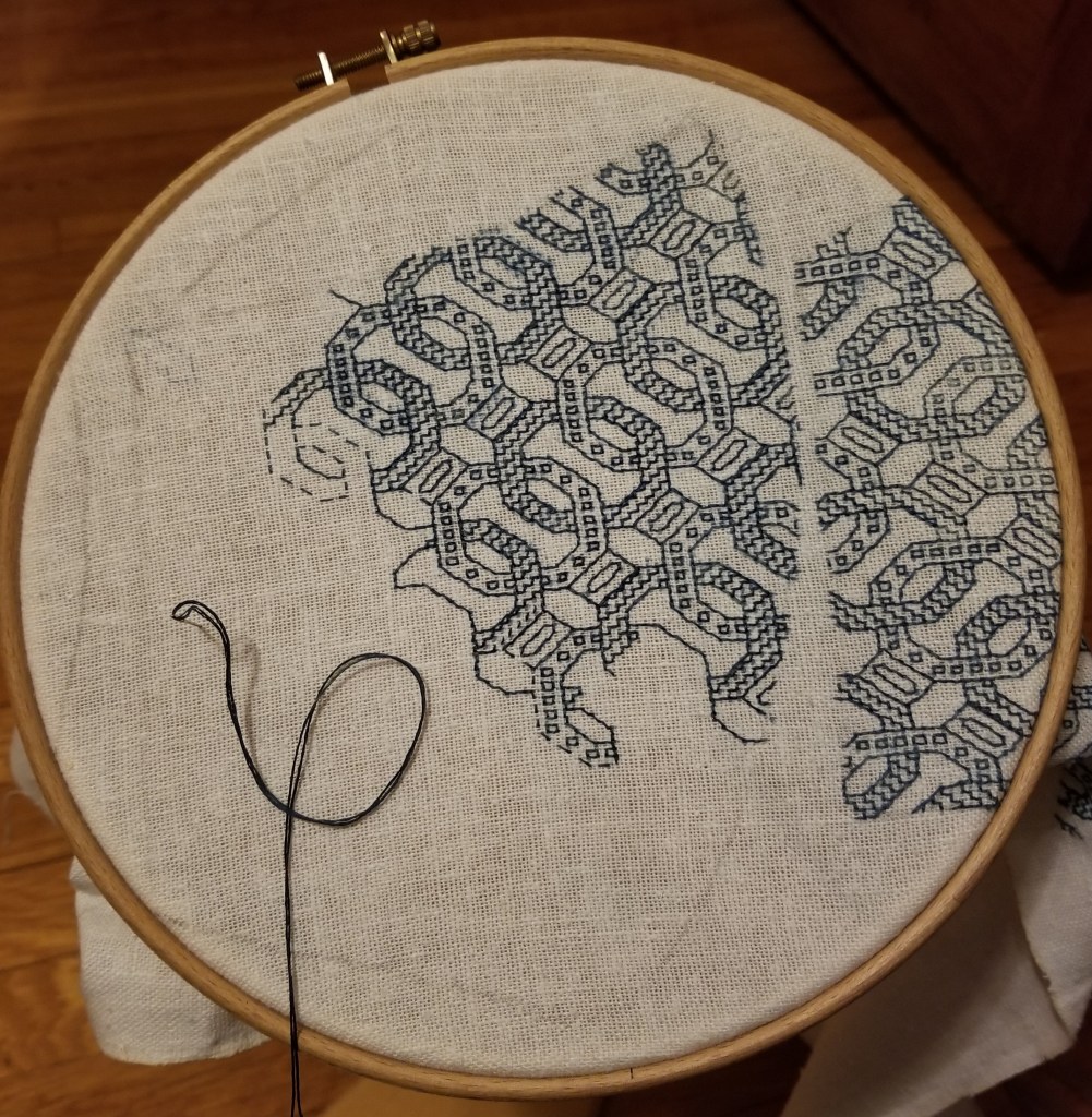
And progress on the current project? I’m about 40% of the way thorough the second side of the first mask. I’ve done a mental flip of the design, too. Not quite mirrored, but enough to complement across the center seam. Thinking of overstitching that center seam with one of the Elizabethan raised plaited stitches, too.

I think your way makes counting the number of stitches easier to see, at least for me it does. Thank you for the detailed explanation and for the information on using GIMP, that is very helpful.
I get what you doing, showing only the intersections, where the needle goes, as opposed to the whole grid, and I LIKE it! With a little practice I think it would be much easier to read, especially for stitching that uses other kinds of stitches than cross stitch. It definitely reduces “clutter.” I have a chart for some Assisi work and haven’t started it because it looks a nightmare. And I think this would work really well for bargello, which is something I am struggling to chart as I’m a cross stitcher, not a needlepointer, and have trouble visualizing bargello on the standard cross stitch grid. I prefer the flood filling to the checkerboard. Thanks so much for sharing your method!
I like you method better. It took a little getting used to at first, but after the first couple of stitches I took following a pattern in TNCM everything fell into place
Adding that checkerboard would be a nightmare!
I have little trouble with any of the charting methods, but I like yours the best. Right now, in my own patterns, I’m using a green grid that overlays the charts, because your dot and dash isn’t an option for lines. Some year maybe the programs will catch up to what we need!
I do like the “flooding”, but not the checkerboard.
Thanks for corroborating my instinct on the checkerboard.
[…] article about charting. Kim Salazar, if you know that name. Ianthe dAveroigne is the other name. https://string-or-nothing.com/2020/09/29/charting/ This is a *great* blog! […]
Like many people, I tend to get used to doing things one way — knitting or crochet patterns, embroidery charts, recipes, etc. etc. — but even though sometimes I have to puzzle over something written differently from what I’m used to, I find that it’s good exercise for my brain, as it were, to change it up now and then!
Your charting actually makes *more* sense, logically, since your “thread” travels from “hole” to “hole”!
I really love the way you chart. It’s much more readable than the grid method. Thanks for the GIMP lessons – now I can chart ‘your way’ too.
Yes! I love leading others astray. :).
[…] in with stitching after the outlines are completed. The sample bit I worked up for a previous discussion on charting methods (derived Kathryn Goodwyn’s redaction) illustrates this method (left). If the piece had no […]
[…] Charting. A comparison of my dot-and-bar method with the traditional drawn-on-quadrille-graph-paper method. Includes link to pre-constructed templates. […]