CORNERED
Continuing on with boring embroidery posts.
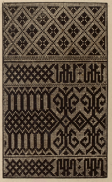
A good many people will recognize this pattern.
I stitched this snippet from a chart I did in TNCM (Plate 64:1). A simplified chart for the same design also exists in Pesel’s Historical Designs for Embroidery, Linen, and Cross Stitch.
The original for my graph is a handkerchief in the Victoria and Albert Museum, Accession T.133-1956. It’s current attribution is circa-1600, England, although that designation has changed over time. It used to be called out as 1580-1600. I’m delighted that museums are revisiting the dates, stitch descriptions, and materials info for their smaller textile holdings. These listings are bound to improve as the methods and technologies (and available funds) to assess them improve. I do not think that Pesel used the same artifact as her base. There are some departures in her graphing from the V&A example, and her marginal notes cite a sampler source, from 1658.
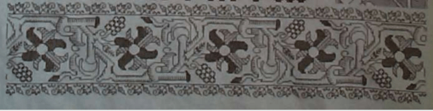
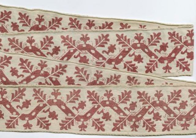
Another reason that this design is so familiar, is that the V&A handkerchief is near iconic, and shows up in several influential stitching history books, including Digby’s Elizabethan Embroidery, and King and Levy’s The Victoria and Albert Museum’s Textile Collection: Embroidery in Britain from 1200 to 1750. But in all of the secondary source representations, it is rarely shown with all four corners. In fact, it used to drive me nuts that I couldn’t see them all. But thanks to the V&A’s site archival image updates, we can enjoy completion. Here is their own photo of the entire artifact:

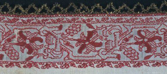
and a color snippet, quoted from the V&A images, for good measure, since repros in the stitching history books often show the original reds:
Gorgeous.
But look at the corners!
I’ve had many people ask me about how to create corners for strapwork, to go around the perimeter of linens, or to anchor a dress yoke. Much fretting over exact matches happens. Even the choice of mitering or bending the work around the angle (as opposed to butting the design up without mating the two directions) causes anxiety. In truth all of these methods appear, although the exact mitering thing is the least commonly seen.
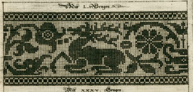
This is one way to treat those corners. Four ways, to be exact, because no two of these corners are exact matches. And it doesn’t matter that they are not.
Numbering clockwise from the upper left, we have 1,2, then 3 and 4, respectively. I’ve taken the liberty of rotating (but not flipping) these so that they are easier to visually compare:
Upper corners, #1 and #2:


and lower corners #3 and #4:


There are three rough treatment styles. 1 and 3 are distinct, and #2 and #4 are similar but not the same. #4 has a fat twig interlace to the left of the flower, to fill in space. In #2 there was less space to fill, so that twig is smaller. The area at roughly noon above the flower is different between #2 and #4 as well. On the others, #3’s flower is squished up against the border, with no surround to its left, and all manner of arabesques fill up the extra space below the flower in #1.
It’s always a matter of personal opinion and borderline heresy to use these cues to try to deduce working method, but it’s clear while our anonymous stitcher may have had a visual guide to the strip parts of her or his design, the corners were fudged in, ad hoc. The narrow companion border’s corners – both inner and outer – are improvised, too.
If I were to be so bold as to speculate, I’d pick the lower left edge as the starting point, with the work starting at the indicated line, and progressing around the piece in the direction indicated (note that the V&A says that the monogram is EM, so that we’re actually looking at the reverse):

The stitcher worked to a convenient point to form a corner, keeping it as much in pattern as possible, turned direction, worked across the top edge, turned, and so on, until the starting point was achieved – at which point the “terminal fudge” was needed to finish the work. It’s also vaguely possible that the finished size of the piece was determined in an attempt to make the the repeats (mostly) work out, rather than the square being laid out first, and the repeats being fitted into it. At least that’s the way I – an improvisational and slightly lazy stitcher – would do it.
So. If you are making a historically inspired piece, do you need to meticulously draft out exact corners first, then follow your chart with fanatical purpose?
Not really.
Just go for it. Much as they did roughly 460 years ago.
PS: Eye training: Bonus applause to the person who spots my departure from the original in the companion border. 🙂
THE LEAFY FAMILY
I hope I’m not boring my readers (especially my knitting pals), but with just a little bit of encouragement, I’m off and running on more historical embroidery pattern families.
This one I’ve nicknamed “Oak Leaves.” It’s relatively well represented – not the design with the most extant examples, but I’ve managed to collect seven photos of artifacts displaying it, in various styles. No modelbook source (yet), and I particularly like when designs are interpreted in different ways.
As in many of these smaller fragments, museum provenances and dates are not necessarily precise. Some of these artifacts have not been revisited since they were originally donated to the hosting institutions. Putting these on a specific which-came-first timeline is problematic, especially doing so based on photos alone. However, there is a possibility here again of “separated at birth” pieces, where an original artifact was cut apart by a dealer and sold to multiple collectors.
I start with a piece given to the Cooper Hewitt by my idol, Marian Hague. She was an embroidery research expert and curator, who worked with several museums in the first half of the 20th century. Her work pairing extant pieces with modebook sources is legendary.
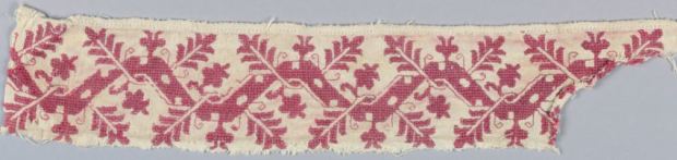
The Cooper-Hewitt citation for this piece dates it as 17th century, and of Italian origin. The museum’s accession number is 1971-50-97 and was acquired as a bequest from Ms. Hague. It displays the signature elements that make up the group – the center meander, with two heavily indented “oak” leaves sprouting left and right, overlapping the meander. A central smaller floral element in the center of each of the meander’s hump, and a secondary leafy sprout filling in the hollow of the design between the leaves. This particular piece also has voided spots along the length of the center meander.
Compare this piece from The Art Institute of Chicago:
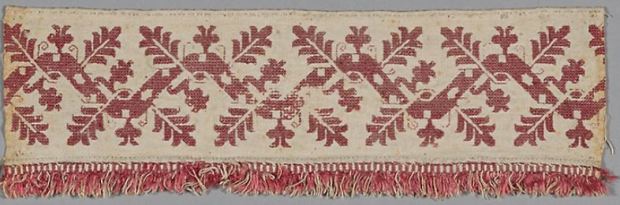
They also attribute it as 17th century, Italian. The AIC accession number is 1907.742, acquired in 1907. Although the C-H example lacks the fringed edge, the executed design of both pieces is extremely close. C-H on left, AIC on right:


Ignore minor wear and tear. The count of the leaves, voiding of the stems, method of placing and working the spots, and placement of the tendrils is the same, although some of the tendrils on the AIC sample have fallen victim to time. Therefore I opine that these two pieces may have come from the same original. That Ms. Hague’s bit is a bit more savaged is not unusual. There are other instances where she had fragments of pieces in museum collections, but usually kept the more damaged bits for her own research.
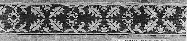
Moving on here’s a fragment from the Metropolitan Museum of Art:

The Met places it as 16th-17th century, also Italian. Its accession number there is 09.50.3806, collected in 1909. This may or may not be part of the same original as the previous two, even though it is fringed like the AIC sample. For one – it’s mirror image. That in an of itself isn’t a big difference. Photos get reversed. Designs themselves are sometimes mirror-imaged if they appear on opposite sides of a larger artifact. Tendrils are missing, but this piece appears to have undergone more wear than the other two. There are enough partial remains of the double running (or back stitch) bits to posit their existence. But while the delicate linear stitching is more prone to damage the heavier interior stitching is more durable.
Look at the little interlace where the leaf-twig emerges from beneath the meander and crosses over it (AIC on left, Met on right):


The little “eye” of filling, which done in the solid filling stitch and should remain – is missing.
Might this be part of the same original, possibly a suite of hangings, covers/cloths or bed furnishings, but of a segment done by a less attentive stitcher? Possibly. But also possibly not, especially in light of the next example.
Here’s another one with an empty “eye.” This example was found by my Stealth Apprentice, and is in the Textiles Collection of the University for the Creative Arts in Farnam.
Unfortunately, the UCA gives no date or provenance for the work. Note how long this strip is, and that it’s folded – we see both sides. This might be double running and one of the double sided Italian cross stitch variants because regular long-armed cross stitch doesn’t look the same front and back. Tendrils? Check. Center meander with holes? Check. Oak leaves and supporting sprouts? Check. BUT those “eyes” – they are not worked, just as in the Met example.
OK, now we go on to other design adaptations. This voided piece from the Boston Museum of Fine Arts is undoubtedly an interpretation of the same design, but with a bit more elaboration on the stems – using twining instead of spots, and on the sprouts and leaves. It’s also doubled north/south – a very common method of taking a strip design and making it more dramatic by making it wider.

The MFA calls this piece out as being Italian, 16th-17th century, and names the technique used as “Punto di Milano.” (The MFA uses several stitch style names not commonly seen elsewhere, this is one.) The accession number is 83.236.
I am particularly intrigued by the unworked area at the upper right. The tightly overstitched pulled mesh technique used for the background is almost impossible to pick out, and even worn, leaves a very clear perturbation of the ground weave. I know this from sad experience. Even over the centuries, I have to say that the missing bit was just never worked. Which gives us an insight into working method – defining an area, then going back and filling it in.
Did this piece, in this style predate the more simplified depictions above? Again we can’t say for sure, but I tend to lean that way because the spots on the wide, plain meander to me look like the simplified descendants of the voids formed by twining stems in the MFA’s example. One person’s opinion – feel free to disagree.
Voiding. That was always done in long-armed cross stitch or the meshy stitch, right? Nope. Here’s another example of the same pattern, with an even more finely defined main twining meander, but done with a squared filling stitch. This one is also from the Metropolitan Museum of Art:

The Met lists this one as being Italian or Greek, from the 16th-17th century. It was acquired in 1909, and its accession number is 09.50.58.
This piece is my favorite of the set, both for the delicacy of the interlace and the squared ground. Obviously the tendrils are gone, as in the other voided interpretation, but it’s the same oak leaf design for sure. And did you catch the mistake? Upper right, where the meander is cut off from joining the previous repeat. That’s not wear and tear – that’s a place where stitching happened where it doesn’t appear in subsequent repeats.
And last, but not least, a pattern cousin. This one was also found by the Stealth Apprentice.

This is an Italian towel or napkin, claimed as 16th century, in the Marcus Jehn private collection. The only link I have for it is to the collector’s Pinterest board.
This is a curious piece. It’s clearly derived from the same pattern family, interpreted in a linear stitch. But the interlaces of the meander are rather heavy compared to the delicacy of the Met square-voided sample, above. The slightly fudged corner is also of interest. If I had to guess, I’d suspect that this piece was a see-me-and-copy, derived from something that looked more like the two voided examples.
So, what have we seen here? Mostly that there are design clusters that are clearly related. That there is no one canonical way in which to use these patterns – interpretations, some only a bit different, and others quite divergent, vary from artifact to artifact, even among those done in the same technique. And based on museum citations alone there’s no clear way to arrange them in parent-child relationships other than idle musing.
Most of all, I like that there is no one “right” way to stitch these designs, and that when I do my own variant, I’m adding to family that stretches back for hundreds of years.
UPDATE:
And another one of the same family surfaces! This one is the largest departure to date in terms of style, but it is clearly descended from the same pattern lineage.
Meet the Metropolitan Museum of Art’s holding #09.50.65 – entitled “Fragment,” dated to the 16th or 17th century, from Italy or Greece; added to the museum’s collection in 1909.

UPDATE UPDATE:
And another…
This one is from the Victoria and Albert Museum. It’s one piece of a composed group of borrders, displayed together. The entire group is attributed to 17th century Italy, and is cataloged together as museum number T.114-1930.

This one is sort of half-way between the versions with the heavy, abstract main trunk at the top of the page and the Met example with the squared ground. In this “missing link” you can see where the lozenge spots on the most abstract versions come from, while it still retains the coiled smaller branches of the most detailed example.
To complicate matters further, there is the fragment below, from the Met, accession 79.1.294, also sourced to 17th century Italy – Sicily in specific. Although the museum calls it a border, I don’t think it started out as one. The bottom edge is nice and neat, with a defined stitched edge, but the top piece is ragged – cut from a larger design. Now look at the V&A piece above and image it doubled, with two strips stacked one on top of another. (Doubling pattern strips this way was a very common method of achieving a deeper design.) In your thought experiment, now “cut” a section where the leaves are facing each other.
Hmmm….
Not only is this totally plausible as a strip cut off of a wider design based on our leafy friend, but the similarities to the Met’s strip are unmistakable. Again, we can prove nothing without artifact forensics on the ground and stitching thread, but I would not be surprised to find that these came from different stitched sections of the same original piece – possibly from a side strip and a wider decorated end of a towel or other cover.
LONG LOST SIBLINGS?
As I wander through on-line collections, occasionally I spot things that look very familiar. There are pattern style families, even specific motifs and strip designs that persist over time, popping up in multiple locations, over periods of decades. Those are fun to trace, and to try to figure out branching traditions, and to try to pinpoint ultimate origins, although that’s rarely possible.
Today’s pieces though are something different. I believe them to be either part of the same original artifact or set of artifacts.
To begin with, here they are. At left is a piece from the Art Institute of Chicago (accession #1907.740); at right is a piece in the Hermitage Museum’s on line collection (accession #T-2734).


The AIC’s piece has a more complete annotation, noting the dimensions of the various component parts, describing the materials and stitches used (“long armed cross stitch, cut and drawn thread work… insertion of silk needle lace”), and giving a provenance and date of Italy, 1601-1650. They call the piece “unfinished.” It was acquired by the museum in 1907.
The Hermitage’s piece provides less detail, silk on linen, and overall dimensions. They call the stitch used “double Italian cross” (or that’s what the Russian translates as). They cite origins as Italy, 16th-17th century, and say the piece came to them from the private collection of Baron Stieglitz. I am unsure which member of that family they are citing, but the the Stieglitzs were prominent bankers and aristocrats during the 1800s, and up to the time of the Russian revolution. They were known for amassing opulent art and antiques collections, among other extravagances.
When my Stealth Apprentice brought the Russian-collected example to my notice last year, she opined that it was unusual to see the very coarse voided strip, needle lace, and more delicately done center piece all in one composed work. I agree with her. It is curious – all the more so because of the second example from Chicago.
Let’s look more closely at the two. Chicago’s larger piece seems to start at the right edge at the same design point of the urn/flower cycle as the Hermitage’s. The count and spacing on the motifs are identical on both pieces, although the Russian sample is very slightly taller – about four or five rows of the flower/urn area pattern. Both seem to be “full length” slices north/south. But that left edge on the Russian example is very clearly cut and truncated, with the narrow border removed from a work’s right edge and seamed to the larger field. AND look at the top area. Not only was the piece sliced off and then replaced on the urn/flower area, that same cut and sewn seam ascends all the way to the top, cutting through BOTH the needle lace band, and the coarsely executed voided strip. It’s also clear that the strip that was cut was taken from the left edge of the original source piece, because the fragment of the narrow border flower at the top left has “turned the corner.”
Further, because both artifacts include an intact right hand edge with no seaming, these were probably descended from a set of two matching items.
Both pieces seem to have been cut off at the right edge, snipped through the narrow needle lace strip, and both show signs of stitching remains on their bottom edge – possibly fragments of more needle lace. On the Russian bit, there’s even evidence of red remnants along the outer edge of the applied border strip. Both works show clear signs of there being a finished hem around the central flower/urn plus companion border section; but no hem is in evidence on the voided strips. Even the linen ground’s weave on the voided strip parts looks coarser than that in the center area’s ground.
So. What do we have?
Here’s one possible flight-of-fancy. I have no evidence to claim this as being true, so it’s just postulation and theory: two rounds of re-use.
Our piece starts off as the urn/flower part – two strips, about 42.3 cm (16 5/8 in) tall, but of an indeterminate length. They might have been bed hanging, long towels, or something akin in shape or proportion to a modern table runner (historical use unknown).
At some point in time, these items gets turned into something else. Possibly a deeper set of bed valences, or possibly one or more rectangular bolster or cushion covers, through the addition of the side strips of voided work, attached by the decorative needle lace sections. These additional bits were done by a different hand than the older flower/urn section. (I do note that there are other examples of artifacts that employ side strips to turn rectangular flat pieces into square-edged 3D cushion covers.)
Fast forward to the second moment of re-use… The second-use bed hanging or bolster cover is cut down again. The unknown recycler may have intended to make multiple covers for smaller cushions, or other smaller covers/bags/whatever. And it’s possible she or he never finished that project – that’s why we have the partial cut-down-and-reassembled Hermitage fragment, and the unfinished fragment in Chicago.
And for the piece’s final disposition among multiple museums – I do know that in the late 1800s, lace and embroidery collecting was a fad among the wealthy and fashionable. Many American museum textile collections crystallized around donations from prominent families – items they picked up on Grand Tours of Europe. I have come across quite a few artifacts that may be pieces sundered in that process – cut apart by antiquities dealers who then sold smaller bits to multiple buyers, rather than keeping artifacts intact and making only one sale. I posit that our flower/urn twins are a pair of those pieces, and having fallen victim to profitable multiple sales, ended up fragmented between two continents.
WHEN IS MORE OF THE SAME NOT MORE OF THE SAME?
Another post that only a stitching history nerd will love.
The last post explored some differences between modelbooks that looked like they featured the same patterns, but in fact were not printed from the same plate. This one looks at one of the most widely reprinted and well known modelbook authors – Johann Siebmacher, and three of his works, all available in on-line editions. All of the excerpts below are from these three sources:
- Schön Neues Modelbuch von allerley lustigen Mödeln naczunehen, zuwürcken unn zusticken, gemacht im Jar Ch. 1597, Nurmberg, 1597, – the source work for Mistress Kathryn Goodwyn’s Needlework Patterns from Renaissance Germany
- One reprinted in 1886 as Kreuzstich- Muster: 36 Tafeln des Ausgabe, 1604, that calls out Siebmacher as its author.
- One indexed simply as Newes Modelbuch with him as author, possibly 1611, but unclear from the source
Many of the designs in these books seem to repeat edition to edition. Some are unique to only one. Before we begin, it’s worth remembering that these books are survivals. Long use and reuse over decades have resulted in page loss. None of the editions are complete, as in “all intact in one original binding,” and some may have been re-composed at a later date from other partial works. But we do what we can with what we have, and Siebmacher’s editions have title pages in them, and distinctive numbering and framing conventions that can lead to a reasonable conclusion that they were from the same printing workshop.
All of the books show graphed designs suited for reproduction using several techniques, including various styles of voided work on the count, lacis (darned knotted net), and buratto (darned woven mesh). Twp of them also include patterns that would be suitable for other forms of lace. Over time these patterns went on to be executed in weaving, cross stitch, filet crochet, and knitting, too. The descendants of these designs ended up in multiple folk traditions and samplers on both sides of the Atlantic.
In addition to the longevity of their contents, Sibmachers books are among the earliest that seem to indicate execution of the design using more than one color or texture, a feature not common in the black-and-white printed early modelbooks. Here are examples the first two books. But I don’t think that these pages were originally printed two-tone. I think they were hand-colored to add the darker squares, either at the time of manufacture or later.
| 1597 | The possibly 1611 edition |
 |
 |
Obviously, the two samples above were printed from the same block. But the pattern of the darker squares is different, and if you look closely, the some of the solid squares looked colored in, as opposed to having been originally printed that way. I can say the retoucher who did the 1597 was a bit neater. I don’t think these were colored by the book buyer, because every single edition of Siebmacher’s works that I’ve seen have included multi-tone pages like this.
Here are other single- and multi-tone blocks that repeat between these two editions:
| 1597 | The possibly 1611 edition |
 |
 |
 |
 |
 |
|
 The brown ink on the G near the talon matches the color of the hand-drawn designs at the back of the book – post-publication additions.
The 1604 edition has similar pages that sport two-tone presentation:

But these books are not the same.
That 1604 edition… It’s curious that there are no blocks that are in the other two Siebmacher works that are also in the 1604 edition, yet all three books are clearly signed by him. And the majority of the block labels that show stitch counts for the repeat, or pattern height in units – they are curiously different between the 1604 and the others, too. But still, there evidence of style affinity across the works. Zeroing in on some specific pattern features:
A very familiar stag, that shows up on some of the earliest samplers, with descendants on American Colonial samplers, all the way up to pieces done in the 1800s.
| 1604 | 1597 |
 |
 |
Similar, yet not the same.
Here is a set that’s confounding. First the hippogriff and undine from 1604:

Compare the item above to these two designs – a winged triton and an undine, each from the 1597 work:
 |
 |
Lions rampant?
| 1604 | 1597 |
 |
 |
Even the geometrics are close but not duplicates
| 1604 | 1597 |
 |
 |
All this aside, even the seemingly close 1597 and possibly-1611 versions have significant differences between them, although they do have exact page duplicates between them. Not so with 1604 – it’s unique when closely compared to the other two, even though all three have the same author attribution, and very similar styles. This is VERY odd considering the vast amount of physical labor that had to go into producing these blocks.
So. What’s going on with the 1604 edition? Why is it so different from the other two? Has anyone read an academic work that examines this issue in more detail, or corroborates these findings with other editions that are not published on line?
So many patterns, so many questions, so little time to do in depth research.
ONE DESIGN’S MIGRATION
Early stitching modelbooks. They so often look the same, page after page. Where did I see that design before? Why is it oh, so familiar?
And so we launch again into a post that only a stitching geek would love.
Early European modelbooks produced by sixteenth century printers in Italy, Germany and France often include similar patterns. Often the same patterns. Sometimes patterns SO much alike that one would think they were printed from the same blocks. In some cases, especially if one printer did successive editions of work, that’s entirely likely. In other cases, where the same block appears in works from different shops – that’s not entirely clear. Especially if the workshops of the various printers were separated by geography and/or time. However it happened – trade in blocks, plagiarism from printed copy, whatever – it is clear that considerable cross-pollination did occur.
Here is just one example.
This is from Niccolo d’Aristotile’s (called Zoppino) Venice-published Ensamplairo di Lavoiri, 1530/1531, as redacted as Volume I of Kathryn Goodwyn’s Flowers of the Needle collection (left). At right I show the same page from an original (unredacted) copy of the same book in the Gallica BNF20 collection, to remove doubt about any assertions I made below being artifacts of cleaning up for reprint. Watch those two center designs:

1530/31, Italy is pretty early, right?
Well, there’s this. Johann Schonsperger the Younger, from 1529, published in Augsberg, Germany This is from Ein new getruckt model Buchli auf außnehen, vnnd bortten wircken..., in the collection of the Staatliche Museen zu Berlin, #0S-1473-kl, as presented via Bildindex.

Not surprisingly, Johann Schonsperger’s earlier work, Ein new Modelbuch auff auaußnehen vnd bortern wircken.. from 1526 (also from Augsberg) has the exact same page. Also from Staatliche Museen zu Berlin, #0S-1472, as presented via Bildindex.

So we’ve traced this panel back to a 1526 edition, published in Germany. But were all of these printed from the same blocks?
I’d say that the two Schonsperger pages were certainly produced from the same blocks. They have the same curious features and mistakes.
By contrast, here are the same sections from the Zoppino work, with the same areas highlighted:

Yup. The little crescent is missing, and the lower arm of the fleur-de-lis type detail with the clumsy header is gone entirely – the design is truncated, leaving it on the cutting room floor. There are other differences – mistakes made in one version of the design but not in the other, that you would only notice if you were trying to redraft or stitch from each pattern.
So in this one case, I’d posit that a copy of a printed page from Schonsperger in Augsberg – either as part of a book, or as a broadside – made its way to Venice, where it was seized upon and re-rendered for inclusion in Zoppino’s collections. Which is pretty much counter to the intuitive argument that I’ve seen many make – that these counted patterns all originated in Italy and then spread north. Of course there may be another printed copy even earlier than Schonsperger…
Oh, and this design in particular? I’ve always been fascinated by the narrow border with its strong directionality. I posited in The New Carolingian Modelbook, that based on similarities to examples of Tiraz band calligraphy done on the count, as appearing in Richard Rutt’s book A History of Hand Knitting, 1989, that this motif may have been copied (possibly without knowing what it represented) from an extant piece of stitching, rug, or other textile from an Islamic workshop. If that’s true, it would make the design’s peregrinations even more impressive. Somewhere in the Islamic world, to Germany, then to Italy. And on from there…
UPDATE
And the Schonsperger plate makes another appearance! This time in Anton Woensam’s Ein new kunstlich Modelbůch, published in 1536, in Köln.

UPDATE UPDATE
You guessed it! Another appearance of our block friend – this one in Peter Quentell’s 1541 Ein New kuntslich Modelbook, published in Cologne. It also has the same idiosyncrasies as the Schonsperger, above.
UPDATE UPDATE UPDATE
Yet another representation has crossed my notice. And it’s a particularly curious one. This is from Schon neues Modelbuch, printed in Frankfurt in 1608, from the shop of Mayn Durch Sigismundum Latomum (Latomus).

Although it mostly aligns with the Schonsperger-Woensam 1536/Quentell 1541 version, it’s lacking a couple of very minor copyist errors, although it faithfully duplicates other peculiarities of that printing. Also it extends further to the left – instead of seven column/diamond repeats in the geometric on the left hand side, there’s a mirror point/bounce repeat. BUT at the center of that repeat there’s an artifact – the “elbow” of the curlicue pattern on the right. In other blocks it may serve to cue the stitcher that the geometric and the curlicue can be alternated, but here it’s encapsulated inside a rather clumsy centering, with a badly botched top and bottom border, plus on the same bounce line, another improvised mirrored center (with an extra wide column of boxes) in the simple separate border beneath. Almost like someone wanted to take an older block and eke out the page, so a new bit was carved to match. Hmmm…..
UPDATE x 4
I thought I had stopped finding more of these today, but apparently not. I’m including this because it fills in more of the early representation/movement of this design.
From Livre nouveau et subtil touchant l’art et science tant de brouderie fronssures tapisseries comme aultres mestiers qu’on fait à l’esguille soit au petit mestier aulte lisse sur toile clere tres utile et necessaire a toutes gens usant des metiers et arts dessinés ou semblables, published in 1527 by Pierre Quinty, probably in Cologne. It appears to be the Schonsperger plate, verbatim. Complete with odd little carving errors.

Our timeline now looks like this:
- 1526 – Augsberg (Schonsperger block)
- 1527 – Cologne (Schonsperger block)
- 1529 – Augsberg (Schonsperger block)
- 1531 – Venice (Zoppino block)
- 1536 – Köln (Schonsperger block)
- 1541 – Cologne (Schonsperger block)
- 1608 – Frankfurt (Schonsperger block, partial – augmented with additional carving)
DOUBLE RUNNING STITCH LOGIC 104 – A REVIEW
Based on private notes of inquiry and discussions on various historical needlework-related boards and forums of late, I see that people are still confused about the working logic of linear stitching. In specific, how to determine if a design can be worked entirely two-sided.
First off – the two most popular historical methods for working thin linear designs are double running stitch and back stitch. The big difference between the two is the appearance of the reverse. Done meticulously, with care paid to invisibly terminating threads, double running stitch is almost indistinguishable front and back. Almost because a few people do produce a slight difference due to differential thread tension on each of the two passes required to produce a unbroken line, but that difference mostly settles out over time. Back stitch on the other hand produces a public side very much like double running, but the reverse of the work is heaver, and depending on the stitcher can look like outline or stem stitch, or even like a split or chain stitch if the needle pierces the previous stitch as a new one is made. Of necessity in back stitch there is twice as much thread on the back of the work as there is on the front.
 |
 |
|
Double Running. |
Back Stitch. |
Double running stitch takes two passes to accomplish because it first lays down a dashed line, with the spaces between the dashes being filled in on the second pass. A back stitch line is completed in one pass, with no need to revisit areas previously stitched to complete the line.
Many people prefer back stitch because there IS no going back. They like the certainty of knowing exactly where they are at all times, over the pretzel logic of calculating how not to be caught in a cul de sac while retracing steps in double running. Personally, I prefer double running, and follow double running logic even if the piece I am working will not be seen on both sides. I find that path planning to be fun, and I appreciate thread economy, especially when working with more costly or difficult to source hand-dyed silks.
But for some one challenge of double running is knowing which designs can be worked in that stitch such that both sides can be made totally identical.
It’s easy. Any design that has no “floating elements” is a prime candidate. If true double sided is a total goal (including invisible termination of thread ends), any piece that has a floating element large enough to allow that burial is also a possibility. It doesn’t matter how complex a design is, so long as elements are all branches and detours off of one or more main baselines, they can be stitched double sided. And yes – there CAN be more than one baseline in a design. More on baseline identification is here. The logic of following detours and returning to the baseline is here. How to break up a large design into several smaller baselines is here.
Identifying floating elements
That’s easy. They are any ornament or detail that is discontinuous from the main line of the design.
Here are several that I’ve done in double running, based on one or more continuous baselines, with no floating element deviations. In these designs every part of every work is attached to every other part, at one or more points.


The last one has additional embellishment in long-armed cross stitch, and the final one includes two edge borders, each done as their own “line” separate from the main motif.
By contrast, here are several that have those “floating elements” called out.


The knot element in the all-over at left is not attached to the main pomegranate frame. It is however just large enough manage thread-end-hiding. So while its presence makes this a tedious and difficult pattern for double-sided double running stitch, it is not a deal breaker. However those little accent diamonds are deal breakers. Too small to hide the ends, and detached from the main design. The ladder element in the arms of the repeat at right is broken from the main design, and is too small for end-camouflage.
There are often short lines or sneaky little floating accents hidden in both simple and more complex repeats. Strawberry pips are notorious for this, although I haven’t any stitched examples to hand:

My dragonbeast, however lovely, has quite a few floating elements, making him a problematic choice for a fully double-sided work. (Eyes and faces are almost always difficult).

And this bit, stitched from a Lipperheide book, is the absolute poster child for discontinuity. I didn’t mark them all, but you get the idea. The spaniel and possibly that center bundle thing are the only bits large enough in which to bury the ends, if a fully two-sided result is desired.

Here’s a tricky one. Look closely at the bit on the left.


It looks continuous, but it’s not. There are in fact FOUR separate double-running baselines, AND a discontinuous element in the motif. He’s in the red circle on the right. Like the round knot in the first example this might be done double sided, provided that the stitcher was willing to terminate separate ends for that relatively large floating element.
So in short – it doesn’t matter how complex a design is, so long as all elements are continuous it CAN be stitched fully double sided, in double running stitch.
THREAD THREAD
Based on questions from Elaine and others, here’s a bit more on the thread I’ve been using on both the Permissions and Trifles samplers.
As I’ve said before, my stash came from a small needlework/beading supply shop in Pune, India. It wasn’t current stock. The head clerk sent a boy scampering up into the storage attic for a VERY dusty box of odds and ends. I picked out the best colors left, avoiding pastels, and looking for what high impact/high contrast hues that still remained in quantities of 10+ skeins. I bought them all. They were very inexpensive – just a few rupees per skein. At the then-current exchange rate of 60 rupees per dollar, I think I spent less than $20.00 translated, and came away with a huge bag full, well over 200 skeins divided up among about 15 colors. Here’s just a sample:


The name brand is Cifonda Art Silk. It’s not a spooled rayon intended for machine embroidery. As you can see, the put-up is more like cotton embroidery floss. And it turns out that the stuff is still being made, and is available in Australia, and even in the US – although mostly by special order.
The websites that offer this thread vary a bit in description. Some say it is a 35% silk/65% rayon blend. Others say it is all rayon. Contemporary put-ups specify 8 meter skeins. My vintage stash skeins are a bit longer, possibly 10 meters (I’ll measure tonight). The large bundles above are actually “super-packages” of ten individual skeins. You can see the bright red one at the left is broken open, with the single skein labels showing. On mine, color numbers are written on each skein by hand, not printed. There can be hue variances between the super-packages of the same color number, so I suspect that special care should be taken to buy all that’s needed at once, so that all is from the same dye lot.
Cifonda’s structure is that of standard floss – six strands of two-ply relatively loose twist. The individual strands are quite fine, two of them are roughly the equivalent of one ply of standard DMC cotton embroidery floss. The colors – especially deeper ones like red and indigo – do run when wet, although they do not crock (shed color on hands, ground cloth, or wax when stitching dry). I would not advise using this thread on clothing, table linen or other things likely to need laundering. It may be possible to set the colors before stitching using a mordant bath or long water soak, but I don’t have the experience, time, or materials quantity for experimentation.
I am pleased with the way the Cifonda looks in my work. It’s a bit shinier and finer textured than cotton floss, although it does not have the coverage of the true silk floss I’ve used (Soie d’Alger). My Cifonda is quite slippery. Two or more plies held together tend to disassociate and slide past each other for differential consumption, even when using short lengths in a small-hole needle. I tamed this by aggressive waxing – running the entire length of my threads over a block of beeswax before use. Since I’m doing linear counted work, any change in color or texture is not noticeable. Someone using this for satin stitch, long-and-short, or other surface stitches that maximize thread sheen would probably want to wax only the inch or so that threads through the needle.
Like all lightly twisted rayons, this thread does catch and shred a bit on rough skin. Care must be taken to use needles with very smooth eyes, and to hold the unworked length out of the way when taking stitches, because the stuff snags extremely easily. My own stash, well aged as it is, contains some colors that are a bit brittle. The bright yellow I’m using now, and the silver-grey I used on the last sampler are both prone to breaking under stress, and must be used in shorter lengths than the other colors.
I will continue to use up my India-souvenir thread stash, working smaller and smaller projects until it is gone. But in all probability, I will not seek out the Cifonda to replace that inventory as it is consumed.
Anyone else have experience or hints on using this rather unruly stuff?
THE WHOLE THING
The permission sampler is rolling right along. At 30 threads per inch (15 stitches per inch) it’s fairly zooming. Here you see the whole cloth. I’m already mostly done with 25% of the patterned area:

That small bit of solid blue cross stitch at the bottom? I hate it and will be picking it out, presently. Originally I wanted to frame the piece top and bottom with a denser border, done in cross stitch. But I don’t like the look. The bottom border will still be blue, and will still span the entire width of the piece, but will be something directional in double-running, instead.
Now for the two newest strips:

Both are patterns from my forthcoming The Second Carolingian Modelbook. The top one is done in two weights of thread – double strand for the red and green sections of the motif, and single strand for the yellow half-cross stitch ground. There’s no historical precedent that I can find for treating the background of a voided piece this way, but I do like the look of the more delicate field against the heavier outlines. It’s something I’ve used a couple of times now. Since there’s no requirement for this piece to be historically accurate, why not play? The pattern itself does have a source – a stitched sample book of designs in the collection of the Metropolitan Museum of Art, with a posted provenance of Spain or Italy, early 1600s.
As for the lower bit, in blue – that one is interesting, too.
Here’s a close-up:
![]()
And here’s the source:
![]()
This is an excerpt from “Tafel 47” in Egenolff’s Modelbook of 1527. Note that the original is clearly a freehand piece – not graphed. But it translates very neatly to work as a counted pattern. If you look closely at some of the freehand drawings in Egenolff and his contemporaries, you’ll see that (to my eye at least) they were intended to be congruent with counted execution. That’s not to say they couldn’t be done off the count, but with constrained angles, no fine detail, and geometric execution, working them that way is a cinch.
Back to my modern piece. It’s pretty clear that the area below the words will be two columns of strip patterns. I am still thinking of what to do in the top part. I could do more strips of similar proportion. I could do one moderately wide strip (the area there is too narrow north-south for any of the really big patterns in T2CM, believe it or not). Or I might do a collection of spot motifs, or one large all-over. I haven’t decided. More bungee jump stitching ahead, as I continue to design on the fly.
FINISHED!
It’s done. All 80+ gears, each with a different filling pattern, worked with well-aged “Art Silk” (probably rayon) purchased for a single rupee per skein in India, on 30-count linen. The soot sprites (little black fuzzy creatures) playing the part of “Trifles” are in discontinued DMC linen floss, so that they contrast shaggy and matte against the brighter, smoother silky stuff. I’ve also attached some real, brass gears as embellishments, to add extra Steampunk flavor.

Here’s a close-up of the sprites in process, adapted from the little soot creatures in the movie Spirited Away.

To stitch them I worked totally off count. (Yes, I can do that, too). I outlined the eyes in split stitch using one strand of floss, and placed the eyes’ pupils, using French knots. Then I worked long and short stitch, encroaching on the split stitch eye frames, to get that spiky, unkempt, hairy texture. The arms and legs are close-worked chain with two strands, with the little toes and fingers (what of them there are) also in split stitch, but with two strands. The gears are filled in using (mostly) double running, with some departures into “wandering running” using two strands of the very fine art silk floss; and outlined in chain stitch using three strands of the stuff. All threads used were waxed using real beeswax, for manageability.
I am happy to say I’ve hit all of the specific design requests. And there were many:
- A good motto
- Steampunk (the gear theme)
- Something Whovian (the Daleks)
- Octopodes (dancing in one of the fills)
- Snails (ditto)
- Unicorns and/or dragons (ditto, and the winged, serpent tailed, beaky thing is good enough)
- Anime (the soot sprites)
- Interlaces (also inhabiting the gears)
- Autumn colors (brown, gold, russet, silver)
- Something from India (the thread itself)
The saying itself is particularly suitable for the target Daughter. It’s one of Mushashi’s Nine Precepts. The Daleks are from a graph by Amy Schilling, intended for knitting. The narrow border is in my forthcoming book, The Second Carolingian Modelbook. I found all of the alphabets used (there are four) in Ramzi’s Sajou collection. The gear shapes are adapted from a freehand tracing of a commercial airbrush stencil by Artool. Most of the gear fills can be found in Ensamplario Atlantio. The few that aren’t from that source are recent doodles, and will be made available in time, either as a fifth segment of that work, or perhaps as their own stand-alone sequel. Ensamplario Secundo, anyone?
Now Younger Daughter doesn’t head off to school until next fall, so I have about a year to add hanging tabs, or back the piece with contrasting fabric to make a scroll-like presentation. So while the stitching is complete, this piece may revisit String when I decide what the display treatment will be.
On to the next. I’ve got two more original stitched pieces in queue, with only a general idea of what each one will be, and what styles/designs/colors I’ll use. Free-fall stitching! Gotta love the adventure!
BLACKWORK INSPIRATION
A couple of people have written to me saying that they’d like to do an original inhabited blackwork piece, but don’t want to do the traditional Elizabethan scrolling flowers, or yet another chessboard. They are hesitant to draft up their own main design, and are unsure where to start. They have asked for some leads on places where they can find drawings particularly suitable for or adaptable to use with counted fills.
I present some suggestions. Mind you – none of these are endorsements or product placements, and are intended as a first step for gathering inspiration.
1. Coloring Books. They come in all flavors from very simple line drawings aimed at kiddies, to complex pieces targeted at over-stressed adults. What you want are ones with large enough spaces for the patterns to play. A mix of large and small areas to fill is ideal because it will allow use of fills of various complexities and densities. Given the vast diversity of what’s available now, a coloring book project can be anything: a kid’s cartoon character, a historical vignette, a Alhambra-style geometric, a complex mandala, something relevant to your faith, a detailed bit of nature drawing, or a cheeky paisley. Dover has a particularly lush collection of coloring books, many of which contain designs that would appeal to an adult.

2. Stained Glass Patterns. These are especially easy to use for blackwork because of the limits that handling tiny bits of glass impose. The drawings tend to have bold outlines and large, flat fill areas.

3. Maps. Proud of your country, home state, county or city? All of those nifty borders outline areas just waiting to be stitched. Collections of clip art for classrooms and teachers contain some of the simplest, most clearly defined examples.

4. Wallpaper Samples. The all-over designs of some wallpapers present excellent opportunities for the use of fills. There are hundreds of collections on-line that can be combed for inspiration.

5. Antique Ironwork. Grills, meshes, fences, and guards are like iron lace. With lots of “white space” between the bars, just waiting for embellishment. I took some photos of ironwork at the V&A that show what I’m thinking of.

6. Architectural Drawings and Plans. There are tons of illustrations of houses and other buildings (also lots of photos). For example, I’m drawn to pix of Craftsman era bungalows.

7. Patchwork Quilting Patterns. There are thousands, some appliqué, some pieced (both geometric and crazy-work), all perfect for this type of stitching. Again, there are thousands of these available on-line both paid and free.

8. Stenciling Designs. These are produced in several scales. There are large ones intended for use in interior decoration, often as borders or furniture accents. There are also smaller ones intended for finer airbrush work, like the one I’m using for my Trifles sampler. In any case, a quick Google search turns up plenty.

9. Mosaic and Tile Patterns. Like stained glass, these often need little or no resizing because the tesserae (mosaic tiles) are just big enough to use as stitching blocks. Here’s a pile of regular layouts.

10. Lace Samples. Many designs intended for lace can be adapted as blackwork outlines. For example, the looping patterns intended for traditional Battenberg could be in-filled using counted geometrics, with the outlines themselves either being stitched, or applied over using soutache cord or a narrow tape or braid. Here’s what I mean.

These are just a few ideas off the top of my head.
