QUESTIONS ON THE LEAVES
Questions about my current project are popping in. I’ll try to answer the ones so far. Feel free to send more.
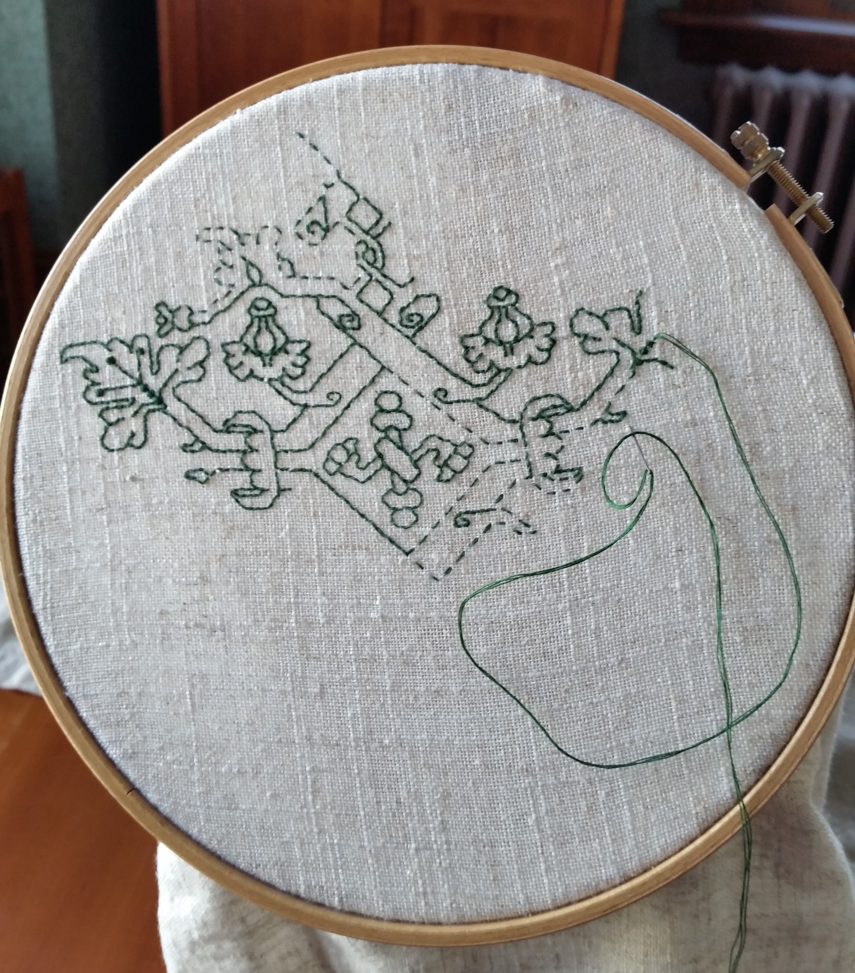
First, a progress shot:

As you can see, I’ve established the border on the second long side of the piece. I still have not decided on whether or not there will be wide borders along the short sides. That decision probably won’t occur until I have to advance the piece on the rollers of my roller frame. Right now the ground cloth’s center is (more or less) at the center of the exposed working area.
On to the questions.
How do you get the design onto the fabric?
I don’t. This is a counted style. I have a paper pattern that shows my repeat, graphed up into a grid. I look at that, then replicate the design on my cloth, using each group of 2×2 threads as my graph grid. It’s just a matter of looking left, seeing “Five stitches in line straight, then one diagonal to the left, then three straight left,” and stitching it.
As I work I constantly check back and forth to make sure that the newly stitched pieces are on target – true to the count of the design. To do that I tend not to work out on a long lead. I try to work adjacent areas so I can check them against each other as I go. For example on this design, I’ll confirm that the ed
My teacher told me that I always need to baste in an even grid before I start a large charted project. Why haven’t you done that?
Because I don’t need to. I do have basted lines that indicate the edges and center point of the area I will be stitching, but I tease them out and clip them as I go along to keep them out of my way. I’ve never used a fully gridded ground with guidelines basted in every ten or twenty stitches apart. I’m comfortable working that way, although I know that others need more alignment aids than I do.
Will you be making this available as a chart or kit?
Not as such. This leafy design will be included in my (ever) forthcoming book, The Second Carolingian Modelbook. (News of that book’s publication will be here on String first). But I won’t be issuing a project chart or kit for this piece.
What thread are you using?
I’m using the vintage “art silk” floss I bought in India. I wish it were real silk, but we do with what we have. One nice thing about it – it’s very fine, and presents much like finger spun if stitched closely.
For the green double-running stitch, I am using two strands of this floss, heavily waxed. For the satin stitch, I am using three strands, unwaxed. The stuff is a bit unruly, and keeping the satin stitch even and smooth is much harder than establishing the design in double running.

What’s the count of your ground?
It’s an 40-count evenweave 100% linen, stash aged. I’m not sure where/when I got it, but I dug it out from the bottom of the pile, so it wasn’t a recent purchase. I’m working over 2×2 threads, so that works out to about 20 stitches per inch. But I think there’s a minute variance in count north-south vs. east-west, so it’s probably more like 20 spi x 19.5 spi.
What will this be when you are done?
A monument to the time it took to stitch.
Seriously, while I had originally thought it would make a nifty pillow for our sofa, complementing the room’s colors and being a different finishing treatment from yet-another-wall-hanging. However, I’ve decided against that. The art silk in satin stitch is too friable, prone to snags and catches. The thought of throwing myself on the sofa and having the rivets of my jeans play havoc with those shiny, smooth bits is a harsh reality check. This will probably end up on my walls, like so many of my other pieces.
EARLY MARKETING? OR NOT….
Another in my occasional series of posts only a stitching nerd will love.
This base design I present here is among the patterns that have long fascinated me. It comes from a time of political and religious conflict, and exists in two versions – one with a devotional inscription, and one plain – with the motto removed.
It’s pretty widespread as pattern books go, appearing in several. There is also at least one actual stitched artifact of it in one of its variants
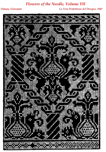
First, to look at the pattern as (and where) it was published.
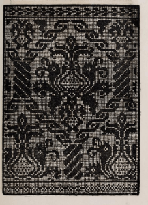
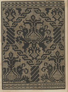
All three modelbook pages of this first group are quoted from Mistress Kathryn Goodwyn’s most excellent Flowers of the Needle collection of modelbook redactions. It’s pretty obvious that the 1537 Zoppino (Venice) and 1567 Ostaeus (Rome) versions were both printed from the same block – the same pattern errors exist on both impressions.

Now for the third – this one was published in 1546, in a book attributed to Domenico daSera, who worked in Lyons, France.
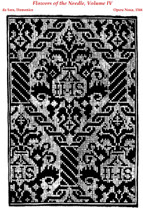
It’s clearly the same design, but carved anew into a different block. The framing mechanism of the twisted columns and chains remains, as does the frondy onion-shaped center motif and the majority of its details. More or less. Obviously the religious motif is new, as is the inclusion of more prominent crosses. But the design is still recognizable.
Going back and forth in time, here’s that same Zoppino block, from his Convivo delle Belle Donne, from August 1532, courtesy of the Metropolitan Museum of Art (Accession 22.66.6) This is the earliest hard-dated rendition of this design that I know of.

It’s also interesting to note that the same block was collected into Hippolyte Cocheris’ 1872 collection Patrons de Broderie et de lingerie du XVIe Siecle which is itself a reprint of several 16th century works. I suspect that a different block may have been involved, because although the copy is almost perfect there are minute mistakes on the Zoppino original that are not replicated in this iteration.
And on to artifacts.
First, here is a clear rendition of the da Sera devotional version. The picture below is shamelessly lifted from the Harvard Art Museum’s holdings page, of their object accession number 1916.379, cited as Italian, but not dated.

Note that the inscriptions switch direction, and not necessarily in a logical manner. I strongly suspect that the stitching is truly double-sided, and the intent was to produce something that could be read from both sides. Either that or the embroiderer was quite forgetful, and neglected to keep track of the front and back. Once the error was established, he or she just kept going.
As an aside, the edging is from Jean Troveon’s 1533 work, Patrons de diverse manieres. It’s also in his other work, La fleur des patrons de lingerie (dated 1533 at the latest) , which we will see again in a moment.
Headed a bit further afield is this example is a first cousin of the design above. The sample below is from the Boston Museum of Fine Arts. It’s got many of the same design elements, but they’ve been simplified and abstracted. We’ve lost the twisty columns, but kept the chain dividers, and the center foliage/flower has been much simplified. This piece is dated to the 16th century, as Italian. MFA Accession 90.50. It’s one of the pieces labeled with the mystery technique “Punto di Milano” which in this case looks like tightly overstitched Italian four-sided stitch, pulled to achieve a meshy look. Oh, with cross stitch accents.

But did someone take the twisty columns design and adapt it? Nope.
Troveon, in La fleur des patrons de lingerie has this one, with the minor exception of using initials in the shields instead of the anonymous sunbursts.

And what else shall we find in Troveon’s soft-dated work? Our old friend, (which based on a close look at block mistakes, I can’t for certain cite as the Hippolyte source.)
Now. We have a few questions.
- How did the border design that appears only a few pages away from the secular version of this design, in the Troveon book get paired with the devotional main motif from daSera?
- Which plate came first? Troveon’s not-dated-in-stone version (1533 latest), or the Zoppino from 1532? Are they printed from the same block or not?
- Why did the design exist and circulate in the two forms?
The places where the secular version appears (Rome, and Venice) were not break-away hotbeds of Protestantism. I would have thought given the tenor of the times (which included the destruction of vast amounts of religious embroidery) the secular version would have been found in the religiously rebellious areas. When I started looking into this my suspicion was that having two versions of this design was an early example of targeted marketing – selling what would appeal to a local demographic. But I can’t substantiate that theory based on place of publication.
The relative order of publication? Again, I can’t hazard a guess. Unless the Bibliothèque Nationale de France refines its listing (or another hard-dated copy of the work surfaces) we are stuck with the uncertainty.
So your guesses are as good as mine. Yet more topics I offer up to anyone doing gradate research in historical embroidery.
Oh. One final aside. Both the secular version of this design and the border from Troveon are graphed up in my first collection The New Carolingian Modelbook.
UPDATE – 2 FEBRUARY 2022

I stumbled across another example of the Da Sera version, worked as lacis (darned net). This one is in the collection of the Metropolitan Museum of Art, accession 06.578. They attribute it as 16th century, Italian or French.
Undoubtedly the same field pattern. Amusingly rendered double-sided by the inversion of some of the inscriptions. It’s also fascinating to see it in combo with this border, which I haven’t seen in a modelbook yet.
FALLING LEAVES
I did not plan to stitch this piece of crimson and gold leaves as a tribute to Fall, but it’s starting to look that way.
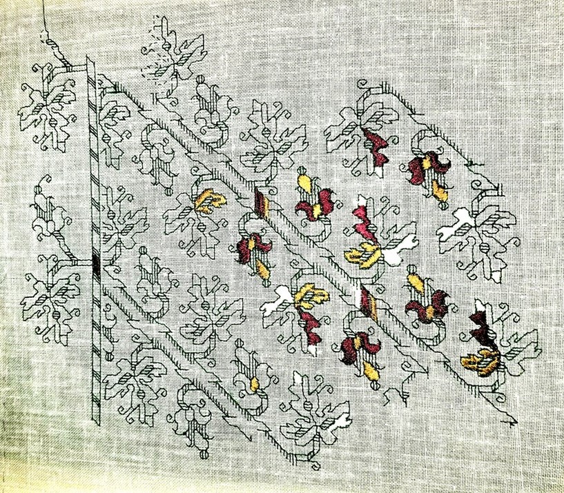
I’m munching along on both the repeat and the border. But being a tad lazy, I’ve been concentrating on the easy-to-do double running, and not on the high-concentration-to-achieve satin stitch. (I envy those who walk through satin stitch and make it look so simple).
This segment is about 65% as wide as the finished piece will be. The center diagonal branches will stretch a bit further to the left, possibly one or one and a half more iterations of the repeat. There will also be a companion border on that edge. I am still deciding whether or not I will add borders to the ends now captive on my frame’s rollers, or whether I will just finish out the design either truncated, or with the narrow diagonal trim, but without the accompanying outer leaves. Lots depends on what this will end up being. That decision is also still up in the air. Pillow? Framed piece? Soft-finished scroll hanging? I haven’t a clue. Not yet, anyway.
In any case, the double running is not presenting a problem. The design is pretty straightforward. Each side of the branch is its own baseline. The only tricky bit is placing the branch sides at the right spot. To do that, I have been using a point where the leaves approach each other closest. That’s the spot with the little “thumb” that sticks out and waves at its counterpart.

I work the next branch side by counting over from the established bit, then proofing my work as I go against other previously stitched areas. Yes, I do make mistakes, but by and large, once I have the pattern down – in this case mostly memorized after so many repeats, counting mistakes are rare.
Much more common is an annoyance of working with one hand in front and the other behind, and blind. Try as I may, I still catch and stitch through my working thread as I push the needle back up from the unseen side to the front. While waxing does help a bit for the double running sections, I still have to stop and de-tangle my stitching thread, often sacrificing a bit to the resulting fray. And it’s worse for the satin stitch areas because those can’t be waxed at all. Not and preserve that lovely sheen.
Since I have only a limited quantity of the thread I am using – more of the vintage “art silk” I bought in India – every inch lost to fraying is heartbreaking. In fact I am working compartmentalized so that I can terminate early, just in case running out of thread becomes all too real.
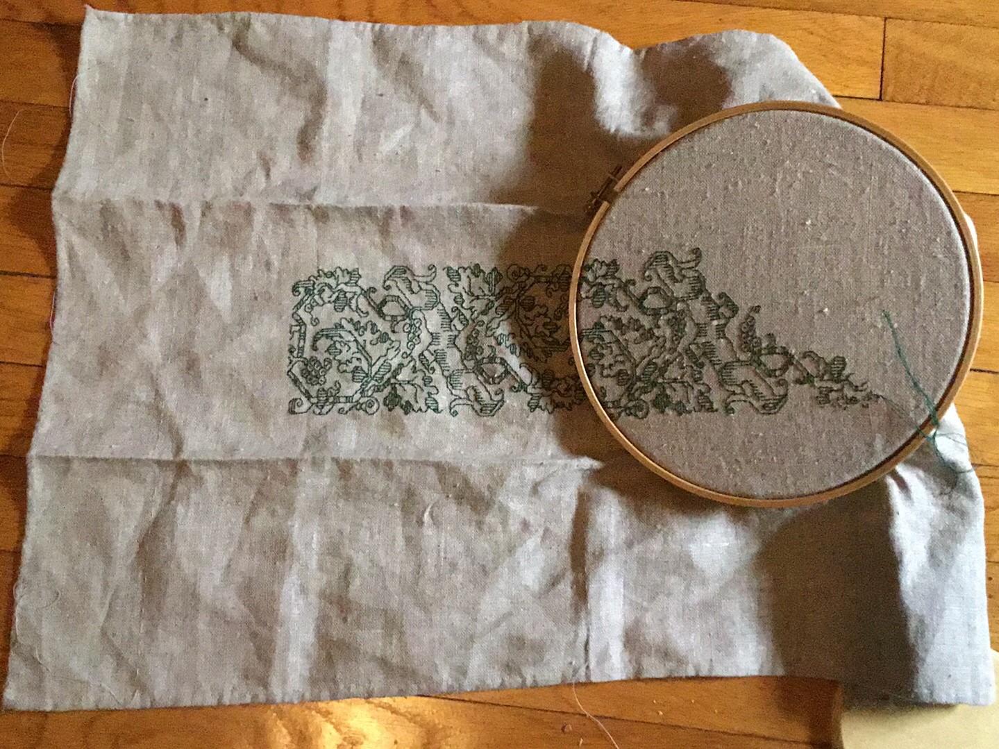
TAKING ON A LIFE OF ITS OWN
I continue on the Italian Renaissance leafy multicolor piece.

The skewed weave you may see is an artifact of image compression, and is not indicative of the appearance of the ground cloth.
Originally I had thought to do yet another sampler cloth, with lots of designs grouped rather willy-nilly, but I have changed my mind. The look of this particular ground is so striking that I want to do a larger example of it. I also have a companion edging for this all-over that I’m itching to apply. Right now I’m leaning towards a large rectangular piece, surrounded by that edging, possibly using some surface work in gold thread for added bling. I’m not sure what the finish will be, but I am considering making this into a pillow, which is one of the possible original uses for a design of this type.
Along the way I am re-learning the delights of Satin Stitch. It never was one of my faves, but the play of light using the faux silk thread can’t be beat. The deep green I’m using for the counted outlines in double running is waxed, but the satin stitch in-fillings are not in order to maximize sheen. And no – I’m not going to stitch every area in every leaf. I’m going to leave the piece partially filled in as it is above. That’s more or less along the lines of the original, but possibly leaving a bit more unfilled. The decision on working the red on the other half of each large leaf is still being made. On one hand it would look interesting, but on the other hand, so much red would overpower the rest of the stitching. Opinions are solicited here.
I’ve also learned the hard way how NOT to handle the multicolor fill on the branch. Originally I had done it as multiple rows of one-unit tall satin stitch, vertically. That broke up the color too much, so I picked that out and re-did it wider, but with the color broken up by the little bits of cross hatching on the sides of the stem. I am not entirely pleased, in part due to clumsy execution of the first. Working that bit horizontally is right out, both for fidelity to the original reasons, and due to the breadth and spread of those areas. I may need to explore threading my satin stitches underneath some of the crosshatches. Or just learning to do them more neatly…
The current plan is to work up the rest of the area inside this hoop, and then transfer the piece to my big flat frame. The thought of hooping over all that satin stitch brings the visceral feel of fingernails on a chalk board.
ANOTHER OPENING, ANOTHER SHOW
OK. Fresh off Cupids, I begin another haphazardly planned piece. As I start this write-up, I have no clear idea as to what I might be doing. But I do know how to start.
I’ve taken a piece of linen from my stash – it’s probably around 40 tpi – and I’ve hemmed it on three sides. The last side is selvedge and I am lazy.
I have also used regular sewing thread to mark out my absolute edges, and the centerlines. I hesitate to say horizontal and vertical because at this point I am not sure which orientation I will use. Note that I have not gridded the entire piece, nor are my basted guidelines done on any sort of regular count (other than following a specific line across the entire cloth).
Now on to think about threads. I’m tired of the DMC cotton I’ve been using. I still have some significant quantities of the faux silk I bought in India. My color selection is more limited, but there are several that remain in multi skein hanks. I’ve picked out some of these in deep forest, a burgundy, a gold, and an off-white/silvery. Polychrome!
Now on to the design itself. And observations on a design cluster.
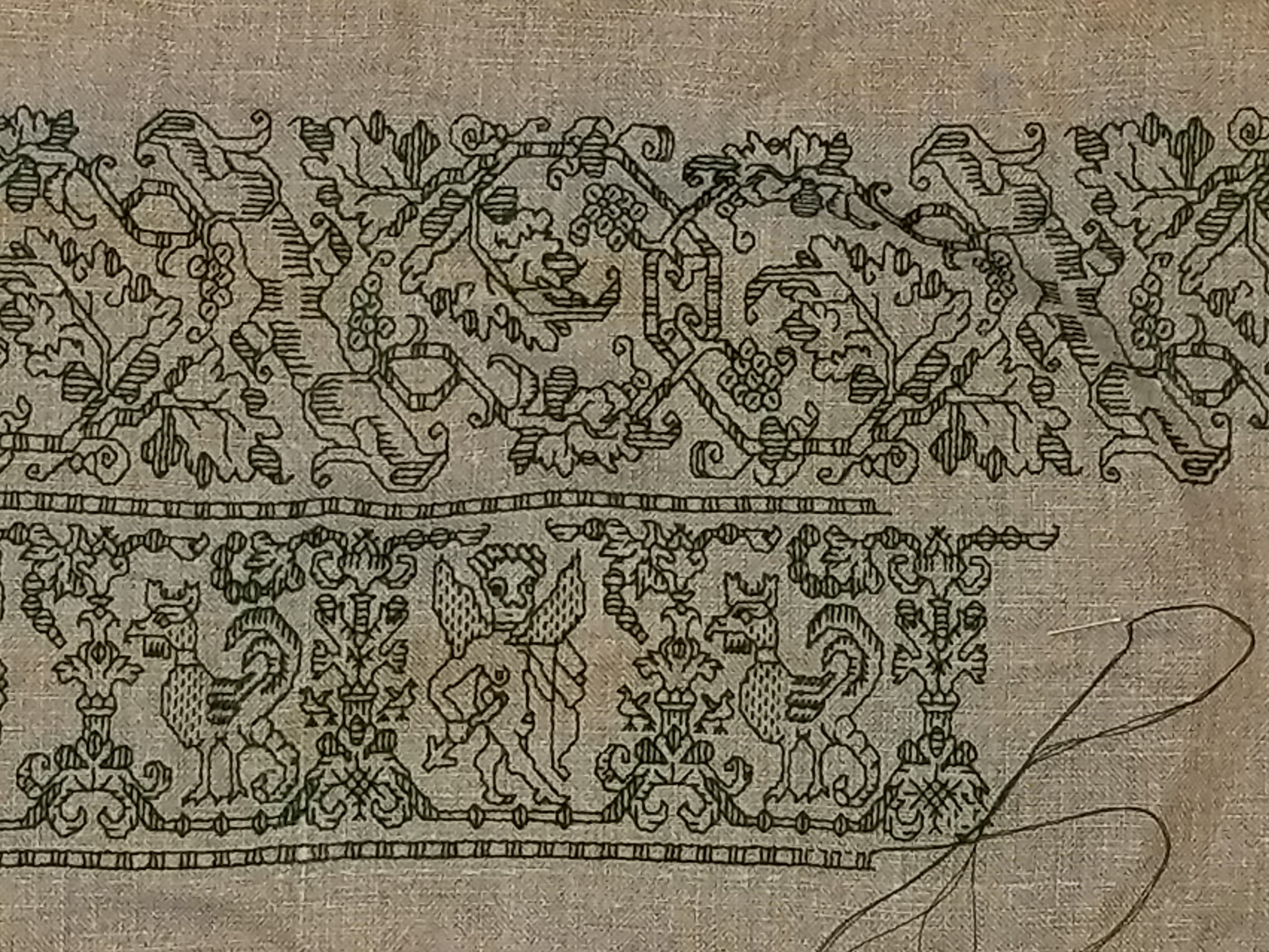
I’m basing this one (at least in part) on an artifact on the Philadelphia Museum of Art, Accession 1894-30-114. The image below is cribbed from their site.

It’s a curious piece, not only because of the use of multicolors, but also because of the clearly counted linear outlines plus the satin stitch fills. Here’s my color-change start:

I haven’t done one of these multicolor, filled pieces yet, and I’m interested to see how I can gild this particular lily. In true bungee-jump stitching style I am not sure if I will fill out the entire cloth with this design, or if I will just do it as a center, then edge it around with other concoctions. Time (and thread availability) will tell.
Now as to why I think this one is part of a design cluster.
While I note that the dating for the Philadelphia Museum snippet is a bit odd (they claim 14th century, which to me is way too early), this piece has significant family resemblance to several other artifacts. One is the center panel of my Stupid Cupid sampler. Both it and the one I’m working now will be in The Second Carolingian Modelbook.

The original of this piece is in the Jewish Museum in New York, Accession F-4927.
Here’s another sample of a similar design. This bit is from the Metropolitan Museum of Art, Accession 79.1.14, along with my stitched rendition of the a very similar design as presented in Pauline Johnstone’s Three Hundred Years of Embroidery, Wakefield Press, 1986, on page 17. My bit is in red at the right. I included the chart for my version in The New Carolingian Modelbook.


UPDATE: The sample in Ms. Johnstone’s book (shown below) is a holding of the Embroiderer’s Guild, #5376. It looks like it and the Met fragments are more long-lost siblings. It’s stitch for stitch identical in every detail to the Met piece.

We have a clear provenance with the Jewish Museum’s piece. It’s dated with a reference to the Jewish calendar year 5343, which puts it at 1582/1583 on the standard Western calendar, and it’s from a congregation in Rome. The lady Honorata Foa either commissioned it or made it herself for donation to that congregation. I’ve written about it before.
The Met’s sample is “Italian, 16th century” (The Embroider’s Guild pegs their piece as 17th century); and the Philadelphia Museum of Art’s sample is also pegged as Italian, but bears rather that rather specious early date.
Now these three designs are not the same pattern. BUT they are quite similar in composition, aesthetic, and motif. All three use semi-realistic gnarled limbs in combo of stylized leaves and crosshatched branches. Two employ grape or berry clusters, and two use those odd multi-tier bell like flowers along with the leaves. All decorate leaves either all or in part with parallel lines, or segment them with some areas accented with parallel lines. And all use large leaves of similar form. Two employ similar sprig companion edgings, and all refer back to the crosshatched branch form for a small dividing border between the main field and the companion edging.
I have not yet found a modelbook example of a pattern in this style.
So…
Are these all examples of a regional substyle – a design vocabulary popular in Rome in the late 1500s? Are they products of a specific professional family of embroiders, or a commissioned workshop/atelier? Were these motifs in general circulation – copied from household to household either from printed pages or from previous stitcheries? Were they done by or associated with other members of Honorata Foa’s congregation?
We can only speculate, and acknowledge that these designs are in fact visual cousins, and in all probability present a snapshot of a specific style, from a specific place, and a specific point of time.
UPDATE UPDATE:
Oooh oooh! What should I find in the Uffuzi Museum’s on line taste of their current “Colors of Judiasm” exhibit, but another 17th century piece with stylistic ties to the items above! It’s beginning to look like this particular group has very close ties to the Italian Jewish community of the 1600s-1700s!

FRAMED!
At long last. Framed and hung up in the bedroom.

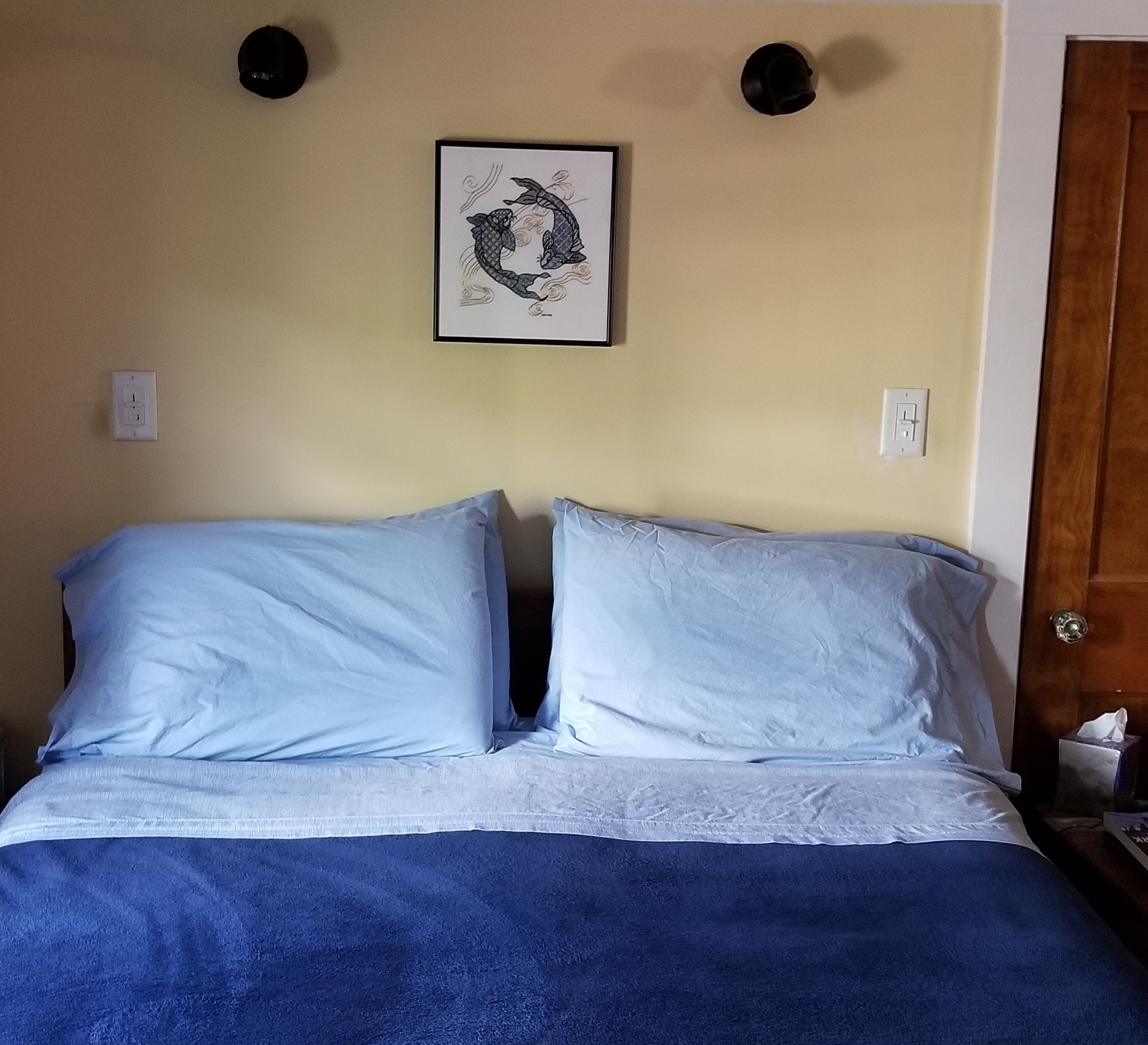
Obviously I now have to paint the bedroom walls…
I’m quite happy with the way this turned out. The frame is simple enameled steel, in deep navy. I ended up going to Walden Framer in Lexington, MA. Mr. Ed Pioli, the owner and artisan in chief, did an excellent job at a reasonable price. I will be bringing my other as-yet unframed pieces there, too.
To answer more questions on the piece’s composition, mostly from other people outside the framing shop when I was there. No, neither of us is a follower of astrology, and it’s not a panel depicting anyone’s sign. It’s just two koi, in a traditional arrangement. And no – there isn’t a boy-koi, and a girl-koi (or any other manifestation of yin/yang) intended. It’s just two koi swimming in a circle. And no, that’s not real gold thread. It’s high quality imitation gold sold for Japanese embroidery. And no, I didn’t sew it on a machine, I did it by hand. Really and truly. (People are curious about the strangest things.)
What am I working on now? Well, the Great Tablecloth/Napkins project is done, but I still itch to stitch. So I’m just doodling. Filling up a small piece of linen, waiting for the Inspiration Fairy to chuck a brick through my mental window.
I’ve written about this design before. I think this time I’ll circle the center panel with other, narrower bands. Again, no set plan, I’ll just pick them as I go along, with no composition agenda in particular in mind. Eventually I’ll figure out what to stitch next.
UPDATE
It’s taken me a week or so to get this post up and out. In the mean time my doodle has grown, but still has no plan.
The lower design is a curious one. Although it’s a clear repeat with the rather bulbous naked cherub alternating with the cockatrice, there is little symmetrical inside the repeat. Close attention has to be paid to this one because even the internal framing mechanism (the bar and beads below the feet of each) has a different counts in each of its two instances, and the usual urn or leafy unit between the creatures also exists in two incarnations. It’s a curious one, for sure, but fun, and is keeping me on my toes.
Both of these designs will be in T2CM, which is moving again towards release. No date yet, but watch this space.
ANOTHER ENDING
Within a general miasma of the-project-is-over-what’s-next blues I present the tablecloth and napkins set:
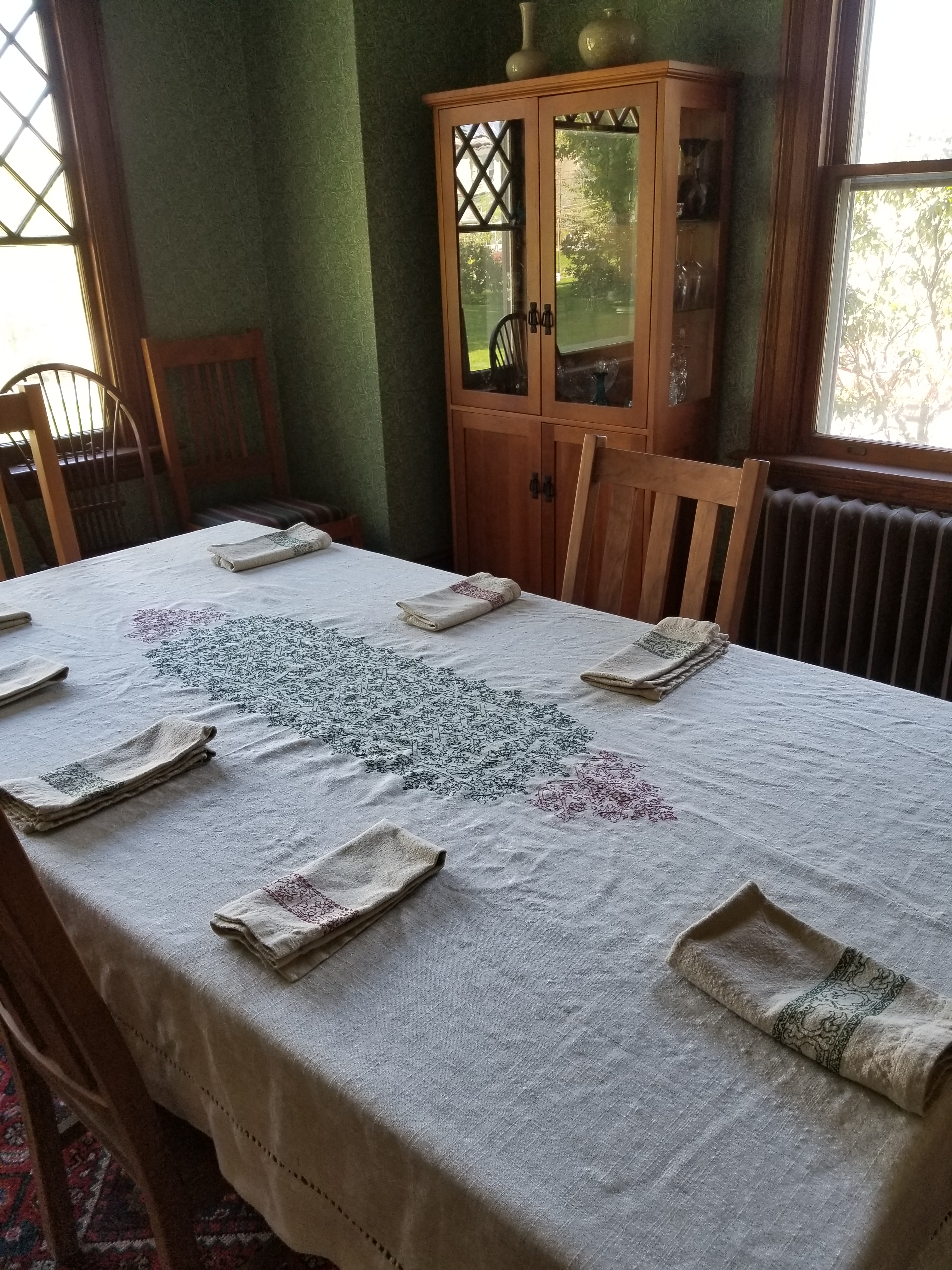
Yes, I will iron the thing before I set a formal table with it, but there’s no point in doing it right now.

I left the areas close to the place settings bare so that in the absolute eventual occurrence of gravy spills, it will be easier to treat the stains.

Special thanks to Elder Daughter for these shots. She’s much better at general camera, even cellphone camera than I am.

Now.
What’s next…
I feel the need to keep stitching. If I can find my stash of green silk I may go back to my Long Green Sampler. But I put it away in a Safe Place; that classic Safe Place that is now out of memory. While I keep hunting for it I might do a quickie, improvised project, then turn it into something useful, like a carry bag or zippered pouches. So many patterns to try out, and so little wall space at this point.
Now in summary and project post-mortem.
I started by buying a plain pre-finished cloth and separate set of napkins from Wayfair.com. I wanted a “rustic linen look” and intended to use them as-is. But when they arrived I noted that the thread counts on both were close enough to even weave to be usefully stitched, slubs and all. I used a mix of threads – a red Sajou embroidery floss #2409, and DMC 890 green floss for the napkins; and (having run out of my souvenir Sajou) DMC 815 on the tablecloth. For the various flosses, I used three plies of both kinds, even though the Sajou was marginally thinner than the DMC.
I started with the napkins, doing one at a time, half red and half green, for no other reason than I thought it would be fun:

The designs are primarily from my ever-forthcoming Second Carolingian Modelbook. After the napkins were done, I wanted to make a coordinating cloth, similarly mismatched in the same two colors.
I started with the center panel design which I graphed up, also for T2CM, from an artifact in the collection of the University of Rhode Island. While it is voided here in the photo provided to me by Christine Lee Callaghan (SCA – Lady Cristina Volpina), I chose to work it outline-only for this piece.
Riffing on the motifs in the historical artifact, I designed a companion edging and end-triangles to complement. Those designs aren’t in T2CM, but as soon as it is released, I will post them here.
All in all, I am quite pleased with the result. Now to figure out what to stitch next, because I find stitching more relaxing than knitting, and the need to stitch is still upon me.
FINAL FUDGING
I’m pretty far along with the tablecloth now, having completed the center panels, and most of the edging top and bottom. Now time to plan out the edging on the two narrow ends, left and right.

Being a bungee-jump stitcher, when I improvised the companion edging I did not bother to consider how wide it would have to be to repeat evenly across. I just went for it, figuring that because I started at the center, each corner would end more or less in the same place.
And when I got to the corners, lo and behold! They are spot on. Here are the three that are done, the other one is still in the frame.


Perfect alignment.
So I’ve taken my border, looked at what’s been stitched, aligned the center of the border with the center of the main motif (and adjusted because the center in this case is a block unit, not a single stitch), and doodled up a juncture.

I’ve taken some liberties, joining the main motif to the side border – not a historically accurate practice – but since I am not making a historically accurate reproduction, why not? Also note the center. I’ve elongated the wrapped scepter motif used elsewhere in both the main and companion designs. We will see if I like it when it’s stitched up.
What’s after this?
I’m still thinking of adding secondary smaller medallions at either end of the cloth, in red. Another design, probably, but I have to either find or think one up that plays well with the established stitching.
TRY, TRY AGAIN
Back from the drawing board. I plan to try this version out tonight. (Quick and dirty plot, not neatened up for general consumption).
You can see how it is wider, more open, and looser than the last version, below

Both are original compositions, incorporating and adapting motif bits from the main design, but they have very different movement and feeling.
My fellow bungee-jump stitchers, note that I also decided that aside from centering the companion border’s repeat on the midpoint of the established work, I am totally unconcerned with how the longitudinal counts of the two interact. This border will not end “neatly” at a corner. I will have to improvise something on the fly when I get there, so Off-the-Cuff Design Fun hasn’t officially ended yet.
I can sense the rising collective gasps of horror from the mass of people who prefer the entire project to be complete and neatly charted prior to being worked on a basted, gridded ground. I understand you and respect your ways, but I enjoy the frisson of danger inherent in my method, and accept that picking out is always a a looming possibility.
And for those of you who want to know what I’m using to create these, here’s a link to my tutorial series for using the free drafting program GIMP to set up and work charted designs. I’m afraid that due to the vagaries of blogging software indexing, the lessons are in reverse order. Go all the way to the bottom of the page, and start with the entry,
“Squares!”
Stay tuned for results of this experiment. At the worst, it’s picking out, and back to the drawing board. Again.
UPDATE
Its a keeper!

Now on to finish out the leftmost repeat, add the one on the right, and add the now-established edging. Also to noodle out how to treat the corners… Adventures in needlework, for sure!
EIGHT IS ENOUGH. ALMOST.
My doodle napkins. All eight complete.
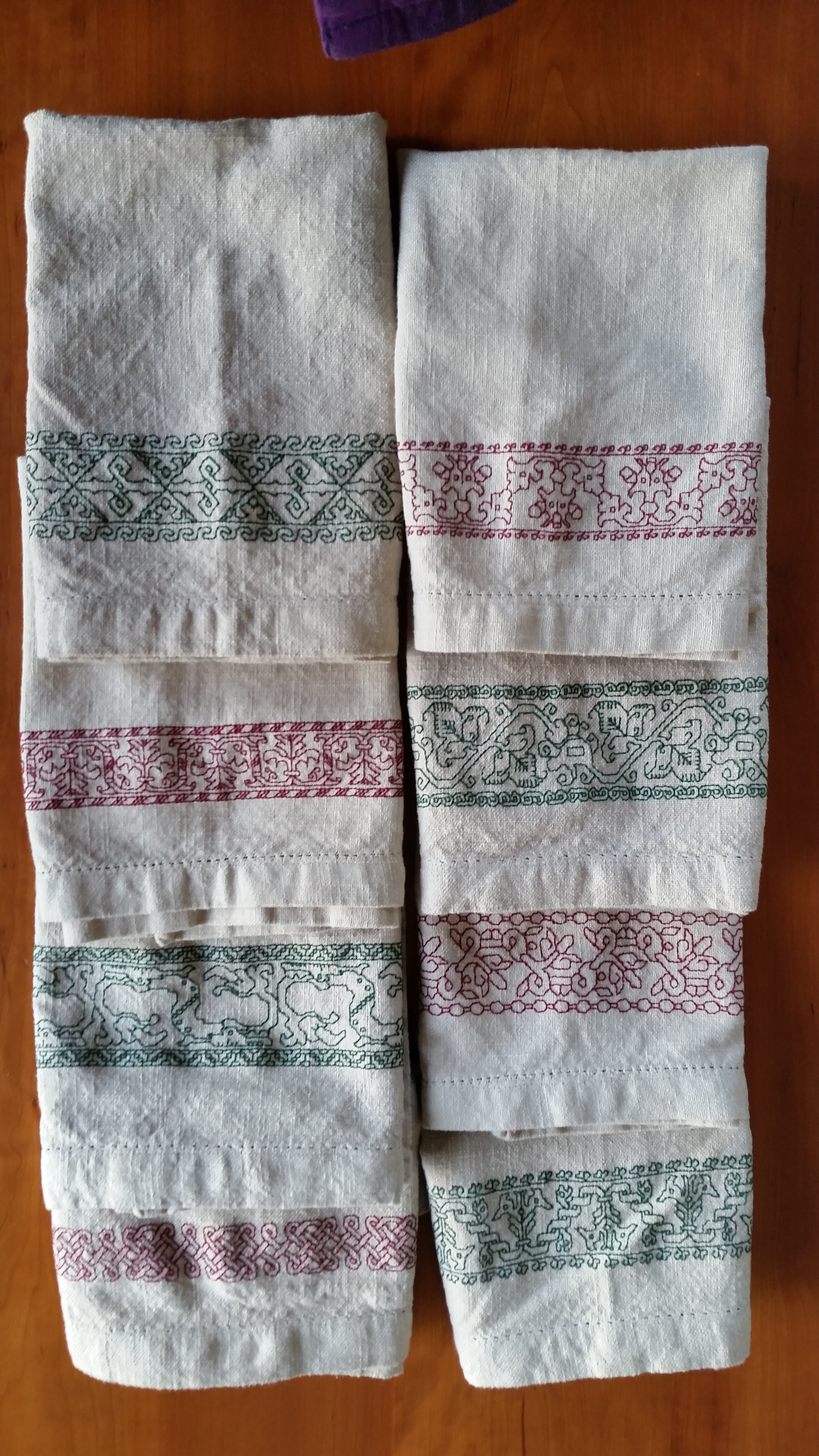
Overall, I’m quite pleased. They were each individually fun and quick to stitch. I did not agonize over them (although there are no mistakes). Napkins are transient goods, destined for hard use, gravy stains, and wine spills. Therefore I did them “quick and dirty.” I used knots, rather than agonizing about ending off my double running stitch invisibly. I used launder-me DMC and Sajou cotton threads, not silk. And the napkins themselves after shrinking in the machine, sometimes through multiple washes, are all slightly different sizes, with almost a full inch of width/length difference between the smallest and the largest. Frankly, I don’t care – they will all serve their purpose quite well.
This shot is for Anne, who asked to see how I was wrapping the borders around the corners of the main motifs:
I’m not going back and adding a secondary border to the first one I did. Or at least today I’m not thinking about doing it. The others were exercises in educated fudging. I was thrilled that the border on the last one (lowest green one on the right) worked out perfectly, both horizontally and vertically, to make four neat and symmetrical corners. That was serendipity, not planning.
Now on to the tablecloth. This one is going to be a challenge. I’m using my sit-on hoop, with the bulk of the cloth gathered up and stuffed into a pillowcase that sits on my lap behind the hoop while I stitch. Not optimally comfortable, but necessary to keep the thing quasi-clean while I work. The cloth itself as a ground is not as easy to count or as forgiving as were the napkins. The threads are quite spindly and rather slubby, but I’m managing.
The design, like those on the napkins, is from my ever-forthcoming Second Carolingian Modelbook. This one in particular is a challenge. What you see here is less than an EIGHTH of the total repeat. This pattern is the largest all-over I have encountered. The artifact I charted it from (below) showed it in voided form, with the background filled by a heavily overstitched and meshy effect ground. I am only working the foreground in double running. Time is too short and tablecloth-hazard too likely for me to invest months in the very labor-intense original treatment of the background.
Special thanks to Christine Lee Callaghan (SCA – Lady Cristina Volpina), who unearthed the artifact from the collections of the University of Rhode Island, and provided spectacular photos of it to me, a byproduct of her own academic research. The image below is hers, appearing here by permission

© 2014, Christine Lee Callaghan, of University of Rhode Island Accession Number 2003.12.286
