QUARTER FOR YOUR THOUGHTS
No, not inflation – at least not overtly. I’m just about 25% done with the frame around the outer edge of my Italian multicolor piece. Closeup posts of the bit currently under the needle are going to be repetitive from here on in, so I present the full canvas of this “painting.”

If it looks to you like I’ve sped up production – I have. I had wanted to mount this piece on my big Millennium frame, but I had no extra wide twill tape on hand. In person shopping being a bit unwieldy right now and not wanting to rely on goods sight-unseen I’ve stuck with the hand hoop, the sit-upon hoop being an inch wider across and even less suited to close-edge work than this smaller one. But I decided to stick the little hoop into my Lowery floor stand. That lets me work two-handed, one above and one below. And working that way for me is about half again as speedy as holding the hoop in one hand and stitching with the other. So one “up” repeat including initial outlines, meshy fills, and Montenegrin lines took about an evening and a half to stitch using the floor stand, but took three+ evenings with the hoop in hand.
The sharp-eyed will note that the center of the repeat currently in the frame does NOT align with my basted line that marks the center of the cloth as a whole, while the center of the repeat along the short edge, where I began does line up with the horizontal center line.
This was on purpose.
I took pains to do the math for the short edge, hoping to get close enough to the final diagonal needed to make a graceful improvisation for the corner. At that time I hadn’t realized that the original stitcher fudged the corner that most resembles what I wanted to do. I made it without that fudging, but at the expense of stitching further towards the serged edge of the cloth than I would otherwise prefer. You can see how low in my hoop my stitching is – a very inefficient and precarious placement that barely grasps the lower end of the fabric as I try to achieve and maintain optimal tension.
Since I hadn’t graphed out the corner and had only a rough estimate of depth, and knowing that my plans for a neat turn might not fit, instead of beginning the piece along my original posited outer edge (the basted line at left), I skimped on the edge area there, too. Not quite as much as along the second edge, but enough to make a difference. My logic was that when I continue around, if I need extra width or some odd bit of kludging to get to a neat corner on the second turn, I’d have more options. And if I didn’t, I wouldn’t be inconvenienced by the extra unworked cloth, and could cut it off in my finish.
Having narrow margins around the stitching (however inconvenient) and removing any excess play into my plans. My intention to finish this piece is to imitate the original, with “poetic interpretation” of what little remains of that treatment – a narrow turned hem, with neatly spaced blanket or buttonhole stitch and corner tassels. The hem-covering stitch of the original is probably plain old blanket stitch due to the way it has deteriorated. I would think that the edge reinforcement of tightly twisted knot like bits along the free edge in buttonhole stitch would have been preserved better, resisting large runs if snagged. But little remains. It’s very hard to see in the photos I took and the museum’s own shots, but there might even be a very narrow, barely there strip of needle lace along the edges – not wild stuff with dags and picots – just a simple solid band. I’ll be squinting at the photos to see if I can learn more. I’ve done that type of edging before, on The Resident Male’s SCA fighting shirt, in black, long ages ago, so it would not be a stretch to do it again. In any case, plain stitched hem or fancified hem, there will be little reveal of plain cloth between it and the established stitching. There will be plenty of linen left for the hem, regardless of how wide or narrow the stitched part ends up being.
Now where the true vertical center point of the piece as a whole is will matter when I get to the wide bar I am planning to add. That will span the middle, across the short dimension. It may be aligned with the center of the pattern iteration I’m currently stitching. That’s about an inch left of the basted line. BUT if I get near the other end of this side and I decide to devise ANOTHER corner treatment, and that treatment needs additional width, it might move either closer to the cloth’s original centerline, or to another point in that general direction. No clue right now what I will be doing, so stay tuned!
….Isn’t the suspense of Bungee Jump Stitching furiously exciting?
NOT QUITE EXACT, BUT GOOD ANYWAY
So. More examinations of the corners of the big towel from the MFA, and my first corner. Here are the four corners of the original
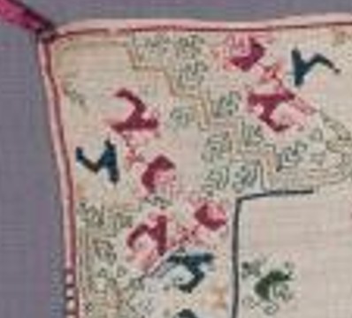

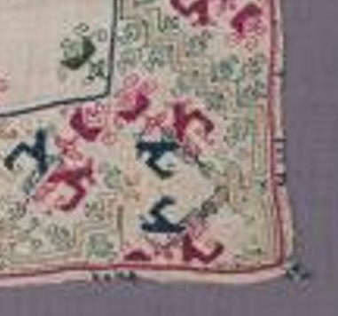
Not quite aligned but all there. Now my stitched corner as of this morning:

It’s closest to the one on the lower left, above. But not exactly. Look at this bit.
That’s a clear kludge. Not to brag, but my join is cleaner than this. I can’t deduce where the stitcher (or stitching team) began, but it’s clear that either the vertical bit on the left side of the photo, or the horizontal bit on the right was already laid down when that corner was rounded. The stitcher did their best, but the pattern doesn’t line up. For that matter, no two of the original corners ARE the same. But I bet you didn’t notice when you looked at the thing as a whole.
I will continue around on my mini-version. I haven’t decided yet if I will limit the width to multiples of the whole design, so I can replicate my corner exactly for the remaining three. Or if I will just make do, in a celebration of the heedless joy of the original.
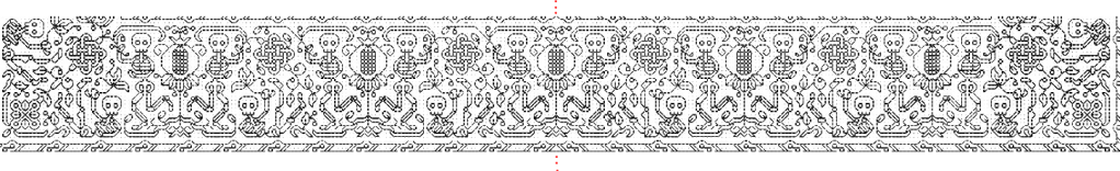
And how far do I have to go to get to the next corner? Here’s my full cloth, so you can see the proportion of as-yet-not-done to the bit completed:
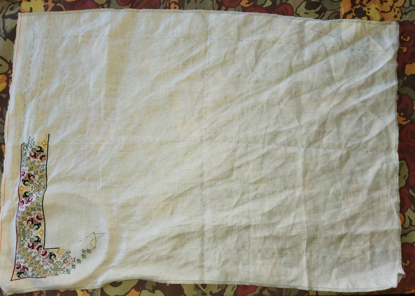
Quite a ways.
Aside from the corner challenge, upcoming decisions include a supplemental treatment spanning the center. Here’s the original again with two double width strips and two narrow single width ones across the center.

Examining those bars, I can conclude that they were done after the framing, and were aligned with the cloth’s horizontal centerpoint, because the band design is truncated (more or less) at the same point where it meets up with the frame, both north and south. But note that the centers of repeat along the long sides of the frame itself do NOT align with those bars, nor do they align with the measured center of the cloth. Again I bet you didn’t notice.
My smaller cloth may have enough room for one wide center bar; two narrow center bars; or one wide bar flanked with two narrow ones. Lots to think on there, but I won’t get to that part until after the frame around the edge is complete. And then there’s their alignment to consider. (I’m leaning towards filing them under Chaotic Neutral for the time being.)
On the healing front, I’ve completed Day 23 of radiation therapy. 17 more to go. No major perturbations, just the slog of rising before dawn to drive downtown and back before major traffic. Not that I’m counting or anything…
FALCONS AND SWORDS
Of course we’ve got them. This is of course an homage to an epic fantasy adventure.

A finish on the voided falcon panel. Foreground first in double running stitch, using black thread. Background then worked in the same accent yellow I’ve been using, in long armed cross stitch (LACS). The telltale plaited look of LACS done in rows that alternate direction is clear:

Working the voiding after the outlines can be tricky. First, on a design this dense, there are lots of angles and small spaces that need to be accommodated. Those starts and stops are a headache for sure, and make the texture a bit murky in that last stitch where the fill abuts an outline. And then there’s the care taken to not snag or penetrate the outline stitching itself, so that it isn’t covered by the voiding. You can see a couple little spots on this were I wasn’t totally successful, and a black outline has been eclipsed by the later work in yellow. I did my best, but no one is perfect.
On to the subsequent three strips. First two fillers – a simple bud meander to balance the narrow border just above the falcons. My own invention, and destined for Ensamplario Atlantio volume III (EnsAtl3). Just a touch of yellow in the tulip like flower, and a stitch in the long leaves to bring the color into this band.
The one below with small quad flowers and slanting rods with fleur-de-lys terminals is also my own, and will be in EnsAtl3. I was thinking the rods or staves of office held by seneschals and stewards. A design element congruent with such folk in Treyavir. Again, just a touch of accent yellow to keep it in play.
The current panel is a bit of a departure. I did a spot motif of similar style on my big dancing skeleton Fangirl Sampler, based on an entirely different as yet unpublished book by my Resident Male.

I have since done some modifications, morphing that spot motif into a repeating border. I really like it – lacy and complex. That border will also be in EnsAtl3. But the design didn’t quite fit here. There was too much empty space, and that was distracting. So I picked out the small bit that I had started, and redid my concept specifically for this sampler. The main elements of the design are still there, but they are denser. I think that it will balance out the lighter, more airy two strips just above it. I’m not sure how to deploy the yellow. Possibly filling in the sword blades and embellishing other elements of the interlace. We will see where fancy takes me as I continue with this strip. This variant will NOT be in EnsAtl3.
After this comes one or two more bands, tops. No clue as to what they will be yet. Existing pieces? Prior art reworked? Something entirely new, doodled up to fit? Keep watching these skies and you’ll find out.
POST REBOOT PROGRESS
Although I’ve been lax about blogging, I have made progress on the Treyavir sampler.

Although it looks like I used several yellows for the accents to the plain black stitching, they are all the same color. What makes them look differently are the numbers of plies, the stitch used, and the stitch density. The yellow in the acorns is done in two plies of DMC #3820 in plain old cross stitch. The interlink accents are two strands of DMC in double running, as are the yellow bits in the odd foliate S-repeat below the chain. The triangular counterchange design uses a single strand of the DMC in double running, worked in a simple box fill. And the flower meander currently being stitched uses that same single strand of DMC yellow and double running, but in a very open and sparse manner.
Catching up since the last post, Strip #3, the vaguely leafy S-repeat, is not my own original. I redacted it from sampler dated 1697 (a bit later than my usual sources). It’s from Detached Geometric Patterns and Italianate Border Designs with Alphabet” 1697. National Trust Collections, Montacute House, Somerset, NT 597706. It’s the black one in the second row, upper right. Obviously the yellow is my add, specific to this piece. I’ve puzzled out several other designs from this sampler, and may include them in the next Ensamplario volume, since being post 1610, they are out of the timeline spread I try to stick to for my Carolingian Modelbook series. But in one place or another they will eventually escape from my desktop.
Skipping ahead to Strip #5, this simple meander is another of my own doodles, and will also be in EnsAtl III, but with a departure from that to-be-published version. Like all of the other placements of yellow in this, the background play was improvised on the spot just for this piece.
The one above the in-process stitching deserves a longer explanation. Strip #4 is something a bit far afield. I can’t call it my own. I would say it’s “After J.R.R. Tolkein.” That’s right. I used an on-newspaper doodle done by The Professor himself as my leaping off point. The heavily embellished newsprint page from August 1960 was displayed in the “Tolkein: Maker of Middle Earth” exhibit. The photo of it was captured by a fellow follower of the Prancing Pony Podcast: Tolkien & Middle Earth discussion group on Facebook, and shared in that group on 9 August 2024. I played with it and produced my version within hours of that post. Here is the inspiring image:

I was moved by the three-color bit at the upper left. Redacting it to be compliant with my blackwork standards was a bit problematic. For one, I stick to a single unit, 90°-45°-180° angle schema. I avoid half stitches and stitches taken over 2×1 units or other multiples. Curved lines are also a challenge. But for all of that, plus trying to keep the thing in as small a footprint as possible, I do think the lineage of my rather art-deco looking version can be perceived.
I also note that the visual designers working on the aesthetic for Gondor in the movie versions of Lord of the Rings might have been likewise inspired by these doodles. Evidence:

Now, what’s this design doing on a piece dedicated to the work of my own Resident Male? I looked at the strips already laid down and then went nosing around in my doodle pages for something that would contrast well with them. Preferably of medium width and a geometric, with potential to be worked up as a relatively solid band rather than a meander or baseline-sprouted design. I wanted something to balance the chain links above it and provide counterbalance to the extra wide designs I’m considering for use in the lower half of the piece. This one was just too juicy to pass over. And flowing from arguably the greatest wellspring of fantasy literature, from which every epic in that genre since has contained at least a drop of legacy, the filtered scion of my interpretation seemed appropriate.
Next up, another Mystery Inscription from Treyavir. Possibly a narrow defining band to frame it, then on to some really complex custom strips that echo bits from that book.
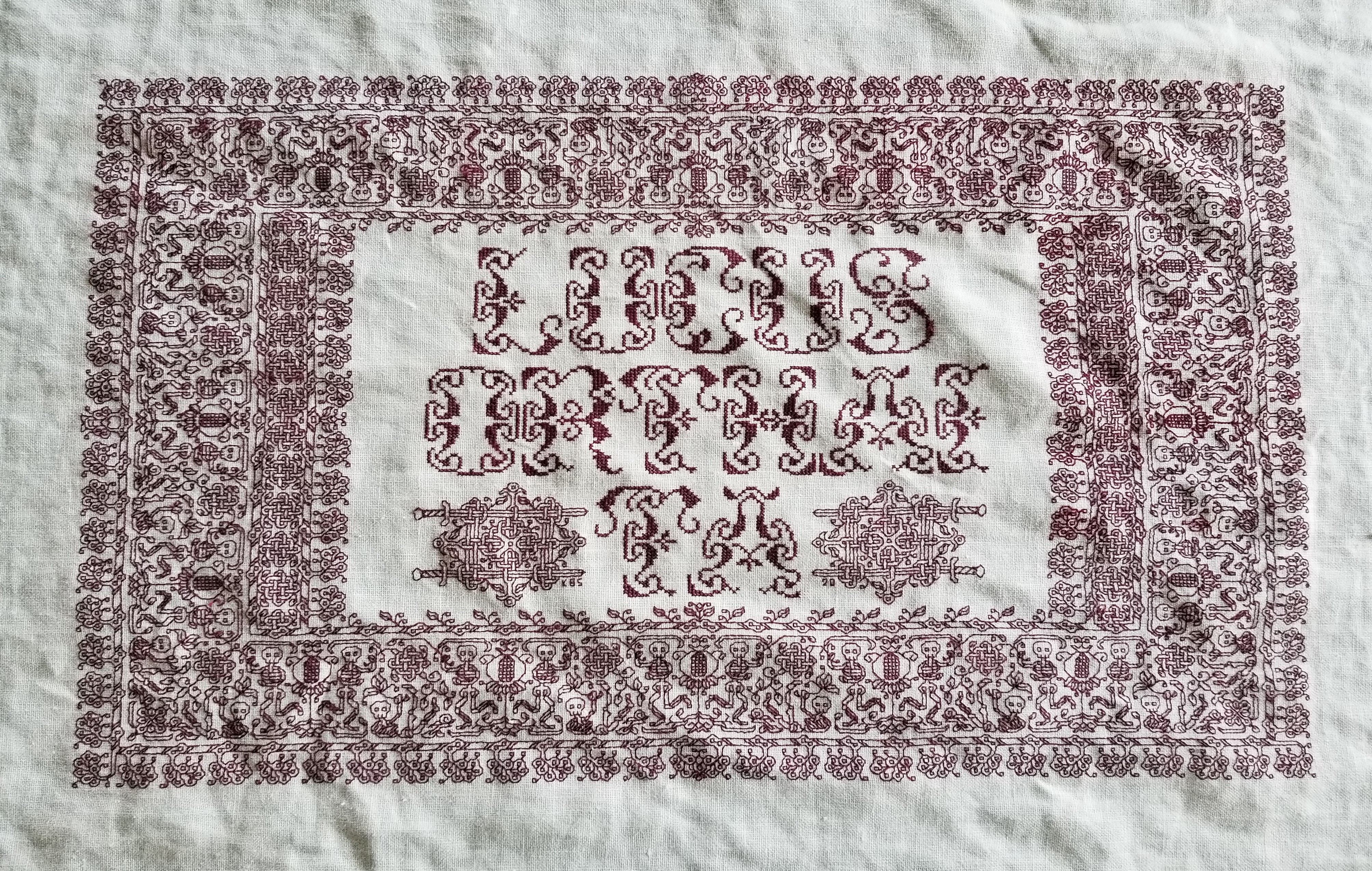
THAT MYSTERY SAYING…
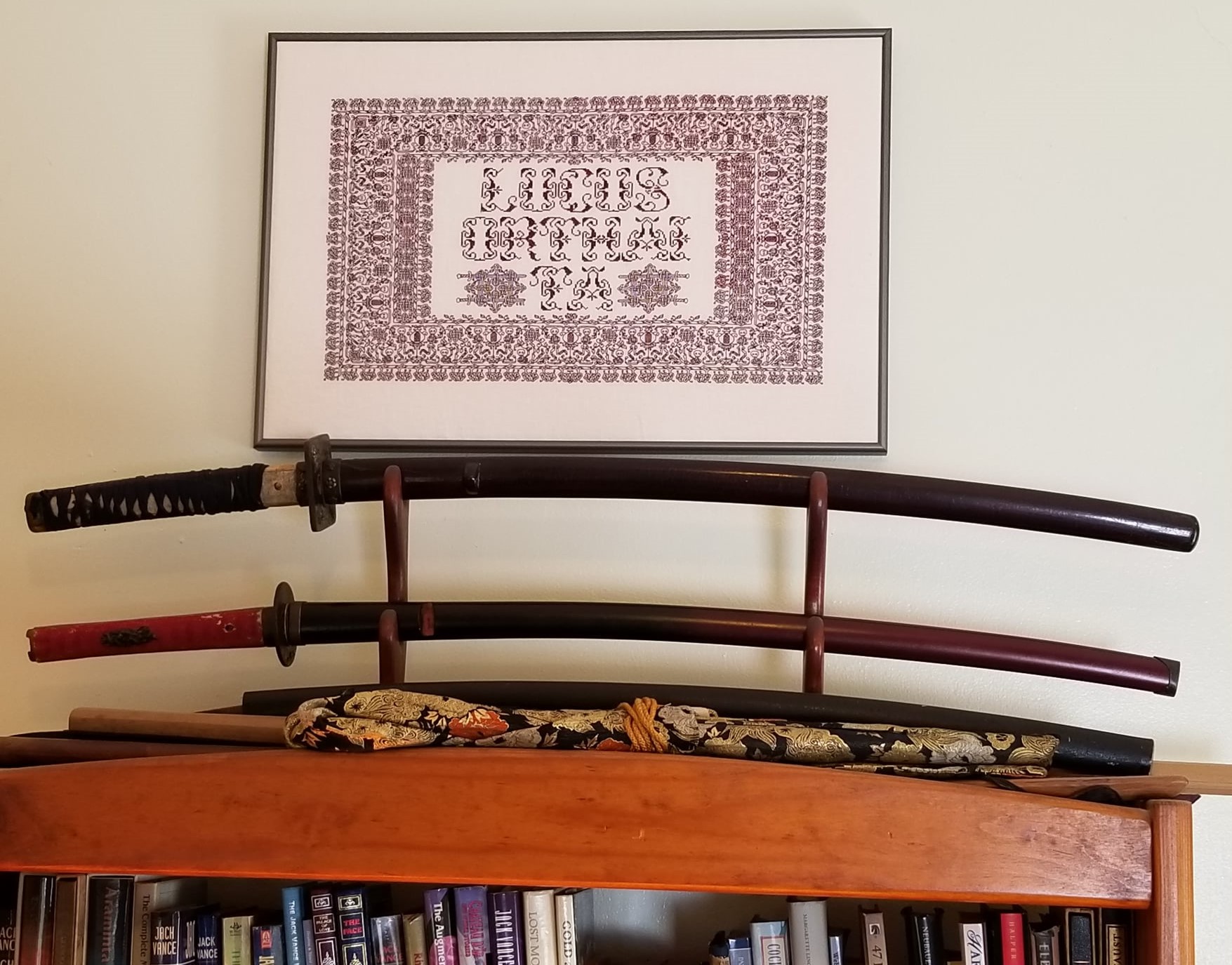
More progress on the sampler tribute to the Resident Male’s book Fractured Symmetry. I’ve teased the photo of the motto on Facebook, and promised to explain it here. I’m now further along, and can do so.

The phrase comes from a discussion describing a settlement of Raylics – furred, pack-dwelling aliens, close allies of Terrans. While their society as a whole is a technologically advanced one, space-flight capable and modern in every aspect, they retain a closer bond to their past than do many other species of similar achievement. One way this manifests is the presence of artisanal/subsistence communes, preserving the skills, values, and lifestyles of prior generations. In this discussion, the Raylic founder of such a commune refutes a scoffer, who doesn’t believe that their efforts would be viable.
“In my youth I traveled space, and on other worlds there are still those who appreciate what is built with ferthan, fuur and fustovv” – Raylic for mind, fist and blood – and we will sell to them if our own folks have so much forgot what it means to truly live.”
Fractured Symmetry, page 224 of the print edition
So in a way, not unlike Roycroft and other similar movements grouped together under the Arts and Crafts banner, this statement echoes the tenets of concentrated, dedicated, personal manufacture; of valuing traditional hand skills for the vision, effort, expression (and any possible personal sacrifice of choice) that they contain. A weighty thought, and one not too often found in gadget-oriented/low-touch science fiction in general. And quite appropriate for a hand-embroidered piece.
As far as what’s what in the stitching, some but not all of the strips have allusions to the various stories that make up the book. The latest band with its fish-like creature is one of the ones that does. All of the band patterns (but not the alphabets) are in my books. A couple are in my free download Ensamplario Atlantio Volume II. Several are from the third volume of that series, on which I am currently working. One is in my for-pay work The Second Carolingian Modelbook.
The fancy initial F is based on yet another of the listings on the Patternmaker Charts blog – adapted from a linear alphabet in Sajou number 182. Although it’s shown in two colors, I opted to do the letter in just one. It was also a bit tricky because it contains a lot of half stitches, which are not well documented in the original chart. Obviously I also modded the letter a bit, making it taller by inserting a bit of my own interlacing, eliminating the solid cross stitch (or satin stitched) units, and smoothing out some pointy ends. The rest of the letters I made up on the fly, as needed. So if you go looking for a full A-Z of them you won’t find it.
One thing I’m still thinking about is adding more to the background field surrounding the motto. A lot will depend on how dense the stitching is beneath it. I don’t intend to do full voiding, not even in a sparse pattern, but there might be some need to add a bit more around the letters. Possibly a couple more spot motifs in blue. We will see…
How far am I along? There’s a little bit of basting remaining, left of the working end of the fish strip. That marks the north/south center point. The fishies straddle it. So there’s still a lot more to go. But that’s good progress considering I only started stitching this one only 14 days ago.
LETTERS FROM THE PAST
Antipodean social media pen pal and long time needlework/knitting co-conspirator Sarah Bradberry recently posted about a thrift store find – a 1971 vintage book entitled Lettering for Embroidery. It’s available for borrowing at the Internet Archive (free account sign-in is required). It’s an interesting read, although its overall aesthetic now looks 60s-retro rather than cutting edge fresh. Which is to say that it’s back in style.
Her post made me think about some of the unconventional alphabets I’ve drawn upon for my various non-traditional samplers, why I picked them, and how I used them.
To begin, I like letter forms – perhaps an inheritance from my grandfather Mack who owned a printing company. He would point out the often tiny differences among various typefaces and font sizes in printers’ samples, advertising materials, newspapers, and in books, and how those differences contributed to the overall message of the printed piece. While I obviously didn’t follow him into the family business, some of what he showed me must have stuck.
Let’s start with one of the more outrageous. It’s a phrase in an non-Terran language, picked up from my one of my Resident Male’s writing ventures. The book itself isn’t out yet, but I can say that in the text, it is translated as “Life’ll kill you.”
Ringed with my dancing skeletons, and bedizened with sword bearing interlaces to echo the stated meaning, I wanted to use an almost unreadable other-worldly set of letter forms; shapes that themselves danced. I went to my go-to spot for graphed alphabets – the free Patternmaker Charts collection of antique Sajou, Alexandre, and other leaflets. This one is from the Rouyer #248 booklet. I kerned and leaded the rather large letters tightly, to accentuate the flow of the curls across the words. (Kerning is the space between letters, leading is the space between lines of type). In terms of composition, the three words are centered, with no regard for how the letters stack vertically. These letters are also proportionally spaced because they vary so much in width, and cannot be easily worked monospaced (the way an old fashioned fixed-width Courier typewriter prints.)
Here’s another where I tried to fit form to the statement. The full chart for Don’t Panic is free here on String.
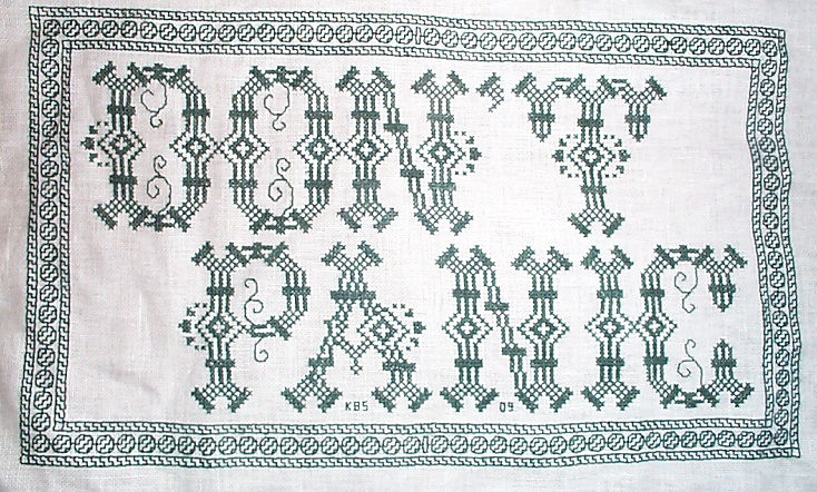

Yes, I know in the Hitchhikers’ Guide books the phrase is described as being “in large, friendly letters,” but this was going into my office where I managed frantic people wrestling deadlines under extreme pressure. I thought a jittery sign would be funnier. My favorite source to the rescue, this alphabet is from Sajou #325. It drips nervousness, even though the firm serifs imply regular stability.
Note that as with many of these vintage alphabets, the letters I and W are omitted, in keeping with the paradigm of classical calligraphy. I extrapolated the I, and doodled a matching apostrophe. Again, I kerned tightly, although I’m not fond of the space between the A and the N. I should have tucked them closer together, as I did between the P and the A. But As are problematic. I also chose not to center these words one on top of the other. The offset adds to the perceived unease.
Here are two more (slideshow presentation to save space, click on arrows beside the photo to advance). In these I chose to use the words as horizontal bands of ornament, flush left and breaking words when I ran out of space. I went back and eked out the bands to come up to the right margins. Mostly I did this because I was impatient. I didn’t want to take the time to do a full arrangement of the motto as it would appear before working the rest of the piece. I knew I’d have space to work the full quotation, but just stitched them letter by letter, with no advance planning. Since I had seen historical samplers that did just that, I felt confident beginning flush left and cutting words in the middle as space dictated.


I am not sure where I got the alphabet for the “Do not meddle in the affairs of wizards” piece. I stitched it circa 1994/1995, just before I began keeping a blog. Obviously the source followed the additional classical convention of presenting just a V shape to cover both that letter and U. I’m also pretty sure I extrapolated the I. In any case, the thread count on this one is no where near as fine as on the others above. There was less room for larger lettering, and I had to find something small enough to fit (most of) the words in, with minimal truncation.
The Arthur C. Clark quotation uses another alphabet from the Patternmaker collection, this time from Sajou #55. It may even be the project on which I stumbled across that source. Being a two-color piece, I wanted something that combined both, and that had an old-fashioned, formal look without being very stuffy. The red swirls suggested a bit of obfuscation and incantation as they tendril around the more solid letter forms. Again I extrapolated the I (thankfully there are no Ws in the phrase). This alphabet with the exception of the I has a very blocky, chunky and solid appearance in spite of the red whisps. There was no need to play with kerning, and spacing between words was easy and regular. The general look of boxy solidity underscores the sentiment expressed. For the A.C. Clarke attribution, I was lucky to find a tall and narrow alphabet in Sajou #172 to fit remaining space on the final lettering line. I will say that after this piece I lost my appetite for broken words.
At the risk of alienating all, my two coarse language pieces (behind the eyeball fig leaf image, also in slide show) use formal typefaces to express very informal and direct sentiments. If you are easily offended by rude words, skip ahead.
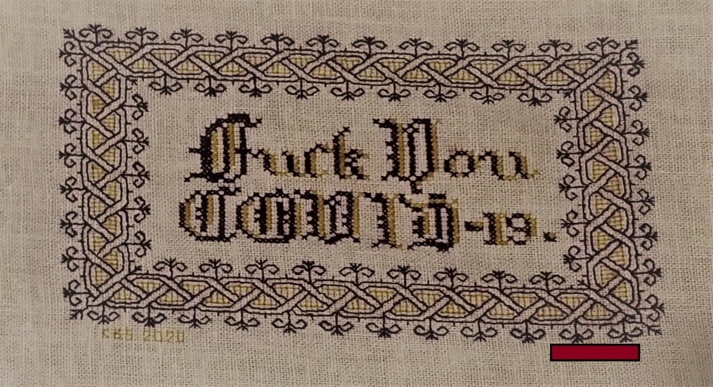
The Covid sentiment, done in a blackletter typeface, uses two alphabets from a German book, available on Patternmaker Charts. One is uppercase, the other lower. The lower case alphabet also supplied the numbers. Again I had to invent a matching letter I. Blackletter family typefaces are reserved for formal documents like diplomas, and newspaper mastheads here in the US. I wanted to play on that gravitas.
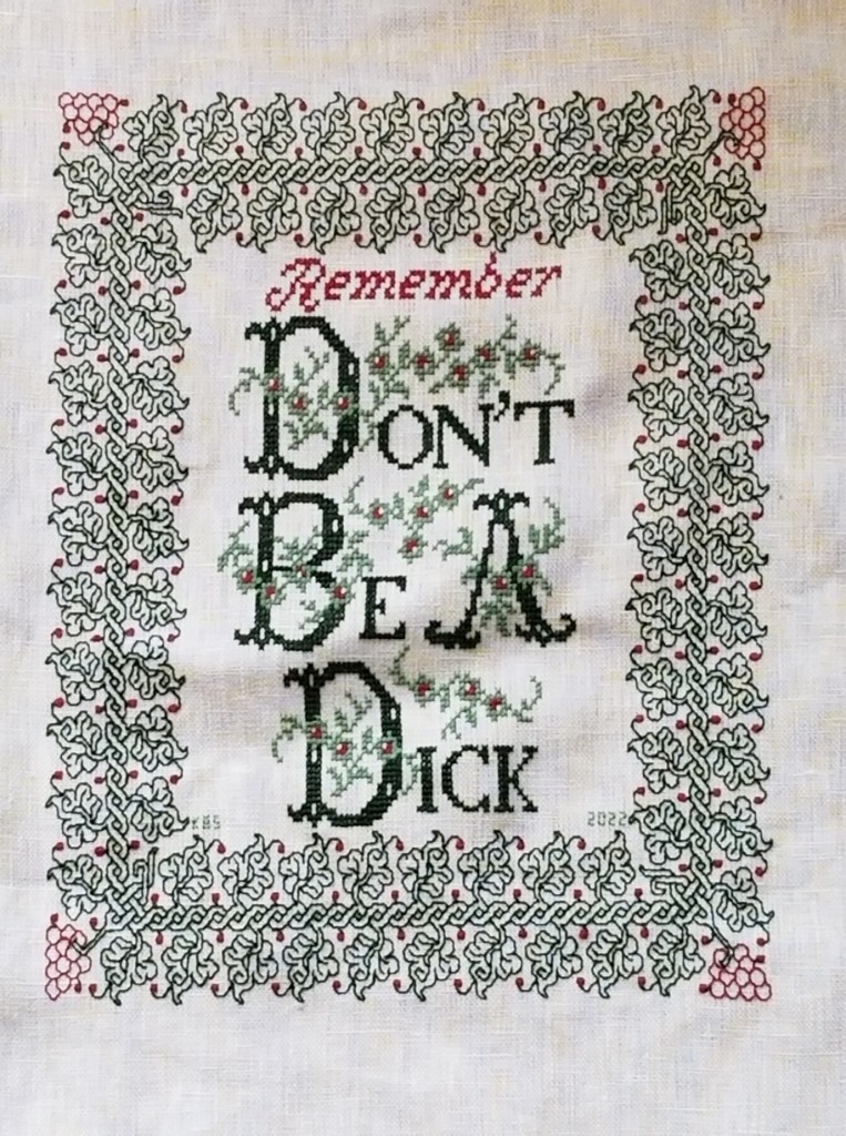
Similarly, for the admonition done in green, I wanted to evoke the greeting card world of hearts and gentle sentiment, to contrast the general scolding represented with sweetness and light. I picked one of the flowery alphabets from Patternmaker Chart’s Sajou #160 but leavened it with a smaller yet still uppercase typeface for the rest of the lettering. That classic form serif alphabet is from Grow and McGrail’s Creating Historic Samplers. The R of Remember is from Sajou #1 also on Patternmaker Charts, and the lower case lettering for the rest of that word can also be found in the Grow and McGrail book. I also adapted the floral ornaments from the initial letters for use as fill to surround the lower case one.
Pay Attention to Trifles has the most typefaces I’ve ever used on a single piece. I wanted the word Attention to leap out, Trifles to be the most ornate, and the message to be decoded only on a second glance. And I wanted a vaguely carnival type over the top mix of styles to complement the extremely busy design that is stuffed full of buried “Easter Eggs” as requested by the recipient.

All of these are from the Patternmaker Charts website.
- Pay – Sajou #652
- Attention – Sajou #654
- Even to – Alexandre #143
- Trifles – Sajou # 53 and 203
The dual tone coloration on these was not always noted in the original. Some I tarted up myself. I kerned each line separately, trying to best suit the alphabets being used, squishing ATTENTION a bit made it shout louder. Letting the other lines straggle a bit more made them a bit more lyrical.
While busy, the mad assortment is just over the top enough to gentle the nagging advice of the motto. If I had done the entire thing in the same face as Attention, the statement would have been way to strident. Throw in a bit of whimsey and it becomes an in-joke between the donor and the recipient. The centered text with the balanced motifs left and right is in contrast to the rather chaotic jumble of gears done in inhabited blackwork. There is repeating arrangement of the gears (more or less), but not the strict centering of the lettering. I think that adds to the haphazard playfulness of this piece.
I have done lots of other pieces with mottoes or words on them, but they don’t really showcase different approaches. The last one I’ll cite here is the piece on which I’m currently working. I’m almost done with the penultimate band, and have designed another custom-fit to go below it and end off the work as a whole.
I can’t say for sure where I found the alphabet I modified for use on this one. I found the image in my notes folder, with no attribution other than mid-March 2020 save date. I ended up upscaling from the typeface as charted by using a block of four units for every single unit in the original, and smoothing angles accordingly. Using the squared fill for the shadowing was intended to make the text reminiscent of a brick wall. That the span of the words is larger than the rest of the piece and contributes to that effect is serendipity, not planning. My count was off, and (thankfully) having started in the center, at least the motto protrudes mostly evenly left and right, looking even more monumental than I had planned.

I did kern aggressively to make the motto fit the space, but I should have lost one more unit between the B and Y of by. Still, I think it works. It’s blocky, yet because the letters are represented by outline and shadow, it contrasts nicely with the rest of the piece, overrun as it is with very busy fills.
OK. A conclusion now. Sort of.
If you are designing your own motto bearing piece, there are lots of choices out there that can make a real impact on the design, above and beyond the decorative elements that surround it. If you are unburdened by time/place restrictions (you are not designing a piece in the style of a specific location, school, style, or era), you are free to play. Think of the lettering as another element you can manipulate to underscore the message of your motto, or to convey a mood in which you would like it to be received.
Want to be playfully threatening, like an admonition to keep the kitchen or bathroom clean? How about using a different typeface and font size for each letter, to make it look like a ransom note. Want to convey warm wishes and affection to your extremely sweet and caring (but possibly somewhat humorless) family member? How about one of the ornate flower-bedecked alphabets from around 1900? Have a Goth leaning pal whose heart beats for irony and sarcasm? Use that same flower font in funereal black and purple to express an over the top sentiment.
You can speak words with typeface choice, font size, color, and spacing beyond the actual ones you stitch.
SOME DEPARTURES
On the final stretch of the Stone by Stone mini sampler. I decided a while back that I wanted to include something with columns in the piece. I had a chart picked out – something I had redacted a while back, destined for T3CM, but was saving for book publication rather than sharing here. But I miscalculated, and the remaining space after the sword panel wasn’t tall enough, so I had to quickly doodle up a solution. It’s not entirely successful. And I’ll detail why after the photo.

First the departures. When I doodle, I stick (mostly) to a list of guidelines I’ve deduced from decades of redacting historical designs. These include sticking to 45/90/180 degree angles – the simple angles formed by the sides and corner to corner diagonals that can be achieved in one square unit. No “knights move,” 2×1 or other multiple unit spanning stitches, and (if at all avoidable) no half stitches. I also try to comply with specific ways that repeats and meanders are formed.
The peacock panel has a small sin – the center point of the peacock’s crown is formed by two half-diagonal stitches. In cross stitch they’d be termed “quarter stitches.” The current columns and potted plants panel doesn’t use any partial stitches, but the urn/plant components aren’t obviously symmetrical to the center line determined by the arch. However you are seeing only one half of the full repeat here. The thing is mirrored as what I described as a type 2 repeat in my earlier post, linked above:

It’s also further complicated by the overlap of the leaf bearing tendril alternating right and left. You’ll see that in better detail as I get further along. This gives it a rather complicated and unexpected adherence to type 2. I’m hoping it will make more visual sense as I go along.
Aside from the issue of the overly complex symmetry the arrangement of the leaves, while formalized is far more naturalistic than historical pieces in general. So is the veining in the leaves. Again a departure from the standard aesthetic.
I’m also not pleased by the minimization of the arch compared to the columns and plant pot. That difference in size and weight does have historical precedent, but it doesn’t complement the overall design as well as I hoped.
And the last bit that didn’t work as well as I hoped is the use of the two colors in this strip. Stone by Stone is stitched in black and green. A very deep green. It alternates by strip except for the motto, in which the foreground of the letters is worked in black, while the shadowing is done in green. The vegetable bits and tendrils of this band are all in green. The columns, arches, and urns are in black. I’m hoping that the green leaves in front of the black columns won’t be so confusing looking when more of them have been completed.
Still, for all of these criticisms, I am not totally displeased. This strip stays. I am not sure what will be the final band below, but whatever it is, it will be densely stitched and black. Thumbing through my notes now looking for just the right thing…
Oh, these two strips – the sword interlace and this historical/modern inspiration mash-up, will be in Ensamplario Atlantio volume III. I’m anticipating that the quick-to-stitch sword one in particular will be popular shirt trim among the SCA’s sword-wielding community. I’m planning on drafting up a matching yoke for it, too.
UNSTITCHED COIF PROJECT – THE DESIGN
Our Fearless Leader, Toni Buckby, has given permission for participants to share the original image and the design from it she has derived and provided for the Unstitched Coif project. I am doing this as an echo for convenience of the project itself, since the we have been requested NOT to share links to the in-group project repository. Since this design is not my own and is totally subject to project rules, I will remove this post when and if requested.
First – the project’s photo of V&A accession number T.844-1974, Click here or on the image below.
Now the print-me files that make up Ms. Buckby’s rendition of the coif’s pattern. Click on the links below to open these PDF files, then save them locally. Note that they are formatted for A4 size paper. That’s a bit longer than standard US letter size. For best results, print on A4 at the presented size (don’t shrink in the print process), then tile the pieces together. There’s enough overlap to make this quite easy.
The official project website is here.
As for my own progress, there’s a tiny bit since the last post. But what’s always striking to me is how the designs bloom once the outlines are added. Compare!


Yes, I am working the design upside down right now. That little bug on the right is not supposed to be seen doing handstands.
MORE ON REPEATS
The repeat on my Dance strip and corner is a bit unusual, and seems to be causing far more problems for stitchers than I anticipated. I designed it so it could be used both as a straight repeat and as a mirrored repeat, but that appears to be the source of the confusion. I’ve talked about the types of repeats and symmetries before, but I will recap briefly.
Here are some basic types of strip-pattern repeats:

- A straight repeat is one in which each unit is repeated “as is”. It is not flipped or mirrored, but marches on like the first line of Rs.
- A mirror (aka bounce) repeat works like the second line of Rs. There are two center lines, and the design mirrors itself between them.
- A meander, the design elements both mirror and flip.
- One-directional meander with mirroring but no flipping.
- One directional meander with flipping but no mirroring. (No example to hand).
- A tumble, the design elements rotate around a center point. (No example to hand).
There are other ways to construct a symmetrical repeat that elaborate on the tumble, introducing further mirroring or flipping, however I will say only the first four methods above are represented in European embroidery styles prior to around 1700, with types #1-#3 being by far the most common, and #4 being rare, but not unknown. And I can’t lay hands on a good example of #5. I haven’t done a comprehensive survey to determine when tumbles (#6) or their more complex derivatives begin to manifest but I can’t say that I recall seeing them on a museum artifact in the time range I pursue.
I also note that patterns can also include more than one type of symmetry, and layered symmetry pieces can become quite complex. There’s more on that in the earlier (and longer) post on repeats I mentioned before.
Now back to the pattern at hand. Here is the basic unit that makes up The Dance.

Notice that the three bony bois cavort in a playground defined by the center of the framing pomegranates. This unit can be combined to make a strip in one of two ways – As a straight repeat (#1), or as a bounce repeat (#2)
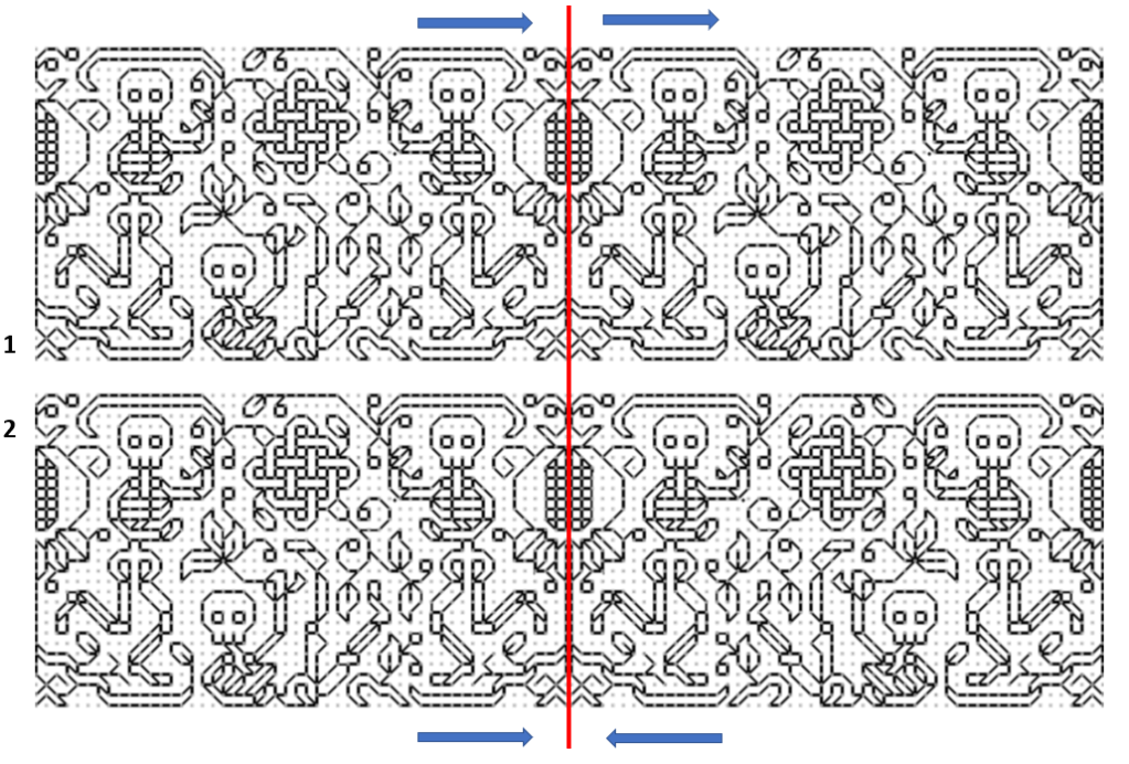
I’ve added the blue arrows to help identify the difference. Look at the fellow lolling on the ground. Above, he’s always facing the same direction. Below, he’s facing his mirror image.
To have a Type #2 bounce repeat that uses THE SAME framing device for both bounce points is at best extremely rare. Most use different devices as the two separators, like this little dolphin repeat from my ever-forthcoming book.

Now. What does this mean? Less authenticity, but more versatility. My current project uses the Dance centered around a single project axis. I use mirroring at ONLY the very center of my piece, with runs of straight repeat left and right until they meet up with a corner. Why? Why not? I liked the look:
But if I were working around a piece with a fixed circumference, like on a strip that was to be seamed into cuff, and there was not room for an even number of repeats, I might appreciate the ability to use an odd number of repeat units (along with type #1 symmetry), to better fit the area to be stitched.
I hope this helps.
GALLERY
Finally. After nine long years since the design challenge was issued and I responded with a pattern for the Flying Spaghetti Monster, a finish has been spotted in the wild.

Special thanks to stitcher Zelda Doyle, who had fun with the thing, then posted the result on Facebook and made my day. This photo is hers, of her own work, and reproduced here by permission. The chart for His Noodly Glory is here.
Have you done something fun with one of the pattern children and wish to add to our Gallery? Please let me know.
