LOOKING BACK AT AN OLD PROJECT
I’ve been tidying up my closets and drawers. I stumbled across a couple of items that I haven’t worn in a long time. Luckily they still fit well enough, so they’ve been rescued and added to the regular rotation. One was this T-shirt style pullover.

It’s one of the most intricate projects I did, mostly because I designed it myself. I did it back before Russian language sites became notorious for malware dissemination and wholesale piracy/copyright infringement. There were a few knitting sites back then that were clearly hobbyist-generated, with hand drawn charts for texture patterns. Needless to say there are many reasons why I do not recommend visiting any of them now and strongly caution against it, but I do confess that in the early days of the international Internet, I did browse worldwide.
In any case I stumbled across a hand drawn texture pattern thumbnail that led to this diagonal design. It wasn’t as tall a repeat as I present, and the drawing didn’t show a center mirroring, but both that detail and elongation were so obvious to me at the time. So to maximize the fun, I doodled up a pattern. The resulting repeat with its offset verticals was SO large that to this day it remains one of the largest knitting charts I’ve ever drafted.
The yarn I used was a bit unusual. I knit this from Silk City’s Spaghetti – a narrow cotton tape ribbon, with a native gauge that was roughly sport weight (24 stitches to 4 inches/10cm). The result was both crisp and springy, making a negative-ease garment that was quite come-hither and curve-hugging. Any hard twist sport weight cotton, linen or ramie can be used. As dense and tightly twisted as possible for maximum display of the textures.
I knit this project before I began blogging with intent – probably around 1991 or so. I shared an initial write-up in the ancient KnitList email based chat group, and eventually revised it and posted it on an earlier incarnation of String-or-Nothing in 2004. It’s been up and available ever since, but I don’t know of anyone else who has tried to knit it. The short length and close fit however seem spot on with current street fashion so I present it again. If I had a full length mirror I’d post an as-worn, but I am quite a bit older, and a bit bigger these days. The pattern is offered in just one size, and given the stretch would probably fit a US size 14-20 of ample endowment. I knit and wore it as a 16-18, and can still present it credibly if a bit brazenly as size 20. You could probably tinker it down a couple sizes using a slightly thinner yarn and smaller needles.
The name? I named it after the middle name my mom always thought was hers, until a birth certificate was obtained and she found out she’d been saddled with another. Since it was a Russian derived name and my mom has always been my knitting inspiration, it seemed fitting.
You can download the pattern for Raiisa here,
or from the sweaters section of the free Knitting Patterns Page tab available elsewhere on this blog.
ELIZABETH HARDWICK ON BIAS?
Once again a chance image on Facebook throws me into a frenzy of charting. The Friends of Sheffield Manor group posted this image of Elizabeth Hardwick, Countess of Shrewsberry. attributed to the school of Hans Elworth. It’s accession 1129165 of the UK’s National Trust collection.

Obviously what struck me were the sleeves. I tried and tried to chart them on the diagonal, but the geometry worked out much more cleanly if done straight. Now sewing, especially historically accurate construction is not my strength. But I ask folk more versed in it than I am, was it possible that if embroidered linen was used for those sleeves might they have been cut on the bias and not with the grain? The motifs look grain-wise at the collar, but are clearly sitting “on point” on the diagonal for the sleeves.
In any case, I’ve added the graph to the on-site free collection here. My rendition of it is approximate, but as close as I was able to achieve. I’m fuzzy on the exact shape of the free floating rondels occupying the empty areas where the chain rosettes meet. And their color is also problematic. Some are brown, some red, and some a pale indeterminant color – it might just be fading of the paint.

I lay no claim to the design itself – only my graphed rendition. Like most of the pieces offered here on String, this is available for your personal use. It’s Good Deed Ware – if you work it up please consider paying the kindness forward, assisting someone in need, calling a friend or family member who could use a bit of cheering up, or otherwise making the world a tiny bit more pleasant. And please note that my representation of this design is copyrighted. if you are interested in using it commercially or for larger distribution, either incorporating it into a pattern for sale or other dissemination, or if you want to use it on items that are made for sale or donation, please contact me.
And as always, I love to see what mischief the pattern children are up to out there in the wide-wide world. Feel free to send me a photo or a link. And if you give permission, I’ll add your work with or without your name (as you desire) to the growing Gallery page here on String.
A SUPPORTING CAST OF GRIFFINS
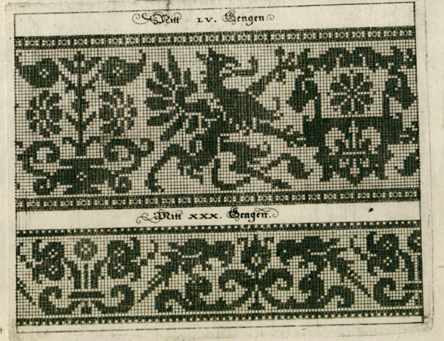
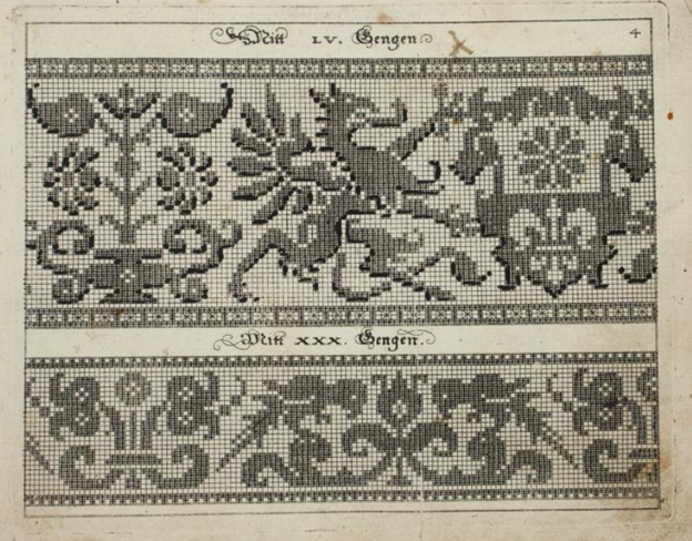
Friend Craig posted a memory last week, and re-shared a chart he adapted from one of the Siebmacher modelbooks – from the 1611 edition.

It got me to thinking. Those heraldic style charted bands appear over many years, and in several iterations. It might be fun to see how they assorted over time. So I went hunting. I combed through my notes, the Internet Archive’s collection of modelbook images, and several other sources.
This isn’t an exhaustive analysis, but it covers most of the easily accessible editions of the chart. And the large number unearthed really underscores the differences in that accessibility from the time I started poking into these early publications (circa 1974) to today. Back then there might be a couple of modelbooks as part of a microfiched set of early publications on file at one’s university. There were several sets of these ‘fiches scattered across the country, so the set that was local to me at Brandeis wasn’t necessarily the same as the set someone else might have at the University of Pennsylvania. A happy trade of blurry low quality photocopies ensued among us needlework dilettantes, and in some cases precision in attribution wasn’t as clear as it could have been. As a result, when I get around to reissuing The New Carolingian Modelbook, my first book of researched patterns, there will be corrections. Especially among the Siebmacher attributions, because somewhere along the way prints from several editions became confused, leading to a couple of the designs marked as being from the 1597 edition, actually being from a later printing.
And Siebmacher or Sibmacher – both actually. I haven’t a clue as to which spelling is the correct one, because both are used. IE is represented more often than just I, so I go with that.
So here we go. It’s another overly long post only a needlework nerd will love.
1597
Johann Siebmacher’s Schon Neues Modelbuch von allerley lustigen Modeln naczunehen, zuwürcken unn zusticken, gemacht im Jar Ch. 1597. Printed in Nurmburg.
This edition is held by the Metropolitan Museum of Art, Accession 20.16 and can be accessed here. Notes accompanying this edition cite that the modelbook historian Arthur Lotz cataloged two editions were printed in 1597, and this is from the later of the two. (I will try to fill in the Lotz numbers for these as I mention them. I have that book, but I don’t read German so please forgive my tentative attributions.) My guess is that this one is from Lotz 32b.
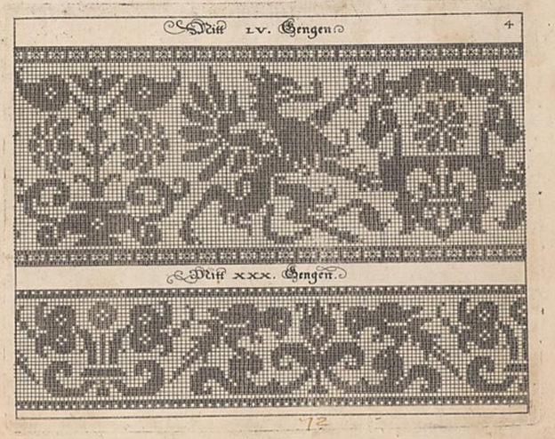
Note that it presented on the same page as the parrot strip. The numeral LV (55) at the top refers to the number of units tall the strip is. Note that all filled blocks are depicted in the same way – as being inhabited by little + symbols. There is also a companion border that shows a combo of filled boxes and straight stitches. Also note that the two “reflection points of the repeat are both shown, along with enough of the repeat reversed to indicate that the design should be worked mirrored. Craig got this spot on when he drafted the design for himself. I’m used to working straight from the historical charts but most folk find the mental flip a bit arduous. He wisely spared himself the conceptual gymnastics.
Johann Siebmacher’s Schon Neues Modelbuch von allerley lustigen Modeln naczunehen, zuwürcken unn zusticken, gemacht im Jar Ch. 1597. Printed in Nurmberg.
Here is the same page from the other edition of 1597. Very possibly Lotz 32a. It’s held by the Bayerische Stasts Bibliothek, and is shared on line here.
It’s very clear that these are both impressions from the same block. The inking is a bit heavier on this one than the other, but the design is the same. Note though that the little “4” in the upper right corner isn’t shown on this one.
The Bibliotheque nationale de France’s copy of Johann Siebmacher’s Schön Neues Modelbuch von allerley lustigen Mödeln naczunehen, zuwürcken unn zusticken : gemacht im Jar Ch. 1597 looks like it might be the same printing as the Lotz 32b version above. It has the same “4” in the corner. BUT throughout the book it appears that someone has added shadings and color variation indicators by hand – over-inking or penciling in selected areas of many of the patterns. I don’t know if this was done by an owner, or was sold this way. I suspect the former. The darker boxes are clearly produced by careful inking, not printing. In other pages of this edition, you can see differences in how thick the ink was laid on, following pen or brush stroke lines, and not imprinted.

I don’t see a date associated with this other annotated edition, listed only as Johann Siebmacher, Newes Modelbuch, but I suspect it’s the 1597 one based on plate similarities. It’s another book in the Clark Art Institute library. Again someone took the liberty of hand-inking some of the pattern pages to add additional shading or interest. You can view it here. Given the placement of the shading, it might be the source for the version Carl used when he drew up his own graph.
Additional reprintings.
I’ll spare you more echoes of exactly the same page, but here are other representations of these 1597 editions.
There was a reproduction made in 1877, called Hans Sibmacher’s Stick- und spitzen-musterbuch: Mit einem vorworte, titelblatt und 35 musterblattern. The editor was Gerold Wien, and it was put out by the Museum fur Kunst und Industrie. The plate is a duplicate of the Lotz 32b one, complete with the 4 in the upper corner. The date of the original is cited in the repro. You can see it here. A second copy of the 1877 facsimile edition is held by the Bayerische Staatsbibliothek and can be found here.
There is an additional reproduction of this book in the collection of the Cleveland Museum of Art, as issued in Berlin in 1885. The image quality is excellent, you can find it here.
1599
Martin Jost. Schön Neues Modelbuch von allerley lustigen Mödeln naazunehen Zuwürken vn[d] Zusticke[n]: gemacht im Jar Ch: 1599. Printed in Basel.
Yes, a different name is on this book. Lotz 34 refers to it by the name of the publisher – Ludwig Konig in Basel. The on line listing also mentions Jost. It is very closely related to the works above with lots of designs in common. But not entirely the same. The on line copy is here.

That’s our friend the griffin, the same motifs on the shield being supported, and the same flower pot behind – all absolutely stitch for stitch true to the earlier version. But the repeat is truncated along the left edge. The left side of the flowerpot is gone. However the upper and lower companion border with its straight stitching is the same, and is aligned the same way with the main motif. Obviously the parrots are gone, replaced with a panel representative of cutwork. The words above the design are the same font size and typeface, but are now centered between the new borders. The letters have the same proportional size to the design’s block units, but the block units are now rendered as solid – not boxed crosses. These books are said to be among the first created using copperplate – not carved wood. I am not familiar with the process of creating those, but it does look like a print of the original might have been used to create this smaller version. Licensed reproduction, cooperative venture, or unauthorized knock-off? I am sure there are academics who have explored this, so I won’t let my speculation run wild.
Additional appearances.
There is another copy of this same griffin imprint in a book cited as Ludwig Kunigs Fewrnew Modelbuch, von allerhandt künstlicher Arbeidt: namlich gestrickt, aussgezogen, aussgeschhnitten, gewiefflet, gestickt, gewirckt, und geneyt : von Wollen, Garn, Faden, oder Seyden : auff der Laden, und sonderlich auff der Ramen : Jetzt erstmals in Teutschlandt an Tag gebracht, zu Ehren und Glücklicher Zeitvertreibung allen dugendsamer Frawen, und Jungfrawen, Nächerinen, auch allen andern, so lust zu solcher künstlicher Arbeit haben, sehr dienstlich. Printed in Basel, 1599. You can find it here.
The Lotz number for this one is 35. It’s a problematic work because it looks like at some point a bunch of pages from several different pattern books were bound together into a “Franken-edition” incorporating some of Pagano, Vincoiolo, and Vecellio in addition to the Siebmacher-derived pages. But the solid blocks griffin with the cut off flower vase, plus the cutwork panel below is identical to the other 1599 imprint.
Jost might have been a bit peripatetic. There is an identical impression of this version in another Jost Martin printing, Schön neues Modelbuch von allerley lustigen Mödeln nachzunehen, zuwürcken un[n] zusticke[n], gemacht im Jar Chr: 1599, printed in Strassburg. No differences from the one above, so I won’t repeat. Possibly the same Lotz number, too. But you can visit it if you like.
1601
Georg Beatus, Schon neues Modelbuch, printed in Frankfurt, 1601.
Yup. Another publisher. This copy is Lotz #40, and is held in the Clark Art Institute Library. You can see it here.

This print looks a lot like the Jost/Konig one, but not exactly so. First, you can dismiss those little white dots. Those are pinpricks, added by someone who ticked off the solid units as they counted. I deduce that because they are also present in many of the empty boxes. But you will notice some oddities. First, the design is further truncated at the right. We’ve lost the complete shield shape bearing the quaternary flower. And the column at the far left has been duplicated. There is also an imprecision on column and row width in this representation, absent on the others. Finally, it’s been formatted for a single print, with no supplemental design below. I’m guessing another plate.
1604
Johann Siebmacher. Newes Modelbuch in Kupffer gemacht, darinen aller hand Arth newer Model von dun, mittel vnd dick aussgeschneidener Arbeit auch andern kunstlichen Neh werck zu gebrauchen. Printed in Nurmberg, in 1604, in the shop of Balthasar Caimox. It’s in the collection of the Metropolitan Museum of Art, accession 29.59.3, and can be seen here. I don’t see this one listed in Lotz under 1604, but the Met’s listing says that it’s likely a re-issue of the 1602 edition which would make it one of the ones Lotz labels as 38a through 38e. What’s notable about this particular copy is that while many of the other fabulous animal/mythical creature strips that accompany the griffins page in the other works, the griffin page itself is missing. It wasn’t in this edition, or the page that bore it has been lost to time. I’ve included this citation here for the sake of completeness.
Note also that this 1604 edition is the one upon which the modern Dover reprint is based. Dover reissued Ernst Wasmuth’s 1880 publication, which he entitled Kreuzstich-Muster 36 Tafeln der Ausgabe v. 1604. That was based on 36 plates from this 1604 printing.
1607
Sigmund Latomus, Schön newes Modelbuch, Von hundert vnd achtzig schönen kunstreichen vnd gerechten Modeln, Teutsche vnd Welsche, welche auff mancherley Art konnen geneet werden, als mit Zopffnath, Creutz vnnd Judenstich, auch auff Laden zu wircken : Dessgleichen von ausserlesenen Zinnigen oder Spitzen. Allen Seydenstickern, Modelwirckerin, Naderin, vnd solcher Arbeitgefiissenen Weibsbildern sehr dienstlich, vnd zu andern Mustern anleytlich vnd verstendig. Printed in Frankfurt, 1607.
Yes, another name on the spine, and printed in another city. The copy from the National Library of Sweden is visible here. It’s cited as being Lotz 43b.

At first glance this looks like another imprint of the same Siebmacher griffins and parrots page from 1597, but look closer. This design adds a blank column of squares to the right edge, replacing the design elements that were there on the earlier block. This is especially evident in the parrot strip, which has lost its center reflection point along the right edge. Also the blocks are filled in, again not the boxed crosses of the earlier work. And the fills look printed, not applied (more on this later). Yet another plate? Not impossible.
1622
Sigismund Latomus was still active in 1622, issuing a modelbook, entitled Schön newes Modelbuch, von 540. schönen auszerwehlten Künstlichen, so wol Italiänischen, Französischen, Ni-derländischen, Engelländischen, als Teutschen Mödeln, in Frankfurt. As one would expect from the lengthy name, he swept up a number of pattern images, issuing them in one big bundle. Of course we can’t rule out that what we see isn’t the original document as published. It’s not at all uncommon for later owners to bind works together (binding was expensive, and separate from publishing).
Our griffins are in this collection, TWICE. One version is another imprint the same rather squished version we saw issued by Beatus in 1601, the other is one we haven’t seen before. It’s roughly similar to the one above it, but there are some very subtle differences in detail, especially along the left and right edge. And of course, it’s paired with yet another secondary border. Original inclusion, or the result of later co-binding? Your guess is as good as mine. The book is here, it’s in the Clark Art Institute Library’s collection.


1660
Skip forward even further, now 63 years since the griffins appeared. Rosina Helena Furst/Paul Furst’s Model Buch Teil.1-2 printed in Nurnberg in 1660 offered a collection of older designs in addition to new ones. There were four in his series. This particular binding combines books 1 and 2. Lotz cites volumes one and 2 as 59 and 60, each with multiple surviving copies. For what it’s worth the Furst books are the first one that mention knitting as a possible mode of use for graphed patterns, and very possibly the first that is credited either in whole or in part to a female author. Some sources credit Paul Furst as the publisher and Rosina Helena Furst as the author, others attribute the entire work to Paul, or imply that Rosina Helena took over the family business after Paul’s death. In any case, they were prolific publishers, and continued to revise, and re-release modelbooks for at least a good 20 years. They did recast the legacy images to meet changing tastes, but it’s clear that our griffin has deeply informed this later, slightly more graceful beast. Note that his pattern height number is different from the earlier ones because his spacing and borders are a different size. You can see this copy here.

1666
We continue on with the Furst Das Neue Modelbuch editions. This one is also from Nurnberg, and is a multi-volume set in the care of the Clark Art Institute Library. The parts are listed as Lotz 59b, 60a, 61b, and 62a. Again someone has inked in bits to indicate shading. But it’s clearly the same plate as the 1660 printing.

1728
This is about as late as I research. Here we are 131 years after first publication, and there is still interest in the griffins. At least in the Furst interpretation of them. This is from the workshop of J.C. Seigels Wittib, in Nurnberg, and is a reissue of the Fursts’ Model Buch Teil 1-2. Again from the Clark Art Institute Library. It also looks to have been hand-inked on top of the same plate print. But if one looks very closely, there are small mistakes in ink application with very slight differences between the two. Including a forgotten square that shows the + behind the ink in one and not the other. A clear indication that the solid black areas were additions, and not done during the print process. It also makes me think that the 1728 inker had a copy of the 1666 book and copied the annotations to the best of their ability. Does that mean that some books were sold pre-inked? Not impossible. You can make your own judgement here.

Stitched representations
I am still looking for these. Representations of other Siebmacher designs exist in monochrome and polychrome counted stitching, as well as in white openwork. His reclining stag is the most often seen through time, but his unicorns, peacocks, eagles, religious symbols, long neck swans, flower pots, and rampant lions grace some spot samplers of the 1600s and into the early 1700s – mostly but not exclusively German or Dutch in origin. I’ve seen the parrots, undines, and mermen in white darned pieces (lacis in addition to withdrawn thread darned work). And that reclining stag crossed the ocean to appear on some early American samplers as well. But I haven’t seen a stitched version of these griffins. Yet.
Of course I haven’t seen everything, and back room pieces are being digitized every day. If you’ve spotted the griffins in the wild, please let me know.
Conclusions
This really is more of an observational survey than an academic hypothesis based essay.
Originally, seeing this (and other Siebmacher designs) repeat across multiple modelbooks, I assumed that they all were produced from the same plate. But on closer examination we see that probably isn’t true.
It is safe to say that there is a strong continuity of design here. And an interesting cross pollination among publishers. Was it tribute, licensing, sharing, or a bit of light plagiarism? We cannot tell from just examining the printings. But we can say that over the course of 131 years there were at least four and possibly five plates made based on the original griffin design, yet all are immediately identifiable as springing from the same source. I’m sure there are scholars who have delved into the interrelationships in the early printing industry, and have described other migrations of text or illustration among printing houses. Perhaps this look at a single pattern book plate will help inform their future musings.
We can also say that these design plates were used by a variety of prolific printers in Germany in response to what must have been continuing demand for pattern books. I say that because they were obviously selling well enough to warrant production over a long span of time, in spite of their largely offering up the same content over and over with only minor supplements. Also, in spite of the sometimes destructive nature of pattern replication at the time these early pattern books survived largely (but not totally) intact. For something so esoteric, with little literary value, they were seen as interesting and useful enough to retain in many libraries – to the delight of those who have rediscovered them again and again across centuries.
I just might have to stitch up these griffins, and in doing so know I’m helping to keep them alive.
A HOLBEIN COLLAR
Special thanks to Karen over at the Elizabethan Costume group on Facebook, who visited the current “Holbein at the Tudor Court” exhibit a the Queen’s Gallery, and came away with an assortment of extreme close-up photos of various clothing details. One of them showed an intimate view of the portrait of Thomas Howard, third Duke of Norfolk, a painting in the Royal Collection. The Duke died in 1554. and the painting was probably done in the decade before he was arrested for treason, which was about 8 years before his death.

He’s quite an imposing gentleman in his lynx fur, and his collar is hard to see in the official full-size repros of the portrait. But Karen’s extreme close-up helped. Her shot is below, shared with her permission.
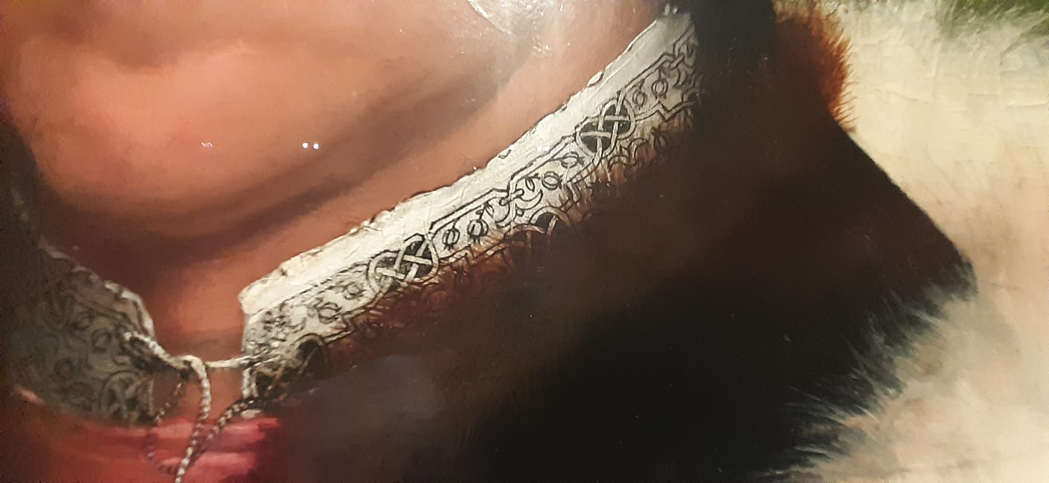
Here’s the blackwork band I transcribed from his collar, more or less.

This redaction is only posited. It’s harder to chart from a painting than it is from a stitched artifact. Luckily this was a Holbein, who understood and clearly depicted the geometry and alignments of countwork. I’ve used my standard rules on this one:
- Modern blackwork and its expanded vocabulary aside, historical examples employ only straight lines, right angles, and 45-degree angles.
- Stitch length units are regular, and are constrained to multiples of a single whole unit, either on edge or on the diagonal. Yes, there are some artifacts with instances of half-unit stitches, but for the most part they are extremely infrequent in foreground design. They do appear sometimes in voided work, to help the stitcher cozy up to the outlines of their previously laid down foreground design.
- Gaps between stitches in a continuously linked design will be the same multiple of the base unit. There are no “floating islands” in this piece. Every bit is straight-line attached to every other bit, and therefore must be on the same base grid.
- Not every iteration of the original is assumed to be spot on accurate. Especially in painted depictions, where three dimensional rendering of rumpled cloth can add imprecision, or the painter not being constrained by a drawn grid, did a “you get the idea” representation rather than a stitch-faithful one.
On this chart I have rendered the background inside the interlaces as a block of solid color, as they were in the painting. It’s not clear what stitches were used to achieve this, but long armed cross stitch, boxed (four-sided) cross stitch, and plain old cross stitch are all good candidates. Note that because these areas are bounded by diagonals there will be considerable fudging with half diagonals (aka quarter stitches in modern cross stitch) to eke out coverage. The solid fill result here is what matters most.
In any case like most of the pieces offered here on String, this is available for your personal use. It’s Good Deed Ware – if you work it up please consider paying the kindness forward, assisting someone in need, calling a friend or family member who could use a bit of cheering up, or otherwise making the world a tiny bit more pleasant. And please note that my representation of this design is copyrighted. if you are interested in using it commercially or for larger distribution, either incorporating it into a pattern for sale or other dissemination, or if you want to use it on items that are made for sale or donation, please contact me.
And as always, I love to see what mischief the pattern children are up to out there in the wide-wide world. Feel free to send me a photo or a link. And if you give permission, I’ll add your work with or without your name (as you desire) to the growing Gallery page here on String.
VALENTINE’S DAY 2024
Among my other projects, I’m working away on sequels to my two book series. Those who know me know better than to ask when they will be released, but progress is being steadily made on The Third Carolingian Modelbook, and on Ensamplario Atlantio Volume III.
EnsAtl3 is moving along faster, in part because it’s largely my own doodles with no time spent researching, documenting, writing prose descriptions with counts, or creating indices. As I was playing in it today I felt a jolt of magnanimity, and in light of the season, I decided to share a small preview. As ever, an easy print/easy read PDF can be downloaded from the link below, or from my Embroidery Patterns page.

This is my own original design. I haven’t stitched it yet. When I do I will come back and add a photo. The band repeat is 47 units tall, and 18 units wide. Two cautions:
- In an uncharacteristic move for me, the points of the arrows are formed by two half-stitches. I try to avoid these, but to get a sharp arrow, they were essential.
- The arrows themselves are NOT aligned on the center line of the hearts. Were I to do so, there would be a lot more half stitches. Be aware of this and don’t be alarmed when the shaft is one unit to the right of the heart centers. I did this uniformly throughout the design – every arrow regardless of up/down orientation is shifted to the right of the heart centerlines.
I can see this stitched for love onto the collar and cuffs of a paramour’s shirt or chemise, or adorning the linen of a beloved offspring. Archers especially might be charmed by it. Of course it can also be used on a band sampler – especially one celebrating a wedding.
To download the Hearts and Arrows Border in PDF format, click here.
Like all the other downloadables on String-or-Nothing, I offer this as good-deed-ware. If you use this, please pay it forward by assisting someone else, or making the day a bit brighter for a friend, family member, acquaintance, or stranger. And also as usual, if you want to use any of these patterns for commercial purposes, either for combination into a new published design work, or to produce for sale or donation (especially in quantity) please contact me before doing so. But please feel free to use it as you wish for your own private enjoyment. And if you want to share a photo of your piece back to me, either for inclusion in the Gallery, or just for me to see – such things always make me smile.
FILE FOLDER ARCHAEOLOGY
It happens that this week a couple of people have stumbled upon this old unfinished sampler that now hangs on my Wall of Shame.

It’s unfinished because I had started it as a wedding present for a friend. Sadly her engagement ended before the wedding. I never felt like finishing it off after that, although I still have it. It’s also the only piece I have ever done on Aida. I didn’t enjoy working that ground, which is probably another reason why it has languished since the early 1980s.
The reason these folks found it was that they were looking for a charted Hebrew alphabet. I knew I had one. Somewhere.
I had drafted one up, and it had gone through several iterations. The first was for a contemplated but never started service project for my family’s congregation – a Torah cover, to be exact. But I never had the time to follow through, so the scrap of graph paper was stowed in my doodle notebooks. About 8 or so years later I began this gift. I rescued the earlier scrap, played with the letter forms a bit based on the Macintosh pixel based Hebrew font. I added back a bit more of the pen and ink serifs, and messed with proportions a bit. After this project went into dormancy that doodle joined the earlier one. And I went looking for both this morning. Needless to say I didn’t find either. But I still have the sampler, so I re-graphed the alphabet based on how I stitched it (and tinkered a bit, again).

Click here for an easy to save PDF of the Hebrew alphabet chart above.
The first two lines at the upper right are the full alphabet. The five characters immediately below them are special. A few of the letters are written differently when they appear at the end of a word. You can’t write without them, so I offer them, too.
In addition to just a plain alphabet, I have charted up some of the most commonly stitched words.
Shalom – Peace
Mazel – Luck
Matzah (also spelled Matzoh) – The unleavened bread eaten at Passover. Some families have special linen napkins to cover the matzah for their Seder celebration.
Lechem – Bread. Like the Matzah cover for Passover, some families have a special napkin to cover the bread for holiday meals and for Shabbat.
Mizrach – East. In Europe it was the custom long ago to mark the Eastern wall of a place of worship or learning as a reminder of Jerusalem. It’s not done as often now as it used to be, but Mizrach embroideries do pop up on Judaica collections.
Now please don’t go asking me for translations or interpretations. I’m pretty much a late entrant to Hebrew School and I continued to struggle with the language in college. So much so that I ended up dropping back to French for my language credit to graduate.
The Hebrew chart will also join the others on my Embroidery Patterns tab.
Another Artifact of the Past
While I was hunting around for the alphabet doodles, I stumbled across the original of the handout I used to use when teaching basic sock knitting. It contains an abbreviated sock that we would work through together in the workshop, plus some of the other sock patterns available here on String. Also, it includes the pattern for the famous “You’re Putting Me On” Socks by express permission of Judy Gibson, that pattern’s author. Judy was major inspiration for sock knitters in the early days of the Internet, and merrily led hundreds of us astray into projects we wouldn’t have dared without her support. The 15 page booklet ends with some other useful references, including a chart of standard sock sizes and measurements, some (mostly dead) links to sock resources on the ‘net, and a visual on Kitchener grafting.

Click here for a free download of my Sock Knitting Workshop handout.
I’ll probably add it to my books page. Eventually.
A NEW CLUSTER OF HERESIES
I’m working happily away on what will become my replacement cushion cover. I decided that rather than cutting shapes and then stitching them, it would be easier to stitch on a larger piece of reclaimed denim, and then cut it into haphazard shapes bearing the stitching later. The denim is particularly thick and heavy, which has posed some problems.

The traditional Japanese method of working this style of running stitch embroidery is to use a relatively long needle, stitch in hand without a frame or hoop, and pleat the fabric onto it, such that the visible stitches on the front are roughly twice as long as the gaps between them.
This type of stitching isn’t easy because the denim resists the tiny folds and scoops needed for evenly placed and correctly sized stitches. I’ve tried, and would probably “get it” on a different ground. Eventually I will do another project in this technique with proper materials, but for now this is what I am committed to, and my goal is more important than the way I get there.
So in the long tradition here at String, Here’s a run down of what I am supposed to be doing, or what would make this a truly traditionally produced piece, along with my confessed heresies.
Needles
I am not using traditional Japanese-made needles, specific to hand sewing, and especially Sashiko.
I have a long steel needle, sharp and stout enough to pierce the denim, with a small eye. I found a paper of five of them in a box of miscellaneous threads and notions I picked up at a yard sale. No name, brand or date is associated with them, and they are not quite uniform. The eyes are very smooth, but there’s a bit of variation on eye placement and point taper. It’s remotely possible they are antique and hand-made. I use another of these as my plunging needle because the small eye retains the loop of strong carpet thread I need to capture goldwork ends and pull them to the back. In any case, these needles are almost two inches long, certainly long enough and easy enough to maneuver for the technique. It’s the stiff denim that’s the problem.
Thread
I looked at various thread options. The threads marketed specific for Sashiko are imported and not exactly inexpensive. From what I gathered, they are unmercerized cotton, nicely twisted, and not as “hard finished” as commercial threads sold for crochet. So I went hunting.
I cast about and eventually ordered a big spool of weaving cotton from Webs. It’s their Valley Yarns “Valley Cotton 10/2.” It was a risky purchase because it’s a large quantity, but I happened to hit a weaving yarn sale. And if the stuff didn’t work for my cushion project, I would be happy to knit lace with it.


I’ve got roughly 4,200 yards. Plenty. On the right above is a comparison shot of some threads next to a metric ruler. Apologies for the lousy photography. From top to bottom we have
- Valley Cotton 10/2 – a two ply matte finish cottom
- Coats & Clarks Knit Cro Sheen – a four ply shiny finish yarn. Much rounder and heavier that the Valley Cotton.
- Standard DMC 6 ply cotton embroidery floss. I didn’t have white to hand, so this is yellow. Six two-ply strands. The Valley is equivalent to about four plies of the DMC.
- Long discontinued DMC 6 ply linen embroidery floss. This I did have in white. It’s a mite heavier than the cotton floss, and the Valley Cotton is equivalent to about 3 plies of this.
I’m pleased with the Valley Cotton’s usability, its proportion in relation to the stitch length I’m using, and it’s appearance against the denim. It also coordinates well with the remaining Haitian cotton upholstery fabric used on the parts of the chair I do not intend on recovering.
Pattern Sources and Preparation
I tried to use straight drafting – laying out the geometry and drawing directly on the fabric. I also tried printed paper designs, employing tracing paper and pouncing to move them from paper to the cloth. Neither was satisfactory. Then I stumbled across some commercially sold plastic templates, and decided to take the short-cut.


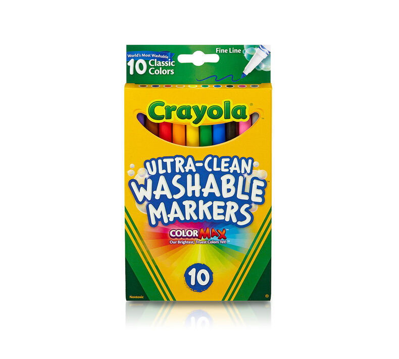
Stencils opened up another experimentation hole. What writing instrument to use with them. I tried all of the standard pens and pencils intended for fabric marking. Some were too crumbly to achieve the fine point needed to use the stencils. A highly regarded pen drew clear, with the ink “blooming” into visibility over a 15 minute period. That was better, but it was difficult to see when ink was poorly laid down and needed retracing, or what had and had not been marked. It was even more difficult to realign the stencil to do a repeating pattern because of the wait and imperfections due to poor ink flow. (In fact I haven’t succeeded doing that yet, but I am still trying).
I settled on an unorthodox inking approach AND a non-traditional marking method. I am using these easily found Crayola wash-out fine point markers with the stencils.
I am also marking on the back, stitching the piece from the back, with starts and terminations on that side, but taking care that the reverse when I am working (which is the public side) shows the longer stitch length as opposed to gap length. Running stitch is running stitch. If you are careful in working, either side can be manipulated to be the public display side. Even in this style where the public side is characterized by longer stitches than there are gaps between them. And that’s why the photo at the top of the page shows the public side of the denim leg I’m stitching, but you see the twill tape wrapped inside unit of my hoop.
Heresies
So to sum up – my heresies are:
- Using a hoop and not stitching in hand
- Stabbing vertically rather than pleating the fabric onto my needle
- Using weaving cotton instead of Sashiko thread
- Using some unidentified vintage needle instead of the recommended long sharps
- Using stencils instead of drafting out the designs by hand
- Stenciling on the BACK rather than the front of the piece
- Stitching from the back, with the reverse side of my work actually being the side on public display
I pause now so the traditionalists can catch their breath, take a sip of tea or coffee and revive themselves.
With luck all hyperventilation and shock have passed.
More unorthodoxy
To add another dimension of complication, I am also hoping to use Western linear stitching on this piece. I plan to use standard double running stitch, and some of the fills or strapwork patterns that are oh so familiar to anyone who has followed this blog. But there is no grid on this denim, and it’s not countable.
Again I am going to cheat, and stitch on the reverse. I am going to use my markers and this piece of plastic canvas to make a dot grid, and then use that dot grid to place my stitches. Double running is the same on front and back. If I stitch with care and make no skips, there should be no telltales in front to betray my working method.
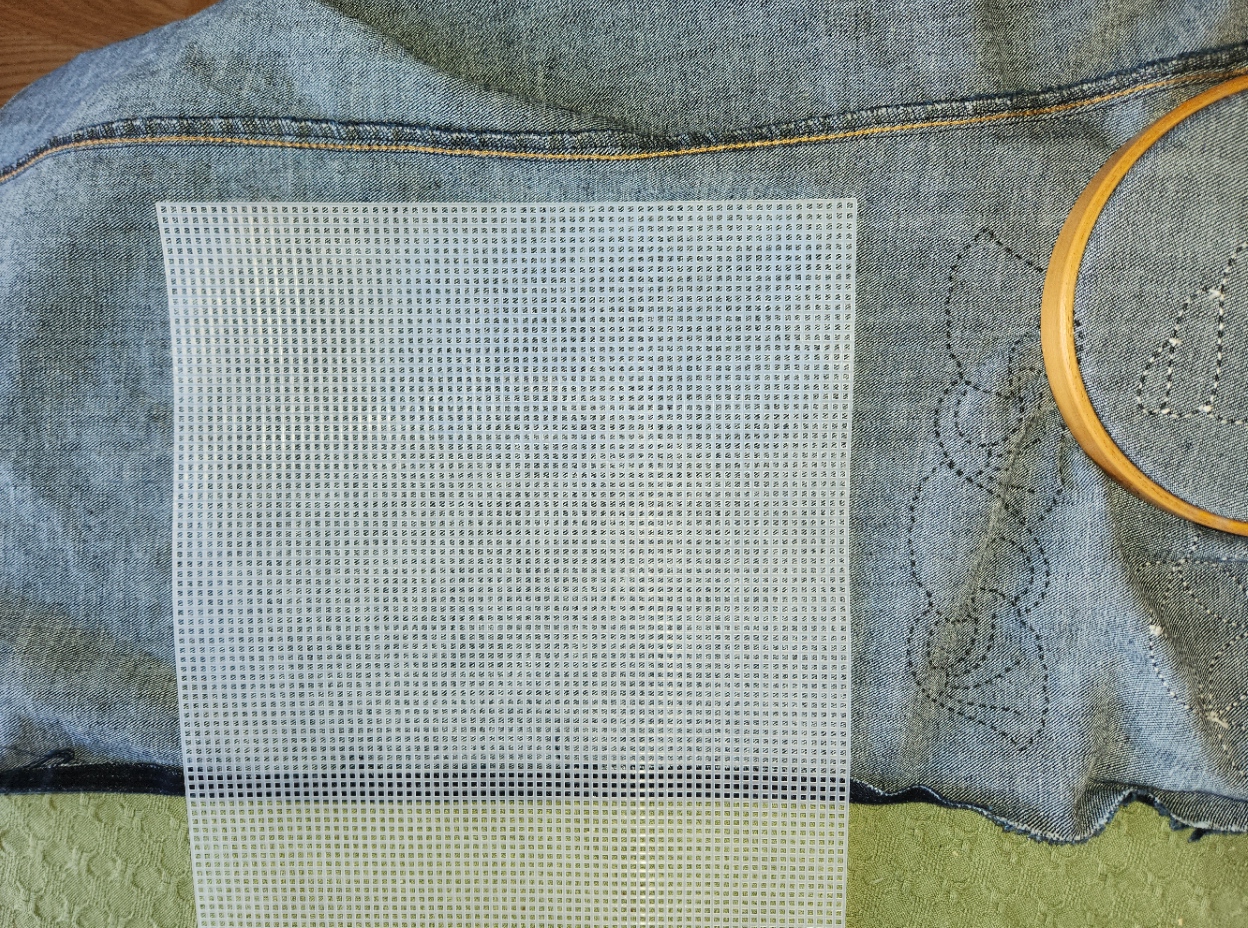
Cheaters may never prosper, but on rare occasion a shortcut or labor-saving method is warranted.
BEGINNINGS – CHAIR RESCUE IN USED DENIM
Now that the spawn are off on their own, I have been able to claim one of their rooms as my office. I’m especially lucky, I know because I also have a room in the basement dedicated to sewing and crafts. But the upstairs room has the computer, my needlework library, and space to relax.
The office is the room with the hanging tambour carpet, and is largely furnished in mismatched Trash Panda style – a couple of purpose-purchases like my standing desk and an OttLight, plus items reclaimed from local everything-free groups, curbside abandonment, and opportunity shops/consignment/resale stores. These include two low end Arts & Crafts style cabinet bookcases, a barrel chair I’ve been hauling around with me since 1978, and the most recent addition, a reproduction Arts & Crafts reclining chair.
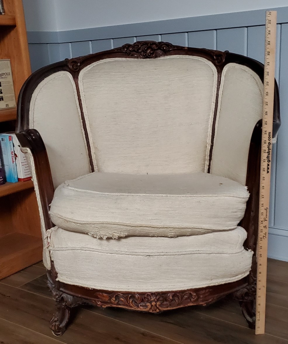
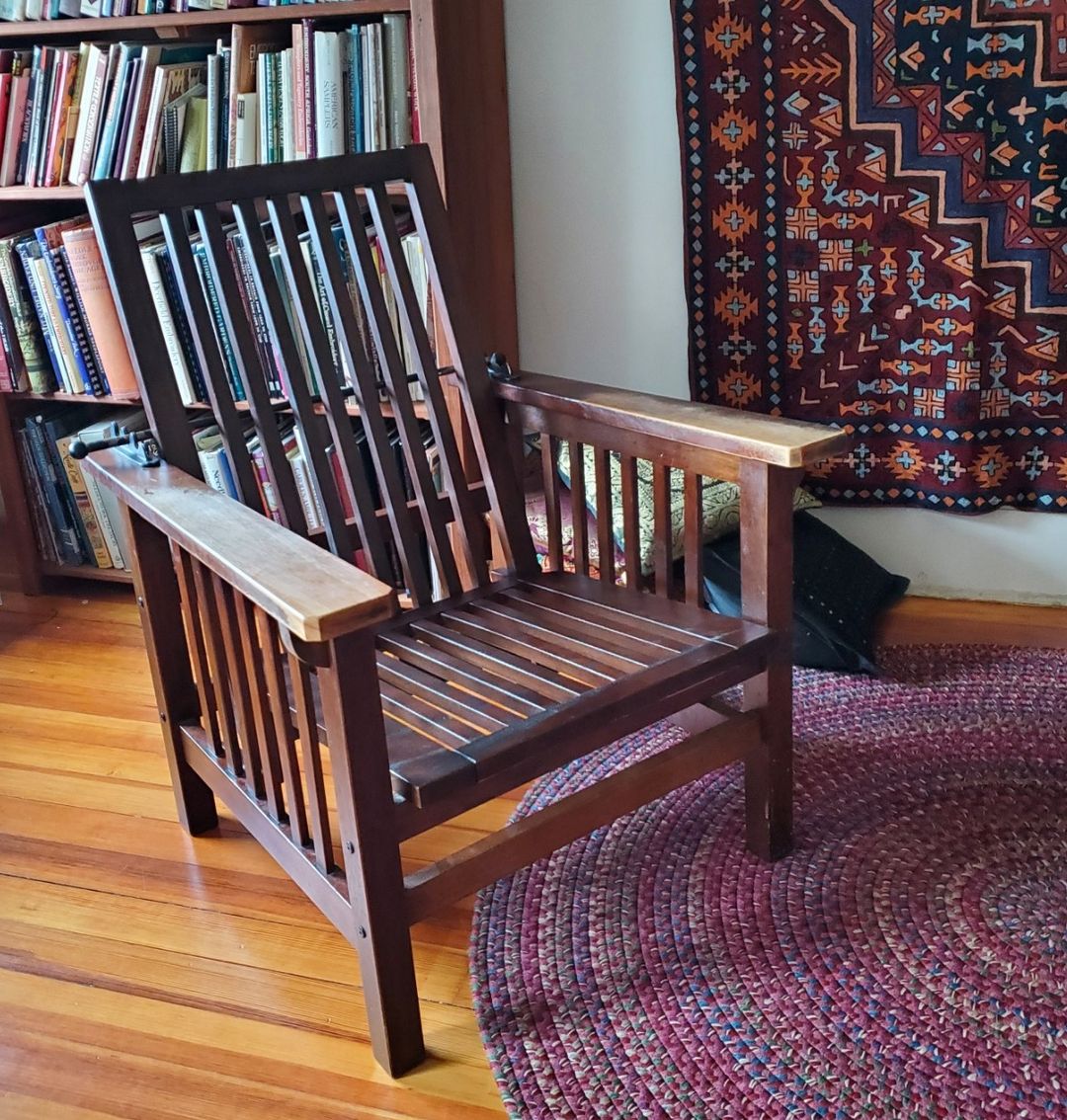
The barrel chair is in acceptable condition except for the horribly worn, stained and snagged cushion, and the little apron just below it. The recliner came as-is, without any cushions at all. Right now I have an old zabuton floor pillow and a couple of throws tossed on it to make it sit-able.
My next project is a massive multipart effort:
- Recover the barrel chair’s seat cushion recycled denim. The denim will be pieced crazy-quilt style with exposed seams. Some of the denim bits will sport sashiko stitching.
- Buy foam and create a thick, resilient seat cushion and backrest cushion for the recliner.
- Cover the recliner cushions with similar pieced and embroidered recycled denim.
- Figure out how to fig-leaf the wear on the barrel chair’s under-cushion apron, again from the used denim, but without embroidery.
To start, I’ve traced the existing cushion onto brown paper (a giant yard waste bag was sacrificed for this), and cut out patterns for the top and bottom. The sides are just a four inch strip wrapped around, so a pattern isn’t needed. I plan to sew random size/shape denim pieces onto the brown paper using my ancient Elna SU sewing machine, employing various wide stitches and exposed edge seams where denim patches overlap. Some of those pieces will be pre-embroidered by hand, taking advantage of some templates to lay out the traditional geometric patterns. And some might be stitched using waste canvas in double running designs. My whim will rule.
Once each of my brown paper mock-up patterns is completely covered with securely stitched denim, I will tear off the paper. The goal is to have the two sides, add a four inch strip running around the edge, winkle in a zipper on back edge, and then stuff the existing pillow, ratty cover and all inside. If necessary I will strip off the old cover and just use the inner foam (probably with a new inner cover I’d have to sew, too.)
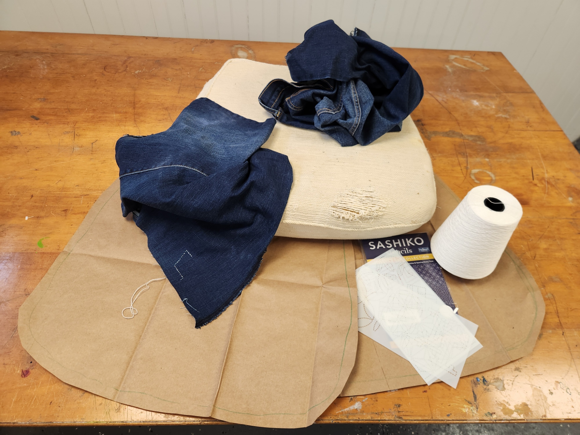
I have lots of denim discards in the house, and can always find more if needed. The big cone of thread I’m using is from Webs – their 10/2 Valley Cotton, intended for weaving. Its a matte finish two ply, and coordinates well with the well-worn Haitian cotton of the barrel chair’s back and sides. The back and sides aren’t being touched in this partial re-do. I’m not worried that I’ll have a ton of thread left over. It’s also useful for lace knitting.
I’m using the stencils to mark the BACK of the denim, and am stitching on it upside down. It’s much easier to see the markings on the back, and I don’t have to worry about the marked lines showing.
Right now I’m attempting to stitch without a hoop, in the scooping style that’s traditional for sashiko, but we’ll see how long that lasts. Denim is thick and scooping those tiny bites evenly in a heavy ground with a needle sharp and sturdy enough to penetrate the denim and with a hole large enough for the thick thread is proving to be a challenge. I may end up using my sit-upon or hand-hoop and stabbing vertically as is my habit.
While I have built cushions from scratch and recovered simple upholstered cushion covers before, there’s a lot here that’s new to me. If you are an old hand at this type of upholstery repair, sashiko, quilting (especially crazy quilting), or repurposing denim and you have advice, please chime in. Your hints would be most welcome.
I expect to be working on the barrel chair through the spring and into summer. Building the cushions for the other chair should take me into fall. And covering the cushions for the second chair will probably fill my time up until mid 2025.
Am I daunted by this timeline? No. I’ll get it all done.
Eventually.
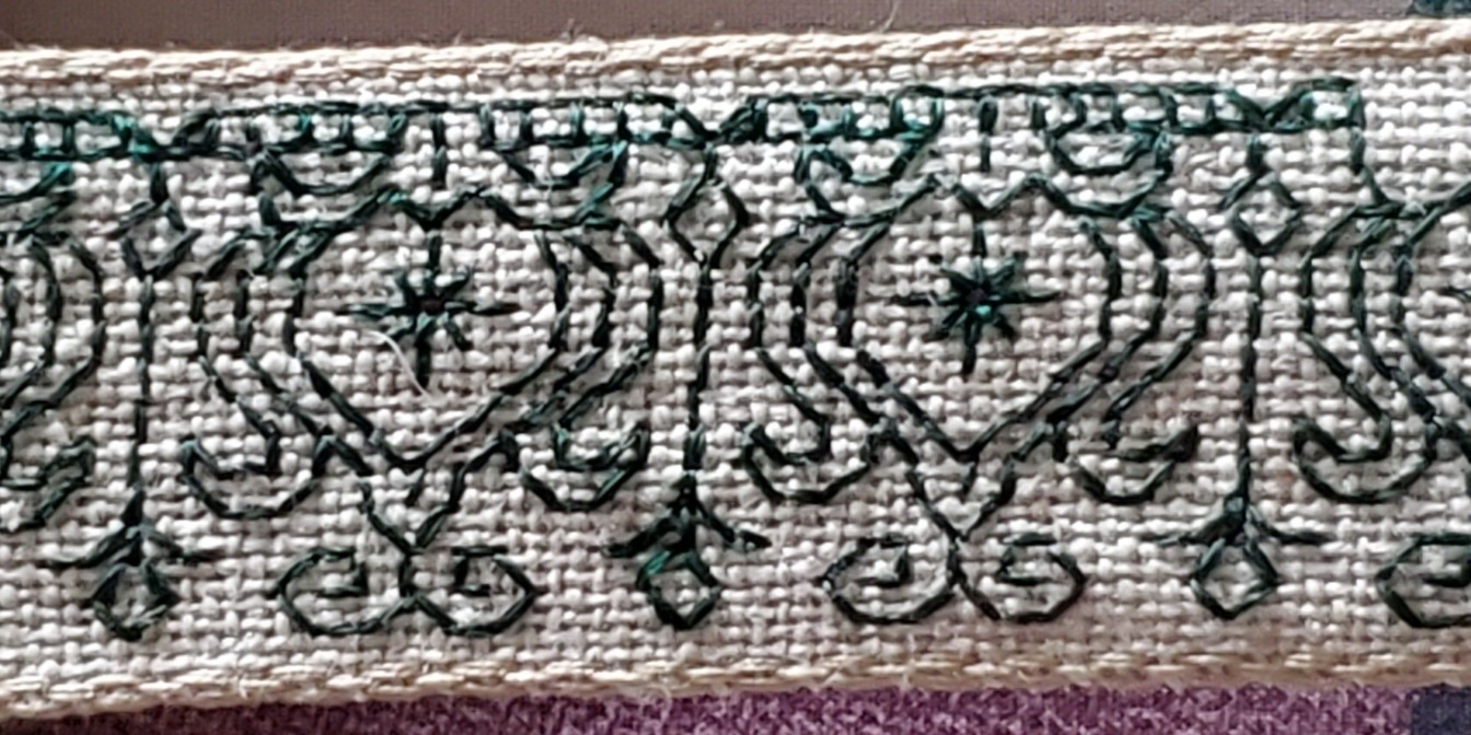
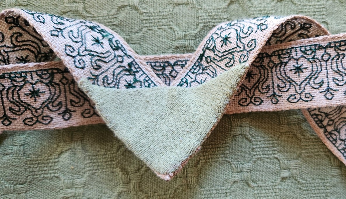
CHATELAINE RIBBON FINISH
A super-quick project for sure. Younger Spawn gave me a chatelaine with a little metal purse for the holiday. I quickly attached my existing tools, put a piece of beeswax in the purse, and set out to use it. But I found that the thing was a bit heavy, likely to injure standard t-shirts and blouses, and pinning it to the waistband of my jeans wasn’t a feasible solution. But it’s a tremendously handy thing.
Stash to the rescue!
I had a length of evenweave linen ribbon I bought at the old Sajou store during our April in Paris trip a few years ago. I’ve been saving it for the right application. This was it.
I cut a length, charted out a new design specific to its width, and set out to stitch it more or less double-sided (not entirely so, but close enough) to use as an award-style neck ribbon to which the chatelaine could be securely and safely pinned. I started stitching on it on 5 January. And in less than two weeks, I have my first 2024 finish.

This is it, upside down so that the signature in the center back reads in the correct orientation. Note that I’ve left the overlap area free from stitching. It’s actually four layers of the ribbon linen thick – the ends folded over each other and securely stitched down. On top of that I also reinforced the back to prevent it from snagging on shirt buttons, and to give the chatelaine pin even more to grab onto.
Yes, that’s the same bit of nylon jersey fabric I used last week for mending. (Waste not, want not.)
Here’s the whole thing with the very appropriate rose pin in place, neatly figleafing the bald point center front:


The extra fluffy pullover doesn’t make an attractive backdrop, but I plead the current cold snap. I’m comfy. And now armed for my next stitching battle!
UPDATE:
The doodle page for the pattern I used on the chatelaine is now available on the Patterns tab here at String. Click below and scroll down to the bottom of the page.
BUSY END TO THE YEAR
No doubt it has been a hectic end of year, what with the standard end of year activities plus the finish on the coif project, and the lightning trip to the UK to view the final exhibit. But that doesn’t mean that other things have languished.
First, because the holiday can’t happen without cookies, even if I am not around to make them all, I present our 2023 cookie plate. Some slimmed down to lower carb versions (with varying levels of success), and some expertly baked by Younger Spawn, whose oven-acumen now far exceeds my own. Luckily Spawn’s job is work-from-anywhere remote and allowed early arrival the week before Christmas. While we were in Sheffield we had a happy house-sitter, tree waterer, and master baker in residence. And said HHS/TW/MBIR had run of the place, its kitchen, library, and media without clumsy parents cluttering available time and space. A win all the way around.

Starting from around 11:00 and spiraling into the center we have:
- Brown butter chocolate chunk cookies. A specialty of Younger Offspring, with grated chocolate bits, chunks and dust instead of commercial chips. To die for.
- Low carb peanut butter cookies. After all sorts of failures trying customized Keto recipes I fell back on the old reliable Joy of Cooking one, but subbed in King Arthur Keto flour and monkfruit-based sweeteners. I have always used Teddy no-sugar peanut butter, too. A slightly stickier dough than usual because the KA Keto flour and it isn’t as absorbent as regular all purpose flour. A bit more oil release on the baking pan, but this time the cookies turned out pretty close to usual – not dry and crumbly, although I couldn’t get the cookie stamp I usually use to work well and fell back to the traditional fork-tine checkerboard. They were pronounced acceptable by my core audience.
- Earthquakes (our name for chocolate crinkles). Full octane. These were made by Younger Offspring, and are especially luscious this year because the batter became the receiving point for ganache left over from another recipe. Not to many fault lines in them this year, but oh so good.
- Mexican Wedding Cakes. Another old family favorite done perfectly by Younger Offspring. Lots of pecans in a buttery shortbread base.
- Lower carb Buffalo Bourbon Balls. This is a family recipe that usually starts with a box of Nilla wafers or other similar vanilla or chocolate flavor plain commercial cookies buzzed to fine crumbs. But commercial low carb cookies are hard to find and maddeningly expensive. So I improvised my own, making large blobby plain cocoa cookies using the Keto flour and fake sugar, plus butter and Dutch process cocoa. Then the next day I ground them up and made the usual, but rolled them in a mix of the cocoa and granulated fake sugar instead of the confectioner’s version of the same monkfruit sweetener. (I wanted to save the powdered stuff for other baking because it works better for most of it than the standard). I used agave syrup in place of corn syrup for these. Plus bourbon this year instead of rum, mostly because that was what we had on hand. These actually turned out to be the best lower-carb cookie I’ve made so far. I will have to do it again so I can write up the recipe because it’s worth sharing and replicating in the future.
- Jam thumbprints. Another winner from Younger Offspring, who has sneaky ways of setting the raspberry jam in the shortbread base so that it is a neat, non messy, intensely fruity bite.
- Slimmed down Oysters. A take on my own invention, using my usual recipe but subbing in the King Arthur Keto flour and monkfruit sweetener into the standard along with the usual avalanche of ground hazelnuts. Those were hard to come by this year, but luckily I had some in the freezer, left over from last year. I was very happy at how the batter worked with the cookie press. And these were a collaborative effort. I did the cookies, but Spawn did the ganache and filled the sandwiches. The ganache is full octane.
- Lemon macarons with lemon curd. All Younger Span, all the way. These are classic, intensely lemony, and lighter than air. An accomplishment far beyond me. Again, to die for.
- Lower carb triple gingers. Obviously the white chocolate chips in the cookies are not slimmed and there is minced candied ginger in there, but the rest of the cookie is my usual recipe, subbing in the low carb flour and sugars. I’m a bit disappointed in these because as a drop cookie they are supposed to spread. These didn’t, remaining the rocky shapes in which they were spooned onto the baking sheet.
- Lower carb chocolate chip with cocoa nibs. This is new this year. I started with a keto shortbread cookie recipe, and added keto chocolate chips, plus no-sugar cocoa nibs (left over from last year). The result is pleasing but also a bit disappointing. The texture and taste of the cookie part is too much like a store-bought Chips Ahoy. I had hoped for something more like a home-baked Tollhouse. But they are not too sweet (a common problem with keto baking because the fake sugars are more intense than their standard counterpart). Good enough, but not great.
- Unseen – a keto lemon cheesecake in place of our standard Panforte, which could not by any means known to man or woman, be slimmed down. In fact, if I went on a forced march through Middle Earth and could pick only one food substance to sustain me, the Panforte, packed with nuts, dried fruit, and carbs would be a space/weight efficient substitute for Lembas.
Obviously for cookies to happen we also had to hit Max Festivity. Again Younger Spawn leapt in and took over the orchestration of the tree, and deployment of the M&M Man Army:

And to round it out, presents were exchanged. I was well prepared with gift socks, mostly knit since I mailed the coif. This photo omits the two last pairs, along with a nifty folding basket that was a present last year, and has been adopted as my knitting bowl for sock production.

Not to brag, but I am delighted that my family knows me so well. Among the puzzles, wearables, and adornments they gave me this year, were stitching things: a quarter yard of 40 count cream linen, a sweet little tabletop caddy box for needles and pins (I will use it for needles and orts), a small cigarette box that is a perfect traveling needle and thread safe, and a chatelaine.

As you can see I’ve already put my favorite laying tool, fine needle threader, and scissors on the chatelaine. I put a slice of beeswax in that little snap purse.
The rose header for it has a sturdy pin on the back. But since I am usually found in T-shirts these days, the weight of the thing might be problematic. This gave me an excellent reason to go stash diving and retrieve a length of evenweave stitching ribbon that I bought at Sajou in Paris when we visited there about seven years ago. A quick trip to the computer to doodle up a new pattern for it, and I’m off and running. It will be an award-ribbon style around the neck piece, with a 90 degree angle in front where the ends overlap. The chatelaine will be pinned to that triple layer of sturdy linen, and the loop will go around my neck. Problem solved. Or it will be as soon as I’m done with the stitching and assembly.