LETTERS FROM THE PAST
Antipodean social media pen pal and long time needlework/knitting co-conspirator Sarah Bradberry recently posted about a thrift store find – a 1971 vintage book entitled Lettering for Embroidery. It’s available for borrowing at the Internet Archive (free account sign-in is required). It’s an interesting read, although its overall aesthetic now looks 60s-retro rather than cutting edge fresh. Which is to say that it’s back in style.
Her post made me think about some of the unconventional alphabets I’ve drawn upon for my various non-traditional samplers, why I picked them, and how I used them.
To begin, I like letter forms – perhaps an inheritance from my grandfather Mack who owned a printing company. He would point out the often tiny differences among various typefaces and font sizes in printers’ samples, advertising materials, newspapers, and in books, and how those differences contributed to the overall message of the printed piece. While I obviously didn’t follow him into the family business, some of what he showed me must have stuck.
Let’s start with one of the more outrageous. It’s a phrase in an non-Terran language, picked up from my one of my Resident Male’s writing ventures. The book itself isn’t out yet, but I can say that in the text, it is translated as “Life’ll kill you.”
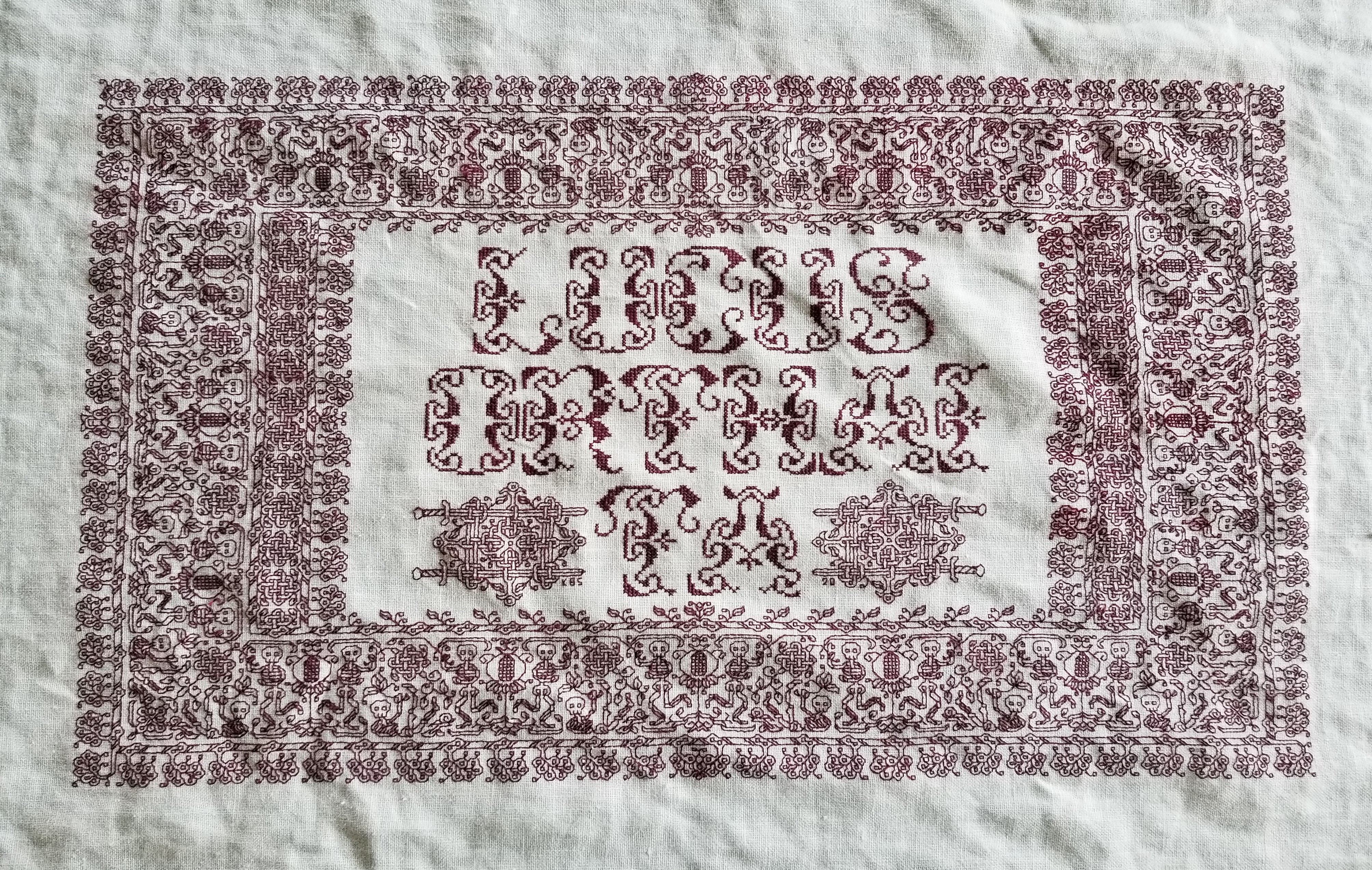
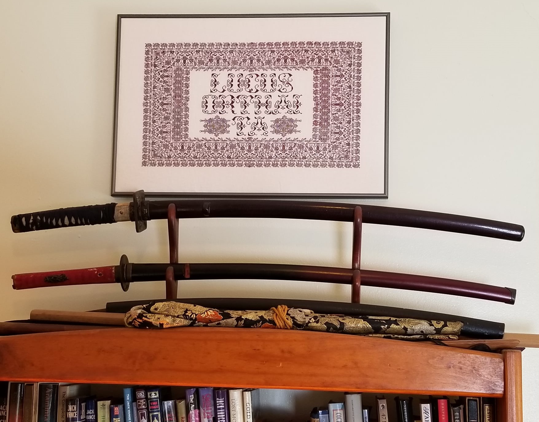
Ringed with my dancing skeletons, and bedizened with sword bearing interlaces to echo the stated meaning, I wanted to use an almost unreadable other-worldly set of letter forms; shapes that themselves danced. I went to my go-to spot for graphed alphabets – the free Patternmaker Charts collection of antique Sajou, Alexandre, and other leaflets. This one is from the Rouyer #248 booklet. I kerned and leaded the rather large letters tightly, to accentuate the flow of the curls across the words. (Kerning is the space between letters, leading is the space between lines of type). In terms of composition, the three words are centered, with no regard for how the letters stack vertically. These letters are also proportionally spaced because they vary so much in width, and cannot be easily worked monospaced (the way an old fashioned fixed-width Courier typewriter prints.)
Here’s another where I tried to fit form to the statement. The full chart for Don’t Panic is free here on String.
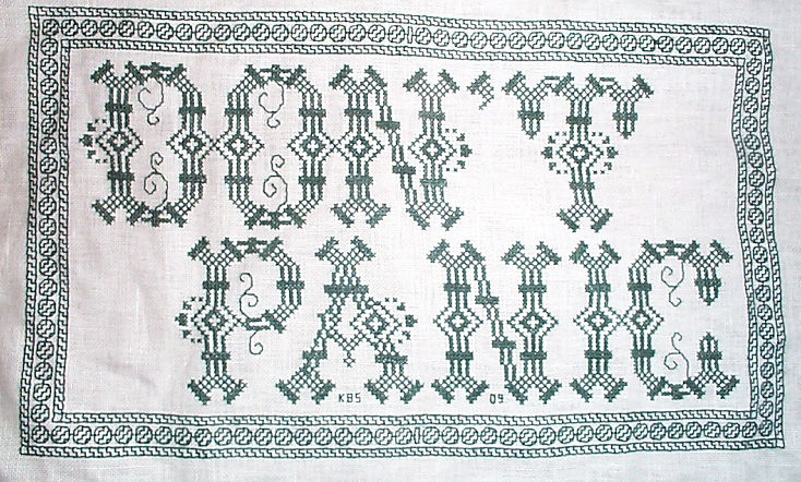

Yes, I know in the Hitchhikers’ Guide books the phrase is described as being “in large, friendly letters,” but this was going into my office where I managed frantic people wrestling deadlines under extreme pressure. I thought a jittery sign would be funnier. My favorite source to the rescue, this alphabet is from Sajou #325. It drips nervousness, even though the firm serifs imply regular stability.
Note that as with many of these vintage alphabets, the letters I and W are omitted, in keeping with the paradigm of classical calligraphy. I extrapolated the I, and doodled a matching apostrophe. Again, I kerned tightly, although I’m not fond of the space between the A and the N. I should have tucked them closer together, as I did between the P and the A. But As are problematic. I also chose not to center these words one on top of the other. The offset adds to the perceived unease.
Here are two more (slideshow presentation to save space, click on arrows beside the photo to advance). In these I chose to use the words as horizontal bands of ornament, flush left and breaking words when I ran out of space. I went back and eked out the bands to come up to the right margins. Mostly I did this because I was impatient. I didn’t want to take the time to do a full arrangement of the motto as it would appear before working the rest of the piece. I knew I’d have space to work the full quotation, but just stitched them letter by letter, with no advance planning. Since I had seen historical samplers that did just that, I felt confident beginning flush left and cutting words in the middle as space dictated.


I am not sure where I got the alphabet for the “Do not meddle in the affairs of wizards” piece. I stitched it circa 1994/1995, just before I began keeping a blog. Obviously the source followed the additional classical convention of presenting just a V shape to cover both that letter and U. I’m also pretty sure I extrapolated the I. In any case, the thread count on this one is no where near as fine as on the others above. There was less room for larger lettering, and I had to find something small enough to fit (most of) the words in, with minimal truncation.
The Arthur C. Clark quotation uses another alphabet from the Patternmaker collection, this time from Sajou #55. It may even be the project on which I stumbled across that source. Being a two-color piece, I wanted something that combined both, and that had an old-fashioned, formal look without being very stuffy. The red swirls suggested a bit of obfuscation and incantation as they tendril around the more solid letter forms. Again I extrapolated the I (thankfully there are no Ws in the phrase). This alphabet with the exception of the I has a very blocky, chunky and solid appearance in spite of the red whisps. There was no need to play with kerning, and spacing between words was easy and regular. The general look of boxy solidity underscores the sentiment expressed. For the A.C. Clarke attribution, I was lucky to find a tall and narrow alphabet in Sajou #172 to fit remaining space on the final lettering line. I will say that after this piece I lost my appetite for broken words.
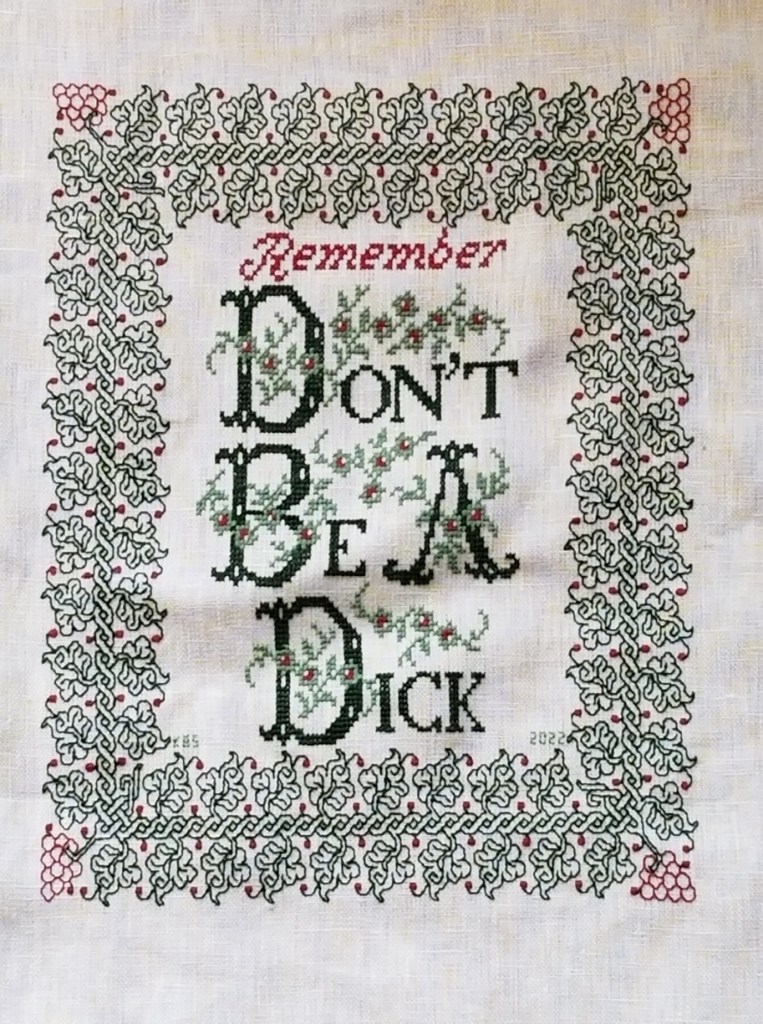
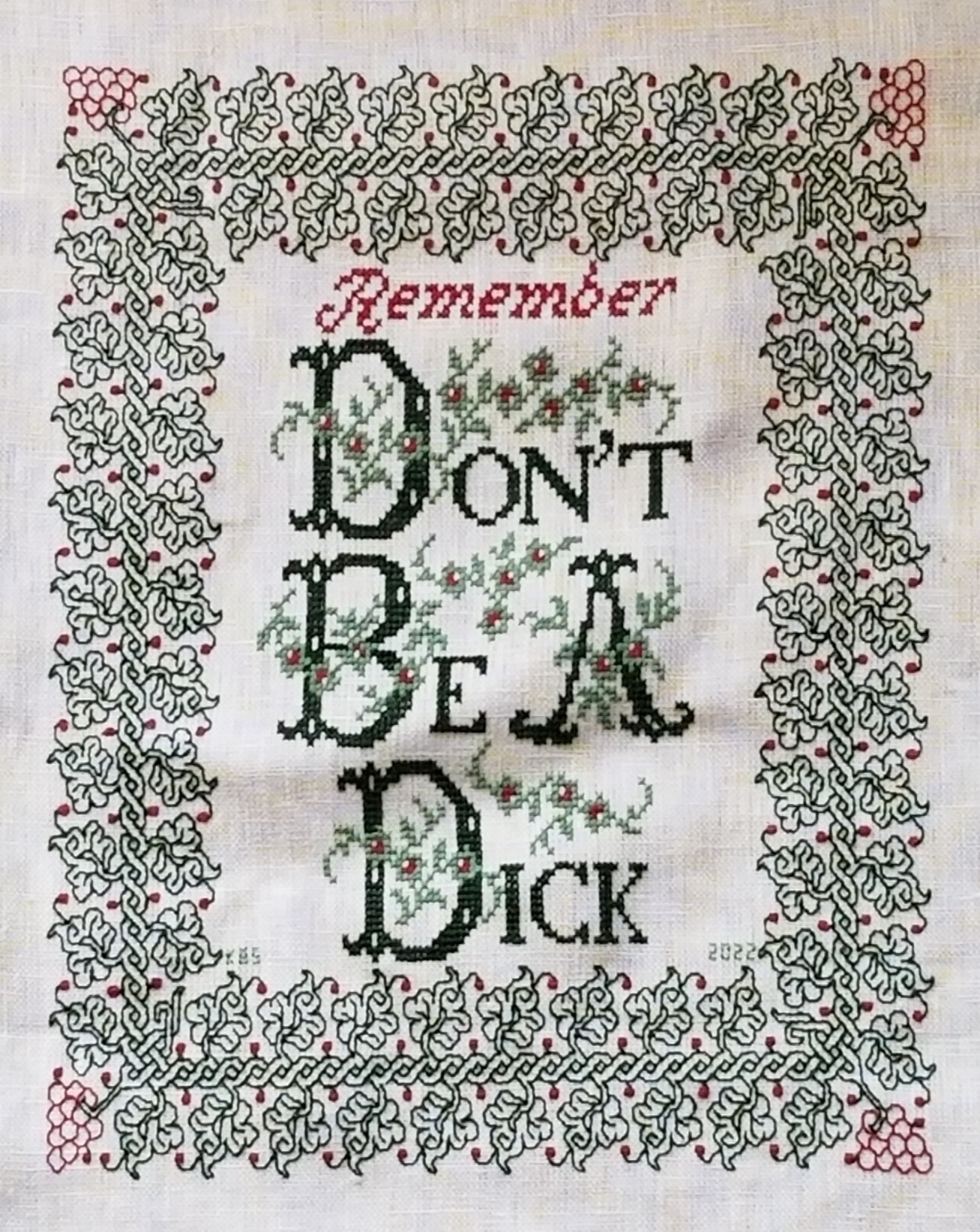
At the risk of alienating all, my two coarse language pieces (behind the eyeball fig leaf image, also in slide show) use formal typefaces to express very informal and direct sentiments. If you are easily offended by rude words, skip ahead.
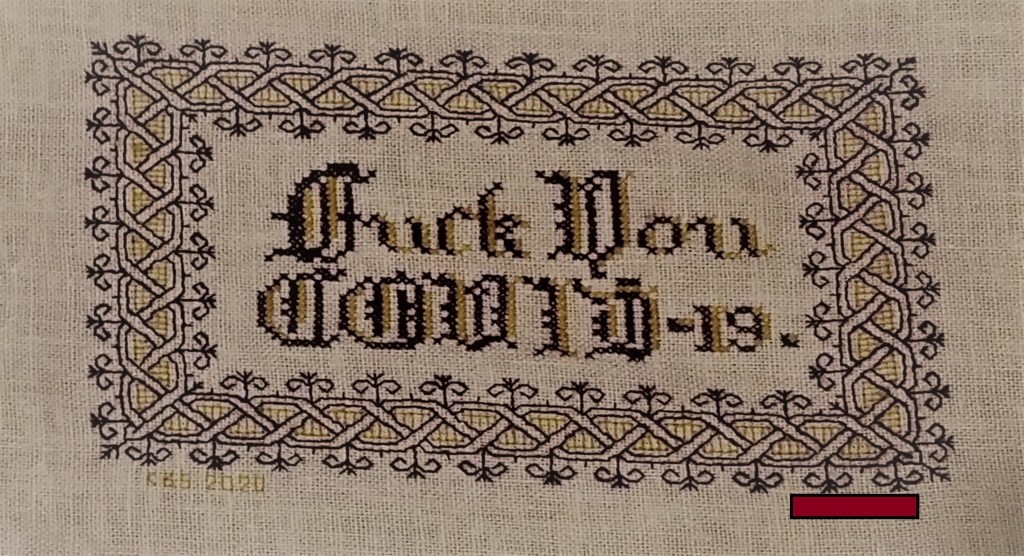
The Covid sentiment, done in a blackletter typeface, uses two alphabets from a German book, available on Patternmaker Charts. One is uppercase, the other lower. The lower case alphabet also supplied the numbers. Again I had to invent a matching letter I. Blackletter family typefaces are reserved for formal documents like diplomas, and newspaper mastheads here in the US. I wanted to play on that gravitas.
Similarly, for the admonition done in green, I wanted to evoke the greeting card world of hearts and gentle sentiment, to contrast the general scolding represented with sweetness and light. I picked one of the flowery alphabets from Patternmaker Chart’s Sajou #160 but leavened it with a smaller yet still uppercase typeface for the rest of the lettering. That classic form serif alphabet is from Grow and McGrail’s Creating Historic Samplers. The R of Remember is from Sajou #1 also on Patternmaker Charts, and the lower case lettering for the rest of that word can also be found in the Grow and McGrail book. I also adapted the floral ornaments from the initial letters for use as fill to surround the lower case one.
Pay Attention to Trifles has the most typefaces I’ve ever used on a single piece. I wanted the word Attention to leap out, Trifles to be the most ornate, and the message to be decoded only on a second glance. And I wanted a vaguely carnival type over the top mix of styles to complement the extremely busy design that is stuffed full of buried “Easter Eggs” as requested by the recipient.

All of these are from the Patternmaker Charts website.
- Pay – Sajou #652
- Attention – Sajou #654
- Even to – Alexandre #143
- Trifles – Sajou # 53 and 203
The dual tone coloration on these was not always noted in the original. Some I tarted up myself. I kerned each line separately, trying to best suit the alphabets being used, squishing ATTENTION a bit made it shout louder. Letting the other lines straggle a bit more made them a bit more lyrical.
While busy, the mad assortment is just over the top enough to gentle the nagging advice of the motto. If I had done the entire thing in the same face as Attention, the statement would have been way to strident. Throw in a bit of whimsey and it becomes an in-joke between the donor and the recipient. The centered text with the balanced motifs left and right is in contrast to the rather chaotic jumble of gears done in inhabited blackwork. There is repeating arrangement of the gears (more or less), but not the strict centering of the lettering. I think that adds to the haphazard playfulness of this piece.
I have done lots of other pieces with mottoes or words on them, but they don’t really showcase different approaches. The last one I’ll cite here is the piece on which I’m currently working. I’m almost done with the penultimate band, and have designed another custom-fit to go below it and end off the work as a whole.
I can’t say for sure where I found the alphabet I modified for use on this one. I found the image in my notes folder, with no attribution other than mid-March 2020 save date. I ended up upscaling from the typeface as charted by using a block of four units for every single unit in the original, and smoothing angles accordingly. Using the squared fill for the shadowing was intended to make the text reminiscent of a brick wall. That the span of the words is larger than the rest of the piece and contributes to that effect is serendipity, not planning. My count was off, and (thankfully) having started in the center, at least the motto protrudes mostly evenly left and right, looking even more monumental than I had planned.

I did kern aggressively to make the motto fit the space, but I should have lost one more unit between the B and Y of by. Still, I think it works. It’s blocky, yet because the letters are represented by outline and shadow, it contrasts nicely with the rest of the piece, overrun as it is with very busy fills.
OK. A conclusion now. Sort of.
If you are designing your own motto bearing piece, there are lots of choices out there that can make a real impact on the design, above and beyond the decorative elements that surround it. If you are unburdened by time/place restrictions (you are not designing a piece in the style of a specific location, school, style, or era), you are free to play. Think of the lettering as another element you can manipulate to underscore the message of your motto, or to convey a mood in which you would like it to be received.
Want to be playfully threatening, like an admonition to keep the kitchen or bathroom clean? How about using a different typeface and font size for each letter, to make it look like a ransom note. Want to convey warm wishes and affection to your extremely sweet and caring (but possibly somewhat humorless) family member? How about one of the ornate flower-bedecked alphabets from around 1900? Have a Goth leaning pal whose heart beats for irony and sarcasm? Use that same flower font in funereal black and purple to express an over the top sentiment.
You can speak words with typeface choice, font size, color, and spacing beyond the actual ones you stitch.
END OF DON’T, BEGINNING OF THE NEXT
Just finishing up Don’t. I think the Mystery Neice will be happy with it. We worked together to pick out the colors, typefaces, and border design used, so there was ample recipient-input on this one.
I’m happy with it, too. Although I have to confess a bit of a mistake at the outset, which has necessitated a somewhat rueful kludge.
The original did not include “Remember.” Why is it there?
Because when I started stitching the border at the left center line, instead of starting it at the center of one of the sprigged spirals, I started with one of the spirals that grows a leaf. That de-centered the inscription north/south. I walked happily down the left edge, across the bottom, and up the right side. When I got to the top I noticed that (horrors!) to make my corner fit there would be larger space between it and the words than there is at the bottom. Nine units more, to be exact. So I thought about what I could put there. More flowers? Possibly. Another ornament? Again possible. But the more I thought about it, the more I wanted to NOT add mass on top which would draw attention to the lack of space at the bottom. So a word was the way to go.
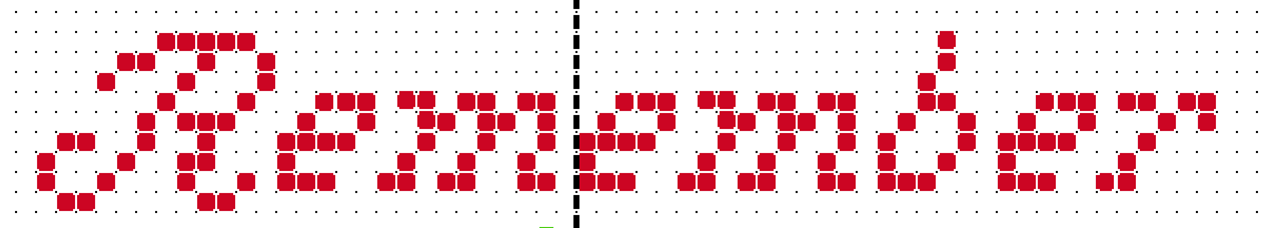
I decided on adding “Remember” and went pawing through alphabet resources to find something thin, elegant, and nine units tall – something that would fill space without adding too much bulk. The initial script R is from an antique Sajou booklet at the Patternmaker Charts site. The lower case letters needed to be smaller, and I found a good candidate in Creating Historic Samplers by Grow and McGrail – the same source I used for the lower case letters in the main area. It’s not a profoundly useful book, but it does have a section of beginners’ advice, plus some sample US Colonial era motifs, alphabets, and borders. Best of all for those just starting out, it’s very inexpensive on the used market.
Now on to the next – Grape Sideboard Scarf.
For the next project I’ve decided to use a well washed linen piece I picked up at a yard sale in Silver Spring, Maryland easily 42 years ago. It’s a dresser scarf, trimmed with a hand-turned hem secured by a simple crochet, with a crochet picot edge on the short sides. Based on the materials and back story I suspect it was cut down from a larger cloth and trimmed out sometime in the late 1930s or 1940s. I got it the same time as I got the larger finished linen piece that became my Everything is Worth Doing Well sampler, although they were not cut from the same source. Yes, it’s worn and a bit discolored from storage even before I got it, but it’s sound.

The stitchable area is about 16.5 inches x 28.5 inches (about 49.9 cm x 72.4 cm), and the thread count is roughly 32 threads per inch. That’s about16 units per inch using a 2×2 thread grid, with a total design area of 264 units x 456 units. That varies a bit across the piece, so I’m averaging measurements taken at several spots (penny method for easy thread counting here).

I’m going to stitch it in red, using a pattern I’ve recently redacted from a 17th century Italian cushion cover held in the Hermitage Museum (Accession T-2736 in case the link breaks). A thumbnail of the original is below. It’s about 40 x 48 cm, roughly 15.75 x 19 inches. No info on the thread count of the artifact.

Obviously I am going to maintain the dresser scarf’s edging. Also depending on the scale the design works up to I may only stitch to within 1.5 inches of the existing hems, then devise a coordinating sprouting edge to encircle the center field.
As far as the charted redaction went – this one was tricksy. There’s a major sub-sub-element that is off-grid; meaning that when I get to it (and write this here so I remember) I will have to “split the difference” on my evenweave, and shunt that bit over one thread.
Since this will be used as a protective placemat on my sideboard largely for opening the evening wine, the grape motif is appropriate. And I’ll use a DMC 6 ply floss, one of the garnets – 615 or 616, I haven’t decided yet on which one yet. I go for cotton instead of silk on this for washability because spills WILL happen.
The next step is to baste in my horizontal and vertical center lines, plus that 1.5 inch margin inside the hems. Then I begin, working center out.
STITCHING ON THE GO
I’m moving right along on the Don’t Be sampler. The cross stitched letters zoomed by. And over the past three days I’ve gotten a good start on the border, as well. Whole piece photo so you can see the overage I’m leaving to facilitate both stitching and final framing, plus the quick hem job.
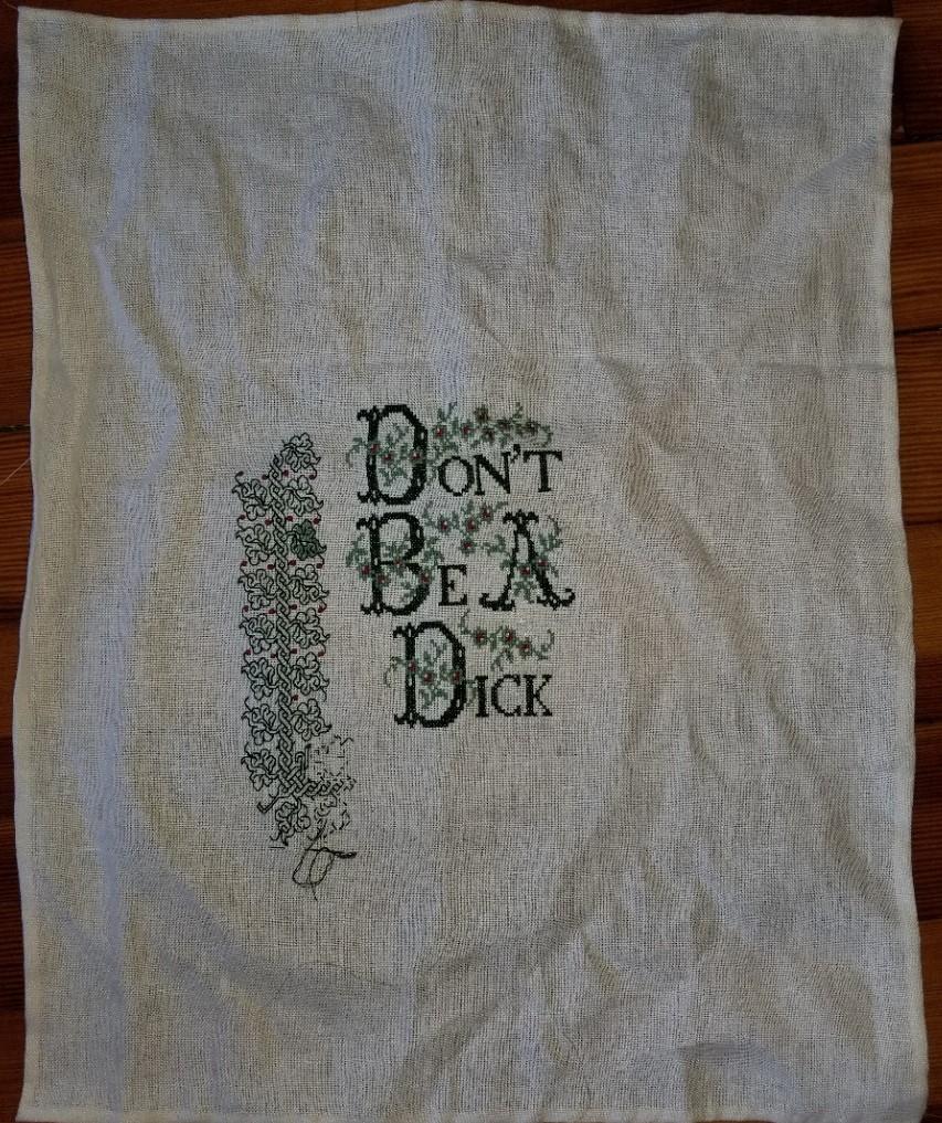
Note that my observation on the skew weave was correct. Those first couple of leaves on the return under the letters are differently proportioned than the leaves in the edge’s vertical part to the left of the motto. That will become more evident as I march along. I don’t remember exactly where I got this piece of pre-packaged ground, or how long it has sat in stash – possibly purchased, possibly as part of a supply salvage gift from a friend who passed it on to me, but certainly not recently. As it is, I will not use anything from defunct company “MCG Textiles” again. Ground sold as evenweave should be exactly that (ok, plus or minus a smidge I will forgive), but a 16% difference between the number of threads in warp and weft is flat out misrepresentation.
The corner is incomplete. I forgot to pack the correct shade of my garnet floss, so the little berries/grapes in the corner will be done later tonight. On the one green leaf, I’m still deciding whether or not to fill in all or some of the leaves. I used plain old cross stitch with one strand of DMC floss for that, flat out skipping partials, and only working full cross stitch X-units. It’s passable. It’s also tedious. When I am done with the double running I’ll make the grand decision. Every leaf, alternating leaves, or none at all.
Now. Where was I that I was working “on the go”?
We ran away to our place on Cape Cod for a last weekend before the renters descend. We went with some long time friends, so it was doubly fun. And I brought this project with me. Folk have asked before how I pack and bring projects, so here’s a thumbnail. Note that I didn’t do it perfectly this time – after all, I ran out of garnet. 🙂
First, the container. The plastic zip bag below (shown both sides) is something I saved the last time we bought a full set of queen size sheets for our bed. It’s rectangular, with an interior pocket, and a zip all the way around one end. It’s also a very tough plastic.
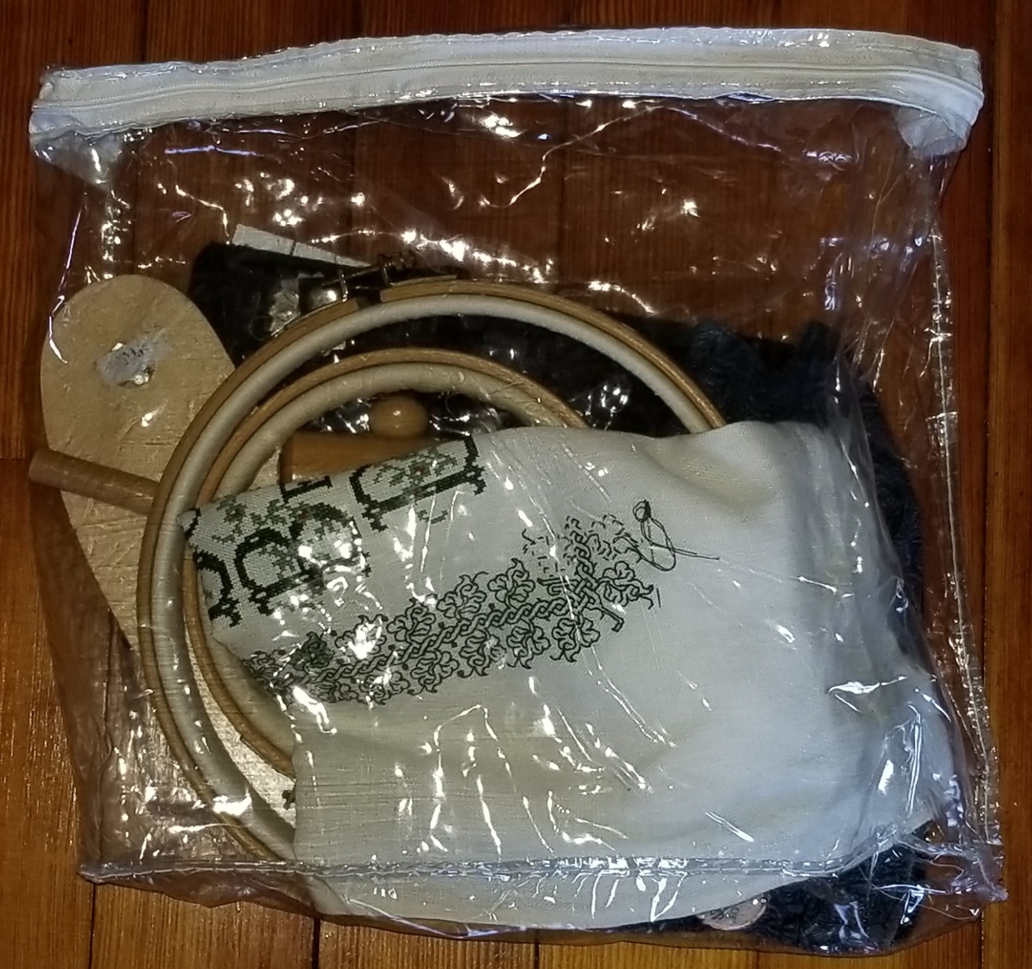

Here you see the main components of my travel kit – the three pieces that make up my sit-upon frame, the project itself, a zip pouch containing essentials (threads, beeswax; my third-best pair of scissors on a retractable spool and a laying tool, both attached to a beaded badge holder; my needle nose electrical assembly tweezers); a little magnetic stand/folder (with magnetic needle minder attached); and a spare in-hand hoop.
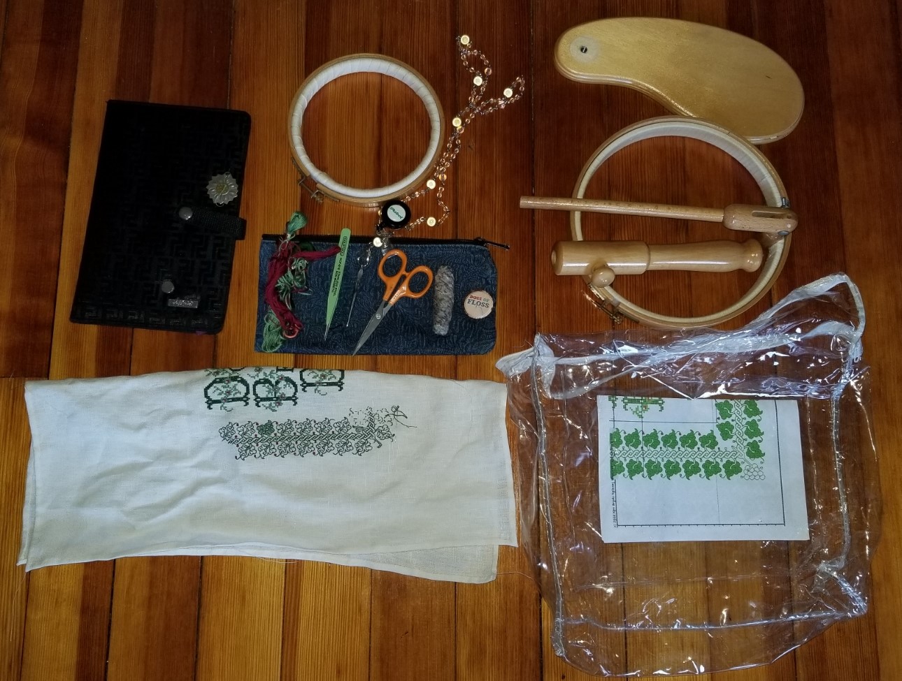
Note that the stand itself is an easy assemble/dissemble, and fits in the pouch with the project. I bring the spare hoop because it’s not always comfortable or possible to use the sit-upon, and because the sit-upon features a fixed hoop-on-stick, it’s cumbersome to use without full assembly.
When I stitch on the beach I leave the magnetic stand folded in the interior pocket of the see-through plastic pouch, with the pattern page on top. If necessary I have a place-keeping magnetic strip that can grip the board through both the plastic and the paper pattern. That way I can keep my pattern safe from dampness and wind on the beach. The supplies/tools zip stays safe in the transparent plastic bag, too, although I do either wear the beaded “chatelaine” around my neck, or clip the retractable badge holder that minds my scissors to my beach chair.

ANOTHER OPENING…
I offered to make one of my nieces a pair of socks or an embroidered bit – noting that I would be happy to stitch up any saying, no matter how profane it might be. She was amused and intrigued by the thought of naughty embroidery, padded off to think, and eventually returned with a request that I’d term more cheeky than offensive. True to my word, I’ve plunged in. The pearl-clutchers who sent me private notes decrying my lack of taste for the Covid sampler and removing themselves from following this website are no longer here, so at this point there should be few left to object.
First a method description because folk have asked how I go about starting a new piece.
I selected a piece of ground from my stash – a piece of 32 thread per inch evenweave with the branding “MCG Textiles.” Well, it claims to be 32 tpi, but it’s really 32×38, so some distortion is expected. I did this first so I knew roughly what size I was going to be designing to fit, rather than starting with the design then questing in vain for a piece of cloth of the correct dimension.
Then I and Target Recipient had a chat back and forth on the general aesthetics. We established that green was a favored color, considered overall composition choices, and looked at some candidate alphabets and strip patterns for the borders. Once we had general agreement on the direction for the piece, I set in, using my chosen computer-based drafting method – a home-grown solution based on the freeware drafting and image editing program GIMP. I offer a tutorial for that (including templates) here on String (read up from the bottom because the blogging software only allows newest at the top organization.)
This is what I came up with.
The charts below are deliberately blurred because while they are good enough for me, they would need to be cleaned up for use by others. Plus I am not sure if I want to add them to the permanent collection here. Target Recipient would have to give permission, for one.

For the record, the leaf and twist border is available in Ensamplario Atlantio II. The alphabet used for the initial caps is from Ramzi’s Patternmaker collection of pre-1920s European leaflets, Sajou #160. The body text from an older book on my shelf – Creating Historic Samplers, by Judith Grow and Elizabeth McGrail, Pine Press, Princeton, 1974. Original elements of this piece not published before include the supplemental embellishment around the words, adapted from the flowers on the initial caps, and the corner for the leaf and twist border.
The next step was to choose my colors – DMC 890 for the darker green, DMC 320 for the lighter green, and DMC 816 for the tiny flashes of garnet red.
Now we get to the fun part – setting up the cloth to begin stitching. The first thing I did was to square off the cloth. I unraveled the thing around the edges, removing all partial threads until I had a full span of both warp and weft. Then I carefully trimmed off the remaining “fringes” left from the unraveling process. I’ve written before about the poor quality control on the MCG packaged product, and this sample was no different. It was quite skew in cut and desperately needed this squaring to determine true grain and useable size. In this case, I lost about an inch of width in one direction and about a half-inch in the other. Having done that I cut the piece allowing a generous border all the way around the stitched area dimension.
Cut piece in hand, next I had to make sure it didn’t unravel further. I have to say am not a fan of taping the edges, and I’ve had equivocal results using zig-zag stitch on my sewing machine to secure them. I’ve had the whole zig-zagged strip pull off. I don’t have a serger, so I stick with old fashioned hand hemming. For this small project that took about an hour to do a finger-pressed double turn hem, a little less than a quarter inch deep all the way around. I followed the ground threads as I did this, so my hems are (mostly) even. Since this will be framed or otherwise finished so that the edges won’t show I wasn’t super-exact about mitering the corners perfectly, as I would be with a handkerchief, napkin or placemat.
The last step of preparation is determining the exact center point and adding the basted orientation guides for both the vertical and horizontal center lines. I use a light color plain sewing cotton for this, and I don’t bother to make the basted stitches any particular length long (some people carefully stitch these over evenly counted blocks of the ground threads). Just having the simple lines are good enough for me. You can see them along with a bit of the hem in this work in progress shot:

Now it’s just a matter of transcribing my graphed out design to the cloth, using cross stitch for the wording. I’m using two strands of the DMC floss for maximum coverage.
When I get up to the surround I will probably switch to double running, and work the outlines and veining of the ivy leaves and twist in the dark green. I am thinking of using one of the more open fillings, diagonal, boxy, or steps, for the infilled areas, and doing them in the lighter green. We’ll see if I change my mind and do something else when I get there.
All in all I expect this one to be a relatively quick stitch. It’s not large or complicated. Here’s progress as of last night. Considering I started this on Friday night, it’s flying.

I hope this step by step on beginning a project is helpful to someone. And as ever, if you enjoy my designs, free broadsides stitch-along and books, and my published books, please post pix. Obviously I’m in this for joy, and few things make me happier than seeing my designs being worked up by others.
