THE SYMMETRIES OF LINEAR STITCHED FILLS AND STRIPS
As promised here’s a rundown on pattern repeat type, and centering fills and strips in designated spaces on your project. For one, there’s really very little need to sit down and stitch-by-stitch completely graph out the design to your final dimensions. In general knowing where the edges and centers of your space, plus the pattern repeat type is all that’s required. These hints go for both fills in regular and irregular shapes, and for strip or band type designs that march along the width of your project, or decorate the edge of a garment.
And a note on grounds, if I may. Aida, Hardanger, Anne Cloth, and Monks Cloth are types of purpose woven grounds used for modern countwork. They feature prominent holes outlining their base size units. Departing from that established grid can be very difficult and involve piercing the fabric in the solid spots between the built-in holes. Partial stitches do exist in the purpose-woven world, and are much despised by stitchers. Working multiple grids skew to each other on the same piece of purpose woven ground is almost never done. I’d say never-never, but somewhere it might exist, although I haven’t seen it nor the rants of despair from folk who have encountered it.
Evenweave (or near-evenweave) is a bit more flexible. Since the stitchers count threads on evenweave instead of hole-defined units, they can employ multiple grids on one piece. If the stitcher decides to work their unit over 2×2 threads, two adjacent spaces can use different grids, offset by one thread so long as the juncture where they meet is taken into consideration. I did this on my Two Fish piece, using the skew alignment to hint at undulating motion. Note the knot and grid filling. Not only is it stitched discontinuously across the bel, I also interrupted the grid. Both sides are worked 2×2, but NOT on the same 2×2 grid – the tail section is displaced one thread up and over.

So when you see me talking about skew grids or using partial stitches when centering various types of symmetry on a single piece, please know that the ability to do this is mainly something that can be done on evenweave. Purpose woven grounds like Aida will limit the way patterns of differing symmetries can be centered against each other. It’s just a fact of life.
Before I begin, all of the fills and bands charted on this page are available in my Ensamplario Atlantio series, my Epic Fandom Stitch Along, or previously shared here on this blog. All are available as free downloads for personal use. Links are provided.
OK. Finally getting into it. Patterns can be grouped into a few basic clusters, with some caveats.
Center Line Repeats
First we have simple line-center repeats. These are designs that cover even numbers of units, and mirror along a center line. The chosen pattern may be a band or strip, with one vertical line where the design mirrors to its left and right. Or it might be an all-over design or fill, with at least one vertical and one horizontal mirroring line.
This blackwork fill/all-over design has both a horizontal and a vertical center line, marked in red. The motif tiles into square blocks of 14 units. The easiest way to use it is to either count to or (if irregular) eyeball the visual center of the space to be filled, then begin stitching the design at the spot where the two center lines meet. Even if the space to be filled is NOT a multiple of 14 but is any other even number of stitches, if centered this way the design will truncate neatly around the edges, as it does in the sample from Ensamplario Atlantio Volume 1, below.
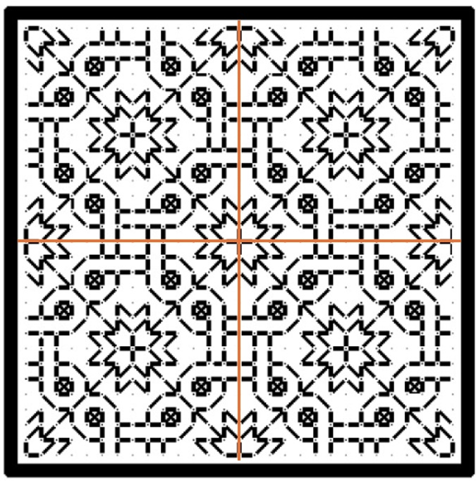
But if the space to be filled contains an odd number of stitches you will either have to displace the center lines so that there is one more unit to one side or the other, or you might have to work partial stitches all the way around the perimeter for full coverage.
Some people insist on using a single grid for ALL of the fills on an inhabited piece. That means that even if they are working over 2×2 threads on evenweave, where adapting the grid you are using to the space at hand would be quite easy, they choose not to. They end up having to either accept minor misalignments between adjacent patterns, or employing partial stitches to eke out the design. That can be avoided by NOT mixing fills or bands with this type of symmetry with some of those discussed later in this article.
Here’s the same type of symmetry expressed in a band pattern. This one is from my Epic Fandom Stitch Along. Note that in this simple meander there are two lines of symmetry (sometimes called mirror or bounce lines). The pattern replicates in mirror image on either side of them, just as it does in the all-over fill. One full repeat is 36 units, and alignment in your desired space can be focused on the center/mirror/bounce lines of either the up or down facing fronds.

Regardless of symmetry type, if you are filling an irregular spot, and you are eyeballing the center alignment point you might end up having to work half stitches around the edge of your area, again to eke out the coverage. This is one reason why some instances of inhabited blackwork (the kind with the freehand drawn outlines infilled with counted geometrics) rely on heavily stitched, thick outlines. Those “fig leaf” the offending partial stitch spots and make the work look neater.
Here’s a bit on my Unstitched Coif, where I eyeballed the alignment of the fill, worked a ton of half stitches (a challenge on 72-74 count near evenweave, stitched over squares of two threads), then went back and put in heavier outlines to hide irregularities. Zoomed waaaaay in like this you can see them around the edges. For scale, that little bud at the upper left is smaller than a US penny.

Now there are some exceptions and complications. We’ll get to those later.
Center Unit Repeats
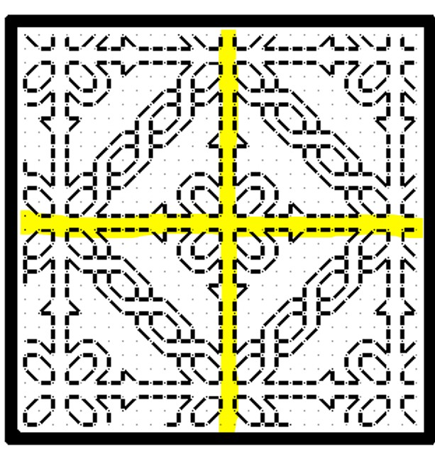
All well and good you say, but the symmetrical repeat I want to use doesn’t meet up neatly at a center line like those. In most cases your repeat has a “spine” of a single unit rather than a center line. That column or row of units is repeated only once, and is not mirrored, although the design itself does mirror left and right (or up and down) that non-repeating column or row. That means that a full repeat of the design includes two symmetrical wings, plus that pesky center unit – an odd number of units, total. Here’s a fill/all-over design that features center units. In this case one full repeat is a square of 23 units (one center unit, plus 11 more units to the left, and to the right of it).
And here’s a strip repeat, also with a simple center-unit style symmetry. Like the line unit band above, there are two possible centers. Either one can be used, although convention on band samplers is to feature two main motifs in the center of the stitched area – in this case the pair of beak to beak chickens.

The strip above is from my Workshop Handout broadside, another free download here at String you can access via this post or via the Embroidery Patterns tab at the top of every page.
Hybrid Repeats
Some designs display a delightful flexibility when it comes to centering because they incorporate BOTH a center unit and a center line bounce point/mirroring. This happens with fills/all-overs and for strip/band patterns.
Here’s a sample of a fill that includes both. I’m only marking one repeat of each type on it, otherwise the thing will end up looking like a swatch of plaid.

This design can be aligned either to the center lines (red), or center units (yellow). And here’s an example of the same type of pattern in a strip or band. The center can be the red line or one of the yellow columns.

Again, if a combo of center line and center column symmetrical strips are used on a band sampler in a mixed environment that doesn’t deviate from one universal grid note that true center alignment will not be possible. The even-number repeat centerline bands will all line up with each other. But if you insert a design with center unit/column symmetry but have to use the same “stitch holes” in Aida as the rest of your project, that center column will not line up with the true center of the rest of the piece. Which may or may not matter to you. Food for thought.
Staggered Drop Repeats
Now it gets harder to identify these. This style of repeat is common in fills/all-overs, but less common in strips/bands, but they do occasionally pop up. For the most part they employ mini-motifs, sometimes in straight-on replication, sometimes with mirroring or rotation; and use regular offsets to place them. Sometimes its a simple half-drop, sometimes it’s a larger interval or not regular when the horizontal and vertical offsets are compared. Most of the time these staggered or evenly scattered mini-motifs do resolve into very large area true repeats, with the same motif repeating in the same relative position in the field, but it’s rare to use these in areas big enough for that resolution to happen. How to center them? It’s a bit more complicated.
Here are three with different rates of periodicity (how big the sample has to be before it manifests a true, full repeat), presenting different problems. These are all from Ensamplario Atlantio Volume 1, Second Edition.

The flowers at left can be centered in a panel in one of two ways. Either using the regular center-line symmetry of the very simple little four petaled flower, or by counting to identify the centerpoint of the more complex sprigged flower. Either way will work, although I think using the smaller mini-motif would be visually more pleasing. Note that regardless of the size or count of the space you use these repeats “walk” and will always truncate around the edges.
The snail garden square at the right is a hybrid. It can be effectively centered either on the tiny squares and on the larger snail-bearing unit. Both work nicely. Which I would choose would depend on the size of the space I wanted to fill with it. If the space was large enough to accommodate four of the snail gardens without truncation, I’d probably use the tiny squares as my center alignment point. The snail gardens rotate around them, and optically form a flower-like shape when viewed from a distance. If the space was small, I’d put the garden in the middle to ensure at least one full iteration of it was represented.
The griffin/dragon beastie in the center presents a harder problem. There’s only one element here, and it has no clear center line or center column/row. Additional complications come from the rotation and offset of the beastie motifs. The easiest way to center this one is to find the center point of the beastie itself, match that to the center point of the area to be filled, and work the others around the first, completing the truncated ones as possible. In the photo below, this is what I did with the wing like bits, second from the right in the photo below, and what I SHOULD have done with the little dolphins in the box next to them, but obviously didn’t.

The myriad mistakes in my current piece are what inspired this post. In addition to the errant dolphins in the latest section, you can see that the voided bit currently underway wasn’t properly aligned. It’s a center line repeat, I have an even number of units across, but if you compare the left and right edges, you’ll see that the design is shifted two units to the right. The center of that strip does not align with the center of the set of boxes, above. The dolphin box is intentionally shorted one unit compared to the others in its row because my count across is not divisible by four (available area minus 6 units total for the gutters between the boxes). There are more similar mistakes in the previously completed part, now wound around the roller bars of my stretcher frame.
I confess to making many alignment sins on this one that together have landed me in this predicament, including initially basting the center guideline that runs the entire length of the piece offset to the right by three units; never going back and measuring, but instead working the other vertical guidelines off that one; starting the first blocks and not bothering to confirm centers or edges until it was too late to pick out and start again; fudging everything in to try to compensate for the pile of errors that was accumulating behind me; and not paying enough attention to centering the various fills in their boxes.
I will continue on to completion with this one, warts and all, but I may revisit the base concept of voided strips alternating with boxed fills in a future work.
ANOTHER NEW TOY
If you’ve been reading here over the past month, you’ll have seen me working the current project in a hand held hoop. I love hoops, especially their portability and versatility. But I vastly prefer the “real estate,” tautness, and ability to use two hands that using a scrolling frame gives. I’ve had two sizes of the Needle Needs Millennium frame for quite a while. I tend to pull those out for the big projects, especially those with metal threads, or that feature easily crushed or disarranged stitches (satin stitch, knot stitches). I also have a sit-upon hoop. I do use that extensively for the smaller pieces with less fragile work on them. It has some of the advantages of the other two types, but as a compromise, with less ability to place the piece in exactly the optimal spot and angle for visual acuity and best lighting. The hands down most efficient way for me to stitch is the big Millennium on my Lowery stand.
After months of hoop-in-hand, I was yearning for the scroll frame experience. I heard that Needle Needs had a new junior size frame, and was also offering smaller roller bar and side extension pieces for the Millennium system. So I sat down and weighed price, stitched area size, and the fact that pieces from the new junior frame are not compatible with its larger brother, then splurged on a pair of new extenders and roller bars.

I have two sets of the older 8-10″ side stretchers. I got that relatively small size because I realized that the bigger ones would produce a stitching area that would be difficult to reach. That bore out when I was working the coif using the 24″ roller bars and the 8-10″ extenders. My behind-the-work left arm could reach only 60% of the available area with it set at full extension – barely making it to the top edge of my piece, and I had to flip the frame over to work the remaining spaces. But while I might have gotten the even smaller 5-7″ sides this time around, I had the feeling that a space that small in combo with the Lowery frame extender arm would be less than optimal.
Obviously the new components arrived yesterday and were immediately deployed:
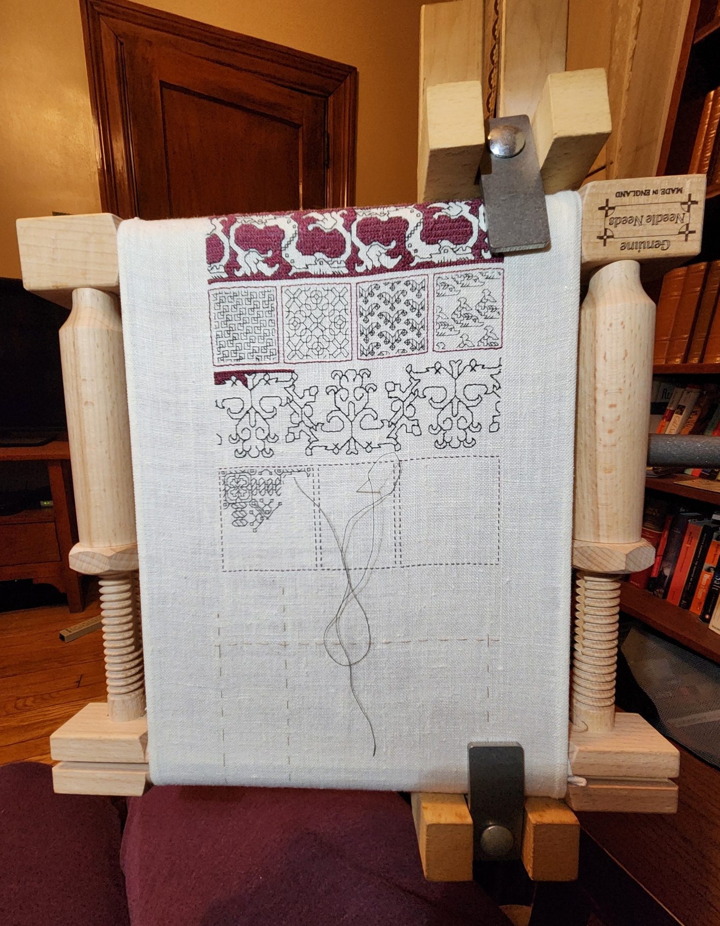
And I was right. You can see how much of the available area is “eaten” by the width of the gripping Large Frame Extender. Even if I position the frame so that the clamp is grasping the corners of the roller bars, it’s awkward to work right up against the Extender’s upright. But just like with the larger set-up for the Coif, I can flip the frame upside down to work that side of the piece.
I know that not all my new projects will be narrow band samplers, but between the new short roller, and the new short side stretchers, plus the pieces I have on hand used in new size mix combos, my toolkit has valuable extended capability.
As for more on the design on this sampler, the types of symmetry often seen in fills and how to best center them depending on the type of symmetry, that will have to wait until the next post. For some reason the blogging software is having indigestion, and I’ll have to cut today’s intended post into two. Will finish that one out and get it up by the end of the week.
AND NOW WE ARE FOUR
I report the finish on my RESIST sampler. Completed, signed and dated.

Don’t worry about that dot on the bottom margin – that’s just fluff I neglected to brush off prior to the photo. The message is dead serious, but there are some silly bits in it. Like the dragon heads that parade across the top. The eyes in the original are empty – no pupils. But I put some in on this strip, and got several emotions when I did. My dragon heads look angry, attentive, contemplative, attentive, and bored. And more. Just a whim.
I am also pleased with the Pegasus strip – doodled up just for this piece. It will be included in my forthcoming Ensamplario Atlantio Volume III (EnsAtl3). No timeline yet for that release. Here are the sources for all fifteen bands, top to bottom.
- Dragon head edging – The Second Carolingian Modelbook (T2CM), Plate 25:4. Redaction with impromptu manic eyeball improvisations.
- Acorn meander – T2CM, Plate 25:3. My original.
- Line interlace – T2CM, Plate 11:3. Adaptation of non-graphed modelbook design.
- Twisted meandering eels – T2CM, Plate 27:2. Redaction
- RESIST using alphabet border – Whole alphabet blocks and bits that fit around them, EnsAtl3. My original.
- Lily buds – Several versions in my various works, this one from my free class handout available on my patterns tab. Adapted redaction.
- Kittens and string – EnsAtl3. My original.
- Large floral all-over – EnsAtl3. My original.
- Doubled simple flower strip – T2CM, sample figure on building larger borders from narrow ones, on the write-up page for Plate 7. Original narrow strip, T2CM, Plate 6:3. My original.
- Cursed bunnies eating my hostas again – I had fun stabbing these guys, too, for obvious reasons. EnsAtl3. My original.
- Very large sprouting all-over. Broadside available here on String here and on my patterns tab. Redaction.
- Block edge border T2CM. Plate 23:2. My original.
- Thistles – T2CM, Plate 30:3/ Adaptation of non-graphed modelbook design.
- Pegasus strip – EnsAtl3. My original.
- Rooster edging – (Turn it upside down and you’ll see them). EnsAtl3. My original.
Now RESIST joins the three fangirl samplers I have completed, celebrating the science fiction works of my Resident Male. That’s a lot of stitching since June, shown here on my Wall of Shame, where all my finished but not yet framed works live.

What’s next? Probably another in the PERSIST-RESIST grouping. ASSIST will be longer than RESIST. Also on a high count not-so-evenweave linen remnant. As you can see, the prep step of hemming has started.

I’m torn about colors and threads. And I have to calculate the thread count of this scrap piece. I have a feeling that it’s a bit more skew than the other four, and probably a skosh coarser than RESIST. I have some silks in various colors that might work on it, doubled in happy polychromatic chaos. Or I might do it all in deep red, possibly with a spot of a shiny black for emphasis.
As to what to put on it, I’m also contemplating options. The word, for sure. Possibly some voided bits or heavy foreground long-armed cross stitch strapwork bands (I haven’t done much of that recently). Or maybe I’ll work in some tiles of fills. But not worked inside freehand drawn shapes – just in geometrics. I have LOTS of fills begging to be taken out to play, some of which I came up with on the fly for the Unstitched Coif project. Since that’s off at the V&A, it seems proper that I stitch them up on something I can look at and enjoy here at home.
Stay tuned for more stitchy mischief.
RAGE STITCHING CONTINUES
I’ve made more progress on the non-name sampler I’ve been working on since the beginning of November:

I’ve added three strips since the last post. The pink/purple and blue one at the top, and the bottommost two below the bunnies.
From top to bottom, RESIST was done in some vintage Belding Corticelli silk, size A. I have a bag of about 15 small wooden spools of the stuff in assorted strident colors. All are unstarted 100 yard spools, and most are singles. There are only a couple of colors for which I have two spools. Here are the two I stitched with on this project, along with the no-name black silk I’ve been using for (most of) the rest of this piece (small embroidery scissors and laying tool for scale).

They were among the goodies re-homed to me by a fellow townsperson who was clearing her late mother’s stash of knitting and stitching supplies. It’s tightly twisted silk, and is perfect for stitching at this gauge. I have fallen in love with it. Sadly, it’s a limited resource. The Belding Corticelli mill closed in 1932. I’ll not be finding more when these are gone. Such is the nature of true love.
The boxed alphabet used for RESIST is from my free book Ensamplario Atlantio II, Plates 33 and 34. I drafted up a band with a design element that looked like an H. Once I had that it occurred to me that folk might like to put mottoes or initials along edges of chemises (a historical usage), so I doodled up the rest of the alphabet for use with that design band. The eagle eyed will spot that the design band I employed with RESIST is slightly different than the one in the book. I can’t help it. Anything worth tinkering with is worth tinkering with again. Oh. And the color choice? It’s not a coincidence.
Moving down to the bottom, the very involved wide floral panel beneath the bunnies is also available free on this site. It’s the all-over I used for the discussion of how to redact a design. That discussion is here, complete with a link to the downloadable pattern. It can also be found on the Embroidery Patterns tab here on String. I enjoyed stitching this one. It went much faster than I expected because the design though involved covers a lot of territory but uses comparatively few stitches to do so.
In deliberate contrast to the open airy nature of the floral strip is the close geometric immediately below it. That one is original, a “roughly inspired by” that appears in my (not free) Second Carolingian Modelbook, Plate 23:2.
Now…. What to add next? As usual I really will not know until it hits me. To that end I am paging through my own pattern books, both published and pending. I may use something from one of them or from the free broadsides on the Embroidery tab page, or something from the Epic Fandom Stitch-Along, or I might draw up something new. Right now I’m on the hunt.
ASIDE: That Epic Fandom Stitch-Along tab is rather cumbersome to use if one is interested in downloading the whole project at once rather than week-by-week piecemeal. Would anyone like me to put the whole thing into a single booklet and add it as a free download to the My Books page here on String?
PENULTIMATE, BUT ROSY
Having fallen a bit behind in timely progress posting, I present current status covering three strips.
First, here is the sword interlace – my own design with no direct historical precedent. Here it’s finished and the color accents have been applied. Since I wrote about it in my last post there’s not much to add other than I am pleased with the way it turned out. The yellow bits are worked in two strands, using plain old cross stitch for the blades and pommel, and two strands in double running (on skew count) for the interlace embellishments and sword hilts.
This pattern in its original slightly taller and more graceful form it will appear in Ensamplario Atlantio Volume III. I think this would make killer trim on the shirt of someone who might favor martial motifs rather than floral or plain geometrics.

The next strip down has debuted here on String, about a year ago. It’s available at my original post, and in the embroidery tab page on this site, where it’s listed as “Sleeve Band, 1500.” I may put it into The Third Carolingian Modelbook, as well. (Yes, I’m working on that one, too). The short story is that I redacted it from a portrait in the collection of the Bristol Museum and Art Gallery, Accession K1651; Italian, circa 1500. Here is its page in Art UK.
Although the majority of the design is as close as I could get to the sleeve decoration in the portrait, for this decidedly non-historical piece I took two liberties. Obviously the first is my use of the second color – in the case done in single strand, simple diamond mesh to contrast with the strongly horizontal/vertical foreground in black. The other departure is the small black square I added at the centerpoint defined by where the birds’ tails meet. That detail isn’t on the original and isn’t on my chart of it. I added that because I work in double running, and it served as a very convenient bridge point that helped me navigate jumps between the non-contiguous motifs.
The only connection I can see between this motif as a tribute to the Treyavir source material is that this style of pattern persisted for a very long time, working its way from haute adornment for noblewomen during the Renaissance to becoming part of a peasant folk tradition that could have been stitched anywhere from the Baltic to the Aegean at any point in time over the past 300 years. And there is a very brave peasant woman in the Resident Male’s novel.

The third band is something that started out with historical underpinnings but took a whole bunch of left hand turns along the way.
If you have a copy of my Second Carolingian Modelbook to hand you will find the original on Plate 27:4. The accompanying blurb cites it as being redacted from an embroidery at Belton House, Lincolnshire, UK, registered with the National Trust as Inventory Number 436944. But in the original the roses were a supporting secondary border, all sprouting from a single straight baseline in the same direction.
I started working the first one that way, then decided to go feral, and do them more closely spaced together, and in the zig-zag manner below. I also added the second color accent I didn’t bother regraphing the design, I just did the mental rotation and kept going. If you like it this way, you can find the book and do the flip yourself, too.
As for why I did it, this is a themed piece after all. Treyavir features an estate that’s a safe haven for women who are economic refugees or endangered survivors of a feudal, patriarchal society. So I’ve taken that and put my roses each in their own secure room, open to come or go as they please, yet protected from life’s more brutal realities. Non standard presentation, but I think it’s an improvement on the rather humdrum original.

Finally, here is the whole thing to date so you can see the balance of density, accent color, and movement. I have room below the roses for one more strip. And I’ve drafted up something special to put there.

DO WHAT’S RIGHT
And we have more progress to report on the latest sampler strip in my series of stitched pieces commemorating the literary output of my Resident Male.
First we start with the now expected Mysterious Saying. In this case, “Ant-Aransa,” a quotation from the inspiring work – Treyavir. It translates roughly to “Do what’s right.” An admonishment that should be heeded more often for us all.

The lettering is not from my usual source for typefaces. I started by looking up pixel based fonts, many from the early days of screen display, and mashed up several Uncial like adaptations to chart out the letters I used. There is no one clean source, but the closest would be Scriptorium. I probably should have allotted more space for the hyphen, but so it goes. The lettering is worked in four sided cross stitch (each cross stitch outlined by a straight stitch on all four sides. I did that to make the saying pop, and to have optimal coverage.
Below Ant-Aransa is a very narrow ancillary border from the upcoming Ensamplario Atlantio III. I believe I show it there in combo with other design elements, and without the second color accents.
Moving on, I designed the strip in progress specifically for this sampler, with specific points of reference to the source inspiration. Treyavir is a work of fantasy with science fiction elements. It tells the story of Reignal Maigntar, Falcon Knight, so of course there have to be prominently featured falcons. Other story elements here include the waning sun, his spear, Grey Hallet (his castle/manor house), and curious crystalline magic gems. All present and accounted for.
As usual the foreground black stitching is worked in double running, but I’ve chosen to do the yellow voiding in long armed cross stitch. This choice was probably not optimal, due to the headache of squeezing that stitch into a few of the very narrow spaces between the foreground motifs. But again, there it is. I might include the falcon strip in Ens Atl III. That decision is still pending. As is revisiting the center of the suns to add some interior decoration. I will wait to see the whole strip completed, including voiding before I make that choice.
What’s left? As you can see below I’m only at the halfway point and there is still plenty of real estate to cover. Probably more swords or other weaponry. In a knightly story there is always room for armaments. Other than that, I haven’t a clue. As usual I’ll figure that out when I get there.

REBOOT
Yes, I did go back and tease out ALL of the stitching seen in my last post. I was not happy with the discontinued DMC linen I was using. Single strand it was (mostly) too thin for this 26.6 tpi linen ground. Doubled, the slubby nature of the thread – especially where two thick sections ended up side by side – made what should be smooth lines very haphazard in appearance.
Not being near home base with my stash to hand, nor near any useful retail outfits or access to reliable one-day delivery where I am, I had to rely on what was already in my stitching box. Back to the black Sulky 30. In this case, on the very coarse ground, two strands work nicely. I teamed the black up with a strong golden yellow (DMC 3820), also worked as two strands.

The yellow is not dark enough to be distinctive on its own for the linear elements, but as fill and voiding, it is effective. So I’m playing with it as accent rather than as a full-fledged “partner color” as done with the two colors on Stone by Stone and Ferthan, Fuur, Fustovv.
The sharp eyed will note a major error on my part, that I will go back and fix the hard way. Look at the right side of the piece. The chain elements end there two units further along in the repeat than they do along the left edge of the stitching. Because the squirrels are not a symmetrical repeat, I did not notice that my centerline was off until I did the second strip. I will go back later and fudge those two left side units in the shorted strips so that everything is nice and even.
And if I hadn’t confessed this sin here, I bet you would never have noticed.
The squirrels and the double chain are both slated for inclusion in Ensamplario Atlantio Volume III. Both are my own designs. The chain will include variants like corners, a centered yoke treatment, so that it can be easily stitched up as embellishment on cuffs and collars for shirts and chemises.
I haven’t decided yet to include the current strip in EnsAtl III, or to hold it in reserve for The Third Carolingian Modelbook (also in production, but not as far along). The reason is that it is a redaction rather than an original. I have a clean point source for it, although it’s late (1697). More on the design as the stitching develops and I figure out how to bling it up with yellow accents.
As to the size of this piece, it’s narrow, but long. You can see how much real estate I have to cover:

I do have a few very tall strips to include on this one. And another Enigmatic Saying in an Unearthly Language. Stay tuned!
IT’S BEEN A WHILE
A catch-up post on what’s been stitched since I explained the Mystery Saying. Just a bit over two weeks, in fact. This is what I’ve been up to:

Forgive the tilt. The lacing is a bit uneven and the work appears skewed. All will be nice and parallel when it’s finally off the frame.
I was in the middle of the fish strip when I last posted. Obviously that plus three more have been completed. Plus a partial that I’m currently stitching. All of these new designs are my own. The fish, pretzel knots, crystal-like flowers, toothed border, and strange furry beast will be in Ensamplario Atlantio III when that’s finally released.
The fish, crystal flowers, and the current monster-bearing strip are all keyed on various stories in Fractured Symmetry, the Resident Male’s book that I am using as inspiration for this piece.
- The fish is well, an otherworldly fish, not much to say about them other than they are a point of minor triumph when they appear.
- The crystal flowers are an interpretation of fractalites – engineered/grown aesthetic constructs that are a special hobby of Terrendurr, the alien half of the detective duo whose adventures the book chronicles.
- And the menacing yeti/gorilla/bigfoot creature is a Yyrgamon, a forest dweller native to the planet Raylic – a bit less mythical than a yeti, rarer than gorillas, and of greater cultural significance than the bigfoot; and of highly significant appearance in one of the books’ stories.
On the sampler the Yyrgamon’s presence will bring some balance to the bottom half of the piece, and provide weight to compliment the saying block, above.
Note that basted line down below my current strip. That’s the bottom edge of the stitching area. I have room for one more band. Or possibly one with a “sprouting” narrow edging across the bottom. No clue as to what will end up there yet. I might have to draft up something new to fit.
Stay tuned!
MINI-SAMPLER PROGRESS
Munching along on my portable summer project, sized and scoped for on-the-go production. I’ve completed the first band and have started on the second.

Both of these original designs will be in Ensamplario Atlantio Volume III. As will (in all probability) the others I use on this thing.
Yes, I’ve chosen a second color – this piece will be in black and deep green. There’s a reason for that which I will reveal in the fullness of time. I’ve also chosen a motto for it – again for a specific reason that I will describe when appropriate.
I had begun this in part as a test of the single ply of Sulky 30 on this ground. While the thread is performing well in terms of ease of stitching, I’m not entirely happy with it. It’s too thin and weedy for best presentation, and two plies would have been overly massive. Here’s a discussion of thread thickness and grounds that will help you understand why I am less than pleased.
How big will this entire piece be? It’s a second-hand store piece of hand-hemstitched linen, a bit more rectangular than but about the same size as a dinner napkin.

You can see here how I tease out my guidelines as I progress, so that I never stitch over them. I know people who do full coverage cross stitch sometimes don’t bother to remove them, but since my style includes so much “white space” I find it better to never encroach on the lines. That makes picking out easier. For the record, I baste with some ancient 100% cotton machine sewing thread from my grandmother’s stash. It’s too fragile to use for structural sewing, but being non-crocking and very smooth, is extremely easy to pull out cleanly.
You can also see that I start in the middle. I worked the dragon strip right, to the guideline at the right edge. Then I filled in the top companion border to end to mate up with the line established by the dragon strip. After that I did dragon to the left, finishing up at the same point already established at the right edge. Since the strip is symmetrical, it terminates at the same distance from the hem on both sides of the work. Again the companion (non-symmetrical) narrow edging at the top was worked to the same point. Now that I have my edges established, I will work all subsequent rows aligned to the first one, using my basted center line for guidance, and finish them left and right in line with the previous work. Really and truly, this is MUCH easier to do than some folks think. Plus working this way does NOT require drafting up the entire strip to fit the available area. The only thing I WILL be drafting out custom will be the motto, so that I can determine its center. Since it will be narrower than the stitching area, I may go back to the doodle board and figure out what I can use to eke out that row left and right. Or maybe not. Another narrow strip after this one, and then we’ll find out…
LOWERY STAND HACK
In one of those “this never happens” moments, I ran across a Lowery stand being offered on my local freecycle exchange. Of course I leapt on the opportunity. Although I have one I now have a second to use in another room, or to leave at our Cape hideaway, so I have less to schlep when we visit.
This one is a bit older than the one I bought several years ago. It came with two attachments – a plastic tray in daisy form meant to hold stitchers’ oddments, and a bar with a pincushion, plus a crosspiece of unknown purpose. I took off the tray because it was very awkward and space-inefficient.
Some digging led me to the answer for the crosspiece bar – originally it held a plastic comb-like attachment, over which waiting threads were to be draped. But this re-homed stand has seen some hard use, and the plastic comb insert was long gone. And for me – not missed. I generally do monochrome or limited color set pieces, and have no need for an extra set of fingers to hold my rainbow of threads.

But the crossbar did suggest something to me. I have always wanted to display a design page alongside my work. Using my big scrolling frame mounted on the Lowery large frame extension, this wasn’t a problem. I could easily affix a page to my working surface or to a little magnet mounted on the end of the frame’s stretcher bars, using a magnetic needle minder. But if I plan on employing the Lowery to hold a smaller hoop, there isn’t enough real estate for that.
I have a flat metal magnet board of the type commonly sold for stitching. But the angle and aperture of the crossbar’s slit were wrong. The board didn’t sit well, nor was it at a useful angle. And it wobbled in the stand. So I went looking for something that might help.
More serendipity. This is the plastic “zipper style” cutting slider strip that comes with large boxes of Stretch-Tite brand plastic wrap. I find them pretty useless for their intended function, but being a packrat, I tend to keep the slider bar in the drawer with the box of wrap until the wrap is used up and the box is consigned to recycling. Here you see it clipped onto the leading edge of the crossbar. I haven’t pushed it all the way on so you can see how they engage.

Obviously I will eventually cut the plastic to length and discard the blue thumb slider. But here is the magnet bar, mounted behind the now-thicker/plastic covered front edge of the crossbar, wedged between it and the crossbar’s back. Nice and secure. At a useful angle, and ready for pattern page deployment.

Oh. That thing I’m stitching? A very small piece of linen I rescued from yet another estate sale. It came neatly hand-hemmed. It’s too small even for my hoop-on-a-stick sit-upon, so I had to pull out my hand-hoop for it. It’s exceptionally nice fabric, with evenly spaced, easy to count warp and weft. There’s a couple of minor stains on it, but once it’s stitched they won’t be noticeable. I’m looking forward to working a hoop on my hand-me-down Lowery. It will be a first, since I usually only pull it out for larger pieces.


The count on this is roughly 33.25 threads per inch in each direction (penny count method – 25 threads covered x 1.33). I’m using this doodle piece to test if I like using Sulky 30 as a single, and to beta some of the designs that will be in Ensamplario Atlantio Volume III, which I’m composing right now.
You can see my basted guidelines marking the center, and on two sides, marking about a half-inch in from the edges. That’s all I need. Gridding for this isn’t necessary. I will stitch out from the center to the right edge, and note where in the pattern I am when I reach my edge-mark guideline. Then I’ll go back and stitch to the same point at the right. For the strips symmetrical to a center line that will be the same point left and right. For strips that are centered on a box unit instead of a line, that will be within one box unit further than the iteration on the right (assuming I center the left edge of the central box on my based centerline). And for non-symmetrical or unidirectional borders like the one I’ve established on top, I’ll just work in the general direction left/right but wait until I’ve established an edge with the symmetrical strips, then I’ll “catch up” to them and make the edges even.
Do I have any idea what strips I will be using? What the overall design will be? What motto or word (if any) this will bear? To what use I will put so fully an embroidered small cloth?
Nope.
No clue as to any of those things. But that hasn’t stopped me before. Like I said – this is an experimental doodle, a portable bit of amusement to eke out the summer’s migrations. Not a deathless Project For The Ages, or an incipient family heirloom. Stay tuned to see how this one evolves. If nothing else, it will be a bit of bungee-jump stitching fun.

