UNHISTORICAL FISH
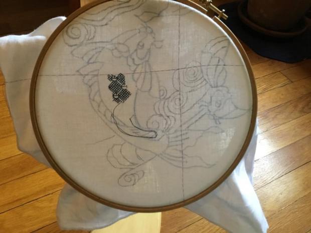
Just to vex my new readership, I start a totally unhistorical stitching project. Well, not to vex anyone actually. This piece was bespoken by The Resident Male a while back. I’ve thought about it for several years, and decided to finally do it. The ultimate purpose is a piece to hang on the wall of our Cape Cod place, as part of a large collage of sea life art.
The design is based on a double-koi motif, where the fish are circling each other. I began with a clip art of a single fish, and simplified it, changing proportions and angles, and removing detail that would be obscured by my chosen stitching style. Then I mirror imaged and flipped a duplicate of my first fish, placing it opposite it’s sibling, and trying to get them more or less balanced and centered as a composition.
For the last bit – the “water lines” in the background, I thank the Public Domain Review, for posting a link to a book of traditional Japanese wave and ripple designs – Ha Bun Shu, by Yusan Mori (circa 1919). My chosen ripple was taken from page 22.
So, with my inspired-by fish, and borrowed water lines (with some of my own extensions to eke out the composition’s dimensions), I end up with this – already shown window-traced onto my prepared ground:

The ground chosen is an almost-white 40 count linen, hemmed on all four sides. I’ve marked the center with basting lines of old, non-crocking plain old sewing thread. I will be picking them out as I encroach upon them because there is no central guide purpose they serve after aligning the initial tracing. I will be using silks, mostly. Originally I thought I’d be stitching only in a hand-dyed natural indigo, colored by (and occasionally available from) my Stealth Apprentice, but last night I changed gears and have added some commercial Au Ver a Soie Soie d’Alger, in a deep green.
I will be working my two fishies in a combo of styles. The fish themselves will be done in inhabited blackwork, with fills inside strong outlines. I’ll pick the fills on whim as I go along, and possibly come up with some new ones along the way. The fish will not be direct opposites of each other – the inner detail will vary, but one will definitely be lighter (using less dense fillings) than the other, and placement of the blue and green may swap.
Right now I’m toying with doing something different for the outlines, instead of my usual plain old chain stitch. Not sure yet what, but I do want to vary the width of some of them analogous to heavier brush strokes.
The water lines will probably be done in gold or silver (maybe both), possibly simple couched strands, possibly something else. I bought some heavier metallic threads at the Sajou store in Paris, and have been hoarding them for the right project. They may well come into play here.
And the first little bit – a filling from Ensamplario Atlantio, the fourth part:
So. Do I have a plan? Kind of. But I still like the fun of designing on the fly.
MORE LONG LOST SIBLINGS
Continuing on…
Long lost siblings: pieces that appear to have been separated back in the heyday of Grand European Tour collectors, with the various parts scattered among museum collections. They are not uncommon. I know there are fans of this series out there, so here are two more pairs I believe to have been cut apart, as opposed to two executions of the same pattern from different originals. For the record, I know of no modelbook sources for either of these designs (if you do, please let me know!)
Why were these cut apart? I suspect that the European dealers who sold antique lace and stitching in the latter part of the 1800s and early 1900s were more interested in maximizing profits than in preserving artifact integrity.
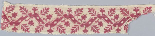
The sample below is quoted from a photo of the Art Institute of Chicago’s (AIC) Accession 1907.664, attributed to Italy of the 17th century:

It’s an unusual piece, combining linear stitching and satin stitching, plus a detached buttonhole insertion to attach it to whatever it originally trimmed.
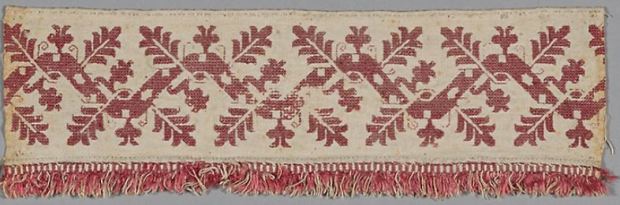
And here’s it’s sibling, in from the holdings of the Boston Museum of Fine Arts (MFA), Accession 95.1126, cited as being Italian, but not assigned date. I’ve excerpted this from the MFA’s photo of its artifact, which is in slightly better, untrimmed condition:

AIC calls out the stitches used as being back stitch, hem, satin, and split. MFA calls them line stitch (one of their names for double-running), chain stitch and laid work. Personally, I do not put much stock in museum stitch descriptions because so many of them have not been revisited since original acquisition, and so many are idiosyncratic. Without seeing the reverse, I’d posit double running or back stitch (back can look like split or chain on the reverse), and satin stitch. But however these pieces were done, differences are minute (a couple of zig-zag branches in the column headers) – it’s pretty clear to me that they were once part of the same source artifact, possibly two ends of the same cloth or towel.
Here’s another pair. We lead off the the MFA’s Accession 09.38, sadly blessed with no provenance or date. It’s described as Punti di Milano Lace – a MFA term for works with the tightly pulled mesh background, either as foreground or (as here) background, and was a gift of James William Paige, who appears to have lived up to the last quarter of the 1800s.

And here is its companion, Border from the AIC, Accession 1969.193, dated 17th century, and attributed to Italy:
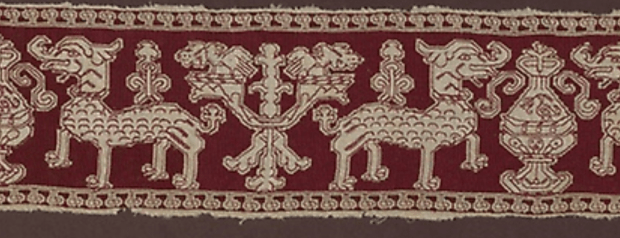
Again, two pieces I believe were once part of the same original artifact, but with so little of whatever that artifact was, it’s hard to speculate what it might have been – bed linens, valences, curtains, table spreads, towels – there’s no way of knowing.
The MFA sample came to the museum as part of the Denman Waldo Ross Collection, who collected widely in Europe and donated many artifacts to the museum in the early 1900s. The AIC piece, was given to the museum in 1969, but it’s unknown how long it was in private hands prior to that gift. It’s worth noting that Mr. Ross was part of “a prosperous Cincinnati family,” so it may not be so odd that the slightly less complete companion to the much better condition sample he gave to the MFA lingered in Ohio.
AIC calls out the working method as pulled thread work in silk, done in two-sided Italian cross stitch, plus back stitch. The MFA gives no descriptions. I’d say without seeing the reverse, back or double running, plus the tightly pulled double-sided mesh stitch are spot on.
Other things to observe in this one is the method of voiding. In some pieces, it runs all the way up to the foreground motif, with no “halo” of unworked linen between design outlines and the mesh background. This is an alternative treatment, and is present on many other artifacts, too. Having done the other, I’d say this method is slightly easier because it does not perturb the outlines of the design; and many of the challenging nooks and crannies are skipped altogether.
What are the beasts pictured? I haven’t a clue. But because squinting at the design, I can convince myself that there are tusks and very long and curled noses, I’ll go out on a limb and dub this the Elephant and Urn pattern. The urn and branching fountain thingy in between the elephants are simplified versions of a pretty standard pair of motifs, with parallels on other pieces, too. But that’s for another post…
UPDATE:
Going through my notes, what should surface, but another snippet of Elephant. This bit is undoubtedly associated with the MFA’s piece, because it was given to the Harvard Art Museum/Fogg Museum in 1916 by Mr. Ross, the same individual who donated the larger fragment to the MFA. The Harvard accession number is 1916.377, and their picture is presented below. They include no date for their entry, but agree that it is Italian.

CORNERED
Continuing on with boring embroidery posts.
A good many people will recognize this pattern.
I stitched this snippet from a chart I did in TNCM (Plate 64:1). A simplified chart for the same design also exists in Pesel’s Historical Designs for Embroidery, Linen, and Cross Stitch.
The original for my graph is a handkerchief in the Victoria and Albert Museum, Accession T.133-1956. It’s current attribution is circa-1600, England, although that designation has changed over time. It used to be called out as 1580-1600. I’m delighted that museums are revisiting the dates, stitch descriptions, and materials info for their smaller textile holdings. These listings are bound to improve as the methods and technologies (and available funds) to assess them improve. I do not think that Pesel used the same artifact as her base. There are some departures in her graphing from the V&A example, and her marginal notes cite a sampler source, from 1658.
Another reason that this design is so familiar, is that the V&A handkerchief is near iconic, and shows up in several influential stitching history books, including Digby’s Elizabethan Embroidery, and King and Levy’s The Victoria and Albert Museum’s Textile Collection: Embroidery in Britain from 1200 to 1750. But in all of the secondary source representations, it is rarely shown with all four corners. In fact, it used to drive me nuts that I couldn’t see them all. But thanks to the V&A’s site archival image updates, we can enjoy completion. Here is their own photo of the entire artifact:

and a color snippet, quoted from the V&A images, for good measure, since repros in the stitching history books often show the original reds:
Gorgeous.
But look at the corners!
I’ve had many people ask me about how to create corners for strapwork, to go around the perimeter of linens, or to anchor a dress yoke. Much fretting over exact matches happens. Even the choice of mitering or bending the work around the angle (as opposed to butting the design up without mating the two directions) causes anxiety. In truth all of these methods appear, although the exact mitering thing is the least commonly seen.
This is one way to treat those corners. Four ways, to be exact, because no two of these corners are exact matches. And it doesn’t matter that they are not.
Numbering clockwise from the upper left, we have 1,2, then 3 and 4, respectively. I’ve taken the liberty of rotating (but not flipping) these so that they are easier to visually compare:
Upper corners, #1 and #2:


and lower corners #3 and #4:


There are three rough treatment styles. 1 and 3 are distinct, and #2 and #4 are similar but not the same. #4 has a fat twig interlace to the left of the flower, to fill in space. In #2 there was less space to fill, so that twig is smaller. The area at roughly noon above the flower is different between #2 and #4 as well. On the others, #3’s flower is squished up against the border, with no surround to its left, and all manner of arabesques fill up the extra space below the flower in #1.
It’s always a matter of personal opinion and borderline heresy to use these cues to try to deduce working method, but it’s clear while our anonymous stitcher may have had a visual guide to the strip parts of her or his design, the corners were fudged in, ad hoc. The narrow companion border’s corners – both inner and outer – are improvised, too.
If I were to be so bold as to speculate, I’d pick the lower left edge as the starting point, with the work starting at the indicated line, and progressing around the piece in the direction indicated (note that the V&A says that the monogram is EM, so that we’re actually looking at the reverse):

The stitcher worked to a convenient point to form a corner, keeping it as much in pattern as possible, turned direction, worked across the top edge, turned, and so on, until the starting point was achieved – at which point the “terminal fudge” was needed to finish the work. It’s also vaguely possible that the finished size of the piece was determined in an attempt to make the the repeats (mostly) work out, rather than the square being laid out first, and the repeats being fitted into it. At least that’s the way I – an improvisational and slightly lazy stitcher – would do it.
So. If you are making a historically inspired piece, do you need to meticulously draft out exact corners first, then follow your chart with fanatical purpose?
Not really.
Just go for it. Much as they did roughly 460 years ago.
PS: Eye training: Bonus applause to the person who spots my departure from the original in the companion border. 🙂
THE LEAFY FAMILY
I hope I’m not boring my readers (especially my knitting pals), but with just a little bit of encouragement, I’m off and running on more historical embroidery pattern families.
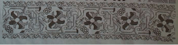
This one I’ve nicknamed “Oak Leaves.” It’s relatively well represented – not the design with the most extant examples, but I’ve managed to collect seven photos of artifacts displaying it, in various styles. No modelbook source (yet), and I particularly like when designs are interpreted in different ways.
As in many of these smaller fragments, museum provenances and dates are not necessarily precise. Some of these artifacts have not been revisited since they were originally donated to the hosting institutions. Putting these on a specific which-came-first timeline is problematic, especially doing so based on photos alone. However, there is a possibility here again of “separated at birth” pieces, where an original artifact was cut apart by a dealer and sold to multiple collectors.
I start with a piece given to the Cooper Hewitt by my idol, Marian Hague. She was an embroidery research expert and curator, who worked with several museums in the first half of the 20th century. Her work pairing extant pieces with modebook sources is legendary.
The Cooper-Hewitt citation for this piece dates it as 17th century, and of Italian origin. The museum’s accession number is 1971-50-97 and was acquired as a bequest from Ms. Hague. It displays the signature elements that make up the group – the center meander, with two heavily indented “oak” leaves sprouting left and right, overlapping the meander. A central smaller floral element in the center of each of the meander’s hump, and a secondary leafy sprout filling in the hollow of the design between the leaves. This particular piece also has voided spots along the length of the center meander.
Compare this piece from The Art Institute of Chicago:
They also attribute it as 17th century, Italian. The AIC accession number is 1907.742, acquired in 1907. Although the C-H example lacks the fringed edge, the executed design of both pieces is extremely close. C-H on left, AIC on right:


Ignore minor wear and tear. The count of the leaves, voiding of the stems, method of placing and working the spots, and placement of the tendrils is the same, although some of the tendrils on the AIC sample have fallen victim to time. Therefore I opine that these two pieces may have come from the same original. That Ms. Hague’s bit is a bit more savaged is not unusual. There are other instances where she had fragments of pieces in museum collections, but usually kept the more damaged bits for her own research.
Moving on here’s a fragment from the Metropolitan Museum of Art:

The Met places it as 16th-17th century, also Italian. Its accession number there is 09.50.3806, collected in 1909. This may or may not be part of the same original as the previous two, even though it is fringed like the AIC sample. For one – it’s mirror image. That in an of itself isn’t a big difference. Photos get reversed. Designs themselves are sometimes mirror-imaged if they appear on opposite sides of a larger artifact. Tendrils are missing, but this piece appears to have undergone more wear than the other two. There are enough partial remains of the double running (or back stitch) bits to posit their existence. But while the delicate linear stitching is more prone to damage the heavier interior stitching is more durable.
Look at the little interlace where the leaf-twig emerges from beneath the meander and crosses over it (AIC on left, Met on right):


The little “eye” of filling, which done in the solid filling stitch and should remain – is missing.
Might this be part of the same original, possibly a suite of hangings, covers/cloths or bed furnishings, but of a segment done by a less attentive stitcher? Possibly. But also possibly not, especially in light of the next example.
Here’s another one with an empty “eye.” This example was found by my Stealth Apprentice, and is in the Textiles Collection of the University for the Creative Arts in Farnam.
Unfortunately, the UCA gives no date or provenance for the work. Note how long this strip is, and that it’s folded – we see both sides. This might be double running and one of the double sided Italian cross stitch variants because regular long-armed cross stitch doesn’t look the same front and back. Tendrils? Check. Center meander with holes? Check. Oak leaves and supporting sprouts? Check. BUT those “eyes” – they are not worked, just as in the Met example.
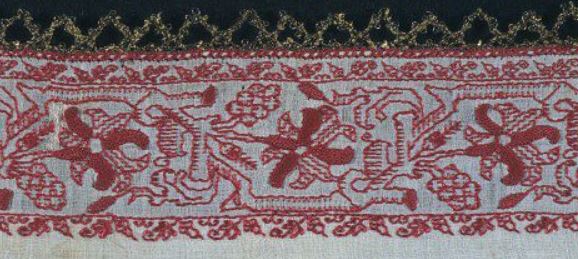
OK, now we go on to other design adaptations. This voided piece from the Boston Museum of Fine Arts is undoubtedly an interpretation of the same design, but with a bit more elaboration on the stems – using twining instead of spots, and on the sprouts and leaves. It’s also doubled north/south – a very common method of taking a strip design and making it more dramatic by making it wider.

The MFA calls this piece out as being Italian, 16th-17th century, and names the technique used as “Punto di Milano.” (The MFA uses several stitch style names not commonly seen elsewhere, this is one.) The accession number is 83.236.
I am particularly intrigued by the unworked area at the upper right. The tightly overstitched pulled mesh technique used for the background is almost impossible to pick out, and even worn, leaves a very clear perturbation of the ground weave. I know this from sad experience. Even over the centuries, I have to say that the missing bit was just never worked. Which gives us an insight into working method – defining an area, then going back and filling it in.
Did this piece, in this style predate the more simplified depictions above? Again we can’t say for sure, but I tend to lean that way because the spots on the wide, plain meander to me look like the simplified descendants of the voids formed by twining stems in the MFA’s example. One person’s opinion – feel free to disagree.
Voiding. That was always done in long-armed cross stitch or the meshy stitch, right? Nope. Here’s another example of the same pattern, with an even more finely defined main twining meander, but done with a squared filling stitch. This one is also from the Metropolitan Museum of Art:

The Met lists this one as being Italian or Greek, from the 16th-17th century. It was acquired in 1909, and its accession number is 09.50.58.
This piece is my favorite of the set, both for the delicacy of the interlace and the squared ground. Obviously the tendrils are gone, as in the other voided interpretation, but it’s the same oak leaf design for sure. And did you catch the mistake? Upper right, where the meander is cut off from joining the previous repeat. That’s not wear and tear – that’s a place where stitching happened where it doesn’t appear in subsequent repeats.
And last, but not least, a pattern cousin. This one was also found by the Stealth Apprentice.

This is an Italian towel or napkin, claimed as 16th century, in the Marcus Jehn private collection. The only link I have for it is to the collector’s Pinterest board.
This is a curious piece. It’s clearly derived from the same pattern family, interpreted in a linear stitch. But the interlaces of the meander are rather heavy compared to the delicacy of the Met square-voided sample, above. The slightly fudged corner is also of interest. If I had to guess, I’d suspect that this piece was a see-me-and-copy, derived from something that looked more like the two voided examples.
So, what have we seen here? Mostly that there are design clusters that are clearly related. That there is no one canonical way in which to use these patterns – interpretations, some only a bit different, and others quite divergent, vary from artifact to artifact, even among those done in the same technique. And based on museum citations alone there’s no clear way to arrange them in parent-child relationships other than idle musing.
Most of all, I like that there is no one “right” way to stitch these designs, and that when I do my own variant, I’m adding to family that stretches back for hundreds of years.
UPDATE:
And another one of the same family surfaces! This one is the largest departure to date in terms of style, but it is clearly descended from the same pattern lineage.
Meet the Metropolitan Museum of Art’s holding #09.50.65 – entitled “Fragment,” dated to the 16th or 17th century, from Italy or Greece; added to the museum’s collection in 1909.

UPDATE UPDATE:
And another…
This one is from the Victoria and Albert Museum. It’s one piece of a composed group of borrders, displayed together. The entire group is attributed to 17th century Italy, and is cataloged together as museum number T.114-1930.

This one is sort of half-way between the versions with the heavy, abstract main trunk at the top of the page and the Met example with the squared ground. In this “missing link” you can see where the lozenge spots on the most abstract versions come from, while it still retains the coiled smaller branches of the most detailed example.
To complicate matters further, there is the fragment below, from the Met, accession 79.1.294, also sourced to 17th century Italy – Sicily in specific. Although the museum calls it a border, I don’t think it started out as one. The bottom edge is nice and neat, with a defined stitched edge, but the top piece is ragged – cut from a larger design. Now look at the V&A piece above and image it doubled, with two strips stacked one on top of another. (Doubling pattern strips this way was a very common method of achieving a deeper design.) In your thought experiment, now “cut” a section where the leaves are facing each other.
Hmmm….
Not only is this totally plausible as a strip cut off of a wider design based on our leafy friend, but the similarities to the Met’s strip are unmistakable. Again, we can prove nothing without artifact forensics on the ground and stitching thread, but I would not be surprised to find that these came from different stitched sections of the same original piece – possibly from a side strip and a wider decorated end of a towel or other cover.
THREAD THREAD
Based on questions from Elaine and others, here’s a bit more on the thread I’ve been using on both the Permissions and Trifles samplers.
As I’ve said before, my stash came from a small needlework/beading supply shop in Pune, India. It wasn’t current stock. The head clerk sent a boy scampering up into the storage attic for a VERY dusty box of odds and ends. I picked out the best colors left, avoiding pastels, and looking for what high impact/high contrast hues that still remained in quantities of 10+ skeins. I bought them all. They were very inexpensive – just a few rupees per skein. At the then-current exchange rate of 60 rupees per dollar, I think I spent less than $20.00 translated, and came away with a huge bag full, well over 200 skeins divided up among about 15 colors. Here’s just a sample:


The name brand is Cifonda Art Silk. It’s not a spooled rayon intended for machine embroidery. As you can see, the put-up is more like cotton embroidery floss. And it turns out that the stuff is still being made, and is available in Australia, and even in the US – although mostly by special order.
The websites that offer this thread vary a bit in description. Some say it is a 35% silk/65% rayon blend. Others say it is all rayon. Contemporary put-ups specify 8 meter skeins. My vintage stash skeins are a bit longer, possibly 10 meters (I’ll measure tonight). The large bundles above are actually “super-packages” of ten individual skeins. You can see the bright red one at the left is broken open, with the single skein labels showing. On mine, color numbers are written on each skein by hand, not printed. There can be hue variances between the super-packages of the same color number, so I suspect that special care should be taken to buy all that’s needed at once, so that all is from the same dye lot.
Cifonda’s structure is that of standard floss – six strands of two-ply relatively loose twist. The individual strands are quite fine, two of them are roughly the equivalent of one ply of standard DMC cotton embroidery floss. The colors – especially deeper ones like red and indigo – do run when wet, although they do not crock (shed color on hands, ground cloth, or wax when stitching dry). I would not advise using this thread on clothing, table linen or other things likely to need laundering. It may be possible to set the colors before stitching using a mordant bath or long water soak, but I don’t have the experience, time, or materials quantity for experimentation.
I am pleased with the way the Cifonda looks in my work. It’s a bit shinier and finer textured than cotton floss, although it does not have the coverage of the true silk floss I’ve used (Soie d’Alger). My Cifonda is quite slippery. Two or more plies held together tend to disassociate and slide past each other for differential consumption, even when using short lengths in a small-hole needle. I tamed this by aggressive waxing – running the entire length of my threads over a block of beeswax before use. Since I’m doing linear counted work, any change in color or texture is not noticeable. Someone using this for satin stitch, long-and-short, or other surface stitches that maximize thread sheen would probably want to wax only the inch or so that threads through the needle.
Like all lightly twisted rayons, this thread does catch and shred a bit on rough skin. Care must be taken to use needles with very smooth eyes, and to hold the unworked length out of the way when taking stitches, because the stuff snags extremely easily. My own stash, well aged as it is, contains some colors that are a bit brittle. The bright yellow I’m using now, and the silver-grey I used on the last sampler are both prone to breaking under stress, and must be used in shorter lengths than the other colors.
I will continue to use up my India-souvenir thread stash, working smaller and smaller projects until it is gone. But in all probability, I will not seek out the Cifonda to replace that inventory as it is consumed.
Anyone else have experience or hints on using this rather unruly stuff?
IT ALL FALLS INTO PLACE
With an extended time sitting in one place and thinking yesterday, I’ve come to design decisions on the direction for the Permission sampler.

I’ve decided to do another bank of two solid columns of multicolor narrow strip bands above the motto, and finish out the top with either the same pomegranate border used at the bottom edge, or a coordinating one with pine cones, of the same size and visual density – also in the blue.
Progress is obvious since the last post. I finished the red voided buds with the grid-background at lower left, and marched the pomegranates across the entire width of the piece. I also did a quick strip of acorns over the words (aligning with the strips below), and I’ve begun on a yellow and red interlace and quaternary rose strip above that one. I’ll do a monochrome design above the red/yellow, probably green and relatively narrow.


As you can see, I am just ripping along. The large stitches on this one (it’s only 30-count stitched over 2×2), plus the sit-on frame that frees the second hand to pass the needle underneath the work are helping me to set local house records for sampler production.
Am I liking the thread? Yes and no. It’s “man made silk” and at least 20 years old before I bought it. Possibly even older. It’s thin and unruly, and needs extreme waxing to make it behave. My little beeswax block is being whittled down, slowly but surely on this one. I do like the sheen of the faux silk – even waxed. What I like less is the damage of age – brittleness, and a tendency to shred. Some colors have aged better than others. For example, the yellow I am using now is very prone to breakage, and must be treated gently, stitching with very short lengths. By contrast the red and blue are horse-strong, and far less likely to snap or denature. Perhaps my yellow is “elderly” compared to the other colors. In any case, I do notice that working with it does take longer and is more fiddly due to the short lengths and stops/restarts after an inopportune Thread Damage Event.
Questions answered:
These are from my inbox, about this project or stitching in general. Feel free to post questions here or write to me – kbsalazar (at) gmail (dot) com.
1. Do you decide on your patterns before you begin?
Not really. I pick them on the fly. On some pieces I stick to a style or unified theme, but often I just thumb through looking for something that has a pleasing contrast with the designs around it; like layering a geometric next to a floral, or using something with a lot of curves next to something that’s strongly angled.
2. Do you prepare your cloth?
I do now. I’ve had some projects that might have been better composed, but because I didn’t clearly mark my margins or centers, I lost track of where I was. Now I outline my stitching area, plus it’s center and quarter-center marks both horizontally and vertically. I use a single strand of Plain Old Sewing Thread, in a light color (in this case – pastel blue), basting it in to indicate those lines. The basting itself is rather haphazard. For example, I do not bother to make my basting stitches over the same number of threads as an aid to counting later. Others do.
I also hem my cloth. I used to use other methods of fray prevention (deliberately raveling out a half inch or so, a line or two of machine stitching, serging, or in a moment of poor judgment – tape), or not bother at all. However I find that I now prefer the finished edges and mitered corners of a nice, even hand-done finger-folded hem.
3. Will you be issuing a kit for this or any of your other projects?
Probably not. Definitely not for a composed kit, complete with thread. There are too many things I want to stitch myself to sit down and figure out thread consumption, buy fabric and thread in bulk, compose the kits, and do inventory management and fulfillment. That would suck the fun out of the thing, for sure. I might consider releasing full, drafted charts for some of the smaller projects like bookcovers for small standard-size notebooks or needle case/biscornu sets, but that also would eat up time I’d rather spend on my own work, or researching and drafting up new designs. I see myself sticking mostly to reference books of patterns and designs, and leaving employment of those designs to the readers.
4. Where are the snails?
One of the folk who visit here has noticed that I put snails in almost every sampler I do. Not every single one, but I do use a variant of this design from my first book on most, especially those for family:

![]()

I haven’t gotten to the snails yet, but they are on the list for this project, too. Possibly next – the green strip I’m thinking of doing just above the current bit.
ANOTHER SAMPLER
This one’s a quickie – a present for Denizen (one of Younger Daughter’s pals, currently staying with us). She’s also headed off to university next year, and deserves her own bit of stitched wall art with a favorite saying.
Denizen has requested the immortal words of Admiral Grace Murray Hopper, “It is often easier to ask for forgiveness than it is to ask for permission.”

As you can see, I’ve already laid in the saying itself, using yet another of the alphabets from Ramzi’s Patternmakercharts.blogspot.com website. In this case, I’ve chosen a very simple all lower case set from Sajou #104. A fancy font would be too bombastic for this sentiment. I used plain old cross stitch (POCS) for the letters.
Ground this time is a large-as-logs 30 count even-weave linen remnant from my stash, long since disassociated from any label, vintage, or maker identification. The floss is more of my India-purchased faux silk – deep crimson, bright green, strident blue, and daffodil yellow. Patterns (so far) are all from The Second Carolingian Modelbook. Being unbound by any historical or usage constraints on this one, I’m happily playing with colors, limited only by the availability of my remaining threads. I’d like to use far more red to anchor the piece, but it’s the color of which I have the least, so I have to work it in more sparingly.
I’m also changing up the orientation and proportions of this one. Instead of long and thin like historical samplers, or portrait orientation like a standard reading page pieces I’ve stitched lately, I’m doing this one landscape – with the longer dimension east-to-west rather than north-to-south. I’ll probably run a more solid border the full width top and bottom, either POCS or long-armed cross stitch. There will be two banks of geometric bands, left and right both above and below the centered saying. Although I might mix that up with a collection of spot motifs above the saying. I haven’t decided yet.
One failure of note though. I wanted to do some Swedish Weaving stitch on this one, as a nod to the Denizen’s heritage. While that style is usually done on huck towling, it can also be done on plain tabby weave fabrics. Unfortunately, this particular ground cloth and my ultra-fine floss are a bad combo for the technique. I didn’t like the look so I picked it out and went with what I have. I’ll do a Swedish Weave project another time.
The motto took just one weekend, and at red bit is only one night’s stitching – about 2 hours worth, so I forecast that I’ll rip through this project in no time.
GEARING UP
As you can see, Trifles is coming along. I’ve just about finished the first set of gears:


The next bit to do will be the two sides, proceeding left and right of the established bit, growing up to frame the motto. I’ll use the same stencil for my basic layout, rotating and flipping it to make the repetition less evident.
A couple of you have written to me to say that you find the gears rather disappointing – that they are not sharp and mechanical enough. In fact, the edges of some of them are more gentle, cam shaped rather than toothed, and the teeth do not mesh exactly.
Frankly, I don’t find this a problem, and I don’t care. The thing will be more representational than mechanistic. I’m going for the idea of gears here, not a CADD drawing.
I am having fun flipping through Ensamplario Atlantio looking for which fill to do next. Everything you see here has been done ad-hoc, one gear at a time, with no pre-planning on what design/color to use next. I’ve used four-color placement principles to avoid having two gears of the same color right next to each other. I’ve also tried to achieve a nice mix of densities and shapes, with contrast between horizontal/vertical and diagonal elements, all-overs/spaced spot motifs, and between straight lines/curvy patterns. On the whole I’m pleased. I’ll add more dark and density to the lower left, next. Also more gold there in that corner.
Stay tuned for further developments!
TRIFIAL PURSUIT
Back from our annual escape to North Truro, and reporting progress on the recently dormant Trifles sampler, being stitched for Younger Daughter to take with her off to college next fall. I decided that for my no-longer-little Steampunk (and Dr. Who) fan, instead of working lots of bands, the design for this one would feature gears. But I had a lot of problems hand-drafting up a nice set of them. It took a while, but eventually I hit on the idea of using a commercial stencil intended for airbrush work, then filling in the traced gear shapes with blackwork counted fills.
Here’s where I am now:

I’ve finished the main motto and the frame around the to-be-worked area. Minor brag: Note that having marched all the way around the piece without drafting first and using only counts of the border repeat to stay on target, I ended up even, perfectly aligned.
All of the fillings I will use on this will be from my free eBook, Ensamplario Atlantio. The ground patterns are stitched using two plies, mostly in double running, with lots of departures to accommodate the non-continuous nature of many of the fills. The outlines are plain old chain stitch, done in three plies of the same color as the gear filling. I am not taking any special pains to make the cam teeth totally square, or to make them mesh. I am liking the rounding and imprecision. Right now I’m thinking of covering the entire piece with gears in burgundy, brown, gold, and silver, relying on classic Four Color Theory to avoid making any two contiguous gears the same hue. Choosing fills for color in addition to density and form is adding a new dimension to this decidedly un-traditional yet somewhat traditional blackwork piece. And I may insert a surprise Trifle or two, just to emphasize the point.
On execution, I can report that I’ve managed to tame the extremely unruly Indian “silk” (in reality, man-made rayon) thread.
Beeswax.
I occasionally wax the last inch or so of my silk threads to make threading easier and to help ward off “ply creep” – when one ply of a multi-ply threading is consumed faster than the others. But I usually don’t wax the entire length unless I’m working with linen thread. However this stuff is hellaciously difficult, shredding and sliding, breaking and fraying, and catching. Using shorter lengths wasn’t the answer – no usable length was short enough to use comfortably. So I moved up to waxing the entire strand, and when I did so, most of my problems disappeared.
I am very pleased with the results using the fully waxed threads. They don’t break. They don’t escape from the needle’s eye. They don’t shred. Both plies are consumed at the same rate. Double running is nice and crisp. A major improvement that’s increased the enjoyment factor of a project that might have been truly tedious.

And I’ve wanted an excuse to stitch up those griffon-drakes since I drafted them up for the book.
DATING DILEMMA
Sorry folks. This has nothing to do with anyone’s search for companionship. Be warned, it’s all about embroidery, and this is a post that only a stitching geek will love.
As I fill out the last few pages of The Second Carolingian Modelbook, I’ve decided to take a stab at a design that seems to be everywhere. Except modelbooks, that is. I call it “Pelican with Harpies and an Urn.” It is one of a set of patterns that crops up again and again in museum holdings worldwide, most often as a fragment. It’s clear that unlike many other snippets, these all came from different works, often executed in different styles or stitching media. I’ve posted about this before, but my collection of examples continues to grow, and with it, the general confusion level.
The dilemma comes in because (to my knowledge) there is no existing printed pattern to establish a point of temporal or geographic origin. But there are lots of examples and they all express the details of the design slightly differently. Now if there was an authoritative point source that became unavailable, one would expect later iterations to be less detailed, or details to become blurred, through succeeding generations of copyist errors. We can see that with the oft-studied “boxers” sampler motif in Colonial American samplers – which probably started out as a cherub bearing a flower, but over time became less specific and more stylized, until what remained was a barely discernable chubby humanoid with a club fist. But I can’t arrange the Pelican/Harpy/Urn designs in an ironclad continuum of graduated detail.
Here’s the parade. The thumbnails are not clickable, please visit the links to see the museums’ higher resolution images.
CH-1. First is this example from the Cooper-Hewitt’s collection (Accession 1931-66-144). They date it as being a 17th century work, but do not offer a provenance. It’s done in silk on linen, with a characteristic tightly drawn background that produces the appearance of mesh, but does not involve withdrawn threads. Details are rendered in straight stitches, and may include double running or back stitch (it’s hard to tell without seeing the reverse). The museum acquired it in 1931, as a gift from Sarah Cooper Hewitt.

CH-2. The Cooper-Hewitt has another example (Accession 1931-66-142). This one is specifically called out as being Italian, and is also dated to the 17th century. It’s a particularly prime piece because it is a full span cut across the end of the towel, cover or cloth it came from. We see the orientation, the top and bottom borders, and how the slightly different side borders framed the work. The museum acquired it in 1931, also as a gift from Sarah Cooper Hewitt.

HERM-1. The Hermitage Museum has two examples. This one is entitled “Valence Embroidered with a Grotesque Motif (fragment),” but the on line page has no accession number. The full description calls out the linear stitching as being double running (Holbein), and the background as being drawn thread. They attribute it to Italy, and the 16th century. The museum got this piece in 1923, via the Stieglitz School, and ultimately from D. Flandin, an antiquarian dealer in Paris.

MET-1. Yet another example in the same style. This one is from the Metropolitan Museum of Art (Accession 14.134.16a). The MET cites it as being Italian, and 17th century. Although this one is at a different museum, and is clearly not a separate piece of either artifact, there’s a connection with the two above. It was acquired in 1914, via the Frederick C. Hewitt Fund.

HERM-2. On to another stitching style. “Valence Embroidered with a Grotesque Motif” from the Hermitage also has no listed accession number. This piece is lacis (darned filet net). It’s dated 16th century and placed in Italy. Although filet work doesn’t allow for the linear details of the red examples above, it’s amazing how much fidelity to the design can be included. Like the other Hermitage piece, it entered their collection via the Stieglitz School Museum in 1923, but came from the collection of J. Kraut, in Frankfurt-am-Main.

MET-2. More stitched net, and not another piece of the one above. This one is also from the MET (Accession 06.582). It’s cited as being Spanish, from the 17th century. This piece was acquired in 1906, via the Rogers Fund.

My Opinions
First of all, I’d agree that the source for these was probably Italian, regardless of where the final objects were collected from. I’d also agree that very late 16th century, but more probably the early 17th century is reasonable for the whole pattern family based on the style, usages, media, and iconography, plus parallels to other contemporary designs.
On to the motifs themselves. The version with the most minutely rendered detail is CH-1. Here are close-ups of the birds/urns and harpies from the five, presented in the same order as above

CH-1 presents the most detailed urn and pelican of the set. Both are encrusted with small linear features, although the placement of those features is not always symmetrical, nor is it identical from repeat to repeat. Feathers on the harpy’s body are shown in neat rows, but her wing feathers are very stylized, using right angles rather than diagonals. I’m unsure what she’s holding – a cup or panpipes (perhaps a fancy on my part, to think of that flower as the music of the pipes). From the patterning, it’s clear that the thing across her middle is her tail, wrapped up from between her legs.


It’s hard to see clearly, but there are lots of differences between the urns and pelicans in CH-1 and CH-2 (blurry pix above). It’s clear that both have less detail. But one of Mother Pelican’s chicks has moved up near her bent head, and another now floats over her back. The nest detail seen in CH-1 is now symmetrical right and left at the top of the urn, instead of looking like leaves on one side, and scrolls on the other. The sprouts on either side of the urn’s bulbous body have changed attachment points, and now hang down, instead of growing up as pomegranates.
CH-2’s harpy has retained her hairdo, but her wings are a bit more gracefully rendered, employing 45-degree angles to round off some of the shapes. Her feathers are more evenly spaced, but her tail is less pronounced, and whatever small markings covered her haunches have been lost in favor of more, smaller feathers. The thing she’s holding has lost its hatching, and now looks more like a cup than panpipes. She has also inherited another wayward pelican chick.


MET-1’s urn is in between the other two in terms of detail. The nest/scroll unit at the top underneath the big pelican has transformed into a chick. The stitcher chose not to fill in the background in the loop defined by the pelican’s neck. There is something unidentifiable between the pelican’s legs, and her fathers are somewhat simplified compared to CH-1. The lower ornament is again descending from the bowl of the urn as leaves, rather than rising from the base.
The harpy too has changed a bit. In this case, I’d say the sipped/sounded thing has parted company from the hand, and now looks more like panpipes, vaguely supported rather than held. She’s gotten a bit more balloon-like, and her breast feathers now march row by row. Her wings however have gotten a bit stunted, and return to a stepwise rendering similar to CH-1, but slightly more clumsy. The tail is suggested, and the haunches have been returned to stippling rather than feathers.


OK. It’s clear that detail is going to be lost when you move from ornamented surface stitching to the negative/positive lacy mesh look of the all-white technique. But even so, a tremendous amount has been preserved. We see the plumage of Mother Pelican, and even some details on her brood (she’s managed to gather three of them together on top of the urn). Her nest is symmetrical. The urn preserves the shapes and proportions of the red stitched pieces, and has grown back the two small pomegranates that grow from the base.
The harpy too preserves a lot of detail, down to the proportions and shapes of its flight feathers, and a bit of the detail inside of the wing. She’s lost some weight, although her hairdo is less detailed. Breast feathers are present, as is a pretty clearly defined tail. Stippling on the haunches looks different from the breast plumage, and her feet are now nicely shaped lion paws.


The final example, MET-2, the Spanish piece, is a bit simplified. The harpy is less prominent, and the largest space is given over to the urn and pelican, and to the foliate ornament between the repeats. Mother Pelican’s brood is more suggested than rendered, although her feathers are nicely done. The urn has the two upward growing pomegranates emerging from the base.
The harpy’s cup/instrument has become less detailed. It’s unclear what it might be. Her feathers have given way to geometric ornament, and her tail is suggested in shadow rather than being clearly defined. Her wings are somewhat like the Hermitage example’s, though. It’s worth noting that her proportions and body shape are more like CH-1 than the other examples.
One other thing that’s of interest is the presence of the little filled boxes that bead the motif’s edges. You can see them along the curve of the pelican’s neck, along the harpy’s breast, and lower legs. They give a lacier appearance to the composition. I also find little protrusions like this to be extremely valuable as I stitch my motifs because they help me confirm counts and stay true to the design. Note that they are absent in the other renditions.
Now, having our fill of urns and harpies, what can we say about them?
It’s obvious that there is an as-yet unidentified but unifying source for this design. I posit that there might originally have been a broadside or model sheet that showed the composition. I guess that it may have been on the count, and that its broad outlines were used to establish the placement of the main design elements. But I don’t believe that it was followed exactly. Instead I think each stitcher used it to establish the first iteration of the design, filling in the details and roughly eyeballing their placement, taking inspiration rather than ironclad direction from the model. Once the first repeat was worked, subsequent repeats and mirrorings were copied from that, with no more call to look at the original. That’s why the baby birds wander around, while the relatively easy to place urn decoration remains more stable.
Because of the different media and slightly different interpretations of the pattern (especially the pomegranates on the urn, and some differences I didn’t detail in the filler between the main motifs), my guess is that the same design branched into two slightly different but recognizable pattern “traditions,” which in turn spawned child works of their own. One of those traditions (marked by the upward pomegranates) made the leap from surface work to darned net.
Now. Which came first? I can’t say. On intuition alone I’d go with the fat, balloon-bodied harpy (MET-1) being later than CH-1, and the two white filet pieces belonging to the same “tradition” as CH-1. That leaves MET-1 and CH-2 as child works of the other branch.
Which came first? What chronological order can be used for these pieces? Aside from these idle thoughts, your guess is as good as mine. If you’ve managed to make it this far, please feel free to differ. Without detailed analysis or forensic investigations into fiber and dye, we’re all just speculating, anyway.
