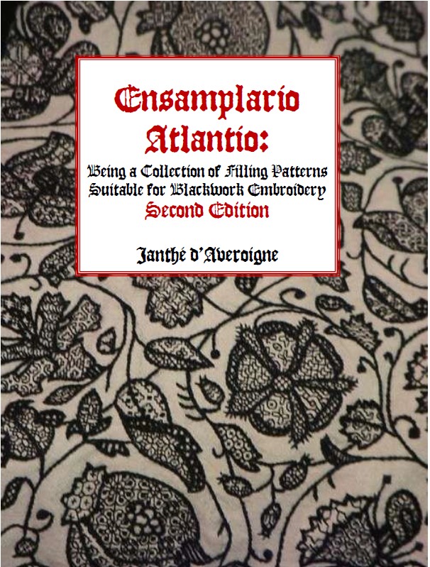
ENSAMPLARIO ATLANTIO – UPDATED
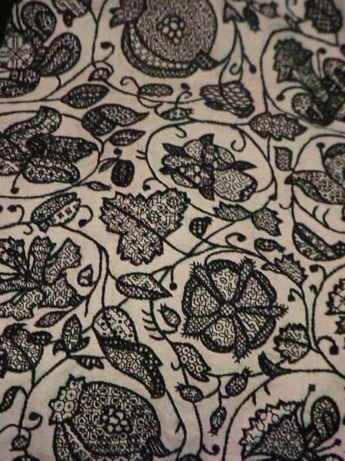
Back in 2011 I issued Ensamplario Atlantio – my first doodle notebook full of fill designs for inhabited blackwork. Many of those designs are also suitable for use as an all-over design or strip pattern. Back then many people had to cope with bandwidth restrictions which made downloading a larger file problematic. So I cut the book up into four pieces to mitigate the problem. Now in 2023, that need has passed.
I’ve taken the original book, corrected some mistakes and typos, added four new pages (24 individual designs), and stitched it back into one single file. Ensamplario Atlantio, Second Edition is now up and available for free download. Having the thing in one piece should make using it easier. And it will make keeping track of it easier for me.
So please click here to download and enjoy!
The sequel, Ensamplario Atlantio Volume II, with 200 more patterns including fills, bands, and yoke designs is also still available as a free download.
THE UNSTITCHED COIF TAKES A ROAD TRIP
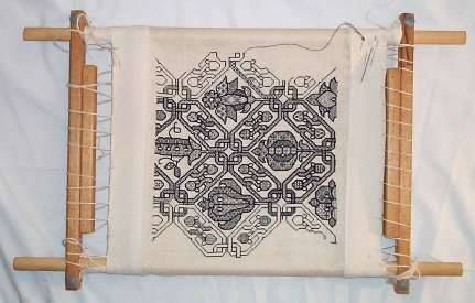
Obviously I am still working on the Unstitched Coif project, and have a bit of progress over the past week or so. I might have had more, but we went to visit family in Buffalo, New York (about a 7.5 hour drive from Boston if you make no stops), and were too busy over the five days for me to steal more than an hour or two to stitch. We did have a great time, and got lots done – just not stitchy stuff.
I will report though that working outside in bright sunlight, even when sitting in the shade is the best illumination I’ve found. For those who look at fine stitching and wonder how folk in the pre-indoor lighting eras did it by firelight, candlelight, or tucked up next to a window, I would suggest that relying on natural sunshine is not a handicap at all, although it is time-limited by its very nature.

Yes, I am sitting in my mother-in-law’s garden, working the design upside-down. It’s upside-down for no other reason than when I first put my frame in the stand it happened to be in that orientation. I’ve just continued on that way. When work on the next vertical swath I may flip it over, but for now I’m just marching to the edge, which is now only a few design elements away.
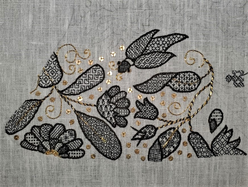
Here are two clear progress shots, first showing the whole area I’ve done (about half of the first pattern sheet as displayed magnet-tacked to my work, above). Plus a detail shot of the latest bits.


A second, larger bird has joined the first, along with the multi-petal flower with its leaf, the rather odd looking columbine (the bit with the three gold petal ends) and some of the foliage, curls, and spangles that surround them. I’m now working on the first of two large grape leaves below the columbine. This area features some larger shapes to fill and I am having lots of fun with them by using some larger, more complex fills. The interlace currently being worked in the grape leaf looks complicated, but once the rhythm of the thing is started, it’s really quite logical.
And I am still on target for not repeating a fill between units. With one tiny exception, while the same fill design may appear more than once in a pattern element like a flower or a bug where a design may inhabit more than one petal or body segment, once that element is done I consider that fill to be “burned” and have not repeated it again. I suspect this will be more of a challenge as I move along, especially in the smallest spaces where there is little play for the more complex repeats.
In any case, I wish I were further along, but I’m also pleased with the progress to date. Gotta stitch faster, I guess…
FIRST BUGS, NOW BIRDS
I’m edging into a new neighborhood on the Unstitched Coif Project. This one is inhabited by birds. The first one is stitched and I’m thinking on the fills for the second. You can see him at the center bottom of the piece, now presented in the correct orientation.

I think he looks a bit like a tiny raven, A slightly confused one at that. I could not resist the visual pun of using the feather fill from the collection presented at the official website for his body. You can make out another oddly shaped bird sketched in below and to the right of the pansy/viola flower.
All in all, I’m pleased with the way this is turning out, although like all participants, I wish my project was proceeding faster. Working so tiny is taxing. Mr. Raven for instance took about four hours to complete, counting the fills, outlining, sequin eye, and couched gold feet.
My game of not repeating fills between units is still afoot, although I am finding it harder and harder to find or devise fills for the particularly tiny areas, like the sepal-leaves on the pansy. And I have to go back and add lighter gold banding the the wings of the big bug.
One more challenge is that of adding the overstitched elements – the couched vein leaves and feather markings on Mr. Raven. I do the fills first, then neaten up their edges with the heavier outlines. But the fills obscure the placement of the overstitching. I do that by eye, referring to a printout of the master design. I’ve mentioned before that others do the outlines first, but with the heavy, embossed reverse chain stitch, working inside tiny spaces would be extremely difficult. I leave that to those who are using outline stitch, freehand fills, and speckling.
Today’s agenda will be filling out the spray of leaves at the (now) right edge, adding the gold stems to it, and flooding the few newly surrounded white space areas with spangles.
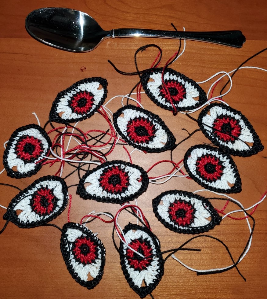
In other news, last weekend I visited Younger Spawn and surrendered the bespoken Eyeball Bolster Cushion, seen here in its forever home, on the target low back mid-century modern sofa for which it was designed. A perfect fit. The recipient was totally thrilled.

The sharp-eyed will spot my stitching set up near the sunny window. I added a hex wrench to my stitching kit, and can take the thing including the disassembled stand with me when I am on walkabout.
While I was out in Spawn’s neighborhood we went to a garden center/plant nursery. Spawn added to the resident collection of exotic houseplants that make the apartment a livable and calming oasis. I noticed that the prices for large, healthy outdoor plants were much lower there in the suburban Albany/Troy New York area than they are here in the outskirts of Boston, so I bought some plants to augment my growing perennial collection. Here they are, just before I plonked them into their spots.
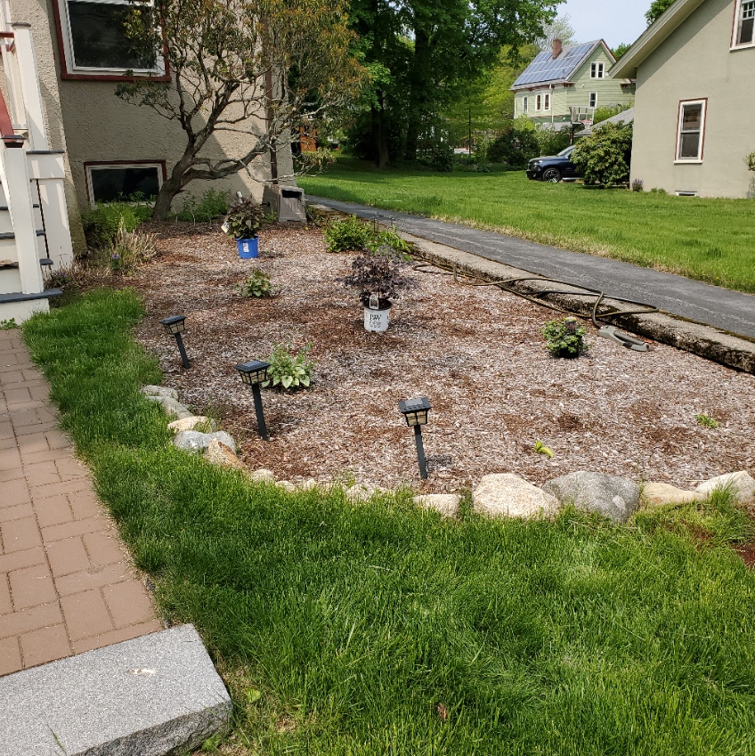
The big blue pot in back is a Chocolate Eupatorium (aka Joe Pye Weed). It’s a fall bloomer, with white flowers. The white pot in the middle is a red-leafed Astilbe variant, with purple/red flowers in mid to late summer. And the little guy over near the hose is a low-growing creeping sedum, that blooms purple in the fall. They join the transplanted peony, curly leafed Hosta, lemon Hosta, pink Astilbe, and two types of Brunnera (one red leaf, one green) that survived last year’s drought and fierce heat that doomed my Aconitum (wolfbane), and Hellebore. A less poisonous garden this year, but one I hope will outlive my ungentle care.
PRICE ALERT
One last thing – if you are interested in buying my pattern collection The Second Carolingian Modelbook, you may want to do so before 30 June. Amazon Kindle is raising print fees, and because the thing is on a razor thin margin, I will be forced to raise the price. I am sorry for this. I tried hard to keep it under $30.00 US per copy, and it will remain so until the end of June, but after than the price will be going up.

AND WE HAVE THE FIRST BUG!
Not to worry, it’s not a computer or programming glitch. It’s completion of the first bug on my rendition of the Unstitched Coif project. The bugs, birds and other inhabitants of this flowery sprawl are especially fun to work.
I may add a tiny motif in his “collar,” it seems a bit bare; and I may go back and darken up the bug body to get better contrast against the wings. But I do like the opposing directionality of the coil pattern on the wings. I am also still debating the density of the paillette spangles. Thinking on their original use, to provide both sparkle in dim interiors and by candlelight, and to signal the wealth of the wearer, packing them in for max bling seems right. However I know to modern eyes the look in full artificial light is cluttered, and I’ve gotten feedback accordingly. We’ll see.
As to new bits in execution – the bug’s eyes are also the same 2mm paillettes, but instead of being affixed with three little gold color faux silk stitches, they are held on with large French knots in the center. I thought about using beads, I have a large seed bead stash that I’ve kept since the 1960s. It came to me jumbled, and my sisters helped sort some of it out. I picked out three candidate colors – black glass, clear glass with gold foil centers, and an opalescent black/metallic glass, and have been experimenting with them both with and without the spangles underneath. You can see below how much better the flat spangle and French knot looks.


I haven’t ruled out using beads yet. There are some bugs with especially tiny faces. I might use them for the eyes of those. They are ever so slightly smaller than the paillettes, but not by much. But French knots may be the solution there, too.
In other developments, my kit has expanded. Thanks to the insight and generosity of long time friend and needlework confidante Kathryn Goodwyn (who took pity on me and came to the rescue) I now have a small clip on light for supplemental illumination. Kathryn says she found it in a Dollar Store (a low price bargain outlet for my UK visitors). I will probably jury rig a thin wooden yardstick across the top edge of my frame later on, as I get closer to the center of the piece and need the extra light there.

Another materials improvement to report. I have switched threads for the fills. I had been using YLI 100, doubled. One strand was too thin, but two looked a bit muddy. I am now using Au Ver à Soie’s Soie Surfine and I like the line and angles better. I won’t tell you when/where I switched, and I don’t think you’ll be able to spot it. Although the two approaches are very close in total width, the Surfine does stitch more smoothly and works up more evenly.
In addition, I attended the first Zoom meet-up for the project yesterday. Toni Buckby, our Fearless Leader did a great thumbnail intro to blackwork in general. its stylistic evolution over time, and the coif project in specific. We were truly inspired to plunge on in, or continue depending on our start status. There were enthusiastic folk in attendance from the UK, US, Canada, and New Zealand (that individual is truly dedicated, considering that it was 1:00am there at the time). It was fun to meet up, share questions, and generally get to know each other.
As promised, I did ask about plans to make the drawing of the coif accessible at the project website. Ms. Buckby assured us that it will be, although the website is still under construction, and it isn’t there right now. But if you do pop by, you’ll see a few of the V&A’s fantastic collection of blackwork artifacts, plus her invaluable hand drawn charts for the specific geometric fills used on them.
I admit the large cushion (V&A Accession T.81-1924) at the top of the official project page brings back wonderful memories.
A blurry image of that artifact was the first bit of blackwork I stumbled across, in Mary Thomas’s Embroidery Book. I was smitten, and shortly thereafter I had need of a special gift for he who would eventually become my Resident Male. Although I had already graphed up and stitched a number of sampler bands from book photos, I took the plunge into blackwork with no guidance other than Mary Thomas, and produced this. It’s now very well worn, and the needle lace around the edges is quite frayed, but for something stitched in the spring of 1975, on muslin, using mostly the wrong stitches, it’s not entirely discreditable.
After that there my fate was sealed.


My blackwork underskirt forepart (left and centers) – stitched in Fall 1976-Spring 1977. My Forever Coif, started in Spring 1990 and still unfinished.
MORE CHALLENGES, MORE EXPERIMENTS
A bit of a challenge here, and almost like I invoked it through charms.
After making the big eyeball cushion and then these little crocheted cotton eyeball appliques abstracted from the big cushion, yesterday I was diagnosed with Shingles, and the point of invasion is around my left eye. It’s like I leaned out the window and yodeled the Elf Knight’s name. So summoned, he came.
I have been to doctors and am under the standard regimen to ameliorate and contain the infection, but the inconvenience of one-eyed stitching remains. Luckily, so far focal length complications have not set in. Still, I can’t just sit here, I have to be doing SOMETHING, so I soldier on.
And so today we have more experiments.
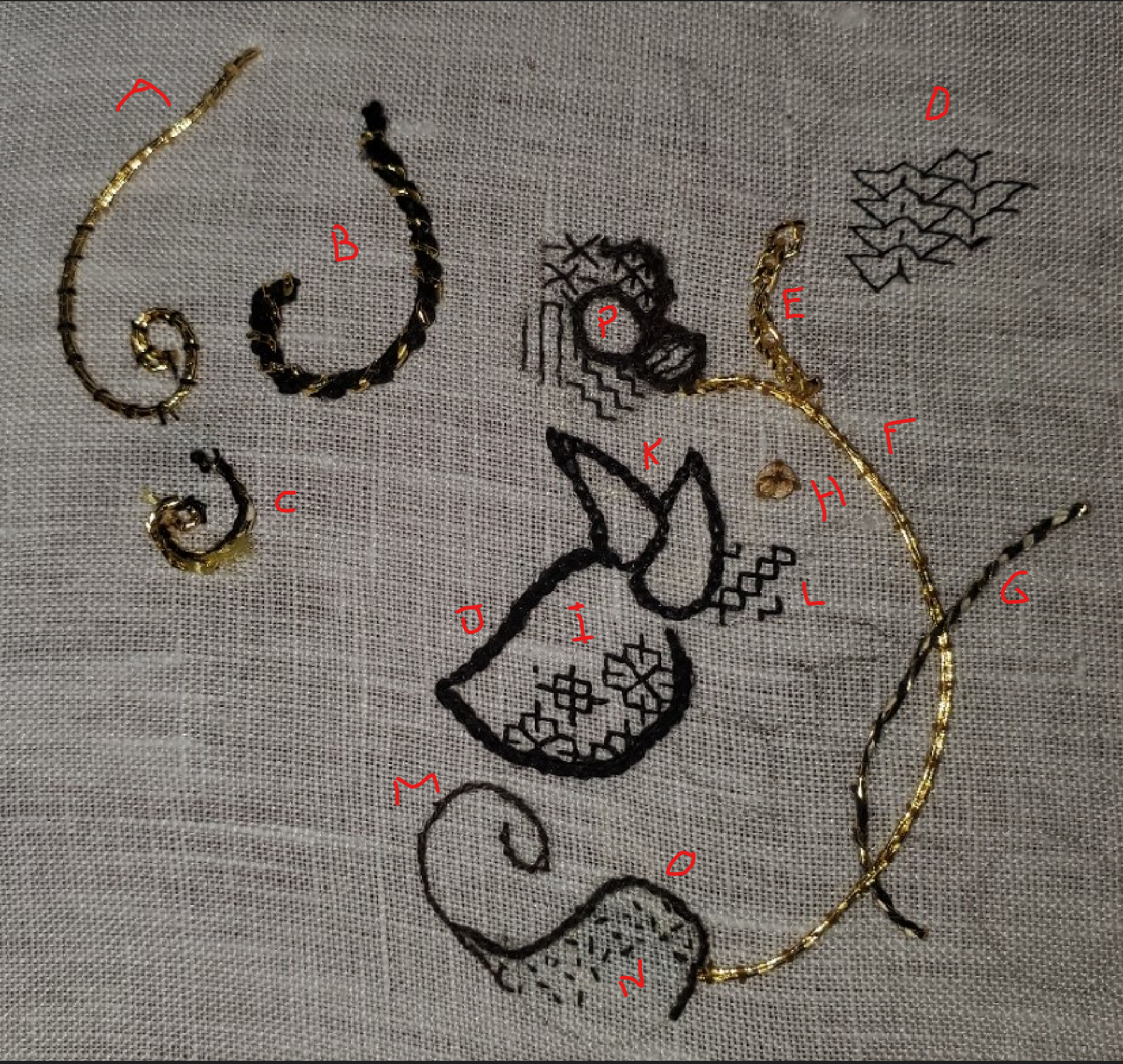
It’s getting confusing, so to supplement the last post, I have added identification letters. Items not discussed in today’s note are in the last one.
First off, the other fine silk and specialty needles aren’t here yet. Sadly one of the threads I ordered is a long lead item, and will not be available until after the September submission deadline for this project. So it has been nixed. With luck the rest of the order should be here by the end of the week. And on to this crop of equivocal results.
Gold Swirl A – I liked the two strands of couched gold I did (Item F), but wondered how three would look. So I tried it, both with the gold color silk couching stitches and black ones. I couldn’t get the three strands to lay as neatly as the two, and the bulk just made handling and plunging them more difficult. So if I use couched gold, it will be the two-strand bit. And I am not that fond of the black threads holding down the gold, so I will use the gold color faux “art silk” I brought back from India.
Heavy Whipped Black Swirl B – This is two threads of my heavier unnamed silk, worked in reverse chain, then whipped with one strand of the Japanese gold. Love the look. Hate doing it because as I found before, the wrapped gold shreds itself. Plus the line is too heavy in company with the others.
Pekinese Stitch Black Swirl C – This started out as two threads of my heavier silk, a line of back stitch. Then I attempted to thread the gold through the stitches, in swirls. Bad idea, as this sorry little twisted tentacle shows. After this bit I have given up all thought of using Japanese Gold #5 as a passing thread, and will stick to couching it. That’s what it does best.
Counted Fills I and L – Two strands of the YLI 100 weight silk. It quite hard spun which works nicely for stitching over 3×3 threads. I think I have a winner here for the counted bits, pending receipt of my other candidate, still in the mail.
Heavy Black Outline J – Two strands of my unnamed silk, worked in reverse chain. I like the bolder line made by reverse chain over that produced by chain the “normal” direction. I do not pierce the fabric as I go under the legs of the previous stitch. I find that gives a more fluid line that better follows curves. There’s more on this stitch here. I like the stitch, but it’s too heavy in this particular thread. The motif outlines should not twice the thickness of the stems. If I go for the stems in the couched gold, this one just won’t do.
Lighter Black Outline K – Two strands of my Golden Schelle silk. This thread is only a fraction thicker than the spooled YLI, but it is more lofty. Two strands of it done in reverse chain is a much more suitable thickness for motif outlines. Again, I think I’ve got a winner. This is a hand dyed thread produced using recipes contemporary with the design of this coif, and my stash is largely from their initial dyeing experiments, therefore in some of the skeins there is a tiny bit of variation in the depth of the black achieved. The later Schelle skeins I have are a luscious, uniform and saturated black, but I am choosing to use the early ones. I won’t go out of my way to maximize the mixed tonality effect, but I do think that just using it naturally as it reels out will lend a very subtle historical look to the stitching.
Skinny Swirl/Outline M – Stem/outline stitch, in one strand of the heavier unnamed silk. First, I find it far harder to achieve a smooth and sinuous line in stem/outline than in reverse chain. And this is just too thin and wimpy for this design. I need a bolder outline than this stitch/thread combo can provide.
Slightly Thicker Swirl/Outline O – Same stitch and thread combo as M, but using two strands. Better. But K just looks better to me.
Stippled Fill N – One strand of the YLI, taking tiny dot straight stitches. A very common treatment found in historical blackwork pieces. No counting required, the stippling is usually used to model the roundness of the shape being filled, with denser and less dense areas. While I’m not a big fan of this treatment I will probably use it on some areas that need filling but are too small for easy use of a counted design.
Am I now ready to go? Almost. I still want to get my hands on the remaining silk, plus the tiny blunt beading needles. But I think I have identified my preferences. I may start in on the big piece tonight, working a counted fill in one of the larger areas. Now which fills to use….
It’s a darned good thing that I have two free books full of them, plus more in my as yet unpublished doodle notebooks. And if you are following along and want to use those fills – a note of caution that I do include in the foreword of both of them. The overwhelming majority of those fill designs are NOT taken from historical works, and in fact have ZERO historical precedent. In general, the more complex, the more likely it is my own flight of fancy. But even my flights of fancy stick to the design precepts of the historical fills. I use only 45, 90, and 180 degree angles – simple straights and diagonals. No “knights move” stitches over 2×1 units. No other elongated stitches, either. One unit = 1 stitch. Those things are wonderful addition to the designer’s vocabulary, adding all sorts of new angles to play with. But they are also absolute markers for the modern style, and I leave them to others.
I will certainly try to stick to fills that are “historically plausible”, but if I transgress and include an identifiably anachronistic one, well, time (and with luck those who cast an appraising eye on the finished work) will forgive me.
INITIAL EXPERIMENTS
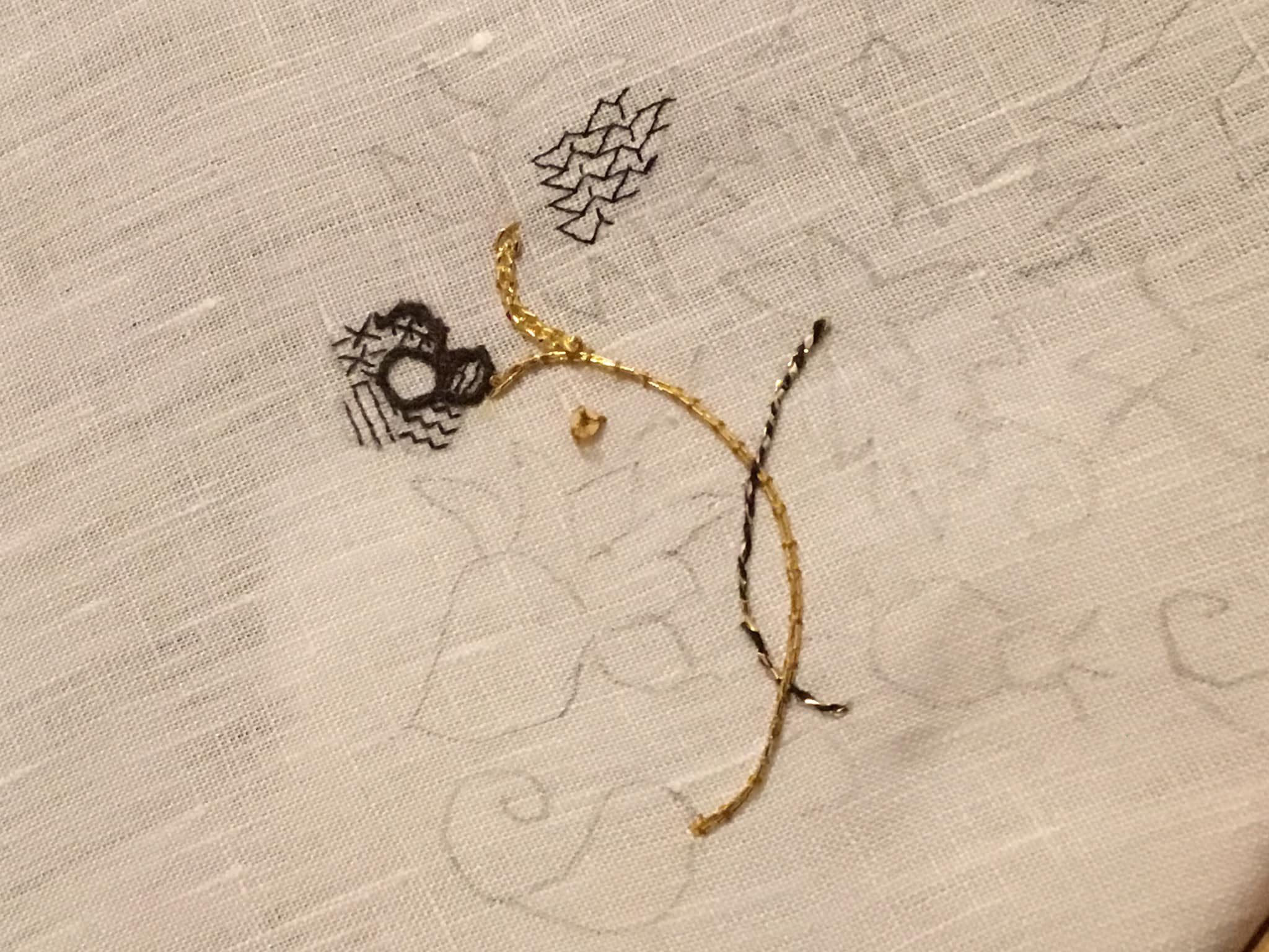
I’ve started in trying out various approaches and threads for the Unstitched Coif project. Here’s last night’s progress on my sidecar companion piece. It’s the same ground and threads I will use on the main project, but done to keep mistakes off “center stage.”
This isn’t final work, just doodles. I am not proud of it, there are lots of things that are sub-optimal. Let’s go through the bits.
First, the couched double strand of Japanese Gold #5. Still getting my mojo back with metal thread couching, I did cross my strands at the beginning of the bit up near the sad little flower, but by and large it worked. And it’s much easier on the flat frame where I can use two hands to stitch, rather than on this little round, where one hand is used to hold the frame itself. If the other hand manipulates the couching thread, I still need a third to tension and bend the metal thread around curves. Sadly, I am only equipped with two hands.
I used a gold color “art silk” for the couching threads, and was able to plunge the ends neatly using a loop of polyester sewing thread to capture them. That thread does not remain in the project. I thread a folded strand into a needle that’s slightly larger than what I would use to stitch, and with the loop trailing, pass it from top to bottom through my ground, then use that loop to nab the metal threads’ ends and pull them through to the reverse.
As far as appearance, not bad. I’ve managed tight curves using this stuff before, and I am confident that I could do it again. But the contrast between the blackwork and the many gold stems might be too great. We will see….
The 2mm paillette sewn just south of the gold stem. It works. It’s the right size for the uninhabited spaces between motifs. I will probably use them to spangle the piece once the majority of the stitching is done. And yes, I used the same faux gold tone silk to affix it, with three stitches.
The thicker gold sprig at the top. Again, that’s the Japanese Gold #5, but used as a passing thread. Only partial success with this bit. I used a reverse chain stitch, and passed the chain loop underneath the legs of the previous stitch, but did not pierce the fabric. While I like the sparkle it adds, it was not easy to do. The wrapped thread denatures, and the #28 needle was impossible to thread. I most definitely need a different needle if I want to use this stuff as a passing thread. Still even though it’s not a heavy plaited stitch and may not be exactly documented as a specific stitch used on historical coifs, the texture sings to me, as an echo of Elizabethan/Stuart era aesthetic. If I can figure out a better needle size, I may use it for some of the logically thicker stem sections. But like the plain couched bit, I am afraid of overwhelming the blackwork. Even more so with with sparkle.
The black and gold stem. Two strands of one of my thicker, stash-aged filament silks. Very fuzzy and prone to catching. I tried out both regular chain stitch and reverse chain (top and bottom of the stem respectively), then I whipped the entire stem with a single strand of the Japanese Gold. Again I had problems with the gold thread unraveling, even though the only place I pierced the ground was at the beginning and end of the stem. Different needle, for sure. And possibly doing it in the other spiral direction. Perhaps I was unknowingly adding to the metal thread’s twist by working in the established direction. But if I can make it work, I do like the look. Perhaps as shown here, I could vary stem treatments, twining full gold with black/gold. Or I could try out a line of double running, back or outline stitch done off count, and whip that, or work another threaded-behind surface treatment with the gold. More thought (and a better needle) is required.
The sad little flower. Been over this one before. My initial stab at counting on this ground. Working over 3×3 threads with one strand of Golden Schelle thread. Not pleased. Nothing wrong with the thread but it but a touch too heavy for the effect I want. That plus my own eyes, the needle size and unfamiliarity with working so fine a count make this bit suboptimal. I also tried using two strands of my slightly thicker stash silk for the outlines, in reverse chain. Too thick. Good for stems at that thickness. Have to experiment with using only one. Or perhaps using two of the Schelle strands for the outlines. More work is needed before I settle on “just right.”
The bit of fill at the very top. This is the debut try-out of one of the finer, newly purchased threads. This one is the one I got off Amazon – YLI 100 weight silk. The tiny spool holds 200 meters.

It has a very smooth finish compared to the others I have, and is quite ethereal. I waxed it with beeswax (as I do all of my threads used for countwork), and that helped give it more body. It was difficult to keep my needle threaded though, because being that fine it could have held a state banquet for fifty more threads of its diameter in the ample eye space of my #28 tapestry needle.
On the effect achieved – yes, I made a mistake in the fill design I was playing with (Ensamplario Atlantio II, #29). I chose that one because it would magnify differences in warp and weft stitch length, both straight and on the diagonal. I am getting more used to working with the magnifier three inches from my nose, and although I have some stitches wrong, they are all in the right spots. The effect though is rather leggy and spider like. This thread may be too tightly spun and smooth for best effect. I will try it out with a double strand next.
So there is my first round-up of experiments. Nothing done yet on the main project. Some food for thought. Some nope. And I am on tenterhooks waiting for the other two threads and the finer needles. But until they arrive, back to the lab for more bench tests!
ON CHARTING
Folk have asked me how I can redact designs from photos. I try to reply, with specific examples from a new-to-me design I just charted up this morning.
First credit where credit is due. This artifact is a work bag in the collection of the Boston Museum of Fine arts, accession number 12.52. Below is their photo of the thing from the page linked in the last sentence.

The museum’s attribution is Italian or English, from around 1600. It’s part of the Denman Waldo Ross Collection, which means it was probably collected before 1900. The description further says it’s done in red silk on white plain weave linen, but does not say if it was done in double running or back stitch. No photos of the stitching’s reverse are shown, although there is a note that implies that when the piece was made up into a bag, a coarser grade of linen was used for the presumably unstitched back side.
The regularity and angles immediately signal to me that is was done on the count. Also that the ground cloth’s weave is not quite even, with a few more threads in the horizontal-appearing direction, than in the vertical. I can tell that from the large center flowers, which although they are quadrilaterally symmetrical, appear to be a bit squished side to side.
First, some base assumptions.
- Modern blackwork and its expanded vocabulary aside, historical examples employ only straight lines, right angles, and 45-degree angles.
- Stitch length units are regular, and are constrained to multiples of a single whole unit, either on edge or on the diagonal. Yes, there are some artifacts with instances of half-unit stitches, but for the most part they are extremely infrequent in foreground design. They do appear sometimes in voided work, to help the stitcher cozy up to the outlines of their previously laid down foreground design.
- Gaps between stitches in a continuously linked design will be the same multiple of the base unit. There are no “floating islands” in this piece. Every bit is straight-line attached to every other bit, and therefore must be on the same base grid.
- Not every iteration of the original is assumed to be spot on accurate. Imperfections in cloth, and stitchers who let mistakes remain or improvise their way out of a mistake can make the creation of a final normed chart a matter of adjudicated compromise, comparing as many of the iterations of the pattern as appear on the piece and deducing the most likely original pattern drafter’s intent.
It’s pretty clear that this photo, while quite good, isn’t the best. Individual stitches blur together. Angles are not always crisp, and the threads have aged over the centuries. Still the base logic and standard shapes that can be formed using the assumptions above remain. I’ve charted hundreds of these, and have a pretty good grasp of what can be done with those shapes, but even if you have fresh eyes and haven’t done this before it’s not impossible. Think Logic.
So. Where to start? That’s easy. At the center.
That big rosette must start at the center with a square of four units. We know that from the little Y units that grow out of it. Heart shape units are pretty common in this work, and it’s also easy to deduce that these must be an extra unit tall so that the center vertical of each ends up one unit above those same Ys. That makes the diagonals linking the center square to the edges of the centermost heart flower two units long.


(An aside: the distortion produced by the less than even ground is evident when you compare the original and my true-square chart.)
The next thing I added was the simple hearts that grow out of the four cardinal directions. That establishes the height and width of that motif. I decided these hearts had flat rather than pointed top corners after looking at several spots on the original, and seeing that to achieve the height as seen, pointy corners would have been too tall – the divot at the center of the heart would not be in proper proportion otherwise. After that I played with the surrounding petal shapes, noting which straight lines were preserved, and noting the parallel size of the right angle juncture where the center heart petals meet with the size of the elongated diamonds that link the center rosette to the smaller flowers. Those have to be two units at each end. And so I filled in the rest of the rosette and those connecting links.
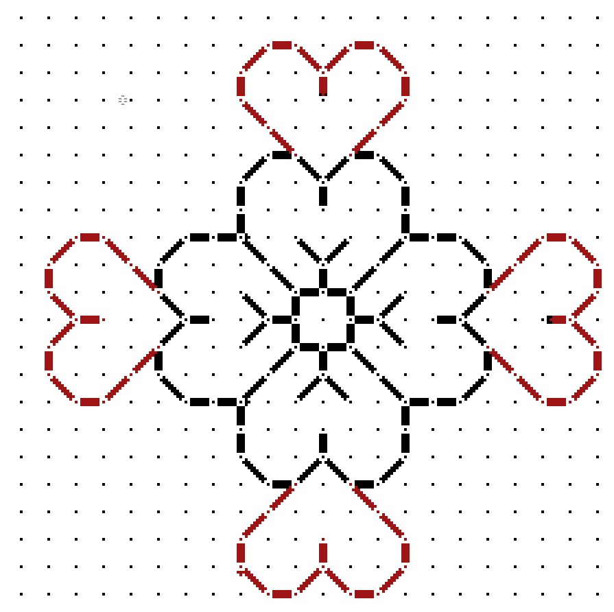

The only thing remaining to create the flower framing motif was to graph out the little blossom. Comparing the corners of those petals it was pretty clear that they WOULD have to be pointy to make the motif congruent with its own center square, which is clearly the same size as the larger rosette. Easy. So is chaining two together to make the inter-rosette connections. The only thing I had to watch for was the direction of those little leaves sprouting on the side. Those had to mirror around the center. A simple matter of copying and pasting, with flips as needed.
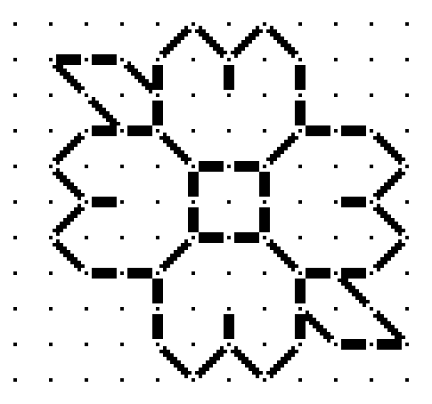

The chart at right is pretty much the entire logical repeat for the floral frame (click on it if it truncates on your device). Now for the harder part. The stemmed sprig of hops? grapes? whatever? is NOT symmetrical at the bottom. For that we have to rely on alignment with the wonderfully and conveniently regular floral frame.
Yes, this part is harder, and sometimes takes quite a few trial-and-error iterations before I hit on the logic of the original. In this case it wasn’t that difficult. Although it’s not possible to count stitches in the photo, our base assumptions and our clearly defined frame made it rather easy. I look for alignments and spacing when compared with the frame. For example, if you compare the red alignment lines on the photo of the original to my chart, you see I hit all the bases. There are lots more points of alignment and extrapolation than just my few red marks. And yes, long familiarity with the shapes and curves possible does make it a bit easier.


You can also see in the original that the curlicues do not always “lay flat.” Some have fallen victim to age and loose stitching. In most cases I had to sift through multiple instances of the repeat and come up with a best guess. And in this photo is one thing I often add – a deliberate interpretation that’s a tell-tale, so that I can spot unauthorized reproductions of my charting, even when others claim to have charted the same original on their own. (Don’t laugh, this does happen. Mapmakers still do this to spot knockoffs, too.)
Thankfully the upper part of the sprig is symmetrical. I use the same alignment and spacing methods to fill in the tightly packed flower/fruit shape and the lily-like finial on the top. The best part of that is once I’ve got a good stab at half, I can cut and paste with mirroring, rather than doodling in every line segment.

And the whole thing together – click here for an easy to download, save and print PDF. Note that a full size page version of this design is also available in the permanent free embroidery patterns collection tab, scroll down to the linear patterns section.

As with all my charts, I copyright my own graphed interpretation, with no claim on the parent object that inspired it. I make this chart freely available for your own personal use. If you intend to incorporate my charting into your own design, and especially if you intend to sell that design OR if you wish to use this to produce items for sale or fundraising purposes – you are requested to contact me before doing so.
GALLERY OF APPRECIATION
UPDATE: 6 FEBRUARY 2024 – I’ve added a permanent page for the Gallery of Appreciation. Click here, or find it in the tabs listing, above.
——-
I adore it when I see projects folk have worked up from my designs. I’ve shown off a smattering of them here on String under the tag “Gallery” on the categories list, but I have fallen behind of late. I will try to be more timely posting these fabulous finishes (and works in progress), as tribute and thanks to the creative people who have returned joy to me.
Right now I have several such submissions lurking in my email inbox. Apologies if you have sent photos to me that haven’t appeared yet. It’s a big inbox, and I am combing back, looking for the flags. Names and photos appear here with the permission of those who sent them. I also have some requests out to folk who have sent me photos, but from whom I do not yet have express consent to post. And if you’d like your work to appear here in a subsequent gallery post, please drop me a line. My Gmail address is kbsalazar (in the usual email format).
So in no particular order other than my stumbling around in the dark, I present the first of what I hope will be a renewed series of proud pieces.
The Second Carolingian Modelbook
Sent in by Alex Logsdon, a genuine original composition featuring many motifs from T2CM, selected, snipped, and arranged in true “bungee jump stitcher” mode – picked on the fly and fitted to the space available. There haven’t been many finished objects from my latest book, and this one made my heart sing.

The New Carolingian Modelbook
Elaine Cochrane is working on a big purple band sampler, and has included in it some strips from TNCM. Elaine is also choosing designs on the fly in bungee-jump mode. I love seeing her piece evolve with the addition of each new bit.

Ensamplario Atlantio, Volumes I and II
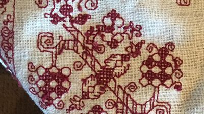
It’s hard for me to separate out the fills in the two volumes in the EnsAtl series. With only a few exceptions, even I can’t remember which ones are in which book. V Louise Behrman is working on a couple of projects using the patterned fills from the books. One is a lovely bit of inhabited blackwork – panels for a casket (a small fabric covered keepsake/display box), the other is destined to be made up into an adorable needle book (a small fabric folder to keep needles safe, dry, and at hand). Both images below are (c) V Louise Behrman, 2022, and appear here with permission.


Epic Fandom Stitchalong – Adaptations
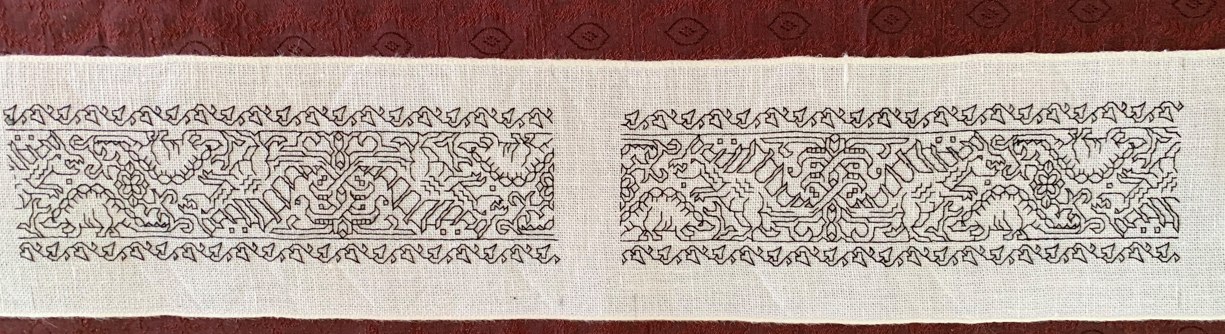
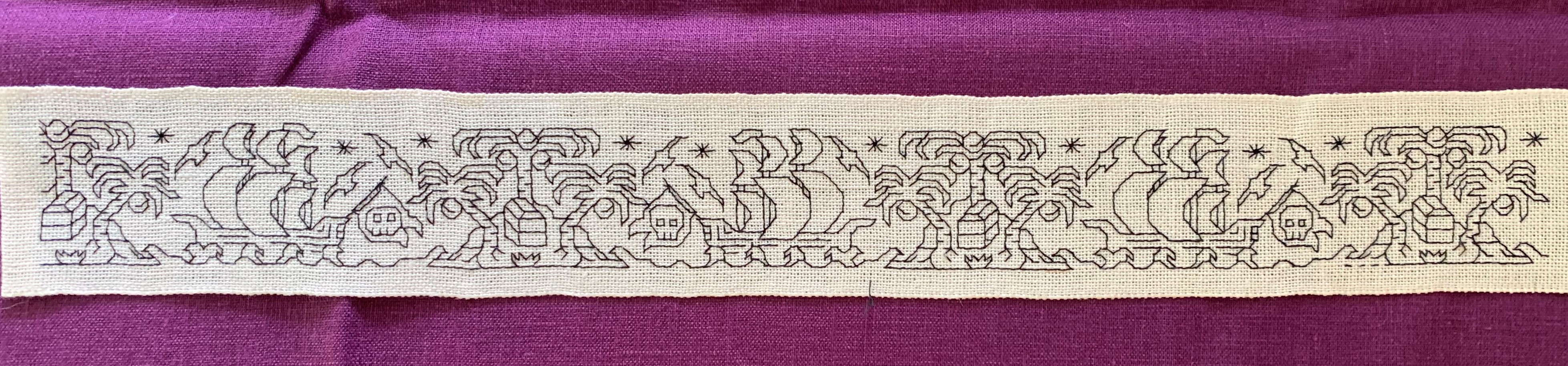
Long time friend and occasional SCA mentor Robert Himmelsbach was a stealth beta tester for some of the bands appearing as part of Epic Fandom. He used the dinosaur strips to make collar and cuff ornamentation for an otherwise historically accurate Renaissance era shirt, proudly proclaiming his ancient lineage and participation in that group’s pre-history (provided you look closely enough at his outfit). He is intending the pirate strip for a second shirt.
Links and/or info about the books mentioned are at the “My Books” tab above. The Stitchalong also has its own tab, above.
FIELD OF FLOWERS FOREHEAD CLOTH
My quick project gets off to a flying start. I’m about 20% done already. I started out with my hand-held 6 inch hoop to get close to the irregular corner of my linen scrap, but now have moved back to the larger 8 inch sit-upon.

The pattern itself is an original doodle destined for the next volume of Ensamplario Atlantio (as usual, no ETA on its release yet, but I’ve got the first 8 pages done). It requires a bit of attention, the diagonal columns connecting the saltire flowers carry twists in various directions, depending on where in the design they are, but overall the pattern itself is more repetitive than difficult. So to up the interest factor, I’ve transformed my original strip/border/edging layout into large, interlocking hashmark-shaped motifs, and am working each one in a different color. The final will have a patchwork meets jigsaw puzzle effect, kind of like a kid’s puzzle mat.
The other item of interest in this one is the thread. After reading about how others were using Sulky, a single ply hard twist thread intended for both hand and machine embroidery, I decided to give it a try. The ground is roughly 32 threads per inch linen, give or take. I am using a double strand of Sulky 30 weight.

First impressions are quite good. The 500 yard spool put-up is very convenient, as is not having to separate plies as with floss. It works up very quickly in linear stitching – the hard twist, firm nature of the thread eliminating the occasional snags and catches that can slow down softer, more friable floss and silk, when stitching with one hand above and one below. It also is amenable to being used in much longer lengths than regular embroidery floss. Longer thread length means fewer stops to end and begin new threads, so that speeds up stitching a bit. And it makes very crisp lines and corners. The hard twist paired with a blunt point needle makes the junctions where stitches cohabit easier to keep clean. There’s far less chance of a split stitch when stitching back up or down through a hole that is already used by a previous stitch, even when using (near) evenweave linen. I also like the way the dense, round thread keeps its “height,” with the stitches standing proud of the surface, rather than splaying out like floss strands do. Of course that means that floss strands provide better coverage for other types of stitches, but for linear work, clean lines and sharp corners take precedence. I try to capture the “depth” of the stitches below.

On the down side, I do note that colors do crock a bit onto the ground cloth even though the thread is not fuzzy. This is mostly evident when mistakes are picked out. Hints of the previously stitched color remain. To be fair, floss does this too, with the added annoyance of more stray fibers. My Silly Putty kludge works well enough on the color halo left when picking out Sulky, though.
So in my opinion Sulky 30 (double stranded) on 32 count linen is a good pairing. I will continue to explore its use, and report back on wash properties and durability. I would even go so far as to recommend it for folk who are interested in trying double running stitch on medium to high count evenweave. I think the properties outlined above would make it easier for those just starting out on their own blackwork journeys to achieve superior results.
Please note that I pay full retail for the materials I use. I do not accept freebies in exchange for reviews, nor does String participate in product placement schemes. Opinions here are entirely my own.
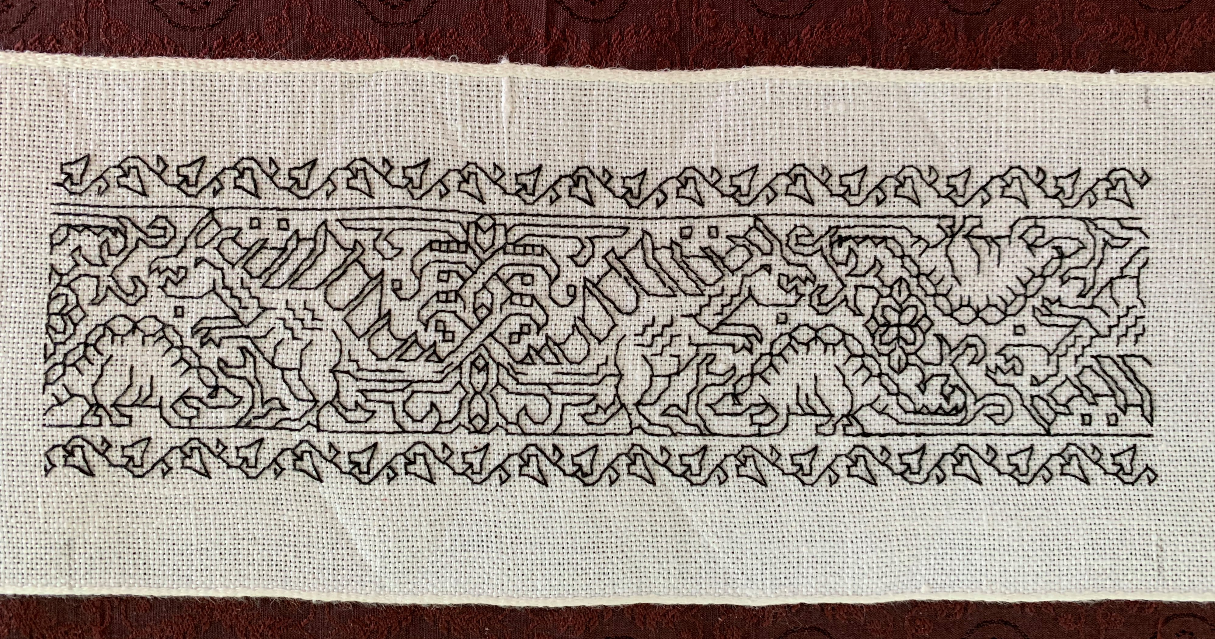
DIZZY GRAPES DONE!
A finish. I began at our Cape place around 14 July, and finished last night at the Cape place on 25 September, about 73 days of stitching, working an average of about 2 hours per day.

To recap, this was a vintage dresser scarf, clearly cut down and re-edged from some older piece of linen. It was very well washed, and although it had no broken warp or weft threads, there was a lot of blooming, where the linen breaks down a bit, with threads fused together and some slubs. The count wasn’t consistent, with some threads being much thicker than others, but spot measurements ranged from 28 to 34 threads per inch, mostly averaging out to between 30 and 32. It was ever so slightly skewed, but no where near as badly as other non-evenweave grounds I’ve worked lately.
The pattern has two parts – the main field which I redacted from a 17th century Italian cushion cover held in the Hermitage Museum, shown below (Accession T-2736 in case the link breaks). The companion border I doodled up myself.

Amusingly the skew count of the ground used in the original is greater than the skew of my vintage linen. You can see that clearly in the smaller motifs which chart out as squares, but appear taller than they are wide. Also my redaction norms the spacing of the motifs, which in the original does vary by quite a bit. But I preserve the “creep”. Look at the partials around the edge of my piece. They rise from/sink into the static edge line, each iteration of the swirl being offset from the previous one by a stitch or two in each direction. You can see the same thing on the original.
I stitched the design in garnet cotton (DMC #815). It took almost all of seven skeins. I worked the linear bits in double running, and the solid bits in a variant of Italian four sided cross stitch (basically cross stitch, but in a box). The version I chose is NOT double sided, instead it produces a grid on the reverse. The only reason why I chose that version is that I hadn’t attempted it before. I have no historical reason to pick it over the more usually done fully two-sided version. The full double sided version is more or less the same stitch that forms meshy totally overstitched grounds, but done “gently” as surface stitching, and not pulled to the max to both totally encase the ground threads and produce the characteristic mesh ground found in so many museum artifacts. Here’s my back showing the grid structure of my single-sided interpretation.
On the whole I am quite pleased. My goal of making a splendid runner for our sideboard has been achieved, and I can retire the old, ratty placemat that’s there now. It’s The Resident Male’s favorite spot for opening bottles of wine, and now he can do so in a style appropriate for a Renaissance princeling.
Things I would do differently. Hmmm…. I now wish I HAD done the solids in the reversible variant. Not because I want to have a true double-sided piece, but because I want to play with the challenge of that stitch some more. (Additional future experiments are warranted.) I’m also not entirely pleased with leaving the original dresser scarf edging on this. For one, the non-rectangular nature of the cloth is more evident with my on-grain, symmetrically sized stitched area. It bothers me. But consensus seems to be to leave it alone. So I will. For now at least.
And so I move on to an interim project. I have a wild departure queued up for my next big thing, but the materials to do it aren’t here yet, so I digress.
I want to make another forehead cloth. I really enjoy wearing the two I did a few years back. They are more fun than bandannas or scarves, and do a good job of keeping the hair out of my eyes. I have a piece of linen scrap I am considering. It’s very densely woven though at about 32 threads per inch, and I am not sure that it will show off my chosen design to good effect. (I do have an airier alternative, but I prefer the look of the scrap.) I don’t remember whose leftover this is, but send thanks again to The Anonymous Donor. As you can see I’ve plotted out the corner of my triangle.
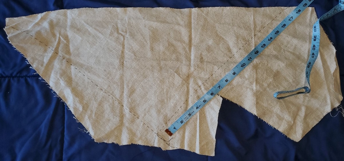
There is plenty of real estate on this piece of spill, left over from Anonymous Donor’s sewing project. I’m aiming to make something midway in size between the two forehead cloths I already have. Something in the range of 14 inches for the non-hypotenuse sides.

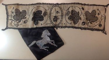
Shameless plug department: These two pieces have been worn heavily and washed without mercy for the past three years, as can be seen by the frayed ties. But look at the stitching, it’s as good as the day I finished. I did it in the stranded silk thread hand dyed by my apprentice using a historical recipe. NO fading, no breakage in spite of the ground’s distortion from being stretched in wear. No harm to the ground beneath the stitches from the dye used. It’s a small batch item, and not always available, but when it is, it’s worth it. Highly recommended.
Back to the project at hand. I will be stitching a rather dense design I recently doodled up. I’m working on Ensamplario Atlantio III, and that pattern will be part of it. And I will be trying out Sulky thread, a spooled mercerized single strand cotton sold for hand and machine stitching. Possibly in polychrome. I have black, red, blue, and green, so I have scope to play.
More on this one as it develops, of course…
