GOLD FISH!
After an annoying lapse of personal preparedness, I am now back from vacation – at home where I left my gold thread. Sadly, no fish-stitching happened during my break because I was without it.
Goldwork is temperamental, exacting, and oh so rewarding. I don’t pretend to be very good at it, especially compared to The Masters. I bumble around at best.
I did play with metal thread embroidery decades ago, when I first encounted the SCA and began looking into historical styles. I did couched work, direct embroidery with passing threads, and or nuée – a style that involves laying the gold threads across the entire width of the image-to-be, then overstitching it with colored threads to create pictures, almost in raster style, that glimmer as the gold peeks through. But I had a goal back then – to advance embroidery in that organization, and all of these styles have a high learning curve. Happily, I stumbled across blackwork – something that’s easy to learn and easy to teach. I haven’t climbed back out of that hole in the years since.
Back to the project at hand – it’s clear that hooping over gold would destroy it, so for this phase of the work I have moved Two Fish to my flat frame.
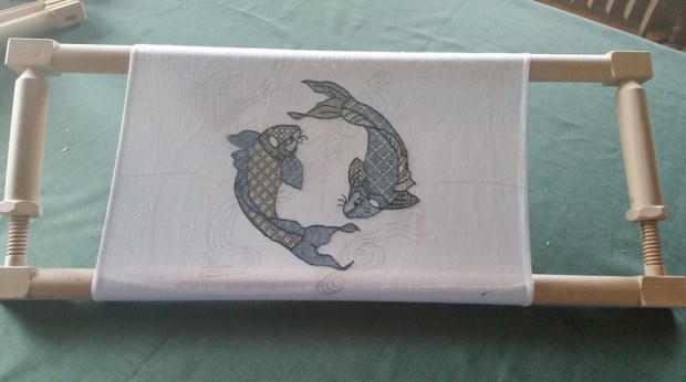
The rather unusual scrolling flat frame is a Millennium from Needle Needs in the UK. It’s a bit on the pricey side, but worth every penny. Although the design isn’t centered in this early fit, I do not think that the minor bit of scrolling I may have to do will damage the work – for example, there’s no point where I would have to lap stitched fabric entirely around the top and bottom bars.
It became evident very quickly that an extra hand would be needed to do this part of the project. Or two. So I hauled out my ancient Grip-It floor stand. I prefer a side stand rather than a trestle or tilt-top support that sits in front of the worker, and but side-supports are hard to find.
Ancient Grip-It works ok, but its main two drawbacks are that is easily overbalanced by a large frame like this, even when front mounted; and that the jaw is wimpy and doesn’t hold very well – and at the same time, I am concerned about pressure it puts on the finely turned wood sidebars of the Millennium. Here’s my sadly overmatched Grip-It in action on an earlier piece on this same frame. You can almost hear the joints squeaking as it strains to keep itself upright. To be fair, since I sit in a Morris style chair as I work, the off side of the frame does get extra support from my left side chair arm.

I’m on the hunt for a replacement floor stand, so if you have a candidate to recommend, feel free to post a comment.
As far as the stitching itself goes, I’ve begun. Even with the floor stand, I find I need additional hands.
I want hand one to manage the stitch-down thread (one strand of gold-color silk floss, well waxed) poised on top of the work; one hand to receive the stitch-down thread’s needle below the work; one hand to provide gentle tension on the gold threads to keep them flat and even as I go along; and one hand to manage a laying tool to keep the two strands being couched in flat alignment to each other, and not crossing over each other. That’s two more hands than I currently have…
I can double up the stitch-down needle hand, stabbing the thing into the work on each stitch, then re-positioning the hand above or below and drawing the thread through the ground; but I haven’t found a graceful way to tension and direct the gold yet. Since I haven’t worked this way in over 20 years, extensive re-training/re-familiarization is needed, and the going is slow but steady.
SHINY!
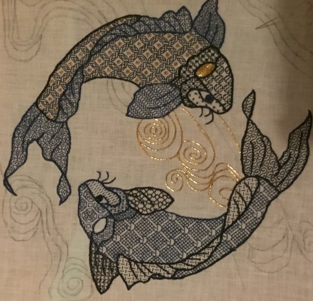
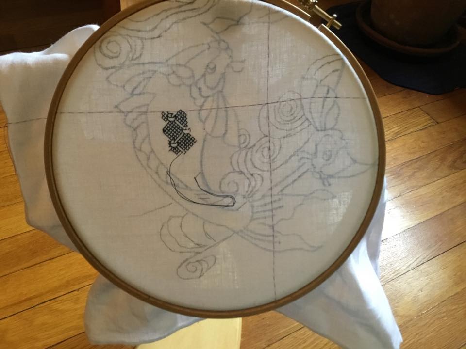
I know there are people who want updates on the Two Fish project. Here’s progress as of last night:

Just two more count-filled areas to go – the cheek between the eye and the gills, and the far fin. The cheek fill will be relatively light, and the fin, much darker than the rest of the fish, but I haven’t picked out either one yet.
Most obviously – I couldn’t wait. Since I don’t plan to relocate the hoop before I end up taking it off altogether and moving to my flat frame, I decided to add the sequins.
As per my earlier random thoughts, I sewed down one 2mm flat gold pailette in the center of each interwoven O shape in the body fill. I attached them using one strand of well-waxed gold tone silk – three stitches per pailette. I’m very happy with the look, and only lost a few that refused to cooperate, skittering away under my chair. If I were to do this again, I’d probably make a muslin cover for a squishy rectangular sponge, and scatter the sequins on it, then use my needle tip to pierce the center hole and pick up each little circle as I needed it. Putting a bunch in a dish, then trying to fish them out one by one with large, clumsy fingers was not efficient.
For reference, the extra-tiny pailettes aren’t a big-box-crafts-store item. I found them on-line, from General Bead in San Francisco. Their 2mm stock is very limited – a vintage assortment of various sizes and colors, made in the 1980s.
I’ve also gotten a start on the heavier outlines. I’ll add the overstitched details to the fins and tail after that. For a while I thought I might render those details in ecru silk, to match the ground fabric color, but I decided that it would be jarring to do that for one fish but not the other. The pailettes are enough of a differentiator between the two. I’ll use blue for those lines, to match the fin/tail color of Fish #2.
Unusual Stitching Gadget/Tool Report
The other bit to report is a rather unorthodox method of remediating crocking – the unwanted transfer of color from the thread to the ground fabric (or the stitcher’s hands).
The deep blue floss silk I am using is an experimental item, an early try at hand-dyed indigo by my Stealth Apprentice. She shared a sample from her initial trial run with me, to see how it worked, and to get feedback to improve her product. But even though we determined that she needed to improve color-set on subsequent batches (which she has done, with excellent results), I am too frugal to let anything go to waste. So I began this project with the beta-test silk.
For the most part, I don’t mind a small amount of crocking on this project. I think it adds to the watery look of the fish. But there have been a couple of mistakes and false starts on my part, where I have had to pick out stitches done in indigo. Those corrections left substantial residue on the cloth. So… How to get rid of the deep blue smudges without harming the already-stitched work? It’s obvious that water-based solutions aren’t going to help. They’ll just float more dye off the threads.
So I hit on an improvised solution.

Yes, that’s Silly Putty. Thinking back, I remember spending lots of time pressing Silly Putty onto newspaper comics pages, to lift images that could be stretched in laughable ways. If it could attract and hold ink from newsprint, might it be able to lift the surface dusting of indigo color from my ground cloth? Maybe…
Looking over the specs for chemical composition and the on-line Materials Safety Data Sheets (MSDS) for the components, it looked like the worst I’d be risking was potential deposit of oil. So I tried it on a scrap of fabric, and saw no oily residue.
I decided to go for it. Using the plastic eggshell underneath to support the fabric, I pressed the Silly Putty onto the smudged area, then quickly lifted it straight up (no scrubbing or “erasing” movements). The goal was not to let it linger on the cloth any longer than it needed to.
While this didn’t work perfectly, three or four quick blots did remove enough of the smudges to even out their tone with the rest of the surrounding area. The blotted area is the part of the back fin, the center of the back fin section closest to the tail.

Under magnification I can see no bits of Putty left in the cloth or in adjacent stitching, nor can I see any oily discoloration. Now that’s not to say that in 100 years (if this piece lasts that long) the blotted areas might not appear extra dirty or otherwise affected, but I won’t be around to do that bit of textile restoration, so for me at least, it’s a win.
Would I try the Silly Putty Solution again under similar circumstances? Probably.
Do I recommend it unconditionally? No. I caution that you carefully weigh possible risks prior to using it on a valuable piece of your own work.
DINING ROOM, FINALLY!
At long last – after 14+ years of living with wallpaper curling off the walls, we have finally gotten the dining room put together. The delay was mostly caused by the need to address functional/structural issues of the house before we could get to aesthetics. So now with the kitchen done and all of the deep infrastructure problems put to bed (and with luck, staying there) we have had a chance to play.
Here’s the Before – dismal 1960s-era beige with wheat ears wallpaper, falling off the plaster in great, crumbling strips:

And here’s the after – re-papered, and with the furniture returned to the room, and the replacement, smaller sideboard happily ensconced.


In time Newer Sideboard will mellow to the same color as the rest of the furniture in the room.
The wallpaper is from Spoonflower, a play on a William Morris style print, by artist Amy Vail. Installation was by Buckets & Boards.
I think the paper truly makes the room!

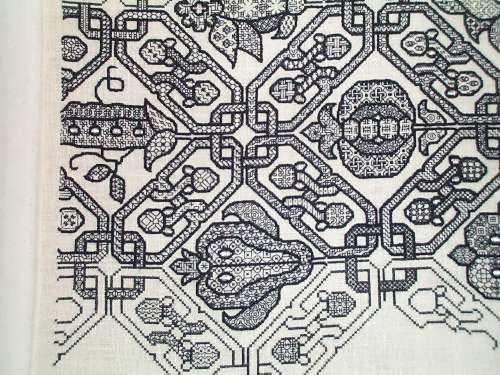
ONE FISH, TWO FISH. GREEN FISH, BLUE FISH.
Some progress on Fish #2, plus some more answers to questions that arrived after the last post.

I’ve started on the main body section, using yet another fill from Ensamplario Atlantio.
How do you know where to put the patterns?
I’m not sure whether you are asking how I know which pattern to pick, or how I place them in their designated spot, so I’ll answer both.
Remember, in the last post I answered that I pick fills on the fly, and that occasionally I pick the wrong one? Here’s an example – the first design I attempted for Fish #2’s main body section, shown just before it disappeared forever:

Yes I went back and teased out this bit that I stitched on Friday night, replacing it with the intertwined Os. I originally chose the discarded fill because I wanted something light, but I didn’t like the effect of this flat lattice as the finished bit grew. It was too static, and in a large area, would have been very boring. Plus, it would be difficult to achieve the visual offset that I used on the other side of the spine in Fish #1. So I went looking for a slightly larger yet not too dense replacement.
The intertwined Os work. But as I sat stitching over the weekend, I had an idea (warning – they are usually dangerous). Those centers of the Os? Think of how nifty they’d look and how blingy Fish #2 would be if each center was spotted with one tiny little 2mm gold spangle like this:

I’ve found some, but they come in a couple of different gold tones. I am waiting for my wave lines gold thread to arrive, then I’ll try to get as close to it as I can with the spangles. I won’t be working with that thread or the spangles until all of the blue and green bits are finished and the piece is safely mounted on my larger, flat frame. And that can’t happen until after the coming weekend because I have promised to lead a beginners’ blackwork class in Rhode Island, and I want to have my Big Green Sampler on display using my big scrolling frame.
How do I decide where in the spot to place a design? It depends. Most of the time I look at my shape and find the “meatiest” part. In a square that’s easy – it’s the exact center of the shape, but for oddly contoured areas, it’s not always the geographic center. Then I look at my chosen fill and find the bit of it I want to emphasize. I center the element of the design I want to emphasize at the “meaty” point, and work from there out to the edges of my chosen shape.
Here are a few examples:


In the first red sample, I’ve more or less centered the fill in the shape, starting with the little flower in the middle In the second, I placed the first acorn I stitched so that there would be one full, uninterrupted iteration of that motif, then completed around it according to the fill’s motif spacing. In the gears, knowing I couldn’t get an entire dragon in the shape, I tried to place at least most of one in the upper left first, knowing that the eye starts looking there. As a bonus, you can see that I tried to roughly center the circles-plus-flowers motif in the maroon gear to the dragon’s right. I started that shape’s fill with the twined edges of the interlace immediately above the gear’s center hole.
How do you get such crisp lines and corners?
First, the silk I am using is longer staple and less fuzzy than cotton floss. The red samples above are DMC cotton, and you can see the halo effect around each stitch. Second, I I also wax my threads rather aggressively – even silk. This compacts them and makes them more difficult to pierce. Since each stitch is so short on 40 count linen (20 stitches = 1 inch), loss of sheen and coverage from waxing is not a problem.
I’m using double-running, with occasional short hops in “heresy stitch” to avoid getting caught in a dead-end. Once I’m done the back of this piece will not be visible, so I am not taking pains to make it totally and completely two-sided. However, I do use double running logic for the most part, for better thread economy and to avoid possible show-through that results from long hops across the back.
As I’ve described before, I use a blunt-point needle to avoid piercing the threads of my ground cloth, and never take an over-two stitch: one unit on my chart = one stitch, at all times. While others do use a sharp to pierce the stitching thread, I find that I don’t like the look produced by piercing previous stitches: it’s often bumpy. I prefer the butted-end-to-end look I achieve with a blunt.
You know this isn’t historical blackwork, right?
Yes, I know that, and I never claimed that it was.
Blackwork is a portmanteau term that covers many, many substyles of high contrast work, often but not always done in monochrome. There are counted substyles and non-counted ones. Some are single color or limited color range works done strip-style, counted or uncounted. Some use abutting areas, each clearly outlined, and filled with various stitched treatments, occasionally but not always geometric, and not always done on the count. Some use stippling as shading either inside or outside of their motifs. Some of those rely on tonal variations to give the piece a three-dimensional feeling, and some don’t. And there’s a whole school of modern blackwork that dispenses with outlines altogether, and uses the tonal density of the patterns – sometimes sticking to a limited number of base designs with modifications, and some using a wider range of fills to achieve a range from light to dark. This last group draws inspiration from engravings and lithographs to make intricately shaded and modeled images.
What Fishies shares with historical styles are the use of heavy outlines, metallic accents, and geometric, counted fills. What it doesn’t share is subject matter – this is a Japanese-inspired, quasi-traditional composition. Also, the complexity of the fills I favor is not particularly well documented. Historical inhabited blackwork tends to simpler fills than the wildly detailed ones I often use. I do note that the body fill for Fish #1 WAS adapted from a historical source – from a sleeve shown in one of the late Elizabethan era men’s portraits, that – of course – I can’t lay hands on right now.
Happily I have no pressures to abide by covenants of historical accuracy for this work. I’m having fun. End of story.
Any other questions? Feel free to post them here as comments, and I’ll try to answer.
SWIMMING ALONG
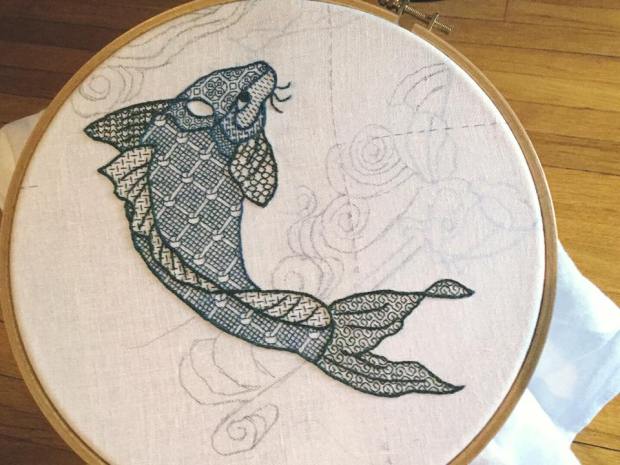
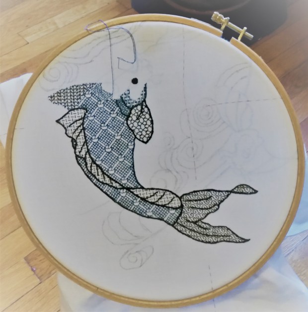
More progress has been made on my Two Fish blackwork piece.
I’ve gotten more questions about how I go about doing these. I’ll try to answer them here, rather than piecemeal by message. If you have additional questions, please feel free to post them in the comments. I’ll sweep up all that lands there, and then answer them in the next Fish post. First – today’s progress:
And the questions….
Where can I get this kit?
There is no kit, it’s an original composition of classic elements that I am designing on the fly. I won’t be publishing a chart for the final project, or releasing it as a kit.
Original? How?
The Resident Male had mentioned a two-fish embroidery a while back, so I started by looking at a few on-line images of swimming koi. Here’s a post about designing original projects drawn from various sources of inspiration.
Using the freeware GIMP graphics program, I adapted a couple, starting by tracing some, then merging them to blend parts together, simplifying details, changing proportions, increasing the spine curvature, and tweaking angles – until I had a fish I liked. Then I flip-mirrored it so that I had two fish circling each other. After that I added the “water lines” behind the pair – adapting them from the bit below (from a book of traditional Japanese wave and ripple designs – Ha Bun Shu, by Yusan Mori, circa 1919), also traced, augmented a bit and then enlarged.

Once I had the whole thing drawn out, I sized it up to be my desired dimension, using the GIMP resize feature, and printed it out on paper.
How did you prepare your cloth?
I selected a piece of 40-count linen, cut a square about 30% larger than my target design dimensions, hemmed all four edges, and basted guide lines to help me identify the center point. On this project I am picking out those guide lines as stitching encroaches on them. I’ve got no need to keep them intact because nothing depends on placement against them. For the record, I’m working my fills over 2×2 threads – 20 stitches per inch.
How did you get the drawing onto the cloth?
I used the poor-girl’s light table – a big window, and a bit of painters’ tape. I took my resized drawing and taped it to my dining room window, then centering the basted lines of my already-hemmed and center-identified fabric over the marked center of the on-paper design, I taped the ground cloth to the window on top of the paper pattern. This is the same method I used for my Ganesh project, although I had just Scotch Tape in India:

Then I traced the design onto the ground using a bunch of pencils I had to hand – some washable pencils intended for cloth marking, some not. I’ll probably regret not using Proper Pencils, but the urge to get going does not always wait until optimal supplies have been secured.
Did you graph out the whole design?
Nope. All I transferred to the cloth were the outlines. For inhabited blackwork (the substyle that uses outlines plus fills), I never graph out the whole project. Once the outlines are on the cloth, I work my fillings right into the spaces indicated, if needed, by looking at a sample of the design, either on another cloth or on paper.
At the time I did the tracing, I had absolutely no firm thoughts about colors, fill designs to use, thickness of outlines, or how to work the water lines. I knew I wanted to use a hand-dyed indigo silk, and possibly some couched metallic thread, but that was it.
Where are the fills from? How do you pick what fills to use?
In truth, I have no idea which fill I will use for any particular spot until I am ready to stitch it and make my selection. Most of the fills I’ll use on this piece are in Ensamplario Atlantio, my free eBook of blackwork geometrics, but I may draft up more or tweak existing ones as needed.
In this case I started with the largest area on the darker of the two fish. I wanted something vaguely reminiscent of scales, but with more interest. I thumbed through book and hit upon the knot design. For the other side of the fish, I used the same fill, but offset it, to imply movement (mating the design across the fin area would have made a flat, static composition). I wanted the tail to feel “swishy” so I chose a design with a prominent swirl. For the back fin, I chose one of the lightest fills, for contrast. The fin behind the fish uses a darker effect fill than the fin in front, again to add depth. And so on.
I try to scale the chosen fill to the size of the area where it will live. Big areas get the largest, most demonstrative fills. Small areas get smaller repeats. Sometimes though I’ll violate this, if a larger design has a smaller sub-element that will fit entirely in the current space – like picking one strawberry out of a larger repeat and using just that.
Do you ever pick a fill you regret later?
Sure. Sometimes a fill does not show to good advantage next to its neighbors. Then I pick it out and try again. But this doesn’t happen very often.
What about the outlines?
I almost always wait to embroider the outlines until all of the adjacent fills have been completed. This gives me a bit of time to be satisfied with the fills as worked, and lets me cover up the edges where fills meet. It’s MUCH easier to cover up than to work flush to a pre-stitched outline, especially when the fill may require a half-stitch at the edge for complete coverage.
The exception for this was my Forever Coif. Instead of drawing the design on my ground, I used cross stitch to lay down my outlines (based on a familiar design, charted in my New Carolingian Modelbook), and then in-filled the to-be-stitched areas with geometrics. Finally, I over-embroidered my cross stitch outlines to make them heavier and more prominent. The original cross stitching does not show:
On Two Fish, I am using mostly reverse chain stitch for the outlines. The thinner accent lines inside the fins and tail are split stitch. Differences in line thickness are achieved by using different numbers of floss strands.
Color? Heresy?
Why not? This is an original, modern piece, done using styles and techniques inspired by historical stitching. There are no Embroidery Police waiting to ticket me because I am using multiple colors.
I started out intending to only use the indigo – a product dyed by a friend of mine. While I love the look, I decided I wanted to play with an additional vector of contrast, so I liberated some commercial Au Ver a Soie Soie D’Alger from my big green sampler project and began experimenting. I liked the additional depth it gave. I may do the other fish as a tonal “opposite” to this one – a traditional treatment of the two-circling-koi motif. If I do, I may swap placement of the colors as well as changing up the density of the fills, so that Fish #2 may have a less dense green body, but darker blue fins and tail.
And the wavy water lines?
Right now, I am still thinking couched metallics. I haven’t decided between gold or silver, or a mix of both. I have some nice silver passing thread brought back from my Paris trip, but nothing comparable in gold, and only a limited quantity of the Sajou stuff. So I have to find the **right** thread for them. That’s going to be tough, with no local sources. I’ll have to rely on recommendations, on-line reviews, and catalog descriptions. Suggestions will be gratefully accepted!
THE AZEMMOUR CLUSTER
Thanks to Elaine, whose comment on the Spider Flower post sent me off on a new research quest, a group that had long intrigued me has now been solidly planted.
I had seen many examples of what appeared to be a related set of stitched fragments, from many museums, collected over many decades – mostly by amateurs in the late 1800s/early 1900s. These were identifiable as being a group because of shared motifs, designs, treatments, materials and overall look. But the museum IDs and book citations were all over the place, citing individual examples as being from anywhere from the Greek Islands, to Sicily, Northern Africa (unspecified), Spain, and the Italian mainland. For example, all of the patterns on this page can be found in Lipperheide’s Muster altitalienischer Leinenstickrei, Volume 1, published in 1881, credited as Italian works. Dates also ranged widely with some examples being attributed as early as the 1500s, and others tagged as late 1800s to early 1900s. I do note however that comparing current tags to my old notes, over the last few years several museums have updated their provenance notations to locate this group in Azemmour, Morocco.
We’ve already seen the Spider Flower, this example from the Boston Museum of Fine Arts, Accession 93.208. Again, their sample is undated, and is tagged as Spanish or North African, with a note that it is “Italian embroidery.”

Here are some others of the same group. This one I tag as the Pomegranate Meander, because the ornament on the diagonals has swollen into an enormous fruit, and the center flower has shrunk down to a skeletal remainder. This sample is quoted from the Cleveland Museum of Art’s photo, and is tagged in their collection as being from Azemmur (an alternate spelling), 19th century, Accession 1929.843.
Mr. Ross has provided us with a Pomegranate sample, too. This one is also at the MFA, Accession 11.2880, called out as Spanish or Eastern, with no date.

Here’s a different member of this group. In my notes I tag it as Wide Snake Meander. This one is from the musée du quai Branly, in Paris, Accession M61.2.16, and is attributed to 17th-18th century, from Azemmour.

This design crops up not infrequently. Here’s a sample from the MFA, Accession 93.1495, no date, with Spain as provenance. Another piece collected my Mr. Ross – this is the MFA’s photo.

And another, from TextilesAsArt.com, entry 2227, they call it out as being Moroccan from Azemmour, and date it to 1650.

Here’s a sample of Wide Snakes that has a different border. This photo is quoted from the dealer RugRabbit’s website. They ID it as 17th century, Moroccan.

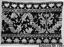
From the Metropolitan Museum of Art, Accession 09.50.1291, now tagged as Moroccan from Azemmour, from the 18th century.
Azemmour has a second style in addition to these pieces. Birds. Paired birds with and without vases or urns, or trees in between them are extremely well represented in museum and private collections. Although paired birds are common in early modelbooks and in stitching examples throughout Europe, the Azemmour birds have a particular look, often done in two colors, with outlines in black and the voided ground in red.
Here is a particularly choice example from the Textile Museum of Canada, Accession T85.0301, dated to the 18th century (image quoted from their photo).
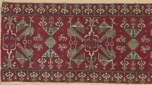
Here’s a whole flock, including MFA 16.298 (Italian or Spanish, no date), Yale University Art Gallery 1941.278 (Azimoor (another alternate spelling), 1700s), Cooper-Hewitt 1970-0-1 (No provenance, late 19th century), Philadelphia Museum of Art’s 1919-686 (Azemmour, 17th century) I’ve easily got two dozen more samples in my logs. They still turn up fairly frequently for sale in textile specialty antiques houses and even on eBay.


And these same birds make appearances on darned net, this image is from a Gros & Delettrez, a dealer in antiquities, who call it out as being from Azemmour, made in the 1800s.

Now. Where did all of these come from?
I’ve read a few accounts that claim Jewish refugees fleeing the Reconquista and Inquisition in Spain settled in and around Azemmour. It is speculated that their influence blended with the local Islamic stitching heritage, to create this local style family; one that is distinct from other Moroccan stitching styles. The Jewish link is cited by The Textile Museum of Canada. The Jewish Virtual Library notes the migration and community. The Jewish link is also mentioned here. The Textile Research Centre writes that production of Azemmour pieces died out in the mid 1900s, although recent revivals have been undertaken.
Finally, to muddy the waters further, here is an artifact that might be seen as a bridge between European/Italian voided work, and the voided work done in Azemmour. This is a strip in the collection of the Cooper-Hewitt Museum Accession 1962-58-17, attributed to 16th century Italy, and the image below is quoted from their photo. Yes, the foreground of the motifs are left quite bare compared to the ornamented Moroccan samples. But look at that design. Does it remind you of both Spider Flower and Pomegranate Meander? It should…

THE SPIDER FLOWER
Continuing…
I have no idea if this design has ever been given an official name, but it shows up with regularity in museum collections. It’s part of a larger design cluster that includes several other patterns, but more on that another day. Today is the Flower’s day. Now. Is this a 17th century design? Or is it later…
I call it “Spider Flower” because it’s characterized by a center bloom that has rather arachnid looking petals, often spiky. It can also be recognized by a simple diagonal meander (with up/down symmetry), and some sort of knot or “wing-nut” swelling ornamenting the simple meander. It’s usually accompanied by a smaller secondary border, but there is little consistency among samples on the secondary border. However, the secondary borders can help in assigning Spider Flower to the cluster I mentioned.
In addition to the general voided layout, there is often complex hatching or other ornamentation on the foreground bits. The background varies too, although it’s usually a solid color treatment – either long-armed cross stitch, or the tightly pulled mesh stitch common to strip pieces produced in Italy.
Here’s a pretty typical example:

This sample is a photo from the Boston Museum of Fine Arts, Accession 16.300. The museum calls the ground “tent stitch” but it looks more like a four-sided Italian cross stitch pulled moderately tight (the mesh effect is not very pronounced, but the coverage is there). It’s part of the MFA’s Denman Waldo Ross Collection, which means it was collected some time prior to his death in 1935. The MFA does not date this piece, and attributes it to North Africa or Spain.
Apparently, Mr. Ross liked this design. He found several examples of it. Here’s another, also from the MFA, Accession 98.204. The museum calls it out as “Spanish or Eastern,” but tags it as being Italian embroidery. Again, it’s called tent stitch, but zooming in shows that the ground is the same four-sided boxed cross stitch, pulled tight.

Nope, it’s not part of the same piece, although the similarities are clear. Not only are the secondary border and internal fills different, but the details of the voided area’s shapes are a bit different, too. Yet for all that, it’s clearly recognizable as another Spider Flower.
Mr. Ross’ third sample in the MFA’s collection. This one is Accession 93.208. Same working method, and again – the museum’s own photo. No date on this one either, although it is also called “Spanish or Eastern,” and tagged as Italian embroidery.
This one has a different and more elaborate secondary border. Also the border is asymmetrical north/south. Possibly it came from the end of a towel or cloth.
But not all of the Spider Flowers I have seen have come from the MFA. Here’s one in the holdings of the Yale University Art Gallery, accession 1939.498 – a gift of Mrs. F.M. Whitehouse in 1939. The museum dates it as being 19th century, originating in Morocco, but put a disclaimer on the page saying that the on-line documentation does not necessarily reflect their most current knowledge about the piece.
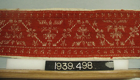
The picture is rather dark and compressed, and the work itself is heavier and less delicate than the above samples, but it’s clear that we have our Flower, along with its companion border. There are some similarities – the layout, the center flower and meander, the ornamentation inside the voided spaces; and some differences, the largest of which is the truncation of that wing-nut decorated lozenge on the meander’s center. It has lost its center barrel. As far as technique goes, I can’t say anything for certain, although given the density of the ground and its alternating left-right directionality, it might be long-armed cross stitch.
The Metropolitan Museum of Art (MET) in New York also has its own Spider Flower sample. Accession number 09.50.1375 seen below in the museum’s photo, was purchased for the museum through the Rogers Fund in 1909. This artifact is dated 16th century, and is sourced to Italy or Greece:

Companion border? Check – and again a totally different one accompanying the main design. Intensely decorated voided spaces? Check. Spindly flower, meander, and barrel/wing-nut lozenge? Yup. This one to me reads as a likely long-armed cross stitch ground, with the plaited row appearance of that stitch.
And lest you think these things were only done in red – here’s in indigo example.
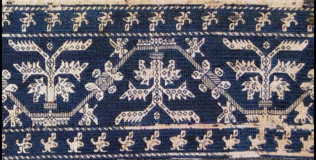
I have quoted this image from the page of Mr. R. John Howe, private collector and dealer in textiles (it’s about half-way down the very long listing), in his report on an 2010 address given by Mae Festa, a noted textile collector, at the Textile Museum in Washington, DC. Ms. Festa attributes the piece to 17th century Italy. She calls it out ias being done in cross stitches and double running stitch. I think the ground is long-armed cross stitch.
So. What can we say about the group as a whole?
Mostly that it is of an undetermined and broad Mediterranean origin, with museums placing the pattern anywhere from Spain to North Africa, to Greece – with a time stamp ranging from the 1600s to the 1800s. That’s a lot of wiggle room.
Why are the dates and places so imprecise? That “Indiana Jones” era of private collecting, for one. The identification on these bits often depended on the claims of the dealers who sold them to the original art patrons on tour. Very few of these household linen fragments have been revisited in detail since museum acquisitions, and those happened between the 1880s and the 1930s.
With no detailed analysis, I can’t second guess the experts, but comparing these to other Moroccan pieces, and to others in the design cluster, then factoring in the conservative nature of traditional stitching, I’d say that it’s not impossible that such an easy to stitch design persisted for a very long time. 1800s – possibly, but I think these are sufficiently different from clearly dated ethnographically-collected Moroccan pieces of the 1800s to warrant speculation that they were done before that (or possibly elsewhere). Early 1600s might be an optimistic stretch, though.
Why do I think this design is easy to work? You’ll see…
CASTLES AND CARAVELS
Ok. I have no idea of there are Real Professional Researchers out there who are noting similarities of pieces held among far flung collections, but as you can see – the subject continues to fascinate me as an dilettante. Trust me – if readers here are willing to sit still for them, I’ve got a ton more examples to share.

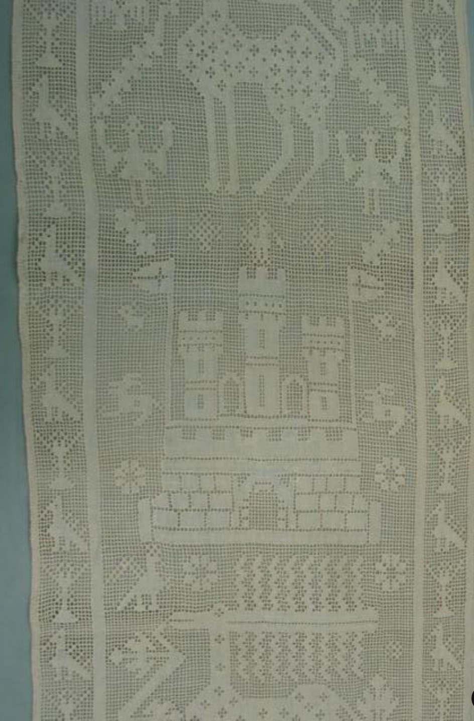
This set is is more difficult to show, in part because the Hermitage Museum has taken down one of the two artifact pages dedicated to two associated cutwork pieces, accession numbers T-8043 and T-8045. The second depicted the castle that I graphed, below. The last time I saw the source artifact at the museum’s website was in November 2014, but the castle can no longer be found from my saved links, or via searches on its name or accession number.
You can find a full-size version of the chart above under the Embroidery Patterns tab at the top of this page.
There were small fragments of partial designs underneath the castle in T-8045 that associated it with this this other Hermitage artifact (T-8043). This one shows a boat with passengers, several happy fish, and a pair of rather blocky lions. The photo below is credited to their official artifact page for T-8043, where it is attributed to Italy, from the late 16th-17th century. They call it “Embroidery over drawn thread”.
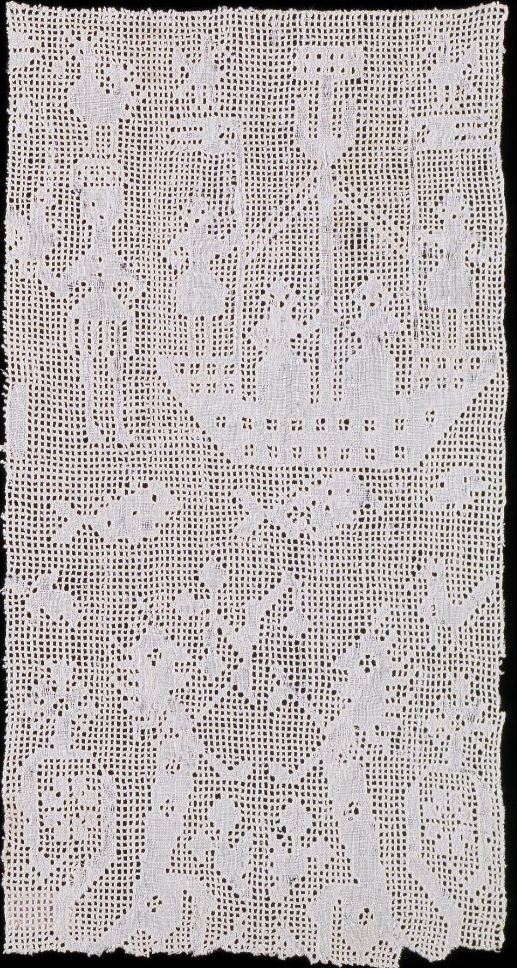
And here’s the cousin of the Hermitage artifacts: a VERY similar – that’s similar, not “same” – fragment from the Philadelphia Museum of Art, Accession #1939-9-1. PMA calls out the piece as being 16th century, Italian, done in linen cutwork and drawnwork.

As far as acquisition time frames, the Hermitage samples come from the same Stieglitz Museum source as the other Hermitage embroidery sample I discussed last week. The Philadelphia Museum of Art came by its piece in 1939, as a gift from Mrs. Frank Thorne Patterson (a noted collector of the time).
Now, the Philadelphia example is a truncated photo of a fragment, and has borders that the Hermitage samples lacked (you’ll have to take my word on the castle original), but in technique, composition and subject matter it’s very, very close. It has the bottom edge of what is clearly almost the same castle as the one I graphed, plus a boat, manned by curious, full skirted figures, and some similar birds. Yes, there are small differences in detail in the boat’s ornaments and passengers, plus motifs on each piece that do not appear on the other, but I believe these artifacts do like they might be from the same workshop.
Obviously, to prove this assertion we’d need some sort of detailed fiber analysis – much more than my casual observations. Any grad students out there need a project?
Keep tuned for more episodes of Embroidery Family Reunion!
UPDATE – 6 APRIL 2020
Spotted in the wild, another example of the Old Castle. This one is on a piece in the collection of the St. Gallen Textilmuseum, Accession 00671. Their listing cites it as being from Sicily, dated 1590-1610.

UPDATE – 31 MAY 2023
Found another. This one is in the collection of the Rhode Island School of Design (RISD). Accession number 56.043.12 in case this link breaks. They log it as being an Italian furniture runner from the 1800s. Not sure what to make of that, but I do note that the composition of the piece as a whole plus the design of both the castle and accompanying birds are spot on congruent with the ones above.
UNHISTORICAL FISH
Just to vex my new readership, I start a totally unhistorical stitching project. Well, not to vex anyone actually. This piece was bespoken by The Resident Male a while back. I’ve thought about it for several years, and decided to finally do it. The ultimate purpose is a piece to hang on the wall of our Cape Cod place, as part of a large collage of sea life art.
The design is based on a double-koi motif, where the fish are circling each other. I began with a clip art of a single fish, and simplified it, changing proportions and angles, and removing detail that would be obscured by my chosen stitching style. Then I mirror imaged and flipped a duplicate of my first fish, placing it opposite it’s sibling, and trying to get them more or less balanced and centered as a composition.
For the last bit – the “water lines” in the background, I thank the Public Domain Review, for posting a link to a book of traditional Japanese wave and ripple designs – Ha Bun Shu, by Yusan Mori (circa 1919). My chosen ripple was taken from page 22.
So, with my inspired-by fish, and borrowed water lines (with some of my own extensions to eke out the composition’s dimensions), I end up with this – already shown window-traced onto my prepared ground:
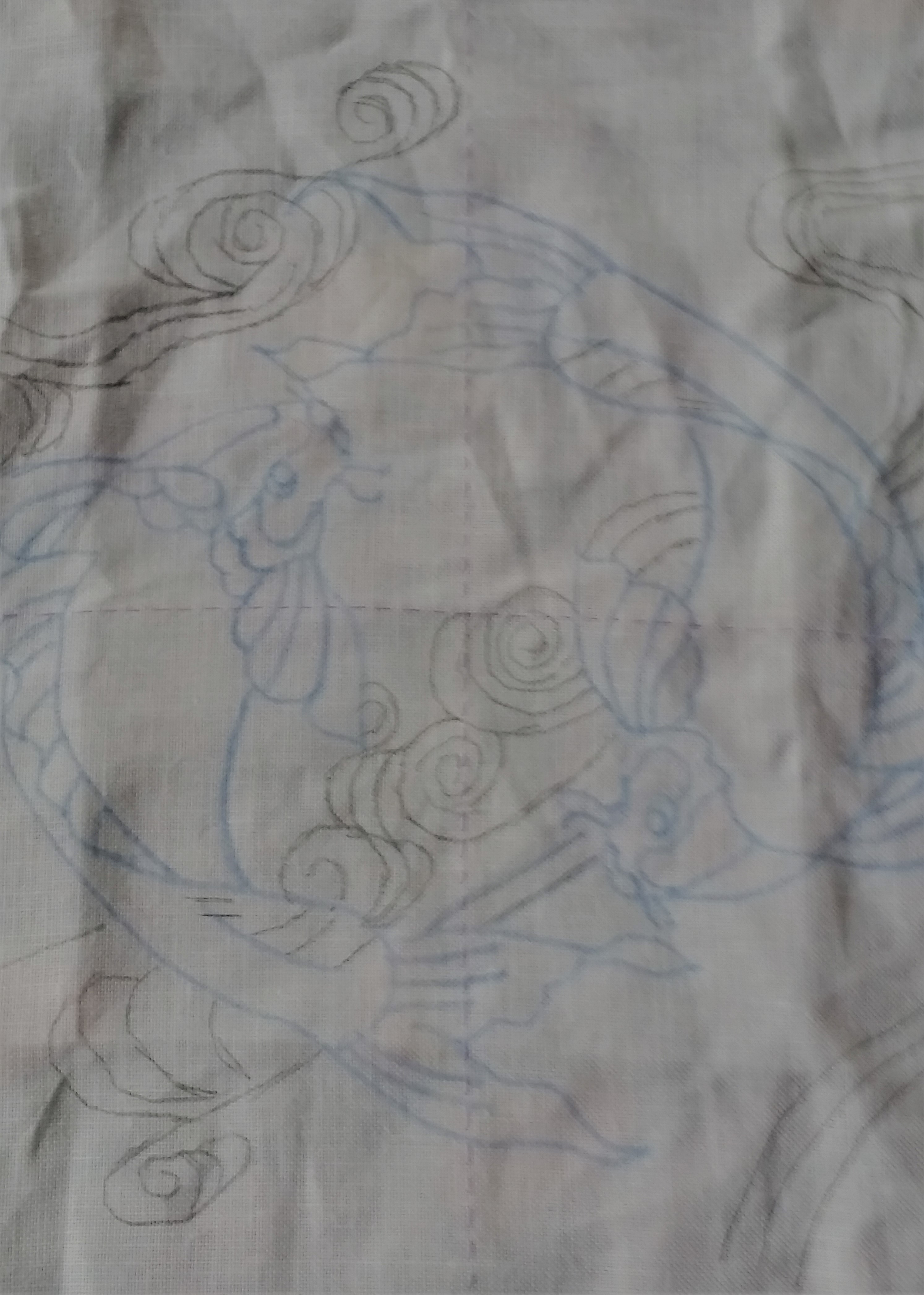
The ground chosen is an almost-white 40 count linen, hemmed on all four sides. I’ve marked the center with basting lines of old, non-crocking plain old sewing thread. I will be picking them out as I encroach upon them because there is no central guide purpose they serve after aligning the initial tracing. I will be using silks, mostly. Originally I thought I’d be stitching only in a hand-dyed natural indigo, colored by (and occasionally available from) my Stealth Apprentice, but last night I changed gears and have added some commercial Au Ver a Soie Soie d’Alger, in a deep green.
I will be working my two fishies in a combo of styles. The fish themselves will be done in inhabited blackwork, with fills inside strong outlines. I’ll pick the fills on whim as I go along, and possibly come up with some new ones along the way. The fish will not be direct opposites of each other – the inner detail will vary, but one will definitely be lighter (using less dense fillings) than the other, and placement of the blue and green may swap.
Right now I’m toying with doing something different for the outlines, instead of my usual plain old chain stitch. Not sure yet what, but I do want to vary the width of some of them analogous to heavier brush strokes.
The water lines will probably be done in gold or silver (maybe both), possibly simple couched strands, possibly something else. I bought some heavier metallic threads at the Sajou store in Paris, and have been hoarding them for the right project. They may well come into play here.
And the first little bit – a filling from Ensamplario Atlantio, the fourth part:
So. Do I have a plan? Kind of. But I still like the fun of designing on the fly.
A CURIOUS APPLIQUE TECHNIQUE
I’ve long been been fascinated by one type of pattern that shows up in a couple of modelbooks. It’s a strip design, done positive/negative, such that cutting down the center line would yield double yardage of the repeating motif.
Here are some examples, quoted from Kathryn Goodwyn’s redacted editions of Giovanni Ostaus, La Ver Perfettione del Disegno, from 1561 and 1567.


I have tried to use this technique myself, with very unsatisfying results due to the stretchy nature of the unsuitable fabric I was using, lack of sufficient stabilizer, and imprecise cutting.
But I’ve finally found a historical example, and it’s pretty close to one of the Ostaeus 1561 designs – amusingly enough, the exact one I tried and failed so badly to use.

The full citation for this piece is
Compare it to this from the 1561 edition of Ostaeus (p.36 in this redacted edition):

As to technique on the CH band – it works just as I envisioned. This is velvet, carefully cut and appliqued to a ground, with the cut edges covered by a couched heavy metallic thread. You have to admire the efficiency of this method; not a scrap of that green fabric was wasted.
So. Has anyone seen other examples? Has anyone attempted the technique, either in fabric as shown here or (probably easier) glovers’ type very thin real or faux leather?
UPDATE – 30 October 2023:
I have finally spotted an instance of this technique, used as clothing detail on an Italian painting, dated to the 16th century. It’s entitled “Portrait of a Girl with Coral Earrings”. This link will take you to the listing on Mutual Art, where you can view and zoom in on a high quality image.

The strip along the closure at the center of her bodice is spot on for this double-length/negative-positive, no waste applique production technique. The strip on the sleeve cap less so, but I’m betting that the waste from the repeat shown would have an equally effective life as decoration as does the bit that ended up being used on this gown.
UPDATE – 16 March 2024
A double sighting! Grace Gamble is to blame. She posted this in-progress shot on Facebook – a piece of negative/positive applique work. I’ve added it here with her permission.

It effectively illustrates the working method – the precision cut strip being delicately appliqued to a base ground. Lively discussion and well deserved admiration followed. Grace pointed to the source for her work, and for the gown she is replicating for SCA wear

This portrait is in the Getty Museum Collection, accession 78.PB.227. It’s entitled “Portrait of a Woman with a Book of Music,” and attributed to Bachiacca (Francesco Ubertini), probably painted between 1540 and 1545. You can see strips of black adornment on shoulders, bodice front and (possibly) around the hem of the dress. I posit hem because I don’t see a place where the applique work meets the waist, so it’s probably not vertical. The pattern of the black adornment on the gown isn’t quite the positive/negative double yardage from one cut approach that’s laid out in the pattern books but the look is VERY congruent with it. Kudos to Grace for hitting on this economical and historically precedented method for her rendition.
And apologies to Grace for not knowing the name or form of address she uses in the SCA. While her face is very familiar and we have many mutual friends, memory of names and titles has largely deserted me. In spite of my ignorance, may her project continue to successful conclusion, and may her fame among needle-wielders ever increase!
